HarmonyOS 6.1 实战:ArkTS 单文件大型项目架构解析,@Entry 入口页面 + 多 @Component 子组件拆分,@Builder 封装可复用 UI 区块
声明式 UI 的核心思想是"状态驱动视图"——开发者只需描述界面在各个状态下的样子,框架自动处理状态到渲染的映射,让 UI 永远与数据保持一致。在 HarmonyOS ArkTS 中,@State、@Prop、@Link 等装饰器将这一理念发挥到了极致,配合 ForEach、Builder 等机制,能够以极少的代码量构建出功能丰富的交互界面。
电商类应用是移动端最复杂的业务形态之一,它融合了商品展示、数据可视化、用户交互、表单输入和弹窗管理等大量技术点。将电商应用跑在 HarmonyOS 声明式 UI 框架上,不仅能验证 ArkTS 的数据驱动能力,还能深入探索声明式范式下列表渲染、动画驱动和模态交互的最佳实践。
本文以一个客制化机械键盘工坊商城为载体,从数据模型设计、纯函数工具层、多 Tab 导航架构到商品 CRUD 全流程弹窗,逐段拆解 ArkTS 源码,力求让每一位 HarmonyOS 开发者都能从中汲取可复用的工程范式。
引言
客制化机械键盘是一个小众但高度活跃的垂直品类。从套件(Kit)到键帽(Cap),从轴体(Switch)到桌面外设(Desk),每一件商品都承载着玩家对"手感"的极致追求。在移动端为这一群体打造电商体验,既需要展示足够丰富的参数数据,又要保证界面在大量商品列表下的流畅度,这对 UI 框架的列表渲染能力和状态管理机制提出了很高的要求。
HarmonyOS 6.1.1 的 ArkTS 声明式 UI 框架天然适配这种场景。它提供了 @Component 组件化装饰器来拆分业务模块,通过 @State 响应式状态自动驱动视图刷新,配合 ForEach 高效渲染列表数据,并用 Stack + 条件渲染 的方式管理多层弹窗。整个工程没有任何 XML 布局文件,所有界面树均由 TypeScript 代码以链式调用的方式声明,做到了"所见即所得"的代码即界面。
本文的商城系统采用深空黑(#0E0E16)与霓虹紫青(#7C4DFF / #00E5FF)的撞色主题,营造出科技感十足的暗色系视觉风格。系统分为首页推荐、套件精选、键帽橱窗、轴体排行榜、桌面外设和个人中心六大模块,每个模块均包含数据可视化图表(条形图/柱状图)、多维度筛选器、双列网格或横向大卡列表,以及完整的商品新增、编辑、删除和详情弹窗流程。接下来将从数据层到视图层逐段剖析。
一、色彩体系与数据模型设计
1.1 全局色板定义
在 ArkTS 中,颜色通常以十六进制字符串的形式传入 fontColor、backgroundColor、linearGradient 等属性。为了让整个应用的色彩体系统一可维护,我们首先定义一个 ColorPalette 接口,将背景色、卡片色、主色调、强调色、星级色等十种语义化颜色集中管理:
interface ColorPalette {
  bg: string
  card: string
  card2: string
  primary: string
  accent: string
  star: string
  text: string
  sub: string
  line: string
  glow: string
}

const KB: ColorPalette = {
  bg: '#0E0E16',
  card: '#181826',
  card2: '#232338',
  primary: '#7C4DFF',
  accent: '#00E5FF',
  star: '#FFD54F',
  text: '#E9E9F5',
  sub: '#8B8BA6',
  line: '#2B2B42',
  glow: '#B388FF'
}
这种设计的好处在于:当需要切换主题色或做暗色/亮色模式适配时,只需修改一个常量对象,所有引用 KB.primary、KB.accent 的组件会自动生效。接口的定义也提供了类型安全——如果拼写错误,编译期就能捕获。
在声明式 UI 中,“色彩即设计系统”。将颜色抽象为语义常量而非魔法字符串,是大型应用可维护性的基石。
1.2 商品数据接口与静态数据源
机械键盘工坊涉及四类商品:套件(KitItem)、键帽(CapItem)、轴体(SwitchItem)和桌面外设(DeskItem)。每类商品都有自己独特的参数维度。以下是套件和轴体的接口定义:
interface KitItem {
  name: string
  brand: string
  layout: string
  price: number
  orig: number
  sale: number
  stars: number
  rgb: number
  weight: number
}

interface SwitchItem {
  name: string
  brand: string
  type: string
  force: number
  price: number
  orig: number
  sale: number
  lubed: string
}
KitItem 包含配列(65%/75%/98键等)、是否支持 RGB、重量等键盘套件特有参数;SwitchItem 则包含轴体类型(线性/段落/静音)、触发压力(克数)和润滑状态。这些接口定义了数据的"契约",后续所有筛选函数、排序函数和详情弹窗都围绕它们展开。
静态数据源以 const 数组的形式定义在文件顶部,模拟后端返回的商品列表。例如 KIT_LIST 包含了从 KBDfans、Akko、Keychron 等品牌的 8 款套件数据,SWITCH_LIST 包含了 TTC、佳达隆、凯华等品牌的 10 款轴体数据。这种设计使得整个应用在没有后端的情况下也能独立运行,非常适合前端原型开发和展示。
二、纯函数工具层
2.1 格式化与计算函数
ArkTS 鼓励将业务逻辑抽取为纯函数,使组件的 build() 方法专注于界面声明。以下是价格格式化、折扣计算和数值格式化的核心函数:
function kbPrice(p: number): string {
  return '¥' + p
}

function kbOff(orig: number, price: number): string {
  return Math.round((orig - price) / orig * 100) + '%'
}

function kbNum(n: number): string {
  return n > 1000 ? (n / 1000).toFixed(1) + 'k' : '' + n
}

function kbBarW(v: number, max: number): string {
  return Math.max(8, Math.round(v / max * 100)) + '%'
}

function kbForceW(f: number): string {
  return Math.max(6, Math.round(f / 65 * 100)) + '%'
}

function kbMonthBar(v: number): string {
  return Math.max(8, Math.round(v / 150 * 100)) + '%'
}
kbPrice 给数字加货币符号;kbOff 计算折扣百分比并四舍五入;kbNum 将大于 1000 的数字转换为 “1.2k” 的简写形式;kbBarW 和 kbForceW 则是条形图宽度计算器,它们接受当前值和最大值(或固定基准值),返回一个百分比字符串用于设置 Column 的 width 属性。注意所有条形图宽度都有一个 Math.max(8, ...) 的下限保护,防止极小值导致条形消失。
纯函数是无状态的——相同的输入永远得到相同的输出,不依赖也不修改任何外部状态。在声明式 UI 中,纯函数可以安全地在
build()中反复调用而不用担心副作用。
2.2 颜色映射函数
为了让不同类型、不同主题的商品有视觉区分度,系统定义了一系列颜色映射函数。这些函数接受一个字符串类型标识,返回对应的语义颜色:
function kbStatusColor(s: string): string {
  if (s === '已签收') {
    return '#4CAF50'
  }
  if (s === '运输中') {
    return '#FFB74D'
  }
  if (s === '待发货') {
    return '#FF8A65'
  }
  return '#EF5350'
}

function kbThemeColor(t: string): string {
  if (t === '粉白') { return '#F8BBD0' }
  if (t === '黑白') { return '#9E9E9E' }
  if (t === '霓虹') { return '#FF4081' }
  if (t === '赛博') { return '#7C4DFF' }
  if (t === '星空') { return '#4FC3F7' }
  return '#8B8BA6'
}

function kbTypeColor(t: string): string {
  if (t === '线性') { return '#00E5FF' }
  if (t === '段落') { return '#FFD54F' }
  return '#B388FF'
}
kbStatusColor 将订单状态映射为语义颜色——已签收用绿色、运输中用橙色、待发货用珊瑚色、退款中用红色。kbThemeColor 将键帽的主题色(粉白、霓虹、赛博等)映射为对应的视觉颜色,用于键帽列表卡片的背景色。kbTypeColor 则将轴体类型映射为颜色——线性轴用青色、段落轴用金色、静音轴用紫色。
2.3 筛选与排序函数
商品列表支持多维度筛选和排序。以下是套件筛选和价格排序的实现:
function kbKitGroup(layout: string): string {
  if (layout.indexOf('40%') >= 0 || layout.indexOf('60%') >= 0 ||
      layout.indexOf('65%') >= 0 || layout.indexOf('75%') >= 0) {
    return '小配列'
  }
  if (layout.indexOf('87') >= 0 || layout.indexOf('98') >= 0 ||
      layout.indexOf('100') >= 0) {
    return '大配列'
  }
  if (layout.indexOf('Alice') >= 0) {
    return '人体工学'
  }
  return '中配列'
}

function kbFilterKits(arr: KitItem[], t: string): KitItem[] {
  let out: KitItem[] = []
  for (let i = 0; i < arr.length; i++) {
    if (t === '全部' || kbKitGroup(arr[i].layout) === t) {
      out.push(arr[i])
    }
  }
  return out
}

function kbPriceTop(arr: KitItem[]): KitItem[] {
  return arr.slice().sort((a: KitItem, b: KitItem): number => {
    return b.price - a.price
  }).slice(0, 6)
}
kbKitGroup 是一个智能分组函数,它根据配列字符串判断属于"小配列"、“大配列"还是"人体工学”——40%~75% 为小配列,87键~100键为大配列,Alice 为人体工学。kbFilterKits 在此基础上做筛选,t === '全部' 时返回全部数据。kbPriceTop 先用 slice() 复制数组避免修改原数据,再按价格降序排序并取前 6 条用于价格对比图表。
2.4 动画驱动函数
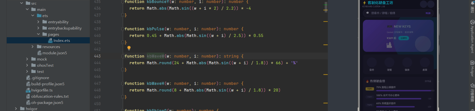
为了让界面"活"起来,系统定义了一组基于 Math.sin 和取模运算的动画函数,它们接受一个递增的 wave 计数器和索引 i,返回位置、透明度或缩放值:
function kbBounceY(w: number, i: number): number {
  return Math.abs(Math.sin((w + i * 2) / 2.2)) * -4
}

function kbPulse(w: number, i: number): number {
  return 0.45 + Math.abs(Math.sin((w + i) / 2.5)) * 0.55
}

function kbWaveH(w: number, i: number): number {
  return Math.round(8 + Math.abs(Math.sin((w + i) / 1.8)) * 20)
}

function kbShineO(w: number): number {
  return Math.abs(Math.sin(w / 7))
}

function kbBlink(w: number): number {
  if (w % 24 < 12) {
    return 1
  }
  return 0.25
}

function kbRipple(w: number, i: number): number {
  return 1 + ((w + i) % 10) / 3
}
这些函数的共同特点是:它们是确定性的——给定相同的 w 和 i,永远返回相同的值。组件在 aboutToAppear 生命周期中通过 setInterval 每 90ms 自增 wave 状态,触发 build() 重新执行,这些函数就会被重新调用并产生"脉动"、“弹跳”、“波纹”、"闪烁"等微动效。虽然每次都重新构建界面树,但 ArkTS 的 Diff 算法只会更新变化的属性节点,性能开销很小。
动画不一定需要 Animation API。用数学函数 + 定时器驱动状态刷新,是一种轻量且可控的"帧动画"方案,尤其适合循环型微动效。
三、主入口组件与底部导航
3.1 入口结构
应用的入口组件 KBApp 负责整体布局:顶部标题栏、搜索栏、内容区域和底部 Tab 导航。它通过 @State cur 维护当前选中的 Tab 索引,在 build() 中用条件渲染切换不同的子组件:
@Entry
@Component
struct KBApp {
  @State cur: number = 0
  @State search: string = ''

  @Builder modalOverlay() {
    Column() {}.width('100%').height('100%').backgroundColor('#66141422')
  }

  build() {
    Stack() {
      Column() {
        Row() {
          Column() {
            Text('⚡ 客制化键盘工坊').fontSize(17).fontWeight(FontWeight.Bold).fontColor(KB.accent)
            Text('KEYBOARD CUSTOM LAB').fontSize(9).fontColor(KB.sub).margin({ top: 2 })
          }.alignItems(HorizontalAlign.Start).layoutWeight(1)
          Column() {}.width(34).height(34).borderRadius(17).backgroundColor(KB.card2)
            .overlay(Text('🔔').fontSize(15))
          Column() {}.width(34).height(34).borderRadius(17).backgroundColor(KB.card2)
            .overlay(Text('👤').fontSize(15)).margin({ left: 8 })
        }.width('94%').padding({ top: 10, bottom: 6 })
        // ... 搜索栏 ...
        Column() {
          if (this.cur === 0) {
            KBHomeTab()
          } else if (this.cur === 1) {
            KBKitTab()
          } else if (this.cur === 2) {
            KBCapTab()
          } else if (this.cur === 3) {
            KBSwitchTab()
          } else if (this.cur === 4) {
            KBDeskTab()
          } else {
            KBMineTab()
          }
        }.layoutWeight(1)
        // ... 底部 Tab ...
      }.width('100%').height('100%')
      this.modalOverlay()
    }.width('100%').height('100%').backgroundColor(KB.bg)
  }
}
这里的核心设计是 Stack 作为根容器,里面放了一个 Column(主界面)和一个 modalOverlay(半透明遮罩层)。modalOverlay 是一个 @Builder 方法,它渲染一个铺满全屏的半透明 Column,为后续各子组件的弹窗提供遮罩背景。子组件内部在需要弹窗时,会将弹窗内容和遮罩一起放在 Stack 的上层,通过 zIndex(999) 保证层级正确。
@Builder方法是 ArkTS 中复用界面片段的关键手段。它类似于一个"渲染函数",可以在多个组件中引用同一段 UI 声明,避免重复代码。
3.2 底部 Tab 导航
底部导航栏通过 ForEach 遍历 KB_TABS 数组渲染六个 Tab 按钮,点击时更新 cur 状态:
Row() {
  ForEach(KB_TABS, (t: string, i: number) => {
    Column() {
      Column() {}.width(30).height(30).borderRadius(15)
        .backgroundColor(this.cur === i ? KB.primary : KB.card2)
        .overlay(Text(KB_TAB_ICONS[i]).fontSize(14)
          .fontColor(this.cur === i ? '#FFFFFF' : KB.sub))
      Text(t).fontSize(10).fontColor(this.cur === i ? KB.accent : KB.sub)
    }.layoutWeight(1).onClick(() => {
      this.cur = i
    })
  }, (t: string) => t)
}.width('100%').height(62).backgroundColor(KB.card)
  .border({ width: { top: 1 }, color: KB.line })
每个 Tab 由一个圆形图标背景和文字标签组成。选中状态下图标背景变为 primary 紫色、文字变为 accent 青色;未选中时图标背景为 card2 深灰、文字为 sub 浅灰。onClick 回调中直接赋值 this.cur = i,由于 cur 是 @State,赋值后自动触发 build() 重新执行,切换内容区域显示的子组件。ForEach 的第三个参数是键值生成器,这里用 Tab 名称作为唯一键。
四、首页推荐模块
4.1 霓虹渐变 Banner 与动画
首页 KBHomeTab 组件包含一个渐变 Banner、类目入口、热销榜单、新品速递和优惠券入口。Banner 使用 linearGradient 创建紫到深紫的对角线渐变,并通过 kbWaveH 函数实现底部的音波动画:
aboutToAppear(): void {
  setInterval(() => {
    this.wave = this.wave + 1
  }, 90)
}

build() {
  Stack() {
    Scroll() {
      Column() {
        Stack() {
          Column() {
            Row() {
              Text('⌨️').fontSize(22)
              Text('NEW KEYS').fontSize(15).fontWeight(FontWeight.Bold).fontColor('#FFFFFF')
                .margin({ left: 6 })
            }
            Text('Gasket 三模套件 · 首发直降').fontSize(10).fontColor('#E6E0FF')
              .margin({ top: 8 })
            Row() {
              Text('¥369 起').fontSize(12).fontColor('#FFFFFF').fontWeight(FontWeight.Bold)
              Text('立即抢').fontSize(10).fontColor('#0E0E16')
                .backgroundColor('#00E5FF').borderRadius(10)
                .padding({ left: 10, right: 10, top: 4, bottom: 4 }).margin({ left: 10 })
            }.margin({ top: 12 })
            Row() {
              ForEach([0, 1, 2, 3, 4, 5, 6, 7], (i: number) => {
                Column() {}.width(3).borderRadius(2).backgroundColor('#FFFFFF')
                  .opacity(0.85).height(kbWaveH(this.wave, i))
              }, (i: number) => '' + i)
            }.width(120).alignItems(VerticalAlign.Bottom).height(28).margin({ top: 8 })
          }.alignItems(HorizontalAlign.Start).margin({ left: 16 })
          // 涟漪扩散圆
          Column() {}.width(84).height(84).borderRadius(42).backgroundColor('#00E5FF')
            .opacity(0.18).scale({ x: kbRipple(this.wave, 0), y: kbRipple(this.wave, 0) })
            .margin({ left: 260, top: 16 })
        }.width('92%').height(150).borderRadius(18)
          .linearGradient({ angle: 135, colors: [['#7C4DFF', 0], ['#3F2A7E', 1]] })
          .margin({ top: 12 })
        // ...
aboutToAppear 中设置 90ms 间隔的定时器,每次执行将 wave 加 1。由于 wave 是 @State,每次更新都会触发 build() 重新执行。Banner 底部的 8 根音波柱通过 ForEach 渲染,每根柱子的高度由 kbWaveH(this.wave, i) 计算——这是一个基于 Math.sin 的函数,随着 wave 递增产生波浪式的起伏效果。右侧还有两个通过 kbRipple 驱动的缩放圆,模拟霓虹光圈的涟漪扩散。
setInterval驱动的动画方案虽然不如animateTo优雅,但它允许开发者完全控制每一帧的数值,灵活性极高。配合@State的自动刷新,可以做出非常复杂的组合动效。
4.2 热销榜单与条形图
热销榜单使用横向条形图展示各套件的销量对比。数据通过 kbHotTop(KIT_LIST) 获取销量前 5 的套件,每行包含排名标签、商品名称、条形图和销量数字:
Column() {
  ForEach(kbHotTop(KIT_LIST), (k: KitItem, i: number) => {
    Row() {
      Text('TOP' + (i + 1)).fontSize(9).fontColor(i === 0 ? '#0E0E16' : '#8B8BA6')
        .backgroundColor(i === 0 ? KB.star : KB.card2).borderRadius(4)
        .padding({ left: 4, right: 4, top: 2, bottom: 2 }).width(40).textAlign(TextAlign.Center)
      Column() {
        Text(k.name).fontSize(11).fontColor(KB.text).fontWeight(FontWeight.Bold)
        Row() {
          Column() {}.height(6).borderRadius(3)
            .width(kbBarW(k.sale, kbMaxHot(KIT_LIST)))
            .backgroundColor(kbFavColor('套件'))
          Column().layoutWeight(1)
          Text(kbNum(k.sale)).fontSize(9).fontColor(KB.sub)
        }.width('100%').margin({ top: 4 })
      }.alignItems(HorizontalAlign.Start).layoutWeight(1).margin({ left: 10 })
    }.width('100%').margin({ top: 10 })
  }, (k: KitItem) => k.name)
}.width('100%').margin({ top: 4 })
条形图的宽度由 kbBarW(k.sale, kbMaxHot(KIT_LIST)) 计算——取当前商品销量与最大销量的比值,映射为百分比宽度。TOP1 的排名标签使用金色(KB.star)背景,其余使用深灰(KB.card2)背景,形成视觉重点。ForEach 的键值生成器使用商品名称 k.name,当列表数据变化时能正确做 Diff。
4.3 签到与优惠券弹窗
首页底部包含签到入口和优惠券入口,点击后分别弹出对应的模态弹窗。以下是签到弹窗的实现:
if (this.showCheck) {
  Stack() {
    this.modalOverlay()
    Column() {
      Text('📅 每日签到').fontSize(17).fontWeight(FontWeight.Bold).fontColor(KB.text)
      Text('连续签到 3 天可领 30 金币').fontSize(10).fontColor(KB.sub).margin({ top: 4 })
      Row() {
        ForEach([0, 1, 2, 3, 4, 5, 6], (i: number) => {
          Column() {
            Column() {}.width(34).height(34).borderRadius(17)
              .backgroundColor(i < 2 ? KB.primary : KB.card2)
              .overlay(Text('+' + (i + 1)).fontSize(11)
                .fontColor(i < 2 ? '#FFFFFF' : KB.sub))
            Text('第' + (i + 1) + '天').fontSize(8).fontColor(KB.sub).margin({ top: 4 })
          }.layoutWeight(1).alignItems(HorizontalAlign.Center)
        }, (i: number) => '' + i)
      }.width('100%').margin({ top: 14 })
      Text('今日签到 +8 金币').fontSize(11).fontColor(KB.accent).margin({ top: 12 })
      Text('立即签到').fontSize(14).fontColor('#FFFFFF').width('100%')
        .textAlign(TextAlign.Center).padding({ top: 11, bottom: 11 })
        .backgroundColor(KB.primary).borderRadius(22).margin({ top: 16 }).onClick(() => {
        this.showCheck = false
      })
    }.width('82%').borderRadius(16).backgroundColor(KB.card)
      .padding({ left: 18, right: 18, top: 18, bottom: 18 })
      .constraintSize({ maxHeight: '78%' })
  }.position({ x: 0, y: 0 }).zIndex(999).width('100%').height('100%')
}
弹窗的结构是 Stack 内嵌 modalOverlay(半透明遮罩)和 Column(弹窗内容)。7 天签到日历通过 ForEach 渲染 7 个圆形格子,已签到的天用紫色背景、未签到的用灰色背景。constraintSize({ maxHeight: '78%' }) 保证弹窗内容超出时可以滚动而不溢出屏幕。点击"立即签到"按钮将 showCheck 置为 false,条件渲染使弹窗消失。
五、套件精选模块——CRUD 全流程
5.1 套件列表与价格对比图
KBKitTab 是功能最完整的商品管理模块,包含价格对比 TOP6 条形图、配列筛选和双列网格列表。组件内部维护了一份 @State kits 数组(从 KIT_LIST 拷贝),所有新增、编辑、删除操作都直接修改这个数组:
@Component
struct KBKitTab {
  @State kits: KitItem[] = []
  @State wave: number = 0
  @State filter: string = '全部'
  @State selIdx: number = -1
  @State showDetail: boolean = false
  @State showAdd: boolean = false
  @State showEdit: boolean = false
  @State showDel: boolean = false
  @State addName: string = '98 配列 Gasket 套件'
  @State addBrand: string = 'Keychron'
  @State addLayout: string = '98键'
  @State addPrice: string = '459'
  @State editName: string = ''
  @State editBrand: string = ''
  @State editLayout: string = '75%'
  @State editPrice: string = ''

  aboutToAppear(): void {
    this.kits = KIT_LIST.slice()
    setInterval(() => {
      this.wave = this.wave + 1
    }, 120)
  }
这里使用了大量 @State 变量来管理弹窗的显隐(showDetail、showAdd、showEdit、showDel)和表单输入(addName、addBrand、addLayout、addPrice 等)。selIdx 记录当前选中的商品索引,用于详情、编辑和删除弹窗定位目标数据。aboutToAppear 中用 slice() 拷贝原始数据,避免直接修改 const 数组。
5.2 商品详情弹窗
点击网格中的商品卡片后,弹出详情弹窗展示完整信息。弹窗内包含商品图标、名称、价格(含原价划线、折扣标签)、四宫格参数(配列、重量、RGB、评分)和操作按钮:
if (this.showDetail) {
  Stack() {
    this.modalOverlay()
    Column() {
      Column() {}.width('100%').height(96).borderRadius(12).backgroundColor(KB.card2)
        .overlay(Text('⌨️').fontSize(34).fontColor(KB.primary))
      Text(this.kits[this.selIdx].name).fontSize(15).fontWeight(FontWeight.Bold)
        .fontColor(KB.text).margin({ top: 10 })
      Row() {
        Text(kbPrice(this.kits[this.selIdx].price)).fontSize(18)
          .fontWeight(FontWeight.Bold).fontColor(KB.accent)
        Text(kbPrice(this.kits[this.selIdx].orig)).fontSize(11).fontColor(KB.sub)
          .decoration({ type: TextDecorationType.LineThrough }).margin({ left: 8 })
        Text('省 ' + kbOff(this.kits[this.selIdx].orig, this.kits[this.selIdx].price))
          .fontSize(9).fontColor('#FF8A65').margin({ left: 6 })
      }.margin({ top: 8 })
      Row() {
        Column() {
          Text(this.kits[this.selIdx].layout).fontSize(11).fontWeight(FontWeight.Bold)
            .fontColor(KB.accent)
          Text('配列').fontSize(9).fontColor(KB.sub).margin({ top: 3 })
        }.layoutWeight(1).alignItems(HorizontalAlign.Center)
        Column() {
          Text('' + this.kits[this.selIdx].weight).fontSize(11)
            .fontWeight(FontWeight.Bold).fontColor(KB.text)
          Text('重量 g').fontSize(9).fontColor(KB.sub).margin({ top: 3 })
        }.layoutWeight(1).alignItems(HorizontalAlign.Center)
        Column() {
          Text(this.kits[this.selIdx].rgb === 1 ? '支持' : '不支持').fontSize(11)
            .fontWeight(FontWeight.Bold)
            .fontColor(this.kits[this.selIdx].rgb === 1 ? KB.glow : KB.sub)
          Text('RGB').fontSize(9).fontColor(KB.sub).margin({ top: 3 })
        }.layoutWeight(1).alignItems(HorizontalAlign.Center)
        Column() {
          Text('' + this.kits[this.selIdx].stars).fontSize(11)
            .fontWeight(FontWeight.Bold).fontColor(KB.star)
          Text('评分').fontSize(9).fontColor(KB.sub).margin({ top: 3 })
        }.layoutWeight(1).alignItems(HorizontalAlign.Center)
      }.width('100%').borderRadius(12).backgroundColor(KB.card2)
        .padding({ top: 12, bottom: 12 }).margin({ top: 12 })
      Row() {
        Text('编辑').fontSize(13).fontColor('#FFFFFF').layoutWeight(1)
          .textAlign(TextAlign.Center).padding({ top: 10, bottom: 10 })
          .backgroundColor('#00B8D4').borderRadius(20).onClick(() => {
          this.editName = this.kits[this.selIdx].name
          this.editBrand = this.kits[this.selIdx].brand
          this.editLayout = this.kits[this.selIdx].layout
          this.editPrice = '' + this.kits[this.selIdx].price
          this.showDetail = false
          this.showEdit = true
        })
        Text('删除').fontSize(13).fontColor('#FFFFFF').layoutWeight(1)
          .textAlign(TextAlign.Center).padding({ top: 10, bottom: 10 })
          .backgroundColor('#EF5350').borderRadius(20).margin({ left: 10 }).onClick(() => {
          this.showDetail = false
          this.showDel = true
        })
      }.width('100%').margin({ top: 12 })
    }.width('84%').borderRadius(16).backgroundColor(KB.card)
      .padding({ left: 16, right: 16, top: 16, bottom: 16 })
      .constraintSize({ maxHeight: '82%' })
  }.position({ x: 0, y: 0 }).zIndex(999).width('100%').height('100%')
}
点击"编辑"按钮时,先将当前商品的数据填充到编辑表单变量中(editName、editBrand 等),然后关闭详情弹窗(showDetail = false)并打开编辑弹窗(showEdit = true)。这种"先填充再切换"的模式确保了编辑表单打开时已有初始值。删除按钮则直接切换到删除确认弹窗。
5.3 新增套件弹窗
新增弹窗包含名称输入框、配列选择器(Chip 标签)、品牌输入框、价格输入框和确认按钮:
if (this.showAdd) {
  Stack() {
    this.modalOverlay()
    Column() {
      Text('🆕 新增套件').fontSize(16).fontWeight(FontWeight.Bold).fontColor(KB.text)
      TextInput({ text: this.addName, placeholder: '套件名称' }).fontSize(12)
        .height(40).margin({ top: 12 }).backgroundColor(KB.card2)
        .onChange((v: string) => {
        this.addName = v
      })
      Text('配列').fontSize(10).fontColor(KB.sub).width('100%').margin({ top: 10 })
      Row() {
        ForEach(kbKitLayoutChips(), (c: string) => {
          Text(c).fontSize(10).fontColor(this.addLayout === c ? '#FFFFFF' : KB.sub)
            .backgroundColor(this.addLayout === c ? KB.accent : KB.card2)
            .borderRadius(12).padding({ left: 9, right: 9, top: 4, bottom: 4 })
            .margin({ right: 6 }).onClick(() => {
            this.addLayout = c
          })
        }, (c: string) => c)
      }.width('100%').margin({ top: 6 })
      TextInput({ text: this.addBrand, placeholder: '品牌' }).fontSize(12)
        .height(40).margin({ top: 10 }).backgroundColor(KB.card2)
        .onChange((v: string) => {
        this.addBrand = v
      })
      TextInput({ text: this.addPrice, placeholder: '价格' }).fontSize(12)
        .height(40).margin({ top: 10 }).backgroundColor(KB.card2)
        .onChange((v: string) => {
        this.addPrice = v
      })
      Text('确认添加').fontSize(14).fontColor('#FFFFFF').width('100%')
        .textAlign(TextAlign.Center).padding({ top: 11, bottom: 11 })
        .backgroundColor(KB.primary).borderRadius(22).margin({ top: 14 }).onClick(() => {
        let it: KitItem = {
          name: this.addName,
          brand: this.addBrand,
          layout: this.addLayout,
          price: parseInt(this.addPrice),
          orig: 479,
          sale: 0,
          stars: 4,
          rgb: 1,
          weight: 1000
        }
        if (isNaN(it.price)) {
          it.price = 399
          it.orig = 479
        }
        this.kits.push(it)
        this.showAdd = false
      })
    }.width('84%').borderRadius(16).backgroundColor(KB.card)
      .padding({ left: 16, right: 16, top: 16, bottom: 16 })
      .constraintSize({ maxHeight: '86%' })
  }.position({ x: 0, y: 0 }).zIndex(999).width('100%').height('100%')
}
TextInput 组件通过 text 参数绑定初始值,通过 onChange 回调更新对应的 @State 变量。配列选择器使用 Chip 标签组,选中时背景变为 accent 青色。确认添加时构造一个新的 KitItem 对象并 push 到 kits 数组——由于 kits 是 @State,数组变化后 ForEach 会自动重新渲染列表。isNaN 检查防止用户输入非数字导致 parseInt 返回 NaN。
5.4 编辑与删除弹窗
编辑弹窗与新增弹窗结构类似,但点击"保存修改"时直接修改 kits[selIdx] 的属性:
Text('保存修改').fontSize(14).fontColor('#0E0E16').width('100%')
  .textAlign(TextAlign.Center).padding({ top: 11, bottom: 11 })
  .backgroundColor(KB.accent).borderRadius(22).margin({ top: 14 }).onClick(() => {
  let np = parseInt(this.editPrice)
  if (isNaN(np)) {
    np = 399
  }
  this.kits[this.selIdx].name = this.editName
  this.kits[this.selIdx].brand = this.editBrand
  this.kits[this.selIdx].layout = this.editLayout
  this.kits[this.selIdx].price = np
  this.kits[this.selIdx].orig = np + 80
  this.showEdit = false
})
删除弹窗包含图标、商品名称、警告文本和确认/取消按钮:
if (this.showDel) {
  Stack() {
    this.modalOverlay()
    Column() {
      Text('⚠️ 删除确认').fontSize(16).fontWeight(FontWeight.Bold).fontColor('#FF6E6E')
      Column() {}.width(64).height(64).borderRadius(32).backgroundColor('#3D1E26')
        .overlay(Text('⌨️').fontSize(26)).margin({ top: 12 })
      Text(this.kits[this.selIdx].name).fontSize(13).fontColor(KB.text)
        .margin({ top: 10 }).textAlign(TextAlign.Center)
      Text('删除后不可恢复,确定要移除该套件吗?').fontSize(10).fontColor(KB.sub)
        .margin({ top: 6 })
      Text('确认删除').fontSize(14).fontColor('#FFFFFF').width('100%')
        .textAlign(TextAlign.Center).padding({ top: 11, bottom: 11 })
        .backgroundColor('#EF5350').borderRadius(22).margin({ top: 16 }).onClick(() => {
        this.kits.splice(this.selIdx, 1)
        this.showDel = false
      })
      Text('再想想').fontSize(12).fontColor(KB.sub).width('100%')
        .textAlign(TextAlign.Center).margin({ top: 8 }).onClick(() => {
        this.showDel = false
      })
    }.width('80%').borderRadius(16).backgroundColor(KB.card)
      .padding({ left: 18, right: 18, top: 18, bottom: 18 })
      .constraintSize({ maxHeight: '72%' })
  }.position({ x: 0, y: 0 }).zIndex(999).width('100%').height('100%')
}
splice(this.selIdx, 1) 从数组中删除指定索引的元素,@State 的响应式机制会自动刷新列表。"再想想"按钮和"确认删除"按钮提供二次确认的机会,防止误删。
六、系统数据流架构
以下是整个应用的组件间数据流与状态流转关系:
七、个人中心模块
7.1 会员卡与数据统计
个人中心 KBMineTab 包含个人资料卡、黑金会员卡(带光泽扫过特效)、数据统计、月度消费柱状图、收藏列表、订单记录和功能入口。会员卡的设计尤为精巧:
Stack() {
  Column() {
    Row() {
      Text('KEY LAB 黑金会员').fontSize(13).fontWeight(FontWeight.Bold)
        .fontColor('#FFE082')
      Column().layoutWeight(1)
      Text('Lv.6').fontSize(10).fontColor('#FFE082')
    }.width('100%')
    Row() {
      Text('剩余成长值 1280').fontSize(10).fontColor('#E6E0FF').margin({ top: 10 })
      Column().layoutWeight(1)
      Text('到期 2027-08').fontSize(10).fontColor('#E6E0FF').margin({ top: 10 })
    }.width('100%')
    Row() {
      ForEach([0, 1, 2, 3, 4], (i: number) => {
        Column() {}.width(3).borderRadius(2).backgroundColor('#FFE082')
          .opacity(kbPulse(this.wave, i)).height(kbWaveH(this.wave, i + 2))
      }, (i: number) => '' + i)
    }.width(80).alignItems(VerticalAlign.Bottom).height(20).margin({ top: 10 })
  }.alignItems(HorizontalAlign.Start).margin({ left: 14, top: 12 })
  // 光泽扫过特效
  Column() {}.width(120).height(120).borderRadius(60).backgroundColor('#FFFFFF')
    .opacity(kbShineO(this.wave) * 0.25).position({ x: -40, y: -20 })
}.width('92%').height(108).borderRadius(16)
  .linearGradient({ angle: 120, colors: [['#3F2A7E', 0], ['#7C4DFF', 0.55], ['#00B8D4', 1]] })
  .margin({ top: 12 }).clip(true)
会员卡使用三色渐变(深紫到亮紫到青色)作为背景,叠加一个白色圆形通过 kbShineO(this.wave) 控制透明度,模拟光线扫过卡面的效果。.clip(true) 确保圆形光斑不会溢出卡片边界。底部的 5 根金色音波柱使用 kbPulse 和 kbWaveH 产生脉动起伏,增强了卡片的动感。
光泽扫过特效是电商会员卡的标志性视觉元素。通过在渐变背景上叠加一个可控透明度的白色圆形,可以低成本地实现这种"高级感"动效。
7.2 月度消费柱状图
月度消费数据以纵向柱状图展示,6 个月的消费金额通过 kbMonthBar 映射为柱子高度:
Row() {
  ForEach([0, 1, 2, 3, 4, 5], (i: number) => {
    Column() {
      Column() {}.width('52%').height(64)
        .height(kbMonthBar(MONTH_VALS[i]))
        .borderRadius(4).backgroundColor(i === 5 ? KB.accent : KB.primary)
        .opacity(i === 5 ? 1 : 0.6)
      Text('' + MONTH_VALS[i]).fontSize(8).fontColor(KB.sub).margin({ top: 3 })
      Text(MONTH_LABELS[i]).fontSize(8).fontColor(KB.sub)
    }.layoutWeight(1).alignItems(HorizontalAlign.Center)
  }, (i: number) => '' + i)
}.width('100%').alignItems(VerticalAlign.Bottom).margin({ top: 8 })
当月(索引 5)的柱子使用 accent 青色且完全不透明,其余月份使用 primary 紫色且 60% 透明度,形成"当月高亮"的视觉效果。alignItems(VerticalAlign.Bottom) 让所有柱子从底部对齐,符合柱状图的视觉规范。
八、技术对比与总结
技术点对比表
| 技术维度 | 本项目实现方案 | 技术特点 | 适用场景 |
|---|---|---|---|
| 状态管理 | @State + 条件渲染 | 单组件内响应式,无需全局 Store | 中小型应用、单页面状态 |
| 列表渲染 | ForEach + 键值生成器 | 自动 Diff 最小化更新 | 动态列表、网格布局 |
| 弹窗管理 | Stack + if 条件 + zIndex | 无需 Dialog API,纯声明式 | 模态弹窗、确认框 |
| 动画驱动 | setInterval + Math.sin | 确定性帧动画,完全可控 | 微动效、循环动画 |
| 数据可视化 | Column width 百分比 | 纯 UI 组件绘制图表 | 条形图、柱状图 |
| 表单输入 | TextInput + onChange + @State | 双向数据流,实时校验 | 新增/编辑表单 |
| 主题管理 | interface + const 色板 | 类型安全,统一可维护 | 全局色彩系统 |
| 组件复用 | @Builder 方法 | 无状态 UI 片段复用 | 遮罩层、公共组件 |
| 数据拷贝 | slice() 避免引用修改 | 保护原始数据不被污染 | 列表 CRUD 操作 |
| 筛选排序 | 纯函数 + for 循环 | 无副作用,可独立测试 | 数据过滤、排序 |
| 布局系统 | Row/Column + layoutWeight | 弹性布局,自适应屏幕 | 响应式界面 |
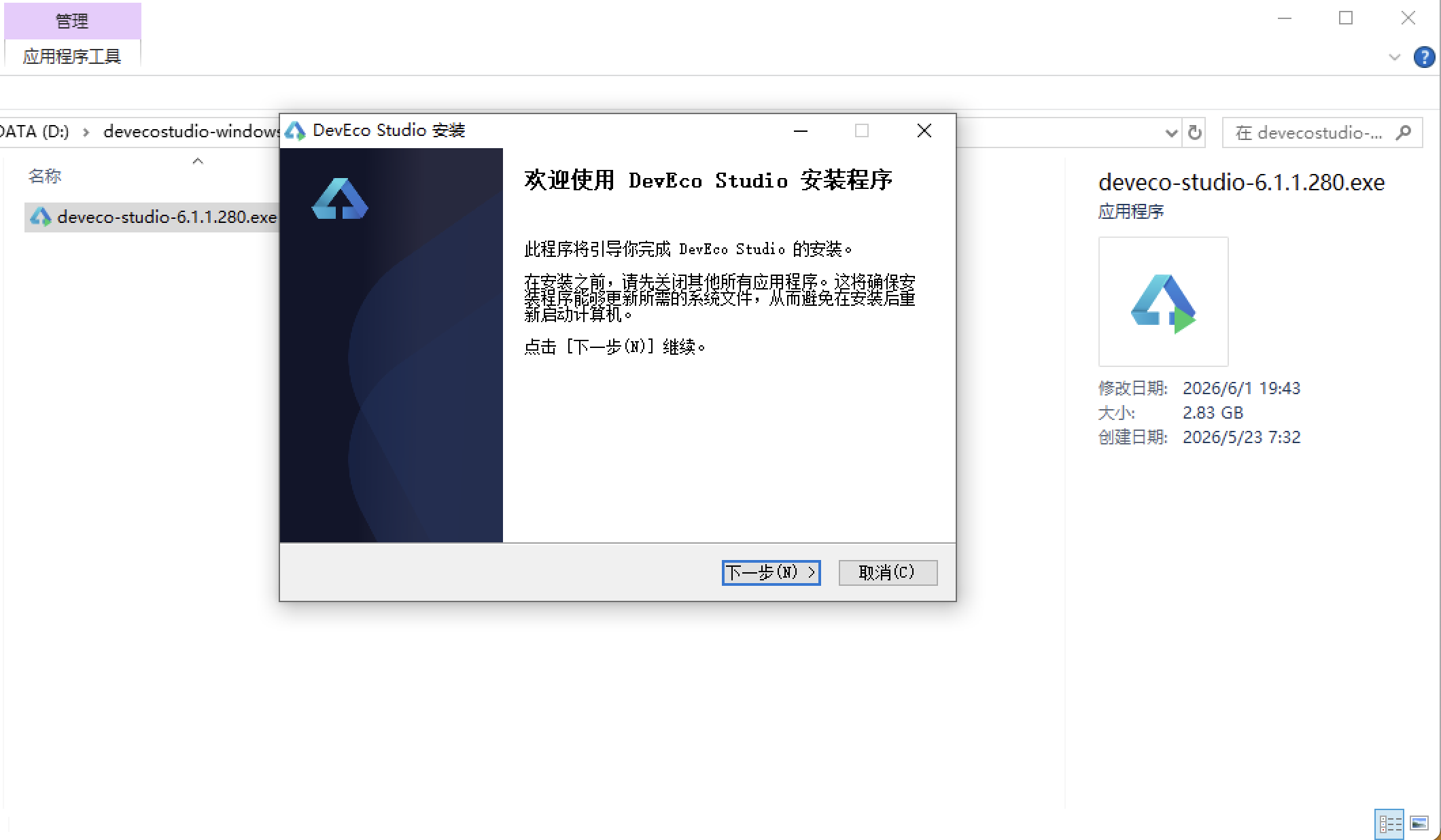
安装DevEco Studio程序
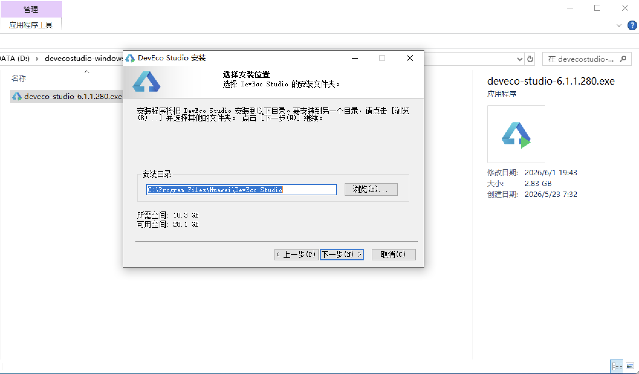
选择目标安装目录:
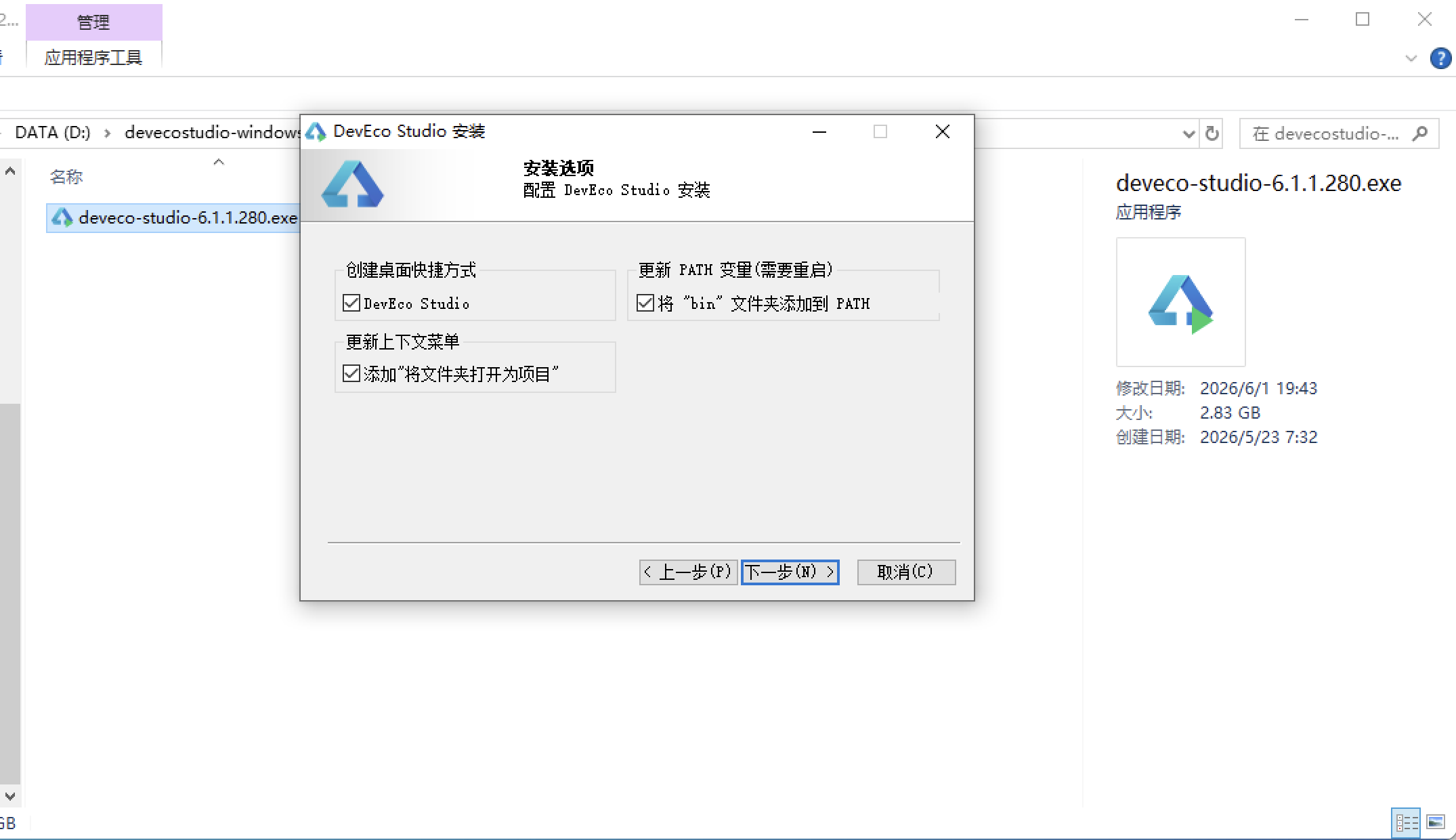
设置环境变量,但是需要重启一下:
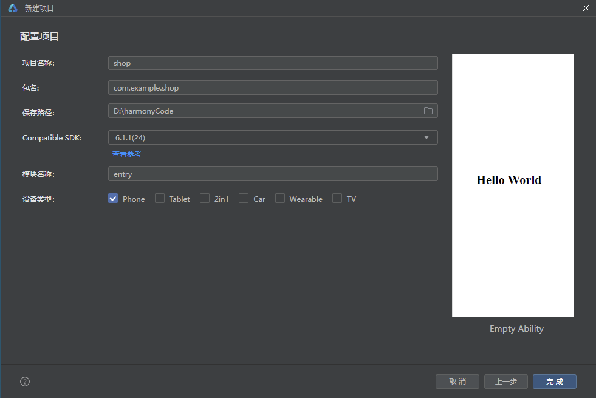
新建一个空白模板:
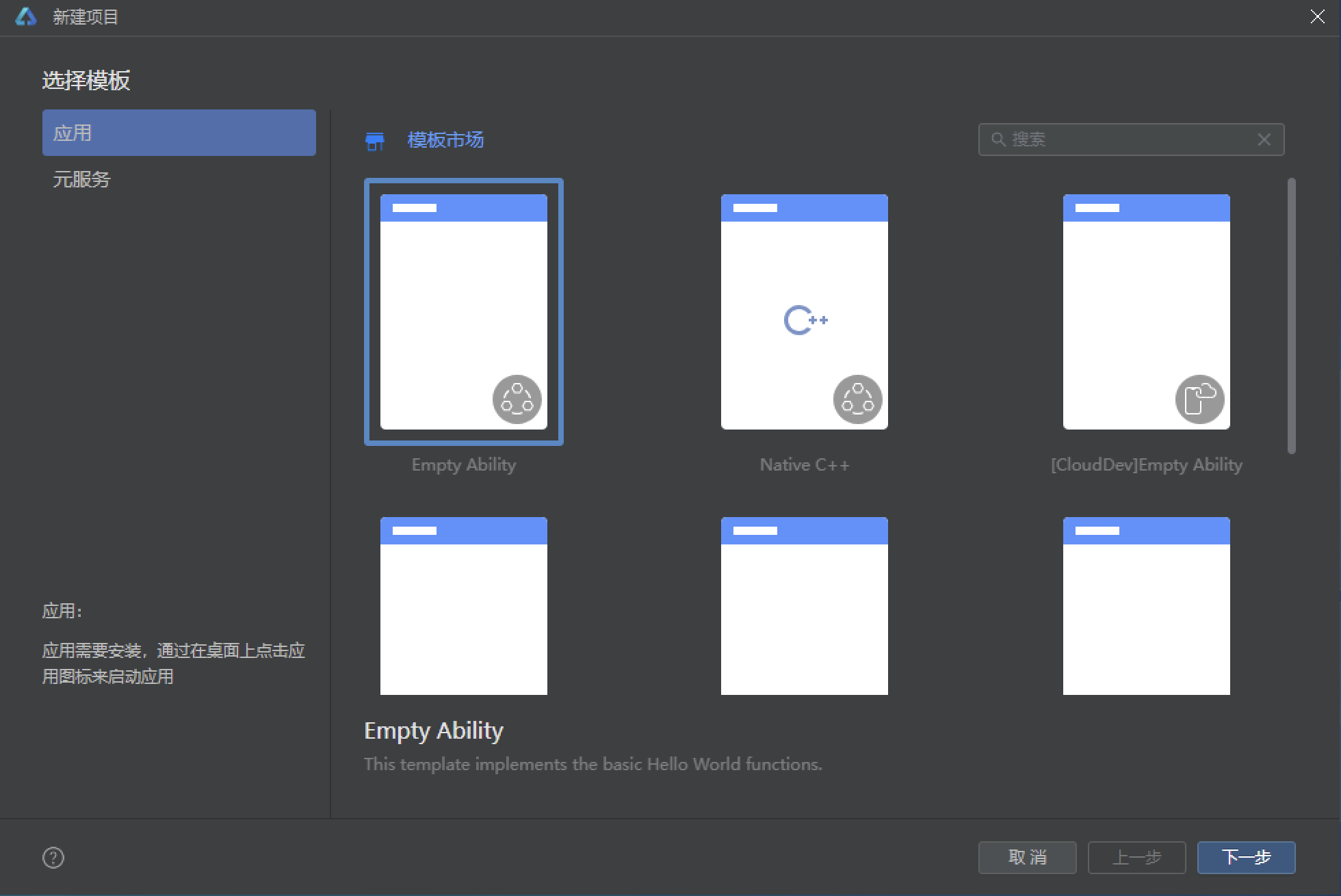
设置API为24的模板项目:
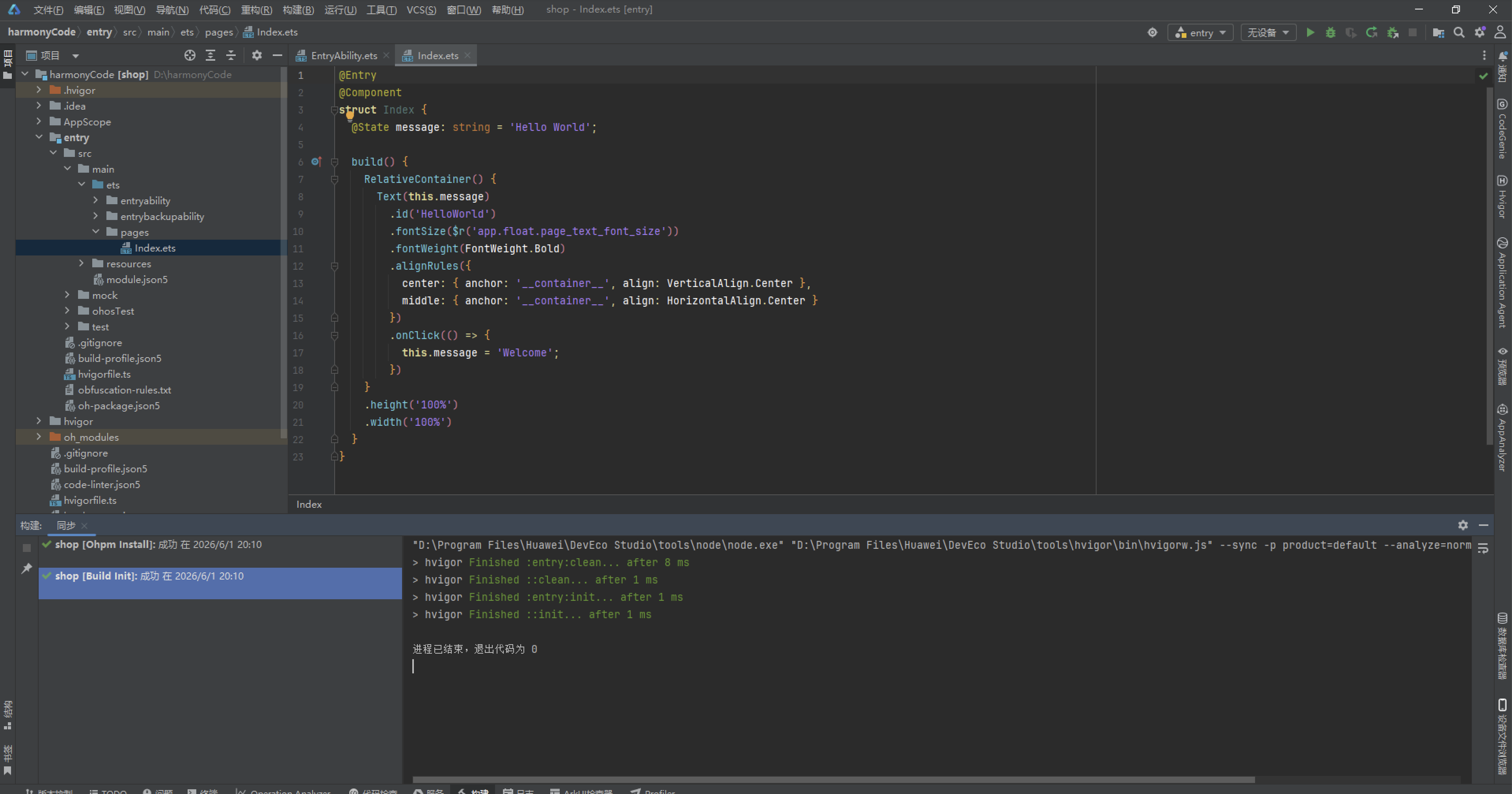
初始化项目,自动下载相关依赖:
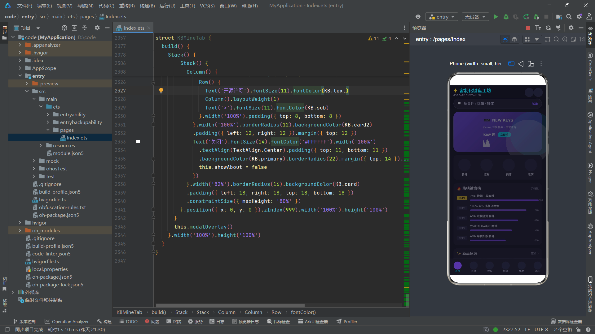
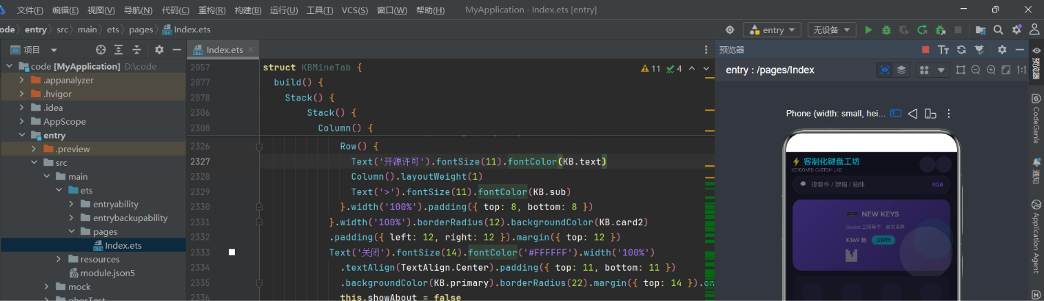
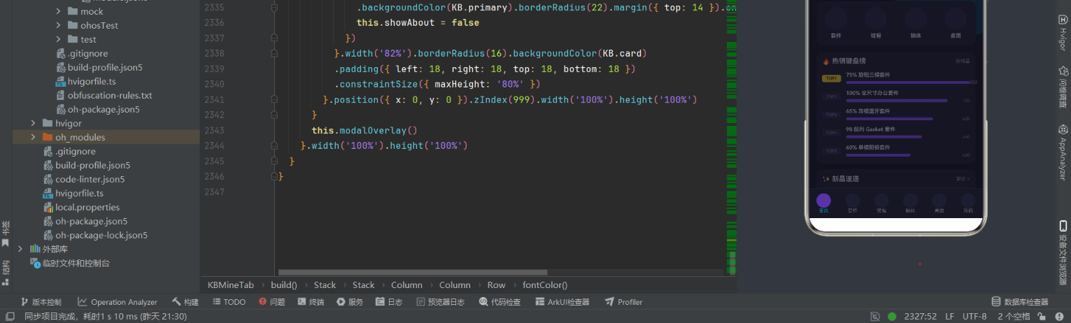
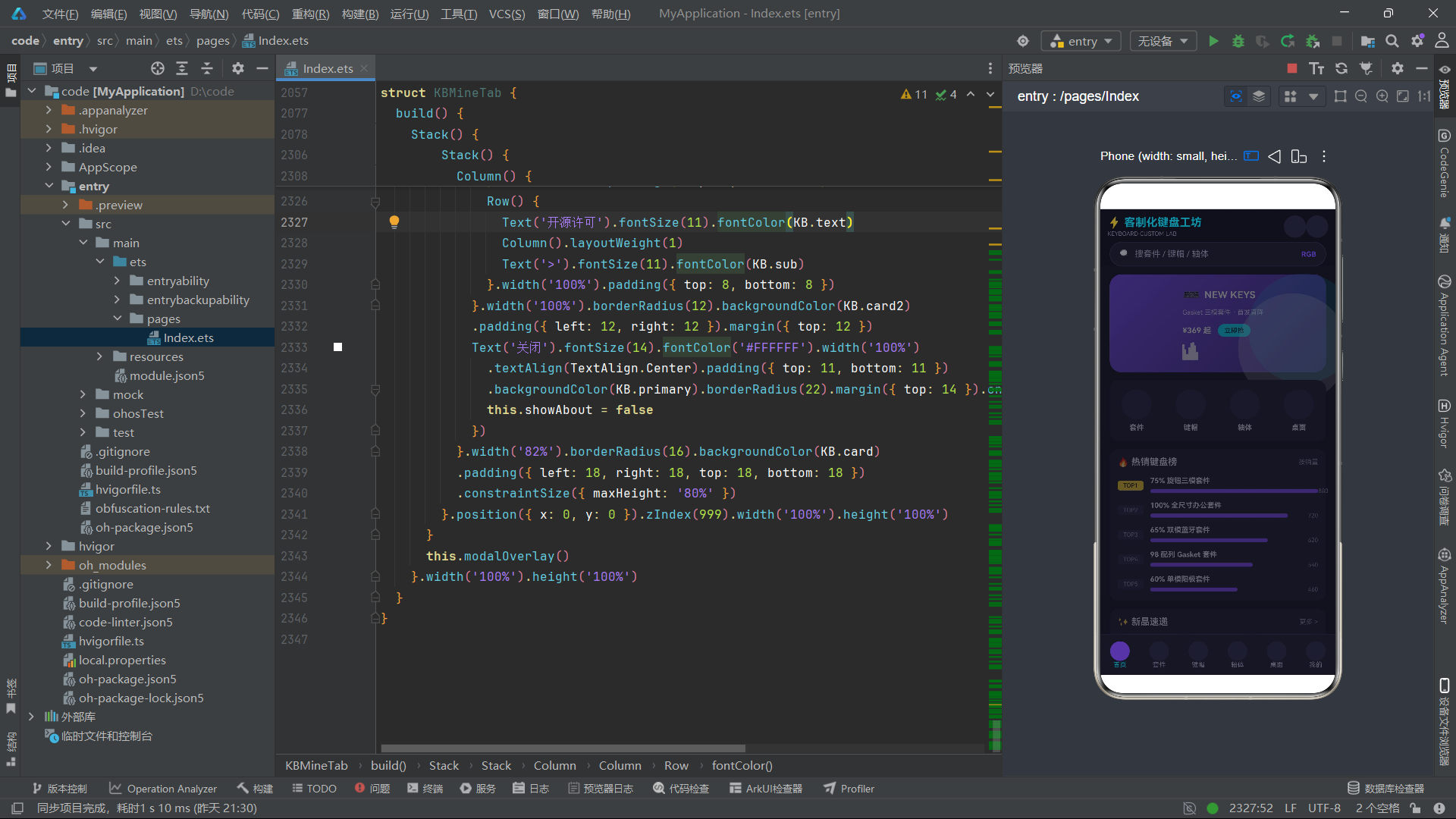
完整代码:
import { display } from '@kit.ArkUI'

interface ColorPalette {
  bg: string
  card: string
  card2: string
  primary: string
  accent: string
  star: string
  text: string
  sub: string
  line: string
  glow: string
}

const KB: ColorPalette = {
  bg: '#0E0E16',
  card: '#181826',
  card2: '#232338',
  primary: '#7C4DFF',
  accent: '#00E5FF',
  star: '#FFD54F',
  text: '#E9E9F5',
  sub: '#8B8BA6',
  line: '#2B2B42',
  glow: '#B388FF'
}


              }.width('100%').padding({ top: 8, bottom: 8 })
              Row() {
                Text('隐私政策').fontSize(11).fontColor(KB.text)
                Column().layoutWeight(1)
                Text('>').fontSize(11).fontColor(KB.sub)
              }.width('100%').padding({ top: 8, bottom: 8 })
              Row() {
                Text('开源许可').fontSize(11).fontColor(KB.text)
                Column().layoutWeight(1)
                Text('>').fontSize(11).fontColor(KB.sub)
              }.width('100%').padding({ top: 8, bottom: 8 })
            }.width('100%').borderRadius(12).backgroundColor(KB.card2)
            .padding({ left: 12, right: 12 }).margin({ top: 12 })
            Text('关闭').fontSize(14).fontColor('#FFFFFF').width('100%')
              .textAlign(TextAlign.Center).padding({ top: 11, bottom: 11 })
              .backgroundColor(KB.primary).borderRadius(22).margin({ top: 14 }).onClick(() => {
              this.showAbout = false
            })
          }.width('82%').borderRadius(16).backgroundColor(KB.card)
          .padding({ left: 18, right: 18, top: 18, bottom: 18 })
          .constraintSize({ maxHeight: '80%' })
        }.position({ x: 0, y: 0 }).zIndex(999).width('100%').height('100%')
      }
      this.modalOverlay()
    }.width('100%').height('100%')
  }
}
总结
本文以客制化机械键盘工坊商城为例,完整剖析了 HarmonyOS 6.1.1 ArkTS 声明式 UI 在电商场景下的工程实践。从数据模型的接口设计到纯函数工具层的抽取,从入口组件的底部导航到六个功能模块的逐一实现,从首页 Banner 的音波动效到会员卡的光泽扫过特效,每一个技术点都体现了声明式范式"状态驱动视图"的核心理念。整个项目没有使用任何第三方图表库或动画框架,所有数据可视化和微动效都通过 ArkTS 内置的 Column、Row、Text 等基础组件配合数学函数实现,充分展示了声明式 UI 的表达力。
在工程架构层面,本项目展示了几个值得借鉴的最佳实践:第一,将所有业务逻辑抽取为纯函数,使 build() 方法专注于界面声明,提升可读性;第二,用 slice() 拷贝原始数据后再操作,避免修改 const 常量;第三,通过 @State 管理弹窗显隐和表单输入,用条件渲染替代 Dialog API,使弹窗代码与列表代码在同一个组件内内聚;第四,使用 @Builder 方法复用遮罩层等公共 UI 片段,减少重复代码;第五,用 setInterval + Math.sin 驱动动画状态,在 @State 的自动刷新机制下实现复杂组合动效。
展望未来,这套架构可以进一步演进:引入 @Provide/@Consume 实现跨组件状态共享(如全局购物车状态),使用 @Observed/@ObjectLink 管理嵌套对象的响应式更新,接入 Navigation 组件实现页面路由和转场动画,以及使用 animateTo 替代 setInterval 获得更流畅的 60fps 动画体验。但核心的"状态驱动视图 + 纯函数工具层 + 组件化拆分"的架构理念,在 HarmonyOS ArkTS 生态中始终是构建高质量应用的基础范式。希望本文的逐段拆解能够帮助开发者在自己的 HarmonyOS 项目中少走弯路,快速构建出功能丰富、交互流畅的声明式 UI 应用。

讨论HarmonyOS开发技术,专注于API与组件、DevEco Studio、测试、元服务和应用上架分发等。
更多推荐

 11
11 0
0- 0



 已为社区贡献8条内容

所有评论(0)