基于 HarmonyOS API 24 的声明式 ArkTS 绩效 OKR 考核应用深度剖析:从 ArkUI 布局体系到状态驱动渲染的全链路工程实践(HarmonyOS 6.1.1 / ArkTS A
一、鸿蒙技术栈背景与声明式 UI 范式概述
HarmonyOS 6.1.1 作为华为全场景分布式操作系统的最新演进版本,在应用开发框架层面带来了更成熟、更高效的声明式 UI 体系。它以 ArkUI 框架为核心,提供了一套从描述到渲染高度统一的开发范式。开发者只需通过状态变量与组件树的声明式绑定,即可让框架自动完成 UI 的差异更新,而无需像传统命令式框架那样手动操作 DOM 节点。这种范式的核心思想是"状态驱动视图",即 UI 是状态的函数映射。
ArkTS 是鸿蒙生态在 TypeScript 基础上扩展而来的应用开发语言。它在保留 TypeScript 静态类型系统优势的同时,针对声明式 UI 的数据绑定、装饰器语义、组件化模型做了深度定制。ArkTS 强化了类型安全约束,禁用了一些动态特性,从而在编译期就能发现更多潜在问题。这使得大型业务应用在协作开发时,代码可维护性与重构安全性显著提升。
在 HarmonyOS ArkTS API 24 这一版本基线上,ArkUI 提供了丰富的内置组件与容器,例如线性布局容器 Column / Row、层叠布局容器 Stack、滚动容器 Scroll、列表渲染 ForEach、进度展示 Progress 等等。这些组件并非简单的 UI 控件,而是与状态管理系统深度耦合的"可观察单元"。当被装饰器标记的状态发生变更时,框架会精确地定位到依赖该状态的组件子树,并触发最小范围的重新渲染。
声明式 UI 的另一个重要特性是数据流的单向性。在 ArkUI 中,状态从顶层向下流动,事件从底层向上冒泡,二者通过装饰器约定形成清晰的契约。@State 管理组件内部状态,@Prop 接收父组件单向同步,@Link 建立父子双向同步,@Builder 抽取可复用的 UI 描述片段,@BuilderParam 实现插槽式组合。这些原语共同构成了 ArkUI 区别于其他前端框架的独特状态模型。
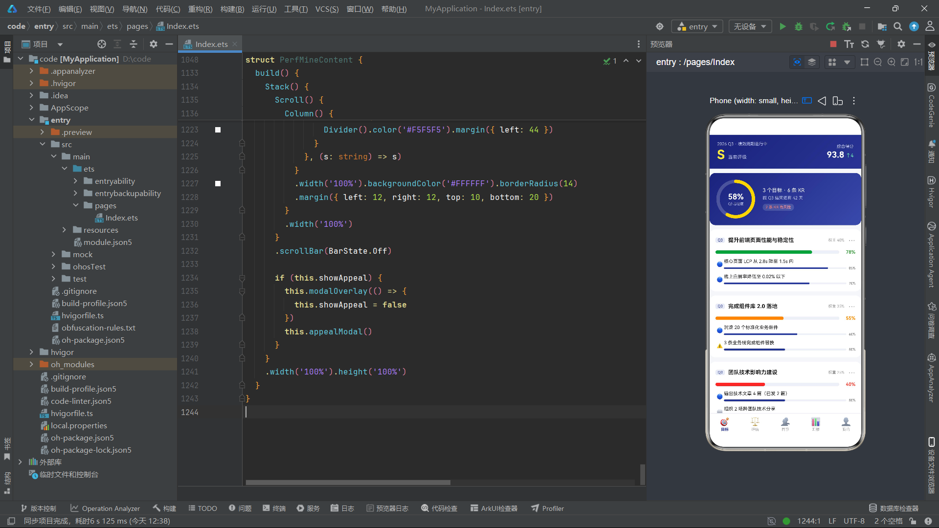
本篇博文要剖析的,是一个面向企业人事场景的"绩效云"应用。它围绕 OKR 目标管理、360 度评估、团队排行、绩效汇报、个人中心五大业务模块展开,覆盖了目标创建、维度打分、互评邀请、结果申诉等完整绩效闭环。在技术上,它综合运用了多 Tab 导航、Stack 层叠弹窗、Scroll 滚动列表、ForEach 动态渲染、Progress 进度环、动画属性、线性渐变背景等 ArkUI 能力,是一个具有相当代表性的中复杂度鸿蒙原生应用样本。
下面,我们将从类型定义、数据模型、入口组件、五大业务页面、五种弹窗交互等多个层次,逐段、逐行地展开剖析。在分析过程中,我们会穿插讲解 ArkUI 各核心组件的技术原理与使用要点,帮助读者既知其然,又知其所以然。
二、应用整体架构与数据模型设计
2.1 架构层次总览
该绩效云应用在结构上采用了典型的"入口组件 + 内容子组件 + 弹窗 Builder + 静态数据源"的四层组织方式。入口组件负责顶部品牌区与底部导航栏的固定布局,内容子组件按 Tab 切换动态挂载,弹窗通过 @Builder 抽象并以 if 条件渲染叠加到 Stack 顶层。这种分层让业务的纵向切分十分清晰。
从架构图可以看出,入口组件持有唯一的 currentTab 状态,底部 Tab 的点击事件修改该状态,内容区通过 if / else if 链路选择对应子组件渲染。这是一种轻量级的导航模式,适用于单层级页面切换场景。相比于 Navigation 组件的路由栈管理,它没有转场动画与页面栈深度,但胜在简单直接、状态集中。
2.2 类型定义层
应用首先定义了一组 interface,用于约束各业务实体的结构。这些类型既是数据契约,也是 ArkUI ForEach 渲染时进行键值生成与差异比较的依据。
interface OkrObjective {
  id: number
  title: string
  quarter: string
  progress: number
  weight: string
  owner: string
  krs: KrItem[]
}
OkrObjective 描述了一个 OKR 目标。id 作为唯一标识,用于 ForEach 的键值生成;title 是目标标题;quarter 标注所属季度;progress 是 0-100 的完成百分比;weight 以字符串形式存储权重,如 '40%';owner 标明责任人;krs 是一个 KrItem[] 数组,表示该目标下的关键成果列表。
interface KrItem {
  id: number
  title: string
  progress: number
  state: string
}
KrItem 描述关键成果。state 以中文字符串表达状态,如 '推进中'、'有风险'、'未开始'。这里值得讨论的是,使用字符串而非枚举来表示状态,在类型安全性上略弱,但换来的是与 UI 展示文本的直接映射。在实际工程中,更推荐用枚举定义状态,再在 UI 层做映射,以兼顾安全与可读。
interface ReviewDim {
  id: number
  name: string
  icon: string
  score: string
  full: number
  desc: string
}
ReviewDim 表示一个评估维度,如"目标达成""专业能力"等。score 以字符串存储,如 '4.5',在渲染时通过 Number(d.score) 转换为数值用于进度条计算。full 表示满分基准,通常为 5。icon 使用 emoji 字符作为图标,这是一种轻量化的图标方案。
interface PeerItem {
  id: number
  name: string
  avatar: string
  dept: string
  score: string
  done: boolean
  invited: boolean
}
PeerItem 描述一位可参与互评的同事。done 标记是否已完成互评,invited 标记是否已被邀请。不过在实际渲染逻辑中,邀请状态是通过组件内的 invitedIds 数组动态判断的,invited 字段并未被直接消费,这体现了静态数据与运行态状态的分离设计。
interface RankItem {
  id: number
  name: string
  avatar: string
  dept: string
  score: string
  medal: string
  trend: string
}
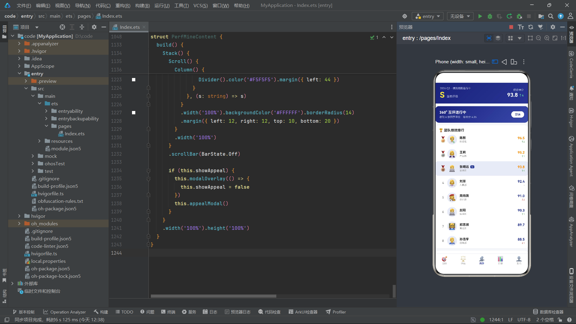
RankItem 描述团队排行中的一位成员。medal 存储奖牌 emoji,前三名分别为金、银、铜,其余为空字符串;trend 存储排名变化趋势,如 '↑2'、'↓1'、'-',在 UI 中根据箭头方向着色。
interface PerfLog {
  id: number
  date: string
  title: string
  kind: string
  change: string
}
PerfLog 描述一条绩效分变动记录。kind 是事件分类标签,如"评级"“表扬”“提案”"考勤"等;change 是分数变化文本,如 '+8 分'、'-3 分',通过字符串中是否包含 '-' 判断正负,从而着色为绿色或红色。
interface DistItem {
  id: number
  level: string
  count: number
  color: string
}
DistItem 描述绩效分布的一档,如 S 档 3 人、A 档 8 人。color 直接以十六进制字符串存储该档的展示色,用于柱状图柱体着色。
2.3 静态数据源
定义完类型后,应用以 const 常量数组的形式初始化了五组业务数据。这些数据在应用生命周期内不变,扮演"模拟接口返回"的角色。
const OKR_LIST: OkrObjective[] = [
  {
    id: 1, title: '提升前端页面性能与稳定性', quarter: 'Q3', progress: 78, weight: '40%', owner: '我',
    krs: [
      { id: 11, title: '核心页面 LCP 从 2.8s 降至 1.5s 内', progress: 85, state: '推进中' },
      { id: 12, title: '线上白屏率降低至 0.02% 以下', progress: 70, state: '推进中' }
    ]
  },
  ...
]
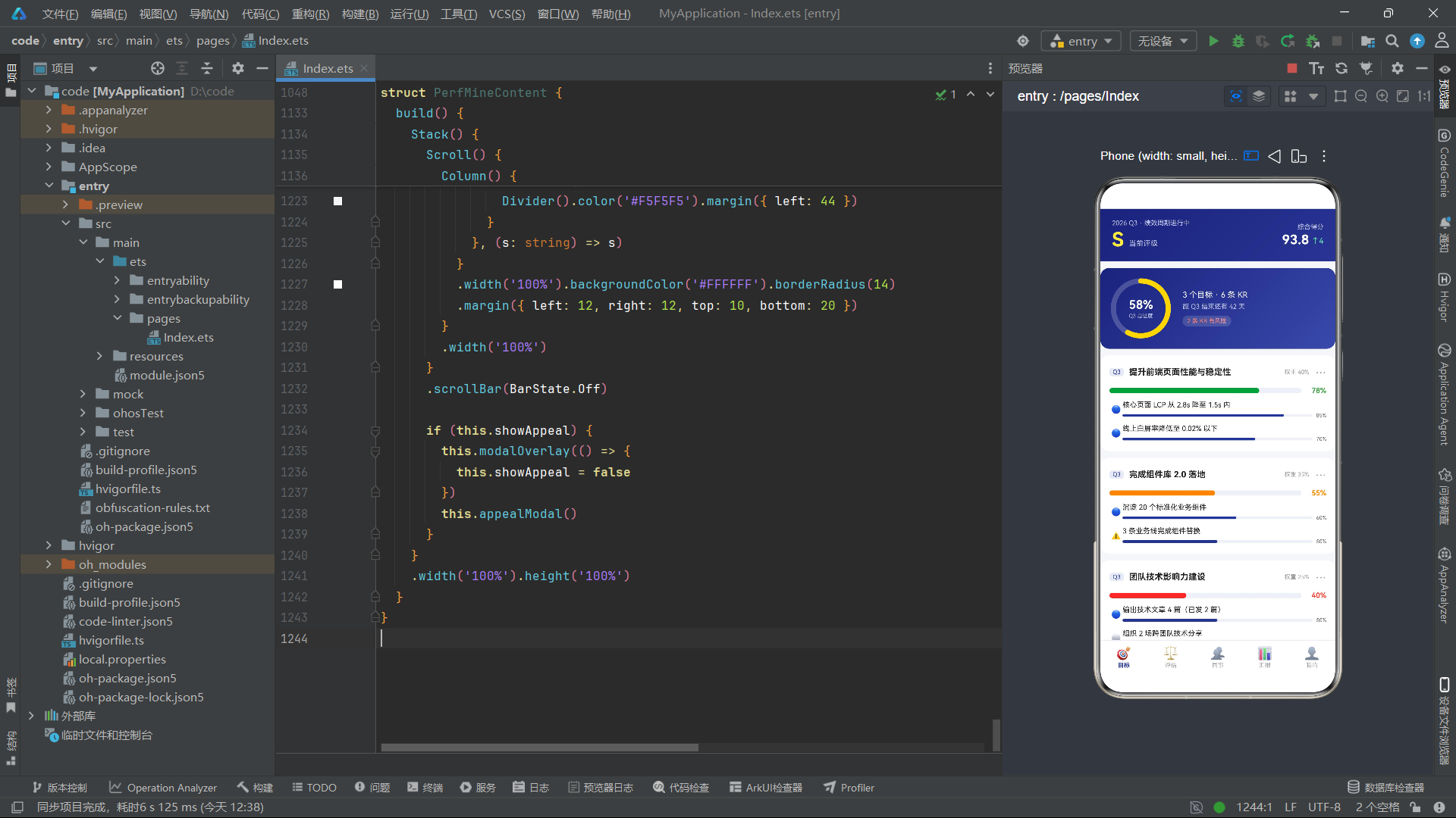
这里可以看到 OKR 的经典结构:一个 Objective 下挂多个 KrItem。第一个目标"提升前端页面性能与稳定性"权重 40%、进度 78%,其下两条 KR 分别是性能指标 LCP 与白屏率。第二条目标"完成组件库 2.0 落地"中有一条 KR 状态为 '有风险',这是 UI 中红色警示标记的数据来源。第三条目标"团队技术影响力建设"整体进度仅 40%,且有一条 KR 状态为 '未开始',对应 UI 中的灰色圆圈图标。
数据流向图清晰地展示了各数据源与页面的对应关系。值得注意的是,PEER_LIST 同时服务于同事页的互评邀请弹窗,而 RANK_LIST 与 DIST_LIST 都在同事页展示,因为同事页天然承担了"团队全景"的职责。
REVIEW_DIMS 包含六个评估维度:目标达成、专业能力、协作沟通、创新精神、责任心、学习成长。每个维度都带 emoji 图标、当前得分、满分与一句话描述。这些数据驱动了评估页的六维横条图与星级展示。
PEER_LIST 列出八位同事,覆盖产品、算法、人事、后端、设计、运维、实习、测试等不同部门,体现了 360 度互评要求跨部门多样性的业务约束。RANK_LIST 同样八位,前三名带奖牌,其中"张明远"被高亮标记为"我",在 UI 中以浅蓝背景区分。
PERF_LOGS 按时间倒序列出八条变动记录,其中包含正向(评级、表扬、提案、里程碑、分享)与负向(考勤、责任)两类。DIST_LIST 则给出 S/A/B/C/D 五档的人数分布,符合企业强制分布制度。
2.4 Tab 定义与枚举
enum PerfTab { OKR, REVIEW, PEER, REPORT, MINE }

interface  PerfTabMeta {
  icon: string
  label: string
}

const PERF_TABS: PerfTabMeta[] = [
  { icon: '🎯', label: '目标' },
  { icon: '⚖️', label: '评估' },
  { icon: '👥', label: '同事' },
  { icon: '📊', label: '汇报' },
  { icon: '👤', label: '我的' }
]
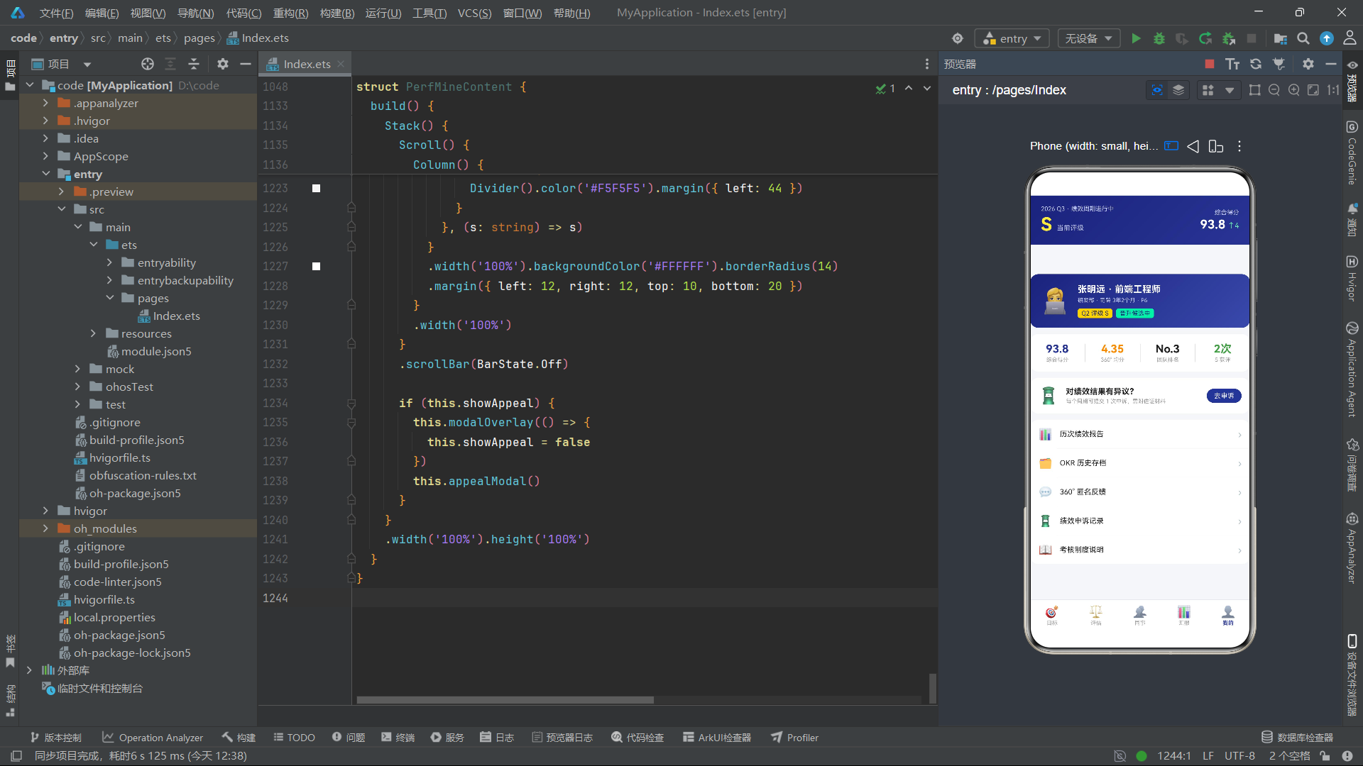
这里用 enum 定义了五个 Tab 的枚举值,默认从 0 开始递增。PerfTabMeta 接口约束每个 Tab 的图标与文字。PERF_TABS 数组按枚举顺序排列,使得下标 idx 可以与枚举值直接对应。这是一种把枚举与元数据解耦又保持有序对齐的常见手法——用枚举做状态判断,用数组做数据遍历。
三、入口组件剖析
入口组件是应用的根,由 @Entry 与 @Component 双装饰器标记。@Entry 表示该组件是页面的入口,会被框架注册为可独立加载的页面;@Component 表示这是一个自定义组件,可被复用与组合。
@Entry
@Component
struct PerfCloudApp {
  @State currentTab: PerfTab = PerfTab.OKR
  ...
}
@State 装饰器是 ArkUI 状态管理的基础原语。被 @State 修饰的变量会成为"可观察状态":当其值发生变化时,框架会自动重新执行 build 方法中依赖该变量的部分,完成局部 UI 刷新。这里 currentTab 初值为 PerfTab.OKR,意味着应用启动后默认展示目标页。
技术点:@State 装饰器详解
@State是组件级内部状态装饰器,仅能在@Component自定义组件内使用。它能观察基本类型(number、string、boolean)的值变化,以及 class 对象的第一层属性变化、数组的首层元素增删。但对于嵌套对象属性的深层变更,需要配合@Observed/@ObjectLink才能精确追踪。在本应用中,大部分状态都是基本类型或数组,因此@State已足够。
3.1 build 方法的整体结构
build() {
  Column() {
    // 顶部头部
    Row() { ... }
    // 内容区
    Column() { ... }
    // 底部 Tab
    Row() { ... }
  }
  .width('100%').height('100%').backgroundColor('#F5F6FA')
}
入口组件的 build 方法用最外层 Column 撑满全屏,内部纵向排列三大区块。Column 是 ArkUI 的纵向线性布局容器,子元素默认沿主轴(纵向)从上到下排列,沿交叉轴(横向)居中对齐。
技术点:Column 容器
Column是 ArkUI 最常用的线性布局之一,主轴方向为垂直。它常用属性包括:
justifyContent(FlexAlign.SpaceBetween):控制主轴方向子元素分布方式。alignItems(HorizontalAlign.Start):控制交叉轴(水平)对齐方式。layoutWeight(n):在父容器中按权重分配剩余空间,常用于让某区块弹性占据剩余高度。这里内容区 Column 通过
layoutWeight(1)占据头部与底部之间的全部剩余高度,实现了经典的"顶栏 + 内容 + 底栏"三段式布局。
3.2 顶部头部区域
Row() {
  Column() {
    Text('2026 Q3 · 绩效周期进行中').fontSize(10).fontColor('#C5CAE9')
    Row() {
      Text('S').fontSize(30).fontWeight(FontWeight.Bold).fontColor('#FFEB3B')
      Text('当前评级').fontSize(11).fontColor('#C5CAE9').margin({ left: 8, top: 12 })
    }
    .margin({ top: 2 })
  }
  .alignItems(HorizontalAlign.Start).layoutWeight(1)
  ...
}
.width('100%').padding({ left: 18, right: 18, top: 16, bottom: 16 })
.linearGradient({ angle: 135, colors: [['#1A237E', 0], ['#283593', 1]] })
头部用 Row 横向排布左右两块信息。左侧 Column 展示当前评级"S"和周期状态文字,右侧 Column 展示综合得分与上升趋势。linearGradient 属性为整行施加 135 度角的线性渐变,从深靛蓝 #1A237E 过渡到稍亮的 #283593,营造商务深蓝质感。
技术点:Row 容器与 linearGradient
Row是横向线性布局容器,主轴方向为水平。它常配合layoutWeight让子元素按比例分配横向空间,或用justifyContent控制水平分布。
linearGradient接受一个对象参数:angle表示渐变角度(0 为向上,90 为向右,顺时针递增);colors是一个二元组数组,每项为[颜色, 位置],位置取值 0-1。这是 ArkUI 提供的声明式渐变能力,无需 Canvas 即可生成质感背景。
左侧 Column 使用 alignItems(HorizontalAlign.Start) 让文字左对齐,layoutWeight(1) 占据横向剩余空间。右侧 Column 默认右对齐展示得分。两个数字 '93.8' 与 '↑4' 通过不同字号与颜色形成视觉层级——大号白色数字突出主信息,小号绿色箭头强调增长态势。
3.3 内容区的条件渲染
Column() {
  if (this.currentTab === PerfTab.OKR) {
    OkrBoardContent()
  } else if (this.currentTab === PerfTab.REVIEW) {
    ReviewCenterContent()
  } else if (this.currentTab === PerfTab.PEER) {
    PeerCenterContent()
  } else if (this.currentTab === PerfTab.REPORT) {
    PerfReportContent()
  } else {
    PerfMineContent()
  }
}
.layoutWeight(1).width('100%')
内容区通过 if / else if / else 链路根据 currentTab 选择挂载对应的子组件。ArkUI 的条件渲染会真正地创建/销毁组件实例——当条件不满足时,对应子组件及其状态会被移除。这意味着每次切换 Tab,子组件的状态(如滚动位置、临时输入)会重置。如果希望保留状态,应改用 Visibility 显隐控制,但代价是所有页面常驻内存。
技术点:条件渲染 vs 显隐控制
ArkUI 提供两种动态展示手段:
if/else条件渲染:条件为假时组件不进入组件树,状态被销毁,性能开销低但状态不保留。visibility(Visibility.Hidden):组件仍在树中,状态保留,但占用内存与部分布局计算。选型原则:状态需要保留且页面较轻用显隐;页面较重且无需保留状态用条件渲染。本应用选条件渲染是合理的,因为各 Tab 状态多为临时输入,重置反而符合用户预期。
3.4 底部 Tab 导航
Row() {
  ForEach(PERF_TABS, (t: PerfTabMeta, idx: number) => {
    Column() {
      Text(t.icon).fontSize(19)
      Text(t.label).fontSize(9)
        .fontColor(this.currentTab === idx ? '#283593' : '#9E9E9E')
        .margin({ top: 2 })
        .fontWeight(this.currentTab === idx ? FontWeight.Bold : FontWeight.Normal)
    }
    .layoutWeight(1).alignItems(HorizontalAlign.Center)
    .padding({ top: 8, bottom: 8 })
    .onClick(() => {
      this.currentTab = idx as PerfTab
    })
  }, (t: PerfTabMeta) => t.label)
}
.width('100%').backgroundColor('#FFFFFF')
.border({ width: { top: 1 }, color: '#E8EAF6' })
底部导航用 Row 横向均分五个 Tab 项。ForEach 遍历 PERF_TABS 数组,为每个 Tab 生成一个 Column(图标 + 文字纵向排列)。layoutWeight(1) 让五个项均分横向空间。
技术点:ForEach 渲染控制
ForEach是 ArkUI 的列表渲染原语,签名大致为ForEach(arr, itemGenerator, keyGenerator)。
- 第一个参数是数据源数组。
- 第二个是项生成函数,接收
(item, index)。- 第三个是键值生成函数,返回字符串作为每项的唯一标识。键值的作用是让框架在数组变化时进行 diff,精确复用或更新已有项,避免整列表重建。
这里键值用
t.label,因为五个 Tab 文字唯一。在生产场景中更推荐用稳定的 id 字段。
onClick 回调中将 idx 转为 PerfTab 赋值给 currentTab。由于 idx 是 number 而 currentTab 是枚举,需要 as PerfTab 断言。点击后 currentTab 变化触发条件渲染重新评估,内容区切换到对应子组件。border({ width: { top: 1 }, color: '#E8EAF6' }) 只给顶部加一条分隔线,是 ArkUI 边框的细粒度控制——可以单独指定某一边的宽度与颜色。
选中态通过三元表达式动态设置 fontColor 与 fontWeight:选中时深蓝加粗,未选中时灰色常规。这种"状态驱动样式"正是声明式 UI 的精髓——开发者声明样式与状态的关系,框架负责在状态变化时更新样式。
四、目标页 OkrBoardContent 深度剖析
目标页是应用的核心业务页面,承载了 OKR 目标的总览、卡片列表、新建与删除交互。它内部维护了多个状态:弹窗显隐、动画开关、表单输入。
@Component
struct OkrBoardContent {
  @State showCreate: boolean = false
  @State showDelete: boolean = false
  @State barAnim: boolean = false
  @State newOkTitle: string = ''
  @State newOkWeight: string = '30%'
  ...
}
showCreate 与 showDelete 分别控制新建弹窗与删除弹窗的显隐。barAnim 是动画开关,初始为 false,在组件 onAppear 后通过 setTimeout 延迟 150ms 置为 true,从而触发进度条的从 0 到目标值的动画展开。newOkTitle 与 newOkWeight 是新建表单的临时输入状态。
4.1 公共遮罩 modalOverlay
@Builder modalOverlay(onClose: () => void) {
  Column() {
    Column().width('100%').height('100%').backgroundColor('rgba(0,0,0,0.5)')
      .onClick(() => {
        onClose()
      })
  }
  .width('100%').height('100%').position({ x: 0, y: 0 }).zIndex(998)
}
技术点:@Builder 装饰器
@Builder用于在组件内抽取一段可复用的 UI 描述。它不是组件,而是一个"构建函数",调用时会内联展开到调用处。与自定义组件相比,@Builder不拥有独立状态,但可以接收参数(包括函数回调),适合抽取弹窗内容、列表项模板等重复结构。
@Builder的参数传递有值语义与按引用传递两种模式:传基本类型为值拷贝;传对象为按引用,内部修改会影响外部。本例中onClose是函数类型的值传递。
这个 modalOverlay 是一个通用遮罩 Builder,接收一个 onClose 回调。它用一个撑满全屏的半透明黑色 Column 作为遮罩层,点击时触发关闭回调。zIndex(998) 让遮罩位于普通内容之上但低于弹窗本身(弹窗 zIndex 为 999)。position({ x: 0, y: 0 }) 让其脱离文档流覆盖到屏幕左上角。
值得注意的工程模式是:每个内容子组件都各自定义了一份相同的 modalOverlay。这是一种可接受的重复——ArkUI 中 @Builder 不能跨组件复用,若要共享可将其提取到独立文件并通过 @Builder 导出,或在更上层统一管理弹窗。本应用选择就近定义,保持了页面自治性。
4.2 新建 OKR 弹窗 createOkModal
@Builder createOkModal() {
  Column() {
    Column() {
      Row() {
        Text('🎯').fontSize(18)
        Text('新建 OKR').fontSize(16).fontWeight(FontWeight.Bold).fontColor('#212121').margin({ left: 6 })
        Text('Q3 剩余 42 天').fontSize(9).fontColor('#9E9E9E').margin({ left: 8 })
      }
      .width('100%').padding({ top: 16, left: 16 })
      ...
    }
    .width('100%').backgroundColor('#FFFFFF')
    .borderRadius({ topLeft: 22, topRight: 22 })
  }
  .width('100%').alignItems(HorizontalAlign.End)
  .position({ x: 0, y: '40%' }).zIndex(999)
}
新建弹窗是一个从屏幕 40% 位置开始、顶部圆角的底部抽屉式表单。外层 Column 用 position({ x: 0, y: '40%' }) 定位,alignItems(HorizontalAlign.End) 让内部内容沿交叉轴右对齐(不过内部仍是 100% 宽)。内层 Column 顶部圆角 22,白底,承载表单内容。
弹窗顶部 Row 横向排布图标、标题与剩余天数提示。这种"图标 + 标题 + 辅助信息"的三段式头部是表单弹窗的常见模式,通过字号与颜色差异建立信息层级。
Column() {
  Text('目标(Objective)').fontSize(11).fontColor('#757575')
  TextInput({ placeholder: '例如:提升产品用户体验', text: this.newOkTitle })
    .fontSize(13).height(38).backgroundColor('#F5F5F5').borderRadius(10)
    .onChange((v: string) => {
      this.newOkTitle = v
    })
    .margin({ top: 6 })
}
.width('100%').padding({ left: 16, right: 16, top: 14 })
目标输入区用 TextInput 组件。text 参数双向绑定到 this.newOkTitle,onChange 回调将输入值回写状态。
技术点:TextInput 输入组件
TextInput是 ArkUI 的单行文本输入组件。常用参数:
placeholder:占位提示文字。text:受控文本值,配合onChange实现受控输入模式。type:输入类型,如InputType.Normal、InputType.Password、InputType.Number。maxLength:最大输入长度。在声明式 UI 中,推荐用"状态 + text 参数 + onChange 回写"的受控模式,确保状态是唯一数据源。本例正是这种模式的典型实现。
Column() {
  Text('关键成果(KR)示例').fontSize(11).fontColor('#757575')
  ForEach(['KR1:NPS 从 45 提升至 60', 'KR2:核心流程转化率 +15%', 'KR3:用户投诉量下降 30%'], (k: string) => {
    Row() {
      Text('☐').fontSize(13).fontColor('#283593')
      Text(k).fontSize(11).fontColor('#616161').margin({ left: 8 })
    }
    .width('100%').padding({ top: 8 })
  }, (k: string) => k)
}
KR 示例区用 ForEach 渲染三条预设示例,每条是一个 Row(复选框占位 + 文本)。这里键值直接用字符串内容 k,因为这些示例文字本身唯一。注意这是静态示例展示,并非可勾选的真实复选框,仅起引导作用。
Column() {
  Text('目标权重').fontSize(11).fontColor('#757575')
  Row() {
    ForEach(['20%', '30%', '40%'], (w: string) => {
      Text(w).fontSize(12)
        .fontColor(this.newOkWeight === w ? '#FFFFFF' : '#616161')
        .backgroundColor(this.newOkWeight === w ? '#283593' : '#F5F5F5')
        .borderRadius(12).padding({ left: 16, right: 16, top: 6, bottom: 6 })
        .margin({ right: 10 })
        .onClick(() => {
          this.newOkWeight = w
        })
    }, (w: string) => w)
  }
  .margin({ top: 8 })
}
权重选择用三个可点击的 Text 标签实现单选。选中态通过 newOkWeight === w 判断,动态切换前景与背景色。这是一种轻量级的"分段选择器"实现,无需 Segment 组件,用纯 Text + 状态即可达成。
Row() {
  Button() {
    Text('取消').fontSize(14).fontColor('#616161')
  }
  .layoutWeight(1).height(40).backgroundColor('#F5F5F5').borderRadius(20)
  .onClick(() => {
    this.showCreate = false
  })

  Button() {
    Text('创建目标').fontSize(14).fontColor('#FFFFFF')
  }
  .layoutWeight(1.4).height(40).backgroundColor('#283593').borderRadius(20)
  .margin({ left: 10 })
  .onClick(() => {
    this.showCreate = false
  })
}
底部双按钮 Row,取消按钮权重 1,创建按钮权重 1.4,使创建按钮略宽以突出主操作。两个按钮都只是关闭弹窗(将 showCreate 置 false),未真正持久化数据——这是 demo 应用的简化处理。
技术点:Button 组件
Button是 ArkUI 的按钮容器组件,可以通过子组件自定义内容。Button('文字')是简写形式,而Button() { Text(...) }形式允许在按钮内放置任意子组件。常用属性包括type(Capsule 圆胶囊、Circle 圆形、Normal 普通)、stateEffect(按下视觉反馈)等。本例用普通 type 配合 backgroundColor 与 borderRadius 自定义胶囊外观。
4.3 删除目标弹窗 deleteOkModal
@Builder deleteOkModal() {
  Column() {
    Column() {
      Text('🗑️').fontSize(34).margin({ top: 18 })
      Text('删除目标「团队技术影响力建设」?').fontSize(14).fontWeight(FontWeight.Bold).fontColor('#212121')
        .margin({ top: 10 }).textAlign(TextAlign.Center)
      Text('该目标下 2 条 KR 与进度记录\n将一并删除且无法恢复。')
        .fontSize(11).fontColor('#9E9E9E').textAlign(TextAlign.Center).margin({ top: 8 })
      ...
    }
    .width('82%').backgroundColor('#FFFFFF').borderRadius(16)
  }
  .width('100%').alignItems(HorizontalAlign.Center)
  .position({ y: '30%' }).zIndex(999)
}
删除弹窗是一个居中警示卡。外层 Column 用 alignItems(HorizontalAlign.Center) 让内容水平居中,position({ y: '30%' }) 让其垂直位于屏幕约 30% 处。内层宽度 82%,圆角 16。
警示文案使用 \n 换行,配合 textAlign(TextAlign.Center) 居中显示。删除确认按钮用红色 #F44336 背景突出危险操作。这种"图标 + 标题 + 说明 + 双按钮"的警示对话框模式,是移动端破坏性操作的标准交互。
4.4 目标页主体 build
build() {
  Stack() {
    Scroll() {
      Column() {
        // 季度总进度卡
        ...
        // OKR 卡片列表
        ...
        // 新建按钮
        ...
      }
      .width('100%')
    }
    .scrollBar(BarState.Off)

    if (this.showCreate) {
      this.modalOverlay(() => { this.showCreate = false })
      this.createOkModal()
    }
    if (this.showDelete) {
      this.modalOverlay(() => { this.showDelete = false })
      this.deleteOkModal()
    }
  }
  .width('100%').height('100%')
  .onAppear(() => {
    setTimeout(() => { this.barAnim = true }, 150)
  })
}
技术点:Stack 层叠布局
Stack是 ArkUI 的层叠布局容器,子元素沿 Z 轴堆叠,后声明的覆盖在先声明的之上。它非常适合实现"内容 + 浮层弹窗"的组合:底层是可滚动的内容区,顶层是条件渲染的弹窗与遮罩。常用属性alignContent控制子元素默认对齐方式(默认居中)。本例中 Stack 内先放 Scroll(内容),再放条件渲染的弹窗。由于弹窗 zIndex 更高且后声明,会自然覆盖在内容之上,无需额外定位即可实现层叠。
技术点:Scroll 滚动容器
Scroll提供可滚动区域,子内容超出视口时可以滚动查看。常用属性:
scrollBar(BarState.Off):隐藏滚动条(保留滚动能力)。scrollable(ScrollDirection.Vertical):滚动方向,默认纵向。edgeEffect(EdgeEffect.Spring):边缘回弹效果。onScroll/onScrollEnd:滚动事件回调。在移动端,长内容页几乎都需要 Scroll 包裹。注意 Scroll 的直接子节点通常是一个 Column 或 Row,由它承载实际内容。
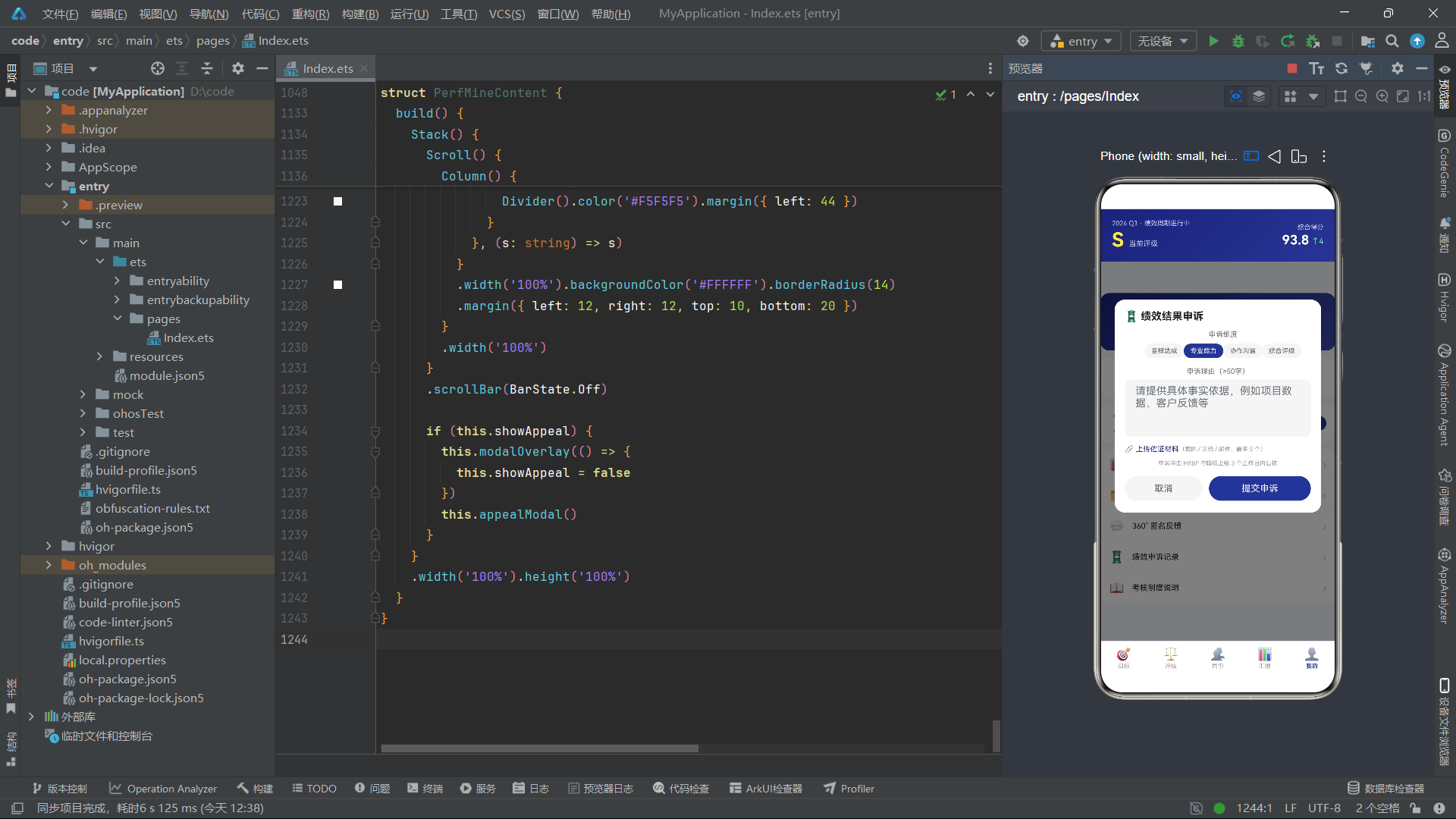
onAppear 是组件生命周期回调,在组件首次挂载到组件树时触发。这里在 onAppear 中用 setTimeout 延迟 150ms 将 barAnim 置 true,从而让进度条从 0 动画展开到目标值。这种"入场动画"手法在数据可视化页面中很常见,能营造"数据加载完成"的仪式感。
4.5 季度总进度卡
Column() {
  Row() {
    Stack() {
      Progress({ value: this.barAnim ? 58 : 0, total: 100, type: ProgressType.Ring })
        .width(92).height(92)
        .color('#FFD600').backgroundColor('rgba(255,255,255,0.2)')
        .style({ strokeWidth: 8 })
        .animation({ duration: 900, curve: Curve.EaseOut })

      Column() {
        Text('58%').fontSize(18).fontWeight(FontWeight.Bold).fontColor('#FFFFFF')
        Text('Q3 总进度').fontSize(8).fontColor('#C5CAE9').margin({ top: 2 })
      }
      .alignItems(HorizontalAlign.Center)
    }
    .width(92).height(92)
    ...
  }
  ...
}
.width('100%').linearGradient({ angle: 135, colors: [['#1A237E', 0], ['#3949AB', 1]] })
.borderRadius(14).margin({ left: 12, right: 12, top: 10 })
技术点:Progress 进度组件
Progress是 ArkUI 的进度展示组件,支持环形、线性、圆形等多种类型。type: ProgressType.Ring为环形进度。常用配置:
value:当前值。total:总数值。color:已完成部分颜色。backgroundColor:未完成部分背景。style({ strokeWidth }):环形线宽。配合
.animation({ duration, curve }),当 value 变化时会以指定时长与曲线动画过渡。本例 value 从 0 变为 58,配合 900ms EaseOut 曲线,形成顺滑的进度填充动画。
这里用 Stack 把环形 Progress 与文字数字叠在一起——Progress 在底层画环,Column 在上层居中显示"58%“与"Q3 总进度”。这是 Stack 层叠布局的经典用法:图形与文字的精确重叠。整卡用深蓝渐变背景,圆角 14,外边距 12 形成卡片间距。
右侧 Column 展示目标/KR 数量、剩余天数与风险提示。"2 条 KR 有风险"用浅红文字配半透明白底胶囊,在深蓝背景上形成警示标记。
4.6 OKR 卡片列表
ForEach(OKR_LIST, (o: OkrObjective) => {
  Column() {
    Row() {
      Column() {
        Text(o.quarter).fontSize(9).fontColor('#283593').backgroundColor('#E8EAF6')
          .borderRadius(4).padding({ left: 5, right: 5, top: 1, bottom: 1 })
      }
      Text(o.title).fontSize(13).fontWeight(FontWeight.Bold).fontColor('#212121')
        .layoutWeight(1).maxLines(1).margin({ left: 8 })
      Text('权重 ' + o.weight).fontSize(9).fontColor('#9E9E9E')
      Text('⋯').fontSize(16).fontColor('#9E9E9E').margin({ left: 10 })
        .onClick(() => { this.showDelete = true })
    }
    .width('100%')
    ...
  }
  .width('100%').backgroundColor('#FFFFFF').borderRadius(14)
  .padding(14).margin({ left: 12, right: 12, top: 10 })
}, (o: OkrObjective) => o.id.toString())
每张 OKR 卡片是一个白底圆角 Column。头部 Row 横向排布:季度标签(浅蓝胶囊)、目标标题(layoutWeight 撑满、单行)、权重、操作菜单"⋯"。maxLines(1) 限制标题单行,超出部分省略,避免长标题撑破布局。
maxLines 是 Text 组件的常用属性,配合 textOverflow(TextOverflow.Ellipsis) 可以在超出时显示省略号。这在列表项标题场景几乎必备,保证卡片高度一致。
Row() {
  Row() {
    Column()
      .width(this.barAnim ? o.progress.toString() + '%' : '0%')
      .height(8).backgroundColor(o.progress >= 60 ? '#43A047' : o.progress >= 45 ? '#FB8C00' : '#F44336')
      .borderRadius(4)
      .animation({ duration: 800, curve: Curve.EaseOut })
  }
  .layoutWeight(1).height(8).backgroundColor('#EEF0F6').borderRadius(4)

  Text(o.progress.toString() + '%').fontSize(11).fontWeight(FontWeight.Bold)
    .fontColor(o.progress >= 60 ? '#43A047' : o.progress >= 45 ? '#FB8C00' : '#F44336')
    .width(38).textAlign(TextAlign.End)
}
.width('100%').margin({ top: 10 })
进度条用嵌套 Row 实现:外层灰底,内层彩色填充。填充宽度根据 barAnim 在 '0%' 与目标百分比之间切换,配合 800ms 动画展开。颜色按进度分级:≥60 绿、≥45 橙、否则红。这种三级配色让进度风险一目了然。
值得注意的是,这里用 Column(空内容)作为进度条填充体,仅靠 width/height/backgroundColor 表现。这是 ArkUI 中常见的"用空容器当色块"技巧,比写一个专门的 Progress 组件更灵活,因为可以自由控制宽度百分比。
4.7 KR 子列表
ForEach(o.krs, (k: KrItem) => {
  Row() {
    Column() {
      Text(k.state === '推进中' ? '🔵' : k.state === '有风险' ? '⚠️' : '⚪').fontSize(12)
    }
    .width(20).alignItems(HorizontalAlign.Center)

    Column() {
      Text(k.title).fontSize(11).fontColor('#212121').maxLines(1)
      Row() {
        Row() {
          Column()
            .width(this.barAnim ? k.progress.toString() + '%' : '0%')
            .height(4).backgroundColor('#283593').borderRadius(2)
            .animation({ duration: 800, curve: Curve.EaseOut })
        }
        .layoutWeight(1).height(4).backgroundColor('#EEF0F6').borderRadius(2)
        Text(k.progress.toString() + '%').fontSize(8).fontColor('#616161').margin({ left: 6 })
      }
      .width('100%').margin({ top: 5 })
    }
    .layoutWeight(1).alignItems(HorizontalAlign.Start)
  }
  .width('100%').padding({ top: 9 })
}, (k: KrItem) => k.id.toString())
KR 列表是 ForEach 嵌套在 OKR ForEach 内部的"双层循环渲染"。每条 KR 是一个 Row:左侧状态图标(按 state 三态切换 emoji),右侧标题与细进度条(高度 4,比 OKR 进度条更细,形成层级差异)。键值用 k.id.toString(),保证每条 KR 的稳定标识。
嵌套 ForEach 是 ArkUI 渲染树状数据的标准手段。外层遍历目标,内层遍历该目标下的 KR,框架会为每个层级独立维护 diff 与复用。键值的稳定性至关重要——如果用数组下标做键,在列表增删时会导致错误复用与状态错乱。
4.8 新建按钮与阴影
Button() {
  Text('+ 新建 OKR 目标').fontSize(14).fontColor('#FFFFFF')
}
.width('60%').height(42).backgroundColor('#283593').borderRadius(21)
.margin({ top: 18, bottom: 24 })
.shadow({ radius: 8, color: 'rgba(40,53,147,0.35)', offsetY: 4 })
.onClick(() => { this.showCreate = true })
新建按钮宽 60%、高 42、圆角 21(高度的一半,形成全圆胶囊)。shadow 属性施加阴影:radius 8 模糊半径、color 半透明深蓝、offsetY 4 向下偏移,模拟按钮悬浮于卡片之上的立体感。
技术点:shadow 阴影属性
shadow接收一个对象:radius模糊半径、color阴影色、offsetX/offsetY偏移量。合理使用阴影可以建立视觉层级,让重要操作按钮"浮"在内容之上。注意阴影会增加渲染开销,在长列表中应克制使用。
上图展示了目标页的动画触发链路与弹窗交互流程。barAnim 是核心动画开关,一次性触发所有进度条的入场动画;两个弹窗通过各自的 boolean 状态独立控制显隐,互不干扰。
五、评估页 ReviewCenterContent 深度剖析
评估页聚焦于六维能力评估,提供综合得分横条、维度卡片列表、维度打分弹窗。它同样采用 Stack + Scroll + 条件弹窗的结构。
@Component
struct ReviewCenterContent {
  @State showScore: boolean = false
  @State starCount: number = 4
  @State scoreTarget: string = '创新精神'
  @State dimAnim: boolean = false
  ...
}
showScore 控制打分弹窗;starCount 是当前选择的星级(1-5);scoreTarget 是正在打分的维度名;dimAnim 是评估条的入场动画开关,与目标页的 barAnim 作用相同。
5.1 综合得分横条
Column() {
  Text('⚖️ 我的 360° 评估').fontSize(13).fontWeight(FontWeight.Bold).fontColor('#212121')
    .width('100%').padding({ left: 14, top: 12 })

  Row() {
    Text('综合').fontSize(11).fontColor('#9E9E9E').width(36)
    Row() {
      Column()
        .width(this.dimAnim ? '87%' : '0%')
        .height(10).backgroundColor('#283593').borderRadius(5)
        .animation({ duration: 700, curve: Curve.EaseOut })
    }
    .layoutWeight(1).height(10).backgroundColor('#EEF0F6').borderRadius(5)
    Text('4.35').fontSize(11).fontWeight(FontWeight.Bold).fontColor('#283593').margin({ left: 8 })
  }
  .width('100%').padding({ left: 14, right: 14, top: 12 })
}
综合得分用一条横向进度条模拟雷达图。左侧"综合"标签固定宽 36,中间横条按 87% 填充(对应 4.35/5),右侧显示数值。dimAnim 控制从 0 到 87% 的动画展开。这种"用横条近似雷达维度"的做法,是在不引入图表库的前提下,用纯 ArkUI 容器实现数据可视化的实用技巧。
5.2 六维评估列表
ForEach(REVIEW_DIMS, (d: ReviewDim) => {
  Row() {
    Text(d.icon).fontSize(24)
      .width(42).height(42).backgroundColor('#E8EAF6')
      .borderRadius(21).textAlign(TextAlign.Center)

    Column() {
      Row() {
        Text(d.name).fontSize(13).fontWeight(FontWeight.Bold).fontColor('#212121')
        Row() {
          ForEach([1, 2, 3, 4, 5], (n: number) => {
            Text(n <= Math.round(Number(d.score)) ? '★' : '☆').fontSize(10)
              .fontColor(n <= Math.round(Number(d.score)) ? '#FFD600' : '#B0BEC5')
          }, (n: number) => d.id.toString() + n.toString())
        }
        .margin({ left: 8 })
        Text(d.score).fontSize(11).fontWeight(FontWeight.Bold).fontColor('#283593').margin({ left: 6 })
      }
      .width('100%')

      Text(d.desc).fontSize(9).fontColor('#9E9E9E').maxLines(1).margin({ top: 4 })

      Row() {
        Row() {
          Column()
            .width(this.dimAnim ? (Number(d.score) / 5 * 100).toFixed(0) + '%' : '0%')
            .height(4).backgroundColor(Number(d.score) >= 4.5 ? '#43A047' : Number(d.score) >= 4 ? '#283593' : '#FB8C00')
            .borderRadius(2)
            .animation({ duration: 700, curve: Curve.EaseOut })
        }
        .layoutWeight(1).height(4).backgroundColor('#EEF0F6').borderRadius(2)
      }
      .width('100%').margin({ top: 6 })
    }
    .layoutWeight(1).alignItems(HorizontalAlign.Start).margin({ left: 12 })

    Text('打分').fontSize(10).fontColor('#283593').backgroundColor('#E8EAF6')
      .borderRadius(10).padding({ left: 10, right: 10, top: 5, bottom: 5 })
      .onClick(() => {
        this.scoreTarget = d.name
        this.showScore = true
      })
  }
  .width('100%').backgroundColor('#FFFFFF').borderRadius(14)
  .padding(12).margin({ left: 12, right: 12, top: 8 })
}, (d: ReviewDim) => d.id.toString())
这是评估页的核心列表。每条维度卡片是一个 Row:左侧圆形 emoji 图标(42x42 圆形背景),中间信息列,右侧"打分"按钮。
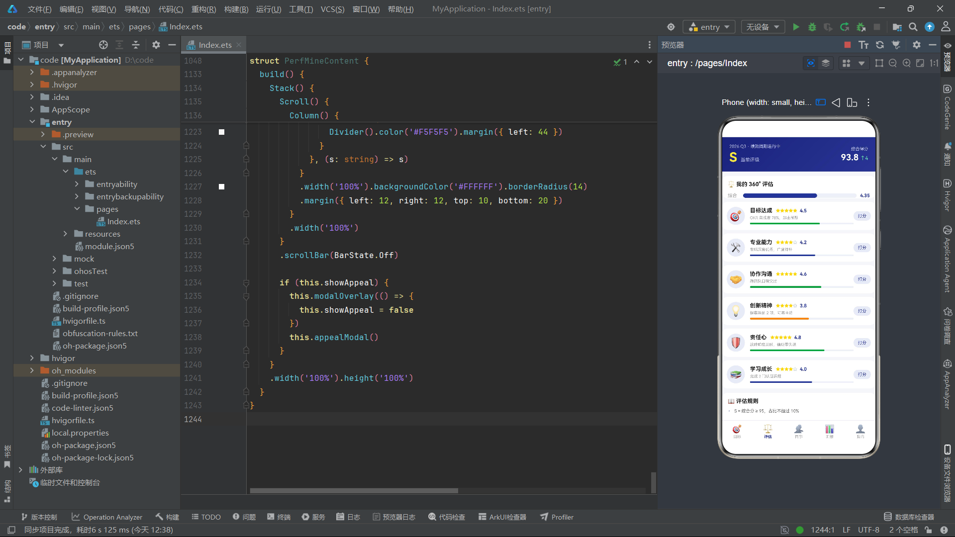
中间列包含三行:维度名 + 星级 + 数值;描述文字;维度分数条。星级用 ForEach 渲染 1-5,通过 n <= Math.round(Number(d.score)) 判断填充实心星或空心星。键值用 d.id.toString() + n.toString(),确保同一维度的五颗星各有独立键。
技术点:Text 组件
Text是最基础的文本展示组件。常用属性:
fontSize/fontColor/fontWeight:字体样式三件套。maxLines(n):最大行数,超出配合textOverflow处理。textAlign:文本对齐,注意它对齐的是文本在自身盒子内的位置,需要配合width才生效。lineHeight:行高,多行文本时影响可读性。margin/padding:外/内边距,几乎所有组件通用。
维度分数条的宽度计算用 (Number(d.score) / 5 * 100).toFixed(0) + '%',即把 0-5 的得分映射为 0-100% 的百分比。.toFixed(0) 取整为字符串。颜色按分数分级:≥4.5 绿、≥4 蓝、否则橙。这种"分数-颜色"映射让用户一眼识别强弱维度。
"打分"按钮点击时设置 scoreTarget 为该维度名并打开弹窗,体现了"事件向上冒泡修改状态、状态向下驱动视图"的单向数据流。
5.3 维度打分弹窗 scoreModal
@Builder scoreModal() {
  Column() {
    Column() {
      Text('⚖️ 评估打分').fontSize(16).fontWeight(FontWeight.Bold).fontColor('#212121')
        .width('100%').padding({ top: 16, left: 16 })
      Text('正在为维度「' + this.scoreTarget + '」打分').fontSize(11).fontColor('#9E9E9E')
        .width('100%').padding({ left: 16, top: 6 })

      Row() {
        ForEach([1, 2, 3, 4, 5], (n: number) => {
          Text(n <= this.starCount ? '★' : '☆').fontSize(34)
            .fontColor(n <= this.starCount ? '#FFD600' : '#B0BEC5')
            .animation({ duration: 200, curve: Curve.EaseOut })
            .margin({ left: 6, right: 6 })
            .onClick(() => { this.starCount = n })
        }, (n: number) => n.toString())
      }
      .margin({ top: 18 })

      Text(this.starCount >= 5 ? '远超预期' : this.starCount === 4 ? '超出预期' : this.starCount === 3 ? '符合预期' : this.starCount === 2 ? '部分达标' : '未达标')
        .fontSize(12).fontWeight(FontWeight.Bold).fontColor('#283593')
        .margin({ top: 8 })
      ...
    }
    .width('88%').backgroundColor('#FFFFFF').borderRadius(16)
  }
  .width('100%').alignItems(HorizontalAlign.Center)
  .position({ y: '18%' }).zIndex(999)
}
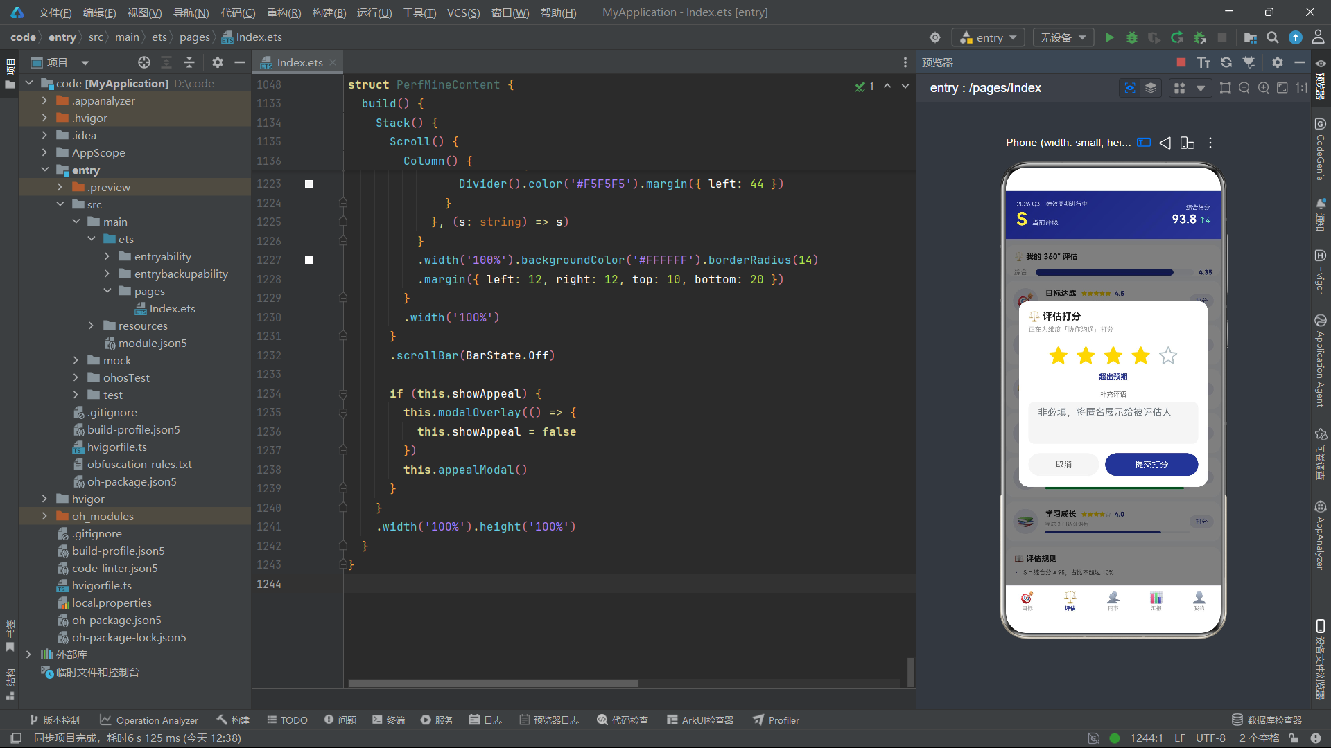
打分弹窗居中展示,星级用 5 个可点击的星形字符。starCount 控制实心星数量,点击某星设置为对应数值。每颗星带 200ms 缩放动画,形成"点亮"反馈。下方文字根据星级显示评级描述,用嵌套三元表达式实现五档映射。
技术点:animation 动画属性
.animation({ duration, curve, delay, iterations, playMode })是 ArkUI 的属性动画。它作用于"前一个属性变化"——当被动画修饰的组件的某些属性(如 width、color、opacity)发生变化时,框架会按指定时长与曲线插值过渡,而非瞬变。
duration:动画时长(毫秒)。curve:缓动曲线,如Curve.EaseOut(先快后慢)、Curve.EaseIn、Curve.Linear。delay:延迟启动。iterations:迭代次数,-1 为无限循环。注意 animation 修饰的是"属性变化过程",因此要先有状态变化(如 starCount 改变)才能看到动画。
Column() {
  Text('补充评语').fontSize(11).fontColor('#757575')
  TextArea({ placeholder: '非必填,将匿名展示给被评估人' })
    .fontSize(12).height(70).backgroundColor('#F5F5F5').borderRadius(10)
    .margin({ top: 6 })
}
.width('100%').padding({ left: 16, right: 16, top: 16 })
评语区用 TextArea 多行输入组件。与 TextInput 不同,TextArea 支持多行换行,适合较长文本输入。这里 height 70 提供约 4-5 行的输入空间。
5.4 评估规则说明
ForEach(['S = 综合分 ≥ 95,占比不超过 10%', 'A = 综合分 90~95,占比约 25%', 'B = 综合分 80~90,占比约 45%', '评估由自评 20% + 上级 40% + 360° 40% 组成'], (r: string) => {
  Row() {
    Text('·').fontSize(14).fontColor('#283593')
    Text(r).fontSize(10).fontColor('#616161').margin({ left: 8 })
  }
  .width('100%').padding({ left: 14, right: 14, top: 7, bottom: 7 })
}, (r: string) => r)
规则说明用 ForEach 渲染四条要点,每条是项目符号 + 文字。这种"静态文本数组 + ForEach"的方式比逐条写 Row 更紧凑,适合规则类、条款类展示。
状态图清晰地描述了评估页的两种状态流转:入场动画流与打分交互流,二者通过不同的状态变量独立运作。
六、同事页 PeerCenterContent 深度剖析
同事页整合了 360 互评邀请入口、团队排行、绩效分布柱状图,是信息密度最高的页面。
@Component
struct PeerCenterContent {
  @State showInvite: boolean = false
  @State invitedCount: number = 3
  @State invitedIds: number[] = [1, 2, 3]
  ...
}
showInvite 控制邀请弹窗;invitedCount 是已邀请人数;invitedIds 是已邀请同事的 id 数组。注意这里用数组 concat 的方式追加 id,而非 push——因为 ArkUI 的 @State 对数组的观察依赖数组引用变化,concat 返回新数组能触发更新,而 push 修改原数组在部分情况下不会触发。
6.1 邀请入口卡
Row() {
  Column() {
    Text('360° 互评进行中').fontSize(14).fontWeight(FontWeight.Bold).fontColor('#FFFFFF')
    Text('收到 6 份同事评价 · 综合分 4.35').fontSize(10).fontColor('#C5CAE9').margin({ top: 4 })
  }
  .alignItems(HorizontalAlign.Start).layoutWeight(1)

  Text('邀请').fontSize(11).fontColor('#283593').backgroundColor('#FFFFFF')
    .borderRadius(13).padding({ left: 14, right: 14, top: 6, bottom: 6 })
    .onClick(() => { this.showInvite = true })
}
.width('100%').padding(16)
.linearGradient({ angle: 135, colors: [['#1A237E', 0], ['#3949AB', 1]] })
.borderRadius(14).margin({ left: 12, right: 12, top: 10 })
入口卡用深蓝渐变背景,左侧信息列、右侧白色"邀请"按钮。这种"主信息 + 主操作"的卡片头部模式在业务卡片中反复出现,是强引导设计的典型。
6.2 团队排行列表
ForEach(RANK_LIST, (r: RankItem) => {
  Row() {
    Column() {
      if (r.medal !== '') {
        Text(r.medal).fontSize(22)
          .animation({ duration: 300, curve: Curve.EaseOut })
      } else {
        Text(r.id.toString()).fontSize(12).fontWeight(FontWeight.Bold).fontColor('#9E9E9E')
      }
    }
    .width(32).alignItems(HorizontalAlign.Center)

    Text(r.avatar).fontSize(24)
      .width(38).height(38).backgroundColor('#E8EAF6').borderRadius(19)
      .textAlign(TextAlign.Center)

    Column() {
      Row() {
        Text(r.name).fontSize(12).fontWeight(FontWeight.Bold).fontColor('#212121')
        if (r.name === '张明远') {
          Text('我').fontSize(8).fontColor('#FFFFFF').backgroundColor('#283593')
            .borderRadius(4).padding({ left: 4, right: 4, top: 1, bottom: 1 }).margin({ left: 5 })
        }
      }
      Text(r.dept).fontSize(9).fontColor('#9E9E9E').margin({ top: 2 })
    }
    .layoutWeight(1).alignItems(HorizontalAlign.Start).margin({ left: 10 })

    Column() {
      Text(r.score).fontSize(13).fontWeight(FontWeight.Bold)
        .fontColor(r.id <= 3 ? '#FB8C00' : '#283593')
      Text(r.trend).fontSize(8)
        .fontColor(r.trend.indexOf('↑') >= 0 ? '#43A047' : r.trend.indexOf('↓') >= 0 ? '#F44336' : '#9E9E9E')
        .margin({ top: 2 })
    }
    .alignItems(HorizontalAlign.End)
  }
  .width('100%').padding({ left: 14, right: 14, top: 9, bottom: 9 })
  .backgroundColor(r.name === '张明远' ? '#E8EAF6' : '#FFFFFF')
  .borderRadius(10)
}, (r: RankItem) => r.id.toString())
每行排行是一个 Row:奖牌/排名序号、头像、姓名+部门、分数+趋势。前三名显示奖牌 emoji 并带 300ms 动画(缩放反馈),其余显示数字序号。
"张明远"被特殊标记:姓名后加"我"标签,整行背景变为浅蓝 #E8EAF6。这种"当前用户高亮"是排行列表的常见需求,通过条件渲染与条件样式实现。
分数颜色按 r.id <= 3 判断:前三名橙色突出,其余深蓝。趋势箭头通过字符串包含 ↑ 或 ↓ 判断方向着色。这种基于字符串内容的条件逻辑虽然不够"类型安全",但在 demo 场景下足够直观。
6.3 团队绩效分布柱状图
Row() {
  ForEach(DIST_LIST, (d: DistItem) => {
    Column() {
      Text(d.count.toString()).fontSize(10).fontWeight(FontWeight.Bold).fontColor(d.color)
      Column()
        .width(26)
        .height((d.count / 12 * 64).toFixed(0) + 'vp')
        .backgroundColor(d.color)
        .borderRadius({ topLeft: 5, topRight: 5 })
      Text(d.level).fontSize(10).fontWeight(FontWeight.Bold).fontColor('#616161').margin({ top: 4 })
      Text('档').fontSize(8).fontColor('#9E9E9E')
    }
    .layoutWeight(1).alignItems(HorizontalAlign.Center)
  }, (d: DistItem) => d.id.toString())
}
.width('100%').padding({ left: 14, right: 14, top: 14, bottom: 14 })
.alignItems(VerticalAlign.Bottom)
.height(100)
这是一个纯 ArkUI 实现的柱状图,无需任何图表库。每根柱子是一个 Column:顶部数字标签、中间色块柱体、底部档位标签。柱体高度通过 (d.count / 12 * 64).toFixed(0) + 'vp' 计算——以 12 人为满刻度映射到 64vp 高度。'vp' 是鸿蒙的虚拟像素单位,根据屏幕密度自适应缩放。
外层 Row 用 alignItems(VerticalAlign.Bottom) 让所有柱子底部对齐,这是柱状图的关键——如果默认居中对齐,柱子会从中间向两侧伸展,视觉错误。height(100) 限定图表区域高度。
技术点:vp / fp 单位
鸿蒙 ArkUI 的尺寸单位:
vp(virtual pixel):虚拟像素,与屏幕密度相关,1vp 约等于 160dpi 屏幕的 1px。这是默认的布局单位。fp(font pixel):字体像素,类似 vp 但会随系统字体大小设置缩放,用于文字。px:物理像素,通常不直接用。字符串形式的尺寸如
'26'、'vp'后缀明确指定单位。无后缀的数字默认按 vp 处理。本例柱高显式带'vp'后缀,是动态计算尺寸时的稳妥写法。
这种"用空 Column 当柱体"的柱状图实现,是 ArkUI 在缺少专业图表组件时的经典替代方案。它的优势是纯声明式、可随数据动态更新、样式完全可控;劣势是无坐标轴、无动画过渡、交互能力弱。对于简单分布展示已足够。
6.4 互评邀请弹窗 invitePeerModal
@Builder invitePeerModal() {
  Column() {
    Column() {
      Text('👥 邀请 360° 互评').fontSize(16).fontWeight(FontWeight.Bold).fontColor('#212121')
        .width('100%').padding({ top: 16, left: 16 })
      Text('已邀请 ' + this.invitedCount.toString() + ' / 5 人 · 至少邀请 3 位不同部门同事')
        .fontSize(10).fontColor('#9E9E9E').width('100%').padding({ left: 16, top: 6 })

      Scroll() {
        Column() {
          ForEach(PEER_LIST, (p: PeerItem) => {
            Row() {
              Text(p.avatar).fontSize(26)
                .width(40).height(40).backgroundColor('#E8EAF6').borderRadius(20)
                .textAlign(TextAlign.Center)
              Column() {
                Text(p.name).fontSize(12).fontWeight(FontWeight.Bold).fontColor('#212121')
                Row() {
                  Text(p.dept).fontSize(9).fontColor('#9E9E9E')
                  if (p.done) {
                    Text('已互评').fontSize(8).fontColor('#43A047').backgroundColor('#E8F5E9')
                      .borderRadius(4).padding({ left: 4, right: 4, top: 1, bottom: 1 }).margin({ left: 6 })
                  }
                }
                .margin({ top: 3 })
              }
              .layoutWeight(1).alignItems(HorizontalAlign.Start).margin({ left: 10 })

              Text(this.invitedIds.indexOf(p.id) >= 0 ? '已邀请' : '邀请')
                .fontSize(10)
                .fontColor(this.invitedIds.indexOf(p.id) >= 0 ? '#9E9E9E' : '#FFFFFF')
                .backgroundColor(this.invitedIds.indexOf(p.id) >= 0 ? '#F5F5F5' : '#283593')
                .borderRadius(11)
                .padding({ left: 12, right: 12, top: 5, bottom: 5 })
                .onClick(() => {
                  if (this.invitedIds.indexOf(p.id) < 0 && this.invitedCount < 5) {
                    this.invitedIds = this.invitedIds.concat([p.id])
                    this.invitedCount = this.invitedCount + 1
                  }
                })
            }
            .width('100%').padding({ left: 16, right: 16, top: 9, bottom: 9 })
          }, (p: PeerItem) => p.id.toString())
        }
        .constraintSize({ maxHeight: 240 })
      }
      .scrollBar(BarState.Off).margin({ top: 8 })

      Button() {
        Text('完成邀请(' + this.invitedCount.toString() + '/5)').fontSize(14).fontColor('#FFFFFF')
      }
      .width('86%').height(40).backgroundColor('#283593').borderRadius(20)
      .margin({ top: 12, bottom: 18 })
      .onClick(() => { this.showInvite = false })
    }
    .width('88%').backgroundColor('#FFFFFF').borderRadius(16)
  }
  .width('100%').alignItems(HorizontalAlign.Center)
  .position({ y: '12%' }).zIndex(999)
}
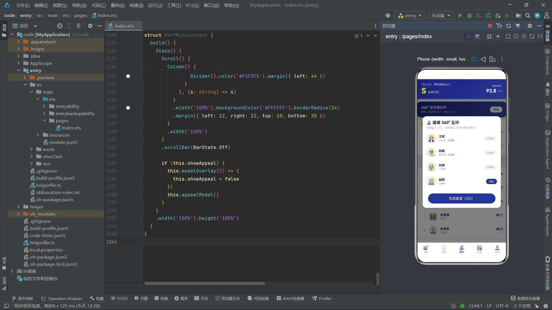
邀请弹窗是一个居中卡片,内含可滚动的同事名单。注意名单外层套了 Scroll,并用 constraintSize({ maxHeight: 240 }) 限制内容最大高度,超出则滚动。这是弹窗内长列表的标准处理——避免名单过长撑爆屏幕。
每条同事项的"邀请"按钮文字与样式根据 invitedIds.indexOf(p.id) >= 0 判断:未邀请显示白字蓝底"邀请",已邀请显示灰字灰底"已邀请"。点击时检查未已邀请且未满 5 人,才追加 id 并计数。
技术点:constraintSize 约束尺寸
constraintSize({ minWidth, maxWidth, minHeight, maxHeight })用于约束组件的尺寸范围,常与 Scroll 配合实现"内容自适应但不超过最大值"的布局。与固定height不同,它允许内容小于最大值时不撑满,只在超出时限制。这在弹窗、卡片等场景非常实用。
concat 返回新数组的写法保证了 @State 能感知到引用变化。如果用 push 修改原数组,ArkUI 在某些版本下不会触发更新。这是 ArkUI 状态管理的一个重要细节——对数组与对象的状态变更,推荐用不可变更新(返回新引用)。
七、汇报页 PerfReportContent 深度剖析
汇报页是纯展示页,无弹窗交互,包含季度切换、季度得分对比柱状图、上级评语、绩效变动时间轴。
@Component
struct PerfReportContent {
  @State pickedQuarter: number = 0
  ...
}
仅有一个状态 pickedQuarter,记录当前选中的季度下标(0-3 对应 Q1-Q4)。
7.1 季度切换栏
Row() {
  ForEach(['Q1', 'Q2', 'Q3', 'Q4'], (q: string, i: number) => {
    Column() {
      Text(q).fontSize(13)
        .fontColor(this.pickedQuarter === i ? '#FFFFFF' : '#616161')
        .fontWeight(this.pickedQuarter === i ? FontWeight.Bold : FontWeight.Normal)
    }
    .layoutWeight(1).alignItems(HorizontalAlign.Center)
    .padding({ top: 10, bottom: 10 })
    .backgroundColor(this.pickedQuarter === i ? '#283593' : '#FFFFFF')
    .borderRadius(10).margin({ left: 4, right: 4 })
    .onClick(() => { this.pickedQuarter = i })
  }, (q: string) => q)
}
.width('100%').margin({ left: 12, right: 12, top: 10 })
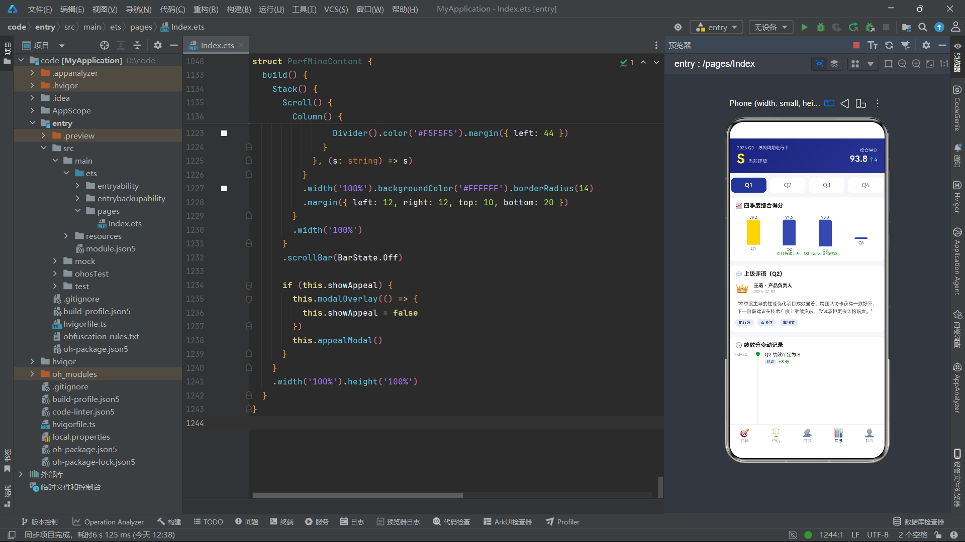
四个季度均分横向空间,选中态深蓝背景白字,未选中白底灰字。点击切换 pickedQuarter,驱动下方柱状图选中柱高亮。
7.2 四季度得分对比柱状图
Row() {
  ForEach([88.2, 91.5, 93.8, 0], (v: number, i: number) => {
    Column() {
      Text(v > 0 ? v.toFixed(1) : '-').fontSize(9).fontColor('#283593')
      Column()
        .width(30)
        .height(v > 0 ? (v / 93.8 * 62).toFixed(0) + 'vp' : '4vp')
        .backgroundColor(this.pickedQuarter === i ? '#FFD600' : '#3949AB')
        .borderRadius({ topLeft: 5, topRight: 5 })
      Text(['Q1', 'Q2', 'Q3', 'Q4'][i]).fontSize(9).fontColor('#616161').margin({ top: 4 })
    }
    .layoutWeight(1).alignItems(HorizontalAlign.Center)
  }, (v: number) => v.toString())
}
.width('100%').padding({ left: 14, right: 14, top: 14, bottom: 14 })
.alignItems(VerticalAlign.Bottom)
.height(98)
与同事页分布柱状图结构一致,但这里柱高按得分映射:(v / 93.8 * 62).toFixed(0) + 'vp',以 93.8 为满刻度映射到 62vp。Q4 得分为 0,柱高仅 4vp 表示"暂无数据"。选中季度的柱子用金黄色 #FFD600 高亮,其余深蓝。
技术点:ForEach 与动态数据
这里数据源是字面量数组
[88.2, 91.5, 93.8, 0],键值用v.toString()。注意当数据源是字面量且每次 build 重建时,ForEach 会重新生成。对于静态数据这是可接受的,但若数据动态变化,应使用稳定且唯一的键值。本例 0 与其他值都不重复,键值勉强可用;更稳妥的做法是用索引i.toString()。
7.3 上级评语卡
Column() {
  Text('💬 上级评语(Q2)').fontSize(13).fontWeight(FontWeight.Bold).fontColor('#212121')
    .width('100%').padding({ left: 14, top: 12 })

  Row() {
    Text('👑').fontSize(26)
    Column() {
      Text('王莉 · 产品负责人').fontSize(11).fontWeight(FontWeight.Bold).fontColor('#212121')
      Text('2026-07-02').fontSize(9).fontColor('#9E9E9E').margin({ top: 2 })
    }
    .alignItems(HorizontalAlign.Start).layoutWeight(1).margin({ left: 10 })
  }
  .width('100%').padding({ left: 14, top: 10 })

  Text('"本季度主导的性能优化项目成效显著,跨团队协作获得一致好评。下一阶段建议在技术广度上继续突破,尝试承担更多架构职责。"')
    .fontSize(11).fontColor('#616161').lineHeight(18)
    .padding({ left: 14, right: 14, top: 10 })

  Row() {
    ForEach(['执行强', '善协作', '重细节'], (t: string) => {
      Text(t).fontSize(9).fontColor('#283593').backgroundColor('#E8EAF6')
        .borderRadius(8).padding({ left: 8, right: 8, top: 3, bottom: 3 })
        .margin({ right: 8 })
    }, (t: string) => t)
  }
  .width('100%').padding({ left: 14, top: 10, bottom: 14 })
}
评语卡分三部分:评价人信息行(头像 emoji + 姓名 + 日期)、评语正文、标签行。lineHeight(18) 设置行高让多行评语更易读。标签用浅蓝胶囊展示能力关键词。
7.4 绩效变动时间轴
ForEach(PERF_LOGS, (l: PerfLog) => {
  Row() {
    Text(l.date).fontSize(10).fontColor('#9E9E9E').width(44)

    Column() {
      Column().width(9).height(9).borderRadius(5)
        .backgroundColor(l.change.indexOf('-') >= 0 ? '#F44336' : '#43A047')
      Column().width(2).layoutWeight(1).backgroundColor('#E8EAF6').margin({ top: 2 })
    }
    .width(16).alignItems(HorizontalAlign.Center)
    .alignSelf(ItemAlign.Stretch)

    Column() {
      Text(l.title).fontSize(11).fontColor('#212121')
      Row() {
        Text(l.kind).fontSize(8).fontColor('#283593').backgroundColor('#E8EAF6')
          .borderRadius(4).padding({ left: 5, right: 5, top: 1, bottom: 1 })
        Text(l.change).fontSize(10).fontWeight(FontWeight.Bold)
          .fontColor(l.change.indexOf('-') >= 0 ? '#F44336' : '#43A047')
          .margin({ left: 6 })
      }
      .margin({ top: 4 })
    }
    .layoutWeight(1).alignItems(HorizontalAlign.Start)
    .padding({ left: 8, bottom: 14 })
  }
  .width('100%').padding({ left: 14, right: 14 })
  .alignItems(VerticalAlign.Top)
  .margin({ top: 8 })
}, (l: PerfLog) => l.id.toString())
时间轴是汇报页最有技术含量的部分。每条记录是一个 Row:左侧日期(固定宽 44)、中间时间轴线列、右侧内容列。
中间列是一个 Column,包含一个圆点(9x9 圆形)和一条竖线(2 宽,layoutWeight 1 撑满剩余高度)。alignSelf(ItemAlign.Stretch) 让该列在 Row 中纵向拉伸,使竖线能连接到下一条记录。圆点颜色按 change 是否含 '-' 判断:正向绿、负向红,形成"绿点/红点"时间轴。
技术点:alignSelf 与 FlexAlign
alignSelf(ItemAlign.Stretch)覆盖父容器对该子项的交叉轴对齐设置,单独指定为拉伸。在时间轴场景中,竖线列需要纵向拉伸以连接相邻节点,而其他列保持顶部对齐,alignSelf 是实现这种"局部拉伸"的关键。
右侧内容列包含标题与一个标签行(分类标签 + 分数变化)。分数变化颜色同样按正负着色。padding({ left: 8, bottom: 14 }) 让内容与时间轴有间距,并在底部留出与下一条的间隔。
八、我的页 PerfMineContent 深度剖析
我的页是个人中心,包含个人评级卡、数据总览、申诉入口、功能列表,以及绩效申诉弹窗。
@Component
struct PerfMineContent {
  @State showAppeal: boolean = false
  @State appealReason: string = ''
  @State appealScore: string = '专业能力'
  ...
}
showAppeal 控制申诉弹窗;appealReason 是申诉理由文本;appealScore 是申诉维度选择,默认"专业能力"。
8.1 个人评级卡
Column() {
Row() {
Text('🧑💻').fontSize(40)
Column() {
Text('张明远 · 前端工程师').fontSize(15).fontWeight(FontWeight.Bold).fontColor('#FFFFFF')
Text('研发部 · 司龄 3年2个月 · P6').fontSize(9).fontColor('#C5CAE9').margin({ top: 4 })
Row() {
Text('Q2 评级 S').fontSize(10).fontColor('#1A237E').backgroundColor('#FFD600')
.borderRadius(4).padding({ left: 6, right: 6, top: 2, bottom: 2 })
Text('晋升候选中').fontSize(10).fontColor('#1A237E').backgroundColor('#69F0AE')
.borderRadius(4).padding({ left: 6, right: 6, top: 2, bottom: 2 }).margin({ left: 6 })
}
.margin({ top: 8 })
}
.layoutWeight(1).alignItems(HorizontalAlign.Start).margin({ left: 12 })
}
.width('100%').padding(16)
}
.width('100%').linearGradient({ angle: 135, colors: [['#1A237E', 0], ['#3949AB', 1]] })
.borderRadius(14).margin({ left: 12, right: 12, top: 10 })
个人卡用深蓝渐变背景,左侧大号 emoji 头像,右侧姓名、职级信息与两个状态标签(Q2 评级 S 金色、晋升候选 绿色)。标签用深蓝文字配亮色背景,在深蓝渐变上形成高对比徽章效果。
8.2 数据总览
Row() {
  Column() {
    Text('93.8').fontSize(18).fontWeight(FontWeight.Bold).fontColor('#283593')
    Text('综合得分').fontSize(9).fontColor('#9E9E9E').margin({ top: 2 })
  }
  .layoutWeight(1).alignItems(HorizontalAlign.Center)

  Column().width(1).height(30).backgroundColor('#E0E0E0')
  ...
}
.width('100%').backgroundColor('#FFFFFF').borderRadius(14)
.padding({ top: 14, bottom: 14 }).margin({ left: 12, right: 12, top: 10 })
数据总览用四等分 Row,每格是一个数字 + 标签的 Column,中间用 1px 宽的灰色 Column 作为分隔线。这种"数字仪表盘"布局在数据展示页非常常见,layoutWeight(1) 保证四格
  if (this.showAppeal) {
    this.modalOverlay(() => {
      this.showAppeal = false
    })
    this.appealModal()
  }
}
.width('100%').height('100%')
}
}
---
### 13.6 总结:
应用采用"类型定义 → 静态数据 → 枚举/元数据 → 入口组件 → 内容子组件 → 弹窗 Builder"的自顶向下组织顺序。每个 `@Component` 职责单一,自带状态与 Builder,消费对应数据。这种"页面自治"架构在中小型应用中足够清晰,重复的 modalOverlay 是可接受的冗余。
若要进一步演进,可考虑:将 modalOverlay 与通用卡片样式抽离为公共 Builder 或自定义组件;将静态数据替换为异步接口请求并配合 `@State` 加载态管理;引入 `@Observed` / `@ObjectLink` 处理更复杂的嵌套对象状态;用 Navigation 组件替代 if/else 实现带转场动画的页面路由。这些演进方向都不改变现有架构的声明式本质,而是在其基础上的增量增强。

讨论HarmonyOS开发技术,专注于API与组件、DevEco Studio、测试、元服务和应用上架分发等。
更多推荐
 0
0 0
0- 0


 已为社区贡献145条内容

所有评论(0)