HarmonyOS 6效果实现:通过 justifyContent 属性可以控制子组件在主轴方向的对齐方式,弹窗内容通过 FlexAlign.End 实现底部抽屉效果
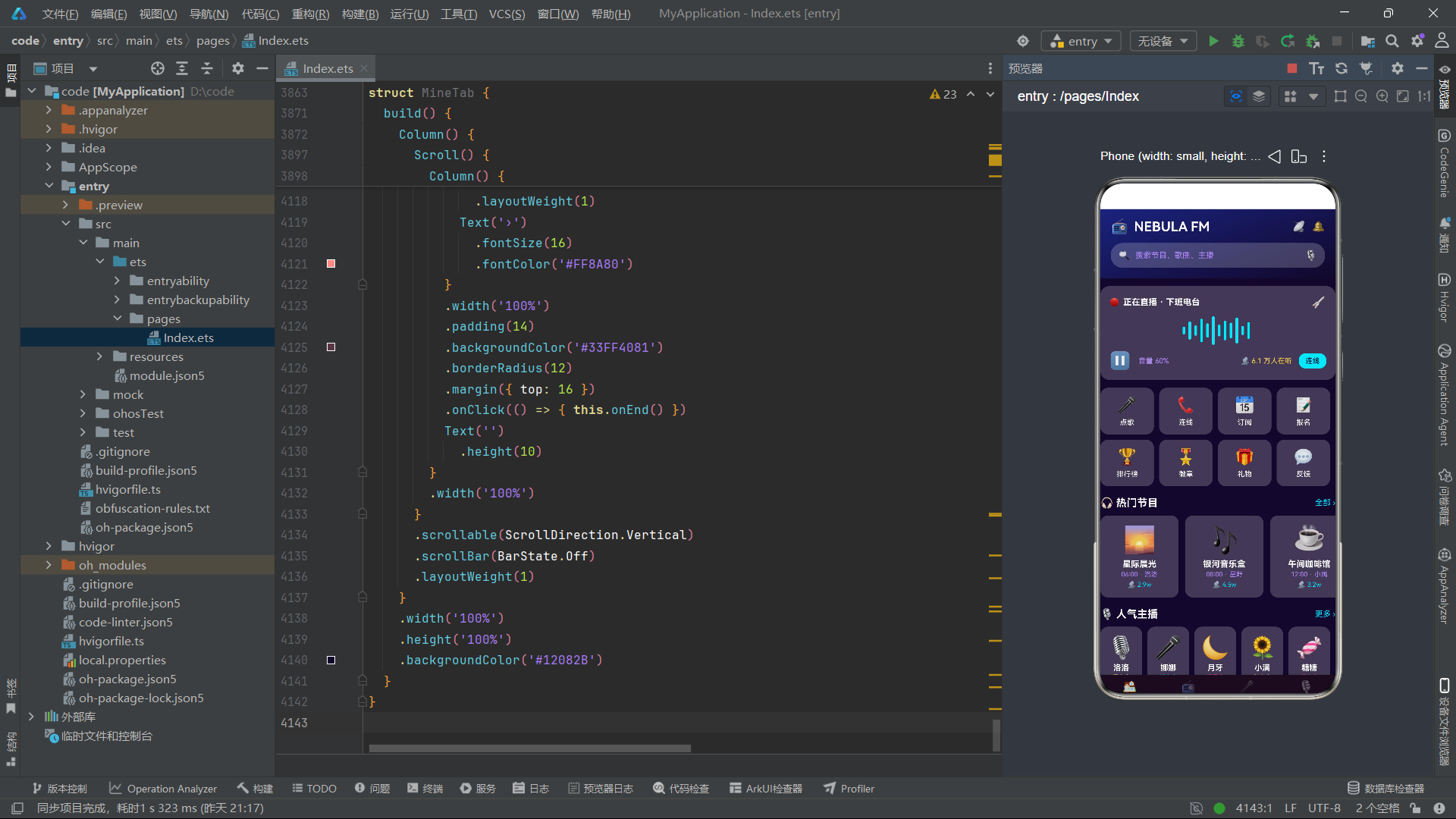
在鸿蒙(HarmonyOS)应用开发领域,ArkTS 声明式 UI 框架正逐步成为构建复杂交互应用的首选方案。本文将以一个名为"NEBULA FM 深空电台"的完整应用为案例,深入剖析其从接口定义、数据层设计、状态管理、多 Tab 导航、十六种弹窗交互到七大子组件的完整技术实现。该应用覆盖了 ArkTS 框架中绝大部分核心能力,包括 @Entry、@Component、@State、@Prop、@Builder、ForEach、Stack、Column、Row、Scroll、FlexAlign、Toggle、Progress、Divider、linearGradient、transition 动画等,是学习鸿蒙声明式 UI 开发的一座富矿。
一、技术背景与整体架构
鸿蒙操作系统(HarmonyOS)提供了基于 ArkTS 语言的声明式 UI 开发范式。ArkTS 是 TypeScript 的超集,在 TypeScript 的基础上增加了面向 UI 声明和状态管理的语法糖。开发者通过 @Component 装饰器定义自定义组件,通过 @Entry 标记入口组件,通过 @State、@Prop、@Link 等装饰器管理组件间数据流。
本案例应用——NEBULA FM 深空电台——是一个功能完整的电台类应用。它拥有七个主 Tab 页面(首页、节目、点歌、主播、听众、排行、我的),采用两排底部导航栏设计。应用内部集成了十六种弹窗交互(包括点歌抽屉、票根确认、节目详情、主播档案、订阅设置、听众连线、收听报告、活动报名、排名奖励、徽章详情、设置面板、生日点播、紧急插播、节目改期、灯牌投票、结束直播),以及七个子组件(HomeTab、ProgramTab、SongTab、AnchorTab、AudienceTab、RankTab、MineTab)。
整体架构遵循"单一入口 + 多子组件 + 集中式弹窗管理"的设计模式。入口组件 Index 负责所有 Tab 切换和弹窗状态调度,子组件通过回调函数将用户操作事件上报给父组件,父组件再根据事件类型打开对应的弹窗。这种模式使得状态管理高度集中,数据流向清晰可追踪。
从上面的架构图可以看出,整个应用的数据流是单向的:子组件产生用户交互事件,通过回调函数传递给入口组件,入口组件更新对应的 @State 状态变量,进而触发对应弹窗的渲染或关闭。这是一种典型的"状态驱动 UI"范式。
核心设计理念:在本应用中,所有弹窗并不使用鸿蒙原生的
CustomDialog组件,而是通过@Builder方法配合Stack层叠布局和条件渲染(if 语句)来实现。这种做法的好处是弹窗完全由 ArkTS 状态变量控制,不依赖CustomDialogController,代码内聚性更高,也更容易实现自定义的进出动画。
二、接口定义层:十大数据模型
应用的第一部分是十个接口定义。ArkTS 中的 interface 用于定义对象的形状,这些接口构成了整个应用的数据契约。
interface Program {
  id: number;
  name: string;
  icon: string;
  time: string;
  anchor: string;
  type: string;
  listeners: number;
  duration: number;
  desc: string;
}

interface Song {
  id: number;
  name: string;
  icon: string;
  singer: string;
  requests: number;
  year: string;
  style: string;
  hot: number;
}

interface Anchor {
  id: number;
  name: string;
  icon: string;
  fans: number;
  voice: string;
  slogan: string;
  programs: number;
  online: boolean;
}
上述代码定义了三个核心数据模型。Program 接口描述了一档电台节目的完整信息,包括编号、名称、图标、播出时间、主播、类型、收听人数、时长和描述。Song 接口描述了可点播歌曲的信息,包含歌手、点播次数、年份、风格和热度值。Anchor 接口描述了主播信息,其中 online 字段使用 boolean 类型标识主播是否正在直播。
在鸿蒙 ArkTS 中,接口的定义方式与 TypeScript 高度一致。每个字段都需要明确声明类型,这保证了编译期的类型安全。当数据从接口实例流入 UI 组件时,编译器会在编译阶段检查类型匹配,避免运行时类型错误。
这种严格类型定义的优势在于:当数据结构发生变化时,编译器会立即在所有引用处报错,开发者可以快速定位所有需要修改的位置。例如,如果在 Program 接口中新增一个 tags: string[] 字段,所有创建 Program 对象的数据源都需要同步添加该字段,否则编译不通过。
interface Audience {
  id: number;
  name: string;
  icon: string;
  level: number;
  hours: number;
  city: string;
  online: boolean;
  msg: string;
}

interface PlayItem {
  id: number;
  songName: string;
  icon: string;
  listener: string;
  votes: number;
  wish: string;
  time: string;
}

interface FmEvent {
  id: number;
  name: string;
  icon: string;
  date: string;
  prize: string;
  signUp: number;
  limit: number;
  desc: string;
}
继续看另外三个接口。Audience 模型描述了听众信息,包含等级、收听时长、所在城市、在线状态和留言。PlayItem 描述了已点播歌曲的队列项,包含点播者、投票数、祝福语和时间。FmEvent 描述了电台运营活动,包含日期、奖品、报名人数和名额上限。
值得注意的是 FmEvent 接口中的 signUp 和 limit 两个字段。在后续的 UI 渲染中,这两个字段会被用来计算报名进度百分比和判断是否满员。通过在数据模型中预置这两个字段,UI 层只需简单的数值比较就能实现"满员禁用报名按钮"的交互逻辑,无需额外状态管理。
interface RadioStat {
  id: number;
  name: string;
  icon: string;
  value: string;
  trend: number;
  color: string;
}

interface RankItem {
  id: number;
  name: string;
  icon: string;
  score: number;
  level: string;
  delta: number;
}

interface Badge {
  id: number;
  name: string;
  icon: string;
  locked: boolean;
  desc: string;
  date: string;
}

interface QuickIcon {
  id: number;
  name: string;
  icon: string;
  color: string;
}
最后四个接口同样各有用途。RadioStat 用于电台运营统计数据展示,trend 字段为正负数表示趋势上升或下降。RankItem 用于排行榜,delta 字段表示排名变化。Badge 用于成就徽章,locked 布尔值决定是否已解锁。QuickIcon 用于首页快捷入口宫格图标。
十个接口的共同特点是:每个接口都携带 id、name、icon 三个基础字段。这体现了该应用数据设计的一致性——所有可展示的实体都有唯一标识符、显示名称和图标。这种统一设计使得 ForEach 渲染时的键值生成函数可以采用统一的 'prefix' + item.id 模式,保证了列表渲染的高效性和正确性。
三、静态数据层:八大数据源
接口定义完成后,应用通过 const 声明了八组静态数据数组,作为整个应用的模拟数据源。
const PROGRAMS: Program[] = [
  { id: 1, name: '星际晨光', icon: '🌅', time: '06:00', anchor: '洛洛', type: '新闻资讯', listeners: 28600, duration: 60, desc: '用最新星际资讯唤醒每一个清晨。' },
  { id: 2, name: '银河音乐盒', icon: '🎶', time: '08:00', anchor: '星野', type: '音乐', listeners: 45200, duration: 120, desc: '精选银河系最动听的旋律。' },
  { id: 3, name: '午间咖啡馆', icon: '☕', time: '12:00', anchor: '小满', type: '生活', listeners: 31800, duration: 90, desc: '聊聊生活里的温暖小事。' },
  { id: 4, name: '深空故事会', icon: '📖', time: '14:30', anchor: '老墨', type: '故事', listeners: 27400, duration: 60, desc: '深空探险家的真实见闻录。' },
  { id: 5, name: '点歌台', icon: '🎤', time: '16:00', anchor: '娜娜', type: '互动', listeners: 53800, duration: 120, desc: '把你的祝福通过电波送出。' },
  { id: 6, name: '下班电台', icon: '🚀', time: '18:30', anchor: '大鹏', type: '脱口秀', listeners: 61200, duration: 90, desc: '下班路上一起开怀大笑。' },
  { id: 7, name: '星海夜话', icon: '🌌', time: '21:00', anchor: '月牙', type: '情感', listeners: 49800, duration: 120, desc: '深夜陪伴你倾诉心事。' },
  { id: 8, name: '午夜蓝调', icon: '🎷', time: '23:30', anchor: '阿蓝', type: '音乐', listeners: 22600, duration: 90, desc: '爵士与蓝调的深夜协奏。' }
];
PROGRAMS 数组包含了十二档节目数据(这里展示了前八档)。每档节目都有完整的数据字段填充。在实际开发中,这类数据通常来自网络请求的 JSON 响应,但本案例使用静态数据来模拟后端返回,使得应用可以独立运行和调试。
使用 const 声明这些数组意味着它们的引用不可变——不能重新赋值为另一个数组,但数组内部的元素是可以被读取的。在 ArkTS 的声明式 UI 中,ForEach 组件会在渲染时遍历这些数组并生成对应的 UI 组件树。
鸿蒙知识点 - ForEach:
ForEach是 ArkTS 中用于列表渲染的核心组件。它接收三个参数:数据源数组、子组件生成函数、键值生成函数。键值生成函数返回的字符串用于框架内部的 diff 算法,当数据变化时只更新发生变化的项,从而提升渲染性能。在本应用中,所有ForEach的键值都采用了'前缀' + item.id的模式,确保每个列表项有唯一稳定的标识。
const SONGS: Song[] = [
  { id: 1, name: '星轨漫游', icon: '🎵', singer: '洛可可', requests: 4520, year: '2026', style: '电子', hot: 98 },
  { id: 2, name: '月光航线', icon: '🌙', singer: '蓝鲸乐队', requests: 3890, year: '2025', style: '流行', hot: 92 },
  { id: 3, name: '银河漫递', icon: '📮', singer: '纸飞机', requests: 3460, year: '2026', style: '民谣', hot: 89 }
];

const ANCHORS: Anchor[] = [
  { id: 1, name: '洛洛', icon: '🎙️', fans: 85600, voice: '晨光音', slogan: '早安星际人!', programs: 2, online: true },
  { id: 2, name: '星野', icon: '🎧', fans: 124300, voice: '治愈音', slogan: '旋律是最好的语言。', programs: 1, online: false }
];

const AUDIENCE: Audience[] = [
  { id: 1, name: '小星', icon: '🌟', level: 12, hours: 168, city: '地球', online: true, msg: '每天下班都听,已经成为习惯啦!' },
  { id: 2, name: '阿航', icon: '🛸', level: 8, hours: 96, city: '火星基地', online: true, msg: '在火星听地球的电台,好神奇。' }
];
上述代码展示了歌曲、主播和听众三组数据源。每条数据的字段值都与前面定义的接口严格匹配。值得注意的是,数据中大量使用了 Emoji 字符作为 icon 字段值。这是一种轻量化的图标方案——不需要引入图片资源文件,直接使用 Unicode Emoji 字符即可在 Text 组件中渲染显示。
这种方案在原型开发和演示场景中非常实用。在生产环境中,可以将 icon 字段替换为图片资源路径,配合 Image 组件使用。由于数据模型和 UI 渲染是解耦的,从 Emoji 迁移到真实图片资源时,只需修改 Text 组件为 Image 组件并调整 icon 字段值即可。
const PLAY_ITEMS: PlayItem[] = [
  { id: 1, songName: '星轨漫游', icon: '🎵', listener: '小星', votes: 4520, wish: '送给正在加班的自己,辛苦了!', time: '今天 15:20' },
  { id: 2, songName: '月光航线', icon: '🌙', listener: '点点', votes: 3890, wish: '祝远在月球站的好友生日快乐!', time: '今天 14:45' }
];

const FM_EVENTS: FmEvent[] = [
  { id: 1, name: '主播招募计划', icon: '🎙️', date: '9 月 1 日', prize: '签约奖金 ¥5000', signUp: 128, limit: 50, desc: '开放 50 个主播名额,用声音出道。' },
  { id: 2, name: '电波情书大赛', icon: '💌', date: '9 月 10 日', prize: '星际机票 2 张', signUp: 356, limit: 500, desc: '用文字写一封给宇宙的情书。' }
];

const RADIO_STATS: RadioStat[] = [
  { id: 1, name: '本月收听', icon: '📻', value: '128.6 万', trend: 12, color: '#00E5FF' },
  { id: 2, name: '点歌次数', icon: '🎤', value: '8.2 万', trend: 8, color: '#FF4081' }
];
点播队列项、活动事件和统计数据三组数据源同样遵循接口契约。PLAY_ITEMS 中的 wish 字段存储了用户的祝福语,这些祝福语会在点歌确认弹窗中以票根形式展示。FM_EVENTS 中第一个活动的 signUp(128)已经超过 limit(50),说明该活动已满员,后续 UI 会据此禁用报名按钮。
const RANKINGS: RankItem[] = [
  { id: 1, name: '洛可可', icon: '🎵', score: 9820, level: '星钻主播', delta: 0 },
  { id: 2, name: '星野', icon: '🎧', score: 8760, level: '黄金主播', delta: 1 },
  { id: 3, name: '娜娜', icon: '🎤', score: 8210, level: '黄金主播', delta: -1 }
];

const BADGES: Badge[] = [
  { id: 1, name: '电波新星', icon: '✨', locked: false, desc: '首次点歌成功', date: '2026.08.01' },
  { id: 5, name: '星钻听友', icon: '💎', locked: true, desc: '累计收听 1000 小时', date: '未解锁' }
];

const QUICK_ICONS: QuickIcon[] = [
  { id: 1, name: '点歌', icon: '🎤', color: '#FF4081' },
  { id: 2, name: '连线', icon: '📞', color: '#00E5FF' }
];
最后三组数据分别服务于排行榜、徽章墙和快捷入口。RANKINGS 中的 delta 字段用正负数表示排名升降,delta: 0 表示持平。BADGES 数组中前四个已解锁(locked: false),后四个未解锁(locked: true),UI 会根据该字段决定显示真实图标还是锁定图标。
四、工具函数层:数据分拣与格式化
定义完数据源后,应用提供了一系列工具函数用于数据分拣和格式化。这些函数是连接原始数据和 UI 渲染之间的桥梁。
function getTopPrograms(): Program[] {
  let rows: Program[] = [];
  for (let i = 0; i < 5 && i < PROGRAMS.length; i++) {
    rows.push(PROGRAMS[i]);
  }
  return rows;
}

function getProgramRows(): Program[] {
  let rows: Program[] = [];
  for (let i = 0; i < PROGRAMS.length; i += 2) {
    rows.push(PROGRAMS[i]);
  }
  return rows;
}

function getProgramRows2(): Program[] {
  let rows: Program[] = [];
  for (let i = 1; i < PROGRAMS.length; i += 2) {
    rows.push(PROGRAMS[i]);
  }
  return rows;
}
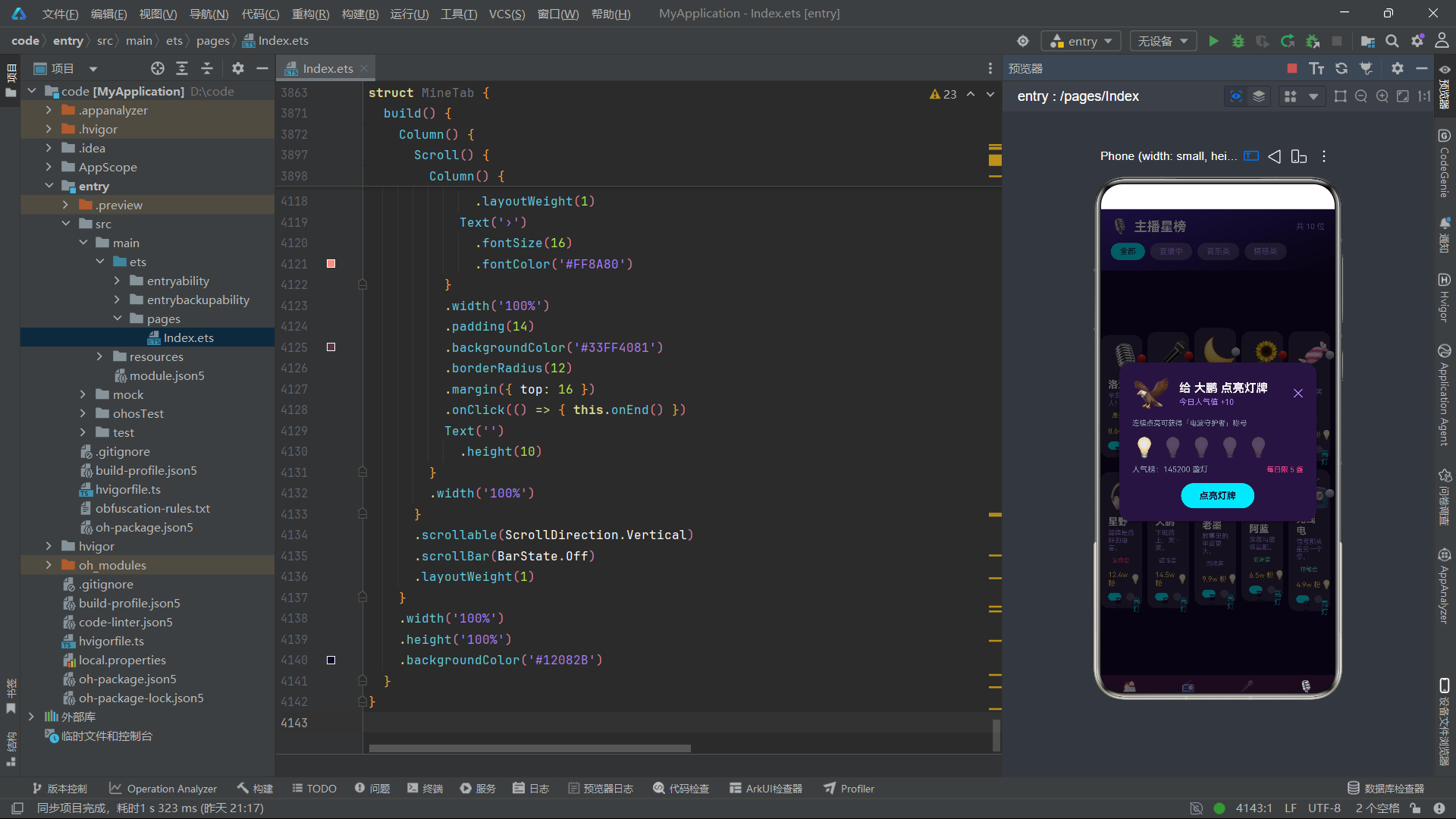
这三个函数体现了应用中"双列布局"的数据分拣策略。getTopPrograms 取前五档节目用于首页横滑展示。getProgramRows 和 getProgramRows2 分别取偶数索引和奇数索引的元素,用于在双列网格中并排展示。
这种分拣方式很巧妙。在 ArkTS 中实现双列网格布局时,如果使用 Grid 组件可以自动换行,但 Grid 对复杂卡片内容的自定义支持有限。本应用选择了用两个 Row 容器分别渲染左右列,每个 Row 内部的 ForEach 各自遍历一半数据。这样每个卡片可以拥有完全独立的自定义布局,灵活性远高于 Grid 组件。
鸿蒙知识点 - Row 与 Column:
Row是水平排列子组件的线性容器,Column是垂直排列子组件的线性容器。它们是 ArkTS 中最基础的两个布局原语。在本应用中,Row被广泛用于并排展示两列卡片、标题与操作按钮水平排列、数据项的标签与值水平排列等场景。通过layoutWeight(1)属性可以让某个子组件占满剩余空间,实现弹性布局效果。
function getBarHeight(val: number, max: number): string {
  let p = max > 0 ? (val / max) * 90 : 0;
  return p.toFixed(0) + 'vp';
}

function getPercent(val: number, total: number): string {
  let p = total > 0 ? (val / total) * 100 : 0;
  return p.toFixed(0) + '%';
}

function formatNum(n: number): string {
  if (n >= 10000) {
    return (n / 10000).toFixed(1) + 'w';
  }
  return n.toString();
}
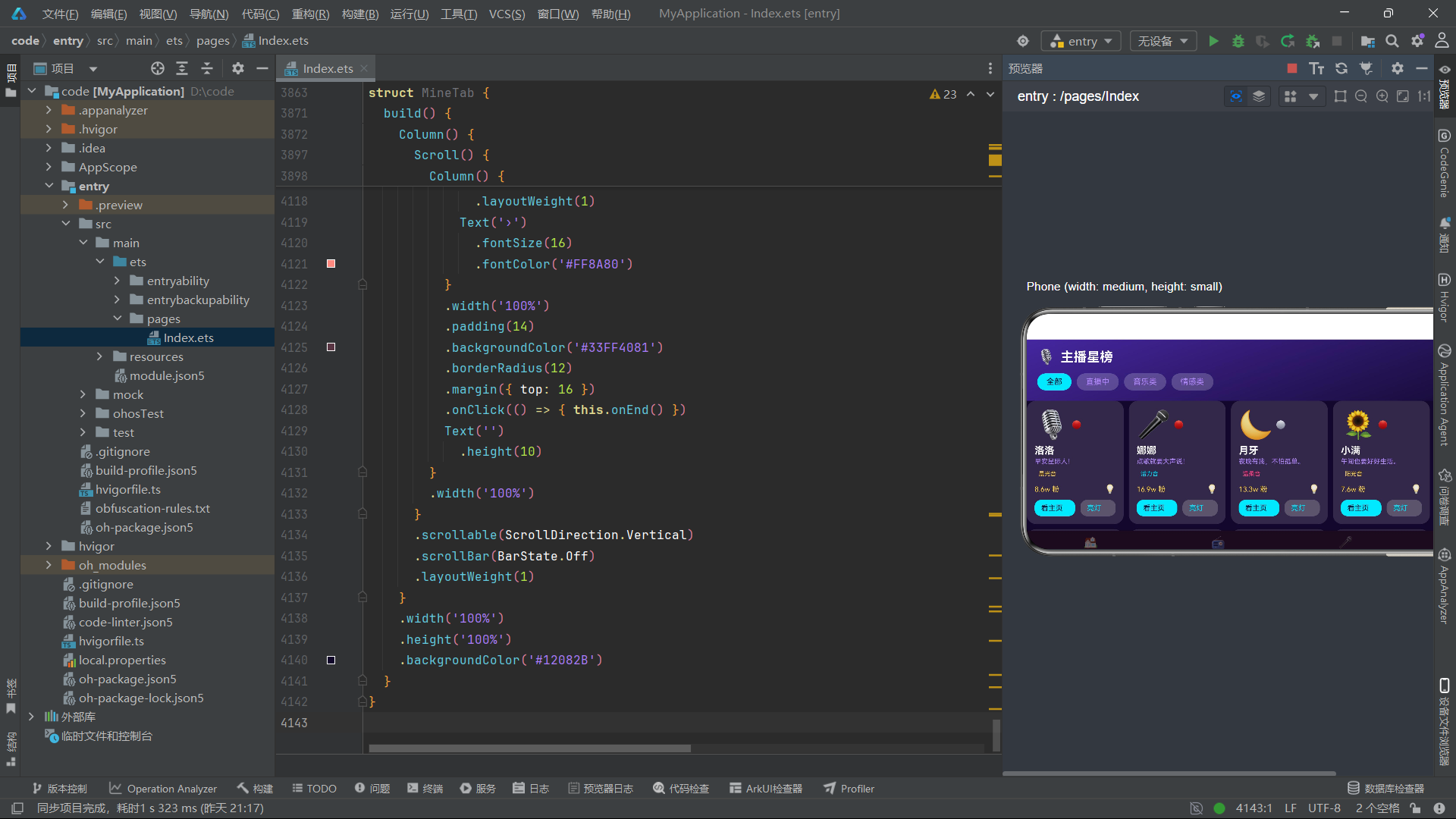
这三个格式化函数负责数值到显示文本的转换。getBarHeight 将数值映射为柱状图高度(最大 90vp),getPercent 计算百分比,formatNum 将大数字转换为"万"为单位的简写。在鸿蒙中,尺寸单位 vp(virtual pixel)是逻辑像素,框架会根据设备屏幕密度自动转换为物理像素。
formatNum 函数的设计体现了"数据展示友好性"原则。原始数据中的收听人数动辄数万(如 61200),直接显示会占据过多空间且不直观。通过 formatNum 转换为 “6.1w” 后,视觉上更紧凑,信息传达也更高效。
function getVoiceColor(v: string): string {
  if (v.indexOf('晨') >= 0 || v.indexOf('阳光') >= 0) {
    return '#FFD54F';
  } else if (v.indexOf('治愈') >= 0 || v.indexOf('温柔') >= 0 || v.indexOf('甜心') >= 0) {
    return '#FF4081';
  } else if (v.indexOf('磁性') >= 0 || v.indexOf('沉稳') >= 0) {
    return '#B388FF';
  } else if (v.indexOf('活力') >= 0) {
    return '#00E5FF';
  }
  return '#69F0AE';
}

function getTrendColor(t: number): string {
  if (t >= 0) {
    return '#E53935';
  }
  return '#43A047';
}
getVoiceColor 函数根据声线特质文本返回对应颜色,getTrendColor 根据趋势正负返回红/绿色。这两个函数展示了 ArkTS 中"语义到视觉"的映射逻辑。通过函数封装颜色计算逻辑,避免了在 UI 代码中散落大量条件判断,提高了代码可维护性。
当需要新增一种声线颜色时,只需在 getVoiceColor 函数中添加一个 else if 分支即可,所有引用该函数的 UI 代码自动生效。这种设计也使得颜色方案的一致性得到保障——同一声线在不同页面始终使用相同颜色。
五、入口组件:状态管理中枢
接下来进入应用的核心部分——入口组件 Index。这个组件是整个应用的状态管理中枢,所有 Tab 切换和弹窗调度都在这里完成。
@Entry
@Component
struct Index {
  @State tabIndex: number = 0;
  @State showToast: boolean = false;
  @State toast: string = '';
  @State playing: boolean = true;
  @State vol: number = 60;
  @State listenHours: number = 386;
  @State badgeCount: number = 4;
@Entry 装饰器标记 Index 为应用入口组件,鸿蒙框架会在应用启动时自动渲染该组件。@Component 装饰器声明这是一个自定义组件。@State 装饰器标记的变量是组件的内部状态,当这些变量的值发生变化时,框架会自动重新渲染引用了这些变量的 UI 部分。
tabIndex 是当前激活的 Tab 索引(0-6 对应七个 Tab),初始值为 0 表示默认显示首页。playing 控制播放按钮的暂停/播放状态。vol 存储当前音量。listenHours 和 badgeCount 是传递给"我的"页面的展示数据。
鸿蒙知识点 - @State:
@State是组件内状态装饰器。被@State修饰的变量在赋值时会触发声明式 UI 的重新渲染。框架通过观察赋值操作来实现响应式更新——只有通过this.xxx = newValue方式赋值才会触发渲染,直接修改对象属性不会触发。@State变量的变化默认只影响当前组件,需要通过@Prop、@Link或回调函数才能传递到子组件。
  // 弹框开关
  @State showSongRequest: boolean = false;
  @State showSongConfirm: boolean = false;
  @State showProgram: boolean = false;
  @State showAnchor: boolean = false;
  @State showSubscribe: boolean = false;
  @State showCall: boolean = false;
  @State showReport: boolean = false;
  @State showEvent: boolean = false;
  @State showRankReward: boolean = false;
  @State showBadge: boolean = false;
  @State showSettings: boolean = false;
  @State showBirthday: boolean = false;
  @State showInterrupt: boolean = false;
  @State showReschedule: boolean = false;
  @State showLight: boolean = false;
  @State showEnd: boolean = false;
这里集中声明了十六个弹窗的开关状态变量。每个弹窗对应一个布尔值,true 表示显示,false 表示隐藏。将所有弹窗状态集中在入口组件管理是本应用的核心架构决策。
这种集中式管理的优势在于:可以确保同一时间只有一个弹窗处于打开状态(虽然技术上允许多个同时打开,但从用户体验角度不应如此)。当一个弹窗的开关从 false 变为 true 时,之前打开的弹窗会自然被新的 Stack 层叠覆盖。同时,关闭弹窗时只需将对应变量设为 false 即可,框架自动移除对应的 UI 节点。
  // 选中对象
  @State selSong: Song | null = null;
  @State selSong2: Song | null = null;
  @State selProgram: Program | null = null;
  @State selProgram2: Program | null = null;
  @State selAnchor: Anchor | null = null;
  @State selEvent: FmEvent | null = null;
  @State selRank: RankItem | null = null;
  @State selBadge: Badge | null = null;
  @State selReschedule: Program | null = null;
  @State selLight: Anchor | null = null;
选中对象是一组可为空(| null)的状态变量。它们存储当前弹窗需要展示的数据对象。例如,当用户点击某档节目时,该节目数据会被赋值给 selProgram,然后 showProgram 设为 true,节目详情弹窗就会读取 selProgram 的数据来渲染内容。
使用 | null 联合类型的原因是:在应用启动时,没有任何弹窗被打开,这些变量应该为 null。只有在用户交互后才被赋值为具体对象。在弹窗的 @Builder 方法中,通过 this.selSong!.name 这样的非空断言来安全访问属性——因为弹窗的渲染条件是 this.showSongRequest && this.selSong !== null,进入渲染时必定非空。
  // 表单字段
  @State fWish: string = '';
  @State fDay: number = 0;
  @State fMonth: number = 1;
  @State fDayIdx: number = 0;
  @State fSongIdx: number = 0;
  @State fCallOn: boolean = false;
  @State fRemindOn: boolean = true;
  @State fQuality: number = 2;
  @State fVote: number = 0;

  private tabs1: string[] = ['首页', '节目', '点歌', '主播'];
  private tabIcons1: string[] = ['🏠', '📻', '🎤', '🎙️'];
  private tabs2: string[] = ['听众', '排行', '我的'];
  private tabIcons2: string[] = ['🌟', '🏆', '👤'];
表单字段用于弹窗内的交互状态。fWish 存储用户在点歌弹窗中输入的祝福语,fDayIdx 和 fSongIdx 存储订阅和改期弹窗中选中的日期/时段索引,fMonth 存储生日点播选中的月份,fQuality 存储音质选择索引(0=流畅, 1=标准, 2=高清),fVote 存储灯牌投票数量。
tabs1 和 tabs2 是两排底部 Tab 的标签和图标数据。第一排四个 Tab(首页/节目/点歌/主播),第二排三个 Tab(听众/排行/我的),共七个 Tab。使用 private 修饰符表示这些数组是组件私有的,不参与响应式渲染。
  showTip(msg: string): void {
    this.toast = msg;
    this.showToast = true;
    setTimeout(() => {
      this.showToast = false;
    }, 1800);
  }
showTip 是一个封装的 Toast 提示方法。它接收消息文本,设置到 toast 变量并打开 showToast 开关,然后通过 setTimeout 在 1.8 秒后自动关闭。这个方法在整个应用中被大量调用,用于操作成功反馈(如"点歌成功"、“已关注主播”、"设置已保存"等)。
setTimeout 在鸿蒙 ArkTS 中可以正常使用。当 1.8 秒后回调执行时,this.showToast = false 会触发 toastBox 组件的移除动画。这里需要注意闭包中对 this 的引用——箭头函数保留了外层的 this 绑定,因此 this 仍然指向 Index 组件实例。
六、build 方法:Stack 层叠与 Tab 调度
build 方法是整个入口组件的 UI 描述入口,它采用了 Stack 层叠容器作为最外层布局。
  build() {
    Stack() {
      Column() {
        // ========== 主内容区 ==========
        if (this.tabIndex === 0) {
          HomeTab({
            playing: this.playing,
            vol: this.vol,
            onTogglePlay: () => {
              this.playing = !this.playing;
            },
            onSong: (s: Song) => {
              this.selSong = s;
              this.showSongRequest = true;
            },
            onProgram: (p: Program) => {
              this.selProgram = p;
              this.showProgram = true;
            },
            onAnchor: (a: Anchor) => {
              this.selAnchor = a;
              this.showAnchor = true;
            },
            onEvent: (e: FmEvent) => {
              this.selEvent = e;
              this.showEvent = true;
            },
            onCall: () => {
              this.showCall = true;
            },
            onReport: () => {
              this.showReport = true;
            },
            onInterrupt: () => {
              this.showInterrupt = true;
            },
            onRank: (r: RankItem) => {
              this.selRank = r;
              this.showRankReward = true;
            }
          })
        }
Stack 是层叠布局容器,子组件按照添加顺序从底到顶堆叠。在本应用中,Stack 的第一个子元素是 Column(包含主内容区和底部 Tab 栏),后续的弹窗组件以条件渲染的方式层叠在主内容之上。
在 Column 内部,首先是一段 if-else if 条件判断,根据 tabIndex 的值渲染对应的子组件。以 tabIndex === 0 为例,渲染 HomeTab 组件并传入大量参数。这些参数分为两类:数据参数(playing、vol)和回调函数参数(onTogglePlay、onSong、onProgram 等)。
回调函数的设计模式是本应用的精髓所在。子组件不直接操作弹窗状态,而是通过回调将事件"上报"给父组件。例如,当用户在首页点击某首歌曲时,HomeTab 调用 this.onSong(s) 传入被点击的歌曲对象,父组件的 onSong 回调将该歌曲存入 selSong 并打开 showSongRequest 开关。这种模式保证了子组件的无状态性——子组件只负责展示数据和触发事件,不关心弹窗如何打开。
        } else if (this.tabIndex === 1) {
          ProgramTab({
            onProgram: (p: Program) => {
              this.selProgram = p;
              this.showProgram = true;
            },
            onSubscribe: (p: Program) => {
              this.selProgram2 = p;
              this.fDayIdx = 0;
              this.showSubscribe = true;
            },
            onReschedule: (p: Program) => {
              this.selReschedule = p;
              this.fDayIdx = 0;
              this.showReschedule = true;
            }
          })
        } else if (this.tabIndex === 2) {
          SongTab({
            onSong: (s: Song) => {
              this.selSong = s;
              this.showSongRequest = true;
            },
            onConfirm: (s: Song) => {
              this.selSong2 = s;
              this.showSongConfirm = true;
            },
            onBirthday: () => {
              this.fMonth = 1;
              this.showBirthday = true;
            },
            onLight: (a: Anchor) => {
              this.selLight = a;
              this.fVote = 0;
              this.showLight = true;
            }
          })
        }
后续的 Tab 分支遵循同样的模式。ProgramTab 接收三个回调:节目详情查看、订阅和改期。SongTab 接收四个回调:点歌、点歌确认、生日点播和灯牌投票。注意 onSubscribe 和 onReschedule 回调中都会重置 fDayIdx = 0,确保每次打开弹窗时日期选择都从默认值开始。
鸿蒙知识点 - Stack:
Stack组件按照子组件声明顺序从下到上层叠。后声明的子组件覆盖先声明的子组件。在本应用中,主内容区最先声明(位于最底层),弹窗遮罩和弹窗内容后声明(覆盖在主内容之上)。通过justifyContent属性可以控制子组件在主轴方向的对齐方式,弹窗内容通过FlexAlign.End实现底部抽屉效果,通过FlexAlign.Center实现居中弹窗效果。
        // ========== 底部 Tab(两排) ==========
        Column() {
          Row() {
            ForEach(this.tabs1, (label: string, idx: number) => {
              this.bottomTabItem(this.tabIcons1[idx], label, idx)
            }, (label: string, idx: number) => 'm' + label + idx)
          }
          .width('100%')
          .height(50)
          Row() {
            ForEach(this.tabs2, (label: string, idx: number) => {
              this.bottomTabItem(this.tabIcons2[idx], label, idx + 4)
            }, (label: string, idx: number) => 's' + label + idx)
          }
          .width('100%')
          .height(44)
        }
        .width('100%')
        .backgroundColor('#1A0B1E')
        .shadow({ radius: 8, color: '#2A000000', offsetY: -2 })
      }
      .width('100%')
      .height('100%')
底部两排 Tab 栏嵌套在主 Column 的底部。外层 Column 包含两个 Row,第一排高度 50vp 包含四个 Tab,第二排高度 44vp 包含三个 Tab。每个 Tab 项通过 this.bottomTabItem(icon, label, idx) 调用公共 Builder 方法渲染。
ForEach 的键值生成函数使用了 'm' + label + idx 和 's' + label + idx 的前缀区分模式,确保两排 Tab 的键值不会冲突。.shadow 属性给底栏添加了向上的阴影投影,增强了视觉层次感。offsetY: -2 表示阴影向上偏移 2vp,模拟底栏"浮在内容之上"的效果。
七、弹窗挂载:条件渲染与遮罩层
主内容区和底栏之后,Stack 内部开始挂载弹窗。每个弹窗由两部分组成:遮罩层(modalOverlay)和弹窗内容(如 songRequestModal)。
      // ========== 弹框挂载 ==========
      if (this.showSongRequest && this.selSong !== null) {
        this.modalOverlay(() => { this.showSongRequest = false })
        this.songRequestModal()
      }
      if (this.showSongConfirm && this.selSong2 !== null) {
        this.modalOverlay(() => { this.showSongConfirm = false })
        this.songConfirmModal()
      }
      if (this.showProgram && this.selProgram !== null) {
        this.modalOverlay(() => { this.showProgram = false })
        this.programModal()
      }
      if (this.showAnchor && this.selAnchor !== null) {
        this.modalOverlay(() => { this.showAnchor = false })
        this.anchorModal()
      }
      if (this.showSubscribe && this.selProgram2 !== null) {
        this.modalOverlay(() => { this.showSubscribe = false })
        this.subscribeModal()
      }
      if (this.showCall) {
        this.modalOverlay(() => { this.showCall = false })
        this.callModal()
      }
每个弹窗的渲染条件是"开关变量为 true 且选中对象非空"的双重判断。对于不需要选中对象的弹窗(如连线、设置、插播等),只需判断开关变量。
遮罩层 modalOverlay 接收一个关闭回调函数。当用户点击遮罩区域时,回调执行将对应开关设为 false,弹窗随之消失。这种"点击外部关闭"是弹窗交互的标准模式。
弹窗内容的渲染通过调用 @Builder 方法实现。@Builder 方法返回的 UI 描述会被内联到调用位置,成为 Stack 的子组件。由于 @Builder 方法是内联的(非独立组件),它可以直接访问 this 上的所有状态变量,无需参数传递。
鸿蒙知识点 - @Builder:
@Builder装饰器用于声明一个可复用的 UI 构建方法。与@Component不同,@Builder方法不会创建独立的组件实例,而是将 UI 描述内联到调用处。这意味着@Builder方法内部的this指向调用它的组件实例,可以直接读写该组件的状态变量。@Builder方法可以接收参数(如bottomTabItem(icon, label, idx)),适合用于构建需要参数化的可复用 UI 片段。
      if (this.showReport) {
        this.modalOverlay(() => { this.showReport = false })
        this.reportModal()
      }
      if (this.showEvent && this.selEvent !== null) {
        this.modalOverlay(() => { this.showEvent = false })
        this.eventModal()
      }
      if (this.showRankReward && this.selRank !== null) {
        this.modalOverlay(() => { this.showRankReward = false })
        this.rankRewardModal()
      }
      if (this.showBadge && this.selBadge !== null) {
        this.modalOverlay(() => { this.showBadge = false })
        this.badgeModal()
      }
      if (this.showSettings) {
        this.modalOverlay(() => { this.showSettings = false })
        this.settingsModal()
      }
      if (this.showBirthday) {
        this.modalOverlay(() => { this.showBirthday = false })
        this.birthdayModal()
      }
      if (this.showInterrupt) {
        this.modalOverlay(() => { this.showInterrupt = false })
        this.interruptModal()
      }
      if (this.showReschedule && this.selReschedule !== null) {
        this.modalOverlay(() => { this.showReschedule = false })
        this.rescheduleModal()
      }
      if (this.showLight && this.selLight !== null) {
        this.modalOverlay(() => { this.showLight = false })
        this.lightModal()
      }
      if (this.showEnd) {
        this.modalOverlay(() => { this.showEnd = false })
        this.endModal()
      }
      if (this.showToast) {
        this.toastBox()
      }
    }
    .width('100%')
    .height('100%')
  }
剩余的弹窗挂载遵循完全一致的模式。最后是 Toast 提示框 toastBox(),它没有遮罩层(因为 Toast 不阻塞用户操作),仅在 showToast 为 true 时渲染。
全部弹窗挂载完成后,Stack 容器闭合。这种设计使得弹窗的添加和移除非常灵活——新增一种弹窗只需三步:声明开关状态变量、编写 @Builder 方法、在挂载区添加条件渲染代码。
八、弹窗一:点歌底部抽屉
现在逐个分析十六个弹窗的 @Builder 实现。第一个是点歌弹窗,采用底部抽屉样式。
  @Builder
  songRequestModal() {
    Column() {
      Column() {
        Row() {
          Text('🎤 点歌 ' + this.selSong!.name)
            .fontSize(18)
            .fontWeight(FontWeight.Bold)
            .fontColor('#FFFFFF')
            .layoutWeight(1)
          Text('✕')
            .fontSize(18)
            .fontColor('#B388FF')
            .onClick(() => { this.showSongRequest = false })
        }
        .width('100%')
        Text(this.selSong!.singer + ' · ' + this.selSong!.style + ' · 点播 ' + formatNum(this.selSong!.requests))
          .fontSize(12)
          .fontColor('#B388FF')
          .width('100%')
          .margin({ top: 6 })
弹窗的标题栏使用 Row 水平排列:左侧是"点歌 + 歌曲名"标题,右侧是关闭按钮。标题通过 layoutWeight(1) 占满剩余宽度,关闭按钮固定在右侧。点击关闭按钮将 showSongRequest 设为 false 即可关闭弹窗。
第二行是歌曲的副标题信息,通过字符串拼接展示歌手、风格和点播次数。formatNum 函数将点播次数格式化为"万"单位。margin({ top: 6 }) 给副标题添加了 6vp 的上边距,使其与标题保持视觉间距。
        Row() {
          Text(this.selSong!.icon)
            .fontSize(48)
          Column() {
            Text('当前排队')
              .fontSize(11)
              .fontColor('#90A4AE')
            Text('第 ' + 128 + ' 位')
              .fontSize(18)
              .fontWeight(FontWeight.Bold)
              .fontColor('#00E5FF')
              .margin({ top: 4 })
          }
          .alignItems(HorizontalAlign.Start)
          .layoutWeight(1)
          .margin({ left: 12 })
          Column() {
            Text('预计播放')
              .fontSize(11)
              .fontColor('#90A4AE')
            Text('16:40')
              .fontSize(18)
              .fontWeight(FontWeight.Bold)
              .fontColor('#FFD54F')
              .margin({ top: 4 })
          }
          .alignItems(HorizontalAlign.Start)
        }
        .width('100%')
        .padding(12)
        .backgroundColor('#2A1B4D')
        .borderRadius(12)
        .margin({ top: 12 })
这是一个信息展示行,使用 Row 水平排列三个部分:歌曲大图标、排队位次信息、预计播放时间。两个 Column 都使用 HorizontalAlign.Start 左对齐,并通过 layoutWeight(1) 让第一个 Column 占满剩余空间。
背景色 #2A1B4D 是深紫色,与整体深空主题一致。borderRadius(12) 添加圆角,margin({ top: 12 }) 与上方标题保持间距。注意排队位次和预计播放时间使用了不同的高亮色(电光青 #00E5FF 和金黄色 #FFD54F),通过颜色区分不同类型的信息。
        Text('写一句祝福语')
          .fontSize(13)
          .fontWeight(FontWeight.Bold)
          .fontColor('#FFFFFF')
          .width('100%')
          .margin({ top: 12 })
        TextArea({ placeholder: '把想说的话通过电波送出去...', text: this.fWish })
          .fontSize(13)
          .fontColor('#FFFFFF')
          .placeholderColor('#6A5C9E')
          .backgroundColor('#2A1B4D')
          .borderRadius(10)
          .height(76)
          .width('100%')
          .onChange((v: string) => { this.fWish = v })
        Row() {
          ForEach(['送给朋友', '生日快乐', '表白', '加油打气'], (t: string, ti: number) => {
            Text(t)
              .fontSize(11)
              .fontColor('#00E5FF')
              .padding({ left: 12, right: 12, top: 5, bottom: 5 })
              .backgroundColor('#15233F')
              .borderRadius(12)
              .margin({ right: 8 })
              .onClick(() => { this.fWish = t })
          }, (t: string, ti: number) => 'w' + ti)
        }
        .width('100%')
        .margin({ top: 10 })
祝福语输入区包含标题、TextArea 文本域和快捷短语选择栏。TextArea 组件通过 onChange 回调将用户输入实时同步到 fWish 状态变量。placeholder 提供占位提示文本,placeholderColor 设置占位文本颜色。
下方的快捷短语使用 ForEach 渲染四个标签按钮。点击任一标签会将对应的短语文本赋值给 fWish,实现一键填充。这是一种提升输入效率的常见交互模式——用户可以选择手打,也可以快速选择预设短语。
鸿蒙知识点 - TextArea:
TextArea是多行文本输入组件,与TextInput(单行输入)不同,TextArea支持换行和更大的输入区域。通过onChange回调可以监听文本变化并同步到状态变量。在 ArkTS 中,表单组件的"受控"模式是通过onChange回调 + 状态变量赋值实现的,与 React 的受控组件概念类似。
        Row() {
          Text('点歌需要 50 电波币')
            .fontSize(12)
            .fontColor('#90A4AE')
          Text('')
            .layoutWeight(1)
          Text('确认点歌')
            .fontSize(14)
            .fontWeight(FontWeight.Bold)
            .fontColor('#12082B')
            .padding({ left: 24, right: 24, top: 10, bottom: 10 })
            .backgroundColor('#00E5FF')
            .borderRadius(20)
            .onClick(() => {
              this.showSongRequest = false;
              this.selSong2 = this.selSong;
              this.showSongConfirm = true;
            })
        }
        .width('100%')
        .margin({ top: 14 })
      }
      .padding(20)
      .width('100%')
      .backgroundColor('#1A0B1E')
      .borderRadius({ topLeft: 22, topRight: 22 })
      .linearGradient({ colors: [['#1A0B1E', 0], ['#2A1B4D', 1]], angle: 180 })
      .transition(TransitionEffect.translate({ y: 300 }).animation({ duration: 220 }))
    }
    .width('100%')
    .height('100%')
    .justifyContent(FlexAlign.End)
  }
弹窗底部是费用提示和确认按钮。确认按钮的点击事件执行了一个"弹窗链式跳转"操作:先关闭当前点歌弹窗(showSongRequest = false),然后将当前选中歌曲赋值给 selSong2,最后打开点歌确认弹窗(showSongConfirm = true)。这种从一个弹窗跳转到另一个弹窗的模式在应用中多次出现。
弹窗的外层 Column 设置了 justifyContent(FlexAlign.End),使内容区贴底显示(底部抽屉效果)。内容区的 transition 使用了 TransitionEffect.translate({ y: 300 }),弹窗出现时从下方 300vp 处滑入,动画时长 220 毫秒。linearGradient 给背景添加了从深紫到浅紫的纵向渐变。
九、弹窗二:电波票根确认卡
点歌确认弹窗采用了"票根卡"设计,居中展示,模拟演唱会门票的视觉风格。
  @Builder
  songConfirmModal() {
    Column() {
      Column() {
        Column() {
          Text('🎫 电波票根')
            .fontSize(12)
            .fontColor('#80D8FF')
          Text(this.selSong2!.name)
            .fontSize(24)
            .fontWeight(FontWeight.Bold)
            .fontColor('#FFFFFF')
            .margin({ top: 6 })
          Text('NEBULA FM · 深空电台')
            .fontSize(10)
            .fontColor('#B388FF')
            .margin({ top: 4 })
        }
        .width('100%')
        .padding({ top: 24, bottom: 24 })
        .backgroundColor('#4527A0')
        .linearGradient({ colors: [['#4527A0', 0], ['#12082B', 1]], angle: 135 })
票根的头部区域使用 135 度对角线渐变,从紫色 #4527A0 渐变到深空黑 #12082B,营造出深邃的太空感。头部包含三行文字:标签(电波票根)、歌曲名(大号加粗白色)和电台品牌名。
这种"票根"视觉设计在产品中具有仪式感——用户点歌后获得一张"电子票根"作为操作凭证,增强了用户行为的仪式感和成就感。在 ArkTS 中,通过 linearGradient 的 angle 参数可以控制渐变方向,135 度表示从左上到右下的对角线方向。
        Column() {
          Row() {
            Text(this.selSong2!.icon)
              .fontSize(42)
            Column() {
              Text(this.selSong2!.name)
                .fontSize(15)
                .fontWeight(FontWeight.Bold)
                .fontColor('#FFFFFF')
              Text(this.selSong2!.singer + ' · ' + this.selSong2!.style)
                .fontSize(11)
                .fontColor('#B388FF')
                .margin({ top: 4 })
            }
            .alignItems(HorizontalAlign.Start)
            .layoutWeight(1)
            .margin({ left: 10 })
            Text('🎶')
              .fontSize(30)
          }
          .width('100%')
          Divider()
            .color('#5E4B8B')
            .strokeWidth(1)
            .dashArray([6, 6])
            .margin({ top: 12, bottom: 12 })
票根的内容区域先展示歌曲信息行,然后使用 Divider 组件添加一条虚线分割线。Divider 的 dashArray([6, 6]) 参数创建虚线效果——6vp 实线 + 6vp 间隔交替。这种虚线分割线在票根/票据设计中非常常见,模拟了真实票据的撕开线。
鸿蒙知识点 - Divider:
Divider组件用于绘制分割线。通过color设置线条颜色,strokeWidth设置线宽,dashArray设置虚线样式(数组中交替指定实线和间隔的长度)。Divider默认水平方向,宽度自动填满父容器。在Column中使用时作为水平分割线,在Row中使用时作为垂直分割线。
          Row() {
            Text('点播人')
              .fontSize(12)
              .fontColor('#90A4AE')
            Text('')
              .layoutWeight(1)
            Text('电波听友 9527')
              .fontSize(13)
              .fontColor('#FFFFFF')
          }
          .width('100%')
          Row() {
            Text('播放时间')
              .fontSize(12)
              .fontColor('#90A4AE')
            Text('')
              .layoutWeight(1)
            Text('今天 16:40')
              .fontSize(13)
              .fontColor('#00E5FF')
          }
          .width('100%')
          .margin({ top: 8 })
          Row() {
            Text('祝福语')
              .fontSize(12)
              .fontColor('#90A4AE')
            Text('')
              .layoutWeight(1)
            Text(this.fWish.length > 0 ? this.fWish : '快乐每一天!')
              .fontSize(13)
              .fontColor('#FFD54F')
          }
          .width('100%')
          .margin({ top: 8 })
          Row() {
            Text('已扣电波币')
              .fontSize(12)
              .fontColor('#90A4AE')
            Text('')
              .layoutWeight(1)
            Text('-50')
              .fontSize(15)
              .fontWeight(FontWeight.Bold)
              .fontColor('#FF4081')
          }
          .width('100%')
          .margin({ top: 8 })
票根的详情区使用多组 Row 展示键值对信息:点播人、播放时间、祝福语、已扣电波币。每个 Row 的结构相同——左侧标签(灰色)+ 中间弹性占位 + 右侧值(彩色高亮)。中间的 Text('').layoutWeight(1) 是一个空文本占位符,通过 layoutWeight(1) 占满中间空间,将右侧值推到最右端。
祝福语行使用了三元表达式 this.fWish.length > 0 ? this.fWish : '快乐每一天!',当用户未输入祝福语时显示默认文本。已扣电波币使用红色 #FF4081 加粗显示,突出费用信息。
          Row() {
            Text('完成')
              .fontSize(14)
              .fontWeight(FontWeight.Bold)
              .fontColor('#12082B')
              .padding({ left: 28, right: 28, top: 11, bottom: 11 })
          }
          .backgroundColor('#00E5FF')
          .borderRadius(20)
          .margin({ top: 14 })
          .onClick(() => {
            this.showSongConfirm = false;
            this.showTip('点歌成功,排在第 128 位');
          })
        }
        .padding(18)
        .backgroundColor('#241540')
        .borderRadius({ bottomLeft: 18, bottomRight: 18 })
      }
      .width('84%')
      .clip(true)
      .shadow({ radius: 14, color: '#5500E5FF', offsetY: 4 })
      .transition(TransitionEffect.scale({ x: 0.85, y: 0.85 }).animation({ duration: 220 }))
    }
    .width('100%')
    .height('100%')
    .justifyContent(FlexAlign.Center)
  }
完成按钮的点击事件关闭确认弹窗并显示 Toast 提示。弹窗使用了 TransitionEffect.scale 缩放动画,从 0.85 倍缩放放大到 1.0,配合 220 毫秒动画时长,营造出"弹出"效果。.clip(true) 确保内容不溢出圆角边界。shadow 使用了带透明度的青色 #5500E5FF,使阴影带有主题色的光晕效果。
十、弹窗三至五:节目详情、主播档案与订阅
接下来分析节目详情弹窗、主播档案弹窗和订阅弹窗。这三个弹窗分别展示了不同的设计风格。
  @Builder
  programModal() {
    Column() {
      Column() {
        Column() {
          Text(this.selProgram!.icon)
            .fontSize(52)
          Text(this.selProgram!.name)
            .fontSize(22)
            .fontWeight(FontWeight.Bold)
            .fontColor('#FFFFFF')
            .margin({ top: 8 })
          Text(this.selProgram!.time + ' · ' + this.selProgram!.duration + ' 分钟')
            .fontSize(12)
            .fontColor('#B388FF')
            .margin({ top: 4 })
          Row() {
            Text(this.selProgram!.type)
              .fontSize(10)
              .fontColor('#12082B')
              .padding({ left: 10, right: 10, top: 3, bottom: 3 })
              .backgroundColor('#00E5FF')
              .borderRadius(8)
          }
          .margin({ top: 8 })
        }
        .width('100%')
        .padding({ top: 26, bottom: 26 })
        .backgroundColor('#4527A0')
        .borderRadius({ topLeft: 18, topRight: 18 })
        .linearGradient({ colors: [['#4527A0', 0], ['#12082B', 1]], angle: 160 })
节目详情弹窗采用"上下拼接卡"设计:上半部分是渐变紫色的头部区域(展示图标、名称、时间、类型标签),下半部分是深色背景的内容区域。头部使用 160 度渐变角度,接近垂直方向但略有偏移,营造出从亮到暗的过渡效果。
类型标签使用电光青 #00E5FF 作为背景色,深色文字 #12082B,通过 borderRadius(8) 形成圆角药丸标签。这种"反色标签"设计在深色主题应用中非常常见——标签背景使用亮色,文字使用暗色,形成强对比度。
        Column() {
          Text(this.selProgram!.desc)
            .fontSize(13)
            .fontColor('#90A4AE')
            .lineHeight(20)
            .width('100%')
          Row() {
            Column() {
              Text('主播')
                .fontSize(11)
                .fontColor('#90A4AE')
              Text(this.selProgram!.anchor)
                .fontSize(15)
                .fontWeight(FontWeight.Bold)
                .fontColor('#FFFFFF')
                .margin({ top: 4 })
            }
            .layoutWeight(1)
            .alignItems(HorizontalAlign.Start)
            Column() {
              Text('收听人数')
                .fontSize(11)
                .fontColor('#90A4AE')
              Text(formatNum(this.selProgram!.listeners))
                .fontSize(15)
                .fontWeight(FontWeight.Bold)
                .fontColor('#00E5FF')
                .margin({ top: 4 })
            }
            .layoutWeight(1)
            .alignItems(HorizontalAlign.Start)
          }
          .width('100%')
          .padding(12)
          .backgroundColor('#2A1B4D')
          .borderRadius(10)
          .margin({ top: 12 })
内容区先展示节目描述(lineHeight(20) 设置行高为 20vp 提升多行文本可读性),然后是一个双列数据卡片展示主播名和收听人数。两个 Column 各自 layoutWeight(1) 平分宽度,左对齐展示标签和值。
底部是"关闭"和"去收听"两个按钮,关闭按钮使用灰色文字无背景,收听按钮使用电光青背景。两个按钮通过 layoutWeight(1) 平分宽度,中间用 margin({ left: 12 }) 留出间距。点击"去收听"会关闭弹窗并显示 Toast"正在收听"。
  @Builder
  anchorModal() {
    Column() {
      Column() {
        Row() {
          Text(this.selAnchor!.icon)
            .fontSize(54)
          Column() {
            Text(this.selAnchor!.name)
              .fontSize(20)
              .fontWeight(FontWeight.Bold)
              .fontColor('#FFFFFF')
            Text(this.selAnchor!.slogan)
              .fontSize(11)
              .fontColor('#B388FF')
              .margin({ top: 4 })
          }
          .alignItems(HorizontalAlign.Start)
          .layoutWeight(1)
          .margin({ left: 12 })
          Column() {
            Text(this.selAnchor!.online ? '🔴 直播中' : '⚪ 休息中')
              .fontSize(10)
              .fontColor(this.selAnchor!.online ? '#FF4081' : '#90A4AE')
              .padding({ left: 8, right: 8, top: 3, bottom: 3 })
              .backgroundColor(this.selAnchor!.online ? '#33FF4081' : '#33FFFFFF')
              .borderRadius(8)
          }
        }
        .width('100%')
主播档案弹窗的头部使用 Row 展示主播大图标、名称+口号和直播状态标签。直播状态标签通过三元表达式根据 online 字段动态切换文字、文字颜色和背景色。背景色使用了带透明度前缀 #33 的十六进制颜色(如 #33FF4081),33 是十六进制的透明度值(约 20%),实现半透明背景效果。
        Row() {
          Text('声线特质')
            .fontSize(12)
            .fontColor('#90A4AE')
          Text(this.selAnchor!.voice)
            .fontSize(13)
            .fontWeight(FontWeight.Bold)
            .fontColor(getVoiceColor(this.selAnchor!.voice))
            .padding({ left: 8, right: 8, top: 3, bottom: 3 })
            .backgroundColor('#33' + getVoiceColor(this.selAnchor!.voice))
            .borderRadius(8)
            .margin({ left: 8 })
        }
        .width('100%')
        .margin({ top: 14 })
声线特质标签的颜色通过 getVoiceColor 函数动态计算——根据声线名称中的关键词返回对应颜色。标签的文字颜色和背景色都基于该函数返回值,背景色通过 '33' + 颜色值 的字符串拼接添加透明度前缀。这是一种动态主题色方案。
鸿蒙知识点 - 颜色透明度:在 ArkTS 中,十六进制颜色可以使用
#AARRGGBB格式,前两位AA是透明度通道。#33对应十进制 51,约 20% 不透明度。#55约 33%,#99约 60%,#DD约 87%。通过调整透明度前缀,可以在同一基础色上创建不同深浅的背景效果,无需定义多套颜色变量。
  @Builder
  subscribeModal() {
    Column() {
      Column() {
        Row() {
          Text('📅 订阅 ' + this.selProgram2!.name)
            .fontSize(18)
            .fontWeight(FontWeight.Bold)
            .fontColor('#FFFFFF')
            .layoutWeight(1)
          Text('✕')
            .fontSize(18)
            .fontColor('#B388FF')
            .onClick(() => { this.showSubscribe = false })
        }
        .width('100%')
        Text(this.selProgram2!.time + ' 播出 · ' + this.selProgram2!.anchor + ' 主持')
          .fontSize(12)
          .fontColor('#B388FF')
          .width('100%')
          .margin({ top: 6 })
        Text('选择收听日期')
          .fontSize(13)
          .fontWeight(FontWeight.Bold)
          .fontColor('#FFFFFF')
          .width('100%')
          .margin({ top: 14 })
        Row() {
          ForEach(['周一', '周二', '周三', '周四', '周五'], (d: string, di: number) => {
            Column() {
              Text(d)
                .fontSize(12)
                .fontColor(this.fDayIdx === di ? '#12082B' : '#B388FF')
              Text(di === 4 ? '今日' : '')
                .fontSize(9)
                .fontColor('#FF4081')
                .margin({ top: 2 })
            }
            .layoutWeight(1)
            .padding({ top: 10, bottom: 10 })
            .backgroundColor(this.fDayIdx === di ? '#00E5FF' : '#2A1B4D')
            .borderRadius(10)
            .margin({ right: 8 })
            .onClick(() => { this.fDayIdx = di })
          }, (d: string, di: number) => 'd1' + di)
        }
        .width('100%')
订阅弹窗是底部抽屉样式,核心交互是日期选择。周一到周五使用五个等宽的 Column 通过 layoutWeight(1) 平分宽度,每个 Column 内部显示日期名称和可选的"今日"标记。选中状态的 Column 背景变为电光青,文字变为深色;未选中状态背景为深紫色,文字为浅紫色。
这种"单选 Chip 组"交互在 ArkTS 中通过 ForEach + 条件样式实现。fDayIdx 存储当前选中的日期索引,点击任一 Chip 时更新该索引,框架自动重新渲染所有 Chip 的样式。只有被选中的 Chip 显示选中态,其余恢复默认态。周六周日单独一行展示,使用不同的索引偏移(di + 5)。
十一、弹窗六至八:连线、收听报告与活动报名
  @Builder
  callModal() {
    Column() {
      Column() {
        Column() {
          Text('📞')
            .fontSize(52)
          Text('听众连线')
            .fontSize(20)
            .fontWeight(FontWeight.Bold)
            .fontColor('#FFFFFF')
            .margin({ top: 8 })
          Text('排队中,前方还有 3 位听友')
            .fontSize(12)
            .fontColor('#B388FF')
            .margin({ top: 4 })
        }
        .width('100%')
        .padding({ top: 24, bottom: 24 })
        .backgroundColor('#4527A0')
        .linearGradient({ colors: [['#4527A0', 0], ['#12082B', 1]], angle: 160 })
听众连线弹窗模拟了电台连线的排队场景。头部展示电话图标、标题和排队信息,使用渐变紫色背景。内容区展示预计等待时间和当前主播信息,底部提供"取消排队"和"排进队列"两个操作按钮。
  @Builder
  reportModal() {
    Column() {
      Column() {
        Row() {
          Text('📊 本周收听报告')
            .fontSize(18)
            .fontWeight(FontWeight.Bold)
            .fontColor('#FFFFFF')
            .layoutWeight(1)
          Text('✕')
            .fontSize(18)
            .fontColor('#B388FF')
            .onClick(() => { this.showReport = false })
        }
        .width('100%')
        Row() {
          ForEach([3.2, 4.8, 2.6, 5.4, 4.1, 6.2, 7.5], (v: number, vi: number) => {
            Column() {
              Text(v.toFixed(1))
                .fontSize(9)
                .fontColor('#00E5FF')
              Column() {
                Text('')
                  .width('100%')
              }
              .width(22)
              .height(getBarHeight(v, 8))
              .backgroundColor('#00E5FF')
              .borderRadius({ topLeft: 4, topRight: 4 })
              .justifyContent(FlexAlign.End)
              .margin({ top: 4 })
              Text(['一', '二', '三', '四', '五', '六', '日'][vi])
                .fontSize(9)
                .fontColor('#90A4AE')
                .margin({ top: 4 })
            }
            .layoutWeight(1)
            .justifyContent(FlexAlign.End)
          }, (v: number, vi: number) => 'b' + vi)
        }
        .width('100%')
        .height(150)
        .padding(12)
        .backgroundColor('#2A1B4D')
        .borderRadius(12)
        .margin({ top: 12 })
收听报告弹窗的特色是柱状图。通过 ForEach 遍历七个数值(对应一周七天),每个柱子是一个 Column,高度通过 getBarHeight(v, 8) 计算(最大值 8,映射到最大 90vp 高度)。柱子顶部显示数值,底部显示星期。整个柱状图容器高度 150vp,使用 FlexAlign.End 让柱子从底部向上生长。
鸿蒙知识点 - FlexAlign:
FlexAlign枚举定义了子组件在主轴方向上的对齐方式。FlexAlign.Start顶部/左侧对齐,FlexAlign.Center居中对齐,FlexAlign.End底部/右侧对齐,FlexAlign.SpaceBetween两端对齐中间等距,FlexAlign.SpaceAround等距环绕,FlexAlign.SpaceEvenly均匀分布。在Column中控制垂直对齐,在Row中控制水平对齐。
  @Builder
  eventModal() {
    Column() {
      Column() {
        Row() {
          Text(this.selEvent!.icon)
            .fontSize(44)
          Column() {
            Text(this.selEvent!.name)
              .fontSize(18)
              .fontWeight(FontWeight.Bold)
              .fontColor('#FFFFFF')
            Text(this.selEvent!.date)
              .fontSize(12)
              .fontColor('#B388FF')
              .margin({ top: 4 })
          }
          .alignItems(HorizontalAlign.Start)
          .layoutWeight(1)
          .margin({ left: 12 })
          Text('✕')
            .fontSize(18)
            .fontColor('#B388FF')
            .onClick(() => { this.showEvent = false })
        }
        .width('100%')
        Text(this.selEvent!.desc)
          .fontSize(13)
          .fontColor('#90A4AE')
          .lineHeight(20)
          .width('100%')
          .margin({ top: 12 })
        Row() {
          Column() {
            Text('活动奖品')
              .fontSize(11)
              .fontColor('#90A4AE')
            Text(this.selEvent!.prize)
              .fontSize(14)
              .fontWeight(FontWeight.Bold)
              .fontColor('#FFD54F')
              .margin({ top: 4 })
          }
          .alignItems(HorizontalAlign.Start)
          .layoutWeight(1)
          Column() {
            Text('报名进度')
              .fontSize(11)
              .fontColor('#90A4AE')
            Text(this.selEvent!.signUp + ' / ' + this.selEvent!.limit)
              .fontSize(14)
              .fontWeight(FontWeight.Bold)
              .fontColor('#00E5FF')
              .margin({ top: 4 })
          }
          .alignItems(HorizontalAlign.End)
        }
        .width('100%')
        .padding(12)
        .backgroundColor('#2A1B4D')
        .borderRadius(10)
        .margin({ top: 12 })
        Progress({ value: this.selEvent!.signUp, total: this.selEvent!.limit })
          .color('#00E5FF')
          .backgroundColor('#33FFFFFF')
          .height(8)
          .width('100%')
          .margin({ top: 10 })
活动报名弹窗展示了 Progress 进度条组件的使用。Progress 接收 value(当前值)和 total(总数),自动计算并显示进度比例。color 设置已完成部分的颜色,backgroundColor 设置未完成部分的背景色,height(8) 设置进度条粗细。
报名按钮的样式根据是否满员动态切换:未满员时背景为电光青、文字为"立即报名";满员时背景为灰色、文字为"已满员"。点击时通过 if 判断是否还有名额,只有未满员才执行报名逻辑并显示成功提示。
十二、弹窗九至十二:排行奖励、徽章、设置与生日
  @Builder
  rankRewardModal() {
    Column() {
      Column() {
        Column() {
          Text('🏆')
            .fontSize(56)
          Text('第 ' + this.selRank!.id + ' 名')
            .fontSize(24)
            .fontWeight(FontWeight.Bold)
            .fontColor('#FFFFFF')
            .margin({ top: 8 })
          Text(this.selRank!.name + ' · ' + this.selRank!.level)
            .fontSize(13)
            .fontColor('#FFF8E1')
            .margin({ top: 4 })
        }
        .width('100%')
        .padding({ top: 26, bottom: 26 })
        .backgroundColor('#FFB300')
        .borderRadius({ topLeft: 18, topRight: 18 })
        .linearGradient({ colors: [['#FFB300', 0], ['#E65100', 1]], angle: 135 })
排行奖励弹窗采用了金色主题,区别于其他弹窗的紫色系。头部使用 #FFB300(金黄色)到 #E65100(深橙色)的 135 度对角线渐变,营造出奖杯的金属质感。内容区使用白色背景(#FFFFFF),与金色头部形成对比,文字颜色也相应调整为深色系。
  @Builder
  badgeModal() {
    Column() {
      Column() {
        Column() {
          Text(this.selBadge!.locked ? '🔒' : this.selBadge!.icon)
            .fontSize(56)
            .opacity(this.selBadge!.locked ? 0.5 : 1)
          Text(this.selBadge!.name)
            .fontSize(20)
            .fontWeight(FontWeight.Bold)
            .fontColor('#FFFFFF')
            .margin({ top: 8 })
          Text(this.selBadge!.locked ? '未解锁' : '已获得 · ' + this.selBadge!.date)
            .fontSize(11)
            .fontColor(this.selBadge!.locked ? '#90A4AE' : '#69F0AE')
            .margin({ top: 4 })
        }
徽章弹窗根据 locked 字段展示不同内容:未解锁显示锁定图标且 opacity(0.5) 半透明,已解锁显示真实图标且完全不透明。状态文字也根据解锁状态切换颜色——灰色表示未解锁,绿色表示已获得。
未解锁的徽章还展示了进度条(Progress 组件,68%),已解锁的徽章显示获得日期。底部按钮的文字也动态切换:未解锁为"继续努力",已解锁为"佩戴徽章"。
  @Builder
  settingsModal() {
    Column() {
      Column() {
        Row() {
          Text('⚙️ 收听设置')
            .fontSize(18)
            .fontWeight(FontWeight.Bold)
            .fontColor('#FFFFFF')
            .layoutWeight(1)
          Text('✕')
            .fontSize(18)
            .fontColor('#B388FF')
            .onClick(() => { this.showSettings = false })
        }
        .width('100%')
        Column() {
          Row() {
            Text('📻')
              .fontSize(20)
            Column() {
              Text('定时关闭')
                .fontSize(13)
                .fontColor('#FFFFFF')
              Text('到时间自动暂停播放')
                .fontSize(10)
                .fontColor('#90A4AE')
                .margin({ top: 2 })
            }
            .alignItems(HorizontalAlign.Start)
            .layoutWeight(1)
            .margin({ left: 10 })
            Toggle({ type: ToggleType.Switch, isOn: this.fCallOn })
              .selectedColor('#00E5FF')
              .onChange((on: boolean) => { this.fCallOn = on })
          }
          .width('100%')
          .padding(12)
          .backgroundColor('#2A1B4D')
          .borderRadius(10)
设置弹窗使用底部抽屉样式,内部包含多个设置项。每个设置项使用 Row 布局:左侧图标 + 中间标题和描述 + 右侧 Toggle 开关。Toggle 组件使用 ToggleType.Switch 样式(类似 iOS 开关),selectedColor 设置开启状态的滑块颜色,onChange 回调同步开关状态到 fCallOn 变量。
鸿蒙知识点 - Toggle:
Toggle组件提供开关选择功能,支持两种类型:ToggleType.Switch(滑动开关)和ToggleType.Checkbox(复选框)。通过isOn参数设置初始状态,onChange回调监听状态变化。Toggle是表单交互中的常用组件,适合二值设置项(开/关)。
          Row() {
            Text('🎚️')
              .fontSize(20)
            Column() {
              Text('音质选择')
                .fontSize(13)
                .fontColor('#FFFFFF')
              Text('当前:' + ['流畅', '标准', '高清'][this.fQuality])
                .fontSize(10)
                .fontColor('#90A4AE')
                .margin({ top: 2 })
            }
            .alignItems(HorizontalAlign.Start)
            .layoutWeight(1)
            .margin({ left: 10 })
            Row() {
              ForEach(['流畅', '标准', '高清'], (q: string, qi: number) => {
                Text(q)
                  .fontSize(10)
                  .fontColor(this.fQuality === qi ? '#12082B' : '#B388FF')
                  .padding({ left: 10, right: 10, top: 5, bottom: 5 })
                  .backgroundColor(this.fQuality === qi ? '#00E5FF' : '#1A3550')
                  .borderRadius(8)
                  .margin({ left: 4 })
                  .onClick(() => { this.fQuality = qi })
              }, (q: string, qi: number) => 'q' + qi)
            }
          }
          .width('100%')
          .padding(12)
          .backgroundColor('#2A1B4D')
          .borderRadius(10)
          .margin({ top: 8 })
音质选择设置项使用三个 Chip 按钮实现单选。选中状态的 Chip 使用电光青背景,未选中使用深蓝背景。描述文字通过数组索引 ['流畅', '标准', '高清'][this.fQuality] 动态显示当前选中的音质名称。这种"标签组单选"是设置项中多值选择的标准交互模式。
  @Builder
  birthdayModal() {
    Column() {
      Column() {
        Column() {
          Text('🎂')
            .fontSize(56)
          Text('生日祝福点播')
            .fontSize(20)
            .fontWeight(FontWeight.Bold)
            .fontColor('#FFFFFF')
            .margin({ top: 8 })
          Text('在生日当天,让全银河听到你的祝福')
            .fontSize(11)
            .fontColor('#B388FF')
            .margin({ top: 4 })
        }
        .width('100%')
        .padding({ top: 26, bottom: 26 })
        .backgroundColor('#1A237E')
        .linearGradient({ colors: [['#1A237E', 0], ['#12082B', 1]], angle: 160 })
        Column() {
          Text('选择生日月份')
            .fontSize(13)
            .fontWeight(FontWeight.Bold)
            .fontColor('#FFFFFF')
            .width('100%')
          Row() {
            ForEach(['1月', '2月', '3月', '4月', '5月', '6月'], (m: string, mi: number) => {
              Text(m)
                .fontSize(11)
                .fontColor(this.fMonth === mi + 1 ? '#12082B' : '#B388FF')
                .padding({ left: 10, right: 10, top: 6, bottom: 6 })
                .backgroundColor(this.fMonth === mi + 5 ? '#00E5FF' : '#2A1B4D')
                .borderRadius(10)
                .margin({ right: 6 })
                .onClick(() => { this.fMonth = mi + 1 })
            }, (m: string, mi: number) => 'm1' + mi)
          }
          .width('100%')
          Row() {
            ForEach(['7月', '8月', '9月', '10月', '11月', '12月'], (m: string, mi: number) => {
              Text(m)
                .fontSize(11)
                .fontColor(this.fMonth === mi + 7 ? '#12082B' : '#B388FF')
                .padding({ left: 10, right: 10, top: 6, bottom: 6 })
                .backgroundColor(this.fMonth === mi + 7 ? '#00E5FF' : '#2A1B4D')
                .borderRadius(10)
                .margin({ right: 6 })
                .onClick(() => { this.fMonth = mi + 7 })
            }, (m: string, mi: number) => 'm2' + mi)
          }
          .width('100%')
          .margin({ top: 8 })
生日点播弹窗使用深蓝色头部(#1A237E),区别于其他弹窗的紫色头部。月份选择分两行展示,上半年 1-6 月和下半年 7-12 月各一行,共十二个 Chip。选中逻辑使用 mi + 1 和 mi + 7 的索引偏移,确保 1-12 月的值与 fMonth 正确对应。
十三、弹窗十三至十六:紧急插播、改期、灯牌与结束
  @Builder
  interruptModal() {
    Column() {
      Column() {
        Column() {
          Text('🚨')
            .fontSize(54)
          Text('紧急插播')
            .fontSize(20)
            .fontWeight(FontWeight.Bold)
            .fontColor('#FFFFFF')
            .margin({ top: 10 })
          Text('太阳风暴预警 · 建议暂停户外活动')
            .fontSize(13)
            .fontColor('#FF8A80')
            .margin({ top: 6 })
        }
        .width('100%')
        .padding({ top: 26, bottom: 26 })
        .backgroundColor('#B71C1C')
        .linearGradient({ colors: [['#B71C1C', 0], ['#4A0000', 1]], angle: 160 })
紧急插播弹窗使用了红色警示主题,头部从 #B71C1C(深红)渐变到 #4A0000(暗红),营造出紧急警示氛围。内容区展示影响范围和电台应对措施,每个信息块使用深红色背景 #8E0000。"收到"按钮也使用红色背景,保持整体风格统一。
  @Builder
  rescheduleModal() {
    Column() {
      Column() {
        Row() {
          Text('🗓️ 改期 ' + this.selReschedule!.name)
            .fontSize(18)
            .fontWeight(FontWeight.Bold)
            .fontColor('#FFFFFF')
            .layoutWeight(1)
          Text('✕')
            .fontSize(18)
            .fontColor('#B388FF')
            .onClick(() => { this.showReschedule = false })
        }
        .width('100%')
        Text('原定 ' + this.selReschedule!.time + ' 播出')
          .fontSize(12)
          .fontColor('#B388FF')
          .width('100%')
          .margin({ top: 6 })
        Text('选择新的播出时间')
          .fontSize(13)
          .fontWeight(FontWeight.Bold)
          .fontColor('#FFFFFF')
          .width('100%')
          .margin({ top: 14 })
        Row() {
          ForEach(['明天', '后天', '本周六', '本周日'], (d: string, di: number) => {
            Text(d)
              .fontSize(12)
              .fontColor(this.fDayIdx === di ? '#12082B' : '#B388FF')
              .padding({ left: 14, right: 14, top: 8, bottom: 8 })
              .backgroundColor(this.fDayIdx === di ? '#00E5FF' : '#2A1B4D')
              .borderRadius(10)
              .margin({ right: 8 })
              .onClick(() => { this.fDayIdx = di })
          }, (d: string, di: number) => 'rd' + di)
        }
        .width('100%')
        Text('选择时段')
          .fontSize(13)
          .fontWeight(FontWeight.Bold)
          .fontColor('#FFFFFF')
          .width('100%')
          .margin({ top: 14 })
        Row() {
          ForEach(['06:00', '12:00', '18:30', '21:00', '23:30'], (t: string, ti: number) => {
            Text(t)
              .fontSize(12)
              .fontColor(this.fSongIdx === ti ? '#12082B' : '#B388FF')
              .padding({ left: 12, right: 12, top: 8, bottom: 8 })
              .backgroundColor(this.fSongIdx === ti ? '#FF4081' : '#2A1B4D')
              .borderRadius(10)
              .margin({ right: 8 })
              .onClick(() => { this.fSongIdx = ti })
          }, (t: string, ti: number) => 'rt' + ti)
        }
        .width('100%')
        .margin({ top: 8 })
节目改期弹窗是底部抽屉样式,包含两组 Chip 选择:日期(明天/后天/本周六/本周日)和时段(06:00/12:00/18:30/21:00/23:30)。日期 Chip 选中时使用电光青背景,时段 Chip 选中时使用星粉色 #FF4081 背景——通过不同的选中色区分两组选择,避免用户混淆。
  @Builder
  lightModal() {
    Column() {
      Column() {
        Row() {
          Text(this.selLight!.icon)
            .fontSize(48)
          Column() {
            Text('给 ' + this.selLight!.name + ' 点亮灯牌')
              .fontSize(18)
              .fontWeight(FontWeight.Bold)
              .fontColor('#FFFFFF')
            Text('今日人气值 +' + (this.fVote + 1) * 10)
              .fontSize(12)
              .fontColor('#B388FF')
              .margin({ top: 4 })
          }
          .alignItems(HorizontalAlign.Start)
          .layoutWeight(1)
          .margin({ left: 12 })
          Text('✕')
            .fontSize(18)
            .fontColor('#B388FF')
            .onClick(() => { this.showLight = false })
        }
        .width('100%')
        Row() {
          ForEach([1, 2, 3, 4, 5], (i: number) => {
            Text('💡')
              .fontSize(30)
              .opacity(i <= this.fVote + 1 ? 1 : 0.25)
              .margin({ right: 6 })
              .onClick(() => { this.fVote = i - 1 })
          }, (i: number) => 'li' + i)
        }
        .width('100%')
        .margin({ top: 14 })
灯牌投票弹窗展示了一个五星级评分交互。五个灯泡 Emoji 通过 ForEach 渲染,opacity 根据 fVote 的值动态计算——点击位置之前的灯泡完全不透明(opacity: 1),之后的半透明(opacity: 0.25)。人气值通过 (this.fVote + 1) * 10 公式计算,选择越多灯牌人气值越高。
  @Builder
  endModal() {
    Column() {
      Column() {
        Column() {
          Text('⏹️')
            .fontSize(52)
          Text('确认结束直播?')
            .fontSize(19)
            .fontWeight(FontWeight.Bold)
            .fontColor('#FFFFFF')
            .margin({ top: 10 })
          Text('结束后将生成今日收听数据报告')
            .fontSize(12)
            .fontColor('#EF9A9A')
            .margin({ top: 6 })
        }
        .width('100%')
        .padding({ top: 24, bottom: 24 })
        .backgroundColor('#C62828')
        .linearGradient({ colors: [['#C62828', 0], ['#7F0000', 1]], angle: 160 })
结束直播弹窗使用红色警示主题(#C62828 到 #7F0000),提示用户这是一个不可逆操作。内容区展示今日收听数据和互动数统计,底部提供"继续直播"(灰色)和"确认结束"(红色)两个按钮。确认结束后关闭弹窗并显示 Toast"直播已结束,报告已生成"。
十四、公共 Builder:底栏项、遮罩与 Toast
  @Builder
  bottomTabItem(icon: string, label: string, idx: number) {
    Column() {
      Text(icon)
        .fontSize(18)
        .opacity(this.tabIndex === idx ? 1 : 0.45)
      Text(label)
        .fontSize(10)
        .fontWeight(this.tabIndex === idx ? FontWeight.Bold : FontWeight.Normal)
        .fontColor(this.tabIndex === idx ? '#00E5FF' : '#6A5C9E')
        .margin({ top: 2 })
    }
    .layoutWeight(1)
    .justifyContent(FlexAlign.Center)
    .height('100%')
    .onClick(() => { this.tabIndex = idx })
  }
bottomTabItem 是底部 Tab 项的公共 Builder,接收图标、标签和索引三个参数。选中状态(tabIndex === idx)时图标完全不透明、文字加粗、文字颜色为电光青;未选中状态图标半透明(0.45)、文字常规、文字颜色为暗紫色。点击时更新 tabIndex 触发 Tab 切换。
layoutWeight(1) 和 height('100%') 确保 Tab 项均匀填满 Row 容器的可用空间。justifyContent(FlexAlign.Center) 让图标和文字在垂直方向居中对齐。
  @Builder
  modalOverlay(onClose: () => void) {
    Column() {
      Text('')
        .width('100%')
        .height('100%')
        .onClick(() => { onClose() })
    }
    .width('100%')
    .height('100%')
    .backgroundColor('#99000000')
  }

  @Builder
  toastBox() {
    Column() {
      Text(this.toast)
        .fontSize(13)
        .fontColor('#FFFFFF')
        .padding({ left: 18, right: 18, top: 10, bottom: 10 })
    }
    .backgroundColor('#DD12082B')
    .borderRadius(18)
    .position({ x: 0, y: '72%' })
    .transition(TransitionEffect.OPACITY.animation({ duration: 180 }))
  }
modalOverlay 是弹窗遮罩层,使用半透明黑色背景(#99000000,约 60% 不透明度),点击任意位置触发关闭回调。它是一个全屏的 Column 包含一个全屏空 Text,空 Text 的 onClick 绑定关闭函数。
toastBox 是 Toast 提示框,使用深紫色半透明背景(#DD12082B),通过 position({ x: 0, y: '72%' }) 定位在屏幕 72% 高度处(偏底部位置)。进出动画使用 TransitionEffect.OPACITY 透明度渐变,时长 180 毫秒。
十五、子组件一:HomeTab 首页
首页是应用的核心页面,内容最为丰富。
@Component
struct HomeTab {
  @Prop playing: boolean;
  @Prop vol: number;
  onTogglePlay: () => void = () => {};
  onSong: (s: Song) => void = () => {};
  onProgram: (p: Program) => void = () => {};
  onAnchor: (a: Anchor) => void = () => {};
  onEvent: (e: FmEvent) => void = () => {};
  onCall: () => void = () => {};
  onReport: () => void = () => {};
  onInterrupt: () => void = () => {};
  onRank: (r: RankItem) => void = () => {};

  build() {
    Column() {
      Column() {
        Row() {
          Text('📻')
            .fontSize(22)
          Text('NEBULA FM')
            .fontSize(20)
            .fontWeight(FontWeight.Bold)
            .fontColor('#FFFFFF')
            .margin({ left: 8 })
          Text('')
            .layoutWeight(1)
          Text('📡')
            .fontSize(16)
          Text('🔔')
            .fontSize(16)
            .margin({ left: 10 })
        }
        .width('100%')
        Row() {
          Text('🔍')
            .fontSize(14)
            .margin({ left: 12 })
          Text('搜索节目、歌曲、主播')
            .fontSize(12)
            .fontColor('#B388FF')
            .margin({ left: 8 })
          Text('')
            .layoutWeight(1)
          Text('🎙️')
            .fontSize(15)
            .margin({ right: 12 })
        }
        .width('100%')
        .height(38)
        .backgroundColor('#33FFFFFF')
        .borderRadius(18)
        .margin({ top: 12 })
      }
      .width('100%')
      .padding({ left: 16, right: 16, top: 14, bottom: 16 })
      .backgroundColor('#1A237E')
      .linearGradient({ colors: [['#1A237E', 0], ['#12082B', 1]], angle: 160 })
HomeTab 组件使用 @Prop 接收父组件传递的 playing 和 vol 数据。@Prop 是单向数据流装饰器——父组件的数据变化会同步到子组件,但子组件不能修改 @Prop 变量。所有交互操作通过回调函数传递回父组件,回调函数使用默认值 = () => {} 确保即使父组件不传也不会报错。
鸿蒙知识点 - @Prop:
@Prop装饰器用于父到子的单向数据传递。父组件的数据变化会自动同步到子组件的@Prop变量,触发子组件重新渲染。但子组件不能直接修改@Prop变量的值——这是 ArkTS 的单向数据流约束。如果需要子到父的数据同步,应使用@Link(双向同步)或回调函数。
首页头部区域使用深蓝色渐变背景,包含品牌名称栏和搜索栏。搜索栏使用半透明白色背景 #33FFFFFF,圆角 18vp,内部展示搜索图标、占位文字和麦克风图标。Text('').layoutWeight(1) 在中间占位,将左右内容推开。
      Scroll() {
        Column() {
          Column() {
            Row() {
              Text('🔴')
                .fontSize(12)
              Text('正在直播 · 下班电台')
                .fontSize(13)
                .fontColor('#FFFFFF')
                .fontWeight(FontWeight.Bold)
                .margin({ left: 6 })
              Text('')
                .layoutWeight(1)
              Text('🚀')
                .fontSize(18)
            }
            .width('100%')
            Row() {
              ForEach([12, 28, 16, 36, 22, 44, 18, 30, 24, 40, 14, 26], (h: number, hi: number) => {
                Column() {
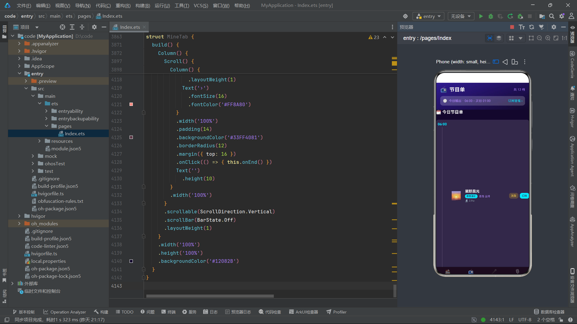
                  Text('')
                    .width('100%')
                }
                .width(4)
                .height(h.toString() + 'vp')
                .backgroundColor('#00E5FF')
                .borderRadius(2)
                .margin({ right: 5 })
              }, (h: number, hi: number) => 'sp' + hi)
            }
            .width('100%')
            .height(46)
            .justifyContent(FlexAlign.Center)
            .margin({ top: 10 })
正在直播卡片中实现了一个频谱模拟动画效果——十二根不同高度的柱子通过 ForEach 渲染。每根柱子是一个 Column,宽度 4vp,高度来自数组 [12, 28, 16, 36, 22, 44, 18, 30, 24, 40, 14, 26]。这些柱子使用电光青色,模拟音频频谱的视觉效果。justifyContent(FlexAlign.Center) 让柱子在行内居中排列。
            Row() {
              Text(this.playing ? '⏸️' : '▶️')
                .fontSize(26)
                .onClick(() => { this.onTogglePlay() })
              Text('音量 ' + this.vol + '%')
                .fontSize(11)
                .fontColor('#B388FF')
                .margin({ left: 12 })
              Text('')
                .layoutWeight(1)
              Text('👥 6.1 万人在听')
                .fontSize(11)
                .fontColor('#FFD54F')
              Row() {
                Text('连线')
                  .fontSize(11)
                  .fontColor('#12082B')
                  .padding({ left: 10, right: 10, top: 5, bottom: 5 })
              }
              .backgroundColor('#00E5FF')
              .borderRadius(10)
              .margin({ left: 10 })
              .onClick(() => { this.onCall() })
            }
            .width('100%')
            .margin({ top: 8 })
          }
          .width('100%')
          .padding(14)
          .backgroundColor('#33FFFFFF')
          .borderRadius(14)
          .margin({ top: 12 })
播放控制栏展示播放/暂停按钮(根据 playing 状态切换图标)、音量百分比、在线人数和连线按钮。播放按钮通过 this.onTogglePlay() 回调通知父组件切换播放状态。连线按钮通过 this.onCall() 回调打开连线弹窗。
          Row() {
            ForEach(getQuickRows(), (q: QuickIcon) => {
              Column() {
                Text(q.icon)
                  .fontSize(24)
                Text(q.name)
                  .fontSize(11)
                  .fontColor('#FFFFFF')
                  .margin({ top: 6 })
              }
              .layoutWeight(1)
              .padding({ top: 12, bottom: 12 })
              .backgroundColor('#33FFFFFF')
              .borderRadius(12)
              .margin({ right: 8 })
              .onClick(() => {
                if (q.id === 1) {
                  this.onSong(SONGS[0]);
                } else if (q.id === 2) {
                  this.onCall();
                } else if (q.id === 4) {
                  this.onEvent(FM_EVENTS[0]);
                } else if (q.id === 5) {
                  this.onRank(RANKINGS[0]);
                } else if (q.id === 6) {
                  this.onReport();
                }
              })
            }, (q: QuickIcon) => 'hq1' + q.id)
          }
          .width('100%')
          .margin({ top: 12 })
快捷宫格使用两行四列布局,每行四个图标。点击事件通过 q.id 判断用户点击了哪个快捷入口,然后调用对应的回调函数。例如 q.id === 1(点歌)调用 onSong 传入第一首歌曲,q.id === 8(反馈)调用 onInterrupt 打开紧急插播弹窗。这种通过 ID 分发的设计使得快捷入口的行为可配置、可扩展。
鸿蒙知识点 - Scroll:
Scroll组件是可滚动容器,内部子组件超出可视区域时可滚动查看。通过scrollable(ScrollDirection.Vertical)设置垂直滚动,scrollable(ScrollDirection.Horizontal)设置水平滚动。scrollBar(BarState.Off)隐藏滚动条。在本应用中,每个 Tab 页面的内容区都包裹在Scroll中,确保内容超出屏幕时可滚动浏览。
          Scroll() {
            Row() {
              ForEach(getTopPrograms(), (p: Program) => {
                Column() {
                  Text(p.icon)
                    .fontSize(40)
                  Text(p.name)
                    .fontSize(13)
                    .fontWeight(FontWeight.Bold)
                    .fontColor('#FFFFFF')
                    .margin({ top: 6 })
                  Text(p.time + ' · ' + p.anchor)
                    .fontSize(10)
                    .fontColor('#B388FF')
                    .margin({ top: 2 })
                  Text('👥 ' + formatNum(p.listeners))
                    .fontSize(10)
                    .fontColor('#00E5FF')
                    .margin({ top: 4 })
                }
                .width(120)
                .padding({ top: 14, bottom: 14 })
                .backgroundColor('#33FFFFFF')
                .borderRadius(12)
                .margin({ right: 10 })
                .onClick(() => { this.onProgram(p) })
              }, (p: Program) => 'hp' + p.id)
            }
          }
          .scrollable(ScrollDirection.Horizontal)
          .scrollBar(BarState.Off)
          .width('100%')
          .margin({ top: 10 })
热门节目区域使用水平 Scroll 容器实现横滑卡片列表。每张卡片宽度固定 120vp,通过 ForEach 渲染前五档节目。水平滚动隐藏滚动条(scrollBar(BarState.Off)),使界面更简洁。点击卡片通过 onProgram(p) 回调打开节目详情弹窗。
十六、子组件二至四:节目单、点歌台与主播星榜
@Component
struct ProgramTab {
  onProgram: (p: Program) => void = () => {};
  onSubscribe: (p: Program) => void = () => {};
  onReschedule: (p: Program) => void = () => {};

  build() {
    Column() {
      Column() {
        Row() {
          Text('📻')
            .fontSize(22)
          Text('节目单')
            .fontSize(20)
            .fontWeight(FontWeight.Bold)
            .fontColor('#FFFFFF')
            .margin({ left: 8 })
          Text('')
            .layoutWeight(1)
          Text('共 ' + PROGRAMS.length + ' 档')
            .fontSize(12)
            .fontColor('#B388FF')
        }
        .width('100%')
      }
      .width('100%')
      .padding({ left: 16, right: 16, top: 14, bottom: 16 })
      .backgroundColor('#311B92')
      .linearGradient({ colors: [['#311B92', 0], ['#12082B', 1]], angle: 160 })
      Scroll() {
        Column() {
          Column() {
            ForEach(PROGRAMS, (p: Program, pi: number) => {
              Row() {
                Column() {
                  Text(p.time)
                    .fontSize(13)
                    .fontWeight(FontWeight.Bold)
                    .fontColor('#00E5FF')
                  Text('')
                    .width(1)
                    .layoutWeight(1)
                    .backgroundColor('#33FFFFFF')
                    .margin({ top: 4 })
                }
                .width(48)
                Text(p.icon)
                  .fontSize(32)
                  .margin({ left: 10, right: 10 })
                Column() {
                  Text(p.name)
                    .fontSize(14)
                    .fontWeight(FontWeight.Bold)
                    .fontColor('#FFFFFF')
                  Row() {
                    Text(p.type)
                      .fontSize(9)
                      .fontColor('#12082B')
                      .padding({ left: 6, right: 6, top: 2, bottom: 2 })
                      .backgroundColor('#00E5FF')
                      .borderRadius(6)
                    Text(p.anchor + ' 主持')
                      .fontSize(10)
                      .fontColor('#B388FF')
                      .margin({ left: 6 })
                  }
                  .margin({ top: 4 })
                  Text('👥 ' + formatNum(p.listeners))
                    .fontSize(10)
                    .fontColor('#90A4AE')
                    .margin({ top: 4 })
                }
                .alignItems(HorizontalAlign.Start)
                .layoutWeight(1)
                .margin({ left: 4 })
节目单页面以时间轴形式展示所有节目。每档节目使用 Row 布局:左侧是时间列(48vp 宽,时间文字 + 垂直连接线),中间是节目图标,右侧是节目信息(名称 + 类型标签 + 主播 + 收听人数)。垂直连接线通过 Text('').width(1).layoutWeight(1) 实现——一个宽度 1vp 的空文本占满剩余高度,背景色为半透明白色,形成时间轴的竖线效果。
每档节目的背景色根据索引奇偶性交替:pi % 2 === 0 ? '#22FFFFFF' : '#33FFFFFF'。这种斑马纹设计提升了长列表的可读性,帮助用户区分相邻行。
@Component
struct SongTab {
  onSong: (s: Song) => void = () => {};
  onConfirm: (s: Song) => void = () => {};
  onBirthday: () => void = () => {};
  onLight: (a: Anchor) => void = () => {};

  build() {
    Column() {
      Column() {
        Row() {
          Text('🎤')
            .fontSize(22)
          Text('点歌台')
            .fontSize(20)
            .fontWeight(FontWeight.Bold)
            .fontColor('#FFFFFF')
            .margin({ left: 8 })
          Text('')
            .layoutWeight(1)
          Text('今日点播 ' + 3240 + ' 首')
            .fontSize(12)
            .fontColor('#FFD54F')
        }
        .width('100%')
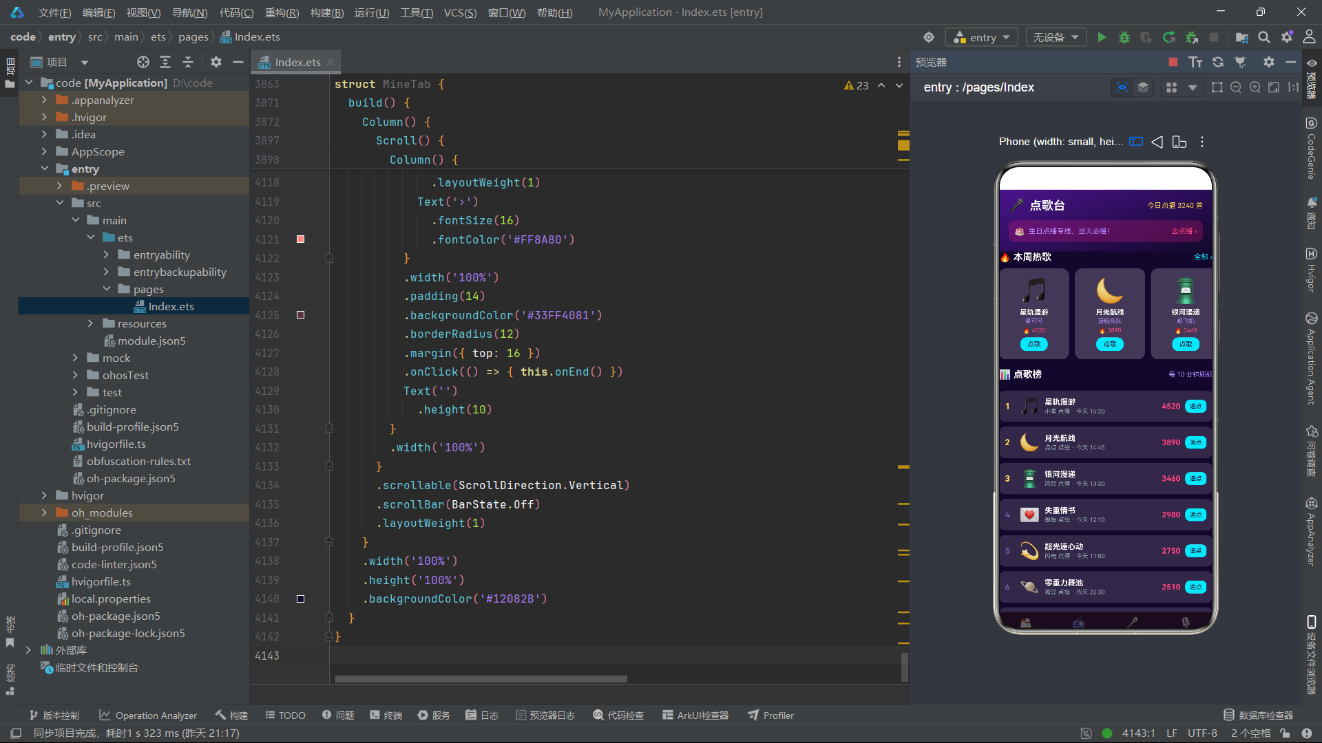
点歌台页面头部使用紫色渐变(#4A148C 到 #12082B),与节目单的深蓝色头部区分。头部还包含一个生日点播专线入口卡片,使用半透明粉色背景 #33FF4081。页面内容包含热歌横滑列表和点歌榜单两个主要区域。
          Column() {
            ForEach(PLAY_ITEMS, (p: PlayItem, pi: number) => {
              Row() {
                Text((pi + 1).toString())
                  .fontSize(14)
                  .fontWeight(FontWeight.Bold)
                  .fontColor(pi < 3 ? '#FFD54F' : '#6A5C9E')
                  .width(24)
                Text(p.icon)
                  .fontSize(28)
                Column() {
                  Text(p.songName)
                    .fontSize(13)
                    .fontWeight(FontWeight.Bold)
                    .fontColor('#FFFFFF')
                  Text(p.listener + ' 点播 · ' + p.time)
                    .fontSize(10)
                    .fontColor('#90A4AE')
                    .margin({ top: 2 })
                }
                .alignItems(HorizontalAlign.Start)
                .layoutWeight(1)
                .margin({ left: 8 })
                Text(formatNum(p.votes))
                  .fontSize(13)
                  .fontWeight(FontWeight.Bold)
                  .fontColor('#FF4081')
                Row() {
                  Text('追点')
                    .fontSize(10)
                    .fontColor('#12082B')
                    .padding({ left: 8, right: 8, top: 5, bottom: 5 })
                }
                .backgroundColor('#00E5FF')
                .borderRadius(8)
                .margin({ left: 8 })
                .onClick(() => { this.onSong(SONGS[pi]) })
              }
              .width('100%')
              .padding(10)
              .backgroundColor('#22FFFFFF')
              .borderRadius(10)
              .margin({ top: 8 })
            }, (p: PlayItem, pi: number) => 'ply' + p.id + pi)
          }
点歌榜单列表中,前三名排名数字使用金黄色 #FFD54F,其余使用暗紫色 #6A5C9E。每条记录展示排名、歌曲图标、歌曲名+点播者+时间、投票数和"追点"按钮。点击追点按钮调用 onSong(SONGS[pi]) 打开点歌弹窗。
@Component
struct AnchorTab {
  onAnchor: (a: Anchor) => void = () => {};
  onLight: (a: Anchor) => void = () => {};

  build() {
    Column() {
      Column() {
        Row() {
          Text('🎙️')
            .fontSize(22)
          Text('主播星榜')
            .fontSize(20)
            .fontWeight(FontWeight.Bold)
            .fontColor('#FFFFFF')
            .margin({ left: 8 })
          Text('')
            .layoutWeight(1)
          Text('共 ' + ANCHORS.length + ' 位')
            .fontSize(12)
            .fontColor('#B388FF')
        }
        .width('100%')
        Row() {
          ForEach(['全部', '直播中', '音乐类', '情感类'], (t: string, ti: number) => {
            Text(t)
              .fontSize(12)
              .fontColor(ti === 0 ? '#12082B' : '#B388FF')
              .padding({ left: 14, right: 14, top: 6, bottom: 6 })
              .backgroundColor(ti === 0 ? '#00E5FF' : '#33FFFFFF')
              .borderRadius(14)
              .margin({ right: 8 })
          }, (t: string, ti: number) => 'ac' + ti)
        }
        .width('100%')
        .margin({ top: 12 })
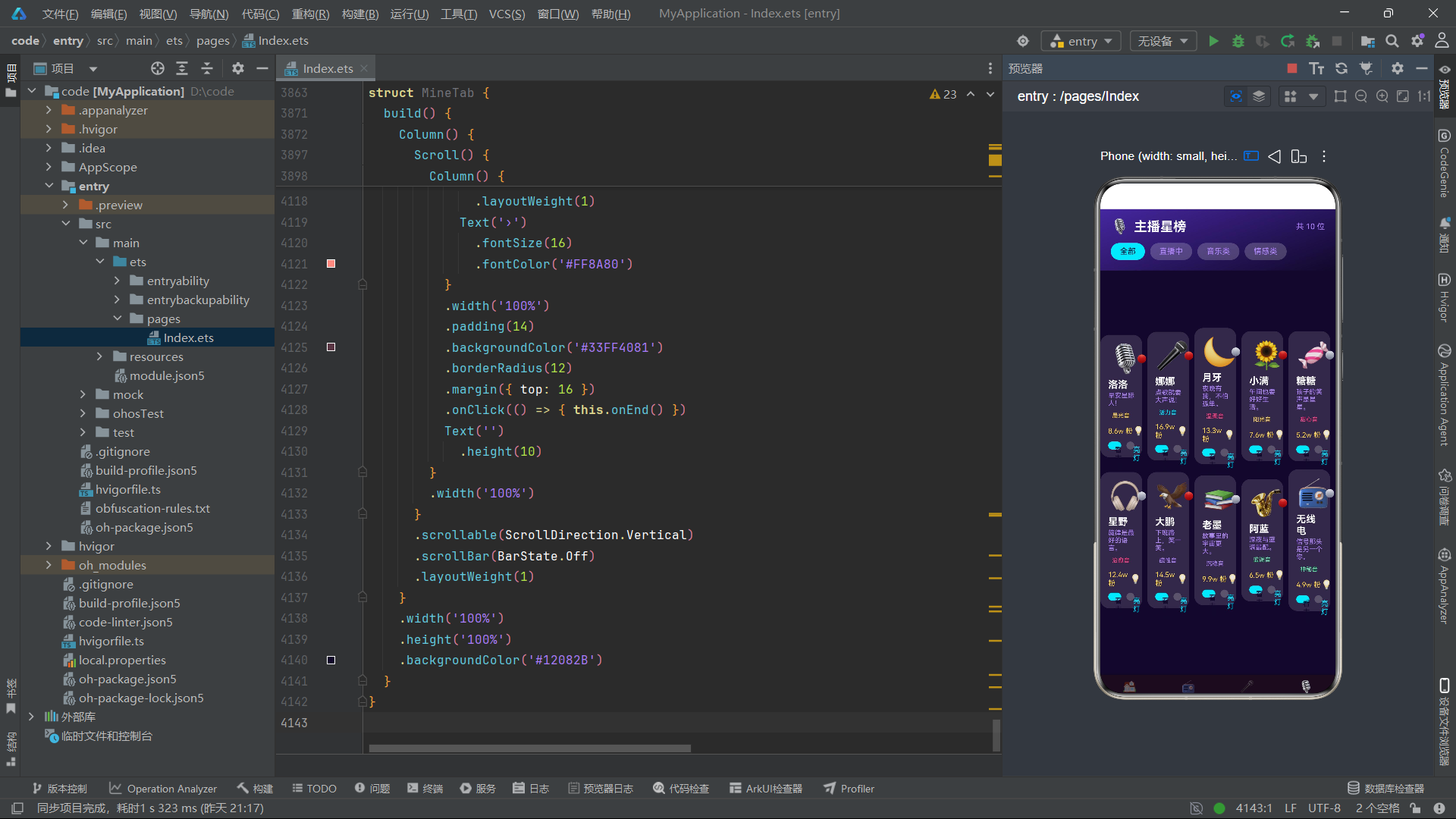
主播星榜页面头部包含四个分类筛选 Chip(全部/直播中/音乐类/情感类),当前选中"全部"(索引 0)。内容区使用双列布局展示主播卡片,每张卡片包含主播图标、在线状态标记、名称、口号、声线标签、粉丝数和两个操作按钮(看主页/亮灯)。通过 getAnchorRows() 和 getAnchorRows2() 分别获取左右列数据。
十七、子组件五至七:听友社区、排行榜与个人中心
@Component
struct AudienceTab {
  onCall: () => void = () => {};
  onBadge: (b: Badge) => void = () => {};

  build() {
    Column() {
      Column() {
        Row() {
          Text('🌟')
            .fontSize(22)
          Text('听友社区')
            .fontSize(20)
            .fontWeight(FontWeight.Bold)
            .fontColor('#FFFFFF')
            .margin({ left: 8 })
          Text('')
            .layoutWeight(1)
          Row() {
            Text('连线')
              .fontSize(12)
              .fontColor('#12082B')
              .padding({ left: 12, right: 12, top: 6, bottom: 6 })
          }
          .backgroundColor('#00E5FF')
          .borderRadius(12)
          .onClick(() => { this.onCall() })
        }
        .width('100%')
听友社区页面头部使用青色渐变(#006064 到 #12082B),右侧有连线按钮。内容区分为听众墙双列卡片和徽章展示两部分。听众卡片展示头像、在线状态、名称、城市+等级、收听时长和留言。徽章区使用双列网格展示已解锁和未解锁的徽章。
@Component
struct RankTab {
  onRank: (r: RankItem) => void = () => {};
  onReport: () => void = () => {};

  build() {
    Column() {
      Scroll() {
        Column() {
          Row() {
            ForEach(RANKINGS, (r: RankItem, ri: number) => {
              Column() {
                Text(getBarHeight(r.score, 10000).replace('vp', ''))
                  .fontSize(9)
                  .fontColor('#00E5FF')
                Column() {
                  Text('')
                    .width('100%')
                }
                .width(20)
                .height(getBarHeight(r.score, 100100))
                .backgroundColor(ri < 3 ? '#FFD54F' : '#00E5FF')
                .borderRadius({ topLeft: 4, topRight: 4 })
                .margin({ top: 2 })
                Text(r.name.length > 2 ? r.name.substring(0, 2) : r.name)
                  .fontSize(9)
                  .fontColor('#FFFFFF')
                  .margin({ top: 4 })
              }
              .layoutWeight(1)
              .justifyContent(FlexAlign.End)
            }, (r: RankItem, ri: number) => 'bar' + ri)
          }
          .width('100%')
          .height(150)
          .padding(12)
          .backgroundColor('#22FFFFFF')
          .borderRadius(12)
          .margin({ top: 12 })
排行榜页面的特色是柱状图和领奖台。柱状图通过 ForEach 渲染所有主播的分数柱子,前三名使用金黄色柱子,其余使用电光青。柱子高度通过 getBarHeight(r.score, 10000) 计算(满分 10000,映射到最大 90vp)。justifyContent(FlexAlign.End) 让柱子从底部对齐。
          Row() {
            Column() {
              Text('🥈')
                .fontSize(34)
              Text(RANKINGS[1].name)
                .fontSize(12)
                .fontWeight(FontWeight.Bold)
                .fontColor('#FFFFFF')
                .margin({ top: 4 })
              Column() {
                Text('')
                  .width('100%')
              }
              .width(70)
              .height(56)
              .backgroundColor('#90A4AE')
              .borderRadius({ topLeft: 8, topRight: 8 })
              .margin({ top: 6 })
              .onClick(() => { this.onRank(RANKINGS[1]) })
            }
            .layoutWeight(1)
            Column() {
              Text('🥇')
                .fontSize(40)
              Text(RANKINGS[0].name)
                .fontSize(13)
                .fontWeight(FontWeight.Bold)
                .fontColor('#FFD54F')
                .margin({ top: 4 })
              Column() {
                Text('')
                  .width('100%')
              }
              .width(76)
              .height(76)
              .backgroundColor('#FFD54F')
              .borderRadius({ topLeft: 8, topRight: 8 })
              .margin({ top: 6 })
              .onClick(() => { this.onRank(RANKINGS[0]) })
            }
            .layoutWeight(1)
            Column() {
              Text('🥉')
                .fontSize(34)
              Text(RANKINGS[2].name)
                .fontSize(12)
                .fontWeight(FontWeight.Bold)
                .fontColor('#FFFFFF')
                .margin({ top: 4 })
              Column() {
                Text('')
                  .width('100%')
              }
              .width(70)
              .height(44)
              .backgroundColor('#FF8A65')
              .borderRadius({ topLeft: 8, topRight: 8 })
              .margin({ top: 6 })
              .onClick(() => { this.onRank(RANKINGS[2]) })
            }
            .layoutWeight(1)
          }
          .width('100%')
          .alignItems(FlexAlign.End)
          .margin({ top: 14 })
领奖台使用三列 Row 实现,中间第一名最高(76vp)、左侧第二名次高(56vp)、右侧第三名最矮(44vp)。三个领奖台底座使用不同颜色:银灰色(第二名)、金黄色(第一名)、橙红色(第三名)。alignItems(FlexAlign.End) 让三个底座底部对齐,高度差形成领奖台的阶梯效果。
@Component
struct MineTab {
  @Prop listenHours: number;
  @Prop badgeCount: number;
  onSettings: () => void = () => {};
  onBadge: (b: Badge) => void = () => {};
  onAnchor: (a: Anchor) => void = () => {};
  onEnd: () => void = () => {};

  build() {
    Column() {
      Column() {
        Row() {
          Text('👤')
            .fontSize(22)
          Text('我的电台')
            .fontSize(20)
            .fontWeight(FontWeight.Bold)
            .fontColor('#FFFFFF')
            .margin({ left: 8 })
          Text('')
            .layoutWeight(1)
          Row() {
            Text('⚙️')
              .fontSize(16)
          }
          .onClick(() => { this.onSettings() })
        }
        .width('100%')
      }
      .width('100%')
      .padding({ left: 16, right: 16, top: 14, bottom: 16 })
      .backgroundColor('#311B92')
      .linearGradient({ colors: [['#311B92', 0], ['#12082B', 1]], angle: 160 })
个人中心页面头部右上角有设置入口,点击打开设置弹窗。内容区包含主播证(票根样式,展示用户 ID、累计收听时长、电波币余额)、统计数据栏(点播歌曲数、连线次数、徽章数、祝福送出数)、常听节目横滑列表、我的徽章双列网格和结束直播入口。
主播证卡片使用了与点歌确认弹窗相同的虚线 Divider 设计,通过 dashArray([6, 6]) 创建撕开线效果。统计栏使用四个等宽 Column 通过 layoutWeight(1) 平分宽度,每项展示大号数字和小号标签。结束直播入口使用半透明红色背景 #33FF4081,点击打开结束确认弹窗。
十八、技术要点总结与对比
通过以上对整个应用的逐段剖析,我们可以提炼出鸿蒙 ArkTS 声明式 UI 开发的核心设计模式和技术要点。以下表格对应用中使用的关键技术进行了系统对比:
| 技术点 | 作用 | 本应用中的使用场景 | 核心要点 |
|---|---|---|---|
| @Entry | 标记入口组件 | Index 组件 | 框架自动渲染入口,每个页面仅一个 |
| @Component | 声明自定义组件 | Index + 七个子组件 | 可复用组件单元,拥有独立生命周期 |
| @State | 组件内状态 | tabIndex、十六个弹窗开关、表单字段 | 赋值触发重新渲染,仅影响当前组件 |
| @Prop | 父到子单向数据 | playing、vol、listenHours、badgeCount | 父数据变化自动同步,子不可修改 |
| @Builder | 可复用 UI 片段 | 十六个弹窗 + 底栏项 + 遮罩 + Toast | 内联到调用处,直接访问 this |
| Stack | 层叠布局 | 弹窗层叠在主内容之上 | 后声明覆盖先声明 |
| Column | 垂直线性布局 | 所有页面的主容器结构 | 子组件从上到下排列 |
| Row | 水平线性布局 | 标题栏、数据行、按钮组 | 子组件从左到右排列 |
| ForEach | 列表渲染 | 所有数据列表、Chip 组、柱状图 | 需提供键值生成函数 |
| Scroll | 滚动容器 | 每个页面的内容区 | 支持垂直和水平滚动 |
| FlexAlign | 对齐方式 | 弹窗居中/贴底、柱状图底部对齐 | Start/Center/End/SpaceBetween |
| linearGradient | 背景渐变 | 所有弹窗头部、页面头部 | 支持 colors + angle 参数 |
| transition | 进出动画 | 所有弹窗的弹出和消失 | translate/scale/opacity |
| Toggle | 开关组件 | 设置弹窗的开关项 | Switch/Checkbox 两种类型 |
| Progress | 进度条 | 活动报名进度、徽章解锁进度 | value/total 自动计算比例 |
| Divider | 分割线 | 票根卡片的虚线撕开线 | dashArray 创建虚线效果 |
| layoutWeight | 弹性宽度 | 占位符、平分布局 | 1 表示占满剩余空间 |
| 条件渲染 (if) | 动态 UI | Tab 切换、弹窗显示/隐藏、状态切换 | 根据 @State 值决定渲染内容 |
| 回调函数 | 子到父通信 | 所有子组件的事件上报 | 父组件定义行为,子组件触发 |
| 三元表达式 | 动态样式 | 选中/未选中态、在线/离线态 | 根据条件切换颜色、文字、图标 |
| Emoji 图标 | 轻量图标 | 所有数据项的 icon 字段 | 无需图片资源,Text 直接渲染 |
十九、总结
本案例应用 NEBULA FM 深空电台是一个功能完整的鸿蒙 ArkTS 声明式 UI 应用,涵盖了从数据建模到复杂交互的完整开发链路。应用的核心架构采用"单一入口组件集中管理状态 + 多子组件分布式渲染 + 回调函数事件上报"的模式。入口组件 Index 持有全部三十八个状态变量(包括 Tab 索引、十六个弹窗开关、十个选中对象、九个表单字段),是整个应用的状态中枢。
在数据层面,应用定义了十个接口和八组静态数据源,覆盖了节目、歌曲、主播、听众、点播队列、活动事件、统计数据、排行榜、徽章和快捷入口等业务实体。工具函数层提供了数据分拣(双列拆分、取前 N 条)、数值格式化(万单位转换、百分比计算、柱状图高度映射)和语义到视觉的映射(声线颜色、趋势颜色)三类辅助能力。
在 UI 层面,十六种弹窗各具特色:底部抽屉式(点歌、订阅、改期、设置、收听报告)、居中卡片式(票根确认、节目详情、主播档案、连线、活动报名、排行奖励、徽章详情、生日点播、灯牌投票、结束直播)、警示式(紧急插播、结束直播)。每种弹窗通过 @Builder 方法声明,配合 modalOverlay 遮罩层和条件渲染实现显示控制,进出动画通过 TransitionEffect 的 translate/scale/opacity 三种效果实现。
七大子组件分别承载不同的业务页面:HomeTab 首页包含直播卡片、频谱模拟、快捷宫格、横滑节目列表、主播推荐和活动预告;ProgramTab 以时间轴形式展示节目单;SongTab 包含热歌横滑和点歌榜单;AnchorTab 使用双列卡片展示主播星榜;AudienceTab 展示听友墙和徽章墙;RankTab 包含柱状图、领奖台和完整榜单;MineTab 展示个人票根、统计数据和我的徽章。
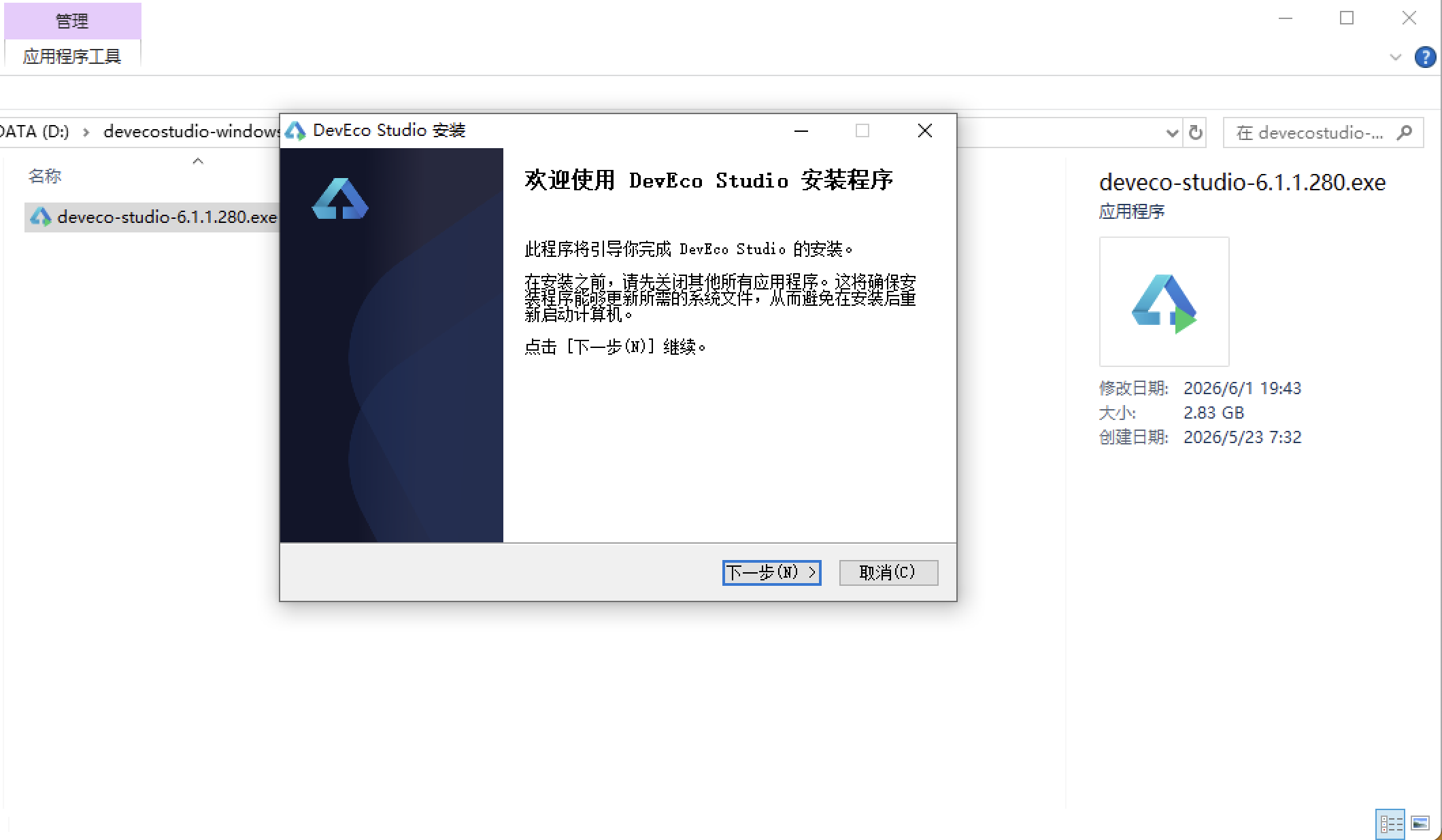
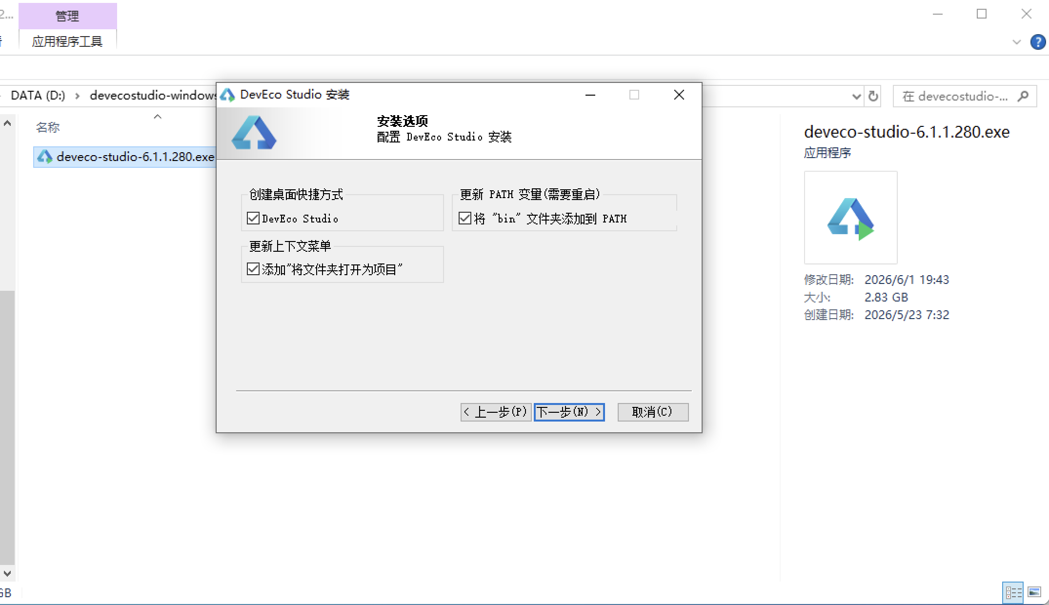
安装DevEco Studio程序
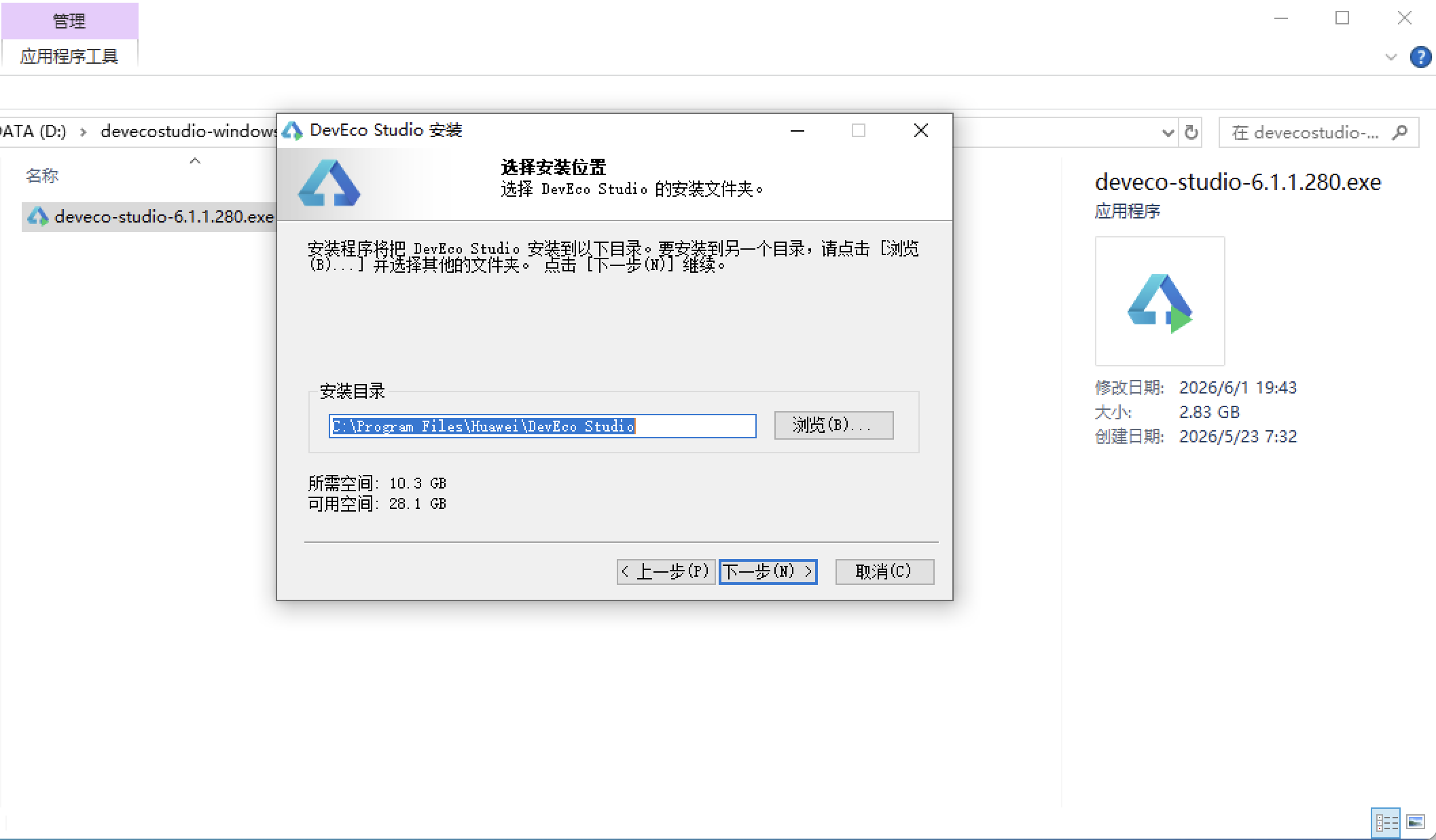
选择目标安装目录:
设置环境变量,但是需要重启一下:
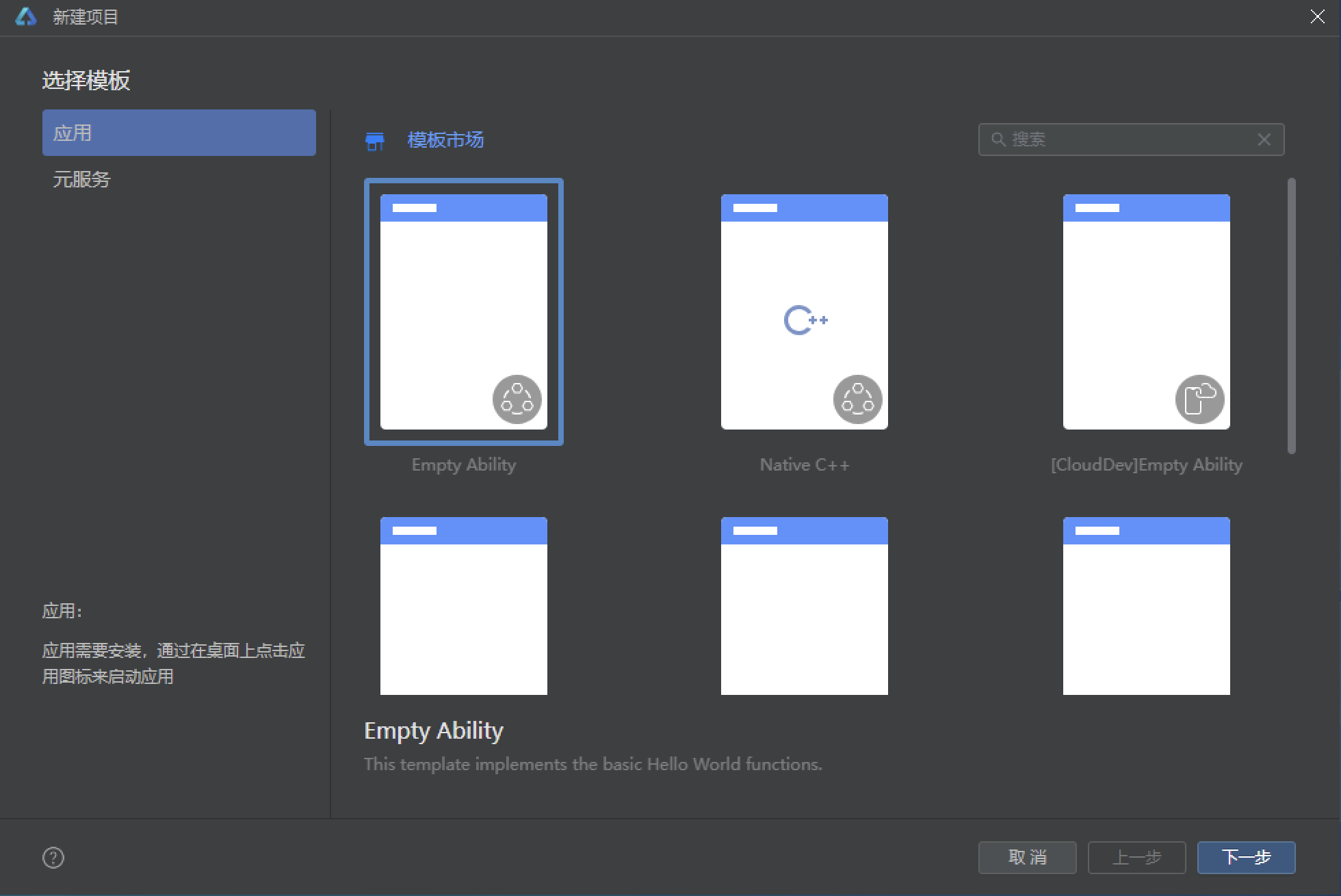
新建一个空白模板:
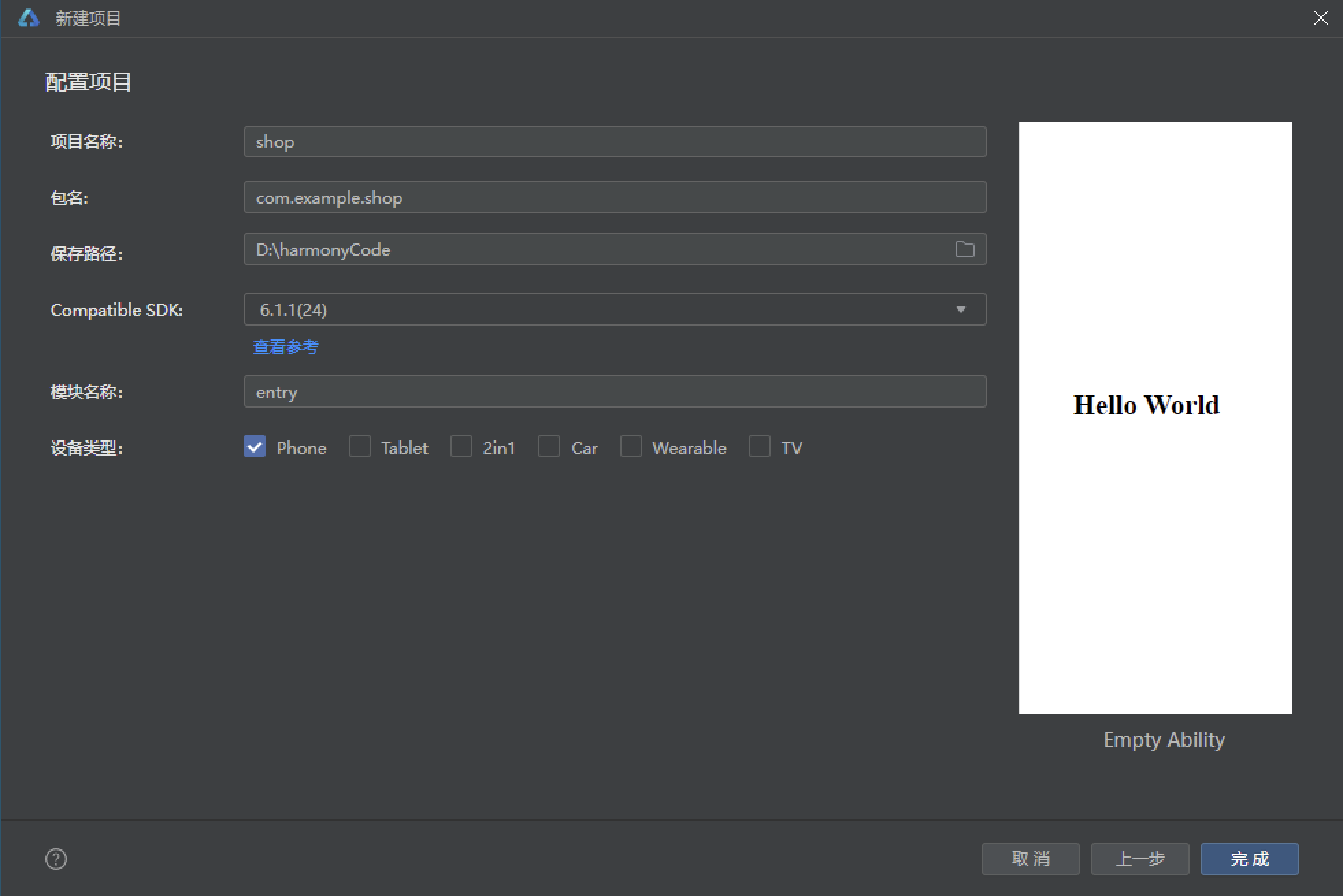
设置API为24的模板项目:
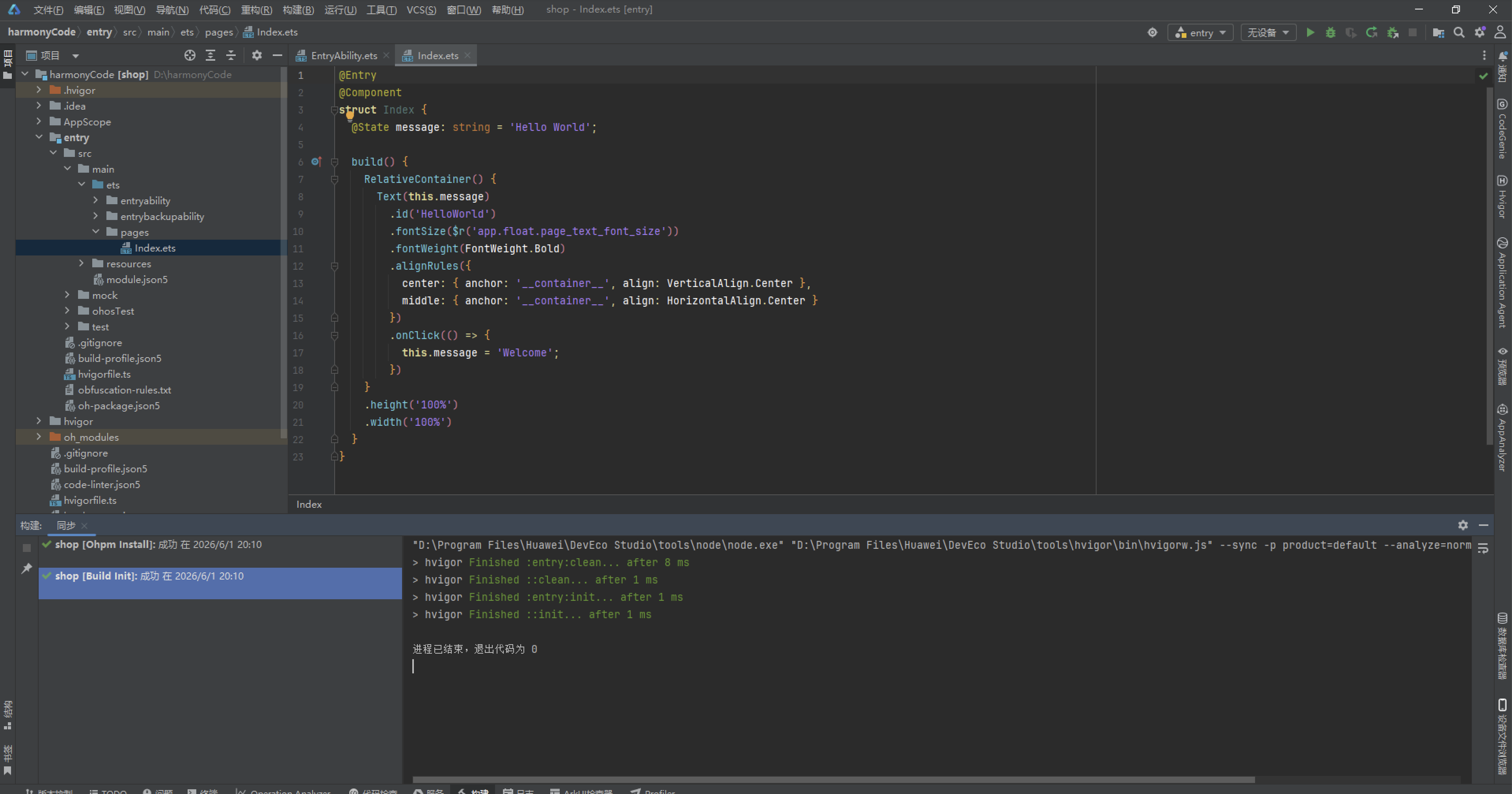
初始化项目,自动下载相关依赖:
完整代码:
// 主题:深空紫黑 #12082B -> #4527A0 + 电光青 #00E5FF + 星粉 #FF4081
// 7 Tab 两排底栏:首页/节目/点歌/主播 + 听众/排行/我的
interface Program {
  id: number;
  name: string;
  icon: string;
  time: string;
  anchor: string;
  type: string;
  listeners: number;
  duration: number;
  desc: string;
}

interface Song {
  id: number;
  name: string;
  icon: string;
  singer: string;
  requests: number;
  year: string;
  style: string;
  hot: number;
}

interface Anchor {
  id: number;
  name: string;
  icon: string;
  fans: number;
  voice: string;
  slogan: string;
  programs: number;
  online: boolean;
}

interface Audience {
  id: number;
  name: string;
  icon: string;
  level: number;
  hours: number;
  city: string;
  online: boolean;
  msg: string;
}

interface PlayItem {
  id: number;
  songName: string;
  icon: string;
  listener: string;
  votes: number;
  wish: string;
  time: string;
}

interface FmEvent {
  id: number;
  name: string;
  icon: string;
  date: string;
  prize: string;
  signUp: number;
  limit: number;
  desc: string;
}

interface RadioStat {
  id: number;
  name: string;
  icon: string;
  value: string;
  trend: number;
  color: string;
}

interface RankItem {
  id: number;
  name: string;
  icon: string;
  score: number;
  level: string;
  delta: number;
}

interface Badge1 {
  id: number;
  name: string;
  icon: string;
  locked: boolean;
  desc: string;
  date: string;
}

interface QuickIcon {
  id: number;
  name: string;
  icon: string;
  color: string;
}

const PROGRAMS: Program[] = [
  { id: 1, name: '星际晨光', icon: '🌅', time: '06:00', anchor: '洛洛', type: '新闻资讯', listeners: 28600, duration: 60, desc: '用最新星际资讯唤醒每一个清晨。' },
  { id: 2, name: '银河音乐盒', icon: '🎶', time: '08:00', anchor: '星野', type: '音乐', listeners: 45200, duration: 120, desc: '精选银河系最动听的旋律。' },
  { id: 3, name: '午间咖啡馆', icon: '☕', time: '12:00', anchor: '小满', type: '生活', listeners: 31800, duration: 90, desc: '聊聊生活里的温暖小事。' },
  { id: 4, name: '深空故事会', icon: '📖', time: '14:30', anchor: '老墨', type: '故事', listeners: 27400, duration: 60, desc: '深空探险家的真实见闻录。' },
  { id: 5, name: '点歌台', icon: '🎤', time: '16:00', anchor: '娜娜', type: '互动', listeners: 53800, duration: 120, desc: '把你的祝福通过电波送出。' },
  { id: 6, name: '下班电台', icon: '🚀', time: '18:30', anchor: '大鹏', type: '脱口秀', listeners: 61200, duration: 90, desc: '下班路上一起开怀大笑。' },
  { id: 7, name: '星海夜话', icon: '🌌', time: '21:00', anchor: '月牙', type: '情感', listeners: 49800, duration: 120, desc: '深夜陪伴你倾诉心事。' },
  { id: 8, name: '午夜蓝调', icon: '🎷', time: '23:30', anchor: '阿蓝', type: '音乐', listeners: 22600, duration: 90, desc: '爵士与蓝调的深夜协奏。' },
  { id: 9, name: '极光早报', icon: '✨', time: '07:30', anchor: '洛洛', type: '新闻资讯', listeners: 19700, duration: 30, desc: '三分钟听完今日星闻。' },
  { id: 10, name: '童声星球', icon: '🧸', time: '10:00', anchor: '糖糖', type: '亲子', listeners: 16800, duration: 60, desc: '孩子们的故事星球。' },
  { id: 11, name: '科幻剧场', icon: '👽', time: '20:00', anchor: '老墨', type: '广播剧', listeners: 35200, duration: 60, desc: '每周一部的星际科幻广播剧。' },
  { id: 12, name: '星空访谈', icon: '🎙️', time: '15:30', anchor: '大鹏', type: '访谈', listeners: 24300, duration: 60, desc: '对话星际各领域有趣的人。' }
];

const SONGS: Song[] = [
  { id: 1, name: '星轨漫游', icon: '🎵', singer: '洛可可', requests: 4520, year: '2026', style: '电子', hot: 98 },
  { id: 2, name: '月光航线', icon: '🌙', singer: '蓝鲸乐队', requests: 3890, year: '2025', style: '流行', hot: 92 },
  { id: 3, name: '银河漫递', icon: '📮', singer: '纸飞机', requests: 3460, year: '2026', style: '民谣', hot: 89 },
  { id: 4, name: '失重情书', icon: '💌', singer: '星野', requests: 2980, year: '2024', style: '情歌', hot: 85 },
  { id: 5, name: '超光速心动', icon: '💫', singer: '波普猫', requests: 2750, year: '2026', style: '电音', hot: 83 },
  { id: 6, name: '零重力舞池', icon: '🪐', singer: '霓虹灯', requests: 2510, year: '2025', style: '舞曲', hot: 80 },
  { id: 7, name: '星际慢递', icon: '🚚', singer: '慢半拍', requests: 2240, year: '2023', style: '民谣', hot: 76 },
  { id: 8, name: '黑洞引力', icon: '🕳️', singer: '深蓝', requests: 1980, year: '2026', style: '说唱', hot: 74 },
  { id: 9, name: '流星许愿', icon: '🌠', singer: '小满', requests: 1860, year: '2025', style: '治愈', hot: 72 },
  { id: 10, name: '月背信号', icon: '📡', singer: '无线电', requests: 1650, year: '2024', style: '后摇', hot: 68 },
  { id: 11, name: '星尘低语', icon: '🫧', singer: '晚风', requests: 1420, year: '2026', style: '轻音乐', hot: 65 },
  { id: 12, name: '轨道错位', icon: '🔀', singer: '双胞胎', requests: 1280, year: '2025', style: '摇滚', hot: 62 },
  { id: 13, name: '极光合唱', icon: '🌈', singer: '北极光合唱团', requests: 1150, year: '2023', style: '合唱', hot: 60 },
  { id: 14, name: '重返地球', icon: '🌍', singer: '归航', requests: 980, year: '2022', style: '抒情', hot: 58 }
];

const ANCHORS: Anchor[] = [
  { id: 1, name: '洛洛', icon: '🎙️', fans: 85600, voice: '晨光音', slogan: '早安星际人!', programs: 2, online: true },
  { id: 2, name: '星野', icon: '🎧', fans: 124300, voice: '治愈音', slogan: '旋律是最好的语言。', programs: 1, online: false },
  { id: 3, name: '娜娜', icon: '🎤', fans: 168900, voice: '活力音', slogan: '点歌就要大声说!', programs: 1, online: true },
  { id: 4, name: '大鹏', icon: '🦅', fans: 145200, voice: '磁性音', slogan: '下班路上,笑一笑。', programs: 2, online: true },
  { id: 5, name: '月牙', icon: '🌙', fans: 132800, voice: '温柔音', slogan: '夜晚有我,不怕孤单。', programs: 1, online: false },
  { id: 6, name: '老墨', icon: '📚', fans: 98700, voice: '沉稳音', slogan: '故事里的宇宙更大。', programs: 2, online: false },
  { id: 7, name: '小满', icon: '🌻', fans: 76300, voice: '阳光音', slogan: '午间也要好好生活。', programs: 1, online: true },
  { id: 8, name: '阿蓝', icon: '🎷', fans: 65400, voice: '蓝调音', slogan: '深夜与蓝调最配。', programs: 1, online: true },
  { id: 9, name: '糖糖', icon: '🍬', fans: 52100, voice: '甜心音', slogan: '孩子的笑声是星星。', programs: 1, online: false },
  { id: 10, name: '无线电', icon: '📻', fans: 48700, voice: '神秘音', slogan: '信号那头是另一个你。', programs: 1, online: false }
];

const AUDIENCE: Audience[] = [
  { id: 1, name: '小星', icon: '🌟', level: 12, hours: 168, city: '地球', online: true, msg: '每天下班都听,已经成为习惯啦!' },
  { id: 2, name: '阿航', icon: '🛸', level: 8, hours: 96, city: '火星基地', online: true, msg: '在火星听地球的电台,好神奇。' },
  { id: 3, name: '点点', icon: '🔭', level: 15, hours: 210, city: '月球站', online: false, msg: '点歌台帮我送出了祝福,太棒了。' },
  { id: 4, name: '风铃', icon: '🎐', level: 6, hours: 72, city: '木星轨道', online: true, msg: '午夜蓝调是失眠救星。' },
  { id: 5, name: '墨墨', icon: '🖋️', level: 10, hours: 132, city: '地球', online: false, msg: '深空故事会每期必听。' },
  { id: 6, name: '糖豆', icon: '🍡', level: 4, hours: 45, city: '金星', online: true, msg: '童声星球陪孩子入睡。' },
  { id: 7, name: '老K', icon: '🎮', level: 9, hours: 108, city: '土星环', online: true, msg: '下班电台笑点太密了。' },
  { id: 8, name: '云朵', icon: '☁️', level: 7, hours: 84, city: '地球', online: false, msg: '星海夜话陪我度过很多夜晚。' },
  { id: 9, name: '闪电', icon: '⚡', level: 5, hours: 60, city: '海王星', online: true, msg: '点歌台永远的神!' },
  { id: 10, name: '月亮', icon: '🌕', level: 11, hours: 156, city: '月球站', online: true, msg: '阿蓝的蓝调太治愈了。' }
];

const PLAY_ITEMS: PlayItem[] = [
  { id: 1, songName: '星轨漫游', icon: '🎵', listener: '小星', votes: 4520, wish: '送给正在加班的自己,辛苦了!', time: '今天 15:20' },
  { id: 2, songName: '月光航线', icon: '🌙', listener: '点点', votes: 3890, wish: '祝远在月球站的好友生日快乐!', time: '今天 14:45' },
  { id: 3, songName: '银河漫递', icon: '📮', listener: '风铃', votes: 3460, wish: '把这首歌寄给三年前的夏天。', time: '今天 13:30' },
  { id: 4, songName: '失重情书', icon: '💌', listener: '墨墨', votes: 2980, wish: '写给暗恋的同事,不敢署名。', time: '今天 12:10' },
  { id: 5, songName: '超光速心动', icon: '💫', listener: '闪电', votes: 2750, wish: '求婚现场就用这首歌!', time: '今天 11:00' },
  { id: 6, songName: '零重力舞池', icon: '🪐', listener: '糖豆', votes: 2510, wish: '周末舞会安排上!', time: '昨天 22:30' },
  { id: 7, songName: '星际慢递', icon: '🚚', listener: '云朵', votes: 2240, wish: '慢一点,再慢一点。', time: '昨天 20:15' },
  { id: 8, songName: '黑洞引力', icon: '🕳️', listener: '老K', votes: 1980, wish: '给熬夜写代码的自己打气。', time: '昨天 18:40' },
  { id: 9, songName: '流星许愿', icon: '🌠', listener: '月亮', votes: 1860, wish: '愿所有听友都梦想成真。', time: '昨天 16:05' },
  { id: 10, songName: '月背信号', icon: '📡', listener: '阿航', votes: 1650, wish: '火星的信号,地球的你收到了吗?', time: '昨天 14:20' }
];

const FM_EVENTS: FmEvent[] = [
  { id: 1, name: '主播招募计划', icon: '🎙️', date: '9 月 1 日', prize: '签约奖金 ¥5000', signUp: 128, limit: 50, desc: '开放 50 个主播名额,用声音出道。' },
  { id: 2, name: '电波情书大赛', icon: '💌', date: '9 月 10 日', prize: '星际机票 2 张', signUp: 356, limit: 500, desc: '用文字写一封给宇宙的情书。' },
  { id: 3, name: '点歌王挑战', icon: '🎤', date: '9 月 15 日', prize: '定制耳机', signUp: 521, limit: 1000, desc: '30 秒清唱挑战,争夺点歌王。' },
  { id: 4, name: '深空声优大赛', icon: '🗣️', date: '9 月 20 日', prize: '配音工作机会', signUp: 203, limit: 200, desc: '为广播剧角色配音,导师团评选。' },
  { id: 5, name: '失眠互助夜', icon: '🌙', date: '9 月 24 日', prize: '助眠礼盒', signUp: 187, limit: 300, desc: '深夜电台开放连线,一起聊聊失眠。' },
  { id: 6, name: '跨星球直播', icon: '📡', date: '10 月 1 日', prize: '星际徽章限定版', signUp: 642, limit: 1000, desc: '五大星球主播联合跨年直播。' },
  { id: 7, name: '老歌金曲夜', icon: '🎷', date: '10 月 8 日', prize: '黑胶唱片', signUp: 98, limit: 150, desc: '复古金曲大放送,回到黄金年代。' },
  { id: 8, name: '听众感恩日', icon: '🎁', date: '10 月 15 日', prize: '周边大礼包', signUp: 780, limit: 2000, desc: '全年听友回馈,好礼送不停。' }
];

const RADIO_STATS: RadioStat[] = [
  { id: 1, name: '本月收听', icon: '📻', value: '128.6 万', trend: 12, color: '#00E5FF' },
  { id: 2, name: '点歌次数', icon: '🎤', value: '8.2 万', trend: 8, color: '#FF4081' },
  { id: 3, name: '在线听友', icon: '🌟', value: '3.1 万', trend: 5, color: '#FFD54F' },
  { id: 4, name: '互动留言', icon: '💬', value: '2.4 万', trend: -3, color: '#B388FF' },
  { id: 5, name: '新增粉丝', icon: '➕', value: '1.8 万', trend: 15, color: '#69F0AE' },
  { id: 6, name: '节目数', icon: '📅', value: '24 档', trend: 2, color: '#FF8A80' },
  { id: 7, name: '连线时长', icon: '⏱️', value: '96 小时', trend: 6, color: '#80D8FF' },
  { id: 8, name: '听友满意度', icon: '😊', value: '98.2%', trend: 1, color: '#FFFF8D' }
];

const RANKINGS: RankItem[] = [
  { id: 1, name: '洛可可', icon: '🎵', score: 9820, level: '星钻主播', delta: 0 },
  { id: 2, name: '星野', icon: '🎧', score: 8760, level: '黄金主播', delta: 1 },
  { id: 3, name: '娜娜', icon: '🎤', score: 8210, level: '黄金主播', delta: -1 },
  { id: 4, name: '大鹏', icon: '🦅', score: 7650, level: '白银主播', delta: 2 },
  { id: 5, name: '月牙', icon: '🌙', score: 6980, level: '白银主播', delta: 0 },
  { id: 6, name: '老墨', icon: '📚', score: 6340, level: '白银主播', delta: -2 },
  { id: 7, name: '小满', icon: '🌻', score: 5820, level: '青铜主播', delta: 1 },
  { id: 8, name: '阿蓝', icon: '🎷', score: 5260, level: '青铜主播', delta: 0 },
  { id: 9, name: '糖糖', icon: '🍬', score: 4780, level: '青铜主播', delta: -1 },
  { id: 10, name: '无线电', icon: '📻', score: 4230, level: '新人主播', delta: 3 }
];

const Badge1S: Badge1[] = [
  { id: 1, name: '电波新星', icon: '✨', locked: false, desc: '首次点歌成功', date: '2026.08.01' },
  { id: 2, name: '百首点歌', icon: '🎶', locked: false, desc: '累计点歌 100 首', date: '2026.08.12' },
  { id: 3, name: '夜猫子', icon: '🦉', locked: false, desc: '收听午夜节目 30 天', date: '2026.08.20' },
  { id: 4, name: '连线达人', icon: '📞', locked: false, desc: '成功连线 10 次', date: '2026.08.22' },
  { id: 5, name: '星钻听友', icon: '💎', locked: true, desc: '累计收听 1000 小时', date: '未解锁' },
  { id: 6, name: '金牌点唱机', icon: '🏆', locked: true, desc: '单曲点播超 1 万', date: '未解锁' },
  { id: 7, name: '跨星大使', icon: '🌏', locked: true, desc: '邀请 50 位新听友', date: '未解锁' },
  { id: 8, name: '电波诗人', icon: '📜', locked: true, desc: '祝福语被选中 30 次', date: '未解锁' }
];

const QUICK_ICONS: QuickIcon[] = [
  { id: 1, name: '点歌', icon: '🎤', color: '#FF4081' },
  { id: 2, name: '连线', icon: '📞', color: '#00E5FF' },
  { id: 3, name: '订阅', icon: '📅', color: '#B388FF' },
  { id: 4, name: '报名', icon: '📝', color: '#FFD54F' },
  { id: 5, name: '排行榜', icon: '🏆', color: '#FF8A80' },
  { id: 6, name: '徽章', icon: '🎖️', color: '#69F0AE' },
  { id: 7, name: '礼物', icon: '🎁', color: '#80D8FF' },
  { id: 8, name: '反馈', icon: '💬', color: '#FFFF8D' }
];

function getTopPrograms(): Program[] {
  let rows: Program[] = [];
  for (let i = 0; i < 5 && i < PROGRAMS.length; i++) {
    rows.push(PROGRAMS[i]);
  }
  return rows;
}

function getProgramRows(): Program[] {
  let rows: Program[] = [];
  for (let i = 0; i < PROGRAMS.length; i += 2) {
    rows.push(PROGRAMS[i]);
  }
  return rows;
}

function getProgramRows2(): Program[] {
  let rows: Program[] = [];
  for (let i = 1; i < PROGRAMS.length; i += 2) {
    rows.push(PROGRAMS[i]);
  }
  return rows;
}

function getTopSongs(): Song[] {
  let rows: Song[] = [];
  for (let i = 0; i < 6 && i < SONGS.length; i++) {
    rows.push(SONGS[i]);
  }
  return rows;
}

function getSongRows(): Song[] {
  let rows: Song[] = [];
  for (let i = 0; i < SONGS.length; i += 2) {
    rows.push(SONGS[i]);
  }
  return rows;
}

function getSongRows2(): Song[] {
  let rows: Song[] = [];
  for (let i = 1; i < SONGS.length; i += 2) {
    rows.push(SONGS[i]);
  }
  return rows;
}

function getAnchorRows(): Anchor[] {
  let rows: Anchor[] = [];
  for (let i = 0; i < ANCHORS.length; i += 2) {
    rows.push(ANCHORS[i]);
  }
  return rows;
}

function getAnchorRows2(): Anchor[] {
  let rows: Anchor[] = [];
  for (let i = 1; i < ANCHORS.length; i += 2) {
    rows.push(ANCHORS[i]);
  }
  return rows;
}

function getAudienceRows(): Audience[] {
  let rows: Audience[] = [];
  for (let i = 0; i < AUDIENCE.length; i += 2) {
    rows.push(AUDIENCE[i]);
  }
  return rows;
}

function getAudienceRows2(): Audience[] {
  let rows: Audience[] = [];
  for (let i = 1; i < AUDIENCE.length; i += 2) {
    rows.push(AUDIENCE[i]);
  }
  return rows;
}

function getTopPlayItems(): PlayItem[] {
  let rows: PlayItem[] = [];
  for (let i = 0; i < 4 && i < PLAY_ITEMS.length; i++) {
    rows.push(PLAY_ITEMS[i]);
  }
  return rows;
}

function getPlayRows(): PlayItem[] {
  let rows: PlayItem[] = [];
  for (let i = 0; i < PLAY_ITEMS.length; i += 2) {
    rows.push(PLAY_ITEMS[i]);
  }
  return rows;
}

function getPlayRows2(): PlayItem[] {
  let rows: PlayItem[] = [];
  for (let i = 1; i < PLAY_ITEMS.length; i += 2) {
    rows.push(PLAY_ITEMS[i]);
  }
  return rows;
}

function getEventRows(): FmEvent[] {
  let rows: FmEvent[] = [];
  for (let i = 0; i < FM_EVENTS.length; i += 2) {
    rows.push(FM_EVENTS[i]);
  }
  return rows;
}

function getEventRows2(): FmEvent[] {
  let rows: FmEvent[] = [];
  for (let i = 1; i < FM_EVENTS.length; i += 2) {
    rows.push(FM_EVENTS[i]);
  }
  return rows;
}

function getStatRows(): RadioStat[] {
  let rows: RadioStat[] = [];
  for (let i = 0; i < RADIO_STATS.length; i += 2) {
    rows.push(RADIO_STATS[i]);
  }
  return rows;
}

function getStatRows2(): RadioStat[] {
  let rows: RadioStat[] = [];
  for (let i = 1; i < RADIO_STATS.length; i += 2) {
    rows.push(RADIO_STATS[i]);
  }
  return rows;
}

function getRankRows(): RankItem[] {
  let rows: RankItem[] = [];
  for (let i = 0; i < RANKINGS.length; i += 2) {
    rows.push(RANKINGS[i]);
  }
  return rows;
}

function getRankRows2(): RankItem[] {
  let rows: RankItem[] = [];
  for (let i = 1; i < RANKINGS.length; i += 2) {
    rows.push(RANKINGS[i]);
  }
  return rows;
}

function getBadge1Rows(): Badge1[] {
  let rows: Badge1[] = [];
  for (let i = 0; i < Badge1S.length; i += 2) {
    rows.push(Badge1S[i]);
  }
  return rows;
}

function getBadge1Rows2(): Badge1[] {
  let rows: Badge1[] = [];
  for (let i = 1; i < Badge1S.length; i += 2) {
    rows.push(Badge1S[i]);
  }
  return rows;
}

function getQuickRows(): QuickIcon[] {
  let rows: QuickIcon[] = [];
  for (let i = 0; i < 4; i++) {
    rows.push(QUICK_ICONS[i]);
  }
  return rows;
}

function getQuickRows2(): QuickIcon[] {
  let rows: QuickIcon[] = [];
  for (let i = 4; i < QUICK_ICONS.length; i++) {
    rows.push(QUICK_ICONS[i]);
  }
  return rows;
}

function getBarHeight(val: number, max: number): string {
  let p = max > 0 ? (val / max) * 90 : 0;
  return p.toFixed(0) + 'vp';
}

function getPercent(val: number, total: number): string {
  let p = total > 0 ? (val / total) * 100 : 0;
  return p.toFixed(0) + '%';
}

function formatNum(n: number): string {
  if (n >= 10000) {
    return (n / 10000).toFixed(1) + 'w';
  }
  return n.toString();
}

function getVoiceColor(v: string): string {
  if (v.indexOf('晨') >= 0 || v.indexOf('阳光') >= 0) {
    return '#FFD54F';
  } else if (v.indexOf('治愈') >= 0 || v.indexOf('温柔') >= 0 || v.indexOf('甜心') >= 0) {
    return '#FF4081';
  } else if (v.indexOf('磁性') >= 0 || v.indexOf('沉稳') >= 0) {
    return '#B388FF';
  } else if (v.indexOf('活力') >= 0) {
    return '#00E5FF';
  }
  return '#69F0AE';
}

function getTrendColor(t: number): string {
  if (t >= 0) {
    return '#E53935';
  }
  return '#43A047';
}
@Entry
@Component
struct Index {
  @State tabIndex1: number = 0;
  @State showToast: boolean = false;
  @State toast: string = '';
  @State playing: boolean = true;
  @State vol: number = 60;
  @State listenHours: number = 386;
  @State Badge1Count: number = 4;
  // 弹框开关
  @State showSongRequest: boolean = false;
  @State showSongConfirm: boolean = false;
  @State showProgram: boolean = false;
  @State showAnchor: boolean = false;
  @State showSubscribe: boolean = false;
  @State showCall: boolean = false;
  @State showReport: boolean = false;
  @State showEvent: boolean = false;
  @State showRankReward: boolean = false;
  @State showBadge1: boolean = false;
  @State showSettings: boolean = false;
  @State showBirthday: boolean = false;
  @State showInterrupt: boolean = false;
  @State showReschedule: boolean = false;
  @State showLight: boolean = false;
  @State showEnd: boolean = false;
  // 选中对象
  @State selSong: Song | null = null;
  @State selSong2: Song | null = null;
  @State selProgram: Program | null = null;
  @State selProgram2: Program | null = null;
  @State selAnchor: Anchor | null = null;
  @State selEvent: FmEvent | null = null;
  @State selRank: RankItem | null = null;
  @State selBadge1: Badge1 | null = null;
  @State selReschedule: Program | null = null;
  @State selLight: Anchor | null = null;
  // 表单字段
  @State fWish: string = '';
  @State fDay: number = 0;
  @State fMonth: number = 1;
  @State fDayIdx: number = 0;
  @State fSongIdx: number = 0;
  @State fCallOn: boolean = false;
  @State fRemindOn: boolean = true;
  @State fQuality: number = 2;
  @State fVote: number = 0;

  private tabs1: string[] = ['首页', '节目', '点歌', '主播'];
  private tabIcons1: string[] = ['🏠', '📻', '🎤', '🎙️'];
  private tabs2: string[] = ['听众', '排行', '我的'];
  private tabIcons2: string[] = ['🌟', '🏆', '👤'];

  showTip(msg: string): void {
    this.toast = msg;
    this.showToast = true;
    setTimeout(() => {
      this.showToast = false;
    }, 1800);
  }

  build() {
    Stack() {
      Column() {
        // ========== 主内容区 ==========
        if (this.tabIndex1 === 0) {
          HomeTab({
            playing: this.playing,
            vol: this.vol,
            onTogglePlay: () => {
              this.playing = !this.playing;
            },
            onSong: (s: Song) => {
              this.selSong = s;
              this.showSongRequest = true;
            },
            onProgram: (p: Program) => {
              this.selProgram = p;
              this.showProgram = true;
            },
            onAnchor: (a: Anchor) => {
              this.selAnchor = a;
              this.showAnchor = true;
            },
            onEvent: (e: FmEvent) => {
              this.selEvent = e;
              this.showEvent = true;

        }
        .width('100%')
        .margin({ top: 8 })
        Text('订阅提醒方式')
    .width('100%')
    .height('100%')
    .backgroundColor('#12082B')
  }
}
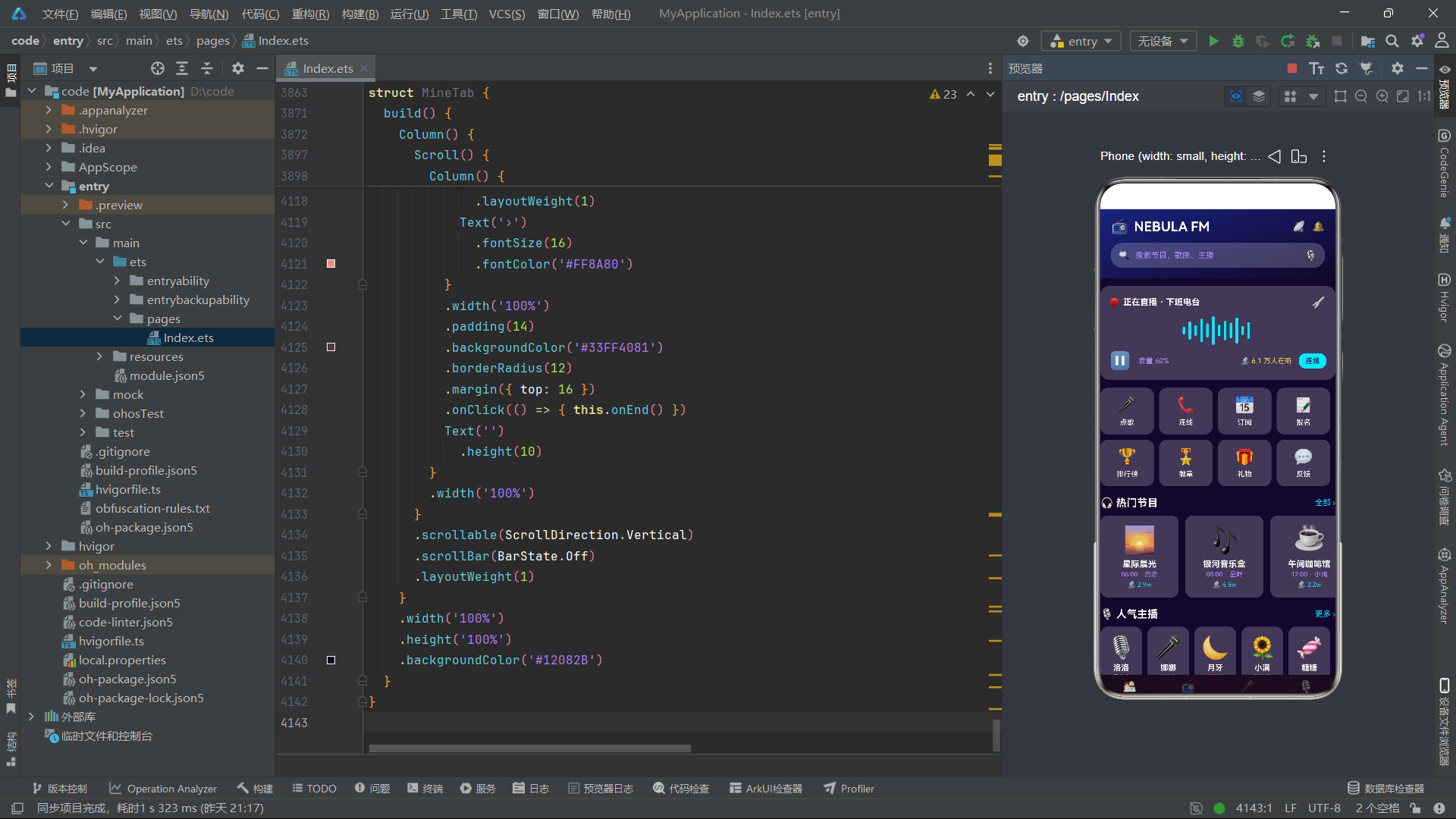
整个应用的色彩体系以深空紫黑为主色调(#12082B 到 #4527A0),电光青(#00E5FF)为主要强调色,星粉(#FF4081)、金黄(#FFD54F)、浅紫(#B388FF)为辅助色。通过 linearGradient 渐变、透明度前缀(#33、#55、#99、#DD)和 shadow 阴影的灵活运用,在深色主题下构建了丰富的视觉层次。
在交互设计上,应用大量使用了 Chip 单选组(日期选择、月份选择、音质选择、时段选择、分类筛选)、星级评分(灯牌投票)、进度条(报名进度、徽章进度)、开关(设置项)和 Toast 反馈等交互模式。所有交互通过 @State 变量驱动,赋值即触发渲染,实现了高度响应式的用户体验。回调函数模式确保了子组件的无状态性和可复用性——子组件只负责展示和触发,不关心后续行为。

讨论HarmonyOS开发技术,专注于API与组件、DevEco Studio、测试、元服务和应用上架分发等。
更多推荐

 2
2 0
0- 0


 已为社区贡献13条内容

所有评论(0)