HarmonyOS 6.1 实战:状态管理全部在 Index 组件内部完成,子组件通过回调函数将事件传递回来,因此只需使用 @State 即可
在鸿蒙 HarmonyOS 生态中,ArkTS 作为主力应用开发语言,承载着声明式 UI 范式的核心使命。它以 TypeScript 为基础,融合了 ArkUI 声明式开发框架的全部能力,将组件化、状态驱动、数据绑定等现代前端理念深度融入语言层面。本文将以一个完整的深海研究所管理应用为蓝本,从类型定义、数据建模、全局函数、主页面架构、弹窗体系、多标签页布局等多个维度,进行逐段、逐行级别的深度技术剖析,揭示 ArkTS 在构建复杂企业级移动应用时所展现出的工程范式与设计哲学。
一、鸿蒙开发背景与 ArkTS 语言特性概述
鸿蒙操作系统(HarmonyOS)是华为面向全场景智慧生活推出的分布式操作系统,其应用开发体系以 ArkUI 声明式框架为核心,而 ArkTS 则是这一框架的官方语言载体。ArkTS 在 TypeScript 的静态类型系统之上,引入了一系列面向声明式 UI 的语言级扩展,包括装饰器语法、状态管理装饰器、构建器函数等,使得开发者能够以接近自然语言的方式描述界面结构与交互逻辑。
在传统的命令式 UI 开发模式中,开发者需要手动操作 DOM 节点或视图对象,通过一系列的方法调用来更新界面。而 ArkTS 所倡导的声明式范式则完全不同:开发者只需描述界面在某一状态下的"样子",框架会自动负责状态变化时的界面更新。这种范式转换极大地降低了 UI 编程的复杂度,使得代码更加简洁、可预测、易于维护。
ArkTS 的核心能力体现在以下几个方面。首先是组件化开发:每一个 @Component 装饰的 struct 都是一个独立的、可复用的 UI 单元,拥有自己的状态和构建逻辑。其次是状态驱动渲染:通过 @State、@Prop、@Link 等装饰器,开发者可以声明组件的响应式状态,当状态发生变化时,框架自动触发依赖该状态的 UI 片段重新渲染。再次是构建器模式:@Builder 装饰器允许开发者定义可复用的 UI 片段函数,这些函数可以在组件内部被多次调用,实现 UI 结构的模块化组合。最后是布局系统:ArkTS 提供了 Column、Row、Stack、Flex 等一系列布局容器组件,它们各自对应不同的排布规则,开发者可以像搭积木一样组合出任意复杂的界面布局。
ArkTS 的设计哲学可以概括为:状态是唯一的真实来源,UI 是状态的函数映射。开发者管理的不是界面,而是数据状态;框架负责的则是将状态映射为可见的界面元素。这一理念贯穿了整个鸿蒙应用开发流程。
本文所要剖析的应用是一个模拟的"深海研究所"管理平台,它涵盖了设施管理、海洋生物图鉴、任务调度、装备管理、个人中心等多个业务模块,通过底部 Tab 导航进行页面切换,并通过丰富的弹窗系统实现详情展示与交互确认。该应用的代码量较大,结构完整,是一个非常适合用于学习 ArkTS 工程实践的范例。接下来,我们将从代码的第一行开始,逐段进行详尽的技术解读。
二、类型系统:颜色调色板接口定义
interface ColorPalette {
  bg: string;
  cardBg: string;
  deepBg: string;
  primary: string;
  secondary: string;
  accent: string;
  gold: string;
  danger: string;
  success: string;
  textPrimary: string;
  textSecondary: string;
  textHint: string;
  border: string;
  white: string;
  orange: string;
  purple: string;
}
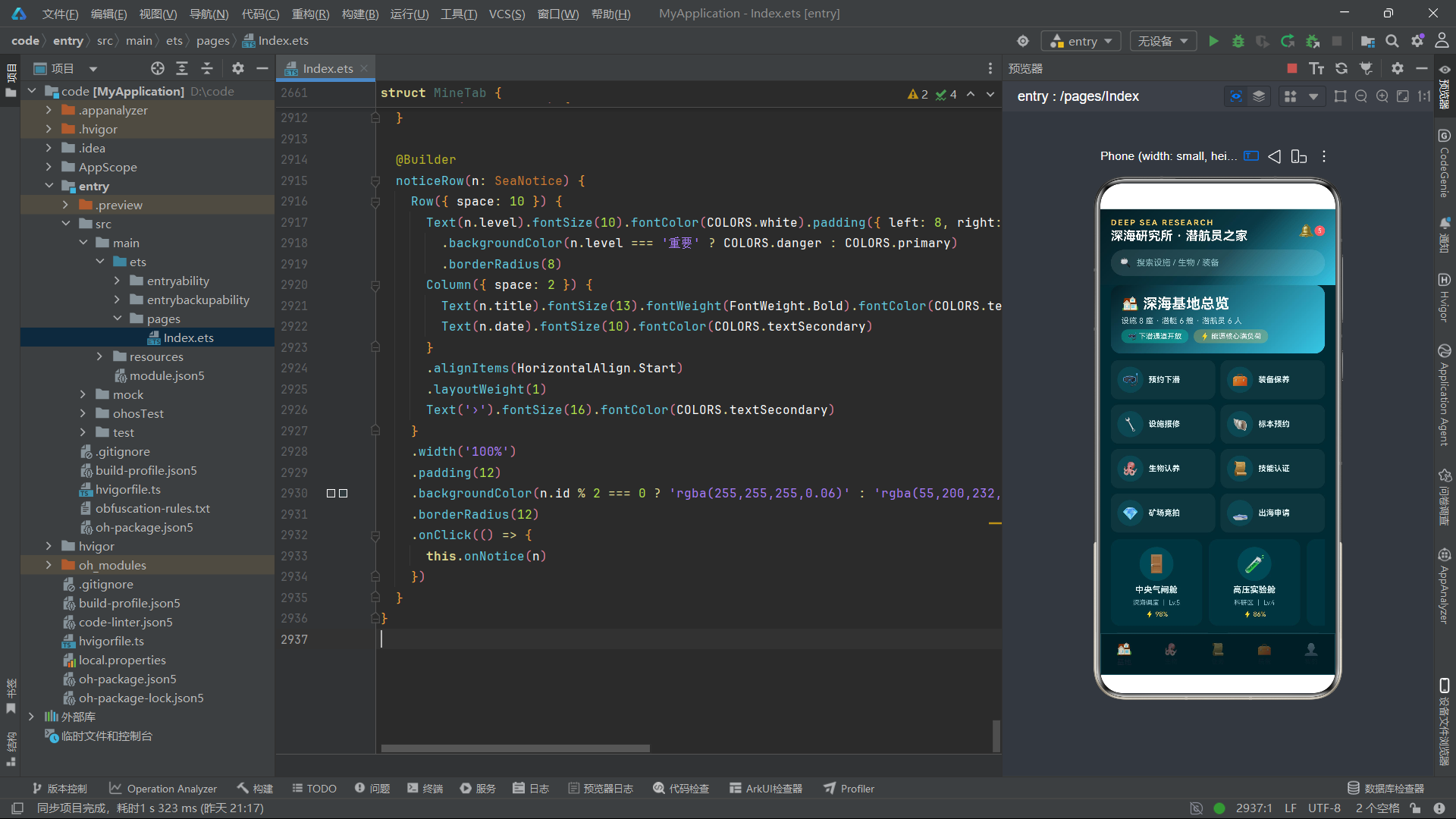
这段代码定义了一个名为 ColorPalette 的接口(interface)。在 ArkTS 以及 TypeScript 中,接口是一种用于定义对象形状的契约工具。它不产生任何运行时代码,仅存在于编译阶段,用于类型检查。ColorPalette 接口定义了十六个字符串类型的属性字段,涵盖了应用所需的完整颜色体系。
从命名可以看出,这个颜色调色板被设计为一个集中的色彩管理中枢。bg 代表主背景色,cardBg 代表卡片背景色,deepBg 代表更深层的背景色,这三者构成了界面的背景层次。primary、secondary、accent 是三个主要的强调色,分别用于不同层级的高亮显示。gold、danger、success 则是语义化的颜色,金色用于奖励和荣誉标识,红色用于警告和危险,绿色用于成功状态。
textPrimary、textSecondary、textHint 构成了文本颜色的三级层次:主要文本、次要文本、提示文本。这种分层设计是现代 UI 设计中的常见做法,通过不同的文本颜色来传达信息的重要程度。border、white、orange、purple 则是辅助性颜色,分别用于边框、纯白、橙色和紫色等特殊用途。
将所有颜色集中定义在一个接口中,是一种非常优秀的工程实践。它确保了整个应用的颜色使用一致性,避免了在代码各处散落硬编码的颜色字符串。当需要调整主题色时,只需修改一处定义,所有引用处自动更新。这是"单一数据源"原则在颜色管理中的体现。
在 ArkTS 的类型系统中,接口定义的字段使用分号结尾,每个字段都必须显式声明类型。这里所有字段都是 string 类型,因为颜色值将以十六进制字符串的形式存储(如 '#062A33')。接口定义本身不包含初始值,实际的值将在实现该接口的常量中提供。
三、颜色常量实例化
const COLORS: ColorPalette = {
  bg: '#062A33',
  cardBg: '#0A3A45',
  deepBg: '#041D24',
  primary: '#37C8E8',
  secondary: '#2EE6C8',
  accent: '#FF8A5C',
  gold: '#FFD166',
  danger: '#FF6B6B',
  success: '#4CD97B',
  textPrimary: '#E6F7F9',
  textSecondary: '#8FBFC7',
  textHint: '#5D8F98',
  border: '#15505C',
  white: '#FFFFFF',
  orange: '#FFA94D',
  purple: '#7C9BFF'
};
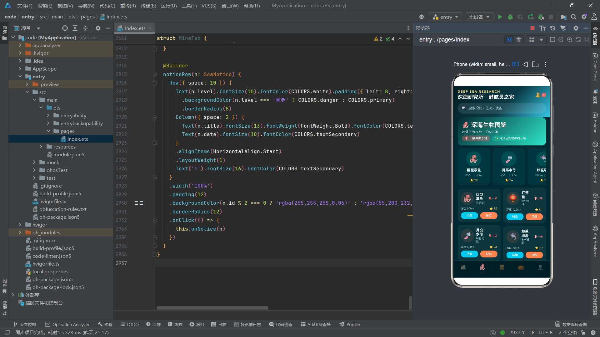
这里定义了一个名为 COLORS 的常量,其类型被标注为 ColorPalette,即上一节定义的接口。通过 const 关键字声明,该变量在初始化后不可被重新赋值,这确保了颜色配置的不可变性,防止在运行时被意外修改。
观察这些颜色值,可以看出整体配色方案以深海蓝绿色调为主。bg 的 #062A33 是一个极深的青蓝色,模拟深海环境的幽暗感。primary 的 #37C8E8 是一个明亮的青色,secondary 的 #2EE6C8 是偏向绿色的青色,两者构成了界面的主要强调色。accent 的 #FF8A5C 是一个珊瑚橙色,作为对比色使用,在蓝色基调中形成视觉焦点。gold 的 #FFD166 是温暖的金黄色,用于奖励、等级等荣誉性元素的展示。
这种配色设计充分体现了应用主题——深海研究所。冷色调的蓝绿色营造出水下环境的沉浸感,而暖色调的金色和橙色则用于突出重要信息和交互元素。文本颜色从接近白色的 #E6F7F9 到偏暗的 #5D8F98,形成了清晰的视觉层次。
在 ArkTS 中,COLORS 作为全局常量,可以在文件的任何位置被引用。由于它不依赖于任何组件的生命周期,因此非常适合作为静态配置数据使用。在后续的组件构建代码中,我们会频繁看到 COLORS.primary、COLORS.textPrimary 等引用方式,这些引用在编译期就会受到类型检查的保护。
四、业务数据接口定义体系
interface BaseFacility {
  id: number;
  name: string;
  icon: string;
  area: string;
  capacity: string;
  power: number;
  status: string;
  level: number;
  desc: string;
}
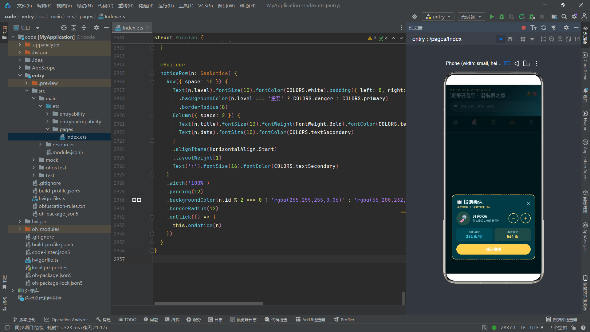
这段代码定义了 BaseFacility 接口,用于描述深海基地中的设施实体。该接口包含九个字段:id 是设施的唯一标识符,类型为数值;name 是设施名称;icon 是设施的图标,这里使用的是 Emoji 字符(如 ‘🚪’);area 标识设施所属区域;capacity 表示容纳能力;power 是运行功率百分比;status 是运行状态;level 是设施等级;desc 是描述文本。
在 ArkTS 中,为业务实体定义接口是一种标准做法。它不仅提供了编译期的类型安全,还起到了文档化的作用——其他开发者通过阅读接口定义,就能快速了解该实体包含哪些属性。每个属性的类型声明也消除了隐式 any 带来的不确定性。
interface SeaCreature {
  id: number;
  name: string;
  icon: string;
  kind: string;
  depth: string;
  size: string;
  rating: number;
  protect: string;
  desc: string;
}

interface SeaTask {
  id: number;
  title: string;
  icon: string;
  type: string;
  reward: number;
  status: string;
  time: string;
  zone: string;
}

interface DiveGear {
  id: number;
  name: string;
  icon: string;
  price: number;
  durability: number;
  depth: string;
  weight: string;
  type: string;
  desc: string;
}
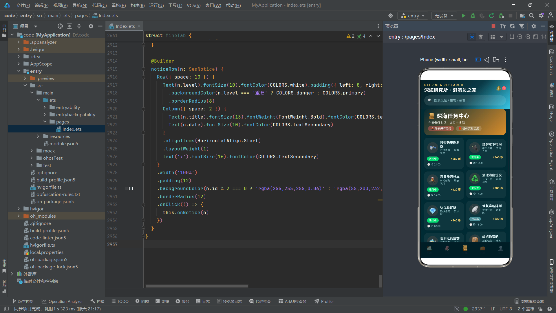
接下来是 SeaCreature、SeaTask 和 DiveGear 三个接口的定义。SeaCreature 描述海洋生物实体,包含种类(kind)、栖息深度(depth)、体型大小(size)、人气评级(rating)和保护等级(protect)等生物特有属性。SeaTask 描述深海任务,包含任务标题、类型、奖励、状态、时间和区域。DiveGear 描述潜水装备,包含价格、耐久度、极限深度、重量和类型。
值得注意的是,这些接口中有些字段在语义上是数值型数据,但被声明为 string 类型。例如 depth 的值 '3000m' 和 size 的值 '4.2m',这些是将数值与单位组合在一起的字符串表示法。这种设计简化了显示逻辑——无需在 UI 层做数值与单位的拼接,直接使用字符串即可。但也牺牲了数值计算的能力,例如无法直接对深度进行排序或比较。这种取舍在以展示为主的应用中是合理的。
在 ArkTS 的接口设计中,字段类型的选择应该以实际使用场景为依据。如果一个数据仅用于显示且不需要参与计算,将其声明为字符串可以简化 UI 代码;如果需要参与逻辑运算或排序,则应保持为数值类型。
power、rating、reward等字段被声明为number,正是因为它们需要参与数值比较和进度条计算。
interface DeepRank {
  id: number;
  name: string;
  icon: string;
  title: string;
  score: number;
  dives: number;
  badge: string;
}

interface SeaNotice {
  id: number;
  title: string;
  date: string;
  level: string;
  content: string;
}

interface SeaOrder {
  id: number;
  no: string;
  item: string;
  from: string;
  to: string;
  status: string;
  eta: string;
  fee: number;
}

interface SeaSkill {
  id: number;
  name: string;
  icon: string;
  level: number;
  exp: number;
  type: string;
  desc: string;
}

interface SeaQuick {
  id: number;
  name: string;
  icon: string;
  color: string;
}
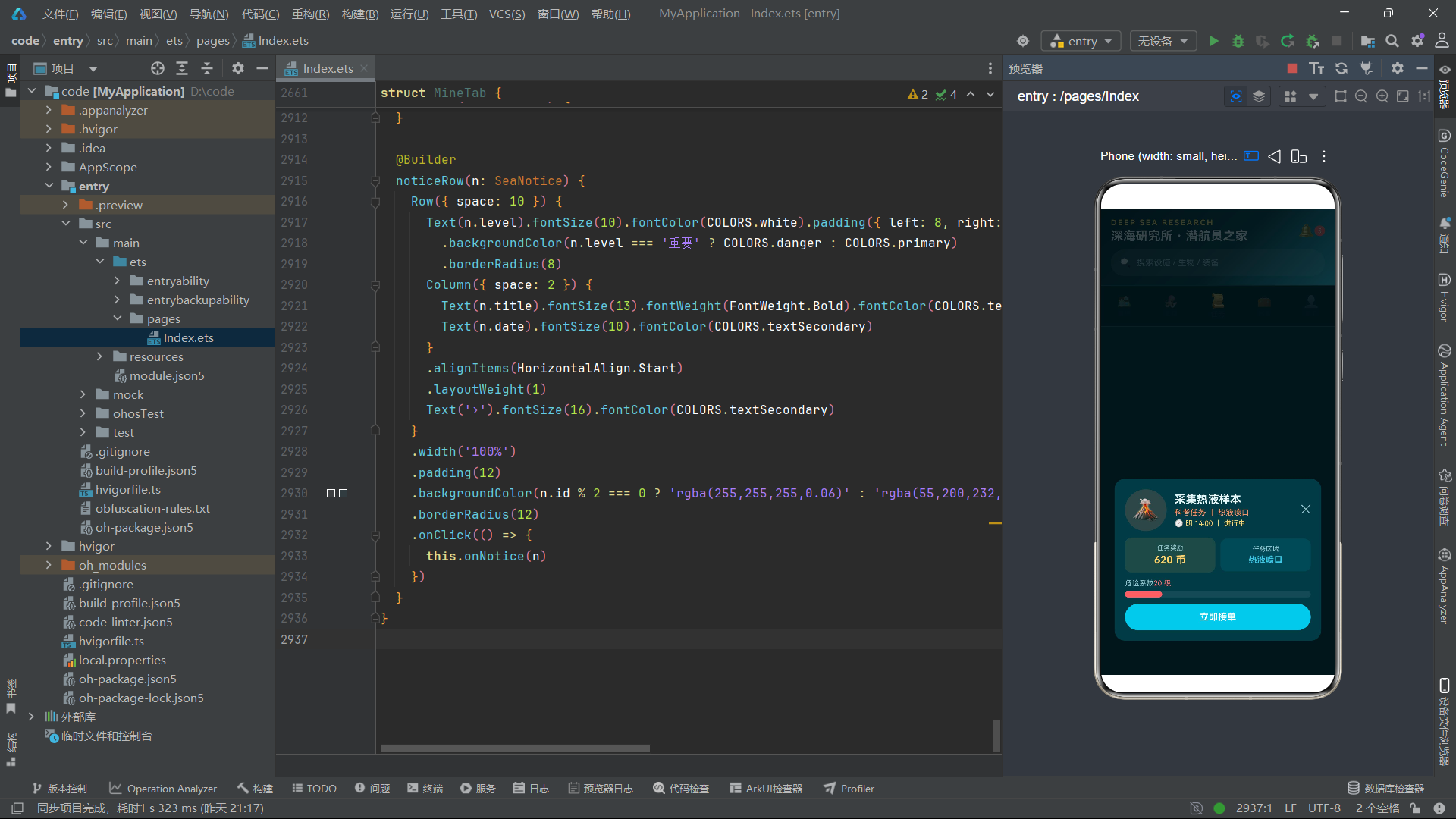
这几段定义了 DeepRank(潜航员排名)、SeaNotice(公告通知)、SeaOrder(物资订单)和 SeaSkill(潜航技能)四个接口。DeepRank 包含积分(score)、下潜次数(dives)和勋章名称(badge)。SeaNotice 包含发布日期、紧急级别和内容。SeaOrder 包含运单号、物品名称、出发地、目的地、状态、预计到达时间和费用。SeaSkill 包含技能等级、经验值和类型。SeaQuick 是快捷入口项,包含名称、图标和主题色。
interface Submarine {
  id: number;
  name: string;
  icon: string;
  maxDepth: string;
  fuel: number;
  oxygen: number;
  crew: number;
  speed: number;
  level: number;
}

interface DeepMineral {
  id: number;
  name: string;
  icon: string;
  source: string;
  value: number;
  hardness: number;
  rarity: string;
}

interface DeepCrew {
  id: number;
  name: string;
  icon: string;
  role: string;
  level: number;
  exp: number;
  dives: number;
  skill: string;
}
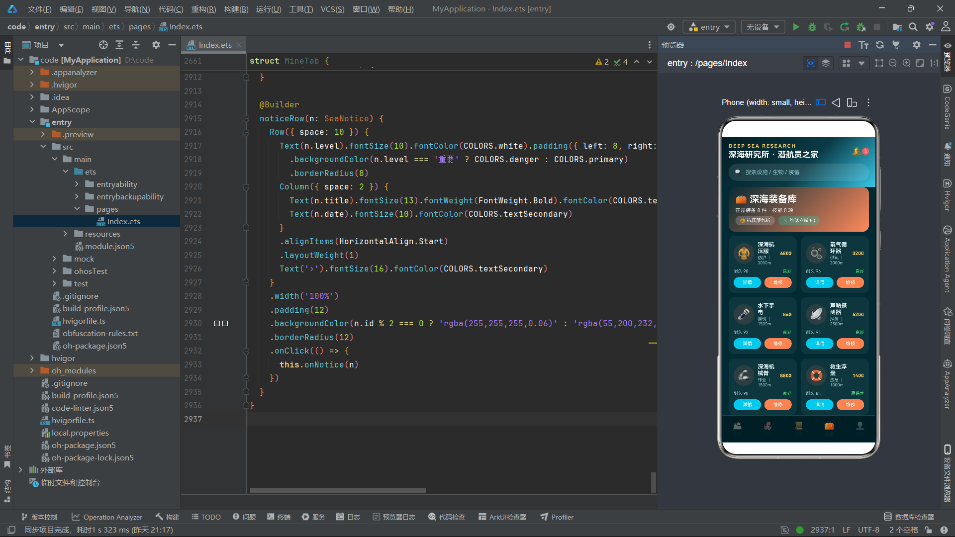
最后三个接口是 Submarine(潜艇)、DeepMineral(深海矿物)和 DeepCrew(潜航员)。Submarine 包含最大潜深、燃料、氧气、载员、速度和等级。DeepMineral 包含产地、估价、硬度和稀有度。DeepCrew 包含角色、等级、经验、下潜次数和擅长技能。至此,整个应用的类型系统已经建立完成,共计定义了十二个业务实体接口加上一个颜色调色板接口。
这套接口体系构成了应用的数据模型层。在 ArkTS 中,虽然这些接口不会产生运行时代码,但它们为后续的常量数据、函数参数、组件属性等提供了完整的类型约束。这是大型应用开发中不可或缺的基础设施——只有类型系统足够完善,后续的组件化和状态管理才能建立在稳固的基础之上。
五、数据常量定义
const BASE_FACILITIES: BaseFacility[] = [
  { id: 1, name: '中央气闸舱', icon: '🚪', area: '深海调度', capacity: '30 人', power: 98, status: '运行中', level: 5, desc: '深潜进出主通道,双重水密门,可同时调度六组潜航小队。' },
  { id: 2, name: '高压实验舱', icon: '🧪', area: '科研区', capacity: '15 人', power: 86, status: '运行中', level: 4, desc: '模拟万米深海压强,供生物与材料耐压实验使用。' },
  // ...更多设施数据
];
这段代码定义了 BASE_FACILITIES 常量数组,类型为 BaseFacility[],即"BaseFacility 接口实现的数组"。数组中每个对象都严格遵循 BaseFacility 接口定义的字段结构。ArkTS 的编译器会在编译期检查每个对象的字段是否与接口匹配,如果缺少字段或类型不符,会立即报错。
数据的设计很考究:每个设施都有符合深海主题的名称和描述。中央气闸舱是深潜进出的主通道,功率高达 98%,等级为 5 级。高压实验舱模拟万米深海压强,用于科研。生态养殖区养殖发光藻与珊瑚鱼群。矿物精炼室处于维护状态,功率为 90%。这些数据虽然都是模拟数据,但具备真实业务数据的结构和语义。
const SEA_CREATURES: SeaCreature[] = [
  { id: 1, name: '巨型章鱼', icon: '🐙', kind: '头足纲', depth: '800m', size: '4.2m', rating: 9.8, protect: '一级', desc: '八腕灵巧,会开罐取食,是基地常驻的智慧访客。' },
  { id: 2, name: '灯笼鱼', icon: '🏮', kind: '灯笼鱼科', depth: '1200m', size: '0.3m', rating: 9.1, protect: '二级', desc: '头顶发光器如小灯笼,夜晚成群如星河流转。' },
  // ...更多生物数据
];

const SEA_TASKS: SeaTask[] = [
  { id: 1, title: '打捞失事探测器', icon: '🛰', type: '打捞任务', reward: 480, status: '进行中', time: '今 21:00', zone: '深海平原' },
  { id: 2, title: '维护水下电网', icon: '🔌', type: '维护任务', reward: 360, status: '进行中', time: '明 10:00', zone: '基地外围' },
  // ...更多任务数据
];
SEA_CREATURES 数组定义了八种海洋生物,从巨型章鱼到珊瑚精灵,每种生物都有详细的分类学信息、栖息深度、体型、人气评级和保护等级。SEA_TASKS 数组定义了八项深海任务,分为进行中和已完成两种状态,涵盖打捞、维护、科考、环保、勘探、检修、观测和后勤等多种类型。
这些数据数组的定义方式有一个共同特点:它们都使用 const 声明为不可变常量,且类型标注明确指向对应的接口数组。在 ArkTS 中,这种做法确保了数据的类型安全性和不可变性。虽然 JavaScript/TypeScript 的 const 仅保证变量引用不被重新赋值,但配合接口类型约束,至少在编译期能够保证数据结构的正确性。
在实际工程项目中,这些数据通常来自后端 API 返回。但在本示例中,使用本地静态数据有诸多优势:无需网络请求即可运行、便于展示 UI 效果、适合作为教学范例。数据内容的设计也颇具匠心——每条记录都有完整的业务语义,使得 UI 渲染效果更加真实可信。
const DIVE_GEAR: DiveGear[] = [
  { id: 1, name: '深海抗压服', icon: '🧥', price: 6800, durability: 98, depth: '3000m', weight: '22kg', type: '防护', desc: '钛合金骨架加复合抗压层,深潜标配防护服。' },
  // ...更多装备数据
];

const DEEP_RANKS: DeepRank[] = [
  { id: 1, name: '沈澜·深蓝', icon: '🌊', title: '首席潜航员', score: 16800, dives: 286, badge: '深蓝勋章' },
  // ...更多排名数据
];

const SEA_NOTICES: SeaNotice[] = [
  { id: 1, title: '热液区科考任务紧急招募', date: '今 08:30', level: '重要', content: '热液喷口活动加剧,急需 4 名持证潜航员参与样本采集,奖励上浮 30%。' },
  // ...更多公告数据
];
DIVE_GEAR 定义了八件潜水装备,涵盖防护、供氧、照明、探测、作业、应急、通讯和动力八大类型。每件装备都有价格、耐久度、极限深度和重量等规格参数。DEEP_RANKS 定义了八位潜航员的排名,按照积分从高到低排列,每人都有对应的称号和勋章。SEA_NOTICES 定义了六条公告通知,分为重要、公告、提醒和通报等不同级别。
const SEA_ORDERS: SeaOrder[] = [
  { id: 1, no: 'DS-2087', item: '深海鱼油精华', from: '科研区', to: '生态养殖区', status: '运输中', eta: '预计 14:30', fee: 320 },
  // ...更多订单数据
];

const SEA_SKILLS: SeaSkill[] = [
  { id: 1, name: '深潜呼吸术', icon: '🫁', level: 6, exp: 85, type: '生存', desc: '高效利用氧气,延长水下作业时长。' },
  // ...更多技能数据
];

const SEA_QUICKS: SeaQuick[] = [
  { id: 1, name: '预约下潜', icon: '🤿', color: '#37C8E8' },
  // ...更多快捷入口数据
];

const SUBMARINES: Submarine[] = [
  { id: 1, name: '蓝鲸号', icon: '🐋', maxDepth: '4000m', fuel: 92, oxygen: 88, crew: 6, speed: 28, level: 5 },
  // ...更多潜艇数据
];

const MINERALS: DeepMineral[] = [
  { id: 1, name: '热液黑烟石', icon: '🌋', source: '热液喷口', value: 8800, hardness: 8.2, rarity: '传说' },
  // ...更多矿物数据
];

const CREW: DeepCrew[] = [
  { id: 1, name: '沈澜', icon: '🌊', role: '首席潜航员', level: 9, exp: 860, dives: 286, skill: '深潜呼吸术' },
  // ...更多船员数据
];
这些数据常量覆盖了应用所需的全部业务数据:物资运单、潜航技能、快捷入口、潜艇、深海矿物和船员。每个数组都遵循对应的接口类型,数据内容丰富且语义完整。SEA_QUICKS 中的每个快捷入口还自带了 color 字段,用于在 UI 中为不同入口赋予不同的主题色,这是数据驱动 UI 样式的典型示例。
至此,应用的全部静态数据已经定义完毕。这些数据将作为后续全局函数的输入源,经过过滤、分组等处理后,传递给各组件进行渲染。数据与 UI 的分离是良好的架构实践——数据层不关心如何显示,UI 层不关心数据从何而来,两者通过接口类型和函数调用建立契约。
六、全局函数:数据过滤与分组
function getFacilityCount(): number {
  return BASE_FACILITIES.length
}
function getFacilityLeft(): BaseFacility[] {
  return BASE_FACILITIES.filter((f: BaseFacility) => f.id % 2 === 1)
}
function getFacilityRight(): BaseFacility[] {
  return BASE_FACILITIES.filter((f: BaseFacility) => f.id % 2 === 0)
}
function getTopFacilities(): BaseFacility[] {
  return BASE_FACILITIES.filter((f: BaseFacility) => f.level >= 4)
}
这一组函数是针对设施数据的过滤工具。getFacilityCount 返回设施数组长度,是一个简单的计数函数。getFacilityLeft 和 getFacilityRight 使用 filter 方法按照 id 的奇偶性将设施数组分成左右两列,这是为了在 UI 中实现双列瀑布流布局而设计的。getTopFacilities 筛选等级大于等于 4 的设施,用于横滑展示中的"王牌设施"。
在 ArkTS 中,函数的参数和返回值都需要显式标注类型。filter 方法的回调函数参数 (f: BaseFacility) 明确标注了类型,返回值 BaseFacility[] 也被显式声明。这种严格的类型标注是 ArkTS 区别于普通 JavaScript 的重要特征,它使得编译器能够在编译期捕获类型错误,提高代码的可靠性。
filter 是 JavaScript/TypeScript 数组的原生方法,它遍历数组的每个元素,对回调函数返回 true 的元素进行收集,最终返回一个新数组。这里使用 f.id % 2 === 1 来判断奇偶性,是一个简洁但有效的方式。需要注意的是,这种分组方式依赖于 id 的连续性和奇偶交替,如果数据源的 id 不是连续的奇偶交替,分组可能会出现不平衡。
function getCreatureCount(): number {
  return SEA_CREATURES.length
}
function getCreatureLeft(): SeaCreature[] {
  return SEA_CREATURES.filter((c: SeaCreature) => c.id % 2 === 1)
}
function getCreatureRight(): SeaCreature[] {
  return SEA_CREATURES.filter((c: SeaCreature) => c.id % 2 === 0)
}
function getTopCreatures(): SeaCreature[] {
  return SEA_CREATURES.filter((c: SeaCreature) => c.rating >= 9.4)
}
针对海洋生物数据的函数组采用了同样的模式。getCreatureCount 返回生物数量,getCreatureLeft 和 getCreatureRight 按奇偶分组,getTopCreatures 筛选人气评级大于等于 9.4 的"明星生物"。可以看出,这些函数的设计模式高度统一:计数函数返回 number,分组函数返回过滤后的数组,筛选函数返回符合条件的子集。
这种统一的模式设计体现了代码的规范性。当开发者看到 getCreatureLeft 时,可以立即推断出它的行为——与 getFacilityLeft 类似,只是数据源不同。这种一致性降低了代码的认知负担,使得阅读和维护更加高效。
在 ArkTS 中,全局函数定义在组件外部,可以在任何组件中直接调用。但需要注意的是,这些函数每次调用都会执行
filter操作并返回新数组,如果在高频渲染的组件中反复调用,可能会产生性能开销。在实际工程项目中,对于频繁使用的结果,可以考虑使用缓存或计算属性来优化。但本示例中数据量较小(每类仅 6-8 条),性能影响可以忽略。
function getRunningTasks(): SeaTask[] {
  return SEA_TASKS.filter((t: SeaTask) => t.status === '进行中')
}
function getDoneTasks(): SeaTask[] {
  return SEA_TASKS.filter((t: SeaTask) => t.status === '已完成')
}
function getTaskCount(): number {
  return SEA_TASKS.length
}
function getTaskLeft(): SeaTask[] {
  return SEA_TASKS.filter((t: SeaTask) => t.id % 2 === 1)
}
function getTaskRight(): SeaTask[] {
  return SEA_TASKS.filter((t: SeaTask) => t.id % 2 === 0)
}
任务数据的函数组除了常规的计数和左右分组外,还增加了按状态筛选的函数。getRunningTasks 筛选状态为"进行中"的任务,getDoneTasks 筛选状态为"已完成"的任务。这种按业务状态进行数据筛选的能力,使得 UI 可以在不同区域展示不同状态的任务——进行中的任务以卡片形式展示在主要区域,已完成的任务以行列表形式展示在次要区域。
function getGearCount(): number {
  return DIVE_GEAR.length
}
function getGearLeft(): DiveGear[] {
  return DIVE_GEAR.filter((g: DiveGear) => g.id % 2 === 1)
}
function getGearRight(): DiveGear[] {
  return DIVE_GEAR.filter((g: DiveGear) => g.id % 2 === 0)
}
function getTopGear(): DiveGear[] {
  return DIVE_GEAR.filter((g: DiveGear) => g.durability >= 95)
}
function getRankTop(): DeepRank[] {
  return DEEP_RANKS.filter((r: DeepRank) => r.id <= 3)
}
function getRankRest(): DeepRank[] {
  return DEEP_RANKS.filter((r: DeepRank) => r.id > 3)
}
装备和排名的函数组延续了同样的设计模式。getTopGear 筛选耐久度大于等于 95 的装备,用于横滑展示。排名数据则被分为"前三名"(getRankTop)和"其余名次"(getRankRest)两部分,这是因为排行榜 UI 通常会对前三名进行特殊展示(领奖台样式),而其余名次以普通列表展示。
function getUnlockedSkills(): SeaSkill[] {
  return SEA_SKILLS.filter((s: SeaSkill) => s.exp >= 30)
}
function getSkillCount(): number {
  return SEA_SKILLS.length
}
function getSkillLeft(): SeaSkill[] {
  return SEA_SKILLS.filter((s: SeaSkill) => s.id % 2 === 1)
}
function getSkillRight(): SeaSkill[] {
  return SEA_SKILLS.filter((s: SeaSkill) => s.id % 2 === 0)
}
function getOrderActive(): SeaOrder[] {
  return SEA_ORDERS.filter((o: SeaOrder) => o.status !== '已完成')
}
function getQuickLeft(): SeaQuick[] {
  return SEA_QUICKS.filter((q: SeaQuick) => q.id <= 4)
}
function getQuickRight(): SeaQuick[] {
  return SEA_QUICKS.filter((q: SeaQuick) => q.id > 4)
}
function getSubCount(): number {
  return SUBMARINES.length
}
function getSubLeft(): Submarine[] {
  return SUBMARINES.filter((s: Submarine) => s.id % 2 === 1)
}
function getSubRight(): Submarine[] {
  return SUBMARINES.filter((s: Submarine) => s.id % 2 === 0)
}
function getMineralCount(): number {
  return MINERALS.length
}
function getMineralLeft(): DeepMineral[] {
  return MINERALS.filter((m: DeepMineral) => m.id % 2 === 1)
}
function getMineralRight(): DeepMineral[] {
  return MINERALS.filter((m: DeepMineral) => m.id % 2 === 0)
}
剩余的全局函数覆盖了技能、订单、快捷入口、潜艇和矿物的数据操作。getUnlockedSkills 筛选经验值大于等于 30 的"已解锁"技能,用于技能柱状图展示。getOrderActive 筛选状态不为"已完成"的活跃订单。getQuickLeft 和 getQuickRight 将八个快捷入口平均分为左右各四个,用于双列宫格布局。潜艇和矿物的函数组同样遵循计数加左右分组的统一模式。
整套全局函数体系共计约三十个函数,按照统一的模式设计,覆盖了所有业务数据类型的计数、分组和筛选需求。这些函数是数据层与 UI 层之间的桥梁——UI 组件通过调用这些函数获取经过处理的数据,而无需关心数据是如何被过滤和分组的。这种分离使得数据逻辑可以被独立测试和复用,也使得 UI 组件的代码更加简洁。
七、主页面入口:@Entry 与 @Component
@Entry
@Component
struct Index {
  @State currentTab: number = 0
  @State showFacility: boolean = false
  @State showDive: boolean = false
  @State showCreature: boolean = false
  @State showFeed: boolean = false
  @State showTask: boolean = false
  @State showRank: boolean = false
  @State showNotice: boolean = false
  @State showOrder: boolean = false
  @State showSkill: boolean = false
  @State showSub: boolean = false
  @State showMineral: boolean = false
  @State showGear: boolean = false
  @State showRepair: boolean = false
  @State showCrew: boolean = false
  @State showVip: boolean = false
  @State showSupply: boolean = false
这段代码是整个应用的入口点。@Entry 装饰器标记 Index 结构体为应用的入口页面组件,鸿蒙系统在应用启动时会自动加载并渲染这个组件。@Component 装饰器声明 Index 是一个自定义组件,它拥有独立的状态管理和构建逻辑。在 ArkTS 中,struct 是用于定义组件的关键字,与 TypeScript 中的 class 类似,但专门用于声明式 UI 组件。
@State 是 ArkTS 状态管理中最核心的装饰器。被 @State 修饰的变量成为"响应式状态变量",当其值发生变化时,框架会自动重新渲染依赖该变量的 UI 片段。这里定义了十七个状态变量:currentTab 是数值类型,初始值为 0,表示当前选中的 Tab 索引(0=基地,1=生物,2=任务,3=装备,4=我的)。其余十六个变量都是布尔类型,初始值为 false,分别对应十六种弹窗的显示状态。
这种"一个弹窗一个状态变量"的设计方式虽然看起来有些冗余,但它提供了最大程度的控制灵活性。每个弹窗可以独立控制显示和隐藏,互不干扰。当用户点击某个卡片时,对应的 show 变量被设为 true,弹窗显示;当用户点击关闭按钮或遮罩层时,对应的 show 变量被设为 false,弹窗消失。
在 ArkTS 中,
@State装饰的变量仅能在组件内部访问和修改。它是组件的"私有状态"。如果需要与父组件同步状态,需要使用@Prop(单向同步)或@Link(双向同步)装饰器。但本应用中的状态管理全部在Index组件内部完成,子组件通过回调函数将事件传递回来,因此只需使用@State即可。
  selFacility: BaseFacility | null = null
  selCreature: SeaCreature | null = null
  selTask: SeaTask | null = null
  selRank: DeepRank | null = null
  selNotice: SeaNotice | null = null
  selOrder: SeaOrder | null = null
  selSkill: SeaSkill | null = null
  selSub: Submarine | null = null
  selMineral: DeepMineral | null = null
  selGear: DiveGear | null = null
  selCrew: DeepCrew | null = null
  selVip: DeepCrew | null = null
  selQuick: SeaQuick | null = null
这些变量没有被 @State 修饰,它们是普通的成员变量,用于存储当前被选中的业务实体。每个变量的类型都使用了联合类型 T | null,初始值为 null,表示初始状态下没有选中任何实体。当用户点击某个卡片时,对应的 sel 变量被赋值为该实体对象,然后对应的 show 变量被设为 true,弹窗显示该实体的详情。
为什么这些变量不加 @State 修饰?因为这些变量的变化不需要直接触发 UI 重新渲染——真正控制弹窗显示的是 show 变量。当 show 变量从 false 变为 true 时,框架重新渲染弹窗区域,此时会读取 sel 变量的值来填充弹窗内容。因此 sel 变量的赋值和 show 变量的修改必须成对执行:先设置 sel,再设置 show,确保弹窗显示时能够读取到正确的实体数据。
这种"选中实体 + 显示标志"的双变量模式是管理弹窗状态的一种实用方案。它简单直接,适合弹窗数量有限的场景。如果弹窗数量非常多或需要更复杂的弹窗管理(如弹窗堆叠、弹窗历史等),可以考虑使用状态机或专门的弹窗管理器来替代。
八、主页面构建方法:头部区域
  build() {
    Column() {
      // ============ 头部(深海研究所横幅) ============
      Column({ space: 10 }) {
        Row() {
          Column({ space: 2 }) {
            Text('DEEP SEA RESEARCH').fontSize(12).fontColor(COLORS.gold).fontWeight(FontWeight.Bold).letterSpacing(2)
            Text('深海研究所 · 潜航员之家').fontSize(19).fontColor(COLORS.white).fontWeight(FontWeight.Bold)
          }
          .alignItems(HorizontalAlign.Start)
          .layoutWeight(1)
          Text('🔔').fontSize(20)
          Text('5').fontSize(10).fontColor(COLORS.white).backgroundColor(COLORS.danger).borderRadius(8).width(16).height(16).textAlign(TextAlign.Center)
        }
        .width('100%')
        Row({ space: 8 }) {
          Text('🔍').fontSize(14)
          Text('搜索设施 / 生物 / 装备').fontSize(13).fontColor(COLORS.textSecondary)
        }
        .width('100%')
        .height(40)
        .padding({ left: 14, right: 14 })
        .backgroundColor('rgba(255,255,255,0.10)')
        .borderRadius(20)
      }
      .padding({ left: 16, right: 16, top: 14, bottom: 14 })
      .width('100%')
      .linearGradient({ angle: 135, colors: [['#041D24', 0.0], ['#0A3A45', 0.55], ['#37C8E8', 1.0]] })
build() 方法是每个 ArkTS 组件的核心——它定义了组件的 UI 结构。Index 组件的 build() 方法最外层是一个 Column,这是 ArkTS 的垂直布局容器。Column 将其子元素从上到下依次排列,是页面级布局的首选容器。
在 ArkTS 中,Column 是一个基础布局组件,它的作用是将子元素沿垂直方向(从上到下)排列。它接受一个可选的参数对象 { space: 10 },表示子元素之间的间距为 10vp(虚拟像素)。Column 还有两个重要的对齐属性:alignItems 控制子元素在水平方向上的对齐方式(默认居中),justifyContent 控制子元素在垂直方向上的分布方式。
头部区域本身也是一个 Column,包含两个子元素。第一个是 Row,用于横向排列标题和通知图标。Row 是 ArkTS 的水平布局容器,将子元素从左到右依次排列。在这个 Row 中,左侧是一个嵌套的 Column,包含英文标题和中文副标题两行文字。这个内嵌 Column 设置了 .alignItems(HorizontalAlign.Start) 使文字左对齐,并通过 .layoutWeight(1) 占据剩余空间,将通知图标推到右侧。
layoutWeight 是 ArkTS 中非常重要的布局属性。它类似于 CSS 中的 flex-grow,表示元素在父容器中占据剩余空间的比例。当多个子元素设置了 layoutWeight 时,剩余空间会按比例分配。这里只有一个子元素设置了 layoutWeight(1),因此它占据了除通知图标之外的所有空间,实现了"标题占主体、图标靠右侧"的经典头部布局。
头部的第二个子元素是一个搜索框样式的 Row,包含搜索图标和占位文字。这个 Row 设置了 .height(40) 固定高度、.padding({ left: 14, right: 14 }) 内边距、.backgroundColor('rgba(255,255,255,0.10)') 半透明白色背景和 .borderRadius(20) 圆角半径,形成了胶囊形状的搜索框外观。这里没有使用输入框组件,仅为视觉占位。
整个头部 Column 使用 .linearGradient() 方法设置了线性渐变背景,从深色 #041D24 到中色 #0A3A45 再到亮色 #37C8E8,角度为 135 度。这种渐变背景为头部赋予了深海般的层次感。
九、主页面构建方法:内容区与 Tab 切换
      // ============ 内容区 ============
      Column() {
        if (this.currentTab === 0) {
          BaseTab({
            onFacility: (f: BaseFacility) => {
              this.selFacility = f
              this.showFacility = true
            },
            onDive: (s: Submarine) => {
              this.selSub = s
              this.showDive = true
            },
            onSub: (s: Submarine) => {
              this.selSub = s
              this.showSub = true
            },
            onRank: (r: DeepRank) => {
              this.selRank = r
              this.showRank = true
            },
            onNotice: (n: SeaNotice) => {
              this.selNotice = n
              this.showNotice = true
            }
          })
        } else if (this.currentTab === 1) {
          CreatureTab({
            onCreature: (c: SeaCreature) => {
              this.selCreature = c
              this.showCreature = true
            },
            onFeed: (c: SeaCreature) => {
              this.selCreature = c
              this.showFeed = true
            },
            onMineral: (m: DeepMineral) => {
              this.selMineral = m
              this.showMineral = true
            }
          })
        } else if (this.currentTab === 2) {
          TaskTab({
            onTask: (t: SeaTask) => {
              this.selTask = t
              this.showTask = true
            },
            onOrder: (o: SeaOrder) => {
              this.selOrder = o
              this.showOrder = true
            }
          })
        } else if (this.currentTab === 3) {
          GearTab({
            onGear: (g: DiveGear) => {
              this.selGear = g
              this.showGear = true
            },
            onRepair: (g: DiveGear) => {
              this.selGear = g
              this.showRepair = true
            },
            onSkill: (sk: SeaSkill) => {
              this.selSkill = sk
              this.showSkill = true
            }
          })
        } else {
          MineTab({
            onTask: (t: SeaTask) => {
              this.selTask = t
              this.showTask = true
            },
            onSkill: (sk: SeaSkill) => {
              this.selSkill = sk
              this.showSkill = true
            },
            onOrder: (o: SeaOrder) => {
              this.selOrder = o
              this.showOrder = true
            },
            onRank: (r: DeepRank) => {
              this.selRank = r
              this.showRank = true
            },
            onNotice: (n: SeaNotice) => {
              this.selNotice = n
              this.showNotice = true
            },
            onCrew: (c: DeepCrew) => {
              this.selCrew = c
              this.showCrew = true
            },
            onVip: (c: DeepCrew) => {
              this.selVip = c
              this.showVip = true
            },
            onSupply: (q: SeaQuick) => {
              this.selQuick = q
              this.showSupply = true
            }
          })
        }
      }
      .layoutWeight(1)
这段代码是内容区的核心——根据 currentTab 的值,条件渲染不同的 Tab 组件。ArkTS 中的 if-else 语句可以直接用在 build() 方法内部进行条件渲染。当 this.currentTab 的值发生变化时,框架会自动重新执行这段逻辑,卸载旧的组件并加载新的组件。
这里展示了 ArkTS 组件化开发的精髓:BaseTab、CreatureTab、TaskTab、GearTab、MineTab 都是独立的自定义组件,每个组件负责一个完整的业务页面。父组件 Index 只负责根据当前 Tab 索引来决定渲染哪个组件,不关心组件内部的实现细节。这种"组合优于继承"的设计思想使得代码结构清晰,各页面可以独立开发和维护。
每个子组件都通过回调函数与父组件通信。以 BaseTab 为例,它接收五个回调函数:onFacility(点击设施时触发)、onDive(点击下潜时触发)、onSub(点击潜艇详情时触发)、onRank(点击排行榜时触发)、onNotice(点击公告时触发)。每个回调函数的参数类型都明确标注了对应的业务实体接口,确保类型安全。
回调函数的实现模式高度统一:先将传入的实体赋值给对应的 sel 变量,再将对应的 show 变量设为 true。这两步操作共同完成"选中实体并打开弹窗"的交互流程。这种模式简洁而有效,但它要求两步操作必须同步执行——如果 sel 赋值和 show 设置之间有异步操作,可能会导致弹窗显示的是旧的实体数据。
内容区 Column 设置了 .layoutWeight(1),这意味着它会占据父容器中除头部和底部 Tab 之外的所有剩余空间。在 ArkTS 的布局系统中,layoutWeight 是实现弹性布局的关键属性——它使得内容区能够自动适应不同屏幕高度,在头部和底部 Tab 固定高度的情况下,内容区自动填充中间区域。
这种"头部固定 + 内容弹性 + 底部固定"的三段式布局是移动应用中最常见的页面骨架。头部展示品牌信息和搜索入口,内容区承载业务信息,底部提供导航切换。ArkTS 的
Column配合layoutWeight可以非常自然地实现这种布局,无需复杂的 CSS 计算。
十、主页面构建方法:底部 Tab 栏
      // ============ 底部 Tab ============
      Row() {
        this.bottomTabItem('🏠', '基地', 0)
        this.bottomTabItem('🐙', '生物', 1)
        this.bottomTabItem('📜', '任务', 2)
        this.bottomTabItem('🧰', '装备', 3)
        this.bottomTabItem('👤', '我的', 4)
      }
      .width('100%')
      .height(64)
      .backgroundColor('#041D24')
      .border({ width: 1, color: '#15505C' })
底部 Tab 栏使用 Row 容器横向排列五个 Tab 项。每个 Tab 项通过调用 this.bottomTabItem() 构建器方法生成,传入图标、标签和索引三个参数。Row 设置了固定高度 64vp、深色背景和上边框,与头部形成视觉呼应。
这里调用 this.bottomTabItem() 是 ArkTS 中 @Builder 方法的使用方式。@Builder 装饰的方法可以在 build() 中像普通函数一样调用,但其返回值是一个 UI 构建片段而非普通值。这种设计使得 UI 结构可以被分解为多个可复用的构建器方法,避免 build() 方法过于冗长。
十一、主页面构建方法:弹窗挂载
      // ============ 弹框挂载 ============
      if (this.showFacility && this.selFacility !== null) {
        this.modalOverlay(() => { this.showFacility = false })
        this.facilityModal()
      }
      if (this.showDive && this.selSub !== null) {
        this.modalOverlay(() => { this.showDive = false })
        this.diveModal()
      }
      if (this.showCreature && this.selCreature !== null) {
        this.modalOverlay(() => { this.showCreature = false })
        this.creatureModal()
      }
      // ... 其余弹窗以相同模式挂载
      if (this.showSupply && this.selQuick !== null) {
        this.modalOverlay(() => { this.showSupply = false })
        this.supplyModal()
      }
    }
    .width('100%')
    .height('100%')
    .backgroundColor(COLORS.bg)
  }
弹窗挂载区域是主页面 build() 的最后一部分。这里使用了十六个 if 条件块,每个条件块对应一个弹窗。条件判断由两部分组成:show 变量为 true(表示该弹窗应该显示)且 sel 变量不为 null(表示有被选中的实体数据)。只有两个条件同时满足时,弹窗才会被渲染。
每个弹窗由两个 @Builder 方法组成:modalOverlay 负责渲染遮罩层,具体的弹窗方法(如 facilityModal)负责渲染弹窗内容。modalOverlay 接收一个关闭回调函数,当用户点击遮罩层时调用该函数,将对应的 show 变量设为 false,从而关闭弹窗。
这种弹窗实现方式利用了 ArkTS 的条件渲染能力——当 show 变量从 true 变为 false 时,条件块不再满足,框架自动卸载对应的 UI 元素,弹窗和遮罩层同时消失。这种"状态驱动显示"的方式无需手动操作 DOM,完全依赖框架的响应式渲染机制。
最外层的 Column 设置了 .width('100%') 和 .height('100%'),使主页面占满整个屏幕,并使用 .backgroundColor(COLORS.bg) 设置了深色背景。弹窗挂载在 Column 的最底部,由于 Column 的子元素按声明顺序从上到下排列,后声明的元素会覆盖在先声明的元素之上(在 Z 轴方向上),因此弹窗和遮罩层会覆盖在头部、内容区和底部 Tab 之上。
十二、@Builder 方法:底部 Tab 项
  @Builder
  bottomTabItem(icon: string, label: string, idx: number) {
    Column({ space: 2 }) {
      Text(icon).fontSize(18)
      Text(label).fontSize(10)
    }
    .width('20%')
    .justifyContent(FlexAlign.Center)
    .scale({ x: this.currentTab === idx ? 1.1 : 1.0, y: this.currentTab === idx ? 1.1 : 1.0 })
    .opacity(this.currentTab === idx ? 1 : 0.45)
    .onClick(() => {
      this.currentTab = idx
    })
  }
bottomTabItem 是一个 @Builder 方法,用于构建底部 Tab 栏的单个 Tab 项。@Builder 是 ArkTS 中用于定义可复用 UI 片段的装饰器。被 @Builder 修饰的方法不同于普通方法——它不返回任何值,而是描述一段 UI 结构,这段结构可以被嵌入到 build() 方法的任何位置。
@Builder 方法可以接收参数,这里接收三个参数:icon(图标字符)、label(标签文字)和 idx(Tab 索引)。在方法内部,使用 Column 垂直排列图标和标签文字,设置了 space: 2 的子元素间距。Column 的宽度设为 '20%',因为有五个 Tab 项,每个占 20% 宽度即可平分底部栏。
.justifyContent(FlexAlign.Center) 使子元素在垂直方向居中对齐。FlexAlign 是 ArkTS 中定义对齐方式的枚举类型,Center 表示居中对齐。除了 Center,还有 Start(顶部对齐)、End(底部对齐)、SpaceBetween(两端对齐)等选项。
.scale() 和 .opacity() 是两个视觉修饰方法,它们根据 this.currentTab === idx 的判断结果取不同的值。当前选中的 Tab 项会被放大到 1.1 倍且不透明度为 1,未选中的 Tab 项保持原始大小且不透明度为 0.45。这种视觉反馈让用户一眼就能看出当前所在页面。
.onClick() 方法绑定了点击事件处理函数。当用户点击某个 Tab 项时,this.currentTab 被设置为该 Tab 的索引值,触发状态变化,框架自动重新渲染内容区,显示对应的 Tab 组件。这是状态驱动 UI 的典型体现——用户的交互改变了状态,状态的变化驱动了 UI 的更新。
十三、@Builder 方法:弹窗遮罩层
  @Builder
  modalOverlay(onClose: () => void) {
    Column() {
    }
    .width('100%')
    .height('100%')
    .backgroundColor('rgba(2,16,20,0.78)')
    .onClick(() => {
      onClose()
    })
    .position({ x: 0, y: 0 })
  }
modalOverlay 是一个通用的弹窗遮罩层构建器。它创建一个空的 Column(没有任何子元素),设置了 width('100%') 和 height('100%') 使其覆盖整个屏幕,使用半透明深色背景 rgba(2,16,20,0.78) 营造遮罩效果。.position({ x: 0, y: 0 }) 将其定位到屏幕左上角,确保覆盖整个可视区域。
遮罩层的 .onClick() 事件绑定了传入的 onClose 回调函数。这意味着用户点击遮罩层(弹窗外的区域)时,会触发关闭操作,将对应的 show 变量设为 false,弹窗和遮罩层同时消失。这种"点击外部关闭弹窗"的交互模式在移动应用中非常常见。
modalOverlay 方法接收一个 () => void 类型的回调函数作为参数,这是一种"函数作为参数"的高阶函数模式。每次调用 modalOverlay 时传入不同的关闭函数,实现了遮罩层的复用——所有十六个弹窗共享同一个遮罩层构建逻辑,只是关闭时修改的状态变量不同。
遮罩层在 ArkTS 中的实现非常简洁——一个全屏的空容器加半透明背景即可。由于 ArkTS 的布局系统会按照声明顺序在 Z 轴上层叠元素,遮罩层总是先于弹窗内容声明,因此自然地位于弹窗内容之下。如果需要更复杂的 Z 轴控制,可以使用
Stack布局或zIndex属性。
十四、弹窗一:基地设施详情
  @Builder
  facilityModal() {
    Column() {
      Column({ space: 10 }) {
        Row() {
          Text(this.selFacility!.icon).fontSize(38).width(70).height(70).textAlign(TextAlign.Center).backgroundColor('rgba(55,200,232,0.16)').borderRadius(18)
          Column({ space: 3 }) {
            Text(this.selFacility!.name).fontSize(18).fontWeight(FontWeight.Bold).fontColor(COLORS.textPrimary)
            Text(this.selFacility!.area + ' | Lv.' + this.selFacility!.level).fontSize(12).fontColor(COLORS.secondary)
            Text('📍 ' + this.selFacility!.status + ' | ⭐ 设施评级 ' + this.selFacility!.level).fontSize(11).fontColor(COLORS.gold)
          }
          .alignItems(HorizontalAlign.Start)
          .layoutWeight(1)
          .margin({ left: 12 })
          Text('✕').fontSize(18).fontColor(COLORS.textSecondary).onClick(() => { this.showFacility = false })
        }
        .width('100%')
facilityModal 是设施详情弹窗的构建器。外层是一个全屏 Column,设置了 justifyContent(FlexAlign.Center) 使内容居中显示。内部嵌套一个 Column 作为弹窗卡片,宽度为 88%,使用深色背景和圆角。
弹窗卡片的头部是一个 Row,横向排列设施图标、设施信息和关闭按钮。设施图标使用 this.selFacility!.icon 获取,这里的 ! 是 TypeScript 的非空断言操作符,表示开发者确定 selFacility 不为 null。由于弹窗的渲染条件已经包含了 this.selFacility !== null 的检查,因此这里使用 ! 是安全的。
设施信息部分是一个嵌套的 Column,包含三行文字:设施名称(18 号字,粗体,主文本色)、区域与等级(12 号字,次强调色)、状态与评级(11 号字,金色)。这三行文字通过不同的字号和颜色形成视觉层次。.alignItems(HorizontalAlign.Start) 使文字左对齐,.layoutWeight(1) 占据剩余空间将关闭按钮推到右侧。
关闭按钮是一个简单的 Text('✕'),绑定了点击事件将 this.showFacility 设为 false。这种文字按钮虽然简单,但在弹窗中非常实用——它不占用太多空间,且用户对其含义有普遍认知。
        Row({ space: 8 }) {
          Column({ space: 3 }) {
            Text('容纳能力').fontSize(10).fontColor(COLORS.textSecondary)
            Text(this.selFacility!.capacity).fontSize(15).fontColor(COLORS.primary).fontWeight(FontWeight.Bold)
          }
          .layoutWeight(1)
          .padding(10)
          .backgroundColor('rgba(55,200,232,0.10)')
          .borderRadius(10)
          Column({ space: 3 }) {
            Text('运行功率').fontSize(10).fontColor(COLORS.textSecondary)
            Text(this.selFacility!.power + '%').fontSize(15).fontColor(COLORS.secondary).fontWeight(FontWeight.Bold)
          }
          .layoutWeight(1)
          .padding(10)
          .backgroundColor('rgba(46,230,200,0.10)')
          .borderRadius(10)
          Column({ space: 3 }) {
            Text('当前状态').fontSize(10).fontColor(COLORS.textSecondary)
            Text(this.selFacility!.status).fontSize(13).fontColor(COLORS.gold).fontWeight(FontWeight.Bold)
          }
          .layoutWeight(1)
          .padding(10)
          .backgroundColor('rgba(255,209,102,0.10)')
          .borderRadius(10)
        }
        .width('100%')
这是弹窗的第二行——三格指标区。使用 Row({ space: 8 }) 横向排列三个等宽的 Column,每个 Column 都设置了 layoutWeight(1) 实现等分宽度。每个格子包含两行文字:上方是 10 号字的标签(次文本色),下方是较大的数值(不同颜色,粗体)。三个格子的背景色使用了对应语义颜色的低透明度版本——容纳能力用青色背景,运行功率用绿色背景,当前状态用金色背景,形成了色彩编码的视觉区分。
这种"三格指标"的布局模式在详情弹窗中非常实用。它将关键数据以并列的方式展示,用户可以在一行内快速获取三个核心指标。layoutWeight(1) 的等分机制确保了三个格子在任何屏幕宽度下都保持等宽,具有良好的自适应能力。
        Column({ space: 6 }) {
          Row() {
            Text('功率负荷').fontSize(11).fontColor(COLORS.textSecondary)
            Text(this.selFacility!.power + ' / 100').fontSize(11).fontColor(COLORS.primary)
          }
          .width('100%')
          Row() {
            Row() {
            }
            .width(this.selFacility!.power + '%')
            .height(9)
            .backgroundColor(COLORS.primary)
            .borderRadius(5)
          }
          .width('100%')
          .height(9)
          .backgroundColor('rgba(255,255,255,0.08)')
          .borderRadius(5)
        }
        .width('100%')
        Text(this.selFacility!.desc).fontSize(12).fontColor(COLORS.textSecondary).lineHeight(20)
        Row() {
          Text('进入设施').fontSize(14).fontColor(COLORS.white).fontWeight(FontWeight.Bold).textAlign(TextAlign.Center).width('100%')
            .padding({ top: 12, bottom: 12 })
            .backgroundColor(COLORS.primary)
            .borderRadius(22)
            .onClick(() => {
              this.showFacility = false
            })
        }
        .width('100%')
弹窗的最后部分包含三个元素:功率负荷进度条、描述文字和操作按钮。进度条的实现是一个经典的嵌套 Row 结构——外层 Row 作为轨道,设置固定的 9vp 高度、半透明背景和圆角;内层 Row 作为填充条,宽度为 this.selFacility!.power + '%',使用主强调色背景。这种"外轨道+内填充"的双层结构是 ArkTS 中实现进度条的标准模式。
描述文字使用 lineHeight(20) 设置了行高,使多行文字之间有舒适的间距。操作按钮是一个全宽的文字按钮,设置了上下内边距、圆角和居中对齐,点击后关闭弹窗。按钮使用 COLORS.primary 作为背景色,是界面的主强调色,引导用户点击。
十五、弹窗二:下潜确认抽屉
  @Builder
  diveModal() {
    Column() {
      Column({ space: 12 }) {
        Row() {
          Column({ space: 2 }) {
            Text('🤿 下潜计划确认').fontSize(18).fontWeight(FontWeight.Bold).fontColor(COLORS.textPrimary)
            Text('确认后将为你锁定潜航时段').fontSize(11).fontColor(COLORS.gold)
          }
          .alignItems(HorizontalAlign.Start)
          .layoutWeight(1)
          Text('✕').fontSize(18).fontColor(COLORS.textSecondary).onClick(() => { this.showDive = false })
        }
        .width('100%')
        Row({ space: 10 }) {
          Text(this.selSub!.icon).fontSize(30).width(56).height(56).textAlign(TextAlign.Center).backgroundColor('rgba(46,230,200,0.14)').borderRadius(28)
          Column({ space: 3 }) {
            Text(this.selSub!.name).fontSize(16).fontWeight(FontWeight.Bold).fontColor(COLORS.textPrimary)
            Text('最大潜深 ' + this.selSub!.maxDepth + ' | 载员 ' + this.selSub!.crew + ' 人').fontSize(11).fontColor(COLORS.textSecondary)
          }
          .alignItems(HorizontalAlign.Start)
          .layoutWeight(1)
          .margin({ left: 8 })
        }
        .width('100%')
        .padding(12)
        .backgroundColor('rgba(255,255,255,0.05)')
        .borderRadius(12)
diveModal 是下潜确认弹窗的构建器,采用了底部抽屉的视觉风格。与居中弹窗不同,底部抽屉的内容卡片使用 .justifyContent(FlexAlign.End) 使其贴在屏幕底部,并通过 .borderRadius({ topLeft: 20, topRight: 20 }) 设置了仅上方两个圆角,模拟从底部滑出的抽屉效果。
弹窗内容包含标题区、潜艇信息卡、三档潜深选择、氧气与预算信息和确认按钮。标题区使用与之前相同的 Row + Column + 关闭按钮 模式。潜艇信息卡是一个带背景色和内边距的 Row,展示潜艇图标、名称和规格。
        Row({ space: 8 }) {
          Column({ space: 3 }) {
            Text('浅潜').fontSize(11).fontColor(COLORS.primary).fontWeight(FontWeight.Bold)
            Text('800m').fontSize(10).fontColor(COLORS.textSecondary)
          }
          .layoutWeight(1)
          .padding(10)
          .backgroundColor('rgba(55,200,232,0.10)')
          .borderRadius(10)
          Column({ space: 3 }) {
            Text('中潜').fontSize(11).fontColor(COLORS.secondary).fontWeight(FontWeight.Bold)
            Text('1500m').fontSize(10).fontColor(COLORS.textSecondary)
          }
          .layoutWeight(1)
          .padding(10)
          .backgroundColor('rgba(46,230,200,0.10)')
          .borderRadius(10)
          Column({ space: 3 }) {
            Text('深潜').fontSize(11).fontColor(COLORS.accent).fontWeight(FontWeight.Bold)
            Text('2500m').fontSize(10).fontColor(COLORS.textSecondary)
          }
          .layoutWeight(1)
          .padding(10)
          .backgroundColor('rgba(255,138,92,0.10)')
          .borderRadius(10)
        }
        .width('100%')
        Row({ space: 8 }) {
          Column({ space: 3 }) {
            Text('氧气储量').fontSize(10).fontColor(COLORS.textSecondary)
            Text(this.selSub!.oxygen + '%').fontSize(15).fontColor(COLORS.secondary).fontWeight(FontWeight.Bold)
          }
          .layoutWeight(1)
          .padding(10)
          .backgroundColor('rgba(46,230,200,0.10)')
          .borderRadius(10)
          Column({ space: 3 }) {
            Text('本次预算').fontSize(10).fontColor(COLORS.textSecondary)
            Text((this.selSub!.fuel * 8) + ' 币').fontSize(15).fontColor(COLORS.gold).fontWeight(FontWeight.Bold)
          }
          .layoutWeight(1)
          .padding(10)
          .backgroundColor('rgba(255,209,102,0.10)')
          .borderRadius(10)
        }
        .width('100%')
        Row() {
          Text('确认下潜').fontSize(14).fontColor(COLORS.white).fontWeight(FontWeight.Bold).textAlign(TextAlign.Center).width('100%')
            .padding({ top: 12, bottom: 12 })
            .backgroundColor(COLORS.secondary)
            .borderRadius(22)
            .onClick(() => {
              this.showDive = false
            })
        }
        .width('100%')
      }
      .width('100%')
      .backgroundColor(COLORS.cardBg)
      .borderRadius({ topLeft: 20, topRight: 20 })
      .padding(16)
      .translate({ y: 18 })
    }
    .width('100%')
    .height('100%')
    .justifyContent(FlexAlign.End)
  }
下潜确认弹窗的潜深选择区使用了三格布局,分别对应浅潜(800m)、中潜(1500m)和深潜(2500m)三个深度档位。每个档位使用不同的颜色编码——浅潜用青色,中潜用绿色,深潜用珊瑚色。这种颜色递进暗示了深度的增加和风险的提升。下方的氧气储量和本次预算使用了二格布局,预算金额通过 this.selSub!.fuel * 8 的简单计算得出,展示了运行时数据计算能力。
十六、弹窗三至五:生物档案、投喂确认与任务卡
  @Builder
  creatureModal() {
    Column() {
      Column({ space: 10 }) {
        Row() {
          Text(this.selCreature!.icon).fontSize(40).width(72).height(72).textAlign(TextAlign.Center).backgroundColor('rgba(46,230,200,0.16)').borderRadius(36)
          Column({ space: 3 }) {
            Text(this.selCreature!.name).fontSize(19).fontWeight(FontWeight.Bold).fontColor(COLORS.textPrimary)
            Text(this.selCreature!.kind + ' | 体长 ' + this.selCreature!.size).fontSize(12).fontColor(COLORS.secondary)
            Text('⭐ 人气 ' + this.selCreature!.rating + ' | 🛡 保护等级 ' + this.selCreature!.protect).fontSize(11).fontColor(COLORS.gold)
          }
          .alignItems(HorizontalAlign.Start)
          .layoutWeight(1)
          .margin({ left: 12 })
          Text('✕').fontSize(18).fontColor(COLORS.textSecondary).onClick(() => { this.showCreature = false })
        }
        .width('100%')
creatureModal 是海洋生物档案弹窗。它的结构与设施详情弹窗类似,但针对生物数据做了适配。头部展示生物图标(更大的 40 号字、72x72 的圆形背景)、生物名称、分类与体长、人气评级与保护等级。这些信息的排列层次分明,从名称到规格再到评价,逐步深入。
        Row({ space: 8 }) {
          Column({ space: 3 }) {
            Text('栖息深度').fontSize(10).fontColor(COLORS.textSecondary)
            Text(this.selCreature!.depth).fontSize(15).fontColor(COLORS.primary).fontWeight(FontWeight.Bold)
          }
          .layoutWeight(1)
          .padding(10)
          .backgroundColor('rgba(55,200,232,0.10)')
          .borderRadius(10)
          Column({ space: 3 }) {
            Text('保护等级').fontSize(10).fontColor(COLORS.textSecondary)
            Text(this.selCreature!.protect).fontSize(15).fontColor(COLORS.danger).fontWeight(FontWeight.Bold)
          }
          .layoutWeight(1)
          .padding(10)
          .backgroundColor('rgba(255,107,107,0.10)')
          .borderRadius(10)
        }
        .width('100%')
        Row({ space: 6 }) {
          Text('🐾 生态习性').fontSize(12).fontColor(COLORS.textPrimary)
          Text(this.selCreature!.desc).fontSize(11).fontColor(COLORS.textSecondary)
        }
        .width('100%')
        .padding(10)
        .backgroundColor('rgba(255,255,255,0.05)')
        .borderRadius(10)
        Row({ space: 8 }) {
          Text('🤿 预约观察').fontSize(13).fontColor(COLORS.white).fontWeight(FontWeight.Bold).textAlign(TextAlign.Center).width('50%')
            .padding({ top: 12, bottom: 12 })
            .backgroundColor(COLORS.primary)
            .borderRadius(22)
            .onClick(() => {
              this.showCreature = false
            })
          Text('🍽 投喂互动').fontSize(13).fontColor(COLORS.white).fontWeight(FontWeight.Bold).textAlign(TextAlign.Center).width('50%')
            .padding({ top: 12, bottom: 12 })
            .backgroundColor(COLORS.accent)
            .borderRadius(22)
            .onClick(() => {
              this.showCreature = false
            })
        }
        .width('100%')
生物弹窗的二格指标区展示了栖息深度和保护等级,保护等级使用红色(COLORS.danger)背景来强调其重要性。生态习性区使用 Row 横向排列标签和描述文字,带半透明背景的圆角容器。底部操作区有两个等宽按钮——“预约观察"和"投喂互动”,分别使用主强调色和珊瑚色,两个按钮各占 50% 宽度。
  @Builder
  feedModal() {
    Column() {
      Column({ space: 10 }) {
        Row() {
          Column({ space: 2 }) {
            Text('🍽 投喂确认').fontSize(18).fontWeight(FontWeight.Bold).fontColor(COLORS.textPrimary)
            Text(this.selCreature!.name + ' | 深海饲料兑换').fontSize(11).fontColor(COLORS.gold)
          }
          .alignItems(HorizontalAlign.Start)
          .layoutWeight(1)
          Text('✕').fontSize(18).fontColor(COLORS.textSecondary).onClick(() => { this.showFeed = false })
        }
        .width('100%')
        Row({ space: 8 }) {
          Row({ space: 10 }) {
            Text(this.selCreature!.icon).fontSize(28).width(52).height(52).textAlign(TextAlign.Center).backgroundColor('rgba(255,209,102,0.14)').borderRadius(26)
            Column({ space: 2 }) {
              Text(this.selCreature!.name).fontSize(14).fontWeight(FontWeight.Bold).fontColor(COLORS.textPrimary)
              Text('每次投喂 2 份营养饲料').fontSize(10).fontColor(COLORS.textSecondary)
            }
            .alignItems(HorizontalAlign.Start)
          }
          .layoutWeight(1)
          Text('−').fontSize(20).fontColor(COLORS.gold).textAlign(TextAlign.Center).width(38).height(38)
            .border({ width: 2, color: COLORS.gold, style: BorderStyle.Dashed })
            .borderRadius(19)
          Text('+').fontSize(20).fontColor(COLORS.gold).textAlign(TextAlign.Center).width(38).height(38)
            .border({ width: 2, color: COLORS.gold, style: BorderStyle.Dashed })
            .borderRadius(19)
        }
        .width('100%')
feedModal 是投喂确认弹窗,采用了金色虚线边框的设计风格,通过 .border({ width: 2, color: COLORS.gold, style: BorderStyle.Dashed }) 实现了金色虚线边框效果。BorderStyle.Dashed 是 ArkTS 中定义边框样式的枚举值,表示虚线样式。
弹窗中包含了数量调节器——减号和加号按钮,都是 38x38 的圆形虚线边框按钮。这种设计在电商类应用中很常见,用于调节购买数量。虽然本示例中减号和加号没有绑定实际的事件处理逻辑(仅做视觉展示),但其设计模式值得学习。
        Row({ space: 8 }) {
          Column({ space: 3 }) {
            Text('饲料单价').fontSize(10).fontColor(COLORS.textSecondary)
            Text((this.selCreature!.rating * 30) + ' 币/份').fontSize(14).fontColor(COLORS.primary).fontWeight(FontWeight.Bold)
          }
          .layoutWeight(1)
          .padding(10)
          .backgroundColor('rgba(55,200,232,0.10)')
          .borderRadius(10)
          Column({ space: 3 }) {
            Text('本次共需').fontSize(10).fontColor(COLORS.textSecondary)
            Text((this.selCreature!.rating * 30 * 2) + ' 币').fontSize(14).fontColor(COLORS.gold).fontWeight(FontWeight.Bold)
          }
          .layoutWeight(1)
          .padding(10)
          .backgroundColor('rgba(255,209,102,0.10)')
          .borderRadius(10)
        }
        .width('100%')
投喂弹窗中的费用计算展示了运行时数据计算的能力。饲料单价通过 this.selCreature!.rating * 30 计算——生物的人气评级越高,饲料单价越贵。本次共需通过 this.selCreature!.rating * 30 * 2 计算,乘以 2 是因为每次投喂 2 份。这种基于实体属性进行运行时计算的方式,使得弹窗内容能够根据不同的选中实体动态变化,而非固定的静态文本。
十七、弹窗六至八:排行榜、公告与运单
  @Builder
  rankModal() {
    Column() {
      Column({ space: 10 }) {
        Row() {
          Column({ space: 2 }) {
            Text('🌊 潜航员荣誉榜').fontSize(18).fontWeight(FontWeight.Bold).fontColor(COLORS.textPrimary)
            Text('本月潜航里程与科考贡献排名').fontSize(11).fontColor(COLORS.gold)
          }
          .alignItems(HorizontalAlign.Start)
          .layoutWeight(1)
          Text('✕').fontSize(18).fontColor(COLORS.textSecondary).onClick(() => { this.showRank = false })
        }
        .width('100%')
        Row({ space: 6 }) {
          ForEach(getRankTop(), (r: DeepRank) => {
            Column({ space: 4 }) {
              Text(r.icon).fontSize(24)
              Text(r.name).fontSize(11).fontColor(COLORS.textPrimary).fontWeight(FontWeight.Bold)
              Text(r.score + '').fontSize(10).fontColor(COLORS.gold)
              Column() {
              }
              .width('100%')
              .height(r.id === 1 ? 46 : r.id === 2 ? 32 : 22)
              .backgroundColor(r.id === 1 ? COLORS.gold : r.id === 2 ? COLORS.secondary : COLORS.accent)
              .borderRadius({ topLeft: 6, topRight: 6 })
            }
            .layoutWeight(1)
            .padding({ top: 10, bottom: 0 })
            .backgroundColor('rgba(55,200,232,0.06)')
            .borderRadius(10)
          })
        }
        .width('100%')
        .alignItems(VerticalAlign.Bottom)
rankModal 是潜航员荣誉榜弹窗,它的设计亮点是领奖台效果。通过 ForEach(getRankTop(), ...) 遍历前三名数据,为每个名次渲染一个 Column,其中包含图标、名称、积分和一个彩色柱条。柱条的高度通过三元运算符根据名次递减——第一名 46vp、第二名 32vp、第三名 22vp,模拟了真实的领奖台高低排列。柱条颜色也根据名次变化——金色、绿色、珊瑚色。
ForEach 是 ArkTS 中用于循环渲染列表数据的核心组件。它接收三个参数:数据数组、项目生成函数和(可选的)键值生成函数。ForEach 会遍历数据数组的每个元素,调用项目生成函数生成对应的 UI 结构。当数据数组发生变化时(增删改),ForEach 会智能地更新 UI,而非全部重新渲染,这得益于框架的差分算法。
.alignItems(VerticalAlign.Bottom) 使三个 Column 在底部对齐,这是实现领奖台效果的关键——由于三个柱条高度不同,底部对齐才能模拟出领奖台从高到低的台阶效果。
        Column({ space: 8 }) {
          ForEach(getRankRest(), (r: DeepRank) => {
            Row() {
              Text('NO.' + r.id).fontSize(11).fontColor(COLORS.gold).width(42)
              Text(r.icon).fontSize(16).width(30)
              Text(r.name).fontSize(13).fontColor(COLORS.textPrimary).fontWeight(FontWeight.Bold).layoutWeight(1)
              Text(r.title).fontSize(11).fontColor(COLORS.textSecondary).width(76)
              Text(r.dives + ' 潜').fontSize(11).fontColor(COLORS.primary)
            }
            .width('100%')
            .padding(10)
            .backgroundColor('rgba(46,230,200,0.08)')
            .borderRadius(10)
          })
        }
        .width('100%')
排行榜弹窗的下半部分使用 ForEach(getRankRest(), ...) 遍历第四名及以后的潜航员,以行列表的形式展示。每行包含名次、图标、名称、称号和下潜次数,使用了 layoutWeight(1) 让名称占据剩余空间。这种"领奖台 + 列表"的排行榜 UI 模式在游戏和社交应用中非常常见。
ForEach在 ArkTS 中的作用类似于 React 中的map或 Vue 中的v-for。但有一个重要区别:ForEach是 ArkTS 的内置组件,而非普通函数调用。框架会对其生成的子组件进行差分更新,当数据变化时只更新变化的部分,保证渲染性能。
十八、弹窗九至十一:技能柱状图、潜艇档案与矿物标本
  @Builder
  skillModal() {
    Column() {
      Column({ space: 10 }) {
        Row() {
          Column({ space: 2 }) {
            Text('🧠 潜航技能成长').fontSize(18).fontWeight(FontWeight.Bold).fontColor(COLORS.textPrimary)
            Text('技能经验值分布 · 共 ' + getSkillCount() + ' 项').fontSize(11).fontColor(COLORS.gold)
          }
          .alignItems(HorizontalAlign.Start)
          .layoutWeight(1)
          Text('✕').fontSize(18).fontColor(COLORS.textSecondary).onClick(() => { this.showSkill = false })
        }
        .width('100%')
        Row({ space: 6 }) {
          ForEach(getUnlockedSkills(), (s: SeaSkill) => {
            Column({ space: 4 }) {
              Text(s.icon).fontSize(20)
              Text(s.name).fontSize(9).fontColor(COLORS.textPrimary)
              Row() {
                Row() {
                }
                .width('100%')
                .height((s.exp) + '%')
                .backgroundColor(s.exp >= 80 ? COLORS.secondary : s.exp >= 50 ? COLORS.primary : COLORS.accent)
                .borderRadius({ topLeft: 4, topRight: 4 })
              }
              .width('100%')
              .height(100)
              .alignItems(VerticalAlign.Bottom)
              .backgroundColor('rgba(255,255,255,0.05)')
              .borderRadius(6)
              Text(s.exp + '').fontSize(9).fontColor(COLORS.gold)
            }
            .layoutWeight(1)
          })
        }
        .width('100%')
skillModal 是技能成长弹窗,它展示了一个柱状图来可视化技能经验值分布。这个柱状图的实现非常巧妙——使用 ForEach 遍历已解锁的技能数据,为每个技能生成一个 Column,其中包含图标、名称、柱条和经验数值。柱条是一个嵌套在固定高度容器中的 Row,内层 Row 的高度设为 s.exp + '%',通过百分比高度实现柱状图的动态高度。
.alignItems(VerticalAlign.Bottom) 使柱条从容器的底部开始生长,这是柱状图的正确视觉效果。柱条颜色使用嵌套的三元运算符根据经验值分段着色——80 以上绿色、50 以上青色、其余珊瑚色,形成了经验值高低的视觉区分。
这种用纯布局组件实现数据可视化的方式是 ArkTS 的特色——没有使用任何图表库,仅通过 Column、Row 的组合和百分比高度,就实现了柱状图效果。虽然功能不如专业图表库丰富,但对于简单的数据可视化需求已经足够,且无需引入额外依赖。
  @Builder
  subModal() {
    Column() {
      Column({ space: 10 }) {
        Row() {
          Text(this.selSub!.icon).fontSize(40).width(72).height(72).textAlign(TextAlign.Center).backgroundColor('rgba(55,200,232,0.16)').borderRadius(36)
          Column({ space: 3 }) {
            Text(this.selSub!.name).fontSize(19).fontWeight(FontWeight.Bold).fontColor(COLORS.textPrimary)
            Text('深潜型潜艇 | Lv.' + this.selSub!.level).fontSize(12).fontColor(COLORS.secondary)
            Text('最大潜深 ' + this.selSub!.maxDepth).fontSize(11).fontColor(COLORS.gold)
          }
          .alignItems(HorizontalAlign.Start)
          .layoutWeight(1)
          .margin({ left: 12 })
          Text('✕').fontSize(18).fontColor(COLORS.textSecondary).onClick(() => { this.showSub = false })
        }
        .width('100%')
subModal 是潜艇档案弹窗,它展示了两个进度条——燃料和氧气。进度条的实现方式与设施详情弹窗中的功率负荷进度条相同,使用"外轨道+内填充"的双层 Row 结构。这种进度条模式在代码中被多次复用,说明了它在 ArkTS 中的实用性。
  @Builder
  mineralModal() {
    Column() {
      Column({ space: 0 }) {
        Column({ space: 4 }) {
          Text(this.selMineral!.icon).fontSize(42)
          Text(this.selMineral!.name).fontSize(20).fontWeight(FontWeight.Bold).fontColor(COLORS.white)
          Text(this.selMineral!.rarity + ' | 产自 ' + this.selMineral!.source).fontSize(12).fontColor(COLORS.gold)
        }
        .width('100%')
        .padding({ top: 26, bottom: 26 })
        .linearGradient({ angle: 180, colors: [['#37C8E8', 0.0], ['#041D24', 1.0]] })
        .borderRadius({ topLeft: 16, topRight: 16 })
mineralModal 是矿物标本弹窗,它的设计亮点是渐变头部。头部 Column 使用 .linearGradient({ angle: 180, colors: [['#37C8E8', 0.0], ['#041D24', 1.0]] }) 设置了从上到下的渐变背景——从青色渐变到深色,模拟了深海矿物的发光效果。头部仅设置了上方两个圆角 .borderRadius({ topLeft: 16, topRight: 16 }),与下方主体内容形成无缝衔接。
这种"渐变头部+主体内容"的上下拼接设计在卡片式 UI 中很流行。头部通过渐变背景和较大的内边距营造视觉焦点,主体内容使用普通背景展示详细信息。两部分通过 space: 0(无间距)和不同的圆角设置实现视觉上的拼接。
十九、弹窗十二至十四:装备详情、维修确认与船员档案
  @Builder
  gearModal() {
    Column() {
      Column({ space: 10 }) {
        Row() {
          Text(this.selGear!.icon).fontSize(38).width(70).height(70).textAlign(TextAlign.Center).backgroundColor('rgba(255,138,92,0.16)').borderRadius(18)
          Column({ space: 3 }) {
            Text(this.selGear!.name).fontSize(18).fontWeight(FontWeight.Bold).fontColor(COLORS.textPrimary)
            Text(this.selGear!.type + '装备 | 编号 G-' + this.selGear!.id + '0').fontSize(12).fontColor(COLORS.accent)
            Text('🗂 装备类型:' + this.selGear!.type).fontSize(11).fontColor(COLORS.gold)
          }
          .alignItems(HorizontalAlign.Start)
          .layoutWeight(1)
          .margin({ left: 12 })
          Text('✕').fontSize(18).fontColor(COLORS.textSecondary).onClick(() => { this.showGear = false })
        }
        .width('100%')
        Row({ space: 6 }) {
          Column({ space: 3 }) {
            Text('采购价').fontSize(10).fontColor(COLORS.textSecondary)
            Text(this.selGear!.price + '').fontSize(14).fontColor(COLORS.gold).fontWeight(FontWeight.Bold)
          }
          .layoutWeight(1)
          .padding(8)
          .backgroundColor('rgba(255,209,102,0.10)')
          .borderRadius(8)
          Column({ space: 3 }) {
            Text('耐久度').fontSize(10).fontColor(COLORS.textSecondary)
            Text(this.selGear!.durability + '').fontSize(14).fontColor(COLORS.secondary).fontWeight(FontWeight.Bold)
          }
          .layoutWeight(1)
          .padding(8)
          .backgroundColor('rgba(46,230,200,0.10)')
          .borderRadius(8)
          // ... 更多格子
        }
        .width('100%')
gearModal 是装备详情弹窗,它的特点是一个五格规格区,展示了采购价、耐久度、极限深度、重量和状态五个指标。五个格子横向排列,每个格子使用 layoutWeight(1) 等分宽度。由于格子较多,内边距和字号都比三格布局稍小(padding(8) 和 14 号字),以适应更密集的信息展示。
装备状态通过三元运算符动态计算:this.selGear!.durability >= 90 ? '良好' : '需保养',当耐久度大于等于 90 时显示"良好",否则显示"需保养"。这种基于数据属性计算展示文本的方式,使得 UI 能够根据实际数据状态呈现不同的内容。
  @Builder
  repairModal() {
    Column() {
      Column({ space: 12 }) {
        Row() {
          Column({ space: 2 }) {
            Text('🔧 装备维修确认').fontSize(18).fontWeight(FontWeight.Bold).fontColor(COLORS.textPrimary)
            Text('维修完成后耐久度恢复至 100%').fontSize(11).fontColor(COLORS.gold)
          }
          .alignItems(HorizontalAlign.Start)
          .layoutWeight(1)
          Text('✕').fontSize(18).fontColor(COLORS.textSecondary).onClick(() => { this.showRepair = false })
        }
        .width('100%')
        // ... 装备信息卡
        Column({ space: 8 }) {
          Row() {
            Text('工时费').fontSize(12).fontColor(COLORS.textSecondary)
            Text('80 币').fontSize(12).fontColor(COLORS.textPrimary).layoutWeight(1).textAlign(TextAlign.End)
          }
          .width('100%')
          Row() {
            Text('材料费').fontSize(12).fontColor(COLORS.textSecondary)
            Text(((100 - this.selGear!.durability) * 20) + ' 币').fontSize(12).fontColor(COLORS.textPrimary).layoutWeight(1).textAlign(TextAlign.End)
          }
          .width('100%')
          Row() {
            Text('合计').fontSize(12).fontWeight(FontWeight.Bold).fontColor(COLORS.gold)
            Text((80 + (100 - this.selGear!.durability) * 20) + ' 币').fontSize(14).fontWeight(FontWeight.Bold).fontColor(COLORS.gold).layoutWeight(1).textAlign(TextAlign.End)
          }
          .width('100%')
        }
        .width('100%')
        .padding(12)
        .backgroundColor('rgba(255,209,102,0.08)')
        .borderRadius(12)
repairModal 是装备维修确认弹窗,采用了底部抽屉样式,与下潜确认弹窗类似。它的核心内容是费用明细——工时费、材料费和合计。材料费通过 (100 - this.selGear!.durability) * 20 计算,表示耐久度越低维修材料费越贵。合计通过 80 + (100 - this.selGear!.durability) * 20 计算,是工时费与材料费之和。
费用明细的每一行都使用了 Row 横向排列标签和金额,金额通过 .layoutWeight(1).textAlign(TextAlign.End) 靠右对齐。这种"左标签右数值"的行布局在账单和费用详情中非常常见,清晰地展示了费用构成。
二十、弹窗十五至十六:贵宾金卡与物资申领
  @Builder
  vipModal() {
    Column() {
      Column({ space: 10 }) {
        Column({ space: 6 }) {
          Text('🌊 深海贵宾会员').fontSize(20).fontWeight(FontWeight.Bold).fontColor(COLORS.gold).letterSpacing(1)
          Text('DEEP SEA VIP CARD').fontSize(11).fontColor('rgba(255,209,102,0.80)').letterSpacing(2)
          Row({ space: 10 }) {
            Text(this.selVip!.icon).fontSize(40).width(68).height(68).textAlign(TextAlign.Center).backgroundColor('rgba(255,209,102,0.20)').borderRadius(34)
            Column({ space: 3 }) {
              Text(this.selVip!.name).fontSize(22).fontWeight(FontWeight.Bold).fontColor(COLORS.white)
              Text(this.selVip!.role + ' | Lv.' + this.selVip!.level).fontSize(12).fontColor(COLORS.gold)
            }
            .alignItems(HorizontalAlign.Start)
            .layoutWeight(1)
            .margin({ left: 8 })
          }
          .width('100%')
          .margin({ top: 10 })
          Row() {
            Text('潜航 ' + this.selVip!.dives + ' 次').fontSize(11).fontColor('rgba(255,255,255,0.85)')
            Text('专长 ' + this.selVip!.skill).fontSize(11).fontColor('rgba(255,255,255,0.85)').layoutWeight(1).textAlign(TextAlign.End)
          }
          .width('100%')
          .padding(10)
          .backgroundColor('rgba(255,255,255,0.10)')
          .borderRadius(10)
        }
        .width('100%')
        .padding(18)
        .linearGradient({ angle: 135, colors: [['#FFD166', 0.0], ['#D98E2B', 0.6], ['#8A5A12', 1.0]] })
        .borderRadius(16)
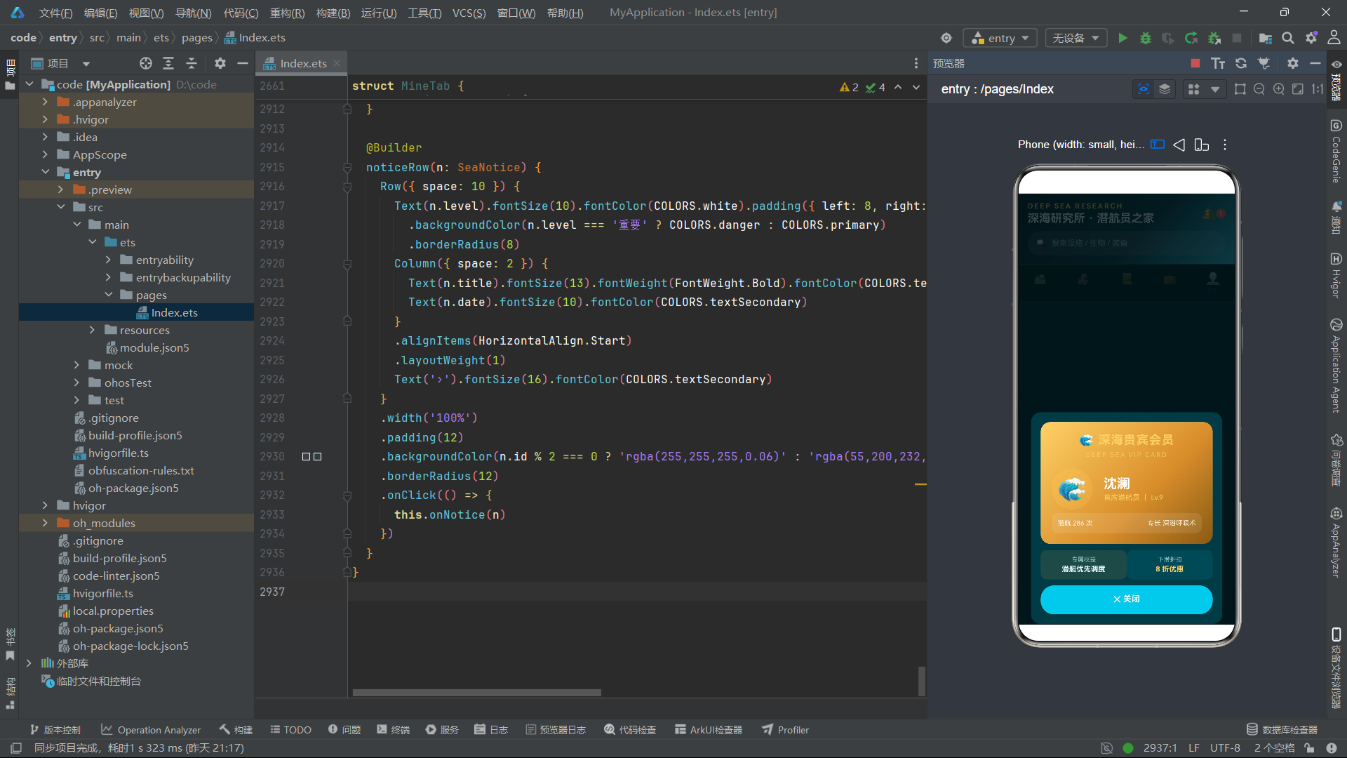
vipModal 是深海贵宾金卡弹窗,它的视觉设计最为华丽。金卡头部使用了三段金色渐变 .linearGradient({ angle: 135, colors: [['#FFD166', 0.0], ['#D98E2B', 0.6], ['#8A5A12', 1.0]] }),从亮金到深金,模拟了实体金卡的金属光泽。.letterSpacing(1) 和 .letterSpacing(2) 为标题文字增加了字间距,营造了高级感。
  @Builder

      Row({ space: 8 }) {

      this.onNotice(n)
    })
  }
}
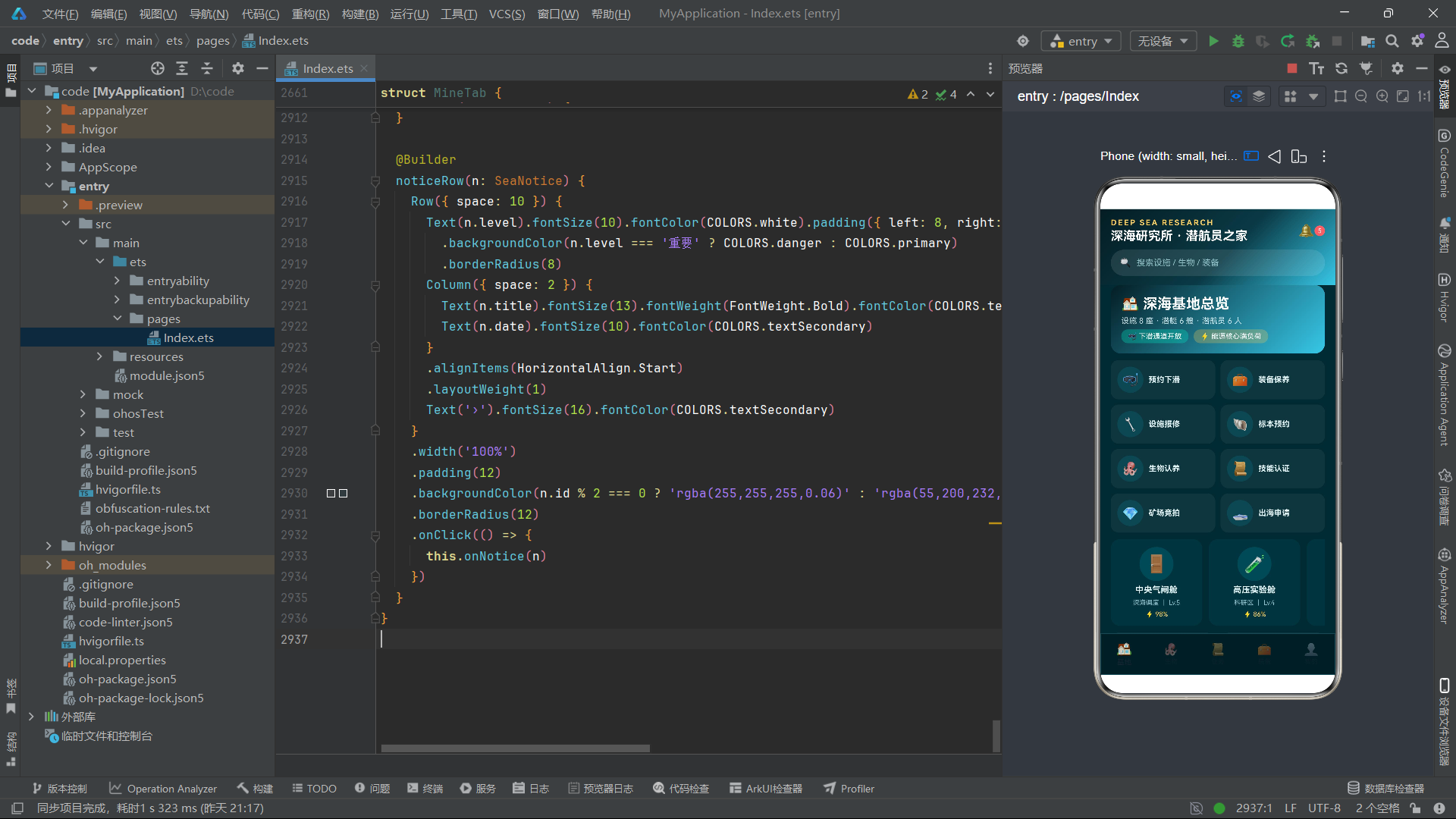
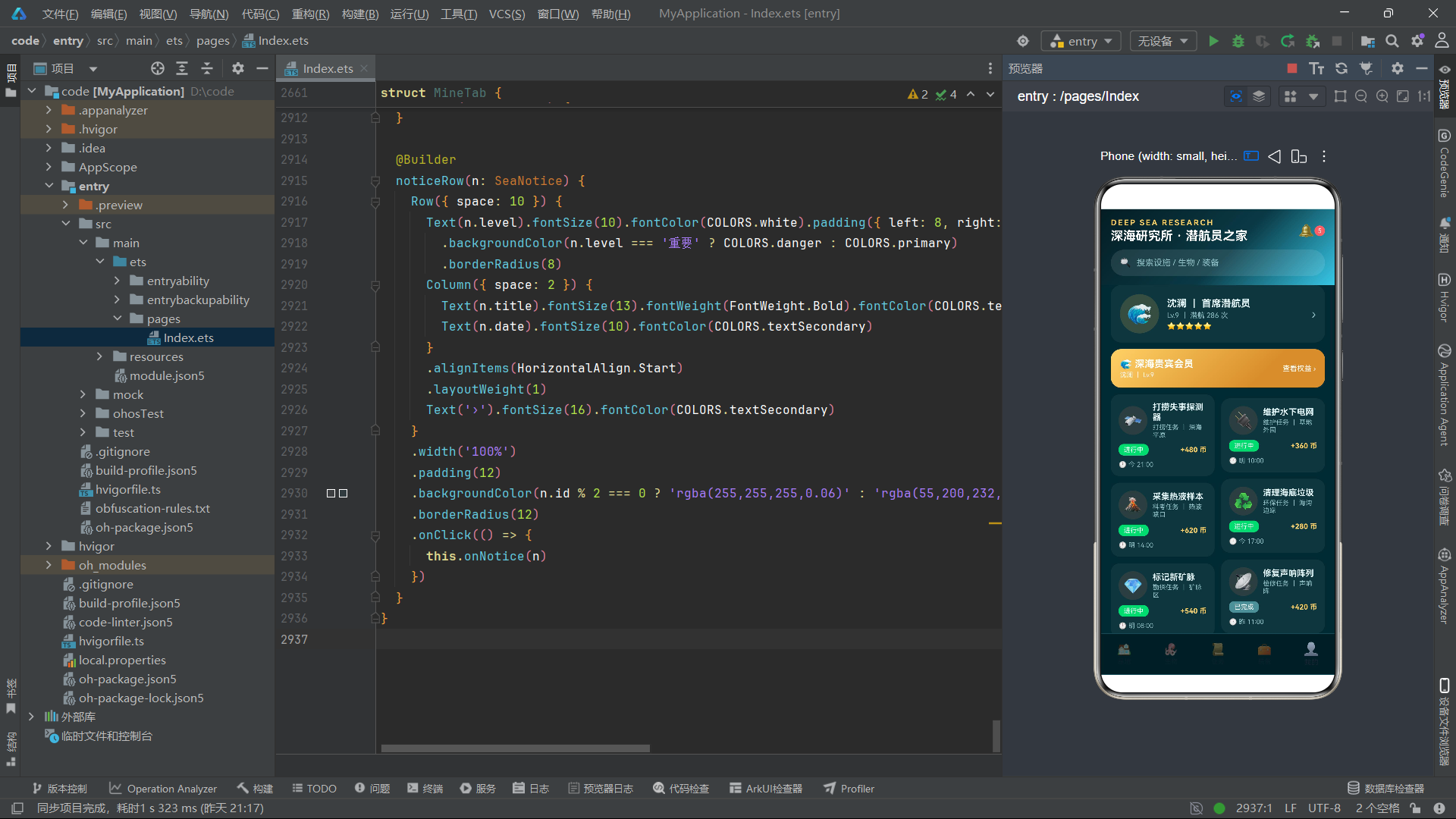
布局技术方面,应用充分利用了 ArkTS 的布局系统。Column 和 Row 是使用频率最高的布局容器,它们通过 space、alignItems、justifyContent、layoutWeight 等属性实现了各种排列和对齐效果。Scroll 组件提供了垂直和水平滚动能力。进度条通过"外轨道+内填充"的双层 Row 结构实现。柱状图通过百分比高度和底部对齐实现。这些布局技术的组合使用,展现了 ArkTS 在纯布局组件构建复杂 UI 方面的强大能力。
构建器复用方面,@Builder 装饰器是应用中最重要的代码组织工具。Index 组件定义了十八个 @Builder 方法,各 Tab 组件定义了多个卡片构建器。这些构建器将复杂的 UI 结构分解为可复用的小片段,使得 build() 方法保持简洁。虽然部分构建器在多个 Tab 组件中被重复定义(如 taskCard、skillCard、orderRow、noticeRow),但这是 ArkTS @Builder 方法属于组件实例这一语言特性的限制所致,在当前架构下是合理的取舍。
交互设计方面,onClick 事件绑定了所有的用户交互——Tab 切换、卡片点击、弹窗关闭、操作按钮等。视觉反馈通过 scale(选中 Tab 放大)、opacity(未选中 Tab 半透明)、动态颜色(状态标签变色)等方式实现。这些交互设计虽然简单,但覆盖了移动应用最常见的交互模式,提供了良好的用户体验。

讨论HarmonyOS开发技术,专注于API与组件、DevEco Studio、测试、元服务和应用上架分发等。
更多推荐

 3
3 0
0- 0



 已为社区贡献8条内容

所有评论(0)