HarmonyOS 6 效果实现 Blank 空白填充组件快速完成页面元素居中与空间自动分配开发教程
在鸿蒙(HarmonyOS)应用开发生态中,ArkTS 作为声明式 UI 编程范式,为开发者提供了状态驱动、组件化构建、高效渲染的能力。本文将以一个完整的软装布艺窗帘生活馆商城应用为蓝本,逐段剖析其代码实现,深入讲解 ArkTS 的核心语法、组件设计、状态管理、动画系统与弹框架构,帮助开发者全面掌握鸿蒙单文件复杂应用的开发方法。
一、应用整体架构与技术栈概览
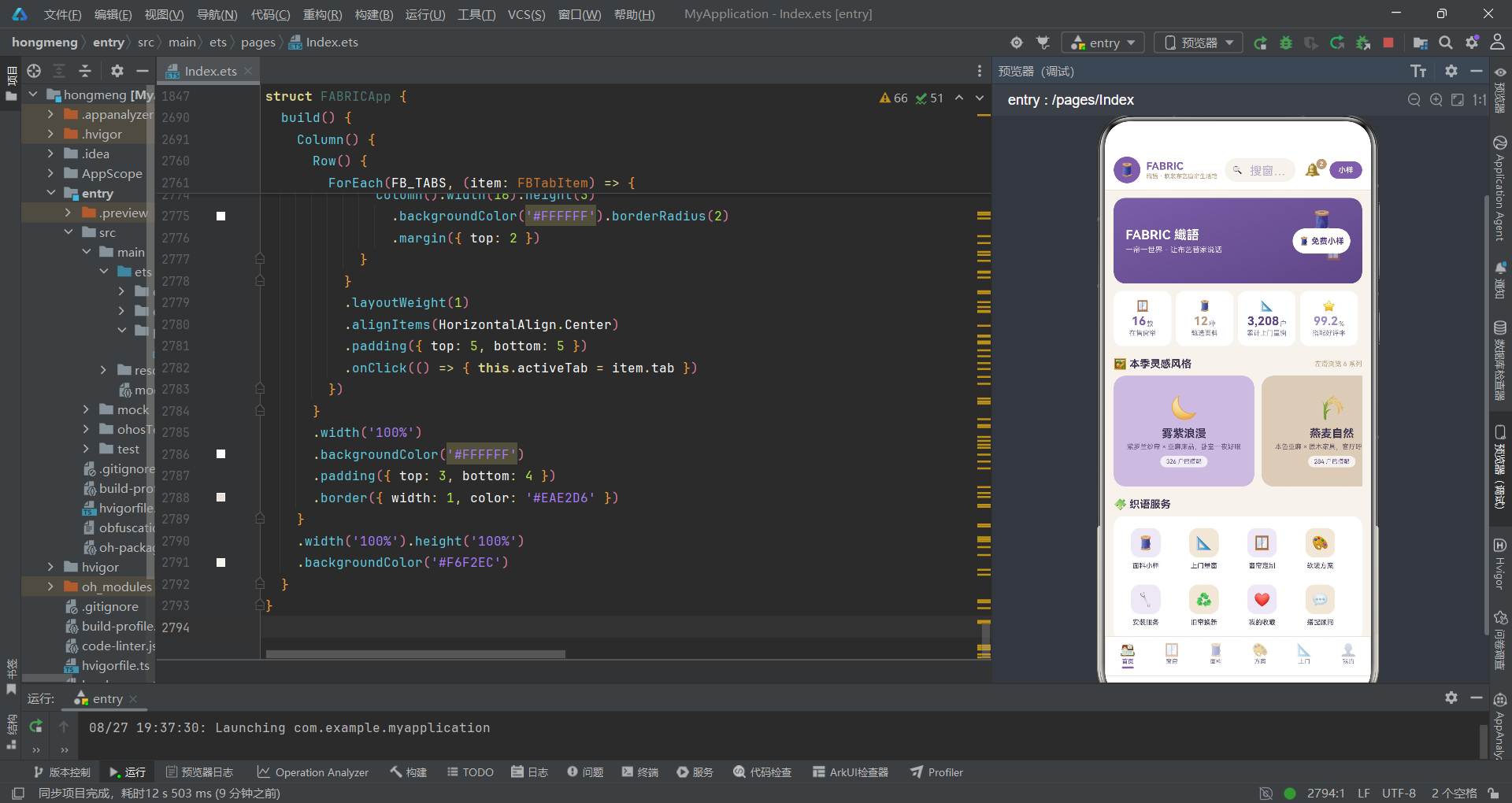
本应用是一个面向软装布艺行业的垂直电商与服务预约平台,业务覆盖窗帘选购、面料小样申请、软装搭配方案、上门量装服务、会员中心等完整链路。整个应用采用鸿蒙原生 ArkTS 语言编写,基于声明式 UI 框架,通过单文件承载全部逻辑,体现了高内聚、低耦合的工程化思想。
应用整体采用"一主多子"的组件架构。主组件 FABRICApp 负责全局状态管理、Tab 路由分发、弹框层调度,六个子内容组件分别承载首页、窗帘、面料、方案、上门、我的六个业务页面。每个子组件通过回调函数向主组件通信,主组件通过属性绑定向子组件下发数据与指令,形成清晰的双向数据流。
在技术栈层面,应用充分利用了 ArkTS 的核心能力。状态管理方面使用 @State 装饰器实现响应式数据绑定。组件化方面使用 @Component 和 @Builder 装饰器分别声明可复用组件与构建器。布局方面综合运用 Column、Row、Stack、Flex、Scroll 等容器组件。动画方面通过 animateTo 实现无限循环的呼吸、飘动、摆动等微交互特效。数据可视化方面通过手工绘制进度条、柱状图、配色比例条等实现轻量级图表展示。
上图展示了应用的整体组件树结构。主组件作为中枢,向下分发到六个业务 Tab 页面和七个弹框模块。每个 Tab 页面内部又有独立的动画状态和数据展示逻辑,弹框层则通过条件渲染叠加在内容区之上,实现模态交互。
应用的视觉设计采用"紫罗兰亚麻风"配色体系,以亚麻米色为底、紫罗兰紫为主调、雾灰紫为辅助色,营造出温暖而高级的家居布艺氛围。所有颜色通过统一的配色常量集中管理,确保视觉一致性。
二、配色体系设计
在鸿蒙 ArkTS 应用开发中,配色管理是视觉一致性的基石。本应用通过接口定义与常量声明的方式,构建了一套完整的配色体系。
interface FBColorPalette {
  bg: string
  card: string
  violet: string
  violetDeep: string
  mist: string
  mistLight: string
  linen: string
  linenLight: string
  ink: string
  line: string
  textSub: string
  textHint: string
}

const FB_COLORS: FBColorPalette = {
  bg: '#F6F2EC',
  card: '#FFFFFF',
  violet: '#7B5EA7',
  violetDeep: '#5E4688',
  mist: '#C9BBDD',
  mistLight: '#EDE7F5',
  linen: '#B99B7A',
  linenLight: '#F0E6D8',
  ink: '#3D3352',
  line: '#EAE2D6',
  textSub: '#7A7290',
  textHint: '#B4AAC6'
}
首先,这里使用 interface 关键字定义了 FBColorPalette 接口。在 ArkTS 中,接口用于声明对象的形状,它是一种类型契约,确保实现该接口的对象必须包含所有声明的字段。这个接口定义了十二个颜色字段,涵盖了背景色、卡片色、主色调、深色调、辅助色、文字色、分割线色等全部视觉维度。
然后,通过 const 声明了 FB_COLORS 常量并赋值为符合接口类型的对象。这种集中式颜色管理方案的优势在于:当需要调整品牌色或适配暗色模式时,只需修改一处即可全局生效。#F6F2EC 作为亚麻米色背景,给人温暖柔和的第一印象;#7B5EA7 紫罗兰紫是品牌主色,用于按钮、标签、强调文字等关键元素。
在实际鸿蒙项目开发中,推荐将配色常量单独抽离到资源文件或公共模块中,通过
AppStorage或静态类进行全局访问。本应用采用单文件内集中声明的方式,便于在代码层面直接引用,也方便开发者快速定位颜色来源。
值得注意的是,配色体系中还定义了 textSub 和 textHint 两级辅助文字色。#7A7290 用于次要文字信息,#B4AAC6 用于提示性文字,这种三级文字色彩层次使信息层级清晰可辨,是移动端界面设计的基本素养。
三、Tab 枚举与导航定义
应用的底部导航采用六 Tab 设计,通过枚举类型管理 Tab 标识,配合数据数组驱动渲染。
enum FBTab {
  Home = 0,
  Curtain = 1,
  Fabric = 2,
  Plan = 3,
  Visit = 4,
  Mine = 5
}

interface FBTabItem {
  tab: FBTab
  icon: string
  label: string
}

const FB_TABS: FBTabItem[] = [
  { tab: FBTab.Home, icon: '🏠', label: '首页' },
  { tab: FBTab.Curtain, icon: '🪟', label: '窗帘' },
  { tab: FBTab.Fabric, icon: '🧵', label: '面料' },
  { tab: FBTab.Plan, icon: '🎨', label: '方案' },
  { tab: FBTab.Visit, icon: '📐', label: '上门' },
  { tab: FBTab.Mine, icon: '👤', label: '我的' }
]
这里首先使用 enum 关键字定义了 FBTab 枚举。在 ArkTS 中,枚举是一种用于定义命名常量集合的数据类型,它为有限的离散值提供了类型安全。每个 Tab 都有一个数字值,从 0 到 5 依次递增。使用枚举而非魔术数字(magic number)的好处是代码可读性大幅提升,FBTab.Home 远比 0 更能表达意图。
接着定义了 FBTabItem 接口,描述每个 Tab 项的结构:tab 字段是枚举标识,icon 是 emoji 图标,label 是显示文字。最后声明 FB_TABS 数组,将六个 Tab 项的数据集中存放。这种"数据驱动渲染"的模式是 ArkTS 的核心思想之一,通过 ForEach 遍历数组即可自动生成底部导航项,无需为每个 Tab 手写重复的 UI 代码。
ForEach 是 ArkTS 中的列表渲染组件,它接收数据数组和渲染函数,自动为每个数据项生成对应的 UI 组件。当数据数组发生变化时,ForEach 会自动触发差分更新,只重新渲染变化的部分,保证渲染性能。
四、首页统计数据模型
首页顶部展示四个关键统计指标,其数据结构定义如下。
interface FBDataStat {
  icon: string
  label: string
  value: string
  sub: string
  color: string
}

const FB_STATS: FBDataStat[] = [
  { icon: '🪟', label: '在售窗帘', value: '16', sub: '款', color: '#7B5EA7' },
  { icon: '🧵', label: '甄选面料', value: '12', sub: '种', color: '#B99B7A' },
  { icon: '📐', label: '累计上门量窗', value: '3,208', sub: '户', color: '#5E4688' },
  { icon: '⭐', label: '搭配好评率', value: '99.2', sub: '%', color: '#9B8AC4' }
]
FBDataStat 接口定义了统计数据的五元组结构。icon 用于表情符号展示,label 是指标名称,value 是核心数值,sub 是单位后缀,color 是该指标的主题色。这种设计使得每个统计卡片都能拥有独立的色彩标识,视觉上不单调。
FB_STATS 数组包含四条数据,分别对应在售窗帘、甄选面料、累计上门量窗、搭配好评率四项指标。数值使用字符串类型存储而非数字,这是因为数值中可能包含千位分隔符(如 3,208)或小数点(如 99.2),使用字符串避免了格式化逻辑的复杂性。
在 ArkTS 中,接口配合常量数组的数据定义模式,相当于传统前端开发中的 Mock 数据层。在实际项目中,这些数据通常来自网络请求,但在单文件应用中,静态数据先行保证了界面开发的独立性,也便于后续将数据源替换为真实 API。
每个统计项的 color 字段使用品牌色系中的不同色值,紫罗兰紫、亚麻棕、深紫、雾灰紫交替使用,四宫格在视觉上形成色彩节奏,避免了同色疲劳。
五、风格与功能宫格数据模型
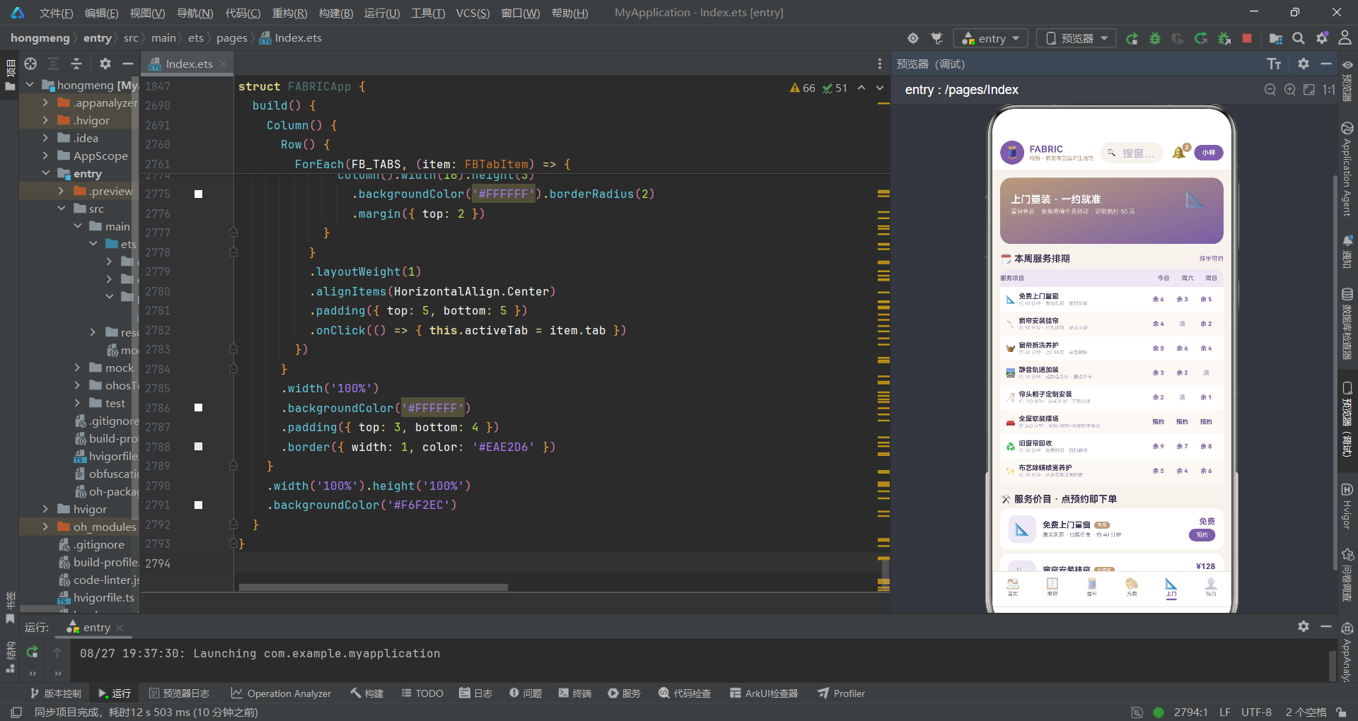
首页的横滑风格大卡和功能宫格分别使用以下数据结构。
interface FBDataStyle {
  id: number
  name: string
  icon: string
  desc: string
  colorHex: string
  count: number
}

const FB_STYLES: FBDataStyle[] = [
  { id: 1, name: '雾紫浪漫', icon: '🌙', desc: '紫罗兰纱帘 × 亚麻床品,卧室一夜好眠', colorHex: '#C9BBDD', count: 326 },
  { id: 2, name: '燕麦自然', icon: '🌾', desc: '本色亚麻 × 原木家具,客厅呼吸感满分', colorHex: '#D9CDB8', count: 284 },
  { id: 3, name: '灰紫轻奢', icon: '💜', desc: '雾灰紫提花 × 丝绒抱枕,全屋高级质感', colorHex: '#9B8AC4', count: 198 },
  { id: 4, name: '亚麻日式', icon: '🍵', desc: '苎麻平幔 × 藤编地毯,书房禅意十足', colorHex: '#CDBFA5', count: 162 },
  { id: 5, name: '奶油法式', icon: '🍰', desc: '米白泡泡纱 × 蕾丝纱幔,餐厅温柔滤镜', colorHex: '#EFD9E2', count: 141 },
  { id: 6, name: '星夜静谧', icon: '🌌', desc: '深紫墨全遮光 × 静音轨道,儿童房哄睡神器', colorHex: '#3D3352', count: 118 }
]
FBDataStyle 接口定义了软装风格的数据结构。colorHex 字段存储风格的代表色,这个颜色将直接用作卡片的背景色,使每种风格在视觉上拥有独特的色彩标识。count 字段记录已有多少户家庭采用了该风格方案,作为社交信任的量化指标。
六种风格的色彩从浅到深排列,从雾紫浪漫的 #C9BBDD 到星夜静谧的 #3D3352,形成一条完整的色彩光谱。desc 字段以"×"符号连接两个软装元素,简洁地传达搭配理念,这是软装行业常见的文案范式。
interface FBDataGrid {
  icon: string
  label: string
  bg: string
}

const FB_GRIDS: FBDataGrid[] = [
  { icon: '🧵', label: '面料小样', bg: '#EDE7F5' },
  { icon: '📐', label: '上门量窗', bg: '#F0E6D8' },
  { icon: '🪟', label: '窗帘定制', bg: '#EDE7F5' },
  { icon: '🎨', label: '软装方案', bg: '#F0E6D8' },
  { icon: '🔧', label: '安装服务', bg: '#EDE7F5' },
  { icon: '♻️', label: '旧帘换新', bg: '#F0E6D8' },
  { icon: '❤️', label: '我的收藏', bg: '#EDE7F5' },
  { icon: '💬', label: '搭配顾问', bg: '#F0E6D8' }
]
功能宫格的数据结构更加简洁,仅包含图标、标签、背景色三个字段。bg 字段的值在 #EDE7F5(雾紫浅)和 #F0E6D8(亚麻浅)之间交替,形成棋盘式的视觉韵律。八项功能覆盖了面料小样、上门量窗、窗帘定制、软装方案、安装服务、旧帘换新、我的收藏、搭配顾问等完整业务链路。
六、风格分布与窗帘数据模型
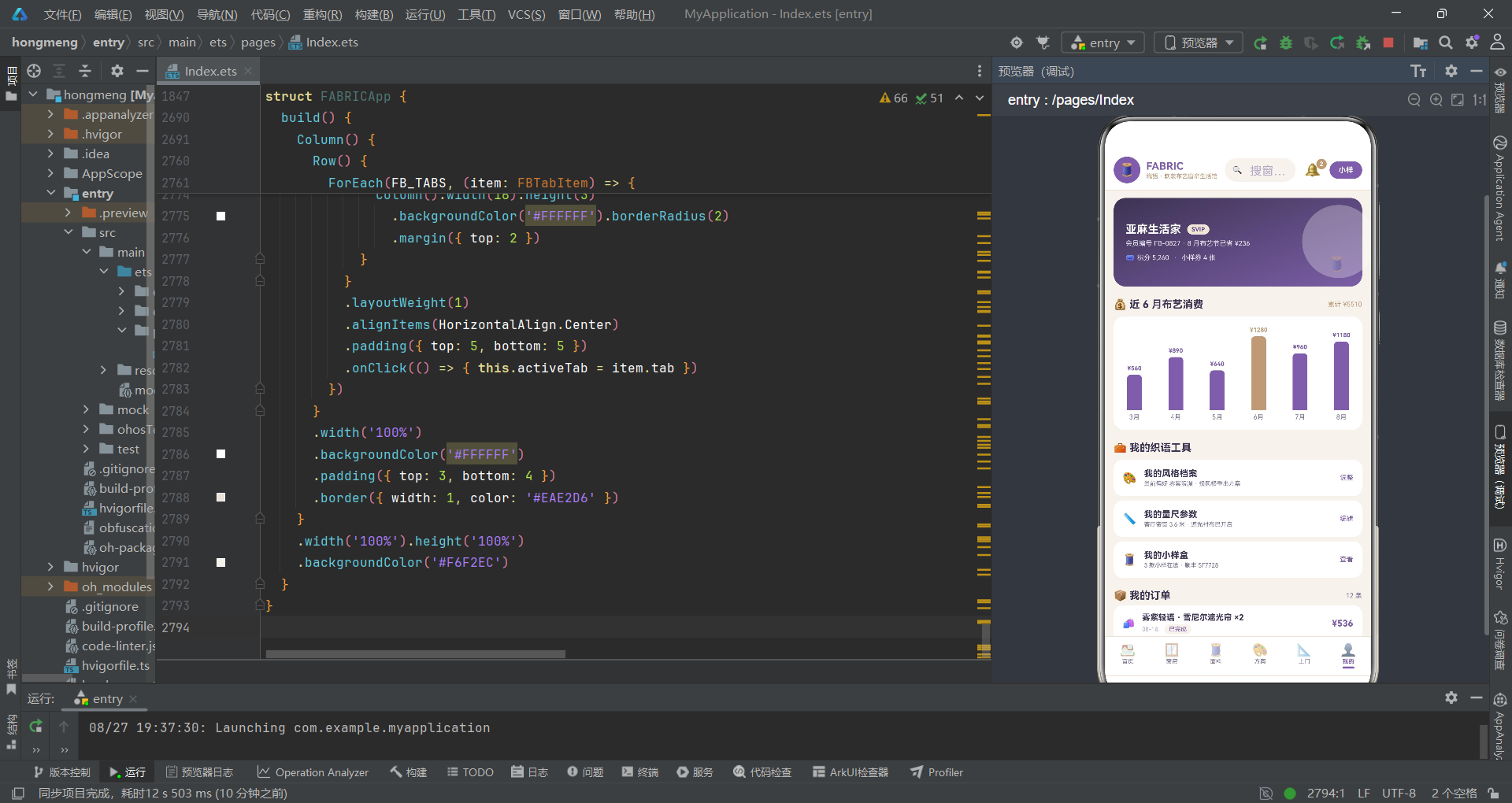
首页还展示了风格类型分布条和窗帘商品列表,其数据结构如下。
interface FBDataDist {
  style: string
  count: number
  color: string
}

const FB_STYLE_DIST: FBDataDist[] = [
  { style: '自然风', count: 128, color: '#7B5EA7' },
  { style: '轻奢风', count: 96, color: '#9B8AC4' },
  { style: '日式', count: 84, color: '#B99B7A' },
  { style: '法式', count: 62, color: '#C9BBDD' },
  { style: '极简', count: 58, color: '#CDBFA5' },
  { style: '复古', count: 40, color: '#5E4688' }
]
FBDataDist 接口用于风格分布数据,style 是风格名称,count 是订单数量,color 是该风格对应的条形图颜色。六种风格的订单量从 128 递减到 40,配合不同色值的条形图,直观展示客户偏好分布。
interface FBDataCurtain {
  id: number
  name: string
  cat: string
  icon: string
  colorHex: string
  price: number
  sales: number
  dim: number
  fold: number
  spaces: string
  tag: string
}

const FBCURTAINS: FBDataCurtain[] = [
  { id: 1, name: '雾紫轻语 · 雪尼尔遮光帘', cat: '卧室', icon: '🌙', colorHex: '#C9BBDD', price: 268, sales: 4820, dim: 95, fold: 2.0, spaces: '主卧/老人房', tag: '爆款' },
  { id: 2, name: '亚麻晨光 · 棉麻半遮光帘', cat: '客厅', icon: '🌾', colorHex: '#D9CDB8', price: 189, sales: 3960, dim: 60, fold: 1.8, spaces: '客厅/阳台', tag: '热卖' },
  { id: 3, name: '星夜黑金 · 全遮光隔音帘', cat: '卧室', icon: '🌌', colorHex: '#3D3352', price: 359, sales: 3610, dim: 99, fold: 2.5, spaces: '主卧/影音室', tag: '隔音' }
  // ... 共 16 款
]
FBDataCurtain 是窗帘商品的核心数据接口,包含十一个字段。cat 用于分类筛选,dim 是遮光率百分比,fold 是褶皱倍数,spaces 以斜杠分隔两个适用空间,tag 是营销标签。十六款窗帘覆盖了卧室、客厅、书房、儿童房、餐厅等全部空间场景,价格从 129 元到 398 元每平方米,满足不同预算需求。
colorHex 字段存储窗帘的代表色,在 UI 层面直接作为色块背景展示,让用户在浏览时就能直观感受窗帘的色彩风格,这比文字描述更高效。
七、面料、方案与服务数据模型
interface FBDataFabric {
  id: number
  name: string
  colorHex: string
  comp: string
  price: number
  feature: string
  stock: number
  feel: number
}

const FBFABRICS: FBDataFabric[] = [
  { id: 1, name: '本色亚麻', colorHex: '#D9CDB8', comp: '100% 亚麻', price: 68, feature: '透气亲肤', stock: 420, feel: 96 },
  { id: 2, name: '棉麻混纺', colorHex: '#E4D9C6', comp: '55% 棉 45% 麻', price: 45, feature: '垂感自然', stock: 680, feel: 92 },
  { id: 3, name: '雾灰紫雪尼尔', colorHex: '#C9BBDD', comp: '雪尼尔绒', price: 88, feature: '厚实遮光', stock: 350, feel: 98 }
  // ... 共 12 种
]
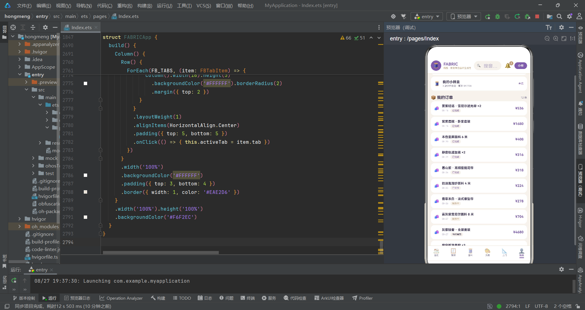
面料数据接口 FBDataFabric 包含成分 comp、特色 feature、库存 stock、手感指数 feel 等专业字段。feel 是一个 0 到 100 的数值,代表盲摸手感的评分,用于手感榜单排序。十二种面料从 32 元的雪纺纱到 128 元的紫罗兰丝绒,价格梯度覆盖大众到轻奢市场。
interface FBDataPlan {
  id: number
  name: string
  style: string
  icon: string
  price: number
  rooms: string
  rating: number
  applied: number
  c1: string
  c2: string
  c3: string
  c4: string
  r1: number
  r2: number
  r3: number
  r4: number
}

const FBPLANS: FBDataPlan[] = [
  { id: 1, name: '紫雾晨眠 · 卧室套装', style: '雾紫浪漫', icon: '🌙', price: 1680, rooms: '窗帘+床品+抱枕', rating: 4.9, applied: 326, c1: '#C9BBDD', c2: '#F6F2EC', c3: '#7B5EA7', c4: '#B99B7A', r1: 40, r2: 30, r3: 20, r4: 10 }
  // ... 共 8 套
]
软装方案数据接口 FBDataPlan 是最复杂的数据结构,包含四个配色字段 c1 到 c4 和四个占比字段 r1 到 r4。这种设计将配色方案拆解为主色、底色、点缀色、强调色四个层次,遵循"四色法则"(主色 40% + 底色 30% + 点缀色 20% + 强调色 10%),是室内设计的专业方法论在数据层面的直接映射。
上图展示了四色法则在软装方案中的角色分工。主色占据 40% 的视觉面积,是空间的主基调;底色占 30% 作为主色的衬托;点缀色占 20% 用于增加视觉层次;强调色仅占 10% 起画龙点睛之效。
八、上门服务与用户数据模型
interface FBDataVisit {
  id: number
  name: string
  icon: string
  duration: string
  price: number
  desc: string
  tag: string
  today: string
  sat: string
  sun: string
}

const FBVISITS: FBDataVisit[] = [
  { id: 1, name: '免费上门量窗', icon: '📐', duration: '约 40 分钟', price: 0, desc: '激光测距 · 出报价单', tag: '免费', today: '余 6', sat: '余 3', sun: '余 5' },
  { id: 2, name: '窗帘安装挂帘', icon: '🔧', duration: '约 90 分钟', price: 128, desc: '打孔挂钩 · 调试平整', tag: '标准化', today: '余 4', sat: '满', sun: '余 2' }
  // ... 共 8 项
]
上门服务数据接口 FBDataVisit 包含 today、sat、sun 三个字段,分别表示今日、周六、周日的可约余量。值为"余 N"表示还有名额,"满"表示已约满,"预约"表示需联系客服。这种设计直接将排期信息嵌入数据,无需额外的日历组件即可展示服务可用性。
interface FBDataBooking {
  id: number
  service: string
  master: string
  date: string
  time: string
  status: string
  addr: string
}

const FBBOOKINGS: FBDataBooking[] = [
  { id: 1, service: '免费上门量窗', master: '量尺组 · 阿哲', date: '08-16', time: '10:00-12:00', status: '已完成', addr: '澜山别院 3 栋 802' },
  { id: 2, service: '静音轨道加装', master: '安装组 · 老周', date: '08-17', time: '14:00-16:00', status: '已完成', addr: '澜山别院 3 栋 802' }
  // ... 共 14 条
]
预约记录数据接口 FBDataBooking 记录了服务名称、师傅信息、日期、时段、状态和地址。十四条记录覆盖了已完成、进行中、待上门、已预约四种状态,构成一条完整的时间轴。master 字段采用"组别 · 人名"的格式,既体现了服务团队的专业分工,又保留了人情味。
九、订单、收藏与消费数据模型
interface FBDataOrder {
  id: number
  item: string
  date: string
  status: string
  price: number
}

const FBORDERS: FBDataOrder[] = [
  { id: 1, item: '雾紫轻语 · 雪尼尔遮光帘 ×2', date: '08-18', status: '已完成', price: 536 },
  { id: 2, item: '紫雾晨眠 · 卧室套装', date: '08-18', status: '已完成', price: 1680 },
  { id: 3, item: '本色亚麻面料 6 米', date: '08-20', status: '已完成', price: 408 }
  // ... 共 12 条
]
订单数据接口 FBDataOrder 包含商品名称、日期、状态和金额。十二条订单呈现了已完成、已发货、制作中、待付尾款、待服务等多种状态,真实模拟了电商订单的全生命周期。
interface FBDataSpend {
  month: string
  amount: number
}

const FBSPEND: FBDataSpend[] = [
  { month: '3月', amount: 560 },
  { month: '4月', amount: 890 },
  { month: '5月', amount: 640 },
  { month: '6月', amount: 1280 },
  { month: '7月', amount: 960 },
  { month: '8月', amount: 1180 }
]
月消费数据接口 FBDataSpend 记录了六个月的布艺消费金额。这些数据将用于"我的"页面的柱状图展示,通过计算每月金额占最大值的比例来动态计算柱高,实现轻量级的数据可视化。
在 ArkTS 中,数据可视化的实现并不一定需要引入图表库。对于简单的柱状图、进度条、比例条等可视化需求,利用
Column的高度属性和backgroundColor即可手工绘制,既减少依赖又保持包体积精简。
十、评价数据与全局纯函数
interface FBDataReview {
  id: number
  user: string
  avatar: string
  item: string
  rating: number
  date: string
  content: string
  tag: string
}

const FBREVIEWS: FBDataReview[] = [
  { id: 1, user: '眠眠兔', avatar: '🐰', item: '紫雾晨眠 · 卧室套装', rating: 5.0, date: '08-25', content: '纱帘配床品绝了,卧室像加了一层柔光滤镜,睡眠质量直线上升。', tag: '质感满分' },
  { id: 2, user: '山茶开了', avatar: '🌺', item: '雾紫轻语 · 雪尼尔遮光帘', rating: 4.9, date: '08-24', content: '遮光真的顶,白天拉上像深夜,加厚褶皱垂感特别高级。', tag: '遮光强' }
  // ... 共 10 条
]
评价数据接口 FBDataReview 包含用户昵称、emoji 头像、评分、日期、评价内容和标签。十条评价使用不同的 emoji 作为用户头像,既节省了图片资源加载,又增添了趣味性。tag 字段是评价的提炼标签,如"质感满分""遮光强"等,帮助浏览者快速筛选关注点。
function fbMoney(p: number): string {
  return '¥' + p.toString()
}

function fbDimW(d: number): string {
  return d.toString() + '%'
}

function fbSalesW(s: number): string {
  return Math.round(s / 4820 * 100).toString() + '%'
}

function fbPriceW(p: number): string {
  return Math.round(p / 128 * 100).toString() + '%'
}

function fbFeelW(f: number): string {
  return f.toString() + '%'
}

function fbDistW(c: number): string {
  return Math.round(c / 128 * 100).toString() + '%'
}

function fbSpendH(a: number): number {
  return Math.round(a / 1280 * 92) + 8
}
全局纯函数是应用的工具层,负责数据格式化和比例计算。fbMoney 将数字转为带人民币符号的字符串。fbDimW 将遮光率数字转为百分比字符串。fbSalesW 将销量转为相对最大销量的百分比,以 4820 为基准值进行归一化计算。
这些函数遵循"纯函数"设计原则:相同输入永远产生相同输出,不产生副作用。fbPriceW 以 128 元为基准计算价格占比,fbFeelW 直接将手感指数转为百分比字符串,fbDistW 以 128 单为基准计算分布占比,fbSpendH 将消费金额映射为柱状图高度(8 到 100 像素区间)。
纯函数是函数式编程的核心概念。在 ArkTS 状态驱动的框架中,纯函数特别适合用于计算 UI 展示所需的派生值,因为它们不依赖外部可变状态,在任何时机调用都能得到确定的结果,便于调试和测试。
十一、状态转换与列表过滤函数
function fbFoldColor(f: number): string {
  return f >= 2.5 ? '#5E4688' : (f >= 2 ? '#7B5EA7' : '#B99B7A')
}

function fbStatusColor(s: string): string {
  return s === '已完成' ? '#7B5EA7' : (s === '进行中' ? '#B99B7A' : (s === '待上门' ? '#9B8AC4' : '#3D3352'))
}

function fbStatusBg(s: string): string {
  return s === '已完成' ? '#EDE7F5' : (s === '进行中' ? '#F0E6D8' : '#F6F2EC')
}

function fbOrderColor(s: string): string {
  return s === '已完成' ? '#7B5EA7' : (s === '已发货' ? '#9B8AC4' : (s === '制作中' ? '#B99B7A' : '#3D3352'))
}

function fbSlotColor(q: string): string {
  return q === '满' ? '#B4AAC6' : (q === '预约' ? '#5E4688' : '#7B5EA7')
}
这一组函数负责将业务状态映射为视觉颜色。fbFoldColor 根据褶皱倍数返回不同深浅的紫色:2.5 倍及以上用深紫 #5E4688,2 倍到 2.5 倍用标准紫 #7B5EA7,2 倍以下用亚麻棕 #B99B7A。这种"数值越大颜色越深"的映射逻辑,让用户通过颜色就能感知参数等级。
fbStatusColor 和 fbStatusBg 分别返回预约状态的前景色和背景色。已完成用紫罗兰紫配雾紫浅底,进行中用亚麻棕配亚麻浅底,待上门用雾灰紫,其他用深紫墨。fbOrderColor 则针对订单状态映射颜色,已完成、已发货、制作中、其他分别对应不同色值。
function fbToggleAt(src: boolean[], i: number): boolean[] {
  let r: boolean[] = src.slice()
  r[i] = !r[i]
  return r
}

function fbFilterCurtains(cat: string): FBDataCurtain[] {
  let r: FBDataCurtain[] = []
  for (let i = 0; i < FBCURTAINS.length; i++) {
    if (cat === '全部' || FBCURTAINS[i].cat === cat) {
      r.push(FBCURTAINS[i])
    }
  }
  return r
}

function fbTopSales(): FBDataCurtain[] {
  let r: FBDataCurtain[] = FBCURTAINS.slice()
  r.sort((a: FBDataCurtain, b: FBDataCurtain) => b.sales - a.sales)
  return r.slice(0, 5)
}

function fbTopDim(): FBDataCurtain[] {
  let r: FBDataCurtain[] = FBCURTAINS.slice()
  r.sort((a: FBDataCurtain, b: FBDataCurtain) => b.dim - a.dim)
  return r.slice(0, 6)
}

function fbTopFabrics(): FBDataFabric[] {
  let r: FBDataFabric[] = FBFABRICS.slice()
  r.sort((a: FBDataFabric, b: FBDataFabric) => b.price - a.price)
  return r
}

function fbTopFeel(): FBDataFabric[] {
  let r: FBDataFabric[] = FBFABRICS.slice()
  r.sort((a: FBDataFabric, b: FBDataFabric) => b.feel - a.feel)
  return r.slice(0, 6)
}

function fbTotalSpend(): number {
  let sum: number = 0
  for (let i = 0; i < FBSPEND.length; i++) {
    sum += FBSPEND[i].amount
  }
  return sum
}
fbToggleAt 是一个重要的不可变更新函数。它首先通过 slice() 复制原数组,然后翻转指定索引的布尔值,返回新数组。在 ArkTS 的 @State 状态管理中,直接修改数组元素不会触发重新渲染,必须返回新的数组引用才能让框架检测到变化。这个函数正是为收藏切换、小样多选等场景设计的。
fbFilterCurtains 根据分类名称过滤窗帘列表。当分类为"全部"时返回所有窗帘,否则只返回匹配分类的窗帘。fbTopSales、fbTopDim、fbTopFabrics、fbTopFeel 分别按销量、遮光率、价格、手感指数排序并截取前几项,用于各类榜单展示。fbTotalSpend 累加六个月消费金额。
十二、首页内容组件(第一部分:品牌横幅与统计)
@Component
struct FABRICHomeContent {
  @State weaveShift: number = 0
  @State weaveOpacity: number = 0.3
  onAddSample: () => void = () => {}
  onBookVisit: () => void = () => {}
  onGoto: (tab: FBTab) => void = (tab: FBTab) => {}

  aboutToAppear() {
    this.getUIContext().animateTo({
      duration: 2200,
      iterations: -1,
      playMode: PlayMode.Alternate,
      curve: Curve.EaseInOut
    }, () => {
      this.weaveShift = 10
      this.weaveOpacity = 0.85
    })
  }
@Component 装饰器将 FABRICHomeContent 声明为一个可复用的 UI 组件。在 ArkTS 中,@Component 是组件化的基础,被装饰的 struct 拥有独立的构建函数 build()、生命周期回调 aboutToAppear(),以及自身的状态管理能力。
@State 装饰器声明了两个响应式状态变量:weaveShift 控制横幅布纹的位移量,weaveOpacity 控制透明度。当这些变量的值发生变化时,引用它们的 UI 部分会自动重新渲染。@State 是 ArkTS 状态管理体系的核心装饰器,它实现了观察者模式,状态变更会自动通知依赖该状态的视图更新。
aboutToAppear() 是组件的生命周期回调,在组件创建后、build() 执行前调用。这里通过 getUIContext().animateTo() 启动一个无限循环动画。duration: 2200 设置动画时长 2.2 秒,iterations: -1 表示无限重复,playMode: PlayMode.Alternate 表示交替播放(正向结束后反向播放),curve: Curve.EaseInOut 设置缓动曲线为先快后慢再快。动画闭包内将 weaveShift 从 0 变到 10、weaveOpacity 从 0.3 变到 0.85,由于是交替模式,动画会在两个状态之间持续往复,形成飘动效果。
aboutToAppear是 ArkTS 组件生命周期的早期钩子,适合用于初始化状态和启动动画。除了aboutToAppear,还有aboutToDisappear(组件销毁前)、onPageShow(页面显示时)、onPageHide(页面隐藏时)等生命周期回调,开发者应根据场景选择合适的时机执行逻辑。
三个回调属性 onAddSample、onBookVisit、onGoto 是子组件向父组件通信的桥梁。在 ArkTS 中,子组件无法直接修改父组件的状态,但可以通过调用父组件传入的回调函数来间接通信。这种"属性绑定 + 回调通知"的模式是 ArkTS 组件间通信的标准做法。
十三、首页内容组件(第二部分:品牌横幅构建)
  build() {
    Scroll() {
      Column() {
        Stack() {
          Column()
            .width('100%').height(116)
            .linearGradient({
              direction: GradientDirection.RightBottom,
              colors: [['#7B5EA7', 0], ['#5E4688', 1]]
            })
            .borderRadius(16)
          Text('🧵').fontSize(26)
            .opacity(this.weaveOpacity)
            .translate({ x: this.weaveShift, y: 0 })
            .position({ x: '76%', y: 16 })
          Text('🪟').fontSize(18)
            .opacity(this.weaveOpacity * 0.7)
            .translate({ x: -this.weaveShift, y: 0 })
            .position({ x: '88%', y: 64 })
          Row() {
            Column() {
              Text('FABRIC 織語').fontSize(17).fontWeight(FontWeight.Bold).fontColor('#FFFFFF')
              Text('一帘一世界 · 让布艺替家说话').fontSize(10).fontColor('#EDE7F5')
                .margin({ top: 4 })
            }
            .alignItems(HorizontalAlign.Start)
            Column().layoutWeight(1)
            Column() {
              Text('🧵 免费小样').fontSize(11).fontWeight(FontWeight.Bold).fontColor('#5E4688')
            }
            .width(78).height(34)
            .backgroundColor('#FFFFFF')
            .borderRadius(17)
            .justifyContent(FlexAlign.Center)
            .onClick(() => { this.onAddSample() })
          }
          .width('100%').padding(16).alignItems(VerticalAlign.Center)
        }
        .width('100%')
        .margin({ top: 10 })
build() 是组件的构建函数,所有 UI 描述都在此函数内完成。最外层是 Scroll 滚动容器,内部包裹 Column 垂直布局。Scroll 是 ArkTS 的滚动容器组件,当内容超出可视区域时自动支持上下滑动,scrollable(ScrollDirection.Vertical) 指定垂直滚动方向。
Stack 是层叠布局容器,它将子元素按声明顺序从底层到顶层堆叠。这里在 Stack 中放置了四层元素:最底层是带渐变背景的 Column,中间两层是飘动的 emoji 装饰,最顶层是品牌文字和按钮。
linearGradient 方法为 Column 设置线性渐变背景。direction: GradientDirection.RightBottom 表示渐变方向从左上到右下,colors 数组定义渐变断点:['#7B5EA7', 0] 表示起点为紫罗兰紫,['#5E4688', 1] 表示终点为深紫。这种渐变效果比纯色更有层次感。
两个 Text 组件通过 translate 属性实现位移动画。🧵 向右移动 weaveShift 像素,🪟 向左移动 weaveShift 像素(负值),两者方向相反,营造出交错飘动的效果。opacity 绑定到动画状态,使 emoji 的透明度也在 0.3 到 0.85 之间呼吸变化。position 属性使用百分比和像素值混合定位,精确控制装饰元素的位置。
Row 容器内部使用三栏布局:左侧是品牌文字 Column,中间用 Column().layoutWeight(1) 占据剩余空间形成弹性间距,右侧是"免费小样"按钮。layoutWeight(1) 是 ArkTS 的弹性权重属性,它让组件占据父容器中剩余的全部空间。justifyContent(FlexAlign.Center) 让按钮内部文字水平居中。
FlexAlign 是 ArkTS 中的弹性对齐枚举,定义了主轴方向上的对齐方式。FlexAlign.Center 表示居中对齐,FlexAlign.Start 表示主轴起点对齐,FlexAlign.End 表示主轴终点对齐,FlexAlign.SpaceBetween 表示两端对齐且元素间距相等,FlexAlign.SpaceAround 表示每个元素两侧间距相等。
十四、首页内容组件(第三部分:统计四格与风格横滑)
        Row() {
          ForEach(FB_STATS, (s: FBDataStat) => {
            Column() {
              Text(s.icon).fontSize(14)
              Row() {
                Text(s.value).fontSize(16).fontWeight(FontWeight.Bold).fontColor(s.color)
                Text(s.sub).fontSize(9).fontColor('#7A7290').margin({ left: 1 })
              }
              .margin({ top: 3 }).alignItems(VerticalAlign.Bottom)
              Text(s.label).fontSize(9).fontColor('#7A7290').margin({ top: 2 })
            }
            .layoutWeight(1)
            .padding({ top: 12, bottom: 12 })
            .backgroundColor('#FFFFFF')
            .borderRadius(12)
            .margin({ right: 6 })
            .alignItems(HorizontalAlign.Center)
          })
        }
        .width('100%').margin({ top: 10 })
统计四格使用 Row 横向布局包裹 ForEach 渲染的四个 Column。ForEach 接收 FB_STATS 数组和渲染函数,函数参数 s 是当前数据项。每个 Column 使用 layoutWeight(1) 等分宽度,形成四等分网格。
每个统计卡片内部从上到下依次是:emoji 图标、数值行(数值 + 单位)、标签文字。数值行的 alignItems(VerticalAlign.Bottom) 让数值和单位底部对齐,因为数值的字号大于单位,底部对齐能保证两者的基线一致,视觉上更协调。fontWeight(FontWeight.Bold) 让数值加粗突出。
        Row() {
          Text('🖼️ 本季灵感风格').fontSize(14).fontWeight(FontWeight.Bold).fontColor('#3D3352')
          Column().layoutWeight(1)
          Text('左滑浏览 6 系列').fontSize(9).fontColor('#B99B7A')
        }
        .width('100%').margin({ top: 16 })
        Scroll() {
          Row() {
            ForEach(FB_STYLES, (st: FBDataStyle) => {
              Stack() {
                Column()
                  .width(190).height(150)
                  .backgroundColor(st.colorHex)
                  .borderRadius(16)
                Column() {
                  Text(st.icon).fontSize(30).opacity(0.9)
                  Text(st.name).fontSize(15).fontWeight(FontWeight.Bold).fontColor('#3D3352')
                    .margin({ top: 8 })
                  Text(st.desc).fontSize(9).fontColor('#3D3352').opacity(0.75)
                    .maxLines(2).margin({ top: 4 })
                  Row() {
                    Text(st.count.toString() + ' 户已搭配').fontSize(8).fontColor('#5E4688')
                      .backgroundColor('rgba(255,255,255,0.75)')
                      .padding({ left: 8, right: 8, top: 3, bottom: 3 })
                      .borderRadius(9)
                  }
                  .margin({ top: 7 })
                }
                .width(190).height(150)
                .justifyContent(FlexAlign.Center)
                .alignItems(HorizontalAlign.Center)
                .padding({ left: 10, right: 10 })
              }
              .width(190).height(150)
              .margin({ right: 10 })
            })
          }
        }
        .scrollable(ScrollDirection.Horizontal)
        .width('100%').margin({ top: 8 }).scrollBar(BarState.Off)
风格横滑区域是首页的核心视觉模块。外层 Scroll 设置 scrollable(ScrollDirection.Horizontal) 启用水平滚动,scrollBar(BarState.Off) 隐藏滚动条,保持界面干净。每个风格卡片使用 Stack 层叠:底层是风格代表色的色块,上层是文字信息。
maxLines(2) 限制描述文字最多显示两行,超出部分自动截断。opacity(0.75) 让描述文字半透明,降低视觉权重,使风格名称更突出。"户已搭配"标签使用 rgba(255,255,255,0.75) 的半透明白色背景,在彩色色块上既能保证文字可读性,又不会过于突兀。
Scroll组件在 ArkTS 中有水平滚动和垂直滚动两种模式,通过scrollable方法配置。横滑卡片流是电商应用首页的常见模式,配合scrollBar(BarState.Off)隐藏滚动条,可以实现流畅的轮播浏览体验。
十五、首页内容组件(第四部分:功能宫格与分布条)
        Text('🧩 织语服务').fontSize(14).fontWeight(FontWeight.Bold).fontColor('#3D3352')
          .width('100%').margin({ top: 16 })
        Flex({ wrap: FlexWrap.Wrap }) {
          ForEach(FB_GRIDS, (g: FBDataGrid) => {
            Column() {
              Column() {
                Text(g.icon).fontSize(18)
              }
              .width(40).height(40)
              .backgroundColor(g.bg)
              .borderRadius(12)
              .justifyContent(FlexAlign.Center)
              Text(g.label).fontSize(9).fontColor('#3D3352').margin({ top: 6 })
            }
            .width('24%')
            .padding({ top: 10, bottom: 10 })
            .alignItems(HorizontalAlign.Center)
            .onClick(() => {
              if (g.label === '面料小样') {
                this.onAddSample()
              } else if (g.label === '上门量窗' || g.label === '安装服务') {
                this.onBookVisit()
              } else if (g.label === '窗帘定制') {
                this.onGoto(FBTab.Curtain)
              } else if (g.label === '软装方案') {
                this.onGoto(FBTab.Plan)
              } else if (g.label === '旧帘换新') {
                this.onGoto(FBTab.Visit)
              } else if (g.label === '我的收藏') {
                this.onGoto(FBTab.Mine)
              }
            })
          })
        }
        .width('100%')
        .padding({ top: 6, bottom: 10, left: 4, right: 4 })
        .backgroundColor('#FFFFFF')
        .borderRadius(14)
        .margin({ top: 8 })
功能宫格使用 Flex 组件配合 wrap: FlexWrap.Wrap 实现自动换行的网格布局。Flex 是 ArkTS 的弹性布局容器,FlexWrap.Wrap 表示当一行排满后自动换行到下一行。每个宫格项宽度设为 24%,一行正好排列四个,两行排列完八个。
Flex 与 Row 的区别在于:Row 不会自动换行,当子元素总宽度超出容器宽度时会溢出或被压缩;Flex 通过 wrap 属性可以自动换行,更适合网格类布局。每个宫格项的 onClick 根据标签名称路由到不同的弹框或 Tab 页面,通过条件判断实现功能分发。
        Column() {
          ForEach(FB_STYLE_DIST, (d: FBDataDist) => {
            Row() {
              Text(d.style).fontSize(10).fontColor('#3D3352').width(46)
              Row() {
                Column()
                  .width(fbDistW(d.count))
                  .height(9)
                  .backgroundColor(d.color)
                  .borderRadius(4)
              }
              .width('100%').height(9)
              .backgroundColor('#F0E6D8')
              .borderRadius(4)
              .justifyContent(FlexAlign.Start)
              .layoutWeight(1)
              Text(d.count.toString() + ' 单').fontSize(9).fontColor('#7A7290').width(36)
            }
            .width('100%')
            .padding({ top: 6, bottom: 6 })
            .alignItems(VerticalAlign.Center)
          })
        }
        .width('100%')
        .padding(12)
        .backgroundColor('#FFFFFF')
        .borderRadius(14)
        .margin({ top: 8 })
风格分布条通过嵌套 Row 和 Column 手工绘制水平进度条。外层 Row 是一行三列布局:风格名称(固定宽度 46)、进度条(弹性宽度)、数值(固定宽度 36)。进度条本身是一个外层 Row(灰色背景)包裹内层 Column(彩色填充),内层 Column 的宽度通过 fbDistW(d.count) 计算得出。
这种"外层灰色轨道 + 内层彩色填充"的双层结构是手工进度条的经典实现。justifyContent(FlexAlign.Start) 确保彩色填充从左侧起点开始。通过纯函数计算百分比宽度,避免了引入图表库的开销,代码简洁且可维护性高。
十六、首页内容组件(第五部分:热销榜与底部小样横幅)
        ForEach(fbTopSales(), (c: FBDataCurtain, i: number) => {
          Row() {
            Text(i === 0 ? '🥇' : (i === 1 ? '🥈' : (i === 2 ? '🥉' : (i + 1).toString())))
              .fontSize(13).fontWeight(FontWeight.Bold).fontColor(i < 3 ? '#B99B7A' : '#7A7290')
              .width(22)
            Column()
              .width(34).height(34)
              .backgroundColor(c.colorHex)
              .borderRadius(10)
              .justifyContent(FlexAlign.Center)
            Text(c.icon).fontSize(15).width(26).textAlign(TextAlign.Center)
            Column() {
              Text(c.name).fontSize(11).fontWeight(FontWeight.Bold).fontColor('#3D3352')
                .maxLines(1)
              Row() {
                Column()
                  .width(fbSalesW(c.sales))
                  .height(5)
                  .backgroundColor(i === 0 ? '#B99B7A' : '#7B5EA7')
                  .borderRadius(3)
              }
              .width('100%').height(5)
              .backgroundColor('#F0E6D8')
              .borderRadius(3)
              .margin({ top: 4 })
            }
            .layoutWeight(1).alignItems(HorizontalAlign.Start).padding({ left: 4 })
            Column() {
              Text(fbMoney(c.price)).fontSize(11).fontWeight(FontWeight.Bold).fontColor('#7B5EA7')
              Text('售 ' + c.sales.toString()).fontSize(8).fontColor('#B4AAC6').margin({ top: 2 })
            }
            .alignItems(VerticalAlign.End)
          }
          .width('100%')
          .padding({ top: 9, bottom: 9, left: 10, right: 10 })
          .backgroundColor('#FFFFFF')
          .borderRadius(12)
          .margin({ top: 6 })
          .alignItems(VerticalAlign.Center)
        })
热销窗帘榜通过 fbTopSales() 函数获取销量前五的窗帘,使用 ForEach 渲染榜单卡片。每行包含排名徽章、色块、商品信息(名称 + 销量进度条)、价格和销量。前三名分别使用金银铜奖牌 emoji,第四名及之后显示数字排名。
textAlign(TextAlign.Center) 让文字在固定宽度的区域内居中对齐。TextAlign 枚举有 Start(左对齐)、Center(居中)、End(右对齐)三种值。销量进度条使用 fbSalesW 函数将销量转为相对最大销量的百分比宽度,第一名用亚麻棕、其余用紫罗兰紫,形成色彩区分。
        Row() {
          Text('📮').fontSize(20)
          Column() {
            Text('摸得到才敢下单').fontSize(13).fontWeight(FontWeight.Bold).fontColor('#3D3352')
            Text('12 种面料免费寄小样 · 顺丰到付回寄免邮').fontSize(9).fontColor('#7A7290')
              .margin({ top: 3 })
          }
          .alignItems(HorizontalAlign.Start).padding({ left: 10 }).layoutWeight(1)
          Text('申请小样').fontSize(10).fontWeight(FontWeight.Bold).fontColor('#FFFFFF')
            .backgroundColor('#7B5EA7')
            .padding({ left: 12, right: 12, top: 7, bottom: 7 })
            .borderRadius(14)
            .onClick(() => { this.onAddSample() })
        }
        .width('100%')
        .padding(14)
        .backgroundColor('#EDE7F5')
        .borderRadius(14)
        .margin({ top: 14 })
        .alignItems(VerticalAlign.Center)
底部小样横幅是一个 Row 容器,三栏布局:左侧 emoji 图标、中间文案、右侧按钮。背景色使用雾紫浅 #EDE7F5,与统计卡片的白色背景形成层次对比。onClick 调用 onAddSample 回调打开小样申请弹框。
这个横幅的设计体现了软装行业的用户心理:"摸得到才敢下单"精准抓住了面料购买的核心痛点。免费小样寄送服务降低了决策门槛,是提高转化率的有效手段。
十七、窗帘内容组件(第一部分:遮光实验室横幅与分类)
@Component
struct FABRICCurtainContent {
  @State activeCat: string = '全部'
  @State veilSwing: number = 0
  @State veilOpacity: number = 0.45
  onEditCurtain: (idx: number) => void = (idx: number) => {}
  onCurtainDetail: (idx: number) => void = (idx: number) => {}
  onGoto: (tab: FBTab) => void = (tab: FBTab) => {}

  aboutToAppear() {
    this.getUIContext().animateTo({
      duration: 2200,
      iterations: -1,
      playMode: PlayMode.Alternate,
      curve: Curve.EaseInOut
    }, () => {
      this.veilSwing = 6
      this.veilOpacity = 0.9
    })
  }
窗帘内容组件 FABRICCurtainContent 拥有三个状态变量。activeCat 记录当前选中的分类,初始值为"全部"。veilSwing 和 veilOpacity 是纱帘摆动动画的状态变量。与首页横幅的平移动画不同,这里使用 rotate 旋转变换来模拟纱帘随风摆动的效果。
三个回调函数分别处理编辑量尺、查看详情和页面跳转。onEditCurtain 和 onCurtainDetail 都接收窗帘索引参数 idx,但索引的计算方式是 c.id - 1,即从商品 ID 映射到数组索引。
  build() {
    Scroll() {
      Column() {
        Stack() {
          Column()
            .width('100%').height(100)
            .linearGradient({
              direction: GradientDirection.RightBottom,
              colors: [['#C9BBDD', 0], ['#9B8AC4', 1]]
            })
            .borderRadius(16)
          Text('🪞').fontSize(26)
            .opacity(this.veilOpacity)
            .rotate({ x: 0, y: 0, z: 1, angle: this.veilSwing })
            .position({ x: '80%', y: 14 })
          Text('🌫️').fontSize(18)
            .opacity(this.veilOpacity * 0.8)
            .rotate({ x: 0, y: 0, z: 1, angle: -this.veilSwing })
            .position({ x: '88%', y: 60 })
          Column() {
            Text('遮光实验室').fontSize(15).fontWeight(FontWeight.Bold).fontColor('#3D3352')
            Text('每款帘子都有实测遮光率与褶皱倍数报告').fontSize(9).fontColor('#5E4688')
              .margin({ top: 4 })
          }
          .alignItems(HorizontalAlign.Start)
          .position({ x: 16, y: 24 })
        }
        .width('100%')
        .margin({ top: 10 })
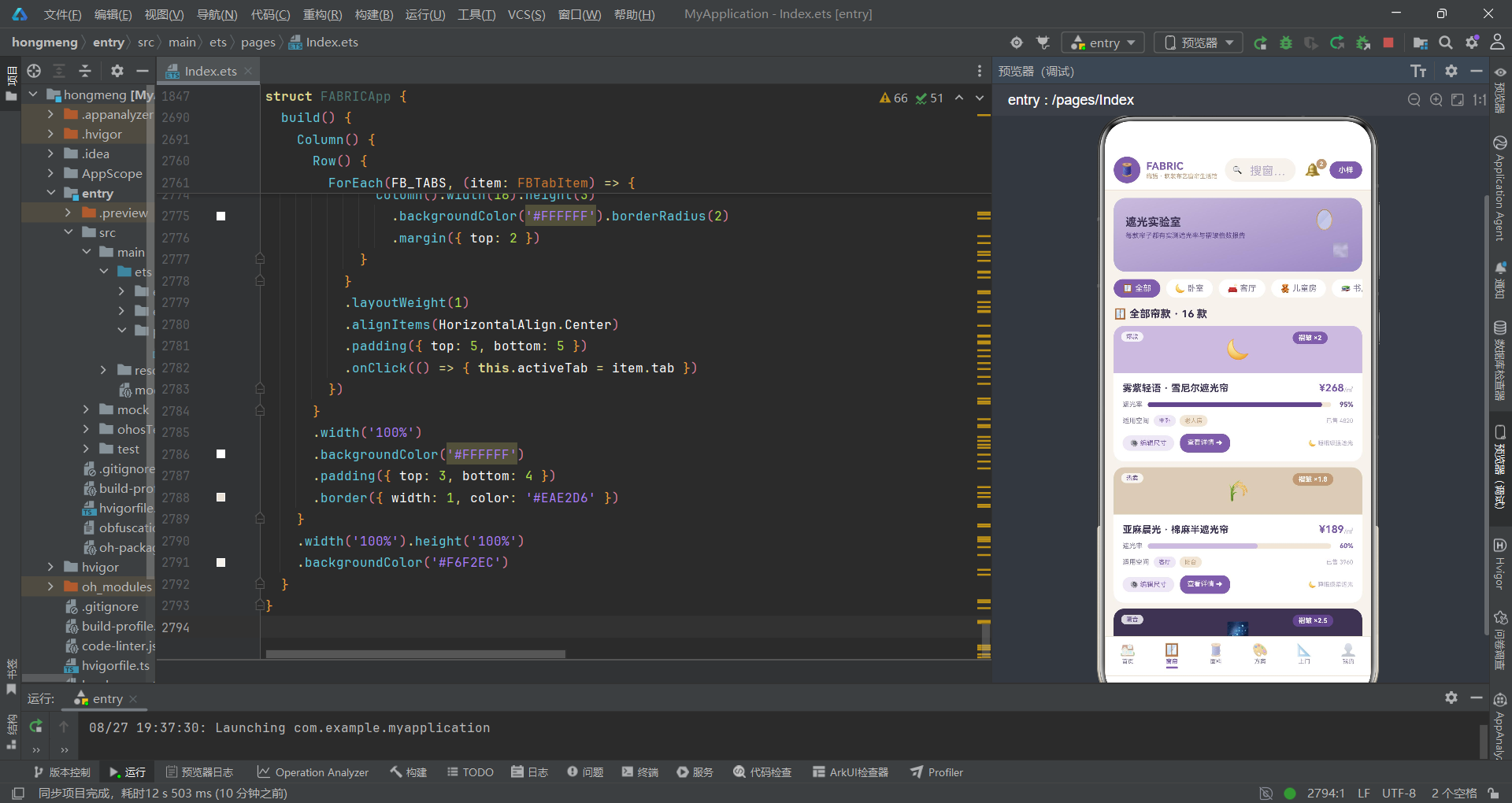
"遮光实验室"横幅使用雾灰紫渐变背景。两个装饰 emoji 分别用正负角度旋转,营造镜子与雾气交错摆动的效果。rotate 方法接收一个对象参数,x、y、z 定义旋转轴向量,angle 定义旋转角度。z: 1 表示绕 Z 轴旋转(即平面内旋转),这是 2D 旋转的标准写法。
position 属性使用绝对定位,将元素放置在 Stack 内的指定坐标。与 CSS 的 position: absolute 类似,ArkTS 的 position 让元素脱离文档流,精确定位到容器内的指定位置。这里品牌文字定位在 (16, 24),两个装饰 emoji 分别定位在右上角区域。
        Scroll() {
          Row() {
            ForEach(FB_CURTAIN_CATS, (c: FBDataCat) => {
              if (this.activeCat === c.name) {
                Text(c.icon + ' ' + c.name).fontSize(11).fontColor('#FFFFFF')
                  .backgroundColor('#7B5EA7')
                  .padding({ left: 12, right: 12, top: 6, bottom: 6 })
                  .borderRadius(14)
                  .margin({ right: 8 })
              } else {
                Text(c.icon + ' ' + c.name).fontSize(11).fontColor('#7A7290')
                  .backgroundColor('#FFFFFF')
                  .padding({ left: 12, right: 12, top: 6, bottom: 6 })
                  .borderRadius(14)
                  .margin({ right: 8 })
                  .onClick(() => { this.activeCat = c.name })
              }
            })
          }
        }
        .scrollable(ScrollDirection.Horizontal)
        .width('100%').margin({ top: 10 }).scrollBar(BarState.Off)
分类筛选条使用横向 Scroll 包裹 Row,通过 ForEach 渲染六个分类标签。这里使用了 ArkTS 的条件渲染语法:if (this.activeCat === c.name) 判断当前分类是否被选中,选中时显示白字紫底样式,未选中时显示灰字白底样式,点击未选中项时更新 activeCat 状态。
条件渲染是 ArkTS 的核心特性之一。在 build() 函数内使用 if/else 可以根据条件动态渲染不同的 UI 树分支。当条件变化时,框架会自动增删对应的 DOM 节点。这里每次点击分类标签,activeCat 变化会触发 ForEach 重新渲染,选中项的样式立即更新。
十八、窗帘内容组件(第二部分:窗帘大卡)
        ForEach(fbFilterCurtains(this.activeCat), (c: FBDataCurtain) => {
          Column() {
            Stack() {
              Column()
                .width('100%').height(64)
                .backgroundColor(c.colorHex)
                .borderRadius({ topLeft: 14, topRight: 14 })
              Text(c.icon).fontSize(26)
              Text('褶皱 ×' + c.fold.toString())
                .fontSize(9).fontWeight(FontWeight.Bold).fontColor('#FFFFFF')
                .backgroundColor(fbFoldColor(c.fold))
                .padding({ left: 8, right: 8, top: 3, bottom: 3 })
                .borderRadius(10)
                .position({ x: '72%', y: 8 })
              Text(c.tag)
                .fontSize(8).fontColor('#5E4688')
                .backgroundColor('rgba(255,255,255,0.8)')
                .padding({ left: 7, right: 7, top: 2, bottom: 2 })
                .borderRadius(8)
                .position({ x: 10, y: 8 })
            }
            .width('100%').height(64)
每款窗帘以大卡片形式展示,卡片由色块头部和信息体两部分组成。色块头部使用 Stack 层叠:底层是窗帘代表色的色块(仅上方圆角),上层是窗帘 emoji、褶皱倍数徽章和营销标签。borderRadius({ topLeft: 14, topRight: 14 }) 分别设置左上和右上圆角,左下和右下保持直角,形成"上半圆角"效果。
褶皱徽章使用 fbFoldColor 函数根据倍数返回不同颜色,倍数越高颜色越深。position({ x: '72%', y: 8 }) 将徽章定位到色块右上角。营销标签使用半透明白色背景,定位到左上角。
            Column() {
              Row() {
                Text(c.name).fontSize(13).fontWeight(FontWeight.Bold).fontColor('#3D3352')
                  .layoutWeight(1).maxLines(1)
                Text(fbMoney(c.price)).fontSize(14).fontWeight(FontWeight.Bold).fontColor('#7B5EA7')
                Text('/㎡').fontSize(9).fontColor('#B4AAC6')
              }
              .width('100%').alignItems(VerticalAlign.Bottom)

              Row() {
                Text('遮光率').fontSize(9).fontColor('#7A7290').width(34)
                Row() {
                  Column()
                    .width(fbDimW(c.dim))
                    .height(7)
                    .backgroundColor(c.dim >= 90 ? '#5E4688' : (c.dim >= 70 ? '#7B5EA7' : '#C9BBDD'))
                    .borderRadius(4)
                }
                .width('100%').height(7)
                .backgroundColor('#F0E6D8')
                .borderRadius(4)
                .justifyContent(FlexAlign.Start)
                .layoutWeight(1)
                Text(c.dim.toString() + '%').fontSize(9).fontWeight(FontWeight.Bold)
                  .fontColor(c.dim >= 90 ? '#5E4688' : '#7B5EA7').width(30).textAlign(TextAlign.End)
              }
              .width('100%').margin({ top: 9 }).alignItems(VerticalAlign.Center)
信息体从上到下依次是商品名称行、遮光率进度条行、适用空间标签行和操作按钮行。商品名称行使用 layoutWeight(1) 让名称占据弹性空间,价格右对齐。遮光率进度条与前述风格分布条结构一致,但颜色根据遮光率分段:90% 以上用深紫,70% 到 90% 用标准紫,70% 以下用雾灰紫。这种分段着色让用户通过颜色深度直观判断遮光等级。
适用空间标签行将 spaces 字段以斜杠分隔为两部分,分别用不同背景色的标签展示。操作按钮行提供"编辑尺寸"和"查看详情"两个按钮,分别触发 onEditCurtain 和 onCurtainDetail 回调,索引均传入 c.id - 1。
十九、窗帘内容组件(第三部分:遮光率对比条)
        Column() {
          ForEach(fbTopDim(), (c: FBDataCurtain, i: number) => {
            Row() {
              Text((i + 1).toString()).fontSize(10).fontWeight(FontWeight.Bold).fontColor('#B99B7A').width(16)
              Column()
                .width(18).height(18)
                .backgroundColor(c.colorHex)
                .borderRadius(5)
              Text(c.name).fontSize(9).fontColor('#3D3352').width(96).maxLines(1)
                .margin({ left: 6 })
              Row() {
                Column()
                  .width(fbDimW(c.dim))
                  .height(8)
                  .backgroundColor(c.dim >= 95 ? '#5E4688' : '#7B5EA7')
                  .borderRadius(4)
              }
              .width('100%').height(8)
              .backgroundColor('#F0E6D8')
              .borderRadius(4)
              .justifyContent(FlexAlign.Start)
              .layoutWeight(1)
              Text(c.dim.toString() + '%').fontSize(9).fontWeight(FontWeight.Bold).fontColor('#5E4688')
                .width(30).textAlign(TextAlign.End)
            }
            .width('100%')
            .padding({ top: 7, bottom: 7 })
            .alignItems(VerticalAlign.Center)
          })
        }
        .width('100%')
        .padding(12)
        .backgroundColor('#FFFFFF')
        .borderRadius(14)
        .margin({ top: 8 })
遮光率对比条通过 fbTopDim() 获取遮光率前六的窗帘,以进度条形式对比展示。每行包含排名序号、色块、商品名称、遮光率进度条和百分比数值。95% 以上的进度条用深紫,其余用标准紫。这个对比模块帮助用户快速找到遮光性能最强的窗帘,是窗帘选购的核心决策维度之一。
maxLines(1) 配合固定宽度 96,确保商品名称超出宽度时自动截断而非换行,保持行高一致性。margin({ left: 6 }) 在色块和名称之间添加 6 的间距。
二十、面料内容组件(第一部分:促销横幅与色卡装饰)
@Component
struct FABRICFabricContent {
  @State chipFloat: number = 0
  @State chipOpacity: number = 0.4
  onAddSample: () => void = () => {}
  onGoto: (tab: FBTab) => void = (tab: FBTab) => {}

  aboutToAppear() {
    this.getUIContext().animateTo({
      duration: 2200,
      iterations: -1,
      playMode: PlayMode.Alternate,
      curve: Curve.EaseInOut
    }, () => {
      this.chipFloat = -5
      this.chipOpacity = 0.95
    })
  }
面料内容组件 FABRICFabricContent 使用 chipFloat 和 chipOpacity 两个状态变量驱动色卡浮沉动画。与前两个组件的飘动和摆动不同,这里使用 translate 的 Y 轴位移来模拟色卡上下浮动的效果,动画状态从 0 变到 -5(向上移动 5 像素)。
        Row() {
          Column() {
            Text('🧵 亚麻织造节').fontSize(15).fontWeight(FontWeight.Bold).fontColor('#FFFFFF')
            Text('面料满 5 米减 30 · 小样免费申领').fontSize(9).fontColor('#EDE7F5').margin({ top: 3 })
          }
          .alignItems(HorizontalAlign.Start).layoutWeight(1)
          Text('包邮').fontSize(10).fontWeight(FontWeight.Bold).fontColor('#5E4688')
            .backgroundColor('#FFFFFF')
            .padding({ left: 12, right: 12, top: 6, bottom: 6 })
            .borderRadius(14)
        }
        .width('100%')
        .padding(14)
        .linearGradient({
          direction: GradientDirection.RightBottom,
          colors: [['#B99B7A', 0], ['#5E4688', 1]]
        })
        .borderRadius(14)
        .margin({ top: 10 })
        .alignItems(VerticalAlign.Center)
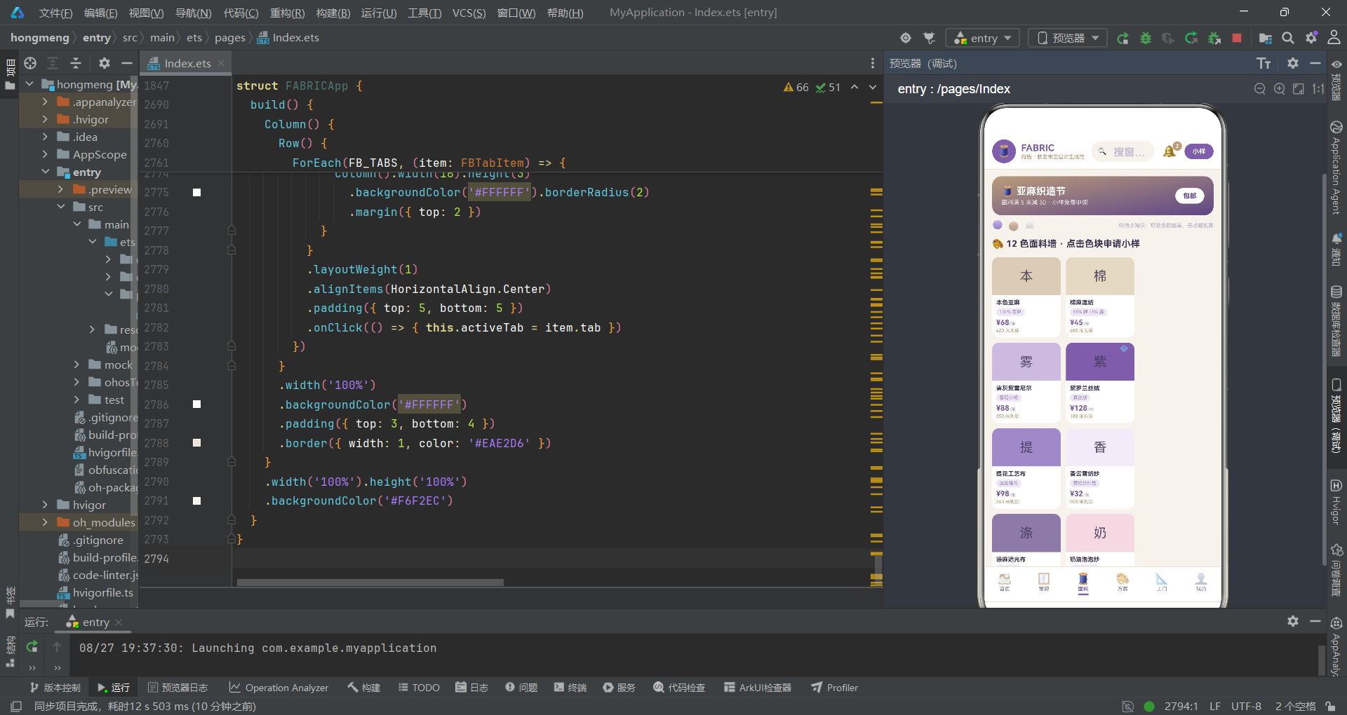
亚麻织造节促销横幅使用从亚麻棕到深紫的渐变背景,左侧是促销文案,右侧是"包邮"标签。这个渐变方向从左上到右下,亚麻棕在左上区域,深紫在右下区域,形成色彩过渡感。layoutWeight(1) 让左侧文案占据弹性空间,"包邮"标签紧贴右侧。
        Row() {
          Text('🟣').fontSize(13)
            .opacity(this.chipOpacity)
            .translate({ x: 0, y: this.chipFloat })
          Text('🟤').fontSize(13)
            .opacity(this.chipOpacity * 0.8)
            .translate({ x: 0, y: -this.chipFloat })
            .margin({ left: 8 })
          Text('◻️').fontSize(13)
            .opacity(this.chipOpacity * 0.6)
            .translate({ x: 0, y: this.chipFloat })
            .margin({ left: 8 })
          Column().layoutWeight(1)
          Text('织物小知识:褶皱倍数越高,垂感越优雅').fontSize(8).fontColor('#B4AAC6')
        }
        .width('100%').margin({ top: 8 }).alignItems(VerticalAlign.Center)
悬浮色卡装饰行展示三个色块 emoji,分别以不同透明度和位移方向浮动。紫色块向上移动,棕色块向下移动(-this.chipFloat 取反值),白色块向上移动。通过调整透明度倍数(1.0、0.8、0.6)形成景深感,前景色块更清晰,后景色块更模糊。右侧是一句织物小知识文案,增加页面的专业感和信息密度。
二十一、面料内容组件(第二部分:色彩 Grid 与价格榜)
        Flex({ wrap: FlexWrap.Wrap }) {
          ForEach(FBFABRICS, (f: FBDataFabric) => {
            Column() {
              Stack() {
                Column()
                  .width('100%').height(58)
                  .backgroundColor(f.colorHex)
                  .borderRadius({ topLeft: 10, topRight: 10 })
                Text(f.name.slice(0, 1)).fontSize(20).fontColor('#3D3352').opacity(0.8)
                if (f.price >= 100) {
                  Text('💎').fontSize(11)
                    .opacity(this.chipOpacity)
                    .translate({ x: 0, y: this.chipFloat })
                    .position({ x: '78%', y: 4 })
                }
              }
              .width('100%').height(58)
              Column() {
                Text(f.name).fontSize(9).fontWeight(FontWeight.Bold).fontColor('#3D3352')
                  .maxLines(1)
                Text(f.comp).fontSize(7).fontColor('#9B8AC4')
                  .backgroundColor('#EDE7F5')
                  .padding({ left: 5, right: 5, top: 2, bottom: 2 })
                  .borderRadius(6)
                  .margin({ top: 3 })
                Row() {
                  Text(fbMoney(f.price)).fontSize(11).fontWeight(FontWeight.Bold).fontColor('#7B5EA7')
                  Text('/米').fontSize(7).fontColor('#B4AAC6')
                }
                .margin({ top: 3 }).alignItems(VerticalAlign.Bottom)
                Text(f.stock.toString() + ' 米现货').fontSize(7).fontColor('#B99B7A')
                  .margin({ top: 2 })
              }
              .width('100%').padding(6).alignItems(HorizontalAlign.Start)
            }
            .width('31%')
            .backgroundColor('#FFFFFF')
            .borderRadius(10)
            .margin({ top: 8, right: 8 })
            .onClick(() => { this.onAddSample() })
          })
        }
        .width('100%').margin({ top: 4 })
十二色面料墙使用 Flex 换行布局,每个色卡宽度为 31%,一行排列三个。每个色卡由色块头部和信息体组成。色块头部使用 Stack 层叠面料代表色背景和面料名称首字。当价格大于等于 100 元时,额外显示钻石 emoji 作为高价标识,并应用浮动动画。
信息体展示面料名称、成分标签、价格行和库存信息。成分标签使用雾紫浅背景的小胶囊样式,与商品名称形成视觉层次。slice(0, 1) 提取面料名称的第一个字符作为色块上的大字展示,这是中文面料命名的常见简化方式。onClick 绑定到 onAddSample 回调,点击任何色卡都可打开小样申请弹框。
        Column() {
          ForEach(fbTopFabrics(), (f: FBDataFabric, i: number) => {
            Row() {
              Text((i + 1).toString()).fontSize(9).fontWeight(FontWeight.Bold)
                .fontColor(i < 3 ? '#B99B7A' : '#B4AAC6').width(14)
              Column()
                .width(16).height(16)
                .backgroundColor(f.colorHex)
                .borderRadius(4)
              Text(f.name).fontSize(9).fontColor('#3D3352').width(78).maxLines(1)
                .margin({ left: 6 })
              Row() {
                Column()
                  .width(fbPriceW(f.price))
                  .height(8)
                  .backgroundColor(f.price >= 100 ? '#5E4688' : (f.price >= 60 ? '#7B5EA7' : '#C9BBDD'))
                  .borderRadius(4)
              }
              .width('100%').height(8)
              .backgroundColor('#F0E6D8')
              .borderRadius(4)
              .justifyContent(FlexAlign.Start)
              .layoutWeight(1)
              Text(fbMoney(f.price)).fontSize(9).fontWeight(FontWeight.Bold).fontColor('#7B5EA7')
                .width(34).textAlign(TextAlign.End)
            }
            .width('100%')
            .padding({ top: 6, bottom: 6 })
            .alignItems(VerticalAlign.Center)
          })
        }
价格榜单通过 fbTopFabrics() 获取按价格降序排列的全部面料。进度条颜色根据价格分段:100 元以上用深紫,60 到 100 元用标准紫,60 元以下用雾灰紫。前三名的排名序号用亚麻棕,其余用浅紫,形成金银铜的视觉暗示。
二十二、方案内容组件
@Component
struct FABRICPlanContent {
  @State breathScale: number = 1
  @State breathOpacity: number = 0.3
  onPalette: (idx: number) => void = (idx: number) => {}
  onDeletePlan: (idx: number) => void = (idx: number) => {}
  onGoto: (tab: FBTab) => void = (tab: FBTab) => {}

  aboutToAppear() {
    this.getUIContext().animateTo({
      duration: 2200,
      iterations: -1,
      playMode: PlayMode.Alternate,
      curve: Curve.EaseInOut
    }, () => {
      this.breathScale = 1.15
      this.breathOpacity = 0.8
    })
  }
方案内容组件 FABRICPlanContent 使用 breathScale 和 breathOpacity 驱动呼吸动画。与前面的位移和旋转不同,这里使用 scale 缩放变换来模拟色块呼吸效果,缩放比例从 1.0 到 1.15,配合透明度从 0.3 到 0.8 的变化,形成"忽大忽明"的呼吸节奏。
        Flex({ wrap: FlexWrap.Wrap }) {
          ForEach(FBPLANS, (p: FBDataPlan, idx: number) => {
            Column() {
              Stack() {
                Row() {
                  Column().width(p.r1 + '%').height(44).backgroundColor(p.c1)
                  Column().width(p.r2 + '%').height(44).backgroundColor(p.c2)
                  Column().width(p.r3 + '%').height(44).backgroundColor(p.c3)
                  Column().width(p.r4 + '%').height(44).backgroundColor(p.c4)
                }
                .width('100%').height(44)
                .borderRadius({ topLeft: 14, topRight: 14 })
                .clip(true)
                Text(p.icon).fontSize(20)
                  .opacity(0.9)
                  .scale({ x: this.breathScale * 0.96, y: this.breathScale * 0.96 })
                Text('✕').fontSize(10).fontColor('#FFFFFF')
                  .padding(4)
                  .position({ x: '86%', y: 2 })
                  .onClick(() => { this.onDeletePlan(idx) })
              }
              .width('100%').height(44)
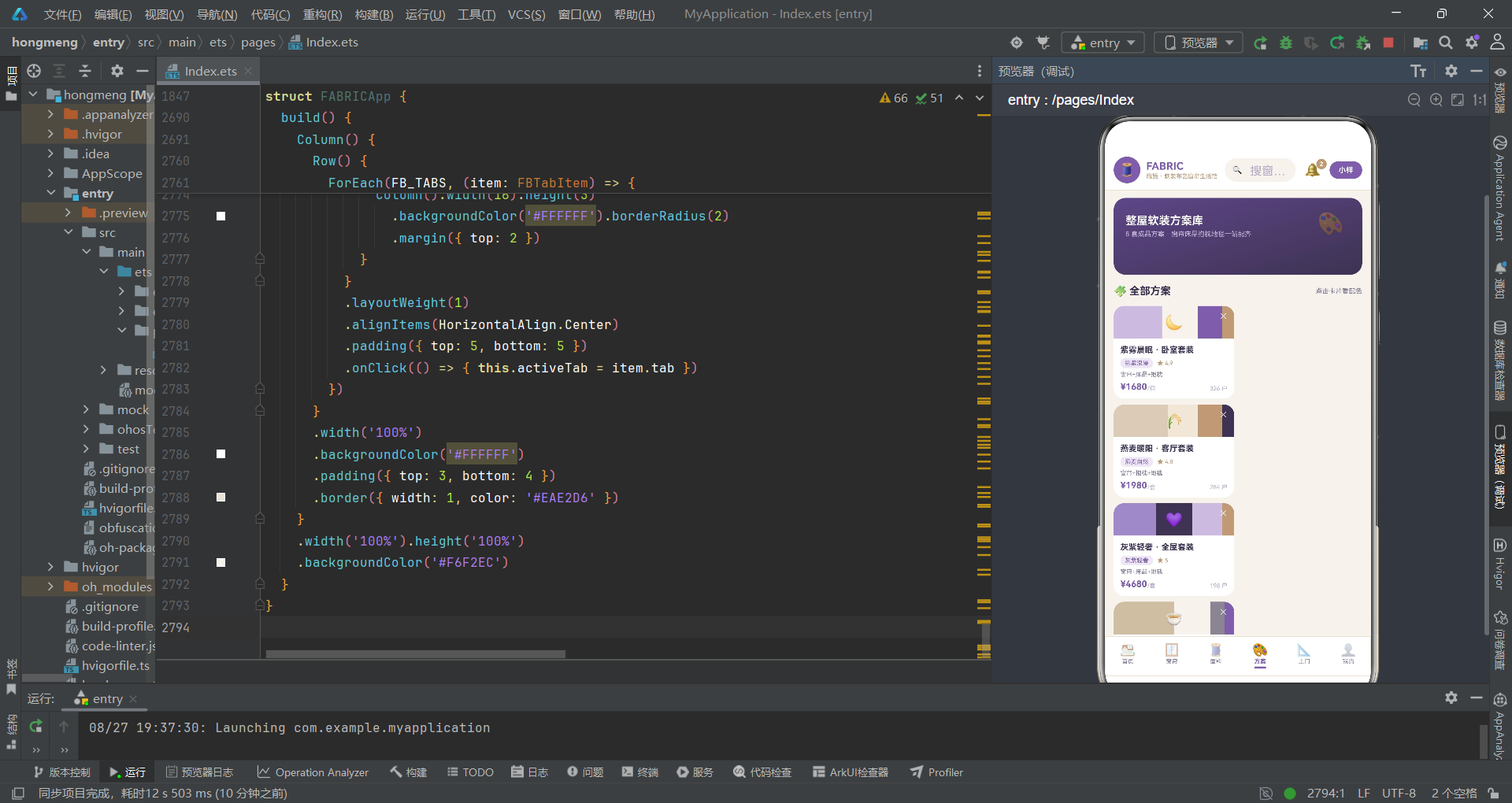
方案卡片的核心创新是配色比例条。在 Stack 内,底层是一个 Row 包含四个 Column,宽度分别为 r1 到 r4 的百分比,背景色为 c1 到 c4。这四个色块紧密排列,形成一条按比例分段的彩色条带,直观展示方案的配色构成。
clip(true) 是 ArkTS 的裁剪属性,它将子元素超出容器边界的部分裁剪掉。这里配色比例条设置了上方圆角 borderRadius({ topLeft: 14, topRight: 14 }),但内部的四个色块是直角的,clip(true) 确保色块不会溢出圆角区域。删除按钮 ✕ 定位在右上角,点击触发 onDeletePlan 回调。
上图展示了配色比例条的内部结构。四个 Column 在 Row 内紧密排列,各自占据百分比宽度,背景色对应方案的四色配置。clip(true) 保证整体圆角效果不被内部直角色块破坏。
二十三、上门服务内容组件(第一部分:排期表)
@Component
struct FABRICVisitContent {
  @State dotShift: number = 0
  @State dotOpacity: number = 0.3
  onBookVisit: () => void = () => {}
  onGoto: (tab: FBTab) => void = (tab: FBTab) => {}

  aboutToAppear() {
    this.getUIContext().animateTo({
      duration: 2200,
      iterations: -1,
      playMode: PlayMode.Alternate,
      curve: Curve.EaseInOut
    }, () => {
      this.dotShift = 8
      this.dotOpacity = 0.95
    })
  }
上门服务内容组件 FABRICVisitContent 使用 dotShift 和 dotOpacity 驱动时间轴光点流动动画。这个动画将应用在预约记录时间轴的连接线上,模拟光点沿时间轴流动的效果。
        Column() {
          Row() {
            Text('服务项目').fontSize(9).fontWeight(FontWeight.Bold).fontColor('#7A7290')
              .layoutWeight(1)
            Text('今日').fontSize(9).fontWeight(FontWeight.Bold).fontColor('#7A7290').width(36)
              .textAlign(TextAlign.Center)
            Text('周六').fontSize(9).fontWeight(FontWeight.Bold).fontColor('#7A7290').width(36)
              .textAlign(TextAlign.Center)
            Text('周日').fontSize(9).fontWeight(FontWeight.Bold).fontColor('#7A7290').width(36)
              .textAlign(TextAlign.Center)
          }
          .width('100%')
          .padding({ top: 8, bottom: 8 })
          .backgroundColor('#EDE7F5')
          .borderRadius({ topLeft: 10, topRight: 10 })
          ForEach(FBVISITS, (v: FBDataVisit, i: number) => {
            Row() {
              Row() {
                Text(v.icon).fontSize(12)
                Column() {
                  Text(v.name).fontSize(10).fontWeight(FontWeight.Bold).fontColor('#3D3352').maxLines(1)
                  Text(v.duration + ' · ' + v.desc).fontSize(7).fontColor('#B4AAC6').maxLines(1)
                    .margin({ top: 1 })
                }
                .alignItems(HorizontalAlign.Start).padding({ left: 5 })
              }
              .layoutWeight(1).alignItems(VerticalAlign.Center)
              Text(v.today).fontSize(9).fontWeight(FontWeight.Bold)
                .fontColor(fbSlotColor(v.today)).width(36).textAlign(TextAlign.Center)
              Text(v.sat).fontSize(9).fontWeight(FontWeight.Bold)
                .fontColor(fbSlotColor(v.sat)).width(36).textAlign(TextAlign.Center)
              Text(v.sun).fontSize(9).fontWeight(FontWeight.Bold)
                .fontColor(fbSlotColor(v.sun)).width(36).textAlign(TextAlign.Center)
            }
            .width('100%')
            .padding({ top: 8, bottom: 8, left: 8, right: 8 })
            .backgroundColor(i % 2 === 0 ? '#FFFFFF' : '#FBF8F4')
            .alignItems(VerticalAlign.Center)
          })
        }
        .width('100%')
        .borderRadius(10)
        .margin({ top: 8 })
服务排期表是一个四列表格:服务项目、今日、周六、周日。表头行使用雾紫浅背景,数据行通过 i % 2 === 0 判断奇偶行,交替使用白色和极浅米色背景,实现斑马条纹效果。可约余量的文字颜色通过 fbSlotColor 函数计算:"余 N"用紫罗兰紫,"满"用浅紫灰,"预约"用深紫。
这个排期表的设计简洁实用,用户一眼就能看出每项服务在三个时间段的可约情况。奇偶行交替背景色降低了长表格的视觉疲劳,是数据表格设计的基本原则。maxLines(1) 确保服务名称和描述超出宽度时截断,不会破坏表格的行高一致性。
二十四、上门服务内容组件(第二部分:时间轴)
        ForEach(FBBOOKINGS, (b: FBDataBooking) => {
          Row() {
            Column() {
              Column()
                .width(10).height(10)
                .backgroundColor(fbStatusColor(b.status))
                .borderRadius(5)
              Column()
                .width(2).height(30)
                .backgroundColor('#C9BBDD')
                .opacity(this.dotOpacity)
                .translate({ x: 0, y: this.dotShift * 0.3 })
                .margin({ top: 3 })
            }
            .width(20)
            .alignItems(HorizontalAlign.Center)

            Column() {
              Row() {
                Text(b.service).fontSize(11).fontWeight(FontWeight.Bold).fontColor('#3D3352')
                  .layoutWeight(1).maxLines(1)
                Text(b.status).fontSize(8).fontColor(fbStatusColor(b.status))
                  .backgroundColor(fbStatusBg(b.status))
                  .padding({ left: 7, right: 7, top: 3, bottom: 3 })
                  .borderRadius(8)
              }
              .width('100%').alignItems(VerticalAlign.Center)
              Row() {
                Text('👷 ' + b.master).fontSize(8).fontColor('#7A7290')
                Text('📅 ' + b.date + ' ' + b.time).fontSize(8).fontColor('#7A7290')
                  .margin({ left: 8 })
              }
              .width('100%').margin({ top: 4 })
              Text('📍 ' + b.addr).fontSize(8).fontColor('#B4AAC6')
                .margin({ top: 3 })
            }
            .layoutWeight(1)
            .padding({ left: 6, top: 2, bottom: 8 })
            .alignItems(HorizontalAlign.Start)
          }
          .width('100%')
          .alignItems(VerticalAlign.Top)
          .padding({ left: 4 })
        })
预约时间轴通过手工绘制实现。每条记录由左右两列组成:左列是时间轴轨道(圆点 + 连接线),右列是记录信息。圆点的颜色通过 fbStatusColor 根据状态映射:已完成为紫、进行中为棕、待上门为雾灰紫、其他为深紫墨。连接线使用雾灰紫色,配合 dotOpacity 和 dotShift * 0.3 实现光点流动效果。
时间轴是 UX 设计中展示历史和未来事件流的经典模式。圆点表示事件节点,连接线表示时间流逝。这里将动画绑定到连接线的 opacity 和 translate 属性,使连接线呈现闪烁和微位移效果,暗示时间轴是"活的",增强了动态感。
在 ArkTS 中,时间轴这种复杂结构并非内置组件,而是通过
Column、Row、borderRadius等基础组件的组合手工构建。这体现了声明式 UI 的灵活性:任何视觉需求都可以通过基础组件的嵌套和属性设置来实现。
二十五、我的内容组件(第一部分:会员卡与消费柱状图)
@Component
struct FABRICMineContent {
  @State glow: number = 0.25
  @State glowScale: number = 1
  @State favOn: boolean[] = [true, true, true, true, true, true]
  onStylePick: () => void = () => {}
  onEditCurtain: () => void = () => {}
  onAddSample: () => void = () => {}
  onGoto: (tab: FBTab) => void = (tab: FBTab) => {}

  aboutToAppear() {
    this.getUIContext().animateTo({
      duration: 2200,
      iterations: -1,
      playMode: PlayMode.Alternate,
      curve: Curve.EaseInOut
    }, () => {
      this.glow = 0.6
      this.glowScale = 1.12
    })
  }
我的内容组件 FABRICMineContent 拥有三个状态变量。glow 和 glowScale 驱动会员卡光晕呼吸动画,favOn 是一个布尔数组,记录六个收藏项的心形状态。这个布尔数组是 @State 管理数组状态的典型用法:初始值全部为 true(已收藏),点击切换时通过 fbToggleAt 函数返回新数组触发更新。
        Stack() {
          Column()
            .width('100%').height(120)
            .linearGradient({
              direction: GradientDirection.RightBottom,
              colors: [['#3D3352', 0], ['#7B5EA7', 1]]
            })
            .borderRadius(16)
          Column()
            .width(98).height(98)
            .borderRadius(49)
            .backgroundColor('#FFFFFF')
            .opacity(this.glow)
            .scale({ x: this.glowScale, y: this.glowScale })
            .position({ x: '76%', y: 10 })
          Text('🧵').fontSize(20)
            .opacity(this.glow)
            .position({ x: '86%', y: 78 })
          Row() {
            Column() {
              Row() {
                Text('亚麻生活家').fontSize(15).fontWeight(FontWeight.Bold).fontColor('#FFFFFF')
                Text('SVIP').fontSize(8).fontWeight(FontWeight.Bold).fontColor('#5E4688')
                  .backgroundColor('#F0E6D8')
                  .padding({ left: 6, right: 6, top: 2, bottom: 2 })
                  .borderRadius(8)
                  .margin({ left: 8 })
              }
              Text('会员编号 FB-0827 · 8 月布艺节已省 ¥236').fontSize(9).fontColor('#EDE7F5')
                .margin({ top: 5 })
              Row() {
                Text('🎟️').fontSize(10)
                Text('积分 5,260').fontSize(9).fontColor('#EDE7F5').margin({ left: 3 })
                Text('·').fontSize(9).fontColor('#EDE7F5').margin({ left: 6 })
                Text('小样券 4 张').fontSize(9).fontColor('#EDE7F5').margin({ left: 6 })
              }
              .margin({ top: 8 })
            }
            .alignItems(HorizontalAlign.Start).layoutWeight(1)
          }
          .width('100%').padding(16)
        }
        .width('100%')
        .margin({ top: 10 })
会员卡使用 Stack 四层堆叠:最底层是深紫到紫罗兰的渐变背景,第二层是一个白色圆形光晕(通过 opacity 和 scale 实现呼吸效果),第三层是品牌 emoji,最上层是会员信息文字。光晕的 borderRadius(49) 是直径 98 的一半,形成完美圆形。
会员卡信息包含会员等级名称、SVIP 徽章、会员编号、省钱记录、积分和小样券。这些信息让用户感受到会员价值,增强平台粘性。position({ x: '76%', y: 10 }) 将光晕定位到卡片右侧,形成"光从右上方照来"的视觉效果。
        Row() {
          ForEach(FBSPEND, (s: FBDataSpend) => {
            Column() {
              Text(fbMoney(s.amount)).fontSize(8).fontWeight(FontWeight.Bold)
                .fontColor(s.amount === 1280 ? '#B99B7A' : '#7B5EA7')
              Column()
                .width(20)
                .height(fbSpendH(s.amount))
                .backgroundColor(s.amount === 1280 ? '#B99B7A' : '#7B5EA7')
                .borderRadius({ topLeft: 5, topRight: 5 })
                .margin({ top: 4 })
              Text(s.month).fontSize(9).fontColor('#7A7290').margin({ top: 4 })
            }
            .layoutWeight(1)
            .alignItems(HorizontalAlign.Center)
          })
        }
        .width('100%')
        .padding({ top: 14, bottom: 12 })
        .backgroundColor('#FFFFFF')
        .borderRadius(14)
        .margin({ top: 8 })
        .alignItems(VerticalAlign.Bottom)
月消费柱状图通过 ForEach 渲染六根柱子。每根柱子是一个 Column,包含金额标签、柱体和月份标签。柱体高度通过 fbSpendH 函数计算,该函数将金额映射到 8 到 100 像素的高度区间。最高月份(1280 元)用亚麻棕色,其他月份用紫罗兰紫,使峰值一目了然。
borderRadius({ topLeft: 5, topRight: 5 }) 只设置上方圆角,模拟柱状图常见的圆顶效果。alignItems(VerticalAlign.Bottom) 让所有柱子在底部对齐,这是柱状图的标准对齐方式。整个柱状图完全由基础组件手工绘制,未引入任何图表库,体现了 ArkTS 声明式 UI 的灵活性。
二十六、我的内容组件(第二部分:订单与收藏列表)
        ForEach(FBORDERS, (o: FBDataOrder) => {
          Row() {
            Text('🛍️').fontSize(13)
            Column() {
              Text(o.item).fontSize(11).fontWeight(FontWeight.Bold).fontColor('#3D3352')
                .maxLines(1)
              Row() {
                Text(o.date).fontSize(8).fontColor('#B4AAC6')
                Text(o.status).fontSize(8).fontColor(fbOrderColor(o.status))
                  .backgroundColor('#F6F2EC')
                  .padding({ left: 6, right: 6, top: 2, bottom: 2 })
                  .borderRadius(7)
                  .margin({ left: 8 })
              }
              .margin({ top: 3 }).alignItems(VerticalAlign.Center)
            }
            .alignItems(HorizontalAlign.Start).padding({ left: 10 }).layoutWeight(1)
            Text(fbMoney(o.price)).fontSize(12).fontWeight(FontWeight.Bold).fontColor('#7B5EA7')
          }
          .width('100%')
          .padding({ top: 10, bottom: 10, left: 12, right: 12 })
          .backgroundColor('#FFFFFF')
          .borderRadius(12)
          .margin({ top: 5 })
          .alignItems(VerticalAlign.Center)
        })
订单列表通过 ForEach 渲染十二条订单。每条订单是一个 Row,包含购物袋 emoji、商品信息(名称 + 日期 + 状态标签)和金额。状态标签的颜色通过 fbOrderColor 函数映射,背景统一使用米色底,形成统一的胶囊样式。
        ForEach(FBFAVS, (f: FBDataFav, i: number) => {
          Row() {
            Stack() {
              Column()
                .width(34).height(34)
                .backgroundColor('#EDE7F5')
                .borderRadius(10)
              Text(f.icon).fontSize(16)
            }
            .width(34).height(34)
            Column() {
              Text(f.name).fontSize(11).fontWeight(FontWeight.Bold).fontColor('#3D3352')
                .maxLines(1)
              Text(f.type + ' · 织语甄选').fontSize(8).fontColor('#B4AAC6').margin({ top: 2 })
            }
            .alignItems(HorizontalAlign.Start).padding({ left: 10 }).layoutWeight(1)
            Text(this.favOn[i] ? '❤️' : '🤍').fontSize(15)
              .onClick(() => { this.favOn = fbToggleAt(this.favOn, i) })
          }
          .width('100%')
          .padding({ top: 10, bottom: 10, left: 12, right: 12 })
          .backgroundColor('#FFFFFF')
          .borderRadius(10)
          .margin({ top: 5 })
          .alignItems(VerticalAlign.Center)
        })
收藏列表的每项右侧有一个心形切换按钮。this.favOn[i] 为 true 时显示红心 emoji,为 false 时显示白心 emoji。点击时调用 fbToggleAt(this.favOn, i) 返回新数组并赋值给 this.favOn,触发该收藏项的重新渲染。
这里体现了 ArkTS 数组状态管理的核心原则:不能直接修改数组元素(如 this.favOn[i] = !this.favOn[i]),因为这不会改变数组引用,框架无法检测到变化。必须通过返回新数组的方式(fbToggleAt 内部使用 slice() 复制后修改),让 @State 检测到引用变化,从而触发重新渲染。
二十七、主应用状态管理
@Entry
@Component
struct FABRICApp {
  @State activeTab: FBTab = FBTab.Home
  @State showAddSample: boolean = false
  @State showDeletePlan: boolean = false
  @State showEditCurtain: boolean = false
  @State showStylePick: boolean = false
  @State showBookVisit: boolean = false
  @State showPalette: boolean = false
  @State showCurtainDetail: boolean = false

  @State selPlanIdx: number = 0
  @State selCurtainIdx: number = 0
  @State selStyleIdx: number = 0

  @State sampleSel: boolean[] = [true, false, true, false, false, false, false, false, false, false, true, false]
  @State sampleAddr: string = ''
  @State samplePhone: string = ''

  @State editWidth: number = 3.6
  @State editDim: boolean = true
  @State editFold: number = 2

  @State visitRooms: number = 3
  @State visitDate: string = '周六 08-29'
  @State visitSlot: string = '上午 09-12'
  @State visitAddr: string = ''
  @State visitSvc: string = '免费上门量窗'
@Entry 装饰器标记 FABRICApp 为应用的入口组件。在 ArkTS 中,@Entry 告知框架这是页面级组件,会作为渲染树的根节点。一个页面只能有一个 @Entry 组件。
主组件的状态分为四组。第一组是 Tab 路由状态 activeTab 和七个弹框开关布尔值。第二组是三个选中项索引(方案、窗帘、风格)。第三组是小样申请表单字段(多选数组、地址、电话)。第四组是窗帘量尺编辑字段(宽度、遮光开关、褶皱倍数)和上门预约字段(房间数、日期、时段、地址、服务项目)。
这种分组管理状态的方式使代码结构清晰。每个弹框都有一组对应的状态变量,弹框的打开和关闭通过布尔开关控制,弹框内的表单数据通过独立的状态变量管理。当用户关闭再重新打开弹框时,状态保留上次的输入值,提供连续的用户体验。
sampleSel 的初始值是一个包含十二个布尔值的数组,其中第 0、2、10 项为 true(默认选中本色亚麻、雾灰紫雪尼尔、原色苎麻三种面料),其余为 false。这个数组的不可变更新同样使用 fbToggleAt 函数。
二十八、弹框遮罩构建器
  @Builder modalOverlay(onClose: () => void) {
    Column()
      .width('100%').height('100%')
      .backgroundColor('rgba(61,51,82,0.55)')
      .onClick(onClose)
  }
@Builder 装饰器声明了一个构建器函数 modalOverlay。@Builder 是 ArkTS 的方法级 UI 构建器,它允许将可复用的 UI 片段封装为函数,在 build() 中通过 this.xxx() 调用。与 @Component 不同,@Builder 不创建独立组件,而是在调用处内联展开。
modalOverlay 是所有弹框共享的遮罩层。它是一个全屏 Column,背景色为半透明深紫 rgba(61,51,82,0.55),点击时调用传入的 onClose 回调关闭弹框。通过参数化的方式,这个构建器可以被所有弹框复用,每个弹框只需传入自己的关闭函数。
rgba 颜色格式的最后一个参数 0.55 是透明度,55% 的不透明度使背景内容若隐若现,同时保证弹框内容足够清晰。这是模态弹框遮罩的标准透明度设置。
二十九、小样申请弹框
  @Builder addSampleModal() {
    Column() {
      this.modalOverlay(() => { this.showAddSample = false })
      Column() {
        Scroll() {
          Column() {
            Column().width(38).height(4).backgroundColor('#EAE2D6').borderRadius(2)
            Row() {
              Text('🧵 新增小样申请').fontSize(15).fontWeight(FontWeight.Bold).fontColor('#3D3352')
              Column().layoutWeight(1)
              Text('✕').fontSize(16).fontColor('#B4AAC6')
                .padding(4)
                .onClick(() => { this.showAddSample = false })
            }
            .width('100%').margin({ top: 10 }).alignItems(VerticalAlign.Center)

            Text('勾选想摸的面料(可多选),小样 8cm × 8cm 免费寄送。').fontSize(9).fontColor('#7A7290')
              .width('100%').margin({ top: 6 })

            Flex({ wrap: FlexWrap.Wrap }) {
              ForEach(FBFABRICS, (f: FBDataFabric, i: number) => {
                Stack() {
                  Column()
                    .width(22).height(22)
                    .backgroundColor(f.colorHex)
                    .borderRadius(6)
                  if (this.sampleSel[i]) {
                    Text('✓').fontSize(11).fontWeight(FontWeight.Bold).fontColor('#FFFFFF')
                  }
                }
                .width(22).height(22)
                .margin({ right: 8, top: 8 })
                .onClick(() => { this.sampleSel = fbToggleAt(this.sampleSel, i) })
              })
            }
            .width('100%')
小样申请弹框是底部抽屉式设计。外层 Column 包含遮罩层和抽屉主体。抽屉主体使用 position({ x: 0, y: '38%' }) 定位在屏幕下方 38% 处,高度通过 constraintSize({ maxHeight: '62%' }) 限制,形成从底部弹出的抽屉效果。
抽屉顶部有一个 38x4 的灰色把手(borderRadius(2)),这是移动端抽屉设计的标准元素,暗示用户可以下拉关闭。面料多选区使用 Flex 换行布局,每个色块 22x22,点击切换选中状态。选中时在色块上层叠加白色对勾 emoji。
TextInput 组件用于地址和电话输入。placeholder 设置占位提示文字,placeholderColor 设置占位文字颜色,onChange 回调在输入变化时更新状态变量。TextInput 是 ArkTS 的文本输入组件,支持单行文本输入,通过 onChange 事件实时同步输入值到状态。
            Column() {
              Text('免费寄送小样').fontSize(13).fontWeight(FontWeight.Bold).fontColor('#FFFFFF')
            }
            .width('100%').height(42)
            .linearGradient({
              direction: GradientDirection.RightBottom,
              colors: [['#7B5EA7', 0], ['#5E4688', 1]]
            })
            .borderRadius(21)
            .justifyContent(FlexAlign.Center)
            .margin({ top: 16 })
            .onClick(() => { this.showAddSample = false })
提交按钮使用渐变背景和胶囊圆角(borderRadius(21),高度 42 的一半)。点击后关闭弹框。按钮文案明确告知"免费寄送",消除用户的价格顾虑。底部还有一行补充说明"小样寄出后 14 天内寄回可全额抵扣面料款",这是软装行业的特色政策。
三十、删除确认弹框
  @Builder deletePlanModal() {
    Column() {
      this.modalOverlay(() => { this.showDeletePlan = false })
      Column() {
        Text('🗑️').fontSize(34)
        Text('确认删除方案?').fontSize(16).fontWeight(FontWeight.Bold).fontColor('#3D3352')
          .margin({ top: 8 })
        Column() {
          Text(FBPLANS[this.selPlanIdx].name).fontSize(12).fontWeight(FontWeight.Bold).fontColor('#5E4688')
          Text('删除后配色卡与报价单将一并清除,无法恢复。').fontSize(9).fontColor('#7A7290')
            .margin({ top: 4 })
        }
        .width('100%')
        .padding(12)
        .backgroundColor('#EDE7F5')
        .borderRadius(12)
        .margin({ top: 12 })
        .alignItems(HorizontalAlign.Center)
        Row() {
          Column() {
            Text('再想想').fontSize(12).fontColor('#3D3352')
          }
          .layoutWeight(1).height(38)
          .backgroundColor('#F0E6D8')
          .borderRadius(19)
          .justifyContent(FlexAlign.Center)
          .margin({ right: 10 })
          .onClick(() => { this.showDeletePlan = false })
          Column() {
            Text('确认删除').fontSize(12).fontWeight(FontWeight.Bold).fontColor('#FFFFFF')
          }
          .layoutWeight(1).height(38)
          .backgroundColor('#7B5EA7')
          .borderRadius(19)
          .justifyContent(FlexAlign.Center)
          .onClick(() => { this.showDeletePlan = false })
        }
        .width('100%').margin({ top: 16 })
      }
      .width('78%')
      .backgroundColor('#FFFFFF')
      .borderRadius(16)
      .padding(20)
      .position({ x: '11%', y: '32%' })
      .alignItems(HorizontalAlign.Center)
    }
    .width('100%').height('100%')
    .position({ x: 0, y: 0 }).zIndex(999)
  }
删除确认弹框是居中圆角卡设计,宽度 78%,定位在屏幕中央偏上。弹框包含删除图标、标题、方案名称提示区和双按钮区。"再想想"按钮用亚麻浅色背景,"确认删除"按钮用紫罗兰紫背景,两者等宽(layoutWeight(1))。
zIndex(999) 设置弹框的层级为 999,确保它显示在所有内容之上。在 ArkTS 中,zIndex 控制同一父容器内子元素的堆叠顺序,值越大越靠上。弹框层需要高于内容层和 Tab 导航层,所以使用 999 这样的高值。
这个弹框的设计遵循了"危险操作需要二次确认"的 UX 原则。删除是不可逆操作,提示文案明确告知"无法恢复",防止用户误操作。取消按钮用较浅的颜色(亚麻浅),确认按钮用较深的颜色(紫罗兰紫),形成视觉引导。
三十一、编辑量尺弹框
  @Builder editCurtainModal() {
    Column() {
      this.modalOverlay(() => { this.showEditCurtain = false })
      Column() {
        Row() {
          Text('📏 编辑窗帘参数').fontSize(15).fontWeight(FontWeight.Bold).fontColor('#3D3352')
          Column().layoutWeight(1)
          Text('✕').fontSize(16).fontColor('#B4AAC6')
            .padding(4)
            .onClick(() => { this.showEditCurtain = false })
        }
        .width('100%').alignItems(VerticalAlign.Center)

        Row() {
          Text('当前帘款:').fontSize(10).fontColor('#7A7290')
          Text(FBCURTAINS[this.selCurtainIdx].name).fontSize(10).fontWeight(FontWeight.Bold).fontColor('#7B5EA7')
            .maxLines(1).layoutWeight(1)
        }
        .width('100%').margin({ top: 10 }).alignItems(VerticalAlign.Center)

        Text('窗帘宽度(米)').fontSize(11).fontWeight(FontWeight.Bold).fontColor('#3D3352')
          .width('100%').margin({ top: 14 })
        Row() {
          Text('🪟').fontSize(16)
          Text(fbWidthText(this.editWidth)).fontSize(20).fontWeight(FontWeight.Bold).fontColor('#7B5EA7')
            .margin({ left: 8 })
          Text('/ 轨道总宽').fontSize(10).fontColor('#7A7290').margin({ left: 4 })
        }
        .width('100%').margin({ top: 8 }).alignItems(VerticalAlign.Bottom)

        Slider({ value: this.editWidth, min: 1, max: 6, step: 0.1 })
          .width('100%')
          .margin({ top: 12 })
          .onChange((v: number) => { this.editWidth = v })
编辑量尺弹框使用居中卡片设计,宽度 86%。弹框内展示了当前帘款名称,然后提供窗帘宽度滑块、褶皱倍数选择和遮光衬布开关三个参数编辑器。
Slider 是 ArkTS 的滑块组件,value 绑定当前值,min 和 max 设置范围,step 设置步长。onChange 回调在滑块拖动时实时更新 editWidth 状态。宽度的文字展示通过 fbWidthText 函数格式化为"X.X 米"的形式。
        Row() {
          Text('经济 ×1.5').fontSize(10)
            .fontColor(this.editFold === 1.5 ? '#FFFFFF' : '#7A7290')
            .backgroundColor(this.editFold === 1.5 ? '#7B5EA7' : '#F6F2EC')
            .padding({ left: 11, right: 11, top: 6, bottom: 6 })
            .borderRadius(13)
            .margin({ right: 8 })
            .onClick(() => { this.editFold = 1.5 })
          Text('标准 ×2.0').fontSize(10)
            .fontColor(this.editFold === 2 ? '#FFFFFF' : '#7A7290')
            .backgroundColor(this.editFold === 2 ? '#7B5EA7' : '#F6F2EC')
            .padding({ left: 11, right: 11, top: 6, bottom: 6 })
            .borderRadius(13)
            .margin({ right: 8 })
            .onClick(() => { this.editFold = 2 })
          Text('华丽 ×2.5').fontSize(10)
            .fontColor(this.editFold === 2.5 ? '#FFFFFF' : '#7A7290')
            .backgroundColor(this.editFold === 2.5 ? '#7B5EA7' : '#F6F2EC')
            .padding({ left: 11, right: 11, top: 6, bottom: 6 })
            .borderRadius(13)
            .onClick(() => { this.editFold = 2.5 })
        }
        .width('100%').margin({ top: 8 })
褶皱倍数选择器使用三个胶囊按钮,分别对应经济(1.5 倍)、标准(2.0 倍)、华丽(2.5 倍)三档。当前选中档位用紫底白字,未选中用米底灰字。这种"三选一"的胶囊选择器是移动端参数选择的常见模式,比下拉菜单更直观,比单选按钮更紧凑。
        Row() {
          Column() {
            Text('遮光衬布加厚').fontSize(12).fontWeight(FontWeight.Bold).fontColor('#3D3352')
            Text('开启后遮光率 +15%,适合临街卧室').fontSize(8).fontColor('#B4AAC6').margin({ top: 3 })
          }
          .alignItems(HorizontalAlign.Start).layoutWeight(1)
          Toggle({ type: ToggleType.Switch, isOn: this.editDim })
            .selectedColor('#7B5EA7')
            .onChange((v: boolean) => { this.editDim = v })
        }
        .width('100%')
        .padding(12)
        .backgroundColor('#F6F2EC')
        .borderRadius(12)
        .margin({ top: 16 })
        .alignItems(VerticalAlign.Center)
遮光衬布开关使用 Toggle 组件。ToggleType.Switch 设置为拨动开关样式,isOn 绑定布尔状态,selectedColor 设置开启状态的主题色,onChange 在切换时更新状态。Toggle 是 ArkTS 的开关组件,支持开关(Switch)、复选框(Checkbox)和单选按钮(RadioButton)三种类型。
三十二、风格选择弹框
  @Builder stylePickModal() {
    Column() {
      this.modalOverlay(() => { this.showStylePick = false })
      Column() {
        Row() {
          Text('🎨 我的风格档案').fontSize(15).fontWeight(FontWeight.Bold).fontColor('#3D3352')
          Column().layoutWeight(1)
          Text('✕').fontSize(16).fontColor('#B4AAC6')
            .padding(4)
            .onClick(() => { this.showStylePick = false })
        }
        .width('100%').alignItems(VerticalAlign.Center)

        Text('选择偏好的家居风格,方案库将按此优先推荐。').fontSize(9).fontColor('#7A7290')
          .width('100%').margin({ top: 6 })
        Text('当前选择:' + FB_STYLES[this.selStyleIdx].name)
          .fontSize(11).fontColor('#7B5EA7')
          .width('100%').margin({ top: 10 })
        Flex({ wrap: FlexWrap.Wrap }) {
          ForEach(FB_STYLES, (st: FBDataStyle, i: number) => {
            if (this.selStyleIdx === i) {
              Column() {
                Text(st.icon).fontSize(20)
                Text(st.name).fontSize(9).fontColor('#7B5EA7').margin({ top: 4 })
                Text(st.count.toString() + ' 户').fontSize(7).fontColor('#5E4688').margin({ top: 2 })
              }
              .width('28%')
              .padding({ top: 12, bottom: 12 })
              .border({ width: 1.5, color: '#7B5EA7' })
              .borderRadius(12)
              .backgroundColor('#EDE7F5')
              .margin({ right: 8, bottom: 8 })
              .alignItems(HorizontalAlign.Center)
              .onClick(() => { this.selStyleIdx = i })
            } else {
              Column() {
                Text(st.icon).fontSize(20)
                Text(st.name).fontSize(9).fontColor('#7A7290').margin({ top: 4 })
                Text(st.count.toString() + ' 户').fontSize(7).fontColor('#B4AAC6').margin({ top: 2 })
              }
              .width('28%')
              .padding({ top: 12, bottom: 12 })
              .border({ width: 1, color: '#EAE2D6' })
              .borderRadius(12)
              .backgroundColor('#FFFFFF')
              .margin({ right: 8, bottom: 8 })
              .alignItems(HorizontalAlign.Center)
              .onClick(() => { this.selStyleIdx = i })
            }
          })
        }
        .width('100%').margin({ top: 8 })
风格选择弹框使用宫格选择式设计,宽度 88%。六种风格以三列网格排列,每项宽度 28%。选中项有 1.5 像素粗的紫色边框和雾紫浅背景,未选中项有 1 像素细的灰色边框和白色背景。选中与未选中的视觉差异通过边框粗细、颜色和背景色三重对比来强调。
这个弹框的特色是每个风格项除了图标和名称,还显示了"N 户"的采用数量。这种社交证明数据增加了用户的选择信心。border 方法接收一个对象参数,width 设置边框粗细,color 设置边框颜色。
三十三、上门预约弹框
  @Builder bookVisitModal() {
    Column() {
      this.modalOverlay(() => { this.showBookVisit = false })
      Column() {
        Scroll() {
          Column() {
            Row() {
              Text('📐 上门测量预约').fontSize(15).fontWeight(FontWeight.Bold).fontColor('#3D3352')
              Column().layoutWeight(1)
              Text('✕').fontSize(16).fontColor('#B4AAC6')
                .padding(4)
                .onClick(() => { this.showBookVisit = false })
            }
            .width('100%').alignItems(VerticalAlign.Center)

            Text('🔧 服务项目').fontSize(11).fontWeight(FontWeight.Bold).fontColor('#3D3352')
              .width('100%').margin({ top: 12 })
            Flex({ wrap: FlexWrap.Wrap }) {
              ForEach(FBVISITS, (v: FBDataVisit) => {
                if (this.visitSvc === v.name) {
                  Text(v.icon + ' ' + v.name).fontSize(9).fontColor('#FFFFFF')
                    .backgroundColor('#7B5EA7')
                    .padding({ left: 9, right: 9, top: 5, bottom: 5 })
                    .borderRadius(12)
                    .margin({ right: 6, top: 6 })
                    .onClick(() => { this.visitSvc = v.name })
                } else {
                  Text(v.icon + ' ' + v.name).fontSize(9).fontColor('#7A7290')
                    .backgroundColor('#F6F2EC')
                    .padding({ left: 9, right: 9, top: 5, bottom: 5 })
                    .borderRadius(12)
                    .margin({ right: 6, top: 6 })
                    .onClick(() => { this.visitSvc = v.name })
                }
              })
            }
            .width('100%')
上门预约弹框是底部抽屉式设计,包含服务项目选择、房间数步进器、日期选择、时段选择和地址输入五个部分。服务项目使用 Flex 换行布局的胶囊标签,选中项紫底白字,未选中米底灰字。
            Row() {
              Column() {
                Text('−').fontSize(16).fontWeight(FontWeight.Bold).fontColor('#7B5EA7')
              }
              .width(36).height(32)
              .backgroundColor('#F0E6D8')
              .borderRadius(10)
              .justifyContent(FlexAlign.Center)
              .onClick(() => {
                if (this.visitRooms > 1) {
                  this.visitRooms -= 1
                }
              })
              Row() {
                Text(this.visitRooms.toString()).fontSize(18).fontWeight(FontWeight.Bold).fontColor('#3D3352')
                Text('间').fontSize(9).fontColor('#7A7290').margin({ left: 3 })
              }
              .justifyContent(FlexAlign.Center)
              .alignItems(VerticalAlign.Bottom)
              .layoutWeight(1)
              Column() {
                Text('+').fontSize(16).fontWeight(FontWeight.Bold).fontColor('#FFFFFF')
              }
              .width(36).height(32)
              .backgroundColor('#7B5EA7')
              .borderRadius(10)
              .justifyContent(FlexAlign.Center)
              .onClick(() => {
                if (this.visitRooms < 12) {
                  this.visitRooms += 1
                }
              })
            }
            .width('100%').margin({ top: 8 })
房间数步进器是手工实现的减加按钮组件。左侧减号按钮用亚麻浅色背景,右侧加号按钮用紫罗兰紫背景,中间显示当前数值和单位。减号按钮有下限保护(不少于 1 间),加号按钮有上限保护(不多于 12 间)。这种边界检查防止用户输入超出合理范围的数值。
日期和时段选择使用三选一的胶囊按钮组,与褶皱倍数选择器的设计模式一致。日期用紫罗兰紫作为选中色,时段用亚麻棕作为选中色,通过色彩区分两组选择器的类别。地址输入使用 TextInput 组件。
三十四、配色方案弹框与窗帘详情弹框
  @Builder paletteModal() {
    Column() {
      this.modalOverlay(() => { this.showPalette = false })
      Column() {
        Row() {
          Text('🎨 配色方案').fontSize(15).fontWeight(FontWeight.Bold).fontColor('#3D3352')
          Column().layoutWeight(1)
          Text('✕').fontSize(16).fontColor('#B4AAC6')
            .padding(4)
            .onClick(() => { this.showPalette = false })
        }
        .width('100%').alignItems(VerticalAlign.Center)

        Text(FBPLANS[this.selPlanIdx].name).fontSize(16).fontWeight(FontWeight.Bold).fontColor('#3D3352')
          .width('100%').margin({ top: 10 })
        Text(FBPLANS[this.selPlanIdx].style + ' · ' + FBPLANS[this.selPlanIdx].rooms)
          .fontSize(10).fontColor('#7B5EA7')
          .width('100%').margin({ top: 4 })

        Row() {
          ForEach(FBPLANS, (p: FBDataPlan, i: number) => {
            if (i === this.selPlanIdx) {
              Row() {
                Column().width(52).height(52).backgroundColor(p.c1).borderRadius(10)
                Column().width(52).height(52).backgroundColor(p.c2).borderRadius(10).margin({ left: 6 })
                Column().width(52).height(52).backgroundColor(p.c3).borderRadius(10).margin({ left: 6 })
                Column().width(52).height(52).backgroundColor(p.c4).borderRadius(10).margin({ left: 6 })
              }
              .alignItems(VerticalAlign.Top)
            }
          })
        }
        .width('100%')
        .justifyContent(FlexAlign.Center)
        .margin({ top: 12 })
配色方案弹框展示了选中方案的详细配色信息。四色色卡以四个 52x52 的圆角方块横向排列,颜色分别对应 c1 到 c4。下方是配色比例条,结构与前述方案卡片中的比例条一致,但增加了独立的占比说明区域,分别列出主色、底色、点缀色、强调色的百分比。
这个弹框通过 ForEach 遍历 FBPLANS 数组,使用 if (i === this.selPlanIdx) 条件渲染只展示当前选中方案的信息。这种写法虽然略显冗长(因为只需展示一个方案却遍历整个数组),但保持了数据驱动渲染的一致性。
  @Builder curtainDetailModal() {
    Column() {
      this.modalOverlay(() => { this.showCurtainDetail = false })
      Column() {
        Row() {
          Text('🪟 帘款详情').fontSize(15).fontWeight(FontWeight.Bold).fontColor('#3D3352')
          Column().layoutWeight(1)
          Text('✕').fontSize(16).fontColor('#B4AAC6')
            .padding(4)
            .onClick(() => { this.showCurtainDetail = false })
        }
        .width('100%').alignItems(VerticalAlign.Center)

        Stack() {
          Column()
            .width('100%').height(84)
            .backgroundColor(FBCURTAINS[this.selCurtainIdx].colorHex)
            .borderRadius(12)
          Text(FBCURTAINS[this.selCurtainIdx].icon).fontSize(32)
          Text(FBCURTAINS[this.selCurtainIdx].tag).fontSize(8).fontColor('#FFFFFF')
            .backgroundColor('#5E4688')
            .padding({ left: 7, right: 7, top: 2, bottom: 2 })
            .borderRadius(8)
            .position({ x: 10, y: 8 })
        }
        .width('100%').height(84).margin({ top: 12 })
窗帘详情弹框是居中大卡设计,宽度 88%。色块头部高度 84,展示窗帘代表色和 emoji。下方是商品名称、分类标签和适用空间标签。然后是三栏参数区:遮光率、褶皱倍数、已售数量,三栏之间用 1 像素宽的分隔线(Column().width(1).height(34).backgroundColor('#EAE2D6'))分隔。
底部是双按钮区:"编辑尺寸"按钮(雾紫浅背景)和"加入定制"按钮(紫罗兰紫背景),等宽排列。点击"编辑尺寸"会先关闭详情弹框(showCurtainDetail = false)再打开编辑弹框(showEditCurtain = true),实现弹框间的跳转。
弹框间的跳转是 ArkTS 状态驱动的自然体现。通过修改两个布尔状态变量,一个弹框消失、另一个弹框出现,整个过程由框架的响应式系统自动完成,无需手动操作 DOM 或管理动画。
三十五、内容区分发与主构建
  @Builder contentArea() {
    Stack() {
      if (this.activeTab === FBTab.Home) {
        FABRICHomeContent({
          onAddSample: () => { this.showAddSample = true },
          onBookVisit: () => { this.showBookVisit = true },
          onGoto: (tab: FBTab) => { this.activeTab = tab }
        })
      } else if (this.activeTab === FBTab.Curtain) {
        FABRICCurtainContent({
          onEditCurtain: (idx: number) => {
            this.selCurtainIdx = idx
            this.showEditCurtain = true
          },
          onCurtainDetail: (idx: number) => {
            this.selCurtainIdx = idx
            this.showCurtainDetail = true
          },
          onGoto: (tab: FBTab) => { this.activeTab = tab }
        })
      } else if (this.activeTab === FBTab.Fabric) {
        FABRICFabricContent({
          onAddSample: () => { this.showAddSample = true },
          onGoto: (tab: FBTab) => { this.activeTab = tab }
        })
      } else if (this.activeTab === FBTab.Plan) {
        FABRICPlanContent({
          onPalette: (idx: number) => {
            this.selPlanIdx = idx
            this.showPalette = true
          },
          onDeletePlan: (idx: number) => {
            this.selPlanIdx = idx
            this.showDeletePlan = true
          },
          onGoto: (tab: FBTab) => { this.activeTab = tab }
        })
      } else if (this.activeTab === FBTab.Visit) {
        FABRICVisitContent({
          onBookVisit: () => { this.showBookVisit = true },
          onGoto: (tab: FBTab) => { this.activeTab = tab }
        })
      } else {
        FABRICMineContent({
          onStylePick: () => { this.showStylePick = true },
          onEditCurtain: () => {
            this.selCurtainIdx = 0
            this.showEditCurtain = true
          },
          onAddSample: () => { this.showAddSample = true },
          onGoto: (tab: FBTab) => { this.activeTab = tab }
        })
      }

      if (this.showAddSample) { this.addSampleModal() }
      if (this.showDeletePlan) { this.deletePlanModal() }
      if (this.showEditCurtain) { this.editCurtainModal() }
      if (this.showStylePick) { this.stylePickModal() }
      if (this.showBookVisit) { this.bookVisitModal() }
      if (this.showPalette) { this.paletteModal() }
      if (this.showCurtainDetail) { this.curtainDetailModal() }
    }
    .width('100%').height('100%')
  }
contentArea 构建器是整个应用的路由中枢。它使用 Stack 作为容器,内层通过 if/else if/else 条件渲染根据 activeTab 的值选择展示对应的 Tab 内容组件。外层是七个弹框的条件渲染,每个弹框通过对应的布尔开关控制。
这种"Stack + 条件渲染"的设计实现了两个关键功能。第一,Tab 切换时,旧 Tab 内容被销毁、新 Tab 内容被创建,保证了各 Tab 的状态独立。第二,弹框叠加在内容之上,当任何弹框打开时,它在 Stack 的最上层渲染,自然覆盖内容区。
子组件的回调属性在初始化时通过对象字面量传入。例如 FABRICHomeContent 接收 onAddSample、onBookVisit、onGoto 三个回调,这些回调在父组件中定义,修改父组件的状态变量。这就是子组件向父组件通信的"回调注入"模式。
上图展示了内容区分发的数据流。activeTab 状态驱动条件渲染选择对应 Tab 组件,子组件通过回调函数通知父组件修改状态,状态变化又触发新一轮的条件渲染,形成响应式闭环。
三十六、头部导航与底部 Tab 栏
  build() {
    Column() {
      Column() {
        Row() {
          Stack() {
            Column()
              .width(36).height(36)
              .backgroundColor('#7B5EA7')
              .borderRadius(18)
            Text('🧵').fontSize(17)
          }
          .width(36).height(36)
          Column() {
            Text('FABRIC').fontSize(14).fontWeight(FontWeight.Bold).fontColor('#7B5EA7')
            Text('織語 · 软装布艺窗帘生活馆').fontSize(8).fontColor('#B99B7A')
              .margin({ top: 1 })
          }
          .alignItems(HorizontalAlign.Start)
          .padding({ left: 8 })

          Row() {
            Text('🔍').fontSize(11).margin({ left: 10 })
            TextInput({ placeholder: '搜窗帘 / 面料 / 方案' })
              .placeholderColor('#B4AAC6').fontSize(11)
              .backgroundColor('#F6F2EC')
              .borderRadius(16)
              .layoutWeight(1).height(32)
              .margin({ left: 6, right: 6 })
              .padding({ left: 4, right: 4 })
          }
          .layoutWeight(1)
          .height(32)
          .backgroundColor('#F6F2EC')
          .borderRadius(16)
          .margin({ left: 10, right: 8 })

          Stack() {
            Text('🔔').fontSize(18)
            Text('2').fontSize(8).fontWeight(FontWeight.Bold).fontColor('#FFFFFF')
              .backgroundColor('#B99B7A')
              .width(14).height(14).borderRadius(7)
              .textAlign(TextAlign.Center)
              .position({ x: 20, y: -3 })
          }
          .width(30).height(24)

          Text('小样').fontSize(10).fontWeight(FontWeight.Bold).fontColor('#FFFFFF')
            .backgroundColor('#7B5EA7')
            .padding({ left: 12, right: 12, top: 6, bottom: 6 })
            .borderRadius(14)
            .margin({ left: 8 })
            .onClick(() => { this.showAddSample = true })
        }
        .width('100%').height(54)
        .padding({ left: 12, right: 12 })
        .alignItems(VerticalAlign.Center)
        Column().width('100%').height(1).backgroundColor('#EAE2D6')
      }
      .width('100%')
      .backgroundColor('#FFFFFF')
头部导航区高度 54,包含品牌 Logo(圆形紫底 + emoji)、品牌名称、搜索框、通知铃铛(带未读数角标)和小样入口按钮。搜索框使用 TextInput 组件,外层 Row 用米色背景和圆角包裹搜索图标和输入框,形成一体化的搜索栏。
通知角标是一个 14x14 的圆形亚麻棕底色背景上显示数字"2",使用 position({ x: 20, y: -3 }) 定位到铃铛右上角偏移位置。y: -3 使用负值让角标略微超出容器上边界,这是移动端角标的常见定位方式。头部底部有一条 1 像素高的分隔线 #EAE2D6,增加视觉层次。
      Row() {
        ForEach(FB_TABS, (item: FBTabItem) => {
          Column() {
            Text(item.icon).fontSize(17)
              .opacity(this.activeTab === item.tab ? 1.0 : 0.45)
            Text(item.label).fontSize(8)
              .fontColor(this.activeTab === item.tab ? '#7B5EA7' : '#7A7290')
              .fontWeight(this.activeTab === item.tab ? FontWeight.Bold : FontWeight.Normal)
              .margin({ top: 1 })
            if (this.activeTab === item.tab) {
              Column().width(16).height(3)
                .backgroundColor('#7B5EA7').borderRadius(2)
                .margin({ top: 2 })
            } else {
              Column().width(16).height(3)
                .backgroundColor('#FFFFFF').borderRadius(2)
                .margin({ top: 2 })
            }
          }
          .layoutWeight(1)
          .alignItems(HorizontalAlign.Center)
          .padding({ top: 5, bottom: 5 })
          .onClick(() => { this.activeTab = item.tab })
        })
      }
      .width('100%')
      .backgroundColor('#FFFFFF')
      .padding({ top: 3, bottom: 4 })
      .border({ width: 1, color: '#EAE2D6' })
    }
    .width('100%').height('100%')
    .backgroundColor('#F6F2EC')
  }
底部 Tab 栏通过 ForEach 渲染六个 Tab 项,每个项使用 layoutWeight(1) 等分宽度。选中 Tab 的图标不透明(opacity: 1.0),文字用紫罗兰紫且加粗;未选中 Tab 的图标半透明(opacity: 0.45),文字用灰色且不加粗。选中 Tab 下方有一条 16x3 的紫色指示条,未选中位置是白色指示条(保持高度一致,避免布局抖动)。
border({ width: 1, color: '#EAE2D6' }) 为底部 Tab 栏设置 1 像素的灰色边框,使其与内容区有明确的视觉分隔。整个主组件的 build() 函数从上到下依次构建头部导航、内容区和底部 Tab 栏三部分,形成完整的页面骨架。
三十七、对比总结
下表对本应用中各 Tab 页面的核心组件、动画类型、数据可视化和交互模式进行对比总结。
| Tab 页面 | 核心容器组件 | 动画类型 | 动画状态变量 | 数据可视化形式 | 核心交互 |
|---|---|---|---|---|---|
| 首页 | Scroll + Column + Stack + Flex | 布纹飘动(translate + opacity) | weaveShift, weaveOpacity | 统计四格、风格横滑卡、功能宫格、分布条、热销榜 | 点击宫格路由分发、小样申请 |
| 窗帘 | Scroll + Column + Stack | 纱帘摆动(rotate + opacity) | veilSwing, veilOpacity | 窗帘大卡、遮光率进度条、褶皱徽章、遮光对比条 | 分类筛选、编辑量尺、查看详情 |
| 面料 | Scroll + Column + Flex | 色卡浮沉(translate + opacity) | chipFloat, chipOpacity | 色彩 Grid、价格对比条、手感指数榜 | 点击色块申请小样 |
| 方案 | Scroll + Column + Flex + Stack | 色块呼吸(scale + opacity) | breathScale, breathOpacity | 配色比例条、双列方案卡、四色法则提示 | 点击卡片查看配色、删除方案 |
| 上门 | Scroll + Column + Stack | 光点流动(translate + opacity) | dotShift, dotOpacity | 排期表、价目列表、预约时间轴 | 预约服务、时间轴浏览 |
| 我的 | Scroll + Column + Stack | 光晕呼吸(scale + opacity) | glow, glowScale, favOn | 会员卡、消费柱状图、订单列表、收藏列表、评价列表 | 风格选择、编辑量尺、收藏切换 |
| 弹框名称 | 展示形式 | 宽度 | 核心组件 | 交互模式 |
|---|---|---|---|---|
| 小样申请 | 底部抽屉 | 100%(高度 62%) | Flex + TextInput + 多选色块 | 多选切换、地址输入 |
| 删除确认 | 居中圆角卡 | 78% | Column + 双按钮 | 二次确认 |
| 编辑量尺 | 居中圆角卡 | 86% | Slider + 胶囊按钮组 + Toggle | 滑块调节、三选一、开关 |
| 风格选择 | 居中圆角卡 | 88% | Flex + 条件渲染边框 | 单选切换 |
| 上门预约 | 底部抽屉 | 100%(高度 62%) | Flex + 步进器 + 胶囊按钮组 + TextInput | 多步表单填写 |
| 配色方案 | 居中圆角卡 | 88% | Row + 四色色卡 + 比例条 | 信息展示 |
| 窗帘详情 | 居中圆角卡 | 88% | Stack + 三栏参数区 + 双按钮 | 详情浏览、弹框跳转 |
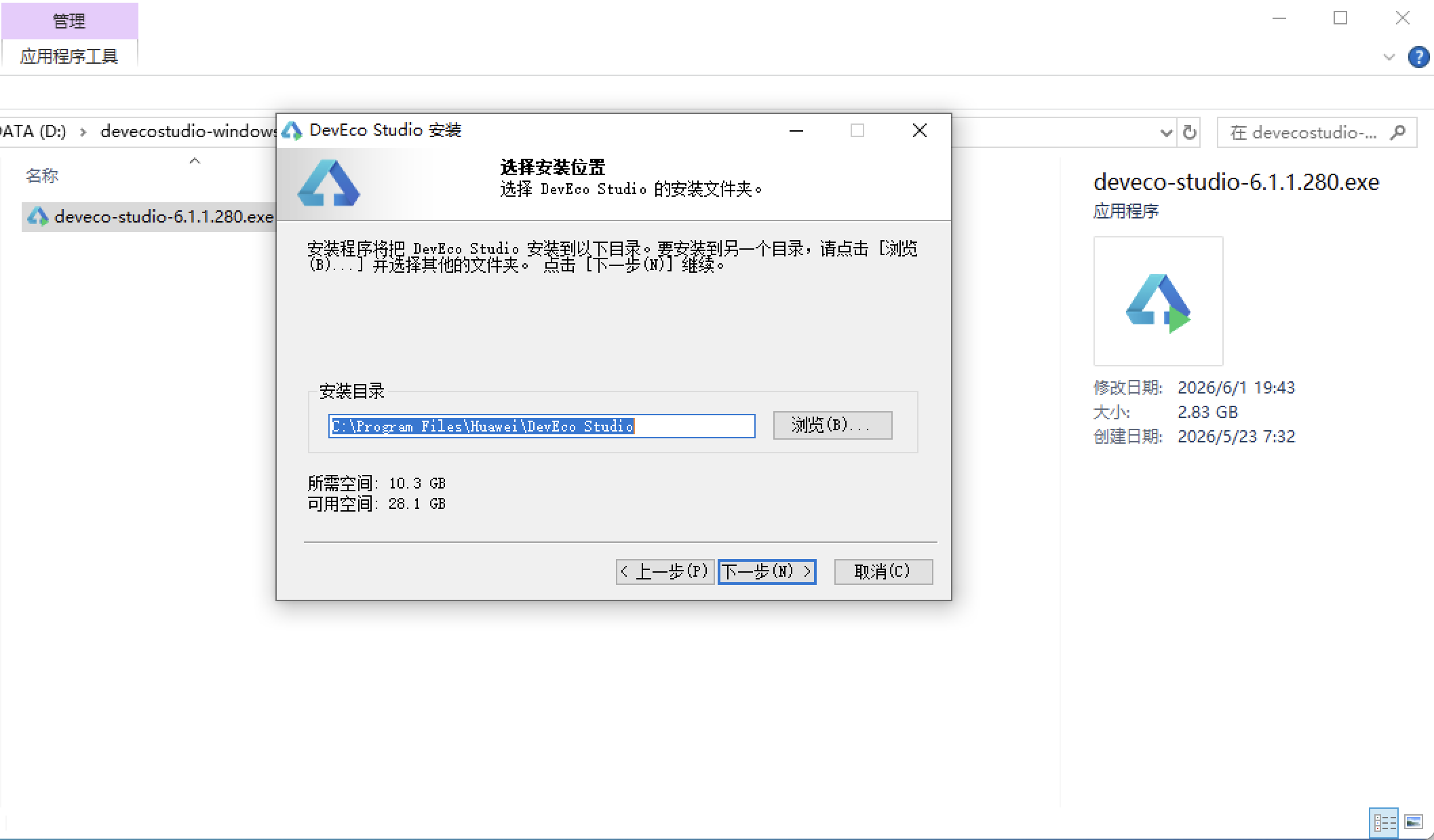
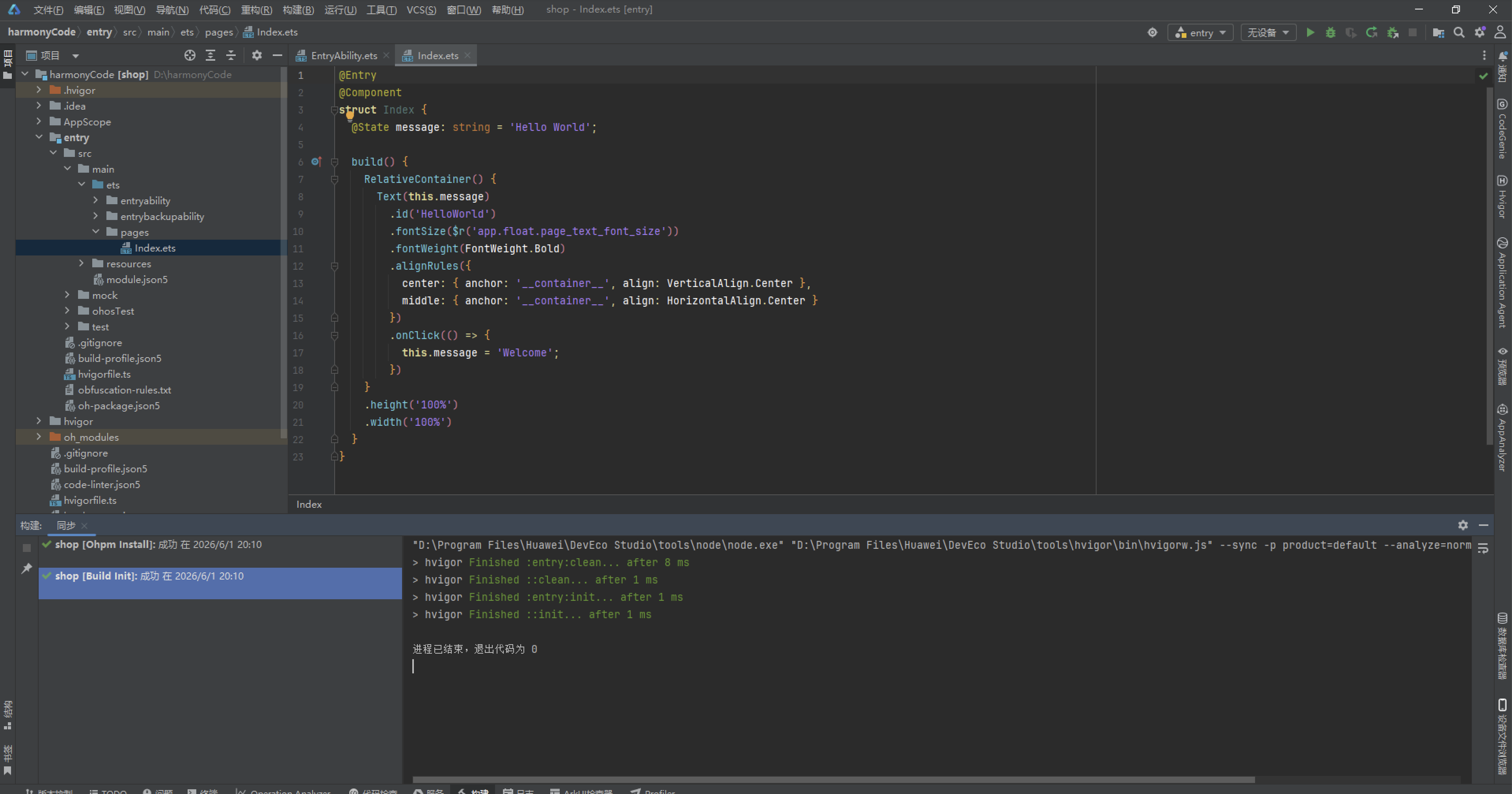
安装DevEco Studio程序
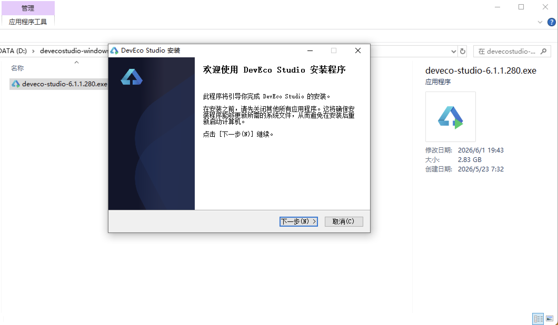
选择目标安装目录:
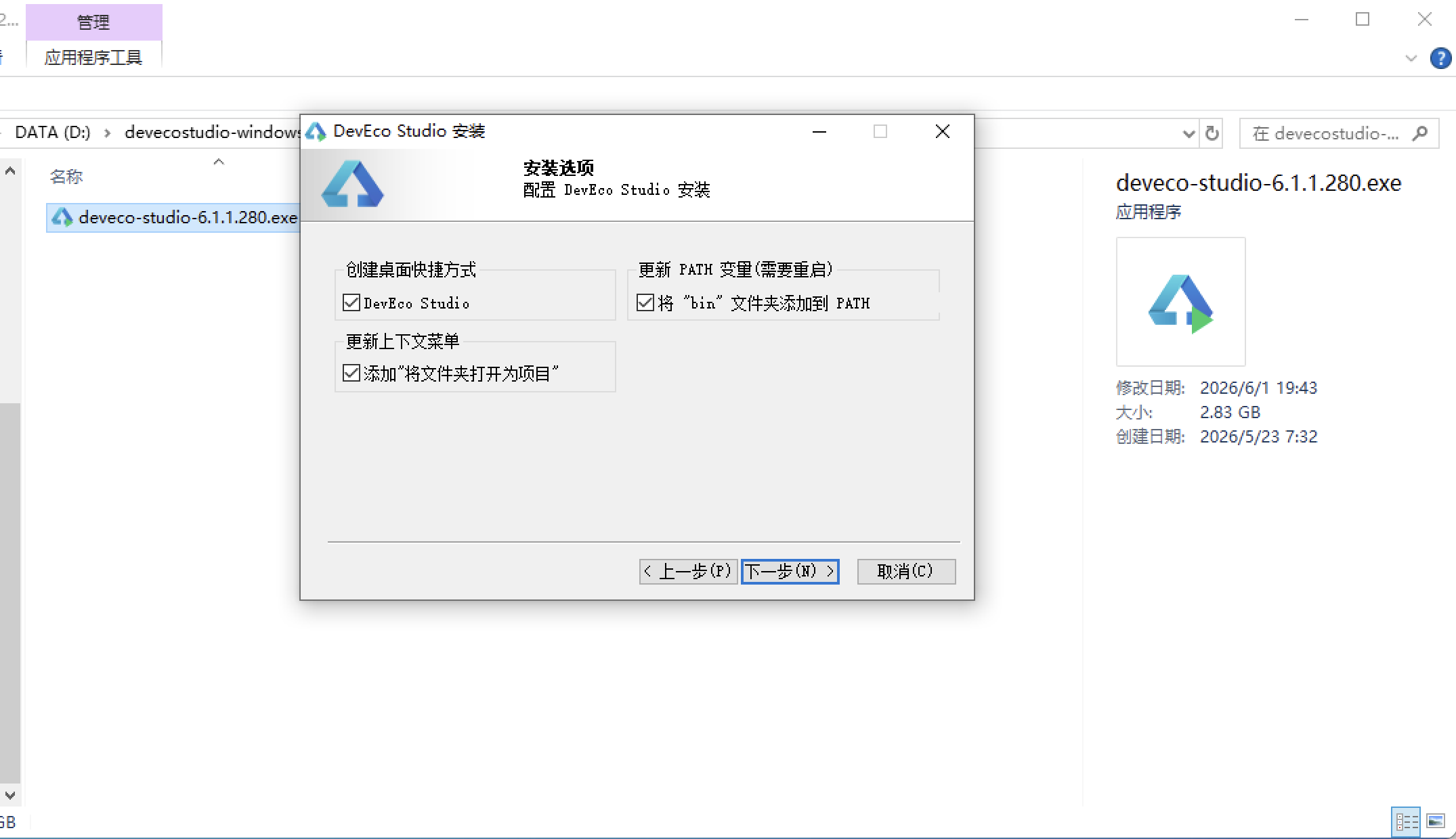
设置环境变量,但是需要重启一下:
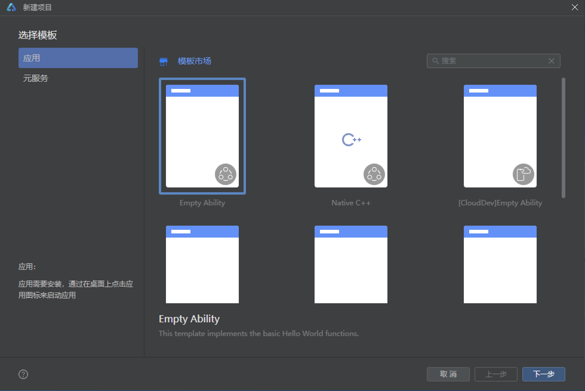
新建一个空白模板:
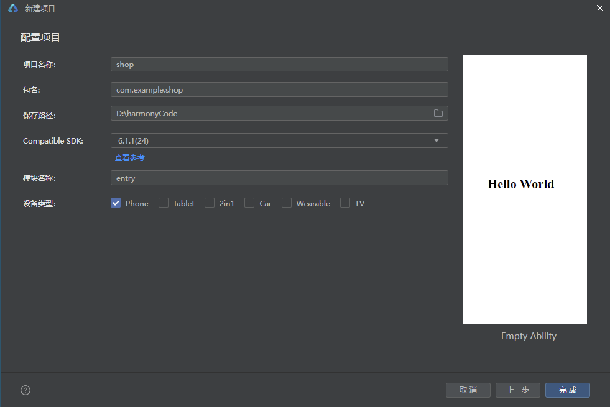
设置API为24的模板项目:
初始化项目,自动下载相关依赖:
完整代码:
// ============================================================
// FABRIC 織語 · 软装布艺窗帘生活馆
// 窗帘/抱枕/床品/地毯布艺商城 + 面料小样申请 + 上门测量安装
// 软装搭配方案 + 我的 · 紫罗兰亚麻风浅色 · ArkTS 单文件
// ============================================================

// ============ 配色(亚麻米 / 紫罗兰 / 雾灰紫 / 亚麻棕 / 深紫墨) ============
interface FBColorPalette {
  bg: string
  card: string
  violet: string
  violetDeep: string
  mist: string
  mistLight: string
  linen: string
  linenLight: string
  ink: string
  line: string
  textSub: string
  textHint: string
}

const FB_COLORS: FBColorPalette = {
  bg: '#F6F2EC',
  card: '#FFFFFF',
  violet: '#7B5EA7',
  violetDeep: '#5E4688',
  mist: '#C9BBDD',
  mistLight: '#EDE7F5',
  linen: '#B99B7A',
  linenLight: '#F0E6D8',
  ink: '#3D3352',
  line: '#EAE2D6',
  textSub: '#7A7290',
  textHint: '#B4AAC6'
}

// ============ Tab 定义 ============
enum FBTab {
  Home = 0,
  Curtain = 1,
  Fabric = 2,
  Plan = 3,
  Visit = 4,
  Mine = 5
}

interface FBTabItem {
  tab: FBTab
  icon: string
  label: string
}

const FB_TABS: FBTabItem[] = [
  { tab: FBTab.Home, icon: '🏠', label: '首页' },
  { tab: FBTab.Curtain, icon: '🪟', label: '窗帘' },
  { tab: FBTab.Fabric, icon: '🧵', label: '面料' },
  { tab: FBTab.Plan, icon: '🎨', label: '方案' },
  { tab: FBTab.Visit, icon: '📐', label: '上门' },
  { tab: FBTab.Mine, icon: '👤', label: '我的' }
]

// ============ 首页统计四格 ============
interface FBDataStat {
  icon: string
  label: string
  value: string
  sub: string
  color: string
}

const FB_STATS: FBDataStat[] = [
  { icon: '🪟', label: '在售窗帘', value: '16', sub: '款', color: '#7B5EA7' },
  { icon: '🧵', label: '甄选面料', value: '12', sub: '种', color: '#B99B7A' },
  { icon: '📐', label: '累计上门量窗', value: '3,208', sub: '户', color: '#5E4688' },
  { icon: '⭐', label: '搭配好评率', value: '99.2', sub: '%', color: '#9B8AC4' }
]

// ============ 首页风格横滑大卡(6 种) ============
interface FBDataStyle {
  id: number
  name: string
  icon: string
  desc: string
  colorHex: string
  count: number
}

const FB_STYLES: FBDataStyle[] = [
  { id: 1, name: '雾紫浪漫', icon: '🌙', desc: '紫罗兰纱帘 × 亚麻床品,卧室一夜好眠', colorHex: '#C9BBDD', count: 326 },
  { id: 2, name: '燕麦自然', icon: '🌾', desc: '本色亚麻 × 原木家具,客厅呼吸感满分', colorHex: '#D9CDB8', count: 284 },
  { id: 3, name: '灰紫轻奢', icon: '💜', desc: '雾灰紫提花 × 丝绒抱枕,全屋高级质感', colorHex: '#9B8AC4', count: 198 },
  { id: 4, name: '亚麻日式', icon: '🍵', desc: '苎麻平幔 × 藤编地毯,书房禅意十足', colorHex: '#CDBFA5', count: 162 },
  { id: 5, name: '奶油法式', icon: '🍰', desc: '米白泡泡纱 × 蕾丝纱幔,餐厅温柔滤镜', colorHex: '#EFD9E2', count: 141 },
  { id: 6, name: '星夜静谧', icon: '🌌', desc: '深紫墨全遮光 × 静音轨道,儿童房哄睡神器', colorHex: '#3D3352', count: 118 }
]

// ============ 首页功能宫格(8 项) ============
interface FBDataGrid {
  icon: string
  label: string
  bg: string
}

const FB_GRIDS: FBDataGrid[] = [
  { icon: '🧵', label: '面料小样', bg: '#EDE7F5' },
  { icon: '📐', label: '上门量窗', bg: '#F0E6D8' },
  { icon: '🪟', label: '窗帘定制', bg: '#EDE7F5' },
  { icon: '🎨', label: '软装方案', bg: '#F0E6D8' },
  { icon: '🔧', label: '安装服务', bg: '#EDE7F5' },
  { icon: '♻️', label: '旧帘换新', bg: '#F0E6D8' },
  { icon: '❤️', label: '我的收藏', bg: '#EDE7F5' },
  { icon: '💬', label: '搭配顾问', bg: '#F0E6D8' }
]

// ============ 风格类型分布条(首页图表) ============
interface FBDataDist {
  style: string
  count: number
  color: string
}

const FB_STYLE_DIST: FBDataDist[] = [
  { style: '自然风', count: 128, color: '#7B5EA7' },
  { style: '轻奢风', count: 96, color: '#9B8AC4' },
  { style: '日式', count: 84, color: '#B99B7A' },
  { style: '法式', count: 62, color: '#C9BBDD' },
  { style: '极简', count: 58, color: '#CDBFA5' },
  { style: '复古', count: 40, color: '#5E4688' }
]

// ============ 窗帘分类 ============
interface FBDataCat {
  name: string
  icon: string
}

const FB_CURTAIN_CATS: FBDataCat[] = [
  { name: '全部', icon: '🪟' },
  { name: '卧室', icon: '🌙' },
  { name: '客厅', icon: '🛋️' },
  { name: '儿童房', icon: '🧸' },
  { name: '书房', icon: '📚' },
  { name: '餐厅', icon: '🍽️' }
]

// ============ 窗帘(16 款) ============
interface FBDataCurtain {
  id: number
  name: string
  cat: string
  icon: string
  colorHex: string
  price: number
  sales: number
  dim: number
  fold: number
  spaces: string
  tag: string
}

const FBCURTAINS: FBDataCurtain[] = [
  { id: 1, name: '雾紫轻语 · 雪尼尔遮光帘', cat: '卧室', icon: '🌙', colorHex: '#C9BBDD', price: 268, sales: 4820, dim: 95, fold: 2.0, spaces: '主卧/老人房', tag: '爆款' },
  { id: 2, name: '亚麻晨光 · 棉麻半遮光帘', cat: '客厅', icon: '🌾', colorHex: '#D9CDB8', price: 189, sales: 3960, dim: 60, fold: 1.8, spaces: '客厅/阳台', tag: '热卖' },
  { id: 3, name: '星夜黑金 · 全遮光隔音帘', cat: '卧室', icon: '🌌', colorHex: '#3D3352', price: 359, sales: 3610, dim: 99, fold: 2.5, spaces: '主卧/影音室', tag: '隔音' },
  { id: 4, name: '薄雾紫纱 · 双层纱帘组', cat: '客厅', icon: '纱', colorHex: '#EDE7F5', price: 129, sales: 3180, dim: 45, fold: 3.0, spaces: '客厅/茶室', tag: '透光' },
  { id: 5, name: '燕麦米 · 日式平幔帘', cat: '书房', icon: '🍵', colorHex: '#E4D9C6', price: 219, sales: 2450, dim: 80, fold: 2.0, spaces: '书房/和室', tag: '日式' },
  { id: 6, name: '紫罗兰之约 · 绒布提花帘', cat: '卧室', icon: '💜', colorHex: '#7B5EA7', price: 328, sales: 2980, dim: 92, fold: 2.2, spaces: '主卧/衣帽间', tag: '提花' },
  { id: 7, name: '云朵白 · 防水百叶帘', cat: '餐厅', icon: '☁️', colorHex: '#F7F3FA', price: 159, sales: 2120, dim: 70, fold: 1.0, spaces: '厨房/卫生间', tag: '防水' },
  { id: 8, name: '莫兰迪灰绿 · 棉麻混纺帘', cat: '客厅', icon: '🌿', colorHex: '#C2CBB8', price: 239, sales: 1860, dim: 75, fold: 2.0, spaces: '客厅/玄关', tag: '莫兰迪' },
  { id: 9, name: '深紫墨 · 复古丝绒帘', cat: '卧室', icon: '🍷', colorHex: '#5E4688', price: 398, sales: 1540, dim: 97, fold: 2.5, spaces: '主卧/酒店风', tag: '复古' },
  { id: 10, name: '裸粉杏 · 泡泡纱公主帘', cat: '儿童房', icon: '🎀', colorHex: '#EFD9E2', price: 168, sales: 2680, dim: 50, fold: 2.8, spaces: '女孩房/亲子房', tag: '亲子' },
  { id: 11, name: '藏蓝星河 · 卡通遮光帘', cat: '儿童房', icon: '⭐', colorHex: '#4A5A8A', price: 208, sales: 3320, dim: 88, fold: 2.0, spaces: '儿童房/游戏间', tag: '哄睡' },
  { id: 12, name: '焦糖棕 · 美式乡村帘', cat: '客厅', icon: '🍂', colorHex: '#B99B7A', price: 288, sales: 1240, dim: 85, fold: 2.2, spaces: '客厅/别墅', tag: '美式' },
  { id: 13, name: '香草米白 · 法式垂坠帘', cat: '餐厅', icon: '🍰', colorHex: '#F0E6D8', price: 278, sales: 1420, dim: 78, fold: 3.0, spaces: '餐厅/法式客厅', tag: '法式' },
  { id: 14, name: '石墨灰 · 北欧极简帘', cat: '书房', icon: '🪵', colorHex: '#8A8592', price: 198, sales: 2260, dim: 90, fold: 1.8, spaces: '书房/工作室', tag: '极简' },
  { id: 15, name: '暮山紫 · 高精密提花帘', cat: '卧室', icon: '🏔️', colorHex: '#9B8AC4', price: 318, sales: 1760, dim: 96, fold: 2.5, spaces: '主卧/轻奢风', tag: '高精密' },
  { id: 16, name: '亚麻本色 · 抗菌防尘帘', cat: '儿童房', icon: '🌱', colorHex: '#CDBFA5', price: 229, sales: 1580, dim: 82, fold: 2.0, spaces: '儿童房/母婴房', tag: '抗菌' }
]

// ============ 面料(12 种) ============
interface FBDataFabric {
  id: number
  name: string
  colorHex: string
  comp: string
  price: number
  feature: string
  stock: number
  feel: number
}

const FBFABRICS: FBDataFabric[] = [
  { id: 1, name: '本色亚麻', colorHex: '#D9CDB8', comp: '100% 亚麻', price: 68, feature: '透气亲肤', stock: 420, feel: 96 },
  { id: 2, name: '棉麻混纺', colorHex: '#E4D9C6', comp: '55% 棉 45% 麻', price: 45, feature: '垂感自然', stock: 680, feel: 92 },
  { id: 3, name: '雾灰紫雪尼尔', colorHex: '#C9BBDD', comp: '雪尼尔绒', price: 88, feature: '厚实遮光', stock: 350, feel: 98 },
  { id: 4, name: '紫罗兰丝绒', colorHex: '#7B5EA7', comp: '真丝绒', price: 128, feature: '轻奢光泽', stock: 180, feel: 97 },
  { id: 5, name: '提花工艺布', colorHex: '#9B8AC4', comp: '涤纶提花', price: 98, feature: '立体花纹', stock: 260, feel: 90 },
  { id: 6, name: '香云雪纺纱', colorHex: '#F2ECF7', comp: '雪纺纱纤维', price: 32, feature: '仙气透光', stock: 900, feel: 85 },
  { id: 7, name: '涤麻遮光布', colorHex: '#8A7BA6', comp: '三层遮光', price: 76, feature: '遮光 95%', stock: 540, feel: 88 },
  { id: 8, name: '奶油泡泡纱', colorHex: '#EFD9E2', comp: '全棉泡泡纱', price: 56, feature: '少女感强', stock: 470, feel: 93 },
  { id: 9, name: '法式蕾丝纱', colorHex: '#F7F3FA', comp: '刺绣蕾丝', price: 108, feature: '精致花边', stock: 150, feel: 89 },
  { id: 10, name: '亚麻棕植绒', colorHex: '#B99B7A', comp: '植绒复合', price: 82, feature: '复古肌理', stock: 310, feel: 94 },
  { id: 11, name: '原色苎麻', colorHex: '#CDBFA5', comp: '100% 苎麻', price: 62, feature: '日式素雅', stock: 380, feel: 91 },
  { id: 12, name: '深紫墨天鹅绒', colorHex: '#3D3352', comp: '天鹅绒', price: 118, feature: '酒店质感', stock: 210, feel: 99 }
]

// ============ 软装方案(8 套) ============
interface FBDataPlan {
  id: number
  name: string
  style: string
  icon: string
  price: number
  rooms: string
  rating: number
  applied: number
  c1: string
  c2: string
  c3: string
  c4: string
  r1: number
  r2: number
  r3: number
  r4: number
}

const FBPLANS: FBDataPlan[] = [
  { id: 1, name: '紫雾晨眠 · 卧室套装', style: '雾紫浪漫', icon: '🌙', price: 1680, rooms: '窗帘+床品+抱枕', rating: 4.9, applied: 326, c1: '#C9BBDD', c2: '#F6F2EC', c3: '#7B5EA7', c4: '#B99B7A', r1: 40, r2: 30, r3: 20, r4: 10 },
  { id: 2, name: '燕麦暖阳 · 客厅套装', style: '燕麦自然', icon: '🌾', price: 1980, rooms: '窗帘+抱枕+地毯', rating: 4.8, applied: 284, c1: '#D9CDB8', c2: '#F0E6D8', c3: '#B99B7A', c4: '#3D3352', r1: 45, r2: 25, r3: 20, r4: 10 },
  { id: 3, name: '灰紫轻奢 · 全屋套装', style: '灰紫轻奢', icon: '💜', price: 4680, rooms: '窗帘+床品+地毯', rating: 5.0, applied: 198, c1: '#9B8AC4', c2: '#3D3352', c3: '#C9BBDD', c4: '#B99B7A', r1: 35, r2: 30, r3: 25, r4: 10 },
  { id: 4, name: '苎麻禅意 · 书房套装', style: '亚麻日式', icon: '🍵', price: 1280, rooms: '窗帘+坐垫+桌旗', rating: 4.7, applied: 162, c1: '#CDBFA5', c2: '#F6F2EC', c3: '#8A8592', c4: '#7B5EA7', r1: 50, r2: 30, r3: 12, r4: 8 },
  { id: 5, name: '奶油法式 · 餐厅套装', style: '奶油法式', icon: '🍰', price: 1480, rooms: '纱帘+桌布+椅套', rating: 4.8, applied: 141, c1: '#EFD9E2', c2: '#F7F3FA', c3: '#C9BBDD', c4: '#B99B7A', r1: 38, r2: 32, r3: 18, r4: 12 },
  { id: 6, name: '星夜安睡 · 儿童房套装', style: '星夜静谧', icon: '🌌', price: 1080, rooms: '遮光帘+床品', rating: 4.9, applied: 118, c1: '#3D3352', c2: '#4A5A8A', c3: '#C9BBDD', c4: '#F0E6D8', r1: 42, r2: 28, r3: 18, r4: 12 },
  { id: 7, name: '暮山紫语 · 主卧套装', style: '灰紫轻奢', icon: '🏔️', price: 2180, rooms: '提花帘+床品+纱', rating: 4.9, applied: 136, c1: '#9B8AC4', c2: '#EDE7F5', c3: '#5E4688', c4: '#B99B7A', r1: 36, r2: 30, r3: 22, r4: 12 },
  { id: 8, name: '石墨静读 · 工作室套装', style: '极简', icon: '🪵', price: 1380, rooms: '窗帘+抱枕', rating: 4.6, applied: 96, c1: '#8A8592', c2: '#F6F2EC', c3: '#3D3352', c4: '#CDBFA5', r1: 40, r2: 28, r3: 20, r4: 12 }
]

// ============ 上门服务(8 项) ============
interface FBDataVisit {
  id: number
  name: string
  icon: string
  duration: string
  price: number
  desc: string
  tag: string
  today: string
  sat: string
  sun: string
}

const FBVISITS: FBDataVisit[] = [
  { id: 1, name: '免费上门量窗', icon: '📐', duration: '约 40 分钟', price: 0, desc: '激光测距 · 出报价单', tag: '免费', today: '余 6', sat: '余 3', sun: '余 5' },
  { id: 2, name: '窗帘安装挂帘', icon: '🔧', duration: '约 90 分钟', price: 128, desc: '打孔挂钩 · 调试平整', tag: '标准化', today: '余 4', sat: '满', sun: '余 2' },
  { id: 3, name: '窗帘拆洗养护', icon: '🧺', duration: '约 60 分钟', price: 98, desc: '上门取送 · 高温除螨', tag: '季末热', today: '余 8', sat: '余 6', sun: '余 4' },
  { id: 4, name: '静音轨道加装', icon: '🛤️', duration: '约 70 分钟', price: 158, desc: '超静音滑轮 · 顺滑不卡', tag: '推荐', today: '余 3', sat: '余 2', sun: '满' },
  { id: 5, name: '帘头幔子定制安装', icon: '🪡', duration: '约 120 分钟', price: 188, desc: '法式平幔 · 工字褶幔', tag: '工艺', today: '余 2', sat: '满', sun: '余 1' },
  { id: 6, name: '全屋软装摆场', icon: '🛋️', duration: '约 240 分钟', price: 588, desc: '窗帘+抱枕+地毯整体陈设', tag: '整屋', today: '预约', sat: '预约', sun: '预约' },
  { id: 7, name: '旧窗帘回收', icon: '♻️', duration: '约 30 分钟', price: 0, desc: '免费拆旧 · 抵扣新帘', tag: '环保', today: '余 9', sat: '余 7', sun: '余 8' },
  { id: 8, name: '布艺除螨喷雾养护', icon: '✨', duration: '约 50 分钟', price: 88, desc: '沙发帘布深层除螨', tag: '健康', today: '余 5', sat: '余 4', sun: '余 6' }
]

// ============ 预约记录(14 条) ============
interface FBDataBooking {
  id: number
  service: string
  master: string
  date: string
  time: string
  status: string
  addr: string
}

const FBBOOKINGS: FBDataBooking[] = [
  { id: 1, service: '免费上门量窗', master: '量尺组 · 阿哲', date: '08-16', time: '10:00-12:00', status: '已完成', addr: '澜山别院 3 栋 802' },
  { id: 2, service: '静音轨道加装', master: '安装组 · 老周', date: '08-17', time: '14:00-16:00', status: '已完成', addr: '澜山别院 3 栋 802' },
  { id: 3, service: '窗帘安装挂帘', master: '安装组 · 老周', date: '08-19', time: '09:00-11:00', status: '已完成', addr: '澜山别院 3 栋 802' },
  { id: 4, service: '免费上门量窗', master: '量尺组 · 小蔓', date: '08-22', time: '15:00-17:00', status: '已完成', addr: '云锦东方 12 栋 1501' },
  { id: 5, service: '布艺除螨喷雾养护', master: '养护组 · 阿玲', date: '08-24', time: '10:00-11:00', status: '已完成', addr: '云锦东方 12 栋 1501' },
  { id: 6, service: '帘头幔子定制安装', master: '工艺组 · 陈师傅', date: '08-26', time: '13:00-15:00', status: '进行中', addr: '云锦东方 12 栋 1501' },
  { id: 7, service: '免费上门量窗', master: '量尺组 · 阿哲', date: '08-28', time: '09:00-10:00', status: '待上门', addr: '翡翠半岛 6 号楼 903' },
  { id: 8, service: '窗帘安装挂帘', master: '安装组 · 大刘', date: '08-29', time: '16:00-18:00', status: '待上门', addr: '翡翠半岛 6 号楼 903' },
  { id: 9, service: '窗帘拆洗养护', master: '养护组 · 阿玲', date: '08-30', time: '10:00-11:00', status: '已预约', addr: '澜山别院 3 栋 802' },
  { id: 10, service: '全屋软装摆场', master: '陈设组 · 苏总监', date: '09-02', time: '09:00-13:00', status: '已预约', addr: '翡翠半岛 6 号楼 903' },
  { id: 11, service: '静音轨道加装', master: '安装组 · 老周', date: '09-05', time: '14:00-16:00', status: '已预约', addr: '云锦东方 12 栋 1501' },
  { id: 12, service: '旧窗帘回收', master: '环保组 · 小柯', date: '09-08', time: '11:00-12:00', status: '已预约', addr: '澜山别院 3 栋 802' },
  { id: 13, service: '布艺除螨喷雾养护', master: '养护组 · 阿玲', date: '09-11', time: '15:00-16:00', status: '已预约', addr: '翡翠半岛 6 号楼 903' },
  { id: 14, service: '窗帘安装挂帘', master: '安装组 · 大刘', date: '09-14', time: '10:00-12:00', status: '已预约', addr: '云锦东方 12 栋 1501' }
]

// ============ 我的订单(12 条) ============
interface FBDataOrder {
  id: number
  item: string
  date: string
  status: string
  price: number
}


}
三十八、总结
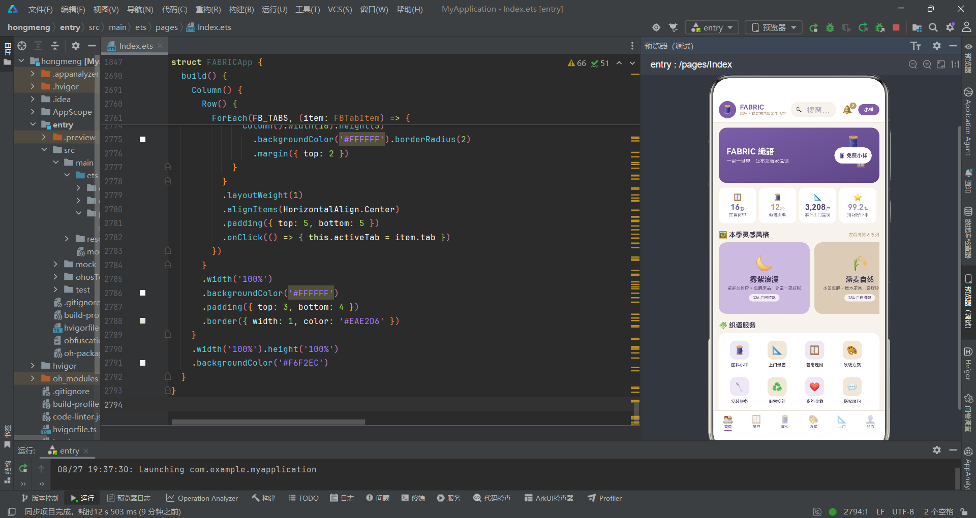
本应用是一个功能完整的软装布艺商城与服务预约平台,采用鸿蒙 ArkTS 声明式 UI 框架,在单文件内承载了六个业务 Tab 页面、七个交互弹框、十余组数据模型和十几个全局纯函数,总代码量约 2800 行。应用的架构设计体现了高度的内聚性和模块化特征。
在配色体系层面,应用通过 FBColorPalette 接口和 FB_COLORS 常量集中管理十二种品牌色,以亚麻米为底色、紫罗兰紫为主色、雾灰紫为辅助色、深紫墨为强调色,构建了统一而富有层次的视觉语言。所有 UI 组件的颜色都引用自这一套配色常量,保证了品牌视觉的一致性。
在数据模型层面,应用定义了十一个数据接口和十一个常量数组,覆盖了统计、风格、功能宫格、分布、窗帘分类、窗帘商品、面料、方案、服务、预约、订单、收藏、消费、评价等全部业务实体。每个接口的字段设计贴合业务需求,如窗帘的遮光率和褶皱倍数、方案的四色配色比例、服务的排期余量等,都是软装行业的专业参数在数据层面的直接映射。
在纯函数工具层层面,应用定义了十七个全局纯函数,分为格式化函数(fbMoney、fbDimW 等)、状态映射函数(fbFoldColor、fbStatusColor 等)、不可变更新函数(fbToggleAt)和列表操作函数(fbFilterCurtains、fbTopSales 等)四类。这些函数严格遵循纯函数原则,无副作用、可组合、易测试,是 UI 渲染的重要支撑。
在组件架构层面,应用采用"一主六子"的组件树结构。主组件 FABRICApp 作为入口组件,承担 Tab 路由、弹框调度、状态管理三大职责。六个子内容组件各自独立管理本页面的 UI 构建和动画状态,通过回调函数向主组件通信。这种分层设计使各组件职责清晰,互不干扰。
在状态管理层面,主组件使用 @State 管理了四大类共十八个状态变量。Tab 路由状态控制页面切换,弹框开关控制七个弹框的显示与隐藏,选中项索引记录用户在列表中的选择位置,表单字段管理小样申请、窗帘编辑和上门预约的输入数据。每个 @State 变量的变化都会自动触发引用该状态的 UI 部分重新渲染,实现了完整的响应式数据流。
在动画系统层面,六个子组件各自拥有独立的动画状态对,通过 aboutToAppear 生命周期中的 animateTo 启动无限循环动画。首页的布纹飘动使用 translate 位移,窗帘页的纱帘摆动使用 rotate 旋转,面料页的色卡浮沉使用 translate 位移,方案页的色块呼吸使用 scale 缩放,上门页的光点流动使用 translate 位移,我的页的光晕呼吸使用 scale 缩放配合 opacity 透明度。六种动画都采用 PlayMode.Alternate 交替播放模式和 Curve.EaseInOut 缓动曲线,时长统一为 2200 毫秒,形成了各页面独特而又统一的动态语言。
在弹框架构层面,应用通过 @Builder 装饰器定义了七个弹框构建器和一个共享的遮罩层构建器。弹框分为底部抽屉式和居中圆角卡式两种形态,遮罩层统一使用半透明深紫背景。弹框的显示通过布尔状态变量控制,弹框间的跳转通过修改两个布尔变量实现(先关闭当前弹框再打开目标弹框)。每个弹框都通过 zIndex(999) 确保层级最高。
在布局技术层面,应用综合运用了 ArkTS 的五大容器组件。Column 用于垂直排列子元素,是每个页面的骨架容器。Row 用于水平排列子元素,配合 layoutWeight 实现弹性宽度分配。Stack 用于层叠子元素,在品牌横幅、色块头部、会员卡等场景中实现多层视觉效果。Flex 配合 FlexWrap.Wrap 用于自动换行的网格布局,在功能宫格、面料色彩墙、方案网格等场景中使用。Scroll 用于滚动容器,分为垂直滚动(页面内容)和水平滚动(风格横滑、分类筛选)两种模式。
在数据可视化层面,应用完全通过基础组件手工绘制了多种图表。进度条使用"外层灰色轨道 + 内层彩色填充"的双层结构,宽度通过纯函数计算百分比。柱状图使用 Column 的高度属性和 fbSpendH 函数映射金额到像素高度。配色比例条使用 Row 包裹多个 Column,各自占据百分比宽度,配合 clip(true) 实现圆角裁剪。这些手工图表避免了引入第三方图表库的开销,保持了应用的轻量性。
在交互模式层面,应用实现了多选切换(小样面料)、单选切换(风格选择、褶皱倍数、日期时段)、滑块调节(窗帘宽度)、开关切换(遮光衬布)、步进器(房间数量)、条件筛选(窗帘分类)、弹框跳转(详情到编辑)等多种交互模式。每种交互都通过修改 @State 状态变量来驱动 UI 更新,充分体现了 ArkTS"状态驱动 UI"的核心思想。
在组件间通信层面,应用采用"属性绑定 + 回调通知"的通信模式。父组件通过属性绑定向子组件传递回调函数,子组件在用户交互时调用这些回调函数,回调函数内部修改父组件的状态变量。这种模式确保了数据流的单向性:状态从父到子,事件从子到父,便于追踪和调试。
在 ForEach 渲染层面,应用大量使用 ForEach 进行列表渲染,包括统计四格、风格横滑卡、功能宫格、分布条、窗帘列表、面料 Grid、方案网格、服务排期表、预约时间轴、订单列表、收藏列表、评价列表、底部 Tab 栏等十余处。ForEach 配合条件渲染(if/else)实现了选中态、过滤态、斑马条纹等动态展示效果。
在鸿蒙技术点的运用层面,应用充分展示了 ArkTS 的核心能力。@Component 装饰器声明可复用组件,@Entry 标记入口组件,@State 管理响应式状态,@Builder 定义可复用 UI 片段。aboutToAppear 生命周期用于初始化动画。animateTo 驱动属性动画。FlexAlign 枚举定义弹性对齐方式。GradientDirection 定义渐变方向。PlayMode 定义动画播放模式。Curve 定义缓动曲线。ScrollDirection 定义滚动方向。BarState 控制滚动条显隐。ToggleType 定义开关类型。TextAlign 定义文字对齐方式。FontWeight 定义字体粗细。这些枚举和装饰器共同构成了 ArkTS 的类型安全体系。

讨论HarmonyOS开发技术,专注于API与组件、DevEco Studio、测试、元服务和应用上架分发等。
更多推荐
 6
6 0
0- 0


 已为社区贡献43条内容

所有评论(0)