HarmonyOS 6 效果实现 Swiper 轮播组件自动轮播手势拖拽指示器自定义全套功能开发分享
在万物互联的鸿蒙生态中,ArkTS 以声明式 UI 范式重新定义了应用的开发体验。本文将以一个名为"INK&WOOD 沉思所"的居家书房定制商城为例,逐段拆解其单文件架构下的六大页签、八类弹窗、装饰动画与数据驱动渲染机制,带你深入理解 ArkUI 组件化开发的精髓。
一、整体技术架构与设计理念

这个项目是一个面向居家书房定制场景的电商类鸿蒙应用,业务覆盖面相当广泛。它不仅包含家庭书房定制(书架墙、升降桌),还整合了人体工学椅、隔音办公舱、收藏书房方案、工位好物以及个人中心等六大功能模块。整个应用采用 ArkTS 声明式开发范式,在一个单文件中完成了全部 UI 与逻辑的编写,体现了 ArkUI"高内聚、低耦合"的组件化设计思想。
从技术栈角度看,项目深度运用了 ArkUI 的核心能力。声明式语法以 build() 方法为入口,通过链式调用描述 UI 结构与样式;状态管理依赖 @State 装饰器实现数据到视图的自动刷新;组件复用通过 @Component 装饰器定义自定义组件,并以 @Builder 封装可复用的 UI 片段。布局层面,Column、Row、Stack、Grid、Scroll 等容器组件协同工作,配合 FlexAlign、layoutWeight、alignContent 等对齐策略,构建出层次分明、响应灵敏的界面结构。
声明式 UI 的核心在于"状态驱动视图"。开发者只需描述界面在某一状态下的样子,框架会自动完成状态变化到视图更新的差分渲染,这让复杂交互逻辑变得清晰可维护。
架构上,整个应用采用了"主组件 + 子组件"的分层模式。主组件 IWMain 作为 @Entry 入口,负责全局状态管理、页签切换、弹窗调度和装饰动画的驱动;六个子组件分别承载各自页签的内容渲染,通过回调函数将用户操作向上传递。这种单向数据流的设计保证了状态的可追溯性,也让组件间的职责边界非常清晰。下方的流程图展示了从用户交互到界面更新的完整数据流向。
二、配色体系与设计令牌

interface IWPalette {
  bg: string
  card: string
  green: string
  greenDeep: string
  greenLight: string
  gold: string
  goldLight: string
  red: string
  redLight: string
  ink: string
  sub: string
  hint: string
  line: string
}

const IW: IWPalette = {
  bg: '#F5F3EC',
  card: '#FFFFFF',
  green: '#2F5D50',
  greenDeep: '#1F4439',
  greenLight: '#DCE6DF',
  gold: '#B08D57',
  goldLight: '#E6D5B8',
  red: '#C25B4E',
  redLight: '#F4E0DC',
  ink: '#2B2B26',
  sub: '#8A8578',
  hint: '#B7B1A4',
  line: '#E7E2D6'
}
项目首先定义了一个 IWPalette 接口,将整个应用的配色体系抽象为一组结构化的设计令牌(Design Token)。这种做法在前端工程化中极为常见,它将视觉语言从业务代码中解耦,使颜色管理集中化、可维护。接口中声明了十三种颜色字段,分别对应背景、卡片底色、墨绿主色及其深浅变体、黄铜棕、朱砂红、墨黑文字以及不同层级的辅助灰。
随后通过 const IW 常量将这些颜色具象化为具体的十六进制色值。整个配色方案围绕"墨绿书卷"的主题展开——#2F5D50 的墨绿作为品牌主色,呼应书房的沉静气质;#B08D57 的黄铜棕赋予质感与温度;#C25B4E 的朱砂红用于警示与价格强调;#F5F3EC 的宣纸米色作为全局背景,营造温润的书卷气息。
值得注意的是,虽然定义了 IW 这个集中化的配色常量,但实际代码中各组件大量使用硬编码的色值字符串(如 '#2F5D50')。这在单文件原型阶段是可接受的折中,但在团队协作或主题切换场景下,统一引用 IW.green 会更加规范。配色体系的层次化设计——从主色到深色、浅色、辅助色的完整梯度——为后续的视觉层级构建打下了坚实基础。
三、页签定义与枚举体系

enum IWTab {
  Study = 0,
  Chair = 1,
  Pod = 2,
  Plan = 3,
  Goods = 4,
  Mine = 5
}

interface IWTabItem {
  tab: IWTab
  icon: string
  label: string
}

const IW_TABS: IWTabItem[] = [
  { tab: IWTab.Study, icon: '🏠', label: '书房' },
  { tab: IWTab.Chair, icon: '🪑', label: '桌椅' },
  { tab: IWTab.Pod, icon: '🎧', label: '办公舱' },
  { tab: IWTab.Plan, icon: '📐', label: '方案' },
  { tab: IWTab.Goods, icon: '🛍️', label: '好物' },
  { tab: IWTab.Mine, icon: '👤', label: '我的' }
]
页签系统是整个应用的导航骨架。项目使用 enum 定义了 IWTab 枚举,为六个页签赋予了语义化的数字标识符。枚举值从 0 开始递增,分别对应书房、桌椅、办公舱、方案、好物、我的。使用枚举而非魔术数字的好处显而易见:代码可读性大幅提升,IWTab.Study 比 0 更能表达意图,同时在编译期就能获得类型检查的保护。
IWTabItem 接口将枚举值与图标、文字标签打包为一个完整的数据结构。tab 字段存储枚举用于逻辑判断,icon 使用 Emoji 作为图标(在原型阶段便捷高效),label 则是底部栏显示的中文文字。这种"数据驱动 UI"的思路非常 ArkUI——配置即界面,修改页签只需改数据,无需改模板。
IW_TABS 数组将六个页签配置项集中管理,后续在底部导航栏通过 ForEach 遍历渲染。这种设计使得新增或调整页签的成本极低:只需在枚举中添加新值、在数组中添加配置项即可。同时,枚举与数据结构的分离保证了类型安全,编译器会确保 tab 字段只能是 IWTab 的合法成员。
在 ArkUI 中,
ForEach是渲染列表数据的核心组件。它会根据数据源自动创建和复用子组件,当数据变化时进行高效的差分更新,这是实现数据驱动 UI 的关键基础设施。
四、数据接口与类型建模

interface IWStudyPlan {
  id: number
  name: string
  wallStyle: string
  room: string
  area: number
  floor: string
  shelves: number
  grid: number
  books: number
  progress: number
  days: number
  price: number
  tag: string
}

interface IWChair {
  id: number
  name: string
  kind: string
  icon: string
  lumbar: number
  price: number
  sales: number
  dims: string[]
  cert: string
}

interface IWPod {
  id: number
  name: string
  size: string
  material: string
  db: number
  price: number
  seats: number
  stock: number
  feature: string
}
ArkTS 作为 TypeScript 的超集,天然支持接口(interface)进行类型建模。项目为六大业务模块分别定义了数据接口,构建了完整的类型体系。IWStudyPlan 描述书房定制方案,包含墙面样式、房间位置、面积、层板数、收纳格、藏书量、工期进度、价格等十余个字段,字段之丰富体现了定制业务的复杂度。
IWChair 接口描述人体工学桌椅,其中 lumbar(腰椎支撑值)和 dims(可调维度数组)是两个特色字段。lumbar 是一个数值,后续会映射为进度条宽度;dims 是字符串数组,如 ['腰托', '坐深', '头枕'],通过嵌套 ForEach 渲染为标签云。cert 字段记录认证标准(BIFMA、SGS、TUV 等),体现了产品合规性管理。
IWPod 接口描述隔音办公舱,其中 db 字段记录降噪分贝值,是办公舱的核心性能指标。seats 表示座位数,区分单人和双人舱体;stock 表示库存,feature 记录特色卖点。每个接口都经过精心设计,字段类型选择恰当——数值用 number、文本用 string、数组用 string[],既保证了类型安全,又便于后续渲染时的类型推断。
接口的全面定义带来了显著的工程价值。在组件 build() 方法中引用这些数据时,IDE 能提供精准的自动补全;编译期就能捕获字段拼写错误和类型不匹配问题;数据结构即文档,接口本身就是对业务模型最清晰的描述。这种强类型约束在大型项目中尤为珍贵,它能将大量潜在运行时错误提前到编译期消灭。
五、静态数据源与纯函数工具集

const IW_STUDY_PLANS: IWStudyPlan[] = [
  { id: 1, name: '墨野书墙', wallStyle: '整墙满铺', room: '客厅', area: 12, floor: '胡桃木', shelves: 8, grid: 48, books: 320, progress: 72, days: 14, price: 9800, tag: '热销' },
  { id: 2, name: '卷云半墙', wallStyle: '半墙横板', room: '主卧', area: 8, floor: '原木色', shelves: 5, grid: 30, books: 180, progress: 45, days: 9, price: 5600, tag: '轻量' },
  { id: 3, name: '折角回廊', wallStyle: '转角L型', room: '书房', area: 15, floor: '墨绿漆', shelves: 9, grid: 54, books: 400, progress: 88, days: 18, price: 13800, tag: '精选' },
  { id: 4, name: '孤岛书塔', wallStyle: '独立书墙', room: '阁楼', area: 20, floor: '白橡木', shelves: 10, grid: 60, books: 520, progress: 30, days: 21, price: 16800, tag: '待开工' }
]
项目预置了大量静态数据作为数据源,包括 12 个书房方案、14 张桌椅、10 种办公舱、10 个设计师方案、16 件好物、12 条订单、6 条收藏、6 个月消费、10 条评价和 6 种书架风格。这些数据以常量数组形式定义,每条数据都严格遵循对应接口的类型约束。以书房方案为例,每条记录都包含了完整的业务信息——从墙样式、房间、面积到层板数、收纳格、藏书量、工期进度和价格。
静态数据的命名也很有讲究,方案名如"墨野书墙"“卷云半墙”“折角回廊”“孤岛书塔”,富有东方美学意境,与整体"墨绿书卷"的视觉风格高度统一。tag 字段则承担业务分类职责,如"热销"“精选”“高性价比”"已交付"等,便于后续的标签渲染和筛选逻辑。
在真实项目中,这些静态数据会被替换为网络请求获取的动态数据。但静态数据在原型阶段有着不可替代的优势:无需后端配合即可完成 UI 开发与联调,大幅提升前端开发效率。
function iwMoney(v: number): string {
  if (v >= 10000) {
    return (v / 10000).toFixed(1) + '万'
  }
  return v.toString()
}

function iwW(n: number): string {
  let r = n
  if (r < 0) {
    r = 0
  }
  if (r > 100) {
    r = 100
  }
  return r.toString() + '%'
}

function iwPw(db: number): string {
  let r = db
  if (r > 60) {
    r = 60
  }
  return (r / 60 * 100).toString() + '%'
}
项目定义了一组全局纯函数作为数据转换工具集。iwMoney 将金额格式化为"万"单位,超过一万元时显示为 x.x万,否则原样输出,这是中文电商场景的标准做法。iwW 将进度值(0-100)转为百分比字符串,并做了边界钳制——小于 0 归零、大于 100 封顶,确保进度条宽度不会溢出容器。
iwPw 专门处理办公舱的降噪分贝值。它将分贝值(最高 60)映射为百分比,因为分贝与进度条宽度并非同一量纲,需要归一化处理。类似地,iwSalesW 将销量(最高 1200)映射为百分比用于销量条形图,iwMonthH 将月消费金额映射为柱状图高度(14 到 114 像素),iwCostW 将造价(最高 18 万)映射为百分比。
这些纯函数的设计有几个共同特点:无副作用、输入输出明确、包含边界保护。边界保护是工程严谨的体现——即使数据异常(如负数或超大值),也不会导致 UI 渲染崩溃。iwRankColor 根据排名返回奖牌色(金、银、铜、灰),iwPodBg 根据索引奇偶返回斑马纹背景色,iwStar 将星级数值转为星号字符串,都是为特定渲染场景定制的工具函数。
function iwFilterGoods(min: number, max: number): IWGoods[] {
  let r: IWGoods[] = []
  for (let i = 0; i < IW_GOODS.length; i++) {
    if (IW_GOODS[i].price >= min && IW_GOODS[i].price <= max) {
      r.push(IW_GOODS[i])
    }
  }
  return r
}

function iwTopGoods(): IWGoods[] {
  let r: IWGoods[] = IW_GOODS.slice()
  r.sort((a: IWGoods, b: IWGoods) => b.sales - a.sales)
  return r.slice(0, 6)
}
iwFilterGoods 实现了好物价格区间筛选,遍历全部商品并按价格范围过滤,返回符合条件的子集。iwTopGoods 和 iwTopChairs 则实现了"热销 TOP6"功能——先通过 slice() 复制原数组(避免修改源数据),再按销量降序排序,最后取前六条。这种"复制-排序-截取"的不可变数据处理模式是函数式编程的典型范式,保证了源数据的不可变性。
六、书房页签子组件:IWStudyContent

@Component
struct IWStudyContent {
  onAdd: () => void = () => {}
  onStyle: (idx: number) => void = (idx: number) => {}
  onDelete: (idx: number) => void = (idx: number) => {}
  onBook: () => void = () => {}
  onGoto: (tab: IWTab) => void = (tab: IWTab) => {}

  build() {
    Scroll() {
      Column() {
        Column() {
          Row() {
            Column() {
              Text('让书房安静下来').fontSize(18).fontWeight(FontWeight.Bold).fontColor('#FFFFFF')
              Text('IN&WOOD 家庭书房定制').fontSize(10).fontColor('#DCE6DF').margin({ top: 6 })
              Column() {
                Text('📞 免费设计').fontSize(11).fontWeight(FontWeight.Bold).fontColor('#2F5D50')
              }
              .width(96).height(30).backgroundColor('#FFFFFF').borderRadius(15)
              .justifyContent(FlexAlign.Center).margin({ top: 10 })
              .onClick(() => { this.onAdd() })
            }
            .alignItems(HorizontalAlign.Start).layoutWeight(1)
            Text('🖋').fontSize(52).opacity(0.9)
          }
          .width('100%').height(120).padding({ left: 16, right: 18 }).alignItems(VerticalAlign.Center)
        }
        .width('100%').height(120)
        .linearGradient({ direction: GradientDirection.RightBottom, colors: [['#2F5D50', 0], ['#1F4439', 1]] })
        .borderRadius(16)
IWStudyContent 是书房页签的内容组件,用 @Component 装饰器声明为自定义组件。组件顶部声明了五个回调函数属性,默认值都是空函数——这是 ArkUI 子组件接收父组件通信的标准模式。父组件在实例化子组件时传入具体的回调实现,子组件在用户交互时调用这些回调,从而将事件向上传递。这种"回调向上、数据向下"的单向数据流是 ArkUI 架构的核心原则。
build() 方法以 Scroll 作为最外层容器,保证内容超出屏幕时可滚动浏览。内部嵌套一个 Column 作为垂直布局容器。顶部横幅使用了 Row 横向布局,左侧 Column 通过 layoutWeight(1) 占据剩余空间,右侧放置一个装饰性 Emoji。横幅通过 linearGradient 设置了从墨绿到深墨绿的渐变背景,GradientDirection.RightBottom 指定渐变方向为右下,营造光影层次感。
横幅中的"免费设计"按钮是一个嵌套的 Column,通过 justifyContent(FlexAlign.Center) 实现内容居中对齐。FlexAlign.Center 是 Flex 布局的主轴对齐枚举,配合容器尺寸和圆角设置,构建出一个胶囊形按钮。点击事件 onClick 调用 this.onAdd(),将交互委托给父组件处理——子组件本身不持有弹窗状态,只负责触发回调。
        ForEach(IW_STUDY_PLANS, (p: IWStudyPlan, idx: number) => {
          Column() {
            Row() {
              Text(p.name).fontSize(15).fontWeight(FontWeight.Bold).fontColor('#2B2B26')
              Text(p.tag).fontSize(9).fontColor('#C25B4E').backgroundColor('#F4E0DC')
                .padding({ left: 6, right: 6, top: 2, bottom: 2 }).borderRadius(8).margin({ left: 6 })
              Column().layoutWeight(1)
              Text('¥' + iwMoney(p.price)).fontSize(13).fontWeight(FontWeight.Bold).fontColor('#B08D57')
            }
            .width('100%')

            Row() {
              Text('🧱 ' + p.wallStyle).fontSize(10).fontColor('#2F5D50').backgroundColor('#DCE6DF')
                .padding({ left: 8, right: 8, top: 3, bottom: 3 }).borderRadius(10).margin({ right: 6 })
              Text('🏠 ' + p.room).fontSize(10).fontColor('#2F5D50').backgroundColor('#DCE6DF')
                .padding({ left: 8, right: 8, top: 3, bottom: 3 }).borderRadius(10).margin({ right: 6 })
              Text('🌳 ' + p.floor).fontSize(10).fontColor('#8A8578').backgroundColor('#F1EDE3')
                .padding({ left: 8, right: 3, bottom: 3 }).borderRadius(10)
            }
            .width('100%').margin({ top: 8 })
方案卡片列表通过 ForEach 遍历 IW_STUDY_PLANS 数据源渲染。ForEach 接收三个参数:数据源、子项生成函数、(可选)键值生成函数。每个方案渲染为一个 Column 卡片,内部从上到下依次是标题行、标签行、统计区、进度条和操作按钮行。这种"列表卡片"是移动端信息展示的经典模式。
标题行使用 Row 横向排列方案名、标签和价格。中间插入一个空的 Column().layoutWeight(1) 作为弹性间隔——这是 ArkUI 中实现"两端对齐"的常用技巧,占据剩余空间将两侧元素推向两端。标签通过背景色和圆角形成胶囊样式,不同语义的标签使用不同配色:朱砂红配浅红底用于状态标签,墨绿配浅绿底用于属性标签。
属性标签行展示了墙样式、房间和地板材质三个维度信息。每个标签都以 Emoji 开头增强视觉识别度,统一使用浅色背景配深色文字的组合,通过 borderRadius(10) 形成圆角胶囊。标签之间用 margin({ right: 6 }) 控制间距,保持视觉节奏一致。这种"信息标签化"的设计让用户能快速扫描和理解方案特征。
            Stack() {
              Column().width('100%').height(6).backgroundColor('#F1EDE3').borderRadius(3)
              Column().width(iwW(p.progress)).height(6).backgroundColor('#2F5D50').borderRadius(3)
            }
            .width('100%').alignContent(Alignment.Start).margin({ top: 6 })

            Row() {
              Column() {
                Text('🎨 风格').fontSize(11).fontColor('#2F5D50')
              }
              .layoutWeight(1).height(34).backgroundColor('#DCE6DF').borderRadius(17)
              .justifyContent(FlexAlign.Center).margin({ right: 6 })
              .onClick(() => { this.onStyle(idx) })
              Column() {
                Text('🗑 删除').fontSize(11).fontColor('#C25B4E')
              }
              .layoutWeight(1).height(34).backgroundColor('#F4E0DC').borderRadius(17)
              .justifyContent(FlexAlign.Center).margin({ right: 6 })
              .onClick(() => { this.onDelete(idx) })
            }
            .width('100%').margin({ top: 10 })
工期进度条是 Stack 组件的经典应用场景。Stack 是层叠布局容器,子元素按声明顺序由下往上堆叠。这里先放一个满宽的灰色背景条,再叠一个按进度百分比着色的前景条,通过 alignContent(Alignment.Start) 让前景条从左侧起始,形成进度条效果。iwW(p.progress) 纯函数将进度值转为百分比宽度字符串,确保进度条宽度与数据精准对应。
操作按钮行展示了 FlexAlign.Center 的另一种用法——作为 justifyContent 参数实现内容垂直居中。四个按钮(风格、收藏、删除、量尺)各自占据 layoutWeight(1) 的等分宽度,通过不同的背景色和文字色区分功能层级:墨绿配浅绿是常规操作,朱砂红配浅红是危险操作(删除),黄铜棕实底是主要操作(量尺预约)。这种颜色语义化的设计语言贯穿整个应用。
七、桌椅页签子组件:IWChairContent

@Component
struct IWChairContent {
  onEdit: (idx: number) => void = (idx: number) => {}
  onGoto: (tab: IWTab) => void = (tab: IWTab) => {}

  build() {
    Scroll() {
      Column() {
        Grid() {
          ForEach(IW_CHAIRS, (c: IWChair, idx: number) => {
            GridItem() {
              Column() {
                Row() {
                  Text(c.icon).fontSize(26)
                  Column().layoutWeight(1)
                  Text(c.kind).fontSize(9).fontColor('#B08D57').backgroundColor('#F1EDE3')
                    .padding({ left: 6, right: 6, top: 2, bottom: 2 }).borderRadius(8)
                }
                .width('100%')

                Text(c.name).fontSize(13).fontWeight(FontWeight.Bold).fontColor('#2B2B26')
                  .margin({ top: 8 })

                Row() {
                  Text('腰椎').fontSize(9).fontColor('#8A8578')
                  Stack() {
                    Column().width('100%').height(5).backgroundColor('#F1EDE3').borderRadius(3)
                    Column().width(iwW(c.lumbar)).height(5).backgroundColor('#2F5D50').borderRadius(3)
                  }
                  .layoutWeight(1).alignContent(Alignment.Start).margin({ left: 6, right: 6 })
                  Text(c.lumbar.toString()).fontSize(9).fontWeight(FontWeight.Bold).fontColor('#2F5D50')
                }
                .width('100%').margin({ top: 8 })
IWChairContent 组件负责桌椅页签的内容渲染。与书房页签的单列大卡不同,这里使用了 Grid 网格布局实现双列卡片排列。Grid 通过 columnsTemplate('1fr 1fr') 设置为两等分列模板,columnsGap(10) 和 rowsGap(10) 控制行列间距。Grid 的子元素必须用 GridItem 包裹,这是 ArkUI 网格布局的规范要求。
每张桌椅卡片内部结构丰富。顶部 Row 横排图标和类别标签,中间是商品名,下方是腰椎支撑进度条——同样使用 Stack 层叠技巧,但高度更小(5 像素)以适应卡片紧凑的布局。腰椎支撑值通过 iwW(c.lumbar) 转为百分比,直观展示椅子的核心性能指标。这种"数据可视化嵌入卡片"的设计让用户无需点击详情即可快速评估产品。
可调维度标签通过嵌套 ForEach 渲染:外层 ForEach 遍历桌椅列表,内层 ForEach(c.dims, ...) 遍历每张桌椅的可调维度数组。ForEach 嵌套是 ArkUI 处理二维数据的常规手段,内层渲染的每个标签都是独立的 Text 组件,通过 margin({ right: 4 }) 控制标签间距。这种设计让数据结构(数组中的数组)直接映射为视觉层级(列表中的标签组)。
        Grid() {
          ForEach(iwTopChairs(), (c: IWChair) => {
            Row() {
              Text(c.name).fontSize(10).fontColor('#2B2B26').width(80)
              Stack() {
                Column().width('100%').height(10).backgroundColor('#F1EDE3').borderRadius(5)
                Column().width(iwSalesW(c.sales)).height(10).backgroundColor('#B08D57').borderRadius(5)
              }
              .layoutWeight(1).alignContent(Alignment.Start).margin({ left: 6, right: 6 })
              Text(c.sales.toString() + ' 件').fontSize(9).fontColor('#8A8578').width(42).textAlign(TextAlign.End)
            }
            .width('100%').padding(8)
          })
        }
        .width('100%').backgroundColor('#FFFFFF').borderRadius(14).padding(10)
        .margin({ bottom: 16 }).border({ width: 1, color: '#E7E2D6' })
热销 TOP6 销量条形图展示了数据可视化在列表中的应用。iwTopChairs() 纯函数返回按销量排序的前六条数据,每条渲染为一行:左侧是商品名(固定宽度 80),中间是 Stack 实现的销量条(宽度由 iwSalesW 计算),右侧是销量数值。textAlign(TextAlign.End) 让数值右对齐,保持数据列的视觉整齐。
这种条形图完全由原生组件构建,无需引入图表库。Stack 层叠背景条和前景条的做法在前面的进度条中已经反复出现,可见这是 ArkUI 中实现"比例条"的通用模式。通过不同的前景色(墨绿用于性能指标、黄铜棕用于销量、朱砂红用于价格),用户能直观区分不同维度的数据含义。
八、办公舱页签子组件:IWPodContent
@Component
struct IWPodContent {
  onBook: () => void = () => {}
  onGoto: (tab: IWTab) => void = (tab: IWTab) => {}

  build() {
    Scroll() {
      Column() {
        Column() {
          Row() {
            Text('型号').fontSize(10).fontWeight(FontWeight.Bold).fontColor('#FFFFFF').layoutWeight(2).textAlign(TextAlign.Center)
            Text('尺寸').fontSize(10).fontWeight(FontWeight.Bold).fontColor('#FFFFFF').layoutWeight(2).textAlign(TextAlign.Center)
            Text('隔音').fontSize(10).fontWeight(FontWeight.Bold).fontColor('#FFFFFF').layoutWeight(1).textAlign(TextAlign.Center)
            Text('价格').fontSize(10).fontWeight(FontWeight.Bold).fontColor('#FFFFFF').layoutWeight(2).textAlign(TextAlign.Center)
          }
          .width('100%').height(32).padding({ left: 6, right: 6 }).backgroundColor('#2F5D50')

          ForEach(IW_PODS, (p: IWPod, idx: number) => {
            Row() {
              Column() {
                Text(p.name).fontSize(10).fontColor('#2B2B26').fontWeight(FontWeight.Bold)
                Text(p.feature).fontSize(8).fontColor('#B7B1A4').margin({ top: 2 })
              }
              .layoutWeight(2).alignItems(HorizontalAlign.Start).padding({ left: 4 })
              Text(p.size).fontSize(9).fontColor('#8A8578').layoutWeight(2).textAlign(TextAlign.Center)
              Text(p.db.toString() + 'dB').fontSize(9).fontWeight(FontWeight.Bold).fontColor('#2F5D50').layoutWeight(1).textAlign(TextAlign.Center)
              Text('¥' + iwMoney(p.price)).fontSize(9).fontColor('#C25B4E').layoutWeight(2).textAlign(TextAlign.Center)
            }
            .width('100%').height(44).padding({ left: 6, right: 6 })
            .backgroundColor(iwPodBg(idx))
            .border({ width: 1, color: '#EDE9DE' })
            .onClick(() => { this.onBook() })
          })
        }
        .width('100%').backgroundColor('#FFFFFF').borderRadius(14).margin({ bottom: 6 })
        .border({ width: 1, color: '#E7E2D6' })
IWPodContent 组件的亮点是斑马纹规格对比表。表格头部是一个 Row,四个表头单元格通过 layoutWeight 按比例分配宽度(2:2:1:2),背景为墨绿、文字为白色,形成醒目的表头。表格体通过 ForEach 遍历办公舱数据,每行同样按比例分配列宽,与表头对齐。
斑马纹效果通过 iwPodBg(idx) 纯函数实现——偶数索引返回白色、奇数索引返回浅米色,交替的背景色让长表格更易阅读。这是数据表格的经典设计模式,在密集信息展示时能有效减轻视觉疲劳。每行的型号列内嵌了特色说明(feature 字段),用更小的字号和更浅的灰色作为辅助信息,形成主次分明的信息层级。
layoutWeight是 ArkUI 弹性布局的核心属性。它让容器内的子元素按权重比例分配剩余空间,类似于 CSS Flexbox 的flex-grow,是实现响应式等分布局的利器。
隔音分贝对比条区域再次运用了 Stack 进度条技巧,但这里通过 iwPw(p.db) 将分贝值(最高 60)归一化为百分比。条形图配合数值标签(如"42 dB"),让用户既能直观对比各舱体的隔音性能,又能看到精确数值。这种"图形+数值"双通道展示的设计兼顾了直观性和精确性。
九、方案页签子组件:IWPlanContent
@Component
struct IWPlanContent {
  onGoto: (tab: IWTab) => void = (tab: IWTab) => {}

  build() {
    Scroll() {
      Column() {
        ForEach(IW_PLANS, (p: IWPlanCase, idx: number) => {
          Column() {
            Row() {
              Text((idx + 1).toString()).fontSize(20).fontWeight(FontWeight.Bold)
                .fontColor(iwRankColor(idx)).width(34).textAlign(TextAlign.Center)
              Column() {
                Text(p.title).fontSize(13).fontWeight(FontWeight.Bold).fontColor('#2B2B26')
                Row() {
                  Text('👩 ' + p.designer).fontSize(9).fontColor('#8A8578').margin({ right: 8 })
                  Text(p.style).fontSize(9).fontColor('#B08D57').backgroundColor('#F1EDE3')
                    .padding({ left: 6, right: 6, top: 2, bottom: 2 }).borderRadius(8)
                }
                .margin({ top: 4 })
              }
              .layoutWeight(1).alignItems(HorizontalAlign.Start).margin({ left: 6 })
              if (idx < 3) {
                Text('👑').fontSize(14)
              }
            }
            .width('100%')

            Row() {
              Text('造价').fontSize(9).fontColor('#8A8578').width(26)
              Stack() {
                Column().width('100%').height(8).backgroundColor('#F1EDE3').borderRadius(4)
                Column().width(iwCostW(p.cost)).height(8).backgroundColor('#B08D57').borderRadius(4)
              }
              .layoutWeight(1).alignContent(Alignment.Start).margin({ left: 6, right: 8 })
              Text('¥' + iwMoney(p.cost)).fontSize(11).fontWeight(FontWeight.Bold).fontColor('#C25B4E')
            }
            .width('100%').margin({ top: 10 })
          }
          .width('100%').backgroundColor('#FFFFFF').borderRadius(14).padding(12)
          .margin({ bottom: 10 }).border({ width: 1, color: '#E7E2D6' })
        })
IWPlanContent 组件实现了设计师方案排行榜。每条榜单记录左侧是排名序号,通过 iwRankColor(idx) 纯函数为前三名赋予奖牌色(金、银、铜),第四名以后使用浅灰。序号字号放大到 20 并加粗,强化排行榜的视觉冲击力。前三名还会额外渲染一个皇冠 Emoji,通过 if (idx < 3) 条件渲染实现——ArkUI 支持在 build() 方法中使用条件语句控制组件的显隐。
排名右侧是方案标题和设计师信息,通过 layoutWeight(1) 占据剩余空间。设计师名和风格标签横排,风格用黄铜棕配浅色底的胶囊标签突出。造价条形图使用了与前文相同的 Stack 技巧,但前景色为黄铜棕,与排行榜的"价值感"主题呼应。iwCostW 将造价(最高 18 万)归一化为百分比,直观对比各方案的造价规模。
客户口碑区域展示了真实评价,通过 IW_REVIEWS.slice(0, 3) 取前三条渲染。每条评价包含用户名、星级(通过 iwStar 转为星号字符串)、日期和评论文本。lineHeight(15) 设置行高让多行评论文本更易阅读。这种"排行榜+口碑"的组合在电商场景中能有效建立信任感。
十、好物页签子组件:IWGoodsContent
@Component
struct IWGoodsContent {
  goodsMin: number = 0
  goodsMax: number = 2000
  onFilter: () => void = () => {}
  onGoto: (tab: IWTab) => void = (tab: IWTab) => {}

  build() {
    Scroll() {
      Column() {
        Grid() {
          ForEach(iwFilterGoods(this.goodsMin, this.goodsMax), (g: IWGoods) => {
            GridItem() {
              Column() {
                Column().width(46).height(46).backgroundColor(g.colorHex).borderRadius(12)
                  .border({ width: 1, color: '#E7E2D6' })
                Text(g.name).fontSize(11).fontWeight(FontWeight.Bold).fontColor('#2B2B26')
                  .margin({ top: 8 }).maxLines(1)
                Text(g.cat).fontSize(9).fontColor('#B08D57').margin({ top: 3 })
                Row() {
                  Text('¥' + iwMoney(g.price)).fontSize(11).fontWeight(FontWeight.Bold).fontColor('#C25B4E')
                  Column().layoutWeight(1)
                  Text(g.sales.toString()).fontSize(9).fontColor('#B7B1A4')
                }
                .width('100%').margin({ top: 6 })
              }
              .width('100%').padding(10).backgroundColor('#FFFFFF').borderRadius(12)
              .border({ width: 1, color: '#E7E2D6' }).alignItems(HorizontalAlign.Center)
            }
          })
        }
        .columnsTemplate('1fr 1fr 1fr').columnsGap(8).rowsGap(8)
        .width('100%').height(760)
IWGoodsContent 组件的特色是"以色分类"的三列色彩网格。goodsMin 和 goodsMax 是从父组件传入的价格筛选范围,通过 iwFilterGoods(this.goodsMin, this.goodsMax) 动态计算筛选结果。这种"父组件持状态、子组件接收参数并渲染"的模式让筛选功能能实时响应——当用户在筛选弹窗中调整价格区间后,父组件的 @State 更新会自动触发子组件重新渲染。
每件好物卡片顶部是一个 46x46 的色块,直接使用商品数据中的 colorHex 字段作为背景色。这种"色卡"设计让用户通过颜色快速识别和选择商品,契合"以色分类"的主题。色块下方是商品名(maxLines(1) 限制单行避免溢出)、分类标签和价格销量行。三列网格通过 columnsTemplate('1fr 1fr 1fr') 实现,比桌椅的双列更紧凑,适应小物件展示需求。
Grid 设置了固定高度 760,这是因为 ArkUI 的 Grid 在 Scroll 内需要明确高度才能正确计算滚动区域。固定高度虽然限制了灵活性,但在数据量已知且稳定的场景下是简单有效的方案。售后保障区域用三等分 Row 展示退换政策、质保年限和以旧换新折扣,信息密度高且层次清晰。
十一、个人中心子组件:IWMineContent
@Component
struct IWMineContent {
  onOrder: (id: string) => void = (id: string) => {}
  onDeleteFav: (id: number) => void = (id: number) => {}
  onGoto: (tab: IWTab) => void = (tab: IWTab) => {}

  build() {
    Scroll() {
      Column() {
        Column() {
          Row() {
            Column() {
              Text('墨玉会员').fontSize(16).fontWeight(FontWeight.Bold).fontColor('#FFFFFF')
              Text('山云工作室 · 赵砚秋').fontSize(9).fontColor('#DCE6DF').margin({ top: 4 })
            }
            .alignItems(HorizontalAlign.Start).layoutWeight(1)
            Text('LV.3').fontSize(14).fontWeight(FontWeight.Bold).fontColor('#F4E0DC')
          }
          .width('100%')

          Row() {
            Text('剩余积分 2,860').fontSize(10).fontColor('#FFFFFF')
            Column().layoutWeight(1)
            Text('成长值 7,200 / 10,000').fontSize(9).fontColor('#DCE6DF')
          }
          .width('100%').margin({ top: 14 })

          Stack() {
            Column().width('100%').height(6).backgroundColor('rgba(255,255,255,0.3)').borderRadius(3)
            Column().width('72%').height(6).backgroundColor('#FFFFFF').borderRadius(3)
          }
          .width('100%').alignContent(Alignment.Start).margin({ top: 8 })
        }
        .width('100%').padding(16)
        .linearGradient({ direction: GradientDirection.RightBottom, colors: [['#2F5D50', 0], ['#1F4439', 1]] })
        .borderRadius(16).border({ width: 1, color: '#B08D57' })
IWMineContent 是个人中心页签的内容组件,顶部是会员卡区域。会员卡使用墨绿渐变背景配合黄铜棕边框,营造高级感。卡内展示了会员等级(LV.3)、积分、成长值和成长进度条。成长进度条同样使用 Stack 层叠技巧,但背景使用了 rgba(255,255,255,0.3) 半透明白色,让进度条在深色背景上更柔和。
月消费柱状图是本组件的可视化亮点。通过 ForEach 遍历六个月数据,每个月渲染为一个 Column(通过 layoutWeight(1) 等分宽度),内部是柱子(高度由 iwMonthH 计算)和月份标签。外层 Row 设置 alignItems(VerticalAlign.Bottom) 让所有柱子底部对齐,形成标准柱状图效果。iwMonthH 函数将金额映射为 14 到 114 像素的高度区间,确保最小值也有可见高度、最大值不超出图表区域。
订单列表通过 IW_ORDERS.slice(0, 4) 只展示前四条,每条订单显示标题、状态标签和金额。点击订单调用 this.onOrder(o.id) 将订单 ID 传给父组件,父组件通过 iwOrderIdx 查找索引并打开订单详情弹窗。收藏列表和评价列表结构类似,都是卡片化的信息展示。收藏项右侧的"移除"按钮直接绑定 onClick 调用 this.onDeleteFav(f.id),体现了列表项内嵌操作按钮的设计模式。
十二、主组件状态管理与动画驱动
@Entry
@Component
struct IWMain {
  @State activeTab: IWTab = IWTab.Study

  @State showAddStudy: boolean = false
  @State showStylePick: boolean = false
  @State showEditDesk: boolean = false
  @State showDeletePlan: boolean = false
  @State showBook: boolean = false
  @State showFilterGoods: boolean = false
  @State showOrderDetail: boolean = false
  @State showDeleteFav: boolean = false

  @State selPlanIdx: number = 0
  @State selChairIdx: number = 0
  @State selOrderIdx: number = 0
  @State selFavIdx: number = 0

  @State roomIdx: number = 0
  @State areaVal: number = 12
  @State heightVal: number = 2.6

  @State styleIdx: number = 0

  @State deskHeight: number = 74
  @State cableOn: boolean = true

  @State dateIdx: number = 0
  @State timeIdx: number = 0

  @State minPrice: number = 0
  @State maxPrice: number = 2000
  @State priceIdx: number = 0
IWMain 是整个应用的入口组件,用 @Entry 和 @Component 双装饰器声明。它承载了全部全局状态,通过 @State 装饰器管理。@State 是 ArkUI 响应式状态管理的核心——被装饰的变量一旦发生变化,框架会自动触发依赖该状态的 UI 组件重新渲染,无需手动调用刷新方法。
状态变量按职责分为四组。第一组是弹窗开关(八个 boolean 变量),每个对应一种弹窗的显隐。第二组是选中索引(四个 number 变量),记录用户当前操作的方案、桌椅、订单、收藏的索引,供弹窗读取详情数据。第三组是表单数据(房型、面积、层高、风格、桌面高度、理线开关、日期、时段等),记录用户在弹窗中的输入。第四组是筛选状态(价格区间和风格标签)。
这种集中式状态管理的好处是状态可追溯、调试方便——所有状态变化都发生在主组件中,子组件只负责渲染和回调。但代价是主组件的状态变量数量较多(超过 25 个),在更复杂的项目中可以考虑用 @Observed/@ObjectLink 或状态管理库进一步拆分。
  @State inkY: number = 0
  @State inkY2: number = 0
  @State paperRot: number = 0
  @State lampGlow: number = 0.5

  aboutToAppear(): void {
    this.getUIContext().animateTo({
      duration: 2400,
      iterations: -1,
      playMode: PlayMode.Alternate,
      curve: Curve.EaseInOut
    }, () => {
      this.inkY = 16
    })
    this.getUIContext().animateTo({
      duration: 3000,
      iterations: -1,
      playMode: PlayMode.Alternate,
      curve: Curve.EaseInOut
    }, () => {
      this.inkY2 = -14
    })
    this.getUIContext().animateTo({
      duration: 3200,
      iterations: -1,
      playMode: PlayMode.Alternate,
      curve: Curve.EaseInOut
    }, () => {
      this.paperRot = 6
    })
    this.getUIContext().animateTo({
      duration: 2200,
      iterations: -1,
      playMode: PlayMode.Alternate,
      curve: Curve.EaseInOut
    }, () => {
      this.lampGlow = 1
    })
  }
aboutToAppear 是组件的生命周期回调,在组件创建后、build() 执行前调用。这里启动了四个无限循环动画,分别驱动墨点漂浮(inkY、inkY2)、纸页翻动(paperRot)和台灯光晕呼吸(lampGlow)。getUIContext().animateTo 是 ArkUI 的显式动画 API,接收动画参数和闭包——闭包中的状态变化会被框架捕获并应用动画过渡。
每个动画的参数略有不同:duration 从 2200 到 3200 毫秒不等,错开的时长让各动画不同步,避免机械感。iterations: -1 表示无限循环,playMode: PlayMode.Alternate 表示往返播放(正向结束后反向播放),curve: Curve.EaseInOut 使用缓入缓出曲线让运动更自然。这些装饰动画只驱动 translate(位移)、rotate(旋转)、scale(缩放)、opacity(透明度)等变换属性,不影响布局,性能开销较小。
显式动画
animateTo与属性动画的区别在于:前者在闭包中修改状态值,框架自动插入过渡帧;后者通过animation()修饰符监听属性变化。显式动画更适合需要精确控制时序和循环的复杂场景。
十三、弹窗构建器:@Builder 的复用艺术
  @Builder modalOverlay(onClose: () => void) {
    Column()
      .width('100%').height('100%')
      .backgroundColor('rgba(43,43,38,0.55)')
      .onClick(onClose)
  }
@Builder 是 ArkUI 的 UI 元素复用装饰器,用于将一段 UI 结构封装为可调用的方法。modalOverlay 是所有弹窗共用的全屏遮罩层——半透明深色背景覆盖全屏,点击时调用传入的 onClose 回调关闭弹窗。这种"遮罩+内容卡"的双层结构是模态弹窗的标准实现模式。
遮罩使用 rgba(43,43,38,0.55) 半透明墨黑色,既遮挡底层内容又能隐约透出,营造层次感。@Builder 方法可以接收参数(这里是 onClose 回调),在调用处通过 this.modalOverlay(() => { ... }) 传参,实现了弹窗关闭逻辑的参数化复用。八个弹窗都先调用 this.modalOverlay(...) 渲染遮罩,再叠加各自的内容卡片。
  @Builder addStudyModal() {
    Column() {
      this.modalOverlay(() => { this.showAddStudy = false })
      Column() {
        Scroll() {
          Column() {
            Column().width(38).height(4).backgroundColor('#E7E2D6').borderRadius(2)
            Row() {
              Text('+ 新增书房定制').fontSize(16).fontWeight(FontWeight.Bold).fontColor('#2B2B26')
              Column().layoutWeight(1)
              Text('✕').fontSize(16).fontColor('#B7B1A4').padding(4)
                .onClick(() => { this.showAddStudy = false })
            }
            .width('100%').margin({ top: 12 })

            Text('① 选择房型').fontSize(11).fontColor('#8A8578').margin({ top: 16 })
            Row() {
              Text('主卧').fontSize(11).fontWeight(this.roomIdx === 0 ? FontWeight.Bold : FontWeight.Normal)
                .fontColor(this.roomIdx === 0 ? '#FFFFFF' : '#8A8578')
                .backgroundColor(this.roomIdx === 0 ? '#2F5D50' : '#F1EDE3')
                .padding({ left: 12, right: 12, top: 6, bottom: 6 }).borderRadius(14)
                .onClick(() => { this.roomIdx = 0 })
              Text('次卧').fontSize(11).fontWeight(this.roomIdx === 1 ? FontWeight.Bold : FontWeight.Normal)
                .fontColor(this.roomIdx === 1 ? '#FFFFFF' : '#8A8578')
                .backgroundColor(this.roomIdx === 1 ? '#2F5D50' : '#F1EDE3')
                .padding({ left: 12, right: 12, top: 6, bottom: 6 }).borderRadius(14)
                .margin({ left: 8 })
                .onClick(() => { this.roomIdx = 1 })
            }
            .width('100%')

            Slider({ value: this.areaVal, min: 4, max: 30, step: 1 })
              .onChange((v: number) => { this.areaVal = v })
新增书房定制弹窗是一个底部抽屉式弹窗,通过 position({ x: 0, y: '28%' }) 定位在屏幕下方 28% 处,配合 borderRadius({ topLeft: 20, topRight: 20 }) 只圆角顶部两角,形成从底部滑入的视觉效果。内容区用 Scroll 包裹并设置 constraintSize({ maxHeight: '72%' }) 限制最大高度,确保表单内容过多时可滚动且不超出屏幕。
房型选择使用了一组互斥的标签按钮。每个标签的三元表达式根据 this.roomIdx 是否等于当前索引来决定字体粗细、文字颜色和背景色——选中时白字墨绿底加粗,未选中时灰字浅底常规。这种"互斥选择标签"的模式在表单中极为常见,通过 @State 驱动样式变化,点击即切换选中索引。五个房型标签(主卧、次卧、客厅、书房、阁楼)横向排列,用户点击切换。
面积和层高使用了 Slider 滑块组件。Slider 接收 value(当前值)、min(最小值)、max(最大值)、step(步长)四个参数,通过 onChange 回调实时更新对应的 @State 变量。面积滑块范围 4-30 平方米步长 1,层高滑块范围 2.2-3.5 米步长 0.1。滑块旁的 Text 显示当前值,由于绑定了 @State,数值会随滑动实时刷新——这就是声明式 UI 的威力,开发者只需管状态,视图更新交给框架。
  @Builder editDeskModal() {
    Column() {
      this.modalOverlay(() => { this.showEditDesk = false })
      Column() {
        Row() {
          Text('桌面高度').fontSize(11).fontColor('#8A8578').margin({ top: 16 })
          Row() {
            Text('阅读 90').fontSize(10).fontColor('#2F5D50').backgroundColor('#DCE6DF')
              .padding({ left: 10, right: 10, top: 5, bottom: 5 }).borderRadius(12)
              .onClick(() => { this.deskHeight = 90 })
            Text('坐姿 74').fontSize(10).fontColor('#2F5D50').backgroundColor('#DCE6DF')
              .padding({ left: 10, right: 10, top: 5, bottom: 5 }).borderRadius(12)
              .margin({ left: 8 })
              .onClick(() => { this.deskHeight = 74 })
            Text('站立 118').fontSize(10).fontColor('#2F5D50').backgroundColor('#DCE6DF')
              .padding({ left: 10, right: 10, top: 5, bottom: 5 }).borderRadius(12)
              .margin({ left: 8 })
              .onClick(() => { this.deskHeight = 118 })
          }
          .width('100%').margin({ top: 8 })
        }

        Toggle({ type: ToggleType.Switch, isOn: this.cableOn })
          .width(44).height(24)
          .onChange((v: boolean) => { this.cableOn = v })
编辑升降桌弹窗展示了 Toggle 开关组件的用法。Toggle 通过 type: ToggleType.Switch 指定为拨动开关样式,isOn 绑定 @State cableOn,onChange 回调更新状态。理线槽开关的状态还联动了桌面材质的显示文案——开启时显示"北美黑胡桃·实木贴面",关闭时显示"肤感白·哑光贴面",体现了状态间的联动关系。
桌面高度除了滑块调节,还提供了三个预设档位快捷按钮(阅读 90cm、坐姿 74cm、站立 118cm)。点击预设按钮直接设置 this.deskHeight 为对应值,由于滑块的 value 绑定了这个状态,滑块会自动跳到对应位置。这种"精确滑块+预设快捷"的组合既支持精细调节又支持快速选择,是表单交互的优秀实践。
  @Builder deletePlanModal() {
    Column() {
      this.modalOverlay(() => { this.showDeletePlan = false })
      Column() {
        Column() {
          Text('⚠️').fontSize(30)
          Text('删除方案').fontSize(16).fontWeight(FontWeight.Bold).fontColor('#C25B4E')
            .margin({ top: 6 })
          Text('删除后不可恢复').fontSize(10).fontColor('#C25B4E').opacity(0.72)
            .margin({ top: 4 })
        }
        .width('100%').padding(16).backgroundColor('#F4E0DC').borderRadius(12)
        .alignItems(HorizontalAlign.Center)

        Text(IW_STUDY_PLANS[this.selPlanIdx].name).fontSize(14).fontWeight(FontWeight.Bold).fontColor('#2B2B26')
          .margin({ top: 4 })

        Row() {
          Column() {
            Text('再想想').fontSize(12).fontColor('#2F5D50')
          }
          .layoutWeight(1).height(38).backgroundColor('#DCE6DF').borderRadius(19)
          .justifyContent(FlexAlign.Center).margin({ right: 10 })
          .onClick(() => { this.showDeletePlan = false })
          Column() {
            Text('确认删除').fontSize(12).fontWeight(FontWeight.Bold).fontColor('#FFFFFF')
          }
          .layoutWeight(1).height(38).backgroundColor('#C25B4E').borderRadius(19)
          .justifyContent(FlexAlign.Center)
          .onClick(() => { this.showDeletePlan = false })
        }
        .width('100%').margin({ top: 16 })
      }
      .width('78%').backgroundColor('#FFFFFF').borderRadius(16).padding(18)
      .alignItems(HorizontalAlign.Center)
      .position({ x: '11%', y: '30%' })
    }
    .width('100%').height('100%')
    .position({ x: 0, y: 0 }).zIndex(999)
  }
删除方案确认弹窗是一个居中圆角卡片,顶部是朱砂红警告区(浅红背景配警示图标和文案),中部显示即将删除的方案名称和属性信息,底部是"再想想"(取消)和"确认删除"双按钮。这种"危险操作二次确认"模式是交互设计的最佳实践,能有效防止误操作。
弹窗通过 position 绝对定位居中显示,zIndex(999) 确保浮于所有内容之上。所有弹窗都设置了 zIndex(999),配合 position({ x: 0, y: 0 }) 全屏覆盖。这种"遮罩+内容卡+高 z 值"的三件套是 ArkUI 实现模态弹窗的通用方案,虽然比系统原生弹窗组件多一些手动工作,但灵活性更高,能完全自定义样式和动画。
十四、内容区分发与最终构建
  @Builder contentArea() {
    Stack() {
      if (this.activeTab === IWTab.Study) {
        IWStudyContent({
          onAdd: () => { this.showAddStudy = true },
          onStyle: (idx: number) => {
            this.selPlanIdx = idx
            this.showStylePick = true
          },
          onDelete: (idx: number) => {
            this.selPlanIdx = idx
            this.showDeletePlan = true
          },
          onBook: () => { this.showBook = true },
          onGoto: (tab: IWTab) => { this.activeTab = tab }
        })
      } else if (this.activeTab === IWTab.Chair) {
        IWChairContent({
          onEdit: (idx: number) => {
            this.selChairIdx = idx
            this.showEditDesk = true
          },
          onGoto: (tab: IWTab) => { this.activeTab = tab }
        })
      } else if (this.activeTab === IWTab.Pod) {
        IWPodContent({
          onBook: () => { this.showBook = true },
          onGoto: (tab: IWTab) => { this.activeTab = tab }
        })
      } else if (this.activeTab === IWTab.Goods) {
        IWGoodsContent({
          goodsMin: this.minPrice,
          goodsMax: this.maxPrice,
          onFilter: () => { this.showFilterGoods = true },
          onGoto: (tab: IWTab) => { this.activeTab = tab }
        })
      } else {
        IWMineContent({
          onOrder: (id: string) => {
            this.selOrderIdx = iwOrderIdx(id)
            this.showOrderDetail = true
          },
          onDeleteFav: (id: number) => {
            this.selFavIdx = iwFavIdx(id)
            this.showDeleteFav = true
          },
          onGoto: (tab: IWTab) => { this.activeTab = tab }
        })
      }
contentArea 是 @Builder 方法,使用 Stack 作为容器,通过 if-else if-else 条件分支根据 this.activeTab 的值分发渲染对应的子组件。这种"条件分发"是 ArkUI 实现页签切换的标准模式——@State activeTab 变化时,build() 重新执行,条件分支选择对应的子组件渲染。
每个子组件实例化时都传入了完整的回调实现。以 IWStudyContent 为例,onAdd 回调设置 showAddStudy = true 打开新增弹窗,onStyle 回调先记录选中索引再打开风格选择弹窗,onDelete 回调先记录索引再打开删除确认弹窗。这种"先记录上下文再打开弹窗"的两步式回调模式贯穿所有列表项操作——弹窗需要知道用户操作的是哪一条数据,所以必须先将索引存入 @State。
IWGoodsContent 的实例化额外传入了 goodsMin 和 goodsMax 两个数据参数,将父组件的筛选状态传递给子组件。当用户在筛选弹窗中修改价格区间后,minPrice 和 maxPrice 更新,IWGoodsContent 接收新值并通过 iwFilterGoods 重新计算筛选结果。这是 ArkUI 父子组件数据传递的标准做法——通过构造参数单向传递,子组件不修改父组件状态,只通过回调向上通知。
      Column().width(10).height(10).backgroundColor('#2F5D50').borderRadius(5)
        .opacity(0.22).position({ x: 22, y: 110 }).translate({ x: 0, y: this.inkY })
        .hitTestBehavior(HitTestMode.None)
      Column().width(7).height(7).backgroundColor('#B08D57').borderRadius(4)
        .opacity(0.32).position({ x: 336, y: 56 }).translate({ x: 0, y: this.inkY2 })
        .hitTestBehavior(HitTestMode.None)
      Text('📄').fontSize(15).opacity(0.45).position({ x: 296, y: 168 })
        .rotate({ angle: this.paperRot })
        .hitTestBehavior(HitTestMode.None)
      Column().width(88).height(88).backgroundColor('#B08D57').borderRadius(44)
        .opacity(0.1 * this.lampGlow)
        .position({ x: 252, y: 36 })
        .scale({ x: this.lampGlow, y: this.lampGlow })
        .hitTestBehavior(HitTestMode.None)

      if (this.showAddStudy) { this.addStudyModal() }
      if (this.showStylePick) { this.stylePickModal() }
      if (this.showEditDesk) { this.editDeskModal() }
      if (this.showDeletePlan) { this.deletePlanModal() }
      if (this.showBook) { this.bookModal() }
      if (this.showFilterGoods) { this.filterGoodsModal() }
      if (this.showOrderDetail) { this.orderDetailModal() }
      if (this.showDeleteFav) { this.deleteFavModal() }
    }
    .width('100%').height('100%')
  }
Stack 容器中还叠加了装饰特效层和弹窗层。装饰特效层包含四个元素:两个漂浮的墨点(绑定 inkY 和 inkY2 的 translate 位移)、一个旋转的纸页 Emoji(绑定 paperRot 的 rotate)、一个呼吸的台灯光晕圆(绑定 lampGlow 的 scale 和 opacity)。这些装饰元素都设置了 hitTestBehavior(HitTestMode.None),让它们不响应触摸事件,纯视觉装饰不干扰交互。
hitTestBehavior(HitTestMode.None)是 ArkUI 的事件透传设置。装饰层设置后,触摸事件会穿透到下层的实际内容,保证装饰元素不会"挡住"用户的点击操作。这是层叠布局中处理事件冲突的关键手段。
弹窗层通过八个独立的 if 条件语句控制——每个弹窗的显隐由对应的 @State boolean 变量决定。与页签分发的 if-else if 互斥不同,弹窗之间理论上可以同时显示(虽然实际交互中通常只开一个)。这种"每个弹窗独立开关"的设计让弹窗管理灵活——任意回调可以独立控制任意弹窗的显隐。
  build() {
    Column() {
      Column() {
        Row() {
          Stack() {
            Column()
              .width(34).height(34)
              .backgroundColor('#2F5D50')
              .borderRadius(17)
            Text('📖').fontSize(16)
          }
          .width(34).height(34)
          Column() {
            Text('INK&WOOD').fontSize(14).fontWeight(FontWeight.Bold).fontColor('#2F5D50')
            Text('沉思所 · 书房定制').fontSize(8).fontColor('#B08D57')
              .margin({ top: 1 })
          }
          .alignItems(HorizontalAlign.Start)
          .padding({ left: 8 })

          Row() {
            Text('🔍').fontSize(11).margin({ left: 10 })
            TextInput({ placeholder: '搜方案 / 桌椅 / 好物' })
              .placeholderColor('#B7B1A4').fontSize(11)
              .backgroundColor('#F1EDE3')
              .borderRadius(16)
              .layoutWeight(1).height(32)
              .margin({ left: 6, right: 6 })
              .padding({ left: 4, right: 4 })
          }
          .layoutWeight(1)
          .height(32)
          .backgroundColor('#F1EDE3')
          .borderRadius(16)
          .margin({ left: 10, right: 8 })

          Text('免费设计').fontSize(10).fontWeight(FontWeight.Bold).fontColor('#FFFFFF')
            .backgroundColor('#B08D57')
            .padding({ left: 10, right: 10, top: 6, bottom: 6 })
            .borderRadius(14)
            .onClick(() => { this.showBook = true })
        }
        .width('100%').height(54)
        .padding({ left: 12, right: 12 })
        .alignItems(VerticalAlign.Center)
        Column().width('100%').height(1).backgroundColor('#E7E2D6')
      }
      .width('100%')
      .backgroundColor('#FFFFFF')

      Column() {
        this.contentArea()
      }
      .layoutWeight(1)
      .backgroundColor('#F5F3EC')

      Row() {
        ForEach(IW_TABS, (item: IWTabItem) => {
          Column() {
            Text(item.icon).fontSize(17)
              .opacity(this.activeTab === item.tab ? 1.0 : 0.45)
            Text(item.label).fontSize(8)
              .fontColor(this.activeTab === item.tab ? '#2F5D50' : '#8A8578')
              .fontWeight(this.activeTab === item.tab ? FontWeight.Bold : FontWeight.Normal)
              .margin({ top: 1 })
            if (this.activeTab === item.tab) {
              Column().width(16).height(3)
                .backgroundColor('#2F5D50').borderRadius(2)
                .margin({ top: 2 })
            } else {
              Column().width(16).height(3)
                .backgroundColor('#FFFFFF').borderRadius(2)
                .margin({ top: 2 })
            }
          }
          .layoutWeight(1)
          .alignItems(HorizontalAlign.Center)
          .padding({ top: 5, bottom: 5 })
          .onClick(() => { this.activeTab = item.tab })
        })
      }
      .width('100%')
      .backgroundColor('#FFFFFF')
      .padding({ top: 3, bottom: 4 })
      .border({ width: 1, color: '#E7E2D6' })
    }
    .width('100%').height('100%')
    .backgroundColor('#F5F3EC')
  }
最终的 build() 方法构建了应用的整体框架,分为头部、内容区和底部导航栏三部分,通过最外层 Column 垂直排列。头部是固定高度的 Column,内部 Row 横排 Logo(Stack 层叠墨绿圆底和书本 Emoji)、品牌名、搜索框和"免费设计"按钮。搜索框使用 TextInput 组件,placeholderColor 设置占位符颜色,layoutWeight(1) 让搜索框占据 Logo 和按钮之间的剩余空间。
Logo 的实现值得一提:Stack 内先放一个 34x34 的墨绿圆角 Column 作为底色,再叠一个书本 Emoji Text,通过层叠形成"圆形底+图标"的徽标效果。品牌名下方用更小的字号显示副标题,通过 margin({ top: 1 }) 紧贴主标题。底部用一条 1 像素高的 Column 作为分割线,这是 ArkUI 中绘制细线的常用技巧。
内容区通过 this.contentArea() 调用前面定义的 @Builder 方法,用 layoutWeight(1) 占据头部和底部之间的全部剩余空间。底部导航栏通过 ForEach 遍历 IW_TABS 渲染六个页签,每个页签是等分宽度的 Column,包含图标、文字和底部指示条。选中状态的图标 opacity 为 1.0、文字加粗墨绿色,未选中状态图标半透明、文字常规灰色。选中时还额外渲染一个墨绿色指示条(if 条件渲染),未选中时渲染白色指示条占位保持高度一致。
点击底部页签调用 this.activeTab = item.tab,这会触发 @State 变更,进而触发 build() 重新执行,contentArea 中的条件分发选择新页签对应的子组件渲染。整个流程闭环:用户点击→状态更新→条件分发→子组件渲染→界面刷新。
十五、核心技术点总结与对比
整个项目虽然以单文件形式组织,但涵盖了 ArkUI 开发的绝大多数核心技术点。从数据建模到状态管理,从布局组合到动画驱动,从组件复用到事件传递,形成了一套完整的声明式 UI 开发实践。下方的表格对项目中使用的主要 ArkUI 技术点进行了系统梳理和对比。
| 技术点 | 作用 | 项目中的应用场景 | 核心特性 |
|---|---|---|---|
@Entry | 声明入口组件 | IWMain 主组件 | 标记应用渲染入口,每个页面一个 |
@Component | 声明自定义组件 | 六个子组件 + 主组件 | 可复用、可嵌套、独立状态域 |
@State | 响应式状态管理 | 主组件 25+ 个状态变量 | 变更自动触发依赖 UI 刷新 |
@Builder | UI 片段复用 | 弹窗、遮罩、内容分发 | 封装可调用 UI 结构,支持参数 |
Column | 垂直布局 | 卡片、表单、列表项 | 主轴垂直,子元素纵向排列 |
Row | 水平布局 | 标题行、标签行、按钮行 | 主轴水平,子元素横向排列 |
Stack | 层叠布局 | 进度条、徽标、弹窗层 | 子元素按声明顺序堆叠 |
Grid | 网格布局 | 桌椅双列、好物三列 | columnsTemplate 定义列模板 |
Scroll | 滚动容器 | 所有页签内容外层 | 内容超出可滚动,scrollBar 控制滚动条 |
ForEach | 列表渲染 | 方案列表、桌椅列表等 | 数据驱动渲染,支持差分更新 |
FlexAlign | 弹性对齐 | 按钮居中、内容对齐 | Center/Start/End 等枚举 |
layoutWeight | 弹性权重 | 等分布局、占位间隔 | 按权重分配剩余空间 |
linearGradient | 渐变背景 | 横幅、会员卡 | 方向 + 颜色站点数组 |
animateTo | 显式动画 | 装饰特效循环动画 | duration/iterations/playMode/curve |
Slider | 滑块输入 | 面积、层高、桌面高度 | value/min/max/step/onChange |
Toggle | 开关输入 | 理线槽开关 | ToggleType.Switch/isOn/onChange |
TextInput | 文本输入 | 搜索框、预约表单 | placeholder/placeholderColor |
position | 绝对定位 | 弹窗定位、装饰元素 | x/y 坐标,配合 zIndex |
hitTestBehavior | 事件透传 | 装饰特效层 | HitTestMode.None 不拦截事件 |
十六、总结
回顾整个项目的技术实现,可以清晰地看到 ArkUI 声明式开发范式的几个核心设计理念。第一是"状态驱动视图"——开发者只需声明状态和 UI 的映射关系,框架自动完成状态变化到视图更新的差分渲染,这使得复杂交互逻辑变得可预测、可追踪。项目中 25 个以上的 @State 变量驱动着页签切换、弹窗显隐、表单输入、筛选过滤和装饰动画等全部交互行为,状态变更即界面更新,无需任何手动刷新调用。
第二是"组件化复用"——通过 @Component 定义独立组件、@Builder 封装 UI 片段,实现了高度的代码复用。六个子组件各自封装页签内容,主组件通过条件分发组合它们;八个弹窗通过 @Builder 封装,共享 modalOverlay 遮罩构建器。这种"组合优于继承"的设计让组件职责单一、边界清晰,任何一个组件都可以独立开发、测试和替换。
第三是"单向数据流"——父组件持有状态并通过构造参数向下传递数据,子组件通过回调函数向上通知事件。子组件绝不直接修改父组件状态,而是通过 onAdd、onStyle、onDelete 等回调让父组件决定如何更新状态。这种单向流动保证了状态变更的可追溯性,在调试时能清晰地还原"哪个交互触发了哪个状态变更导致了哪部分 UI 更新"。
第四是"声明式布局的链式表达"——ArkUI 通过链式属性调用描述组件的样式和行为,从 width/height/padding/margin 等尺寸属性,到 backgroundColor/borderRadius/border 等外观属性,到 justifyContent/alignItems/layoutWeight 等布局属性,到 onClick/onChange 等事件属性,全部以链式调用串联。这种表达方式虽然初看冗长,但优势在于"所见即所得"——一个组件的全部配置集中在一段链式调用中,无需在样式表和模板之间来回跳转。
从工程实践角度看,项目在数据层的设计也值得借鉴。全部数据通过 interface 建模,类型约束严格;静态数据以常量数组集中管理,易于替换为接口数据;纯函数工具集封装了所有数据转换逻辑(金额格式化、百分比计算、排序截取、筛选过滤),无副作用且可独立测试。这种"数据接口化、转换函数化"的做法让数据层与视图层彻底解耦,即便未来接入真实后端 API,只需替换数据获取方式,视图组件和纯函数无需任何改动。
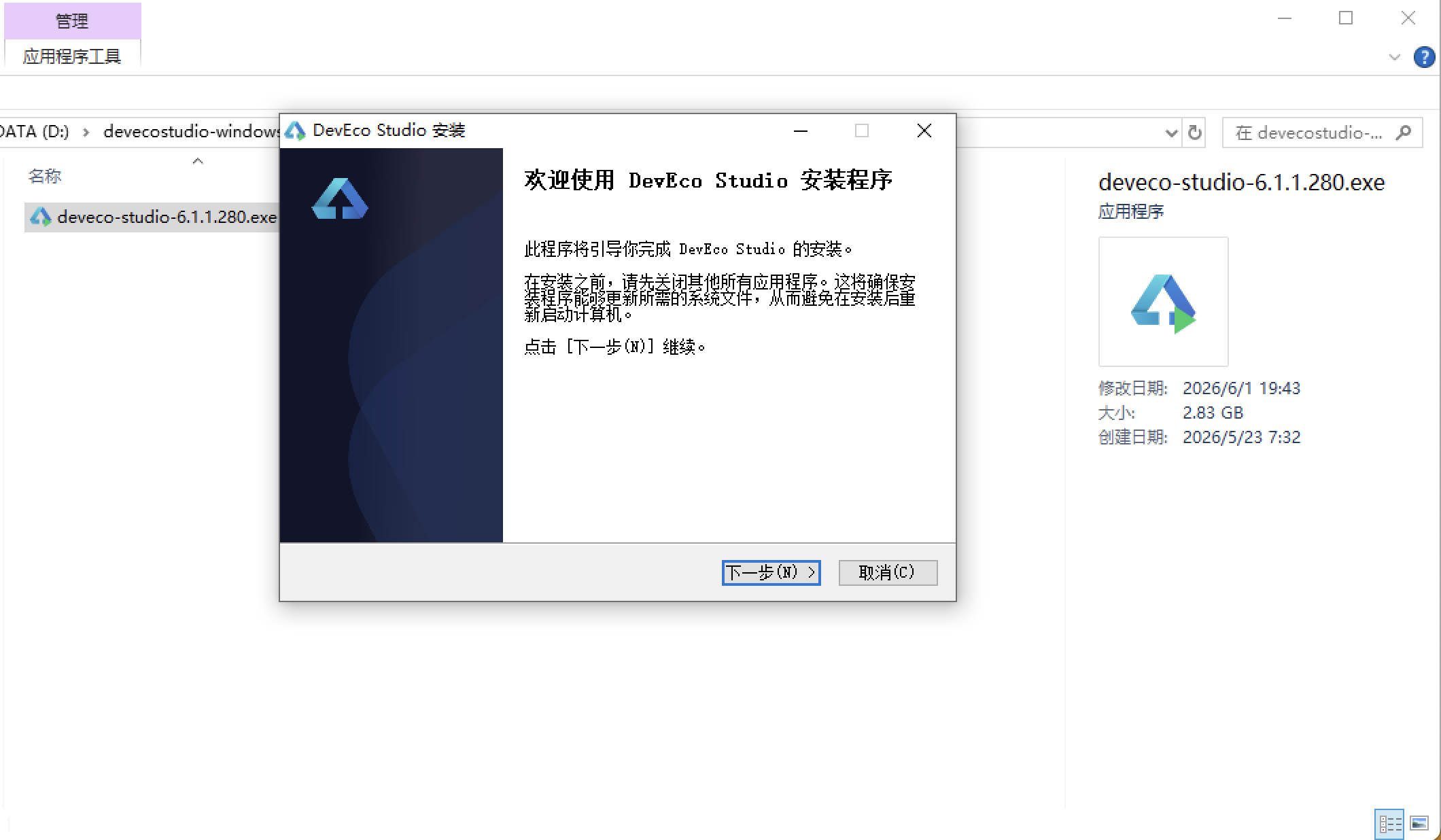
安装DevEco Studio程序
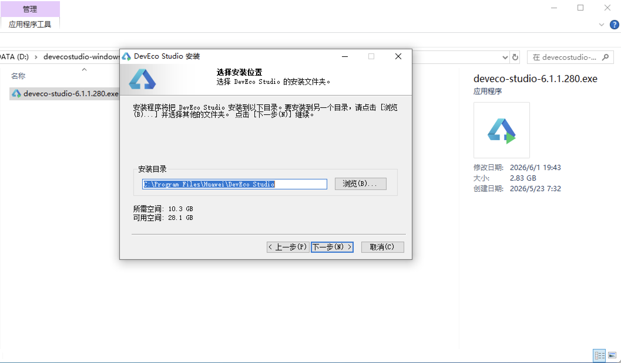
选择目标安装目录:
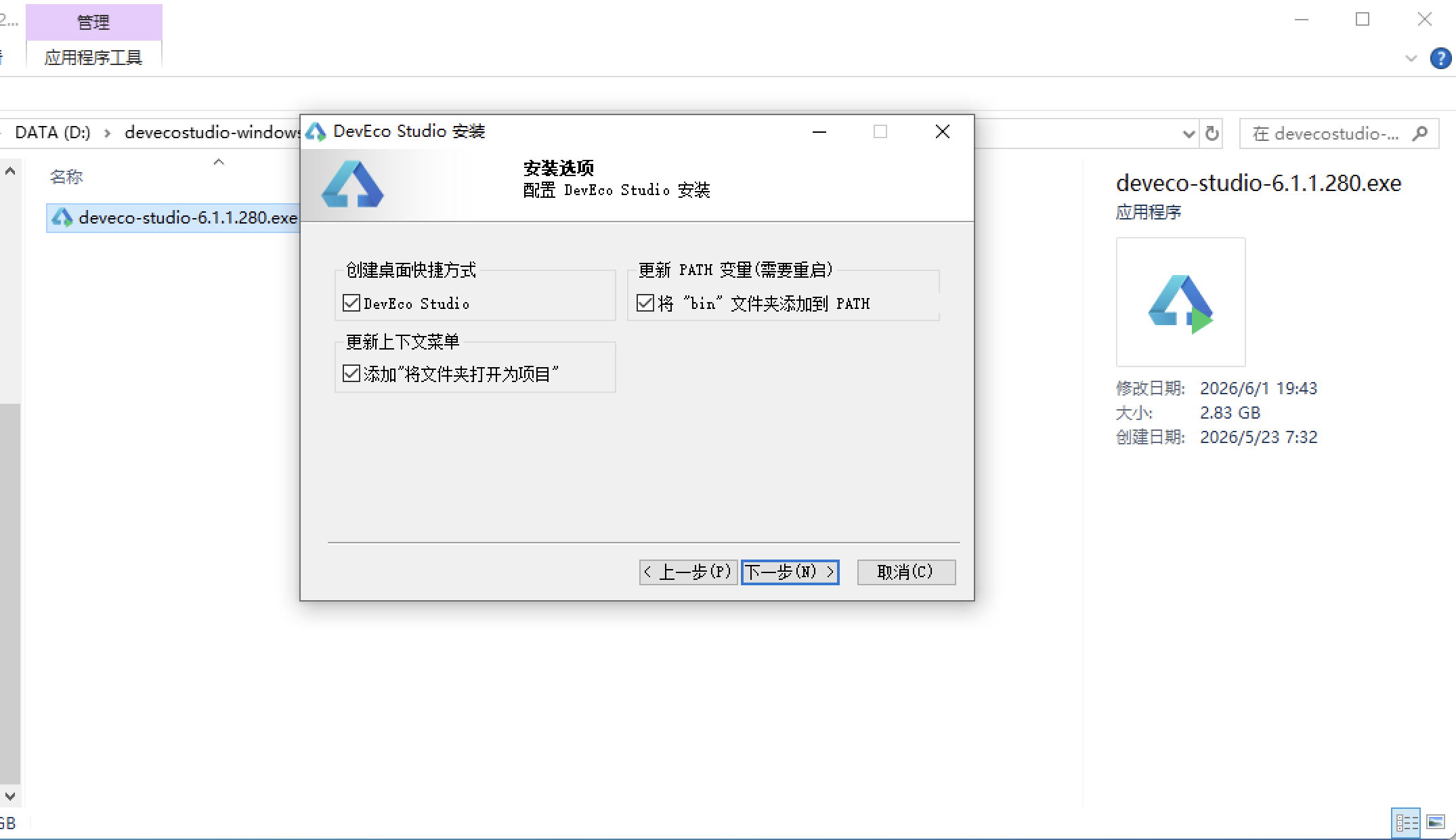
设置环境变量,但是需要重启一下:
新建一个空白模板:
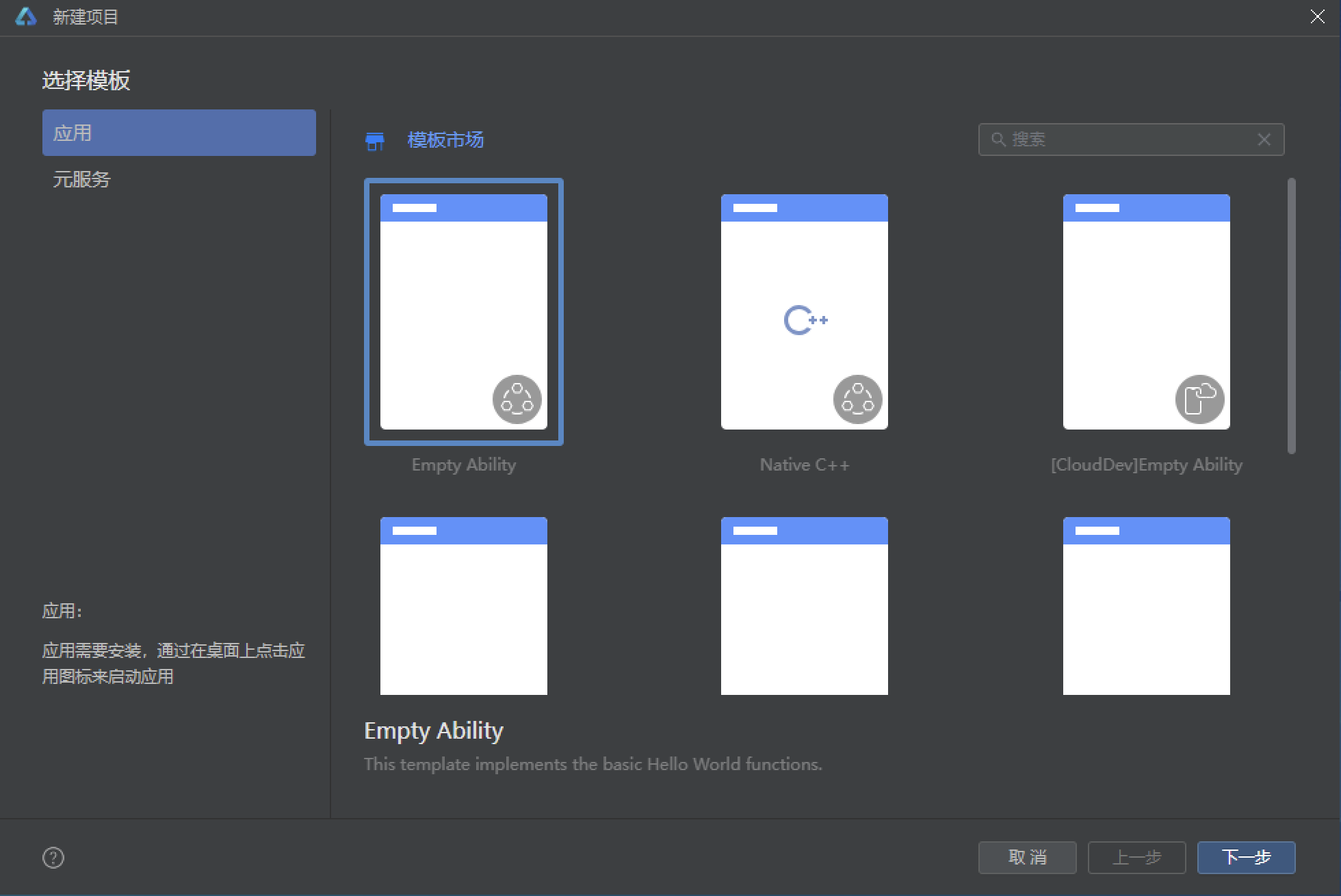
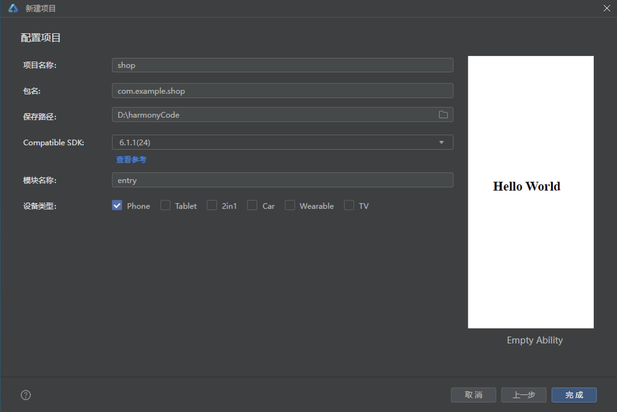
设置API为24的模板项目:
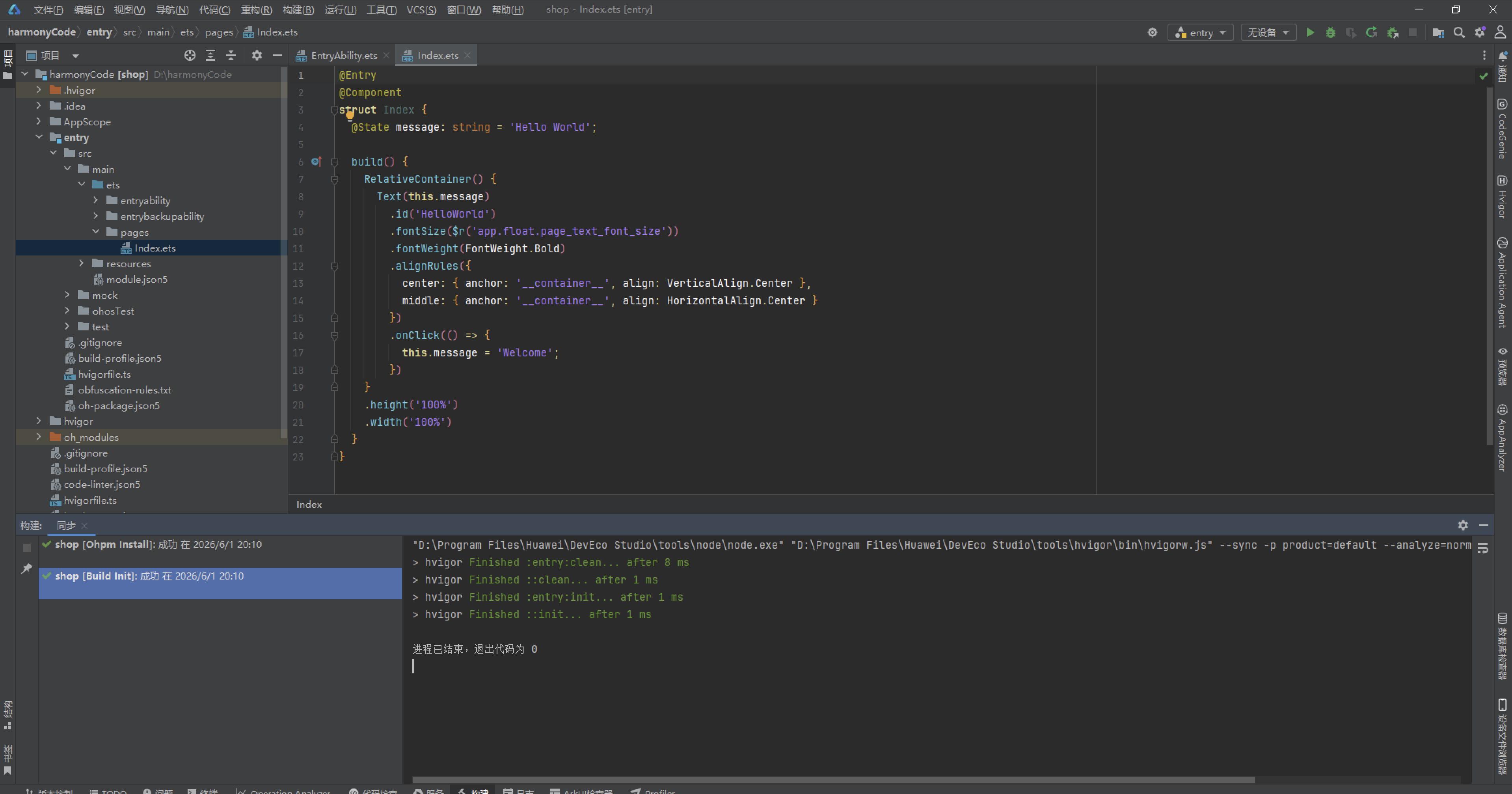
初始化项目,自动下载相关依赖:
完整代码:
// ============================================================
// INK&WOOD 沉思所 · 居家书房 / 办公舱定制馆
// 家庭书房定制(书架墙 / 升降桌)+ 人体工学椅 + 隔音办公舱
// + 收藏书房方案 + 工位好物 + 我的
// 墨绿书卷浅色 · ArkTS 单文件
// ============================================================

// ============ 配色(宣纸米 / 墨绿 / 黄铜棕 / 朱砂红 / 墨黑) ============
interface IWPalette {
  bg: string
  card: string
  green: string
  greenDeep: string
  greenLight: string
  gold: string
  goldLight: string
  red: string
  redLight: string
  ink: string
  sub: string
  hint: string
  line: string
}

const IW: IWPalette = {
  bg: '#F5F3EC',
  card: '#FFFFFF',
  green: '#2F5D50',
  greenDeep: '#1F4439',
  greenLight: '#DCE6DF',
  gold: '#B08D57',
  goldLight: '#E6D5B8',
  red: '#C25B4E',
  redLight: '#F4E0DC',
  ink: '#2B2B26',
  sub: '#8A8578',
  hint: '#B7B1A4',
  line: '#E7E2D6'
}

// ============ Tab 定义(6 个) ============
enum IWTab {
  Study = 0,
  Chair = 1,
  Pod = 2,
  Plan = 3,
  Goods = 4,
  Mine = 5
}

interface IWTabItem {
  tab: IWTab
  icon: string
  label: string
}

const IW_TABS: IWTabItem[] = [
  { tab: IWTab.Study, icon: '🏠', label: '书房' },
  { tab: IWTab.Chair, icon: '🪑', label: '桌椅' },
  { tab: IWTab.Pod, icon: '🎧', label: '办公舱' },
  { tab: IWTab.Plan, icon: '📐', label: '方案' },
  { tab: IWTab.Goods, icon: '🛍️', label: '好物' },
  { tab: IWTab.Mine, icon: '👤', label: '我的' }
]

// ============ 数据接口 ============
interface IWStudyPlan {
  id: number
  name: string
  wallStyle: string
  room: string
  area: number
  floor: string
  shelves: number
  grid: number
  books: number
  progress: number
  days: number
  price: number
  tag: string
}

interface IWChair {
  id: number
  name: string
  kind: string
  icon: string
  lumbar: number
  price: number
  sales: number
  dims: string[]
  cert: string
}

interface IWPod {
  id: number
  name: string
  size: string
  material: string
  db: number
  price: number
  seats: number
  stock: number
  feature: string
}

interface IWPlanCase {
  id: number
  title: string
  designer: string
  style: string
  cost: number
  area: number
  days: number
  votes: number
}

interface IWGoods {
  id: number
  name: string
  colorHex: string
  cat: string
  price: number
  sales: number
}

interface IWOrder {
  id: string
  title: string
  status: string
  date: string
  amount: number
  type: string
}

interface IWFav {
  id: number
  name: string
  type: string
  date: string
  score: number
}

interface IWMonth {
  month: string
  amount: number
  count: number
}

interface IWReview {
  id: number
  user: string
  star: number
  text: string
  date: string
}

interface IWStyleMeta {
  name: string
  color: string
  desc: string
}

// ============ 静态数据:12 个书房定制方案 ============
const IW_STUDY_PLANS: IWStudyPlan[] = [
  { id: 1, name: '墨野书墙', wallStyle: '整墙满铺', room: '客厅', area: 12, floor: '胡桃木', shelves: 8, grid: 48, books: 320, progress: 72, days: 14, price: 9800, tag: '热销' },
  { id: 2, name: '卷云半墙', wallStyle: '半墙横板', room: '主卧', area: 8, floor: '原木色', shelves: 5, grid: 30, books: 180, progress: 45, days: 9, price: 5600, tag: '轻量' },
  { id: 3, name: '折角回廊', wallStyle: '转角L型', room: '书房', area: 15, floor: '墨绿漆', shelves: 9, grid: 54, books: 400, progress: 88, days: 18, price: 13800, tag: '精选' },
  { id: 4, name: '孤岛书塔', wallStyle: '独立书墙', room: '阁楼', area: 20, floor: '白橡木', shelves: 10, grid: 60, books: 520, progress: 30, days: 21, price: 16800, tag: '待开工' },
  { id: 5, name: '井字格架', wallStyle: '半墙横板', room: '次卧', area: 6, floor: '原木色', shelves: 4, grid: 22, books: 120, progress: 60, days: 7, price: 4200, tag: '高性价比' },
  { id: 6, name: '松涛满墙', wallStyle: '整墙满铺', room: '客厅', area: 18, floor: '黑胡桃', shelves: 12, grid: 72, books: 620, progress: 100, days: 24, price: 19800, tag: '已交付' },
  { id: 7, name: '苔痕层架', wallStyle: '转角L型', room: '主卧', area: 10, floor: '墨绿漆', shelves: 7, grid: 40, books: 260, progress: 50, days: 12, price: 8600, tag: '进行中' },
  { id: 8, name: '简素白墙', wallStyle: '半墙横板', room: '书房', area: 9, floor: '纯白', shelves: 5, grid: 28, books: 150, progress: 15, days: 8, price: 4800, tag: '新单' },
  { id: 9, name: '烟墨梯架', wallStyle: '整墙满铺', room: '阁楼', area: 25, floor: '胡桃木', shelves: 14, grid: 84, books: 750, progress: 78, days: 28, price: 22800, tag: '高端' },
  { id: 10, name: '藤影错落', wallStyle: '独立书墙', room: '客厅', area: 14, floor: '藤编', shelves: 8, grid: 46, books: 300, progress: 64, days: 16, price: 11800, tag: '自然系' },
  { id: 11, name: '灯下长案', wallStyle: '半墙横板', room: '次卧', area: 7, floor: '原木色', shelves: 4, grid: 26, books: 140, progress: 35, days: 6, price: 3900, tag: '预算友好' },
  { id: 12, name: '云隐深架', wallStyle: '转角L型', room: '书房', area: 16, floor: '墨绿漆', shelves: 10, grid: 58, books: 460, progress: 92, days: 20, price: 15800, tag: '即将完工' }
]

// ============ 静态数据:14 张人体工学桌椅 ============
const IW_CHAIRS: IWChair[] = [
  { id: 1, name: '脊柱骑士', kind: '人体工学椅', icon: '🪑', lumbar: 92, price: 2199, sales: 860, dims: ['腰托', '坐深', '头枕'], cert: 'BIFMA' },
  { id: 2, name: '云感升降桌', kind: '升降桌', icon: '🖥', lumbar: 70, price: 1799, sales: 720, dims: ['高度', '升降', '记忆'], cert: 'SGS' },
  { id: 3, name: '藤编阅读椅', kind: '书桌椅', icon: '📚', lumbar: 62, price: 899, sales: 540, dims: ['坐深', '倾角'], cert: 'TUV' },
  { id: 4, name: '站坐交替台', kind: '站立桌', icon: '🧍', lumbar: 74, price: 2399, sales: 410, dims: ['高度', '记忆', '便携'], cert: 'CE' },
  { id: 5, name: '真皮工学椅Pro', kind: '人体工学椅', icon: '👑', lumbar: 96, price: 3999, sales: 320, dims: ['腰托', '坐深', '头枕', '扶手'], cert: 'BIFMA' },
  { id: 6, name: '榫卯书桌椅', kind: '书桌椅', icon: '🪵', lumbar: 55, price: 1299, sales: 380, dims: ['坐深', '扶手'], cert: 'FSC' },
  { id: 7, name: '静音电动桌', kind: '升降桌', icon: '🔕', lumbar: 78, price: 2899, sales: 290, dims: ['高度', '静音', '防夹'], cert: 'SGS' },
  { id: 8, name: '悬浮网布椅', kind: '人体工学椅', icon: '🌬', lumbar: 88, price: 1699, sales: 610, dims: ['腰托', '坐深'], cert: 'TUV' },
  { id: 9, name: '双电机大桌', kind: '升降桌', icon: '⚡', lumbar: 76, price: 3299, sales: 230, dims: ['高度', '双电机', '记忆'], cert: 'CE' },
  { id: 10, name: '高背贵妃椅', kind: '书桌椅', icon: '🛋', lumbar: 66, price: 1499, sales: 180, dims: ['坐深', '倾角', '头枕'], cert: 'BIFMA' },
  { id: 11, name: '碳钢站立椅', kind: '站立桌', icon: '🧱', lumbar: 72, price: 1099, sales: 260, dims: ['高度', '坐垫'], cert: 'SGS' },
  { id: 12, name: '童趣学习椅', kind: '人体工学椅', icon: '🧒', lumbar: 60, price: 699, sales: 450, dims: ['坐深', '踏脚'], cert: 'TUV' },
  { id: 13, name: '升降书房桌', kind: '升降桌', icon: '🖥', lumbar: 75, price: 1999, sales: 680, dims: ['高度', '理线'], cert: 'CE' },
  { id: 14, name: '记忆棉午睡椅', kind: '书桌椅', icon: '💤', lumbar: 80, price: 999, sales: 390, dims: ['倾角', '头枕'], cert: 'FSC' }
]

// ============ 静态数据:10 种隔音办公舱 ============
const IW_PODS: IWPod[] = [
  { id: 1, name: '一人静舱', size: '1.2×1.4m', material: '铝型材夹层', db: 42, price: 12900, seats: 1, stock: 8, feature: '吸音棉内衬' },
  { id: 2, name: '双人会谈舱', size: '1.8×2.0m', material: '实木复合', db: 38, price: 18900, seats: 2, stock: 5, feature: '双面玻璃' },
  { id: 3, name: '迷你电话亭', size: '0.9×1.2m', material: '铝型材夹层', db: 46, price: 8900, seats: 1, stock: 12, feature: '竖线排风' },
  { id: 4, name: '录音直播舱', size: '1.5×1.8m', material: '加厚夹层', db: 52, price: 22900, seats: 1, stock: 3, feature: '声学棱柱' },
  { id: 5, name: '极光玻璃舱', size: '1.2×1.6m', material: '钢化玻璃', db: 35, price: 15900, seats: 1, stock: 6, feature: '通透视野' },
  { id: 6, name: '书架嵌合舱', size: '1.4×1.8m', material: '实木复合', db: 44, price: 20900, seats: 1, stock: 2, feature: '书墙一体' },
  { id: 7, name: '便携折叠舱', size: '1.0×1.3m', material: '轻铝蜂窝', db: 30, price: 6900, seats: 1, stock: 15, feature: '5分钟组装' },
  { id: 8, name: '家庭读书角', size: '1.6×2.2m', material: '加厚夹层', db: 48, price: 26900, seats: 2, stock: 4, feature: '地台阅读' },
  { id: 9, name: '极简白舱', size: '1.2×1.4m', material: '铝型材夹层', db: 40, price: 11900, seats: 1, stock: 9, feature: '极简白板墙' },
  { id: 10, name: '儿童学习舱', size: '1.3×1.5m', material: '软包实木', db: 36, price: 13900, seats: 1, stock: 7, feature: '圆角软包' }
]

// ============ 静态数据:10 个设计师方案(排行榜) ============
const IW_PLANS: IWPlanCase[] = [
  { id: 1, title: '回廊书房 · 三面书架', designer: '林砚', style: '侘寂风', cost: 128000, area: 26, days: 28, votes: 386 },
  { id: 2, title: '光之桌角 · 窗边升降区', designer: '周叙', style: '现代极简', cost: 68000, area: 14, days: 15, votes: 342 },
  { id: 3, title: '墨色半墙 · 主卧藏书馆', designer: '苏禾', style: '新中式', cost: 56000, area: 11, days: 12, votes: 301 },
  { id: 4, title: '阁楼灯塔 · 斜顶书架墙', designer: '林砚', style: '工业风', cost: 158000, area: 32, days: 35, votes: 268 },
  { id: 5, title: '双人沉浸舱 · 静音书房', designer: '陈桥', style: '科技风', cost: 92000, area: 18, days: 20, votes: 245 },
  { id: 6, title: '藤编阳光角 · 亲子阅读', designer: '苏禾', style: '自然风', cost: 47000, area: 9, days: 10, votes: 210 },
  { id: 7, title: '胡桃绅士 · 复古书案区', designer: '周叙', style: '复古风', cost: 76000, area: 15, days: 18, votes: 188 },
  { id: 8, title: '云雾白 · 极简办公舱套', designer: '陈桥', style: '极简白', cost: 84000, area: 16, days: 19, votes: 165 },
  { id: 9, title: '儿童书塔 · 成长型书架', designer: '林砚', style: '萌趣风', cost: 39000, area: 8, days: 9, votes: 142 },
  { id: 10, title: '环绕影音 · 沉浸书房', designer: '苏禾', style: '影音风', cost: 132000, area: 24, days: 30, votes: 129 }
]

// ============ 静态数据:16 件工位好物(色卡) ============
const IW_GOODS: IWGoods[] = [
  { id: 1, name: '黄铜蘑菇台灯', colorHex: '#B08D57', cat: '灯具', price: 299, sales: 860 },
  { id: 2, name: '宣纸风琴台历', colorHex: '#D8C9A3', cat: '文具', price: 59, sales: 720 },
  { id: 3, name: '墨绿丝绒书立', colorHex: '#2F5D50', cat: '收纳', price: 89, sales: 640 },
  { id: 4, name: '朱砂笔插笔筒', colorHex: '#C25B4E', cat: '文具', price: 69, sales: 580 },
  { id: 5, name: '白橡木显示器架', colorHex: '#C8B89A', cat: '桌面', price: 199, sales: 510 },
  { id: 6, name: '磁吸理线器套装', colorHex: '#3A3A34', cat: '数码', price: 49, sales: 460 },
  { id: 7, name: '藤编收纳篮', colorHex: '#D4B483', cat: '收纳', price: 129, sales: 420 },
  { id: 8, name: '乳白托腕垫', colorHex: '#F2F0EA', cat: '桌面', price: 79, sales: 380 },
  { id: 9, name: '黄铜书挡一对', colorHex: '#B08D57', cat: '收纳', price: 139, sales: 350 },
  { id: 10, name: '墨黑金属笔架', colorHex: '#2B2B26', cat: '文具', price: 109, sales: 310 },
  { id: 11, name: '苔绿A4杂志盒', colorHex: '#5C7A6E', cat: '收纳', price: 45, sales: 290 },
  { id: 12, name: '陶瓷台面香薰座', colorHex: '#C7A24F', cat: '家居', price: 159, sales: 260 },
  { id: 13, name: '原木便签夹板', colorHex: '#6B4F3A', cat: '文具', price: 35, sales: 240 },
  { id: 14, name: '冷灰折叠桌垫', colorHex: '#9AA0A6', cat: '桌面', price: 99, sales: 220 },
  { id: 15, name: '宣纸纹理相框', colorHex: '#E6D5B8', cat: '家居', price: 119, sales: 190 },
  { id: 16, name: '琥珀玻璃镇纸', colorHex: '#D4A94E', cat: '文具', price: 169, sales: 170 }
]

// ============ 静态数据:12 条订单 ============
const IW_ORDERS: IWOrder[] = [
  { id: 'IW20260701', title: '墨野书墙定制', status: '制作中', date: '07-12', amount: 9800, type: '书房定制' },
  { id: 'IW20260702', title: '脊柱骑士工学椅', status: '已发货', date: '07-15', amount: 2199, type: '成品家具' },
  { id: 'IW20260703', title: '一人静舱', status: '待安装', date: '07-18', amount: 12900, type: '办公舱' },
  { id: 'IW20260704', title: '上门量尺预约', status: '已预约', date: '07-20', amount: 0, type: '量尺服务' },
  { id: 'IW20260705', title: '云感升降桌1.2m', status: '已完成', date: '07-21', amount: 1799, type: '成品家具' },
  { id: 'IW20260706', title: '回廊书房设计费', status: '已完成', date: '07-23', amount: 6800, type: '设计服务' },
  { id: 'IW20260707', title: '黄铜蘑菇台灯', status: '已完成', date: '07-25', amount: 299, type: '工位好物' },
  { id: 'IW20260708', title: '墨野书墙安装尾款', status: '制作中', date: '07-27', amount: 4900, type: '书房定制' },
  { id: 'IW20260709', title: '双人会谈舱', status: '待量尺', date: '07-29', amount: 18900, type: '办公舱' },
  { id: 'IW20260710', title: '藤编收纳篮×2', status: '已完成', date: '07-30', amount: 258, type: '工位好物' },
  { id: 'IW20260711', title: '烟墨梯架定金', status: '待开工', date: '08-02', amount: 11400, type: '书房定制' },
  { id: 'IW20260712', title: '真皮工学椅Pro', status: '售后中', date: '08-05', amount: 3999, type: '成品家具' }
]

// ============ 静态数据:6 条收藏 ============
const IW_FAVS: IWFav[] = [
  { id: 1, name: '墨野书墙方案', type: '书房定制', date: '07-16', score: 95 },
  { id: 2, name: '脊柱骑士工学椅', type: '成品家具', date: '07-18', score: 92 },
  { id: 3, name: '回廊书房设计', type: '设计案例', date: '07-22', score: 98 },
  { id: 4, name: '双人沉浸舱', type: '办公舱', date: '07-26', score: 90 },
  { id: 5, name: '黄铜蘑菇台灯', type: '工位好物', date: '07-28', score: 88 },
  { id: 6, name: '云隐深架方案', type: '书房定制', date: '08-03', score: 94 }
]

// ============ 静态数据:6 个月消费 ============
const IW_MONTHS: IWMonth[] = [
  { month: '3月', amount: 3200, count: 3 },
  { month: '4月', amount: 4600, count: 4 },
  { month: '5月', amount: 2100, count: 2 },
  { month: '6月', amount: 5800, count: 5 },
  { month: '7月', amount: 4600, count: 4 },
  { month: '8月', amount: 3400, count: 3 }
]

// ============ 静态数据:10 条评价 ============
const IW_REVIEWS: IWReview[] = [
  { id: 1, user: '林间客', star: 5, text: '书架墙收纳格太合理,按层规划藏书翻倍。', date: '07-19' },
  { id: 2, user: '小满妈妈', star: 5, text: '升降桌安静顺滑,小朋友写作业高度刚好。', date: '07-22' },
  { id: 3, user: '独居的乔', star: 4, text: '办公舱隔音不错,就是安装师傅晚了半天。', date: '07-24' },
  { id: 4, user: '山月照', star: 5, text: '设计师上门量尺很专业,方案改了三版都耐心。', date: '07-26' },
  { id: 5, user: '白衬衫', star: 4, text: '工学椅腰托支撑到位,坐深调节稍紧。', date: '07-28' },
  { id: 6, user: '拾光者', star: 5, text: '台灯光线柔和,放书桌很出气质。', date: '07-30' },
  { id: 7, user: '早八战士', star: 5, text: '磁吸理线器拯救了乱糟糟的桌面。', date: '08-01' },
  { id: 8, user: '住在书里', star: 4, text: '藤编收纳篮质感好,小贵但值得。', date: '08-03' },
  { id: 9, user: '静水深流', star: 5, text: '从量尺到交付全程透明,工期按时。', date: '08-05' },
  { id: 10, user: '云上居', star: 5, text: '儿童学习舱孩子超喜欢,专注力明显提升。', date: '08-08' }
]

// ============ 静态数据:6 种书架风格(宫格选择) ============
const IW_STYLES: IWStyleMeta[] = [
  { name: '侘寂原木', color: '#C8B89A', desc: '浅木肌理' },
  { name: '墨绿涂装', color: '#2F5D50', desc: '沉静书卷' },
  { name: '胡桃深色', color: '#6B4F3A', desc: '稳重厚实' },
  { name: '藤编格栅', color: '#D4B483', desc: '通透轻盈' },
  { name: '纯白极简', color: '#F2F0EA', desc: '干净利落' },
  { name: '金属黑框', color: '#3A3A34', desc: '工业硬朗' }
]

// ============ 全局纯函数 ============
function iwMoney(v: number): string {
  if (v >= 10000) {
    return (v / 10000).toFixed(1) + '万'
  }
  return v.toString()
}

function iwW(n: number): string {
  let r = n
  if (r < 0) {
    r = 0
  }
  if (r > 100) {
    r = 100
  }
  return r.toString() + '%'
}

function iwPw(db: number): string {
  let r = db
  if (r > 60) {
    r = 60
  }
  return (r / 60 * 100).toString() + '%'
}

function iwSalesW(s: number): string {
  let r = s
  if (r > 1200) {
    r = 1200
  }
  return (r / 1200 * 100).toString() + '%'
}

function iwMonthH(m: number): number {
  let r = m
  if (r > 6000) {
    r = 6000
  }
  return 14 + r / 6000 * 100
}

function iwCostW(c: number): string {
  let r = c
  if (r > 180000) {
    r = 180000
  }
  return (r / 180000 * 100).toString() + '%'
}

function iwRankColor(i: number): string {
  if (i === 0) {
    return '#D4A94E'
  }
  if (i === 1) {
    return '#9AA0A6'
  }
  if (i === 2) {
    return '#B08D57'
  }
  return '#E7E2D6'
}

function iwPodBg(i: number): string {
  if (i % 2 === 0) {
    return '#FFFFFF'
  }
  return '#F1EDE3'
}

function iwStar(s: number): string {
  if (s >= 5) {
    return '★★★★★'
  }
  if (s === 4) {
    return '★★★★☆'
  }
  return '★★★☆☆'
}

function iwPriceLabel(i: number): string {
  if (i === 0) {
    return '全部价位'
  }
  if (i === 1) {
    return '百元档 60-500'
  }
  if (i === 2) {
    return '千元档 500-1500'
  }
  return '轻奢档 1500-3000'
}

function iwFilterGoods(min: number, max: number): IWGoods[] {
  let r: IWGoods[] = []
  for (let i = 0; i < IW_GOODS.length; i++) {
    if (IW_GOODS[i].price >= min && IW_GOODS[i].price <= max) {
      r.push(IW_GOODS[i])
    }
  }
  return r
}

function iwTopGoods(): IWGoods[] {
  let r: IWGoods[] = IW_GOODS.slice()
  r.sort((a: IWGoods, b: IWGoods) => b.sales - a.sales)
  return r.slice(0, 6)
}

function iwTopChairs(): IWChair[] {
  let r: IWChair[] = IW_CHAIRS.slice()
  r.sort((a: IWChair, b: IWChair) => b.sales - a.sales)
  return r.slice(0, 6)
}

function iwOrderIdx(id: string): number {
  let r = 0
  for (let i = 0; i < IW_ORDERS.length; i++) {
    if (IW_ORDERS[i].id === id) {
      r = i
      break
    }
  }
  return r
}

function iwFavIdx(id: number): number {
  let r = 0
  for (let i = 0; i < IW_FAVS.length; i++) {
    if (IW_FAVS[i].id === id) {
      r = i
      break
    }
  }
  return r
}

// ============================================================
// 子组件 1:书房 tab(一列大卡 + 收纳格统计 + 工期进度条)
// ============================================================
@Component
struct IWStudyContent {
  onAdd: () => void = () => {}
  onStyle: (idx: number) => void = (idx: number) => {}
  onDelete: (idx: number) => void = (idx: number) => {}
  onBook: () => void = () => {}
  onGoto: (tab: IWTab) => void = (tab: IWTab) => {}

  build() {
    Scroll() {
      Column() {
        // 顶部横幅
        Column() {
          Row() {
            Column() {
              Text('让书房安静下来').fontSize(18).fontWeight(FontWeight.Bold).fontColor('#FFFFFF')
              Text('IN&WOOD 家庭书房定制').fontSize(10).fontColor('#DCE6DF').margin({ top: 6 })
              Column() {
                Text('📞 免费设计').fontSize(11).fontWeight(FontWeight.Bold).fontColor('#2F5D50')
              }
              .width(96).height(30).backgroundColor('#FFFFFF').borderRadius(15)
              .justifyContent(FlexAlign.Center).margin({ top: 10 })
              .onClick(() => { this.onAdd() })
            }
            .alignItems(HorizontalAlign.Start).layoutWeight(1)
            Text('🖋').fontSize(52).opacity(0.9)
          }
          .width('100%').height(120).padding({ left: 16, right: 18 }).alignItems(VerticalAlign.Center)
        }
        .width('100%').height(120)
        .linearGradient({ direction: GradientDirection.RightBottom, colors: [['#2F5D50', 0], ['#1F4439', 1]] })
        .borderRadius(16)

        // 统计小卡
        Row() {
          Column() {
            Text('9').fontSize(16).fontWeight(FontWeight.Bold).fontColor('#2F5D50')
            Text('在案方案').fontSize(9).fontColor('#8A8578').margin({ top: 2 })
          }
          .layoutWeight(1).alignItems(HorizontalAlign.Center)
          Column() {
            Text('3').fontSize(16).fontWeight(FontWeight.Bold).fontColor('#B08D57')
            Text('已交付').fontSize(9).fontColor('#8A8578').margin({ top: 2 })
          }
          .layoutWeight(1).alignItems(HorizontalAlign.Center)
          Column() {
            Text('16').fontSize(16).fontWeight(FontWeight.Bold).fontColor('#2F5D50')
            Text('平均工期/天').fontSize(9).fontColor('#8A8578').margin({ top: 2 })
          }
          .layoutWeight(1).alignItems(HorizontalAlign.Center)
          Column() {
            Text('98%').fontSize(16).fontWeight(FontWeight.Bold).fontColor('#C25B4E')
            Text('客户满意').fontSize(9).fontColor('#8A8578').margin({ top: 2 })
          }
          .layoutWeight(1).alignItems(HorizontalAlign.Center)
        }
        .width('100%').backgroundColor('#FFFFFF').borderRadius(14).padding(12)
        .margin({ top: 12, bottom: 4 })
        .border({ width: 1, color: '#E7E2D6' })

        Row() {
          Text('在定制方案 · 12').fontSize(14).fontWeight(FontWeight.Bold).fontColor('#2B2B26')
          Column().layoutWeight(1)
          Text('按进度排序').fontSize(9).fontColor('#B7B1A4')
        }
        .width('100%').margin({ top: 10, bottom: 8 })

        // 方案大卡列表
        ForEach(IW_STUDY_PLANS, (p: IWStudyPlan, idx: number) => {
          Column() {
            Row() {
              Text(p.name).fontSize(15).fontWeight(FontWeight.Bold).fontColor('#2B2B26')
              Text(p.tag).fontSize(9).fontColor('#C25B4E').backgroundColor('#F4E0DC')
                .padding({ left: 6, right: 6, top: 2, bottom: 2 }).borderRadius(8).margin({ left: 6 })
              Column().layoutWeight(1)
              Text('¥' + iwMoney(p.price)).fontSize(13).fontWeight(FontWeight.Bold).fontColor('#B08D57')
            }
            .width('100%')

            Row() {
              Text('🧱 ' + p.wallStyle).fontSize(10).fontColor('#2F5D50').backgroundColor('#DCE6DF')
                .padding({ left: 8, right: 8, top: 3, bottom: 3 }).borderRadius(10).margin({ right: 6 })
              Text('🏠 ' + p.room).fontSize(10).fontColor('#2F5D50').backgroundColor('#DCE6DF')
                .padding({ left: 8, right: 8, top: 3, bottom: 3 }).borderRadius(10).margin({ right: 6 })
              Text('🌳 ' + p.floor).fontSize(10).fontColor('#8A8578').backgroundColor('#F1EDE3')
                .padding({ left: 8, right: 8, top: 3, bottom: 3 }).borderRadius(10)
            }
            .width('100%').margin({ top: 8 })

            // 收纳格数统计
            Row() {
              Column() {
                Text(p.shelves.toString()).fontSize(15).fontWeight(FontWeight.Bold).fontColor('#2F5D50')
                Text('层板数').fontSize(9).fontColor('#8A8578').margin({ top: 2 })
              }
              .layoutWeight(1).alignItems(HorizontalAlign.Center)
              Column() {
                Text(p.grid.toString()).fontSize(15).fontWeight(FontWeight.Bold).fontColor('#B08D57')
                Text('收纳格').fontSize(9).fontColor('#8A8578').margin({ top: 2 })
              }
              .layoutWeight(1).alignItems(HorizontalAlign.Center)
              Column() {
                Text(p.books.toString()).fontSize(15).fontWeight(FontWeight.Bold).fontColor('#2F5D50')
                Text('藏书量').fontSize(9).fontColor('#8A8578').margin({ top: 2 })
              }
              .layoutWeight(1).alignItems(HorizontalAlign.Center)
            }
            .width('100%').padding(10).backgroundColor('#F8F6F0').borderRadius(10).margin({ top: 10 })

            // 工期进度
            Row() {
              Text('工期进度').fontSize(10).fontColor('#8A8578')
              Column().layoutWeight(1)
              Text(p.progress.toString() + '%').fontSize(10).fontWeight(FontWeight.Bold)
                .fontColor(p.progress === 100 ? '#C25B4E' : '#2F5D50')
            }
            .width('100%').margin({ top: 10 })

            Stack() {
              Column().width('100%').height(6).backgroundColor('#F1EDE3').borderRadius(3)
              Column().width(iwW(p.progress)).height(6).backgroundColor('#2F5D50').borderRadius(3)
            }
            .width('100%').alignContent(Alignment.Start).margin({ top: 6 })

            Row() {
              Text('⏱ 工期 ' + p.days.toString() + ' 天').fontSize(10).fontColor('#8A8578')
              Column().layoutWeight(1)
              Text('📐 ' + p.area.toString() + '㎡').fontSize(10).fontColor('#8A8578')
              Column().layoutWeight(1)
              Text('🏷 ' + p.tag).fontSize(10).fontColor('#B7B1A4')
            }
            .width('100%').margin({ top: 8 })

            // 操作按钮行
            Row() {
              Column() {
                Text('🎨 风格').fontSize(11).fontColor('#2F5D50')
              }
              .layoutWeight(1).height(34).backgroundColor('#DCE6DF').borderRadius(17)
              .justifyContent(FlexAlign.Center).margin({ right: 6 })
              .onClick(() => { this.onStyle(idx) })
              Column() {
                Text('⭐ 收藏').fontSize(11).fontColor('#2F5D50')
              }
              .layoutWeight(1).height(34).backgroundColor('#DCE6DF').borderRadius(17)
              .justifyContent(FlexAlign.Center).margin({ right: 6 })
              .onClick(() => { this.onGoto(IWTab.Mine) })
              Column() {
                Text('🗑 删除').fontSize(11).fontColor('#C25B4E')
              }
              .layoutWeight(1).height(34).backgroundColor('#F4E0DC').borderRadius(17)
              .justifyContent(FlexAlign.Center).margin({ right: 6 })
              .onClick(() => { this.onDelete(idx) })
              Column() {
                Text('📏 量尺').fontSize(11).fontColor('#FFFFFF')
              }
              .layoutWeight(1).height(34).backgroundColor('#B08D57').borderRadius(17)
              .justifyContent(FlexAlign.Center)
              .onClick(() => { this.onBook() })
            }
            .width('100%').margin({ top: 10 })
          }
          .width('100%').backgroundColor('#FFFFFF').borderRadius(14).padding(14)
          .margin({ bottom: 10 }).border({ width: 1, color: '#E7E2D6' })
        })

        // 定制服务流程
        Column() {
          Text('定制服务流程').fontSize(14).fontWeight(FontWeight.Bold).fontColor('#2B2B26')
          Row() {
            Text('① 预约量尺').fontSize(10).fontColor('#2F5D50').layoutWeight(1)
            Text('② 上门勘测').fontSize(10).fontColor('#8A8578').layoutWeight(1)
            Text('③ 出图确认').fontSize(10).fontColor('#8A8578').layoutWeight(1)
          }
          .width('100%').margin({ top: 10 })
          Row() {
            Text('④ 工厂制作').fontSize(10).fontColor('#8A8578').layoutWeight(1)
            Text('⑤ 上门安装').fontSize(10).fontColor('#8A8578').layoutWeight(1)
            Text('⑥ 五年质保').fontSize(10).fontColor('#B08D57').layoutWeight(1)
          }
          .width('100%').margin({ top: 8 })
        }
        .width('100%').padding(14).backgroundColor('#FFFFFF').borderRadius(14)
        .margin({ top: 4, bottom: 8 }).border({ width: 1, color: '#E7E2D6' })
        .alignItems(HorizontalAlign.Start)

        // 底部服务承诺
        Column() {
          Text('✔ 免费量尺 · 7 天出图 · 质保 5 年').fontSize(11).fontColor('#2F5D50')
            .fontWeight(FontWeight.Bold)
          Text('签约即可锁定 8 月板材供应价').fontSize(9).fontColor('#8A8578').margin({ top: 4 })
        }
        .width('100%').padding(14).backgroundColor('#DCE6DF').borderRadius(14)
        .alignItems(HorizontalAlign.Center).margin({ top: 4, bottom: 16 })
      }
      .width('100%').padding(12)
    }
    .width('100%').height('100%')
    .scrollBar(BarState.Off)
  }
}

// ============================================================
// 子组件 2:桌椅 tab(双列 Grid + 腰椎支撑条 + 热销榜)
// ============================================================
@Component
struct IWChairContent {
  onEdit: (idx: number) => void = (idx: number) => {}
  onGoto: (tab: IWTab) => void = (tab: IWTab) => {}

  build() {
    Scroll() {
      Column() {
        // 顶部横幅
        Column() {
          Row() {
            Column() {
              Text('坐得稳,才读得进').fontSize(18).fontWeight(FontWeight.Bold).fontColor('#FFFFFF')
              Text('人体工学桌椅 · 三档认证可选').fontSize(10).fontColor('#DCE6DF').margin({ top: 6 })
              Row() {
                Text('认证').fontSize(9).fontColor('#2F5D50').backgroundColor('#DCE6DF')
                  .padding({ left: 8, right: 8, top: 2, bottom: 2 }).borderRadius(8).margin({ right: 6 })
                Text('评测').fontSize(9).fontColor('#FFFFFF').backgroundColor('#B08D57')
                  .padding({ left: 8, right: 8, top: 2, bottom: 2 }).borderRadius(8)
              }
              .margin({ top: 10 })
            }
            .alignItems(HorizontalAlign.Start).layoutWeight(1)
            Text('🪑').fontSize(48).opacity(0.9)
          }
          .width('100%').height(120).padding({ left: 16, right: 18 }).alignItems(VerticalAlign.Center)
        }
        .width('100%').height(120)
        .linearGradient({ direction: GradientDirection.RightBottom, colors: [['#B08D57', 0], ['#8A6A3D', 1]] })
        .borderRadius(16)

        Row() {
          Column() {
            Text('14').fontSize(16).fontWeight(FontWeight.Bold).fontColor('#2F5D50')
            Text('款在售').fontSize(9).fontColor('#8A8578').margin({ top: 2 })
          }
          .layoutWeight(1).alignItems(HorizontalAlign.Center)
          Column() {
            Text('1.9k').fontSize(16).fontWeight(FontWeight.Bold).fontColor('#B08D57')
            Text('均价').fontSize(9).fontColor('#8A8578').margin({ top: 2 })
          }
          .layoutWeight(1).alignItems(HorizontalAlign.Center)
          Column() {
            Text('3').fontSize(16).fontWeight(FontWeight.Bold).fontColor('#2F5D50')
            Text('档认证').fontSize(9).fontColor('#8A8578').margin({ top: 2 })
          }
          .layoutWeight(1).alignItems(HorizontalAlign.Center)
          Column() {
            Text('5年').fontSize(16).fontWeight(FontWeight.Bold).fontColor('#C25B4E')
            Text('质保').fontSize(9).fontColor('#8A8578').margin({ top: 2 })
          }
          .layoutWeight(1).alignItems(HorizontalAlign.Center)
        }
        .width('100%').backgroundColor('#FFFFFF').borderRadius(14).padding(12)
        .margin({ top: 12, bottom: 10 }).border({ width: 1, color: '#E7E2D6' })

        Row() {
          Text('全系 14 款 · 点击编辑').fontSize(14).fontWeight(FontWeight.Bold).fontColor('#2B2B26')
          Column().layoutWeight(1)
          Text('左右滑动浏览').fontSize(9).fontColor('#B7B1A4')
        }
        .width('100%').margin({ bottom: 8 })

        // 双列 Grid
        Grid() {
          ForEach(IW_CHAIRS, (c: IWChair, idx: number) => {
            GridItem() {
              Column() {
                Row() {
                  Text(c.icon).fontSize(26)
                  Column().layoutWeight(1)
                  Text(c.kind).fontSize(9).fontColor('#B08D57').backgroundColor('#F1EDE3')
                    .padding({ left: 6, right: 6, top: 2, bottom: 2 }).borderRadius(8)
                }
                .width('100%')

                Text(c.name).fontSize(13).fontWeight(FontWeight.Bold).fontColor('#2B2B26')
                  .margin({ top: 8 })

                // 腰椎支撑条
                Row() {
                  Text('腰椎').fontSize(9).fontColor('#8A8578')
                  Stack() {
                    Column().width('100%').height(5).backgroundColor('#F1EDE3').borderRadius(3)
                    Column().width(iwW(c.lumbar)).height(5).backgroundColor('#2F5D50').borderRadius(3)
                  }
                  .layoutWeight(1).alignContent(Alignment.Start).margin({ left: 6, right: 6 })
                  Text(c.lumbar.toString()).fontSize(9).fontWeight(FontWeight.Bold).fontColor('#2F5D50')
                }
                .width('100%').margin({ top: 8 })

                // 可调维度标签
                Row() {
                  ForEach(c.dims, (d: string) => {
                    Text(d).fontSize(9).fontColor('#2F5D50').backgroundColor('#DCE6DF')
                      .padding({ left: 5, right: 5, top: 2, bottom: 2 }).borderRadius(8)
                      .margin({ right: 4 })
                  })
                }
                .width('100%').margin({ top: 8 })

                Row() {
                  Text('¥' + iwMoney(c.price)).fontSize(12).fontWeight(FontWeight.Bold).fontColor('#C25B4E')
                  Column().layoutWeight(1)
                  Text('已售 ' + c.sales.toString()).fontSize(9).fontColor('#B7B1A4')
                }
                .width('100%').margin({ top: 8 })

                Column() {
                  Text(c.cert + ' 认证').fontSize(9).fontColor('#FFFFFF')
                }
                .width('100%').height(26).backgroundColor('#2F5D50').borderRadius(13)
                .justifyContent(FlexAlign.Center).margin({ top: 8 })
                .onClick(() => { this.onEdit(idx) })
              }
              .width('100%').padding(12).backgroundColor('#FFFFFF').borderRadius(12)
              .border({ width: 1, color: '#E7E2D6' })
              .alignItems(HorizontalAlign.Start)
            }
          })
        }
        .columnsTemplate('1fr 1fr').columnsGap(10).rowsGap(10)
        .width('100%').height(1080)

        // 热销 TOP6 销量条形图
        Row() {
          Text('热销 TOP6').fontSize(14).fontWeight(FontWeight.Bold).fontColor('#2B2B26')
          Column().layoutWeight(1)
          Text('按销量').fontSize(9).fontColor('#B7B1A4')
        }
        .width('100%').margin({ top: 16, bottom: 8 })

        Column() {
          ForEach(iwTopChairs(), (c: IWChair) => {
            Row() {
              Text(c.name).fontSize(10).fontColor('#2B2B26').width(80)
              Stack() {
                Column().width('100%').height(10).backgroundColor('#F1EDE3').borderRadius(5)
                Column().width(iwSalesW(c.sales)).height(10).backgroundColor('#B08D57').borderRadius(5)
              }
              .layoutWeight(1).alignContent(Alignment.Start).margin({ left: 6, right: 6 })
              Text(c.sales.toString() + ' 件').fontSize(9).fontColor('#8A8578').width(42).textAlign(TextAlign.End)
            }
            .width('100%').padding(8)
          })
        }
        .width('100%').backgroundColor('#FFFFFF').borderRadius(14).padding(10)
        .margin({ bottom: 16 }).border({ width: 1, color: '#E7E2D6' })
      }
      .width('100%').padding(12)
    }
    .width('100%').height('100%')
    .scrollBar(BarState.Off)
  }
}

// ============================================================
// 子组件 3:办公舱 tab(斑马纹规格对比表 + 隔音分贝对比条)
// ============================================================
@
}
在视觉设计层面,项目展现了成熟的配色体系运用能力。墨绿、黄铜棕、朱砂红、宣纸米四色构成的调色板贯穿全局,通过深浅变体和透明度变化构建出丰富的视觉层次。横幅的渐变背景、会员卡的渐变加边框、进度条的层叠双色、斑马纹表格的交替底色、色卡网格的纯色块——每一种视觉手法都服务于特定的信息表达需求,而非单纯的装饰。装饰动画层(墨点漂浮、纸页翻动、光晕呼吸)通过 animateTo 无限循环驱动变换属性,配合 hitTestBehavior(HitTestMode.None) 透传事件,在不干扰交互的前提下为界面注入了生命感。

用 ArkUI 构建一个功能丰富、交互复杂、视觉精致的电商类应用。从底部的六个页签到顶部的搜索栏,从列表卡片到表单弹窗,从数据可视化(进度条、柱状图、条形图)到装饰动画,每一个技术点都有对应的落地实现。对于希望深入理解鸿蒙 ArkUI 开发的工程师而言,这个项目的代码结构、状态管理模式、组件复用策略和布局组合技巧都具有很高的参考价值。声明式 UI 的核心不在于记住多少 API,而在于建立"状态即界面"的思维模型——当开发者习惯于用状态描述界面、用回调连接交互、用组件封装复用时,复杂的用户界面也就变得清晰可控了。

讨论HarmonyOS开发技术,专注于API与组件、DevEco Studio、测试、元服务和应用上架分发等。
更多推荐
 2
 0
- 0


 已为社区贡献43条内容

所有评论(0)