HarmonyOS ArkTS API 24 枚举类型与状态文案映射封装,实现前端展示文案与底层枚举解耦的工程化方案
一、技术前言
在数字化校园建设浪潮中,校园资讯阅读平台已成为连接师生与校园生活的核心纽带。从学术前沿的硅光芯片突破到社团话剧的开票公告,从双选会企业名录到图书馆自习区试运行,每一条校园资讯都需要精准的内容分发、清晰的信息层级和流畅的跨模块交互体验。传统校园资讯应用往往面临三大痛点:资讯分类割裂导致频道切换生硬、下载来源不可追溯导致文件管理混乱、听报场景缺乏字幕辅助导致无障碍体验缺失。
HarmonyOS ArkUI 框架以其声明式 UI 范式为这些问题提供了系统级的解决方案。ArkUI 基于 TypeScript 扩展的 ArkTS 语言,通过 @Component 装饰器封装可复用组件,通过 @State、@Observed 等状态管理装饰器实现数据驱动渲染,通过 @Builder 方法将复杂的 UI 结构拆分为可组合的构建块。这种架构天然适合校园资讯场景中"数据-视图-交互"紧耦合的需求——一条要闻从新增发布到横滑展示、从编辑溯源到删除确认,整个生命周期都在响应式状态的驱动下自动完成视图更新。
本平台深度融合了 HarmonyOS 6.1.1 的三大前沿特性。Speech Kit AI 字幕提供了 AICaptionComponent 组件与 AICaptionController 控制器的完整能力链——通过 AICaptionOptions 新增的 sourceLanguage/targetLanguage/fontSize/fontColor 四字段实现字幕语言方向与视觉风格的精细化配置,通过 writeAudio 以 640 字节 PCM 分块写入音频流驱动实时转写上屏,中文源时目标语言锁定 zh 确保翻译方向不越界。ArkWeb 下载双 URL 溯源实现了完整的下载生命周期管控——WebDownloadDelegate 的四个回调(onBeforeDownload/onDownloadUpdated/onDownloadFailed/onDownloadFinish)覆盖下载全流程,完成回调中通过 getOriginalUrl(原始直链 URL)与 getReferrerUrl(引用页 URL)双接口还原每次下载的完整来路,配合 getTotalBytes 换算文件大小、startDownload 实现应用侧主动发起下载。Tabs 嵌套滚动通过 nestedScroll(TabsNestedScrollMode) 让内层栏目列表滑到边缘后联动外层频道翻页——SELF_FIRST 模式下一次手势即可完成两级切换,SELF_ONLY 模式则保持各层独立,这一全局枚举在 API 24 零 import 即可用。
二、整体架构流程图
整体架构以主组件为根,采用 Stack 容器实现页面层叠:底层是 Column 纵向布局的头部 Banner + 内容区 + 底部 Tab 栏,顶层是全屏弹窗遮罩。内容区通过 currentTab 状态索引在 6 个 @Builder 方法间切换,每个 Tab 拥有完全独立的布局结构。三大特性(Speech Kit AI 字幕、ArkWeb 下载双 URL 溯源、Tabs 嵌套滚动)分别挂载在听报、网页/下载、频道三个 Tab 上,但它们的状态变量统一声明在组件顶层,实现跨 Tab 数据共享——用户在网页 Tab 触发的下载完成后,下载记录会出现在下载 Tab 的列表中;在听报 Tab 调整的字幕语言方向,会反映在头部 Banner 的状态胶囊中。
从分层视角看,整个文件严格遵循"色彩系统 -> 常量定义 -> 辅助函数 -> 数据模型 -> 组件主体 -> Builder 函数群"的七层架构。色彩系统通过 ColorPalette 接口与 COLORS 常量集中管理全文件颜色;常量定义区声明了从 Tab 元数据到快捷站点、从语言配置到热榜数据等全部静态数据;辅助函数区提供分类配色、热度格式化等纯函数工具;数据模型区以 @Observed 装饰器标记五个业务实体类,确保属性变更可被框架响应式系统捕获;组件主体集中管理状态变量、生命周期方法和业务操作方法;Builder 函数群则将 UI 拆分为头部、六个 Tab、底部导航和三组弹窗等独立构建块。这种分层使各职责边界清晰,便于维护和扩展。
三、色彩体系设计
3.1 ColorPalette 接口定义
平台采用浅色青春蓝白主题,通过 ColorPalette 接口集中声明全部颜色字段,使全文件色彩管理统一可控。接口定义在编译期即约束所有颜色字段必须是 string 类型,任何拼写错误或类型不匹配都会在编译阶段暴露:
interface ColorPalette {
  bg: string;       // 页面底色·浅云蓝白
  card: string;     // 卡片底色·纯白
  chip: string;     // 胶囊/输入底色·浅湖蓝
  title: string;    // 主标题·墨蓝黑
  sub: string;      // 次级文字·青灰蓝
  text3: string;    // 弱化文字·雾蓝灰
  blue: string;     // 主色·青春蓝
  red: string;      // 辅色·活力红(热榜 TOP1)
  green: string;    // 辅色·青葱绿
  orange: string;   // 辅色·暖阳橙
  line: string;     // 分割线·浅雾线
  tabOn: string;    // Tab 激活色·青春蓝
  mask: string;     // 弹窗遮罩·墨蓝半透
  white: string;    // 渐变卡上的纯白文字
  whiteSoft: string; // 渐变卡上的弱化白文字
  trackW: string;   // 渐变卡上的进度条轨道色
  gradA: string;    // 渐变起点·青春蓝(头部/身份卡)
  gradB: string;    // 渐变终点·深青春蓝(统计大卡)
}
接口设计体现了 ArkTS 类型安全的优势。与普通 JavaScript 动态添加属性不同,ColorPalette 在编译期约束所有颜色字段必须为 string 类型。接口注释采用"字段名 + 用途"的格式,使每个颜色的语义角色一目了然。特别注意接口中包含三组渐变卡专用字段(white/whiteSoft/trackW),它们专用于渐变背景上的文字与进度条,因为纯白文字在浅色背景上不可读,但在青春蓝渐变卡上恰好形成高对比度。gradA 与 gradB 则定义了渐变起止色,被头部 Banner 与身份卡两个区域复用。
3.2 COLORS 常量逐色分析
const COLORS: ColorPalette = {
  bg: '#F4F7FB',       // 浅云蓝白,营造明亮通透的校园阅读氛围
  card: '#FFFFFF',     // 纯白卡片底色,信息承载的干净画布
  chip: '#E9F0F8',     // 浅湖蓝胶囊底色,轻柔区分交互元素
  title: '#1F2A3A',    // 墨蓝黑标题,高对比度保证正文可读性
  sub: '#5C6B80',      // 青灰蓝副标题,层次柔和过渡
  text3: '#93A2B5',    // 雾蓝灰弱文本,辅助信息不抢视觉焦点
  blue: '#3B82F6',     // 青春蓝主色,贯穿头部渐变与 Tab 激活
  red: '#EF5350',      // 活力红辅色,热榜 TOP1 与删除操作
  green: '#34A870',    // 青葱绿辅色,学术频道与完成状态
  orange: '#F5A623',   // 暖阳橙辅色,热榜 TOP2 与下载进行中
  line: '#DFE8F2',     // 浅雾线分割,低对比不干扰内容
  tabOn: '#3B82F6',    // Tab 选中色与主色一致
  mask: 'rgba(31,42,58,0.5)', // 墨蓝半透遮罩
  white: '#FFFFFF',           // 渐变卡上的纯白文字
  whiteSoft: 'rgba(255,255,255,0.85)', // 渐变卡上的弱化白文字
  trackW: 'rgba(255,255,255,0.35)',    // 渐变卡上的进度条轨道色
  gradA: '#3B82F6',    // 渐变起点·青春蓝
  gradB: '#2563C9'     // 渐变终点·深青春蓝
};
色彩设计遵循"青春活力"原则:蓝绿橙红四色分别对应"主色/学术/社团/体育"四种资讯分类语义,使用户在浅色环境下凭颜色即可快速识别资讯归属。
bg 为 #F4F7FB 浅云蓝白,模拟清晨校园天空的明亮底色,营造通透感而不刺眼,适合长时间阅读。card 为纯白 #FFFFFF,卡片与浅云蓝白背景形成柔和对比,保证信息区块的清晰边界。chip 为 #E9F0F8 浅湖蓝,用于胶囊徽章、输入框底色和进度条轨道,与卡片底色仅差一档亮度,既区分又不突兀。
title 为 #1F2A3A 墨蓝黑,主标题文字色,与浅色背景形成高对比度但不刺眼。sub 为 #5C6B80 青灰蓝,副标题色,在标题与弱文本之间架起层次过渡。text3 为 #93A2B5 雾蓝灰,三级弱文本,用于辅助说明、时间戳和提示文案,视觉权重最低。
blue 为 #3B82F6 青春蓝,平台主色,象征青春与活力,贯穿头部渐变起点、Tab 选中态、分类色条和按钮背景。red 为 #EF5350 活力红,辅色,专用于热榜 TOP1 高亮和删除确认按钮,通过低频使用强化警示语义。green 为 #34A870 青葱绿,辅色,用于学术频道分类色和下载完成状态。orange 为 #F5A623 暖阳橙,辅色,用于热榜 TOP2、下载进行中状态和外层频道位置徽标。
line 为 #DFE8F2 浅雾线,分割线色,低对比度不干扰内容。tabOn 与 blue 同值,保证 Tab 选中态与主色一致。mask 为半透明墨蓝 rgba(31,42,58,0.5),弹窗遮罩使用 RGBA 格式实现 50% 透明度。white/whiteSoft/trackW 三色专用于渐变卡,分别在渐变背景上承载主文字(纯白)、副文字(85% 透明白)和进度条轨道(35% 透明白)。gradA 与 gradB 定义青春蓝到深青春蓝的渐变区间,头部 Banner 使用 160 度角渐变,身份卡使用 135 度角渐变,角度差异使两个区域在视觉上有所区分。
四、Tab 元数据与辅助数据
4.1 底部导航 Tab 定义
interface TabMeta {
  icon: string;   // Tab 图标
  label: string;  // Tab 标签
}

const TAB_LIST: TabMeta[] = [
  { icon: '📰', label: '头条' },
  { icon: '🌀', label: '频道' },
  { icon: '🌐', label: '网页' },
  { icon: '📥', label: '下载' },
  { icon: '🎧', label: '听报' },
  { icon: '👤', label: '我的' }
];
TabMeta 接口定义了 Tab 导航项的最小数据结构:icon 为 emoji 字符串图标,label 为中文标签文字。TAB_LIST 常量数组按顺序声明六个 Tab 项,分别对应头条、频道、网页、下载、听报和我的。这种将导航元数据与 UI 渲染分离的设计使 Tab 配置可独立维护——新增或调整 Tab 只需修改数组而无需触碰 @Builder 方法。底部导航栏在 tabBar() 构建器中通过 ForEach 遍历此数组渲染,选中态通过 currentTab 索引与 index 比较判断,每个 Tab 项以 layoutWeight(1) 等分宽度,实现 6 Tab 单排均匀分布。
6 个 Tab 覆盖校园资讯阅读的全链路:头条聚焦今日要闻与热榜排行,频道提供分类深度浏览,网页实现校园站点直达与下载触发,下载管理进行中任务与溯源记录,听报提供 AI 字幕无障碍听读,我的承载订阅身份与收藏管理。从用户旅程角度,一个典型场景是:用户在头条 Tab 浏览今日要闻,点击横滑大卡进入编辑修改来源信息;切换到频道 Tab 深入浏览学术频道的推荐栏目;跳转网页 Tab 直达北大官网下载校报 PDF;在下载 Tab 查看双 URL 溯源记录;最后在听报 Tab 配置 AI 字幕收听讲座回放。
4.2 频道与栏目嵌套数据
频道 Tab 的嵌套滚动需要双层 Tabs 数据支撑。外层校园频道定义 5 个分类,每个频道配独立图标:
interface ChannelItem {
  name: string;  // 频道名(要闻/学术/社团/体育/招聘)
  icon: string;  // 频道图标
}

const OUTER_CHANNELS: ChannelItem[] = [
  { name: '要闻', icon: '📰' },
  { name: '学术', icon: '🔬' },
  { name: '社团', icon: '🎭' },
  { name: '体育', icon: '⚽' },
  { name: '招聘', icon: '💼' }
];
ChannelItem 接口定义了外层频道项的两字段结构,OUTER_CHANNELS 数组包含 5 个频道,通过 barMode(BarMode.Scrollable) 实现横滑页签。频道名与要闻分类色一一对应——头条频道对应青春蓝,学术频道对应青葱绿,社团频道对应暖阳橙,体育频道对应活力红,招聘频道对应深青春蓝,这一映射关系由 catColor 函数实现。
const INNER_TABS: string[] = ['推荐', '最新', '热门', '深度', '图集'];
const NEWS_CATS: string[] = ['头条', '学术', '社团', '体育', '招聘'];
INNER_TABS 定义了 5 个内层栏目子页签名,作为 nestedScroll 的挂载宿主。每个栏目页通过 innerMockData 生成器生成 8 条卡片数据,保证内容超一屏——这是 nestedScroll 演示的前提条件,只有内容可滚动才能感知"滑到边缘"的接力行为。NEWS_CATS 为要闻分类常量,与频道名保持一致,横滑大卡分类 chips 与新增弹窗共用此分类。
4.3 快捷站点与语言配置
interface QuickSite {
  icon: string;  // 站点图标
  name: string;  // 站点名
  url: string;   // 站点地址
}

const QUICK_SITES: QuickSite[] = [
  { icon: '🏫', name: '北京大学', url: 'https://www.pku.edu.cn' },
  { icon: '📚', name: '北大图书馆', url: 'https://lib.pku.edu.cn' },
  { icon: '🎓', name: '清华大学', url: 'https://www.tsinghua.edu.cn' },
  { icon: '📖', name: '中国教育在线', url: 'https://www.eol.cn' }
];
4 个高校/教育类真实站点作为网页 Tab 的快捷入口,点击即加载。QuickSite 接口定义了三字段结构:图标、名称和 URL 地址。QUICK_SITES 中每个站点的 URL 均为真实可达的校园官网地址,点击后直接设置 urlInput 与 webUrl 两个状态变量加载页面。当前站点(webUrl 匹配)以青春蓝底白字高亮显示,形成视觉选中态。
AI 字幕的语言配置通过两组接口和常量定义:
interface LangOption {
  code: string;  // 语言码
  name: string;  // 展示名
}

const SRC_LANGS: LangOption[] = [
  { code: 'zh', name: '中文' },
  { code: 'en', name: '英文' }
];

const TGT_LANGS_EN: LangOption[] = [
  { code: 'zh', name: '中文' },
  { code: 'en', name: '英文' },
  { code: 'zh-en', name: '中英双语' }
];
SRC_LANGS 定义源语言二选一(中文/英文),TGT_LANGS_EN 定义英文源时的目标语言三选(中文/英文/中英双语)。中文源时目标语言锁定 zh(取值范围仅 ['zh']),因此不提供目标语言选项数组——这一约束由 switchSourceLang 方法在运行时强制执行。语言码 zh/en/zh-en 是 Speech Kit 的标准取值,langName 函数负责将其转为中文展示名。
interface SizeOption {
  size: AICaptionFontSize;  // 枚举档位(非 number)
  name: string;             // 展示名
}

const SIZE_OPTIONS: SizeOption[] = [
  { size: AICaptionFontSize.SMALL, name: '小号' },
  { size: AICaptionFontSize.NORMAL, name: '标准' },
  { size: AICaptionFontSize.BIG, name: '大号' },
  { size: AICaptionFontSize.LARGE, name: '超大' }
];

const CAPTION_FONT_COLORS: string[] = ['#FFFFFF', '#FFE9B0', '#9CE8B5', '#9CD0FF', '#FFB3C1'];
字号配置通过 SizeOption 接口将 AICaptionFontSize 枚举值与中文展示名绑定,四档(小号/标准/大号/超大)默认选中标准 NORMAL。SizeOption 的 size 字段类型是 AICaptionFontSize 枚举而非 number,这体现了 ArkTS 的类型安全性——编译器会在编译期检查枚举值是否合法。字幕字体颜色预设 5 种(纯白/暖黄/青绿/天蓝/粉红),fontColor 为 ResourceColor 类型,#RRGGBB 字符串即可直接使用。
4.4 业务素材常量
月度柱状图数据覆盖近 6 个月校报阅读量(126~214 千次),满刻度 240 千次作为柱高换算基准:
const MONTH_IDX: number[] = [0, 1, 2, 3, 4, 5];
const MONTH_NAME: string[] = ['03月', '04月', '05月', '06月', '07月', '08月'];
const READ_VAL: number[] = [126, 168, 143, 192, 176, 214];
const BAR_MAX: number = 240;
MONTH_IDX 为索引数组,供 ForEach 遍历使用。MONTH_NAME 与 READ_VAL 按索引一一对应,分别提供月份标签和阅读量数值。BAR_MAX 为满刻度值 240 千次,barHeight 方法通过 READ_VAL[i] / BAR_MAX * 96 换算柱高——例如 214 千次对应 214/240*96 ≈ 85.6 像素,再经呼吸动画波动后四舍五入为最终高度。
校园热榜 8 条,与头条要闻遥相呼应的真实校园话题:
interface HotItem {
  title: string;  // 热榜标题
  hot: number;    // 热度值
}

const HOT_RANK: HotItem[] = [
  { title: '我校团队破解硅光芯片耦合难题', hot: 48600 },
  { title: '2026 春季双选会 320 家企业进校', hot: 41200 },
  { title: '图书馆 24 小时自习区明起试运行', hot: 37800 },
  { title: '校男篮逆转夺 CUBA 东南区冠军', hot: 35400 },
  { title: '三位学者入选新一批杰青名单', hot: 29900 },
  { title: '话剧社年度大戏《雷雨》开票', hot: 26300 },
  { title: '人工智能通识课下学期全覆盖', hot: 23800 },
  { title: '百年校庆志愿者招募启动', hot: 21500 }
];
热榜数据从 TOP1 的 48600 热度到 TOP8 的 21500 热度梯度递减,覆盖科研突破、就业双选、图书馆服务、体育赛事、人才荣誉、社团活动、教学改革和校庆招募等校园全维度资讯。rankColor 函数为前三名赋予活力红/暖阳橙/青葱绿,其余为雾蓝灰,使排行榜的视觉权重自然递减。热度值通过 hotText 函数格式化为 w 单位(如 48600 转为 4.9w),适配紧凑徽标空间。
内层栏目标题素材池与注解池为每个栏目页生成 8 条卡片内容:
const INNER_TITLES: string[] = [
  '人事任免', '评比公示', '讲座预告', '赛事战报',
  '招生动态', '就业双选', '社团夜校', '校庆筹备'
];

const INNER_NOTES: string[] = [
  '校长办公会审议通过新版学分制细则,下周一起在两校区试行',
  '国家奖学金初评名单公示三天,接受实名书面异议',
  '图灵奖得主受邀开讲《硅光时代》,本科生可预约现场席位',
  '校运会游泳预赛刷新两项校纪录,决赛本周六上午开赛',
  '强基计划新增智能感知方向,报名通道月底关闭',
  '春季双选会企业名录已更新,支持按行业与城市筛选',
  '话剧社《雷雨》加开周六午场,票务通道今晚八点开启',
  '百年校庆志愿者第二批次招募,岗前培训同步开放'
];
INNER_TITLES 与 INNER_NOTES 按 innerMockData 生成器中的索引 i-1 一一对应,配合栏目名拼出行业化标题(如"推荐·人事任免 第 1 条")和频道栏目路径 + 行业注解描述。8 条数据保证每个栏目页内容超一屏,这是 nestedScroll 演示的前提——只有内容可滚动才能触发"滑到边缘"的接力逻辑。
收藏清单与订阅频道常量支撑"我的" Tab 的内容展示:
interface FavRow {
  icon: string;  // 收藏类型图标
  label: string; // 收藏内容名
  hint: string;  // 大小/来源提示
}

const FAV_ROWS: FavRow[] = [
  { icon: '📄', label: '2026 夏季校报 PDF 合订本', hint: '2.8 MB' },
  { icon: '🎬', label: 'AI 芯片讲座全程回放', hint: '486 MB' },
  { icon: '🏀', label: 'CUBA 东南王决赛集锦', hint: '128 MB' },
  { icon: '📊', label: '双选会企业名录表格', hint: '1.2 MB' },
  { icon: '📅', label: '2026-2027 学年校历', hint: '0.9 MB' },
  { icon: '🎨', label: '社团招新海报素材包', hint: '15.6 MB' }
];

const SUB_CHIPS: string[] = ['要闻', '学术', '社团', '体育', '招聘', '讲座'];
FAV_ROWS 包含 6 行收藏,与下载记录一一呼应的校园资料,每行含图标、名称和大小提示。点击"溯源"按钮跳转到下载 Tab(currentTab = 3),形成跨 Tab 导航闭环。SUB_CHIPS 为已订阅频道,6 个 chips 中"要闻"以青春蓝底白字突出,其余雾蓝灰底,与外层频道呼应。
五、工具函数分析
工具函数层提供了颜色映射、文案格式化与状态配色等纯函数逻辑,是组件 Builder 函数复用的基础设施。所有函数均为模块级函数(非组件方法),不依赖组件状态,可独立测试和复用。
5.1 嵌套模式文案函数
/** 嵌套模式完整文案:SELF_FIRST=先内后外 / SELF_ONLY=仅内层(nestedScroll 枚举翻译) */
function modeLabel(mode: TabsNestedScrollMode): string {
  return mode === TabsNestedScrollMode.SELF_FIRST
    ? 'SELF_FIRST·先内后外' : 'SELF_ONLY·仅内层';
}

/** 嵌套模式短文案(头部胶囊与模式切换 chips 用) */
function modeShort(mode: TabsNestedScrollMode): string {
  return mode === TabsNestedScrollMode.SELF_FIRST ? '先内后外' : '仅内层';
}
modeLabel 返回完整文案(如 SELF_FIRST·先内后外),包含枚举原名与中文释义,用于模式状态卡的详细说明行,让开发者能同时看到技术术语和业务语义。modeShort 返回短文案(如 先内后外),用于头部胶囊和模式切换 chips 的紧凑展示——这些空间有限,只展示中文释义即可。两个函数均以 TabsNestedScrollMode 枚举为入参,这是 API 24 的全局枚举,零 import 即可用,通过严格等于比较 SELF_FIRST 返回对应文案,其他值(即 SELF_ONLY)走 else 分支。
5.2 语言码转展示名函数
/** 语言码转展示名:zh→中文 / en→英文 / zh-en→中英双语 */
function langName(code: string): string {
  if (code === 'zh') {
    return '中文';
  }
  if (code === 'en') {
    return '英文';
  }
  return '中英双语';
}
langName 将 zh/en/zh-en 分别转为中文/英文/中英双语,用于头部字幕状态胶囊(如 zh→zh-en 展示为 中文→中英双语)与场景卡语言方向标签的展示。函数以字符串严格等于判断语言码,默认分支返回"中英双语"——这覆盖了 zh-en 的情况,也保证了传入未知语言码时不会返回空字符串。
5.3 要闻分类配色与图标函数
/** 要闻分类配色:头条青春蓝 / 学术青葱绿 / 社团暖阳橙 / 体育活力红 / 招聘深青春蓝 */
function catColor(cat: string): string {
  if (cat === '头条') {
    return COLORS.blue;
  }
  if (cat === '学术') {
    return COLORS.green;
  }
  if (cat === '社团') {
    return COLORS.orange;
  }
  if (cat === '体育') {
    return COLORS.red;
  }
  if (cat === '招聘') {
    return COLORS.blueD;
  }
  return COLORS.text3;
}

/** 要闻分类图标:与外层频道图标一致,横滑大卡封面用 */
function catIcon(cat: string): string {
  if (cat === '头条') {
    return '📰';
  }
  if (cat === '学术') {
    return '🔬';
  }
  if (cat === '社团') {
    return '🎭';
  }
  if (cat === '体育') {
    return '⚽';
  }
  return '💼';
}
catColor 按分类返回青春蓝/青葱绿/暖阳橙/活力红/深青春蓝,这五种颜色与外层频道图标一一对应,使用户在横滑大卡封面上一眼即可识别资讯归属。catIcon 返回对应分类的 emoji 图标,与 OUTER_CHANNELS 中的频道图标完全一致,保证视觉一致性。两个函数均以字符串严格等于判断分类名,默认分支返回雾蓝灰色(catColor)或招聘图标(catIcon),确保未匹配分类时有合理的回退值。
这两个函数在横滑大卡中配合使用:catColor 提供分类色条的背景色和热度徽标的文字色,catIcon 提供封面区域的分类图标。在新增要闻弹窗中,分类 chips 选中后,catColor 的返回值将决定新卡片在横滑列表中的色彩归属。
5.4 热榜大编号配色函数
/** 热榜大编号配色:TOP1 活力红 / TOP2 暖阳橙 / TOP3 青葱绿 / 其余雾蓝灰 */
function rankColor(idx: number): string {
  if (idx === 0) {
    return COLORS.red;
  }
  if (idx === 1) {
    return COLORS.orange;
  }
  if (idx === 2) {
    return COLORS.green;
  }
  return COLORS.text3;
}
rankColor 以索引为入参,实现 TOP1 活力红、TOP2 暖阳橙、TOP3 青葱绿、其余雾蓝灰的渐变语义。前三名通过红橙绿三色暖到冷的过渡,使视觉权重自然递减;第四名及以后统一使用雾蓝灰,避免过多颜色干扰阅读。该函数在热榜列表中同时用于大编号文字色和火焰热度徽标色,使每行的编号与热度徽标在视觉上形成呼应。
5.5 热度值格式化函数
/** 热度值格式化:过万缩写为 w(48600 → 4.9w) */
function hotText(hot: number): string {
  if (hot >= 10000) {
    return (hot / 10000).toFixed(1) + 'w';
  }
  return hot.toString();
}
hotText 将过万的热度值缩写为 w(万),如 48600 转为 4.9w、41200 转为 4.1w。这一格式化逻辑适配了紧凑徽标空间的展示需求——原始数字"48600"需要 5 个字符,而"4.9w"仅需 3 个字符。函数以 10000 为阈值分支,小于 1 万的热度值直接 toString() 展示,保证小数值的精确性。该函数在热榜列表的热度副文案和火焰徽标中均被调用。
5.6 下载状态配色函数
/** 下载状态配色:失败活力红 / 进行中暖阳橙 / 完成青葱绿 / 空闲雾蓝灰 */
function dlStateColor(state: string): string {
  if (state.indexOf('失败') >= 0) {
    return COLORS.red;
  }
  if (state.indexOf('下载') >= 0 || state.indexOf('开始') >= 0 || state.indexOf('发起') >= 0) {
    return COLORS.orange;
  }
  if (state.indexOf('完成') >= 0) {
    return COLORS.green;
  }
  return COLORS.text3;
}
dlStateColor 按状态文案关键词匹配颜色——含"失败"返回活力红,含"下载"“开始”"发起"返回暖阳橙,含"完成"返回青葱绿,其余返回雾蓝灰。这种基于关键词匹配的设计使函数能适配动态变化的状态文案:下载过程中状态文案从"已开始"变为"正在下载 45%“再到"下载完成”,颜色随之从暖阳橙变为青葱绿,无需维护状态枚举与颜色的映射表。该函数在头部下载状态胶囊和下载任务卡中均被调用,保证色彩一致性。
5.7 工具函数汇总表
| 函数名 | 入参 | 返回值 | 调用场景 |
|---|---|---|---|
| modeLabel | TabsNestedScrollMode | 完整文案字符串 | 模式状态卡详细说明 |
| modeShort | TabsNestedScrollMode | 短文案字符串 | 头部胶囊、模式切换 chips |
| langName | 语言码 string | 中文展示名 | 头部字幕胶囊、场景卡标签 |
| catColor | 分类名 string | 颜色 hex 字符串 | 横滑大卡色条、热度徽标 |
| catIcon | 分类名 string | emoji 图标 | 横滑大卡封面图标 |
| rankColor | 索引 number | 颜色 hex 字符串 | 热榜大编号、热度徽标 |
| hotText | 热度值 number | 格式化字符串 | 热榜副文案、热度徽标 |
| dlStateColor | 状态文案 string | 颜色 hex 字符串 | 头部下载胶囊、下载任务卡 |
六、数据模型层
平台采用 @Observed 装饰器标记所有业务实体类,确保数组元素的属性变更能被 ArkUI 框架的响应式系统捕获。@Observed 的核心机制是:当被装饰类的实例属性发生变更时,框架会通知所有引用该实例的 @State 变量,触发关联 UI 的重渲染。这与 @State 的数组级监听形成互补——@State 监听数组本身的增删,@Observed 监听数组元素内部的属性变更。
6.1 要闻模型 NewsItem
@Observed
export class NewsItem {
  title: string;   // 要闻标题
  cat: string;     // 分类(头条/学术/社团/体育/招聘)
  source: string;  // 来源(校新闻中心/就业指导中心等)
  time: string;    // 发布时间
  hot: number;     // 热度值

  constructor(title: string, cat: string, source: string, time: string, hot: number) {
    this.title = title;
    this.cat = cat;
    this.source = source;
    this.time = time;
    this.hot = hot;
  }
}
NewsItem 是头条 Tab 的横滑大卡实体,也是弹窗增删改绑定的核心业务实体。五字段分别承载标题、分类、来源、发布时间和热度值。构造函数接收全部参数并赋值给实例属性。@Observed 装饰器确保当编辑弹窗修改 source 或 time 属性后,横滑大卡的对应文字自动刷新。
const NEWS_LIST: NewsItem[] = [
  new NewsItem('我校团队破解硅光芯片耦合难题', '头条', '校新闻中心', '今天 08:30', 48600),
  new NewsItem('2026 春季双选会 320 家企业进校', '招聘', '就业指导中心', '今天 07:55', 41200),
  new NewsItem('图书馆 24 小时自习区明起试运行', '头条', '图书馆', '昨天 21:10', 37800),
  new NewsItem('校男篮逆转夺 CUBA 东南区冠军', '体育', '体育部', '昨天 19:42', 35400),
  new NewsItem('三位学者入选新一批杰青名单', '学术', '科研院', '昨天 15:08', 29900),
  new NewsItem('话剧社年度大戏《雷雨》开票', '社团', '学生艺术团', '08-27 20:15', 26300),
  new NewsItem('人工智能通识课下学期全覆盖', '学术', '教务处', '08-27 11:26', 23800),
  new NewsItem('百年校庆志愿者招募启动', '社团', '校团委', '08-26 09:30', 21500)
];
8 条 Mock 数据涵盖硅光芯片突破、双选会、图书馆自习区、CUBA 夺冠等真实校园话题,热度值从 48600 到 21500 梯度分布,覆盖头条/招聘/体育/学术/社团五种分类。时间标签从"今天 08:30"到"08-26 09:30"模拟真实发布时间线。
6.2 栏目卡片模型 InnerCard
@Observed
export class InnerCard {
  id: string;     // 唯一键(频道-栏目-序号)
  tag: string;    // 所属栏目子页签名
  title: string;  // 卡片标题(栏目·题材 第 N 条)
  desc: string;   // 卡片描述(频道栏目路径 + 行业注解)

  constructor(id: string, tag: string, title: string, desc: string) {
    this.id = id;
    this.tag = tag;
    this.title = title;
    this.desc = desc;
  }
}
InnerCard 是嵌套 Tabs 的列表条目。id 字段格式为"频道-栏目-序号"(如"要闻-推荐-1"),作为 ForEach 的 key 保证唯一性。tag 字段记录所属栏目名,用于卡片右上角的小标签展示。title 和 desc 分别为卡片标题和描述,由 innerMockData 生成器拼接素材池生成。
function innerMockData(channel: ChannelItem, tabName: string): InnerCard[] {
  const list: InnerCard[] = [];
  for (let i = 1; i <= 8; i++) {
    list.push(new InnerCard(
      `${channel.name}-${tabName}-${i}`,
      tabName,
      `${tabName}·${INNER_TITLES[i - 1]} 第 ${i} 条`,
      `${channel.icon} 「${channel.name}」频道「${tabName}」栏目第 ${i} 条:${INNER_NOTES[i - 1]}`));
  }
  return list;
}
innerMockData 是栏目卡片的 Mock 生成器,接收频道项和栏目名为参数,循环 8 次生成 8 条卡片。每次循环从 INNER_TITLES 和 INNER_NOTES 素材池中按 i-1 索引取值,拼出行业化标题和描述。8 条数据保证内容超一屏,这是 nestedScroll 演示的前提条件——只有内容可滚动,内层滑到边缘的接力行为才能被感知。该函数在 innerTabs Builder 中被调用,为每个频道 x 栏目组合动态生成数据。
6.3 滑动日志模型 SwipeLog
@Observed
export class SwipeLog {
  layer: string;    // 层级(外层频道/内层栏目)
  tabName: string;  // 翻到的页签名
  fromIdx: number;  // 起始索引
  toIdx: number;    // 目标索引
  mode: string;     // 触发时的嵌套模式(modeLabel 结果)
  time: string;     // 记录时间

  constructor(layer: string, tabName: string, fromIdx: number, toIdx: number, mode: string) {
    this.layer = layer;
    this.tabName = tabName;
    this.fromIdx = fromIdx;
    this.toIdx = toIdx;
    this.mode = mode;
    const d = new Date();
    this.time = `${String(d.getHours()).padStart(2, '0')}:${String(d.getMinutes()).padStart(2, '0')}:${String(d.getSeconds()).padStart(2, '0')}`;
  }
}
SwipeLog 记录两层翻页的完整轨迹。构造函数接收层级、页签名、起始索引、目标索引和嵌套模式五个参数,time 字段在构造时自动填充当前时间戳——通过 new Date() 获取时间,padStart(2, '0') 补零保证两位格式(如"09:05:03")。mode 字段记录事发时的嵌套模式(modeLabel 的返回值),使日志能追溯翻页发生时处于 SELF_FIRST 还是 SELF_ONLY 模式。
在 onChange 回调中,新日志通过 unshift 置顶到 swipeLogs 数组,上限 40 条防止内存膨胀(超过 40 条时 pop 移除末尾)。模式状态卡通过 recentLogs 方法取最近 4 条日志展示,以双色徽标(外层暖阳橙"外"/内层青葱绿"内")区分层级,等宽字体显示索引变化(如"0→1")和时间戳。
6.4 下载记录模型 DownloadRecord
@Observed
export class DownloadRecord {
  fileName: string;     // 文件名(getSuggestedFileName 结果)
  fileSize: string;     // 文件大小(getTotalBytes 换算)
  finishTime: string;   // 完成时间
  originalUrl: string;  // 原始 URL 地址(getOriginalUrl 结果)
  referrerUrl: string;  // 引用页 URL 地址(getReferrerUrl 结果)

  constructor(fileName: string, fileSize: string, finishTime: string,
    originalUrl: string, referrerUrl: string) {
    this.fileName = fileName;
    this.fileSize = fileSize;
    this.finishTime = finishTime;
    this.originalUrl = originalUrl;
    this.referrerUrl = referrerUrl;
  }
}
DownloadRecord 是下载完成回调中构建的双 URL 溯源条目。五字段中 originalUrl 和 referrerUrl 是核心——前者由 getOriginalUrl 获取文件直链地址,后者由 getReferrerUrl 获取触发下载的页面地址,两者共同还原下载来路。fileSize 通过 getTotalBytes 除以 1048576 换算为 MB 单位。
const DOWNLOAD_RECORDS: DownloadRecord[] = [
  new DownloadRecord('campus_paper_2026summer.pdf', '2.8 MB', '今天 09:12',
    'https://news.pku.edu.cn/download/campus_paper_2026summer.pdf?from=campus',
    'https://news.pku.edu.cn/paper/list?year=2026'),
  new DownloadRecord('ai_chip_lecture_full.mp4', '486 MB', '今天 08:40',
    'https://media.tsinghua.edu.cn/lecture/2026/ai_chip_full.mp4?track=edu',
    'https://www.tsinghua.edu.cn/lecture/list.htm?id=204'),
  new DownloadRecord('cuba_final_highlight.mp4', '128 MB', '昨天 22:05',
    'https://sports.cuba.org.cn/video/2026/final/highlight.mp4?quality=hd',
    'https://sports.cuba.org.cn/match/schedule?round=final'),
  new DownloadRecord('job_fair_companies.xlsx', '1.2 MB', '昨天 17:33',
    'https://job.pku.edu.cn/fair/2026spring/companies.xlsx?export=1',
    'https://job.pku.edu.cn/fair/detail?fairId=118'),
  new DownloadRecord('academic_calendar_2026.docx', '0.9 MB', '08-27 10:48',
    'https://dean.pku.edu.cn/download/calendar/2026-2027.docx?lang=zh',
    'https://dean.pku.edu.cn/notice/863.htm'),
  new DownloadRecord('club_recruit_posters.zip', '15.6 MB', '08-26 16:20',
    'https://youth.pku.edu.cn/club/2026/posters.zip?from=wechat',
    'https://youth.pku.edu.cn/club/index.htm')
];
6 条 Mock 数据的 URL 均为"域名+路径+参数"的完整真实感校园地址。原始 URL 指向文件直链(如 .../campus_paper_2026summer.pdf?from=campus),引用页 URL 指向触发下载的列表页(如 .../paper/list?year=2026)。在下载记录卡中,原始 URL 行以 🔗 图标和深青春蓝等宽字体展示,引用页 URL 行以 📄 图标和青灰蓝等宽字体展示,双 URL 行以不同图标与颜色区分来路关系。
6.5 字幕场景模型 CaptionScene
@Observed
export class CaptionScene {
  scene: string;  // 场景名(如"英语新闻听力")
  desc: string;   // 场景说明
  src: string;    // 推荐源语言
  tgt: string;    // 推荐目标语言

  constructor(scene: string, desc: string, src: string, tgt: string) {
    this.scene = scene;
    this.desc = desc;
    this.src = src;
    this.tgt = tgt;
  }
}
CaptionScene 是听报 Tab 的推荐语言组合卡。四字段分别承载场景名、场景说明、推荐源语言和推荐目标语言。src 和 tgt 字段为语言码(zh/en/zh-en),点击场景卡时通过 applyScene 方法一键应用推荐的源/目标语言组合。
const SCENE_LIST: CaptionScene[] = [
  new CaptionScene('英语新闻听力', '英文校园播客原文转写,同步生成中文对照字幕', 'en', 'zh-en'),
  new CaptionScene('晨报双语播读', '中文晨间校报播读,超大字号字幕跟随朗读滚动', 'zh', 'zh'),
  new CaptionScene('讲座实时转写', '海外学者线上讲座,中英双语字幕实时上屏', 'en', 'zh-en'),
  new CaptionScene('留学申请面签', '英文招生宣讲音频,整体译成中文字幕', 'en', 'zh'),
  new CaptionScene('社团招新广播', '中文招新广播转写上屏,暖黄大字号易读', 'zh', 'zh')
];
5 条场景覆盖英语新闻听力、晨报双语播读、讲座实时转写、留学申请面签、社团招新广播,每条提供推荐的语言组合。英文源场景推荐中英双语(en→zh-en)或纯中文翻译(en→zh),中文源场景锁定中文目标(zh→zh)。点击场景卡时,applyScene 方法先调用 switchSourceLang 联动源语言(确保中文源时目标锁定 zh),再单独设置目标语言,确保语言组合始终有效。
6.6 数据模型关系图
NewsItem 是唯一同时被 Tab 和弹窗系统引用的模型,这使其成为平台的核心业务实体。InnerCard 由 innerMockData 生成器动态创建,不持有全局常量数组。SwipeLog 在运行时由 onChange 回调动态构建并 unshift 到日志数组。DownloadRecord 有 6 条 Mock 初始数据,运行时由 onDownloadFinish 回调动态构建并 unshift 置顶。CaptionScene 为纯静态数据,仅用于展示和一键应用。
七、组件主体结构
7.1 状态变量分层声明
主组件的状态变量按职责分为五组,层次清晰。这种分组设计使每个特性的状态变量自成体系,便于理解和维护。
基础 UI 状态:
@State currentTab: number = 0;   // 当前 Tab 索引
@State breath: boolean = false;  // 呼吸动画开关(驱动柱状图波动与圆点闪烁)
private timer: number = -1;      // 呼吸动画定时器句柄
currentTab 控制 6 Tab 切换,初始值为 0(头条 Tab)。breath 为呼吸动画布尔开关,每 1000ms 翻转一次,驱动柱状图奇偶柱波动、头部圆点闪烁和底部选中图标脉动。timer 为定时器句柄,aboutToDisappear 中用于清理。
弹窗状态:
@State addModal: boolean = false;   // 新增要闻弹窗
@State editModal: boolean = false;  // 编辑来源时间弹窗
@State delModal: boolean = false;   // 删除确认弹窗
@State editIdx: number = -1;        // 编辑条目索引
@State delIdx: number = -1;         // 删除条目索引
三态布尔控制三个弹窗的独立渲染,editIdx/delIdx 记录操作条目索引。弹窗系统绑定 NewsItem 要闻实体,新增弹窗管理标题/分类/来源三字段,编辑弹窗管理来源与时间两字段,删除弹窗仅展示标题确认。
表单状态:
@State formTitle: string = '';   // 新增表单:要闻标题
@State formCat: string = '头条';  // 新增表单:分类 chips 当前值
@State formSource: string = '';  // 新增表单:来源
@State editSource: string = '';  // 编辑表单:来源
@State editTime: string = '';    // 编辑表单:发布时间
新增表单三字段(formTitle/formCat/formSource)在 openAdd 时重置,编辑表单两字段(editSource/editTime)在 openEdit 时回填当前值。formCat 默认值为"头条",保证用户打开新增弹窗时分类 chips 有默认选中项。
头条业务状态:
@State newsList: NewsItem[] = NEWS_LIST; // 要闻横滑大卡数据
newsList 初始化为 NEWS_LIST 常量(8 条 Mock 数据),增删改操作后通过 this.newsList = this.newsList.slice() 触发 @State 数组的响应式刷新。
特性 A 状态(Speech Kit AI 字幕):
private captionController: AICaptionController = new AICaptionController();
@State captionShown: boolean = false;
@State srcLang: string = 'zh';
@State tgtLang: string = 'zh';
@State captionSize: AICaptionFontSize = AICaptionFontSize.NORMAL;
// @State captionColor: string = '#FFFFFF';  // 原硬编码,改引用常量
@State captionColor: string = CAPTION_FONT_COLORS[0];
@State captionReady: boolean = false;
@State captionErrMsg: string = '';
@State captionFed: number = 0;
@State sceneList: CaptionScene[] = SCENE_LIST;
captionController 为 AICaptionController 实例(private,非 @State,因为控制器本身不变),通过 writeAudio 驱动字幕转写。captionShown 为字幕显示状态,通过 @Link 双向绑定传入 AICaptionComponent。srcLang/tgtLang 为源/目标语言码,初始均为 zh(中文源锁定中文目标)。captionSize 为字体大小枚举,默认 NORMAL。captionColor 初始值引用 CAPTION_FONT_COLORS[0](纯白),原硬编码已注释保留。captionReady/captionErrMsg 由 onPrepared/onError 回调更新。captionFed 计数已写入的 640 字节音频块数。
特性 B 状态(ArkWeb 下载双 URL 溯源):
private webController: webview.WebviewController = new webview.WebviewController();
private downloadDelegate: webview.WebDownloadDelegate = new webview.WebDownloadDelegate();
@State urlInput: string = QUICK_SITES[0].url;
@State webUrl: string = QUICK_SITES[0].url;
@State dlName: string = '';
@State dlPercent: number = 0;
@State dlState: string = '空闲';
@State downloadRecords: DownloadRecord[] = DOWNLOAD_RECORDS;
webController 与 downloadDelegate 为控制器与代理实例(private)。urlInput/webUrl 双状态分离——前者绑定地址栏输入框,后者绑定 Web 组件 src,用户敲字只更新 urlInput,点击"前往"后才校验并更新 webUrl。dlName/dlPercent/dlState 管理当前下载进度,downloadRecords 初始化为 6 条 Mock 数据。
特性 C 状态(Tabs 嵌套滚动):
@State nestedMode: TabsNestedScrollMode = TabsNestedScrollMode.SELF_FIRST;
@State outerIndex: number = 0;
@State innerIndex: number = 0;
@State swipeLogs: SwipeLog[] = [];
nestedMode 为嵌套模式枚举,初始值为 SELF_FIRST(先内后外)。outerIndex/innerIndex 记录双层当前索引,用于双层位置说明行的实时展示。swipeLogs 初始为空数组,运行时由 onChange 回调动态填充。
7.2 生命周期方法
aboutToAppear() {
  this.setupDownloadDelegate();
  this.timer = setInterval(() => {
    this.breath = !this.breath;
  }, 1000);
}

aboutToDisappear() {
  if (this.timer !== -1) {
    clearInterval(this.timer);
    this.timer = -1;
  }
}
aboutToAppear 完成两件初始化:第一,调用 setupDownloadDelegate 注册下载代理(四回调绑定到 controller),确保网页内触发的下载能进入回调链路;第二,启动 1000ms 间隔的呼吸动画定时器,持续翻转 breath 布尔值。aboutToDisappear 清理定时器防止内存泄漏——clearInterval 后将 timer 置为 -1,避免重复清理。
呼吸动画的传播路径如下:setInterval 每 1000ms 翻转 breath -> breath 变更触发 @State 响应式更新 -> 关联 UI 自动重渲染。具体传播到三处:头部 Banner 的呼吸圆点透明度在 0.45 与 0.9 之间交替、月度柱状图奇偶柱在 +6% 与 -6% 之间交替波动、底部选中 Tab 图标透明度在 0.78 与 1.0 之间脉动。
7.3 下载代理注册(特性 B 核心)
setupDownloadDelegate 方法是 ArkWeb 下载双 URL 溯源的完整实现,四个回调覆盖下载全生命周期:
setupDownloadDelegate() {
  // 下载开始前:必须调用 start() 提供沙箱路径,否则任务永远停在 PENDING
  this.downloadDelegate.onBeforeDownload((item: webview.WebDownloadItem) => {
    const hostCtx = this.getUIContext().getHostContext();
    const dir = hostCtx ? hostCtx.filesDir : '';
    this.dlName = item.getSuggestedFileName();
    this.dlPercent = 0;
    this.dlState = '已开始';
    item.start(dir + '/' + item.getSuggestedFileName());
  });
onBeforeDownload 是下载开始前的回调。核心操作是调用 item.start(沙箱路径) 提供保存路径——如果不调用此方法,下载任务永远停在 PENDING 状态无法启动。沙箱路径通过 this.getUIContext().getHostContext().filesDir 获取应用沙箱目录,拼接 getSuggestedFileName 得到完整保存路径。同时更新 dlName、dlPercent 和 dlState 三个状态变量,使下载任务卡实时展示当前文件名和"已开始"状态。
  // 下载进行中:刷新进度条与百分比文案
  this.downloadDelegate.onDownloadUpdated((item: webview.WebDownloadItem) => {
    this.dlPercent = item.getPercentComplete();
    this.dlState = '正在下载 ' + item.getPercentComplete() + '%';
  });
onDownloadUpdated 是下载进行中的持续回调,每次进度变化时触发。通过 getPercentComplete 获取 0~100 的百分比整数,更新 dlPercent(驱动 Progress 进度条)和 dlState(驱动状态文案"正在下载 45%")。dlStateColor 函数检测到文案中包含"下载"关键词,返回暖阳橙色,使头部下载胶囊和任务卡状态文字同步变为暖阳橙。
  // 下载失败:置失败文案并清零进度
  this.downloadDelegate.onDownloadFailed((item: webview.WebDownloadItem) => {
    this.dlState = '下载失败 · ' + item.getGuid();
    this.dlPercent = 0;
  });
onDownloadFailed 是下载失败的回调。文案附带 getGuid 返回的任务唯一标识,便于开发者排查失败原因。进度清零,dlStateColor 检测到"失败"关键词返回活力红色。
  // 下载完成:getOriginalUrl + getReferrerUrl 双 URL 溯源,大小 getTotalBytes 换算
  this.downloadDelegate.onDownloadFinish((item: webview.WebDownloadItem) => {
    const originalUrl: string = item.getOriginalUrl();
    const referrerUrl: string = item.getReferrerUrl();
    this.downloadRecords.unshift(new DownloadRecord(
      item.getSuggestedFileName(),
      Math.round(item.getTotalBytes() / 1048576) + ' MB',
      '刚刚', originalUrl, referrerUrl));
    this.dlState = '下载完成';
    this.dlPercent = 100;
  });
onDownloadFinish 是双 URL 溯源的核心回调。调用 getOriginalUrl 获取原始直链 URL(文件的真实下载地址),调用 getReferrerUrl 获取引用页 URL(触发下载的页面地址),配合 getTotalBytes 除以 1048576 换算 MB 大小,构建 DownloadRecord 实例并 unshift 置顶到记录列表。状态置为"下载完成",进度置为 100。
  try {
    this.webController.setDownloadDelegate(this.downloadDelegate);
  } catch (error) {
    console.error(`ErrorCode: ${(error as BusinessError).code}, Message: ${(error as BusinessError).message}`);
  }
}
最后通过 setDownloadDelegate 将代理绑定到 controller,使网页内触发的下载才会进入上述回调。try-catch 包裹消除初始化时序导致的抛错告警,错误信息通过 BusinessError 的 code 与 message 打印到控制台。
7.4 地址栏加载与主动下载
loadUrl() {
  let url = this.urlInput.trim();
  if (url === '') {
    return;
  }
  if (!url.startsWith('https://') && !url.startsWith('http://')) {
    url = 'https://' + url;
  }
  this.urlInput = url;
  this.webUrl = url;
}
loadUrl 方法实现地址栏"前往"逻辑。urlInput/webUrl 双状态分离设计——用户输入时只更新 urlInput(绑定 TextInput 的 onChange),点击"前往"后才校验并更新 webUrl(绑定 Web 组件 src)。校验逻辑:空值直接返回;无 https:// 或 http:// 协议前缀时自动补 https://。这种分离设计避免了用户输入过程中 Web 组件频繁重载网页。
triggerDownload(url: string) {
  try {
    this.dlName = url.slice(url.lastIndexOf('/') + 1);
    this.dlPercent = 0;
    this.dlState = '已发起下载请求';
    this.webController.startDownload(url);
  } catch (error) {
    console.error(`ErrorCode: ${(error as BusinessError).code}, Message: ${(error as BusinessError).message}`);
    this.dlState = '发起失败 ' + (error as BusinessError).code;
  }
}
triggerDownload 方法实现应用侧主动发起下载。从 URL 截取文件名(url.slice(url.lastIndexOf('/') + 1)),重置进度,置状态文案为"已发起下载请求",调用 webController.startDownload(url) 发起下载。try-catch 包裹并打印 BusinessError,失败时更新状态文案附带错误码。这一能力使下载不依赖网页内的点击操作——应用侧可主动触发任意 URL 的下载,网页 Tab 底部的"下载校报合订本 PDF"和"下载讲座回放 MP4"两个按钮即调用此方法。
7.5 AI 字幕配置与音频写入(特性 A 核心)
buildCaptionOptions(): AICaptionOptions {
  const opts: AICaptionOptions = {
    initialOpacity: 1,
    sourceLanguage: this.srcLang,
    targetLanguage: this.tgtLang,
    fontSize: this.captionSize,
    fontColor: this.captionColor,
    onPrepared: () => {
      this.captionReady = true;
      this.captionErrMsg = '';
    },
    onError: (error: BusinessError) => {
      this.captionErrMsg = '字幕服务异常 ' + error.code + ':' + error.message;
    }
  };
  return opts;
}
buildCaptionOptions 方法组装 AICaptionOptions 对象,体现 6.1.1 新增的四字段。sourceLanguage 绑定源语言状态 srcLang,targetLanguage 绑定目标语言状态 tgtLang,fontSize 绑定字号枚举 captionSize,fontColor 绑定颜色预设 captionColor。同时注册两个回调:onPrepared 在字幕服务就绪时置 captionReady 为 true 并清空错误信息,onError 在字幕服务异常时捕获 BusinessError 并写入错误文案。该方法在 AICaptionComponent 初始化时被调用,每次语言/字号/颜色变更都会重新构建 options 并触发组件更新。
switchSourceLang(code: string) {
  this.srcLang = code;
  if (code === 'zh') {
    this.tgtLang = 'zh';        // 中文源:无翻译方向可选,锁定中文
  } else {
    this.tgtLang = 'zh-en';     // 英文源:默认切中英双语,用户可再选 zh/en
  }
}
switchSourceLang 方法实现源语言切换时的联动逻辑。中文源时目标语言必须锁定 zh(取值范围仅 ['zh'],选其他值会导致字幕服务初始化失败),英文源时默认切中英双语 zh-en,用户可再选 zh(纯中文翻译)或 en(纯英文转写)。这一联动确保了字幕服务初始化不会因无效语言组合而失败——例如用户将源语言从英文切回中文时,目标语言自动从 zh-en 回落为 zh。
feedAudioStream() {
  const block = new Uint8Array(640);
  for (let i = 0; i < 640; i += 2) {
    const t = (i / 2) / 16000;
    const v = Math.round(Math.sin(2 * Math.PI * 440 * t) * 6000);
    block[i] = v & 0xFF;
    block[i + 1] = (v >> 8) & 0xFF;
  }
  try {
    const audioData: AudioData = { data: block };
    this.captionController.writeAudio(audioData);
    this.captionFed++;
  } catch (e) {
    this.captionErrMsg = '音频写入失败';
  }
}
feedAudioStream 方法生成 640 字节 PCM 音频块驱动字幕转写。音频参数为 16kHz 采样率、16bit 位深、单声道,640 字节对应 320 个采样点,约 20ms 时长。以 440Hz 正弦波填充(标准音 A4),振幅 6000(16bit 范围 -32768~32767 中的中等音量)。每个采样值通过 v & 0xFF 取低字节、(v >> 8) & 0xFF 取高字节写入 Uint8Array,形成小端序 16bit PCM 数据。封装为 AudioData 对象后通过 captionController.writeAudio 写入,每次写入后递增 captionFed 计数器,try-catch 捕获写入异常。
applyScene(scene: CaptionScene) {
  this.switchSourceLang(scene.src);
  this.tgtLang = scene.tgt;
}
applyScene 方法实现场景卡一键应用。先调用 switchSourceLang 联动源语言(确保中文源时目标锁定 zh),再单独设置目标语言。这一调用顺序保证了语言组合的合法性——如果场景推荐的是 en→zh-en,先切换源语言为英文(目标自动设为 zh-en),再显式设置目标为 zh-en(与自动值一致,无副作用);如果场景推荐的是 zh→zh,先切换源语言为中文(目标自动锁定 zh),再显式设置目标为 zh(与锁定值一致)。
7.6 柱状图与日志辅助方法
barHeight(i: number): number {
  const base = READ_VAL[i] / BAR_MAX * 96;
  const wave = (i % 2 === 0) === this.breath ? 1.06 : 0.94;
  return Math.max(8, Math.round(base * wave));
}
barHeight 方法实现月度柱状图柱高换算。base 为基准高度:READ_VAL[i] / BAR_MAX * 96,以 96 像素为满刻度高度,按阅读量比例换算。wave 为波动系数:当偶数柱(i % 2 === 0)与 breath 同步时放大 1.06 倍,异步时缩小 0.94 倍,实现 +6% 与 -6% 的交替波动。Math.max(8, ...) 确保最小高度 8 像素,避免极小值柱子不可见。Math.round 四舍五入为整数像素。
recentLogs(): SwipeLog[] {
  if (this.swipeLogs.length <= 4) {
    return this.swipeLogs;
  }
  return this.swipeLogs.slice(0, 4);
}

clearLogs() {
  this.swipeLogs = [];
}
recentLogs 返回最近 4 条翻页日志(unshift 后最新在最前,直接 slice(0, 4) 取前 4 条)。clearLogs 清空全部日志,置 swipeLogs 为空数组触发 @State 响应式更新。
7.7 要闻弹窗业务操作
openAdd() {
  this.formTitle = '';
  this.formCat = '头条';
  this.formSource = '';
  this.addModal = true;
}

openEdit(idx: number) {
  this.editIdx = idx;
  this.editSource = this.newsList[idx].source;
  this.editTime = this.newsList[idx].time;
  this.editModal = true;
}
openAdd 重置新增表单三字段(标题清空、分类设为"头条"默认值、来源清空)并打开新增弹窗。openEdit 回填当前索引条目的来源与时间到编辑表单,记录编辑索引,打开编辑弹窗。
saveNews() {
  if (this.formTitle.trim() === '' || this.formSource.trim() === '') {
    return;
  }
  this.newsList.unshift(new NewsItem(
    this.formTitle.trim(), this.formCat, this.formSource.trim(), '刚刚', 12000));
  this.newsList = this.newsList.slice();
  this.addModal = false;
}
saveNews 执行新增操作。标题和来源均 trim() 后非空校验,任一为空直接返回(不关闭弹窗)。校验通过后以表单值构建 NewsItem 实例,热度给默认值 12000,时间设为"刚刚",unshift 置顶到列表。关键操作是 this.newsList = this.newsList.slice() ——虽然 unshift 已修改原数组,但 @State 的响应式系统需要数组引用变更才能触发重渲染,slice() 创建新数组引用使框架感知到变化。最后关闭弹窗。
editNews() {
  if (this.editIdx >= 0 && this.editIdx < this.newsList.length) {
    this.newsList[this.editIdx].source = this.editSource;
    this.newsList[this.editIdx].time = this.editTime;
    this.newsList = this.newsList.slice();
  }
  this.editModal = false;
}

delNews() {
  if (this.delIdx >= 0 && this.delIdx < this.newsList.length) {
    this.newsList.splice(this.delIdx, 1);
    this.newsList = this.newsList.slice();
  }
  this.delModal = false;
}
editNews 更新指定索引条目的来源与时间,delNews 通过 splice 删除指定索引条目。两者同样以 this.newsList = this.newsList.slice() 触发 @State 数组的响应式刷新。索引有效性校验(editIdx >= 0 && editIdx < this.newsList.length)防止越界访问。
7.8 根构建方法
build() {
  Stack({ alignContent: Alignment.Center }) {
    Column() {
      this.headerBanner()
      Divider().strokeWidth(1).color(COLORS.line)
      Column() {
        if (this.currentTab === 0) {
          this.tabHead()
        } else if (this.currentTab === 1) {
          this.tabChannel()
        } else if (this.currentTab === 2) {
          this.tabWeb()
        } else if (this.currentTab === 3) {
          this.tabDownload()
        } else if (this.currentTab === 4) {
          this.tabListen()
        } else {
          this.tabMine()
        }
      }.layoutWeight(1).width('100%')
      this.tabBar()
    }.width('100%').height('100%')

    if (this.addModal) {
      this.panelAdd(() => { this.addModal = false; })
    }
    if (this.editModal) {
      this.panelEdit(() => { this.editModal = false; })
    }
    if (this.delModal) {
      this.panelDel(() => { this.delModal = false; })
    }
  }.width('100%').height('100%').backgroundColor(COLORS.bg)
}
Stack 容器实现页面层叠:底层 Column 纵向排列头部 Banner、分割线、内容区(layoutWeight(1) 占据剩余空间)、底部 Tab 栏;顶层是三态弹窗的条件渲染。内容区通过 if-else 链在 6 个 @Builder 方法间切换,每个 Tab 拥有完全独立的布局结构。弹窗通过 onClose 回调函数关闭,点击遮罩即调用回调置 false。alignContent(Alignment.Center) 使弹窗内容居中显示。整个 Stack 以浅云蓝白 COLORS.bg 为背景色。
八、头部 Banner 详解
@Builder
headerBanner() {
  Column({ space: 10 }) {
    Row() {
      Column({ space: 4 }) {
        Text('📰 青春播报 · 校园资讯阅读').fontSize(19).fontWeight(FontWeight.Bold)
          .fontColor(COLORS.white)
        Text(this.currentTab === 0 ? `头条编辑部 · 今日要闻 ${this.newsList.length} 条`
          : this.currentTab === 1 ? '频道 · 频道×栏目双层 Tabs 嵌套'
            : this.currentTab === 2 ? '网页 · ArkWeb 校园站点直达'
              : this.currentTab === 3 ? `下载 · 双 URL 溯源 ${this.downloadRecords.length} 条`
                : this.currentTab === 4 ? `听报 · AI 字幕 ${langName(this.srcLang)}→${langName(this.tgtLang)}`
                  : '我的 · 订阅与收藏').fontSize(11).fontColor(COLORS.whiteSoft)
      }.alignItems(HorizontalAlign.Start).layoutWeight(1)

      Circle({ width: 10, height: 10 })
        .fill(COLORS.white)
        .opacity(this.breath ? 0.9 : 0.45)
    }.width('100%')
头部 Banner 采用青春蓝渐变(gradA 到 gradB,160 度角),结构分为上下两层。上层左侧为标题"青春播报 · 校园资讯阅读"与 currentTab 联动的副标题——6 种文案随 Tab 切换动态变化:头条 Tab 展示要闻条数、频道 Tab 展示嵌套说明、网页 Tab 展示站点直达、下载 Tab 展示溯源条数、听报 Tab 展示字幕语言方向(如"中文→中英双语")、我的 Tab 展示订阅与收藏。上层右侧为呼吸圆点,由 breath 驱动透明度在 0.45 与 0.9 之间交替,形成持续闪烁的视觉脉动。
    Row({ space: 8 }) {
      // 要闻胶囊
      Row({ space: 6 }) {
        Text('🗞').fontSize(10)
        Text(`要闻 ${this.newsList.length} 条`).fontSize(10).fontColor(COLORS.sub)
      }.padding({ left: 10, right: 10, top: 6, bottom: 6 })
      .borderRadius(12).backgroundColor(COLORS.chip)

      // 特性 C 状态胶囊(nestedScroll 嵌套模式)
      Row({ space: 4 }) {
        Circle({ width: 6, height: 6 })
          .fill(this.nestedMode === TabsNestedScrollMode.SELF_FIRST ? COLORS.green : COLORS.orange)
        Text(`嵌套 ${modeShort(this.nestedMode)}`).fontSize(10).fontColor(COLORS.sub)
      }.padding({ left: 10, right: 10, top: 6, bottom: 6 })
      .borderRadius(12).backgroundColor(COLORS.chip)

      // 特性 A 状态胶囊(字幕语言方向)
      Row({ space: 4 }) {
        Circle({ width: 6, height: 6 }).fill(COLORS.blue)
        Text(`${this.srcLang}→${this.tgtLang}`).fontSize(10).fontColor(COLORS.sub)
      }.padding({ left: 10, right: 10, top: 6, bottom: 6 })
      .borderRadius(12).backgroundColor(COLORS.chip)

      // 特性 B 状态胶囊(下载状态)
      Row({ space: 4 }) {
        Circle({ width: 6, height: 6 }).fill(dlStateColor(this.dlState))
        Text(`下载 ${this.dlState}`).fontSize(10).fontColor(COLORS.sub)
          .maxLines(1).textOverflow({ overflow: TextOverflow.Ellipsis })
      }.padding({ left: 10, right: 10, top: 6, bottom: 6 })
      .borderRadius(12).backgroundColor(COLORS.chip).layoutWeight(1)
    }.width('100%')
  }.padding({ left: 16, right: 16, top: 12, bottom: 12 })
  .width('100%')
  .linearGradient({ angle: 160, colors: [[COLORS.gradA, 0], [COLORS.gradB, 1]] })
}
下层四个状态胶囊横向排列——要闻胶囊展示要闻条数;嵌套模式胶囊以圆点颜色区分模式(SELF_FIRST 青葱绿 / SELF_ONLY 暖阳橙)并展示短文案;字幕语言胶囊展示源到目标语言码(如 zh→zh-en);下载状态胶囊以 dlStateColor 配色圆点展示当前下载状态文案,layoutWeight(1) 占据剩余宽度,maxLines(1) + 省略号防溢出。这四个胶囊实现了"三特性状态在头部统一可视化"的设计目标——用户在任何 Tab 都能一眼掌握要闻数量、嵌套模式、字幕语言方向和下载进度。
九、头条 Tab 深度分析
头条 Tab 是业务主 Tab,三个板块纵向堆叠于 Scroll 容器内:要闻横滑大卡、校园热榜大编号榜、月度阅读量柱状图。
9.1 要闻横滑大卡
@Builder
tabHead() {
  Scroll() {
    Column({ space: 12 }) {
      Column({ space: 10 }) {
        Row() {
          Text('🗞 今日要闻').fontSize(14).fontWeight(FontWeight.Bold).fontColor(COLORS.title)
          Column().layoutWeight(1)
          Text('+ 新增要闻').fontSize(10).fontColor(COLORS.white)
            .padding({ left: 10, right: 10, top: 6, bottom: 6 })
            .backgroundColor(COLORS.blue).borderRadius(12)
            .onClick(() => { this.openAdd(); })
        }.width('100%')

        Scroll() {
          Row({ space: 10 }) {
            ForEach(this.newsList, (item: NewsItem, idx: number) => {
              this.newsBigCard(item, idx)
            }, (item: NewsItem, idx: number) => item.title + '-' + idx.toString())
          }.padding({ bottom: 2 })
        }
        .scrollable(ScrollDirection.Horizontal)
        .scrollBar(BarState.Off)
        .width('100%')

        Text('左滑浏览全部要闻 · 点击卡片可编辑来源与时间 · 长按卡片可删除')
          .fontSize(9).fontColor(COLORS.text3).width('100%')
      }.width('100%').padding(12).backgroundColor(COLORS.card).borderRadius(12)
要闻横滑大卡板块的标题行包含"今日要闻"标题和"+ 新增要闻"按钮,按钮调用 openAdd 打开新增弹窗。横滑 Scroll 设 scrollable(ScrollDirection.Horizontal) 和 scrollBar(BarState.Off) 隐藏滚动条,ForEach 遍历 newsList 渲染每张卡片,key 函数为 item.title + '-' + idx 保证唯一性。底部提示文案说明操作方式。
@Builder
newsBigCard(item: NewsItem, idx: number) {
  Column({ space: 8 }) {
    // 分类色条封面
    Row() {
      Column().width(5).height('100%').backgroundColor(catColor(item.cat))
      Row({ space: 8 }) {
        Text(catIcon(item.cat)).fontSize(22)
        Column({ space: 2 }) {
          Text(item.cat + '频道').fontSize(12).fontWeight(FontWeight.Bold).fontColor(COLORS.title)
          Text('青春播报 · ' + item.time).fontSize(9).fontColor(COLORS.text3)
        }.alignItems(HorizontalAlign.Start).layoutWeight(1)
        Text('🔥' + hotText(item.hot)).fontSize(10).fontColor(catColor(item.cat))
      }.layoutWeight(1).padding({ left: 8, right: 8 }).alignItems(VerticalAlign.Center)
    }.width('100%').height(58).backgroundColor(COLORS.chip).borderRadius(10)

    // 标题(最多两行)
    Text(item.title).fontSize(13).fontWeight(FontWeight.Bold).fontColor(COLORS.title)
      .maxLines(2).textOverflow({ overflow: TextOverflow.Ellipsis })

    // 来源行 + 编辑删除入口
    Row() {
      Text(item.source).fontSize(9).fontColor(COLORS.sub)
        .padding({ left: 6, right: 6, top: 2, bottom: 2 })
        .backgroundColor(COLORS.chip).borderRadius(7)
      Column().layoutWeight(1)
      Text('编辑').fontSize(9).fontColor(COLORS.blue)
        .onClick(() => { this.openEdit(idx); })
      Text('删除').fontSize(9).fontColor(COLORS.red)
        .onClick(() => { this.delIdx = idx; this.delModal = true; })
    }.width('100%')
  }.width(230).padding(10).backgroundColor(COLORS.card).borderRadius(12)
  .alignItems(HorizontalAlign.Start)
}
每张卡片宽 230 像素,包含三部分。分类色条封面:左侧 5px 宽的分类色竖条(catColor 返回色),配分类图标(catIcon 返回 emoji)、频道名、发布时间和热度徽标,高度 58 像素,浅湖蓝底色圆角 10。标题区域最多两行省略展示。来源行包含来源徽章(浅湖蓝底圆角 7)、编辑入口(青春蓝色文字,点击调用 openEdit)和删除入口(活力红色文字,点击设置 delIdx 并打开删除确认弹窗)。
9.2 校园热榜大编号榜
      Column({ space: 10 }) {
        Row() {
          Text('🔥 校园热榜').fontSize(14).fontWeight(FontWeight.Bold).fontColor(COLORS.title)
          Column().layoutWeight(1)
          Text('TOP 1-8 · 每小时更新').fontSize(9).fontColor(COLORS.text3)
        }.width('100%')

        ForEach(HOT_RANK, (row: HotItem, idx: number) => {
          Row({ space: 10 }) {
            Text(String(idx + 1)).fontSize(idx < 3 ? 20 : 16).fontWeight(FontWeight.Bold)
              .fontColor(rankColor(idx)).width(34).textAlign(TextAlign.Center)
              .fontFamily('monospace')
            Column({ space: 3 }) {
              Text(row.title).fontSize(12).fontColor(COLORS.title).maxLines(1)
                .textOverflow({ overflow: TextOverflow.Ellipsis })
              Text('热度 ' + hotText(row.hot) + ' · 校园热议中').fontSize(9).fontColor(COLORS.text3)
            }.layoutWeight(1).alignItems(HorizontalAlign.Start)
            Text('🔥 ' + hotText(row.hot)).fontSize(10).fontColor(rankColor(idx))
              .padding({ left: 8, right: 8, top: 4, bottom: 4 })
              .backgroundColor(COLORS.chip).borderRadius(10)
          }.width('100%').alignItems(VerticalAlign.Center)
        }, (row: HotItem, idx: number) => 'hot-' + idx.toString())
      }.width('100%').padding(12).backgroundColor(COLORS.card).borderRadius(12)
8 条热榜以 ForEach 渲染,大编号列固定宽 34 像素,等宽字体居中。TOP1~3 字号 20 加粗高亮(idx < 3 ? 20 : 16),其余字号 16。rankColor 为前三名赋予活力红/暖阳橙/青葱绿,使排行榜的视觉权重自然递减。每行包含编号、标题(单行省略)、热度副文案(如"热度 4.9w · 校园热议中")和火焰热度徽标(浅湖蓝底圆角 10,颜色与编号一致)。
9.3 月度阅读量柱状图
@Builder
chartCard() {
  Column({ space: 10 }) {
    Row() {
      Text('📊 校报近 6 个月阅读量').fontSize(14).fontWeight(FontWeight.Bold).fontColor(COLORS.title)
      Column().layoutWeight(1)
      Text('单位:千次').fontSize(9).fontColor(COLORS.text3)
    }.width('100%')

    Row({ space: 6 }) {
      ForEach(MONTH_IDX, (i: number) => {
        Column({ space: 4 }) {
          Text(`${READ_VAL[i]}`).fontSize(8).fontColor(COLORS.text3)
            .fontFamily('monospace')
          Column()
            .width('62%')
            .height(this.barHeight(i))
            .borderRadius(4)
            .linearGradient({ angle: 180, colors: [[COLORS.blue, 0], [COLORS.blueD, 1]] })
          Text(MONTH_NAME[i]).fontSize(9).fontColor(COLORS.sub)
        }.layoutWeight(1).alignItems(HorizontalAlign.Center)
      }, (i: number) => `bar_${i}_${this.breath}`)
    }.width('100%').alignItems(VerticalAlign.Bottom).height(132)

    Text('柱高随 breath 呼吸在 ±6% 区间交替波动,满刻度按 240 千次换算')
      .fontSize(9).fontColor(COLORS.text3).width('100%')
  }.width('100%').padding(12).backgroundColor(COLORS.card).borderRadius(12)
}
6 根柱子以 ForEach 渲染,每根柱子是垂直 Column:顶部数值(等宽字体 8px)、中部渐变柱体(62% 宽度,青春蓝纵向渐变 180 度,圆角 4px)、底部月份标签。barHeight 方法以 breath 状态控制奇偶柱 +6% 与 -6% 交替波动。ForEach 的 key 函数 bar_${i}_${this.breath} 附带 breath 值,确保每次翻转触发柱子的重渲染。整个柱图行以 alignItems(VerticalAlign.Bottom) 底部对齐,高度 132 像素。底部说明文字"柱高随 breath 呼吸在 ±6% 区间交替波动,满刻度按 240 千次换算"使这一机制对用户可见。
十、频道 Tab 深度分析(特性 C 宿主)
频道 Tab 是 nestedScroll 嵌套滚动的完整演示场,结构自上而下包含模式切换 chips、双层位置说明行、外层宿主 Tabs、内层 Tabs 和模式状态卡。
10.1 模式切换与位置说明
@Builder
tabChannel() {
  Column({ space: 10 }) {
    Row({ space: 8 }) {
      Text(`嵌套模式:${modeLabel(this.nestedMode)}`)
        .fontSize(11).fontColor(COLORS.sub).layoutWeight(1)
        .maxLines(1).textOverflow({ overflow: TextOverflow.Ellipsis })
      ForEach([TabsNestedScrollMode.SELF_ONLY, TabsNestedScrollMode.SELF_FIRST],
        (m: TabsNestedScrollMode) => {
          Text(modeShort(m)).fontSize(10)
            .padding({ left: 10, right: 10, top: 5, bottom: 5 }).borderRadius(12)
            .fontColor(this.nestedMode === m ? COLORS.white : COLORS.text3)
            .backgroundColor(this.nestedMode === m ? COLORS.blue : COLORS.card)
            .onClick(() => { this.nestedMode = m; })
        }, (m: TabsNestedScrollMode) => `mode_${m}`)
    }.width('100%')
模式切换 chips 包含两个选项(SELF_ONLY/SELF_FIRST),以 ForEach 渲染。选中态青春蓝底白字,未选中态雾蓝灰,点击切换 nestedMode 状态。左侧展示当前模式的完整文案(如"嵌套模式:SELF_FIRST·先内后外"),单行省略防溢出。
    Row({ space: 6 }) {
      Circle({ width: 6, height: 6 }).fill(COLORS.orange)
      Text(`外层 ${OUTER_CHANNELS[this.outerIndex].name}频道(第 ${this.outerIndex + 1}/5 个)`)
        .fontSize(10).fontColor(COLORS.sub)
      Column().layoutWeight(1)
      Circle({ width: 6, height: 6 }).fill(COLORS.green)
      Text(`内层 ${INNER_TABS[this.innerIndex]}(第 ${this.innerIndex + 1}/5 页)`)
        .fontSize(10).fontColor(COLORS.sub)
    }.width('100%')
双层位置说明行以暖阳橙圆点标注外层频道位置(如"外层 要闻频道(第 1/5 个)“),青葱绿圆点标注内层栏目位置(如"内层 推荐(第 1/5 页)”),双徽标并行展示当前双层状态。这两个索引随 onChange 回调实时更新,使用户能清晰感知自己当前位于双层结构的哪个位置。
10.2 外层宿主 Tabs
    Tabs({ barPosition: BarPosition.Start }) {
      ForEach(OUTER_CHANNELS, (ch: ChannelItem) => {
        TabContent() {
          this.innerTabs(ch)
        }.tabBar(`${ch.icon} ${ch.name}`)
      }, (ch: ChannelItem) => ch.name)
    }
    .barMode(BarMode.Scrollable)
    .onChange((index: number) => {
      this.swipeLogs.unshift(new SwipeLog('外层频道', OUTER_CHANNELS[index].name,
        this.outerIndex, index, modeLabel(this.nestedMode)));
      this.outerIndex = index;
      if (this.swipeLogs.length > 40) {
        this.swipeLogs.pop();
      }
    })
    .layoutWeight(1).width('100%')
外层宿主 Tabs 包含 5 个校园频道(要闻/学术/社团/体育/招聘),barMode(BarMode.Scrollable) 横滑页签。每个 TabContent 调用 innerTabs(ch) 渲染内层 Tabs。onChange 回调中 unshift 翻页日志(layer 为"外层频道",记录事发时的嵌套模式),更新 outerIndex,上限 40 条防止内存膨胀(超过时 pop 移除末尾)。
10.3 内层 Tabs(nestedScroll 挂载点)
@Builder
innerTabs(channel: ChannelItem) {
  Tabs({ barPosition: BarPosition.Start }) {
    ForEach(INNER_TABS, (name: string) => {
      TabContent() {
        List({ space: 10 }) {
          ForEach(innerMockData(channel, name), (item: InnerCard) => {
            ListItem() {
              Column({ space: 6 }) {
                Row() {
                  Text(`${channel.icon} ${channel.name}·${name}`).fontSize(13)
                    .fontWeight(FontWeight.Bold).fontColor(COLORS.title)
                  Column().layoutWeight(1)
                  Text(item.tag).fontSize(10).fontColor(COLORS.sub)
                }.width('100%')
                Text(item.title).fontSize(12).fontColor(COLORS.sub).maxLines(1)
                  .textOverflow({ overflow: TextOverflow.Ellipsis })
                Text(item.desc).fontSize(11).fontColor(COLORS.text3).maxLines(2)
                  .textOverflow({ overflow: TextOverflow.Ellipsis })
                Row({ space: 8 }) {
                  Text(`${channel.name}频道`).fontSize(9).fontColor(COLORS.orange)
                    .padding({ left: 5, right: 5, top: 1, bottom: 1 }).borderRadius(4)
                    .backgroundColor(COLORS.chip)
                  Text('校园认证稿源').fontSize(9).fontColor(COLORS.green)
                    .padding({ left: 5, right: 5, top: 1, bottom: 1 }).borderRadius(4)
                    .backgroundColor(COLORS.chip)
                }.width('100%')
              }.width('100%').padding(12).borderRadius(10).backgroundColor(COLORS.card)
            }
          }, (item: InnerCard) => item.id)
        }.width('100%').height('100%').scrollBar(BarState.Off)
      }.tabBar(name)
    }, (name: string) => name)
  }
  .barMode(BarMode.Scrollable)
  .onChange((index: number) => {
    this.swipeLogs.unshift(new SwipeLog('内层栏目', INNER_TABS[index],
      this.innerIndex, index, modeLabel(this.nestedMode)));
    this.innerIndex = index;
    if (this.swipeLogs.length > 40) {
      this.swipeLogs.pop();
    }
  })
  .nestedScroll(this.nestedMode)
  .layoutWeight(1).width('100%')
}
内层 Tabs 是 nestedScroll 的挂载点。每个频道内挂载 5 个栏目子页签(推荐/最新/热门/深度/图集),每个栏目页是 List 包含 8 条 InnerCard 卡片。每张卡片包含频道栏目标题行、卡片标题(单行省略)、卡片描述(两行省略)和双标签行(频道名标签暖阳橙色 + 校园认证稿源标签青葱绿色)。onChange 回调记录内层翻页日志(layer 为"内层栏目")。
关键行是 .nestedScroll(this.nestedMode) ——这是被嵌套的内层 Tabs 的挂载点。SELF_FIRST 模式下内层滑到边缘后继续同向滑,外层立即接力翻页,一次手势完成两级切换;SELF_ONLY 模式则手势终结,需抬手再滑外层页签才能换频道。模式切换后,nestedMode 状态变更触发 @State 响应式更新,内层 Tabs 的 nestedScroll 参数自动更新为新模式。
10.4 模式状态卡
@Builder
modeStateCard() {
  Column({ space: 8 }) {
    Row() {
      Text('🧭 嵌套模式状态').fontSize(12).fontWeight(FontWeight.Bold).fontColor(COLORS.title)
      Column().layoutWeight(1)
      Text(modeLabel(this.nestedMode)).fontSize(9).fontColor(
        this.nestedMode === TabsNestedScrollMode.SELF_FIRST ? COLORS.green : COLORS.orange)
    }.width('100%')

    Text(this.nestedMode === TabsNestedScrollMode.SELF_FIRST
      ? 'SELF_FIRST:内层栏目滑到最后一页后继续同向滑,外层频道立即接力翻页,一次手势完成两级切换'
      : 'SELF_ONLY(默认):内层栏目滑到边缘后手势终结,需抬手再滑外层页签才能换频道')
      .fontSize(9).fontColor(COLORS.sub).width('100%')

    Row() {
      Text(`已记录 ${this.swipeLogs.length} 次翻页`).fontSize(10).fontColor(COLORS.sub)
      Column().layoutWeight(1)
      Text('清空').fontSize(10).fontColor(COLORS.red)
        .padding({ left: 10, right: 10, top: 3, bottom: 3 })
        .backgroundColor(COLORS.chip).borderRadius(9)
        .onClick(() => { this.clearLogs(); })
    }.width('100%')

    if (this.swipeLogs.length === 0) {
      Text('暂无记录:横滑外层频道页签或内层栏目内容试一试')
        .fontSize(9).fontColor(COLORS.text3).width('100%')
    } else {
      ForEach(this.recentLogs(), (log: SwipeLog) => {
        Row({ space: 8 }) {
          Text(log.layer === '外层频道' ? '外' : '内').fontSize(9)
            .fontColor(log.layer === '外层频道' ? COLORS.orange : COLORS.green)
            .width(16).height(16).textAlign(TextAlign.Center)
            .backgroundColor(COLORS.chip).borderRadius(8)
          Text(log.tabName).fontSize(10).fontColor(COLORS.title)
            .layoutWeight(1).maxLines(1).textOverflow({ overflow: TextOverflow.Ellipsis })
          Text(`${log.fromIdx}→${log.toIdx}`).fontSize(9).fontColor(COLORS.sub)
            .fontFamily('monospace')
          Text(log.time).fontSize(9).fontColor(COLORS.text3).fontFamily('monospace')
        }.width('100%').alignItems(VerticalAlign.Center)
      }, (log: SwipeLog) => `${log.time}_${log.tabName}_${log.toIdx}`)
    }
  }.width('100%').padding(12).backgroundColor(COLORS.card).borderRadius(12)
}
模式状态卡解释当前模式行为(SELF_FIRST 的接力语义 vs SELF_ONLY 的独立语义),展示已记录翻页次数与最近 4 条日志。日志条目以双色徽标区分外/内层(外层暖阳橙"外"/内层青葱绿"内"),等宽字体显示索引变化(如"0→1")和时间戳。提供"清空"按钮调用 clearLogs 清空全部日志。空状态时展示引导文案"暂无记录:横滑外层频道页签或内层栏目内容试一试"。
十一、网页 Tab 深度分析(特性 B 入口)
网页 Tab 是 ArkWeb 下载特性的触发入口,包含地址栏、快捷站点横滑、Web 组件本体和主动下载按钮四个板块。
@Builder
tabWeb() {
  Column({ space: 10 }) {
    // 地址栏:输入 + 前往
    Row({ space: 8 }) {
      TextInput({ text: this.urlInput, placeholder: '输入校园站点,如 pku.edu.cn' })
        .layoutWeight(1).height(38).fontSize(11).fontColor(COLORS.title)
        .backgroundColor(COLORS.card).borderRadius(10)
        .onChange((value: string) => { this.urlInput = value; })
      Text('前往').fontSize(11).fontColor(COLORS.white)
        .padding({ left: 14, right: 14, top: 10, bottom: 10 })
        .backgroundColor(COLORS.blue).borderRadius(10)
        .onClick(() => { this.loadUrl(); })
    }.width('100%')
地址栏采用 TextInput + "前往"按钮的布局。TextInput 绑定 urlInput,用户输入时通过 onChange 只更新 urlInput,点击"前往"才调用 loadUrl 校验协议前缀并更新 webUrl。这种双状态分离设计避免了用户输入过程中 Web 组件频繁重载网页。
    // 快捷站点横滑
    Scroll() {
      Row({ space: 8 }) {
        ForEach(QUICK_SITES, (site: QuickSite) => {
          Row({ space: 5 }) {
            Text(site.icon).fontSize(10)
            Text(site.name).fontSize(9)
              .fontColor(this.webUrl === site.url ? COLORS.white : COLORS.sub)
              .maxLines(1).textOverflow({ overflow: TextOverflow.Ellipsis })
          }.padding({ left: 10, right: 10, top: 6, bottom: 6 })
          .backgroundColor(this.webUrl === site.url ? COLORS.blue : COLORS.card)
          .borderRadius(12)
          .onClick(() => { this.urlInput = site.url; this.webUrl = site.url; })
        }, (site: QuickSite) => site.url)
      }
    }
    .scrollable(ScrollDirection.Horizontal)
    .scrollBar(BarState.Off)
    .width('100%')
4 个高校站点以 ForEach 渲染,当前站点(webUrl 匹配)青春蓝底白字高亮,点击直接设置 urlInput 与 webUrl 加载。横滑 Scroll 隐藏滚动条,站点名单行省略防溢出。
    // Web 组件本体
    Web({ src: this.webUrl, controller: this.webController })
      .layoutWeight(1)
      .width('100%')
      .borderRadius(10)
      .backgroundColor(COLORS.chip)

    Column({ space: 8 }) {
      Row() {
        Column().layoutWeight(1)
        Text(this.dlState).fontSize(9).fontColor(dlStateColor(this.dlState))
      }.width('100%')
      Row({ space: 10 }) {
        Text('下载校报合订本 PDF').fontSize(10).fontColor(COLORS.white)
          .layoutWeight(1).textAlign(TextAlign.Center)
          .padding({ top: 9, bottom: 9 }).backgroundColor(COLORS.blue).borderRadius(9)
          .onClick(() => {
            this.triggerDownload('https://news.pku.edu.cn/download/campus_paper_2026summer.pdf?from=app');
          })
        Text('下载讲座回放 MP4').fontSize(10).fontColor(COLORS.blue)
          .layoutWeight(1).textAlign(TextAlign.Center)
          .padding({ top: 9, bottom: 9 })
          .borderRadius(9).border({ width: 1, color: COLORS.blue })
          .onClick(() => {
            this.triggerDownload('https://media.tsinghua.edu.cn/lecture/2026/ai_chip_full.mp4?track=campus');
          })
      }.width('100%')
      Text('完成后在「下载」Tab 查看 getOriginalUrl 与 getReferrerUrl 双溯源')
        .fontSize(8).fontColor(COLORS.text3)
    }.width('100%').padding(12).backgroundColor(COLORS.card).borderRadius(12)
  }.width('100%').height('100%').padding({ left: 14, right: 14, top: 10, bottom: 8 })
}
Web 组件本体以 Web({ src: this.webUrl, controller: this.webController }) 初始化,layoutWeight(1) 占据主要空间,圆角 10 像素。网页内点击下载链接自动进入 delegate 四回调链路。底部主动下载区域包含状态文案行和两个下载按钮——"下载校报合订本 PDF"为实心青春蓝按钮,"下载讲座回放 MP4"为青春蓝描边按钮,分别调用 triggerDownload 发起不同 URL 的下载。底部提示文案引导用户完成后到下载 Tab 查看双溯源信息。
十二、下载 Tab 深度分析
下载 Tab 展示下载全流程状态与溯源记录,包含进行中任务卡和已完成记录列表两个板块。
@Builder
tabDownload() {
  Scroll() {
    Column({ space: 12 }) {
      // 进行中任务卡
      Column({ space: 10 }) {
        Row() {
          Text('⬇ 下载任务').fontSize(13).fontColor(COLORS.title).fontWeight(FontWeight.Bold)
          Column().layoutWeight(1)
          Text(this.dlState).fontSize(9).fontColor(dlStateColor(this.dlState))
        }.width('100%')
        Text(this.dlName === '' ? '暂无进行中任务(可在网页 Tab 主动触发)' : this.dlName)
          .fontSize(10).fontColor(COLORS.sub)
          .maxLines(1).textOverflow({ overflow: TextOverflow.Ellipsis })
        Progress({ value: this.dlPercent, total: 100, type: ProgressType.Linear })
          .width('100%').height(6)
          .color(COLORS.blue).backgroundColor(COLORS.chip)
        Row() {
          Text('进度 ' + this.dlPercent + '%').fontSize(9).fontColor(COLORS.sub)
          Column().layoutWeight(1)
          Text('保存至沙箱 filesDir').fontSize(9).fontColor(COLORS.text3)
        }.width('100%')
      }.width('100%').padding(14).backgroundColor(COLORS.card).borderRadius(12)
进行中任务卡展示文件名(dlName 为空时显示提示文案"暂无进行中任务(可在网页 Tab 主动触发)")、Progress 线性进度条(dlPercent/100,青春蓝填充色,浅湖蓝轨道色)、进度百分比和"保存至沙箱 filesDir"提示。状态文案以 dlStateColor 配色——空闲时雾蓝灰、进行中暖阳橙、完成青葱绿、失败活力红。
      // 已完成记录列表
      Column({ space: 10 }) {
        Row() {
          Text('🗂 已完成下载 · 双 URL 溯源').fontSize(13).fontColor(COLORS.title).fontWeight(FontWeight.Bold)
          Column().layoutWeight(1)
          Text(this.downloadRecords.length + ' 条').fontSize(9).fontColor(COLORS.text3)
        }.width('100%')
        ForEach(this.downloadRecords, (item: DownloadRecord) => {
          this.recordCard(item)
        }, (item: DownloadRecord) => item.fileName + item.finishTime)
      }.width('100%').padding(12).backgroundColor(COLORS.card).borderRadius(12)
    }.padding({ left: 14, right: 14, top: 12, bottom: 12 })
  }
  .layoutWeight(1)
  .width('100%')
  .scrollBar(BarState.Off)
}
已完成记录列表以 ForEach 遍历 downloadRecords,每条调用 recordCard 渲染。标题行展示"已完成下载 · 双 URL 溯源"和记录条数。
@Builder
recordCard(item: DownloadRecord) {
  Column({ space: 6 }) {
    Row({ space: 8 }) {
      Text('📄 ' + item.fileName).fontSize(11).fontColor(COLORS.title).fontWeight(FontWeight.Bold)
        .layoutWeight(1)
        .maxLines(1).textOverflow({ overflow: TextOverflow.Ellipsis })
      Text(item.finishTime).fontSize(8).fontColor(COLORS.text3)
    }.width('100%')
    Row({ space: 6 }) {
      Text(item.fileSize).fontSize(8).fontColor(COLORS.sub)
        .padding({ left: 6, right: 6, top: 2, bottom: 2 })
        .backgroundColor(COLORS.chip).borderRadius(7)
      Text('校园官方渠道').fontSize(8).fontColor(COLORS.green)
    }.width('100%')
    // 原始 URL 行(getOriginalUrl 结果)
    Row({ space: 4 }) {
      Text('🔗').fontSize(9)
      Text(item.originalUrl).fontSize(8).fontColor(COLORS.blueD)
        .fontFamily('monospace').layoutWeight(1)
        .maxLines(1).textOverflow({ overflow: TextOverflow.Ellipsis })
    }.width('100%')
    // 引用页 URL 行(getReferrerUrl 结果)
    Row({ space: 4 }) {
      Text('📄').fontSize(9)
      Text(item.referrerUrl).fontSize(8).fontColor(COLORS.sub)
        .fontFamily('monospace').layoutWeight(1)
        .maxLines(1).textOverflow({ overflow: TextOverflow.Ellipsis })
    }.width('100%')
  }.width('100%').padding(10)
  .backgroundColor(COLORS.chip).borderRadius(10)
}
下载记录卡包含四行信息:文件名与完成时间行(加粗标题文字 + 浅色时间戳)、文件大小与渠道标签行(浅湖蓝底大小徽章 + 青葱绿"校园官方渠道"标签)、原始 URL 行(🔗 图标 + 深青春蓝等宽字体单行截断,展示 getOriginalUrl 结果)、引用页 URL 行(📄 图标 + 青灰蓝等宽字体单行截断,展示 getReferrerUrl 结果)。双 URL 行以不同图标与颜色区分,等宽字体增强地址的可读性,使用户能一眼分辨文件直链来源和触发下载的页面地址。
十三、听报 Tab 深度分析(特性 A 宿主)
听报 Tab 以五个区块完整展示 AI 字幕的配置能力:实时预览卡、语言设置联动卡、字号四档卡、字幕颜色预设卡和听报场景卡列表。
13.1 实时预览卡
@Builder
tabListen() {
  Scroll() {
    Column({ space: 12 }) {
      // 区块一:AICaptionComponent 实时预览卡
      Column({ space: 10 }) {
        Row() {
          Text('🗣 AI 字幕实时预览').fontSize(13).fontWeight(FontWeight.Bold).fontColor(COLORS.title)
          Column().layoutWeight(1)
          Text(this.captionReady ? '已就绪' : '初始化中').fontSize(10)
            .fontColor(this.captionReady ? COLORS.green : COLORS.text3)
        }.width('100%')
        AICaptionComponent({
          isShown: this.captionShown,
          controller: this.captionController,
          options: this.buildCaptionOptions()
        }).width('100%').height(110).borderRadius(10)
        Row({ space: 8 }) {
          Button(this.captionShown ? '隐藏字幕' : '开启字幕').fontSize(12).height(32)
            .backgroundColor(COLORS.tabOn).fontColor(COLORS.white)
            .onClick(() => { this.captionShown = !this.captionShown; })
          Button('写入演示音频').fontSize(12).height(32)
            .backgroundColor(COLORS.chip).fontColor(COLORS.sub)
            .onClick(() => { this.feedAudioStream(); })
          Column().layoutWeight(1)
          Text('已写 ' + this.captionFed.toString() + ' 块').fontSize(9).fontColor(COLORS.text3)
        }.width('100%')
        if (this.captionErrMsg !== '') {
          Text(this.captionErrMsg).fontSize(9).fontColor(COLORS.red)
            .maxLines(2).textOverflow({ overflow: TextOverflow.Ellipsis })
        }
      }.width('100%').padding(12).backgroundColor(COLORS.card).borderRadius(12)
AICaptionComponent 组件以 isShown(@Link 双向绑定传入 captionShown)、controller(captionController 实例)、options(buildCaptionOptions 返回)三参数初始化,高度 110 像素。就绪状态以青葱绿/雾蓝灰文本指示(captionReady 为 true 时"已就绪"青葱绿色,否则"初始化中"雾蓝灰)。"开启/隐藏字幕"按钮翻转 captionShown 布尔值,由于 @Link 双向绑定,字幕组件的显示状态会同步更新。"写入演示音频"按钮调用 feedAudioStream 生成 640 字节 PCM 音频块写入控制器,已写入块数实时计数。错误信息以活力红两行省略展示。
13.2 语言设置联动卡
      // 区块二:源语言/目标语言联动卡
      Column({ space: 10 }) {
        Row() {
          Text('🌐 语言设置(联动)').fontSize(13).fontWeight(FontWeight.Bold).fontColor(COLORS.title)
          Column().layoutWeight(1)
          Text('sourceLanguage → targetLanguage').fontSize(8).fontColor(COLORS.text3)
            .maxLines(1).textOverflow({ overflow: TextOverflow.Ellipsis })
        }.width('100%')
        Row({ space: 8 }) {
          Text('源语言').fontSize(10).fontColor(COLORS.sub)
          ForEach(SRC_LANGS, (lang: LangOption) => {
            Text(lang.name).fontSize(10).fontWeight(FontWeight.Bold)
              .fontColor(this.srcLang === lang.code ? COLORS.white : COLORS.sub)
              .padding({ left: 12, right: 12, top: 5, bottom: 5 })
              .backgroundColor(this.srcLang === lang.code ? COLORS.blue : COLORS.chip)
              .borderRadius(10)
              .onClick(() => { this.switchSourceLang(lang.code); })
          }, (lang: LangOption) => 'src-' + lang.code)
        }.width('100%')
源语言 chips(中文/英文)点击触发 switchSourceLang 联动。选中态青春蓝底白字加粗,未选中态浅湖蓝底青灰蓝字。
        if (this.srcLang === 'zh') {
          Row({ space: 8 }) {
            Text('目标语言').fontSize(10).fontColor(COLORS.sub)
            Text('中文(锁定)').fontSize(10).fontWeight(FontWeight.Bold).fontColor(COLORS.text3)
              .padding({ left: 12, right: 12, top: 5, bottom: 5 })
              .backgroundColor(COLORS.chip).borderRadius(10)
            Text('中文源仅支持目标 zh').fontSize(9).fontColor(COLORS.text3)
          }.width('100%')
        } else {
          Row({ space: 8 }) {
            Text('目标语言').fontSize(10).fontColor(COLORS.sub)
            ForEach(TGT_LANGS_EN, (lang: LangOption) => {
              Text(lang.name).fontSize(10).fontWeight(FontWeight.Bold)
                .fontColor(this.tgtLang === lang.code ? COLORS.white : COLORS.sub)
                .padding({ left: 12, right: 12, top: 5, bottom: 5 })
                .backgroundColor(this.tgtLang === lang.code ? COLORS.blue : COLORS.chip)
                .borderRadius(10)
                .onClick(() => { this.tgtLang = lang.code; })
            }, (lang: LangOption) => 'tgt-' + lang.code)
          }.width('100%')
        }
      }.width('100%').padding(12).backgroundColor(COLORS.card).borderRadius(12)
目标语言区域通过 if-else 条件分支展示不同内容。中文源时目标语言锁定显示"中文(锁定)“并提示"中文源仅支持目标 zh”,不可点击切换;英文源时目标语言三选(中文/英文/中英双语),各自独立可点。这一联动设计确保了字幕服务初始化不会因无效语言组合而失败——中文源时目标语言必须为 zh,否则 buildCaptionOptions 组装的 AICaptionOptions 会导致 onError 回调触发。
13.3 字号四档卡
      // 区块三:字号四档卡
      Column({ space: 10 }) {
        Row() {
          Text('🔠 字号四档').fontSize(13).fontWeight(FontWeight.Bold).fontColor(COLORS.title)
          Column().layoutWeight(1)
          Text('AICaptionFontSize').fontSize(9).fontColor(COLORS.text3)
        }.width('100%')
        Row({ space: 8 }) {
          ForEach(SIZE_OPTIONS, (opt: SizeOption) => {
            Text(opt.name).fontSize(11).fontWeight(FontWeight.Bold)
              .fontColor(this.captionSize === opt.size ? COLORS.white : COLORS.sub)
              .layoutWeight(1).textAlign(TextAlign.Center)
              .padding({ top: 8, bottom: 8 })
              .backgroundColor(this.captionSize === opt.size ? COLORS.blue : COLORS.chip)
              .borderRadius(10)
              .onClick(() => { this.captionSize = opt.size; })
          }, (opt: SizeOption) => 'size-' + opt.name)
        }.width('100%')
      }.width('100%').padding(12).backgroundColor(COLORS.card).borderRadius(12)
AICaptionFontSize 枚举四档(小号/标准/大号/超大)以 ForEach 渲染,选中态青春蓝底白字,等宽布局(layoutWeight(1) + textAlign(TextAlign.Center)),点击切换 captionSize 状态。注意 captionSize === opt.size 比较的是枚举值而非字符串,这体现了 ArkTS 类型安全的优势——枚举值比较在编译期有类型检查保障。
13.4 字幕颜色预设卡
      // 区块四:五色卡
      Column({ space: 10 }) {
        Row() {
          Text('🎨 字幕颜色预设').fontSize(13).fontWeight(FontWeight.Bold).fontColor(COLORS.title)
          Column().layoutWeight(1)
          Text(this.captionColor).fontSize(9).fontColor(COLORS.text3).fontFamily('monospace')
        }.width('100%')
        Row({ space: 10 }) {
          ForEach(CAPTION_FONT_COLORS, (color: string, idx: number) => {
            Stack() {
              Circle({ width: 26, height: 26 }).fill(color)
                .border({ width: 1, color: COLORS.line })
              if (this.captionColor === color) {
                Text('✓').fontSize(12).fontWeight(FontWeight.Bold).fontColor(COLORS.bg)
              }
            }.alignContent(Alignment.Center)
            .onClick(() => { this.captionColor = color; })
          }, (color: string, idx: number) => 'font-color-' + idx.toString())
        }.width('100%')
      }.width('100%').padding(12).backgroundColor(COLORS.card).borderRadius(12)
5 种颜色(纯白/暖黄/青绿/天蓝/粉红)以 Circle 圆形渲染,选中态叠加 ✓ 标记(以页面底色为文字色,在彩色圆上形成反差)。当前颜色值以等宽字体展示于标题行右侧(如 #FFFFFF)。fontColor 为 ResourceColor 类型,#RRGGBB 字符串即可直接使用。点击圆形切换 captionColor 状态,触发 buildCaptionOptions 重新组装 options,字幕组件的字幕文字颜色实时更新。
13.5 听报场景卡列表
      // 区块五:字幕场景卡列表
      Column({ space: 10 }) {
        Row() {
          Text('💡 听报场景').fontSize(13).fontWeight(FontWeight.Bold).fontColor(COLORS.title)
          Column().layoutWeight(1)
          Text('点击应用').fontSize(9).fontColor(COLORS.text3)
        }.width('100%')
        ForEach(this.sceneList, (scene: CaptionScene, idx: number) => {
          Row({ space: 10 }) {
            Text('🎧').fontSize(16)
            Column({ space: 3 }) {
              Text(scene.scene).fontSize(12).fontWeight(FontWeight.Bold).fontColor(COLORS.title)
                .maxLines(1).textOverflow({ overflow: TextOverflow.Ellipsis })
              Text(scene.desc).fontSize(9).fontColor(COLORS.sub)
                .maxLines(2).textOverflow({ overflow: TextOverflow.Ellipsis })
            }.layoutWeight(1).alignItems(HorizontalAlign.Start)
            Text(langName(scene.src) + ' → ' + langName(scene.tgt)).fontSize(9)
              .fontColor(this.srcLang === scene.src && this.tgtLang === scene.tgt
                ? COLORS.green : COLORS.text3)
              .padding({ left: 8, right: 8, top: 3, bottom: 3 })
              .backgroundColor(COLORS.chip).borderRadius(9)
          }.width('100%').padding(12).backgroundColor(COLORS.card).borderRadius(10)
          .alignItems(VerticalAlign.Center)
          .onClick(() => { this.applyScene(scene); })
        }, (scene: CaptionScene, idx: number) => 'scene-' + idx.toString())
      }.width('100%')
    }.padding({ left: 14, right: 14, top: 12, bottom: 12 })
  }
  .layoutWeight(1)
  .width('100%')
  .scrollBar(BarState.Off)
}
5 条场景以 ForEach 渲染,每条含耳机图标、场景名(单行省略)、场景说明(两行省略)和语言方向标签(当前匹配时青葱绿高亮,否则雾蓝灰)。标签文案格式为"源语言 → 目标语言"(如"英文 → 中英双语"),通过 langName 函数将语言码转为中文展示名。点击场景卡调用 applyScene 一键应用推荐的源/目标语言组合——先调用 switchSourceLang 联动源语言,再单独设置目标语言,确保语言组合始终有效。
十四、我的 Tab 深度分析
我的 Tab 承载用户身份与收藏管理,包含订阅身份渐变大卡、已订阅频道 chips、收藏清单行和推送时段设置行四个板块。
@Builder
tabMine() {
Scroll() {
Column({ space: 12 }) {
// 订阅身份渐变大卡
Column({ space: 12 }) {
Row({ space: 12 }) {
Text('👨🎓').fontSize(34)
Column({ space: 4 }) {
Text('林晓 · 新闻学院 2024 级').fontSize(16).fontWeight(FontWeight.Bold)
.fontColor(COLORS.white)
Text('青春播报金牌读者 · 已订阅 12 个频道').fontSize(10).fontColor(COLORS.whiteSoft)
}.layoutWeight(1).alignItems(HorizontalAlign.Start)
}.width('100%')
Row({ space: 8 }) {
this.idStat('连续读报', '68 天')
this.idStat('累计阅读', '1284 篇')
this.idStat('收藏内容', '36 篇')
}.width('100%')
}.width('100%').padding(16).borderRadius(14)
.linearGradient({ angle: 135, colors: [[COLORS.gradA, 0.0], [COLORS.gradB, 1.0]] })
订阅身份渐变大卡采用 135 度角从 gradA 到 gradB 的青春蓝渐变,与头部 Banner 的 160 度角渐变形成区分。左侧学生头像 emoji(34px),右侧姓名学院与金牌读者身份。下方三格统计以 idStat Builder 渲染:
@Builder
idStat(label: string, value: string) {
  Column({ space: 3 }) {
    Text(value).fontSize(13).fontWeight(FontWeight.Bold).fontColor(COLORS.white)
    Text(label).fontSize(9).fontColor(COLORS.whiteSoft)
  }.layoutWeight(1).alignItems(HorizontalAlign.Center)
}
idStat 是渐变大卡内的三格统计单元,接收标签和数值两个参数。数值以纯白加粗 13px 展示,标签以 85% 透明白 9px 展示,layoutWeight(1) 等分三格宽度。三格分别为"连续读报 68 天"“累计阅读 1284 篇”“收藏内容 36 篇”。
      // 已订阅频道 chips
      Column({ space: 10 }) {
        Row() {
          Text('📡 我的订阅').fontSize(13).fontWeight(FontWeight.Bold).fontColor(COLORS.title)
          Column().layoutWeight(1)
          Text('12 个频道').fontSize(9).fontColor(COLORS.text3)
        }.width('100%')
        Flex({ wrap: FlexWrap.Wrap }) {
          ForEach(SUB_CHIPS, (chip: string) => {
            Text(chip).fontSize(10).fontColor(chip === '要闻' ? COLORS.white : COLORS.sub)
              .padding({ left: 12, right: 12, top: 6, bottom: 6 })
              .backgroundColor(chip === '要闻' ? COLORS.blue : COLORS.chip)
              .borderRadius(11)
              .margin({ right: 8, bottom: 8 })
          }, (chip: string) => 'sub-' + chip)
        }.width('100%')
      }.width('100%').padding(12).backgroundColor(COLORS.card).borderRadius(12)
已订阅频道 chips 以 Flex({ wrap: FlexWrap.Wrap }) 换行布局 6 个 chips,"要闻"以青春蓝底白字突出,其余雾蓝灰底。margin({ right: 8, bottom: 8 }) 为每个 chip 添加右侧和底部间距,与外层频道呼应。
      // 收藏清单行
      Column({ space: 10 }) {
        Row() {
          Text('⭐ 收藏清单').fontSize(13).fontWeight(FontWeight.Bold).fontColor(COLORS.title)
          Column().layoutWeight(1)
          Text('含下载溯源资料').fontSize(9).fontColor(COLORS.text3)
        }.width('100%')
        ForEach(FAV_ROWS, (row: FavRow, idx: number) => {
          Row({ space: 10 }) {
            Text(row.icon).fontSize(16)
            Column({ space: 2 }) {
              Text(row.label).fontSize(12).fontColor(COLORS.title)
                .maxLines(1).textOverflow({ overflow: TextOverflow.Ellipsis })
              Text('收藏于下载 Tab · 大小 ' + row.hint).fontSize(9).fontColor(COLORS.text3)
            }.layoutWeight(1).alignItems(HorizontalAlign.Start)
            Text('溯源').fontSize(9).fontColor(COLORS.blue)
              .padding({ left: 8, right: 8, top: 3, bottom: 3 })
              .backgroundColor(COLORS.chip).borderRadius(9)
              .onClick(() => { this.currentTab = 3; })
          }.width('100%').padding({ top: 10, bottom: 10 })
          .backgroundColor(COLORS.card).borderRadius(10)
          .alignItems(VerticalAlign.Center)
        }, (row: FavRow, idx: number) => 'fav-' + idx.toString())
      }.width('100%').padding(12).backgroundColor(COLORS.card).borderRadius(12)
6 行收藏以 ForEach 渲染,每行含图标、名称(单行省略)、大小提示与"溯源"按钮。点击溯源跳转到下载 Tab(currentTab = 3),形成跨 Tab 导航闭环——用户在"我的"Tab 查看收藏的校报 PDF,点击"溯源"跳转到下载 Tab 查看该文件的双 URL 来源信息。
      // 推送时段设置行
      Column({ space: 10 }) {
        Row() {
          Text('🔔 推送时段').fontSize(13).fontWeight(FontWeight.Bold).fontColor(COLORS.title)
          Column().layoutWeight(1)
          Text('晨晚报直达').fontSize(9).fontColor(COLORS.text3)
        }.width('100%')
        Row({ space: 10 }) {
          Text('07:30 晨报速递').fontSize(11).fontColor(COLORS.sub)
            .layoutWeight(1).textAlign(TextAlign.Center)
            .padding({ top: 8, bottom: 8 }).backgroundColor(COLORS.chip).borderRadius(9)
          Text('21:00 晚报合订').fontSize(11).fontColor(COLORS.sub)
            .layoutWeight(1).textAlign(TextAlign.Center)
            .padding({ top: 8, bottom: 8 }).backgroundColor(COLORS.chip).borderRadius(9)
        }.width('100%')
        Text('听报内容配合 AI 字幕在「听报」Tab 播读,双语字幕随朗读滚动')
          .fontSize(9).fontColor(COLORS.text3).width('100%')
      }.width('100%').padding(12).backgroundColor(COLORS.card).borderRadius(12)
    }.padding({ left: 14, right: 14, top: 12, bottom: 12 })
  }
  .layoutWeight(1)
  .width('100%')
  .scrollBar(BarState.Off)
}
推送时段设置行展示 07:30 晨报速递与 21:00 晚报合订两个时段块,以浅湖蓝底圆角 9 的等宽按钮样式呈现。底部提示文案"听报内容配合 AI 字幕在「听报」Tab 播读,双语字幕随朗读滚动"将推送功能与听报 Tab 的 AI 字幕能力串联,形成功能闭环引导。
十五、底部 Tab 栏
@Builder
tabBar() {
  Row() {
    ForEach(TAB_LIST, (tab: TabMeta, index: number) => {
      Column({ space: 3 }) {
        Text(tab.icon).fontSize(17)
          .opacity(this.currentTab === index && this.breath ? 1 : 0.78)
        Text(tab.label).fontSize(9)
          .fontColor(this.currentTab === index ? COLORS.tabOn : COLORS.text3)
      }.justifyContent(FlexAlign.Center)
      .layoutWeight(1)
      .padding({ top: 7, bottom: 7 })
      .onClick(() => { this.currentTab = index; })
    }, (tab: TabMeta) => tab.label)
  }.width('100%').backgroundColor(COLORS.card)
}
底部 6 Tab 栏自绘单排实现:ForEach 遍历 TAB_LIST,每项 Column 包含图标(17px)与标签(9px),layoutWeight(1) 等分宽度。选中态图标在 breath 为 true 时透明度 1.0,否则 0.78,形成选中图标的闪烁脉动;标签以 tabOn 青春蓝高亮,未选中以 text3 雾蓝灰弱化。纯白底色与浅云蓝白背景形成层次。点击更新 currentTab 触发内容区切换。
呼吸动画在底部 Tab 栏的传播路径为:setInterval 每 1000ms 翻转 breath -> breath 变更触发 @State 响应式更新 -> ForEach 重渲染 -> 选中态图标的 opacity 表达式重新计算 -> 透明度在 1.0 与 0.78 之间交替。这种基于状态驱动的动画机制无需手动操作 DOM,框架自动完成最小化重渲染。
十六、弹窗系统
弹窗系统采用 modalOverlay 全屏遮罩 + 三态独立渲染的架构。三个弹窗均以 Stack 包裹遮罩与内容,alignContent(Alignment.Center) 使内容居中。
16.1 全屏遮罩层
@Builder
modalOverlay(onClose: () => void) {
  Column().width('100%').height('100%').backgroundColor(COLORS.mask)
    .onClick(() => { onClose(); })
}
墨蓝半透遮罩(rgba(31,42,58,0.5))铺满全屏,点击即调用 onClose 回调关闭弹窗。onClose 是一个 () => void 类型的回调函数,由各弹窗在调用 modalOverlay 时传入——新增弹窗传入 () => { this.addModal = false; },编辑弹窗传入 () => { this.editModal = false; },删除弹窗传入 () => { this.delModal = false; }。这种回调注入设计使遮罩层与具体弹窗解耦,同一遮罩可复用于三个弹窗。
16.2 新增要闻弹窗
@Builder
panelAdd(onClose: () => void) {
  Stack() {
    this.modalOverlay(onClose)
    Column({ space: 12 }) {
      Text('新增要闻').fontSize(15).fontColor(COLORS.title).fontWeight(FontWeight.Bold)

      Column({ space: 6 }) {
        Text('要闻标题').fontSize(9).fontColor(COLORS.sub)
        TextInput({ text: this.formTitle, placeholder: '如:校游泳队蝉联省市金牌' })
          .fontSize(11).fontColor(COLORS.title)
          .backgroundColor(COLORS.chip).borderRadius(8)
          .onChange((value: string) => { this.formTitle = value; })
      }.width('100%').alignItems(HorizontalAlign.Start)

      Column({ space: 6 }) {
        Text('分类').fontSize(9).fontColor(COLORS.sub)
        Row({ space: 8 }) {
          ForEach(NEWS_CATS, (cat: string) => {
            Text(cat).fontSize(10).fontWeight(FontWeight.Bold)
              .fontColor(this.formCat === cat ? COLORS.white : COLORS.sub)
              .layoutWeight(1).textAlign(TextAlign.Center)
              .padding({ top: 6, bottom: 6 })
              .backgroundColor(this.formCat === cat ? COLORS.blue : COLORS.chip)
              .borderRadius(9)
              .onClick(() => { this.formCat = cat; })
          }, (cat: string) => 'form-cat-' + cat)
        }.width('100%')
      }.width('100%').alignItems(HorizontalAlign.Start)

      Column({ space: 6 }) {
        Text('来源').fontSize(9).fontColor(COLORS.sub)
        TextInput({ text: this.formSource, placeholder: '如:校新闻中心' })
          .fontSize(11).fontColor(COLORS.title)
          .backgroundColor(COLORS.chip).borderRadius(8)
          .onChange((value: string) => { this.formSource = value; })
      }.width('100%').alignItems(HorizontalAlign.Start)

      Row({ space: 10 }) {
        Text('取消').fontSize(12).fontColor(COLORS.sub).layoutWeight(1).textAlign(TextAlign.Center)
          .padding({ top: 9, bottom: 9 }).backgroundColor(COLORS.chip).borderRadius(9)
          .onClick(() => { onClose(); })
        Text('发布').fontSize(12).fontColor(COLORS.white).fontWeight(FontWeight.Bold)
          .layoutWeight(1).textAlign(TextAlign.Center)
          .padding({ top: 9, bottom: 9 }).backgroundColor(COLORS.blue).borderRadius(9)
          .onClick(() => { this.saveNews(); })
      }.width('100%')
    }.width('82%').padding(16).backgroundColor(COLORS.card).borderRadius(14)
  }.width('100%').height('100%').alignContent(Alignment.Center)
}
新增要闻弹窗绑定 NewsItem 实体的标题/分类/来源三字段表单。分类 chips 以 NEWS_CATS 五项(头条/学术/社团/体育/招聘)ForEach 渲染,选中态青春蓝底白字等宽布局。"取消"按钮调用 onClose 关闭弹窗,"发布"按钮调用 saveNews 执行新增——标题/来源必填校验(trim() 后非空),热度给默认值 12000,unshift 置顶到列表,slice() 触发响应式刷新。弹窗内容宽度 82%,圆角 14,纯白底色。
16.3 编辑要闻弹窗
@Builder
panelEdit(onClose: () => void) {
  Stack() {
    this.modalOverlay(onClose)
    Column({ space: 12 }) {
      Text('编辑要闻来源').fontSize(15).fontColor(COLORS.title).fontWeight(FontWeight.Bold)

      if (this.editIdx >= 0 && this.editIdx < this.newsList.length) {
        Column({ space: 6 }) {
          Text('当前标题(只读)').fontSize(9).fontColor(COLORS.sub)
          Text(this.newsList[this.editIdx].title).fontSize(12).fontColor(COLORS.title)
            .maxLines(2).textOverflow({ overflow: TextOverflow.Ellipsis })
            .width('100%').padding({ top: 8, bottom: 8 })
            .backgroundColor(COLORS.chip).borderRadius(8)
        }.width('100%').alignItems(HorizontalAlign.Start)

        Column({ space: 6 }) {
          Text('来源').fontSize(9).fontColor(COLORS.sub)
          TextInput({ text: this.editSource, placeholder: '如:校新闻中心' })
            .fontSize(11).fontColor(COLORS.title)
            .backgroundColor(COLORS.chip).borderRadius(8)
            .onChange((value: string) => { this.editSource = value; })
        }.width('100%').alignItems(HorizontalAlign.Start)

        Column({ space: 6 }) {
          Text('发布时间').fontSize(9).fontColor(COLORS.sub)
          TextInput({ text: this.editTime, placeholder: '如:今天 09:30' })
            .fontSize(11).fontColor(COLORS.title)
            .backgroundColor(COLORS.chip).borderRadius(8)
            .onChange((value: string) => { this.editTime = value; })
        }.width('100%').alignItems(HorizontalAlign.Start)
      }

      Row({ space: 10 }) {
        Text('取消').fontSize(12).fontColor(COLORS.sub).layoutWeight(1).textAlign(TextAlign.Center)
          .padding({ top: 9, bottom: 9 }).backgroundColor(COLORS.chip).borderRadius(9)
          .onClick(() => { onClose(); })
        Text('保存').fontSize(12).fontColor(COLORS.white).fontWeight(FontWeight.Bold)
          .layoutWeight(1).textAlign(TextAlign.Center)
          .padding({ top: 9, bottom: 9 }).backgroundColor(COLORS.blue).borderRadius(9)
          .onClick(() => { this.editNews(); })
      }.width('100%')
    }.width('82%').padding(16).backgroundColor(COLORS.card).borderRadius(14)
  }.width('100%').height('100%').alignContent(Alignment.Center)
}
编辑要闻弹窗绑定 NewsItem 实体的来源与发布时间更新。只读标题以 maxLines(2) 省略展示于浅湖蓝底块,使用户在编辑来源和时间时仍能看到当前要闻的标题上下文。来源与发布时间两个 TextInput 分别绑定 editSource/editTime,openEdit 时回填当前值。"保存"按钮调用 editNews 更新指定索引条目的来源与时间,slice() 触发响应式刷新。索引有效性校验(editIdx >= 0 && editIdx < this.newsList.length)通过 if 条件包裹表单内容,防止越界访问。
16.4 删除确认弹窗
@Builder
panelDel(onClose: () => void) {
  Stack() {
    this.modalOverlay(onClose)
    Column({ space: 12 }) {
      Text('删除要闻').fontSize(15).fontColor(COLORS.title).fontWeight(FontWeight.Bold)
      Text(this.delIdx >= 0 && this.delIdx < this.newsList.length
        ? `确认删除「${this.newsList[this.delIdx].title}」?删除后不可恢复。`
        : '索引无效,请返回重试。')
        .fontSize(11).fontColor(COLORS.sub)
        .maxLines(3).textOverflow({ overflow: TextOverflow.Ellipsis })

      Row({ space: 10 }) {
        Text('取消').fontSize(12).fontColor(COLORS.sub).layoutWeight(1).textAlign(TextAlign.Center)
          .padding({ top: 9, bottom: 9 }).backgroundColor(COLORS.chip).borderRadius(9)
          .onClick(() => { onClose(); })
        Text('确认删除').fontSize(12).fontColor(COLORS.white).fontWeight(FontWeight.Bold)
          .layoutWeight(1).textAlign(TextAlign.Center)
          .padding({ top: 9, bottom: 9 }).backgroundColor(COLORS.red).borderRadius(9)
          .onClick(() => { this.delNews(); })
      }.width('100%')
    }.width('78%').padding(16).backgroundColor(COLORS.card).borderRadius(14)
  }.width('100%').height('100%').alignContent(Alignment.Center)
}
删除确认弹窗以活力红主按钮强化危险操作的视觉警示。确认文案以 maxLines(3) 省略展示被删标题,格式为"确认删除「标题」?删除后不可恢复。"。"取消"青灰蓝底,"确认删除"活力红底白字加粗,调用 delNews 执行 splice 删除。索引无效时展示"索引无效,请返回重试。"的回退文案。弹窗宽度 78%,比新增/编辑弹窗的 82% 略窄,视觉上更加聚焦。所有弹窗的操作均以 this.newsList = this.newsList.slice() 触发 @State 数组的响应式刷新,确保横滑大卡实时更新。
十七、功能模块对比表
| 模块 | 核心技术 | 关键接口/装饰器 | 数据模型 | 交互特性 |
|---|---|---|---|---|
| 头部 Banner | linearGradient 渐变 + 状态胶囊 | COLORS.gradA/gradB、breath | currentTab 联动副标题 | 四胶囊统一展示三特性状态 |
| 头条 Tab | ForEach 横滑 + 传统柱状图 | Scroll(Horizontal)、Progress | NewsItem(@Observed)、HotItem | 大卡编辑/删除、柱状呼吸波动 |
| 频道 Tab | nestedScroll 嵌套滚动 | TabsNestedScrollMode、nestedScroll() | InnerCard(@Observed)、SwipeLog(@Observed) | SELF_FIRST 接力翻页、双层日志 |
| 网页 Tab | ArkWeb Web 组件 + 主动下载 | Web、webview.WebviewController | urlInput/webUrl 双状态分离 | 地址栏前往、快捷站点、主动下载 |
| 下载 Tab | WebDownloadDelegate 四回调 | onBeforeDownload/onDownloadUpdated/onDownloadFailed/onDownloadFinish | DownloadRecord(@Observed) | getOriginalUrl+getReferrerUrl 双溯源 |
| 听报 Tab | Speech Kit AI 字幕 | AICaptionComponent、AICaptionController、writeAudio | CaptionScene(@Observed) | 四字段配置、640 字节 PCM 分块写入 |
| 我的 Tab | 渐变身份卡 + Flex 换行 | linearGradient、Flex(FlexWrap.Wrap) | FavRow、SUB_CHIPS | 收藏溯源跳转下载 Tab |
| 底部 Tab 栏 | 自绘单排 + breath 闪烁 | ForEach、layoutWeight(1) | TAB_LIST | 选中图标透明度脉动 |
| 弹窗系统 | modalOverlay + 三态渲染 | Stack + 条件渲染 | addModal/editModal/delModal | 遮罩点击关闭、必填校验 |
17.1 三特性能力链对比
| 特性 | 技术 | 宿主 Tab | 核心接口 | 状态变量 | 跨 Tab 共享表现 |
|---|---|---|---|---|---|
| 特性 A | Speech Kit AI 字幕 | 听报 Tab | AICaptionOptions 四字段 + writeAudio | captionController、srcLang、tgtLang、captionSize、captionColor | 头部字幕胶囊展示语言方向 |
| 特性 B | ArkWeb 下载双 URL 溯源 | 网页/下载 Tab | WebDownloadDelegate 四回调 + startDownload | webController、downloadDelegate、dlPercent、dlState、downloadRecords | 头部下载胶囊展示状态、下载 Tab 展示溯源记录 |
| 特性 C | Tabs 嵌套滚动 | 频道 Tab | nestedScroll(TabsNestedScrollMode) | nestedMode、outerIndex、innerIndex、swipeLogs | 头部嵌套胶囊展示模式 |
17.2 数据模型与消费方对比
| 模型 | 装饰器 | 字段数 | Mock 条数 | 消费 Tab | 弹窗引用 |
|---|---|---|---|---|---|
| NewsItem | @Observed | 5 | 8 | 头条 Tab | panelAdd/panelEdit/panelDel |
| InnerCard | @Observed | 4 | 动态生成(8x5x5) | 频道 Tab | 无 |
| SwipeLog | @Observed | 6 | 运行时动态 | 频道 Tab | 无 |
| DownloadRecord | @Observed | 5 | 6+运行时 | 下载 Tab | 无 |
| CaptionScene | @Observed | 4 | 5 | 听报 Tab | 无 |
17.3 呼吸动画传播路径对比
| 传播目标 | 表达式 | 视觉效果 | 触发频率 |
|---|---|---|---|
| 头部圆点 | opacity(breath ? 0.9 : 0.45) | 透明度闪烁 | 1000ms |
| 柱状图柱高 | barHeight(i) 中 1.06/0.94 系数 | 奇偶柱交替波动 ±6% | 1000ms |
| 底部选中图标 | opacity(breath ? 1 : 0.78) | 选中图标脉动 | 1000ms |
十八、总结与展望
本文深度解析了一个融合 HarmonyOS 6.1.1 三大前沿特性的校园资讯阅读平台。平台以青春蓝白浅色主题为视觉基调,以 6 Tab 单排导航为骨架,将 Speech Kit AI 字幕、ArkWeb 下载双 URL 溯源、Tabs 嵌套滚动三大特性分别挂载于听报、网页/下载、频道三个 Tab,同时通过头部 Banner 的四状态胶囊实现三特性状态的全局可视化。
在数据架构层面,所有业务实体均以 @Observed 装饰,配合 @State 数组的 slice() 触发响应式刷新,确保增删改操作实时反映到视图。五个 @Observed 类分别支撑各自 Tab 的列表渲染,NewsItem 同时被弹窗系统引用以实现 CRUD 操作。InnerCard 由 innerMockData 生成器动态创建,保证 8 条卡片内容超一屏,这是 nestedScroll 演示的前提条件。
在状态管理层面,三特性状态统一声明在组件顶层,实现跨 Tab 数据共享——网页 Tab 的下载完成自动更新下载 Tab 的记录,听报 Tab 的语言调整反映到头部胶囊,频道 Tab 的嵌套模式切换反映到头部胶囊。状态变量按职责分为基础 UI 状态、弹窗状态、表单状态、头条业务状态、特性 A/B/C 状态五组,层次清晰。
在交互设计层面,呼吸动画贯穿全局——头部圆点闪烁、柱状图奇偶波动、底部选中图标脉动,形成统一的视觉节奏。setInterval 每 1000ms 翻转 breath 布尔值,通过 @State 响应式系统自动传播到三处 UI,无需手动操作 DOM。ForEach 的 key 函数附带 breath 值(如 bar_${i}_${this.breath}),确保每次翻转触发柱子的正确重渲染。
在特性实现层面,三大特性各有其技术亮点。Speech Kit AI 字幕通过 AICaptionOptions 的四字段(sourceLanguage/targetLanguage/fontSize/fontColor)实现字幕语言方向与视觉风格的精细化配置,中文源时目标语言锁定 zh 确保翻译方向不越界,640 字节 PCM 音频分块写入驱动实时转写上屏。ArkWeb 下载双 URL 溯源通过 WebDownloadDelegate 的四回调覆盖下载全流程,完成回调中 getOriginalUrl 与 getReferrerUrl 双接口还原每次下载的完整来路,startDownload 实现应用侧主动发起下载。Tabs 嵌套滚动通过 nestedScroll(TabsNestedScrollMode) 让内层栏目列表滑到边缘后联动外层频道翻页,SELF_FIRST 与 SELF_ONLY 两种模式的差异行为通过 onChange 回调记录的翻页日志可感知、可追溯。
展望未来,平台可在以下方向持续演进:一是接入实时校园资讯推送通道,使要闻列表从 Mock 数据升级为实时数据流;二是引入 AI 个性化推荐算法,基于用户阅读历史智能排序频道与栏目内容;三是扩展 AI 字幕的语音合成能力,实现从"听报"到"读报"的双向无障碍体验;四是在下载溯源基础上增加文件校验与病毒扫描能力,保障校园资料安全;五是将 nestedScroll 嵌套模式与手势识别深度结合,支持自定义接力阈值与方向感知。HarmonyOS 的分布式能力还可进一步发挥——通过跨设备流转将听报内容投屏到智慧教室大屏,将下载文件自动同步到学习平板,让校园资讯阅读真正实现"多端协同、无缝流转"。
附录:DevEco Studio 创建新项目与查看 SDK 版本
本章节演示如何使用 DevEco Studio 创建一个 HarmonyOS 新项目,并查看当前 IDE 已安装的 SDK 版本,适合作为其他技术博文的补充操作指南。
一、创建新项目
1.1 进入欢迎界面
启动 DevEco Studio 后,首先看到的是欢迎界面。左侧导航栏默认选中 “项目”,右侧提供三个主要入口:
- 新建项目:从头创建新项目
- 打开项目:打开本地已有项目
- 克隆仓库:从 Git 等版本控制拉取代码
点击 “新建项目” 按钮,进入项目创建向导。
1.2 选择项目模板
在弹出的"新建项目"对话框中,左侧分类标签提供了两种项目类型:
| 类型 | 说明 |
|---|---|
| 应用(Application) | 开发标准的 HarmonyOS 应用,具备完整的 Ability 生命周期 |
| 元服务(Atomic Service) | 开发轻量级的原子化服务,无需安装即可使用 |
选择 “应用” 标签后,右侧展示多种模板。对于大多数场景,推荐选择 “Empty Ability” —— 这是一个最基础的入门模板,仅包含 Hello World 功能,适合从零开始构建应用。
1.3 配置项目信息
点击 “下一步” 后,进入项目配置界面,需要填写以下核心参数:
| 配置项 | 示例值 | 说明 |
|---|---|---|
| 项目名称(Project name) | rollboat | 应用的项目名称,建议使用英文命名 |
| 包名(Bundle name) | com.rollboat.myapplication | 应用唯一标识,采用反向域名格式 |
| 保存路径(Save location) | D:\CodeFactory\rollboat | 项目本地存储路径,避免使用中文和空格 |
| 兼容 SDK(Compatible SDK) | 6.1.1(24) | 目标 HarmonyOS API 版本,点击"查看参考"可了解各版本差异 |
| 模块名称(Module name) | entry | 主模块名称,默认 entry 为应用入口模块 |
| 设备类型(Device types) | ☑ Phone | 勾选目标设备:Phone / Tablet / 2in1 / Car / Wearable / TV |
右侧预览区会实时展示当前模板的默认效果 —— 一个居中显示的 “Hello World” 文本。
1.4 完成创建
确认配置无误后,点击右下角 “完成” 按钮,IDE 将自动执行以下操作:
- 生成项目骨架(Stage 模型目录结构)
- 执行
ohpm install安装依赖 - 运行 Hvigor 构建初始化(
Build Init)
构建日志中显示 “退出代码为 0” 表示项目初始化成功。
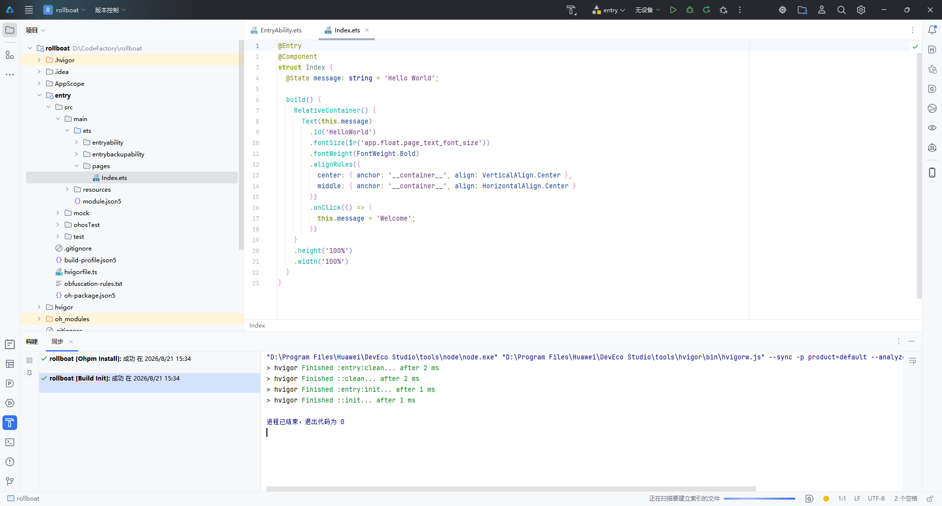
1.5 项目结构概览
创建完成后,左侧项目面板展示的是标准的 Stage 模型 目录结构:
rollboat/
├── .hvigor/                   # Hvigor 构建工具缓存
├── .idea/                     # IDE 配置文件
├── AppScope/                  # 应用级全局配置
│   └── app.json5
├── entry/                     # 主模块(入口模块)
│   ├── src/main/ets/
│   │   ├── entryability/      # Ability 生命周期管理
│   │   │   └── EntryAbility.ets
│   │   └── pages/             # UI 页面
│   │       └── Index.ets      # 首页(默认 Hello World)
│   ├── src/main/resources/    # 资源文件
│   ├── module.json5           # 模块配置
│   └── build-profile.json5    # 构建配置
├── oh_modules/                # OHPM 依赖包
├── build-profile.json5        # 工程构建配置
├── hvigorfile.ts              # Hvigor 构建脚本
└── oh-package.json5           # 包管理配置
核心文件 Index.ets 的默认代码如下,采用 ArkTS 声明式 UI 语法:
@Entry
@Component
struct Index {
  @State message: string = 'Hello World';

  build() {
    RelativeContainer() {
      Text(this.message)
        .id('HelloWorld')
        .fontSize($r('app.float.page_text_font_size'))
        .fontWeight(FontWeight.Bold)
        .alignRules({
          center: { anchor: '__container__', align: VerticalAlign.Center },
          middle: { anchor: '__container__', align: HorizontalAlign.Center }
        })
        .onClick(() => {
          this.message = 'Welcome';
        })
    }
    .height('100%')
    .width('100%')
  }
}
| 关键语法 | 作用 |
|---|---|
@Entry | 标记为页面入口,可用于路由跳转 |
@Component | 声明为自定义组件 |
@State | 状态变量,数据变更时自动触发 UI 刷新 |
RelativeContainer | 相对布局容器,替代传统线性布局 |
.onClick() | 点击事件,此处点击后文本变为 “Welcome” |
打开右侧 Previewer(预览器),选择 Phone 设备,即可实时预览 Hello World 效果,无需连接真机或启动模拟器。
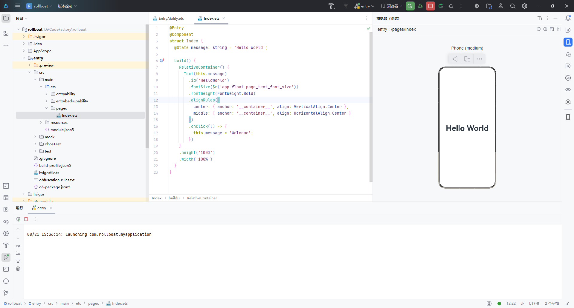
二、查看 SDK 版本
2.1 查看 HarmonyOS SDK
DevEco Studio 安装时已内置 HarmonyOS SDK,无需单独下载。通过以下路径查看:
文件 → 设置 → HarmonyOS SDK(或快捷键
Ctrl + Alt + S搜索 “HarmonyOS SDK”)
在设置面板中,可以看到当前已安装的 SDK 版本信息:
| 名称 | 阶段 | 状态 |
|---|---|---|
| HarmonyOS 6.1.1 | Release | ✅ 已安装 |
界面顶部提示:“HarmonyOS SDK 已经包含在 IDE,无需单独安装”,省去了手动配置 SDK 的繁琐步骤。
2.2 查看 ArkUI-X SDK(跨平台扩展)
如果项目需要将 ArkUI 框架扩展到多个 OS 平台(Android / iOS / OpenHarmony),还需要配置 ArkUI-X SDK。路径如下:
文件 → 设置 → 语言和框架 → ArkUI-X
在这里可以查看已安装和可选的 ArkUI-X SDK 版本:
| 版本 | SDK 版本号 | 阶段 | 状态 |
|---|---|---|---|
| API Version 24 | 6.1.1.100 | Release | ✅ 已安装 |
| API Version 23 | 6.1.0.28 | Beta1 | 未安装 |
| API Version 22 | 6.0.2.112 | Release | 未安装 |
安装路径示例:D:\DevTools\ArkUI-X\sdk
说明:ArkUI-X 允许开发者使用一套 ArkTS 主代码,同时构建多平台应用。如果仅开发 HarmonyOS 原生应用,无需额外安装 ArkUI-X SDK。
三、小结
| 步骤 | 操作 | 关键点 |
|---|---|---|
| 创建项目 | 欢迎页 → 新建项目 → 选择 Empty Ability 模板 → 配置项目信息 → 完成 | 使用 Stage 模型 + ArkTS 语言 |
| 查看 SDK | 设置 → HarmonyOS SDK | SDK 已内置,无需手动安装 |
| 跨平台扩展 | 设置 → ArkUI-X | 根据需要安装对应 API 版本 |
至此,DevEco Studio 的项目创建与 SDK 环境确认全部完成,可以开始 HarmonyOS 应用的功能开发。

讨论HarmonyOS开发技术,专注于API与组件、DevEco Studio、测试、元服务和应用上架分发等。
更多推荐


 13
 0
- 0


 已为社区贡献117条内容

所有评论(0)