HarmonyOS ArkTS API 24深度解析@State装饰器底层响应原理,理清状态变量更新驱动视图刷新的完整链路,剖析作用域边界、初始化约束与常见编译报错根源,掌握状态管理高级避坑方案,大幅
一、技术前言
在出境旅游服务加速数字化的当下,跨境旅行正从"纸质攻略+离线地图"向"一站式智能行程簿"演进。从签证状态速览到目的地横滑选卡,从地图地标长按探索到景点 POI 相关性搜索,从行程提醒时间轴到沙箱自定义通知铃声,再到 AI 字幕多语讲解——每一项能力都对应着一个独立的业务场景和一套差异化的交互模式。传统旅行应用面临三大痛点:地图交互停留在只读浏览层缺乏事件监听能力、通知铃声只能用系统预设无法个性化定制、多语讲解依赖外部翻译应用导致体验割裂。一个优秀的海外行程簿应用需要将这七大功能模块(行程管理、地图探索、POI 搜索、行程提醒、沙箱铃声、AI 字幕、旅行家主页)融合在统一的深色主题界面中,同时保持各模块交互的独立性和状态联动的实时性。
HarmonyOS ArkUI 框架为这些痛点提供了系统级解决方案。ArkUI 的声明式 UI 范式通过 @Component 封装可复用组件、@State 管理响应式状态、@Builder 拆分复杂 UI 结构,天然适合"行程-地图-提醒"多 Tab 架构。@Observed 装饰器让数据模型字段级变化被 UI 感知,实现"数据更新即视图刷新"的流畅体验——当用户在编辑弹窗中修改行程天数时,@Observed 的 TripItem 实例字段变更立即触发横滑大卡和清单行的同步刷新,无需手动调用重渲染方法。@Entry 标记入口组件,Stack 容器层叠主界面与全屏弹窗,ForEach 驱动列表渲染——这套组合拳让七 Tab 异构布局在一个组件内有序共存。状态驱动机制的核心优势在于:开发者只需声明"UI 是状态函数",框架自动追踪依赖关系并执行最小化 DOM diff,这极大降低了多 Tab 共享状态的同步复杂度。
本平台深度融合 HarmonyOS 6.1.1 的三大前沿特性。Map Kit 提供地图组件的 MapComponent 渲染能力与 MapEventManager 事件管理器,通过 onMarkerLongClick 和 onPoiLongClick 双长按监听实现地标探索交互——Marker 长按回调参数为 map.Marker 类型,可读取 getId() 和 getPosition() 两个方法返回的标注 ID 和经纬度坐标;POI 长按回调参数为 mapCommon.Poi 类型,仅含 id、name、position 三个字段,相比 Marker 更轻量。同时 site.searchByText 接口返回的 reliability 相关性分数(取值区间 [0,1])为 POI 搜索结果提供精准排序依据,分数越高匹配度越高。Speech Kit 的 AI 字幕组件 AICaptionComponent 引入了 sourceLanguage(‘zh’|‘en’)、targetLanguage(‘zh’|‘en’|‘zh-en’)、fontSize(AICaptionFontSize 枚举四档)、fontColor(ResourceColor 类型)四个新字段,支持中英双向翻译、中英双语对照、四档字号调节和五色字体预设,配合 writeAudio 640 字节 PCM 块写入实现实时语音转字幕。Notification Kit 在 EL1 沙箱区域生成自定义 WAV 铃声文件,通过 fileUri.getUriFromPath 转换为沙箱 URI 后以 sound: 'uri::' + uri 形式注入通知请求,实现通知铃声的完全个性化定制。
二、整体架构流程图
架构以 Page 为根组件,使用 Stack 容器层叠:底层 Column 纵向排列头部、分割线、Scroll 内容区和底部 Tab 栏,顶层是三个独立弹窗各自条件渲染。内容区通过 currentTab 在七个 Builder 方法间切换,地图 Tab 因 MapComponent 需有界高度而独占内容区不进 Scroll 容器,其余六个 Tab 共享主滚动容器。三大特性分散在地图(双长按监听)、铃音(EL1 沙箱铃声)和字幕(AI 字幕四字段)三个 Tab 上,状态变量统一声明在组件顶层实现跨 Tab 共享与联动。数据模型层的七个 @Observed 类分别支撑各自 Tab 的列表渲染,TripItem 同时被弹窗系统引用以实现 CRUD 操作,RingItem 的 inSandbox 字段联动铃音 Tab 与提醒 Tab 的通知 sound 链路。
三、色彩体系设计
3.1 ColorPalette 接口定义
平台采用深色"夜航深蓝 + 霓虹青"主题,通过 ColorPalette 接口集中声明全部颜色字段,使全文件色彩管理统一可控:
interface ColorPalette {
  bg: string;      // 页面背景(夜航深蓝)
  card: string;    // 卡片底色(深海军蓝)
  title: string;   // 主标题(冷白)
  sub: string;     // 副标题(雾蓝灰)
  text3: string;   // 三级弱文本(暗蓝灰)
  cyan: string;    // 霓虹青(主色)
  cyanD: string;   // 霓虹青深色
  orange: string;  // 落日橙(辅助暖色)
  purple: string;  // 星紫(电子签徽标)
  green: string;   // 通过绿(免签徽标)
  red: string;     // 警示红(删除/失败)
  line: string;    // 分割线
  tabOn: string;   // Tab 选中色
  mask: string;    // 弹窗遮罩
}
这段接口定义体现了 ArkTS 的类型安全优势。与普通 JavaScript 动态添加属性不同,ColorPalette 接口在编译期即约束所有颜色字段必须是 string 类型,任何拼写错误或类型不匹配都会在编译阶段暴露。接口注释采用"字段名 + 用途"的格式,使每个颜色的语义角色一目了然,后续维护者无需追踪代码即可理解色彩用途。值得注意的是接口中省略了 dark 字段但在常量中补充了它——这是因为次级容器底色(状态胶囊/标签底色)与卡片底色属同一色系但在不同亮度档,开发者在实现时按需扩展。
3.2 COLORS 常量逐色分析
const COLORS: ColorPalette = {
  bg: '#0D1522',      // 夜航深蓝,模拟机舱暗光环境的沉浸式背景
  card: '#16233A',    // 深海军蓝卡片底色,比背景亮一档
  dark: '#1D2E4A',    // 次级容器底色(状态胶囊/标签底色)
  title: '#E8F0FA',    // 冷白标题,暗光环境高对比阅读
  sub: '#9DB4D0',     // 雾蓝灰副标题,层次柔和过渡
  text3: '#67819E',   // 暗蓝灰弱文本,辅助信息不抢视觉焦点
  cyan: '#38C8D8',    // 霓虹青主色,渐变横幅与按钮主色
  cyanD: '#2298A8',   // 霓虹青深色,柱状图渐变起点
  orange: '#FF8A4C',  // 落日橙辅助暖色,POI标识与警示状态
  purple: '#8A7FE8',  // 星紫色,电子签徽标与字幕语言标识
  green: '#4EC98A',   // 通过绿,免签徽标与已就绪状态
  red: '#E86060',     // 警示红,删除操作与错误反馈
  line: '#223450',    // 深蓝分割线,低对比不干扰
  tabOn: '#38C8D8',   // Tab选中色为霓虹青(与主色一致)
  mask: 'rgba(0,0,0,0.6)' // 半透黑弹窗遮罩
};
色彩体系以"夜航深蓝 + 霓虹青"为核心对比。深蓝代表长途夜航机舱的沉浸氛围,霓虹青代表跨境旅行中的数字指引信号。bg 为 #0D1522 夜航深蓝,模拟长途飞行时机舱暗光环境的沉浸式背景,降低白光对眼睛的刺激,适合长时间查阅行程。card 为 #16233A 深海军蓝,卡片底色比背景亮一档,形成柔和的层级区分。dark 为 #1D2E4A 次级容器底色,用于状态胶囊和标签底色,位于背景与卡片之间。
title 为 #E8F0FA 冷白,主标题文字色,在暗光环境下形成高对比度阅读体验。sub 为 #9DB4D0 雾蓝灰,副标题色,在标题与弱文本之间架起层次过渡。text3 为 #67819E 暗蓝灰,三级弱文本,用于辅助说明和时间戳,视觉权重最低不抢焦点。
cyan 为 #38C8D8 霓虹青,平台主色,象征跨境旅行的数字指引信号,贯穿渐变横幅、按钮主色、Tab 选中态和柱状图渐变终点。cyanD 为 #2298A8 霓虹青深色,用于柱状图渐变起点和"设默认"按钮的已选中态。orange 为 #FF8A4C 落日橙,辅助暖色,与霓虹青形成冷暖对比,用于 POI 标识和未授权警示状态。purple 为 #8A7FE8 星紫,专门用于电子签徽标和字幕语言方向标识,通过色相区分避免与主色冲突。green 为 #4EC98A 通过绿,用于免签徽标和已就绪状态,传递"顺利通过"的积极语义。red 为 #E86060 警示红,仅用于删除操作和错误反馈,通过低频使用强化警示语义。line 为 #223450 深蓝分割线,低对比度不干扰内容。tabOn 与 cyan 同值,保证 Tab 选中态与主色一致。mask 为半透明黑色 rgba(0,0,0,0.6),弹窗遮罩使用 RGBA 格式实现 60% 透明度。
3.3 色彩语义角色分配
色彩语义角色分配遵循三条原则。第一,背景层从深到浅形成三级梯度:bg 最暗、card 中间、dark 最浅但仍在暗色范围内,确保视觉层级分明。第二,文本层从亮到暗形成三级对比:title 最亮、sub 中间、text3 最暗,让信息按重要性递减呈现。第三,功能色按业务语义分配:cyan 用于主操作和主交互、orange 用于辅助暖色和 POI 标识、purple 用于电子签和字幕语言、green 用于通过和已就绪、red 用于删除和错误——五种功能色各司其职不交叉使用。
四、Tab 元数据与常量定义
4.1 底部导航 Tab 定义
interface TabMeta {
  icon: string;
  label: string;
}

const TAB_LIST: TabMeta[] = [
  { icon: '🧭', label: '行程' },
  { icon: '🗺️', label: '地图' },
  { icon: '🔍', label: '搜索' },
  { icon: '⏰', label: '提醒' },
  { icon: '🎵', label: '铃音' },
  { icon: '🗣', label: '字幕' },
  { icon: '👤', label: '我的' }
];
TabMeta 接口定义了底部导航项的最小数据结构:icon 为 emoji 字符串,label 为中文标签文字。TAB_LIST 常量数组按顺序声明七个 Tab 项,分别对应行程、地图、搜索、提醒、铃音、字幕和我的。这种将导航元数据与 UI 渲染分离的设计使 Tab 配置可独立维护,新增或调整 Tab 只需修改数组而无需触碰 @Builder 方法。底部导航栏在 tabBar() 构建器中通过 ForEach 遍历此数组渲染,选中态通过 currentTab 索引与 index 比较判断。七个 Tab 覆盖了跨境旅行从行程规划到多语讲解的完整场景链路。
4.2 头部联动副标题定义
const TAB_SUBS: string[] = [
  '跨境行程总览与签证速览',
  '香港地标长按探索',
  '景点 POI 相关性搜索',
  '行程提醒与本地通知',
  '沙箱自定义通知铃声',
  'AI 字幕多语讲解',
  '旅行家主页与足迹'
];
TAB_SUBS 数组与 TAB_LIST 一一对应——当用户切换 Tab 时,头部副标题联动显示当前 Tab 的功能描述。例如选中"地图"时头部副标题变为"香港地标长按探索",选中"字幕"时变为"AI 字幕多语讲解"。这种联动设计让用户在任何 Tab 下都能通过头部快速确认当前功能定位。副标题使用 text3 暗蓝灰着色,字号 11,单行省略,视觉权重低于主标题,形成主次分明的信息层级。
4.3 地图标注点与城市中心
const CITY_CENTER: mapCommon.LatLng = { latitude: 22.3193, longitude: 114.1694 };

interface SpotItem {
  name: string;
  lat: number;
  lng: number;
  tag: string;
}

const MARKER_SPOTS: SpotItem[] = [
  { name: '维多利亚港', lat: 22.2938, lng: 114.1722, tag: '夜景' },
  { name: '太平山顶', lat: 22.2759, lng: 114.1455, tag: '观景' },
  { name: '尖沙咀星光大道', lat: 22.2930, lng: 114.1718, tag: '海滨' },
  { name: '旺角街市', lat: 22.3217, lng: 114.1697, tag: '市集' },
  { name: '香港迪士尼乐园', lat: 22.3130, lng: 114.0420, tag: '乐园' },
  { name: '港珠澳大桥口岸', lat: 22.4947, lng: 113.9770, tag: '口岸' }
];
城市中心定位于香港中环(纬度 22.3193、经度 114.1694),作为跨境游枢纽,是地图初始视野中心和 POI 搜索的 location 基准点。SpotItem 接口定义了门店标注点的四字段结构,MARKER_SPOTS 数组包含六处香港地标标注点,覆盖夜景、观景、海滨、市集、乐园、口岸六大跨境游客高频场景。这些数据在 setupMapCallback 中通过 mapController.addMarker 批量添加到地图上。每个标注点的 tag 字段虽未在 UI 中直接展示,但保留了业态分类能力,未来可扩展为地图标注的差异化图标或颜色映射。
4.4 搜索快捷关键字与字幕语言选项
const QUICK_QUERIES: string[] = ['景点', '餐厅', '地铁站', '酒店', '口岸', '博物馆'];

interface LangOption {
  code: string;
  name: string;
}

const SRC_LANGS: LangOption[] = [
  { code: 'zh', name: '中文' },
  { code: 'en', name: '英文' }
];

const TGT_LANGS_EN: LangOption[] = [
  { code: 'zh', name: '中文' },
  { code: 'en', name: '英文' },
  { code: 'zh-en', name: '中英双语' }
];
QUICK_QUERIES 定义了搜索 Tab 的六个快捷关键字 chips,覆盖跨境游客高频 POI 类型:景点、餐厅、地铁站、酒店、口岸、博物馆。点击任一 chip 自动填入关键字并触发搜索,省去手动输入的步骤。LangOption 接口定义了语言选项的两字段结构:code 为语言码(‘zh’|‘en’|‘zh-en’),name 为中文展示名。SRC_LANGS 源语言仅支持中文和英文两种,TGT_LANGS_EN 为英文源时的目标语言选项(中文、英文、中英双语三档)。当源语言为中文时,目标语言锁定为 zh(无翻译方向可选),这一约束通过 switchSourceLang 函数实现联动。
4.5 字幕字号选项与字体颜色预设
interface SizeOption {
  size: AICaptionFontSize;
  name: string;
}

const SIZE_OPTIONS: SizeOption[] = [
  { size: AICaptionFontSize.SMALL, name: '小号' },
  { size: AICaptionFontSize.NORMAL, name: '标准' },
  { size: AICaptionFontSize.BIG, name: '大号' },
  { size: AICaptionFontSize.LARGE, name: '超大' }
];

const CAPTION_FONT_COLORS: string[] = ['#FFFFFF', '#7CE8F5', '#FFD9A8', '#C9F2D9', '#FFC2CE'];
SizeOption 接口将 AICaptionFontSize 枚举值与中文展示名绑定,SIZE_OPTIONS 数组声明了四档字号:SMALL(小号)、NORMAL(标准)、BIG(大号)、LARGE(超大)。字号选项在字幕 Tab 中以卡片网格展示,每张卡片显示预览字号和名称,选中态使用霓虹青高亮和边框。CAPTION_FONT_COLORS 预设了五种字体颜色:冷白 #FFFFFF、霓虹青 #7CE8F5、暖橙 #FFD9A8、薄荷绿 #C9F2D9、樱花粉 #FFC2CE,覆盖五种视觉风格,让用户根据字幕背景和个人偏好自由切换。
4.6 月度出行数据与足迹国家清单
const MONTH_NAME: string[] = ['03', '04', '05', '06', '07', '08'];
const MONTH_DAYS: number[] = [3, 5, 2, 6, 4, 8];

interface FootRow {
  flag: string;
  name: string;
  cities: number;
  last: string;
}

const FOOT_ROWS: FootRow[] = [
  { flag: '🇭🇰', name: '中国香港', cities: 18, last: '08月' },
  { flag: '🇯🇵', name: '日本', cities: 6, last: '07月' },
  { flag: '🇹🇭', name: '泰国', cities: 3, last: '05月' },
  { flag: '🇸🇬', name: '新加坡', cities: 1, last: '04月' },
  { flag: '🇰🇷', name: '韩国', cities: 2, last: '03月' },
  { flag: '🇲🇴', name: '中国澳门', cities: 2, last: '02月' }
];
MONTH_NAME 和 MONTH_DAYS 为近 6 个月跨境出行天数数据(3/5/2/6/4/8 天),合计 28 天,驱动行程 Tab 的柱状图。每根柱子高度由 breath 状态驱动微波动——breath 为 true 时高度为 14 + v * 9,为 false 时为 12 + v * 9,差值 2 像素形成呼吸效果。FootRow 接口定义了足迹国家清单行的四字段结构,FOOT_ROWS 包含六条数据(中国香港 18 城、日本 6 城、泰国 3 城、新加坡 1 城、韩国 2 城、中国澳门 2 城),每行包含国旗 emoji、国家名、解锁城市数和最近到访月份。
五、工具函数群
5.1 可靠性分数映射
interface ScoreLevel {
  label: string;
  color: string;
}

function reliabilityScore(score: number): ScoreLevel {
  if (score >= 0.8) {
    return { label: '高相关', color: COLORS.green };
  }
  if (score >= 0.5) {
    return { label: '中相关', color: COLORS.orange };
  }
  return { label: '低相关', color: COLORS.text3 };
}
reliabilityScore 函数将 site.searchByText 返回的 [0,1] 区间相关性分数映射为三档标签和颜色:0.8 以上为高相关(通过绿 #4EC98A)、0.5 至 0.8 为中相关(落日橙 #FF8A4C)、0.5 以下为低相关(暗蓝灰 #67819E)。该函数返回 ScoreLevel 结构体,包含 label 和 color 两个字段,在搜索结果列表中同时驱动等级标签着色和分数条颜色,让用户一眼判断 POI 搜索结果的可信度。阈值 0.8 和 0.5 是经验值——高于 0.8 的 POI 通常名称和地址完全匹配关键字,0.5 到 0.8 为部分匹配,低于 0.5 为弱关联。Mock 数据中 香港太空馆 的 reliability 为 0.94 属高相关,重庆大厦 为 0.22 属低相关,覆盖三档全量。
5.2 长按事件类型颜色映射
function typeColor(type: string): string {
  if (type === 'Marker') {
    return COLORS.cyan;
  }
  if (type === 'POI') {
    return COLORS.orange;
  }
  return COLORS.text3;
}
typeColor 函数区分地图长按事件类型——Marker 长按用霓虹青 #38C8D8 标识、POI 长按用落日橙 #FF8A4C 标识,两种颜色对应地图 Tab 双长按监听 Toggle 的选中色,保持视觉一致性。该函数在事件日志流中驱动类型徽标着色,让用户通过颜色快速区分事件来源。默认返回 text3 暗蓝灰作为兜底色,防止未来新增事件类型时未覆盖导致着色异常。
5.3 签证类型颜色映射
function visaColor(visa: string): string {
  if (visa.startsWith('免签')) {
    return COLORS.green;
  }
  if (visa.startsWith('落地签')) {
    return COLORS.cyan;
  }
  if (visa.startsWith('电子签')) {
    return COLORS.purple;
  }
  return COLORS.orange;
}
visaColor 函数通过字符串前缀匹配实现签证类型到颜色的映射:免签绿(#4EC98A,传递"顺利通过"语义)、落地签青(#38C8D8,主色标识"到达办理")、电子签紫(#8A7FE8,数字标识"线上申请")、需面签橙(#FF8A4C,暖色警示"需到领事馆")。该函数在行程 Tab 的横滑大卡和清单行中驱动签证色徽标着色,让用户一屏速览各目的地签证类型。使用 startsWith 前缀匹配而非精确匹配,是因为 Mock 数据中包含"免签备案"这种复合前缀,前缀匹配可兼容更多变体。
5.4 当前时刻格式化
function nowTime(): string {
  const d = new Date();
  const p = (n: number) => n.toString().padStart(2, '0');
  return `${p(d.getHours())}:${p(d.getMinutes())}:${p(d.getSeconds())}`;
}
nowTime 函数返回当前时刻的 HH:mm:ss 格式字符串,用于长按事件日志和通知历史的时间戳。内部使用箭头函数 p 将个位数补零(如 9 变 09),保证时间格式统一为两位数。该函数在 bindMarkerLongClick、bindPoiLongClick 和 publishNotice 三处调用,为每条事件日志和通知记录打上实时时间戳。相比于直接拼接 getHours() 等返回值,补零操作确保了视觉对齐——等宽字体下 09:12:40 和 09:15:03 各列对齐,阅读体验更整洁。
5.5 WAV 音频字节生成
function buildWavBytes(freq: number, durationMs: number): ArrayBuffer {
  const sampleRate = 44100;
  const numSamples = Math.floor(sampleRate * durationMs / 1000);
  const dataSize = numSamples * 2;
  const buf = new ArrayBuffer(44 + dataSize);
  const view = new DataView(buf);
  const writeStr = (offset: number, s: string) => {
    for (let i = 0; i < s.length; i++) {
      view.setUint8(offset + i, s.charCodeAt(i));
    }
  };
  // RIFF 容器标识
  writeStr(0, 'RIFF');
  view.setUint32(4, 36 + dataSize, true);
  writeStr(8, 'WAVE');
  // fmt 子块
  writeStr(12, 'fmt ');
  view.setUint32(16, 16, true);       // 子块大小
  view.setUint16(20, 1, true);       // PCM 编码
  view.setUint16(22, 1, true);       // 单声道
  view.setUint32(24, sampleRate, true);  // 采样率
  view.setUint32(28, sampleRate * 2, true); // 字节率
  view.setUint16(32, 2, true);       // 块对齐
  view.setUint16(34, 16, true);      // 16bit 量化
  // data 子块
  writeStr(36, 'data');
  view.setUint32(40, dataSize, true);
  // PCM 正弦波采样 + 起音包络 + 自然衰减
  for (let i = 0; i < numSamples; i++) {
    const t = i / sampleRate;
    const env = Math.min(1, i / (sampleRate * 0.02));       // 起音包络
    const decay = Math.max(0, 1 - t / (durationMs / 1000)); // 自然衰减
    const v = Math.sin(2 * Math.PI * freq * t) * 0.5 * env * decay;
    view.setInt16(44 + i * 2, Math.round(v * 32767), true);
  }
  return buf;
}
buildWavBytes 函数是铃音 Tab 的核心工具,它根据频率和时长参数生成符合 WAV 规范的音频字节流。整个函数分为三个阶段。
第一阶段是头部写入。44 字节头部包含 RIFF 容器标识(writeStr(0, 'RIFF'))、文件大小(36 + dataSize)、WAVE 格式标识、fmt 子块(PCM 编码声明、采样率 44100Hz、单声道、16bit 量化、字节率 sampleRate * 2、块对齐 2)。writeStr 辅助函数通过 charCodeAt 将字符串逐字节写入 DataView,setUint32 和 setUint16 的第三个参数 true 表示小端序(WAV 标准字节序)。
第二阶段是 PCM 采样生成。音频数据段通过正弦波公式 Math.sin(2 * Math.PI * freq * t) 生成 PCM 采样值,其中 freq 为频率参数(如 990Hz 对应"登机叮咚"、523Hz 对应"口岸钟声")。每个采样值乘以 0.5 降幅度(避免满幅削波),再乘以起音包络 env 和自然衰减 decay。
第三阶段是包络处理。起音包络 env 在前 20ms 内从 0 线性渐升到 1(Math.min(1, i / (sampleRate * 0.02))),模拟真实铃声的起音阶段避免咔哒声;自然衰减 decay 从 1 线性递减到 0(Math.max(0, 1 - t / (durationMs / 1000))),模拟铃声随时间衰减的物理特性。最终采样值通过 Math.round(v * 32767) 量化为 16bit 整数并写入 DataView。该函数生成的字节流直接写入 EL1 沙箱文件,作为通知自定义铃声的音频源。
六、数据模型层
6.1 行程条目 TripItem
@Observed export class TripItem {
  city: string;   // 目的地城市
  days: number;   // 行程天数
  visa: string;   // 签证类型(免签/落地签/电子签/需面签)
  plan: string;   // 行程概要

  constructor(city: string, days: number, visa: string, plan: string) {
    this.city = city;
    this.days = days;
    this.visa = visa;
    this.plan = plan;
  }
}

const TRIP_LIST: TripItem[] = [
  new TripItem('香港', 4, '免签备案', '维港夜景 · 太平山顶 · 迪士尼'),
  new TripItem('东京', 6, '电子签', '浅草寺 · 涩谷十字 · 镰仓一日'),
  new TripItem('曼谷', 5, '落地签', '大皇宫 · 水上市场 · 恰图洽周末市集'),
  new TripItem('新加坡', 4, '免签', '滨海湾花园 · 环球影城 · 圣淘沙'),
  new TripItem('首尔', 5, '免签', '景福宫 · 明洞 · 南怡岛'),
  new TripItem('大阪', 6, '电子签', '环球影城 · 道顿堀 · 奈良喂鹿'),
  new TripItem('巴黎', 9, '需面签', '卢浮宫 · 塞纳河游船 · 凡尔赛宫')
];
TripItem 是业务主 Tab 的核心实体,使用 @Observed 装饰器使其字段级变化被 UI 感知。四个字段分别表示目的地城市、行程天数、签证类型和行程概要。TRIP_LIST 初始包含七条数据——从香港免签备案到巴黎需面签,覆盖免签、落地签、电子签、需面签四种签证类型。TripItem 同时绑定三个弹窗:新增弹窗 unshift 置顶新实例、编辑弹窗就地修改字段驱动刷新、删除弹窗 splice 移除条目。@Observed 的关键字段级监听特性在编辑弹窗中发挥核心作用——doEdit 方法直接修改 tripList[editIdx] 的 city、days、visa、plan 字段而非替换整个数组元素,框架自动检测字段变更并刷新引用该实例的所有 UI 组件(横滑大卡和清单行同步更新)。
6.2 搜索结果 SearchRecord
@Observed export class SearchRecord {
  name: string;         // 地点名称
  address: string;      // 格式化地址
  distance: number;     // 直线距离(米)
  reliability: number; // 相关性分数 [0,1]

  constructor(name: string, address: string, distance: number, reliability: number) {
    this.name = name;
    this.address = address;
    this.distance = distance;
    this.reliability = reliability;
  }
}

const SEARCH_MOCK: SearchRecord[] = [
  new SearchRecord('香港太空馆', '尖沙咀梳士巴利道10号', 420, 0.94),
  new SearchRecord('星光大道', '尖沙咀海滨长廊', 680, 0.88),
  new SearchRecord('香港文化中心', '尖沙咀梳士巴利道', 750, 0.71),
  new SearchRecord('天星小轮尖沙咀码头', '尖沙咀天星码头', 910, 0.62),
  new SearchRecord('海港城', '尖沙咀广东道3-27号', 1150, 0.45),
  new SearchRecord('重庆大厦', '尖沙咀弥敦道36-44号', 1320, 0.22)
];
SearchRecord 封装 POI 搜索结果的四个核心字段:名称、地址、距离和相关性分数。SEARCH_MOCK 初始 Mock 数据覆盖高、中、低三档可靠性分数(0.94 到 0.22),距离从 420 米到 1320 米递增。当真实搜索失败时(无 AGC 配置或无网络),runSearch 方法保留 Mock 数据并提示错误码,体现调用链完整性。reliability 字段驱动搜索结果列表的等级标签着色(reliabilityScore 函数)和分数条颜色(Progress 线性进度条),让用户通过视觉量化判断搜索结果的可信度。
6.3 地图长按事件日志 EventLog
@Observed export class EventLog {
  type: string;   // Marker / POI
  name: string;   // 标记 id 或 POI 名称
  lat: number;    // 纬度
  lng: number;    // 经度
  time: string;   // 触发时刻

  constructor(type: string, name: string, lat: number, lng: number, time: string) {
    this.type = type;
    this.name = name;
    this.lat = lat;
    this.lng = lng;
    this.time = time;
  }
}

const EVENT_SEED: EventLog[] = [
  new EventLog('Marker', '#0 维多利亚港(演示)', 22.2938, 114.1722, '09:12:40'),
  new EventLog('POI', '尖沙咀海滨花园(演示)', 22.2932, 114.1716, '09:15:03')
];
EventLog 记录地图长按事件流,包含事件类型(Marker/POI)、名称、经纬度和触发时刻。EVENT_SEED 预置两条演示数据让用户进入地图 Tab 即见日志效果。Marker 长按回调通过 marker.getId() 和 marker.getPosition() 读取坐标与 ID,POI 长按回调通过 poi.name 和 poi.position 读取名称与坐标,两者均 unshift 置顶事件日志并限制最多保留 12 条(超过则 pop 移除末尾),形成实时事件日志流。经纬度在 UI 中使用 toFixed(4) 保留四位小数并以等宽字体 monospace 显示,保证各列对齐。
6.4 行程提醒 RemindItem
@Observed export class RemindItem {
  time: string;    // 提醒时刻
  title: string;   // 提醒标题
  repeat: string;  // 重复规则
  on: boolean;     // 开关状态

  constructor(time: string, title: string, repeat: string, on: boolean) {
    this.time = time;
    this.title = title;
    this.repeat = repeat;
    this.on = on;
  }
}

const REMIND_LIST: RemindItem[] = [
  new RemindItem('06:30', '值机提醒:CX984 香港 → 东京', '出行日', true),
  new RemindItem('09:00', '酒店入住:尖沙咀皇悦酒店', '单次', true),
  new RemindItem('09:40', '集合出发:旺角地铁站 C3 口', '出行日', true),
  new RemindItem('12:00', '景点预约:太平山缆车快速通道', '单次', false),
  new RemindItem('15:30', '跨境巴士:港珠澳大桥口岸集合', '单次', true),
  new RemindItem('20:00', '夜间导览:维港幻彩咏香江', '出行日', false)
];
RemindItem 支撑提醒 Tab 的时间轴布局,四个字段分别表示提醒时刻、标题、重复规则和开关状态。REMIND_LIST 包含六条提醒数据,覆盖值机、入住、集合、景点预约、跨境巴士和夜间导览六种跨境旅行场景,重复规则分"出行日"和"单次"两种。on 字段驱动时间轴的竖线颜色(开启霓虹青/关闭分割线色)和圆点颜色,以及提醒内容列的文字颜色和状态文案(“提醒开启中”/“已暂停”)。toggleRemind 方法直接翻转 item.on 字段,利用 @Observed 的字段级监听实现就地刷新。
6.5 铃声库 RingItem
@Observed export class RingItem {
  name: string;       // 铃声名
  file: string;       // 沙箱文件名
  freq: number;       // 生成频率 Hz
  duration: number;   // 时长 ms
  size: string;       // 文件大小展示
  inSandbox: boolean; // 是否已写入沙箱

  constructor(name: string, file: string, freq: number,
    duration: number, size: string, inSandbox: boolean) {
    this.name = name;
    this.file = file;
    this.freq = freq;
    this.duration = duration;
    this.size = size;
    this.inSandbox = inSandbox;
  }
}

const RING_LIST: RingItem[] = [
  new RingItem('登机叮咚', 'ring_boarding_ding.wav', 990, 900, '—', false),
  new RingItem('口岸钟声', 'ring_gate_bell.wav', 523, 1400, '—', false),
  new RingItem('巴士到站', 'ring_bus_arrive.wav', 660, 1000, '—', false),
  new RingItem('行李转盘', 'ring_baggage_loop.wav', 440, 1200, '—', false),
  new RingItem('集合哨声', 'ring_meet_whistle.wav', 880, 800, '—', false),
  new RingItem('夜航星光', 'ring_night_star.wav', 784, 1500, '—', false)
];
RingItem 是铃音 Tab 的核心实体,六个字段分别表示铃声名、沙箱文件名、生成频率、时长、文件大小和沙箱状态。RING_LIST 包含六款预设铃声,频率从 440Hz 到 990Hz 覆盖不同音高,时长从 800ms 到 1500ms 覆盖短促到悠长。inSandbox 字段是铃音 Tab 的状态枢纽——初始为 false 且 size 为 '—',当 WAV 字节成功写入 EL1 沙箱后 genRing 方法将 inSandbox 置为 true 并计算文件大小 KB 数更新 size 字段。@Observed 的字段级监听确保 inSandbox 变更后铃声库列表的"沙箱/未生成"标签和"EL1 ✓/未落盘"预览卡同步刷新。
6.6 字幕场景 CaptionScene
@Observed export class CaptionScene {
  scene: string;   // 场景名
  desc: string;    // 场景说明
  src: string;     // 推荐源语言
  tgt: string;     // 推荐目标语言

  constructor(scene: string, desc: string, src: string, tgt: string) {
    this.scene = scene;
    this.desc = desc;
    this.src = src;
    this.tgt = tgt;
  }
}

const CAPTION_SCENES: CaptionScene[] = [
  new CaptionScene('双语导览讲解', '英文导游讲解实时转中英双语字幕,边走边听', 'en', 'zh-en'),
  new CaptionScene('外语点餐对话', '读懂菜单与侍应对话,点单不踩雷', 'en', 'zh'),
  new CaptionScene('问路应急翻译', '街头问路实时出字,方向看得见', 'en', 'zh'),
  new CaptionScene('机场广播听译', '登机口变更广播即时转文字提醒', 'en', 'zh-en'),
  new CaptionScene('中文讲解复盘', '回国回放中文讲解录音,整理游记笔记', 'zh', 'zh')
];
CaptionScene 定义了字幕 Tab 的场景推荐卡数据结构,四个字段分别表示场景名、说明、推荐源语言和推荐目标语言。CAPTION_SCENES 预设五个跨境讲解场景:双语导览(en→zh-en)、外语点餐(en→zh)、问路翻译(en→zh)、机场广播(en→zh-en)、中文复盘(zh→zh)。点击场景卡调用 applyScene(idx) 方法一次性套用推荐的源语言和目标语言组合,省去用户手动逐项设置。五个场景覆盖了从出境到回国的完整多语交互链路。
6.7 通知历史 NoticeLog
@Observed export class NoticeLog {
  title: string;  // 通知标题
  text: string;   // 通知正文
  time: string;   // 发布时刻

  constructor(title: string, text: string, time: string) {
    this.title = title;
    this.text = text;
    this.time = time;
  }
}

const NOTICE_SEED: NoticeLog[] = [
  new NoticeLog('值机提醒', 'CX984 香港 → 东京 已开放线上值机,请核对护照有效期。', '06:30:00'),
  new NoticeLog('集合提醒', '跨境巴士 15:30 港珠澳大桥口岸发车,请提前 20 分钟集合。', '15:10:00'),
  new NoticeLog('夜间导览', '维港幻彩咏香江 20:00 开始,星光大道观景位已收藏。', '19:40:00')
];
NoticeLog 记录已发布通知的标题、正文和发布时刻。NOTICE_SEED 预置三条通知历史让用户进入提醒 Tab 即见效果。publishNotice 方法成功发布通知后 unshift 置顶新的 NoticeLog 实例并限制最多保留 8 条(超过则 pop 移除末尾)。通知历史流以倒序展示,每条记录显示标题(sub 雾蓝灰加粗)、发布时刻(text3 暗蓝灰)和正文(text3 暗蓝灰,最多两行省略),底部使用 dark 次级容器底色与卡片形成层次区分。
七、组件主体与状态管理
7.1 状态变量分层声明
@Entry
@Component
struct Page1278 {
  // --- Tab 状态 ---
  @State currentTab: number = 0;

  // --- 弹窗状态(绑定行程实体 TripItem) ---
  @State addModal: boolean = false;
  @State editModal: boolean = false;
  @State delModal: boolean = false;
  @State editIdx: number = -1;
  @State delIdx: number = -1;

  // --- 弹窗表单缓存 ---
  @State formCity: string = '';
  @State formDays: string = '';
  @State formVisa: string = '';
  @State formPlan: string = '';

  // --- 动画状态 ---
  @State breath: boolean = false;
  timer: number = -1;
组件主体通过 @Entry @Component 标记为入口组件,状态变量分为五层。第一层是 Tab 切换状态:currentTab 数字索引驱动内容区在七个 @Builder 方法间切换,初始值为 0 对应行程 Tab。第二层是弹窗状态:addModal/editModal/delModal 三个布尔值控制三个弹窗的条件渲染,editIdx 和 delIdx 缓存当前操作的行程索引。第三层是弹窗表单缓存:formCity/formDays/formVisa/formPlan 四个字符串暂存用户在弹窗中输入的表单值,打开弹窗时由 openAdd/openEdit 初始化。第四层是动画状态:breath 布尔值每秒翻转驱动多处微交互,timer 保存 setInterval 返回的定时器 ID。第五层是业务数据数组,将在下文详述。
  // --- 业务数据数组 ---
  @State tripList: TripItem[] = TRIP_LIST;
  @State remindList: RemindItem[] = REMIND_LIST;
  @State ringList: RingItem[] = RING_LIST;
  @State noticeLogs: NoticeLog[] = NOTICE_SEED;

  // --- Map Kit 状态 ---
  private mapOptions: mapCommon.MapOptions = {
    position: { target: CITY_CENTER, zoom: 13 }
  };
  private mapCallback?: AsyncCallback<map.MapComponentController>;
  private mapController?: map.MapComponentController;
  private mapEventManager?: map.MapEventManager;
  @State eventLogs: EventLog[] = EVENT_SEED;
  @State markerListenOn: boolean = true;
  @State poiListenOn: boolean = true;
  @State queryInput: string = '景点';
  @State searchRecords: SearchRecord[] = SEARCH_MOCK;
  @State searchState: string = '待搜索(等待实时搜索)';
业务数据数组层包含四个 @State 数组,分别初始化为 TRIP_LIST、REMIND_LIST、RING_LIST 和 NOTICE_SEED。Map Kit 状态层包括地图选项 mapOptions(定位香港中环、缩放 13 级)、地图回调 mapCallback、控制器 mapController、事件管理器 mapEventManager(四个均为 private 非 @State,不触发 UI 重渲染),以及长按事件日志流 eventLogs、双长按监听开关 markerListenOn/poiListenOn、搜索关键字 queryInput、搜索结果数组 searchRecords 和搜索状态文案 searchState。
  // --- Speech Kit 状态 ---
  private captionController: AICaptionController = new AICaptionController();
  @State captionShown: boolean = false;
  @State srcLang: string = 'en';
  @State tgtLang: string = 'zh-en';
  @State captionSize: AICaptionFontSize = AICaptionFontSize.NORMAL;
  @State captionColor: string = CAPTION_FONT_COLORS[0];
  @State captionReady: boolean = false;
  @State captionErrMsg: string = '';
  @State captionFed: number = 0;

  // --- Notification 状态 ---
  @State granted: boolean = false;
  notifyId: number = 100;
  @State currentRing: RingItem = RING_LIST[0];
  @State noticeState: string = '尚未发布通知';
Speech Kit 状态层包含字幕控制器 captionController(private,AICaptionController 实例)、字幕显示状态 captionShown(通过 @Link 双向绑定到 AICaptionComponent 的 isShown 参数)、源语言 srcLang(默认 ‘en’)、目标语言 tgtLang(默认 ‘zh-en’)、字号枚举 captionSize(默认 NORMAL)、字体颜色 captionColor(默认冷白)、就绪状态 captionReady、错误信息 captionErrMsg 和已写入音频块计数 captionFed。Notification 状态层包含授权状态 granted、通知 ID 自增基数 notifyId(private 非 @State)、当前铃声 currentRing 和发布结果反馈 noticeState。
7.2 生命周期方法
aboutToAppear() {
  this.setupMapCallback();
  notificationManager.isNotificationEnabled().then((enabled: boolean) => {
    this.granted = enabled;
  }).catch((err: BusinessError) => {
    console.error(`isNotificationEnabled failed: ${err.message}`);
  });
  this.timer = setInterval(() => {
    this.breath = !this.breath;
  }, 1000);
}

aboutToDisappear() {
  clearInterval(this.timer);
}
aboutToAppear 生命周期执行三项初始化。第一项是装配地图回调——setupMapCallback 方法将异步回调函数赋值给 mapCallback 状态,该回调在 MapComponent 初始化完成后被框架调用,内含错误判空、获取控制器、获取事件管理器、批量添加 Marker、注册双长按监听五个步骤。第二项是查询通知授权状态——notificationManager.isNotificationEnabled() 返回 Promise,异步更新 granted 状态并联动头部三特性胶囊和提醒 Tab 的授权状态卡。第三项是启动呼吸动画定时器——setInterval 每秒翻转 breath 布尔值,breath 状态联动头部呼吸圆点透明度、柱状图柱体高度微波动、通知授权状态卡圆点透明度和旅行家渐变大卡呼吸圆点——一个定时器驱动四处微交互,体现状态驱动的声明式 UI 优势。
aboutToDisappear 清除定时器防止内存泄漏。如果不在组件销毁时调用 clearInterval(this.timer),定时器会持续运行导致已销毁组件的状态被修改,可能引发空指针异常或内存泄漏。
7.3 根构建方法
build() {
  Stack() {
    Column() {
      this.headerMain()
      Divider().strokeWidth(1).color(COLORS.line)
      if (this.currentTab === 1) {
        this.tabMap()
      } else {
        Scroll() {
          Column({ space: 12 }) {
            if (this.currentTab === 0) {
              this.tabTrip()
            } else if (this.currentTab === 2) {
              this.tabSearch()
            } else if (this.currentTab === 3) {
              this.tabRemind()
            } else if (this.currentTab === 4) {
              this.tabRing()
            } else if (this.currentTab === 5) {
              this.tabCaption()
            } else {
              this.tabMine()
            }
          }.width('100%').padding({ left: 14, right: 14, top: 12, bottom: 16 })
        }.layoutWeight(1).width('100%')
        .scrollBar(BarState.Off).edgeEffect(EdgeEffect.Spring)
      }
      this.tabBar()
    }.width('100%').height('100%')

    if (this.addModal) {
      this.panelAdd(() => { this.addModal = false; })
    }
    if (this.editModal) {
      this.panelEdit(() => { this.editModal = false; })
    }
    if (this.delModal) {
      this.panelDel(() => { this.delModal = false; })
    }
  }
  .alignContent(Alignment.Center)
  .backgroundColor(COLORS.bg)
  .height('100%')
}
根构建使用 Stack 层叠主界面列和弹窗层。主界面 Column 从上到下依次是头部 headerMain()、1 像素分割线(COLORS.line 深蓝色)、内容区和底部 Tab 栏 tabBar()。
内容区采用条件分支策略:地图 Tab(currentTab === 1)因 MapComponent 需有界高度而独占内容区直接渲染(不进 Scroll),这是 MapComponent 的特殊要求——它需要确定的高度才能正确渲染地图瓦片,放入无限高度的 Scroll 容器会导致地图高度为 0。其余六个 Tab 共享 Scroll 滚动容器并设置 layoutWeight(1) 占满分割线与 Tab 栏之间的剩余高度。滚动容器关闭滚动条(scrollBar(BarState.Off))、启用弹簧边缘效果(edgeEffect(EdgeEffect.Spring)),内容区设置 14 水平内边距和 12/16 垂直内边距。
弹窗系统通过三个布尔状态条件渲染——addModal、editModal、delModal 任一为 true 时对应弹窗覆盖在主界面上方。Stack 容器使用 alignContent(Alignment.Center) 使弹窗居中显示,背景色为 COLORS.bg 夜航深蓝。
八、头部详解
@Builder
headerMain() {
  Row({ space: 10 }) {
    Column({ space: 3 }) {
      Text('海外行程簿')
        .fontSize(20).fontWeight(FontWeight.Bold).fontColor(COLORS.title)
      Text(TAB_SUBS[this.currentTab])
        .fontSize(11).fontColor(COLORS.text3)
        .maxLines(1).textOverflow({ overflow: TextOverflow.Ellipsis })
    }
    .layoutWeight(1).alignItems(HorizontalAlign.Start)

    // 三特性状态胶囊
    Column({ space: 4 }) {
      Row({ space: 4 }) {
        Text('🗺️').fontSize(10)
        Text(this.markerListenOn || this.poiListenOn ? '长按On' : '长按Off')
          .fontSize(9).fontColor(this.markerListenOn || this.poiListenOn ? COLORS.cyan : COLORS.text3)
      }.padding({ left: 8, right: 8, top: 3, bottom: 3 }).borderRadius(10).backgroundColor(COLORS.dark)

      Row({ space: 4 }) {
        Text('🗣').fontSize(10)
        Text(this.srcLang + '→' + this.tgtLang).fontSize(9).fontColor(COLORS.purple)
      }.padding({ left: 8, right: 8, top: 3, bottom: 3 }).borderRadius(10).backgroundColor(COLORS.dark)

      Row({ space: 4 }) {
        Text('🔔').fontSize(10)
        Text(this.granted ? '已授权' : '未授权')
          .fontSize(9).fontColor(this.granted ? COLORS.green : COLORS.orange)
      }.padding({ left: 8, right: 8, top: 3, bottom: 3 }).borderRadius(10).backgroundColor(COLORS.dark)
    }

    Circle({ width: 8, height: 8 })
      .fill(COLORS.cyan)
      .opacity(this.breath ? 1 : 0.25)
  }
  .width('100%')
  .padding({ left: 14, right: 14, top: 12, bottom: 12 })
}
头部由四部分组成。第一部分是左侧应用名"海外行程簿"(字号 20、粗体、冷白色)与 Tab 联动副标题(字号 11、暗蓝灰、单行省略)。副标题通过 TAB_SUBS[this.currentTab] 索引获取当前 Tab 的功能描述,切换 Tab 时副标题即时联动变化。左侧 Column 使用 layoutWeight(1) 占满主行剩余宽度并左对齐。
第二部分是右侧三特性状态胶囊群,纵向排列三个胶囊。地图长按监听状态胶囊显示"长按On"或"长按Off",当 markerListenOn 或 poiListenOn 任一为 true 时显示霓虹青"On",否则显示暗蓝灰"Off"。字幕语言方向胶囊以星紫色显示 srcLang→tgtLang(如"en→zh-en"),让用户一眼掌握当前字幕翻译方向。通知授权状态胶囊显示"已授权"(通过绿)或"未授权"(落日橙),驱动提醒 Tab 的授权状态卡。
第三部分是最右侧呼吸圆点,使用 Circle 组件绘制 8x8 像素霓虹青圆点,透明度由 breath 状态驱动在 1 和 0.25 之间每秒翻转。整个头部使用 14 水平内边距和 12 垂直内边距,与内容区的 14 水平内边距对齐。
九、Tab0 行程:横滑大卡与清单行
行程 Tab 是业务主 Tab,由四部分纵向构成,每部分都有独立的布局逻辑和数据联动。
9.1 标题行与行程计数
Row() {
  Text('🧭 目的地横滑 · 签证状态一屏速览')
    .fontSize(13).fontColor(COLORS.title).fontWeight(FontWeight.Bold)
  Column().layoutWeight(1)
  Text(`${this.tripList.length} 个行程`)
    .fontSize(10).fontColor(COLORS.text3)
}.width('100%')
标题行使用 Row 横向布局:左侧标题文字(粗体、冷白色),中间用 Column().layoutWeight(1) 占据剩余空间实现右对齐,右侧行程计数(暗蓝灰)。行程计数通过 ${this.tripList.length} 动态显示当前行程总数,新增或删除行程后立即联动更新。
9.2 目的地横滑大卡
Scroll() {
  Row({ space: 12 }) {
    ForEach(this.tripList, (item: TripItem, idx: number) => {
      Column({ space: 8 }) {
        Row() {
          Text(item.city).fontSize(18).fontWeight(FontWeight.Bold).fontColor(COLORS.title)
          Column().layoutWeight(1)
          Text(`${item.days}天`).fontSize(12).fontColor(COLORS.bg)
            .padding({ left: 8, right: 8, top: 2, bottom: 2 })
            .borderRadius(8).backgroundColor(COLORS.cyan)
        }.width('100%')

        Text(item.plan).fontSize(10).fontColor(COLORS.sub)
          .maxLines(2).textOverflow({ overflow: TextOverflow.Ellipsis }).textAlign(TextAlign.Start)

        Row({ space: 6 }) {
          Circle({ width: 6, height: 6 }).fill(visaColor(item.visa))
          Text(item.visa).fontSize(10).fontColor(visaColor(item.visa))
        }.width('100%')
      }
      .width(170).padding(12).borderRadius(14)
      .linearGradient({ angle: 135, colors: [[COLORS.dark, 0], [COLORS.card, 1]] })
    }, (item: TripItem, idx: number) => `${idx}-${item.city}`)
  }
  .padding({ left: 2, right: 2 })
}
.scrollable(ScrollDirection.Horizontal)
.scrollBar(BarState.Off)
.width('100%')
横滑大卡区域使用横向 Scroll 容器,ForEach 遍历 tripList 渲染每张卡片。卡片宽度固定 170,内含城市名(字号 18、粗体)、天数标签(霓虹青底、夜航深蓝字、圆角胶囊)、行程概要(雾蓝灰、最多两行省略)和签证色徽标(visaColor 函数着色的 6px 圆点 + 文字)。卡片背景使用 135 度 linearGradient 从 dark 到 card 渐变模拟封面效果。横向滚动关闭滚动条,ForEach 的键值函数 ${idx}-${item.city} 确保数组变更时正确 diff。编辑行程后,@Observed 的 TripItem 字段变更触发对应卡片的局部刷新,无需重绘整个列表。
9.3 行程清单行
Column({ space: 8 }) {
  ForEach(this.tripList, (item: TripItem, idx: number) => {
    Row({ space: 10 }) {
      Text('🧭').fontSize(16)
      Column({ space: 3 }) {
        Row({ space: 8 }) {
          Text(item.city).fontSize(13).fontWeight(FontWeight.Bold).fontColor(COLORS.title)
          Text(item.visa).fontSize(9).fontColor(visaColor(item.visa))
            .padding({ left: 6, right: 6, top: 1, bottom: 1 })
            .borderRadius(6).backgroundColor(COLORS.dark)
          Text(`${item.days}天`).fontSize(10).fontColor(COLORS.text3)
        }
        Text(item.plan).fontSize(10).fontColor(COLORS.sub)
          .maxLines(1).textOverflow({ overflow: TextOverflow.Ellipsis })
      }.layoutWeight(1).alignItems(HorizontalAlign.Start)

      Text('✏️').fontSize(14).onClick(() => { this.openEdit(idx); })
      Text('🗑').fontSize(14).onClick(() => { this.openDel(idx); })
    }
    .width('100%').padding(12)
    .borderRadius(12).backgroundColor(COLORS.card)
  }, (item: TripItem, idx: number) => `row-${idx}-${item.city}`)
}.width('100%')
行程清单行以纵向 Column 容器排列,每行使用横向 Row 布局:指南针 emoji、行程信息列(城市名 + 签证徽标 + 天数 + 概要)和编辑/删除两个操作入口。编辑按钮调用 openEdit(idx) 回填表单字段后打开编辑弹窗,删除按钮调用 openDel(idx) 打开删除确认弹窗。每行使用卡片底色、12 内边距和 12 圆角,与横滑大卡保持一致的视觉风格。清单行的键值函数 row-${idx}-${item.city} 与横滑大卡不同,确保两个 ForEach 独立 diff。
9.4 新增行程入口
Row() {
  Text('+ 新增行程')
    .fontSize(13).fontColor(COLORS.bg).fontWeight(FontWeight.Bold)
}
.width('100%').height(42).justifyContent(FlexAlign.Center)
.borderRadius(12).backgroundColor(COLORS.cyan)
.onClick(() => { this.openAdd(); })
新增行程入口使用霓虹青全宽按钮,高度 42,居中显示"+ 新增行程"粗体文字(夜航深蓝色),圆角 12。点击调用 openAdd() 方法清空表单缓存(formCity/formDays/formPlan 置空、formVisa 设为"免签")并打开新增弹窗。按钮使用霓虹青底色与夜航深蓝文字形成高对比度,在深色主题中醒目突出。
十、Tab1 地图:双长按监听与日志流
地图 Tab 是三大特性中 Map Kit 的集中展示区,由三部分纵向构成。
10.1 双 Toggle 监听开关行
Row({ space: 14 }) {
  Toggle({ type: ToggleType.Switch, isOn: this.markerListenOn })
    .selectedColor(COLORS.cyan)
    .width(40).height(22)
    .onChange(() => { this.toggleMarkerListen(); })
  Text('Marker长按')
    .fontSize(11).fontColor(this.markerListenOn ? COLORS.cyan : COLORS.text3)

  Toggle({ type: ToggleType.Switch, isOn: this.poiListenOn })
    .selectedColor(COLORS.orange)
    .width(40).height(22)
    .onChange(() => { this.togglePoiListen(); })
  Text('POI长按')
    .fontSize(11).fontColor(this.poiListenOn ? COLORS.orange : COLORS.text3)

  Column().layoutWeight(1)
  Text('长按地标/POI 试试')
    .fontSize(9).fontColor(COLORS.text3)
}.width('100%').padding({ left: 14, right: 14 })
双 Toggle 开关行包含 Marker 长按监听(霓虹青)和 POI 长按监听(落日橙)两个开关。Toggle 切换时调用 toggleMarkerListen 或 togglePoiListen——开启时调用 bindMarkerLongClick/bindPoiLongClick 注册监听,关闭时调用 offMarkerLongClick/offPoiLongClick 清除该类型全部订阅(不传参即清除全部)。Toggle 的 selectedColor 分别使用霓虹青和落日橙,与事件日志流中的类型徽标颜色一致,形成视觉一致性引导。右侧提示文字"长按地标/POI 试试"引导用户交互。
10.2 MapComponent 本体
MapComponent({ mapOptions: this.mapOptions, mapCallback: this.mapCallback })
  .layoutWeight(1).width('100%').borderRadius(12)
MapComponent 通过 layoutWeight(1) 占满 Toggle 行与日志流之间的剩余高度。地图选项 mapOptions 在组件状态层声明,定位香港中环(纬度 22.3193、经度 114.1694)、缩放 13 级。mapCallback 在 aboutToAppear 中通过 setupMapCallback 装配为异步回调函数,该回调在地图初始化完成后被框架调用。地图组件使用 12 圆角与整体卡片风格统一。
10.3 地图初始化回调链
setupMapCallback() {
  this.mapCallback = async (err: BusinessError, mapController: map.MapComponentController) => {
    if (err) {
      console.error(`Map init failed, code: ${err.code}, message: ${err.message}`);
      return;
    }
    this.mapController = mapController;
    this.mapEventManager = mapController.getEventManager();
    // 批量添加地标 Marker
    for (const spot of MARKER_SPOTS) {
      const markerOptions: mapCommon.MarkerOptions = {
        position: { latitude: spot.lat, longitude: spot.lng },
        clickable: true, visible: true, rotation: 0, zIndex: 0,
        alpha: 1, anchorU: 0.5, anchorV: 1, draggable: false, flat: false
      };
      try {
        await this.mapController.addMarker(markerOptions);
      } catch (e) {
        console.error(`addMarker failed: ${(e as BusinessError).message}`);
      }
    }
    this.bindMarkerLongClick();
    this.bindPoiLongClick();
  };
}
setupMapCallback 方法将异步回调函数赋值给 mapCallback,该回调在 MapComponent 初始化完成后被框架调用。回调内部依次执行五个步骤。第一步是错误判空——如果 err 不为空则打印错误日志并 return,防止后续操作在无效控制器上执行。第二步是获取控制器和事件管理器——mapController.getEventManager() 返回 MapEventManager 实例,后续的长按监听注册和注销都通过此实例执行。第三步是批量添加地标 Marker——遍历 MARKER_SPOTS 数组,为每个标注点构造 MarkerOptions(含位置、可点击、可见、锚点等参数),逐个 await + try-catch 调用 addMarker。第四步和第五步是注册 Marker 长按监听和 POI 长按监听。
10.4 长按事件日志流
Column({ space: 6 }) {
  Row() {
    Text('📍 长按事件日志')
      .fontSize(12).fontColor(COLORS.title).fontWeight(FontWeight.Bold)
    Column().layoutWeight(1)
    Text(`${this.eventLogs.length} 条`)
      .fontSize(10).fontColor(COLORS.text3)
  }.width('100%')

  Scroll() {
    Column({ space: 6 }) {
      ForEach(this.eventLogs, (log: EventLog, idx: number) => {
        Row({ space: 8 }) {
          Text(log.type).fontSize(9).fontColor(COLORS.bg)
            .padding({ left: 6, right: 6, top: 2, bottom: 2 })
            .borderRadius(6).backgroundColor(typeColor(log.type))
          Text(log.name).fontSize(11).fontColor(COLORS.sub).layoutWeight(1)
            .maxLines(1).textOverflow({ overflow: TextOverflow.Ellipsis })
          Text(`${log.lat.toFixed(4)}, ${log.lng.toFixed(4)}`)
            .fontSize(9).fontColor(COLORS.text3).fontFamily('monospace')
          Text(log.time).fontSize(9).fontColor(COLORS.text3)
        }.width('100%')
      }, (log: EventLog, idx: number) => `log-${idx}-${log.time}`)
    }.width('100%')
  }
  .layoutWeight(1).width('100%')
  .scrollBar(BarState.Off).edgeEffect(EdgeEffect.Spring)

  Text('off 不传参=清除该类型全部订阅')
    .fontSize(9).fontColor(COLORS.text3).fontFamily('monospace')
}
.width('100%').height(172)
.padding(10).borderRadius(12).backgroundColor(COLORS.card)
长按事件日志流固定高度 172 可滚动,顶部标题行显示日志计数。每条日志使用横向 Row 布局:类型徽标(typeColor 着色,Marker 霓虹青/POI 落日橙,夜航深蓝字)、名称(雾蓝灰、单行省略、layoutWeight(1) 占满中间空间)、经纬度(等宽字体四位小数 toFixed(4))和触发时刻。日志流使用 Scroll 容器,关闭滚动条、启用弹簧边缘效果。底部等宽字体提示"off 不传参=清除该类型全部订阅",说明 offMarkerLongClick/offPoiLongClick 不传参即清除全部订阅的 API 特性。
十一、Tab2 搜索:关键字与可靠性分数条
搜索 Tab 展示 site.searchByText 的调用链,由四部分构成。
11.1 搜索框与触发按钮
Row({ space: 8 }) {
  TextInput({ text: this.queryInput, placeholder: '输入关键字,如:景点' })
    .layoutWeight(1).height(38).fontSize(12).fontColor(COLORS.title)
    .backgroundColor(COLORS.dark).placeholderColor(COLORS.text3).borderRadius(10)
    .onChange((v: string) => { this.queryInput = v; })
  Button('搜索').height(38).fontSize(12)
    .backgroundColor(COLORS.cyan).fontColor(COLORS.bg).borderRadius(10)
    .onClick(() => { this.runSearch(); })
}.width('100%')
搜索框使用 TextInput 组件,text 参数绑定 queryInput 状态实现双向同步。搜索按钮使用霓虹青底色,点击调用 runSearch 方法发起 POI 搜索。输入框和按钮共享同一 Row,输入框使用 layoutWeight(1) 占满按钮左侧的剩余宽度。
11.2 快捷关键字 chips
Row({ space: 8 }) {
  ForEach(QUICK_QUERIES, (q: string) => {
    Text(q).fontSize(11).fontColor(this.queryInput === q ? COLORS.bg : COLORS.sub)
      .padding({ left: 10, right: 10, top: 5, bottom: 5 }).borderRadius(12)
      .backgroundColor(this.queryInput === q ? COLORS.cyan : COLORS.dark)
      .onClick(() => {
        this.queryInput = q;
        this.runSearch();
      })
  }, (q: string) => q)
}.width('100%')
快捷关键字 chips 使用横向 Row 布局六个 POI 类型胶囊。点击 chip 自动填入关键字(this.queryInput = q)并触发搜索(this.runSearch()),省去用户手动输入和点击搜索按钮两步操作。当前选中的 chip 使用霓虹青底色高亮,未选中的使用 dark 次级容器底色。
11.3 搜索执行与结果映射
async runSearch() {
  this.searchState = '搜索中…';
  const params: site.SearchByTextParams = {
    query: this.queryInput,
    location: CITY_CENTER,
    radius: 5000,
    language: 'zh'
  };
  try {
    const result: site.SearchByTextResult = await site.searchByText(params);
    const sites: site.Site[] = result.sites ?? [];
    if (sites.length === 0) {
      this.searchState = '无结果,已保留当前推荐';
      return;
    }
    this.searchRecords = sites.map((s: site.Site) => new SearchRecord(
      s.name ?? '未命名地点', s.formatAddress ?? '暂无地址',
      s.distance ?? 0, s.reliability ?? 0));
    this.searchState = `返回 ${sites.length} 条结果`;
  } catch (e) {
    const err = e as BusinessError;
    this.searchState = `搜索失败(${err.code}),保留当前推荐`;
  }
}
runSearch 方法构造 SearchByTextParams(关键字 query、城市中心位置 location、5000 米搜索半径 radius、中文语言 language),调用 site.searchByText 获取结果。成功时将 site.Site[] 通过 map 方法映射为 SearchRecord[] 更新列表——每个 site.Site 的 name、formatAddress、distance、reliability 四个字段使用 ?? 空值合并运算符兜底(s.name ?? '未命名地点'),防止可选字段为 undefined 时崩溃。搜索失败时(无 AGC 配置或无网络)捕获异常并提示错误码,保留 Mock 数据不替换,体现调用链完整性。
11.4 结果列表与 reliability 分数条
List({ space: 10 }) {
  ForEach(this.searchRecords, (rec: SearchRecord, idx: number) => {
    ListItem() {
      Column({ space: 7 }) {
        Row() {
          Text(rec.name).fontSize(13).fontWeight(FontWeight.Bold).fontColor(COLORS.title)
            .layoutWeight(1).maxLines(1).textOverflow({ overflow: TextOverflow.Ellipsis })
          Text(reliabilityScore(rec.reliability).label).fontSize(10)
            .fontColor(reliabilityScore(rec.reliability).color)
            .padding({ left: 6, right: 6, top: 2, bottom: 2 })
            .borderRadius(6).backgroundColor(COLORS.dark)
        }.width('100%')

        Text(rec.address).fontSize(10).fontColor(COLORS.sub).width('100%')
          .maxLines(1).textOverflow({ overflow: TextOverflow.Ellipsis })

        Row({ space: 8 }) {
          Text(`${rec.distance}m`).fontSize(10).fontColor(COLORS.text3).width(52)
          Progress({ value: rec.reliability * 100, total: 100, type: ProgressType.Linear })
            .layoutWeight(1).color(reliabilityScore(rec.reliability).color)
            .backgroundColor(COLORS.dark).borderRadius(3)
          Text(rec.reliability.toFixed(2)).fontSize(10).fontColor(COLORS.sub).width(36)
            .fontFamily('monospace').textAlign(TextAlign.End)
        }.width('100%')
      }
      .width('100%').padding(12).borderRadius(12).backgroundColor(COLORS.card)
    }
  }, (rec: SearchRecord, idx: number) => `rec-${idx}-${rec.name}`)
}
.width('100%').scrollBar(BarState.Off)
结果列表每项使用三层结构:第一层是名称行(粗体名称 + 等级标签徽标),第二层是格式化地址(雾蓝灰、单行省略),第三层是距离 + reliability 分数条 + 分数值。分数条使用 Progress 线性进度条,value 映射为 rec.reliability * 100(将 0~1 区间映射到 0~100 进度),颜色随等级变化(reliabilityScore 函数返回的 color)。分数值用等宽字体两位小数右对齐显示(textAlign(TextAlign.End)),保证各条目的分数值列对齐。整个列表使用 List 组件关闭滚动条,依赖外层 Scroll 容器的滚动能力。
十二、Tab3 提醒:时间轴与通知授权
提醒 Tab 由四部分构成,是 Notification Kit 特性的联动展示区。
12.1 通知授权状态卡
Column({ space: 8 }) {
  Row({ space: 8 }) {
    Circle({ width: 8, height: 8 })
      .fill(this.granted ? COLORS.green : COLORS.orange)
      .opacity(this.breath ? 1 : 0.4)
    Text(this.granted ? '通知授权:已开启' : '通知授权:未开启')
      .fontSize(13).fontWeight(FontWeight.Bold)
      .fontColor(this.granted ? COLORS.green : COLORS.orange)
    Column().layoutWeight(1)
    if (!this.granted) {
      Button('去授权')
        .height(28).fontSize(11)
        .backgroundColor(COLORS.orange).fontColor(COLORS.bg)
        .borderRadius(14)
        .onClick(() => { this.requestAuth(); })
    }
  }.width('100%')
  Text('开启后可接收值机、集合、入住等行程提醒;铃声来自「铃音」Tab 的沙箱自定义铃声。')
    .fontSize(10).fontColor(COLORS.text3).width('100%')
}
.width('100%').padding(12)
.borderRadius(12).backgroundColor(COLORS.card)
通知授权状态卡显示授权状态——已授权时显示通过绿圆点 + “通知授权:已开启”(通过绿),未授权时显示落日橙圆点 + “通知授权:未开启”(落日橙)+ "去授权"按钮。圆点透明度由 breath 状态驱动在 1 和 0.4 之间每秒翻转,形成呼吸闪烁效果吸引用户注意。未授权时点击"去授权"按钮调用 requestAuth 方法——该方法先调用 requestEnableNotification 请求授权,若用户曾拒绝(返回 1600004)则调用 openNotificationSettings 拉起通知设置页引导手动开启。底部说明文字告知用户铃声来自铃音 Tab 的沙箱自定义铃声,建立两个 Tab 间的联动认知。
12.2 行程提醒时间轴
Column() {
  ForEach(this.remindList, (item: RemindItem, idx: number) => {
    Row() {
      // 时间列(固定宽度 52)
      Column({ space: 4 }) {
        Text(item.time).fontSize(13).fontWeight(FontWeight.Bold).fontColor(COLORS.title)
        Text(item.repeat).fontSize(9).fontColor(COLORS.text3)
      }
      .width(52).height('100%').justifyContent(FlexAlign.Center)

      // 竖线列(圆点 + 竖线填充行高)
      Column({ space: 4 }) {
        Circle({ width: 8, height: 8 }).fill(item.on ? COLORS.cyan : COLORS.text3)
        Column().layoutWeight(1).width(2)
          .backgroundColor(item.on ? COLORS.cyan : COLORS.line)
      }
      .width(20).height('100%')
      .alignItems(HorizontalAlign.Center).padding({ top: 10 })

      // 提醒内容列
      Column({ space: 6 }) {
        Text(item.title).fontSize(12).fontColor(item.on ? COLORS.title : COLORS.text3)
          .maxLines(1).textOverflow({ overflow: TextOverflow.Ellipsis })
        Text(item.on ? '提醒开启中' : '已暂停')
          .fontSize(9).fontColor(item.on ? COLORS.green : COLORS.text3)
      }
      .layoutWeight(1).height('100%')
      .justifyContent(FlexAlign.Center).alignItems(HorizontalAlign.Start)

      // 开关列
      Toggle({ type: ToggleType.Switch, isOn: item.on })
        .selectedColor(COLORS.cyan).width(40).height(22)
        .onChange(() => { this.toggleRemind(idx); })
    }
    .width('100%').height(72).margin({ bottom: 6 })
    .alignItems(VerticalAlign.Top)
    .backgroundColor(COLORS.card).borderRadius(12)
    .padding({ left: 12, right: 12 })
  }, (item: RemindItem, idx: number) => `remind-${idx}-${item.time}`)
}.width('100%')
行程提醒时间轴使用固定行高 72 的四列布局。第一列是时间列(固定宽度 52),显示提醒时刻(粗体)和重复规则。第二列是竖线列(固定宽度 20),顶部圆点(8x8 像素)颜色随 on 状态变化(开启霓虹青/关闭暗蓝灰),下方竖线(2 像素宽,layoutWeight(1) 填充行高)颜色同样随 on 状态变化(开启霓虹青/关闭分割线色)。第三列是提醒内容列,显示标题和状态文案(“提醒开启中”/“已暂停”),文字颜色随 on 状态变化。第四列是 Toggle 开关列,切换调用 toggleRemind(idx) 直接翻转 item.on 字段,@Observed 的字段级监听立即刷新该行的圆点、竖线、文字颜色和状态文案。
12.3 发布行程提醒
Column({ space: 8 }) {
  Row({ space: 8 }) {
    Text('🎵').fontSize(14)
    Text('当前铃声:' + this.currentRing.name).fontSize(11).fontColor(COLORS.sub)
      .layoutWeight(1).maxLines(1).textOverflow({ overflow: TextOverflow.Ellipsis })
    Text(this.currentRing.inSandbox ? '沙箱已就绪' : '未生成').fontSize(9)
      .fontColor(this.currentRing.inSandbox ? COLORS.green : COLORS.orange)
  }.width('100%')
  Row() {
    Text('📣 发布行程提醒').fontSize(13).fontColor(COLORS.bg).fontWeight(FontWeight.Bold)
  }
  .width('100%').height(40).justifyContent(FlexAlign.Center)
  .borderRadius(12).backgroundColor(COLORS.cyan)
  .onClick(() => {
    this.publishNotice('行程提醒', '集合出发前 30 分钟,请核对证件与签证材料。');
  })
  Text(this.noticeState).fontSize(10).fontColor(COLORS.text3).width('100%')
}
.width('100%').padding(12).borderRadius(12).backgroundColor(COLORS.card)
发布行程提醒区块顶部显示当前铃声信息(铃声名 + 沙箱状态),让用户在发布前确认 sound 链路就绪状态。“发布行程提醒"霓虹青按钮调用 publishNotice 方法,携带标题"行程提醒"和正文"集合出发前 30 分钟,请核对证件与签证材料”。底部 noticeState 状态文案显示发布结果反馈,如"通知已发布(id 101)“或"发布失败 1600004:…”。publishNotice 方法通过 fileUri.getUriFromPath 将沙箱路径转换为 URI,以 sound: 'uri::' + uri 形式注入通知请求,实现携带自定义铃声的通知发布。
12.4 通知历史流
Column({ space: 8 }) {
  Text('📜 通知历史')
    .fontSize(12).fontColor(COLORS.title).fontWeight(FontWeight.Bold).width('100%')
  ForEach(this.noticeLogs, (log: NoticeLog, idx: number) => {
    Column({ space: 4 }) {
      Row() {
        Text(log.title).fontSize(11).fontWeight(FontWeight.Bold).fontColor(COLORS.sub)
        Column().layoutWeight(1)
        Text(log.time).fontSize(9).fontColor(COLORS.text3)
      }.width('100%')
      Text(log.text).fontSize(10).fontColor(COLORS.text3).width('100%')
        .maxLines(2).textOverflow({ overflow: TextOverflow.Ellipsis })
    }
    .width('100%').padding(10).borderRadius(10).backgroundColor(COLORS.dark)
  }, (log: NoticeLog, idx: number) => `notice-${idx}-${log.time}`)
}.width('100%')
通知历史流以 NoticeLog 倒序展示已发布通知的标题(雾蓝灰加粗)、发布时刻(暗蓝灰)和正文(暗蓝灰,最多两行省略)。每条记录使用 dark 次级容器底色与外层卡片形成层次区分。publishNotice 成功后 unshift 置顶新的 NoticeLog 实例并限制最多保留 8 条(超过则 pop 移除末尾),确保历史流不会无限增长。
十三、Tab4 铃音:EL1 沙箱与 sound 预览
铃音 Tab 是 Notification Kit 特性的核心展示区,由三部分构成。
13.1 当前铃声预览卡
Column({ space: 8 }) {
  Row({ space: 8 }) {
    Text('🎵').fontSize(16)
    Column({ space: 3 }) {
      Text(this.currentRing.name).fontSize(14).fontWeight(FontWeight.Bold).fontColor(COLORS.title)
      Text(`${this.currentRing.freq}Hz · ${this.currentRing.duration}ms · ${this.currentRing.size}`)
        .fontSize(10).fontColor(COLORS.text3)
    }.layoutWeight(1).alignItems(HorizontalAlign.Start)
    Text(this.currentRing.inSandbox ? 'EL1 ✓' : '未落盘').fontSize(10)
      .fontColor(this.currentRing.inSandbox ? COLORS.green : COLORS.orange)
      .padding({ left: 8, right: 8, top: 3, bottom: 3 })
      .borderRadius(10).backgroundColor(COLORS.dark)
  }.width('100%')
  Text('生成 WAV → 写入 EL1 files → 设默认 → sound 填 uri:: 前缀发布')
    .fontSize(9).fontColor(COLORS.text3).width('100%')
}
.width('100%').padding(12).borderRadius(12).backgroundColor(COLORS.card)
当前铃声预览卡显示铃声名(粗体)、频率/时长/大小三元组(等宽字体)和沙箱状态徽标("EL1 ✓"通过绿/"未落盘"落日橙)。底部说明文字"生成 WAV → 写入 EL1 files → 设默认 → sound 填 uri:: 前缀发布"完整描述了 sound 链路的四个阶段,让用户理解从铃声生成到通知发布的完整流程。当用户在铃声库中点击"生成"后,currentRing 的 inSandbox 和 size 字段更新,预览卡同步刷新。
13.2 铃声库列表
Column({ space: 8 }) {
  ForEach(this.ringList, (ring: RingItem, idx: number) => {
    Row({ space: 10 }) {
      Circle({ width: 8, height: 8 })
        .fill(this.currentRing === ring ? COLORS.cyan : COLORS.line)
      Column({ space: 3 }) {
        Row({ space: 6 }) {
          Text(ring.name)
            .fontSize(12).fontWeight(FontWeight.Bold)
            .fontColor(this.currentRing === ring ? COLORS.cyan : COLORS.title)
          Text(ring.inSandbox ? '沙箱' : '未生成')
            .fontSize(9).fontColor(ring.inSandbox ? COLORS.green : COLORS.text3)
        }
        Text(`${ring.file} · ${ring.freq}Hz · ${ring.duration}ms · ${ring.size}`)
          .fontSize(9).fontColor(COLORS.text3)
          .fontFamily('monospace')
          .maxLines(1).textOverflow({ overflow: TextOverflow.Ellipsis })
      }.layoutWeight(1).alignItems(HorizontalAlign.Start)

      Text('生成')
        .fontSize(11).fontColor(COLORS.cyan)
        .padding({ left: 10, right: 10, top: 5, bottom: 5 })
        .borderRadius(10).backgroundColor(COLORS.dark)
        .onClick(() => { this.genRing(idx); })
      Text('设默认')
        .fontSize(11).fontColor(COLORS.bg)
        .padding({ left: 10, right: 10, top: 5, bottom: 5 })
        .borderRadius(10)
        .backgroundColor(this.currentRing === ring ? COLORS.cyanD : COLORS.cyan)
        .onClick(() => { this.setCurrentRing(idx); })
    }
    .width('100%').padding(12)
    .borderRadius(12).backgroundColor(COLORS.card)
  }, (ring: RingItem, idx: number) => `ring-${idx}-${ring.name}`)
}.width('100%')
铃声库列表展示六款预设铃声(登机叮咚、口岸钟声、巴士到站、行李转盘、集合哨声、夜航星光),每项左侧圆点标识当前默认铃声(霓虹青/分割线色),中间显示铃声名、沙箱状态和文件信息(等宽字体),右侧"生成"和"设默认"两个操作按钮。"生成"按钮调用 genRing 方法——该方法调用 saveRingToSandbox 将 buildWavBytes 生成的 WAV 字节写入 EL1 沙箱 filesDir 目录,成功后更新 inSandbox 为 true 并计算文件大小 KB 数。"设默认"按钮调用 setCurrentRing 方法将选中铃声设为 currentRing,已选中的按钮使用 cyanD 深霓虹青底色区分。
13.3 沙箱写入与 sound 预览方法
saveRingToSandbox(fileName: string, freq: number, durationMs: number): string {
  const hostCtx = this.getUIContext().getHostContext() as common.UIAbilityContext;
  if (!hostCtx) { return ''; }
  const appCtx = hostCtx.getApplicationContext();
  appCtx.area = contextConstant.AreaMode.EL1;   // 必须在 EL1 沙箱下
  const dir = appCtx.filesDir;                   // EL1 区域 files 目录
  const path = dir + '/' + fileName;
  try {
    const data = buildWavBytes(freq, durationMs);
    const file = fs.openSync(path, fs.OpenMode.CREATE | fs.OpenMode.WRITE_ONLY | fs.OpenMode.TRUNC);
    fs.writeSync(file.fd, data);
    fs.closeSync(file);
  } catch (e) {
    console.error(`saveRing failed: ${(e as BusinessError).message}`);
    return '';
  }
  return path;
}

soundPreview(): string {
  const hostCtx = this.getUIContext().getHostContext() as common.UIAbilityContext;
  if (!hostCtx) {
    return "sound: 'uri::' + fileUri.getUriFromPath(path)";
  }
  const appCtx = hostCtx.getApplicationContext();
  appCtx.area = contextConstant.AreaMode.EL1;
  const path = appCtx.filesDir + '/' + this.currentRing.file;
  return "sound: 'uri::' + fileUri.getUriFromPath('" + path + "')";
}
saveRingToSandbox 方法通过 getUIContext().getHostContext() 获取上下文(已废弃 getContext(this)),设置 appCtx.area = contextConstant.AreaMode.EL1 确保写入 EL1 加密等级沙箱区域。然后通过 fs.openSync 以 CREATE | WRITE_ONLY | TRUNC 模式打开文件,fs.writeSync 写入 WAV 字节,fs.closeSync 关闭文件描述符。沙箱写入失败时返回空字符串,发布通知时回退系统铃声。
soundPreview 方法展示 sound 字段的完整值:沙箱路径 → fileUri.getUriFromPath 转换 → 'uri::' + uri 前缀拼接,让用户在发布前预览 sound 字段的实际取值。当 hostCtx 不可用时返回方法签名字符串作为兜底提示。
十四、Tab5 字幕:AI 字幕五区块
字幕 Tab 是 Speech Kit 的集中展示区,由五个区块构成。
14.1 区块一:AICaptionComponent 实时预览
Column({ space: 10 }) {
  Row() {
    Text('🗣 AI 字幕实时预览')
      .fontSize(14).fontColor(COLORS.title).fontWeight(FontWeight.Bold)
    Column().layoutWeight(1)
    Text(this.captionReady ? '已就绪' : '初始化中')
      .fontSize(10).fontColor(this.captionReady ? COLORS.green : COLORS.text3)
  }.width('100%')

  AICaptionComponent({
    isShown: this.captionShown,
    controller: this.captionController,
    options: this.buildCaptionOptions()
  })
  .width('100%').height(110).borderRadius(10)

  if (this.captionErrMsg !== '') {
    Text(this.captionErrMsg)
      .fontSize(10).fontColor(COLORS.red).width('100%')
      .maxLines(2).textOverflow({ overflow: TextOverflow.Ellipsis })
  }

  Row({ space: 10 }) {
    Button(this.captionShown ? '隐藏字幕' : '开启字幕')
      .fontSize(12).height(32).layoutWeight(1)
      .backgroundColor(COLORS.cyan).fontColor(COLORS.bg)
      .borderRadius(10)
      .onClick(() => { this.captionShown = !this.captionShown; })
    Button(`写入演示音频(${this.captionFed})`)
      .fontSize(12).height(32).layoutWeight(1)
      .backgroundColor(COLORS.dark).fontColor(COLORS.sub)
      .borderRadius(10)
      .onClick(() => { this.feedAudioStream(); })
  }.width('100%')
}
.width('100%').padding(12).borderRadius(12).backgroundColor(COLORS.card)
区块一是 AICaptionComponent 实时预览,高度固定 110 像素。isShown 通过 @Link 双向绑定 captionShown 状态——当用户点击"开启字幕"按钮翻转 captionShown 时,@Link 机制将状态变更同步到组件内部驱动字幕显隐。controller 传入 AICaptionController 实例,options 调用 buildCaptionOptions 组装。顶部标题行右侧显示就绪状态(通过绿"已就绪"/暗蓝灰"初始化中"),由 onPrepared 回调置 captionReady 为 true。错误信息行在 captionErrMsg 非空时显示红色错误提示,由 onError 回调填充。下方两个按钮:翻转字幕显隐和写入演示音频(调用 feedAudioStream 生成 640 字节 PCM 块调用 writeAudio 写入并计数)。
14.2 区块二:源语言/目标语言联动
Column({ space: 10 }) {
  Text('🌐 语言设置(sourceLanguage → targetLanguage)')
    .fontSize(13).fontColor(COLORS.title).fontWeight(FontWeight.Bold).width('100%')

  Row({ space: 8 }) {
    Text('源语言').fontSize(11).fontColor(COLORS.text3).width(48)
    ForEach(SRC_LANGS, (opt: LangOption) => {
      Text(opt.name)
        .fontSize(11)
        .fontColor(this.srcLang === opt.code ? COLORS.bg : COLORS.sub)
        .padding({ left: 12, right: 12, top: 6, bottom: 6 })
        .borderRadius(14)
        .backgroundColor(this.srcLang === opt.code ? COLORS.cyan : COLORS.dark)
        .onClick(() => { this.switchSourceLang(opt.code); })
    }, (opt: LangOption) => opt.code)
  }.width('100%')

  if (this.srcLang === 'zh') {
    Row({ space: 8 }) {
      Text('目标语言').fontSize(11).fontColor(COLORS.text3).width(48)
      Text('中文(锁定 zh)')
        .fontSize(11).fontColor(COLORS.purple)
        .padding({ left: 12, right: 12, top: 6, bottom: 6 })
        .borderRadius(14).backgroundColor(COLORS.dark)
      Text('中文源无翻译方向可选')
        .fontSize(9).fontColor(COLORS.text3)
    }.width('100%')
  } else {
    Row({ space: 8 }) {
      Text('目标语言').fontSize(11).fontColor(COLORS.text3).width(48)
      ForEach(TGT_LANGS_EN, (opt: LangOption) => {
        Text(opt.name)
          .fontSize(11)
          .fontColor(this.tgtLang === opt.code ? COLORS.bg : COLORS.sub)
          .padding({ left: 12, right: 12, top: 6, bottom: 6 })
          .borderRadius(14)
          .backgroundColor(this.tgtLang === opt.code ? COLORS.purple : COLORS.dark)
          .onClick(() => { this.tgtLang = opt.code; })
      }, (opt: LangOption) => opt.code)
    }.width('100%')
  }
}
.width('100%').padding(12).borderRadius(12).backgroundColor(COLORS.card)
区块二是源语言/目标语言联动设置。源语言可选中文或英文,切换时调用 switchSourceLang——中文源时目标语言锁定 zh(显示"中文(锁定 zh)"无可选项),英文源时目标语言可选中文、英文或中英双语。这一联动逻辑通过 if (this.srcLang === 'zh') 条件分支实现:中文源时渲染锁定提示行,英文源时渲染 TGT_LANGS_EN 三档可选胶囊(选中态星紫色)。源语言胶囊选中态使用霓虹青,目标语言胶囊选中态使用星紫色,通过颜色区分两个语言维度。
14.3 区块三:字号四档选择
Column({ space: 10 }) {
  Text('🔠 字幕字号(AICaptionFontSize 四档枚举)')
    .fontSize(13).fontColor(COLORS.title).fontWeight(FontWeight.Bold).width('100%')
  Row({ space: 8 }) {
    ForEach(SIZE_OPTIONS, (opt: SizeOption) => {
      Column({ space: 4 }) {
        Text(opt.name === '超大' ? '大A' : (opt.name === '大号' ? '大' : (opt.name === '小号' ? '小' : '标')))
          .fontSize(opt.size === AICaptionFontSize.LARGE ? 20 : (opt.size === AICaptionFontSize.BIG ? 17 : (opt.size === AICaptionFontSize.SMALL ? 11 : 14)))
          .fontColor(this.captionSize === opt.size ? COLORS.cyan : COLORS.sub)
        Text(opt.name)
          .fontSize(9)
          .fontColor(this.captionSize === opt.size ? COLORS.cyan : COLORS.text3)
      }
      .layoutWeight(1)
      .padding({ top: 8, bottom: 8 })
      .borderRadius(10)
      .backgroundColor(this.captionSize === opt.size ? COLORS.dark : COLORS.card)
      .border({
        width: this.captionSize === opt.size ? 1 : 0,
        color: this.captionSize === opt.size ? COLORS.cyan : COLORS.line
      })
      .onClick(() => { this.captionSize = opt.size; })
    }, (opt: SizeOption) => opt.name)
  }.width('100%')
}
.width('100%').padding(12).borderRadius(12).backgroundColor(COLORS.card)
区块三是字号四档选择,对应 AICaptionFontSize 枚举的 SMALL/NORMAL/BIG/LARGE。每档显示预览字符(小/标/大/大A,字号随枚举值递增)和名称。选中态使用霓虹青高亮文字、dark 底色和 1 像素霓虹青边框,未选中态使用雾蓝灰文字、卡片底色和无边框。点击设置 captionSize 后,buildCaptionOptions 方法重新组装 AICaptionOptions 并传入 AICaptionComponent,字幕字号即时变化。
14.4 区块四:字体颜色五色卡
Column({ space: 10 }) {
  Text('🎨 字幕颜色(fontColor · ResourceColor)')
    .fontSize(13).fontColor(COLORS.title).fontWeight(FontWeight.Bold).width('100%')
  Row({ space: 10 }) {
    ForEach(CAPTION_FONT_COLORS, (c: string, idx: number) => {
      Column({ space: 5 }) {
        Column()
          .width(30).height(30).borderRadius(15)
          .backgroundColor(c)
          .border({
            width: this.captionColor === c ? 2 : 1,
            color: this.captionColor === c ? COLORS.cyan : COLORS.line
          })
        Text(this.captionColor === c ? '使用中' : `#${idx + 1}`)
          .fontSize(8)
          .fontColor(this.captionColor === c ? COLORS.cyan : COLORS.text3)
      }
      .layoutWeight(1)
      .onClick(() => { this.captionColor = c; })
    }, (c: string, idx: number) => `color-${idx}-${c}`)
  }.width('100%')
}
.width('100%').padding(12).borderRadius(12).backgroundColor(COLORS.card)
区块四是字体颜色五色卡,使用 ForEach 遍历 CAPTION_FONT_COLORS 常量数组渲染五个圆形色块(冷白、霓虹青、暖橙、薄荷绿、樱花粉)。选中态色块使用 2 像素霓虹青边框和"使用中"文字,未选中态使用 1 像素分割线色边框和序号文字。点击设置 captionColor 后,buildCaptionOptions 方法重新组装并传入 AICaptionComponent,字幕字体颜色即时变化。
14.5 区块五:跨境讲解场景卡
Column({ space: 8 }) {
  Text('🧳 跨境讲解场景(点击套用推荐语言组合)')
    .fontSize(12).fontColor(COLORS.title).fontWeight(FontWeight.Bold).width('100%')
  ForEach(CAPTION_SCENES, (sc: CaptionScene, idx: number) => {
    Row({ space: 10 }) {
      Text('🗣').fontSize(14)
      Column({ space: 3 }) {
        Text(sc.scene)
          .fontSize(12).fontWeight(FontWeight.Bold).fontColor(COLORS.title)
        Text(sc.desc)
          .fontSize(10).fontColor(COLORS.text3)
          .maxLines(1).textOverflow({ overflow: TextOverflow.Ellipsis })
      }.layoutWeight(1).alignItems(HorizontalAlign.Start)
      Text(sc.src + '→' + sc.tgt)
        .fontSize(9).fontColor(COLORS.cyan)
        .padding({ left: 8, right: 8, top: 3, bottom: 3 })
        .borderRadius(10).backgroundColor(COLORS.dark)
    }
    .width('100%').padding(12)
    .borderRadius(12).backgroundColor(COLORS.card)
    .onClick(() => { this.applyScene(idx); })
  }, (sc: CaptionScene, idx: number) => `scene-${idx}-${sc.scene}`)

  if (this.captionErrMsg !== '') {
    Text('onError 兜底:' + this.captionErrMsg)
      .fontSize(9).fontColor(COLORS.red).width('100%')
  }
}.width('100%')
区块五是跨境讲解场景卡,ForEach 遍历 CAPTION_SCENES 五个场景(双语导览、外语点餐、问路翻译、机场广播、中文复盘),每项显示场景名、说明和推荐语言方向徽标。点击场景卡调用 applyScene(idx) 一次性套用推荐的源语言和目标语言组合(如点击"双语导览讲解"设置 srcLang='en'、tgtLang='zh-en'),省去用户在区块二中手动逐项设置。底部在 captionErrMsg 非空时显示 onError 兜底错误信息。
14.6 buildCaptionOptions 方法
buildCaptionOptions(): AICaptionOptions {
  const opts: AICaptionOptions = {
    initialOpacity: 1,
    sourceLanguage: this.srcLang,
    targetLanguage: this.tgtLang,
    fontSize: this.captionSize,
    fontColor: this.captionColor,
    onPrepared: () => {
      this.captionReady = true;
      this.captionErrMsg = '';
    },
    onError: (error: BusinessError) => {
      this.captionErrMsg = '字幕服务异常 ' + error.code + ':' + error.message;
    }
  };
  return opts;
}
buildCaptionOptions 方法组装 AICaptionOptions 时体现四个新字段:sourceLanguage(‘zh’|‘en’)、targetLanguage(‘zh’|‘en’|‘zh-en’)、fontSize(AICaptionFontSize 枚举)、fontColor(ResourceColor 类型,此处传入 #RRGGBB 字符串)。同时设置 onPrepared 回调置 captionReady 为 true 并清空错误信息,onError 回调捕获错误信息填充 captionErrMsg。该方法在 AICaptionComponent 的 options 参数中被调用,每次状态变更(语言/字号/颜色)后重新组装并传入组件。
十五、Tab6 我的:渐变大卡与足迹清单
我的 Tab 由三部分构成。
15.1 旅行家渐变大卡
Column({ space: 12 }) {
Row({ space: 10 }) {
Text('🧑✈️').fontSize(30)
Column({ space: 3 }) {
Text('环球线旅行家 · VoyagerPro')
.fontSize(16).fontWeight(FontWeight.Bold).fontColor(COLORS.title)
Text('开通 680 天 · 海外行程簿终身版')
.fontSize(10).fontColor(COLORS.sub)
}.layoutWeight(1).alignItems(HorizontalAlign.Start)
Circle({ width: 8, height: 8 })
.fill(COLORS.cyan)
.opacity(this.breath ? 1 : 0.3)
}.width('100%')
Row() {
Column({ space: 3 }) {
Text('12').fontSize(20).fontWeight(FontWeight.Bold).fontColor(COLORS.cyan)
Text('足迹国家').fontSize(9).fontColor(COLORS.sub)
}.layoutWeight(1)
Column({ space: 3 }) {
Text('38').fontSize(20).fontWeight(FontWeight.Bold).fontColor(COLORS.orange)
Text('解锁城市').fontSize(9).fontColor(COLORS.sub)
}.layoutWeight(1)
Column({ space: 3 }) {
Text('28').fontSize(20).fontWeight(FontWeight.Bold).fontColor(COLORS.purple)
Text('出行天数').fontSize(9).fontColor(COLORS.sub)
}.layoutWeight(1)
Column({ space: 3 }) {
Text('6').fontSize(20).fontWeight(FontWeight.Bold).fontColor(COLORS.green)
Text('待启程').fontSize(9).fontColor(COLORS.sub)
}.layoutWeight(1)
}.width('100%')
}
.width('100%').padding(16).borderRadius(16)
.linearGradient({ angle: 160, colors: [[COLORS.cyanD, 0], [COLORS.dark, 0.55], [COLORS.card, 1]] })
旅行家渐变大卡使用 160 度 linearGradient 从 cyanD(霓虹青深色)经 dark(次级容器底色)到 card(卡片底色)的三段渐变,模拟从霓虹青到深蓝的渐变封面效果。上半部分显示旅行家 emoji(30 号)、身份标题"环球线旅行家 · VoyagerPro"和开通天数,右侧呼吸圆点透明度由 breath 状态驱动在 1 和 0.3 之间每秒翻转。下半部分四列统计数据:足迹国家 12(霓虹青)、解锁城市 38(落日橙)、出行天数 28(星紫)、待启程 6(通过绿),四个数字使用四种功能色,避免单色单调。
15.2 足迹国家清单行
Text('🌏 足迹国家 / 地区')
  .fontSize(13).fontColor(COLORS.title).fontWeight(FontWeight.Bold).width('100%')

Column({ space: 8 }) {
  ForEach(FOOT_ROWS, (row: FootRow, idx: number) => {
    Row({ space: 10 }) {
      Text(row.flag).fontSize(20)
      Text(row.name)
        .fontSize(13).fontColor(COLORS.title)
        .layoutWeight(1)
        .maxLines(1).textOverflow({ overflow: TextOverflow.Ellipsis })
      Text(`${row.cities} 城`)
        .fontSize(11).fontColor(COLORS.sub)
      Text(row.last)
        .fontSize(10).fontColor(COLORS.text3)
        .padding({ left: 8, right: 8, top: 2, bottom: 2 })
        .borderRadius(8).backgroundColor(COLORS.dark)
    }
    .width('100%').padding(12)
    .borderRadius(12).backgroundColor(COLORS.card)
  }, (row: FootRow, idx: number) => `foot-${idx}-${row.name}`)
}.width('100%')
足迹国家清单行展示六条数据(中国香港 18 城、日本 6 城、泰国 3 城、新加坡 1 城、韩国 2 城、中国澳门 2 城),每行包含国旗 emoji(20 号)、国家名(冷白色、layoutWeight(1) 占满中间空间)、解锁城市数(雾蓝灰)和最近到访月份(暗蓝灰、dark 底色胶囊)。每行使用卡片底色、12 内边距和 12 圆角,与整体设计语言一致。
15.3 版本与特性声明
Column({ space: 4 }) {
  Text('海外行程簿 v6.1.1 · Map Kit + Speech Kit + Notification Kit')
    .fontSize(9).fontColor(COLORS.text3).width('100%')
    .textAlign(TextAlign.Center)
  Text('多语旅行服务 · 深色主题')
    .fontSize(9).fontColor(COLORS.text3).width('100%')
    .textAlign(TextAlign.Center)
}
.width('100%').padding({ top: 4, bottom: 4 })
版本声明行居中显示"海外行程簿 v6.1.1 · Map Kit + Speech Kit + Notification Kit"和"多语旅行服务 · 深色主题"两行文字,使用 text3 暗蓝灰最小字号 9,视觉权重最低不抢焦点。声明信息告知用户当前版本号和集成的三大 Kit,以及应用的主题定位。
十六、图表卡片:月度柱状图
@Builder
chartCard() {
  Column({ space: 10 }) {
    Row() {
      Text('📊 近 6 个月跨境出行天数')
        .fontSize(13).fontColor(COLORS.title).fontWeight(FontWeight.Bold)
      Column().layoutWeight(1)
      Text('合计 28 天')
        .fontSize(10).fontColor(COLORS.text3)
    }.width('100%')

    Row({ space: 10 }) {
      ForEach(MONTH_DAYS, (v: number, idx: number) => {
        Column({ space: 6 }) {
          Text(`${v}天`)
            .fontSize(10).fontColor(COLORS.sub)
          Column() {
            Column()
              .width('100%')
              .height(this.breath ? 14 + v * 9 : 12 + v * 9)
              .borderRadius(4)
              .linearGradient({ angle: 180, colors: [[COLORS.cyan, 0], [COLORS.cyanD, 1]] })
          }
          .height(92).width(20)
          .justifyContent(FlexAlign.End)

          Text(MONTH_NAME[idx])
            .fontSize(10).fontColor(COLORS.text3)
        }.layoutWeight(1)
      }, (v: number, idx: number) => `month-${idx}-${v}`)
    }.width('100%')
  }
  .width('100%').padding(12)
  .borderRadius(12).backgroundColor(COLORS.card)
}
月度柱状图使用 Column + ForEach 传统柱状方案,无需 Canvas 绘制。六根柱子对应 03 至 08 月的出行天数(3/5/2/6/4/8 天),每根柱子的高度由 breath 状态驱动微波动——breath 为 true 时高度为 14 + v * 9,为 false 时为 12 + v * 9,差值 2 像素形成呼吸效果。柱子使用 180 度 linearGradient 从霓虹青到霓虹青深色渐变,容器固定高度 92 并通过 justifyContent(FlexAlign.End) 实现底部对齐。柱子顶部显示天数标签(雾蓝灰),底部显示月份名(暗蓝灰),整体形成简洁的数据可视化卡片。标题行右侧显示"合计 28 天"总计信息,让用户一屏掌握半年出行概况。
十七、底部 Tab 栏
@Builder
tabBar() {
  Row() {
    ForEach(TAB_LIST, (tab: TabMeta, idx: number) => {
      Column({ space: 3 }) {
        Text(tab.icon).fontSize(18).opacity(this.currentTab === idx ? 1 : 0.55)
        Text(tab.label).fontSize(9)
          .fontColor(this.currentTab === idx ? COLORS.tabOn : COLORS.text3)
          .fontWeight(this.currentTab === idx ? FontWeight.Bold : FontWeight.Normal)
      }.layoutWeight(1).padding({ top: 7, bottom: 7 }).onClick(() => {
        this.currentTab = idx;
      })
    }, (tab: TabMeta, idx: number) => `tab-${idx}-${tab.label}`)
  }
  .width('100%').backgroundColor(COLORS.card)
  .border({ width: { top: 1 }, color: COLORS.line })
}
底部 Tab 栏采用单排七项布局,每项通过 layoutWeight(1) 等分宽度。选中态图标不透明度为 1、文字为霓虹青(tabOn)加粗;未选中态图标不透明度 0.55、文字为暗蓝灰常规字重。点击切换 currentTab 即可驱动整个内容区重新渲染对应 Tab 的 Builder。Tab 栏顶部使用 1 像素分割线(COLORS.line 深蓝色)与内容区分隔,背景色为卡片底色(#16233A 深海军蓝),与整体深色主题保持一致。七项 Tab 等分宽度后每项约 51 像素宽(以 360 像素屏宽计),emoji 图标 18 号和文字 9 号在等分宽度内居中显示,留有舒适的点击区域。
十八、弹窗系统
弹窗系统由三个独立弹窗和一个共享遮罩层组成,通过 addModal/editModal/delModal 三个布尔状态条件渲染。
18.1 全屏遮罩层
@Builder
modalOverlay(onClose: () => void) {
  Column() {
    Column()
      .width('100%').height('100%')
      .backgroundColor(COLORS.mask)
  }
  .width('100%').height('100%')
  .onClick(() => { onClose(); })
}
遮罩层使用半透明黑色(rgba(0,0,0,0.6))覆盖全屏,点击空白处触发 onClose 回调关闭弹窗。每个弹窗 Builder 内部先调用 modalOverlay(onClose) 铺底,再叠加表单内容。遮罩层的 onClick 绑定在 Column 容器上,而表单内容层叠在上方,点击表单内容不会触发关闭(事件被表单容器拦截),只有点击遮罩空白处才关闭。
18.2 新增行程弹窗
@Builder
panelAdd(onClose: () => void) {
  Stack() {
    this.modalOverlay(onClose)
    Column({ space: 14 }) {
      Row() {
        Text('🧭 新增行程').fontSize(16).fontWeight(FontWeight.Bold).fontColor(COLORS.title)
        Column().layoutWeight(1)
        Text('✕').fontSize(14).fontColor(COLORS.text3).onClick(() => { onClose(); })
      }.width('100%')

      Text('目的地城市').fontSize(11).fontColor(COLORS.sub).width('100%')
      TextInput({ text: this.formCity, placeholder: '如:伦敦' })
        .height(38).fontSize(12).fontColor(COLORS.title)
        .backgroundColor(COLORS.dark).placeholderColor(COLORS.text3).borderRadius(10)
        .onChange((v: string) => { this.formCity = v; })

      Text('行程天数').fontSize(11).fontColor(COLORS.sub).width('100%')
      TextInput({ text: this.formDays, placeholder: '如:5' })
        .height(38).fontSize(12).fontColor(COLORS.title)
        .backgroundColor(COLORS.dark).placeholderColor(COLORS.text3).borderRadius(10)
        .type(InputType.Number)
        .onChange((v: string) => { this.formDays = v; })

      Text('签证类型').fontSize(11).fontColor(COLORS.sub).width('100%')
      TextInput({ text: this.formVisa, placeholder: '免签 / 落地签 / 电子签 / 需面签' })
        .height(38).fontSize(12).fontColor(COLORS.title)
        .backgroundColor(COLORS.dark).placeholderColor(COLORS.text3).borderRadius(10)
        .onChange((v: string) => { this.formVisa = v; })

      Text('行程概要').fontSize(11).fontColor(COLORS.sub).width('100%')
      TextInput({ text: this.formPlan, placeholder: '如:大本钟 · 泰晤士游船' })
        .height(38).fontSize(12).fontColor(COLORS.title)
        .backgroundColor(COLORS.dark).placeholderColor(COLORS.text3).borderRadius(10)
        .onChange((v: string) => { this.formPlan = v; })

      Row({ space: 10 }) {
        Button('取消')
          .layoutWeight(1).height(38).fontSize(13)
          .backgroundColor(COLORS.dark).fontColor(COLORS.sub).borderRadius(10)
          .onClick(() => { onClose(); })
        Button('确认新增')
          .layoutWeight(1).height(38).fontSize(13)
          .backgroundColor(COLORS.cyan).fontColor(COLORS.bg).borderRadius(10)
          .onClick(() => { this.doAdd(); })
      }.width('100%')
    }
    .width('86%').padding(18).borderRadius(16).backgroundColor(COLORS.card)
  }
  .width('100%').height('100%').alignContent(Alignment.Center)
}
新增弹窗包含城市、天数(InputType.Number 数字键盘)、签证类型、行程概要四个表单字段。每个字段上方有标签文字(雾蓝灰),输入框使用 dark 次级容器底色、10 圆角。打开时 openAdd 清空表单缓存并设置签证默认值"免签"。确认新增 doAdd 对表单进行空值兜底(城市为空填"未命名目的地"、天数为空填 3、签证为空填"免签"、概要为空填"行程待规划"),然后 unshift 置顶新的 TripItem 实例。弹窗宽度 86%,Stack 容器使用 alignContent(Alignment.Center) 居中显示。
18.3 编辑行程弹窗
/** 确认编辑:就地修改 @Observed 实例字段驱动刷新 */
doEdit() {
  if (this.editIdx < 0 || this.editIdx >= this.tripList.length) {
    this.editModal = false;
    return;
  }
  const t = this.tripList[this.editIdx];
  const days = Number.parseInt(this.formDays);
  t.city = this.formCity.trim() === '' ? t.city : this.formCity.trim();
  t.days = Number.isNaN(days) ? t.days : days;
  t.visa = this.formVisa.trim() === '' ? t.visa : this.formVisa.trim();
  t.plan = this.formPlan.trim() === '' ? t.plan : this.formPlan.trim();
  this.editModal = false;
}
编辑弹窗的表单结构与新增一致,打开时 openEdit(idx) 回填当前行程字段到表单缓存。确认编辑 doEdit 对索引进行边界校验(editIdx < 0 || editIdx >= tripList.length 时直接关闭),然后就地修改 @Observed 实例的字段——城市为空保留原值、天数为 NaN 保留原值,这种就地修改方式利用 @Observed 的字段级监听特性,无需替换整个数组即可驱动 UI 刷新。横滑大卡和清单行中引用该 TripItem 实例的组件自动检测字段变更并局部重渲染。
18.4 删除确认弹窗
@Builder
panelDel(onClose: () => void) {
  Stack() {
    this.modalOverlay(onClose)
    Column({ space: 16 }) {
      Text('🗑 删除行程')
        .fontSize(16).fontWeight(FontWeight.Bold).fontColor(COLORS.title)

      if (this.delIdx >= 0 && this.delIdx < this.tripList.length) {
        Text(`确认删除「${this.tripList[this.delIdx].city}」的行程吗?删除后不可恢复。`)
          .fontSize(12).fontColor(COLORS.sub).width('100%')
          .textAlign(TextAlign.Center)
      } else {
        Text('未选中有效行程')
          .fontSize(12).fontColor(COLORS.sub).width('100%')
          .textAlign(TextAlign.Center)
      }

      Row({ space: 10 }) {
        Button('取消')
          .layoutWeight(1).height(38).fontSize(13)
          .backgroundColor(COLORS.dark).fontColor(COLORS.sub)
          .borderRadius(10)
          .onClick(() => { onClose(); })
        Button('确认删除')
          .layoutWeight(1).height(38).fontSize(13)
          .backgroundColor(COLORS.red).fontColor(COLORS.title)
          .borderRadius(10)
          .onClick(() => { this.doDel(); })
      }.width('100%')
    }
    .width('78%').padding(20).borderRadius(16).backgroundColor(COLORS.card)
  }
  .width('100%').height('100%').alignContent(Alignment.Center)
}
删除弹窗采用危险操作红色确认设计。显示目标城市名称和"删除后不可恢复"提示,确认删除 doDel 对索引进行边界校验后 splice 移除条目。删除弹窗宽度 78%(比新增/编辑弹窗的 86% 更窄),以突出危险操作的聚焦感。"确认删除"按钮使用警示红底色和冷白文字,与"取消"按钮的 dark 底色形成强对比,引导用户审慎操作。当 delIdx 越界时显示"未选中有效行程"提示而非崩溃,增强健壮性。
十九、功能模块对比表
| 功能模块 | 对应 Tab | 核心 API / 特性 | 数据模型 | 关键交互 |
|---|---|---|---|---|
| 行程管理 | 行程 | @Observed + 弹窗 CRUD | TripItem | 横滑大卡 + 清单行 + 新增/编辑/删除 |
| 地图探索 | 地图 | Map Kit MapComponent + MapEventManager | EventLog/SpotItem | Marker/POI 双长按监听 + 事件日志流 |
| POI 搜索 | 搜索 | Map Kit site.searchByText | SearchRecord | 关键字输入 + reliability 分数条排序 |
| 行程提醒 | 提醒 | Notification Kit publish | RemindItem/NoticeLog | 时间轴 + 授权卡 + 通知历史流 |
| 沙箱铃声 | 铃音 | Notification Kit EL1 沙箱 + fileUri | RingItem | WAV 生成 + EL1 写入 + sound 预览 |
| AI 字幕 | 字幕 | Speech Kit AICaptionComponent | CaptionScene | 四新字段 + 五区块面板 + 场景推荐 |
| 旅行家主页 | 我的 | linearGradient + ForEach | FootRow | 渐变大卡 + 足迹清单 + 版本声明 |
| 月度图表 | 行程(内嵌) | Column + ForEach 柱状图 | MONTH_DAYS | breath 联动高度微波动 |
| 通知授权 | 提醒 | Notification Kit requestEnableNotification | — | 首次授权 + 设置页二次引导 |
| 呼吸动画 | 全局 | setInterval + @State breath | — | 圆点透明度 + 柱状图 + 授权圆点 |
| 弹窗系统 | 全局 | Stack + 条件渲染 | 表单缓存 | 新增/编辑/删除三弹窗 + 遮罩层 |
| 语言联动 | 字幕 | switchSourceLang 条件分支 | LangOption | 中文源锁定 + 英文源三档可选 |
二十、状态联动关系图
三大状态联动链贯穿整个应用。呼吸动画链由一个 setInterval 定时器驱动,每秒翻转 breath 布尔值,联动头部呼吸圆点、柱状图柱高、授权圆点和旅行家圆点四处微交互——一处状态变更驱动多处视觉反馈,体现声明式 UI 的状态驱动优势。行程 CRUD 链通过弹窗系统实现新增/编辑/删除三种操作,@Observed 的 TripItem 字段级监听确保数据变更后横滑大卡、清单行和行程计数同步刷新。铃声 sound 链从 WAV 字节生成到 EL1 沙箱写入再到通知发布,串联了铃音 Tab 和提醒 Tab 两个独立模块。
二十一、总结与展望
本文深度解析了一个基于 HarmonyOS ArkUI 框架的海外行程簿应用,该应用以"夜航深蓝 + 霓虹青 + 落日橙"深色主题为视觉基调,通过七 Tab 异构布局覆盖了跨境旅行从行程规划到多语讲解的完整场景。核心技术贡献体现在三个方面。
第一,Map Kit 的深度集成实现了从"只读地图"到"交互地图"的跨越。MapEventManager 的 onMarkerLongClick 和 onPoiLongClick 双长按监听让用户可以长按地标标注和 POI 兴趣点触发事件回调——Marker 长按回调通过 marker.getPosition() 和 marker.getId() 读取坐标与 ID,POI 长按回调通过 poi.name 和 poi.position 读取名称与坐标,两者均 unshift 置顶事件日志并限制 12 条上限。配合 site.searchByText 返回的 reliability 相关性分数实现 POI 搜索结果的精准排序与可视化展示——分数条使用 Progress 线性进度条,值映射为 reliability * 100,颜色随等级变化(高相关通过绿/中相关落日橙/低相关暗蓝灰)。这为跨境游客提供了"探索-搜索-记录"的完整地图交互闭环。
第二,Notification Kit 的 EL1 沙箱自定义铃声链路实现了通知铃声的完全个性化。从 buildWavBytes 函数生成符合 WAV 规范的正弦波音频字节(44 字节头 + 16bit 单声道 PCM 采样 + 起音包络 + 自然衰减),到 saveRingToSandbox 方法在 EL1 沙箱区域写入文件(appCtx.area = contextConstant.AreaMode.EL1),再到 fileUri.getUriFromPath 转换沙箱路径为 URI 并以 sound: 'uri::' + uri 形式注入通知请求——整条链路让用户可以为值机提醒、集合出发、入住通知等不同场景定制专属铃声,摆脱系统预设铃声的单调限制。requestAuth 方法的二次授权引导(requestEnableNotification 失败后调用 openNotificationSettings 拉起设置页)进一步保证了通知权限的可获得性。
第三,Speech Kit 的 AI 字幕组件通过 sourceLanguage、targetLanguage、fontSize、fontColor 四个新字段实现了多语讲解的灵活配置。源语言与目标语言的联动逻辑(中文源锁定 zh、英文源可选中文/英文/中英双语)配合五档字号(SMALL/NORMAL/BIG/LARGE)和五色字体预设(冷白/霓虹青/暖橙/薄荷绿/樱花粉),让跨境游客在双语导览、外语点餐、问路翻译、机场广播听译等不同场景下都能获得最佳的字幕阅读体验。AICaptionComponent 的 isShown 通过 @Link 双向绑定实现字幕显隐的即时切换,writeAudio 方法接收 640 字节 PCM 块(16kHz/16bit/单声道约 20ms)实现实时语音转字幕的演示链路。
展望未来,该应用可在以下方向持续演进:一是引入 MapComponent 的路径规划能力,实现行程 Tab 横滑大卡到地图 Tab 的导航跳转,让用户从"查看目的地"到"导航到目的地"一气呵成;二是扩展 AI 字幕的 writeAudio 链路,接入真实麦克风采集实现从演示音频到实时语音转字幕的闭环,配合 AICaptionController 的 start/stop 方法实现完整的语音识别生命周期管理;三是深化 Notification Kit 的通知交互,利用通知动作按钮实现"一键值机"“一键导航到集合点"等快捷操作,让通知从被动提醒升级为主动操作入口;四是接入行程数据持久化,让 TripItem 和 RemindItem 跨会话保存到关系型数据库或分布式数据服务,构建真正的"终身版海外行程簿”;五是扩展 RingItem 的音频源,支持用户从本地音乐库导入自定义铃声片段,突破正弦波生成的音色限制。HarmonyOS ArkUI 的声明式范式和 @Observed 字段级监听为这些扩展提供了坚实的技术底座,让功能演进无需重构即可平滑叠加。
附录:DevEco Studio 创建新项目与查看 SDK 版本
本章节演示如何使用 DevEco Studio 创建一个 HarmonyOS 新项目,并查看当前 IDE 已安装的 SDK 版本,适合作为其他技术博文的补充操作指南。
一、创建新项目
1.1 进入欢迎界面
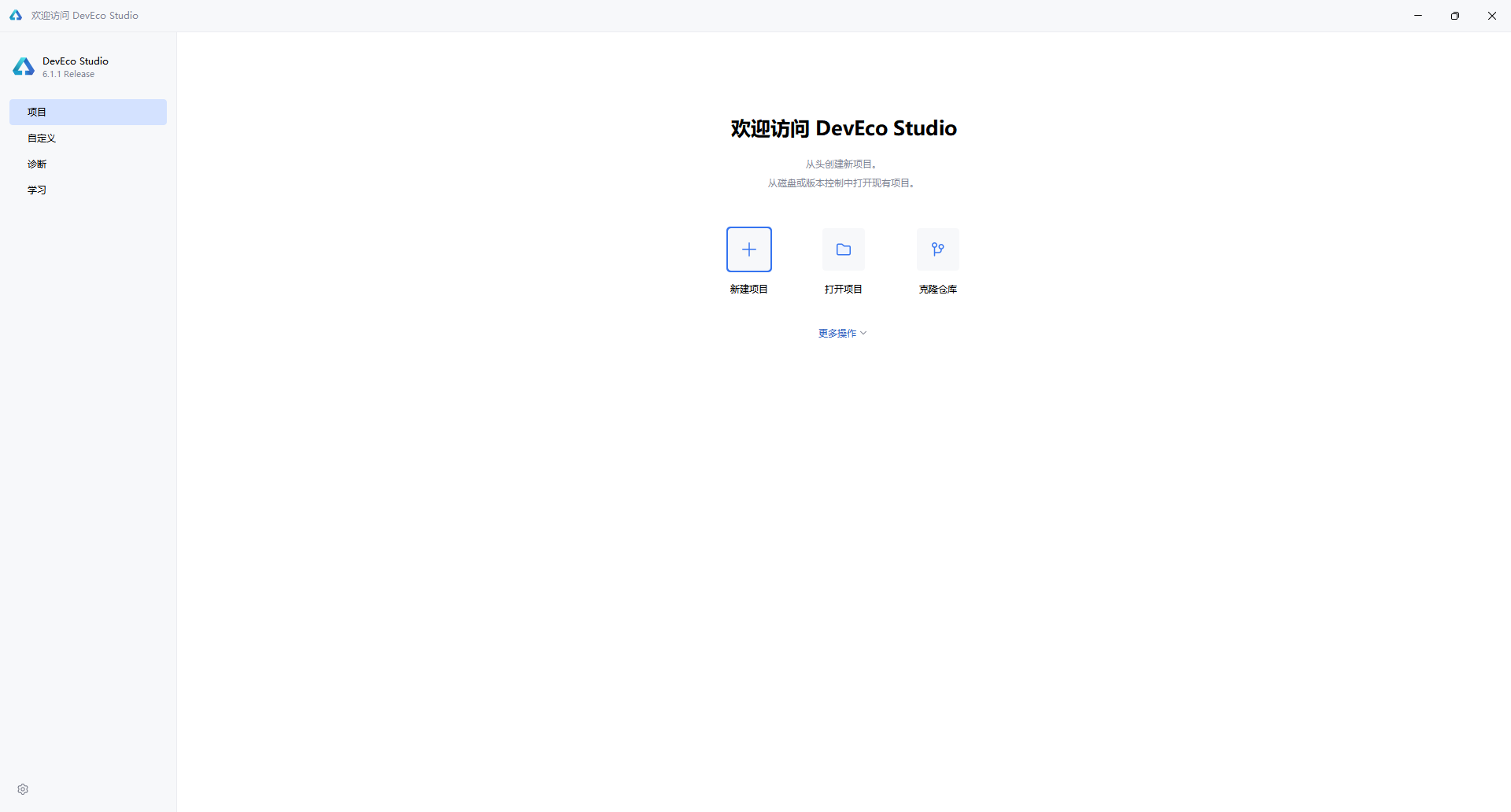
启动 DevEco Studio 后,首先看到的是欢迎界面。左侧导航栏默认选中 “项目”,右侧提供三个主要入口:
- 新建项目:从头创建新项目
- 打开项目:打开本地已有项目
- 克隆仓库:从 Git 等版本控制拉取代码
点击 “新建项目” 按钮,进入项目创建向导。
1.2 选择项目模板
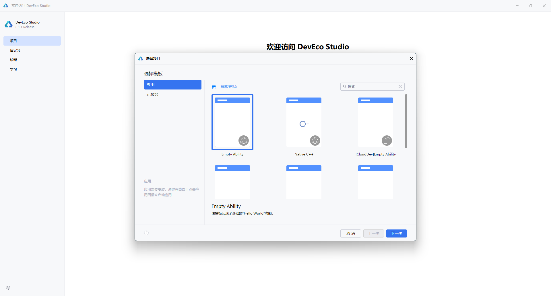
在弹出的"新建项目"对话框中,左侧分类标签提供了两种项目类型:
| 类型 | 说明 |
|---|---|
| 应用(Application) | 开发标准的 HarmonyOS 应用,具备完整的 Ability 生命周期 |
| 元服务(Atomic Service) | 开发轻量级的原子化服务,无需安装即可使用 |
选择 “应用” 标签后,右侧展示多种模板。对于大多数场景,推荐选择 “Empty Ability” —— 这是一个最基础的入门模板,仅包含 Hello World 功能,适合从零开始构建应用。
1.3 配置项目信息
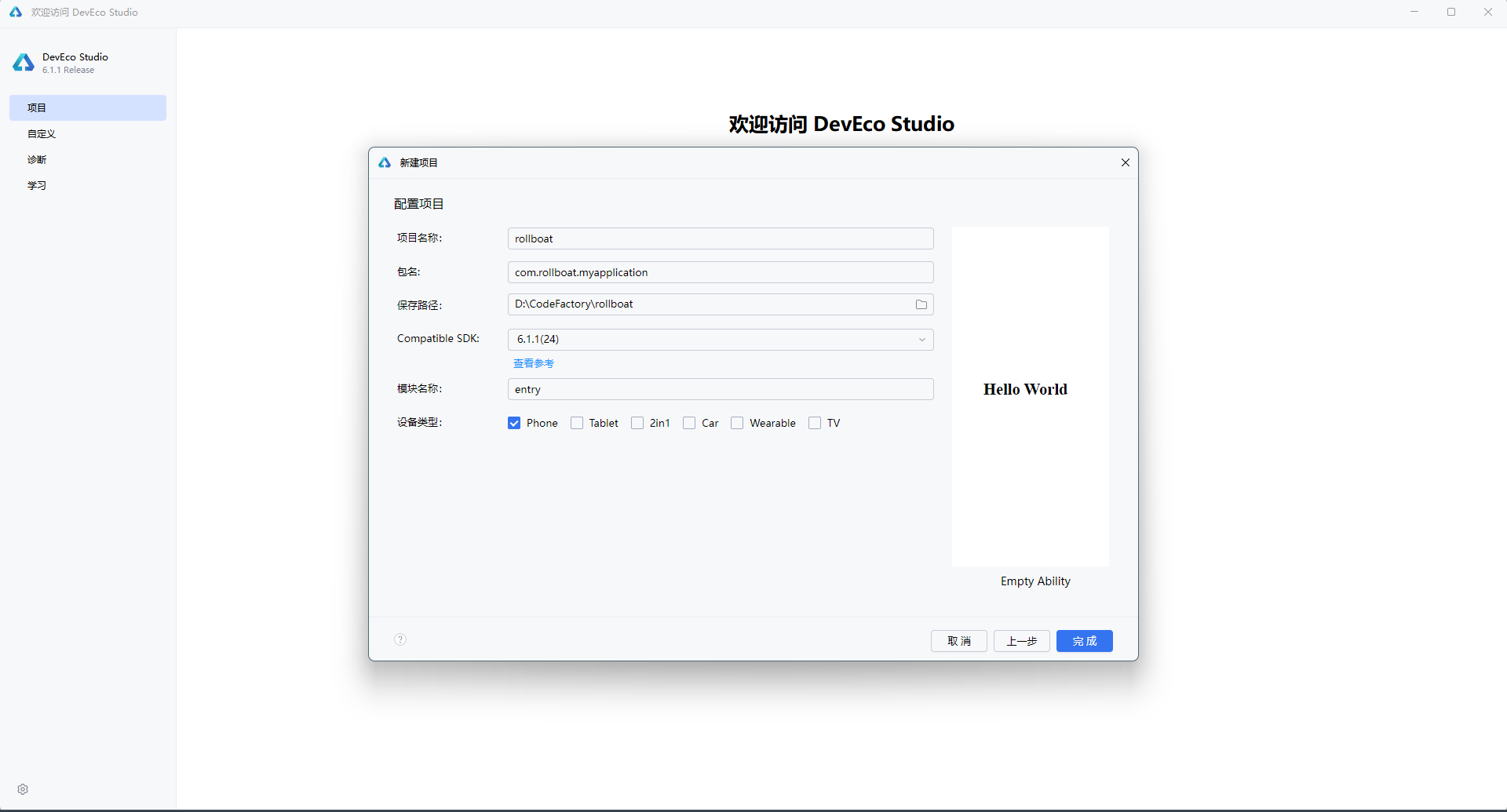
点击 “下一步” 后,进入项目配置界面,需要填写以下核心参数:
| 配置项 | 示例值 | 说明 |
|---|---|---|
| 项目名称(Project name) | rollboat | 应用的项目名称,建议使用英文命名 |
| 包名(Bundle name) | com.rollboat.myapplication | 应用唯一标识,采用反向域名格式 |
| 保存路径(Save location) | D:\CodeFactory\rollboat | 项目本地存储路径,避免使用中文和空格 |
| 兼容 SDK(Compatible SDK) | 6.1.1(24) | 目标 HarmonyOS API 版本,点击"查看参考"可了解各版本差异 |
| 模块名称(Module name) | entry | 主模块名称,默认 entry 为应用入口模块 |
| 设备类型(Device types) | ☑ Phone | 勾选目标设备:Phone / Tablet / 2in1 / Car / Wearable / TV |
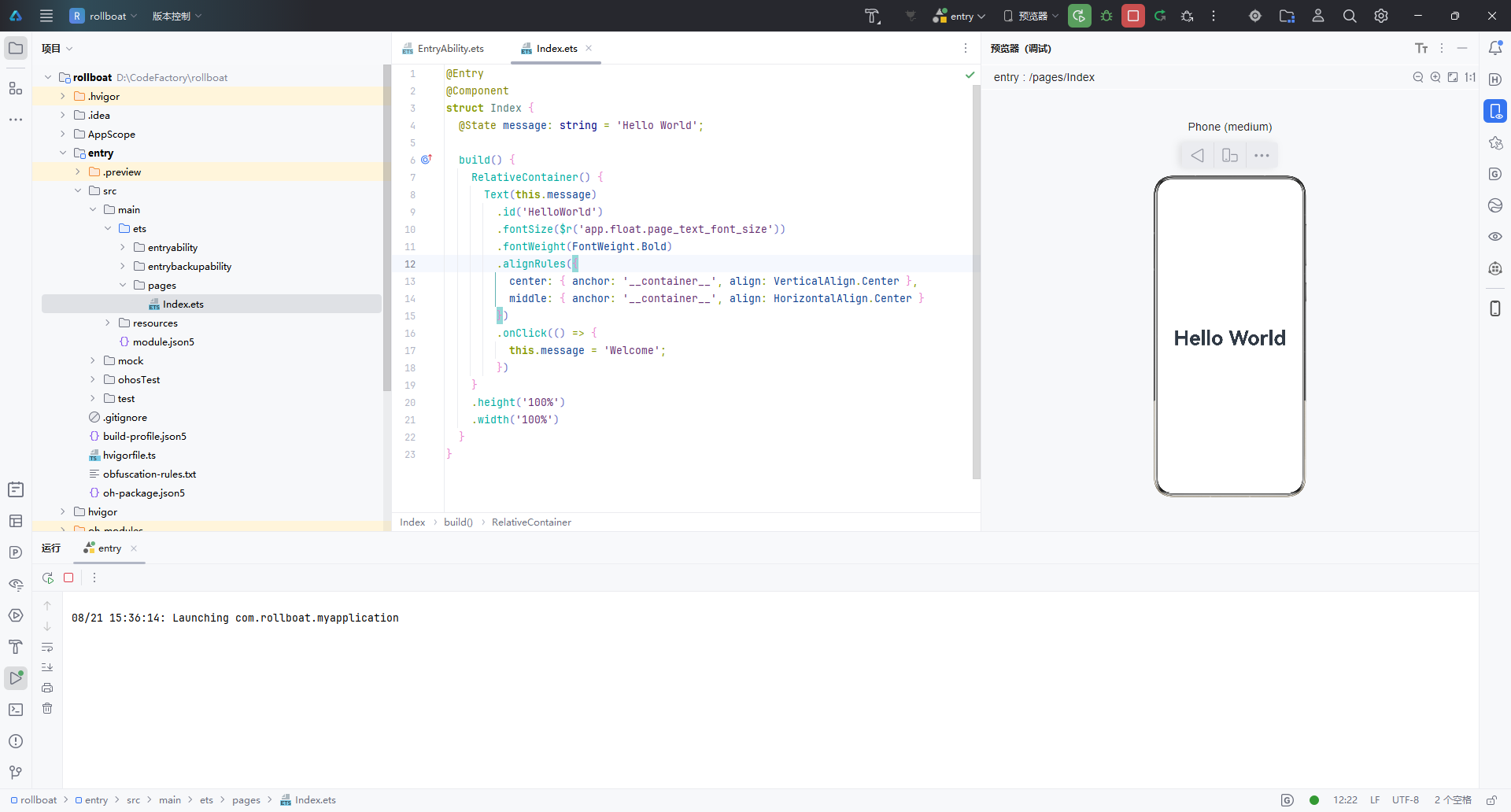
右侧预览区会实时展示当前模板的默认效果 —— 一个居中显示的 “Hello World” 文本。
1.4 完成创建
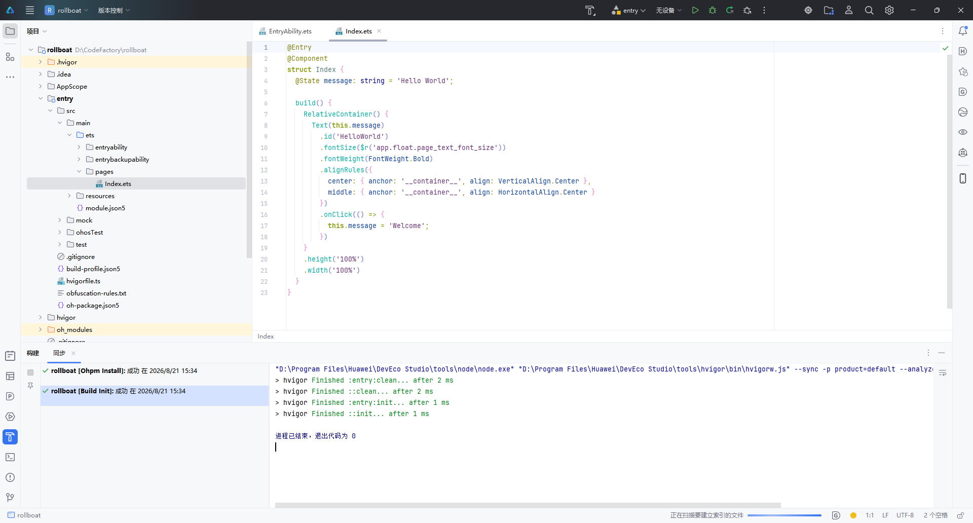
确认配置无误后,点击右下角 “完成” 按钮,IDE 将自动执行以下操作:
- 生成项目骨架(Stage 模型目录结构)
- 执行
ohpm install安装依赖 - 运行 Hvigor 构建初始化(
Build Init)
构建日志中显示 “退出代码为 0” 表示项目初始化成功。
1.5 项目结构概览
创建完成后,左侧项目面板展示的是标准的 Stage 模型 目录结构:
rollboat/
├── .hvigor/                   # Hvigor 构建工具缓存
├── .idea/                     # IDE 配置文件
├── AppScope/                  # 应用级全局配置
│   └── app.json5
├── entry/                     # 主模块(入口模块)
│   ├── src/main/ets/
│   │   ├── entryability/      # Ability 生命周期管理
│   │   │   └── EntryAbility.ets
│   │   └── pages/             # UI 页面
│   │       └── Index.ets      # 首页(默认 Hello World)
│   ├── src/main/resources/    # 资源文件
│   ├── module.json5           # 模块配置
│   └── build-profile.json5    # 构建配置
├── oh_modules/                # OHPM 依赖包
├── build-profile.json5        # 工程构建配置
├── hvigorfile.ts              # Hvigor 构建脚本
└── oh-package.json5           # 包管理配置
核心文件 Index.ets 的默认代码如下,采用 ArkTS 声明式 UI 语法:
@Entry
@Component
struct Index {
  @State message: string = 'Hello World';

  build() {
    RelativeContainer() {
      Text(this.message)
        .id('HelloWorld')
        .fontSize($r('app.float.page_text_font_size'))
        .fontWeight(FontWeight.Bold)
        .alignRules({
          center: { anchor: '__container__', align: VerticalAlign.Center },
          middle: { anchor: '__container__', align: HorizontalAlign.Center }
        })
        .onClick(() => {
          this.message = 'Welcome';
        })
    }
    .height('100%')
    .width('100%')
  }
}
| 关键语法 | 作用 |
|---|---|
@Entry | 标记为页面入口,可用于路由跳转 |
@Component | 声明为自定义组件 |
@State | 状态变量,数据变更时自动触发 UI 刷新 |
RelativeContainer | 相对布局容器,替代传统线性布局 |
.onClick() | 点击事件,此处点击后文本变为 “Welcome” |
打开右侧 Previewer(预览器),选择 Phone 设备,即可实时预览 Hello World 效果,无需连接真机或启动模拟器。
二、查看 SDK 版本
2.1 查看 HarmonyOS SDK
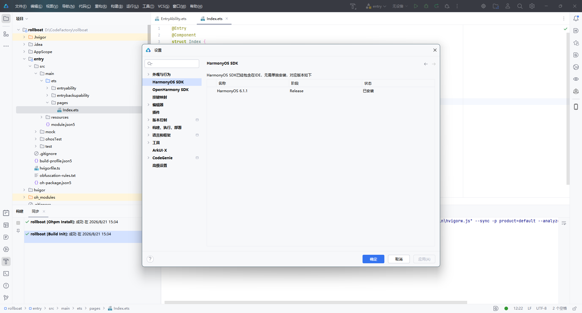
DevEco Studio 安装时已内置 HarmonyOS SDK,无需单独下载。通过以下路径查看:
文件 → 设置 → HarmonyOS SDK(或快捷键
Ctrl + Alt + S搜索 “HarmonyOS SDK”)
在设置面板中,可以看到当前已安装的 SDK 版本信息:
| 名称 | 阶段 | 状态 |
|---|---|---|
| HarmonyOS 6.1.1 | Release | ✅ 已安装 |
界面顶部提示:“HarmonyOS SDK 已经包含在 IDE,无需单独安装”,省去了手动配置 SDK 的繁琐步骤。
2.2 查看 ArkUI-X SDK(跨平台扩展)
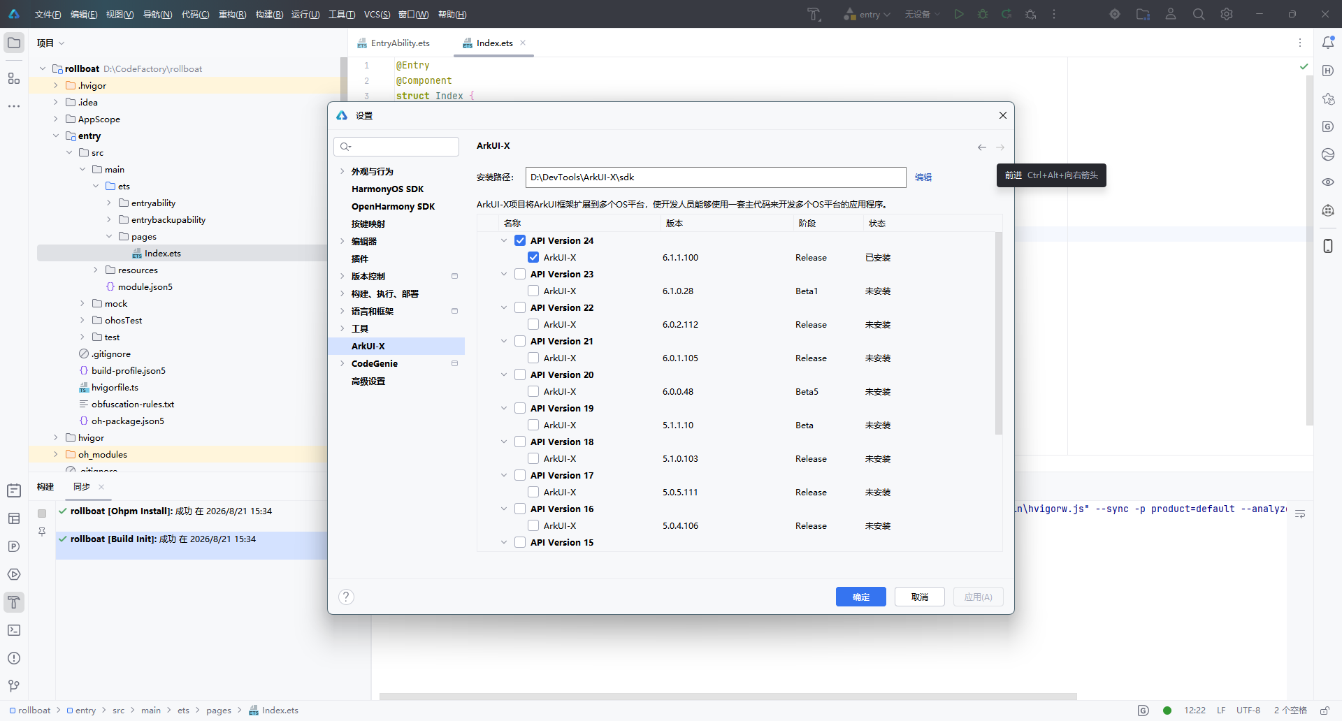
如果项目需要将 ArkUI 框架扩展到多个 OS 平台(Android / iOS / OpenHarmony),还需要配置 ArkUI-X SDK。路径如下:
文件 → 设置 → 语言和框架 → ArkUI-X
在这里可以查看已安装和可选的 ArkUI-X SDK 版本:
| 版本 | SDK 版本号 | 阶段 | 状态 |
|---|---|---|---|
| API Version 24 | 6.1.1.100 | Release | ✅ 已安装 |
| API Version 23 | 6.1.0.28 | Beta1 | 未安装 |
| API Version 22 | 6.0.2.112 | Release | 未安装 |
安装路径示例:D:\DevTools\ArkUI-X\sdk
说明:ArkUI-X 允许开发者使用一套 ArkTS 主代码,同时构建多平台应用。如果仅开发 HarmonyOS 原生应用,无需额外安装 ArkUI-X SDK。
三、小结
| 步骤 | 操作 | 关键点 |
|---|---|---|
| 创建项目 | 欢迎页 → 新建项目 → 选择 Empty Ability 模板 → 配置项目信息 → 完成 | 使用 Stage 模型 + ArkTS 语言 |
| 查看 SDK | 设置 → HarmonyOS SDK | SDK 已内置,无需手动安装 |
| 跨平台扩展 | 设置 → ArkUI-X | 根据需要安装对应 API 版本 |
至此,DevEco Studio 的项目创建与 SDK 环境确认全部完成,可以开始 HarmonyOS 应用的功能开发。

讨论HarmonyOS开发技术,专注于API与组件、DevEco Studio、测试、元服务和应用上架分发等。
更多推荐



 5
5 0
0- 0


 已为社区贡献99条内容

所有评论(0)