HarmonyOS ArkUI 共享自习室预约平台全链路:原木米与静谧绿的沉浸学习美学
一、技术前言
在共享经济蓬勃发展的当下,"共享学习空间"正成为城市青年自我提升的重要场景。从一线城市核心商圈的旗舰自习舱到社区角落的午休阅读舱,专注书房这种新型共享学习空间以其灵活按时计费、安静沉浸环境和精细座位管理三大优势,迅速吸引了考研党、考证族和远程办公人群。然而,一个优秀的共享自习室预约应用面临着诸多工程挑战:门店座位实时入座率的可视化呈现、地图精确定位与长按交互、POI 搜索结果的相关性量化展示、通知铃声的个性化定制与沙箱安全存储,以及多维度会员数据的图表化呈现——每一个功能模块都需要独立的布局架构、精细的状态管理和流畅的交互反馈。
HarmonyOS ArkUI 框架以其声明式 UI 范式为这些问题提供了系统级的解决方案。ArkUI 基于 TypeScript 扩展的 ArkTS 语言构建,其核心设计哲学包含三大支柱:声明式渲染——开发者只需描述界面"是什么"而非"怎么构建",框架通过虚拟 DOM diff 算法自动完成最小化 DOM 更新,使 UI 状态与数据模型保持同步;组件化架构——通过 @Component 装饰器将界面拆分为独立可复用的组件单元,每个组件拥有自己的状态管理和生命周期,组件间通过参数传递和回调函数实现松耦合通信;状态驱动机制——@State 装饰器监听变量变化并自动触发关联 UI 的重渲染,@Observed 装饰器使类的实例具备可观察性,当对象属性变更时通知所有引用处刷新,实现数据到视图的单向流动。这种架构天然适合预约场景中"实时数据—多维视图—即时交互"紧耦合的需求。
本平台深度融合了 HarmonyOS 的三大前沿特性。Map Kit 提供了 6.1.1 版本新增的双长按监听能力链——通过 onMarkerLongClick 回调捕获地图标注点的长按手势(回调参数为 map.Marker,可读取 getId() 和 getPosition()),通过 onPoiLongClick 回调捕获兴趣点的长按手势(回调参数为 mapCommon.Poi,仅含 id、name、position 三字段),同时配合 site.searchByText 接口实现关键字 POI 搜索,搜索结果中每个 site.Site 携带 reliability 相关性分数,量化衡量匹配程度。Notification Kit 实现了 EL1 沙箱自定义铃声链路——通过 buildWavBytes 函数动态生成正弦波 PCM 音频字节(44 字节 WAV 头 + 16bit 单声道采样数据),写入 EL1 加密等级沙箱的 filesDir 目录,再以 'uri::' + fileUri.getUriFromPath(沙箱路径) 的特殊前缀格式填入 NotificationRequest.sound 字段,使不同场景的通知可携带差异化铃声。Canvas 绘制 通过 CanvasRenderingContext2D 实现两种自定义可视化:drawRing 绘制带呼吸动画的入座率进度环(背景环 + 进度弧 + 中心大字),drawLine 绘制高峰时段在座人数折线图(网格线 + 渐变填充 + 折线 + 数据点 + 峰值标注),两者均由 1 秒间隔的 setInterval 呼吸动画联动重绘,营造"实时刷新"的视觉氛围。
二、整体架构流程图
整体架构以 Page1225 为根组件,采用 Stack 容器实现页面层叠:底层是 Column 纵向布局的头部区域 + 内容区 + 底部 Tab 栏,顶层是三组全屏弹窗遮罩(新增、编辑、删除)。内容区通过 currentTab 状态索引在六个 @Builder 方法间切换,地图 Tab 因 MapComponent 需要有界高度而独占内容区不进入 Scroll,其余五个 Tab 共享一个 Scroll 滚动容器。三大特性(Map Kit 双长按、Notification 沙箱铃声、Canvas 双图)分别挂载在地图、提醒、自习室三个 Tab 上,但它们的状态变量统一声明在组件顶层,实现跨 Tab 数据共享。数据模型层的六个 @Observed 类分别支撑各自 Tab 的列表渲染,StudyRoomItem 同时被弹窗系统引用以实现 CRUD 操作。
三、色彩体系设计
3.1 ColorPalette 接口定义
平台采用浅色"原木米 + 静谧绿"主题,通过 ColorPalette 接口集中声明全部颜色字段,使全文件色彩管理统一可控:
interface ColorPalette {
  bg: string;      // 页面背景(原木米)
  card: string;    // 卡片底色(纯白)
  chip: string;    // 浅色胶囊 / 徽章底
  sub: string;     // 副标题(灰橄榄)
  text3: string;   // 三级弱文本(浅灰橄榄)
  green: string;   // 静谧绿(主色)
  greenD: string;  // 静谧绿深色
  orange: string;  // 原木橙(辅助暖色)
  blue: string;    // 信息蓝(Marker 徽标)
  red: string;     // 警示红(近满座 / 删除)
  line: string;    // 分割线 / Canvas 网格
  tabOn: string;   // Tab 选中色
  mask: string;    // 弹窗遮罩
}
这段接口定义体现了 ArkTS 的类型安全优势。与普通 JavaScript 动态添加属性不同,ColorPalette 接口在编译期即约束所有颜色字段必须是 string 类型,任何拼写错误或类型不匹配都会在编译阶段暴露。注意接口中省略了 title 字段但在常量中补充了它——这是因为主标题色与背景色系高度相关,开发者在实现时按需扩展。接口注释采用"字段名 + 用途"的格式,使每个颜色的语义角色一目了然,后续维护者无需追踪代码即可理解色彩用途。
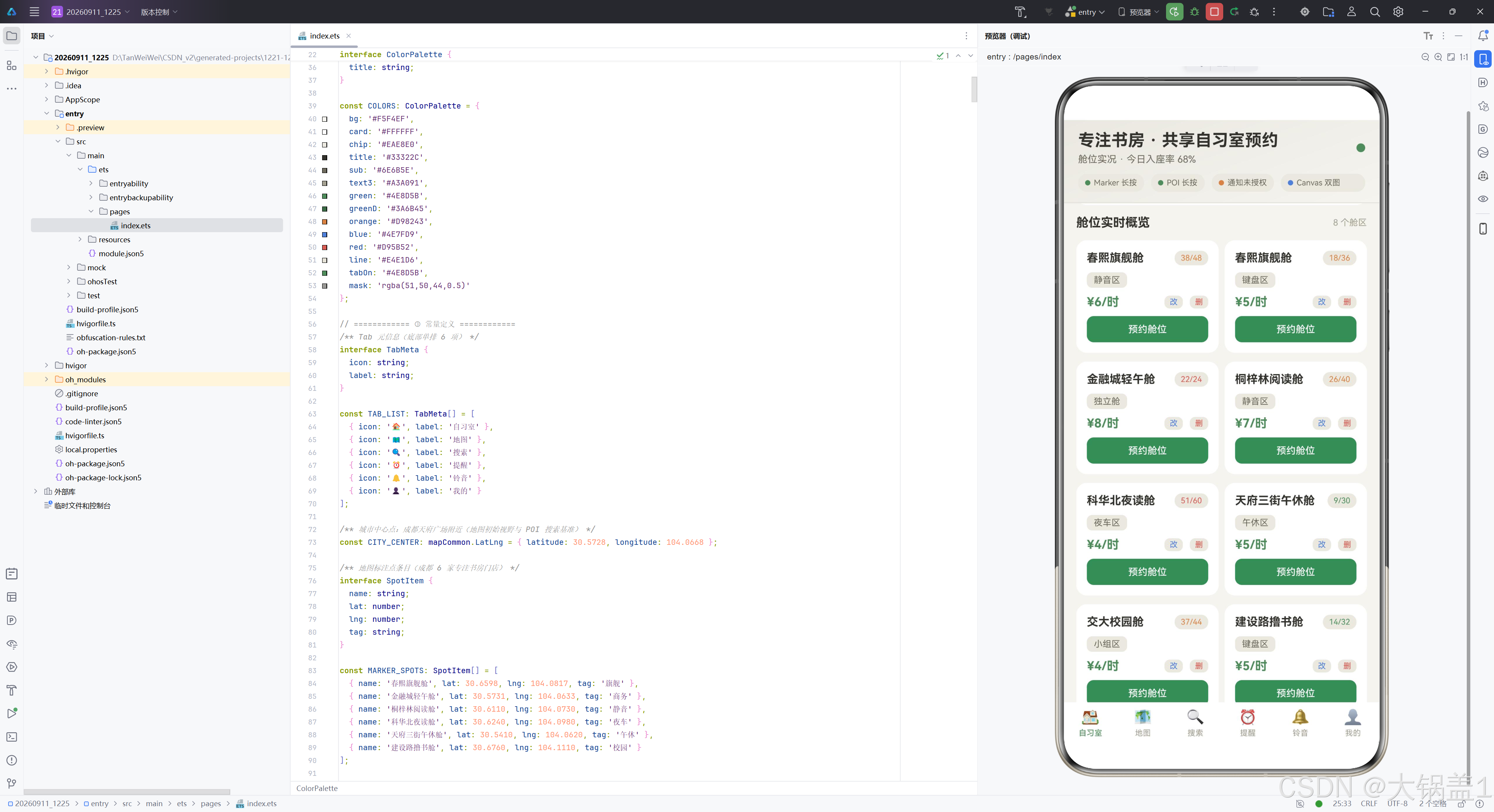
3.2 COLORS 常量逐色分析
const COLORS: ColorPalette = {
  bg: '#F5F4EF',
  card: '#FFFFFF',
  chip: '#EAE8E0',
  title: '#33322C',
  sub: '#6E6B5E',
  text3: '#A3A091',
  green: '#4E8D5B',
  greenD: '#3A6B45',
  orange: '#D98243',
  blue: '#4E7FD9',
  red: '#D95B52',
  line: '#E4E1D6',
  tabOn: '#4E8D5B',
  mask: 'rgba(51,50,44,0.5)'
};
色彩设计遵循"沉浸学习"原则,每一色都有明确的语义角色。bg 为 #F5F4EF 原木米,模拟原木书桌的温暖底色,降低白光对眼睛的刺激,适合长时间阅读场景。card 为纯白 #FFFFFF,卡片与背景形成柔和对比,保证信息区块的清晰边界。chip 为 #EAE8E0 浅米灰,用于胶囊徽章和进度条底色,与卡片底色仅差一档亮度,既区分又不突兀。
title 为 #33322C 深原木黑,主标题文字色,与浅色背景形成高对比度但不刺眼。sub 为 #6E6B5E 灰橄榄,副标题色,在标题与弱文本之间架起层次过渡。text3 为 #A3A091 浅灰橄榄,三级弱文本,用于辅助说明和时间戳,视觉权重最低。
green 为 #4E8D5B 静谧绿,平台主色,象征专注与生长,贯穿进度环弧线、价格文字、Tab 选中态和按钮背景。greenD 为 #3A6B45 静谧绿深色,用于渐变终点和已生成铃声的按钮态。orange 为 #D98243 原木橙,辅助暖色,用于距离数值、峰值标注和热门状态提示。blue 为 #4E7FD9 信息蓝,专用于 Marker 徽标和进行中状态,与主绿色形成冷暖对比。red 为 #D95B52 警示红,仅用于近满座提示和删除按钮,通过低频使用强化警示语义。line 为 #E4E1D6 分割线色,同时复用为 Canvas 网格线,低对比度不干扰内容。tabOn 与 green 同值,保证 Tab 选中态与主色一致。mask 为半透明深色 rgba(51,50,44,0.5),弹窗遮罩使用 RGBA 格式实现 50% 透明度,与原木色系协调。
四、Tab 元数据与辅助数据
4.1 底部导航 Tab 定义
interface TabMeta {
  icon: string;
  label: string;
}

const TAB_LIST: TabMeta[] = [
  { icon: '🏠', label: '自习室' },
  { icon: '🗺️', label: '地图' },
  { icon: '🔍', label: '搜索' },
  { icon: '⏰', label: '提醒' },
  { icon: '🔔', label: '铃音' },
  { icon: '👤', label: '我的' }
];
TabMeta 接口定义了 Tab 导航项的最小数据结构:icon 为 emoji 字符串,label 为中文标签文字。TAB_LIST 常量数组按顺序声明六个 Tab 项,分别对应自习室、地图、搜索、提醒、铃音和我的。这种将导航元数据与 UI 渲染分离的设计使 Tab 配置可独立维护,新增或调整 Tab 只需修改数组而无需触碰 @Builder 方法。底部导航栏在 tabBar() 构建器中通过 ForEach 遍历此数组渲染,选中态通过 currentTab 索引与 index 比较判断。
4.2 地图标注与 Canvas 数据
const CITY_CENTER: mapCommon.LatLng = { latitude: 30.5728, longitude: 104.0668 };

interface SpotItem {
  name: string;
  lat: number;
  lng: number;
  tag: string;
}

const MARKER_SPOTS: SpotItem[] = [
  { name: '春熙旗舰舱', lat: 30.6598, lng: 104.0817, tag: '旗舰' },
  { name: '金融城轻午舱', lat: 30.5731, lng: 104.0633, tag: '商务' },
  { name: '桐梓林阅读舱', lat: 30.6110, lng: 104.0730, tag: '静音' },
  { name: '科华北夜读舱', lat: 30.6240, lng: 104.0980, tag: '夜车' },
  { name: '天府三街午休舱', lat: 30.5410, lng: 104.0620, tag: '午休' },
  { name: '建设路撸书舱', lat: 30.6760, lng: 104.1110, tag: '校园' }
];
CITY_CENTER 定义了成都天府广场附近的经纬度坐标,作为地图初始视野中心和 POI 搜索的 location 基准点。SpotItem 接口定义了门店标注点的四字段结构,MARKER_SPOTS 数组包含六家专注书房门店的模拟数据,覆盖旗舰、商务、静音、夜车、午休、校园六种业态标签。这些数据在 setupMapCallback 中通过 mapController.addMarker 批量添加到地图上。
const RING_RATE: number = 0.68;
const PEAK_LABELS: string[] = ['08', '09', '10', '11', '12', '13', '14', '15', '16', '17', '18', '19'];
const PEAK_VALUES: number[] = [18, 35, 58, 76, 64, 42, 48, 70, 88, 95, 82, 56];
RING_RATE 为 0.68,表示全城 8 舱区 215/314 席的今日入座率,驱动 Canvas 进度环的弧长比例。PEAK_LABELS 和 PEAK_VALUES 为 08 至 19 点共 12 个整点的高峰时段在座人数,驱动 Canvas 折线图的 X 轴标签和 Y 轴数据点。峰值出现在 17 点 95 人,在折线图中通过橙色文字标注。
4.3 会员与预约记录数据
const MONTH_NAME: string[] = ['03', '04', '05', '06', '07', '08'];
const MONTH_HOURS: number[] = [46, 58, 63, 71, 66, 82];

interface BookingRow {
  date: string;
  room: string;
  zone: string;
  dur: string;
  status: string;
}

const BOOKING_ROWS: BookingRow[] = [
  { date: '今天', room: '春熙旗舰舱', zone: '静音区 A08', dur: '6.0h', status: '进行中' },
  { date: '08-28', room: '春熙旗舰舱', zone: '静音区 A12', dur: '3.5h', status: '已完成' },
  { date: '08-27', room: '金融城轻午舱', zone: '独立舱 C03', dur: '2.0h', status: '已完成' },
  { date: '08-26', room: '科华北夜读舱', zone: '夜车区 N21', dur: '4.5h', status: '已完成' },
  { date: '08-25', room: '桐梓林阅读舱', zone: '静音区 B07', dur: '1.5h', status: '已取消' },
  { date: '08-24', room: '建设路撸书舱', zone: '键盘区 K15', dur: '5.0h', status: '已完成' }
];
MONTH_NAME 和 MONTH_HOURS 为近 6 个月入座时长数据(单位:小时),驱动"我的"Tab 的柱状图,最高值 82h 对应当月。BookingRow 接口定义了预约记录行的五字段结构,BOOKING_ROWS 包含 6 条预约记录,覆盖"进行中"“已完成”"已取消"三种状态,每种状态由 statusColor 函数映射为不同的徽章颜色(绿/蓝/灰),状态色条以 3px 宽的竖条形式显示在每行左侧。
五、工具函数分析
5.1 搜索相关性等级映射
interface ScoreLevel {
  label: string;
  color: string;
}

function reliabilityScore(score: number): ScoreLevel {
  if (score >= 0.8) {
    return { label: '高相关', color: COLORS.green };
  }
  if (score >= 0.5) {
    return { label: '中相关', color: COLORS.orange };
  }
  return { label: '低相关', color: COLORS.text3 };
}
ScoreLevel 接口定义了相关性等级的返回结构:label 为中文标签,color 为对应颜色。reliabilityScore 函数接收 Map Kit searchByText 返回的 reliability 分数(取值范围 0 至 1),通过两道阈值判断将其分为三档:0.8 及以上为"高相关"配静谧绿、0.5 及以上为"中相关"配原木橙、其余为"低相关"配浅灰橄榄。这种分级设计使搜索结果不依赖具体数值即可凭颜色快速判断匹配质量,绿橙灰三色形成"优—中—弱"的直觉梯度。返回的对象同时携带标签文字和颜色值,调用方可直接将 label 渲染为胶囊文字、color 渲染为胶囊文字色,实现数据到视图的一步映射。
5.2 事件类型与状态颜色映射
function typeColor(type: string): string {
  if (type === 'Marker') {
    return COLORS.blue;
  }
  if (type === 'POI') {
    return COLORS.orange;
  }
  return COLORS.text3;
}

function statusColor(status: string): string {
  if (status === '已完成') {
    return COLORS.green;
  }
  if (status === '进行中') {
    return COLORS.blue;
  }
  return COLORS.text3;
}

function occColor(rate: number): string {
  if (rate >= 0.85) {
    return COLORS.red;
  }
  if (rate >= 0.5) {
    return COLORS.orange;
  }
  return COLORS.green;
}
这三个函数构成了平台的状态色彩映射体系。typeColor 将地图长按事件类型映射为徽标色:Marker 类型配信息蓝(与地图标注点视觉一致),POI 类型配原木橙(区分于 Marker),其余回退浅灰橄榄。statusColor 将预约状态映射为徽章色:已完成配静谧绿(成功语义),进行中配信息蓝(活跃语义),已取消配浅灰橄榄(弱化语义)。occColor 将在座率映射为提示色:0.85 及以上配警示红(近满座需警惕),0.5 及以上配原木橙(热门建议尽早预约),其余配静谧绿(余位充足可从容选择)。
5.3 时间戳与音频生成
function nowTime(): string {
  const d = new Date();
  const p = (n: number) => n.toString().padStart(2, '0');
  return `${p(d.getHours())}:${p(d.getMinutes())}:${p(d.getSeconds())}`;
}
nowTime 函数获取当前时刻并格式化为 HH:mm:ss 字符串。内部定义了局部函数 p,将个位数补零(如 9 变为 “09”),通过 padStart(2, '0') 实现两位补齐。该函数在地图长按事件日志和通知历史时间戳两处使用,确保时间格式统一。
function buildWavBytes(freq: number, durationMs: number): ArrayBuffer {
  const sampleRate = 44100;
  const numSamples = Math.floor(sampleRate * durationMs / 1000);
  const dataSize = numSamples * 2;
  const buf = new ArrayBuffer(44 + dataSize);
  const view = new DataView(buf);
  const writeStr = (offset: number, s: string) => {
    for (let i = 0; i < s.length; i++) {
      view.setUint8(offset + i, s.charCodeAt(i));
    }
  };
  writeStr(0, 'RIFF');
  view.setUint32(4, 36 + dataSize, true);
  writeStr(8, 'WAVE');
  writeStr(12, 'fmt ');
  view.setUint32(16, 16, true);
  view.setUint16(20, 1, true);
  view.setUint16(22, 1, true);
  view.setUint32(24, sampleRate, true);
  view.setUint32(28, sampleRate * 2, true);
  view.setUint16(32, 2, true);
  view.setUint16(34, 16, true);
  writeStr(36, 'data');
  view.setUint32(40, dataSize, true);
  for (let i = 0; i < numSamples; i++) {
    const t = i / sampleRate;
    const env = Math.min(1, i / (sampleRate * 0.02));
    const decay = Math.max(0, 1 - t / (durationMs / 1000));
    const v = Math.sin(2 * Math.PI * freq * t) * 0.5 * env * decay;
    view.setInt16(44 + i * 2, Math.round(v * 32767), true);
  }
  return buf;
}
这是平台最底层的音频生成函数,用于在客户端动态构建 WAV 格式的正弦波音频字节。函数接收频率(Hz)和时长(毫秒)两个参数,采样率固定为 44100Hz(CD 音质标准),计算出总采样数和字节数后分配 ArrayBuffer。前 44 字节为 WAV 文件头:RIFF 标识、文件大小、WAVE 格式、fmt 子块、PCM 编码(格式 1)、单声道、采样率、字节率、块对齐、16bit 量化深度、data 子块标识及数据大小。所有多字节整数的写入使用 true 参数表示小端序,符合 WAV 规范。
数据区通过循环逐采样填充:t 为当前采样对应的时间秒数,env 为起音包络(前 20ms 线性上升至 1,避免点击噪声),decay 为自然衰减包络(从 1 线性降至 0),最终波形为正弦函数乘以 0.5 振幅再乘以两个包络。setInt16 将浮点值映射到 16bit 整数范围(-32768 至 32767)并写入。此函数生成的音频可直接写入 EL1 沙箱文件,再通过 fileUri.getUriFromPath 转换为 uri:: 前缀的通知铃声,实现了从参数到可播放铃声的完整链路。
六、数据模型层
6.1 StudyRoomItem 舱位模型
@Observed export class StudyRoomItem {
  name: string;
  zone: string;
  price: number;
  seats: number;
  occupied: number;

  constructor(name: string, zone: string, price: number, seats: number, occupied: number) {
    this.name = name;
    this.zone = zone;
    this.price = price;
    this.seats = seats;
    this.occupied = occupied;
  }
}
StudyRoomItem 是平台的业务主模型,用 @Observed 装饰器修饰,表示该类的实例具备可观察性。当任何实例的属性发生变化时(如编辑后修改 price),所有引用该实例的 @State 数组会收到通知并触发 UI 刷新。五个属性分别对应门店名、区域、时价、总座位和在座数,构造函数逐字段赋值。export 关键字使该类可被其他文件引用。ROOM_LIST 常量预置了 8 条舱位数据,覆盖静音区、键盘区、独立舱、夜车区、午休区、小组区等多种区域类型,在座率从 30% 到 92% 不等,为双列卡片列表提供丰富的展示样本。
6.2 SearchRecord 搜索结果模型
@Observed export class SearchRecord {
  name: string;
  address: string;
  distance: number;
  reliability: number;

  constructor(name: string, address: string, distance: number, reliability: number) {
    this.name = name;
    this.address = address;
    this.distance = distance;
    this.reliability = reliability;
  }
}
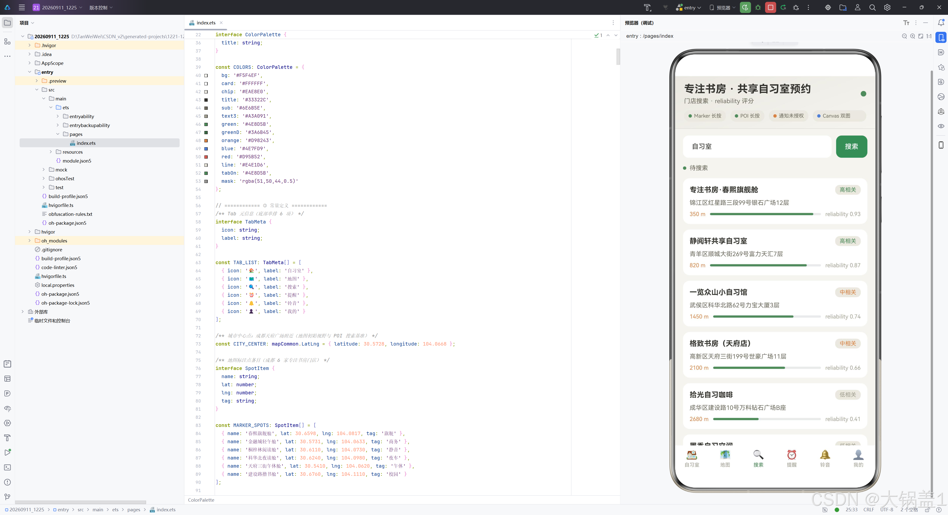
SearchRecord 封装 POI 搜索结果条目。reliability 字段是最关键的设计——它直接对应 Map Kit site.Site 对象上的同名属性,取值范围 0 至 1,量化衡量搜索结果与关键字的匹配程度。SEARCH_MOCK 预置了 6 条模拟数据,reliability 值从 0.93 到 0.28 覆盖高、中、低三档,配合 reliabilityScore 函数实现色彩分级展示。distance 字段为直线距离(米),在结果列表中以原木橙色显示,与静谧绿的 reliability 分数条形成暖冷对比。
6.3 EventLog 事件日志模型
@Observed export class EventLog {
  type: string;
  name: string;
  lat: number;
  lng: number;
  time: string;

  constructor(type: string, name: string, lat: number, lng: number, time: string) {
    this.type = type;
    this.name = name;
    this.lat = lat;
    this.lng = lng;
    this.time = time;
  }
}
EventLog 记录地图长按事件。type 区分 Marker 和 POI 两种长按来源,name 为标记 ID 或 POI 名称,lat/lng 为触发位置的经纬度,time 为触发时刻。EVENT_SEED 预置了 2 条种子数据,实际运行时通过 unshift 置顶新事件并 pop 尾部,保持最多 12 条的滑动窗口,使日志流既有初始内容又不会无限增长。
6.4 RemindItem 提醒条目模型
@Observed export class RemindItem {
  time: string;
  title: string;
  repeat: string;
  on: boolean;

  constructor(time: string, title: string, repeat: string, on: boolean) {
    this.time = time;
    this.title = title;
    this.repeat = repeat;
    this.on = boolean;
  }
}
RemindItem 封装预约提醒条目。time 为提醒时刻,title 为提醒标题,repeat 为重复规则(工作日/每天/周末),on 为开关状态。REMIND_LIST 预置了 5 条提醒,从 07:45 早鸟场到 22:30 夜车场结束,覆盖全天学习时段。on 属性驱动时间轴中每行 Toggle 的选中态和文字色——开启时时间文字配静谧绿、圆点配静谧绿;暂停时配浅灰橄榄,视觉即含义。
6.5 RingItem 与 NoticeLog 模型
@Observed export class RingItem {
  name: string;
  file: string;
  freq: number;
  duration: number;
  size: string;
  inSandbox: boolean;

  constructor(name: string, file: string, freq: number,
    duration: number, size: string, inSandbox: boolean) {
    this.name = name;
    this.file = file;
    this.freq = freq;
    this.duration = duration;
    this.size = size;
    this.inSandbox = inSandbox;
  }
}
RingItem 封装铃声库条目。name 为铃声中文名,file 为沙箱文件名,freq 和 duration 驱动 buildWavBytes 生成音频参数,size 初始为 '—' 表示未生成,生成后回填 KB 大小,inSandbox 标记是否已写入 EL1 沙箱。RING_LIST 预置了 5 条铃声(静谧水滴 880Hz、翻书轻响 660Hz、落笔沙沙 520Hz、开舱叮咚 990Hz、闭馆风铃 440Hz),频率从低到高覆盖不同听感。
@Observed export class NoticeLog {
  title: string;
  text: string;
  time: string;

  constructor(title: string, text: string, time: string) {
    this.title = title;
    this.text = text;
    this.time = time;
  }
}
NoticeLog 封装通知历史条目,仅含标题、正文和时间三字段。NOTICE_SEED 预置了 3 条种子数据(预约成功、时长提醒、闭馆提醒),实际发布通知时通过 unshift 置顶新记录并保持最多 8 条,发布失败时也会置顶一条带错误码的失败记录,保持历史流的完整可追溯。
七、组件主体结构
7.1 状态变量声明
@Entry
@Component
struct Page1225 {
  @State currentTab: number = 0;

  @State addModal: boolean = false;
  @State editModal: boolean = false;
  @State delModal: boolean = false;
  @State editIdx: number = -1;
  @State delIdx: number = -1;

  @State formName: string = '';
  @State formZone: string = '';
  @State formPrice: string = '';
  @State formSeats: string = '';

  @State breath: boolean = false;
  timer: number = -1;

  @State roomList: StudyRoomItem[] = ROOM_LIST;
  @State remindList: RemindItem[] = REMIND_LIST;
  @State ringList: RingItem[] = RING_LIST;
  @State noticeLogs: NoticeLog[] = NOTICE_SEED;
@Entry 装饰器标记此结构体为页面入口组件,@Component 声明其为可复用组件。状态变量分为四组:Tab 状态(currentTab 控制 6 个 Tab 切换)、弹窗状态(三个 boolean 控制弹窗显隐,两个 number 记录操作索引)、表单缓存(四个 string 暂存新增/编辑表单输入)、动画状态(breath 布尔值每秒翻转驱动呼吸动画,timer 非 @State 因为定时器 ID 不需触发 UI 刷新)。业务数据数组直接引用预置常量初始化,由于 @Observed 类的实例属性变更会自动触发关联 UI 刷新,这些数组支持增删改后自动重渲染。
  private mapOptions: mapCommon.MapOptions = {
    position: { target: CITY_CENTER, zoom: 13 }
  };
  private mapCallback?: AsyncCallback<map.MapComponentController>;
  private mapController?: map.MapComponentController;
  private mapEventManager?: map.MapEventManager;
  @State eventLogs: EventLog[] = EVENT_SEED;
  @State markerListenOn: boolean = true;
  @State poiListenOn: boolean = true;
  @State queryInput: string = '自习室';
  @State searchRecords: SearchRecord[] = SEARCH_MOCK;
  @State searchState: string = '待搜索';

  @State granted: boolean = false;
  notifyId: number = 100;
  @State currentRing: RingItem = RING_LIST[0];

  private ringCtx: CanvasRenderingContext2D =
    new CanvasRenderingContext2D(new RenderingContextSettings(true));
  private lineCtx: CanvasRenderingContext2D =
    new CanvasRenderingContext2D(new RenderingContextSettings(true));
Map Kit 相关状态中,mapOptions 为 private(不需 UI 刷新),定义地图初始视野以成都天府广场为中心、缩放级别 13。mapCallback 为地图初始化回调,mapController 和 mapEventManager 在回调中赋值后用于 Marker 操作和长按监听。eventLogs、markerListenOn、poiListenOn 为 @State 因为需驱动日志流和开关胶囊的 UI 刷新。queryInput、searchRecords、searchState 为搜索 Tab 的三组状态。Notification 状态中 granted 驱动授权状态卡 UI,notifyId 为自增 ID 不需刷新。两个 CanvasRenderingContext2D 实例分别为 private(Canvas 上下文不参与响应式渲染),通过 RenderingContextSettings(true) 开启抗锯齿。
7.2 生命周期方法
  aboutToAppear() {
    this.setupMapCallback();
    notificationManager.isNotificationEnabled().then((enabled: boolean) => {
      this.granted = enabled;
    }).catch((err: BusinessError) => {
      console.error(`isNotificationEnabled failed: ${err.message}`);
    });
    this.timer = setInterval(() => {
      this.breath = !this.breath;
      this.drawRing();
      this.drawLine();
    }, 1000);
  }

  aboutToDisappear() {
    clearInterval(this.timer);
  }
aboutToAppear 在组件创建后、build 执行前调用,完成三项初始化:调用 setupMapCallback 装配地图回调(内部批量添加 Marker 并注册双长按监听);异步查询通知授权状态并回填 granted;启动 1 秒间隔定时器翻转 breath 布尔值并重绘两张 Canvas 图(进度环弧长随 breath 在 1 和 0.88 之间切换实现呼吸效果,折线图在重绘时刷新)。aboutToDisappear 在组件销毁前清除定时器,防止内存泄漏。
7.3 根构建方法
  build() {
    Stack({ alignContent: Alignment.Center }) {
      Column() {
        this.headerMain()
        Divider().strokeWidth(1).color(COLORS.line)
        if (this.currentTab === 1) {
          this.tabMap()
        } else {
          Scroll() {
            Column({ space: 12 }) {
              if (this.currentTab === 0) {
                this.tabStudy()
              } else if (this.currentTab === 2) {
                this.tabSearch()
              } else if (this.currentTab === 3) {
                this.tabRemind()
              } else if (this.currentTab === 4) {
                this.tabRing()
              } else {
                this.tabMine()
              }
            }.width('100%').padding({ left: 14, right: 14, top: 12, bottom: 16 })
          }.layoutWeight(1).width('100%')
          .scrollBar(BarState.Off).edgeEffect(EdgeEffect.Spring)
        }
        this.tabBar()
      }.width('100%').height('100%')

      if (this.addModal) {
        this.panelAdd(() => { this.addModal = false; })
      }
      if (this.editModal) {
        this.panelEdit(() => { this.editModal = false; })
      }
      if (this.delModal) {
        this.panelDel(() => { this.delModal = false; })
      }
    }.width('100%').height('100%').backgroundColor(COLORS.bg)
  }
build 方法采用 Stack 层叠布局实现"主界面 + 弹窗"两层结构。底层 Column 纵向排列头部、分割线、内容区和底部 Tab 栏。内容区通过 if/else 链判断 currentTab:地图 Tab(索引 1)直接渲染 tabMap() 且不进入 Scroll(因为 MapComponent 需要有界高度通过 layoutWeight(1) 占满);其余 5 个 Tab 共享一个 Scroll 滚动容器,内部 Column 间距 12,内边距 14/14/12/16,关闭滚动条并启用弹簧边缘效果。顶层三个弹窗通过各自 @State 布尔值控制显隐,每个弹窗接收一个关闭回调用于重置状态。Stack 的背景色设为原木米 COLORS.bg。
八、头部区域详解
  @Builder
  headerMain() {
    Column({ space: 10 }) {
      Row() {
        Column({ space: 4 }) {
          Text('专注书房 · 共享自习室预约').fontSize(19).fontWeight(FontWeight.Bold)
            .fontColor(COLORS.title)
          Text(this.currentTab === 0 ? '舱位实况 · 今日入座率 68%'
            : this.currentTab === 1 ? '门店地图 · 长按标记试试'
              : this.currentTab === 2 ? '门店搜索 · reliability 评分'
                : this.currentTab === 3 ? '预约提醒 · 沙箱铃声通知'
                  : this.currentTab === 4 ? '铃声坊 · EL1 沙箱音频'
                    : '我的自习 · 会员时长').fontSize(11).fontColor(COLORS.sub)
        }.alignItems(HorizontalAlign.Start).layoutWeight(1)

        Circle({ width: 10, height: 10 }).fill(COLORS.green)
          .opacity(this.breath ? 1 : 0.4)
      }.width('100%')

      Row({ space: 8 }) {
        Row({ space: 4 }) {
          Circle({ width: 6, height: 6 })
            .fill(this.markerListenOn ? COLORS.green : COLORS.orange)
          Text('Marker 长按').fontSize(9).fontColor(COLORS.sub)
        }.padding({ left: 8, right: 8, top: 5, bottom: 5 })
        .borderRadius(10).backgroundColor(COLORS.chip)

        Row({ space: 4 }) {
          Circle({ width: 6, height: 6 })
            .fill(this.poiListenOn ? COLORS.green : COLORS.orange)
          Text('POI 长按').fontSize(9).fontColor(COLORS.sub)
        }.padding({ left: 8, right: 8, top: 5, bottom: 5 })
        .borderRadius(10).backgroundColor(COLORS.chip)

        Row({ space: 4 }) {
          Circle({ width: 6, height: 6 })
            .fill(this.granted ? COLORS.green : COLORS.orange)
          Text(this.granted ? '通知已授权' : '通知未授权').fontSize(9).fontColor(COLORS.sub)
        }.padding({ left: 8, right: 8, top: 5, bottom: 5 })
        .borderRadius(10).backgroundColor(COLORS.chip)

        Row({ space: 4 }) {
          Circle({ width: 6, height: 6 }).fill(COLORS.blue)
          Text('Canvas 双图').fontSize(9).fontColor(COLORS.sub)
        }.padding({ left: 8, right: 8, top: 5, bottom: 5 })
        .borderRadius(10).backgroundColor(COLORS.chip).layoutWeight(1)
      }.width('100%')
    }.padding({ left: 16, right: 16, top: 12, bottom: 12 }).width('100%')
    .linearGradient({ angle: 160, colors: [[COLORS.chip, 0], [COLORS.bg, 1]] })
  }
头部区域是整个应用的"状态总览面板",由两行内容构成。第一行为应用标题行:左侧 Column 包含 19 号粗体主标题"专注书房 · 共享自习室预约"和 11 号副标题,副标题通过六重三元运算符与 currentTab 联动,每个 Tab 对应一句简短的功能描述(如"舱位实况 · 今日入座率 68%""门店地图 · 长按标记试试"等),使用户切换 Tab 时立即看到上下文确认。右侧为一个 10px 的静谧绿圆点,透明度随 breath 在 1 和 0.4 之间切换,实现"心跳呼吸"效果提示实时刷新。
第二行为四枚特性状态胶囊,采用 Row({ space: 8 }) 横向排布,每枚胶囊由一个 6px 圆点 + 文字标签组成,背景色为浅米灰 COLORS.chip,圆角 10。前两枚反映 Map Kit 双长按监听状态(Marker/POI),圆点颜色随 markerListenOn/poiListenOn 在静谧绿(开启)和原木橙(关闭)间切换。第三枚反映通知授权状态,文字和圆点随 granted 变化。第四枚为静态的"Canvas 双图"标识,圆点固定信息蓝。最后一枚胶囊使用 layoutWeight(1) 占满剩余宽度使布局右对齐。头部整体使用 160 度角度的线性渐变,从浅米灰到原木米实现柔和过渡。
九、自习室 Tab 深度分析
9.1 Canvas 进度环卡
  @Builder
  ringCard() {
    Column({ space: 8 }) {
      Row() {
        Text('今日入座率').fontSize(14).fontWeight(FontWeight.Bold)
          .fontColor(COLORS.title).layoutWeight(1)
        Text('全城 8 舱区 · 实时').fontSize(10).fontColor(COLORS.text3)
      }.width('100%')
      Row({ space: 14 }) {
        Canvas(this.ringCtx).width(168).height(168)
          .onReady(() => {
            this.drawRing();
          })
        Column({ space: 8 }) {
          Text('在座 215 人').fontSize(12).fontWeight(FontWeight.Bold).fontColor(COLORS.title)
          Text('空余 99 席').fontSize(12).fontColor(COLORS.sub)
          Text('晚高峰 17~19 点最紧张,建议提前 1 小时锁舱;静音区余位长期紧张,可切换键盘区。')
            .fontSize(10).fontColor(COLORS.text3)
        }.layoutWeight(1).alignItems(HorizontalAlign.Start)
      }.width('100%').alignItems(VerticalAlign.Center)
    }.width('100%').padding(14).backgroundColor(COLORS.card).borderRadius(12)
  }
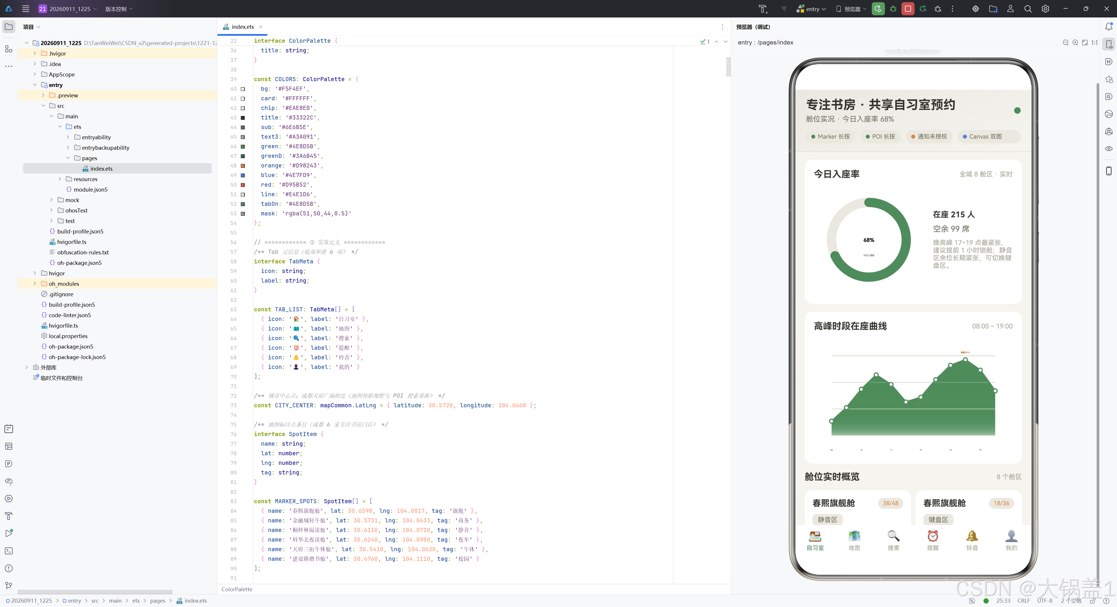
进度环卡由标题行和内容行两部分构成。标题行左侧为 14 号粗体"今日入座率",右侧为 10 号"全城 8 舱区 · 实时"弱文本。内容行采用 Row({ space: 14 }) 横向布局:左侧为 168x168 的 Canvas 组件,绑定 ringCtx 上下文,在 onReady 回调中调用 drawRing() 完成首绘;右侧为 Column 信息区,展示在座 215 人、空余 99 席的绝对数字和一段运营建议文案。这种"图形 + 文字"的并排布局使用户既可通过进度环直觉感知入座率,又可通过具体数字精确决策。
9.2 drawRing 绘制原理
  drawRing() {
    const ctx = this.ringCtx;
    const w = ctx.width;
    if (w <= 0) { return; }
    const cx = w / 2;
    const cy = w / 2;
    const r = w * 0.34;
    const lw = Math.round(w * 0.082);
    const rate = RING_RATE;
    const wave = this.breath ? 1 : 0.88;
    // 背景环
    ctx.beginPath();
    ctx.arc(cx, cy, r, 0, Math.PI * 2);
    ctx.strokeStyle = COLORS.chip;
    ctx.lineWidth = lw;
    ctx.lineCap = 'round';
    ctx.stroke();
    // 进度弧
    ctx.beginPath();
    ctx.arc(cx, cy, r, -Math.PI / 2, -Math.PI / 2 + Math.PI * 2 * rate * wave);
    ctx.strokeStyle = COLORS.green;
    ctx.lineWidth = lw;
    ctx.lineCap = 'round';
    ctx.stroke();
    // 中心大字
    ctx.fillStyle = COLORS.title;
    ctx.font = `bold ${Math.round(w * 0.14)}px sans-serif`;
    ctx.textAlign = 'center';
    ctx.fillText(`${Math.round(rate * 100)}%`, cx, cy + w * 0.02);
    // 副标签
    ctx.fillStyle = COLORS.text3;
    ctx.font = `${Math.max(9, Math.round(w * 0.062))}px sans-serif`;
    ctx.fillText('今日入座率', cx, cy + w * 0.15);
  }
drawRing 绘制由四层叠加而成。首先计算几何参数:圆心 (cx, cy) 在画布正中,半径 r 为宽度的 34%,线宽 lw 为宽度的 8.2%,进度率取常量 0.68,呼吸系数 wave 随 breath 在 1 和 0.88 之间切换(使进度弧弧长每秒微缩再恢复,模拟"心跳")。第一层为背景环:以 chip 浅米灰色绘制完整圆环,线帽圆角。第二层为进度弧:从 12 点方向(-PI/2)起画,弧长为 2π × 0.68 × wave,静谧绿描边。第三层为中心大字:以 title 深原木黑色、粗体绘制"68%“百分比。第四层为副标签"今日入座率”,以 text3 浅灰橄榄色绘制在百分比下方。整个绘制过程在 aboutToAppear 的 1 秒定时器中被反复调用,实现呼吸动画。
9.3 高峰折线卡与 drawLine 绘制
  @Builder
  peakCard() {
    Column({ space: 8 }) {
      Row() {
        Text('高峰时段在座曲线').fontSize(14).fontWeight(FontWeight.Bold)
          .fontColor(COLORS.title).layoutWeight(1)
        Text('08:00 ~ 19:00').fontSize(10).fontColor(COLORS.text3)
      }.width('100%')
      Canvas(this.lineCtx).width('100%').height(180)
        .onReady(() => {
          this.drawLine();
        })
    }.width('100%').padding(14).backgroundColor(COLORS.card).borderRadius(12)
  }
折线卡的标题行展示"高峰时段在座曲线"和时间范围"08:00 ~ 19:00",内容区为全宽 180 高的 Canvas,绑定 lineCtx 上下文,在 onReady 中首绘。
  drawLine() {
    const ctx = this.lineCtx;
    const w = ctx.width;
    const h = ctx.height;
    if (w <= 0 || h <= 0) { return; }
    const padX = Math.round(w * 0.09);
    const padY = Math.round(h * 0.16);
    const max = 100;
    const stepX = (w - padX * 2) / (PEAK_VALUES.length - 1);
    // 背景网格
    ctx.strokeStyle = COLORS.line;
    ctx.lineWidth = 1;
    for (let i = 0; i <= 3; i++) {
      const y = padY + (h - padY * 2) * i / 3;
      ctx.beginPath();
      ctx.moveTo(padX, y);
      ctx.lineTo(w - padX, y);
      ctx.stroke();
    }
    // 渐变填充
    const grad = ctx.createLinearGradient(0, padY, 0, h - padY);
    grad.addColorStop(0, COLORS.green);
    grad.addColorStop(1, 'rgba(78,141,91,0.05)');
    ctx.beginPath();
    ctx.moveTo(padX, h - padY);
    for (let i = 0; i < PEAK_VALUES.length; i++) {
      const x = padX + i * stepX;
      const y = h - padY - (PEAK_VALUES[i] / max) * (h - padY * 2);
      ctx.lineTo(x, y);
    }
    ctx.lineTo(w - padX, h - padY);
    ctx.closePath();
    ctx.fillStyle = grad;
    ctx.fill();
    // 折线主线
    ctx.beginPath();
    for (let i = 0; i < PEAK_VALUES.length; i++) {
      const x = padX + i * stepX;
      const y = h - padY - (PEAK_VALUES[i] / max) * (h - padY * 2);
      if (i === 0) { ctx.moveTo(x, y); } else { ctx.lineTo(x, y); }
    }
    ctx.strokeStyle = COLORS.green;
    ctx.lineWidth = 2;
    ctx.stroke();
    // 数据点
    for (let i = 0; i < PEAK_VALUES.length; i++) {
      const x = padX + i * stepX;
      const y = h - padY - (PEAK_VALUES[i] / max) * (h - padY * 2);
      ctx.beginPath();
      ctx.arc(x, y, 3, 0, Math.PI * 2);
      ctx.fillStyle = COLORS.card;
      ctx.fill();
      ctx.strokeStyle = COLORS.green;
      ctx.lineWidth = 1.5;
      ctx.stroke();
    }
    // 峰值标注
    const peakIdx = 9;
    const px = padX + peakIdx * stepX;
    const py = h - padY - (PEAK_VALUES[peakIdx] / max) * (h - padY * 2);
    ctx.fillStyle = COLORS.orange;
    ctx.font = `${Math.max(9, Math.round(w * 0.026))}px sans-serif`;
    ctx.textAlign = 'center';
    ctx.fillText('峰值 95 人', px, py - 10);
    // 横轴标签
    ctx.fillStyle = COLORS.text3;
    for (let i = 0; i < PEAK_LABELS.length; i += 2) {
      const x = padX + i * stepX;
      ctx.fillText(PEAK_LABELS[i], x, h - 6);
    }
  }
drawLine 绘制由六层叠加而成。首先计算内边距 padX/padY 和数据点间距 stepX。第一层为 4 条水平网格线,以 line 分割色绘制,将纵向空间均分为 4 档。第二层为渐变填充区域:从折线起点到末点沿数据点连线,再闭合到 X 轴底边,使用从静谧绿到近透明的线性渐变填充。第三层为折线主线:依次连接 12 个数据点,静谧绿 2px 描边。第四层为白心绿边的数据点圆点:每个数据点画半径 3 的圆,白色填充绿色描边。第五层为峰值标注:在 17 点(索引 9)的数据点上方 10px 处用原木橙绘制"峰值 95 人"文字。第六层为横轴时间标签:每隔一个索引绘制时间标签(08、10、12、14、16、18),避免拥挤。与进度环一样,此函数在 1 秒定时器中被反复调用重绘。
9.4 舱位双列卡片
  @Builder
  tabStudy() {
    Column({ space: 12 }) {
      this.ringCard()
      this.peakCard()

      Row() {
        Text('舱位实时概览').fontSize(14).fontWeight(FontWeight.Bold)
          .fontColor(COLORS.title).layoutWeight(1)
        Text(`${this.roomList.length} 个舱区`).fontSize(10).fontColor(COLORS.text3)
      }.width('100%')

      Flex({ wrap: FlexWrap.Wrap, justifyContent: FlexAlign.SpaceBetween }) {
        ForEach(this.roomList, (room: StudyRoomItem, idx: number) => {
          Column({ space: 8 }) {
            Row() {
              Text(room.name).fontSize(13).fontWeight(FontWeight.Bold).fontColor(COLORS.title)
                .layoutWeight(1).maxLines(1).textOverflow({ overflow: TextOverflow.Ellipsis })
              Text(`${room.occupied}/${room.seats}`).fontSize(9)
                .fontColor(occColor(room.occupied / room.seats))
                .padding({ left: 7, right: 7, top: 3, bottom: 3 })
                .borderRadius(8).backgroundColor(COLORS.chip)
            }.width('100%')

            Text(room.zone).fontSize(10).fontColor(COLORS.sub)
              .padding({ left: 8, right: 8, top: 3, bottom: 3 })
              .borderRadius(6).backgroundColor(COLORS.chip)
              .alignSelf(ItemAlign.Start)

            Row({ space: 8 }) {
              Text(`¥${room.price}/时`).fontSize(14).fontWeight(FontWeight.Bold)
                .fontColor(COLORS.green).layoutWeight(1)
              Text('改').fontSize(9).fontColor(COLORS.blue)
                .padding({ left: 6, right: 6, top: 2, bottom: 2 })
                .borderRadius(6).backgroundColor(COLORS.chip)
                .onClick(() => { this.openEdit(idx); })
              Text('删').fontSize(9).fontColor(COLORS.red)
                .padding({ left: 6, right: 6, top: 2, bottom: 2 })
                .borderRadius(6).backgroundColor(COLORS.chip)
                .onClick(() => { this.openDel(idx); })
            }.width('100%')

            Button('预约舱位').height(30).fontSize(11).borderRadius(8)
              .fontColor(COLORS.card).backgroundColor(COLORS.green).width('100%')
              .onClick(() => { this.openAdd(room.name); })
          }.width('49%').padding(12).backgroundColor(COLORS.card).borderRadius(12)
          .margin({ bottom: 10 })
        }, (room: StudyRoomItem, idx: number) => room.name + room.zone + idx.toString())
      }.width('100%')
    }.width('100%')
  }
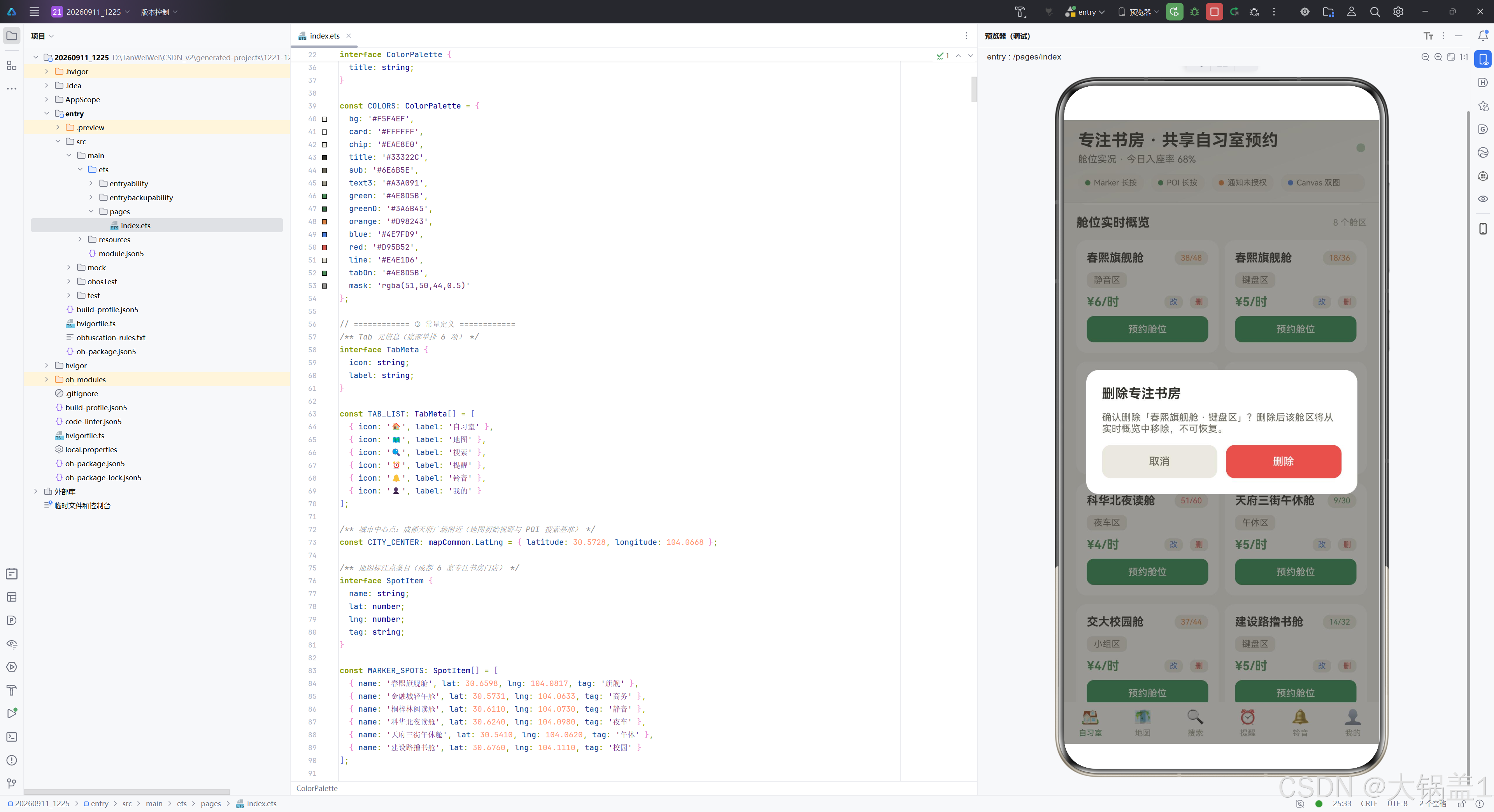
tabStudy 是自习室 Tab 的根构建器,纵向排列进度环卡、折线卡、标题行和双列舱位卡片。双列卡片使用 Flex({ wrap: FlexWrap.Wrap, justifyContent: FlexAlign.SpaceBetween }) 实现自动换行的双列布局,每个卡片宽度 49% 留 2% 间距。ForEach 遍历 roomList 数组渲染每个舱位卡片,卡片内部结构为四层:门店名行(左对齐粗体名称 + 右侧在座数徽章,徽章颜色由 occColor 根据在座率映射)、区域徽章(左对齐胶囊标签)、价格操作行(静谧绿粗体价格 + "改"蓝色文字按钮 + "删"红色文字按钮)、预约舱位按钮(静谧绿底白字)。三个操作按钮分别触发 openEdit、openDel 和 openAdd,其中"预约舱位"按钮将门店名预填到新增弹窗。ForEach 的第三参数为键值生成函数 room.name + room.zone + idx.toString(),确保列表项的唯一标识稳定。
十、地图 Tab 深度分析
10.1 地图初始化与双长按监听
  setupMapCallback() {
    this.mapCallback = async (err: BusinessError, mapController: map.MapComponentController) => {
      if (err) {
        console.error(`Map init failed, code: ${err.code}, message: ${err.message}`);
        return;
      }
      this.mapController = mapController;
      this.mapEventManager = mapController.getEventManager();
      for (const spot of MARKER_SPOTS) {
        const markerOptions: mapCommon.MarkerOptions = {
          position: { latitude: spot.lat, longitude: spot.lng },
          clickable: true, visible: true, rotation: 0,
          zIndex: 0, alpha: 1, anchorU: 0.5, anchorV: 1,
          draggable: false, flat: false
        };
        try {
          await this.mapController.addMarker(markerOptions);
        } catch (e) {
          console.error(`addMarker failed: ${(e as BusinessError).message}`);
        }
      }
      this.mapEventManager.onMarkerLongClick((marker: map.Marker) => {
        this.eventLogs.unshift(new EventLog('Marker',
          `#${marker.getId()} 门店标记`, marker.getPosition().latitude,
          marker.getPosition().longitude, nowTime()));
        if (this.eventLogs.length > 12) { this.eventLogs.pop(); }
      });
      this.mapEventManager.onPoiLongClick((poi: mapCommon.Poi) => {
        this.eventLogs.unshift(new EventLog('POI', poi.name,
          poi.position.latitude, poi.position.longitude, nowTime()));
        if (this.eventLogs.length > 12) { this.eventLogs.pop(); }
      });
    };
  }
setupMapCallback 是 Map Kit 能力链的入口。回调函数为 async 异步函数,接收错误对象和地图控制器两个参数。初始化流程分为三步:第一步将 mapController 保存到实例属性,通过 getEventManager() 获取事件管理器。第二步遍历 MARKER_SPOTS 数组,为每个门店构造 MarkerOptions(位置经纬度、可点击、可见、锚点底部居中),逐个 await 调用 addMarker 异步添加,每个调用包裹 try-catch 确保单点失败不阻断后续。第三步注册双长按监听:onMarkerLongClick 回调接收 map.Marker 对象,通过 getId() 获取标记 ID、getPosition() 获取经纬度,构造 EventLog 置顶到日志流;onPoiLongClick 回调接收 mapCommon.Poi 对象(仅含 name 和 position),同样构造日志置顶。两个监听均保持日志最多 12 条的滑动窗口。
10.2 监听开关与搜索
  toggleMarkerListen() {
    if (!this.mapEventManager) { return; }
    if (this.markerListenOn) {
      this.mapEventManager.offMarkerLongClick();
    } else {
      this.mapEventManager.onMarkerLongClick((marker: map.Marker) => {
        this.eventLogs.unshift(new EventLog('Marker',
          `#${marker.getId()} 门店标记`, marker.getPosition().latitude,
          marker.getPosition().longitude, nowTime()));
        if (this.eventLogs.length > 12) { this.eventLogs.pop(); }
      });
    }
    this.markerListenOn = !this.markerListenOn;
  }
toggleMarkerListen 实现 Marker 长按监听的开关注入。当当前为开启状态时调用 offMarkerLongClick()(不传参即清除该类型全部订阅)关闭监听,反之重新注册监听回调。最后翻转 markerListenOn 状态驱动头部胶囊 UI 刷新。togglePoiListen 逻辑完全对称。
  async runSearch() {
    this.searchState = '搜索中…';
    const params: site.SearchByTextParams = {
      query: this.queryInput,
      location: CITY_CENTER,
      radius: 5000,
      language: 'zh'
    };
    try {
      const result: site.SearchByTextResult = await site.searchByText(params);
      const sites: site.Site[] = result.sites ?? [];
      if (sites.length === 0) {
        this.searchState = '无结果,已保留当前推荐';
        return;
      }
      this.searchRecords = sites.map((s: site.Site) => new SearchRecord(
        s.name ?? '未命名地点', s.formatAddress ?? '暂无地址',
        s.distance ?? 0, s.reliability ?? 0));
      this.searchState = `返回 ${sites.length} 条结果`;
    } catch (e) {
      const err = e as BusinessError;
      this.searchState = `搜索失败(${err.code}),保留当前推荐`;
    }
  }
runSearch 调用 Map Kit 的 site.searchByText 接口执行关键字 POI 搜索。搜索参数包含查询关键字、中心坐标(成都天府广场)、5 公里搜索半径和中文语言。try-catch 结构确保无 AGC 配置或无网络时不会崩溃:成功且有结果时将 site.Site 数组映射为 SearchRecord 数组(使用 ?? 空值合并运算符对每个字段兜底),更新搜索状态文案;空结果时保留当前推荐并提示;异常时保留 Mock 数据并显示错误码。这种"优雅降级"设计使搜索功能在网络不可用时仍保持可用性。
10.3 地图 Tab 布局
  @Builder
  tabMap() {
    Column({ space: 10 }) {
      Row({ space: 10 }) {
        Row({ space: 6 }) {
          Toggle({ type: ToggleType.Switch, isOn: this.markerListenOn })
            .width(36).height(20).selectedColor(COLORS.green)
            .onChange(() => { this.toggleMarkerListen(); })
          Text('Marker 长按').fontSize(11)
            .fontColor(this.markerListenOn ? COLORS.title : COLORS.text3)
        }.padding({ left: 10, right: 10, top: 8, bottom: 8 })
        .backgroundColor(COLORS.card).borderRadius(10).layoutWeight(1)

        Row({ space: 6 }) {
          Toggle({ type: ToggleType.Switch, isOn: this.poiListenOn })
            .width(36).height(20).selectedColor(COLORS.green)
            .onChange(() => { this.togglePoiListen(); })
          Text('POI 长按').fontSize(11)
            .fontColor(this.poiListenOn ? COLORS.title : COLORS.text3)
        }.padding({ left: 10, right: 10, top: 8, bottom: 8 })
        .backgroundColor(COLORS.card).borderRadius(10).layoutWeight(1)
      }.width('100%')

      MapComponent({ mapOptions: this.mapOptions, mapCallback: this.mapCallback })
        .layoutWeight(1).width('100%').borderRadius(12)

      Column({ space: 6 }) {
        Row() {
          Text('长按事件日志').fontSize(12).fontWeight(FontWeight.Bold)
            .fontColor(COLORS.title).layoutWeight(1)
          Text(`${this.eventLogs.length} 条`).fontSize(10).fontColor(COLORS.text3)
        }.width('100%')
        List({ space: 6 }) {
          ForEach(this.eventLogs, (log: EventLog) => {
            ListItem() {
              Row({ space: 8 }) {
                Text(log.type).fontSize(9).fontColor(COLORS.card)
                  .padding({ left: 6, right: 6, top: 2, bottom: 2 })
                  .borderRadius(4).backgroundColor(typeColor(log.type))
                Text(log.name).fontSize(11).fontColor(COLORS.title)
                  .layoutWeight(1).maxLines(1)
                  .textOverflow({ overflow: TextOverflow.Ellipsis })
                Text(`${log.lat.toFixed(4)}, ${log.lng.toFixed(4)}`)
                  .fontSize(9).fontColor(COLORS.text3)
                Text(log.time).fontSize(9).fontColor(COLORS.text3)
              }.width('100%')
            }
          }, (log: EventLog) => log.type + log.name + log.time)
        }.width('100%').height(96).scrollBar(BarState.Off)
      }.width('100%').padding(10).backgroundColor(COLORS.card).borderRadius(12)
    }.width('100%').layoutWeight(1)
    .padding({ left: 14, right: 14, top: 12, bottom: 12 })
  }
地图 Tab 布局为纵向三段式。第一段为双 Toggle 开关行:Marker 长按和 POI 长按各一个 Switch 型 Toggle,均等分宽度,Toggle 选中色为静谧绿,文字色随开关状态在 title 和 text3 间切换。第二段为 MapComponent 本体,通过 layoutWeight(1) 占满中间剩余高度(这是地图 Tab 不进入 Scroll 的根本原因——MapComponent 需要有界高度),圆角 12。第三段为长按事件日志卡:标题行显示"长按事件日志"和条数,List 高度固定 96 可独立滚动,每条日志由类型徽标(Marker 蓝/POI 橙背景白字)、名称、经纬度(保留 4 位小数)和时间四部分横排构成。整个 Tab 使用 layoutWeight(1) 占满内容区高度,内边距 14/14/12/12。
十一、搜索 Tab 深度分析
  @Builder
  tabSearch() {
    Column({ space: 12 }) {
      Row({ space: 8 }) {
        TextInput({ text: this.queryInput, placeholder: '输入关键字,如:自习室' })
          .layoutWeight(1).height(40).fontSize(12)
          .fontColor(COLORS.title).placeholderColor(COLORS.text3)
          .backgroundColor(COLORS.card).borderRadius(10)
          .onChange((value: string) => { this.queryInput = value; })
        Button('搜索').height(40).fontSize(12).borderRadius(10)
          .fontColor(COLORS.card).backgroundColor(COLORS.green)
          .onClick(() => { this.runSearch(); })
      }.width('100%')

      Row({ space: 6 }) {
        Circle({ width: 6, height: 6 })
          .fill(this.searchState.startsWith('搜索失败') ? COLORS.red : COLORS.green)
        Text(this.searchState).fontSize(11).fontColor(COLORS.sub)
      }.width('100%')

      Column({ space: 10 }) {
        ForEach(this.searchRecords, (rec: SearchRecord) => {
          Column({ space: 8 }) {
            Row({ space: 8 }) {
              Text(rec.name).fontSize(13).fontWeight(FontWeight.Bold).fontColor(COLORS.title)
                .layoutWeight(1).maxLines(1).textOverflow({ overflow: TextOverflow.Ellipsis })
              Text(reliabilityScore(rec.reliability).label).fontSize(10)
                .fontColor(reliabilityScore(rec.reliability).color)
                .padding({ left: 8, right: 8, top: 3, bottom: 3 })
                .borderRadius(8).backgroundColor(COLORS.chip)
            }.width('100%')
            Text(rec.address).fontSize(11).fontColor(COLORS.sub).width('100%')
              .maxLines(1).textOverflow({ overflow: TextOverflow.Ellipsis })
            Row({ space: 8 }) {
              Text(`${rec.distance} m`).fontSize(10).fontColor(COLORS.orange)
              Progress({ value: rec.reliability * 100, total: 100, type: ProgressType.Linear })
                .layoutWeight(1).height(5).color(COLORS.green)
              Text(`reliability ${rec.reliability.toFixed(2)}`).fontSize(10)
                .fontColor(COLORS.text3)
            }.width('100%')
          }.width('100%').padding(12).backgroundColor(COLORS.card).borderRadius(12)
        }, (rec: SearchRecord) => rec.name)
      }.width('100%')
    }.width('100%')
  }
搜索 Tab 布局为纵向三段式。第一段为搜索框行:TextInput 输入框(等分宽度,白底圆角,placeholder 浅灰橄榄色)和"搜索"按钮(静谧绿底白字),输入框 onChange 回调更新 queryInput,按钮 onClick 调用 runSearch。第二段为搜索状态行:一个 6px 圆点 + 状态文案,圆点颜色根据 searchState 是否以"搜索失败"开头在警示红和静谧绿间切换,实现成功/失败的直觉反馈。第三段为结果列表:每条结果卡片由三行构成——名称行(粗体名称 + reliability 等级胶囊标签,标签文字和颜色均由 reliabilityScore 函数返回)、地址行(单行省略)、分数条行(原木橙距离数值 + Progress 线性进度条将 reliability 映射为 0-100 宽度 + 灰色 reliability 数值保留两位小数)。Progress 组件是 ArkUI 内置的进度条原语,type: ProgressType.Linear 指定线性样式,颜色静谧绿,高度仅 5px 使其呈现为纤细的分数条。
十二、提醒 Tab 深度分析
  @Builder
  tabRemind() {
    Column({ space: 12 }) {
      // 通知授权状态卡
      Column({ space: 10 }) {
        Row({ space: 10 }) {
          Circle({ width: 10, height: 10 })
            .fill(this.granted ? COLORS.green : COLORS.orange)
          Column({ space: 2 }) {
            Text('通知授权状态').fontSize(13).fontWeight(FontWeight.Bold)
              .fontColor(COLORS.title)
            Text(this.granted ? '已授权:预约提醒可携带沙箱自定义铃声送达'
              : '未授权:点击右侧按钮申请,拒绝过会跳转系统通知设置页')
              .fontSize(10).fontColor(COLORS.sub)
              .maxLines(2).textOverflow({ overflow: TextOverflow.Ellipsis })
          }.layoutWeight(1).alignItems(HorizontalAlign.Start)
          Button(this.granted ? '已授权' : '去授权')
            .height(30).fontSize(11).borderRadius(8)
            .fontColor(this.granted ? COLORS.green : COLORS.card)
            .backgroundColor(this.granted ? COLORS.chip : COLORS.green)
            .onClick(() => { this.requestAuth(); })
        }.width('100%')
      }.width('100%').padding(14).backgroundColor(COLORS.card).borderRadius(12)
提醒 Tab 的第一段为通知授权状态卡。一个 10px 圆点反映授权状态(静谧绿=已授权,原木橙=未授权),旁边为标题和描述文案,描述文案根据 granted 状态切换为"已授权:预约提醒可携带沙箱自定义铃声送达"或"未授权:点击右侧按钮申请,拒绝过会跳转系统通知设置页"。右侧按钮的文字和配色也随状态切换:未授权时为"去授权"(静谧绿底白字),已授权时为"已授权"(浅米灰底静谧绿字)。onClick 调用 requestAuth 方法发起授权请求。
12.1 预约提醒时间轴
      Row() {
        Text('预约提醒时间轴').fontSize(14).fontWeight(FontWeight.Bold)
          .fontColor(COLORS.title).layoutWeight(1)
        Text('开场前 15 分钟自动提醒').fontSize(10).fontColor(COLORS.text3)
      }.width('100%')

      Column() {
        ForEach(this.remindList, (item: RemindItem, idx: number) => {
          Row() {
            Column({ space: 4 }) {
              Text(item.time).fontSize(13).fontWeight(FontWeight.Bold)
                .fontColor(item.on ? COLORS.green : COLORS.text3)
              Text(item.repeat).fontSize(9).fontColor(COLORS.text3)
            }.width(52).alignItems(HorizontalAlign.Start)

            Column() {
              Circle({ width: 8, height: 8 })
                .fill(item.on ? COLORS.green : COLORS.text3)
              Column().width(2).layoutWeight(1)
                .backgroundColor(idx === this.remindList.length - 1 ? COLORS.card : COLORS.line)
            }.width(16).alignItems(HorizontalAlign.Center).height('100%')

            Column({ space: 6 }) {
              Row() {
                Text(item.title).fontSize(12).fontWeight(FontWeight.Bold).fontColor(COLORS.title)
                  .layoutWeight(1).maxLines(1).textOverflow({ overflow: TextOverflow.Ellipsis })
                Text(item.on ? '已开启' : '已暂停').fontSize(9)
                  .fontColor(item.on ? COLORS.green : COLORS.text3)
              }.width('100%')
              Row() {
                Text('到点通过系统通知送达').fontSize(9).fontColor(COLORS.text3)
                  .layoutWeight(1)
                Toggle({ type: ToggleType.Switch, isOn: item.on })
                  .width(34).height(19).selectedColor(COLORS.green)
                  .onChange((isOn: boolean) => { item.on = isOn; })
              }.width('100%')
            }.layoutWeight(1).height('100%')
            .justifyContent(FlexAlign.Center)
            .padding(10).backgroundColor(COLORS.card).borderRadius(10)
          }.width('100%').height(72).margin({ bottom: 6 })
        }, (item: RemindItem) => item.time + item.title)
      }.width('100%')
时间轴是提醒 Tab 的核心可视化组件。每行固定高度 72,由三列构成:时间列(宽 52,显示时刻和重复规则,时刻颜色随 on 状态在静谧绿和浅灰橄榄间切换)、竖线列(宽 16,顶部 8px 圆点 + 底部 2px 竖线,末行竖线隐藏避免拖出空白)、提醒卡片列(等分宽度,白底圆角,内部为标题行和操作行,操作行右侧 Toggle 可切换开关状态)。Toggle 的 onChange 回调直接修改 item.on 属性,由于 RemindItem 是 @Observed 类,属性变更会自动触发时间轴和头部胶囊的 UI 刷新。
12.2 通知发布与历史
      Button('发布预约提醒(携带沙箱铃声)')
        .width('100%').height(42).fontSize(13).borderRadius(10)
        .fontColor(COLORS.card).backgroundColor(COLORS.green)
        .onClick(() => {
          this.publishNotice('预约提醒',
            '您预约的春熙旗舰舱·静音区 A08 将于 15 分钟后开场,请及时到舱刷卡入座。');
        })

      Row() {
        Text('通知历史').fontSize(14).fontWeight(FontWeight.Bold)
          .fontColor(COLORS.title).layoutWeight(1)
        Text('NoticeLog').fontSize(10).fontColor(COLORS.text3)
      }.width('100%')
      Column({ space: 8 }) {
        ForEach(this.noticeLogs, (log: NoticeLog) => {
          Column({ space: 4 }) {
            Row() {
              Text(log.title).fontSize(12).fontWeight(FontWeight.Bold).fontColor(COLORS.title)
                .layoutWeight(1).maxLines(1).textOverflow({ overflow: TextOverflow.Ellipsis })
              Text(log.time).fontSize(9).fontColor(COLORS.text3)
            }.width('100%')
            Text(log.text).fontSize(10).fontColor(COLORS.sub).width('100%')
              .maxLines(2).textOverflow({ overflow: TextOverflow.Ellipsis })
          }.width('100%').padding(10).backgroundColor(COLORS.card).borderRadius(10)
        }, (log: NoticeLog) => log.title + log.time)
      }.width('100%')
    }.width('100%')
  }
发布按钮调用 publishNotice 方法发送一条携带沙箱铃声的通知,通知内容为"您预约的春熙旗舰舱·静音区 A08 将于 15 分钟后开场,请及时到舱刷卡入座"。通知历史流展示 noticeLogs 数组中的记录,每条记录由标题行(标题 + 时间)和正文行组成,最多 8 条。发布成功和失败都会置顶新记录,失败记录标题携带错误码。
十三、铃音 Tab 深度分析
  @Builder
  tabRing() {
    Column({ space: 12 }) {
      Column({ space: 10 }) {
        Row() {
          Text('当前默认铃声').fontSize(12).fontColor(COLORS.sub).layoutWeight(1)
          Text(this.currentRing.inSandbox ? '已落盘 EL1' : '未落盘').fontSize(10)
            .fontColor(this.currentRing.inSandbox ? COLORS.green : COLORS.orange)
        }.width('100%')
        Text(this.currentRing.name).fontSize(16).fontWeight(FontWeight.Bold)
          .fontColor(COLORS.title).width('100%')
        Text(`${this.currentRing.file} · ${this.currentRing.freq}Hz · ${this.currentRing.duration}ms`)
          .fontSize(10).fontColor(COLORS.text3).width('100%')
      }.width('100%').padding(14).backgroundColor(COLORS.card).borderRadius(12)

      Row() {
        Text('铃声库').fontSize(14).fontWeight(FontWeight.Bold)
          .fontColor(COLORS.title).layoutWeight(1)
        Text('生成后即可作为通知铃声').fontSize(10).fontColor(COLORS.text3)
      }.width('100%')

      Column({ space: 10 }) {
        ForEach(this.ringList, (item: RingItem) => {
          Column({ space: 8 }) {
            Row({ space: 8 }) {
              Column({ space: 2 }) {
                Text(item.name).fontSize(13).fontWeight(FontWeight.Bold).fontColor(COLORS.title)
                Text(`${item.freq}Hz · ${item.duration}ms · ${item.size}`)
                  .fontSize(9).fontColor(COLORS.text3)
              }.layoutWeight(1).alignItems(HorizontalAlign.Start)
              if (item === this.currentRing) {
                Text('默认').fontSize(9).fontColor(COLORS.green)
                  .padding({ left: 7, right: 7, top: 3, bottom: 3 })
                  .borderRadius(8).backgroundColor(COLORS.chip)
              }
              Text(item.inSandbox ? '沙箱' : '未生成').fontSize(9)
                .fontColor(item.inSandbox ? COLORS.green : COLORS.text3)
                .padding({ left: 7, right: 7, top: 3, bottom: 3 })
                .borderRadius(8).backgroundColor(COLORS.chip)
            }.width('100%')
            Row({ space: 8 }) {
              Button('生成到沙箱').height(30).fontSize(11).borderRadius(8)
                .fontColor(COLORS.card)
                .backgroundColor(item.inSandbox ? COLORS.greenD : COLORS.green)
                .layoutWeight(1)
                .onClick(() => { this.genRing(item); })
              Button('设为默认').height(30).fontSize(11).borderRadius(8)
                .fontColor(COLORS.green).backgroundColor(COLORS.chip)
                .layoutWeight(1)
                .onClick(() => { this.setDefaultRing(item); })
            }.width('100%')
          }.width('100%').padding(12).backgroundColor(COLORS.card).borderRadius(12)
        }, (item: RingItem) => item.file)
      }.width('100%')
    }.width('100%')
  }
铃音 Tab 布局为纵向三段式。第一段为当前默认铃声卡:状态行显示落盘状态(“已落盘 EL1"配静谧绿 / “未落盘"配原木橙),铃声名为 16 号粗体,底部为文件名 + 频率 + 时长 + 大小的参数行。第二段为铃声库标题行。第三段为铃声库列表:每条铃声卡片由信息行和操作行构成,信息行左侧为铃声名和参数(频率/时长/大小),右侧为两个状态胶囊——当前默认铃声显示"默认"胶囊(静谧绿字),落盘状态显示"沙箱”(绿字)或"未生成”(灰字)。操作行两个等分按钮:"生成到沙箱"按钮背景色随 inSandbox 在静谧绿深色(已生成)和静谧绿(未生成)间切换,调用 genRing 方法;"设为默认"按钮浅米灰底静谧绿字,调用 setDefaultRing 方法。
13.1 沙箱铃声核心方法
  saveRingToSandbox(fileName: string, freq: number, durationMs: number): string {
    const hostCtx = this.getUIContext().getHostContext() as common.UIAbilityContext;
    if (!hostCtx) { return ''; }
    const appCtx = hostCtx.getApplicationContext();
    appCtx.area = contextConstant.AreaMode.EL1;
    const path = appCtx.filesDir + '/' + fileName;
    try {
      const data = buildWavBytes(freq, durationMs);
      const file = fs.openSync(path, fs.OpenMode.CREATE | fs.OpenMode.WRITE_ONLY | fs.OpenMode.TRUNC);
      fs.writeSync(file.fd, data);
      fs.closeSync(file);
    } catch (e) {
      console.error(`saveRingToSandbox failed: ${(e as BusinessError).message}`);
      return '';
    }
    return path;
  }
saveRingToSandbox 是 Notification Kit 铃声链路的核心方法。通过 getUIContext().getHostContext() 获取 UIAbility 上下文,再通过 getApplicationContext() 获取应用上下文。关键步骤是将 appCtx.area 设为 contextConstant.AreaMode.EL1——通知铃声文件必须位于 EL1 加密等级的沙箱目录中,否则系统通知服务无法读取。路径拼接 filesDir + '/' + fileName 后,调用 buildWavBytes 生成音频字节,以 CREATE | WRITE_ONLY | TRUNC 模式打开文件(创建/只写/截断),写入字节后关闭文件。成功返回沙箱绝对路径,失败返回空字符串。
  publishNotice(title: string, text: string) {
    const hostCtx = this.getUIContext().getHostContext() as common.UIAbilityContext;
    if (!hostCtx) { return; }
    if (!this.currentRing.inSandbox) {
      const path = this.saveRingToSandbox(this.currentRing.file,
        this.currentRing.freq, this.currentRing.duration);
      if (path !== '') { this.currentRing.inSandbox = true; }
    }
    const appCtx = hostCtx.getApplicationContext();
    appCtx.area = contextConstant.AreaMode.EL1;
    const sandboxPath = appCtx.filesDir + '/' + this.currentRing.file;
    const soundVal = 'uri::' + fileUri.getUriFromPath(sandboxPath);
    const request: notificationManager.NotificationRequest = {
      id: this.notifyId++,
      notificationSlotType: notificationManager.SlotType.SOCIAL_COMMUNICATION,
      content: {
        notificationContentType: notificationManager.ContentType.NOTIFICATION_CONTENT_BASIC_TEXT,
        normal: {
          title: title,
          text: text,
          additionalText: '铃声:' + this.currentRing.name + ' · ' + this.currentRing.file
        }
      },
      sound: soundVal
    };
    notificationManager.publish(request).then(() => {
      this.noticeLogs.unshift(new NoticeLog(title, text, nowTime()));
      if (this.noticeLogs.length > 8) { this.noticeLogs.pop(); }
    }).catch((err: BusinessError) => {
      this.noticeLogs.unshift(new NoticeLog(`发布失败(${err.code})`, text, nowTime()));
      if (this.noticeLogs.length > 8) { this.noticeLogs.pop(); }
    });
  }
publishNotice 是铃声链路的终点方法。首先确保当前铃声已落盘——若 inSandbox 为 false 则调用 saveRingToSandbox 生成。然后将 appCtx.area 设为 EL1,拼接沙箱路径,通过 fileUri.getUriFromPath 将路径转换为 URI,再添加 'uri::' 前缀构造 sound 值。通知请求的 notificationSlotType 设为 SOCIAL_COMMUNICATION(社交通信级别,高优先级),内容类型为基本文本,additionalText 附带铃声名称信息。sound 字段填入 soundVal 后调用 notificationManager.publish 发布。成功时置顶正常通知日志,失败时(常见 1600004 未授权)置顶带错误码的失败日志。
十四、我的 Tab 深度分析
14.1 会员渐变大卡
  @Builder
  tabMine() {
    Column({ space: 12 }) {
      Column({ space: 10 }) {
        Row() {
          Column({ space: 4 }) {
            Text('静读会员 · 年卡').fontSize(11).fontColor(COLORS.card).opacity(0.9)
            Text('专注书房').fontSize(18).fontWeight(FontWeight.Bold).fontColor(COLORS.card)
          }.alignItems(HorizontalAlign.Start).layoutWeight(1)
          Text('VIP').fontSize(12).fontWeight(FontWeight.Bold).fontColor(COLORS.greenD)
            .padding({ left: 10, right: 10, top: 4, bottom: 4 })
            .borderRadius(8).backgroundColor(COLORS.card)
        }.width('100%')
        Text('剩余 168 小时 · 有效期至 2026-12-31').fontSize(11)
          .fontColor(COLORS.card).opacity(0.92).width('100%')
        Row({ space: 16 }) {
          Column({ space: 2 }) {
            Text('本月入座').fontSize(9).fontColor(COLORS.card).opacity(0.85)
            Text('82h').fontSize(14).fontWeight(FontWeight.Bold).fontColor(COLORS.card)
          }.alignItems(HorizontalAlign.Start)
          Column({ space: 2 }) {
            Text('累计舱次').fontSize(9).fontColor(COLORS.card).opacity(0.85)
            Text('57 次').fontSize(14).fontWeight(FontWeight.Bold).fontColor(COLORS.card)
          }.alignItems(HorizontalAlign.Start)
          Column().layoutWeight(1)
          Button('续费时长').height(30).fontSize(11).borderRadius(15)
            .fontColor(COLORS.greenD).backgroundColor(COLORS.card)
            .onClick(() => {
              this.publishNotice('续费成功', '年卡已续 60 小时,新时长已同步至全部舱区,可立即预约。');
            })
        }.width('100%').alignItems(VerticalAlign.Center)
      }.width('100%').padding(16).borderRadius(14)
      .linearGradient({ angle: 135, colors: [[COLORS.green, 0], [COLORS.greenD, 1]] })
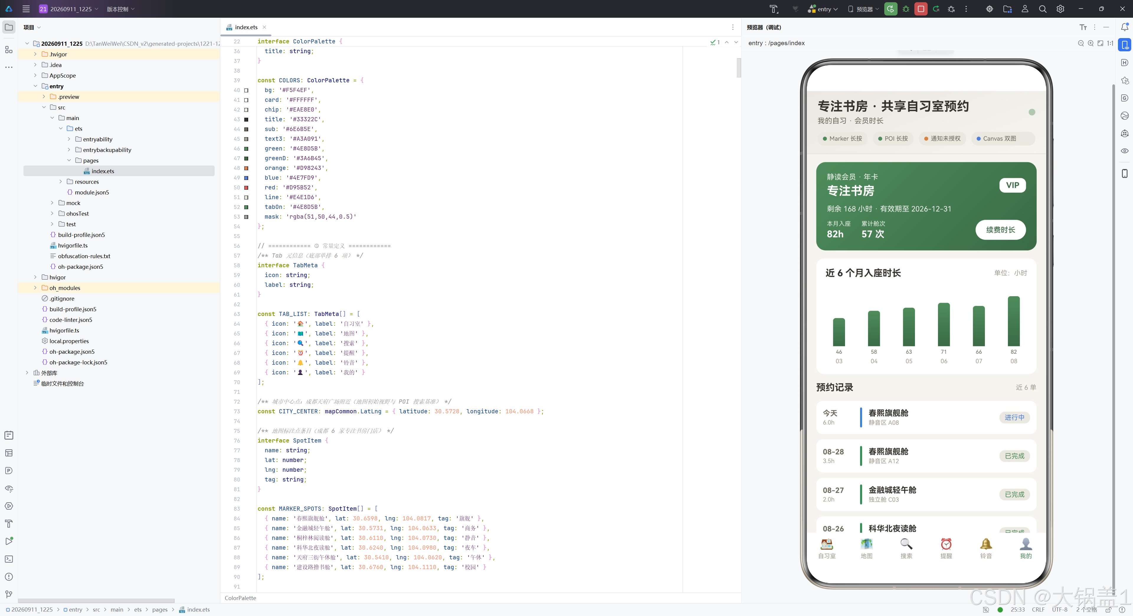
会员渐变大卡使用 135 度线性渐变从静谧绿到静谧绿深色,文字全部白色,通过 opacity 控制层次(0.9/0.92/0.85 三档透明度对应不同信息权重)。卡片内容分三层:顶行为会员等级标题和"VIP"胶囊;中间为剩余时长和有效期;底行为本月入座 82h、累计舱次 57 次和"续费时长"按钮,按钮点击后发送一条续费成功通知。
14.2 柱状图卡
  @Builder
  chartCard() {
    Column({ space: 10 }) {
      Row() {
        Text('近 6 个月入座时长').fontSize(14).fontWeight(FontWeight.Bold)
          .fontColor(COLORS.title).layoutWeight(1)
        Text('单位:小时').fontSize(10).fontColor(COLORS.text3)
      }.width('100%')
      Row({ space: 12 }) {
        ForEach(MONTH_NAME, (m: string, idx: number) => {
          Column({ space: 4 }) {
            Column()
              .width(18)
              .height(Math.max(14, MONTH_HOURS[idx] * (this.breath ? 1 : 0.92)))
              .borderRadius({ topLeft: 4, topRight: 4 })
              .linearGradient({ angle: 180, colors: [[COLORS.green, 0], [COLORS.greenD, 1]] })
            Text(`${MONTH_HOURS[idx]}`).fontSize(8).fontColor(COLORS.sub)
            Text(m).fontSize(9).fontColor(COLORS.text3)
          }.layoutWeight(1).justifyContent(FlexAlign.End)
        }, (m: string) => m)
      }.width('100%').height(120).alignItems(VerticalAlign.Bottom)
    }.width('100%').padding(14).backgroundColor(COLORS.card).borderRadius(12)
  }
柱状图卡使用纯 ArkUI 组件(非 Canvas)绘制。Row 容器高度 120 底部对齐,ForEach 遍历 6 个月份数据,每个月份为一个 Column,内部从上到下为柱体(18 宽,高度由 MONTH_HOURS[idx] * (this.breath ? 1 : 0.92) 计算,最小 14)、数值标签和月份标签。柱体使用 180 度线性渐变(静谧绿到静谧绿深色),顶部圆角。breath 状态使柱高每秒微缩再恢复,与 Canvas 双图同步呼吸。
14.3 预约记录清单
      Row() {
        Text('预约记录').fontSize(14).fontWeight(FontWeight.Bold)
          .fontColor(COLORS.title).layoutWeight(1)
        Text('近 6 单').fontSize(10).fontColor(COLORS.text3)
      }.width('100%')
      Column({ space: 8 }) {
        ForEach(BOOKING_ROWS, (row: BookingRow) => {
          Row({ space: 10 }) {
            Column({ space: 2 }) {
              Text(row.date).fontSize(11).fontWeight(FontWeight.Bold).fontColor(COLORS.sub)
              Text(row.dur).fontSize(9).fontColor(COLORS.text3)
            }.width(46).alignItems(HorizontalAlign.Start)
            Column().width(3).height(30).borderRadius(2)
              .backgroundColor(statusColor(row.status))
            Column({ space: 2 }) {
              Text(row.room).fontSize(12).fontWeight(FontWeight.Bold).fontColor(COLORS.title)
              Text(row.zone).fontSize(9).fontColor(COLORS.text3)
            }.layoutWeight(1).alignItems(HorizontalAlign.Start)
            Text(row.status).fontSize(10).fontColor(statusColor(row.status))
              .padding({ left: 8, right: 8, top: 3, bottom: 3 })
              .borderRadius(8).backgroundColor(COLORS.chip)
          }.width('100%').padding(10).backgroundColor(COLORS.card).borderRadius(10)
        }, (row: BookingRow) => row.date + row.zone)
      }.width('100%')
    }.width('100%')
  }
预约记录清单的每行由四列构成:日期列(宽 46,显示日期和时长)、状态色条(3px 宽竖条,颜色由 statusColor 映射——已完成绿/进行中蓝/已取消灰)、门店信息列(等分宽度,门店名和区域)、状态徽章列(胶囊标签,文字色与色条一致)。这种"色条 + 徽章"双重状态可视化使用户在浏览列表时能一眼区分各记录状态。
十五、底部 Tab 栏
  @Builder
  tabBar() {
    Row() {
      ForEach(TAB_LIST, (tab: TabMeta, index: number) => {
        Column({ space: 3 }) {
          Text(tab.icon).fontSize(17)
          Text(tab.label).fontSize(9)
            .fontColor(this.currentTab === index ? COLORS.tabOn : COLORS.text3)
        }.justifyContent(FlexAlign.Center).layoutWeight(1)
        .padding({ top: 7, bottom: 7 })
        .onClick(() => {
          this.currentTab = index;
        })
      }, (tab: TabMeta) => tab.label)
    }.width('100%').backgroundColor(COLORS.card)
  }
底部 Tab 栏采用自绘实现而非 Tabs 组件。Row 容器白底,ForEach 遍历 TAB_LIST 渲染六个 Tab 项,每项等分宽度(layoutWeight(1)),内部纵向排列 emoji 图标(17 号)和中文标签(9 号)。选中态标签颜色为 tabOn(与静谧绿同值),未选中为 text3 浅灰橄榄。onClick 回调将 currentTab 设为当前索引,触发内容区 if/else 链切换到对应 Tab 的 @Builder 方法。自绘 Tab 栏相比 Tabs 组件提供了更精细的样式控制(如 emoji 字体大小、间距、内边距)。
十六、弹窗系统
16.1 弹窗遮罩层
  @Builder
  modalOverlay(onClose: () => void) {
    Column().width('100%').height('100%').backgroundColor(COLORS.mask)
      .onClick(() => {
        onClose();
      })
  }
modalOverlay 是三组弹窗共用的遮罩层构建器。一个全屏 Column 背景色为半透明深色 mask,onClick 回调调用传入的 onClose 函数关闭弹窗。这种"遮罩 + 内容"的 Stack 层叠结构是弹窗系统的通用模式。
16.2 新建弹窗
  @Builder
  panelAdd(onClose: () => void) {
    Stack({ alignContent: Alignment.Center }) {
      this.modalOverlay(onClose)
      Column({ space: 12 }) {
        Text('新增专注书房').fontSize(15).fontWeight(FontWeight.Bold)
          .fontColor(COLORS.title).width('100%')
        Text('创建后置顶到舱位列表,在座数从 0 开始计')
          .fontSize(10).fontColor(COLORS.text3).width('100%')
        TextInput({ text: this.formName, placeholder: '门店名,如:万象城阅读舱' })
          .height(38).fontSize(12).fontColor(COLORS.title)
          .placeholderColor(COLORS.text3).backgroundColor(COLORS.chip).borderRadius(8)
          .onChange((value: string) => { this.formName = value; })
        TextInput({ text: this.formZone, placeholder: '区域,如:静音区 / 键盘区 / 独立舱' })
          .height(38).fontSize(12).fontColor(COLORS.title)
          .placeholderColor(COLORS.text3).backgroundColor(COLORS.chip).borderRadius(8)
          .onChange((value: string) => { this.formZone = value; })
        TextInput({ text: this.formPrice, placeholder: '时价(元/小时),如:6' })
          .height(38).fontSize(12).fontColor(COLORS.title)
          .placeholderColor(COLORS.text3).backgroundColor(COLORS.chip).borderRadius(8)
          .type(InputType.Number)
          .onChange((value: string) => { this.formPrice = value; })
        TextInput({ text: this.formSeats, placeholder: '总座位数,如:40' })
          .height(38).fontSize(12).fontColor(COLORS.title)
          .placeholderColor(COLORS.text3).backgroundColor(COLORS.chip).borderRadius(8)
          .type(InputType.Number)
          .onChange((value: string) => { this.formSeats = value; })
        Row({ space: 10 }) {
          Button('取消').height(38).fontSize(12).borderRadius(10)
            .fontColor(COLORS.sub).backgroundColor(COLORS.chip).layoutWeight(1)
            .onClick(() => { onClose(); })
          Button('创建').height(38).fontSize(12).borderRadius(10)
            .fontColor(COLORS.card).backgroundColor(COLORS.green).layoutWeight(1)
            .onClick(() => { this.confirmAdd(); })
        }.width('100%')
      }.width('86%').padding(18).borderRadius(14).backgroundColor(COLORS.card)
    }.width('100%').height('100%')
  }
新建弹窗使用 Stack 层叠遮罩和内容卡。内容卡宽度 86%,白底圆角 14,内边距 18。卡片内部纵向排列标题、说明文案和四个 TextInput 表单项(门店名、区域、时价、总座位数),其中时价和座位数使用 InputType.Number 约束为数字键盘。每个输入框的 onChange 回调将值写入对应的 formXxx 状态变量。底部为"取消"和"创建"两个等分按钮,取消调用 onClose 关闭弹窗,创建调用 confirmAdd 提交表单。
16.3 编辑弹窗与删除弹窗
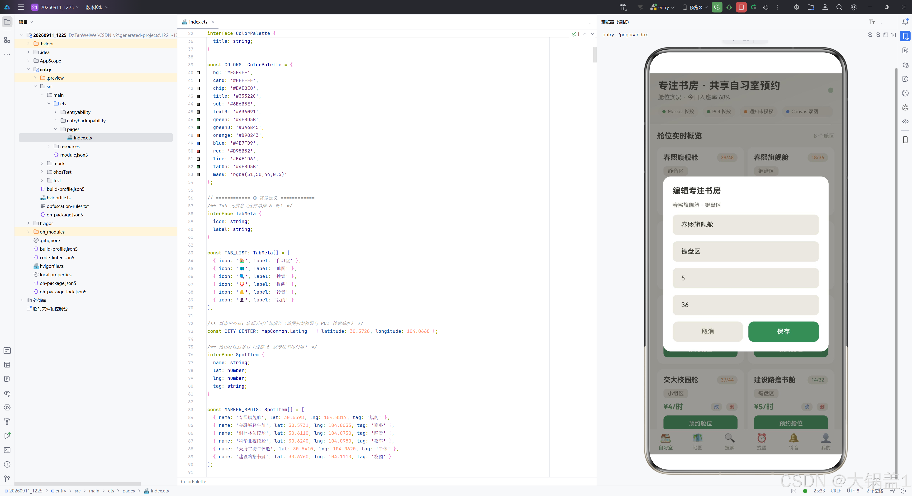
编辑弹窗 panelEdit 的结构与新建弹窗几乎一致,差异在于标题为"编辑专注书房",副标题显示当前编辑的门店名和区域(通过 editIdx 索引读取 roomList),四个输入框预填当前值(由 openEdit 方法在打开前写入 formXxx),底部按钮为"取消"和"保存",保存调用 saveEdit 方法。
删除弹窗 panelDel 结构更简化:标题"删除专注书房"、确认文案(显示待删除的门店名和区域,提示不可恢复)、"取消"和"删除"两个按钮,删除按钮使用警示红 COLORS.red 背景以强化危险操作语义,调用 confirmDel 方法。
16.4 弹窗操作方法
  openAdd(name: string) {
    this.formName = name;
    this.formZone = '';
    this.formPrice = '';
    this.formSeats = '';
    this.addModal = true;
  }

  openEdit(idx: number) {
    this.editIdx = idx;
    const room = this.roomList[idx];
    this.formName = room.name;
    this.formZone = room.zone;
    this.formPrice = room.price.toString();
    this.formSeats = room.seats.toString();
    this.editModal = true;
  }

  openDel(idx: number) {
    this.delIdx = idx;
    this.delModal = true;
  }

  confirmAdd() {
    const price = Number(this.formPrice);
    const seats = Number(this.formSeats);
    this.roomList.unshift(new StudyRoomItem(
      this.formName === '' ? '未命名专注书房' : this.formName,
      this.formZone === '' ? '静音区' : this.formZone,
      Number.isNaN(price) || price <= 0 ? 5 : price,
      Number.isNaN(seats) || seats <= 0 ? 30 : seats, 0));
    this.addModal = false;
  }

  saveEdit() {
    if (this.editIdx >= 0 && this.editIdx < this.roomList.length) {
      const room = this.roomList[this.editIdx];
      if (this.formName !== '') { room.name = this.formName; }
      if (this.formZone !== '') { room.zone = this.formZone; }
      const price = Number(this.formPrice);
      if (!Number.isNaN(price) && price > 0) { room.price = price; }
      const seats = Number(this.formSeats);
      if (!Number.isNaN(seats) && seats > 0) { room.seats = seats; }
    }
    this.editModal = false;
  }

  confirmDel() {
    if (this.delIdx >= 0 && this.delIdx < this.roomList.length) {
      this.roomList.splice(this.delIdx, 1);
    }
    this.delModal = false;
  }
六个弹窗操作方法构成完整的 CRUD 链路。openAdd 接收门店名预填(可从舱位卡"预约舱位"按钮传入),清空其余表单字段后打开弹窗。openEdit 通过索引读取当前舱位数据预填全部表单字段。openDel 仅记录索引后打开确认弹窗。confirmAdd 对表单输入做容错处理——空名称回退"未命名专注书房",空区域回退"静音区",非法价格回退 5 元,非法座位回退 30,在座数固定从 0 起计,通过 unshift 置顶到 roomList 数组。saveEdit 采用"空值保留原值"策略——空字符串不覆盖原值,非法数值跳过,确保编辑时不误清数据。confirmDel 通过 splice 删除指定索引的舱位。三个 confirm/save 方法在操作完成后将对应弹窗状态置为 false 关闭弹窗。
十七、功能模块对比表
| 功能模块 | 核心技术 | 数据模型 | 状态变量 | 布局策略 | 关键特性 |
|---|---|---|---|---|---|
| 自习室 Tab | Canvas 绘制 | StudyRoomItem | breath, roomList | Flex 双列换行 | drawRing 进度环 + drawLine 折线,1 秒呼吸重绘 |
| 地图 Tab | Map Kit | EventLog | eventLogs, markerListenOn, poiListenOn | 三段式纵向 | onMarkerLongClick + onPoiLongClick 双长按监听 |
| 搜索 Tab | site.searchByText | SearchRecord | queryInput, searchRecords, searchState | 纵向列表 | reliability 分数分级 + Progress 线性分数条 |
| 提醒 Tab | Notification Kit | RemindItem, NoticeLog | granted, remindList, noticeLogs | 时间轴 + 列表 | EL1 沙箱铃声 + requestEnableNotification 二次授权 |
| 铃音 Tab | CoreFileKit + fileUri | RingItem | ringList, currentRing | 纵向列表 | buildWavBytes 动态音频生成 + uri:: 前缀铃声 |
| 我的 Tab | ArkUI 组件 + linearGradient | BookingRow | 无独立状态 | 渐变大卡 + 柱状图 | 纯组件柱状图(非 Canvas)+ breath 联动 |
| 弹窗系统 | @State 三态管理 | 复用 StudyRoomItem | addModal, editModal, delModal, formXxx | Stack 层叠 | 新建/编辑/删除三态 + 空值容错 |
| 头部区域 | linearGradient + 三元运算 | TabMeta | currentTab, breath, granted, markerListenOn, poiListenOn | 两行纵向 | Tab 联动副标题 + 四特性状态胶囊 + 呼吸圆点 |
十八、总结与展望
本文以"专注书房 · 共享自习室预约"为业务场景,完整解析了一个基于 HarmonyOS ArkUI 框架的 1585 行单文件组件化应用架构。从色彩体系的 14 色原木米 + 静谧绿主题,到六大 Tab 各自独立的布局结构,再到三大前沿特性(Map Kit 双长按监听、Notification Kit EL1 沙箱铃声、Canvas 双图绘制)的深度集成,平台展示了 ArkUI 声明式 UI 范式在复杂业务场景下的系统级表达能力。
架构层面,平台采用"根组件 Stack 层叠 + Column 三段式(头部/内容区/底部 Tab 栏)+ 顶层弹窗系统"的经典布局架构,通过 currentTab 状态索引在六个 @Builder 方法间切换实现 Tab 内容隔离。六大 @Observed 数据模型类分别支撑各自 Tab 的列表渲染,@State 状态变量统一声明在组件顶层实现跨 Tab 数据共享,弹窗系统通过三个 boolean 状态变量控制显隐、四个 string 缓存表单输入,形成了"数据-状态-视图"三层清晰的单向流动。
技术亮点方面,Map Kit 的双长按监听(onMarkerLongClick + onPoiLongClick)是 6.1.1 版本的重要新增能力,使地图交互从"只读浏览"升级为"长按采集";Notification Kit 的 EL1 沙箱铃声链路(buildWavBytes → fs.openSync → fileUri.getUriFromPath → 'uri::' + uri)实现了从频率参数到可播放铃声的端到端自研链路;Canvas 双图(drawRing + drawLine)通过 setInterval 呼吸动画联动重绘,营造了"实时刷新"的视觉氛围,同时柱状图卡使用纯 ArkUI 组件 + breath 联动实现了非 Canvas 的图表方案。
未来展望,平台可在以下方向深化。其一,接入真实后端 API 替换 Mock 数据,使舱位入座率、搜索结果和预约记录具备实时性;其二,将 buildWavBytes 的正弦波替换为真实录制的环境音采样(如翻书声、键盘声),提升铃声的辨识度和沉浸感;其三,引入 @StorageLink 跨组件持久化状态,使舱位列表和铃声配置在应用重启后保持;其四,利用 Map Kit 的路线规划能力增加"导航到舱"功能,从预约到抵达形成闭环;其五,为柱状图和折线图增加触摸交互(如点击数据点弹出详情),从"静态展示"升级为"交互探索"。这些方向将使共享自习室预约平台从技术演示走向产品化落地,真正服务于城市青年的专注学习需求。
附录:DevEco Studio 创建新项目与查看 SDK 版本
本章节演示如何使用 DevEco Studio 创建一个 HarmonyOS 新项目,并查看当前 IDE 已安装的 SDK 版本,适合作为其他技术博文的补充操作指南。
一、创建新项目
1.1 进入欢迎界面
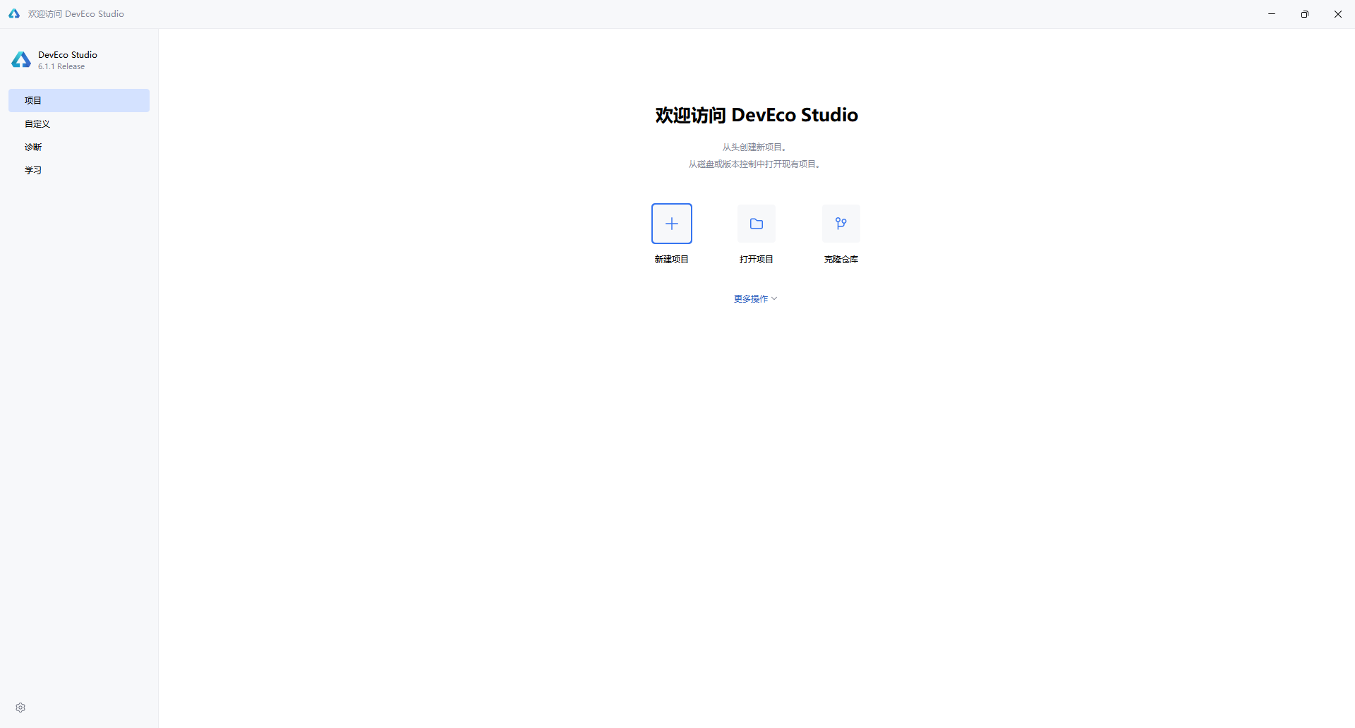
启动 DevEco Studio 后,首先看到的是欢迎界面。左侧导航栏默认选中 “项目”,右侧提供三个主要入口:
- 新建项目:从头创建新项目
- 打开项目:打开本地已有项目
- 克隆仓库:从 Git 等版本控制拉取代码
点击 “新建项目” 按钮,进入项目创建向导。
1.2 选择项目模板
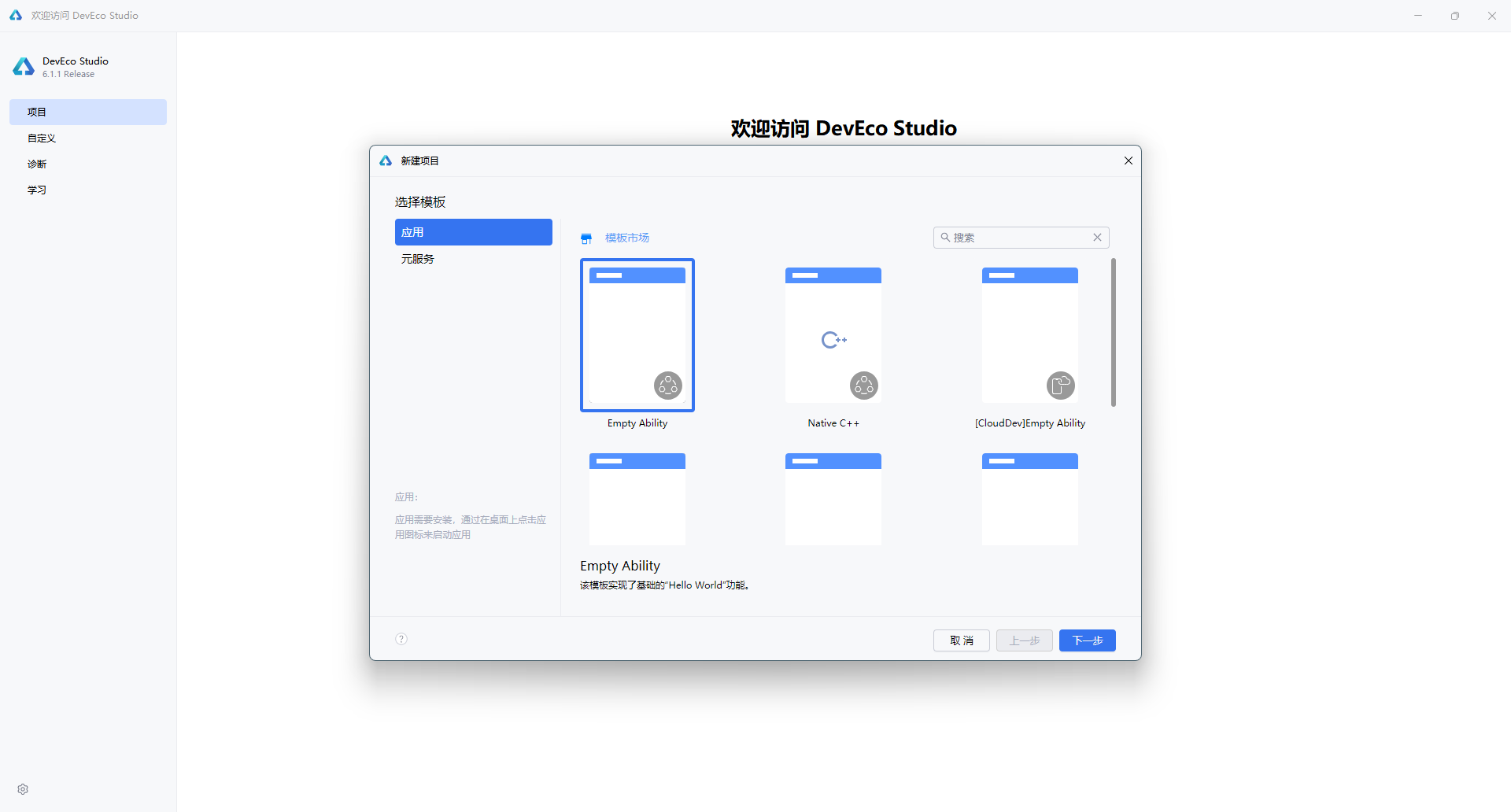
在弹出的"新建项目"对话框中,左侧分类标签提供了两种项目类型:
| 类型 | 说明 |
|---|---|
| 应用(Application) | 开发标准的 HarmonyOS 应用,具备完整的 Ability 生命周期 |
| 元服务(Atomic Service) | 开发轻量级的原子化服务,无需安装即可使用 |
选择 “应用” 标签后,右侧展示多种模板。对于大多数场景,推荐选择 “Empty Ability” —— 这是一个最基础的入门模板,仅包含 Hello World 功能,适合从零开始构建应用。
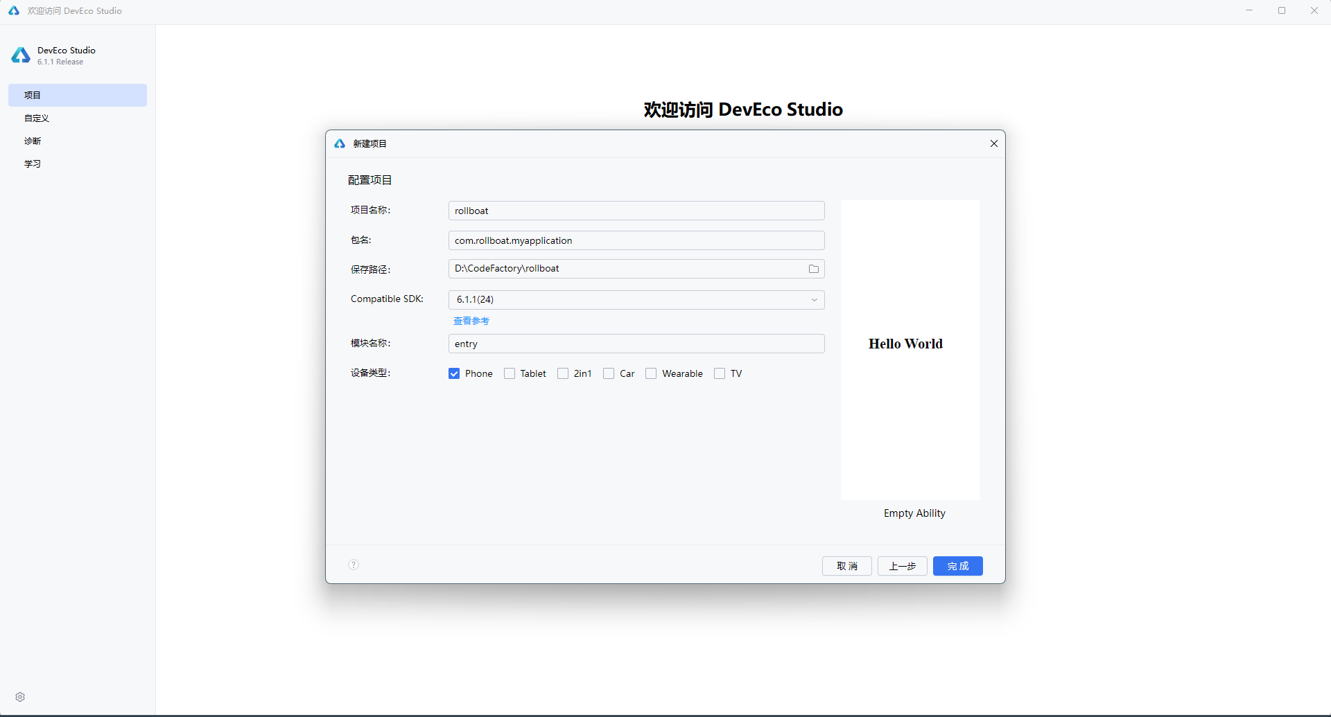
1.3 配置项目信息
点击 “下一步” 后,进入项目配置界面,需要填写以下核心参数:
| 配置项 | 示例值 | 说明 |
|---|---|---|
| 项目名称(Project name) | rollboat | 应用的项目名称,建议使用英文命名 |
| 包名(Bundle name) | com.rollboat.myapplication | 应用唯一标识,采用反向域名格式 |
| 保存路径(Save location) | D:\CodeFactory\rollboat | 项目本地存储路径,避免使用中文和空格 |
| 兼容 SDK(Compatible SDK) | 6.1.1(24) | 目标 HarmonyOS API 版本,点击"查看参考"可了解各版本差异 |
| 模块名称(Module name) | entry | 主模块名称,默认 entry 为应用入口模块 |
| 设备类型(Device types) | ☑ Phone | 勾选目标设备:Phone / Tablet / 2in1 / Car / Wearable / TV |
右侧预览区会实时展示当前模板的默认效果 —— 一个居中显示的 “Hello World” 文本。
1.4 完成创建
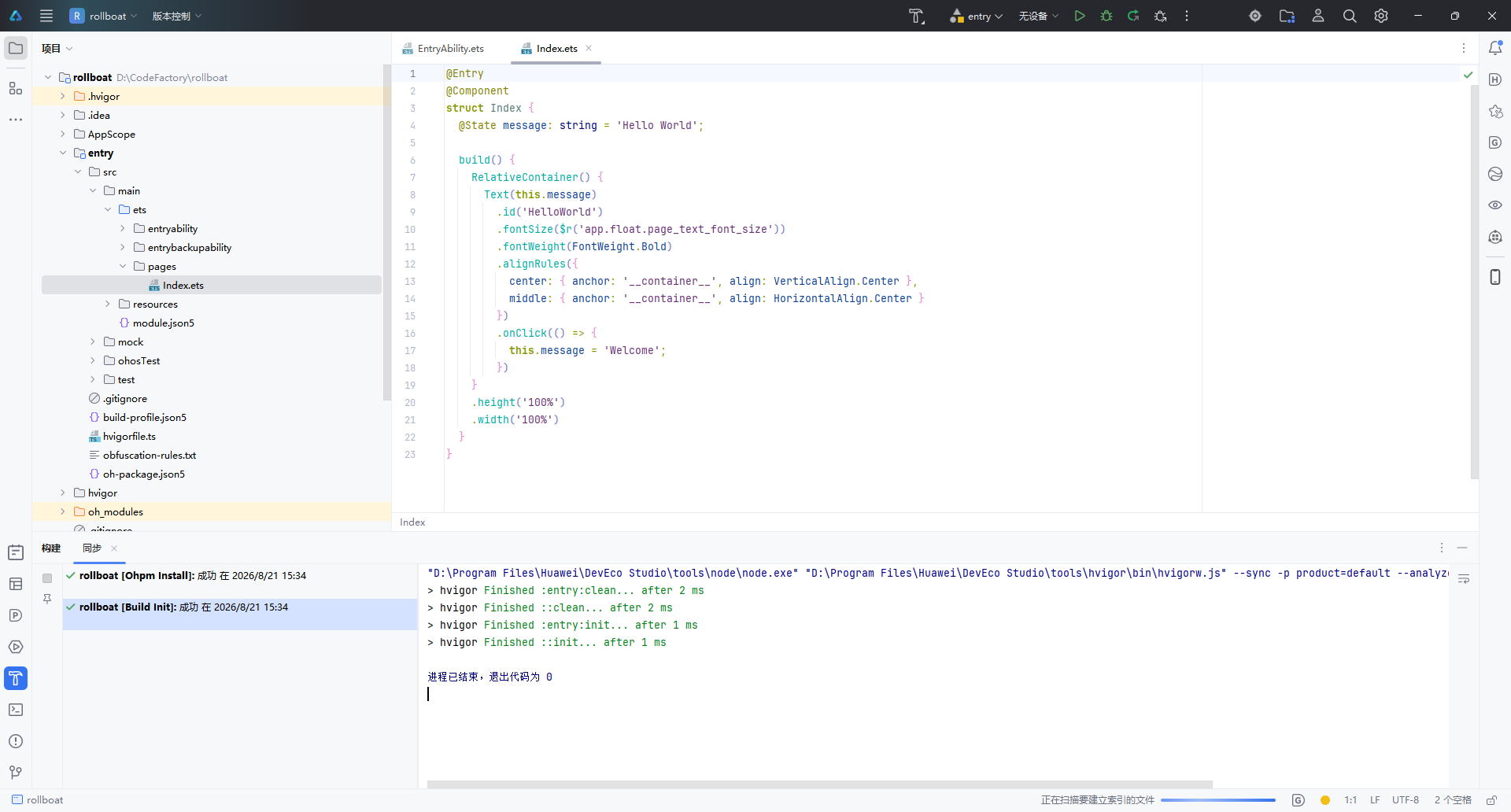
确认配置无误后,点击右下角 “完成” 按钮,IDE 将自动执行以下操作:
- 生成项目骨架(Stage 模型目录结构)
- 执行
ohpm install安装依赖 - 运行 Hvigor 构建初始化(
Build Init)
构建日志中显示 “退出代码为 0” 表示项目初始化成功。
1.5 项目结构概览
创建完成后,左侧项目面板展示的是标准的 Stage 模型 目录结构:
rollboat/
├── .hvigor/                   # Hvigor 构建工具缓存
├── .idea/                     # IDE 配置文件
├── AppScope/                  # 应用级全局配置
│   └── app.json5
├── entry/                     # 主模块(入口模块)
│   ├── src/main/ets/
│   │   ├── entryability/      # Ability 生命周期管理
│   │   │   └── EntryAbility.ets
│   │   └── pages/             # UI 页面
│   │       └── Index.ets      # 首页(默认 Hello World)
│   ├── src/main/resources/    # 资源文件
│   ├── module.json5           # 模块配置
│   └── build-profile.json5    # 构建配置
├── oh_modules/                # OHPM 依赖包
├── build-profile.json5        # 工程构建配置
├── hvigorfile.ts              # Hvigor 构建脚本
└── oh-package.json5           # 包管理配置
核心文件 Index.ets 的默认代码如下,采用 ArkTS 声明式 UI 语法:
@Entry
@Component
struct Index {
  @State message: string = 'Hello World';

  build() {
    RelativeContainer() {
      Text(this.message)
        .id('HelloWorld')
        .fontSize($r('app.float.page_text_font_size'))
        .fontWeight(FontWeight.Bold)
        .alignRules({
          center: { anchor: '__container__', align: VerticalAlign.Center },
          middle: { anchor: '__container__', align: HorizontalAlign.Center }
        })
        .onClick(() => {
          this.message = 'Welcome';
        })
    }
    .height('100%')
    .width('100%')
  }
}
| 关键语法 | 作用 |
|---|---|
@Entry | 标记为页面入口,可用于路由跳转 |
@Component | 声明为自定义组件 |
@State | 状态变量,数据变更时自动触发 UI 刷新 |
RelativeContainer | 相对布局容器,替代传统线性布局 |
.onClick() | 点击事件,此处点击后文本变为 “Welcome” |
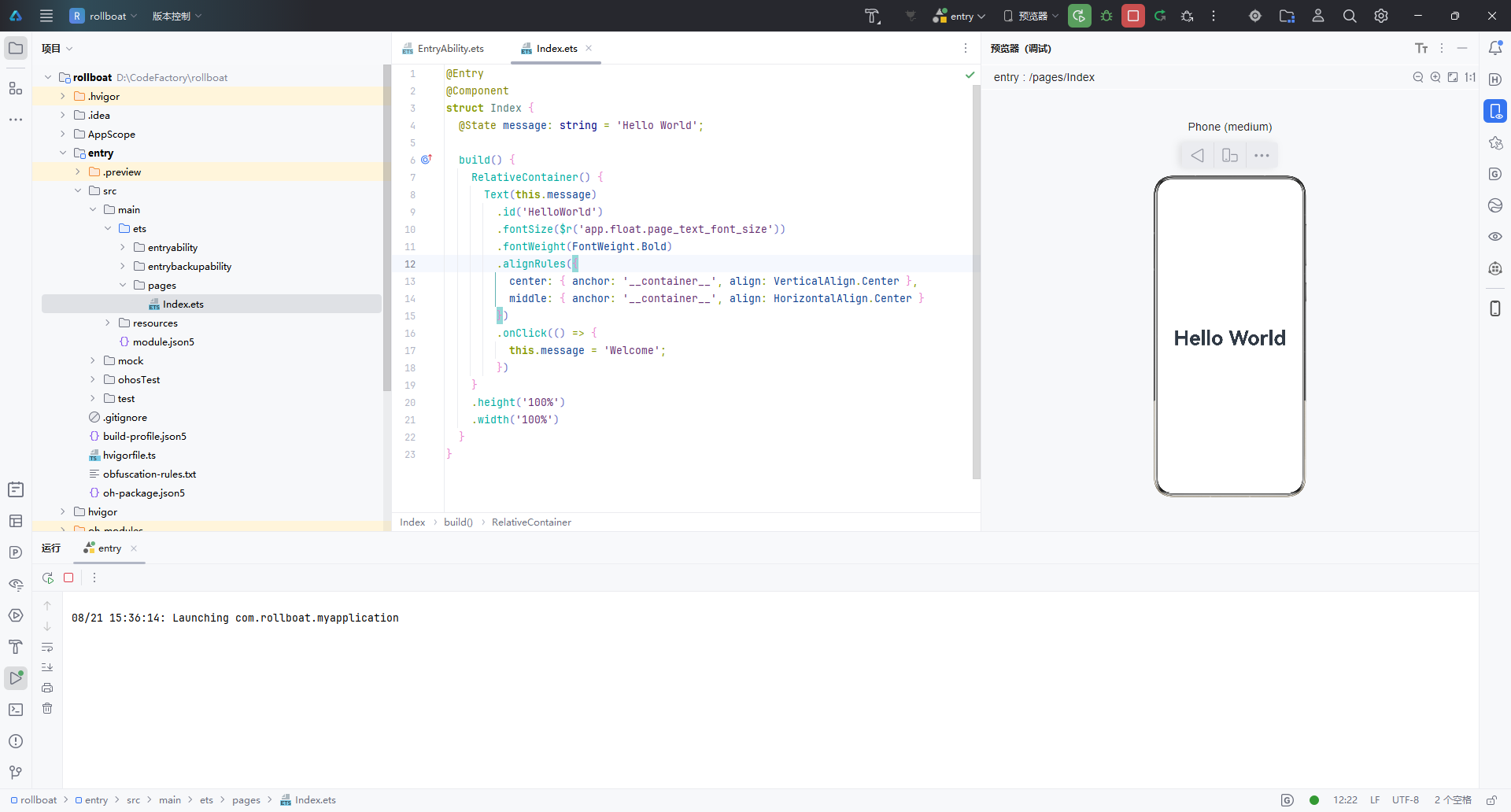
打开右侧 Previewer(预览器),选择 Phone 设备,即可实时预览 Hello World 效果,无需连接真机或启动模拟器。
二、查看 SDK 版本
2.1 查看 HarmonyOS SDK
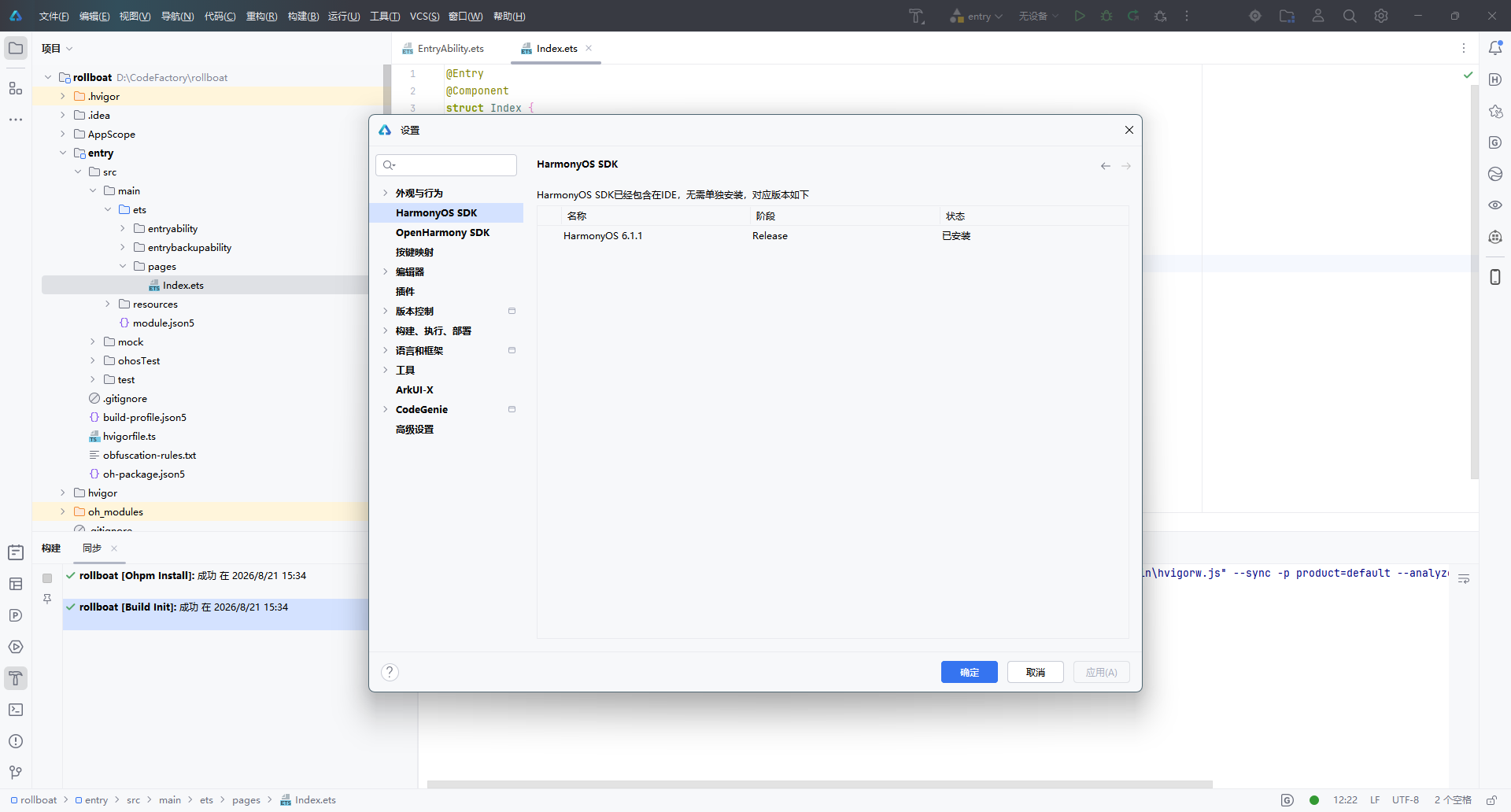
DevEco Studio 安装时已内置 HarmonyOS SDK,无需单独下载。通过以下路径查看:
文件 → 设置 → HarmonyOS SDK(或快捷键
Ctrl + Alt + S搜索 “HarmonyOS SDK”)
在设置面板中,可以看到当前已安装的 SDK 版本信息:
| 名称 | 阶段 | 状态 |
|---|---|---|
| HarmonyOS 6.1.1 | Release | ✅ 已安装 |
界面顶部提示:“HarmonyOS SDK 已经包含在 IDE,无需单独安装”,省去了手动配置 SDK 的繁琐步骤。
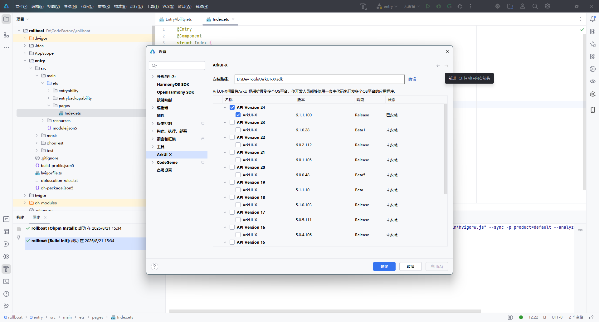
2.2 查看 ArkUI-X SDK(跨平台扩展)
如果项目需要将 ArkUI 框架扩展到多个 OS 平台(Android / iOS / OpenHarmony),还需要配置 ArkUI-X SDK。路径如下:
文件 → 设置 → 语言和框架 → ArkUI-X
在这里可以查看已安装和可选的 ArkUI-X SDK 版本:
| 版本 | SDK 版本号 | 阶段 | 状态 |
|---|---|---|---|
| API Version 24 | 6.1.1.100 | Release | ✅ 已安装 |
| API Version 23 | 6.1.0.28 | Beta1 | 未安装 |
| API Version 22 | 6.0.2.112 | Release | 未安装 |
安装路径示例:D:\DevTools\ArkUI-X\sdk
说明:ArkUI-X 允许开发者使用一套 ArkTS 主代码,同时构建多平台应用。如果仅开发 HarmonyOS 原生应用,无需额外安装 ArkUI-X SDK。
三、小结
| 步骤 | 操作 | 关键点 |
|---|---|---|
| 创建项目 | 欢迎页 → 新建项目 → 选择 Empty Ability 模板 → 配置项目信息 → 完成 | 使用 Stage 模型 + ArkTS 语言 |
| 查看 SDK | 设置 → HarmonyOS SDK | SDK 已内置,无需手动安装 |
| 跨平台扩展 | 设置 → ArkUI-X | 根据需要安装对应 API 版本 |
至此,DevEco Studio 的项目创建与 SDK 环境确认全部完成,可以开始 HarmonyOS 应用的功能开发。
本文基于 DevEco Studio 6.1.1 Release 版本编写,不同版本界面可能存在细微差异。

讨论HarmonyOS开发技术,专注于API与组件、DevEco Studio、测试、元服务和应用上架分发等。
更多推荐
 6
6 0
0- 0


 已为社区贡献58条内容

所有评论(0)