沉浸式社交娱乐场景下的 HarmonyOS 多套件融合实践:从地图 POI 搜索到 AI 字幕速记的 ArkTS 全栈架构深度解析
一、技术前置概述
1.1 HarmonyOS 开发栈全景
HarmonyOS(鸿蒙操作系统)是华为面向万物互联时代打造的分布式操作系统,其核心设计理念是"一次开发、多端部署"。在应用开发层面,HarmonyOS 提供了一套完整且独立的开发栈,从底层的系统服务、中间的框架能力,到上层的 UI 声明式范式,形成了一个垂直整合的技术生态。对于开发者而言,理解 HarmonyOS 的分层架构是构建复杂应用的前提。
HarmonyOS 的应用开发栈从下到上大致可以分为四层:操作系统内核层、系统服务层(System Service Layer)、框架层(Framework Layer)和应用层(Application Layer)。操作系统内核层负责进程调度、内存管理、硬件驱动等底层能力;系统服务层提供了窗口管理、包管理、通知管理等核心系统服务;框架层则是开发者直接接触的重心所在,包含 ArkUI 声明式 UI 框架、各种 Kit(能力套件)以及分布式调度框架;应用层则是开发者基于这些能力构建的具体业务应用。
在 HarmonyOS 6.x 版本中,框架层的能力得到了极大丰富,尤其是各类 Kit(能力套件)的持续扩展和增强。Kit 是 HarmonyOS 面向开发者提供的能力聚合单元,每个 Kit 聚焦一个垂直领域,例如 Map Kit 负责地图与位置服务、Speech Kit 负责语音与字幕能力、BasicServicesKit 负责异步回调与错误处理等基础服务。开发者通过 @kit.xxx 的命名空间引入所需套件,在单文件内即可完成多套件的协同编排,这种设计极大地降低了跨能力融合的开发门槛。
1.2 ArkUI 声明式范式与 ArkTS
ArkUI 是 HarmonyOS 的 UI 开发框架,支持两种开发范式:命令式(Java/C++)和声明式(ArkTS)。声明式范式是当前 HarmonyOS 应用开发的推荐方式,它采用 ArkTS 语言——一种在 TypeScript 基础上扩展的编程语言,增加了 @Component、@Entry、@State、@Builder、@Observed 等装饰器语法,使开发者能够以声明式的方式描述 UI 结构和状态驱动逻辑。
ArkUI 声明式范式的核心思想是"状态驱动 UI 变更"。开发者通过 @State 定义可观测的状态变量,当这些变量的值发生变化时,ArkUI 框架会自动重新执行依赖该状态的 UI 构建(re-render),实现界面与数据的同步更新。这种范式与 React 的状态管理思路类似,但 ArkUI 通过编译期优化和 C++ 层的直接渲染,在性能上更具优势。
在 ArkUI 中,@Builder 装饰器用于定义可复用的 UI 构建函数,类似于其他框架中的"组件函数"。@Entry 标记入口组件,@Component 声明自定义组件。@Observed 用于标记可观察的数据模型类,配合 @ObjectLink 实现嵌套对象的响应式更新。这些装饰器构成了 ArkUI 声明式开发的核心语法体系。
1.3 Map Kit 地图套件
Map Kit 是 HarmonyOS 提供的地图服务能力套件,封装了地图渲染、标注管理、POI(Point of Interest)搜索、路径规划等能力。在 HarmonyOS 6.1.1 版本中,Map Kit 引入了多项重要增强,其中最值得关注的是 searchByText 接口对 reliability(相关性分数)字段的支持,以及 MapEventManager 对 Marker 长按和 POI 长按事件的监听能力。
searchByText 是基于关键字的 POI 搜索接口,开发者传入查询参数 SearchByTextParams(包含 query 关键字、location 中心点坐标、radius 搜索半径、language 语言偏好),即可获得 SearchByTextResult,其中包含 sites 数组。每个 Site 对象携带名称、格式化地址、直线距离以及 reliability 相关性分数(取值范围 0 到 1),该分数反映了搜索结果与查询关键字的匹配程度,是排序和展示的重要依据。
MapComponent 是 ArkUI 声明式地图组件,通过 mapOptions(地图初始视野参数)和 mapCallback(初始化回调)两个核心参数完成地图的挂载。回调函数中可以获得 MapComponentController 控制器实例,进而通过 getEventManager() 获取 MapEventManager,用于注册各类地图交互事件监听。Marker 标注的添加通过 addMarker 异步方法完成,需要构建 MarkerOptions 指定坐标、可点击性、可见性、锚点等属性。
1.4 Speech Kit 与 AI 字幕
Speech Kit 是 HarmonyOS 的语音能力套件,其中 AICaptionComponent(AI 字幕组件)是面向实时语音转写场景的高阶能力。在 HarmonyOS 6.1.1 版本中,AICaptionOptions 配置接口新增了四个关键字段:sourceLanguage(源语言)、targetLanguage(目标语言)、fontSize(字体大小)和 fontColor(字体颜色),使字幕的国际化适配和外观定制能力大幅提升。
AICaptionComponent 组件通过 isShown(显示状态,支持 @Link 双向绑定)、controller(AICaptionController 实例)和 options(AICaptionOptions 配置)三个参数完成挂载。AICaptionController 提供了 writeAudio 方法,用于将 PCM 格式的音频数据分块写入字幕引擎进行实时转写。AICaptionFontSize 是字体大小枚举类型,包含 SMALL、NORMAL、BIG、LARGE 四档,而非简单的数字类型。onPrepared 和 onError 是两个关键回调,前者在字幕引擎就绪时触发,后者在发生错误时携带 BusinessError 信息触发。
1.5 Tabs 嵌套滚动机制
Tabs 是 ArkUI 中的页签容器组件,支持通过 barMode 设置页签布局模式(Fixed 固定、Scrollable 可滚动)。在 HarmonyOS API 24+ 版本中,Tabs 新增了 nestedScroll 方法,接收 TabsNestedScrollMode 枚举参数,支持 SELF_ONLY(仅内层滚动)和 SELF_FIRST(先内后外,内层滑到边缘后联动外层)两种模式。这一机制使得双层甚至多层 Tabs 嵌套时的滚动协调成为可能,为复杂信息架构的浏览体验提供了底层支撑。
1.6 BasicServicesKit 基础服务
BasicServicesKit 提供了 AsyncCallback 异步回调和 BusinessError 错误模型等基础类型。AsyncCallback<T> 是 HarmonyOS 中广泛使用的异步回调泛型接口,其签名为 (err: BusinessError, data: T) => void,第一个参数为错误对象(为 null/undefined 表示成功),第二个参数为返回数据。BusinessError 包含 code(错误码)和 message(错误信息)两个字段,是所有 Kit 调用异常的统一错误模型。在整个应用中,地图初始化回调、搜索异常捕获、音频写入异常等场景均依赖这两个类型进行错误处理。
二、应用全景与架构总览
2.1 业务场景定位
本项目是一个"剧本杀门店预约"应用,定位为沉浸式社交娱乐领域的垂直服务工具。应用围绕剧本杀这一新兴社交娱乐形态,整合了剧本库浏览、双层频道筛选、门店地图探索、POI 搜索、AI 字幕速记、玩家战报管理六大核心功能模块,通过底部七 Tab 的导航架构将各功能串联为一个完整的产品闭环。
2.2 整体架构图
┌─────────────────────────────────────────────────────────────────────┐
│                        谜馆 · 剧本杀门店预约                           │
│                      深色·暗幕紫(#160F22) + 烛光金(#E8C15A)            │
├─────────────────────────────────────────────────────────────────────┤
│  头部区:应用名 + Tab联动副标题 + 三特性状态胶囊 + 呼吸圆点             │
├─────────────────────────────────────────────────────────────────────┤
│                         内容区(7 Tab 切换)                          │
│  ┌──────────┬──────────┬──────────┬──────────┬──────────┬──────────┐│
│  │ Tab0 剧本│ Tab1 频道│ Tab2 日志│ Tab3 门店│ Tab4 搜索│ Tab5 开场││
│  │ 题材chips│ 双层Tabs │ 翻页时间 │ MapKit  │searchBy │AICaption ││
│  │ 双列剧本 │nestedScr │ 轴日志  │ 地图组件│ Text搜索 │ AI字幕   ││
│  │ 本周开本 │ SELF_    │ 内外层  │ 双长按  │reliabili│ 四新字段 ││
│  │ 大编号榜 │ FIRST等  │ 双徽标  │ Toggle  │ ty三档条 │ writeAud ││
│  ├──────────┤          │         │         │         │io音频    ││
│  │ Tab6 我的│         │         │         │         │         ││
│  │ 玩家大卡 │         │         │         │         │         ││
│  │ 战报清单 │         │         │         │         │         ││
│  │ 月柱状图 │         │         │         │         │         ││
│  └──────────┴──────────┴──────────┴──────────┴──────────┴──────────┘│
├─────────────────────────────────────────────────────────────────────┤
│  弹窗系统:modalOverlay遮罩 + panelAdd组局 + panelEdit改时间 + panelDel取消│
├─────────────────────────────────────────────────────────────────────┤
│  底部 Tab 栏:单排 7 项(剧本/频道/日志/门店/搜索/开场/我的)           │
└─────────────────────────────────────────────────────────────────────┘
2.3 三特性融合关系图
          ┌──────────────────────────────────────────────┐
          │           HarmonyOS 6.1.1 三特性同文件叠加     │
          └──────────────────┬───────────────────────────┘
                             │
         ┌───────────────────┼───────────────────┐
         │                   │                   │
    ┌─────┴─────┐     ┌─────┴─────┐     ┌─────┴─────┐
    │ 特性 A     │     │ 特性 B     │     │ 特性 C     │
    │ Map Kit   │     │ Tabs嵌套   │     │ Speech Kit │
    │           │     │ 滚动       │     │ AI字幕     │
    │ searchBy  │     │            │     │            │
    │ Text +    │     │ SELF_ONLY │     │ sourceLang │
    │ reliabili │     │ SELF_FIRST│     │ targetLang │
    │ ty分数    │     │           │     │ fontSize   │
    │           │     │ 外层4频道 │     │ fontColor  │
    │ Marker    │     │ ×内层5页签│     │            │
    │ 长按监听  │     │           │     │ writeAudio │
    │ POI       │     │ onChange  │     │ 640字节PCM │
    │ 长按监听  │     │ 翻页日志  │     │            │
    └───────────┘     └───────────┘     └───────────┘
         │                   │                   │
         └───────────────────┼───────────────────┘
                             │
                    ┌────────┴────────┐
                    │  统一状态管理中枢  │
                    │  @State 驱动刷新  │
                    │  @Observed 数据模型│
                    │  @Builder 视图群   │
                    └─────────────────┘
2.4 数据流与状态驱动流程
用户交互                    状态变更                     UI 刷新
─────────────────────────────────────────────────────────────────
Tab 点击            → currentTab 变更        → 内容区条件分支重建
题材 chips 点击     → genreFilter 变更       → filteredScripts() 重算
外层 Tabs 翻页      → outerIndex 变更        → swipeLogs unshift 记录
内层 Tabs 翻页      → innerIndex 变更        → swipeLogs unshift 记录
模式切换           → nestedMode 变更         → 内层 .nestedScroll() 重绑
Marker 长按         → eventLogs unshift      → 日志流列表刷新
POI 长按            → eventLogs unshift      → 日志流列表刷新
搜索按钮点击        → searchRecords 赋值     → 结果列表 + 分数条重建
源语言切换          → srcLang/tgtLang 联动   → 语言设置卡 + options预览重建
字号选择            → captionSize 变更       → 外观卡 + options预览重建
颜色选择            → captionColor 变更      → 外观卡 + options预览重建
组局确认            → scriptList unshift     → 剧本卡列表刷新
呼吸定时器          → breath 翻转            → 圆点闪烁 + 柱状图波动
三、逐段代码深度解析
3.1 模块导入
import { MapComponent, mapCommon, map, site } from '@kit.MapKit';
import { AICaptionComponent, AudioData, AICaptionOptions, AICaptionController, AICaptionFontSize } from '@kit.SpeechKit';
import { AsyncCallback, BusinessError } from '@kit.BasicServicesKit';
本应用仅允许三行 import 语句,这是整个文件的基础约束。每一行 import 都精准对应一个能力套件,体现了 HarmonyOS Kit 化能力聚合的设计哲学。
第一行从 @kit.MapKit 导入了四个符号。MapComponent 是 ArkUI 声明式地图组件,直接在 UI 树中渲染地图画面。mapCommon 是地图通用命名空间,包含了 LatLng(经纬度坐标)、MapOptions(地图初始化参数)、MarkerOptions(标注选项)、Poi(兴趣点)等通用类型。map 是地图核心命名空间,提供 MapComponentController(地图控制器)、MapEventManager(事件管理器)、Marker(标注实例)等运行时类型。site 是 POI 搜索命名空间,提供 SearchByTextParams(搜索参数)、SearchByTextResult(搜索结果)、Site(搜索结果条目)等搜索相关类型。
第二行从 @kit.SpeechKit 导入了五个符号。AICaptionComponent 是 AI 字幕 UI 组件。AudioData 是音频数据容器接口,包含一个 data: Uint8Array 字段。AICaptionOptions 是字幕配置接口,包含 initialOpacity、sourceLanguage、targetLanguage、fontSize、fontColor、onPrepared、onError 等字段。AICaptionController 是字幕控制器实例,提供 writeAudio 方法。AICaptionFontSize 是字体大小枚举,有 SMALL、NORMAL、BIG、LARGE 四档。
第三行从 @kit.BasicServicesKit 导入了两个基础类型。AsyncCallback<T> 是异步回调泛型,签名为 (err: BusinessError, data: T) => void。BusinessError 是错误模型,包含 code 和 message 字段。这两个类型贯穿整个应用的异步调用和错误处理链路。
3.2 颜色系统
interface ColorPalette {
  bg: string;
  card: string;
  dark: string;
  title: string;
  sub: string;
  text3: string;
  purple: string;
  purpleD: string;
  gold: string;
  blue: string;
  green: string;
  red: string;
  line: string;
  tabOn: string;
  mask: string;
}

const COLORS: ColorPalette = {
  bg: '#160F22',
  card: '#221838',
  dark: '#2C2148',
  title: '#F2EBFA',
  sub: '#C0B2DC',
  text3: '#8378A8',
  purple: '#8B5CF6',
  purpleD: '#6D3FD6',
  gold: '#E8C15A',
  blue: '#4E9BE3',
  green: '#4EC98A',
  red: '#E85B6E',
  line: '#352A50',
  tabOn: '#E8C15A',
  mask: 'rgba(0,0,0,0.6)'
};
颜色系统是整个应用视觉一致性的基石。这里通过 ColorPalette 接口定义了一个包含十六个色位的颜色面板,然后用 COLORS 常量实例化。这种设计方式有多个优点。
首先是类型安全。通过接口约束,每个色位都有明确的类型定义,开发者在引用时能够获得 IDE 的智能提示和编译期类型检查,避免了拼写错误和遗漏。
其次是语义化命名。bg 代表页面背景色(暗幕紫黑 #160F22),card 代表卡片底色(深紫幕 #221838),dark 代表胶囊和输入框底色(暗紫 #2C2148),title 代表主标题色(烛光冷白 #F2EBFA),sub 代表副标题色(雾紫灰 #C0B2DC),text3 代表三级弱文本色(暗紫灰 #8378A8)。这些命名直接反映了颜色在 UI 中的用途而非颜色本身的色值,使开发者在构建 UI 时能快速定位所需色位。
purple 是主色暗幕紫(#8B5CF6),purpleD 是渐变终点深色(#6D3FD6),gold 是辅助暖色烛光金(#E8C15A),这三个颜色构成了应用的核心主题色组。blue(幽蓝)、green(通过绿)、red(警示红)是功能语义色,分别用于信息辅助、成功徽标和取消/失败场景。line 是分割线色,tabOn 是 Tab 选中色,mask 是弹窗遮罩色(使用 rgba 半透明黑色)。
整个配色方案围绕"暗幕紫+烛光金"双主色展开,营造出剧本杀场景特有的沉浸式、略带神秘感的视觉氛围。深色背景配合烛光金高亮,在视觉上模拟了密室中烛光摇曳的氛围感,与业务场景高度契合。
3.3 常量定义
interface TabMeta {
  icon: string;
  label: string;
}

const TAB_LIST: TabMeta[] = [
  { icon: '🎭', label: '剧本' }, { icon: '🗂️', label: '频道' },
  { icon: '📖', label: '日志' }, { icon: '🗺️', label: '门店' },
  { icon: '🔍', label: '搜索' }, { icon: '🎬', label: '开场' },
  { icon: '👤', label: '我的' }
];
TabMeta 接口定义了底部导航栏每一项的元信息,包含 icon(emoji 图标)和 label(文字标签)。TAB_LIST 常量数组定义了七个 Tab 项:剧本、频道、日志、门店、搜索、开场、我的。这七个 Tab 覆盖了剧本杀预约应用的全部核心功能,从剧本浏览到门店探索,从搜索筛选到 AI 字幕速记,再到玩家个人主页,形成了一个完整的产品功能闭环。
const TAB_SUBS: string[] = [
  '本周新本热开与拼车组局', '题材×难度双层嵌套浏览',
  '双层 Tabs 翻页事件时间轴', '成都六馆标注与长按探索',
  '门店 POI 相关性搜索', 'AI 字幕 DM 开场速记', '玩家主页与开本战报'
];
TAB_SUBS 是头部 Tab 联动副标题数组,与 TAB_LIST 一一对应。当用户切换 Tab 时,头部副标题会同步更新为当前 Tab 的功能描述,起到引导和上下文提示的作用。这种设计将头部信息与底部导航绑定,使头部成为一个"动态信息条"而非静态标题栏。
const CITY_CENTER: mapCommon.LatLng = { latitude: 30.5728, longitude: 104.0668 };
CITY_CENTER 定义了成都天府广场的经纬度坐标,作为地图初始视野的中心点和 POI 搜索的基准点。选择成都作为业务城市,是因为成都是国内剧本杀产业的重镇,拥有密集的剧本杀门店和活跃的玩家社群。
interface SpotItem {
  name: string;
  lat: number;
  lng: number;
  tag: string;
}

const MARKER_SPOTS: SpotItem[] = [
  { name: '春熙路·谜境旗舰店', lat: 30.5950, lng: 104.0817, tag: '旗舰店' },
  { name: '太古里·雾锁密馆', lat: 30.5985, lng: 104.0840, tag: '沉浸' },
  { name: '宽窄巷子·锦官夜谈', lat: 30.6630, lng: 104.0540, tag: '古风' },
  { name: '九眼桥·血色玫瑰馆', lat: 30.6420, lng: 104.0830, tag: '恐怖' },
  { name: '环球中心·迷雾剧场', lat: 30.5730, lng: 104.0620, tag: '机制' },
  { name: '交大路·剧本公社', lat: 30.6930, lng: 104.0380, tag: '拼场' }
];
SpotItem 定义了地图标注点条目结构,包含门店名、纬度、经度和特色标签四个字段。MARKER_SPOTS 定义了成都六家谜馆门店的标注数据,分布在春熙路、太古里、宽窄巷子、九眼桥、环球中心、交大路六个成都地标区域,每家门店都有独特的特色标签(旗舰店、沉浸、古风、恐怖、机制、拼场),与剧本杀的题材分类相呼应。
接下来是一系列业务常量定义。GENRE_CHIPS 定义了题材横滚筛选标签(全部、悬疑、情感、恐怖、机制、欢乐),用于剧本 Tab 的筛选和拼车组局弹窗的表单选择。OUTER_CHANNELS 定义了外层嵌套 Tabs 的四个题材频道(悬疑、情感、恐怖、机制),INNER_TABS 定义了内层五个难度子页签(新手、进阶、硬核、城限、独家),两者构成 4×5=20 个频道页签组合。
interface LangOption {
  code: string;
  name: string;
}

const SRC_LANGS: LangOption[] = [
  { code: 'zh', name: '中文' }, { code: 'en', name: '英文' }
];

const TGT_LANGS_EN: LangOption[] = [
  { code: 'zh', name: '中文' }, { code: 'en', name: '英文' }, { code: 'zh-en', name: '中英双语' }
];
语言选项常量服务于 AI 字幕的语言设置。SRC_LANGS 定义了源语言可选项(中文/英文),TGT_LANGS_EN 定义了英文源时的目标语言可选项(中文/英文/中英双语)。注意中文源时目标语言被锁定为 ‘zh’,因为中文源不支持翻译到其他语言,所以不提供选择项。
interface SizeOption {
  size: AICaptionFontSize;
  name: string;
}

const SIZE_OPTIONS: SizeOption[] = [
  { size: AICaptionFontSize.SMALL, name: '小号' },
  { size: AICaptionFontSize.NORMAL, name: '标准' },
  { size: AICaptionFontSize.BIG, name: '大号' },
  { size: AICaptionFontSize.LARGE, name: '超大' }
];
SizeOption 的 size 字段类型是 AICaptionFontSize 枚举而非 number,这是 HarmonyOS 6.1.1 字幕字号配置的类型约束。SIZE_OPTIONS 将四档枚举与中文展示名配对,用于 UI 中的字号选择卡片。
CAPTION_FONT_COLORS 定义了五种字幕字体颜色预设(白色、烛光金、淡紫、薄荷绿、粉色),这些颜色都是 ResourceColor 类型支持的 ‘#RRGGBB’ 字符串格式。MONTH_IDX、MONTH_NAME、MONTH_VAL 三个数组定义了近六个月的开本局数数据(6、8、5、9、7、11),用于"我的"Tab 的月度柱状图展示。BAR_MAX 定义了柱状图的满刻度(12 局),是柱高换算的基准。
INNER_TITLES 和 INNER_NOTES 是内层频道剧本素材池,各含八条数据,分别用于卡片标题和卡片描述的生成,配合难度页签拼装出行业化的内容文案。
3.4 辅助函数群
interface ScoreLevel {
  label: string;
  color: string;
}

function reliabilityScore(score: number): ScoreLevel {
  if (score >= 0.8) {
    return { label: '高相关', color: COLORS.green };
  }
  if (score >= 0.5) {
    return { label: '中相关', color: COLORS.gold };
  }
  return { label: '低相关', color: COLORS.text3 };
}
reliabilityScore 函数将 searchByText 返回的 reliability 相关性分数(0~1 的浮点数)映射为三档等级标签和对应的颜色。分数大于等于 0.8 为"高相关"(通过绿),大于等于 0.5 为"中相关"(烛光金),其余为"低相关"(暗紫灰)。这个函数是搜索结果可视化展示的核心辅助逻辑,将抽象的数值分数转化为用户可直观理解的等级标识和视觉颜色。
function modeLabel(mode: TabsNestedScrollMode): string {
  return mode === TabsNestedScrollMode.SELF_FIRST
    ? 'SELF_FIRST·先内后外' : 'SELF_ONLY·仅内层';
}

function modeShort(mode: TabsNestedScrollMode): string {
  return mode === TabsNestedScrollMode.SELF_FIRST ? '先内后外' : '仅内层';
}
modeLabel 和 modeShort 两个函数将 TabsNestedScrollMode 枚举值翻译为可读文案。前者输出完整文案(包含枚举名和中文解释),用于日志记录;后者输出短文案,用于头部状态胶囊和模式切换 chips。这两个函数的分离体现了"同一数据,不同展示粒度"的设计思想。
function difficultyColor(diff: number): string {
  if (diff <= 2) {
    return COLORS.green;
  }
  if (diff === 3) {
    return COLORS.gold;
  }
  if (diff === 4) {
    return COLORS.purple;
  }
  return COLORS.red;
}
difficultyColor 函数将难度星级(15)映射为四种颜色:12 星新手绿、3 星进阶烛光金、4 星硬核暗幕紫、5 星地狱红。这种渐变式的颜色映射让用户在浏览剧本卡时能通过颜色快速感知难度等级,形成视觉化的难度梯度。
function genreColor(genre: string): string {
  if (genre.indexOf('悬疑') >= 0) {
    return COLORS.blue;
  }
  if (genre.indexOf('情感') >= 0) {
    return COLORS.gold;
  }
  if (genre.indexOf('恐怖') >= 0) {
    return COLORS.red;
  }
  if (genre.indexOf('机制') >= 0) {
    return COLORS.purple;
  }
  if (genre.indexOf('欢乐') >= 0) {
    return COLORS.green;
  }
  return COLORS.text3;
}
genreColor 函数根据题材关键词返回对应的配色。使用 indexOf 而非全等比较,是因为题材字符串可能包含组合描述(如"古风情感"、“欧式硬核悬疑”),子串匹配更灵活。悬疑对应幽蓝、情感对应烛光金、恐怖对应警示红、机制对应暗幕紫、欢乐对应通过绿,每种题材的配色都与其情感基调相呼应。
starText 函数生成难度星级的文本表示,用实心星和空心星组合,实心星数量等于难度值,空心星补齐到五位。typeColor 函数将长按事件类型(Marker/POI)映射为对应的徽标颜色。resultColor 函数将战报结果关键词(MVP、逃脱、败、胜)映射为对应的徽标颜色。langName 函数将语言码转换为中文展示名。nowTime 函数返回当前时间的 HH:mm:ss 格式字符串,用于长按事件日志的时间戳。
3.5 数据模型与 Mock 数据
@Observed export class ScriptCard {
  title: string;
  genre: string;
  players: number;
  duration: string;
  diff: number;
  open: string;

  constructor(title: string, genre: string, players: number, duration: string, diff: number, open: string) {
    this.title = title;
    this.genre = genre;
    this.players = players;
    this.duration = duration;
    this.diff = diff;
    this.open = open;
  }
}
ScriptCard 是剧本条目数据模型,使用 @Observed 装饰器标记为可观察类。这意味着当 ScriptCard 实例的字段被修改时(例如修改开本时间),ArkUI 框架能够感知到变化并触发依赖该实例的 UI 部分重新渲染。@Observed 的作用机制是在类的 setter 方法中注入通知逻辑,实现字段级响应式更新。
ScriptCard 包含六个字段:剧本名、题材、适配人数、游玩时长、难度星级(1~5)、下次开本时间。SCRIPT_LIST 常量初始化了八条剧本数据,涵盖古风情感、欧式硬核悬疑、恐怖沉浸、欢乐机制、情感城限、机制阵营等多种题材类型,为双列剧本卡的展示提供丰富的数据基础。
@Observed export class InnerCard {
  id: string;
  tag: string;
  title: string;
  desc: string;

  constructor(id: string, tag: string, title: string, desc: string) {
    this.id = id;
    this.tag = tag;
    this.title = title;
    this.desc = desc;
  }
}
InnerCard 是内层频道卡片模型,id 为唯一键(格式为"题材-难度-序号"),tag 为所属难度子页签名,title 和 desc 为卡片标题和描述。innerMockData 是频道卡片 Mock 数据生成器函数,根据频道和页签名生成八条卡片数据,保证内容超出一屏,为 nestedScroll 的滚动联动演示提供前提条件。
@Observed export class SwipeLog {
  layer: string;
  tabName: string;
  fromIdx: number;
  toIdx: number;
  mode: string;
  time: string;

  constructor(layer: string, tabName: string, fromIdx: number, toIdx: number, mode: string) {
    this.layer = layer;
    this.tabName = tabName;
    this.fromIdx = fromIdx;
    this.toIdx = toIdx;
    this.mode = mode;
    const d = new Date();
    this.time = `${String(d.getHours()).padStart(2, '0')}:${String(d.getMinutes()).padStart(2, '0')}:${String(d.getSeconds()).padStart(2, '0')}`;
  }
}
SwipeLog 是滑动日志模型,记录每次两层翻页事件的完整信息:层级(外层题材/内层难度)、翻到的页签名、起始索引、目标索引、触发时的嵌套模式、记录时间。这个模型是日志 Tab 时间轴展示的数据基础,也是嵌套滚动行为追踪的核心载体。构造函数中自动生成时间戳,使用 padStart 补零保证格式一致。
SearchRecord 是 POI 搜索结果条目模型,包含门店名、格式化地址、直线距离和相关性分数。SEARCH_MOCK 初始化了六条搜索结果数据,覆盖高、中、低三档相关性分数,为搜索 Tab 的初始展示提供数据。EventLog 是地图长按事件日志条目模型,包含事件类型(Marker/POI)、名称、经纬度和触发时刻。EVENT_SEED 提供了两条种子日志数据用于初始展示。
CaptionScene 是字幕场景条目模型,包含场景名、场景说明、推荐源语言和推荐目标语言。CAPTION_SCENES 初始化了五个字幕场景(DM 开场白速记、日语引进本讲解、粤语拼场连麦、英文独家本开演、复盘夜谈记录),用户点击场景卡可一键应用推荐的语言组合。BattleItem 是战报条目模型,包含剧本名、所饰角色、战报结果、战报注解和完局时间。BATTLE_LIST 初始化了六条战报数据。
3.6 页面结构体与状态管理
@Entry
@Component
struct Page1294 {
  @State currentTab: number = 0;
  @State breath: boolean = false;
  private timer: number = -1;
@Entry 装饰器标记该结构体为应用入口组件,@Component 声明它是一个自定义组件。Page1294 是整个应用唯一的页面入口,承载了全部七个 Tab 的业务逻辑和 UI 构建。
currentTab 是当前 Tab 索引状态变量,初始值为 0(剧本 Tab),驱动内容区的条件分支重建。breath 是呼吸动画开关布尔状态,每秒翻转一次,驱动头部圆点闪烁和月度柱状图的波动效果。timer 是呼吸动画定时器句柄,是普通私有变量(非 @State),因为它的变更不需要触发 UI 更新。
  @State addModal: boolean = false;
  @State editModal: boolean = false;
  @State delModal: boolean = false;
  @State editIdx: number = -1;
  @State delIdx: number = -1;

  @State formScript: string = '';
  @State formGenre: string = '悬疑';
  @State formPlayers: string = '';
  @State formOpen: string = '';
  @State editOpen: string = '';
弹窗状态管理分为两层。第一层是三个弹窗的显示开关(addModal、editModal、delModal),以及编辑和取消操作的条目索引(editIdx、delIdx)。第二层是弹窗表单缓存,包括组局表单的剧本名、题材、人数、开本时间,以及编辑表单的新开本时间。这些缓存变量确保弹窗表单的输入状态独立于主列表,关闭弹窗后重新打开时会重置。
  @State scriptList: ScriptCard[] = SCRIPT_LIST;
  @State genreFilter: string = '全部';

  @State nestedMode: TabsNestedScrollMode = TabsNestedScrollMode.SELF_FIRST;
  @State outerIndex: number = 0;
  @State innerIndex: number = 0;
  @State swipeLogs: SwipeLog[] = [];
剧本业务状态包括剧本数据列表和题材筛选值。nestedMode 是嵌套滚动模式状态,初始值为 SELF_FIRST(先内后外)。outerIndex 和 innerIndex 分别记录外层和内层 Tabs 的当前页签索引。swipeLogs 是翻页日志数组,初始为空,每次翻页都会 unshift 一条新记录。
  private mapOptions: mapCommon.MapOptions = {
    position: { target: CITY_CENTER, zoom: 12 }
  };
  private mapCallback?: AsyncCallback<map.MapComponentController>;
  private mapController?: map.MapComponentController;
  private mapEventManager?: map.MapEventManager;
  @State eventLogs: EventLog[] = EVENT_SEED;
  @State markerListenOn: boolean = true;
  @State poiListenOn: boolean = true;
  @State queryInput: string = '门店';
  @State searchRecords: SearchRecord[] = SEARCH_MOCK;
  @State searchState: string = '待搜索(等待实时搜索)';
Map Kit 状态包括地图初始化参数(中心点和缩放级别)、初始化回调函数、地图控制器、事件管理器四个私有变量,以及长按事件日志流、两个长按监听开关、搜索关键字、搜索结果和搜索状态五个 @State 变量。地图控制器和事件管理器使用私有变量而非 @State,因为它们不需要直接驱动 UI 变更,而是通过操作 @State 变量间接驱动。
  private captionController: AICaptionController = new AICaptionController();
  @State captionShown: boolean = false;
  @State srcLang: string = 'zh';
  @State tgtLang: string = 'zh';
  @State captionSize: AICaptionFontSize = AICaptionFontSize.NORMAL;
  @State captionColor: string = CAPTION_FONT_COLORS[0];
  @State captionReady: boolean = false;
  @State captionErrMsg: string = '';
  @State captionFed: number = 0;
Speech Kit 状态包含字幕控制器实例(私有,在构造时即创建)、字幕显示状态(@Link 双向绑定)、源语言、目标语言、字体大小枚举、字体颜色、就绪状态、错误信息和已写入音频块计数。这些状态变量全面覆盖了 AI 字幕功能的全部可配置维度。
3.7 生命周期方法
  aboutToAppear() {
    this.setupMapCallback();
    this.timer = setInterval(() => {
      this.breath = !this.breath;
    }, 1000);
  }

  aboutToDisappear() {
    if (this.timer !== -1) {
      clearInterval(this.timer);
      this.timer = -1;
    }
  }
aboutToAppear 是 ArkUI 组件生命周期方法,在组件创建后、UI 渲染前触发。这里完成两项初始化:一是调用 setupMapCallback() 装配地图初始化回调函数,二是启动每秒翻转 breath 状态的定时器,驱动全局呼吸动画。
aboutToDisappear 在组件销毁前触发,负责清除定时器,避免内存泄漏。这里先检查 timer 是否为 -1(已清除的哨兵值),再调用 clearInterval 清除定时器并重置句柄。这种防御性编程确保了即使在异常场景下也不会重复清除定时器。
3.8 Map Kit 方法群
  bindMarkerLongClick() {
    if (!this.mapEventManager) {
      return;
    }
    this.mapEventManager.onMarkerLongClick((marker: map.Marker) => {
      const pos = marker.getPosition();
      this.eventLogs.unshift(new EventLog('Marker',
        '#' + marker.getId() + ' 门店标注', pos.latitude, pos.longitude, nowTime()));
      if (this.eventLogs.length > 12) {
        this.eventLogs.pop();
      }
    });
  }
bindMarkerLongClick 方法注册 Marker 长按事件监听。首先进行空值保护——如果事件管理器未初始化则直接返回。然后调用 onMarkerLongClick 注册回调,回调参数类型为 map.Marker(HarmonyOS 6.1.1 新增的参数类型),可以读取标注的 id 和坐标。在回调中,通过 marker.getPosition() 获取经纬度坐标,通过 marker.getId() 获取标注 id,构造 EventLog 实例并 unshift 到日志流头部。同时限制日志流最多保留 12 条,超出时从尾部 pop 移除,这是一个经典的滑动窗口设计。
  bindPoiLongClick() {
    if (!this.mapEventManager) {
      return;
    }
    this.mapEventManager.onPoiLongClick((poi: mapCommon.Poi) => {
      this.eventLogs.unshift(new EventLog('POI',
        poi.name ?? '未命名 POI', poi.position.latitude, poi.position.longitude, nowTime()));
      if (this.eventLogs.length > 12) {
        this.eventLogs.pop();
      }
    });
  }
bindPoiLongClick 方法注册 POI 长按事件监听,回调参数类型为 mapCommon.Poi,仅包含 id、name、position 三个字段。与 Marker 长按类似,构造 EventLog 并 unshift 到日志流,同时保持最多 12 条的限制。注意这里使用了空值合并运算符 ??,当 poi.name 为 null/undefined 时回退到默认文案。
  setupMapCallback() {
    this.mapCallback = async (err: BusinessError, mapController: map.MapComponentController) => {
      if (err) {
        console.error(`Map init failed, code: ${err.code}, message: ${err.message}`);
        return;
      }
      this.mapController = mapController;
      this.mapEventManager = mapController.getEventManager();
      for (const spot of MARKER_SPOTS) {
        const markerOptions: mapCommon.MarkerOptions = {
          position: { latitude: spot.lat, longitude: spot.lng },
          clickable: true,
          visible: true,
          rotation: 0,
          zIndex: 0,
          alpha: 1,
          anchorU: 0.5,
          anchorV: 1,
          draggable: false,
          flat: false
        };
        try {
          await this.mapController.addMarker(markerOptions);
        } catch (e) {
          console.error(`addMarker failed: ${(e as BusinessError).message}`);
        }
      }
      this.bindMarkerLongClick();
      this.bindPoiLongClick();
    };
  }
setupMapCallback 是地图初始化的核心装配方法。它将一个 async 回调函数赋值给 mapCallback,该回调会在 MapComponent 渲染完成后被系统调用。回调的执行流程是一个精心设计的五步链式初始化过程。
第一步是错误判断——如果 err 不为空,说明地图初始化失败,打印错误日志后直接返回,不执行后续逻辑。第二步是保存地图控制器实例到成员变量。第三步是通过 mapController.getEventManager() 获取事件管理器。第四步是批量添加门店 Marker——遍历 MARKER_SPOTS 六个标注点,为每个点构建完整的 MarkerOptions(包含坐标、可点击性、可见性、旋转角度、层级、透明度、锚点偏移、可拖拽性、是否贴地等全部属性),然后通过 await this.mapController.addMarker(markerOptions) 异步添加。每个 addMarker 调用都包裹在 try-catch 中,单个标注添加失败不会中断后续标注的添加。第五步是注册两种长按监听——先 Marker 后 POI。
  toggleMarkerListen() {
    if (!this.mapEventManager) {
      return;
    }
    if (this.markerListenOn) {
      this.mapEventManager.offMarkerLongClick();
    } else {
      this.bindMarkerLongClick();
    }
    this.markerListenOn = !this.markerListenOn;
  }

  togglePoiListen() {
    if (!this.mapEventManager) {
      return;
    }
    if (this.poiListenOn) {
      this.mapEventManager.offPoiLongClick();
    } else {
      this.bindPoiLongClick();
    }
    this.poiListenOn = !this.poiListenOn;
  }
toggleMarkerListen 和 togglePoiListen 是两个长按监听开关方法。当开关为开时调用 off 方法清除监听(不传参表示清除该类型的全部订阅),当开关为关时调用对应的 bind 方法重新注册监听,最后翻转开关状态。这两个方法让用户可以动态控制是否接收地图长按事件,提供了灵活的事件监听管控能力。
  async runSearch() {
    this.searchState = '搜索中…';
    const params: site.SearchByTextParams = {
      query: this.queryInput,
      location: CITY_CENTER,
      radius: 5000,
      language: 'zh'
    };
    try {
      const result: site.SearchByTextResult = await site.searchByText(params);
      const sites: site.Site[] = result.sites ?? [];
      if (sites.length === 0) {
        this.searchState = '无结果,已保留当前推荐';
        return;
      }
      this.searchRecords = sites.map((s: site.Site) => new SearchRecord(
        s.name ?? '未命名门店', s.formatAddress ?? '暂无地址',
        s.distance ?? 0, s.reliability ?? 0));
      this.searchState = `返回 ${sites.length} 条结果`;
    } catch (e) {
      const err = e as BusinessError;
      this.searchState = `搜索失败(${err.code}),保留当前推荐`;
    }
  }
runSearch 是关键字搜索的异步方法,完整展示了 searchByText 接口的调用链。首先更新搜索状态为"搜索中…",然后构建 SearchByTextParams 参数对象,包含查询关键字、中心点坐标、搜索半径(5000 米)和语言偏好(中文)。
在 try 块中调用 site.searchByText(params) 等待异步返回,使用空值合并运算符对 result.sites 做兜底处理。如果返回空数组,更新状态为"无结果,已保留当前推荐"并返回,保持已有数据不被清空。如果返回非空数组,使用 map 方法将 site.Site 数组转换为 SearchRecord 数组,其中每个字段的取值都使用 ?? 做了空值兜底。最后更新搜索状态为返回结果数量。
catch 块捕获异常,将错误对象转型为 BusinessError,更新状态为"搜索失败(错误码),保留当前推荐"。这种处理方式确保了在无 AGC 配置或无网络的情况下,应用不会崩溃,而是保留 Mock 数据并给出明确的错误提示,体现了完整的调用链容错设计。
3.9 Speech Kit 方法群
  buildCaptionOptions(): AICaptionOptions {
    const opts: AICaptionOptions = {
      initialOpacity: 1,
      sourceLanguage: this.srcLang,
      targetLanguage: this.tgtLang,
      fontSize: this.captionSize,
      fontColor: this.captionColor,
      onPrepared: () => {
        this.captionReady = true;
        this.captionErrMsg = '';
      },
      onError: (error: BusinessError) => {
        this.captionErrMsg = '字幕服务异常 ' + error.code + ':' + error.message;
      }
    };
    return opts;
  }
buildCaptionOptions 方法组装 AICaptionOptions 配置对象,集中体现了 HarmonyOS 6.1.1 新增的四个字幕配置字段。initialOpacity 设置为 1(完全不透明),sourceLanguage 和 targetLanguage 分别绑定到源语言和目标语言状态变量,fontSize 绑定到字体大小枚举状态,fontColor 绑定到字体颜色状态。onPrepared 回调在字幕引擎就绪时将 captionReady 设为 true 并清空错误信息,onError 回调在发生异常时将错误码和错误信息拼接为错误文案。这个方法每次被调用时都会基于当前状态值重新构建配置对象,确保字幕组件始终使用最新的配置。
  switchSourceLang(code: string) {
    this.srcLang = code;
    if (code === 'zh') {
      this.tgtLang = 'zh';
    } else {
      this.tgtLang = 'zh-en';
    }
  }
switchSourceLang 方法处理源语言切换时的目标语言联动逻辑。当切换到中文源时,目标语言必须锁定为 ‘zh’(中文源仅支持中文目标,选其他值初始化会失败)。当切换到英文源时,目标语言默认切到 ‘zh-en’(中英双语),用户可以再手动选择 zh 或 en。这种联动逻辑确保了语言配置的合法性,避免了无效组合导致的初始化失败。
  applyScene(idx: number) {
    const sc = CAPTION_SCENES[idx];
    this.switchSourceLang(sc.src);
    this.tgtLang = sc.tgt;
  }
applyScene 方法实现字幕场景卡的一键应用。从 CAPTION_SCENES 取出指定索引的场景,先通过 switchSourceLang 设置源语言并联动目标语言,再覆盖目标语言为场景推荐值。这种两步操作确保了语言联动逻辑的一致性。
  captionSizeName(): string {
    if (this.captionSize === AICaptionFontSize.SMALL) {
      return 'SMALL';
    }
    if (this.captionSize === AICaptionFontSize.BIG) {
      return 'BIG';
    }
    if (this.captionSize === AICaptionFontSize.LARGE) {
      return 'LARGE';
    }
    return 'NORMAL';
  }
captionSizeName 方法将当前字号枚举值转换为对应的枚举名字符串,用于 options 代码预览卡中的实时镜像展示。这里使用条件判断而非 switch,是因为枚举值与字符串的映射需要显式处理。
  feedDemoAudio() {
    const block = new Uint8Array(640);
    for (let i = 0; i < 640; i += 2) {
      const t = (i / 2) / 16000;
      const v = Math.round(Math.sin(2 * Math.PI * 440 * t) * 6000);
      block[i] = v & 0xFF;
      block[i + 1] = (v >> 8) & 0xFF;
    }
    try {
      const audioData: AudioData = { data: block };
      this.captionController.writeAudio(audioData);
      this.captionFed++;
    } catch (e) {
      this.captionErrMsg = '音频写入失败:' + (e as BusinessError).message;
    }
  }
feedDemoAudio 方法生成演示音频流并写入字幕引擎。首先创建一个 640 字节的 Uint8Array 缓冲区,然后以 2 字节为单位(16bit 采样)填充正弦波数据。采样率为 16000Hz,频率为 440Hz(标准音 A4),振幅为 6000。每个采样值通过 Math.sin(2 * Math.PI * 440 * t) 计算后取整,然后按小端序拆分为两个字节写入缓冲区。
640 字节的 PCM 数据在 16kHz/16bit/单声道格式下约等于 20 毫秒的音频,这是字幕引擎 writeAudio 方法推荐的分块大小。写入操作包裹在 try-catch 中,成功时递增已写入计数器,失败时记录错误信息。这个方法完整展示了 writeAudio 的正确使用方式——分块、小端序、PCM 原始数据。
3.10 翻页日志与柱状图辅助方法
  outerCount(): number {
    let n = 0;
    for (const log of this.swipeLogs) {
      if (log.layer === '外层题材') {
        n++;
      }
    }
    return n;
  }

  innerCount(): number {
    let n = 0;
    for (const log of this.swipeLogs) {
      if (log.layer === '内层难度') {
        n++;
      }
    }
    return n;
  }
outerCount 和 innerCount 分别统计外层和内层的翻页次数,遍历日志数组按 layer 字段分类计数。这两个方法用于日志 Tab 的统计徽标展示。
  barHeight(i: number): number {
    const base = MONTH_VAL[i] / BAR_MAX * 92;
    const wave = (i % 2 === 0) === this.breath ? 1.06 : 0.94;
    return Math.max(8, Math.round(base * wave));
  }
barHeight 方法计算月度柱状图的柱高。首先基于月度数据值和满刻度计算基础高度(最大 92 像素),然后根据 breath 状态和柱索引的奇偶性计算波动系数——当"柱索引为偶数"与"breath 为 true"同为真或同为假时,系数为 1.06(放大 6%),否则为 0.94(缩小 6%)。这种设计使得奇偶柱在 breath 翻转时产生交替波动效果,形成"呼吸"般的视觉动画。最后使用 Math.max(8, ...) 确保最小高度不低于 8 像素,避免数据值为 0 时柱体完全消失。
  indexOfCard(card: ScriptCard): number {
    for (let i = 0; i < this.scriptList.length; i++) {
      if (this.scriptList[i] === card) {
        return i;
      }
    }
    return -1;
  }
indexOfCard 方法通过实体引用(而非值比较)查找剧本在 scriptList 中的真实索引。这是处理筛选后索引与原索引解耦的关键——当题材筛选过滤后,ForEach 传入的 idx 是筛选后列表的索引,而非原列表索引,直接使用会导致弹窗操作错误的剧本。通过实体引用查找(=== 引用相等),可以准确定位到原始列表中的真实位置。
  filteredScripts(): ScriptCard[] {
    if (this.genreFilter === '全部') {
      return this.scriptList;
    }
    const list: ScriptCard[] = [];
    for (const s of this.scriptList) {
      if (s.genre.indexOf(this.genreFilter) >= 0) {
        list.push(s);
      }
    }
    return list;
  }
filteredScripts 方法根据题材筛选值返回过滤后的剧本列表。当筛选值为"全部"时直接返回完整列表,否则遍历列表使用子串匹配筛选。这个方法在每次 UI 重建时都会被调用,基于当前的 genreFilter 状态返回对应的子集。
3.11 弹窗业务操作
  openAdd() {
    this.formScript = '';
    this.formGenre = '悬疑';
    this.formPlayers = '';
    this.formOpen = '';
    this.addModal = true;
  }
openAdd 方法打开拼车组局弹窗,在打开前重置所有表单缓存变量为初始值,确保每次打开都是干净的表单状态。
  openEdit(idx: number) {
    if (idx < 0 || idx >= this.scriptList.length) {
      return;
    }
    this.editIdx = idx;
    this.editOpen = this.scriptList[idx].open;
    this.editModal = true;
  }
openEdit 方法打开修改开本时间弹窗,先做索引越界保护,然后保存编辑索引并回填当前开本时间到表单缓存。
  openDel(idx: number) {
    this.delIdx = idx;
    this.delModal = true;
  }
openDel 方法打开取消组局确认弹窗,保存取消索引后打开弹窗。
  doAdd() {
    const players = Number.parseInt(this.formPlayers);
    const title = this.formScript.trim() === '' ? '未命名新本' : this.formScript.trim();
    const open = this.formOpen.trim() === '' ? '时间待定' : this.formOpen.trim();
    this.scriptList.unshift(new ScriptCard(title, this.formGenre,
      Number.isNaN(players) ? 6 : players, '4小时', 3, open));
    this.addModal = false;
  }
doAdd 方法确认组局操作。首先解析拼车人数,对剧本名和开本时间做 trim 和空值兜底(空剧本名回退为"未命名新本",空时间回退为"时间待定",非法人数回退为 6),然后构造 ScriptCard 实例并 unshift 到列表头部,最后关闭弹窗。unshift 而非 push 的设计使新组局的剧本出现在列表顶部,符合"最新创建优先展示"的交互预期。
  doEdit() {
    if (this.editIdx < 0 || this.editIdx >= this.scriptList.length) {
      this.editModal = false;
      return;
    }
    const card = this.scriptList[this.editIdx];
    card.open = this.editOpen.trim() === '' ? card.open : this.editOpen.trim();
    this.editModal = false;
  }
doEdit 方法确认修改开本时间。先做索引越界保护(越界时直接关闭弹窗),然后取出目标 ScriptCard 实例,修改其 open 字段。由于 ScriptCard 被 @Observed 标记,字段修改会自动触发依赖该实例的 UI 部分重新渲染。如果新时间为空则保持原值不变。最后关闭弹窗。
  doDel() {
    if (this.delIdx < 0 || this.delIdx >= this.scriptList.length) {
      this.delModal = false;
      return;
    }
    this.scriptList.splice(this.delIdx, 1);
    this.delModal = false;
  }
doDel 方法确认取消组局。索引越界保护后,使用 splice 从列表中移除目标剧本,然后关闭弹窗。splice 操作会触发 @State 数组的变更通知,依赖该数组的 ForEach 会自动更新。
3.12 根构建方法
  build() {
    Stack() {
      Column() {
        this.headerMain()
        Divider().strokeWidth(1).color(COLORS.line)
        if (this.currentTab === 1) {
          this.tabChannel()
        } else if (this.currentTab === 3) {
          this.tabMap()
        } else {
          Scroll() {
            Column({ space: 12 }) {
              if (this.currentTab === 0) {
                this.tabScript()
              } else if (this.currentTab === 2) {
                this.tabLog()
              } else if (this.currentTab === 4) {
                this.tabSearch()
              } else if (this.currentTab === 5) {
                this.tabCaption()
              } else {
                this.tabMine()
              }
            }.width('100%').padding({ left: 14, right: 14, top: 12, bottom: 16 })
          }.layoutWeight(1).width('100%')
          .scrollBar(BarState.Off).edgeEffect(EdgeEffect.Spring)
        }
        this.tabBar()
      }.width('100%').height('100%')

      if (this.addModal) {
        this.panelAdd(() => {
          this.addModal = false;
        })
      }
      if (this.editModal) {
        this.panelEdit(() => {
          this.editModal = false;
        })
      }
      if (this.delModal) {
        this.panelDel(() => {
          this.delModal = false;
        })
      }
    }
    .alignContent(Alignment.Center)
    .backgroundColor(COLORS.bg)
    .height('100%')
  }
build 是组件的根构建方法,定义了整个页面的骨架结构。最外层是一个 Stack(层叠容器),背景色为暗幕紫,高度撑满。Stack 内部分为两层。
第一层是主界面列,从上到依次是头部(headerMain)、分割线(Divider)、内容区和底部 Tab 栏(tabBar)。内容区采用条件分支策略——频道 Tab(索引 1)和门店 Tab(索引 3)因为包含嵌套 Tabs 和 MapComponent 等需要固定高度的组件,不进入主 Scroll 容器,而是直接占据内容区;其余五个 Tab(剧本、日志、搜索、开场、我的)则统一放入一个 Scroll 容器中,开启弹簧边缘效果(EdgeEffect.Spring),隐藏滚动条(BarState.Off)。
第二层是弹窗系统,三个弹窗(panelAdd、panelEdit、panelDel)通过条件渲染挂在 Stack 上层,各弹窗接收一个 onClose 回调用于关闭。由于 Stack 的层叠特性,弹窗会覆盖在主界面上方,实现模态遮罩效果。弹窗居中对齐(Alignment.Center)。
3.13 Builder 视图群——头部
  @Builder
  headerMain() {
    Row({ space: 10 }) {
      Column({ space: 3 }) {
        Text('谜馆').fontSize(20).fontWeight(FontWeight.Bold).fontColor(COLORS.title)
        Text(TAB_SUBS[this.currentTab]).fontSize(11).fontColor(COLORS.text3)
          .maxLines(1).textOverflow({ overflow: TextOverflow.Ellipsis })
      }.layoutWeight(1).alignItems(HorizontalAlign.Start)

      Column({ space: 4 }) {
        Row({ space: 4 }) {
          Text('🗺️').fontSize(10)
          Text(this.markerListenOn || this.poiListenOn ? '长按On' : '长按Off').fontSize(9)
            .fontColor(this.markerListenOn || this.poiListenOn ? COLORS.gold : COLORS.text3)
        }.padding({ left: 8, right: 8, top: 3, bottom: 3 }).borderRadius(10).backgroundColor(COLORS.dark)

        Row({ space: 4 }) {
          Text('🗣').fontSize(10)
          Text(this.srcLang + '→' + this.tgtLang).fontSize(9).fontColor(COLORS.purple)
        }.padding({ left: 8, right: 8, top: 3, bottom: 3 }).borderRadius(10).backgroundColor(COLORS.dark)

        Row({ space: 4 }) {
          Text('🌀').fontSize(10)
          Text(modeShort(this.nestedMode)).fontSize(9)
            .fontColor(this.nestedMode === TabsNestedScrollMode.SELF_FIRST ? COLORS.green : COLORS.gold)
        }.padding({ left: 8, right: 8, top: 3, bottom: 3 }).borderRadius(10).backgroundColor(COLORS.dark)
      }

      Circle({ width: 8, height: 8 }).fill(COLORS.gold).opacity(this.breath ? 1 : 0.25)
    }
    .width('100%')
    .padding({ left: 14, right: 14, top: 12, bottom: 12 })
  }
headerMain 是头部构建器,采用 Row 布局,左侧是应用名和 Tab 联动副标题,右侧是三特性状态胶囊和呼吸圆点。
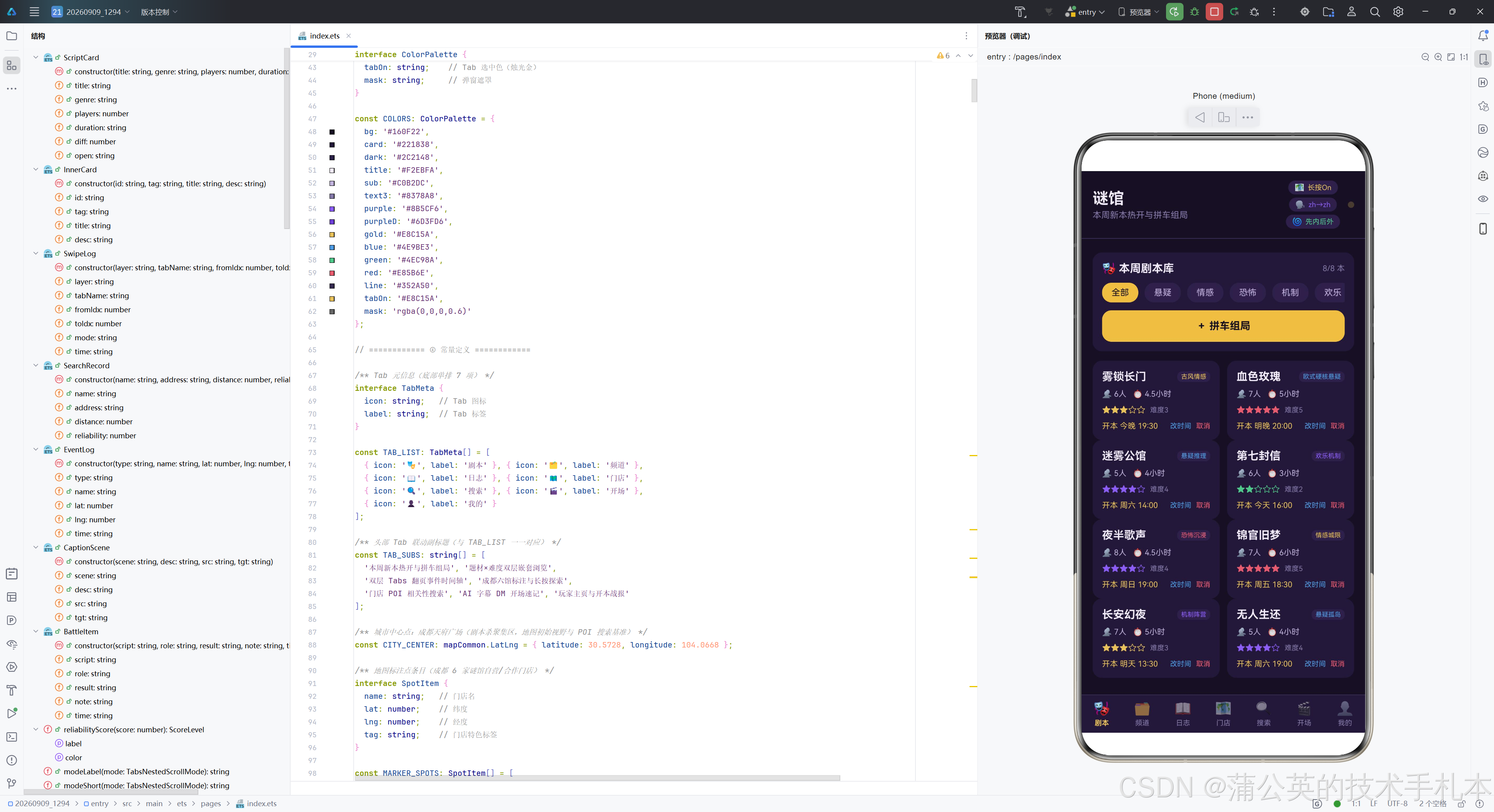
左侧 Column 包含两行文本:第一行是应用名"谜馆",字号 20,粗体,烛光冷白色;第二行是当前 Tab 的联动副标题(从 TAB_SUBS 数组取值),字号 11,暗紫灰色,单行显示并省略溢出。layoutWeight(1) 让左侧 Column 占据除右侧胶囊外的全部宽度。
右侧 Column 包含三个状态胶囊,分别对应三个特性。第一个胶囊显示地图长按监听状态(On/Off),当 Marker 或 POI 任一监听开启时显示"长按On"并使用烛光金色,否则显示"长按Off"并使用暗紫灰色。第二个胶囊显示字幕语言方向(源语言→目标语言),使用暗幕紫色。第三个胶囊显示嵌套滚动模式短文案,SELF_FIRST 模式使用通过绿,SELF_ONLY 模式使用烛光金。
最右侧是一个 8x8 像素的圆形呼吸圆点,填充烛光金,透明度随 breath 状态在 1 和 0.25 之间切换,形成闪烁效果。这个圆点既是装饰元素,也是全局呼吸动画的视觉指示器。
3.14 Builder 视图群——Tab0 剧本
  @Builder
  tabScript() {
    Column({ space: 12 }) {
      Column({ space: 10 }) {
        Row() {
          Text('🎭 本周剧本库').fontSize(14).fontColor(COLORS.title).fontWeight(FontWeight.Bold)
          Column().layoutWeight(1)
          Text(`${this.filteredScripts().length}/${this.scriptList.length} 本`).fontSize(10).fontColor(COLORS.text3)
        }.width('100%')

        Scroll() {
          Row({ space: 8 }) {
            ForEach(GENRE_CHIPS, (g: string) => {
              Text(g).fontSize(11).fontColor(this.genreFilter === g ? COLORS.bg : COLORS.sub)
                .padding({ left: 12, right: 12, top: 6, bottom: 6 }).borderRadius(12)
                .backgroundColor(this.genreFilter === g ? COLORS.gold : COLORS.dark)
                .onClick(() => { this.genreFilter = g; })
            }, (g: string) => `genre-${g}`)
          }
        }.scrollable(ScrollDirection.Horizontal).scrollBar(BarState.Off).width('100%')

        Row() {
          Text('+ 拼车组局').fontSize(13).fontColor(COLORS.bg).fontWeight(FontWeight.Bold)
        }.width('100%').height(40).justifyContent(FlexAlign.Center)
        .borderRadius(12).backgroundColor(COLORS.gold)
        .onClick(() => { this.openAdd(); })
      }.width('100%').padding(12).borderRadius(12).backgroundColor(COLORS.card)
tabScript 是剧本 Tab 的构建器,分为三个主要区块。
第一区块是题材横滚 chips 和拼车组局入口,包裹在一个卡片容器中。顶部 Row 显示"本周剧本库"标题和当前筛选数量/总数统计。中部是一个横向滚动的 Scroll 容器,内含六个题材 chips(全部、悬疑、情感、恐怖、机制、欢乐),选中态为烛光金底暗幕紫文字,未选中态为暗紫底雾紫灰文字,点击切换 genreFilter 状态。底部是一个全宽的"拼车组局"按钮,烛光金底暗幕紫文字,点击调用 openAdd() 打开组局弹窗。
      Flex({ wrap: FlexWrap.Wrap, justifyContent: FlexAlign.SpaceBetween }) {
        ForEach(this.filteredScripts(), (item: ScriptCard, idx: number) => {
          Column({ space: 8 }) {
            Row({ space: 6 }) {
              Text(item.title).fontSize(14).fontWeight(FontWeight.Bold).fontColor(COLORS.title)
                .layoutWeight(1).maxLines(1).textOverflow({ overflow: TextOverflow.Ellipsis })
              Text(item.genre).fontSize(8).fontColor(genreColor(item.genre))
                .padding({ left: 5, right: 5, top: 2, bottom: 2 })
                .borderRadius(6).backgroundColor(COLORS.dark)
            }.width('100%')

            Row({ space: 8 }) {
              Text(`👥 ${item.players}人`).fontSize(10).fontColor(COLORS.sub)
              Text(`⏱ ${item.duration}`).fontSize(10).fontColor(COLORS.sub)
            }.width('100%')

            Row({ space: 6 }) {
              Text(starText(item.diff)).fontSize(11).fontColor(difficultyColor(item.diff))
              Text(`难度${item.diff}`).fontSize(9).fontColor(COLORS.text3)
            }.width('100%')

            Row() {
              Text(`开本 ${item.open}`).fontSize(10).fontColor(COLORS.gold)
                .layoutWeight(1).maxLines(1).textOverflow({ overflow: TextOverflow.Ellipsis })
              Text('改时间').fontSize(9).fontColor(COLORS.blue)
                .onClick(() => { this.openEdit(this.indexOfCard(item)); })
              Text('取消').fontSize(9).fontColor(COLORS.red).padding({ left: 6 })
                .onClick(() => { this.openDel(this.indexOfCard(item)); })
            }.width('100%')
          }.width('48.6%').padding(12).borderRadius(12).backgroundColor(COLORS.card)
        }, (item: ScriptCard, idx: number) => `script-${idx}-${item.title}`)
      }.width('100%')
    }.width('100%')
  }
第二区块是双列剧本卡列表,使用 Flex 容器配合 FlexWrap.Wrap 实现自动换行,SpaceBetween 两端对齐。每张卡片宽度为 48.6%(略小于 50%,为间距留出空间),包含四行信息。
第一行是剧本名(粗体,烛光冷白,单行省略)和题材标签(使用 genreColor 函数着色)。第二行是适配人数和游玩时长。第三行是难度星级文本(使用 starText 生成,使用 difficultyColor 着色)和难度数值。第四行是开本时间(烛光金,单行省略)和两个操作入口——“改时间”(幽蓝色,调用 openEdit)和"取消"(警示红,调用 openDel)。两个操作都通过 indexOfCard(item) 查找实体引用对应的真实索引,确保筛选后操作正确的剧本。
3.15 Builder 视图群——Tab1 频道
  @Builder
  tabChannel() {
    Column({ space: 10 }) {
      Row({ space: 8 }) {
        Text(`嵌套模式:${modeLabel(this.nestedMode)}`).fontSize(11).fontColor(COLORS.sub)
          .layoutWeight(1).maxLines(1).textOverflow({ overflow: TextOverflow.Ellipsis })
        ForEach([TabsNestedScrollMode.SELF_ONLY, TabsNestedScrollMode.SELF_FIRST],
          (m: TabsNestedScrollMode) => {
            Text(modeShort(m)).fontSize(10)
              .padding({ left: 10, right: 10, top: 5, bottom: 5 }).borderRadius(12)
              .fontColor(this.nestedMode === m ? COLORS.bg : COLORS.text3)
              .backgroundColor(this.nestedMode === m ? COLORS.purple : COLORS.card)
              .onClick(() => { this.nestedMode = m; })
          }, (m: TabsNestedScrollMode) => `mode_${m}`)
      }.width('100%')
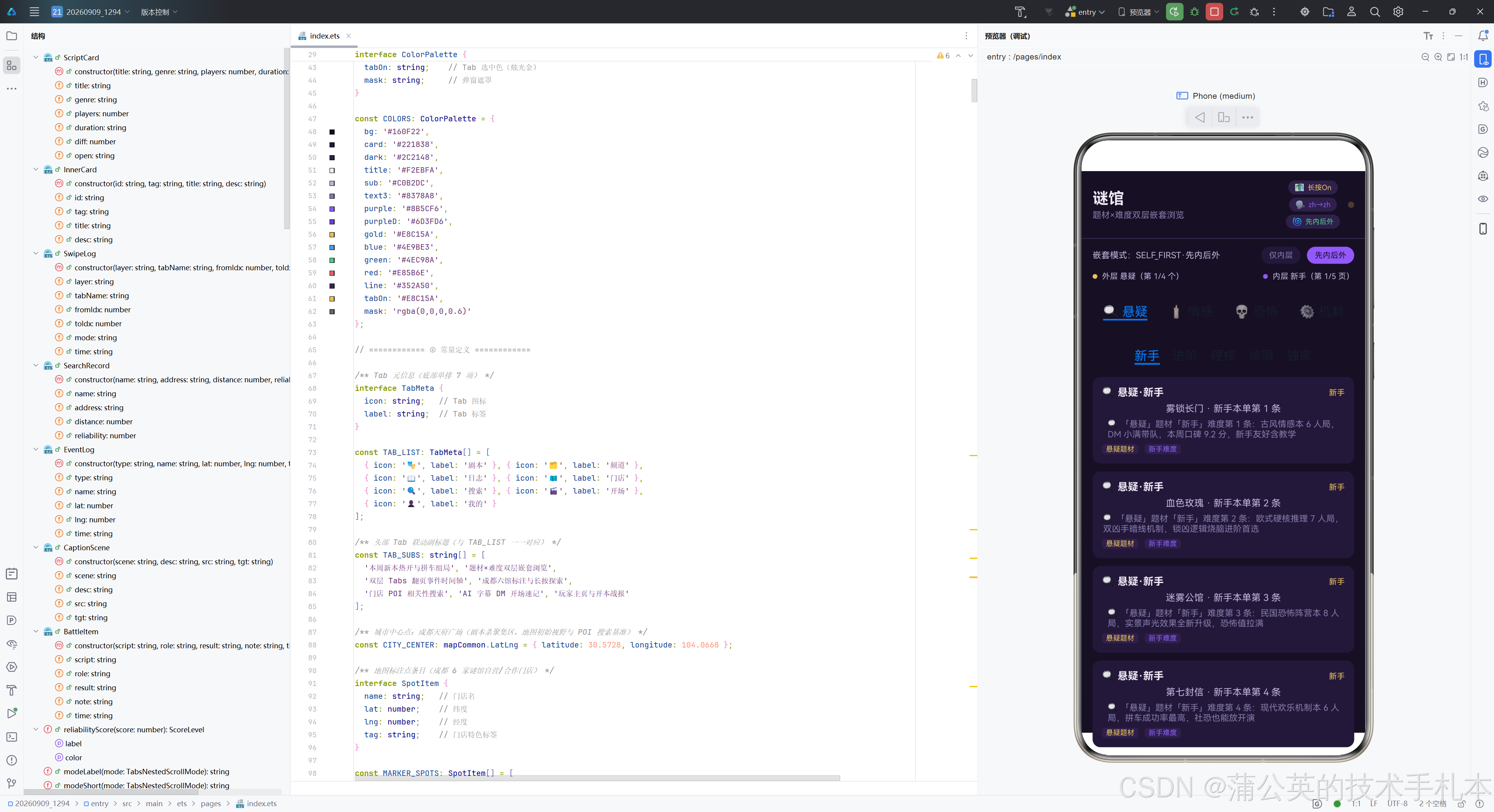
tabChannel 是频道 Tab 的构建器,是特性 B(Tabs 嵌套滚动)的核心宿主。顶部 Row 包含模式说明文案和两个模式切换 chips。切换 chips 通过 ForEach 遍历两个 TabsNestedScrollMode 枚举值生成,选中态为暗幕紫底暗幕紫黑文字,未选中态为卡片底暗紫灰文字,点击切换 nestedMode 状态。
      Row({ space: 6 }) {
        Circle({ width: 6, height: 6 }).fill(COLORS.gold)
        Text(`外层 ${OUTER_CHANNELS[this.outerIndex].name}(第 ${this.outerIndex + 1}/4 个)`)
          .fontSize(10).fontColor(COLORS.sub)
        Column().layoutWeight(1)
        Circle({ width: 6, height: 6 }).fill(COLORS.purple)
        Text(`内层 ${INNER_TABS[this.innerIndex]}(第 ${this.innerIndex + 1}/5 页)`)
          .fontSize(10).fontColor(COLORS.sub)
      }.width('100%')
当前位置说明行使用双色圆点徽标(外层烛光金、内层暗幕紫)标识当前双层 Tabs 的位置,外层显示"第 X/4 个"频道,内层显示"第 X/5 页"难度页签。
      Tabs({ barPosition: BarPosition.Start }) {
        ForEach(OUTER_CHANNELS, (ch: ChannelItem) => {
          TabContent() {
            this.innerTabs(ch)
          }.tabBar(`${ch.icon} ${ch.name}`)
        }, (ch: ChannelItem) => ch.name)
      }
      .barMode(BarMode.Fixed)
      .onChange((index: number) => {
        this.swipeLogs.unshift(new SwipeLog('外层题材', OUTER_CHANNELS[index].name,
          this.outerIndex, index, modeLabel(this.nestedMode)));
        this.outerIndex = index;
        if (this.swipeLogs.length > 40) {
          this.swipeLogs.pop();
        }
      })
      .layoutWeight(1).width('100%')
外层宿主 Tabs 包含四个题材频道 TabContent,每个 TabContent 的内容由 innerTabs(ch) 构建。barMode(BarMode.Fixed) 使外层页签固定均分宽度。onChange 回调在外层翻页时触发,构造 SwipeLog 记录(layer=‘外层题材’,记录目标频道名、起止索引、当前嵌套模式),unshift 到日志数组头部。日志数组限制最多 40 条,超出时从尾部移除。这里的关键点是:在 SELF_FIRST 模式下,内层 Tabs 滑到边缘后继续滑动会触发外层 onChange,这就是"滚动接力"的证据。
  @Builder
  innerTabs(channel: ChannelItem) {
    Tabs({ barPosition: BarPosition.Start }) {
      ForEach(INNER_TABS, (name: string) => {
        TabContent() {
          List({ space: 10 }) {
            ForEach(innerMockData(channel, name), (item: InnerCard) => {
              ListItem() {
                Column({ space: 6 }) {
                  Row() {
                    Text(`${channel.icon} ${channel.name}·${name}`).fontSize(13)
                      .fontWeight(FontWeight.Bold).fontColor(COLORS.title)
                    Column().layoutWeight(1)
                    Text(item.tag).fontSize(10).fontColor(COLORS.gold)
                  }.width('100%')
                  Text(item.title).fontSize(12).fontColor(COLORS.sub).maxLines(1)
                    .textOverflow({ overflow: TextOverflow.Ellipsis })
                  Text(item.desc).fontSize(11).fontColor(COLORS.text3).maxLines(2)
                    .textOverflow({ overflow: TextOverflow.Ellipsis })
                  Row({ space: 8 }) {
                    Text(`${channel.name}题材`).fontSize(9).fontColor(COLORS.gold)
                      .padding({ left: 5, right: 5, top: 1, bottom: 1 }).borderRadius(4)
                      .backgroundColor(COLORS.dark)
                    Text(`${name}难度`).fontSize(9).fontColor(COLORS.purple)
                      .padding({ left: 5, right: 5, top: 1, bottom: 1 }).borderRadius(4)
                      .backgroundColor(COLORS.dark)
                  }.width('100%')
                }.width('100%').padding(12).borderRadius(10).backgroundColor(COLORS.card)
              }
            }, (item: InnerCard) => item.id)
          }.width('100%').height('100%').scrollBar(BarState.Off)
        }.tabBar(name)
      }, (name: string) => name)
    }
    .barMode(BarMode.Scrollable)
    .onChange((index: number) => {
      this.swipeLogs.unshift(new SwipeLog('内层难度', INNER_TABS[index],
        this.innerIndex, index, modeLabel(this.nestedMode)));
      this.innerIndex = index;
      if (this.swipeLogs.length > 40) {
        this.swipeLogs.pop();
      }
    })
    .nestedScroll(this.nestedMode)
    .layoutWeight(1).width('100%')
  }
innerTabs 是内层 Tabs 的构建器,接收外层频道项作为参数。内层 Tabs 包含五个难度子页签(新手、进阶、硬核、城限、独家),每个页签的内容是一个 List 列表,包含八条由 innerMockData(channel, name) 生成的 InnerCard 卡片。每张卡片显示频道图标+频道名+难度名标题、卡片标题(单行省略)、卡片描述(两行省略)和两个标签徽标(题材烛光金、难度暗幕紫)。
barMode(BarMode.Scrollable) 使内层页签可横向滚动。onChange 回调记录内层翻页日志(layer=‘内层难度’)。最关键的一行是 .nestedScroll(this.nestedMode)——这是嵌套滚动机制的挂载点,将当前 nestedMode 状态绑定到内层 Tabs。当模式为 SELF_FIRST 时,内层滑到边缘后继续滑动会联动外层翻页;当模式为 SELF_ONLY 时,内层滑到边缘后不联动外层,仅在内层范围内滚动。
3.16 Builder 视图群——Tab2 日志
  @Builder
  tabLog() {
    Column({ space: 12 }) {
      Column({ space: 10 }) {
        Row() {
          Text('📖 翻页事件时间轴').fontSize(14).fontColor(COLORS.title).fontWeight(FontWeight.Bold)
          Column().layoutWeight(1)
          Text(`共 ${this.swipeLogs.length} 条`).fontSize(10).fontColor(COLORS.text3)
        }.width('100%')

        Row({ space: 8 }) {
          Row({ space: 4 }) {
            Circle({ width: 6, height: 6 }).fill(COLORS.gold)
            Text(`外层题材 ${this.outerCount()} 次`).fontSize(10).fontColor(COLORS.sub)
          }.padding({ left: 10, right: 10, top: 5, bottom: 5 })
          .borderRadius(10).backgroundColor(COLORS.dark)

          Row({ space: 4 }) {
            Circle({ width: 6, height: 6 }).fill(COLORS.purple)
            Text(`内层难度 ${this.innerCount()} 次`).fontSize(10).fontColor(COLORS.sub)
          }.padding({ left: 10, right: 10, top: 5, bottom: 5 })
          .borderRadius(10).backgroundColor(COLORS.dark)

          Column().layoutWeight(1)
          Text('清空').fontSize(10).fontColor(COLORS.red)
            .padding({ left: 12, right: 12, top: 5, bottom: 5 }).borderRadius(9)
            .backgroundColor(COLORS.dark).onClick(() => { this.clearLogs(); })
        }.width('100%')

        Text('「频道」Tab 内外层每翻一页 unshift 一条记录,layer 区分层级并携带事发时嵌套模式')
          .fontSize(9).fontColor(COLORS.text3).width('100%')
      }.width('100%').padding(12).borderRadius(12).backgroundColor(COLORS.card)
tabLog 是日志 Tab 的构建器,展示翻页事件时间轴。顶部统计卡包含总记录数、外层/内层分项计数(使用 outerCount 和 innerCount 方法)和清空按钮。统计徽标使用双色圆点区分层级——外层烛光金、内层暗幕紫。
      if (this.swipeLogs.length === 0) {
        Column({ space: 8 }) {
          Text('📭').fontSize(28)
          Text('暂无翻页记录:去「频道」Tab 横滑内外层页签试试').fontSize(11).fontColor(COLORS.text3)
        }.width('100%').padding({ top: 28, bottom: 28 }).borderRadius(12).backgroundColor(COLORS.card)
      } else {
        Column() {
          ForEach(this.swipeLogs, (log: SwipeLog, idx: number) => {
            Row() {
              Column({ space: 4 }) {
                Text(log.layer === '外层题材' ? '外' : '内').fontSize(12).fontWeight(FontWeight.Bold)
                  .fontColor(log.layer === '外层题材' ? COLORS.bg : COLORS.title)
                  .width(26).height(26).textAlign(TextAlign.Center).borderRadius(13)
                  .backgroundColor(log.layer === '外层题材' ? COLORS.gold : COLORS.purple)
                Text(log.time).fontSize(8).fontColor(COLORS.text3)
              }.width(52).height('100%').justifyContent(FlexAlign.Center)

              Column({ space: 4 }) {
                Circle({ width: 8, height: 8 }).fill(log.layer === '外层题材' ? COLORS.gold : COLORS.purple)
                Column().layoutWeight(1).width(2).backgroundColor(COLORS.line)
              }.width(20).height('100%').alignItems(HorizontalAlign.Center).padding({ top: 10 })

              Column({ space: 6 }) {
                Row({ space: 8 }) {
                  Text(log.tabName).fontSize(13).fontWeight(FontWeight.Bold).fontColor(COLORS.title)
                    .maxLines(1).textOverflow({ overflow: TextOverflow.Ellipsis })
                  Text(`${log.fromIdx} → ${log.toIdx}`).fontSize(9).fontColor(COLORS.sub).fontFamily('monospace')
                }.width('100%')
                Text(log.layer + ' · ' + log.mode).fontSize(9).fontColor(COLORS.text3)
                  .maxLines(1).textOverflow({ overflow: TextOverflow.Ellipsis })
              }.layoutWeight(1).height('100%').justifyContent(FlexAlign.Center).alignItems(HorizontalAlign.Start)
            }.width('100%').height(72).margin({ bottom: 6 }).alignItems(VerticalAlign.Top)
            .backgroundColor(COLORS.card).borderRadius(12).padding({ left: 12, right: 12 })
          }, (log: SwipeLog, idx: number) => `log-${idx}-${log.time}-${log.tabName}`)
        }.width('100%')
      }
    }.width('100%')
  }
时间轴列表部分先判断日志是否为空——空状态显示空状态提示卡,引导用户去频道 Tab 操作。非空状态使用 ForEach 遍历日志数组,每条记录渲染为一个固定高度 72 像素的 Row,包含三列。
第一列是层级徽标——外层显示"外"字(烛光金底暗幕紫黑文字),内层显示"内"字(暗幕紫底烛光冷白文字),下方显示时间。第二列是竖线——顶部圆点(双色)和填充行高的竖线,构成时间轴的视觉连线。第三列是翻页内容——页签名(粗体)和起止索引(等宽字体),以及层级和模式的说明文案。
3.17 Builder 视图群——Tab3 门店
  @Builder
  tabMap() {
    Column({ space: 10 }) {
      Row({ space: 14 }) {
        Toggle({ type: ToggleType.Switch, isOn: this.markerListenOn })
          .selectedColor(COLORS.gold).width(40).height(22)
          .onChange(() => { this.toggleMarkerListen(); })
        Text('Marker长按').fontSize(11).fontColor(this.markerListenOn ? COLORS.gold : COLORS.text3)

        Toggle({ type: ToggleType.Switch, isOn: this.poiListenOn })
          .selectedColor(COLORS.blue).width(40).height(22)
          .onChange(() => { this.togglePoiListen(); })
        Text('POI长按').fontSize(11).fontColor(this.poiListenOn ? COLORS.blue : COLORS.text3)

        Column().layoutWeight(1)
        Text('长按门店/POI 试试').fontSize(9).fontColor(COLORS.text3)
      }.width('100%')

      MapComponent({ mapOptions: this.mapOptions, mapCallback: this.mapCallback })
        .layoutWeight(1).width('100%').borderRadius(12)

      Column({ space: 6 }) {
        Row() {
          Text('📍 长按事件日志').fontSize(12).fontColor(COLORS.title).fontWeight(FontWeight.Bold)
          Column().layoutWeight(1)
          Text(`${this.eventLogs.length} 条`).fontSize(10).fontColor(COLORS.text3)
        }.width('100%')

        Scroll() {
          Column({ space: 6 }) {
            ForEach(this.eventLogs, (log: EventLog, idx: number) => {
              Row({ space: 8 }) {
                Text(log.type).fontSize(9).fontColor(COLORS.bg)
                  .padding({ left: 6, right: 6, top: 2, bottom: 2 }).borderRadius(6)
                  .backgroundColor(typeColor(log.type))
                Text(log.name).fontSize(11).fontColor(COLORS.sub).layoutWeight(1)
                  .maxLines(1).textOverflow({ overflow: TextOverflow.Ellipsis })
                Text(`${log.lat.toFixed(4)}, ${log.lng.toFixed(4)}`).fontSize(9)
                  .fontColor(COLORS.text3).fontFamily('monospace')
                Text(log.time).fontSize(9).fontColor(COLORS.text3)
              }.width('100%')
            }, (log: EventLog, idx: number) => `log-${idx}-${log.time}`)
          }.width('100%')
        }
        .layoutWeight(1).width('100%')
        .scrollBar(BarState.Off).edgeEffect(EdgeEffect.Spring)

        Text('off 不传参=清除该类型全部订阅')
          .fontSize(9).fontColor(COLORS.text3).fontFamily('monospace')
      }
      .width('100%').height(172)
      .padding(10).borderRadius(12).backgroundColor(COLORS.card)
    }
    .width('100%').layoutWeight(1)
    .padding({ left: 14, right: 14, top: 10, bottom: 10 })
  }
tabMap 是门店 Tab 的构建器,是特性 A(Map Kit)的核心展示区。整体分为三部分。
顶部是双长按 Toggle 开关行。Marker 长按开关使用烛光金选中色,POI 长按开关使用幽蓝选中色。两个 Toggle 的 onChange 分别调用 toggleMarkerListen 和 togglePoiListen 方法,动态注册或清除事件监听。
中部是 MapComponent 地图组件本体,使用 layoutWeight(1) 占满剩余高度,圆角 12 像素。地图通过 mapOptions 设置初始视野(成都天府广场,缩放 12 级),通过 mapCallback 接收初始化回调。地图渲染完成后,回调函数会自动添加六个门店 Marker 并注册两种长按监听。
底部是长按事件日志流,固定高度 172 像素,内含可滚动的事件列表。每条日志显示事件类型徽标(使用 typeColor 着色)、事件名称(单行省略)、经纬度坐标(等宽字体,保留四位小数)和触发时间。日志流下方有一行等宽字体的技术提示"off 不传参=清除该类型全部订阅",说明 Toggle 关闭时的底层行为。
3.18 Builder 视图群——Tab4 搜索
  @Builder
  tabSearch() {
    Column({ space: 12 }) {
      Row({ space: 8 }) {
        TextInput({ text: this.queryInput, placeholder: '输入关键字,如:剧本杀门店' })
          .layoutWeight(1).height(38).fontSize(12).fontColor(COLORS.title)
          .backgroundColor(COLORS.dark).placeholderColor(COLORS.text3).borderRadius(10)
          .onChange((v: string) => { this.queryInput = v; })
        Button('搜索').height(38).fontSize(12)
          .backgroundColor(COLORS.gold).fontColor(COLORS.bg).borderRadius(10)
          .onClick(() => { this.runSearch(); })
      }.width('100%')

      Text(this.searchState).fontSize(11).fontColor(COLORS.text3).width('100%')

      List({ space: 10 }) {
        ForEach(this.searchRecords, (rec: SearchRecord, idx: number) => {
          ListItem() {
            Column({ space: 7 }) {
              Row() {
                Text(rec.name).fontSize(13).fontWeight(FontWeight.Bold).fontColor(COLORS.title)
                  .layoutWeight(1).maxLines(1).textOverflow({ overflow: TextOverflow.Ellipsis })
                Text(reliabilityScore(rec.reliability).label).fontSize(10)
                  .fontColor(reliabilityScore(rec.reliability).color)
                  .padding({ left: 6, right: 6, top: 2, bottom: 2 })
                  .borderRadius(6).backgroundColor(COLORS.dark)
              }.width('100%')

              Text(rec.address).fontSize(10).fontColor(COLORS.sub).width('100%')
                .maxLines(1).textOverflow({ overflow: TextOverflow.Ellipsis })

              Row({ space: 8 }) {
                Text(`${rec.distance}m`).fontSize(10).fontColor(COLORS.text3).width(52)
                Progress({ value: rec.reliability * 100, total: 100, type: ProgressType.Linear })
                  .layoutWeight(1).color(reliabilityScore(rec.reliability).color)
                  .backgroundColor(COLORS.dark).borderRadius(3)
                Text(rec.reliability.toFixed(2)).fontSize(10).fontColor(COLORS.sub).width(36)
                  .fontFamily('monospace').textAlign(TextAlign.End)
              }.width('100%')
            }.width('100%').padding(12).borderRadius(12).backgroundColor(COLORS.card)
          }
        }, (rec: SearchRecord, idx: number) => `rec-${idx}-${rec.name}`)
      }
      .width('100%').scrollBar(BarState.Off)
    }.width('100%')
  }
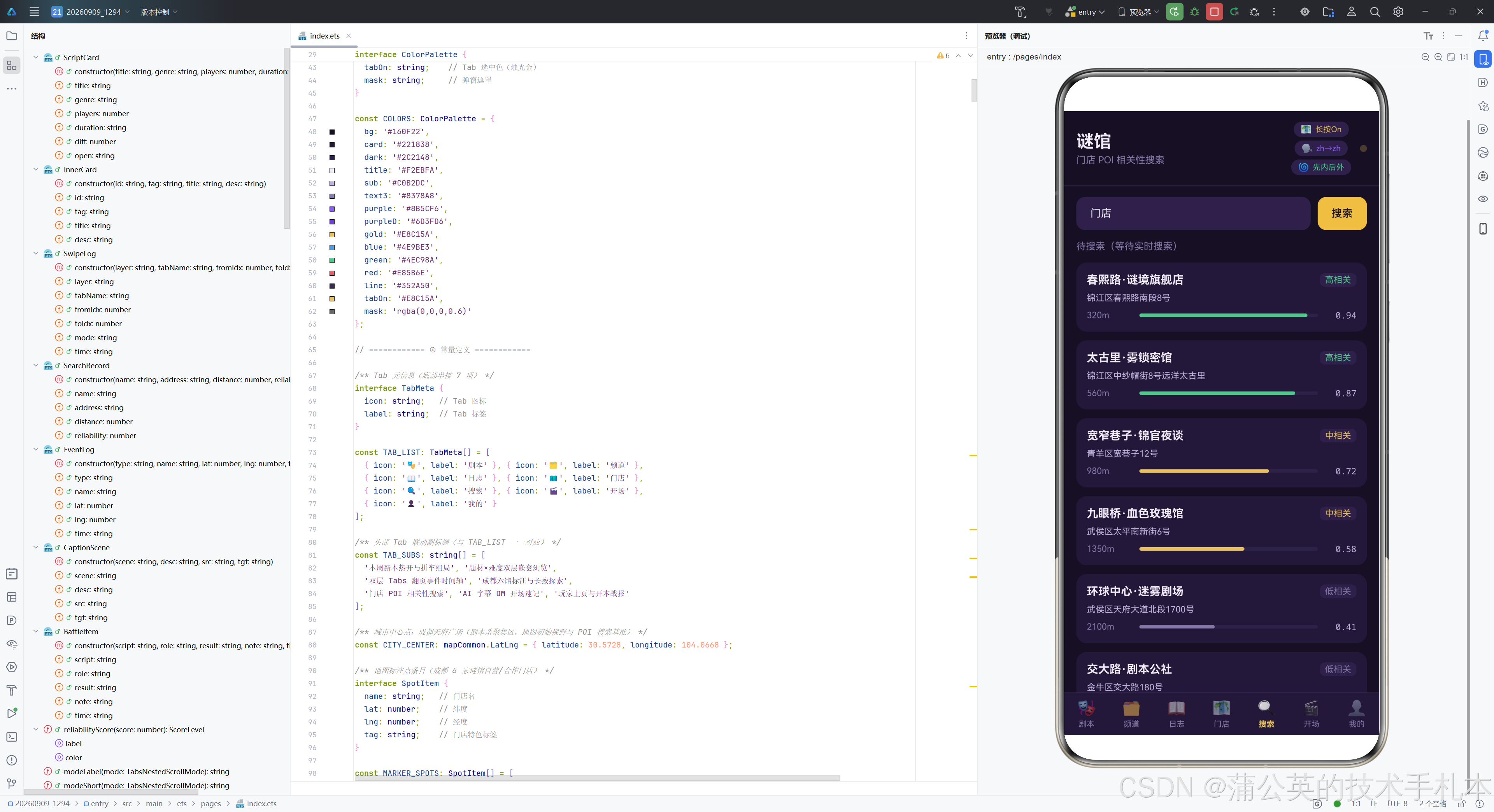
tabSearch 是搜索 Tab 的构建器,展示 searchByText 的搜索能力和 reliability 相关性分数的可视化。整体分为三部分。
顶部是搜索框和触发按钮。TextInput 绑定到 queryInput 状态,placeholder 提示输入关键字。搜索按钮烛光金底,点击调用 runSearch() 发起异步搜索。
中部是搜索状态文案,显示当前搜索的进度或结果信息。
底部是搜索结果列表,每条结果包含三行。第一行是门店名(粗体,单行省略)和相关性等级标签(使用 reliabilityScore 函数获取等级和颜色)。第二行是格式化地址(单行省略)。第三行是距离、reliability 分数条和分数值——分数条使用 Progress 线性进度组件,值映射为百分比,颜色使用等级对应的颜色,分数值使用等宽字体保留两位小数右对齐。这种三元素组合将相关性分数同时用进度条和数值展示,兼顾了直观性和精确性。
3.19 Builder 视图群——Tab5 开场
  @Builder
  tabCaption() {
    Column({ space: 12 }) {
      Column({ space: 10 }) {
        Row() {
          Text('🎬 AI 字幕实时预览').fontSize(14).fontColor(COLORS.title).fontWeight(FontWeight.Bold)
          Column().layoutWeight(1)
          Text(this.captionReady ? '已就绪' : '初始化中').fontSize(10)
            .fontColor(this.captionReady ? COLORS.green : COLORS.text3)
        }.width('100%')

        AICaptionComponent({
          isShown: this.captionShown,
          controller: this.captionController,
          options: this.buildCaptionOptions()
        })
        .width('100%').height(110).borderRadius(10)

        if (this.captionErrMsg !== '') {
          Text(this.captionErrMsg).fontSize(10).fontColor(COLORS.red).width('100%')
            .maxLines(2).textOverflow({ overflow: TextOverflow.Ellipsis })
        }

        Row({ space: 10 }) {
          Button(this.captionShown ? '隐藏字幕' : '开启字幕')
            .fontSize(12).height(32).layoutWeight(1)
            .backgroundColor(COLORS.gold).fontColor(COLORS.bg).borderRadius(10)
            .onClick(() => { this.captionShown = !this.captionShown; })
          Button(`写入演示音频(${this.captionFed})`)
            .fontSize(12).height(32).layoutWeight(1)
            .backgroundColor(COLORS.dark).fontColor(COLORS.sub).borderRadius(10)
            .onClick(() => { this.feedDemoAudio(); })
        }.width('100%')

        Text('演示音频为 640 字节 PCM 块(16kHz/16bit/单声道 ≈ 20ms),经 writeAudio 分块送入字幕引擎')
          .fontSize(9).fontColor(COLORS.text3).width('100%')
      }.width('100%').padding(12).borderRadius(12).backgroundColor(COLORS.card)
tabCaption 是开场 Tab 的构建器,是特性 C(Speech Kit AI 字幕)的核心展示区。整体分为五个区块。
第一区块是 AICaptionComponent 实时预览卡。顶部显示标题和就绪状态(captionReady 为 true 时显示"已就绪"绿色,否则显示"初始化中"灰色)。核心是 AICaptionComponent 组件的挂载——isShown 绑定到 captionShown 状态(@Link 双向绑定,直接传 @State 引用),controller 绑定到 captionController 实例,options 绑定到 buildCaptionOptions() 方法的返回值。组件高度 110 像素,圆角 10。下方有错误信息显示区(非空时显示)和两个操作按钮——"开启/隐藏字幕"切换显示状态,"写入演示音频"调用 feedDemoAudio() 写入 PCM 块,按钮文字显示已写入次数。
      Column({ space: 10 }) {
        Row() {
          Text('🌐 语言设置(联动)').fontSize(13).fontColor(COLORS.title).fontWeight(FontWeight.Bold)
          Column().layoutWeight(1)
          Text('sourceLanguage → targetLanguage').fontSize(8).fontColor(COLORS.text3)
            .maxLines(1).textOverflow({ overflow: TextOverflow.Ellipsis })
        }.width('100%')

        Row({ space: 8 }) {
          Text('源语言').fontSize(11).fontColor(COLORS.text3).width(48)
          ForEach(SRC_LANGS, (opt: LangOption) => {
            Text(opt.name).fontSize(11).fontWeight(FontWeight.Bold)
              .fontColor(this.srcLang === opt.code ? COLORS.bg : COLORS.sub)
              .padding({ left: 12, right: 12, top: 5, bottom: 5 }).borderRadius(14)
              .backgroundColor(this.srcLang === opt.code ? COLORS.gold : COLORS.dark)
              .onClick(() => { this.switchSourceLang(opt.code); })
          }, (opt: LangOption) => `src-${opt.code}`)
        }.width('100%')

        if (this.srcLang === 'zh') {
          Row({ space: 8 }) {
            Text('目标语言').fontSize(11).fontColor(COLORS.text3).width(48)
            Text('中文(锁定)').fontSize(11).fontWeight(FontWeight.Bold).fontColor(COLORS.purple)
              .padding({ left: 12, right: 12, top: 5, bottom: 5 })
              .borderRadius(14).backgroundColor(COLORS.dark)
            Text('中文源仅支持目标 zh').fontSize(9).fontColor(COLORS.text3)
          }.width('100%')
        } else {
          Row({ space: 8 }) {
            Text('目标语言').fontSize(11).fontColor(COLORS.text3).width(48)
            ForEach(TGT_LANGS_EN, (opt: LangOption) => {
              Text(opt.name).fontSize(11).fontWeight(FontWeight.Bold)
                .fontColor(this.tgtLang === opt.code ? COLORS.bg : COLORS.sub)
                .padding({ left: 12, right: 12, top: 5, bottom: 5 }).borderRadius(14)
                .backgroundColor(this.tgtLang === opt.code ? COLORS.purple : COLORS.dark)
                .onClick(() => { this.tgtLang = opt.code; })
            }, (opt: LangOption) => `tgt-${opt.code}`)
          }.width('100%')
        }
      }.width('100%').padding(12).borderRadius(12).backgroundColor(COLORS.card)
第二区块是语言设置卡,展示 sourceLanguage → targetLanguage 的联动逻辑。源语言有两个选项(中文/英文),选中态烛光金底。当源语言为中文时,目标语言锁定为中文(显示"中文(锁定)“并提示"中文源仅支持目标 zh”),无可选项。当源语言为英文时,目标语言有三个选项(中文/英文/中英双语),选中态暗幕紫底,可自由切换。这种条件分支确保了语言组合的合法性。
      Column({ space: 12 }) {
        Row() {
          Text('🎨 外观设置').fontSize(13).fontColor(COLORS.title).fontWeight(FontWeight.Bold)
          Column().layoutWeight(1)
          Text('fontSize · fontColor').fontSize(9).fontColor(COLORS.text3)
        }.width('100%')

        Row({ space: 8 }) {
          ForEach(SIZE_OPTIONS, (opt: SizeOption) => {
            Column({ space: 4 }) {
              Text(opt.size === AICaptionFontSize.LARGE ? '大A' : (opt.size === AICaptionFontSize.BIG ? '大' : (opt.size === AICaptionFontSize.SMALL ? '小' : '标')))
                .fontSize(opt.size === AICaptionFontSize.LARGE ? 20 : (opt.size === AICaptionFontSize.BIG ? 17 : (opt.size === AICaptionFontSize.SMALL ? 11 : 14)))
                .fontColor(this.captionSize === opt.size ? COLORS.gold : COLORS.sub)
              Text(opt.name).fontSize(9)
                .fontColor(this.captionSize === opt.size ? COLORS.gold : COLORS.text3)
            }.layoutWeight(1).padding({ top: 8, bottom: 8 }).borderRadius(10)
            .backgroundColor(this.captionSize === opt.size ? COLORS.dark : COLORS.card)
            .border({
              width: this.captionSize === opt.size ? 1 : 0,
              color: this.captionSize === opt.size ? COLORS.gold : COLORS.line
            })
            .onClick(() => { this.captionSize = opt.size; })
          }, (opt: SizeOption) => opt.name)
        }.width('100%')

        Divider().strokeWidth(1).color(COLORS.line)

        Row({ space: 10 }) {
          ForEach(CAPTION_FONT_COLORS, (c: string, idx: number) => {
            Column({ space: 5 }) {
              Column().width(30).height(30).borderRadius(15).backgroundColor(c)
                .border({
                  width: this.captionColor === c ? 2 : 1,
                  color: this.captionColor === c ? COLORS.gold : COLORS.line
                })
              Text(this.captionColor === c ? '使用中' : `#${idx + 1}`).fontSize(8)
                .fontColor(this.captionColor === c ? COLORS.gold : COLORS.text3)
            }.layoutWeight(1).onClick(() => { this.captionColor = c; })
          }, (c: string, idx: number) => `color-${idx}-${c}`)
        }.width('100%')
      }.width('100%').padding(12).borderRadius(12).backgroundColor(COLORS.card)
第三区块是外观设置卡,展示 fontSize 和 fontColor 两个配置。字号四档使用嵌套三元表达式动态确定预览字符和字号大小——LARGE 显示"大A"(20px)、BIG 显示"大"(17px)、SMALL 显示"小"(11px)、NORMAL 显示"标"(14px),选中态使用烛光金并添加金色边框。五色块使用 30x30 圆形色块展示,选中态添加 2 像素金色边框并显示"使用中"标签。
      Column({ space: 8 }) {
        Row() {
          Text('🧾 options 代码预览').fontSize(13).fontColor(COLORS.title).fontWeight(FontWeight.Bold)
          Column().layoutWeight(1)
          Text('buildCaptionOptions()').fontSize(9).fontColor(COLORS.text3)
        }.width('100%')

        Column({ space: 4 }) {
          Text('AICaptionOptions {').fontSize(10).fontColor(COLORS.sub).fontFamily('monospace')
          Text('  initialOpacity: 1,').fontSize(10).fontColor(COLORS.text3).fontFamily('monospace')
          Text(`  sourceLanguage: '${this.srcLang}',   // ★ 6.1.1 新增`)
            .fontSize(10).fontColor(COLORS.gold).fontFamily('monospace')
          Text(`  targetLanguage: '${this.tgtLang}',  // ★ 6.1.1 新增`)
            .fontSize(10).fontColor(COLORS.gold).fontFamily('monospace')
          Text(`  fontSize: AICaptionFontSize.${this.captionSizeName()},  // ★ 6.1.1 新增`)
            .fontSize(10).fontColor(COLORS.purple).fontFamily('monospace')
          Text(`  fontColor: '${this.captionColor}',  // ★ 6.1.1 新增`)
            .fontSize(10).fontColor(COLORS.blue).fontFamily('monospace')
          Text('  onPrepared: () => void,  onError: (BusinessError) => void')
            .fontSize(10).fontColor(COLORS.text3).fontFamily('monospace')
          Text('}').fontSize(10).fontColor(COLORS.sub).fontFamily('monospace')
        }.width('100%').padding(10).borderRadius(10).backgroundColor(COLORS.dark)
      }.width('100%').padding(12).borderRadius(12).backgroundColor(COLORS.card)
第四区块是 options 代码预览卡,以等宽字体实时镜像 buildCaptionOptions() 方法的组装结果。每行对应一个配置字段,新增字段使用不同颜色高亮(sourceLanguage/targetLanguage 烛光金、fontSize 暗幕紫、fontColor 幽蓝),并标注"★ 6.1.1 新增"注释。这个卡片让开发者可以直观看到当前配置对象的结构和值,是"代码即文档"设计理念的体现。
      Column({ space: 8 }) {
        Row() {
          Text('💡 谜馆字幕场景').fontSize(12).fontColor(COLORS.title).fontWeight(FontWeight.Bold)
          Column().layoutWeight(1)
          Text('点击应用').fontSize(9).fontColor(COLORS.text3)
        }.width('100%')

        ForEach(CAPTION_SCENES, (sc: CaptionScene, idx: number) => {
          Row({ space: 10 }) {
            Text('🎬').fontSize(14)
            Column({ space: 3 }) {
              Text(sc.scene).fontSize(12).fontWeight(FontWeight.Bold).fontColor(COLORS.title)
                .maxLines(1).textOverflow({ overflow: TextOverflow.Ellipsis })
              Text(sc.desc).fontSize(10).fontColor(COLORS.text3)
                .maxLines(1).textOverflow({ overflow: TextOverflow.Ellipsis })
            }.layoutWeight(1).alignItems(HorizontalAlign.Start)
            Text(langName(sc.src) + '→' + langName(sc.tgt)).fontSize(9)
              .fontColor(this.srcLang === sc.src && this.tgtLang === sc.tgt ? COLORS.gold : COLORS.text3)
              .padding({ left: 8, right: 8, top: 3, bottom: 3 })
              .borderRadius(10).backgroundColor(COLORS.dark)
          }.width('100%').padding(12).borderRadius(12).backgroundColor(COLORS.card)
          .onClick(() => { this.applyScene(idx); })
        }, (sc: CaptionScene, idx: number) => `scene-${idx}-${sc.scene}`)

        if (this.captionErrMsg !== '') {
          Text('onError 兜底:' + this.captionErrMsg).fontSize(9).fontColor(COLORS.red).width('100%')
        }
      }.width('100%')
    }.width('100%')
  }
第五区块是字幕场景列表,展示五个预设场景(DM 开场白速记、日语引进本讲解等)。每个场景卡显示场景名、场景说明和推荐语言方向(使用 langName 转换为中文展示名)。当当前语言组合与场景推荐一致时,语言方向标签使用烛光金高亮。点击场景卡调用 applyScene(idx) 一键应用推荐的语言组合。底部有 onError 兜底提示,非空时显示错误信息。
3.20 Builder 视图群——Tab6 我的
  @Builder
  tabMine() {
    Column({ space: 12 }) {
      Column({ space: 12 }) {
        Row({ space: 10 }) {
          Text('🕵️').fontSize(30)
          Column({ space: 3 }) {
            Text('谜馆常客 · 夜谈玩家').fontSize(16).fontWeight(FontWeight.Bold).fontColor(COLORS.title)
            Text('入驻 512 天 · 沉浸式社交娱乐终身卡').fontSize(10).fontColor(COLORS.sub)
          }.layoutWeight(1).alignItems(HorizontalAlign.Start)
          Circle({ width: 8, height: 8 }).fill(COLORS.gold).opacity(this.breath ? 1 : 0.3)
        }.width('100%')

        Row() {
          Column({ space: 3 }) {
            Text('86').fontSize(20).fontWeight(FontWeight.Bold).fontColor(COLORS.gold)
            Text('开局数').fontSize(9).fontColor(COLORS.sub)
          }.layoutWeight(1)
          Column({ space: 3 }) {
            Text('92').fontSize(20).fontWeight(FontWeight.Bold).fontColor(COLORS.purple)
            Text('推理值').fontSize(9).fontColor(COLORS.sub)
          }.layoutWeight(1)
          Column({ space: 3 }) {
            Text('7').fontSize(20).fontWeight(FontWeight.Bold).fontColor(COLORS.blue)
            Text('徽章 badge').fontSize(9).fontColor(COLORS.sub)
          }.layoutWeight(1)
          Column({ space: 3 }) {
            Text('12').fontSize(20).fontWeight(FontWeight.Bold).fontColor(COLORS.green)
            Text('待开本').fontSize(9).fontColor(COLORS.sub)
          }.layoutWeight(1)
        }.width('100%')
      }.width('100%').padding(16).borderRadius(16)
      .linearGradient({
        angle: 160,
        colors: [[COLORS.purpleD, 0], [COLORS.dark, 0.55], [COLORS.card, 1]]
      })
tabMine 是"我的"Tab 的构建器,分为三个主要区块。
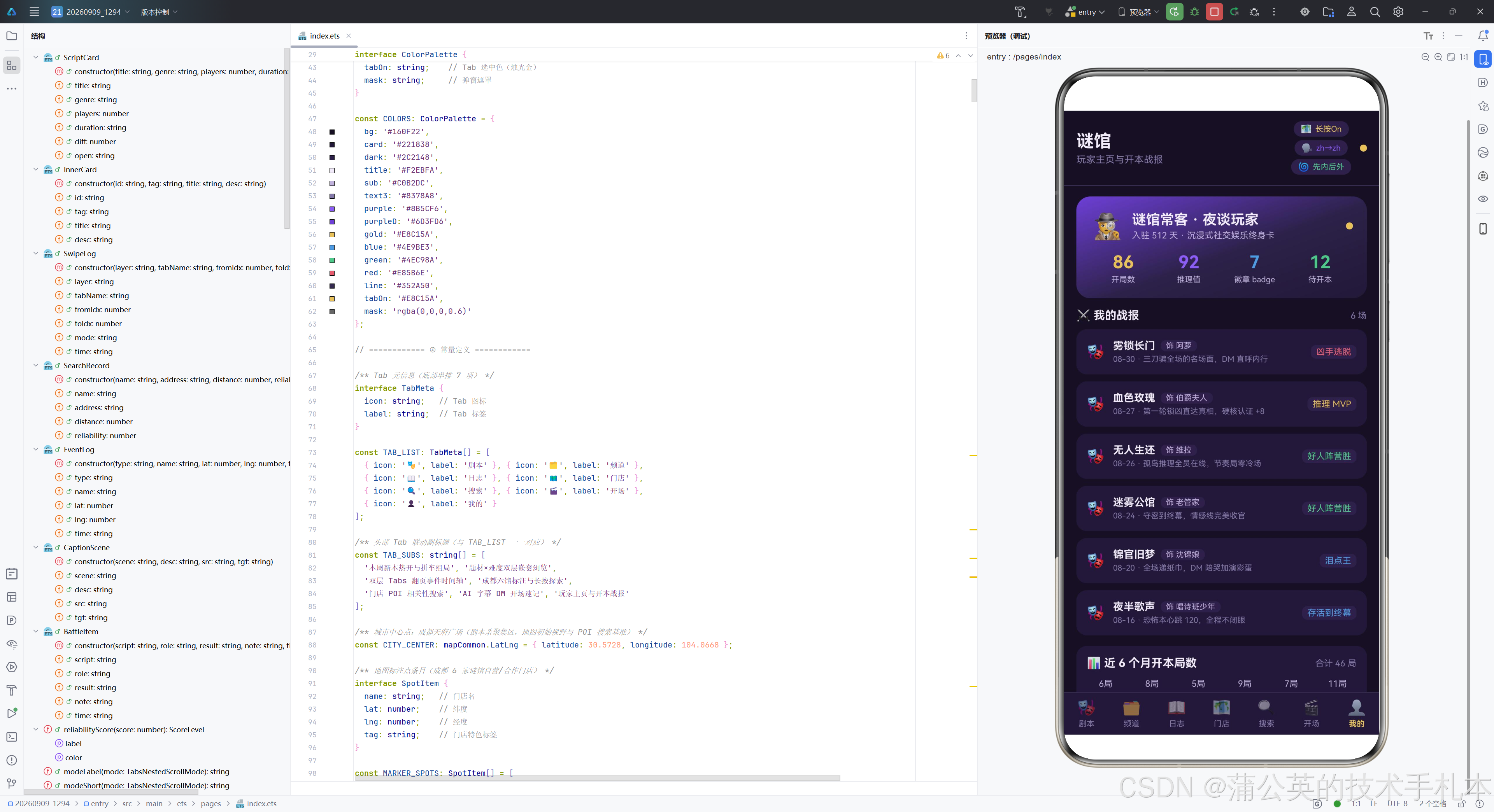
第一区块是玩家渐变大卡,使用 linearGradient 三色渐变(暗幕紫深色→暗紫→深紫幕,角度 160 度)作为背景,营造出从深到浅的层次感。卡片顶部显示玩家身份信息(侦探 emoji + 玩家名 + 入驻信息 + 呼吸圆点),下方四列数据展示开局数(86,烛光金)、推理值(92,暗幕紫)、徽章数(7,幽蓝)、待开本数(12,通过绿)。
      Column({ space: 8 }) {
        Row() {
          Text('⚔️ 我的战报').fontSize(13).fontColor(COLORS.title).fontWeight(FontWeight.Bold)
          Column().layoutWeight(1)
          Text(`${this.battleList.length} 场`).fontSize(10).fontColor(COLORS.text3)
        }.width('100%')

        ForEach(this.battleList, (b: BattleItem, idx: number) => {
          Row({ space: 10 }) {
            Text('🎭').fontSize(16)
            Column({ space: 3 }) {
              Row({ space: 6 }) {
                Text(b.script).fontSize(12).fontWeight(FontWeight.Bold).fontColor(COLORS.title)
                  .maxLines(1).textOverflow({ overflow: TextOverflow.Ellipsis })
                Text(`饰 ${b.role}`).fontSize(9).fontColor(COLORS.sub)
                  .padding({ left: 6, right: 6, top: 1, bottom: 1 })
                  .borderRadius(6).backgroundColor(COLORS.dark)
              }
              Text(`${b.time} · ${b.note}`).fontSize(9).fontColor(COLORS.text3)
                .maxLines(1).textOverflow({ overflow: TextOverflow.Ellipsis })
            }.layoutWeight(1).alignItems(HorizontalAlign.Start)

            Text(b.result).fontSize(10).fontColor(resultColor(b.result))
              .padding({ left: 6, right: 6, top: 2, bottom: 2 })
              .borderRadius(6).backgroundColor(COLORS.dark)
          }.width('100%').padding(12).borderRadius(12).backgroundColor(COLORS.card)
        }, (b: BattleItem, idx: number) => `battle-${idx}-${b.script}-${b.time}`)
      }.width('100%')
第二区块是战报清单,使用 ForEach 遍历 battleList 六条战报数据。每行显示剧本名(粗体,单行省略)、所饰角色(徽标)、完局时间和注解(单行省略)、战报结果(使用 resultColor 着色的徽标)。结果颜色根据关键词动态变化——MVP 烛光金、逃脱/败局红、胜局绿、其余幽蓝。
      this.chartCard()

      Text('谜馆 v6.1.1 · Map Kit + Speech Kit + Tabs 嵌套滚动 · 深色·暗幕紫+烛光金')
        .fontSize(9).fontColor(COLORS.text3).width('100%').textAlign(TextAlign.Center)
        .padding({ top: 4, bottom: 4 })
    }.width('100%')
  }
第三区块调用 chartCard() 构建月度柱状图,底部显示版本和特性声明文案。
  @Builder
  chartCard() {
    Column({ space: 10 }) {
      Row() {
        Text('📊 近 6 个月开本局数').fontSize(13).fontColor(COLORS.title).fontWeight(FontWeight.Bold)
        Column().layoutWeight(1)
        Text('合计 46 局').fontSize(10).fontColor(COLORS.text3)
      }.width('100%')

      Row({ space: 10 }) {
        ForEach(MONTH_IDX, (i: number) => {
          Column({ space: 6 }) {
            Text(`${MONTH_VAL[i]}局`).fontSize(10).fontColor(COLORS.sub)
            Column() {
              Column().width('100%').height(this.barHeight(i)).borderRadius(4)
                .linearGradient({ angle: 180, colors: [[COLORS.gold, 0], [COLORS.purpleD, 1]] })
            }.height(92).width(20).justifyContent(FlexAlign.End)
            Text(MONTH_NAME[i]).fontSize(10).fontColor(COLORS.text3)
          }.layoutWeight(1)
        }, (i: number) => `month-${i}-${this.breath}`)
      }.width('100%').alignItems(VerticalAlign.Bottom)

      Text('柱高随 breath 呼吸在 ±6% 区间交替波动 · 满刻度按 12 局换算')
        .fontSize(9).fontColor(COLORS.text3).width('100%')
    }.width('100%').padding(12).borderRadius(12).backgroundColor(COLORS.card)
  }
chartCard 是月度柱状图构建器,使用 Column+ForEach 的传统方式实现柱状图。六根柱子均分宽度,每根柱子由三部分组成:顶部数据标签(局数)、中部柱体(使用 barHeight(i) 计算高度,渐变填充从烛光金到暗幕紫深色,底部对齐)、底部月份标签。柱高的波动由 breath 状态驱动,奇偶柱交替放大/缩小 6%,形成呼吸动画效果。ForEach 的 keyGenerator 使用 ``month-i−{i}-i−{this.breath}```,将 breath 变化纳入 key 计算,确保 breath 翻转时柱体会重新渲染。
3.21 Builder 视图群——底部 Tab 栏
  @Builder
  tabBar() {
    Row() {
      ForEach(TAB_LIST, (tab: TabMeta, idx: number) => {
        Column({ space: 3 }) {
          Text(tab.icon).fontSize(17).opacity(this.currentTab === idx ? 1 : 0.55)
          Text(tab.label).fontSize(9)
            .fontColor(this.currentTab === idx ? COLORS.tabOn : COLORS.text3)
            .fontWeight(this.currentTab === idx ? FontWeight.Bold : FontWeight.Normal)
        }.layoutWeight(1).padding({ top: 7, bottom: 7 })
        .onClick(() => { this.currentTab = idx; })
      }, (tab: TabMeta, idx: number) => `tab-${idx}-${tab.label}`)
    }
    .width('100%').backgroundColor(COLORS.card)
    .border({ width: { top: 1 }, color: COLORS.line })
  }
tabBar 是底部 Tab 栏构建器,使用 Row 布局,七个 Tab 项均分宽度(layoutWeight(1))。选中态:图标完全不透明、标签烛光金色粗体;未选中态:图标 55% 透明度、标签暗紫灰色常规字重。顶部有一条分割线。点击切换 currentTab 状态。
3.22 弹窗系统
  @Builder
  modalOverlay(onClose: () => void) {
    Column() {
      Column().width('100%').height('100%').backgroundColor(COLORS.mask)
    }
    .width('100%').height('100%')
    .onClick(() => { onClose(); })
  }
modalOverlay 是全屏弹窗遮罩层构建器,使用半透明黑色背景覆盖全屏,点击空白区域调用 onClose 回调关闭弹窗。这是所有弹窗共享的遮罩基础组件。
  @Builder
  panelAdd(onClose: () => void) {
    Stack() {
      this.modalOverlay(onClose)
      Column({ space: 14 }) {
        Row() {
          Text('🎭 拼车组局').fontSize(16).fontWeight(FontWeight.Bold).fontColor(COLORS.title)
          Column().layoutWeight(1)
          Text('✕').fontSize(14).fontColor(COLORS.text3).onClick(() => { onClose(); })
        }.width('100%')

        Text('剧本名').fontSize(11).fontColor(COLORS.sub).width('100%')
        TextInput({ text: this.formScript, placeholder: '如:雾锁长门' })
          .height(38).fontSize(12).fontColor(COLORS.title)
          .backgroundColor(COLORS.dark).placeholderColor(COLORS.text3).borderRadius(10)
          .onChange((v: string) => { this.formScript = v; })

        Text('题材').fontSize(11).fontColor(COLORS.sub).width('100%')
        Scroll() {
          Row({ space: 8 }) {
            ForEach(GENRE_CHIPS, (g: string) => {
              Text(g).fontSize(11).fontColor(this.formGenre === g ? COLORS.bg : COLORS.sub)
                .padding({ left: 12, right: 12, top: 6, bottom: 6 }).borderRadius(12)
                .backgroundColor(this.formGenre === g ? COLORS.purple : COLORS.dark)
                .onClick(() => { this.formGenre = g; })
            }, (g: string) => `form-genre-${g}`)
          }
        }.scrollable(ScrollDirection.Horizontal).scrollBar(BarState.Off).width('100%')

        Text('拼车人数').fontSize(11).fontColor(COLORS.sub).width('100%')
        TextInput({ text: this.formPlayers, placeholder: '如:6' })
          .height(38).fontSize(12).fontColor(COLORS.title)
          .backgroundColor(COLORS.dark).placeholderColor(COLORS.text3).borderRadius(10)
          .type(InputType.Number)
          .onChange((v: string) => { this.formPlayers = v; })

        Text('开本时间').fontSize(11).fontColor(COLORS.sub).width('100%')
        TextInput({ text: this.formOpen, placeholder: '如:今晚 19:30' })
          .height(38).fontSize(12).fontColor(COLORS.title)
          .backgroundColor(COLORS.dark).placeholderColor(COLORS.text3).borderRadius(10)
          .onChange((v: string) => { this.formOpen = v; })

        Row({ space: 10 }) {
          Button('取消').layoutWeight(1).height(38).fontSize(13)
            .backgroundColor(COLORS.dark).fontColor(COLORS.sub).borderRadius(10)
            .onClick(() => { onClose(); })
          Button('确认组局').layoutWeight(1).height(38).fontSize(13)
            .backgroundColor(COLORS.gold).fontColor(COLORS.bg).borderRadius(10)
            .onClick(() => { this.doAdd(); })
        }.width('100%')
      }
      .width('86%').padding(18).borderRadius(16).backgroundColor(COLORS.card)
    }
    .width('100%').height('100%').alignContent(Alignment.Center)
  }
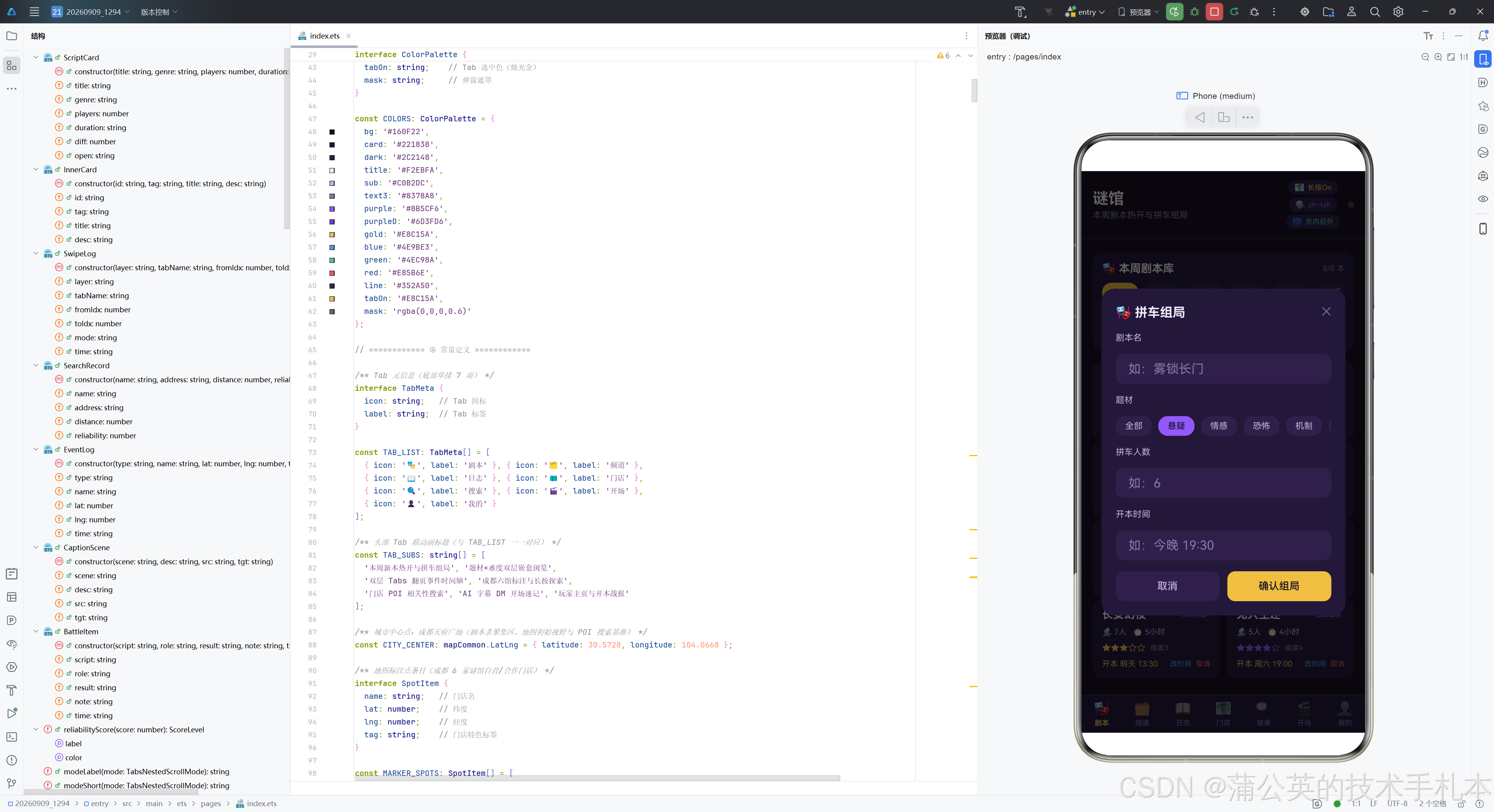
panelAdd 是拼车组局弹窗构建器,使用 Stack 层叠遮罩层和弹窗内容。弹窗宽度 86%,居中对齐,圆角 16。表单包含四个字段:剧本名(TextInput)、题材(横向滚动 chips,选中态暗幕紫底)、拼车人数(TextInput,数字键盘类型 InputType.Number)、开本时间(TextInput)。底部两个按钮——"取消"调用 onClose 关闭弹窗,"确认组局"调用 doAdd() 执行组局逻辑。
  @Builder
  panelEdit(onClose: () => void) {
    Stack() {
      this.modalOverlay(onClose)
      Column({ space: 14 }) {
        Row() {
          Text('⏱ 修改开本时间').fontSize(16).fontWeight(FontWeight.Bold).fontColor(COLORS.title)
          Column().layoutWeight(1)
          Text('✕').fontSize(14).fontColor(COLORS.text3).onClick(() => { onClose(); })
        }.width('100%')

        if (this.editIdx >= 0 && this.editIdx < this.scriptList.length) {
          Text('当前剧本(只读)').fontSize(11).fontColor(COLORS.sub).width('100%')
          Row({ space: 8 }) {
            Text(this.scriptList[this.editIdx].title).fontSize(13).fontWeight(FontWeight.Bold)
              .fontColor(COLORS.title).layoutWeight(1)
              .maxLines(1).textOverflow({ overflow: TextOverflow.Ellipsis })
            Text(this.scriptList[this.editIdx].genre).fontSize(9)
              .fontColor(genreColor(this.scriptList[this.editIdx].genre))
              .padding({ left: 6, right: 6, top: 2, bottom: 2 })
              .borderRadius(6).backgroundColor(COLORS.dark)
          }.width('100%').padding(10).borderRadius(10).backgroundColor(COLORS.dark)

          Text(`当前开本:${this.scriptList[this.editIdx].open}`)
            .fontSize(10).fontColor(COLORS.text3).width('100%')

          Text('新开本时间').fontSize(11).fontColor(COLORS.sub).width('100%')
          TextInput({ text: this.editOpen, placeholder: '如:周日 14:00' })
            .height(38).fontSize(12).fontColor(COLORS.title)
            .backgroundColor(COLORS.dark).placeholderColor(COLORS.text3).borderRadius(10)
            .onChange((v: string) => { this.editOpen = v; })
        } else {
          Text('未选中有效剧本').fontSize(12).fontColor(COLORS.sub).width('100%').textAlign(TextAlign.Center)
        }

        Row({ space: 10 }) {
          Button('取消').layoutWeight(1).height(38).fontSize(13)
            .backgroundColor(COLORS.dark).fontColor(COLORS.sub).borderRadius(10)
            .onClick(() => { onClose(); })
          Button('保存修改').layoutWeight(1).height(38).fontSize(13)
            .backgroundColor(COLORS.gold).fontColor(COLORS.bg).borderRadius(10)
            .onClick(() => { this.doEdit(); })
        }.width('100%')
      }
      .width('86%').padding(18).borderRadius(16).backgroundColor(COLORS.card)
    }
    .width('100%').height('100%').alignContent(Alignment.Center)
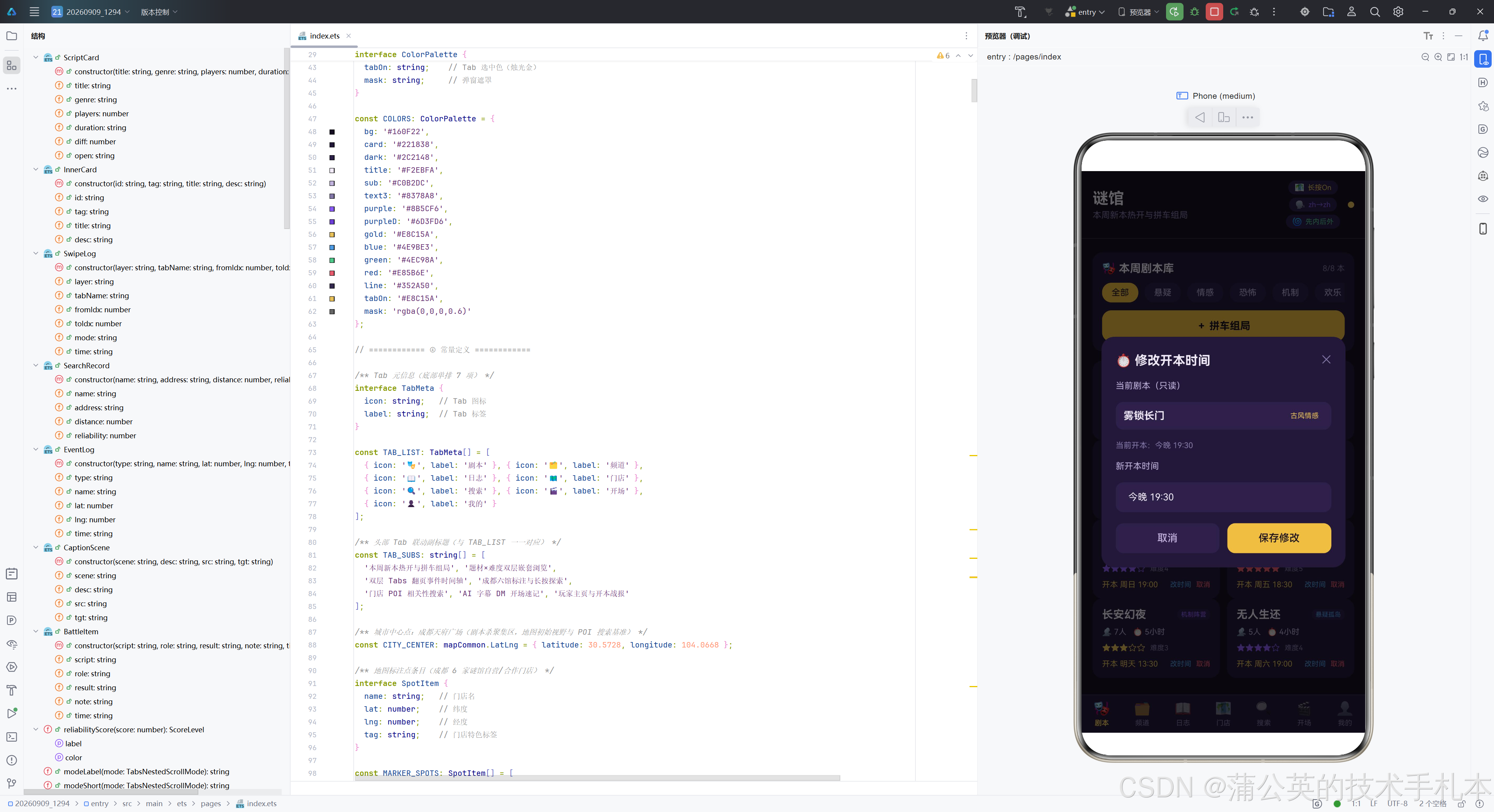
  }
panelEdit 是修改开本时间弹窗构建器。与组局弹窗不同,编辑弹窗的剧本名是只读回显的——通过条件判断 editIdx 的有效性,有效时显示当前剧本名(只读)、题材标签和当前开本时间,以及新开本时间的输入框;无效时显示"未选中有效剧本"提示。底部"保存修改"按钮调用 doEdit() 执行修改。
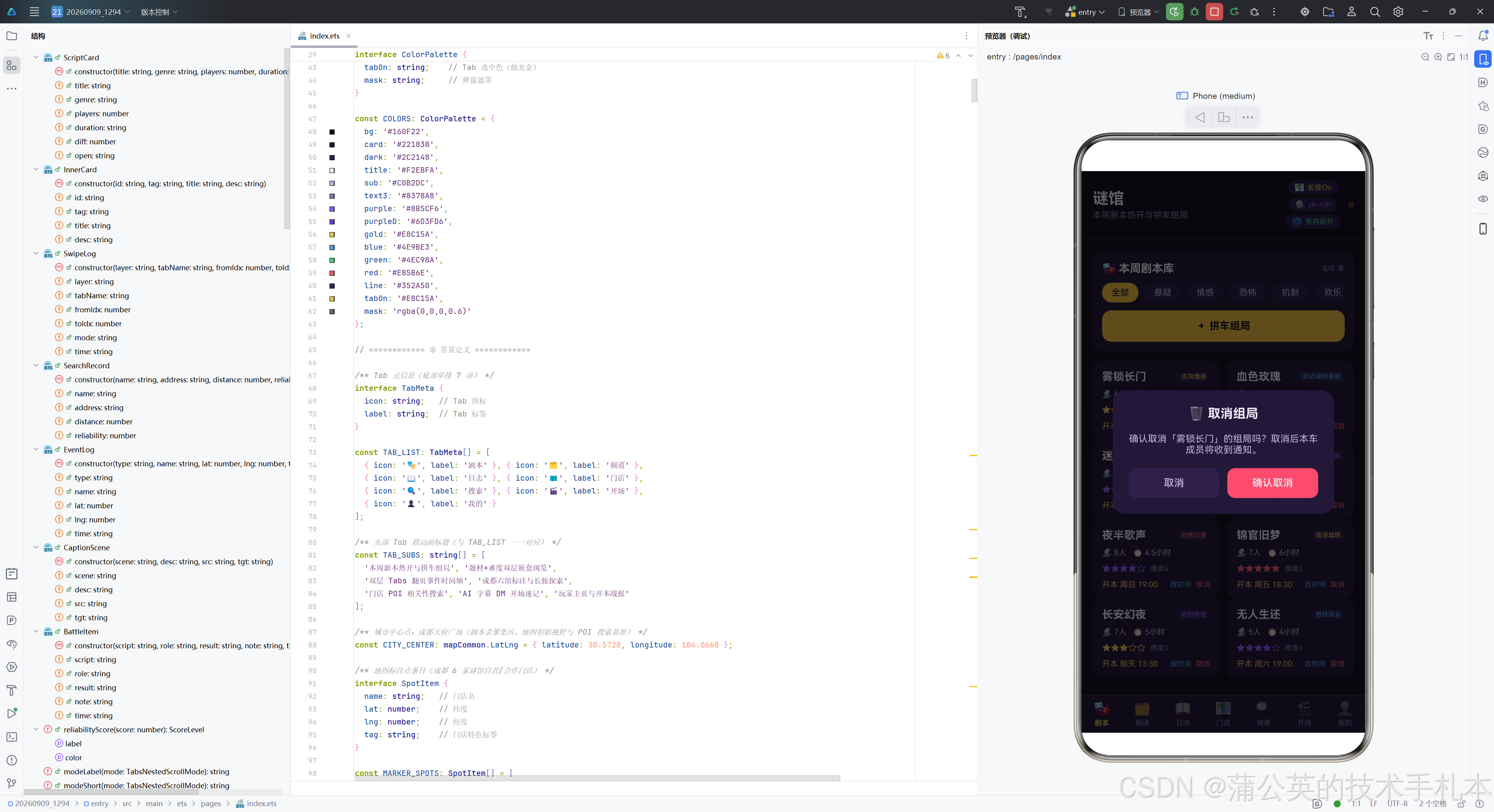
  @Builder
  panelDel(onClose: () => void) {
    Stack() {
      this.modalOverlay(onClose)
      Column({ space: 16 }) {
        Text('🗑 取消组局').fontSize(16).fontWeight(FontWeight.Bold).fontColor(COLORS.title)

        if (this.delIdx >= 0 && this.delIdx < this.scriptList.length) {
          Text(`确认取消「${this.scriptList[this.delIdx].title}」的组局吗?取消后本车成员将收到通知。`)
            .fontSize(12).fontColor(COLORS.sub).width('100%').textAlign(TextAlign.Center)
        } else {
          Text('未选中有效剧本').fontSize(12).fontColor(COLORS.sub).width('100%').textAlign(TextAlign.Center)
        }

        Row({ space: 10 }) {
          Button('取消').layoutWeight(1).height(38).fontSize(13)
            .backgroundColor(COLORS.dark).fontColor(COLORS.sub).borderRadius(10)
            .onClick(() => { onClose(); })
          Button('确认取消').layoutWeight(1).height(38).fontSize(13)
            .backgroundColor(COLORS.red).fontColor(COLORS.title).borderRadius(10)
            .onClick(() => { this.doDel(); })
        }.width('100%')
      }
      .width('78%').padding(20).borderRadius(16).backgroundColor(COLORS.card)
    }
    .width('100%').height('100%')
    .alignContent(Alignment.Center)
  }
panelDel 是取消组局确认弹窗构建器,宽度较窄(78%),用于危险操作的二次确认。弹窗显示确认文案(包含目标剧本名),底部"确认取消"按钮使用警示红色底,与"取消"按钮形成视觉对比,强调危险操作属性。确认调用 doDel() 执行删除。
四、技术对比表
| 维度 | Map Kit(特性 A) | Tabs 嵌套滚动(特性 B) | Speech Kit AI 字幕(特性 C) |
|---|---|---|---|
| 所属套件 | @kit.MapKit | ArkUI 内置组件 | @kit.SpeechKit |
| API 版本 | HarmonyOS 6.1.1 增强 | API 24+(nestedScroll) | HarmonyOS 6.1.1 新增四字段 |
| 核心能力 | 地图渲染 + POI 搜索 + 标注管理 + 长按监听 | 双层 Tabs 滚动协调 + 翻页接力 | 实时语音转写 + 多语言 + 外观定制 |
| 关键类型 | MapComponent, mapCommon, map, site | Tabs, TabContent, TabsNestedScrollMode | AICaptionComponent, AICaptionController, AICaptionOptions |
| 核心接口 | searchByText, addMarker, onMarkerLongClick, onPoiLongClick | .nestedScroll(mode), .onChange | writeAudio, buildCaptionOptions |
| 异步模式 | AsyncCallback 回调 + async/await + try-catch | 同步事件回调(onChange) | async writeAudio + try-catch |
| 状态驱动 | eventLogs, searchRecords, markerListenOn | nestedMode, outerIndex, innerIndex, swipeLogs | captionShown, srcLang, tgtLang, captionSize, captionColor |
| 错误处理 | BusinessError 码 + 保留 Mock 数据兜底 | 无异常场景(纯 UI 交互) | onError 回调 + captionErrMsg 展示 |
| 数据模型 | SearchRecord, EventLog, SpotItem | SwipeLog, InnerCard, ChannelItem | CaptionScene, LangOption, SizeOption |
| UI 展示 | MapComponent 组件 + 日志流列表 + 分数条 | 双层 Tabs + 翻页时间轴 | AICaptionComponent + 五区块配置卡 |
| 可配置性 | 监听开关 Toggle + 搜索关键字 | SELF_ONLY / SELF_FIRST 模式切换 | 源/目标语言 + 字号四档 + 五色 |
| 业务场景 | 门店地图探索 + POI 搜索筛选 | 题材×难度双层浏览 + 行为追踪 | DM 开场速记 + 引进本翻译 + 复盘记录 |
| 性能考量 | Marker 批量异步添加 + 日志窗口限 12 条 | 翻页日志限 40 条 + unshift 置顶 | 640 字节 PCM 分块 + 块计数追踪 |
| 响应式机制 | @State 数组驱动日志列表刷新 | @State 驱动 nestedScroll 重绑 + 日志刷新 | @State 驱动 options 重建 + @Link 双向绑定 |
五、深度总结
5.1 架构亮点:单文件多套件融合的工程范式
本项目最突出的架构亮点在于将 HarmonyOS 三大特性(Map Kit、Tabs 嵌套滚动、Speech Kit AI 字幕)在单文件内完成了深度融合。这种"单文件多套件叠加"的架构范式并非简单的代码堆叠,而是通过统一的状态管理中枢、分层的 Builder 视图群和弹窗系统三个维度的精心设计,实现了特性的有机融合。
统一的状态管理中枢是融合的基础。全部三十余个 @State 状态变量集中定义在 Page1294 结构体中,覆盖了 Tab 切换、呼吸动画、弹窗开关、表单缓存、剧本业务、嵌套滚动、地图事件、搜索结果、字幕配置等多个业务域。每个特性都有独立的状态子集,但通过共享的 breath 呼吸状态和 currentTab 索引实现了跨特性的联动——呼吸动画同时驱动头部圆点闪烁和柱状图波动,Tab 切换同时驱动内容区重建和头部副标题更新。这种设计避免了状态碎片化,使整个应用的状态流可追踪、可维护。
分层的 Builder 视图群是融合的骨架。七个 Tab 的 UI 构建被拆分为七个独立的 @Builder 方法(tabScript、tabChannel、tabLog、tabMap、tabSearch、tabCaption、tabMine),每个方法聚焦一个特性域的 UI 构建。头部和底部 Tab 栏也有独立的 Builder 方法。这种拆分使每个 Builder 方法的职责单一、代码量可控,便于独立维护和迭代。根 build 方法通过条件分支调度各 Builder 方法,形成了清晰的调度层。
弹窗系统是融合的交互层。三个弹窗(组局、改时间、取消)通过 modalOverlay 共享遮罩层,通过 Stack 层叠在主界面上方。弹窗的业务操作(doAdd、doEdit、doDel)直接操作 scriptList @State 数组,修改结果通过响应式机制自动反映到剧本卡列表。弹窗表单缓存与主列表状态解耦,确保表单操作的独立性。
5.2 状态管理:响应式数据流的设计哲学
本项目的状态管理体现了 ArkUI 声明式范式的核心理念——“状态驱动 UI 变更”。@State 装饰器使变量具备可观测性,@Observed 使数据模型类具备字段级响应式更新能力,两者配合构建了从数据到 UI 的自动同步管道。
@Observed 的使用是本项目状态管理的一大亮点。ScriptCard、InnerCard、SwipeLog、SearchRecord、EventLog、CaptionScene、BattleItem 七个数据模型类全部标记为 @Observed,这意味着这些类的实例在被 @State 数组引用时,其字段修改能够被 ArkUI 框架感知。例如 doEdit 方法中 card.open = newValue 的赋值操作,会自动触发依赖该 ScriptCard 实例的剧本卡重新渲染,无需手动通知。这种字段级响应式更新相比整个数组替换的粗粒度更新,在性能上更具优势。
indexOfCard 方法的设计体现了引用相等的响应式管理思路。在题材筛选后,ForEach 传入的 idx 是筛选后列表的索引,与原列表索引不一致。通过实体引用查找(=== 而非值比较),确保弹窗操作正确的剧本实例,而 @Observed 的字段级响应式确保修改结果反映到所有引用该实例的 UI 部分。
5.3 健壮性设计:防御性编程与容错策略
本项目在健壮性方面做了大量防御性设计,体现在以下几个层面。
异步调用的全链路错误处理。地图初始化回调首先检查 err 是否为空,空则打印日志并返回。每个 addMarker 调用都包裹在独立的 try-catch 中,单个标注失败不中断批量添加。runSearch 方法的 try-catch 覆盖了从参数构建到结果映射的全链路,失败时保留 Mock 数据并给出错误提示。feedDemoAudio 的 try-catch 捕获 writeAudio 异常并记录错误信息。
空值保护与兜底处理。mapEventManager 在使用前先做空值判断。poi.name ?? '未命名 POI'、s.name ?? '未命名门店'、s.formatAddress ?? '暂无地址'、s.distance ?? 0、s.reliability ?? 0 等空值合并运算符的使用,确保了可选字段缺失时不会导致运行时错误。result.sites ?? [] 确保搜索结果为空时不会触发后续的 map 操作异常。
索引越界保护。openEdit、doEdit、doDel 等涉及索引操作的方法都先检查索引是否在有效范围内。editIdx 和 delIdx 的初始值为 -1 作为哨兵值,在弹窗的条件分支中同时检查上限和下限,有效时显示内容、无效时显示"未选中有效剧本"提示。
输入验证与兜底。doAdd 方法对表单输入做了完整的验证和兜底处理——剧本名 trim 后为空则回退为"未命名新本",开本时间为空则回退为"时间待定",人数解析为 NaN 则回退为 6。这种设计确保了即使用户提交不完整的表单,也能生成合法的数据。
资源管理。aboutToDisappear 清除定时器避免内存泄漏。日志数组限制最大长度(事件日志 12 条、翻页日志 40 条),超出时从尾部移除,这是一个滑动窗口设计,防止日志无限增长导致内存问题。
5.4 产品融合:业务场景与技术特性的深度耦合
本项目最令人印象深刻的是技术特性与业务场景的深度耦合。三个技术特性并非孤立展示,而是融入了剧本杀预约的具体业务流程中。
Map Kit 的门店探索与剧本预约流程耦合。六个门店标注分布在成都各区域,每个门店都有特色标签(旗舰店、沉浸、古风、恐怖、机制、拼场),与剧本题材分类呼应。Marker 和 POI 长按监听让用户可以长按地图上的门店标注查看详情,长按 POI 搜索周边兴趣点。searchByText 的 reliability 相关性分数帮助用户评估搜索结果与查询关键字的匹配程度,三档分数条直观展示了搜索质量。
Tabs 嵌套滚动与频道浏览流程耦合。外层四个题材频道(悬疑、情感、恐怖、机制)×内层五个难度页签(新手、进阶、硬核、城限、独家)的双层结构,精准映射了剧本杀的"题材×难度"分类体系。SELF_FIRST 模式下内层滑到边缘后联动外层翻页,实现了流畅的双层浏览体验。翻页日志时间轴记录了用户的浏览行为轨迹,既是一个调试工具也是一个用户行为分析窗口。
Speech Kit AI 字幕与开场速记流程耦合。五个字幕场景(DM 开场白速记、日语引进本讲解、粤语拼场连麦、英文独家本开演、复盘夜谈记录)精准对应了剧本杀实际运营中的字幕需求场景。源语言/目标语言的联动逻辑(中文源锁定中文目标、英文源可选三种目标)反映了 AI 字幕的实际业务约束。640 字节 PCM 块的分块写入方式,体现了实时音频流的正确处理方式。
5.5 视觉设计:沉浸式暗色主题的工程实现
"暗幕紫+烛光金"的配色方案是本项目视觉设计的核心。十六个色位的颜色面板通过 ColorPalette 接口和 COLORS 常量集中管理,确保了全应用色彩一致性。暗幕紫黑背景模拟密室暗光环境,烛光金高亮模拟烛光温暖感,两者结合营造出剧本杀特有的沉浸式神秘氛围。
颜色映射函数群是视觉设计的工程化体现。reliabilityScore、difficultyColor、genreColor、typeColor、resultColor 等辅助函数将业务数据(分数、难度、题材、事件类型、战报结果)映射为对应的视觉颜色,使颜色不再是装饰而是信息的载体。这种"数据驱动的颜色"设计使 UI 能够通过颜色传达业务语义,降低了用户的认知成本。
呼吸动画是视觉设计的动态层。每秒翻转的 breath 状态同时驱动三个视觉元素——头部圆点闪烁(透明度 1↔0.25)、玩家大卡圆点闪烁(透明度 1↔0.3)、月度柱状图波动(奇偶柱交替 ±6%)。这种"一状态多用途"的设计用一个定时器驱动了全局的动态视觉效果,既统一又有层次。
渐变效果增强了视觉层次感。玩家大卡使用 160 度三色线性渐变(暗幕紫深色→暗紫→深紫幕),柱状图柱体使用 180 度双色渐变(烛光金→暗幕紫深色)。渐变方向和色标位置的精心设计,使卡片和柱体呈现出从深到浅、从暖到冷的层次过渡。
5.6 工程规范:代码组织与可维护性
本项目的代码组织遵循了严格的工程规范,体现在以下几个方面。
import 约束。全文件仅允许三行 import 语句,分别对应三个 Kit。这种约束避免了 import 滥用,倒逼开发者在单文件内完成全部逻辑,有利于代码的内聚和可读性。
分区注释。代码使用 // ============ ② xxx ============ 格式的分区注释,将文件划分为颜色系统、常量定义、辅助函数、数据模型、组件主体、Builder 函数群等逻辑区域。这种分区方式使开发者能够快速定位代码位置,也暗示了代码的组织结构。
JSDoc 注释。每个接口、常量、函数、方法都有详细的 JSDoc 注释,说明其用途、参数含义、返回值和业务逻辑。这些注释不仅是文档,也是代码自解释性的体现。
命名规范。接口使用 PascalCase(ColorPalette、TabMeta、SpotItem),常量使用 UPPER_SNAKE_CASE(COLORS、TAB_LIST、CITY_CENTER),函数使用 camelCase(reliabilityScore、modeLabel、difficultyColor),类使用 PascalCase 并用 @Observed 标记。这种命名规范使代码具有良好的可读性和一致性。
5.7 总结与展望
本项目是一个 HarmonyOS 多套件融合开发的完整范例,展示了在单文件内将地图服务、嵌套滚动、AI 字幕三大特性与剧本杀门店预约业务场景深度融合的工程实践。从架构设计到状态管理,从防御性编程到视觉设计,从代码组织到产品融合,每个维度都体现了深入的技术思考和工程素养。
对于 HarmonyOS 开发者而言,本项目的价值不仅在于三个特性的技术实现,更在于其展示的"特性融合"方法论——如何将独立的技术能力编织为一个完整的产品体验。这种方法论对于构建复杂的 HarmonyOS 应用具有普遍的参考意义。
随着 HarmonyOS 的持续演进,Map Kit 的路径规划、Speech Kit 的多说话人识别、Tabs 的多层嵌套等更高阶能力将为类似应用带来更丰富的可能性。本项目的架构范式——统一状态管理、分层 Builder 视图、弹窗系统、防御性编程——为承载这些更高阶能力提供了坚实的工程基础。
附录:DevEco Studio 创建新项目与查看 SDK 版本
本章节演示如何使用 DevEco Studio 创建一个 HarmonyOS 新项目,并查看当前 IDE 已安装的 SDK 版本,适合作为其他技术博文的补充操作指南。
一、创建新项目
1.1 进入欢迎界面
启动 DevEco Studio 后,首先看到的是欢迎界面。左侧导航栏默认选中 “项目”,右侧提供三个主要入口:
- 新建项目:从头创建新项目
- 打开项目:打开本地已有项目
- 克隆仓库:从 Git 等版本控制拉取代码
点击 “新建项目” 按钮,进入项目创建向导。
1.2 选择项目模板
在弹出的"新建项目"对话框中,左侧分类标签提供了两种项目类型:
| 类型 | 说明 |
|---|---|
| 应用(Application) | 开发标准的 HarmonyOS 应用,具备完整的 Ability 生命周期 |
| 元服务(Atomic Service) | 开发轻量级的原子化服务,无需安装即可使用 |
选择 “应用” 标签后,右侧展示多种模板。对于大多数场景,推荐选择 “Empty Ability” —— 这是一个最基础的入门模板,仅包含 Hello World 功能,适合从零开始构建应用。
1.3 配置项目信息
点击 “下一步” 后,进入项目配置界面,需要填写以下核心参数:
| 配置项 | 示例值 | 说明 |
|---|---|---|
| 项目名称(Project name) | rollboat | 应用的项目名称,建议使用英文命名 |
| 包名(Bundle name) | com.rollboat.myapplication | 应用唯一标识,采用反向域名格式 |
| 保存路径(Save location) | D:\CodeFactory\rollboat | 项目本地存储路径,避免使用中文和空格 |
| 兼容 SDK(Compatible SDK) | 6.1.1(24) | 目标 HarmonyOS API 版本,点击"查看参考"可了解各版本差异 |
| 模块名称(Module name) | entry | 主模块名称,默认 entry 为应用入口模块 |
| 设备类型(Device types) | ☑ Phone | 勾选目标设备:Phone / Tablet / 2in1 / Car / Wearable / TV |
右侧预览区会实时展示当前模板的默认效果 —— 一个居中显示的 “Hello World” 文本。
1.4 完成创建
确认配置无误后,点击右下角 “完成” 按钮,IDE 将自动执行以下操作:
- 生成项目骨架(Stage 模型目录结构)
- 执行
ohpm install安装依赖 - 运行 Hvigor 构建初始化(
Build Init)
构建日志中显示 “退出代码为 0” 表示项目初始化成功。
1.5 项目结构概览
创建完成后,左侧项目面板展示的是标准的 Stage 模型 目录结构:
rollboat/
├── .hvigor/                   # Hvigor 构建工具缓存
├── .idea/                     # IDE 配置文件
├── AppScope/                  # 应用级全局配置
│   └── app.json5
├── entry/                     # 主模块(入口模块)
│   ├── src/main/ets/
│   │   ├── entryability/      # Ability 生命周期管理
│   │   │   └── EntryAbility.ets
│   │   └── pages/             # UI 页面
│   │       └── Index.ets      # 首页(默认 Hello World)
│   ├── src/main/resources/    # 资源文件
│   ├── module.json5           # 模块配置
│   └── build-profile.json5    # 构建配置
├── oh_modules/                # OHPM 依赖包
├── build-profile.json5        # 工程构建配置
├── hvigorfile.ts              # Hvigor 构建脚本
└── oh-package.json5           # 包管理配置
核心文件 Index.ets 的默认代码如下,采用 ArkTS 声明式 UI 语法:
@Entry
@Component
struct Index {
  @State message: string = 'Hello World';

  build() {
    RelativeContainer() {
      Text(this.message)
        .id('HelloWorld')
        .fontSize($r('app.float.page_text_font_size'))
        .fontWeight(FontWeight.Bold)
        .alignRules({
          center: { anchor: '__container__', align: VerticalAlign.Center },
          middle: { anchor: '__container__', align: HorizontalAlign.Center }
        })
        .onClick(() => {
          this.message = 'Welcome';
        })
    }
    .height('100%')
    .width('100%')
  }
}
| 关键语法 | 作用 |
|---|---|
@Entry | 标记为页面入口,可用于路由跳转 |
@Component | 声明为自定义组件 |
@State | 状态变量,数据变更时自动触发 UI 刷新 |
RelativeContainer | 相对布局容器,替代传统线性布局 |
.onClick() | 点击事件,此处点击后文本变为 “Welcome” |
打开右侧 Previewer(预览器),选择 Phone 设备,即可实时预览 Hello World 效果,无需连接真机或启动模拟器。
二、查看 SDK 版本
2.1 查看 HarmonyOS SDK
DevEco Studio 安装时已内置 HarmonyOS SDK,无需单独下载。通过以下路径查看:
文件 → 设置 → HarmonyOS SDK(或快捷键
Ctrl + Alt + S搜索 “HarmonyOS SDK”)
在设置面板中,可以看到当前已安装的 SDK 版本信息:
| 名称 | 阶段 | 状态 |
|---|---|---|
| HarmonyOS 6.1.1 | Release | ✅ 已安装 |
界面顶部提示:“HarmonyOS SDK 已经包含在 IDE,无需单独安装”,省去了手动配置 SDK 的繁琐步骤。
2.2 查看 ArkUI-X SDK(跨平台扩展)
如果项目需要将 ArkUI 框架扩展到多个 OS 平台(Android / iOS / OpenHarmony),还需要配置 ArkUI-X SDK。路径如下:
文件 → 设置 → 语言和框架 → ArkUI-X
在这里可以查看已安装和可选的 ArkUI-X SDK 版本:
| 版本 | SDK 版本号 | 阶段 | 状态 |
|---|---|---|---|
| API Version 24 | 6.1.1.100 | Release | ✅ 已安装 |
| API Version 23 | 6.1.0.28 | Beta1 | 未安装 |
| API Version 22 | 6.0.2.112 | Release | 未安装 |
安装路径示例:D:\DevTools\ArkUI-X\sdk
说明:ArkUI-X 允许开发者使用一套 ArkTS 主代码,同时构建多平台应用。如果仅开发 HarmonyOS 原生应用,无需额外安装 ArkUI-X SDK。
三、小结
| 步骤 | 操作 | 关键点 |
|---|---|---|
| 创建项目 | 欢迎页 → 新建项目 → 选择 Empty Ability 模板 → 配置项目信息 → 完成 | 使用 Stage 模型 + ArkTS 语言 |
| 查看 SDK | 设置 → HarmonyOS SDK | SDK 已内置,无需手动安装 |
| 跨平台扩展 | 设置 → ArkUI-X | 根据需要安装对应 API 版本 |
至此,DevEco Studio 的项目创建与 SDK 环境确认全部完成,可以开始 HarmonyOS 应用的功能开发。
本文基于 DevEco Studio 6.1.1 Release 版本编写,不同版本界面可能存在细微差异。

讨论HarmonyOS开发技术,专注于API与组件、DevEco Studio、测试、元服务和应用上架分发等。
更多推荐

 4
4 0
0- 0


 已为社区贡献13条内容

所有评论(0)