HarmonyOS 校园应用系列之ArkTS 表单工程:打印文件创建页的受控组件与分组卡片实践
HarmonyOS 校园应用系列之ArkTS 表单工程:打印文件创建页的受控组件与分组卡片实践
一、页面定位与功能概述
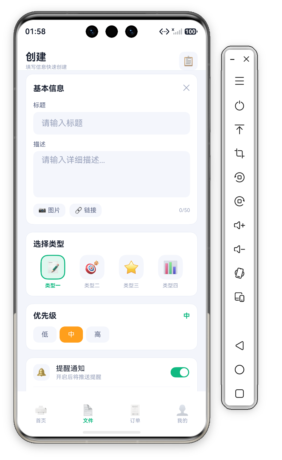
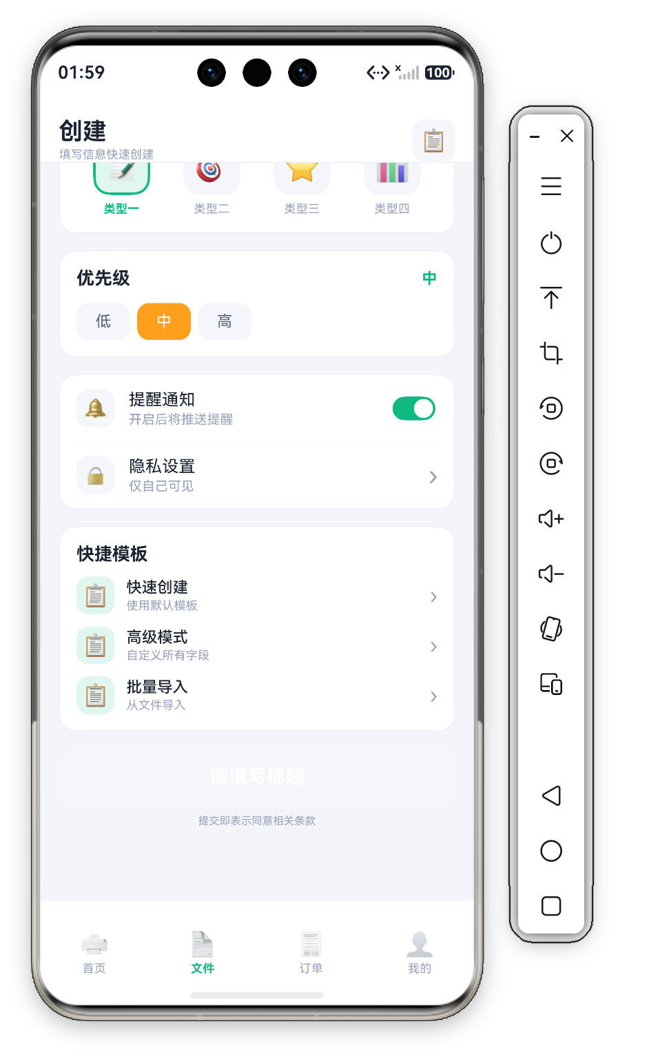
文件创建页(Func1Tab)是校园打印 App 的 "数据录入中心"——用户在此创建打印任务,填写标题、描述、选择打印类型和优先级。页面标题为 "创建",副标题 "填写信息快速创建" 明确了单一职责。
本页是纯粹的 "数据录入型页面"——包含 TextInput、TextArea、Toggle 等多种受控表单组件,是学习 ArkUI 表单开发的最佳实战案例。页面采用 "Section 分组卡片" 布局,每个功能区用白色圆角卡片包裹,卡片间距 14vp(Column({ space: 14 }))。
1.1 页面状态定义
@State inputTitle: string = ''       // 文档标题
@State inputDesc: string = ''        // 详细描述
@State selectedType: number = 0      // 选中的类型索引
@State selectedPriority: number = 1  // 优先级:0=低, 1=中, 2=高
@State remindOn: boolean = true      // 提醒通知开关
5 个 @State 变量覆盖所有输入维度。selectedType 和 selectedPriority 使用 number 类型作为数组索引,比 string 类型更语义化。
二、页面头部 —— 标题 + 操作按钮
@Builder
Header() {
  Row({ space: 12 }) {
    Column({ space: 2 }) {
      Text('创建').fontSize(20).fontWeight(FontWeight.Bold).fontColor(C.text)
      Text('填写信息快速创建').fontSize(10).fontColor(C.textDim)
    }.alignItems(HorizontalAlign.Start)
    Blank()
    Row() { Text('📋').fontSize(18) }
      .width(36).height(36).backgroundColor(C.cardSoft).borderRadius(D.rSm).justifyContent(FlexAlign.Center)
  }
  .width('100%').height(this.safeTop + 60)
  .padding({ top: this.safeTop, left: D.pad, right: D.pad })
  .backgroundColor(C.card).alignItems(VerticalAlign.Bottom)
  .border({ width: { bottom: 1 }, color: C.stroke })
}
头部是 "主标题+副标题"双行结构:左侧 20vp 加粗"创建"与 10vp 灰色副标题"填写信息快速创建"纵向排列,明确页面单一职责。右侧是 📋 emoji 图标放在 C.cardSoft 底、D.rSm 圆角的 36×36 方块中,暗示可从剪贴板粘贴文档信息,这是 "降低输入成本" 的典型策略。头部高度 safeTop + 60 配合 alignItems(VerticalAlign.Bottom) 让内容沉底对齐,底部 1vp C.stroke 分隔线与白底 C.card 构成通栏吸顶效果。
三、FormCard —— 基本信息录入区
@Builder
FormCard() {
  Column({ space: 12 }) {
    Row() {
      Text('基本信息').fontSize(15).fontWeight(FontWeight.Bold).fontColor(C.text)
      Blank()
      Text('✕').fontSize(16).fontColor(C.textDim)
    }.width('100%')

    Column({ space: 6 }) {
      Text('标题').fontSize(12).fontColor(C.textSub)
      TextInput({ placeholder: '请输入标题', text: this.inputTitle })
        .onChange((v: string) => { this.inputTitle = v; })
        .height(44).backgroundColor(C.cardSoft).borderRadius(D.rSm).placeholderColor(C.textDim)
    }.alignItems(HorizontalAlign.Start).width('100%')

    Column({ space: 6 }) {
      Text('描述').fontSize(12).fontColor(C.textSub)
      TextArea({ placeholder: '请输入详细描述...', text: this.inputDesc })
        .onChange((v: string) => { this.inputDesc = v; })
        .height(90).backgroundColor(C.cardSoft).borderRadius(D.rSm).placeholderColor(C.textDim)
    }.alignItems(HorizontalAlign.Start).width('100%')

    Row({ space: 8 }) {
      Text('📷 图片').fontSize(12).fontColor(C.textSub)
        .padding({ left: 10, right: 10, top: 6, bottom: 6 })
        .backgroundColor(C.cardSoft).borderRadius(D.rSm)
      Text('🔗 链接').fontSize(12).fontColor(C.textSub)
        .padding({ left: 10, right: 10, top: 6, bottom: 6 })
        .backgroundColor(C.cardSoft).borderRadius(D.rSm)
      Blank()
      Text(`${this.inputTitle.length}/50`).fontSize(10).fontColor(C.textDim)
    }.width('100%')
  }
  .width('100%').padding(14).backgroundColor(C.card).borderRadius(D.rMd)
  .border({ width: 1, color: C.stroke })
}
3.1 TextInput vs TextArea 对比
| 特性 | TextInput | TextArea |
|---|---|---|
| 适用场景 | 单行短文本(标题) | 多行长文本(描述) |
| 默认行为 | Enter 不换行 | Enter 换行 |
| 高度 | 固定 44vp | 固定 90vp |
两者共享相同样式体系(D.rSm 圆角 10vp、C.cardSoft 浅灰背景),保持视觉一致性。
3.2 受控组件双向绑定模式
TextInput({ placeholder: '请输入标题', text: this.inputTitle })  // ① 外部传入当前值
  .onChange((v: string) => {                                     // ② 用户输入时回调
    this.inputTitle = v                                          // ③ 更新状态变量触发重渲染
  })
这是 ArkUI 标准的 受控组件模式 —— UI 显示完全由状态决定,不存在"显示值和存储值不一致"的问题。在表单校验、重置、回填场景中尤为关键。
3.3 实时字数统计
${this.inputTitle.length}/50 展示标题输入框的实时字数——即时反馈让用户每输入一个字符就看到变化,分母 50 隐式传达上限。接近或超限时可将数字变为橙色/红色警告。
3.4 附件按钮设计
图片和链接按钮使用 "emoji 图标+文字+色块" 组合(📷 图片、🔗 链接,浅灰背景 C.cardSoft),像可点击的标签(Tag Button),比纯文字或纯图标更醒目。
四、TypeCard —— 图标化四选一类型选择器
@Builder
TypeCard() {
  Column({ space: 12 }) {
    Text('选择类型').fontSize(15).fontWeight(FontWeight.Bold).fontColor(C.text).width('100%')
    Row() {
      ForEach(this.types, (item: OptionItem, idx: number) => {
        Column({ space: 6 }) {
          Row() { Text(item.icon).fontSize(24) }
            .width(48).height(48).borderRadius(D.rMd).justifyContent(FlexAlign.Center)
            .backgroundColor(this.selectedType === idx ? C.primarySoft : C.cardSoft)
            .border({ width: this.selectedType === idx ? 2 : 0, color: C.primary })
          Text(item.name).fontSize(10)
            .fontColor(this.selectedType === idx ? C.primary : C.textDim)
            .fontWeight(this.selectedType === idx ? FontWeight.Bold : FontWeight.Normal)
        }.layoutWeight(1)
        .onClick(() => { this.selectedType = idx; })
      }, (item: OptionItem) => item.name)
    }.width('100%')
  }
  .width('100%').padding(14).backgroundColor(C.card).borderRadius(D.rMd)
  .border({ width: 1, color: C.stroke })
}
4.1 选中态的四重同步变化
选中某类型时同时发生 4 个视觉属性变化:
| 属性 | 未选中 | 选中 |
|---|---|---|
| 图标背景色 | 浅灰 C.cardSoft | 浅绿 C.primarySoft(色块强调) |
| 图标边框 | 0vp | 2vp 绿色描边 |
| 文字颜色 | 灰 C.textDim | 绿 C.primary(文字高亮) |
| 文字字重 | Normal | Bold(加粗强化) |
图标是 emoji Text(📝 类型一 / 🎯 类型二 / ⭐ 类型三 / 📊 类型四),放在 48×48、D.rMd 圆角的方块中。多重信号叠加的效果远超单一属性切换——即使不看文字,仅凭色块+边框就能识别选中项。
4.2 为什么不用 Radio 组件?
标准 Radio 只能显示圆形选择器,无法展示业务图标;需要横向一行四列排列而非垂直列表;选中态需要使用主题绿色。当标准组件无法满足需求时,用基础组件组合自定义是合理的选择。
五、PriorityCard —— 三档优先级
@Builder
PriorityCard() {
  Column({ space: 12 }) {
    Row() {
      Text('优先级').fontSize(15).fontWeight(FontWeight.Bold).fontColor(C.text)
      Blank()
      Text(this.priorities[this.selectedPriority]).fontSize(13).fontColor(C.primary).fontWeight(FontWeight.Bold)
    }.width('100%')
    Row({ space: 6 }) {
      ForEach(this.priorities, (p: string, idx: number) => {
        Text(p).fontSize(13)
          .fontColor(this.selectedPriority === idx ? '#FFFFFF' : C.textSub)
          .backgroundColor(this.selectedPriority === idx ? (idx === 2 ? C.danger : idx === 1 ? C.warn : C.ok) : C.cardSoft)
          .borderRadius(D.rSm).padding({ left: 16, right: 16, top: 8, bottom: 8 })
          .onClick(() => { this.selectedPriority = idx; })
      }, (p: string) => p)
    }.width('100%')
  }
  .width('100%').padding(14).backgroundColor(C.card).borderRadius(D.rMd)
  .border({ width: 1, color: C.stroke })
}
5.1 当前值回显
卡片标题行右侧用 Text(this.priorities[this.selectedPriority]) 实时回显当前选中的优先级(绿色加粗),用户无需扫视下方按钮即可确认当前状态。
5.2 交通灯色彩语义
| 优先级 | 色值 | 含义 |
|---|---|---|
| 低 | C.ok(#2BB673)绿色 | 冷静、不紧急 |
| 中 | C.warn(#FF9F1C)琥珀 | 注意、默认推荐 |
| 高 | C.danger(#FF5A6E)红色 | 紧急、立即关注 |
选中项填充对应语义色 + 白字,未选中项统一为 C.cardSoft 浅灰底 + C.textSub 灰字。默认值 selectedPriority = 1 即"中"档,大多数用户会接受默认选项以减少决策成本。
六、SettingCard —— Toggle 开关与设置项
@Builder
SettingCard() {
  Column({ space: 0 }) {
    Row({ space: 12 }) {
      Row() { Text('🔔').fontSize(16) }
        .width(32).height(32).backgroundColor(C.cardSoft).borderRadius(D.rSm).justifyContent(FlexAlign.Center)
      Column({ space: 2 }) {
        Text('提醒通知').fontSize(14).fontColor(C.text)
        Text('开启后将推送提醒').fontSize(11).fontColor(C.textDim)
      }.alignItems(HorizontalAlign.Start).layoutWeight(1)
      Toggle({ type: ToggleType.Switch, isOn: this.remindOn })
        .selectedColor(C.primary)
        .onChange((on: boolean) => { this.remindOn = on; })
    }.width('100%').padding({ top: 12, bottom: 12 })
    Divider().color(C.stroke)
    Row({ space: 12 }) {
      Row() { Text('🔒').fontSize(16) }
        .width(32).height(32).backgroundColor(C.cardSoft).borderRadius(D.rSm).justifyContent(FlexAlign.Center)
      Column({ space: 2 }) {
        Text('隐私设置').fontSize(14).fontColor(C.text)
        Text('仅自己可见').fontSize(11).fontColor(C.textDim)
      }.alignItems(HorizontalAlign.Start).layoutWeight(1)
      Text('›').fontSize(22).fontColor(C.textDim)
    }.width('100%').padding({ top: 12, bottom: 12 })
  }
  .width('100%').padding({ left: 14, right: 14 }).backgroundColor(C.card).borderRadius(D.rMd)
  .border({ width: 1, color: C.stroke })
}
提醒开关使用系统 Toggle 组件(ToggleType.Switch 滑动开关),isOn 绑定 remindOn 状态,.selectedColor(C.primary) 让开启态轨道为主题绿。图标是 emoji Text('🔔') 放在 32×32 浅灰方块中。卡片下半部分是"隐私设置"跳转项(🔒 图标 + › 箭头),中间用 Divider().color(C.stroke) 分隔——开关项与跳转项合并在同一张卡片是设置页的经典分组手法。
HarmonyOS 提供三种 Toggle 类型:Switch(iOS 风格滑动开关)、Checkbox(复选框)、Button(独立切换按钮)。开/关二态用 Toggle 更直观;多选用 Checkbox 更语义准确。"提醒通知"明显是二态开关。
七、TemplateCard 与 SubmitBtn —— 快捷模板与提交按钮
@Builder
TemplateCard() {
  Column({ space: 10 }) {
    Text('快捷模板').fontSize(15).fontWeight(FontWeight.Bold).fontColor(C.text).width('100%')
    ForEach(this.templates, (item: QuickTemplate) => {
      Row({ space: 10 }) {
        Row() { Text('📋').fontSize(18) }
          .width(32).height(32).backgroundColor(C.primarySoft).borderRadius(D.rSm).justifyContent(FlexAlign.Center)
        Column({ space: 2 }) {
          Text(item.title).fontSize(13).fontWeight(FontWeight.Medium).fontColor(C.text)
          Text(item.desc).fontSize(10).fontColor(C.textDim)
        }.alignItems(HorizontalAlign.Start).layoutWeight(1)
        Text('›').fontSize(18).fontColor(C.textDim)
      }.width('100%')
      .onClick(() => { promptAction.showToast({ message: item.title }); })
    }, (item: QuickTemplate) => item.title)
  }
  .width('100%').padding(14).backgroundColor(C.card).borderRadius(D.rMd)
  .border({ width: 1, color: C.stroke })
}

@Builder
SubmitBtn() {
  Column({ space: 8 }) {
    Button(this.inputTitle.length > 0 ? '✓ 提交创建' : '请填写标题')
      .width('100%').height(48)
      .backgroundColor(this.inputTitle.length > 0 ? C.primary : C.cardSoft).fontColor('#FFFFFF')
      .fontSize(16).fontWeight(FontWeight.Bold).borderRadius(D.rMd)
      .onClick(() => {
        if (this.inputTitle.length === 0) { promptAction.showToast({ message: '请输入标题' }); return; }
        promptAction.showToast({ message: '创建成功!' });
        this.inputTitle = ''; this.inputDesc = '';
      })
    Text('提交即表示同意相关条款').fontSize(9).fontColor(C.textDim).width('100%').textAlign(TextAlign.Center)
  }.width('100%')
}
快捷模板提供三个预设(快速创建/高级模式/批量导入),点击弹出 toast。提交按钮是 状态自适应按钮:标题为空时显示"请填写标题"(C.cardSoft 灰底),有输入时变为"✓ 提交创建"(C.primary 绿底)——按钮文案与背景色随 inputTitle.length 联动,无需额外校验提示。点击时若标题为空弹 toast "请输入标题"并 return;成功则弹"创建成功!"并清空 inputTitle、inputDesc 两个状态完成表单重置。按钮下方 9vp 灰字"提交即表示同意相关条款"是合规提示。
八、表单设计六大最佳实践
- 视觉分组:每个功能区用独立白色圆角卡片包裹,降低认知负荷
- 渐进式 disclosure:核心信息 → 分类 → 优先级 → 辅助设置 → 模板 → 提交,符合自然思维流程
- 即时反馈:字数实时更新、选中态即时切换、Toggle 即时响应、按钮文案随输入变化
- 合理默认值:类型默认第一项、优先级默认"中"、提醒默认开启
- 清晰标签体系:输入字段上方小号灰色标签 + placeholder 补充上下文
- 操作引导:快捷模板降低输入成本、提交按钮文案引导补全标题
九、表单校验与提交流程
源码中的提交校验逻辑非常轻量——只校验标题:
.onClick(() => {
  if (this.inputTitle.length === 0) { promptAction.showToast({ message: '请输入标题' }); return; }
  promptAction.showToast({ message: '创建成功!' });
  this.inputTitle = ''; this.inputDesc = '';
})
若要扩展为完整的生产级流程,可在此基础上增加四步:
// 第一步:前端校验
const canSubmit = this.inputTitle.trim().length > 0 && this.inputDesc.trim().length > 0;
if (!canSubmit) { showToast('请填写完整信息'); return; }

// 第二步:数据组装
const payload = { title: this.inputTitle, content: this.inputDesc,
  type: this.types[this.selectedType].name,
  priority: ['低','中','高'][this.selectedPriority], reminder: this.remindOn };

// 第三步:异步请求(http 模块 POST)
// 第四步:状态重置或路由跳转
十、键盘适配方案
真机上键盘弹出可能遮挡输入框。三种解决方案:
.expandSafeArea([SafeAreaType.KEYBOARD])— 自动避让- Scroll 包裹输入区域(推荐,本页已采用)— 最简单,框架自动处理
- 监听
window.on('keyboardHeightChange')动态调整 padding
本页主内容区已经包裹在 Scroll 中(.layoutWeight(1).scrollBar(BarState.Off).align(Alignment.Top)),键盘弹出时用户可滚动定位被遮挡的输入框。
十一、总结
文件创建页展示了 ArkUI 表单开发的完整模式:Section 卡片分组布局保持视觉清晰,受控组件双向绑定确保数据一致性,图标化选择器提供超越标准组件的表现力,状态自适应提交按钮引导用户补全关键信息。这些模式可直接复用到任何需要数据录入的场景。

讨论HarmonyOS开发技术,专注于API与组件、DevEco Studio、测试、元服务和应用上架分发等。
更多推荐
 2
2 0
0- 0



 已为社区贡献613条内容

所有评论(0)