HarmonyOS 校园应用系列之ArkUI 声明式:会议室日程页的动态副标题与双态记录卡片
HarmonyOS 校园应用系列之ArkUI 声明式:会议室日程页的动态副标题与双态记录卡片
一、页面定位与功能概述
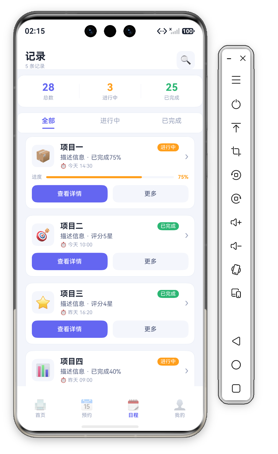
日程页(Func2Tab)是会议室预约 App 的 "记录管理" 页,标题 "记录",副标题 ${this.records.length} 条记录(当前 5 条)。页面自上而下:Header(标题+搜索图标)→ StatsCard(三维统计)→ TabBar(全部/进行中/已完成)→ 记录卡片列表。每条卡片含 Emoji 图标、标题、状态标签、描述、时间、进度条(仅进行中)与操作按钮。
核心思想 "状态驱动渲染"——activeTab 控制标签高亮,status 决定卡片视觉(进行中显示橙色进度条+橙标签,已完成显示绿标签)。
@State activeTab: number = 0          // 0=全部, 1=进行中, 2=已完成
private records: RecordItem[] = [
  { id: 1, emoji: '📦', title: '项目一', status: '进行中', time: '今天 14:30',
    desc: '描述信息 · 已完成75%', statusColor: C.warn },
  { id: 2, emoji: '🎯', title: '项目二', status: '已完成', time: '今天 10:00',
    desc: '描述信息 · 评分5星', statusColor: C.ok },
  // ...
]
注意 RecordItem 接口含 statusColor 字段——标签颜色直接存在数据里,渲染时无需再判断。


二、StatsCard —— 三维统计
@Builder
StatsCard() {
  Row() {
    ForEach(this.stats, (s: StatItem, idx: number) => {
      Column({ space: 3 }) {
        Text(s.value).fontSize(20).fontWeight(FontWeight.Bold).fontColor(s.color)
        Text(s.label).fontSize(10).fontColor(C.textDim)
      }.layoutWeight(1)
      if (idx < this.stats.length - 1) { Divider().vertical(true).height(28).color(C.stroke) }
    }, (s: StatItem) => s.label)
  }
  .width('100%').height(64).backgroundColor(C.card).borderRadius(D.rMd)
  .border({ width: 1, color: C.stroke }).justifyContent(FlexAlign.SpaceAround)
  .margin({ top: 10, left: D.pad, right: D.pad })
}
数据为 28 总数 / 3 进行中 / 25 已完成,颜色依次 C.primary / C.warn / C.ok——数字直接用语义色:总数主题色、进行中橙、已完成绿。相间用 Divider().vertical(true).height(28) 竖分隔线,if (idx < length-1) 保证末尾不多画。
三、TabBar —— 状态过滤标签
@Builder
TabBar() {
  Row({ space: 0 }) {
    ForEach(this.tabs, (t: string, idx: number) => {
      Column({ space: 6 }) {
        Text(t).fontSize(13)
          .fontColor(this.activeTab === idx ? C.primary : C.textDim)
          .fontWeight(this.activeTab === idx ? FontWeight.Bold : FontWeight.Normal)
        Column().width(24).height(2).borderRadius(1)
          .backgroundColor(this.activeTab === idx ? C.primary : 'transparent')
      }
      .layoutWeight(1).padding({ top: 8, bottom: 8 })
      .onClick(() => { this.activeTab = idx; })
    }, (t: string) => t)
  }
  .width('100%').backgroundColor(C.card).borderRadius(D.rSm)
  .border({ width: 1, color: C.stroke })
  .margin({ top: 10, left: D.pad, right: D.pad })
}
3.1 底部指示器
选中标签下方有 24vp 宽、2vp 高主题色圆角指示器。指示器 Column 始终渲染,未选中时 backgroundColor('transparent') 占位——比 if/else 切换节点更平稳,不会引起布局跳动。每个标签 .layoutWeight(1) 等分整行,整条 TabBar 本身也是一张边框卡片。
3.2 纯视觉切换
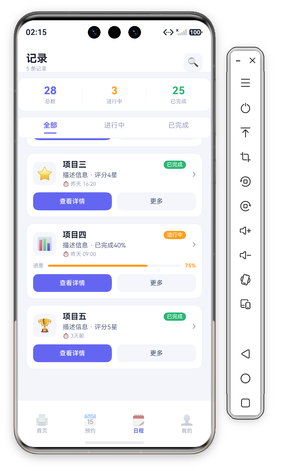
注意:本页 activeTab 只驱动标签高亮,记录列表并未按状态过滤——ForEach(this.records, ...) 始终渲染全部 5 条。这是演示页的简化处理;若要真过滤,可在 ForEach 数据源处按 this.activeTab 过滤数组,或用 @Watch 监听 activeTab 更新派生状态。
四、RecordCard —— 条件渲染记录卡片
@Builder
RecordCard(item: RecordItem) {
  Column({ space: 10 }) {
    Row({ space: 12 }) {
      Row() { Text(item.emoji).fontSize(24) }
        .width(44).height(44).backgroundColor(C.cardSoft).borderRadius(D.rSm).justifyContent(FlexAlign.Center)
      Column({ space: 4 }) {
        Row() {
          Text(item.title).fontSize(15).fontWeight(FontWeight.Bold).fontColor(C.text).layoutWeight(1)
          Text(item.status).fontSize(10).fontColor('#FFFFFF')
            .backgroundColor(item.statusColor)
            .padding({ left: 6, right: 6, top: 2, bottom: 2 }).borderRadius(D.rSm)
        }.width('100%')
        Text(item.desc).fontSize(12).fontColor(C.textSub)
        Text(`⏱ ${item.time}`).fontSize(10).fontColor(C.textDim)
      }.alignItems(HorizontalAlign.Start).layoutWeight(1)
      Text('›').fontSize(20).fontColor(C.textDim)
    }.width('100%')

    if (item.status === '进行中') {
      Row() {
        Text('进度').fontSize(10).fontColor(C.textDim)
        Stack({ alignContent: Alignment.Start }) {
          Column().width('100%').height(4).backgroundColor(C.cardSoft).borderRadius(2)
          Column().width('75%').height(4).borderRadius(2).backgroundColor(C.warn)
        }.layoutWeight(1).margin({ left: 8, right: 8 })
        Text('75%').fontSize(10).fontColor(C.warn).fontWeight(FontWeight.Bold)
      }.width('100%')
    }

    Row({ space: 10 }) {
      Button('查看详情')
        .fontSize(12).fontColor('#FFFFFF').backgroundColor(C.primary)
        .borderRadius(D.rSm).height(34).layoutWeight(1)
        .onClick(() => { promptAction.showToast({ message: item.title }); })
      Button('更多')
        .fontSize(12).fontColor(C.textSub).backgroundColor(C.cardSoft)
        .borderRadius(D.rSm).height(34).layoutWeight(1)
        .onClick(() => { promptAction.showToast({ message: '更多操作' }); })
    }.width('100%')
  }
  .width('100%').padding(12).backgroundColor(C.card).borderRadius(D.rMd)
  .border({ width: 1, color: C.stroke })
}
4.1 statusColor 数据驱动标签
状态标签没有抽取独立 Builder,也没有在渲染层做条件判断——颜色直接读数据字段 backgroundColor(item.statusColor)(进行中 C.warn 橙、已完成 C.ok 绿,均在 records 数据里定义)。"颜色进数据" 让渲染零分支,新增状态只需加数据项。
4.2 if 条件渲染进度条
if (item.status === '进行中') 包裹进度条——已完成不显示。注意进度值是写死的 width('75%') 与 Text('75%')(演示数据),填充色 C.warn 与标签色呼应。结构差异大时用 if 比 visibility/opacity 更高效(false 时不创建节点)。
五、操作按钮组 —— 主次分明
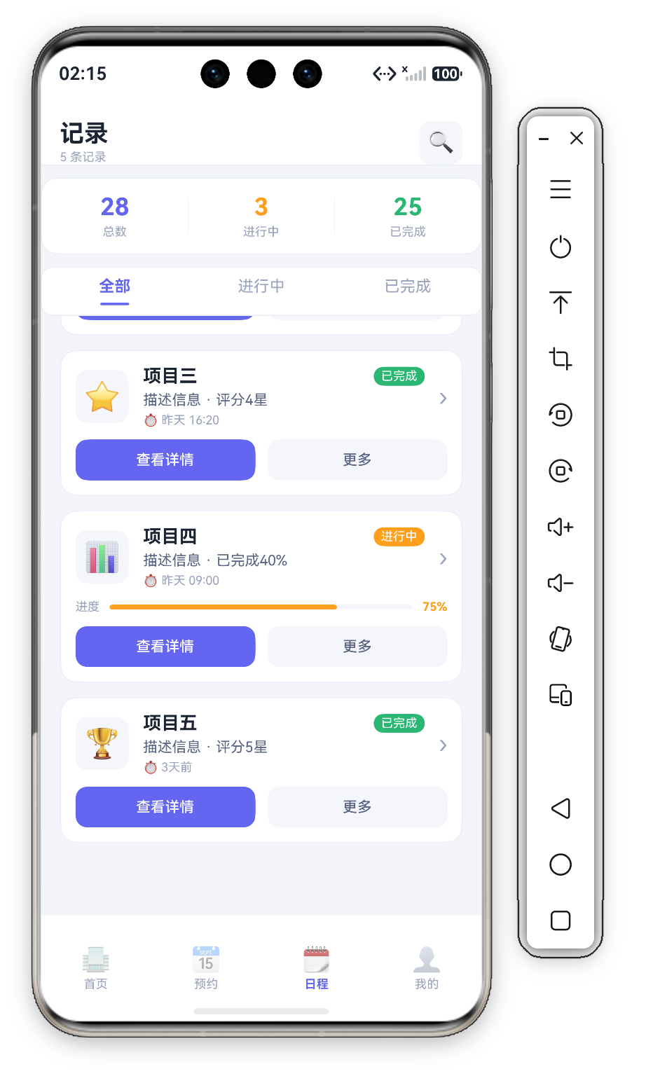
双按钮遵循 "主操作 + 次操作":查看详情(主题色底白字,行动召唤,点击 Toast 项目名)/ 更多(浅灰底灰字,辅助入口,点击 Toast"更多操作")。共享 fontSize(12).height(34).borderRadius(D.rSm).layoutWeight(1) 形成 1:1 对称。
六、"UI = f(state)" 数据驱动
整个页面是声明式 UI 典范——视觉由状态唯一确定:
.backgroundColor(item.statusColor)                          // 状态色→标签色(数据驱动)
if (item.status === '进行中') { /* 进度条 */ }              // 状态→是否渲染
.width('75%')                                               // 进度→宽度(演示写死)
.fontColor(this.activeTab === idx ? C.primary : C.textDim)  // Tab→选中样式
开发者只描述"什么状态下长什么样",框架处理从状态到渲染的全部过程。
七、Header —— 标题与搜索入口
@Builder
Header() {
  Row({ space: 12 }) {
    Column({ space: 2 }) {
      Text('记录').fontSize(20).fontWeight(FontWeight.Bold).fontColor(C.text)
      Text(`${this.records.length} 条记录`).fontSize(10).fontColor(C.textDim)
    }.alignItems(HorizontalAlign.Start)
    Blank()
    Row() { Text('🔍').fontSize(18) }
      .width(36).height(36).backgroundColor(C.cardSoft).borderRadius(D.rSm).justifyContent(FlexAlign.Center)
      .onClick(() => { promptAction.showToast({ message: '搜索' }); })
  }
  .width('100%').height(this.safeTop + 60)
  .padding({ top: this.safeTop, left: D.pad, right: D.pad })
  .backgroundColor(C.card).alignItems(VerticalAlign.Bottom)
  .border({ width: { bottom: 1 }, color: C.stroke })
}
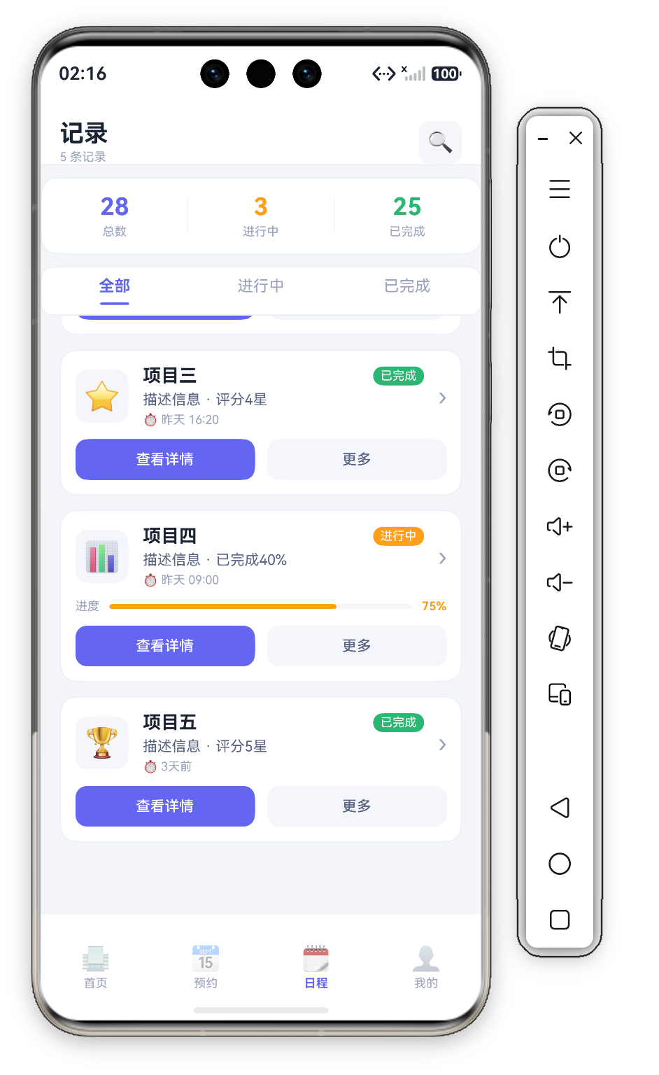
副标题 ${this.records.length} 条记录 是模板字符串动态计数——数据增减自动同步。搜索图标是 36vp 圆角方块,点击 Toast"搜索"。头部高度 safeTop + 60 配合 alignItems(VerticalAlign.Bottom) 让内容沉底、避开状态栏,底部 1vp 描边与页面分层。
八、总结
| 组件 | 技术亮点 | 复杂度 |
|---|---|---|
| StatsCard | 语义化三色统计 + 竖分隔线 | ⭐⭐ |
| TabBar | transparent 占位指示器 + layoutWeight 等分 | ⭐⭐⭐ |
| RecordCard | if 条件渲染 + statusColor 数据驱动 | ⭐⭐⭐⭐ |
| Stack 进度条 | 双层覆盖 | ⭐⭐⭐ |
条件渲染 + 数据驱动配色 是核心学习点:状态颜色存进数据字段(statusColor),渲染层零分支;结构差异(进度条有无)交给 if 条件渲染,主结构保持清晰。

讨论HarmonyOS开发技术,专注于API与组件、DevEco Studio、测试、元服务和应用上架分发等。
更多推荐


 0
0 0
0- 0



 已为社区贡献628条内容

所有评论(0)