HarmonyOS 校园应用系列之ArkUI 实战:不引图表库 —— 水电缴费账单页手写的胶囊 Tab 与时间轴
HarmonyOS 校园应用系列之ArkUI 实战:不引图表库 —— 水电缴费账单页手写的胶囊 Tab 与时间轴
应用背景:10 水电缴费的账单页(Func2Tab.ets,208 行)是用户查看历史缴费记录的核心页面。本文聚焦 TabBar 胶囊过滤栏、OverviewCard 统计概览、TimelineList 时间轴列表 三大模块。

一、页面整体结构
// Func2Tab.ets — 页面根结构
Column() {
  this.Header()
  this.TabBar()
  Scroll() {
    Column({ space: 14 }) {
      this.OverviewCard()
      this.TimelineList()
    }
    .width('100%')
    .padding({ left: D.pad, right: D.pad, top: 14, bottom: D.pad + this.safeBottom + 20 })
  }
  .layoutWeight(1).scrollBar(BarState.Off).align(Alignment.Top)
}
.width('100%').height('100%').backgroundColor(C.bg)
根布局为 Column 三段式:Header 与 TabBar 均固定在 Scroll 外部不随内容滚动,滚动区只承载 OverviewCard 与 TimelineList 两个模块。

二、Header 标题栏
// Header — 标题栏
@Builder
Header() {
  Row() {
    Text('缴费账单')
      .fontSize(20).fontWeight(FontWeight.Bold).fontColor(C.text)
  }
  .width('100%').height(this.safeTop + 56)
  .padding({ top: this.safeTop, left: D.pad, right: D.pad })
  .backgroundColor(C.card)
  .alignItems(VerticalAlign.Bottom)
}
白底标题栏,高度 safeTop + 56 动态适配状态栏,"缴费账单" 20vp 粗体贴底显示。
三、TabBar 胶囊过滤栏
// TabBar — 过滤标签栏
@Builder
TabBar() {
  Row({ space: 6 }) {
    ForEach(this.tabs, (t: TabItem, idx: number) => {
      Row({ space: 4 }) {
        Text(t.label).fontSize(13).fontColor(this.tabIdx === idx ? '#FFFFFF' : C.textSub)
        Text(t.count.toString()).fontSize(10).fontColor(this.tabIdx === idx ? '#FFFFFF' : C.textDim)
          .padding({ left: 5, right: 5, top: 1, bottom: 1 })
          .backgroundColor(this.tabIdx === idx ? '#33FFFFFF' : C.cardSoft)
          .borderRadius(8)
      }
      .padding({ left: 14, right: 14, top: 8, bottom: 8 })
      .backgroundColor(this.tabIdx === idx ? C.primary : C.card)
      .borderRadius(18)
      .border({ width: 1, color: this.tabIdx === idx ? C.primary : C.stroke })
      .onClick(() => { this.tabIdx = idx; })
    }, (t: TabItem) => t.label)
  }
  .width('100%')
  .padding({ left: D.pad, right: D.pad, top: 12, bottom: 12 })
  .backgroundColor(C.card)
}
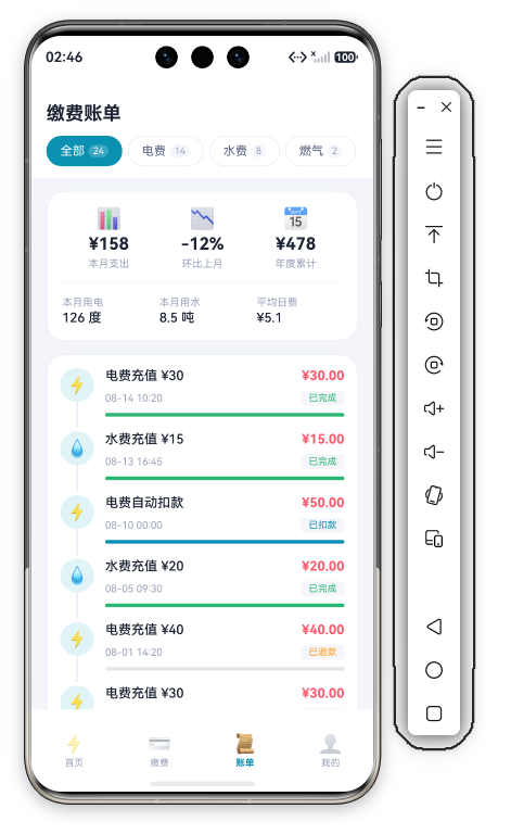
胶囊 + 计数徽标 是本页最具特色的交互设计:
- 每个 tab 是 18vp 圆角胶囊,内部"标签文字 + 计数徽标"横排
- 选中态:主色实底 + 白字,徽标变 20% 透明白底(
#33FFFFFF) - 未选中:白底 + 次要色字,徽标浅灰底(
C.cardSoft) - 四个维度:全部(24) / 电费(14) / 水费(8) / 燃气(2)
注意:onClick 只更新 @State tabIdx,仅切换胶囊样式,不过滤列表数据——时间轴始终展示全量记录。
四、OverviewCard 统计概览卡
// OverviewCard — 统计概览
@Builder
OverviewCard() {
  Column({ space: 14 }) {
    Row() {
      ForEach(this.statCards, (s: StatCard) => {
        Column({ space: 4 }) {
          Text(s.emoji).fontSize(22)
          Text(s.value).fontSize(18).fontWeight(FontWeight.Bold).fontColor(C.text)
          Text(s.label).fontSize(11).fontColor(C.textDim)
        }
        .layoutWeight(1).alignItems(HorizontalAlign.Center)
      }, (s: StatCard) => s.label)
    }
    .width('100%')

    Divider().color(C.stroke).strokeWidth(0.5)

    Row({ space: 12 }) {
      Column({ space: 2 }) {
        Text('本月用电').fontSize(11).fontColor(C.textDim)
        Text('126 度').fontSize(14).fontColor(C.text).fontWeight(FontWeight.Medium)
      }
      .alignItems(HorizontalAlign.Start).layoutWeight(1)
      Column({ space: 2 }) {
        Text('本月用水').fontSize(11).fontColor(C.textDim)
        Text('8.5 吨').fontSize(14).fontColor(C.text).fontWeight(FontWeight.Medium)
      }
      .alignItems(HorizontalAlign.Start).layoutWeight(1)
      Column({ space: 2 }) {
        Text('平均日费').fontSize(11).fontColor(C.textDim)
        Text('¥5.1').fontSize(14).fontColor(C.text).fontWeight(FontWeight.Medium)
      }
      .alignItems(HorizontalAlign.Start).layoutWeight(1)
    }
    .width('100%')
  }
  .width('100%')
  .padding(16)
  .backgroundColor(C.card)
  .borderRadius(D.rLg)
  .border({ width: 1, color: C.stroke })
}
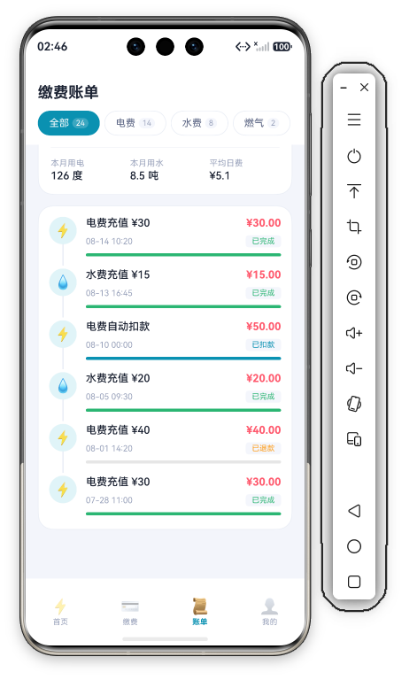
一张卡分上下两区,中间 0.5vp Divider 分隔:
| 上区三统计 | 值 | 下区三明细 | 值 |
|---|---|---|---|
| 📊 本月支出 | ¥158 | 本月用电 | 126 度 |
| 📉 环比上月 | -12% | 本月用水 | 8.5 吨 |
| 📅 年度累计 | ¥478 | 平均日费 | ¥5.1 |
上区带 Emoji 图标、18vp 粗体数值;下区 11vp 灰标签 + 14vp 中黑数值,layoutWeight(1) 三等分。
五、TimelineList 账单时间轴
5.1 数据模型
// 时间轴数据(节选)
private timeline: TimelineItem[] = [
  { id: 1, emoji: '⚡', title: '电费充值 ¥30', date: '08-14 10:20', amount: '¥30.00', status: '已完成', statusColor: C.ok, progress: 100 },
  { id: 3, emoji: '⚡', title: '电费自动扣款', date: '08-10 00:00', amount: '¥50.00', status: '已扣款', statusColor: C.primary, progress: 100 },
  { id: 5, emoji: '⚡', title: '电费充值 ¥40', date: '08-01 14:20', amount: '¥40.00', status: '已退款', statusColor: C.warn, progress: 0 }
  // ... 共 6 条
]
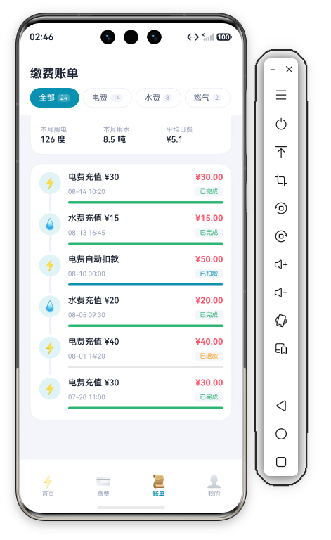
TimelineItem 自带 statusColor 字段——每条记录的状态颜色在数据层就绑定好(已完成 C.ok 绿 / 已扣款 C.primary 青 / 已退款 C.warn 橙),渲染层零判断。
5.2 时间轴渲染
// TimelineList — 时间轴列表(单条)
Column() {
  Row({ space: 12 }) {
    Column({ space: 0 }) {
      Row() {
        Text(item.emoji).fontSize(18)
      }
      .width(36).height(36)
      .backgroundColor(C.primarySoft).borderRadius(18)
      .justifyContent(FlexAlign.Center)

      if (idx < this.timeline.length - 1) {
        Column()
          .width(2).height(28)
          .backgroundColor(C.stroke)
      }
    }
    .alignItems(HorizontalAlign.Center)

    Column({ space: 8 }) {
      Row() {
        Text(item.title).fontSize(14).fontColor(C.text).fontWeight(FontWeight.Medium).layoutWeight(1)
        Text(item.amount).fontSize(14).fontColor(C.danger).fontWeight(FontWeight.Bold)
      }
      .width('100%')

      Row() {
        Text(item.date).fontSize(11).fontColor(C.textDim).layoutWeight(1)
        Text(item.status).fontSize(10).fontColor(item.statusColor)
          .padding({ left: 8, right: 8, top: 2, bottom: 2 })
          .backgroundColor(C.cardSoft)
          .borderRadius(4)
      }
      .width('100%')

      Progress({ value: item.progress, total: 100 }).color(item.statusColor).width('100%')
    }
    .alignItems(HorizontalAlign.Start).layoutWeight(1)
  }
  .width('100%')
  .alignItems(VerticalAlign.Top)
}
.width('100%')
.padding({ bottom: 4 })
.onClick(() => { promptAction.showToast({ message: item.title }); })
时间轴三要素:
- 节点:36vp 圆形 Emoji 图标(
borderRadius(18)浅青底) - 连接线:非末条时在节点下方渲染 2×28vp 竖线(
C.stroke),if (idx < length-1)条件渲染 - 内容区:标题+金额、日期+状态徽章(浅灰底圆角小胶囊,字色取
statusColor)、Progress进度条(颜色同样取statusColor)
进度条直接用系统 Progress 组件(value/total 驱动),颜色逐条跟随 statusColor,无需自绘轨道。整个列表装在一张大卡里(外层 Column({ space: 0 }) + padding(14) + 卡片底),条目间靠连接线视觉串联。
六、本章小结
| 组件 | 核心技术 | 学习价值 |
|---|---|---|
| TabBar | 胶囊选中态 + 计数徽标 | 过滤交互标准模式 |
| OverviewCard | Divider 分区 + 双排统计 | 一卡双区信息密度 |
| TimelineList | 条件连接线 + statusColor 数据驱动 | 时间轴列表实现 |
TimelineList 时间轴 最具学习价值——if (idx < length - 1) 一行实现末条无连接线,statusColor 把颜色决策前置到数据层,渲染零分支。

讨论HarmonyOS开发技术,专注于API与组件、DevEco Studio、测试、元服务和应用上架分发等。
更多推荐
 0
0 0
0- 0



 已为社区贡献628条内容

所有评论(0)