HarmonyOS:6.0 新增和增强特性
一、@Consume装饰的变量支持设置默认值
说明
从API version 20开始,@Consume装饰的变量支持设置默认值。
@Component
struct MyComponent {
  @Consume('withDefault') defaultValue: number = 10;

  build() {
  }

}
示例效果图
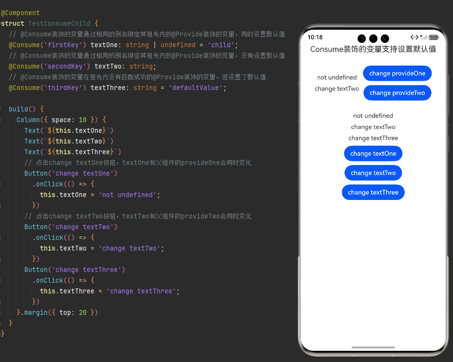
示例代码
@Entry
@Component
struct TestConsume {
  @State message: string = 'Consume装饰的变量支持设置默认值';
  @Provide('firstKey') provideOne: string | undefined = undefined;
  @Provide('secondKey') provideTwo: string = 'the second provider';

  build() {
    Column({ space: 10 }) {
      Text(this.message)
        .id('TestConsumeHelloWorld')
        .fontSize($r('app.float.page_text_font_20fp'))
        .margin({ bottom: 20 })
      Row({ space: 10 }) {
        Column({ space: 10 }) {
          Text(`${this.provideOne}`)
          Text(this.provideTwo)
        }

        Column({ space: 10 }) {
          // 点击change provideOne按钮,provideOne和子组件中的textOne属性会同时变化
          Button('change provideOne')
            .onClick(() => {
              this.provideOne = undefined;
            })
          // 点击change provideTwo按钮,provideTwo和子组件中的textTwo属性会同时变化
          Button('change provideTwo')
            .onClick(() => {
              this.provideTwo = 'the next provider';
            })
        }
      }

      TestConsumeChild()
    }
    .height('100%')
    .width('100%')
  }
}


@Component
struct TestConsumeChild {
  // @Consume装饰的变量通过相同的别名绑定其祖先内的@Provide装饰的变量,同时设置默认值
  @Consume('firstKey') textOne: string | undefined = 'child';
  // @Consume装饰的变量通过相同的别名绑定其祖先内的@Provide装饰的变量,没有设置默认值
  @Consume('secondKey') textTwo: string;
  // @Consume装饰的变量在祖先内没有匹配成功的@Provide装饰的变量,但设置了默认值
  @Consume('thirdKey') textThree: string = 'defaultValue';

  build() {
    Column({ space: 10 }) {
      Text(`${this.textOne}`)
      Text(`${this.textTwo}`)
      Text(`${this.textThree}`)
      // 点击change textOne按钮,textOne和父组件的provideOne会同时变化
      Button('change textOne')
        .onClick(() => {
          this.textOne = 'not undefined';
        })
      // 点击change textTwo按钮,textTwo和父组件的provideTwo会同时变化
      Button('change textTwo')
        .onClick(() => {
          this.textTwo = 'change textTwo';
        })
      Button('change textThree')
        .onClick(() => {
          this.textThree = 'change textThree';
        })
    }.margin({ top: 20 })
  }
}
在上面的示例中:
- Parent声明了@Provide(‘firstKey’) provideOne: string | undefined = undefined 与 @Provide(‘secondKey’) provideTwo: string = ‘the second provider’。
- Child声明了@Consume(‘firstKey’) textOne: string | undefined = ‘child’,@Consume(‘secondKey’) textTwo: string 与 @Consume(‘thirdKey’) textThree: string = ‘defaultValue’。
- Child是Parent的子组件,Child在初始化@Consume装饰的三个属性时,textOne根据’firstKey’别名绑定Parent中的provideOne属性,provideOne的值会覆盖textOne的默认值,所以textOne初始化的值为undefined;textTwo根据’secondKey’别名绑定Parent中的providedTwo属性,textTwo初始化的值为’the second provider’;textThree在祖先组件中不存在匹配结果,如果@Consume没有设置默认值,则会抛出运行时错误,示例中textThree有默认值’defaultValue’,所以textThree初始化的值为’defaultValue’。
- @Consume装饰的属性设置的默认值仅在祖先组件没有匹配结果时才生效,有匹配结果时无影响。
二、新增支持将属性字符串根据文本布局选项转换成对应的Paragraph数组
API20新增getParagraphs
支持设备:Phone | PC/2in1 | Tablet | TV | Wearable
getParagraphs(styledString: StyledString, options?: TextLayoutOptions): Array<Paragraph>
将属性字符串根据文本布局选项转换成对应的Paragraph数组。
系统能力: SystemCapability.ArkUI.ArkUI.Full
参数:
| 参数名 | 类型 | 必填 | 说明 |
|---|---|---|---|
| styledString | StyledString | 是 | 待转换的属性字符串。 |
| options | TextLayoutOptions | 否 | 文本布局选项。 |
返回值:
| 类型 | 说明 |
|---|---|
| Array<Paragraph> | Paragraph的数组。 |
示例:
通过MeasureUtils的getParagraphs方法测算文本,当内容超出最大显示行数的时候,截断文本显示并展示“…全文”的效果。
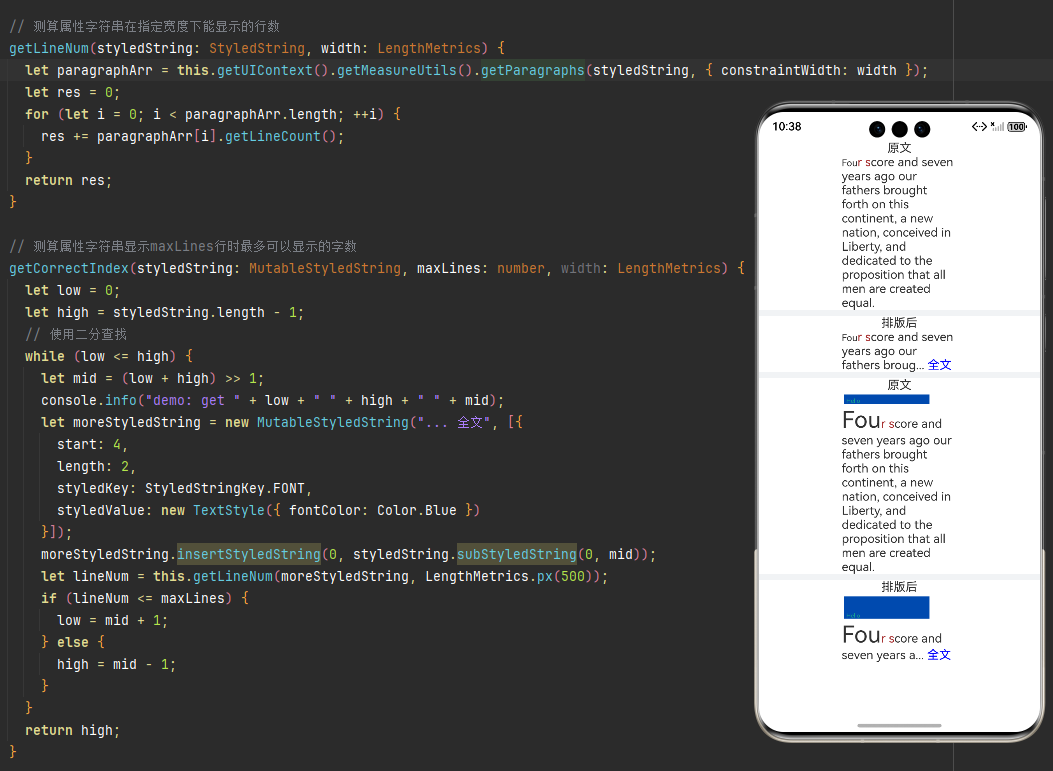
import { LengthMetrics } from '@kit.ArkUI';
import { drawing } from '@kit.ArkGraphics2D';

class MyCustomSpan extends CustomSpan {
  constructor(word: string, width: number, height: number, context: UIContext) {
    super();
    this.word = word;
    this.width = width;
    this.height = height;
    this.context = context;
  }

  onMeasure(measureInfo: CustomSpanMeasureInfo): CustomSpanMetrics {
    return { width: this.width, height: this.height };
  }

  onDraw(context: DrawContext, options: CustomSpanDrawInfo) {
    let canvas = context.canvas;
    const brush = new drawing.Brush();
    brush.setColor({
      alpha: 255,
      red: 0,
      green: 74,
      blue: 175
    });
    const font = new drawing.Font();
    font.setSize(25);
    const textBlob = drawing.TextBlob.makeFromString(this.word, font, drawing.TextEncoding.TEXT_ENCODING_UTF8);
    canvas.attachBrush(brush);
    canvas.drawRect({
      left: options.x + 10,
      right: options.x + this.context.vp2px(this.width) - 10,
      top: options.lineTop + 10,
      bottom: options.lineBottom - 10
    });
    brush.setColor({
      alpha: 255,
      red: 23,
      green: 169,
      blue: 141
    });
    canvas.attachBrush(brush);
    canvas.drawTextBlob(textBlob, options.x + 20, options.lineBottom - 15);
    canvas.detachBrush();
  }

  setWord(word: string) {
    this.word = word;
  }

  width: number = 160;
  word: string = "drawing";
  height: number = 10;
  context: UIContext;
}

@Entry
@Component
struct TestParagraph {
  str: string =
    "Four score and seven years ago our fathers brought forth on this continent, a new nation, conceived in Liberty, and dedicated to the proposition that all men are created equal.";
  mutableStr2 = new MutableStyledString(this.str, [
    {
      start: 0,
      length: 3,
      styledKey: StyledStringKey.FONT,
      styledValue: new TextStyle({ fontSize: LengthMetrics.px(20) })
    },
    {
      start: 3,
      length: 3,
      styledKey: StyledStringKey.FONT,
      styledValue: new TextStyle({ fontColor: Color.Brown })
    }
  ]);

  // 测算属性字符串在指定宽度下能显示的行数
  getLineNum(styledString: StyledString, width: LengthMetrics) {
    let paragraphArr = this.getUIContext().getMeasureUtils().getParagraphs(styledString, { constraintWidth: width });
    let res = 0;
    for (let i = 0; i < paragraphArr.length; ++i) {
      res += paragraphArr[i].getLineCount();
    }
    return res;
  }

  // 测算属性字符串显示maxLines行时最多可以显示的字数
  getCorrectIndex(styledString: MutableStyledString, maxLines: number, width: LengthMetrics) {
    let low = 0;
    let high = styledString.length - 1;
    // 使用二分查找
    while (low <= high) {
      let mid = (low + high) >> 1;
      console.info("demo: get " + low + " " + high + " " + mid);
      let moreStyledString = new MutableStyledString("... 全文", [{
        start: 4,
        length: 2,
        styledKey: StyledStringKey.FONT,
        styledValue: new TextStyle({ fontColor: Color.Blue })
      }]);
      moreStyledString.insertStyledString(0, styledString.subStyledString(0, mid));
      let lineNum = this.getLineNum(moreStyledString, LengthMetrics.px(500));
      if (lineNum <= maxLines) {
        low = mid + 1;
      } else {
        high = mid - 1;
      }
    }
    return high;
  }

  mutableStrAllContent = new MutableStyledString(this.str, [
    {
      start: 0,
      length: 3,
      styledKey: StyledStringKey.FONT,
      styledValue: new TextStyle({ fontSize: LengthMetrics.px(40) })
    },
    {
      start: 3,
      length: 3,
      styledKey: StyledStringKey.FONT,
      styledValue: new TextStyle({ fontColor: Color.Brown })
    }
  ]);
  customSpan1: MyCustomSpan = new MyCustomSpan("Hello", 120, 10, this.getUIContext());
  mutableStrAllContent2 = new MutableStyledString(this.str, [
    {
      start: 0,
      length: 3,
      styledKey: StyledStringKey.FONT,
      styledValue: new TextStyle({ fontSize: LengthMetrics.px(100) })
    },
    {
      start: 3,
      length: 3,
      styledKey: StyledStringKey.FONT,
      styledValue: new TextStyle({ fontColor: Color.Brown })
    }
  ]);
  controller: TextController = new TextController();
  controller2: TextController = new TextController();
  textController: TextController = new TextController();
  textController2: TextController = new TextController();

  aboutToAppear() {
    this.mutableStrAllContent2.insertStyledString(0, new StyledString(this.customSpan1));
    this.mutableStr2.insertStyledString(0, new StyledString(this.customSpan1));
  }

  build() {
    Scroll() {
      Column() {
        Text('原文')
        Text(undefined, { controller: this.controller }).width('500px').onAppear(() => {
          this.controller.setStyledString(this.mutableStrAllContent);
        })
        Divider().strokeWidth(8).color('#F1F3F5')
        Text('排版后')
        Text(undefined, { controller: this.textController }).onAppear(() => {
          let now = this.getCorrectIndex(this.mutableStrAllContent, 3, LengthMetrics.px(500));
          if (now != this.mutableStrAllContent.length - 1) {
            let moreStyledString = new MutableStyledString("... 全文", [{
              start: 4,
              length: 2,
              styledKey: StyledStringKey.FONT,
              styledValue: new TextStyle({ fontColor: Color.Blue })
            }]);
            moreStyledString.insertStyledString(0, this.mutableStrAllContent.subStyledString(0, now));
            this.textController.setStyledString(moreStyledString);
          } else {
            this.textController.setStyledString(this.mutableStrAllContent);
          }
        })
          .width('500px')
        Divider().strokeWidth(8).color('#F1F3F5')
        Text('原文')
        Text(undefined, { controller: this.controller2 }).width('500px').onAppear(() => {
          this.controller2.setStyledString(this.mutableStrAllContent2);
        })
        Divider().strokeWidth(8).color('#F1F3F5')
        Text('排版后')
        Text(undefined, { controller: this.textController2 }).onAppear(() => {
          let now = this.getCorrectIndex(this.mutableStrAllContent2, 3, LengthMetrics.px(500));
          let moreStyledString = new MutableStyledString("... 全文", [{
            start: 4,
            length: 2,
            styledKey: StyledStringKey.FONT,
            styledValue: new TextStyle({ fontColor: Color.Blue })
          }]);
          moreStyledString.insertStyledString(0, this.mutableStrAllContent2.subStyledString(0, now));
          this.textController2.setStyledString(moreStyledString);
        })
          .width('500px')
      }.width('100%')
    }
  }
}
三、SymbolGlyph新增支持快速替换动效、阴影效果、禁用动效、渐变效果
ReplaceEffectType 枚举说明
替换动效类型的枚举值。
卡片能力: 从API version 20开始,该接口支持在ArkTS卡片中使用。
元服务API: 从API version 20开始,该接口支持在元服务中使用。
系统能力: SystemCapability.ArkUI.ArkUI.Full
| 名称 | 值 | 说明 |
|---|---|---|
| SEQUENTIAL | 0 | 默认替换动效:当前symbol完全消失后,新symbol出现。 |
| CROSS_FADE | 1 | 快速替换动效:当前symbol淡出的同时,新symbol淡入,产生更流畅、更快速的过渡效果。 |
| SLASH_OVERLAY | 2 | 禁用动效:用带有斜杠遮罩层的symbol替换当前symbol,通常用于表示禁用或非活动状态。 |
3.1 快速替换动效
API20开始,constructor(scope?: EffectScope, replaceType?: ReplaceEffectType)
ReplaceSymbolEffect的构造函数,替换动效。支持指定具体的替换动效类型。
卡片能力: 从API version 20开始,该接口支持在ArkTS卡片中使用。
元服务API: 从API version 20开始,该接口支持在元服务中使用。
系统能力: SystemCapability.ArkUI.ArkUI.Full
参数
| 参数名 | 类型 | 必填 | 说明 |
|---|---|---|---|
| scope | EffectScope | 否 | 动效范围。 默认值:EffectScope.LAYER |
| replaceType | ReplaceEffectType | 否 | 替换动效类型。 默认值:ReplaceEffectType.SEQUENTIAL |
示例代码
Column({ space: 10 }) {
          Text("快速替换动效")
          SymbolGlyph(this.replaceFlag ? $r('sys.symbol.checkmark_circle') : $r('sys.symbol.person_crop_circle_fill_1'))
            .fontSize(96)
            .symbolEffect(new ReplaceSymbolEffect(EffectScope.WHOLE, ReplaceEffectType.CROSS_FADE),
              this.triggerValueReplace)
          Button('trigger')
            .onClick(() => {
              this.replaceFlag = !this.replaceFlag;
              this.triggerValueReplace = this.triggerValueReplace + 1;
            })
        }
3.2 阴影效果
示例代码
Column({ space: 10 }) {
          Text("阴影效果")
          SymbolGlyph($r('sys.symbol.ohos_wifi'))
            .fontSize(96)
            .symbolEffect(new HierarchicalSymbolEffect(EffectFillStyle.ITERATIVE), this.isActive)
            .symbolShadow(this.options)
          Button(this.isActive ? '关闭' : '播放')
            .onClick(() => {
              this.isActive = !this.isActive;
            })
        }
3.3 禁用动效
示例代码
 Column({ space: 10 }) {
          Text("禁用动效")
          SymbolGlyph(this.replaceFlag1 ? $r('sys.symbol.eye_slash') : $r('sys.symbol.eye'))
            .fontSize(96)
            .renderingStrategy(SymbolRenderingStrategy.MULTIPLE_COLOR)
            .symbolEffect(new ReplaceSymbolEffect(EffectScope.LAYER, ReplaceEffectType.SLASH_OVERLAY),
              this.triggerValueReplace1)
          Button('trigger')
            .onClick(() => {
              this.replaceFlag1 = !this.replaceFlag1;
              this.triggerValueReplace1 = this.triggerValueReplace1 + 1;
            })
        }
3.4 渐变效果
示例代码
 Column({ space: 10 }) {
          Text("渐变效果")
          SymbolGlyph($r('sys.symbol.ohos_wifi'))
            .fontSize(96)
            // .shaderStyle(new ColorShaderStyle(Color.Blue))
            .shaderStyle(new LinearGradientStyle({
              angle: 270,
              direction: GradientDirection.Bottom,
              colors: [[Color.Blue, 40]],
              repeating: true
            }))
        }
完整示例效果图
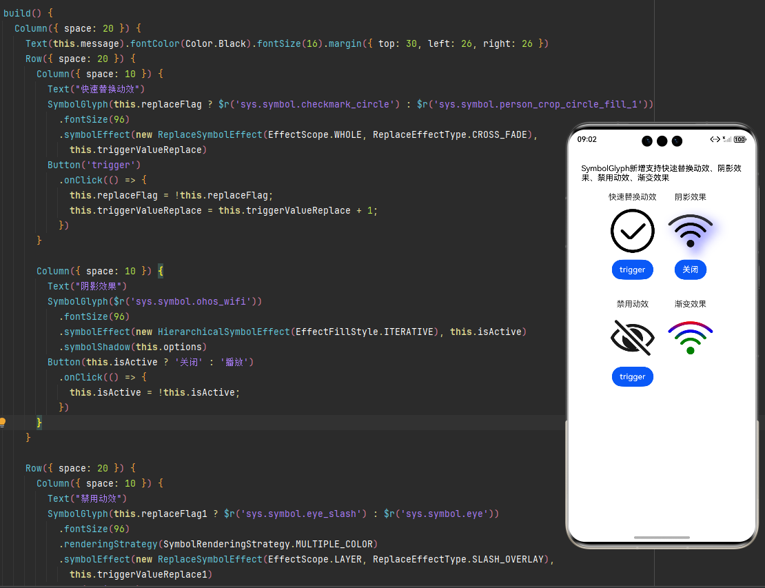
完整示例代码
@Entry
@Component
struct TestSymbolGlyph {
  @State message: string = 'SymbolGlyph新增支持快速替换动效、阴影效果、禁用动效、渐变效果';
  replaceFlag: boolean = true;
  replaceFlag1: boolean = true;
  @State isActive: boolean = true;
  @State triggerValueReplace: number = 0;
  @State triggerValueReplace1: number = 0;
  options: ShadowOptions = {
    radius: 10.0,
    color: Color.Blue,
    offsetX: 10,
    offsetY: 10,
  };

  build() {
    Column({ space: 20 }) {
      Text(this.message).fontColor(Color.Black).fontSize(16).margin({ top: 30, left: 26, right: 26 })
      Row({ space: 20 }) {
        Column({ space: 10 }) {
          Text("快速替换动效")
          SymbolGlyph(this.replaceFlag ? $r('sys.symbol.checkmark_circle') : $r('sys.symbol.person_crop_circle_fill_1'))
            .fontSize(96)
            .symbolEffect(new ReplaceSymbolEffect(EffectScope.WHOLE, ReplaceEffectType.CROSS_FADE),
              this.triggerValueReplace)
          Button('trigger')
            .onClick(() => {
              this.replaceFlag = !this.replaceFlag;
              this.triggerValueReplace = this.triggerValueReplace + 1;
            })
        }

        Column({ space: 10 }) {
          Text("阴影效果")
          SymbolGlyph($r('sys.symbol.ohos_wifi'))
            .fontSize(96)
            .symbolEffect(new HierarchicalSymbolEffect(EffectFillStyle.ITERATIVE), this.isActive)
            .symbolShadow(this.options)
          Button(this.isActive ? '关闭' : '播放')
            .onClick(() => {
              this.isActive = !this.isActive;
            })
        }
      }

      Row({ space: 20 }) {
        Column({ space: 10 }) {
          Text("禁用动效")
          SymbolGlyph(this.replaceFlag1 ? $r('sys.symbol.eye_slash') : $r('sys.symbol.eye'))
            .fontSize(96)
            .renderingStrategy(SymbolRenderingStrategy.MULTIPLE_COLOR)
            .symbolEffect(new ReplaceSymbolEffect(EffectScope.LAYER, ReplaceEffectType.SLASH_OVERLAY),
              this.triggerValueReplace1)
          Button('trigger')
            .onClick(() => {
              this.replaceFlag1 = !this.replaceFlag1;
              this.triggerValueReplace1 = this.triggerValueReplace1 + 1;
            })
        }

        Column({ space: 10 }) {
          Text("渐变效果")
          SymbolGlyph($r('sys.symbol.ohos_wifi'))
            .fontSize(96)
            // .shaderStyle(new ColorShaderStyle(Color.Blue))
            .shaderStyle(new LinearGradientStyle({
              angle: 270,
              direction: GradientDirection.Bottom,
              colors: [[Color.Red, 0.0], [Color.Blue, 0.3], [Color.Green, 0.5]],
              repeating: true
            }))
        }
      }
      .alignItems(VerticalAlign.Top)
      .margin({top: 20})

      // Row() {
      //   Column() {
      //     Text("Light")
      //     SymbolGlyph($r('sys.symbol.ohos_trash'))
      //       .fontWeight(FontWeight.Lighter)
      //       .fontSize(96)
      //   }
      //
      //   Column() {
      //     Text("Normal")
      //     SymbolGlyph($r('sys.symbol.ohos_trash'))
      //       .fontWeight(FontWeight.Normal)
      //       .fontSize(96)
      //   }
      //
      //   Column() {
      //     Text("Bold")
      //     SymbolGlyph($r('sys.symbol.ohos_trash'))
      //       .fontWeight(FontWeight.Bold)
      //       .fontSize(96)
      //   }
      // }
      //
      // Row() {
      //   Column() {
      //     Text("单色")
      //     SymbolGlyph($r('sys.symbol.ohos_folder_badge_plus'))
      //       .fontSize(96)
      //       .renderingStrategy(SymbolRenderingStrategy.SINGLE)
      //       .fontColor([Color.Black, Color.Green, Color.White])
      //   }
      //
      //   Column() {
      //     Text("多色")
      //     SymbolGlyph($r('sys.symbol.ohos_folder_badge_plus'))
      //       .fontSize(96)
      //       .renderingStrategy(SymbolRenderingStrategy.MULTIPLE_COLOR)
      //       .fontColor([Color.Black, Color.Green, Color.White])
      //   }
      //
      //   Column() {
      //     Text("分层")
      //     SymbolGlyph($r('sys.symbol.ohos_folder_badge_plus'))
      //       .fontSize(96)
      //       .renderingStrategy(SymbolRenderingStrategy.MULTIPLE_OPACITY)
      //       .fontColor([Color.Black, Color.Green, Color.White])
      //   }
      // }
      //
      // Row() {
      //   Column() {
      //     Text("无动效")
      //     SymbolGlyph($r('sys.symbol.ohos_wifi'))
      //       .fontSize(96)
      //       .effectStrategy(SymbolEffectStrategy.NONE)
      //   }
      //
      //   Column() {
      //     Text("整体缩放动效")
      //     SymbolGlyph($r('sys.symbol.ohos_wifi'))
      //       .fontSize(96)
      //       .effectStrategy(SymbolEffectStrategy.SCALE)
      //   }
      //
      //   Column() {
      //     Text("层级动效")
      //     SymbolGlyph($r('sys.symbol.ohos_wifi'))
      //       .fontSize(96)
      //       .effectStrategy(SymbolEffectStrategy.HIERARCHICAL)
      //   }
      // }
    }
  }
}
四、Text组件新增支持设置为数字翻牌动效
contentTransition说明
contentTransition(transition: Optional<ContentTransition>)
可以设置为数字翻牌动效NumericTextTransition。
元服务API: 从API version 20开始,该接口支持在元服务中使用。
系统能力: SystemCapability.ArkUI.ArkUI.Full
参数:
| 参数名 | 类型 | 必填 | 说明 |
|---|---|---|---|
| transition | Optional<ContentTransition> | 是 | 文本动效属性。 |
NumericTextTransition说明
数字翻牌动效。仅限正整数,不支持小数和负数。不支持渐变色和Text跑马灯模式。不支持选中,copyOption属性无效。当文本存在子组件时或通过属性字符串设置时,数字翻牌失效。
NumericTextTransition继承自ContentTransition。
元服务API: 从API version 20开始,该接口支持在元服务中使用。
系统能力: SystemCapability.ArkUI.ArkUI.Full
属性
元服务API: 从API version 20开始,该接口支持在元服务中使用。
系统能力: SystemCapability.ArkUI.ArkUI.Full
| 名称 | 类型 | 只读 | 可选 | 说明 |
|---|---|---|---|---|
| flipDirection | FlipDirection | 否 | 是 | 翻牌方向。 默认值:FlipDirection.DOWN |
| enableBlur | boolean | 否 | 是 | 是否开启翻牌模糊效果。 默认值:false true:开启翻牌模糊效果。 false:不开启翻牌模糊效果。 |
示例效果图
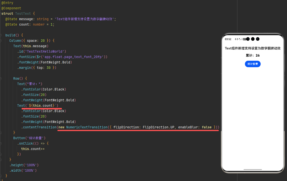
示例代码
@Entry
@Component
struct TestText {
  @State message: string = 'Text组件新增支持设置为数字翻牌动效';
  @State count: number = 1;

  build() {
    Column({ space: 20 }) {
      Text(this.message)
        .id('TestTextHelloWorld')
        .fontSize($r('app.float.page_text_font_20fp'))
        .fontWeight(FontWeight.Bold)
        .margin({ top: 30 })

      Row() {
        Text("累计:")
          .fontColor(Color.Black)
          .fontSize(20)
          .fontWeight(FontWeight.Bold)
        Text(`${this.count}`)
          .fontColor(Color.Black)
          .fontSize(20)
          .fontWeight(FontWeight.Bold)
          .contentTransition(new NumericTextTransition({ flipDirection: FlipDirection.UP, enableBlur: false }))
      }
      Button('统计数量')
        .onClick(() => {
          this.count++
        })
    }
    .height('100%')
    .width('100%')
  }
}
五、Scroll组件新增支持设置手势缩放的大小比例控制
minZoomScale
minZoomScale(scale: number)
设置Scroll组件内容的最小手势缩放比例。
元服务API: 从API version 20开始,该接口支持在元服务中使用。
系统能力: SystemCapability.ArkUI.ArkUI.Full
参数:
| 参数名 | 类型 | 必填 | 说明 |
|---|---|---|---|
| scale | number | 是 | Scroll组件内容的最小手势缩放比例。 默认值:1 取值范围:(0, maxZoomScale],小于或等于0时按默认值1处理,大于maxZoomScale时按maxZoomScale处理。 |
说明
当maxZoomScale和minZoomScale不同时为1时,Scroll组件会启用缩放手势。
zoomScale API20+
zoomScale(scale: number)
设置Scroll组件内容的缩放比例。
元服务API: 从API version 20开始,该接口支持在元服务中使用。
系统能力: SystemCapability.ArkUI.ArkUI.Full
参数:
| 参数名 | 类型 | 必填 | 说明 |
|---|---|---|---|
| scale | number | 是 | Scroll组件内容的最大手势缩放比例。 默认值:1 取值范围:(0, +∞),小于或等于0时按默认值1处理。 |
minZoomScale API 20+
Phone API 20+ | PC/2in1 API 20+ | Tablet API 20+ | TV API20+ | Wearable API20+
minZoomScale(scale: number)
设置Scroll组件内容的最小手势缩放比例。
元服务API: 从API version 20开始,该接口支持在元服务中使用。
模型约束: 此接口仅可在Stage模型下使用。
系统能力: SystemCapability.ArkUI.ArkUI.Full
参数:
| 参数名 | 类型 | 必填 | 说明 |
|---|---|---|---|
| scale | number | 是 | Scroll组件内容的最小手势缩放比例。 默认值:1 取值范围:(0, maxZoomScale],小于或等于0时按默认值1处理,大于maxZoomScale时按maxZoomScale处理。 |
说明
当maxZoomScale和minZoomScale不同时为1时,Scroll组件会启用缩放手势。
zoomScale API20+
Phone API 20+ | PC/2in1 API 20+ | Tablet API 20+ | TV API20+ | Wearable API20+
zoomScale(scale: number)
设置Scroll组件内容的缩放比例。
元服务API: 从API version 20开始,该接口支持在元服务中使用。
模型约束: 此接口仅可在Stage模型下使用。
系统能力: SystemCapability.ArkUI.ArkUI.Full
参数:
| 参数名 | 类型 | 必填 | 说明 |
|---|---|---|---|
| scale | number | 是 | 设置Scroll组件内容的缩放比例,该参数支持!!双向绑定变量。。 默认值:1 取值范围:(0, +∞),小于或等于0时按默认值1处理。 |
六、ArkWeb
6.1 新增支持在网络加载错误时返回自定义的错误页
onOverrideErrorPage API20+
Phone API 20+ | PC/2in1 API 20+ | Tablet API 20+ | TV API20+ | Wearable API20+
onOverrideErrorPage(callback: OnOverrideErrorPageCallback)
网页加载遇到错误时触发该回调,可用于设置自定义错误页替换ArkWeb提供的默认错误页。默认仅mainframe加载出错时触发;启用subframe错误页功能后,subframe加载出错时也会触发。
说明
- 该功能需通过调用setErrorPageEnabled API20+启用mainframe错误页功能后才会生效。如需同时启用subframe错误页功能,请调用setErrorPageEnabled接口并将includeSubframe设置为true。
- 通过errorPageEvent.request.isMainFrame()判断请求来源是mainframe还是subframe,以便在回调中分别设置对应的自定义错误页。
- 通过errorPageEvent.error.getErrorCode()获取的错误码大于0代表http协议错误,小于0代表网络错误。
系统能力: SystemCapability.Web.Webview.Core
参数:
| 参数名 | 类型 | 必填 | 说明 |
|---|---|---|---|
| callback | OnOverrideErrorPageCallback | 是 | 网页加载遇到错误时触发。 |
示例代码
import { webview } from '@kit.ArkWeb';
import { deviceInfo } from '@kit.BasicServicesKit';

@Entry
@Component
struct TestWebOverrideErrorPage {
  controller: webview.WebviewController = new webview.WebviewController();

  build() {
    Column() {
      if (deviceInfo.sdkApiVersion >= 20) {
        Web({ src: $rawfile("iframe_error.html"), controller: this.controller })
          .onControllerAttached(() => {
            // 启用mainframe错误页功能,并同时启用subframe错误页功能
            // this.controller.setErrorPageEnabled(true, true);
            try {
              this.controller.setErrorPageEnabled(true);
            } catch (error) {
              console.log("设置 setErrorPageEnabled 发生异常:", error)
            }
          })
          .onOverrideErrorPage((event) => {
            let errorCode: number = event.error.getErrorCode();
            if (event.request.isMainFrame()) {
              // mainframe加载失败,返回mainframe自定义错误页
              return "<html><body><h1>主页面加载失败</h1><p>错误码:" + errorCode + "</p></body></html>";
            }
            // subframe加载失败,返回subframe自定义错误页
            return "<html><body><h1>子页面加载失败</h1><p>错误码:" + errorCode + "</p></body></html>";
          })
      } else {
        Web({ src: $rawfile("iframe_error.html"), controller: this.controller })
          .onErrorReceive((data: OnErrorReceiveEvent) => {
            console.log("onErrorReceive回到:",data.error.getErrorInfo())
          })
      }
    }
  }
}
6.2 基于Web的PDF浏览能力增强
PDF文档预览回调功能
从API version 20开始,PDF文档预览支持两种回调功能:加载成功/失败回调和滚动到底部事件回调。
在下面的示例中,Web组件创建时指定默认加载的网络PDF文档https://www.example.com/test.pdf。使用时需替换为真实的可访问URL。
加载成功/失败回调。
Web({
  src: 'https://www.example.com/test.pdf',
  controller: this.controller
})
  .onPdfLoadEvent(
    (eventInfo: OnPdfLoadEvent) => {
      console.info(`Load event callback called. url: ${eventInfo.url}, result: ${eventInfo.result}.`)
    }
  )
滚动到底部事件回调。
Web({
  src: 'https://www.example.com/test.pdf',
  controller: this.controller
})
  .onPdfScrollAtBottom(
    (eventInfo: OnPdfScrollEvent) => {
      console.info(`Scroll at bottom callback called. url: ${eventInfo.url}.`)
    }
  )
通过配置PDF文件预览参数,控制打开预览时页面状态
当前支持如下参数:
| 语法 | 描述 |
|---|---|
| nameddest=destination | 指定PDF文档中的命名目标。 |
| page=pagenum | 使用整数指定文档中的页码,文档第一页的pagenum值为1。 |
| zoom=scale,left,top | 使用浮点或整数值设置缩放和滚动系数。例如:缩放值100表示缩放值为100%。 向左和向上滚动值位于坐标系中,0,0 表示可见页面的左上角,无论文档如何旋转。scale为必选参数。left,top为非必选参数。 |
| toolbar=1 or 0 | 1表示打开顶部工具栏。0表示关闭顶部工具栏。 |
| navpanes=1 or 0 | 1表示打开侧边导航窗格。0表示关闭侧边导航窗格。 |
| pdfbackgroundcolor=color | 从HarmonyOS 6.0系统版本开始,支持指定PDF文档背景色,color为标准的六位十六进制RGB(取值范围为000000~ffffff,例如白色为:ffffff)。 |
URL示例:
https://example.com/test.pdf#nameddest=Chapter6
https://example.com/test.pdf#page=3
https://example.com/test.pdf#zoom=50
https://example.com/test.pdf#page=3&zoom=200,250,100
https://example.com/test.pdf#toolbar=0
https://example.com/test.pdf#navpanes=0
https://example.com/test.pdf#pdfbackgroundcolor=ffffff
onPdfLoadEvent API20+
onPdfLoadEvent(callback: Callback)
通知用户PDF页面加载状态,包括成功或失败。
系统能力: SystemCapability.Web.Webview.Core
参数:
| 参数名 | 类型 | 必填 | 说明 |
|---|---|---|---|
| callback | Callback<OnPdfLoadEvent> | 是 | 当PDF加载成功或失败时,会触发回调,通知用户PDF页面加载状态。 |
示例代码
// xxx.ets
import { webview } from '@kit.ArkWeb';

@Entry
@Component
struct WebComponent {
  controller: webview.WebviewController = new webview.WebviewController();

  build() {
    Column() {
      // 使用时需将'https://www.example.com/xxx.pdf'替换为真实可访问的地址
      Web({ src: 'https://www.example.com/xxx.pdf', controller: this.controller })
        .onPdfLoadEvent((eventInfo: OnPdfLoadEvent) => {
          console.info(`Load event callback called. url: ${eventInfo.url}, result: ${eventInfo.result}.`)
        })
    }
  }
}

讨论HarmonyOS开发技术,专注于API与组件、DevEco Studio、测试、元服务和应用上架分发等。
更多推荐

 10
10 0
0- 0


 已为社区贡献81条内容

所有评论(0)