社群表情商店的深色霓虹美学:ArkUI斜纹像素画与WebP元数据引擎的实战解析
技术前言
在数字社交生态中,表情包早已超越了简单的"图片"范畴,成为一种独特的社群语言和文化载体。从早期的 ASCII 颜文字到如今的动态 WebP 表情套装,表情商店作为连接创作者与社群用户的关键枢纽,需要在有限的手机屏幕上同时呈现"视觉冲击力"与"信息密度"——既要用鲜明的配色抓住用户眼球,又要在一屏内展示足够的商品信息供用户决策。这种矛盾在深色主题下尤为突出:深色背景能有效突出荧光色系的视觉张力,但也要求更高的对比度和更精细的层次控制。
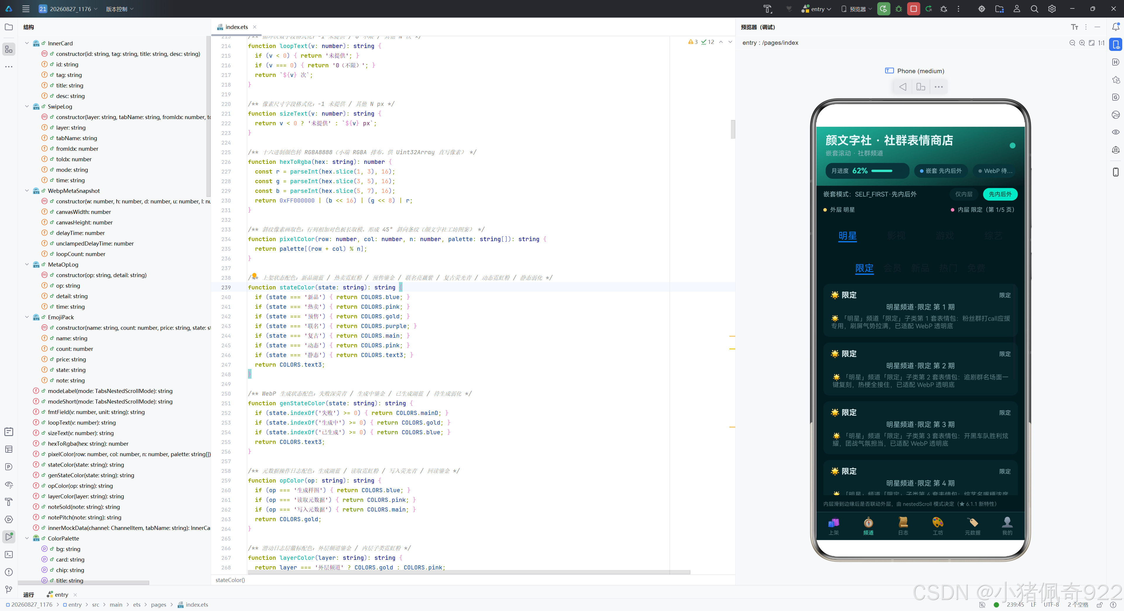
HarmonyOS NEXT(API 24)为解决这类复杂交互场景提供了两项关键能力。第一项是 Tabs 组件的嵌套滚动机制(nestedScroll),它允许在内外两层 Tabs 之间建立"先内后外"或"仅内层"的滚动联动关系。对于一个需要"频道×子类"二维分类的表情商店来说,这意味着用户可以在内层浏览某频道的子类表情时,滑到边缘后自动或手动联动到外层频道切换,获得无缝的内容探索体验。第二项是 Image Kit 新增的 WebP 元数据类型化读写接口(readImageMetadataByType / writeImageMetadata),它使得开发者可以在应用沙箱内零权限地对 WebP 文件进行五字段元数据(canvasWidth/canvasHeight/delayTime/unclampedDelayTime/loopCount)的读取、写入与回读校验。对于表情商店来说,WebP 是动图表情的主要格式,能够直接在端侧调试和修改动图参数,极大简化了表情包的制作与上架流程。
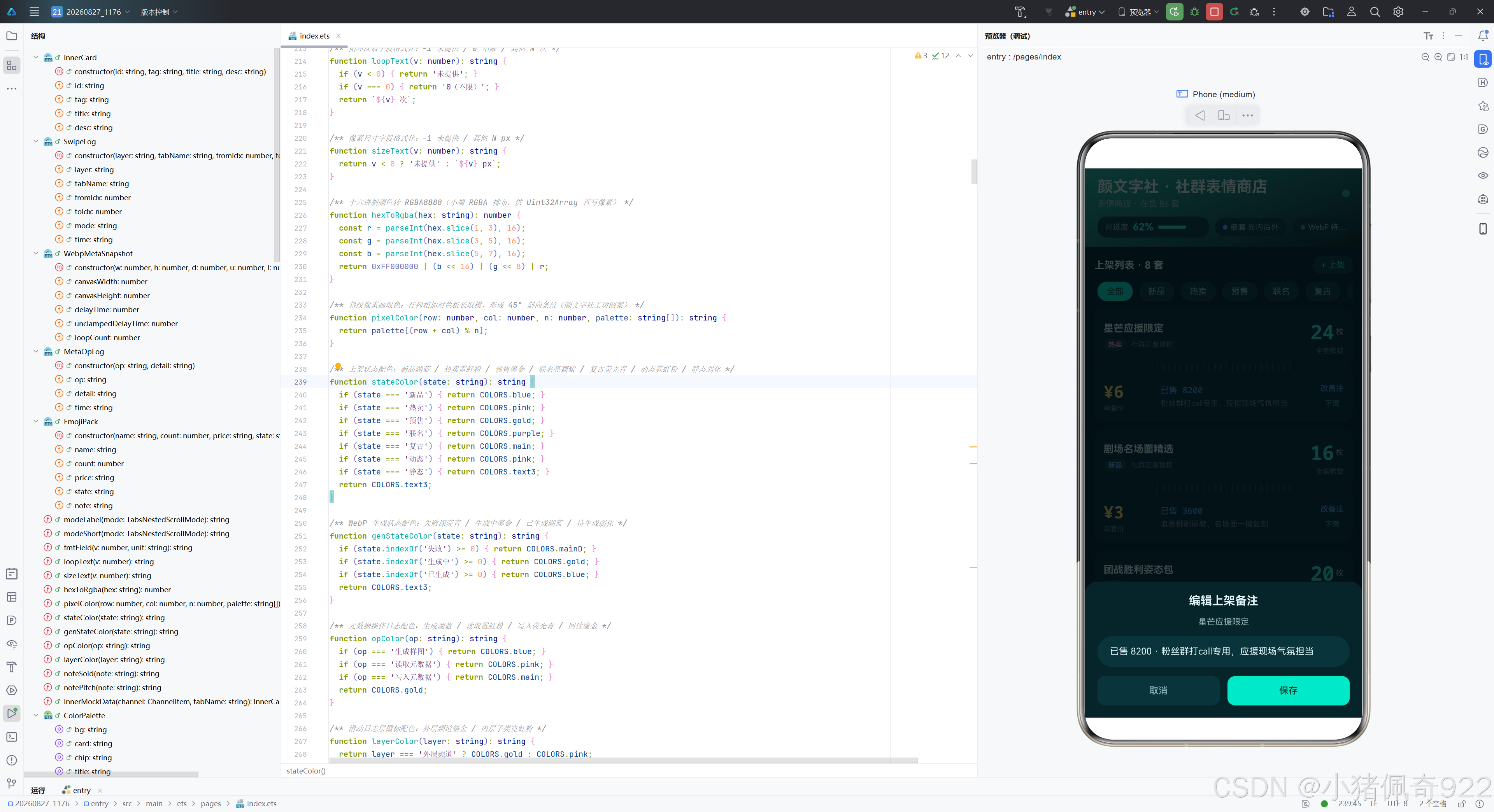
本文将以"颜文字社"这一社群表情商店为载体,完整呈现这两项 API 24 新特性在深色主题场景下的工程实践。整个应用采用墨青(#081A1E)底色搭配荧光青(#2EE6C8)主题色和霓虹粉(#FF7EB6)辅色,营造出赛博朋克般的霓虹质感。在像素画生成方面,采用 (row + col) % n 的斜纹算法,形成 45° 对角线条纹图案,与条漫平台的竖带图案形成鲜明对比。在列表设计方面,首创"两段式票券卡"布局——上段展示表情包信息与枚数大字,中缝模拟撕票虚线,下段展示价格与卖点,让表情商品的信息呈现如同实体票券般有仪式感。整个应用同时融入了渐变统计大卡、呼吸圆点动画、三态统一弹窗系统等丰富的 UI 组件,力求在技术深度与产品完整度之间取得平衡。
应用架构总览
以下是整个应用的架构流程图,展示了从用户交互到核心特性的完整链路:
┌─────────────────────────────────────────────────────────────────┐
│                    颜文字社 · 社群表情商店                       │
├─────────────────────────────────────────────────────────────────┤
│  头部 Banner(墨青渐变 + 月进度胶囊 + 双特性状态胶囊 + 呼吸圆点) │
├─────────────────────────────────────────────────────────────────┤
│                        六 Tab 内容区                             │
├──────────┬──────────┬──────────┬──────────┬──────────┬─────────┤
│  Tab0    │  Tab1    │  Tab2    │  Tab3    │  Tab4    │  Tab5   │
│  上架    │  频道    │  日志    │  工坊    │  元数据  │  我的   │
│          │          │          │          │          │         │
│ 统计大卡 │ 外层4频道│ 翻页时间 │ 像素画   │ 五字段   │ 身份卡  │
│ 代码预览 │ 内层5页签│ 线日志   │ 生成WebP │ 快照卡   │ 功能清单│
│ 筛选chips│ nestedSc │ 清空按钮 │ 沙箱落盘 │ 写入控制 │ 版本信息│
│ 票券卡   │ roll挂载 │          │          │ 回读校验 │         │
│ 列表     │          │          │          │ 操作日志 │         │
├──────────┴──────────┴──────────┴──────────┴──────────┴─────────┤
│                   底部 6 Tab 导航栏                              │
├─────────────────────────────────────────────────────────────────┤
│              全屏弹窗遮罩(add / edit / del 三态)               │
└─────────────────────────────────────────────────────────────────┘

特性 A:Tabs 嵌套滚动(API 24)
  ┌─ 外层 Tabs(4 频道:明星/影视/游戏/综艺,BarMode.Fixed)
  │    └─ 内层 Tabs(5 子页签:限定/会员/新品/热门/免费,BarMode.Scrollable)
  │         └─ .nestedScroll(TabsNestedScrollMode)
  │              ├─ SELF_ONLY  → 内层滑到边缘只滚自身
  │              └─ SELF_FIRST → 内层优先,到边缘联动父容器

特性 B:ImageKit WebP 元数据(API 24)
  工坊生成WebP ──→ 元数据页读取 ──→ 写入控制台 ──→ 回读校验
       │                │              │              │
   genWebpFile()    readMeta()     writeMeta()    verifyRead()
   斜纹像素画→编码→落盘  五字段快照    写回五字段      二次读取比对

票券卡列表设计:
  ┌──────────────────────────┐
  │  上段:表情包名+状态+枚数  │
  ├○························○┤  ← 中缝撕票线(左右缺口圆+竖线刻度)
  │  下段:价格+购买人数+卖点  │
  └──────────────────────────┘
模块导入分析
应用仅依赖三行 import,体现了极简的模块化策略:
// 三行 import:图片处理、文件IO、错误类型
import { image } from '@kit.ImageKit';       // 图片编解码与元数据读写
import { fileIo } from '@kit.CoreFileKit';   // 沙箱文件读写
import { BusinessError } from '@kit.BasicServicesKit'; // 错误类型断言
image 来自 ImageKit,提供 createPixelMap(像素图创建)、createImagePacker(编码器)、createImageSource(图片源)等核心 API,是 WebP 生成与元数据读写的基石。fileIo 来自 CoreFileKit,负责沙箱目录下的文件操作,所有 WebP 文件落在 getContext(this).filesDir 目录下,零权限要求。BusinessError 用于在 try-catch 中将异常断言为业务错误,提取 code 和 message 写入操作日志。这种三行导入的策略确保了应用的最小依赖,每个 Kit 各司其职,不产生冗余。
颜色系统设计
深色主题的颜色系统同样采用接口声明与常量实现分离的模式,但色板构成与浅色主题截然不同:
/** 主题色板接口:集中声明页面所有颜色字段(墨青 + 荧光青 + 霓虹粉深色系) */
interface ColorPalette {
  bg: string;       // 页面底色·墨青
  card: string;     // 卡片底色·深青
  chip: string;     // 胶囊/输入底色·暗瓶绿
  title: string;    // 主标题·浅雾白
  sub: string;      // 次级文字·灰青
  text3: string;    // 弱化文字·暗青灰
  main: string;     // 主题色·荧光青
  mainD: string;    // 主题色深·深荧青
  pink: string;     // 辅色·霓虹粉
  gold: string;     // 辅色·鎏金
  blue: string;     // 辅色·湖蓝
  purple: string;   // 辅色·亮藕紫
  line: string;     // 分割线
  tabOn: string;    // Tab 激活色
  mask: string;     // 弹窗遮罩
  codeBg: string;   // 代码预览底色
  gradA: string;    // 渐变起点·荧光青(统计大卡)
  gradB: string;    // 渐变终点·深荧青(统计大卡/头部/身份卡)
  onMain: string;   // 主色按钮上的深字(荧光青底建议深字)
}

/** 深色主题色板常量(颜文字社 · 墨青 + 荧光青 + 霓虹粉) */
const COLORS: ColorPalette = {
  bg: '#081A1E',
  card: '#0E2429',
  chip: '#16333A',
  title: '#E4F5F7',
  sub: '#8FB6BC',
  text3: '#56787E',
  main: '#2EE6C8',
  mainD: '#1FB8A0',
  pink: '#FF7EB6',
  gold: '#FFD166',
  blue: '#4DA8FF',
  purple: '#9D7BEA',
  line: '#1E4148',
  tabOn: '#2EE6C8',
  mask: 'rgba(4,12,14,0.75)',
  codeBg: '#051316',
  gradA: '#2EE6C8',
  gradB: '#1FB8A0',
  onMain: '#06322C'
};
这套深色色板有几点值得深入分析。首先是底色 #081A1E(墨青),这是一种接近黑色但带有青色微调的极深色,比纯黑 #000000 更有层次感,不会产生"空洞"的视觉感受。卡片底色 #0E2429(深青)比页面底色稍亮,通过微妙的明度差形成卡片与背景的层次区分。主题色 #2EE6C8(荧光青)是整个色板的灵魂——它既有青色的清冷感,又通过高饱和度产生"荧光"般的视觉冲击力,在深色背景上极为醒目。辅色 #FF7EB6(霓虹粉)与荧光青形成强烈的冷暖对比,用于"热卖""动态"等高优先级状态标识。
特别值得注意的是 onMain 字段设为 #06322C(深色),而非白色。这是因为荧光青本身亮度很高,白色文字在荧光青背景上对比度不足,改用深色文字反而更清晰。这种"深底深字"的反直觉选择体现了深色主题设计的精细化考量。codeBg 设为 #051316,比页面底色更深,形成"代码区域是页面中最深的部分"的视觉层次。遮罩色使用 rgba(4,12,14,0.75)——比浅色主题的 0.5 更高不透明度,因为深色主题下弹窗需要更强的遮蔽感。
常量数据层设计
底部导航与频道页签
/** 底部导航 Tab 常量列表(6 Tab 单排) */
const TAB_LIST: TabMeta[] = [
  { icon: '🛍', label: '上架' },
  { icon: '🧭', label: '频道' },
  { icon: '📜', label: '日志' },
  { icon: '🎨', label: '工坊' },
  { icon: '🏷', label: '元数据' },
  { icon: '👤', label: '我的' }
];

/** 外层频道常量(4 个,社群表情分发频道) */
const OUTER_CHANNELS: ChannelItem[] = [
  { name: '明星', icon: '🌟' },
  { name: '影视', icon: '🎬' },
  { name: '游戏', icon: '🎮' },
  { name: '综艺', icon: '🎤' }
];

/** 内层子页签常量(5 个,社群表情子类,nestedScroll 挂载宿主) */
const INNER_TABS: string[] = ['限定', '会员', '新品', '热门', '免费'];

/** 上架筛选 chips 常量(8 个,按表情包上架状态) */
const CATE_TAGS: string[] = ['全部', '新品', '热卖', '预售', '联名', '复古', '动态', '静态'];
底部六 Tab 中,第一个是"上架"(而非条漫平台的"书架"),体现了表情商店以"商品管理"为核心的定位。外层四频道(明星/影视/游戏/综艺)是表情包最常见的内容来源分类——明星表情来自粉丝应援、影视表情来自名场面截图、游戏表情来自团战截图、综艺表情来自名嘴语录。内层五子页签(限定/会员/新品/热门/免费)则按商品属性分类——限定是稀缺款、会员是专享款、新品是刚上架、热门是销量高、免费是引流款。八筛选标签(全部/新品/热卖/预售/联名/复古/动态/静态)中,"动态/静态"是表情包特有的分类维度,区分动图 WebP 与静态图。
WebP 参数与上架种子数据
/** WebP 编码质量(样图工坊固定档位) */
const WEBP_QUALITY: number = 90;

/** 像素画画布边长(96×96,与 WebPMetadata 的 canvasWidth/Height 同值写回) */
const CANVAS_SIZE: number = 96;

/** WebP 帧延迟预设(delayTime/unclampedDelayTime 写入档位) */
const DELAY_PRESETS: number[] = [120, 200, 500];

/** WebP 循环次数预设(loopCount 写入档位,0=不限) */
const LOOP_PRESETS: number[] = [0, 1, 3, 5];

/** 上架种子数据(8 条,社群表情商店票券卡 Mock,全部行业语义化) */
const PACK_SEEDS: PackSeed[] = [
  { name: '星芒应援限定', count: 24, price: '¥6', state: '热卖', sold: '已售 8200',
    pitch: '粉丝群打call专用,应援现场气氛担当' },
  { name: '剧场名场面精选', count: 16, price: '¥3', state: '新品', sold: '已售 3600',
    pitch: '追剧群刷屏款,名场面一键复刻' },
  { name: '团战胜利姿态包', count: 20, price: '¥5', state: '预售', sold: '已订 1200',
    pitch: '开黑车队预定款,上架即解锁全套' },
  // ... 其余5条
];
上架种子数据有 8 条,每条都包含表情包名、全套枚数、价格、状态标签、购买人数文案和卖点。与条漫平台不同,表情包的数据模型增加了 count(枚数)和 price(价格)两个字段——枚数是表情包的核心商品属性(一套包含多少张表情),价格则是交易属性。种子数据中的文案如"粉丝群打call专用"“追剧群刷屏款”"开黑车队预定款"等,都紧密围绕社群表情的使用场景,让 Mock 数据具有真实的商业气息。
票券中缝刻度常量
/** 票券中缝竖线刻度常量(24 个刻度,模拟撕票虚线) */
const DASH_TICKS: number[] = [0, 1, 2, 3, 4, 5, 6, 7, 8, 9, 10, 11,
  12, 13, 14, 15, 16, 17, 18, 19, 20, 21, 22, 23];
这是表情商店特有的常量,用于票券卡中缝的撕票线效果。24 个刻度对应 24 个细竖线,配合左右两个缺口圆,模拟实体票券的撕票虚线。这种设计是表情商店在列表样式上与条漫平台最大的区别——条漫用追更进度条清单,表情商店用票券卡,体现了"商品交易"的仪式感。
代码预览行与功能清单
/** 新特性代码预览行(Tab0 代码卡 6 行 monospace,双特性各半) */
const CODE_PREVIEW_LINES: string[] = [
  'Tabs().nestedScroll(TabsNestedScrollMode.SELF_FIRST)',
  'TabsNestedScrollMode.SELF_ONLY   // 默认·仅自身',
  'TabsNestedScrollMode.SELF_FIRST  // 24+·到边缘联动父容器',
  'image.MetadataType.WEBP_METADATA       // 24+',
  'source.readImageMetadataByType(types, 0)',
  'source.writeImageMetadata({ webPMetadata })'
];

/** 我的页功能清单常量(6 行,主理人中心入口) */
const FUNC_ITEMS: FuncItem[] = [
  { icon: '🏪', label: '我的店铺', hint: '在售 86 套' },
  { icon: '📈', label: '销售报表', hint: '本月 1240 枚' },
  { icon: '💞', label: '粉丝运营', hint: '粉丝 1.2万' },
  { icon: '🧩', label: '素材管理', hint: '素材 460 枚' },
  { icon: '👑', label: '创作者权益', hint: '分成比例 50%' },
  { icon: '📌', label: '关于版本', hint: 'v1.0.0 · API 24' }
];
功能清单六行覆盖了店铺管理、销售数据、粉丝运营、素材管理、创作者权益和版本信息,完全围绕"主理人"(店铺运营者)的视角设计,与条漫平台的"漫友"视角形成对比。
辅助函数分析
像素画取色算法:斜纹条纹
这是表情商店与条漫平台在技术实现上最核心的差异点:
/** 斜纹像素画取色:行列相加对色板长取模,形成 45° 斜向条纹(颜文字社工坊图案) */
function pixelColor(row: number, col: number, n: number, palette: string[]): string {
  return palette[(row + col) % n];
}
与条漫平台的竖带算法 Math.floor(col / 8) % n 不同,斜纹算法使用 (row + col) % n。这个公式的几何意义是:当 row + col 为常数时,所有满足条件的像素取同一颜色。在二维平面上,row + col = C 是一条 45° 的对角线——随着 C 的增大,颜色在色板中循环切换。因此生成的图案是一组 45° 倾斜的彩色条纹。
以 96×96 画布、五色色板为例:row + col 的取值范围是 0(左上角)到 190(右下角),% 5 后在 0~4 之间循环。从左上到右下,每过一条对角线换一次颜色,形成五色交替的斜纹图案。这种图案与荧光青、霓虹粉等高饱和度色板搭配时,会产生强烈的霓虹光效,非常契合表情商店的赛博朋克美学。
对比两种算法的本质差异:
| 算法维度 | 竖带算法(条漫) | 斜纹算法(表情商店) |
|---|---|---|
| 公式 | Math.floor(col / 8) % n | (row + col) % n |
| 依赖变量 | 仅 col(列坐标) | row + col(行列之和) |
| 条纹方向 | 垂直(竖向) | 45° 对角线 |
| 条纹宽度 | 8 像素 | 1 像素(更细密) |
| 色彩切换频率 | 每 8 列切换 | 每行/列递增切换 |
| 视觉效果 | 宽幅竖带 | 密集斜纹 |
| 适用场景 | 阅读类应用 | 商业化应用 |
票券备注拆分函数
/** 拆出票券下段的购买人数段(note 以「·」分隔,前段为已售人数;无分隔符时返回空串) */
function noteSold(note: string): string {
  const seg = note.split('·');
  return seg.length > 1 ? seg[0].trim() : '';
}

/** 拆出票券下段的卖点段(note 以「·」分隔,后段为一句卖点;无分隔符时整句作为卖点) */
function notePitch(note: string): string {
  const seg = note.split('·');
  return seg.length > 1 ? seg[1].trim() : note;
}
这两个函数是表情商店特有的,用于将 EmojiPack 的 note 字段(格式为"购买人数 · 一句卖点")拆分为两段独立展示。使用 ·(中圆点)作为分隔符,如果 note 中没有分隔符,noteSold 返回空串,notePitch 返回整句。这种设计让一个 note 字段同时承载两个信息维度,在数据模型上节省了一个字段,在 UI 上则通过票券卡的下段布局分别展示。
状态配色函数群
/** 上架状态配色:新品湖蓝 / 热卖霓虹粉 / 预售鎏金 / 联名亮藕紫 / 复古荧光青 / 动态霓虹粉 / 静态弱化 */
function stateColor(state: string): string {
  if (state === '新品') { return COLORS.blue; }
  if (state === '热卖') { return COLORS.pink; }
  if (state === '预售') { return COLORS.gold; }
  if (state === '联名') { return COLORS.purple; }
  if (state === '复古') { return COLORS.main; }
  if (state === '动态') { return COLORS.pink; }
  if (state === '静态') { return COLORS.text3; }
  return COLORS.text3;
}
七种上架状态映射到六种颜色(热卖和动态共用霓虹粉)。新品用湖蓝(清新感)、热卖用霓虹粉(高热度)、预售用鎏金(期待感)、联名用亮藕紫(稀缺感)、复古用荧光青(主题色呼应怀旧)、动态用霓虹粉(活力感)、静态用弱化灰(低调)。色彩映射逻辑紧扣表情包的商品属性。
颜色转换与格式化函数
/** 十六进制颜色转 RGBA8888(小端 RGBA 排布,供 Uint32Array 直写像素) */
function hexToRgba(hex: string): number {
  const r = parseInt(hex.slice(1, 3), 16);
  const g = parseInt(hex.slice(3, 5), 16);
  const b = parseInt(hex.slice(5, 7), 16);
  return 0xFF000000 | (b << 16) | (g << 8) | r;
}
hexToRgba 函数的逻辑与条漫平台完全一致——解析 #RRGGBB 为 R/G/B 分量,通过位运算组装为 32 位 RGBA_8888 小端整数。0xFF000000 设置 Alpha 为 255(不透明),B 占 16~23 位、G 占 8~15 位、R 占 0~7 位。这种排布可以直接写入 Uint32Array 供 createPixelMap 使用。
格式化函数群(fmtField、loopText、sizeText)也与条漫平台一致,统一使用 -1 作为"未提供"的哨兵值,loopCount = 0 表示无限循环。
数据模型层
EmojiPack:表情包上架模型
/** @Observed 表情包上架条目模型:社群表情商店票券卡(支持新上架/改备注/下架) */
@Observed
export class EmojiPack {
  name: string;   // 表情包名
  count: number;  // 全套枚数
  price: string;  // 单套价格文案(¥N / 免费)
  state: string;  // 状态标签(对应 CATE_TAGS)
  note: string;   // 上架备注(购买人数 · 一句卖点,可编辑)

  constructor(name: string, count: number, price: string, state: string, note: string) {
    this.name = name;
    this.count = count;
    this.price = price;
    this.state = state;
    this.note = note;
  }
}
EmojiPack 是表情商店的核心数据模型,与条漫平台的 ComicSeries 相比,增加了 count(全套枚数)和 price(价格文案)两个字段,去掉了 progress(追更进度)和 update(最近更新)。note 字段采用复合格式"购买人数 · 一句卖点",通过 noteSold 和 notePitch 函数拆分展示。使用 @Observed 装饰器保证属性变化时 UI 自动更新——比如编辑 note 后,票券卡下段的购买人数和卖点会立即刷新。
其他数据模型
/** @Observed 内层子类卡片模型:嵌套 Tabs 的列表条目(每子页签 8 条) */
@Observed
export class InnerCard {
  id: string;     // 唯一键(频道-子类-序号)
  tag: string;    // 所属子页签名
  title: string;  // 卡片标题(频道·子类 第 N 期)
  desc: string;   // 卡片描述(使用场景)
  constructor(id: string, tag: string, title: string, desc: string) { ... }
}

/** @Observed 滑动日志模型:外/内层翻页记录(日志 Tab 时间线条目) */
@Observed
export class SwipeLog {
  layer: string;    // 层级(外层频道/内层子类)
  tabName: string;  // 翻到的页签名
  fromIdx: number;  // 起始索引
  toIdx: number;    // 目标索引
  mode: string;     // 触发时的嵌套模式
  time: string;     // 记录时间
  constructor(layer: string, tabName: string, fromIdx: number, toIdx: number, mode: string) { ... }
}

/** @Observed WebP 元数据快照模型:五字段镜像(-1 表示未提供) */
@Observed
export class WebpMetaSnapshot {
  canvasWidth: number;         // 画布宽
  canvasHeight: number;        // 画布高
  delayTime: number;           // 帧延迟(限幅后)
  unclampedDelayTime: number;  // 帧延迟(未限幅)
  loopCount: number;           // 循环次数
  constructor(w: number, h: number, d: number, u: number, l: number) { ... }
}

/** @Observed 元数据操作日志模型:生成/读取/写入/回读四类 */
@Observed
export class MetaOpLog {
  op: string;      // 操作名
  detail: string;  // 结果明细
  time: string;    // 记录时间
  constructor(op: string, detail: string) { ... }
}
InnerCard、SwipeLog、WebpMetaSnapshot、MetaOpLog 四个模型与条漫平台完全一致,只是 InnerCard.desc 的描述内容不同——表情商店的描述聚焦于"使用场景"而非条漫的"看点"。innerMockData 生成器中,每条卡片的描述拼接了频道图标、频道名、子类名和场景描述:“「明星」频道「限定」子类第 1 套表情包:粉丝群打call应援专用,刷屏气势拉满,已适配 WebP 透明底”。
组件状态体系
@Entry
@Component
struct Page1176 {
  /************* 基础 UI 状态 *************/
  @State currentTab: number = 0;      // 当前 Tab 索引
  @State breath: number = 0;          // 呼吸动画计步器
  private breathTimer: number = -1;   // 呼吸动画定时器句柄

  /************* 上架业务状态 *************/
  @State packList: EmojiPack[] = PACK_SEEDS.map((s: PackSeed) =>
    new EmojiPack(s.name, s.count, s.price, s.state, `${s.sold} · ${s.pitch}`));
  @State activeCate: string = '全部'; // 当前状态筛选
  @State statPacks: number = 86;      // 在售表情包(套)
  @State statSales: number = 1240;    // 今日销量(枚)
  @State statIncome: number = 268;    // 今日分成(元)
  @State monthDone: number = 1240;    // 本月销量进度
  @State monthTotal: number = 2000;   // 本月销量目标

  /************* 弹窗状态(三态统一) *************/
  @State modalVisible: boolean = false;
  @State panelType: string = '';
  @State inputText: string = '';
  @State editIndex: number = -1;

  /************* 特性 A 状态(Tabs 嵌套滚动) *************/
  @State nestedMode: TabsNestedScrollMode = TabsNestedScrollMode.SELF_FIRST;
  @State outerIndex: number = 0;
  @State innerIndex: number = 0;
  @State swipeLogs: SwipeLog[] = [];

  /************* 特性 B 状态(WebP 元数据) *************/
  @State pixelMap?: image.PixelMap = undefined;
  @State webpPath: string = '';
  @State genState: string = '待生成';
  @State metaSnapshot?: WebpMetaSnapshot = undefined;
  @State writeDelay: number = 120;
  @State writeLoop: number = 3;
  @State verifySnapshot?: WebpMetaSnapshot = undefined;
  @State opLogs: MetaOpLog[] = [];
}
状态体系与条漫平台结构一致,但业务数据完全不同。上架业务状态中 packList 通过 PACK_SEEDS.map 将种子数据映射为 EmojiPack 实例,note 字段拼接 sold 和 pitch(“已售 8200 · 粉丝群打call专用,应援现场气氛担当”)。三个统计指标改为在售套数、今日销量和今日分成,月进度改为本月销量进度。弹窗操作的分派逻辑也相应调整:
/** 弹窗确认:按类型分派(新上架置顶列表 / 保存备注 / 下架条目) */
confirmPanel() {
  if (this.panelType === 'add' && this.inputText.trim() !== '') {
    // 新上架:状态取当前筛选(「全部」时默认「新品」),unshift 置顶列表首位,同步在售套数
    const state = this.activeCate === '全部' ? '新品' : this.activeCate;
    this.packList.unshift(new EmojiPack(this.inputText.trim(), 24, '¥5', state,
      '已售 0 · 今日新上架,等待社群检验'));
    this.statPacks = this.statPacks + 1;
  } else if (this.panelType === 'edit' && this.editIndex >= 0
    && this.editIndex < this.packList.length) {
    // 编辑:仅更新上架备注(购买人数 · 一句卖点),空输入不覆盖
    if (this.inputText.trim() !== '') {
      this.packList[this.editIndex].note = this.inputText.trim();
    }
  } else if (this.panelType === 'del' && this.editIndex >= 0
    && this.editIndex < this.packList.length) {
    // 下架:移出商店并同步在售套数
    this.packList.splice(this.editIndex, 1);
    this.statPacks = this.statPacks > 0 ? this.statPacks - 1 : 0;
  }
  this.closePanel();
}
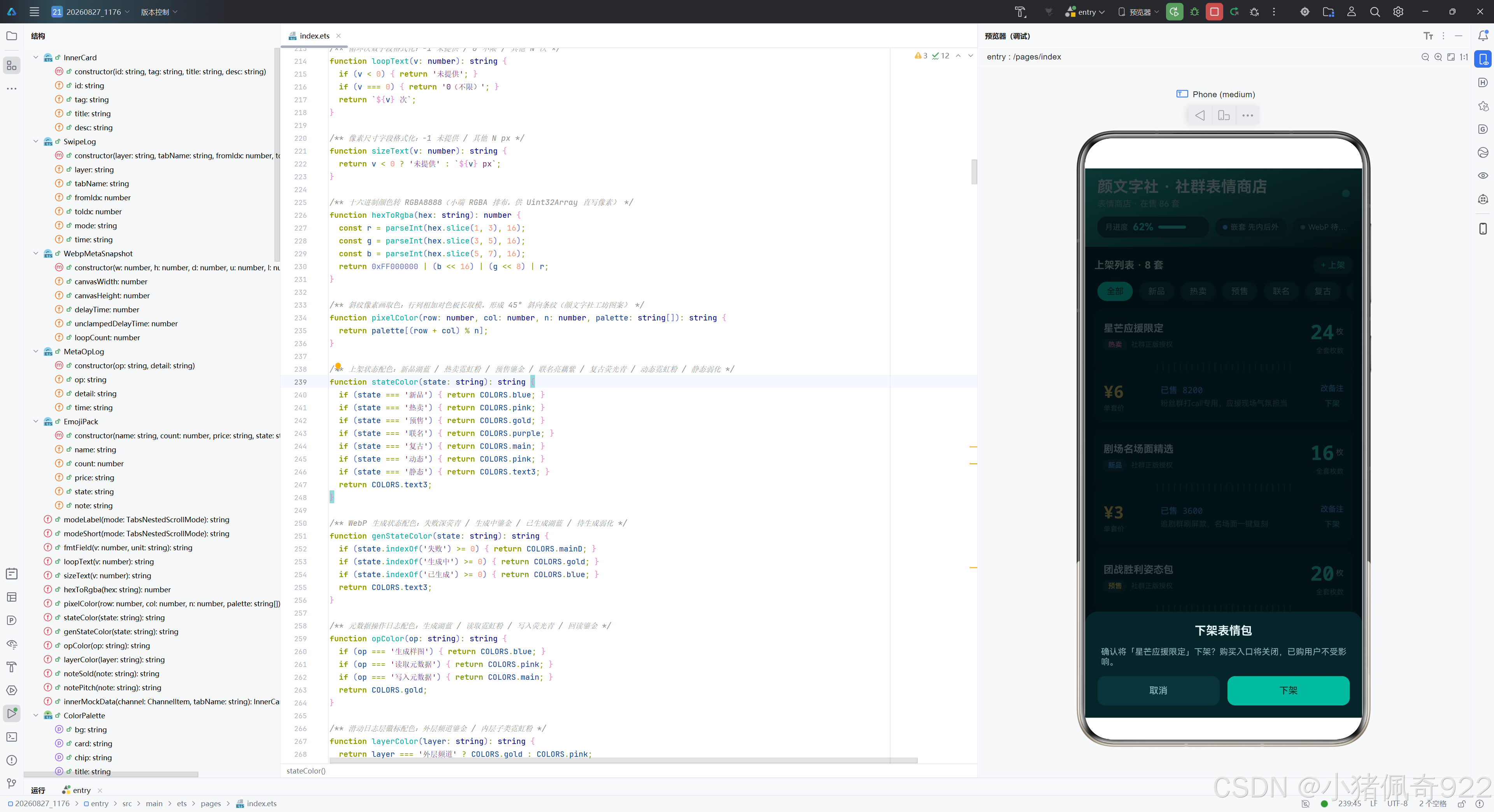
新上架时默认枚数 24、价格 ¥5、状态取当前筛选(“全部"时默认"新品”),备注为"已售 0 · 今日新上架,等待社群检验"——初始销量为零,等待社群验证。下架时通过 splice 移除条目并同步递减在售套数。
WebP 生成链路
┌──────────────────────────────────────────────────────────────┐
│                    genWebpFile() 生成链路                     │
├──────────────────────────────────────────────────────────────┤
│                                                              │
│  1. 创建 ArrayBuffer(96×96×4 = 36864 字节)                  │
│     └→ Uint32Array 视图,逐像素写色                           │
│         循环 9216 次,pixelColor 斜纹取色 → hexToRgba 转 RGBA │
│                                                              │
│  2. ArrayBuffer → PixelMap                                  │
│     └→ image.createPixelMap(buf, {RGBA_8888, 96×96})         │
│         └→ 赋值 this.pixelMap(UI 预览)                      │
│                                                              │
│  3. PixelMap → WebP 编码                                     │
│     └→ image.createImagePacker()                             │
│         └→ packer.packToData(pm, {image/webp, quality:90})    │
│             └→ packer.release() 释放编码器                     │
│                                                              │
│  4. 落盘沙箱 filesDir                                        │
│     └→ fileIo.openSync(path, READ_WRITE|CREATE|TRUNC)        │
│         └→ fileIo.writeSync(fd, webpBuf)                      │
│             └→ fileIo.closeSync(file)                         │
│                                                              │
│  5. 更新状态                                                  │
│     └→ this.webpPath = path                                  │
│     └→ this.genState = "已生成 XX.XKB"                       │
│     └→ opLogs.unshift(MetaOpLog) 记录日志                     │
│                                                              │
└──────────────────────────────────────────────────────────────┘
/**
 * 斜纹像素画编码为 WebP 并落盘:
 * Uint32Array 逐像素写色 → createPixelMap → packToData(image/webp) →
 * fileIo.openSync(READ_WRITE|CREATE|TRUNC) 写入 filesDir
 */
async genWebpFile() {
  this.genState = '生成中…';
  try {
    // 逐像素绘制斜纹(五色色板,45° 斜向条纹)
    const total = CANVAS_SIZE * CANVAS_SIZE;
    const buf = new ArrayBuffer(total * 4);
    const pixels = new Uint32Array(buf);
    const palette: string[] = [COLORS.main, COLORS.pink, COLORS.gold,
      COLORS.blue, COLORS.purple];
    for (let i = 0; i < total; i++) {
      const row = Math.floor(i / CANVAS_SIZE);
      const col = i % CANVAS_SIZE;
      pixels[i] = hexToRgba(pixelColor(row, col, palette.length, palette));
    }
    // ArrayBuffer → PixelMap
    const opts: image.InitializationOptions = {
      size: { width: CANVAS_SIZE, height: CANVAS_SIZE },
      pixelFormat: image.PixelMapFormat.RGBA_8888
    };
    const pm = await image.createPixelMap(buf, opts);
    this.pixelMap = pm;
    // PixelMap → WebP 编码(packer 用后必须 release)
    const packer = image.createImagePacker();
    const webpBuf = await packer.packToData(pm, { format: 'image/webp', quality: WEBP_QUALITY });
    await packer.release();
    // 落盘沙箱 filesDir(句柄用后必须 closeSync)
    const path = `${getContext(this).filesDir}/demo_meta.webp`;
    const file = fileIo.openSync(path,
      fileIo.OpenMode.READ_WRITE | fileIo.OpenMode.CREATE | fileIo.OpenMode.TRUNC);
    fileIo.writeSync(file.fd, webpBuf);
    fileIo.closeSync(file);
    this.webpPath = path;
    this.genState = `已生成 ${(webpBuf.byteLength / 1024).toFixed(1)}KB`;
    this.opLogs.unshift(new MetaOpLog('生成样图',
      `${CANVAS_SIZE}×${CANVAS_SIZE} 斜纹像素画编码为 WebP 并落盘`));
    if (this.opLogs.length > 30) { this.opLogs.pop(); }
  } catch (e) {
    const err = e as BusinessError;
    this.genState = `生成失败(${err.code})`;
    this.opLogs.unshift(new MetaOpLog('生成样图', `失败:code ${err.code},${err.message}`));
  }
}
生成链路与条漫平台结构完全一致,但色板和算法不同。色板使用 [COLORS.main, COLORS.pink, COLORS.gold, COLORS.blue, COLORS.purple]——荧光青、霓虹粉、鎏金、湖蓝、亮藕紫五色,这是深色主题的标志性色组合。pixelColor(row, col, palette.length, palette) 调用的是斜纹算法,(row + col) % 5 使五色沿 45° 对角线交替分布。生成后的 WebP 文件同样落在 filesDir/demo_meta.webp,操作日志记录"斜纹像素画编码为 WebP 并落盘"。
资源管理要点与条漫平台一致:packer 和 file 句柄用后即释,opLogs 通过 unshift 置顶 + pop 限长 30 条,整个函数包裹在 try-catch 中处理异常。
元数据读取、写入与回读校验
这三个函数与条漫平台完全一致,体现了两项核心特性的 API 不随业务场景变化:
/** 按类型读取 WebP 元数据:readImageMetadataByType([WEBP_METADATA], 0) */
async readMeta() {
  if (this.webpPath === '') {
    this.opLogs.unshift(new MetaOpLog('读取元数据', '请先生成 WebP 样图'));
    return;
  }
  try {
    const file = fileIo.openSync(this.webpPath, fileIo.OpenMode.READ_WRITE);
    const source = image.createImageSource(file.fd);
    const types: image.MetadataType[] = [image.MetadataType.WEBP_METADATA];
    // ★ 类型化读取:index=0(多帧图帧索引,静态 WebP 取 0)
    const meta = await source.readImageMetadataByType(types, 0);
    const webp = meta.webPMetadata;
    this.metaSnapshot = new WebpMetaSnapshot(
      webp?.canvasWidth ?? -1, webp?.canvasHeight ?? -1,
      webp?.delayTime ?? -1, webp?.unclampedDelayTime ?? -1,
      webp?.loopCount ?? -1);
    await source.release();
    fileIo.closeSync(file);
    this.opLogs.unshift(new MetaOpLog('读取元数据',
      `画布 ${this.metaSnapshot!.canvasWidth}×${this.metaSnapshot!.canvasHeight},` +
      `帧延迟 ${fmtField(this.metaSnapshot!.delayTime, 'ms')},` +
      `循环 ${fmtField(this.metaSnapshot!.loopCount, ' 次')}`));
    if (this.opLogs.length > 30) { this.opLogs.pop(); }
  } catch (e) {
    const err = e as BusinessError;
    this.opLogs.unshift(new MetaOpLog('读取元数据', `失败:code ${err.code},${err.message}`));
  }
}
读取流程:空路径保护 → 以 READ_WRITE 模式打开文件 → createImageSource(fd) 创建源 → 声明 WEBP_METADATA 类型 → readImageMetadataByType(types, 0) 读取(帧索引 0)→ ?? 空值合并回退 -1 → 构造 WebpMetaSnapshot 快照 → 释放 source 和 file → 记录日志。
/** 写回 WebPMetadata 五字段:delayTime/unclampedDelayTime/loopCount 来自控制台选择 */
async writeMeta() {
  if (this.webpPath === '') {
    this.opLogs.unshift(new MetaOpLog('写入元数据', '请先生成 WebP 样图'));
    return;
  }
  try {
    const file = fileIo.openSync(this.webpPath, fileIo.OpenMode.READ_WRITE);
    const source = image.createImageSource(file.fd);
    // ★ 写回:WebPMetadata 是类,对象字面量必须 as 断言(官方样例模式)
    const webpMeta = {
      canvasWidth: CANVAS_SIZE,
      canvasHeight: CANVAS_SIZE,
      delayTime: this.writeDelay,
      unclampedDelayTime: this.writeDelay,
      loopCount: this.writeLoop
    } as image.WebPMetadata;
    const meta: image.ImageMetadata = { webPMetadata: webpMeta };
    await source.writeImageMetadata(meta);
    await source.release();
    fileIo.closeSync(file);
    this.opLogs.unshift(new MetaOpLog('写入元数据',
      `帧延迟=${this.writeDelay}ms,循环=${this.writeLoop === 0 ? '不限' : this.writeLoop} 次`));
    if (this.opLogs.length > 30) { this.opLogs.pop(); }
    // 写入完成后立即回读校验
    await this.verifyRead();
  } catch (e) {
    const err = e as BusinessError;
    this.opLogs.unshift(new MetaOpLog('写入元数据',
      `失败:code ${err.code},${err.message}(7700202=不支持,7700204=参数非法)`));
  }
}
写入流程:构造 WebPMetadata 对象字面量(as 类型断言)→ 包装为 ImageMetadata → writeImageMetadata 写回 → 释放资源 → 记录日志 → 立即调用 verifyRead() 回读校验。错误码 7700202 表示设备不支持,7700204 表示参数非法。
/** 回读校验:再次 readImageMetadataByType,比对 delayTime/loopCount 是否与写入值一致 */
async verifyRead() {
  try {
    const file = fileIo.openSync(this.webpPath, fileIo.OpenMode.READ_WRITE);
    const source = image.createImageSource(file.fd);
    const meta = await source.readImageMetadataByType([image.MetadataType.WEBP_METADATA], 0);
    const webp = meta.webPMetadata;
    this.verifySnapshot = new WebpMetaSnapshot(
      webp?.canvasWidth ?? -1, webp?.canvasHeight ?? -1,
      webp?.delayTime ?? -1, webp?.unclampedDelayTime ?? -1,
      webp?.loopCount ?? -1);
    await source.release();
    fileIo.closeSync(file);
    const ok = this.verifySnapshot!.delayTime === this.writeDelay
      && this.verifySnapshot!.loopCount === this.writeLoop;
    this.opLogs.unshift(new MetaOpLog('回读校验',
      ok ? '已生效:delayTime/loopCount 与写入值一致'
        : `差异:delayTime=${fmtField(this.verifySnapshot!.delayTime, 'ms')},` +
        `loopCount=${fmtField(this.verifySnapshot!.loopCount, ' 次')}`));
    if (this.opLogs.length > 30) { this.opLogs.pop(); }
  } catch (e) {
    const err = e as BusinessError;
    this.opLogs.unshift(new MetaOpLog('回读校验', `失败:code ${err.code},${err.message}`));
  }
}
回读校验:二次读取元数据 → 构造 verifySnapshot → 比对 delayTime 和 loopCount → 记录"已生效"或"差异"日志。在 UI 上,校验卡通过湖蓝边框高亮区分于普通快照卡。
Tabs 嵌套滚动实现
双层 Tabs 结构
/** Tab1 频道:模式切换 chips + 外层 4 频道 × 内层 5 子页签双层 Tabs */
@Builder
tabNested() {
  Column({ space: 10 }) {
    // 模式说明 + 切换 chips(SELF_ONLY / SELF_FIRST)
    Row({ space: 8 }) {
      Text(`嵌套模式:${modeLabel(this.nestedMode)}`)
        .fontSize(11).fontColor(COLORS.sub).layoutWeight(1)
        .maxLines(1).textOverflow({ overflow: TextOverflow.Ellipsis })
      ForEach([TabsNestedScrollMode.SELF_ONLY, TabsNestedScrollMode.SELF_FIRST],
        (m: TabsNestedScrollMode) => {
          Text(modeShort(m)).fontSize(10)
            .padding({ left: 10, right: 10, top: 5, bottom: 5 }).borderRadius(12)
            .fontColor(this.nestedMode === m ? COLORS.onMain : COLORS.text3)
            .backgroundColor(this.nestedMode === m ? COLORS.main : COLORS.card)
            .onClick(() => { this.nestedMode = m; })
        }, (m: TabsNestedScrollMode) => `mode_${m}`)
    }.width('100%')

    // 当前双层位置说明行(外层鎏金 / 内层霓虹粉双徽标)
    Row({ space: 6 }) {
      Circle({ width: 6, height: 6 }).fill(COLORS.gold)
      Text(`外层 ${OUTER_CHANNELS[this.outerIndex].name}`)
        .fontSize(10).fontColor(COLORS.sub)
      Blank()
      Circle({ width: 6, height: 6 }).fill(COLORS.pink)
      Text(`内层 ${INNER_TABS[this.innerIndex]}(第 ${this.innerIndex + 1}/5 页)`)
        .fontSize(10).fontColor(COLORS.sub)
    }.width('100%')

    // 外层宿主 Tabs(4 频道,BarMode.Fixed)
    Tabs({ barPosition: BarPosition.Start }) {
      ForEach(OUTER_CHANNELS, (ch: ChannelItem) => {
        TabContent() {
          this.innerTabs(ch)
        }.tabBar(ch.name)
      }, (ch: ChannelItem) => ch.name)
    }
    .barMode(BarMode.Fixed)
    .onChange((index: number) => {
      this.swipeLogs.unshift(new SwipeLog('外层频道', OUTER_CHANNELS[index].name,
        this.outerIndex, index, modeLabel(this.nestedMode)));
      this.outerIndex = index;
      if (this.swipeLogs.length > 40) { this.swipeLogs.pop(); }
    })
    .layoutWeight(1).width('100%')

    Text('内层滑到边缘后是否联动外层,由 nestedScroll 模式决定(★ 新特性)')
      .fontSize(9).fontColor(COLORS.text3).width('100%')
  }.width('100%').height('100%').padding({ left: 12, right: 12, top: 4, bottom: 8 })
}
频道页的双层 Tabs 结构与条漫平台一致,但徽标配色不同——外层用鎏金圆点、内层用霓虹粉圆点(条漫平台是鎏金和苔绿)。外层四频道(明星/影视/游戏/综艺)使用 BarMode.Fixed 固定宽度均分。模式切换 chips 的激活态使用荧光青底配深色文字(onMain),与条漫平台的白字形成对比。
内层 Tabs 与 nestedScroll
/** 内层 Tabs(nestedScroll 挂载点:5 子页签 × 每页 8 条子类卡片) */
@Builder
innerTabs(channel: ChannelItem) {
  Tabs({ barPosition: BarPosition.Start }) {
    ForEach(INNER_TABS, (name: string) => {
      TabContent() {
        List({ space: 10 }) {
          ForEach(innerMockData(channel, name), (item: InnerCard) => {
            ListItem() {
              Column({ space: 6 }) {
                Row() {
                  Text(`${channel.icon} ${name}`).fontSize(13)
                    .fontWeight(FontWeight.Bold).fontColor(COLORS.title)
                  Blank()
                  Text(item.tag).fontSize(10).fontColor(COLORS.sub)
                }.width('100%')
                Text(item.title).fontSize(12).fontColor(COLORS.sub).maxLines(1)
                  .textOverflow({ overflow: TextOverflow.Ellipsis })
                Text(item.desc).fontSize(11).fontColor(COLORS.text3).maxLines(2)
                  .textOverflow({ overflow: TextOverflow.Ellipsis })
              }.width('100%').padding(12).borderRadius(10).backgroundColor(COLORS.card)
            }
          }, (item: InnerCard) => item.id)
        }.width('100%').height('100%')
      }.tabBar(name)
    }, (name: string) => name)
  }
  .barMode(BarMode.Scrollable)
  .onChange((index: number) => {
    this.swipeLogs.unshift(new SwipeLog('内层子类', INNER_TABS[index],
      this.innerIndex, index, modeLabel(this.nestedMode)));
    this.innerIndex = index;
    if (this.swipeLogs.length > 40) { this.swipeLogs.pop(); }
  })
  .nestedScroll(this.nestedMode)   // ★ 新特性:内层滑到边缘后是否联动外层
  .layoutWeight(1).width('100%')
}
内层 Tabs 使用 BarMode.Scrollable(可滚动标签栏),五个子页签(限定/会员/新品/热门/免费)可横向滚动。每个 TabContent 包含 8 条 InnerCard,保证内容超过一屏以触发嵌套滚动。.nestedScroll(this.nestedMode) 是 API 24 新增属性,SELF_ONLY 模式下内层滑到边缘只滚自身,SELF_FIRST 模式下内层优先滚动,到边缘联动外层频道切换。
首页与两段式票券卡列表
首页(上架 Tab)是表情商店的核心运营页面,包含统计大卡、代码预览、筛选和两段式票券卡列表。
统计大卡与代码预览
/** Tab0 上架:渐变统计大卡 + 双特性代码预览卡 + 筛选 chips + 两段式票券卡列表 */
@Builder
tabShelf() {
  Column({ space: 10 }) {
    Scroll() {
      Column({ space: 10 }) {
        // —— 第一段:荧光青渐变统计大卡(三列统计 + 呼吸圆点) ——
        Column({ space: 12 }) {
          Row() {
            Column({ space: 4 }) {
              Text('今日商店数据').fontSize(12).fontColor(COLORS.onMain)
              Text('颜文字社后台 · 实时更新').fontSize(9).fontColor(COLORS.onMain)
            }.alignItems(HorizontalAlign.Start).layoutWeight(1)
            // LIVE 呼吸指示
            Row({ space: 5 }) {
              Circle({ width: 8, height: 8 }).fill(COLORS.pink)
                .opacity(0.5 + (this.breath % 20) * 0.025)
              Text('热卖中').fontSize(9).fontColor(COLORS.onMain)
            }
          }.width('100%')
          // 三列统计数字(在售套数 / 今日销量 / 今日分成)
          Row({ space: 8 }) {
            this.statBig('在售表情包', `${this.statPacks}`, '套', COLORS.title)
            this.statBig('今日销量', `${this.statSales}`, '枚', COLORS.pink)
            this.statBig('今日分成', `${this.statIncome}`, '元', COLORS.gold)
          }.width('100%')
          Text('商店每十分钟刷新销量 · 数据来自社群分发后台')
            .fontSize(9).fontColor(COLORS.onMain).width('100%')
        }.padding(14).borderRadius(14).width('100%')
        .linearGradient({ angle: 135, colors: [[COLORS.gradA, 0], [COLORS.gradB, 1]] })
        // ...
      }.width('100%')
    }.scrollBar(BarState.Off).width('100%').layoutWeight(1)
  }.width('100%').height('100%').padding({ left: 12, right: 12, top: 4, bottom: 8 })
}
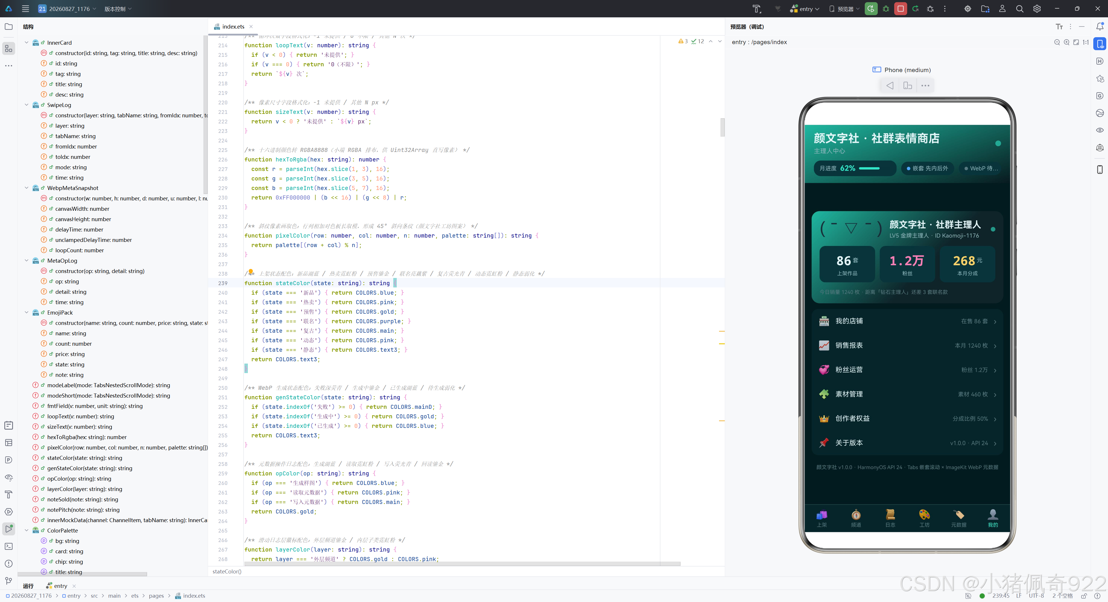
统计大卡使用荧光青渐变背景(gradA 到 gradB,135° 角),与条漫平台的墨绿渐变形成视觉对比。三列统计数字(在售套数/今日销量/今日分成)分别用浅雾白、霓虹粉、鎏金着色。LIVE 指示器改为"热卖中",使用霓虹粉圆点配呼吸动画。卡内文字使用 onMain(深色),保证在荧光青背景上的可读性。代码预览卡的前三行用鎏金色、后三行用霓虹粉色(条漫平台是柠橙和苔绿),体现深色主题的色彩偏好。
两段式票券卡列表
// 两段式票券卡列表(上段信息 + 中缝撕票线 + 下段价格,与热榜布局区分)
List({ space: 10 }) {
  ForEach(this.filteredPacks(), (item: EmojiPack) => {
    ListItem() {
      Column() {
        // —— 票券上段:表情包名 + 状态徽标 + 枚数大字 ——
        Row({ space: 10 }) {
          Column({ space: 6 }) {
            Text(item.name).fontSize(13).fontWeight(FontWeight.Bold)
              .fontColor(COLORS.title).maxLines(1)
              .textOverflow({ overflow: TextOverflow.Ellipsis })
            Row({ space: 6 }) {
              Text(item.state).fontSize(9).fontWeight(FontWeight.Bold)
                .fontColor(stateColor(item.state))
                .padding({ left: 6, right: 6, top: 2, bottom: 2 })
                .borderRadius(6).backgroundColor(COLORS.chip)
              Text('社群正版授权').fontSize(9).fontColor(COLORS.text3)
            }.width('100%')
          }.alignItems(HorizontalAlign.Start).layoutWeight(1)

          // 枚数大字(荧光青 monospace)
          Column({ space: 2 }) {
            Row({ space: 2 }) {
              Text(`${item.count}`).fontSize(26).fontWeight(FontWeight.Bold)
                .fontColor(COLORS.main).fontFamily('monospace')
              Text('枚').fontSize(10).fontColor(COLORS.sub)
            }
            Text('全套枚数').fontSize(9).fontColor(COLORS.text3)
          }.alignItems(HorizontalAlign.End)
        }.width('100%').padding({ left: 12, right: 12, top: 12, bottom: 10 })

        // —— 票券中缝:撕票线(左右缺口圆 + Row 内竖线刻度虚线感分割) ——
        Row() {
          // 左缺口圆(模拟票孔,填页面底色)
          Circle({ width: 12, height: 12 }).fill(COLORS.bg)
            .margin({ left: -6 })
          // 竖线刻度虚线(Row 内多个细竖线)
          Row({ space: 6 }) {
            ForEach(DASH_TICKS, (t: number) => {
              Column().width(1.5).height(10).borderRadius(1)
                .backgroundColor(COLORS.line)
            }, (t: number) => `tick_${t}`)
          }.justifyContent(FlexAlign.Center).layoutWeight(1)
          // 右缺口圆(模拟票孔,填页面底色)
          Circle({ width: 12, height: 12 }).fill(COLORS.bg)
            .margin({ right: -6 })
        }.width('100%')

        // —— 票券下段:价格大字 + 购买人数 + 一句卖点 ——
        Row({ space: 10 }) {
          // 价格大字(鎏金 monospace)
          Column({ space: 2 }) {
            Text(item.price).fontSize(22).fontWeight(FontWeight.Bold)
              .fontColor(COLORS.gold).fontFamily('monospace')
            Text('单套价').fontSize(9).fontColor(COLORS.text3)
          }.alignItems(HorizontalAlign.Start).width(64)

          // 购买人数(note 前段)+ 一句卖点(note 后段)
          Column({ space: 4 }) {
            Text(noteSold(item.note)).fontSize(11).fontColor(COLORS.blue)
              .fontFamily('monospace').maxLines(1)
              .textOverflow({ overflow: TextOverflow.Ellipsis }).width('100%')
            Text(notePitch(item.note)).fontSize(10).fontColor(COLORS.text3)
              .maxLines(2).textOverflow({ overflow: TextOverflow.Ellipsis })
              .width('100%')
          }.alignItems(HorizontalAlign.Start).layoutWeight(1)

          // 右侧行内操作:改备注 / 下架
          Column({ space: 8 }) {
            Text('改备注').fontSize(10).fontColor(COLORS.blue)
              .onClick(() => { this.openPanel('edit', this.indexOfPack(item)); })
            Text('下架').fontSize(10).fontColor(COLORS.mainD)
              .onClick(() => { this.openPanel('del', this.indexOfPack(item)); })
          }
        }.width('100%').padding({ left: 12, right: 12, top: 10, bottom: 12 })
      }.borderRadius(12).backgroundColor(COLORS.card).width('100%')
    }
  }, (item: EmojiPack) => `${item.name}_${item.price}_${item.note}`)
}.scrollBar(BarState.Off).width('100%')
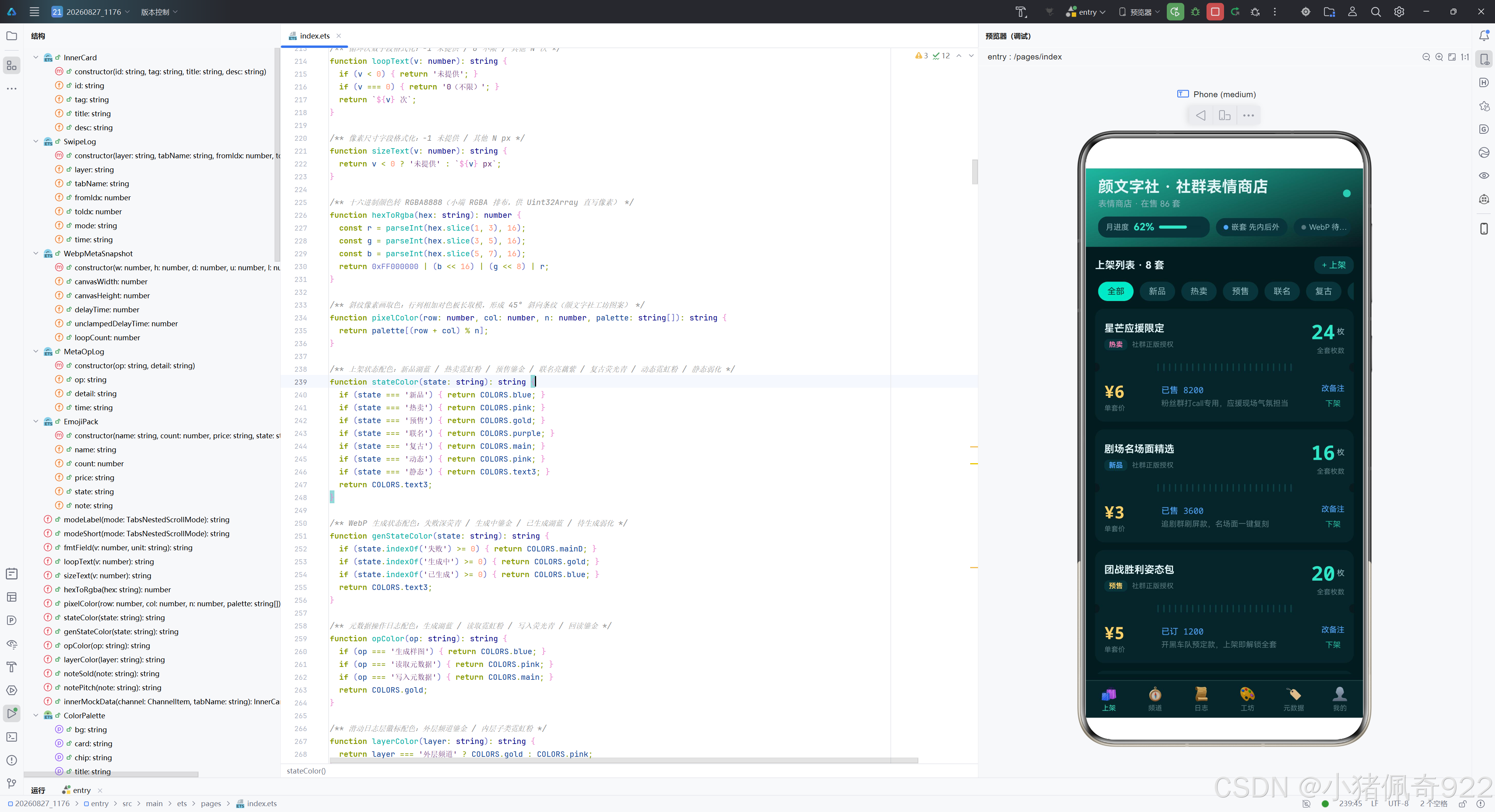
两段式票券卡是表情商店最具特色的 UI 设计,与条漫平台的追更进度条清单截然不同。每张票券卡分为三部分:
上段:左侧展示表情包名和状态徽标(含"社群正版授权"标识),右侧以 26px monospace 荧光青大字展示全套枚数。枚数是表情包的核心商品属性,用最大字号突出。
中缝:模拟实体票券的撕票虚线。左右两个 12px 圆形缺口(填充页面底色 COLORS.bg,制造"被撕掉"的视觉效果),中间是 24 个 1.5px 宽的细竖线刻度(DASH_TICKS 常量驱动),形成密集的虚线感分割。这个设计让数字内容获得了实体票券的仪式感。
下段:左侧以 22px 鎏金 monospace 大字展示价格,中间通过 noteSold 和 notePitch 拆分 note 字段,分别展示购买人数(湖蓝色 monospace)和一句卖点(弱化灰色多行),右侧是"改备注"和"下架"行内操作。
筛选逻辑与条漫平台一致,通过 filteredPacks() 预计算:
/** 计算筛选后的上架列表(预计算,不在 ForEach 内调用 filter) */
filteredPacks(): EmojiPack[] {
  if (this.activeCate === '全部') { return this.packList; }
  const result: EmojiPack[] = [];
  for (const item of this.packList) {
    if (item.state === this.activeCate) { result.push(item); }
  }
  return result;
}
工坊与元数据页面
工坊页
/** Tab3 工坊:斜纹像素画参数卡 + PixelMap 预览 + 生成按钮 + 沙箱路径卡 */
@Builder
tabStudio() {
  Column({ space: 10 }) {
    Scroll() {
      Column({ space: 10 }) {
        // 参数说明卡(画布 / 质量 / 图案)
        Column({ space: 8 }) {
          Text('样图参数').fontSize(12).fontWeight(FontWeight.Bold).fontColor(COLORS.title)
          Row({ space: 8 }) {
            this.paramChip('画布', `${CANVAS_SIZE}×${CANVAS_SIZE}`)
            this.paramChip('质量', `${WEBP_QUALITY}`)
            this.paramChip('图案', '斜纹')
          }.width('100%')
          Text('色板:荧光青 / 霓虹粉 / 鎏金 / 湖蓝 / 亮藕紫 五色斜向条纹')
            .fontSize(9).fontColor(COLORS.text3).width('100%')
        }.padding(10).borderRadius(12).backgroundColor(COLORS.card).width('100%')

        // 像素画预览(可选状态判空渲染)
        Column({ space: 8 }) {
          if (this.pixelMap !== undefined) {
            Image(this.pixelMap!)
              .width(160).height(160).borderRadius(12)
              .objectFit(ImageFit.Fill)
          } else {
            Column({ space: 6 }) {
              Text('🎨').fontSize(30)
              Text('尚未生成样图').fontSize(10).fontColor(COLORS.text3)
            }.width(160).height(160).borderRadius(12).backgroundColor(COLORS.chip)
            .justifyContent(FlexAlign.Center)
          }
          Text(this.genState).fontSize(11).fontColor(genStateColor(this.genState))
        }.width('100%')

        // 生成按钮
        Button('生成 WebP 样图')
          .fontSize(12).height(38).borderRadius(10)
          .fontColor(COLORS.onMain).backgroundColor(COLORS.main)
          .width('100%')
          .onClick(() => { this.genWebpFile(); })

        // 沙箱路径卡(生成后显示)
        if (this.webpPath !== '') {
          Column({ space: 6 }) {
            Row() {
              Text('沙箱落盘路径').fontSize(11).fontWeight(FontWeight.Bold)
                .fontColor(COLORS.title)
              Blank()
              Text('filesDir').fontSize(9).fontColor(COLORS.text3)
            }.width('100%')
            Text(this.webpPath).fontSize(9).fontFamily('monospace')
              .fontColor(COLORS.blue).width('100%').maxLines(2)
              .textOverflow({ overflow: TextOverflow.Ellipsis })
          }.padding(10).borderRadius(12).backgroundColor(COLORS.chip).width('100%')
        }
        // ... 生成链路说明卡
      }.width('100%')
    }.scrollBar(BarState.Off).width('100%').layoutWeight(1)
  }.width('100%').height('100%').padding({ left: 12, right: 12, top: 4, bottom: 8 })
}
工坊页的参数卡显示"图案:斜纹"(条漫平台是"竖带"),色板说明为五色斜向条纹。预览区与条漫平台一致,采用可选状态判空渲染。生成按钮使用荧光青底配深色文字(onMain),沙箱路径以湖蓝色 monospace 展示(条漫平台用苔绿色)。
元数据页
元数据页与条漫平台完全一致,包含读取区、快照卡、写入控制台、回读校验卡和操作日志流:
/** 元数据五字段快照卡 Builder(highlight=true 为回读校验高亮卡) */
@Builder
metaCard(title: string, snap: WebpMetaSnapshot, highlight: boolean) {
  Column({ space: 6 }) {
    Row() {
      Text(title).fontSize(12).fontWeight(FontWeight.Bold).fontColor(COLORS.title)
      Blank()
      Text(highlight ? '回读值' : '快照值').fontSize(9)
        .fontColor(highlight ? COLORS.blue : COLORS.text3)
    }.width('100%')
    this.metaRow('canvasWidth', sizeText(snap.canvasWidth))
    this.metaRow('canvasHeight', sizeText(snap.canvasHeight))
    this.metaRow('delayTime', fmtField(snap.delayTime, 'ms'))
    this.metaRow('unclampedDelayTime', fmtField(snap.unclampedDelayTime, 'ms'))
    this.metaRow('loopCount', loopText(snap.loopCount))
  }.padding(10).borderRadius(12).width('100%')
  .backgroundColor(COLORS.card)
  .border({ width: 1, color: highlight ? COLORS.blue : COLORS.line })
}
metaCard 的 highlight 参数在表情商店中使用湖蓝边框(条漫平台用苔绿),回读值标签也用湖蓝色(条漫用苔绿)。五字段以 metaRow 逐行展示,monospace 字体保证对齐。写入控制台提供帧延迟和循环次数的 chips 选择器,用户选择后点击"写入并回读校验"触发 writeMeta()。
我的页面
/** Tab5 我的:社群主理人身份大卡 + 功能清单行 + 版本信息 */
@Builder
tabMine() {
  Column({ space: 10 }) {
    Scroll() {
      Column({ space: 10 }) {
        // 身份渐变大卡(LV5 社群主理人 + 三列战绩 + 呼吸圆点)
        Column({ space: 12 }) {
          Row({ space: 12 }) {
            Text('( ̄▽ ̄)').fontSize(30)
            Column({ space: 4 }) {
              Text('颜文字社 · 社群主理人').fontSize(16).fontWeight(FontWeight.Bold)
                .fontColor(COLORS.title)
              Text('LV5 金牌主理人 · ID Kaomoji-1176').fontSize(10)
                .fontColor(COLORS.sub)
            }.alignItems(HorizontalAlign.Start).layoutWeight(1)
            // 呼吸圆点
            Circle({ width: 8, height: 8 }).fill(COLORS.main)
              .opacity(0.5 + (this.breath % 20) * 0.025)
          }.width('100%')
          // 三列战绩(上架套数 / 粉丝 / 本月分成)
          Row({ space: 8 }) {
            this.statBig('上架作品', '86', '套', COLORS.title)
            this.statBig('粉丝', '1.2万', '', COLORS.pink)
            this.statBig('本月分成', '268', '元', COLORS.gold)
          }.width('100%')
          Text('今日销量 1240 枚 · 距离「钻石主理人」还差 3 套联名款')
            .fontSize(9).fontColor(COLORS.text3).width('100%')
        }.padding(14).borderRadius(14).width('100%')
        .linearGradient({ angle: 135, colors: [[COLORS.gradB, 0], [COLORS.card, 0.6]] })

        // 功能清单 6 行
        Column() {
          ForEach(FUNC_ITEMS, (item: FuncItem) => {
            Row({ space: 10 }) {
              Text(item.icon).fontSize(16)
              Text(item.label).fontSize(12).fontColor(COLORS.title).layoutWeight(1)
              Text(item.hint).fontSize(10).fontColor(COLORS.text3)
              Text('›').fontSize(14).fontColor(COLORS.text3)
            }.padding({ top: 12, bottom: 12, left: 12, right: 12 }).width('100%')
          }, (item: FuncItem) => item.label)
        }.borderRadius(12).backgroundColor(COLORS.card).width('100%')

        // 版本信息
        Text('颜文字社 v1.0.0 · HarmonyOS API 24 · Tabs 嵌套滚动 × ImageKit WebP 元数据')
          .fontSize(9).fontColor(COLORS.text3).width('100%')
          .textAlign(TextAlign.Center).padding({ top: 6, bottom: 6 })
      }.width('100%')
    }.scrollBar(BarState.Off).width('100%').layoutWeight(1)
  }.width('100%').height('100%').padding({ left: 12, right: 12, top: 4, bottom: 8 })
}
我的页面以身份渐变大卡开头,身份标识为"颜文字社 · 社群主理人 LV5",渐变从 gradB(深荧青)到 card(深青)。身份卡使用了一个 ASCII 颜文字 ( ̄▽ ̄) 作为头像(30px 字体),呼应了"颜文字社"的品牌调性。三列战绩改为上架作品(86套)、粉丝(1.2万)、本月分成(268元),呼吸圆点使用荧光青色。进度提示改为"距离「钻石主理人」还差 3 套联名款",体现等级晋升的游戏化设计。
头部 Banner 与弹窗系统
头部 Banner
/** 头部渐变 Banner:Tab 联动副标题 + 月进度胶囊 + 双特性状态胶囊 + 呼吸圆点 */
@Builder
headerBanner() {
  Column({ space: 10 }) {
    Row() {
      Column({ space: 4 }) {
        Text('颜文字社 · 社群表情商店').fontSize(20).fontWeight(FontWeight.Bold)
          .fontColor(COLORS.title)
        Text(this.currentTab === 0 ? '表情商店 · 在售 86 套'
          : this.currentTab === 1 ? '嵌套滚动 · 社群频道'
            : this.currentTab === 2 ? '滑动日志 · 两层翻页'
              : this.currentTab === 3 ? 'WebP 样图工坊'
                : this.currentTab === 4 ? '元数据读写 · 五字段'
                  : '主理人中心').fontSize(11).fontColor(COLORS.sub)
      }.alignItems(HorizontalAlign.Start).layoutWeight(1)
      // 呼吸圆点
      Circle({ width: 10, height: 10 })
        .fill(COLORS.main)
        .opacity(0.5 + (this.breath % 20) * 0.025)
    }.width('100%')

    Row({ space: 8 }) {
      // 月进度胶囊(本月销量进度)
      Row({ space: 6 }) {
        Text('月进度').fontSize(10).fontColor(COLORS.sub)
        Text(`${Math.round(this.monthDone / this.monthTotal * 100)}%`)
          .fontSize(13).fontWeight(FontWeight.Bold).fontColor(COLORS.main)
        Progress({ value: this.monthDone, total: this.monthTotal,
          type: ProgressType.Linear }).width(56).height(4).color(COLORS.main)
      }.padding({ left: 10, right: 10, top: 6, bottom: 6 })
      .borderRadius(12).backgroundColor(COLORS.chip)

      // 特性 A 状态胶囊(嵌套模式)
      Row({ space: 4 }) {
        Circle({ width: 6, height: 6 })
          .fill(this.nestedMode === TabsNestedScrollMode.SELF_FIRST
            ? COLORS.blue : COLORS.gold)
        Text(`嵌套 ${modeShort(this.nestedMode)}`).fontSize(10).fontColor(COLORS.sub)
      }.padding({ left: 10, right: 10, top: 6, bottom: 6 })
      .borderRadius(12).backgroundColor(COLORS.chip)

      // 特性 B 状态胶囊(WebP 生成状态)
      Row({ space: 4 }) {
        Circle({ width: 6, height: 6 }).fill(genStateColor(this.genState))
        Text(`WebP ${this.genState}`).fontSize(10).fontColor(COLORS.sub)
          .maxLines(1).textOverflow({ overflow: TextOverflow.Ellipsis })
      }.padding({ left: 10, right: 10, top: 6, bottom: 6 })
      .borderRadius(12).backgroundColor(COLORS.chip).layoutWeight(1)
    }.width('100%')
  }.padding({ left: 16, right: 16, top: 12, bottom: 12 })
  .width('100%')
  .linearGradient({ angle: 160, colors: [[COLORS.gradB, 0], [COLORS.bg, 1]] })
}
头部 Banner 使用从 gradB(深荧青)到 bg(墨青)的 160° 渐变(条漫平台是从 gradA 到 bg),形成从稍亮到极深的过渡。标题使用 COLORS.title(浅雾白)而非条漫平台的 COLORS.card(暖纸白)。呼吸圆点使用荧光青色。嵌套模式胶囊的圆点区分色使用湖蓝和鎏金(条漫用苔绿和鎏金)。
弹窗系统
弹窗系统采用"三态统一"设计,modalOverlay 全屏遮罩 + 三个面板 Builder:
/** 全屏弹窗遮罩:点击空白关闭(底部弹出面板容器) */
@Builder
modalOverlay() {
  Column() {
    // 空白遮罩区(点击关闭)
    Column().width('100%').layoutWeight(1)
      .onClick(() => { this.closePanel(); })
    // 弹窗面板(按类型三选一)
    if (this.panelType === 'add') {
      this.panelAdd()
    } else if (this.panelType === 'edit') {
      this.panelEdit()
    } else if (this.panelType === 'del') {
      this.panelDel()
    }
  }.width('100%').height('100%').backgroundColor(COLORS.mask)
  .justifyContent(FlexAlign.End)
}
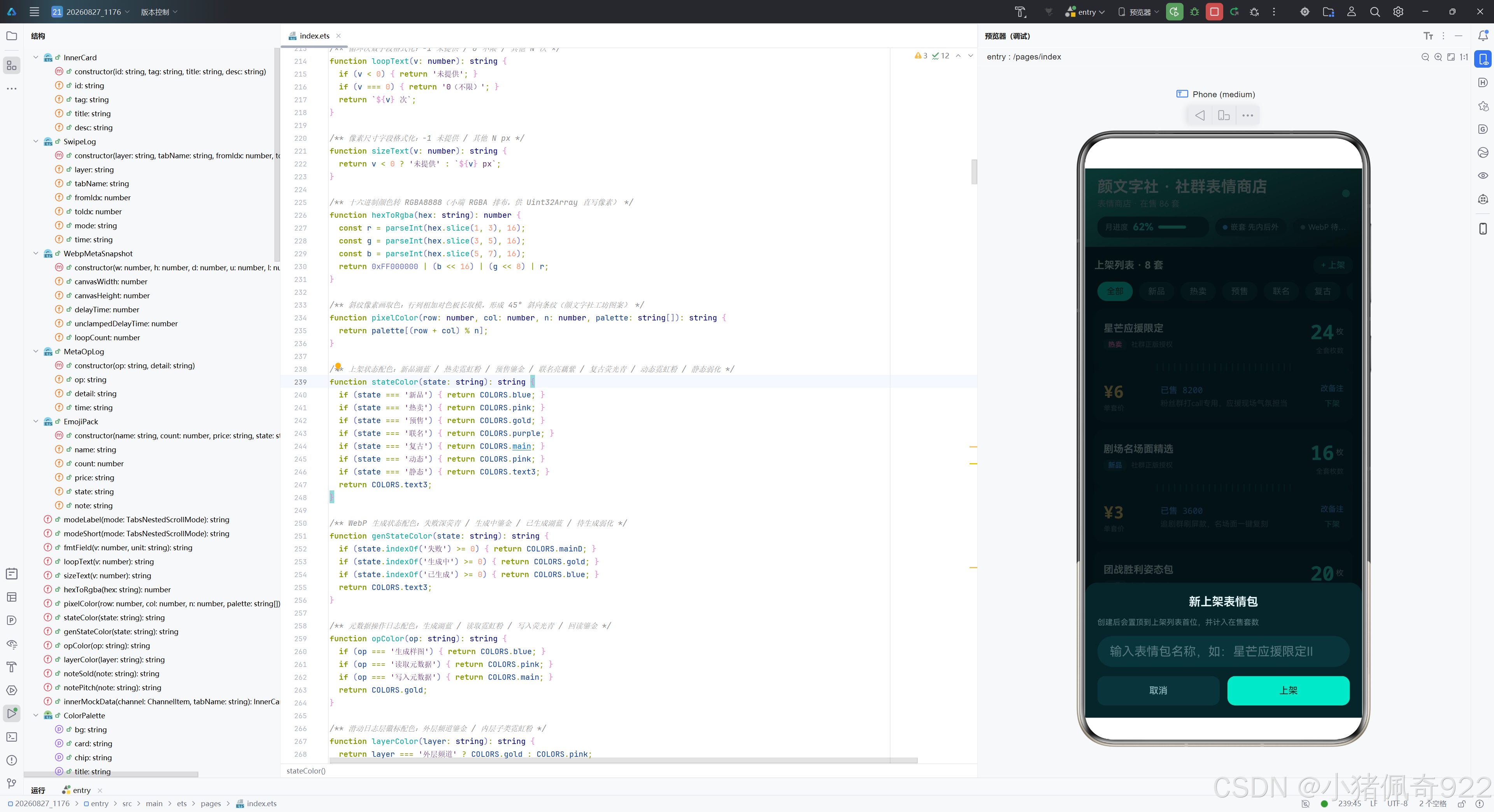
遮罩层使用 rgba(4,12,14,0.75)(比条漫平台的 0.5 更高不透明度),因为深色主题下需要更强的遮蔽感。面板从底部弹出(FlexAlign.End),点击空白区域关闭。
/** 弹窗一:新上架表情包(输入名称 unshift 置顶列表,计入在售套数) */
@Builder
panelAdd() {
  Column({ space: 12 }) {
    Text('新上架表情包').fontSize(15).fontWeight(FontWeight.Bold)
      .fontColor(COLORS.title)
    Text('创建后会置顶到上架列表首位,并计入在售套数')
      .fontSize(10).fontColor(COLORS.text3).width('100%')
    TextInput({ placeholder: '输入表情包名称,如:星芒应援限定Ⅱ' })
      .fontSize(12).height(40)
      .fontColor(COLORS.title)
      .placeholderColor(COLORS.text3)
      .backgroundColor(COLORS.chip)
      .onChange((value: string) => { this.inputText = value; })
    Row({ space: 10 }) {
      Button('取消')
        .fontSize(12).height(38).borderRadius(10)
        .fontColor(COLORS.sub).backgroundColor(COLORS.chip)
        .layoutWeight(1)
        .onClick(() => { this.closePanel(); })
      Button('上架')
        .fontSize(12).height(38).borderRadius(10)
        .fontColor(COLORS.onMain).backgroundColor(COLORS.main)
        .layoutWeight(1)
        .onClick(() => { this.confirmPanel(); })
    }.width('100%')
  }.padding(16).borderRadius({ topLeft: 16, topRight: 16 })
  .backgroundColor(COLORS.card).width('100%')
}
新建弹窗的确认按钮文案是"上架"(条漫是"追更"),占位符提示"输入表情包名称,如:星芒应援限定Ⅱ"。确认按钮使用荧光青底配深色文字。编辑弹窗的占位符提示"输入新的上架备注(已售 N · 一句卖点)“,确认按钮文案是"保存”。删除弹窗的标题是"下架表情包",确认按钮文案是"下架"(条漫是"删除"),使用 mainD(深荧青)背景色。
技术对比表格
以下是表情商店与条漫平台在各个维度上的对比分析:
| 对比维度 | 格子漫(条漫平台) | 颜文字社(表情商店) |
|---|---|---|
| 主题色调 | 浅色主题·米黄纸+墨绿 | 深色主题·墨青+荧光青+霓虹粉 |
| 底色/卡片底 | #F7F3E6(米黄纸) / #FFFDF5(暖纸白) | #081A1E(墨青) / #0E2429(深青) |
| 像素画算法 | Math.floor(col/8)%n 竖带条纹 | (row+col)%n 斜纹45°条纹 |
| 色板构成 | 墨绿/柠橙/湖蓝/砖红/鎏金 | 荧光青/霓虹粉/鎏金/湖蓝/亮藕紫 |
| 列表样式 | 追更进度条清单(四行卡片) | 两段式票券卡(上段+中缝+下段) |
| 外层频道 | 搞笑/恋爱/悬疑/日常 | 明星/影视/游戏/综艺 |
| 内层页签 | 四格/条漫/彩页/番外/周边 | 限定/会员/新品/热门/免费 |
| 筛选标签 | 全部/连载/完结/日更/周更/免费/会员/独家 | 全部/新品/热卖/预售/联名/复古/动态/静态 |
| 数据模型 | ComicSeries(名/更新/进度/状态/心得) | EmojiPack(名/枚数/价格/状态/备注) |
| 统计指标 | 追更中/本周更新/书架作品 | 在售套数/今日销量/今日分成 |
| 用户身份 | 格子漫·漫友 LV8 | 颜文字社·主理人 LV5 |
| 弹窗确认文案 | 追更/保存/删除 | 上架/保存/下架 |
| 头部渐变方向 | gradA→bg (墨绿→米黄) | gradB→bg (深荧青→墨青) |
| onMain 色值 | #FFFFFF(白字) | #06322C(深字) |
| 嵌套滚动核心 | nestedScroll(SELF_FIRST/SELF_ONLY) | 同左(API完全一致) |
| WebP元数据 | 五字段读写回读校验 | 同左(API完全一致) |
| 特色常量 | 无票券刻度 | DASH_TICKS(24个中缝刻度) |
| 备注拆分 | 无(note直接展示) | noteSold/notePitch拆分展示 |
详细总结
本文以"颜文字社"社群表情商店为载体,完整呈现了 HarmonyOS API 24 两项核心新特性在深色主题场景下的工程实践。从视觉设计层面看,整个应用采用墨青(#081A1E)底色搭配荧光青(#2EE6C8)主题色和霓虹粉(#FF7EB6)辅色,通过高饱和度的荧光色系在极深背景上产生强烈的视觉冲击力,营造出赛博朋克般的霓虹质感。颜色系统的 21 个字段中,onMain 设为深色而非白色是一个反直觉但正确的选择——荧光青本身亮度极高,深色文字反而对比度更好。遮罩色使用 0.75 不透明度(高于浅色主题的 0.5),因为深色主题下弹窗需要更强的遮蔽感。
在技术实现层面,最核心的差异在于像素画算法。斜纹算法 (row + col) % n 利用行列之和的几何特性——row + col = C 在二维平面上是 45° 对角线——生成密集的对角线条纹图案。与条漫平台的竖带算法 Math.floor(col / 8) % n 相比,斜纹算法依赖行列双坐标而非仅列坐标,条纹宽度为 1 像素(更细密),色彩切换频率更高,最终效果是五色沿 45° 方向交替的密集斜纹,配合荧光色板产生霓虹光效。两种算法的对比体现了同一 API 在不同业务场景下的灵活适配——竖带适合阅读类应用的宽幅视觉,斜纹适合商业应用的高密度视觉冲击。
在 UI 设计层面,两段式票券卡是表情商店最具特色的创新。上段展示表情包名、状态徽标和枚数大字(26px 荧光青 monospace),中缝通过左右缺口圆和 24 个细竖线刻度模拟实体票券的撕票虚线,下段展示价格大字(22px 鎏金 monospace)、购买人数和一句卖点。这种设计让数字内容获得了实体票券的仪式感,与条漫平台的追更进度条清单形成鲜明对比。note 字段通过 noteSold 和 notePitch 两个函数拆分为购买人数和卖点两段独立展示,在数据模型上节省了一个字段。
在两项核心特性方面,Tabs 嵌套滚动和 ImageKit WebP 元数据的 API 调用与条漫平台完全一致——这正是 API 设计的初衷:同一套接口服务不同业务场景。外层四频道(明星/影视/游戏/综艺)× 内层五子页签(限定/会员/新品/热门/免费)的双层 Tabs 结构,配合 nestedScroll 的两种模式,实现了内容层级浏览的灵活控制。WebP 元数据的生成→读取→写入→回读校验四步链路,通过斜纹像素画生成 WebP 文件,随后完成五字段的读取、写入和回读比对,全过程在沙箱 filesDir 下零权限完成。资源管理方面严格遵循"用后即释"原则,packer、source、file 句柄都在使用后立即释放,操作日志通过 unshift 置顶 + pop 限长保证可读性。
整个应用展现了深色主题设计的精细化考量——从色板选择到对比度控制,从渐变方向到遮罩透明度,每个细节都经过深思熟虑,共同构成了一个既有技术深度又有产品完整度的 HarmonyOS ArkUI 深色主题应用范例。
附录:DevEco Studio 创建新项目与查看 SDK 版本
本章节演示如何使用 DevEco Studio 创建一个 HarmonyOS 新项目,并查看当前 IDE 已安装的 SDK 版本,适合作为其他技术博文的补充操作指南。
一、创建新项目
1.1 进入欢迎界面
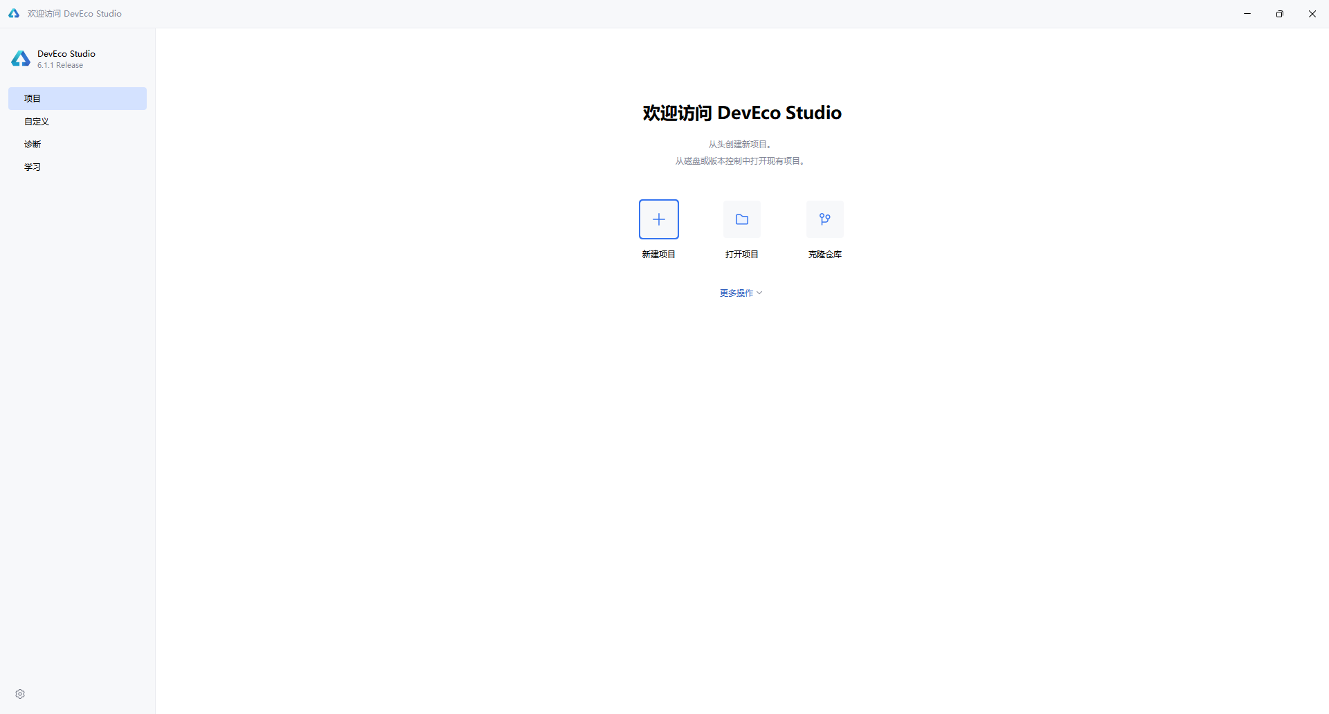
启动 DevEco Studio 后,首先看到的是欢迎界面。左侧导航栏默认选中 “项目”,右侧提供三个主要入口:
- 新建项目:从头创建新项目
- 打开项目:打开本地已有项目
- 克隆仓库:从 Git 等版本控制拉取代码
点击 “新建项目” 按钮,进入项目创建向导。
1.2 选择项目模板
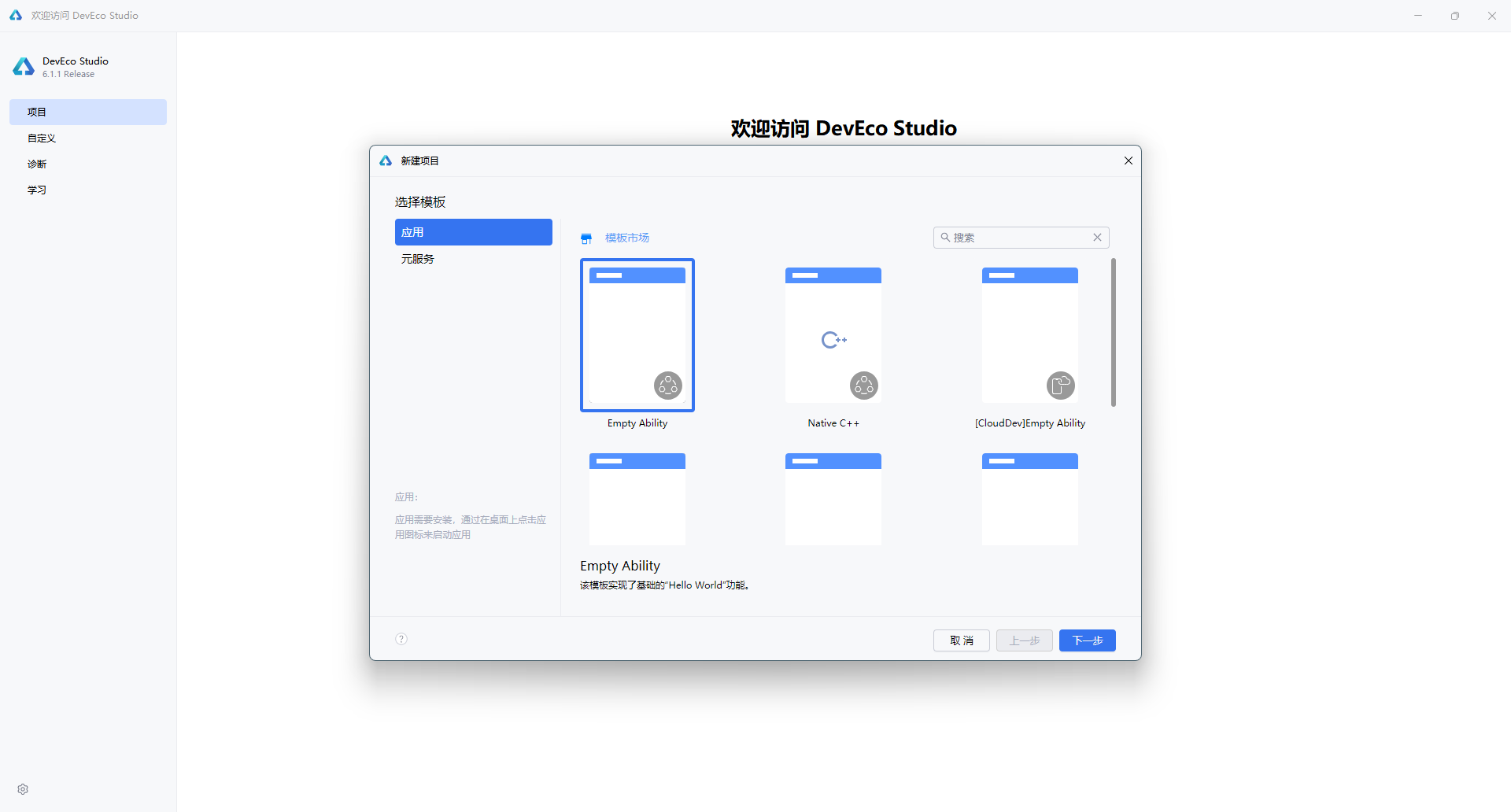
在弹出的"新建项目"对话框中,左侧分类标签提供了两种项目类型:
| 类型 | 说明 |
|---|---|
| 应用(Application) | 开发标准的 HarmonyOS 应用,具备完整的 Ability 生命周期 |
| 元服务(Atomic Service) | 开发轻量级的原子化服务,无需安装即可使用 |
选择 “应用” 标签后,右侧展示多种模板。对于大多数场景,推荐选择 “Empty Ability” —— 这是一个最基础的入门模板,仅包含 Hello World 功能,适合从零开始构建应用。
1.3 配置项目信息
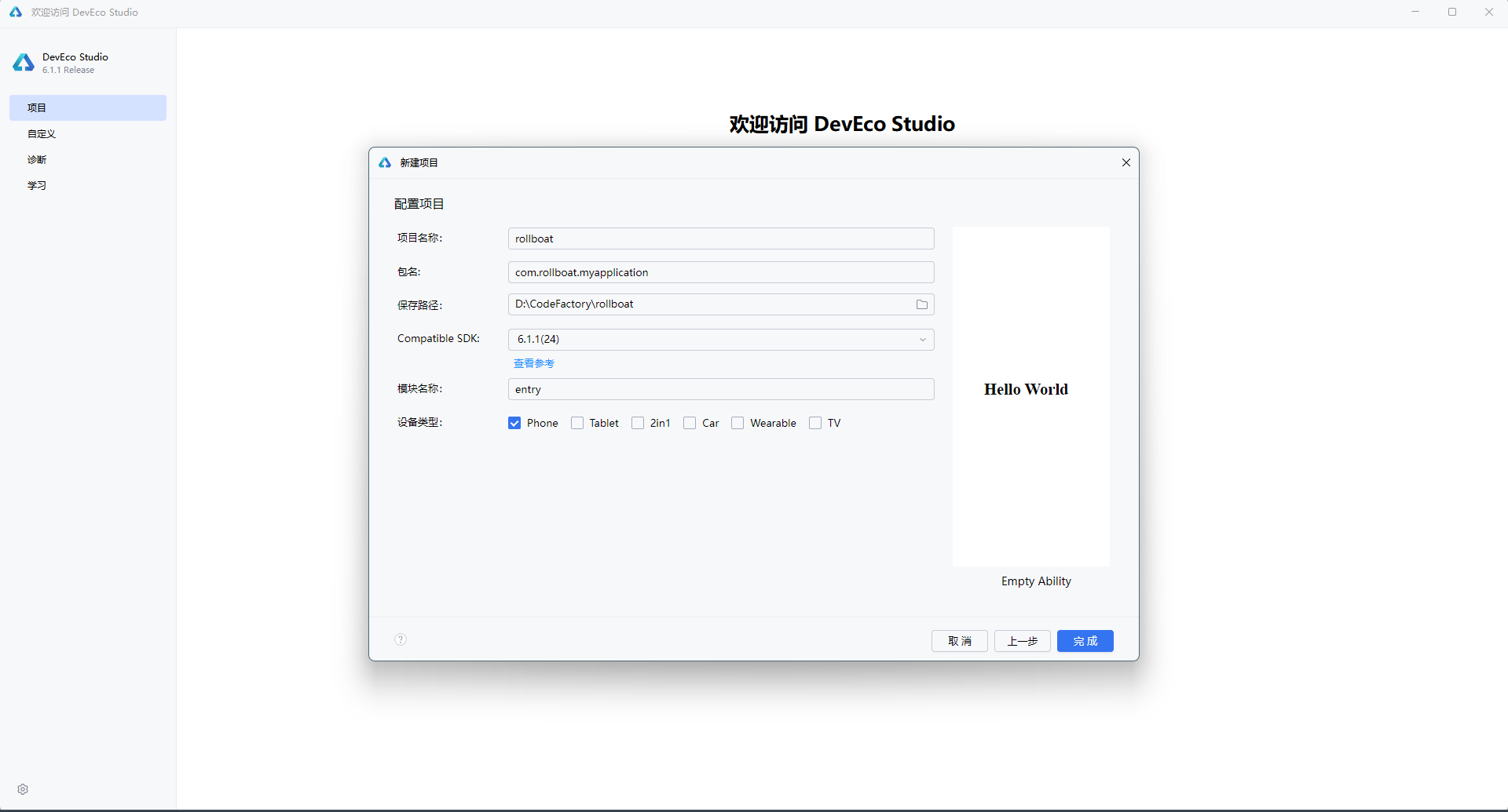
点击 “下一步” 后,进入项目配置界面,需要填写以下核心参数:
| 配置项 | 示例值 | 说明 |
|---|---|---|
| 项目名称(Project name) | rollboat | 应用的项目名称,建议使用英文命名 |
| 包名(Bundle name) | com.rollboat.myapplication | 应用唯一标识,采用反向域名格式 |
| 保存路径(Save location) | D:\CodeFactory\rollboat | 项目本地存储路径,避免使用中文和空格 |
| 兼容 SDK(Compatible SDK) | 6.1.1(24) | 目标 HarmonyOS API 版本,点击"查看参考"可了解各版本差异 |
| 模块名称(Module name) | entry | 主模块名称,默认 entry 为应用入口模块 |
| 设备类型(Device types) | ☑ Phone | 勾选目标设备:Phone / Tablet / 2in1 / Car / Wearable / TV |
右侧预览区会实时展示当前模板的默认效果 —— 一个居中显示的 “Hello World” 文本。
1.4 完成创建
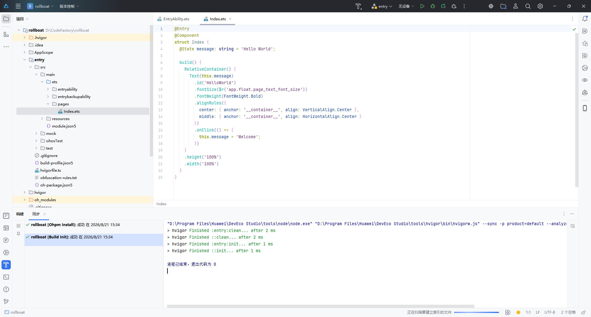
确认配置无误后,点击右下角 “完成” 按钮,IDE 将自动执行以下操作:
- 生成项目骨架(Stage 模型目录结构)
- 执行
ohpm install安装依赖 - 运行 Hvigor 构建初始化(
Build Init)
构建日志中显示 “退出代码为 0” 表示项目初始化成功。
1.5 项目结构概览
创建完成后,左侧项目面板展示的是标准的 Stage 模型 目录结构:
rollboat/
├── .hvigor/                   # Hvigor 构建工具缓存
├── .idea/                     # IDE 配置文件
├── AppScope/                  # 应用级全局配置
│   └── app.json5
├── entry/                     # 主模块(入口模块)
│   ├── src/main/ets/
│   │   ├── entryability/      # Ability 生命周期管理
│   │   │   └── EntryAbility.ets
│   │   └── pages/             # UI 页面
│   │       └── Index.ets      # 首页(默认 Hello World)
│   ├── src/main/resources/    # 资源文件
│   ├── module.json5           # 模块配置
│   └── build-profile.json5    # 构建配置
├── oh_modules/                # OHPM 依赖包
├── build-profile.json5        # 工程构建配置
├── hvigorfile.ts              # Hvigor 构建脚本
└── oh-package.json5           # 包管理配置
核心文件 Index.ets 的默认代码如下,采用 ArkTS 声明式 UI 语法:
@Entry
@Component
struct Index {
  @State message: string = 'Hello World';

  build() {
    RelativeContainer() {
      Text(this.message)
        .id('HelloWorld')
        .fontSize($r('app.float.page_text_font_size'))
        .fontWeight(FontWeight.Bold)
        .alignRules({
          center: { anchor: '__container__', align: VerticalAlign.Center },
          middle: { anchor: '__container__', align: HorizontalAlign.Center }
        })
        .onClick(() => {
          this.message = 'Welcome';
        })
    }
    .height('100%')
    .width('100%')
  }
}
| 关键语法 | 作用 |
|---|---|
@Entry | 标记为页面入口,可用于路由跳转 |
@Component | 声明为自定义组件 |
@State | 状态变量,数据变更时自动触发 UI 刷新 |
RelativeContainer | 相对布局容器,替代传统线性布局 |
.onClick() | 点击事件,此处点击后文本变为 “Welcome” |
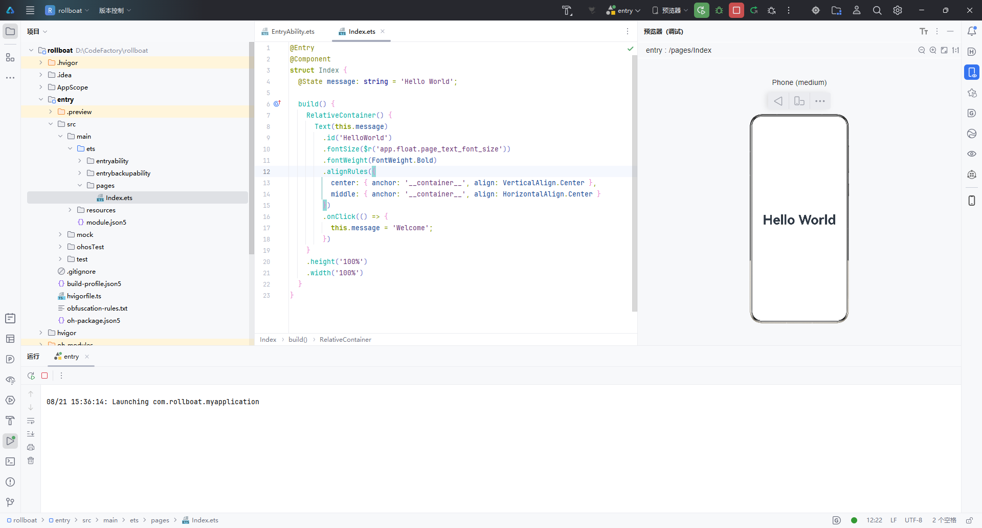
打开右侧 Previewer(预览器),选择 Phone 设备,即可实时预览 Hello World 效果,无需连接真机或启动模拟器。
二、查看 SDK 版本
2.1 查看 HarmonyOS SDK
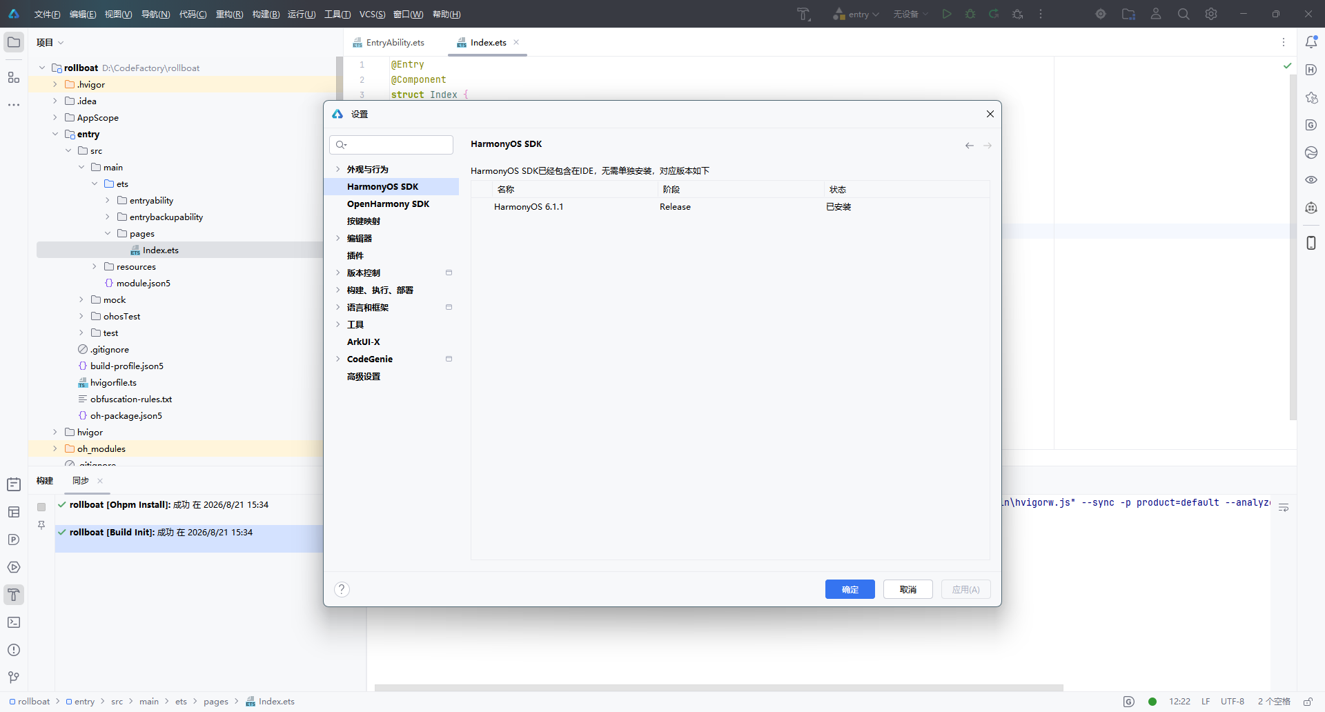
DevEco Studio 安装时已内置 HarmonyOS SDK,无需单独下载。通过以下路径查看:
文件 → 设置 → HarmonyOS SDK(或快捷键
Ctrl + Alt + S搜索 “HarmonyOS SDK”)
在设置面板中,可以看到当前已安装的 SDK 版本信息:
| 名称 | 阶段 | 状态 |
|---|---|---|
| HarmonyOS 6.1.1 | Release | ✅ 已安装 |
界面顶部提示:“HarmonyOS SDK 已经包含在 IDE,无需单独安装”,省去了手动配置 SDK 的繁琐步骤。
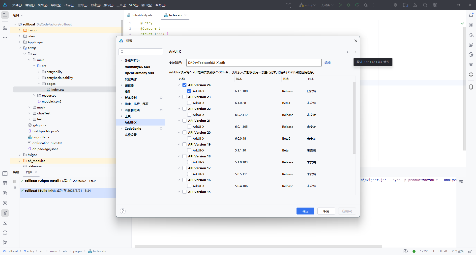
2.2 查看 ArkUI-X SDK(跨平台扩展)
如果项目需要将 ArkUI 框架扩展到多个 OS 平台(Android / iOS / OpenHarmony),还需要配置 ArkUI-X SDK。路径如下:
文件 → 设置 → 语言和框架 → ArkUI-X
在这里可以查看已安装和可选的 ArkUI-X SDK 版本:
| 版本 | SDK 版本号 | 阶段 | 状态 |
|---|---|---|---|
| API Version 24 | 6.1.1.100 | Release | ✅ 已安装 |
| API Version 23 | 6.1.0.28 | Beta1 | 未安装 |
| API Version 22 | 6.0.2.112 | Release | 未安装 |
安装路径示例:D:\DevTools\ArkUI-X\sdk
说明:ArkUI-X 允许开发者使用一套 ArkTS 主代码,同时构建多平台应用。如果仅开发 HarmonyOS 原生应用,无需额外安装 ArkUI-X SDK。
三、小结
| 步骤 | 操作 | 关键点 |
|---|---|---|
| 创建项目 | 欢迎页 → 新建项目 → 选择 Empty Ability 模板 → 配置项目信息 → 完成 | 使用 Stage 模型 + ArkTS 语言 |
| 查看 SDK | 设置 → HarmonyOS SDK | SDK 已内置,无需手动安装 |
| 跨平台扩展 | 设置 → ArkUI-X | 根据需要安装对应 API 版本 |
至此,DevEco Studio 的项目创建与 SDK 环境确认全部完成,可以开始 HarmonyOS 应用的功能开发。
本文基于 DevEco Studio 6.1.1 Release 版本编写,不同版本界面可能存在细微差异。

讨论HarmonyOS开发技术,专注于API与组件、DevEco Studio、测试、元服务和应用上架分发等。
更多推荐

 8
8 0
0- 0


 已为社区贡献105条内容

所有评论(0)