#跟着坚果学鸿蒙#实现一个登陆页面
·
实现一个登陆页面
1.分析UI组成
2.用到的组件
Text文本组件
Image图片组件
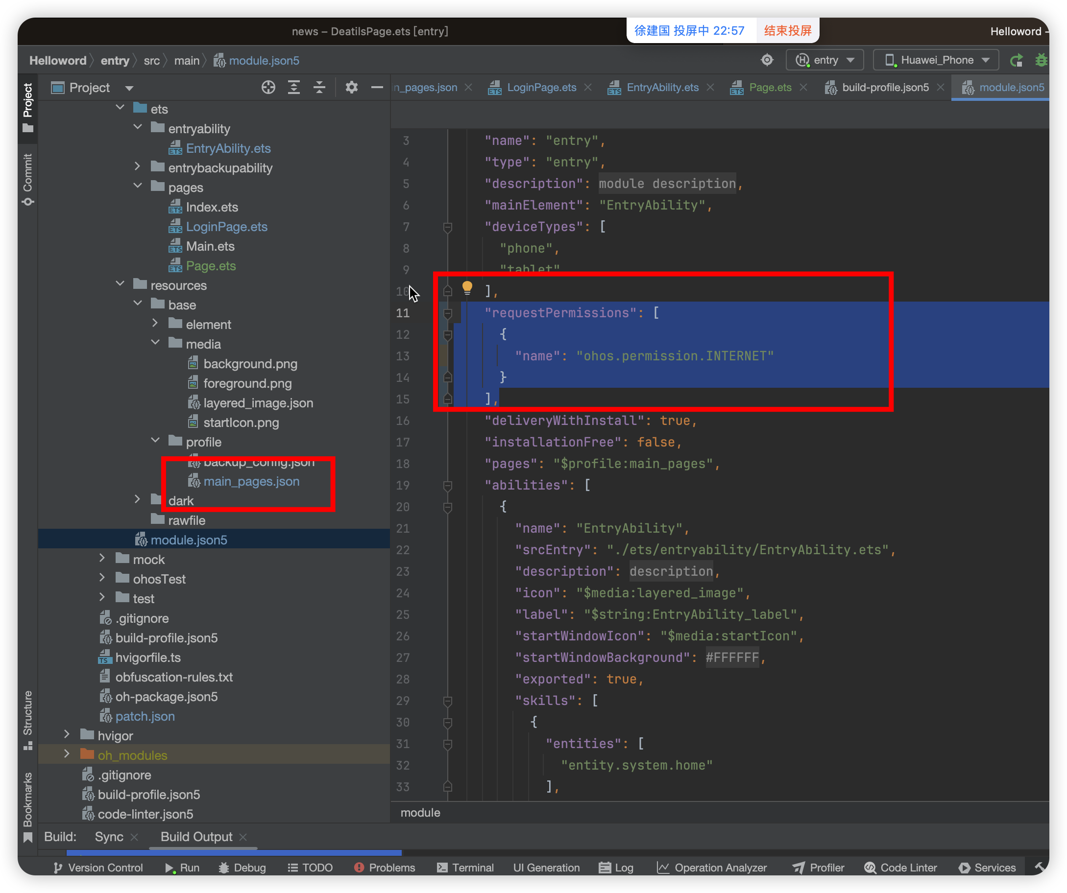
//图片组件,加载网络图片,需要添加网络权限
      Image("https://developer.huawei.com/allianceCmsResource/resource/HUAWEI_Developer_VUE/images/0417/kaifa-03.png")
        .width(60).border({
        radius: 20
      }).margin({
        bottom: 20
      })
Button按钮组件
TextInput组件
Divider()
提供分隔器组件,分隔不同内容块/内容元素。
Blank
空白填充组件,在容器主轴方向上,空白填充组件具有自动填充容器空余部分的能力。仅当父组件为Row/Column/Flex时生效。
Row() {
Text("短信验证码登陆")
Blank()
Text("忘记密码")
}.width("100%").padding({
left: 20,
right: 20
})
Column组件
沿垂直方向布局的容器。
Row组件
沿水平方向布局容器。
通用属性
width宽度
height高度
border
| 名称 | 参数类型 | 必填 | 描述 |
|---|---|---|---|
| width | Length | EdgeWidths9+ | LocalizedEdgeWidths12+ | 否 | 设置边框宽度。 |
| color | ResourceColor | EdgeColors9+ | LocalizedEdgeColors12+ | 否 | 设置边框颜色。 |
| radius | Length | BorderRadiuses9+ | LocalizedBorderRadiuses12+ | 否 | 设置边框圆角半径。 |
| style | BorderStyle | EdgeStyles9+ | 否 | 设置边框样式。 |
| dashGap12+ | LengthMetrics | EdgeWidths | LocalizedEdgeWidths | 否 | 设置虚线的线段间距,仅在边框样式为虚线时生效。不支持设置百分比。 |
| dashWidth12+ | LengthMetrics | EdgeWidths | LocalizedEdgeWidths | 否 | 设置虚线的线段长度,仅在边框样式为虚线时生效。不支持设置百分比。 |
通用事件
onclick
3.装饰器介绍
@Entry
@Entry装饰的自定义组件将作为UI页面的入口。在单个UI页面中,最多可以使用@Entry装饰一个自定义组件。
@Component
自定义组件具有以下特点:
-
可组合:允许开发者组合使用系统组件、及其属性和方法。
-
可重用:自定义组件可以被其他组件重用,并作为不同的实例在不同的父组件或容器中使用。
-
数据驱动UI更新:通过状态变量的改变,来驱动UI的刷新。
自定义组件的基本用法
以下示例展示了自定义组件的基本用法。
@Component
struct HelloComponent {
@State message: string = 'Hello, World!';
build() {
// HelloComponent自定义组件组合系统组件Row和Text
Row() {
Text(this.message)
.onClick(() => {
// 状态变量message的改变驱动UI刷新,UI从'Hello, World!'刷新为'Hello, ArkUI!'
this.message = 'Hello, ArkUI!';
})
}
}
}
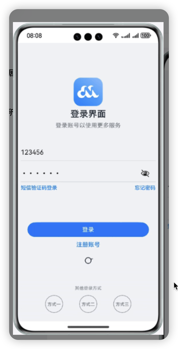
4.编码
@Entry
@Component
struct LoginPage {
//UI描述需要在build实现
build() {
Column() {
//图片组件,加载网络图片,需要添加网络权限
Image("https://developer.huawei.com/allianceCmsResource/resource/HUAWEI_Developer_VUE/images/0417/kaifa-03.png")
.width(60).border({
radius: 20,
}).margin({
bottom: 10
})
Text("登陆界面").fontWeight(800).margin({
top: 10
}).fontColor(Color.Black)
Text("登陆账号以使用更多服务")
TextInput({
placeholder: "账号"
}).backgroundColor(Color.White)
Divider().strokeWidth(3).color(Color.Red)
TextInput({
placeholder: "密码"
}).type(InputType.Password).backgroundColor(Color.White)
Divider().margin({
// bottom:20
})
Row() {
Text("短信验证码登陆").fontColor(Color.Blue).fontSize(12)
Blank()
Text("忘记密码").fontColor(Color.Blue).fontSize(12)
}.width("100%").padding({
left: 20,
right: 20,
top: 20,
bottom: 120
})
Button("登陆").width("80%").type(ButtonType.Normal).border({
radius: 10
})
Text("注册账号").margin({
bottom: 120,
top: 20
}).fontColor(Color.Blue)
LoadingProgress().width(20)
Text("其他登陆方式").fontColor(Color.Grey)
Row() {
Text("方式一").width(80).height(80).textAlign(TextAlign.Center)
.border({
width: 6,
radius: 100
})
Text("方式二").width(80).height(80).textAlign(TextAlign.Center)
.border({
width: 6,
radius: 100
})
Text("方式三").width(80).height(80).textAlign(TextAlign.Center)
.border({
width: 6,
radius: 100
})
}.width("100%").justifyContent(FlexAlign.SpaceBetween).padding({
left: 40,
right: 40
})
}.backgroundColor("#FFFFFF").padding({
top:50
})
}
}

讨论HarmonyOS开发技术,专注于API与组件、DevEco Studio、测试、元服务和应用上架分发等。
更多推荐
 0
0 0
0- 0


 已为社区贡献15条内容

所有评论(0)