#跟着晓明学鸿蒙# HarmonyOS聊天列表基础布局实现
·
目录
- 案例介绍
- 代码实现
- 数据模型设计
- 基础布局实现
- 代码详解
- 1. 数据模型设计解析
- 2. 页面结构解析
- 3. 列表项设计
- 4. 样式设计要点
- 总结
案例介绍
本篇文章将介绍如何使用HarmonyOS NEXT的ArkTS语言实现一个聊天应用的基础列表布局。我们将重点关注页面的数据模型设计和基础UI组件的布局实现,为后续的交互功能开发打下基础。
代码实现
数据模型设计
// 消息数据模型
class MessageItem {
  id: number;
  name: string;
  avatar: string;
  message: string;
  time: string;
  unread: boolean;
  pinned: boolean;

  constructor(id: number, name: string, avatar: string, message: string, time: string, unread: boolean = false, pinned: boolean = false) {
    this.id = id;
    this.name = name;
    this.avatar = avatar;
    this.message = message;
    this.time = time;
    this.unread = unread;
    this.pinned = pinned;
  }
}
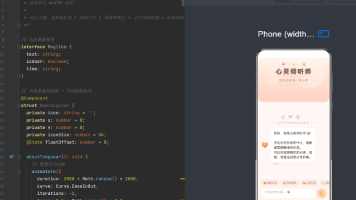
基础布局实现
@Entry
@Component
struct ChatListExample {
  // 消息数据
  @State messageList: MessageItem[] = [
    new MessageItem(1, '张三', '/assets/avatar1.png', '你好,最近怎么样?', '10:30', true, true),
    new MessageItem(2, '李四', '/assets/avatar2.png', '周末有空一起打球吗?', '昨天', true),
    new MessageItem(3, '王五', '/assets/avatar3.png', '项目进展如何了?', '昨天')
  ];

  build() {
    Column() {
      // 顶部导航栏
      Row() {
        Text('消息')
          .fontSize(20)
          .fontWeight(FontWeight.Bold)

        Blank()

        Button() {
          Image($r('app.media.add'))
            .width(24)
            .height(24)
        }
        .width(36)
        .height(36)
        .backgroundColor('transparent')
        .margin({ right: 8 })
      }
      .width('100%')
      .height(56)
      .padding({ left: 16, right: 16 })
      .backgroundColor('#FFFFFF')

      // 搜索框
      Row() {
        Image($r('app.media.search'))
          .width(20)
          .height(20)
          .margin({ right: 8 })

        Text('搜索')
          .fontSize(16)
          .fontColor('#999999')
      }
      .width('100%')
      .height(40)
      .backgroundColor('#F5F5F5')
      .borderRadius(20)
      .padding({ left: 16, right: 16 })
      .margin({ top: 8, bottom: 16, left: 16, right: 16 })

      // 消息列表
      List() {
        ForEach(this.messageList, (item: MessageItem) => {
          ListItem() {
            Row() {
              // 头像
              Image(item.avatar)
                .width(50)
                .height(50)
                .borderRadius(25)
                .margin({ right: 16 })

              // 消息内容
              Column() {
                // 名称和时间
                Row() {
                  Text(item.name)
                    .fontSize(16)
                    .fontWeight(FontWeight.Medium)

                  Blank()

                  Text(item.time)
                    .fontSize(14)
                    .fontColor('#999999')
                }
                .width('100%')
                .margin({ bottom: 4 })

                // 消息内容
                Text(item.message)
                  .fontSize(14)
                  .fontColor('#666666')
                  .maxLines(1)
                  .textOverflow({ overflow: TextOverflow.Ellipsis })
              }
              .layoutWeight(1)
              .alignItems(HorizontalAlign.Start)
            }
            .width('100%')
            .padding(16)
            .backgroundColor('#FFFFFF')
            .borderRadius(8)
          }
        })
      }
      .width('100%')
      .layoutWeight(1)
      .divider({ strokeWidth: 1, color: '#F0F0F0', startMargin: 72, endMargin: 16 })
    }
    .width('100%')
    .height('100%')
    .backgroundColor('#FFFFFF')
  }
}
代码详解
1. 数据模型设计解析
MessageItem类:用于定义聊天消息id: 消息唯一标识符name: 发送者名称avatar: 发送者头像message: 消息内容time: 发送时间unread: 是否未读pinned: 是否置顶
2. 页面结构解析
- 整体布局使用
Column组件,包含三个主要部分:- 顶部导航栏:标题和添加按钮
- 搜索框:搜索功能占位
- 消息列表:主要内容区域
3. 列表项设计
- 使用
List和ListItem组件构建列表 - 每个列表项包含:
- 左侧圆形头像
- 右侧消息内容(名称、时间、消息文本)
- 使用
divider属性添加分割线
4. 样式设计要点
- 字体大小层级:
- 导航标题:20px
- 用户名称:16px
- 消息内容:14px
- 颜色应用:
- 主要文本:默认色
- 次要文本:灰色(#666666)
- 时间文本:浅灰色(#999999)
- 间距设计:
- 统一的内边距(16px)
- 合理的组件间距
总结
本篇文章介绍了聊天列表的基础布局实现,包括数据模型的设计和基础UI组件的布局。通过合理的数据结构设计和组件布局,我们搭建了一个清晰的消息列表界面。这个基础结构为后续添加更多交互功能提供了良好的基础。在实际开发中,可以基于这个基础结构,根据具体需求扩展更多功能。

讨论HarmonyOS开发技术,专注于API与组件、DevEco Studio、测试、元服务和应用上架分发等。
更多推荐
 1
1 0
0- 0


 已为社区贡献104条内容

所有评论(0)