线性布局(Colum/Row)
1.1. 基本概念
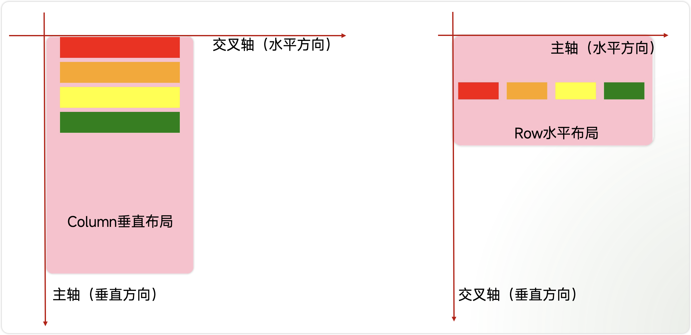
线性布局是开发中最常用的布局,通过线性容器Row和Column构建。其子元素在线性方向上(水平方向和垂直方向)依次排列。
- Column:容器内子元素按照垂直方向排列。
- Row:容器内子元素按照水平方向排列。
主轴和交叉轴
- 主轴:线性布局在布局方向上的轴线称为主轴,Column主轴为垂直方向,Row主轴为水平方向。
- 交叉轴:垂直于主轴方向的轴线称为交叉轴,Column交叉轴为水平方向,Row交叉轴为垂直方向。
1.2. 子元素的排列间距
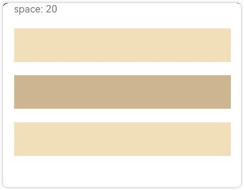
通过{ space: 25 }用来设置布局元素在排列方向上的间距。
- Column 垂直方向的间距
如下图所示,Column垂直排列了4个元素,他们之间的间距为20。
实现上图效果的代码如下
Column({ space: 20 }) {
Text('space: 20').fontSize(15).fontColor(Color.Gray).width('90%')
Row().width('90%').height(50).backgroundColor(0xF5DEB3)
Row().width('90%').height(50).backgroundColor(0xD2B48C)
Row().width('90%').height(50).backgroundColor(0xF5DEB3)
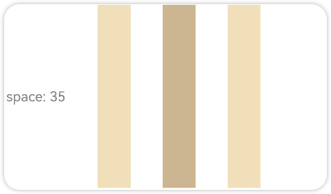
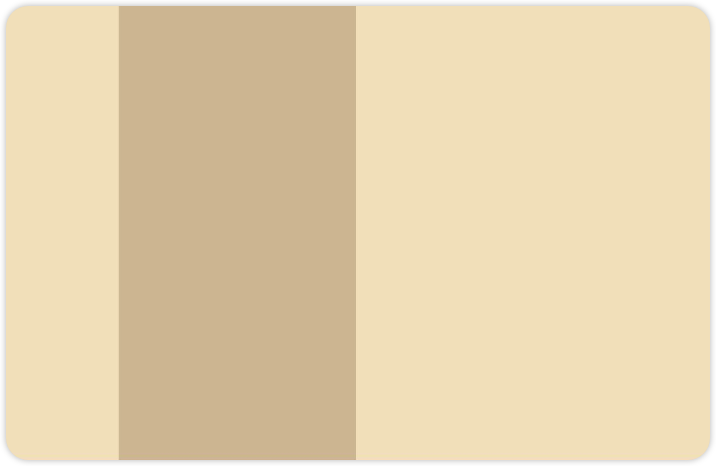
}.width('100%') - Row 水平方向上的间距
如图所示,水平方向上排列了4个元素,他们之间的间距是35
实现上述效果的代码如下
Row({ space: 35 }) {
  Text('space: 35').fontSize(15).fontColor(Color.Gray)
  Row().width('10%').height(200).backgroundColor(0xF5DEB3)
  Row().width('10%').height(200).backgroundColor(0xD2B48C)
  Row().width('10%').height(200).backgroundColor(0xF5DEB3)
}.width('100%')
1.3. Column 主轴排列方式
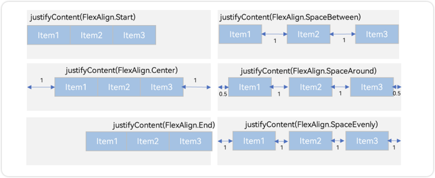
Column布局通过调用justifyContent属性设置布局子元素在主轴上的排列方式。一共有6种排列方式
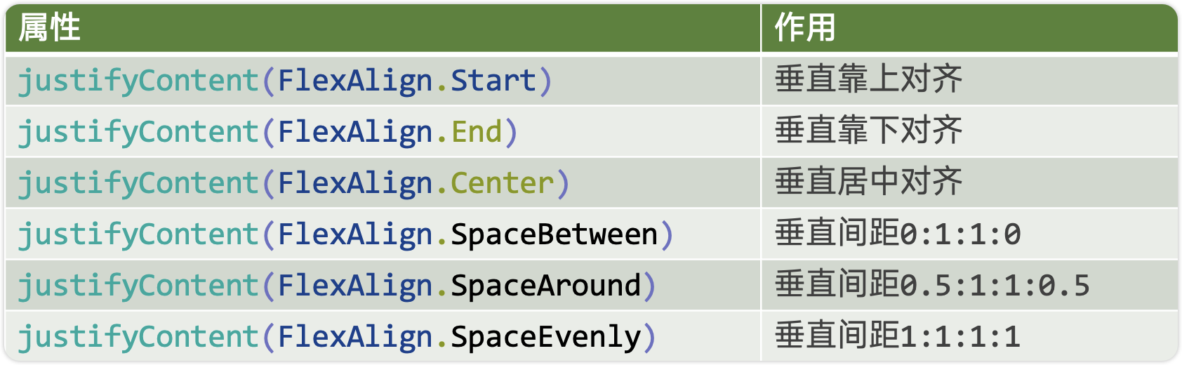
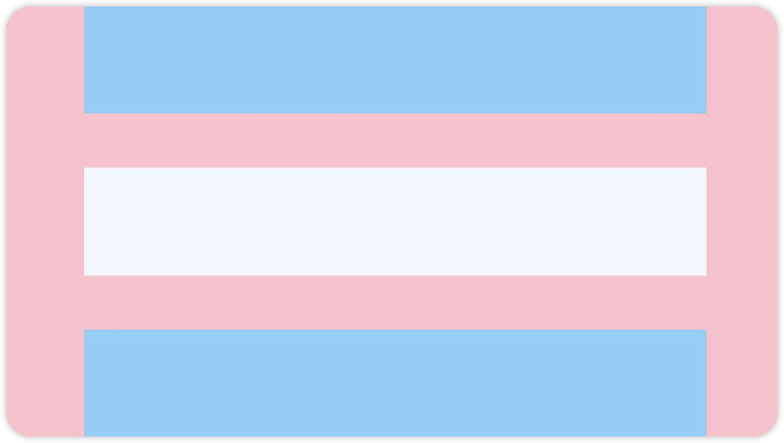
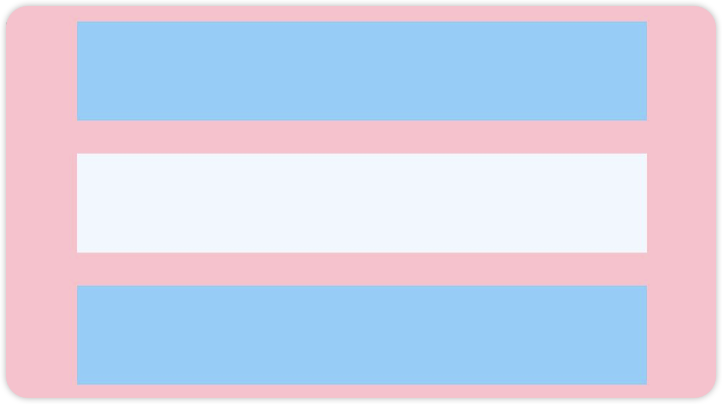
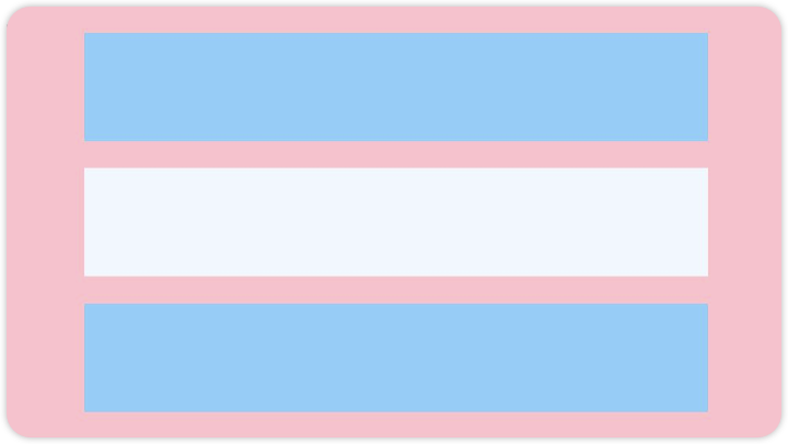
先看前三种对齐方式:如下图所示,分别是垂直靠上对齐、垂直居中对齐、垂直考下对齐。
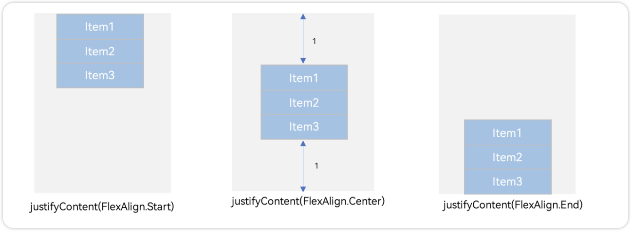
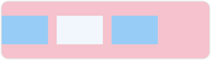
例1:如图所示,垂直靠上对齐(为了演示方便,我把最外层的背景换成了品红Color.Pink)
Column() {
      Row().width('80%').height(50).backgroundColor('#87CEFA')
      Row().width('80%').height(50).backgroundColor('#F0F8FF')
      Row().width('80%').height(50).backgroundColor('#87CEFA')
    }
    .width('100%').height(500).backgroundColor(Color.Pink)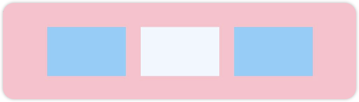
.justifyContent(FlexAlign.Start)例2:如图所示,垂直居中对齐
Column() {
      Row().width('80%').height(50).backgroundColor('#87CEFA')
      Row().width('80%').height(50).backgroundColor('#F0F8FF')
      Row().width('80%').height(50).backgroundColor('#87CEFA')
    }
    .width('100%').height(500).backgroundColor(Color.Pink)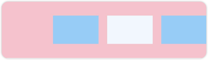
.justifyContent(FlexAlign.Center)例3:如下图所示,垂直靠下对齐
Column() {
      Row().width('80%').height(50).backgroundColor('#87CEFA')
      Row().width('80%').height(50).backgroundColor('#F0F8FF')
      Row().width('80%').height(50).backgroundColor('#87CEFA')
    }
    .width('100%').height(500).backgroundColor(Color.Pink)
    .justifyContent(FlexAlign.End)
再看后三种对齐方式,可以按照比例设置布局内子元素的间距,如图所示
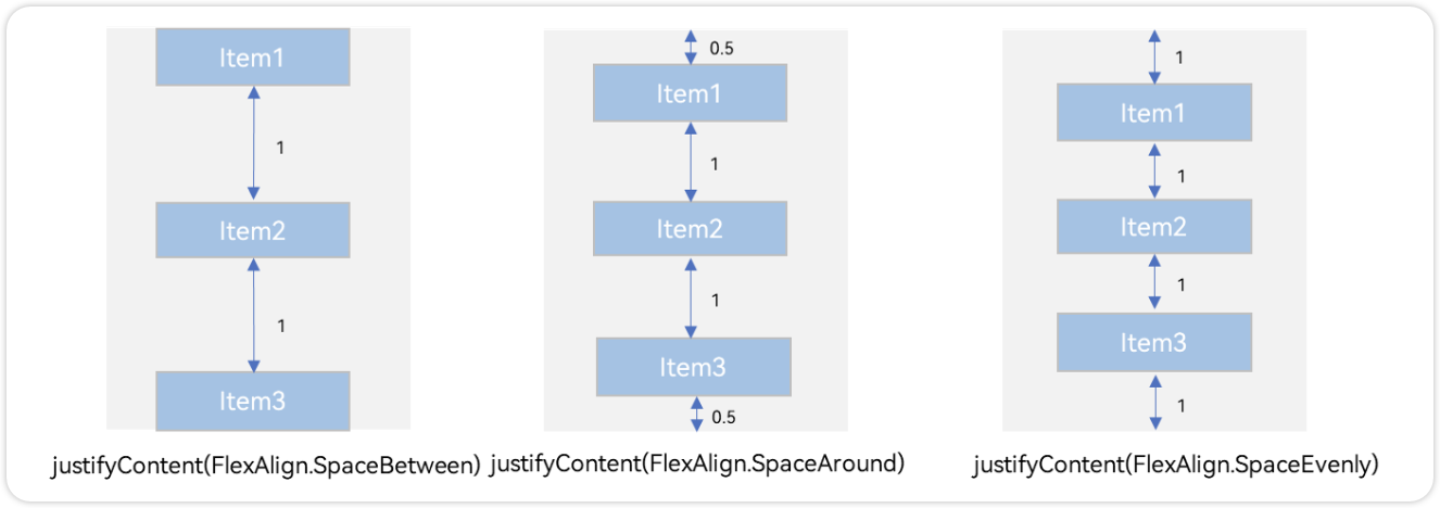
例4:按照0:1:1:0设置布局内子元素的间距
 Column() {
      Row().width('80%').height(50).backgroundColor('#87CEFA')
      Row().width('80%').height(50).backgroundColor('#F0F8FF')
      Row().width('80%').height(50).backgroundColor('#87CEFA')
    }
    .width('100%').height(500).backgroundColor(Color.Pink)
.justifyContent(FlexAlign.SpaceBetween)例5:按照0.5:1:1:0.5设置布局内子元素的间距
Column() {
      Row().width('80%').height(50).backgroundColor('#87CEFA')
      Row().width('80%').height(50).backgroundColor('#F0F8FF')
      Row().width('80%').height(50).backgroundColor('#87CEFA')
    }
    .width('100%').height(500).backgroundColor(Color.Pink)
.justifyContent(FlexAlign.SpaceAround)例6:按照1:1:1:1设置布局内子元素的间距
Column() {
      Row().width('80%').height(50).backgroundColor('#87CEFA')
      Row().width('80%').height(50).backgroundColor('#F0F8FF')
      Row().width('80%').height(50).backgroundColor('#87CEFA')
    }
    .width('100%').height(500).backgroundColor(Color.Pink)
    .justifyContent(FlexAlign.SpaceEvenly)
1.4. Column 交叉轴排列方式
Column的主轴是垂直方向,交叉轴垂直于主轴,所以交叉轴就是水平方向;通过 alignItems属性设置子元素在交叉轴上的对齐方式。
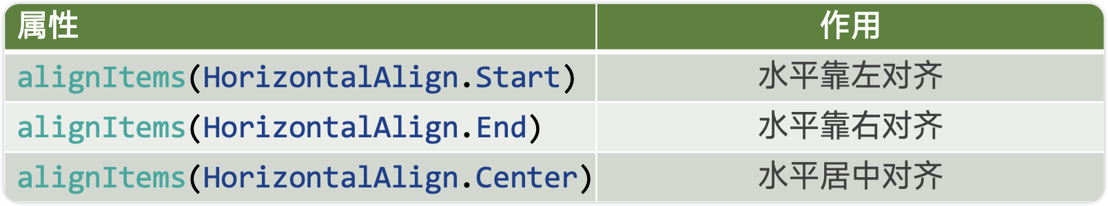
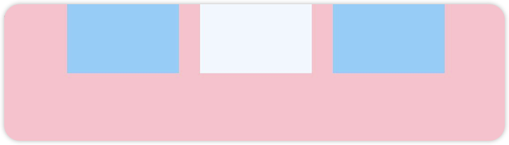
例1:Colum 子元素水平靠左对齐
Column() {
      Row().width('80%').height(50).backgroundColor('#87CEFA')
      Row().width('80%').height(50).backgroundColor('#F0F8FF')
      Row().width('80%').height(50).backgroundColor('#87CEFA')
    }
    .width('100%').height(200).backgroundColor(Color.Pink)
    .justifyContent(FlexAlign.Center)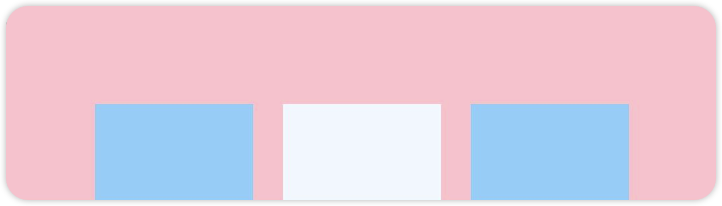
.alignItems(HorizontalAlign.Start) //水平靠左例2:Colum 子元素水平靠右对齐
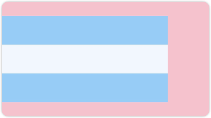
Column() {
      Row().width('80%').height(50).backgroundColor('#87CEFA')
      Row().width('80%').height(50).backgroundColor('#F0F8FF')
      Row().width('80%').height(50).backgroundColor('#87CEFA')
    }
    .width('100%').height(200).backgroundColor(Color.Pink)
    .justifyContent(FlexAlign.Center)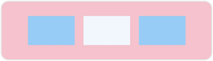
.alignItems(HorizontalAlign.End) //水平靠右例3:Colum 子元素水平居中对齐
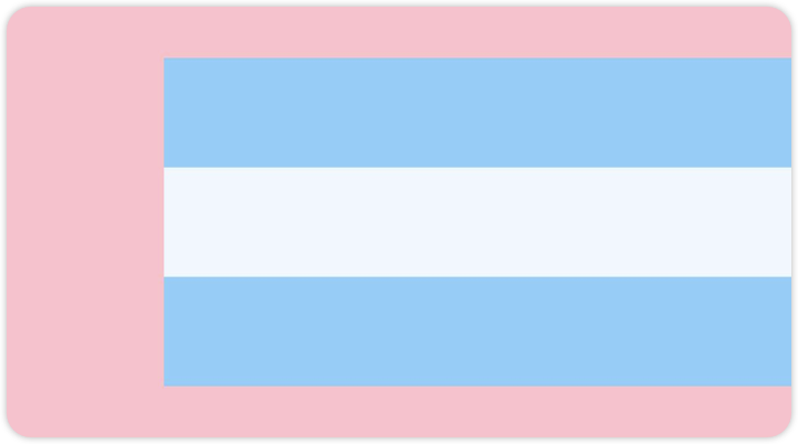
Column() {
      Row().width('80%').height(50).backgroundColor('#87CEFA')
      Row().width('80%').height(50).backgroundColor('#F0F8FF')
      Row().width('80%').height(50).backgroundColor('#87CEFA')
    }
    .width('100%').height(200).backgroundColor(Color.Pink)
    .justifyContent(FlexAlign.Center)
    .alignItems(HorizontalAlign.Center)
1.5. Row 主轴排列方式
Row容器内子元素在水平方向上的排列图
例1:水平靠左对齐
Row({ space: 15 }) {
      Column().width(80).height(50).backgroundColor('#87CEFA')
      Column().width(80).height(50).backgroundColor('#F0F8FF')
      Column().width(80).height(50).backgroundColor('#87CEFA')
    }
    .width('100%').height(100).backgroundColor(Color.Pink)
.justifyContent(FlexAlign.Start)例2:水平靠居中对齐
Row({ space: 15 }) {
      Column().width(80).height(50).backgroundColor('#87CEFA')
      Column().width(80).height(50).backgroundColor('#F0F8FF')
      Column().width(80).height(50).backgroundColor('#87CEFA')
    }
    .width('100%').height(100).backgroundColor(Color.Pink)
.justifyContent(FlexAlign.Center)例3:水平靠右对齐
Row({ space: 15 }) {
      Column().width(80).height(50).backgroundColor('#87CEFA')
      Column().width(80).height(50).backgroundColor('#F0F8FF')
      Column().width(80).height(50).backgroundColor('#87CEFA')
    }
    .width('100%').height(100).backgroundColor(Color.Pink)
.justifyContent(FlexAlign.End)例4:水平方向按照0:1:1:0设置排列间距
Row({ space: 15 }) {
      Column().width(80).height(50).backgroundColor('#87CEFA')
      Column().width(80).height(50).backgroundColor('#F0F8FF')
      Column().width(80).height(50).backgroundColor('#87CEFA')
    }
    .width('100%').height(100).backgroundColor(Color.Pink)
.justifyContent(FlexAlign.SpaceBetween)例5:水平方向按照0.5:1:1:0.5设置排列间距
Row({ space: 15 }) {
      Column().width(80).height(50).backgroundColor('#87CEFA')
      Column().width(80).height(50).backgroundColor('#F0F8FF')
      Column().width(80).height(50).backgroundColor('#87CEFA')
    }
    .width('100%').height(100).backgroundColor(Color.Pink)
.justifyContent(FlexAlign.SpaceAround)例6:水平方向按照1:1:1:1设置间距
Row({ space: 15 }) {
      Column().width(80).height(50).backgroundColor('#87CEFA')
      Column().width(80).height(50).backgroundColor('#F0F8FF')
      Column().width(80).height(50).backgroundColor('#87CEFA')
    }
    .width('100%').height(100).backgroundColor(Color.Pink)
    .justifyContent(FlexAlign.SpaceEvenly)
1.6. Row 交叉轴排列方式
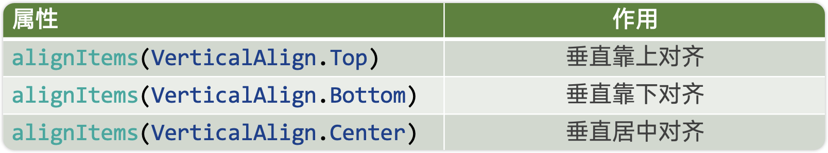
Row的主轴是水平方向,交叉轴垂直于主轴,所以交叉轴就是垂直方向;通过 alignItems属性设置子元素在交叉轴上的对齐方式。
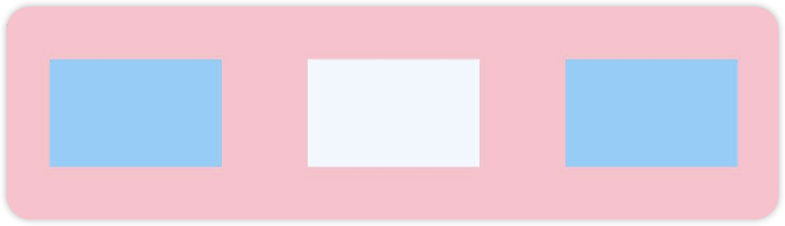
例1:Row 子元素垂直靠上对齐
Row({ space: 15 }) {
      Column().width(80).height(50).backgroundColor('#87CEFA')
      Column().width(80).height(50).backgroundColor('#F0F8FF')
      Column().width(80).height(50).backgroundColor('#87CEFA')
    }
    .width('100%').height(100).backgroundColor(Color.Pink)
    .justifyContent(FlexAlign.Center)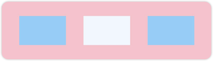
.alignItems(VerticalAlign.Top) //水平靠上例2:Row 子元素垂直靠下对齐
Row({ space: 15 }) {
      Column().width(80).height(50).backgroundColor('#87CEFA')
      Column().width(80).height(50).backgroundColor('#F0F8FF')
      Column().width(80).height(50).backgroundColor('#87CEFA')
    }
    .width('100%').height(100).backgroundColor(Color.Pink)
    .justifyContent(FlexAlign.Center)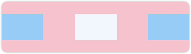
.alignItems(VerticalAlign.Bottom) //水平靠下例3:Colum 子元素垂直居中对齐
Row({ space: 15 }) {
      Column().width(80).height(50).backgroundColor('#87CEFA')
      Column().width(80).height(50).backgroundColor('#F0F8FF')
      Column().width(80).height(50).backgroundColor('#87CEFA')
    }
    .width('100%').height(100).backgroundColor(Color.Pink)
    .justifyContent(FlexAlign.Center)
    .alignItems(VerticalAlign.Center)  //水平靠下
1.7. 空白填充
在线性布局下,常用空白填充组件Blank,在容器主轴方向自动填充空白空间,达到自适应拉伸效果。Row和Column作为容器,只需要添加宽高为百分比,当屏幕宽高发生变化时,会产生自适应效果。
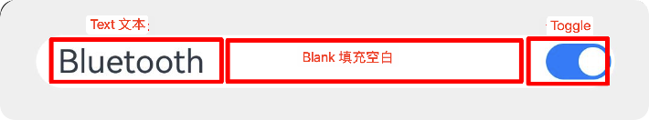
Column() {
      Row() {
        Text('Bluetooth').fontSize(18)
        Blank()
        Toggle({ type: ToggleType.Switch, isOn: true })
      }
      .backgroundColor(0xFFFFFF).borderRadius(15).width('100%')
      .padding(12)
    }
    .width('100%').backgroundColor(0xEFEFEF).padding(20)
1.8. 自适应缩放
父容器尺寸确定时,使用 layoutWeight()属性 设置子元素和兄弟元素在主轴上的权重,忽略元素本身尺寸设置,使它们在任意尺寸的设备下自适应占满剩余空间。
Column() {
  Row() {
    Text('1').backgroundColor(0xF5DEB3).height('100%').layoutWeight(1).textAlign(TextAlign.Center)
    Text('2').backgroundColor(0xD2B48C).height('100%').layoutWeight(2).textAlign(TextAlign.Center)
    Text('3').backgroundColor(0xF5DEB3).height('100%').layoutWeight(3).textAlign(TextAlign.Center)
  }.backgroundColor(0xffd306).height('30%').width('100%')
}
2. 弹性布局(Flex)
2.1. 基本概念
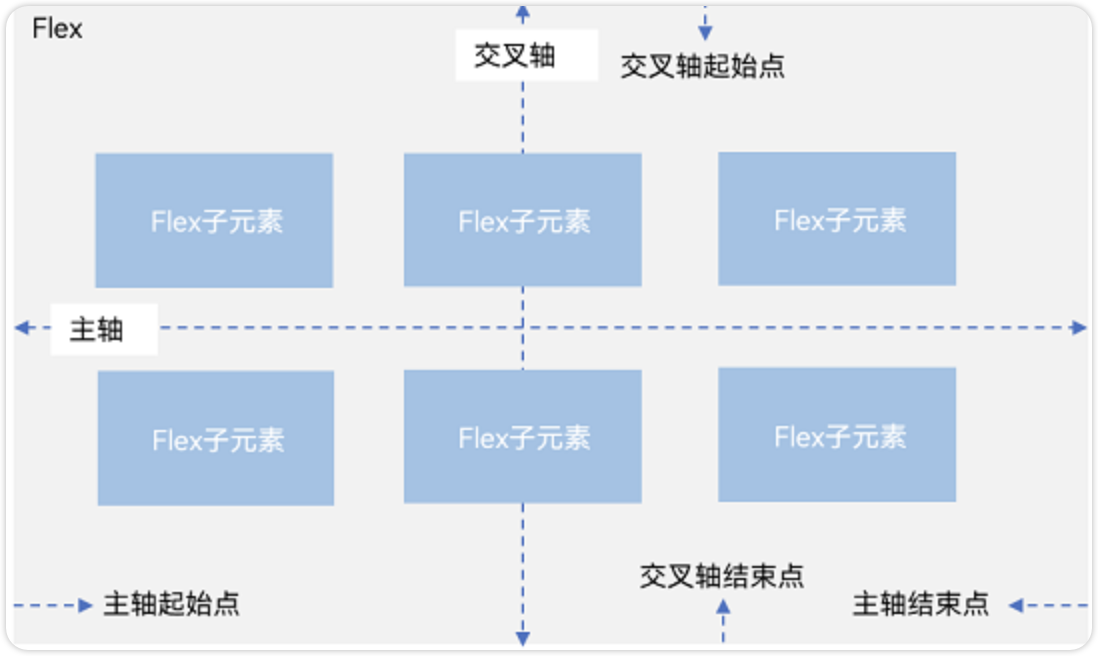
弹性布局和线性布局很多基本概念都是相同的,也分为主轴和交叉轴,线性布局能做的弹性布局都能做。但是弹性布局有一个特殊的效果,就是组件可以换行显示。
- 主轴:Flex组件布局方向的轴线,子元素默认沿着主轴排列。主轴开始的位置称为主轴起始点,结束位置称为主轴结束点。
- 交叉轴:垂直于主轴方向的轴线。交叉轴开始的位置称为交叉轴起始点,结束位置称为交叉轴结束点。
2.2. 布局方向
在Flex弹性布局中,通过direction参数设置主轴为水平方向。默认为水平排列。
Flex({direction:FlexDirection.Row}) 水平从左往右排列
Flex({direction:FlexDirection.RowReverse}) 水平从右往左排列
Flex({direction:FlexDirection.Column}) 垂直从上到下排列
Flex({direction:FlexDirection.ColumnReverse}) 垂直从下到上排列
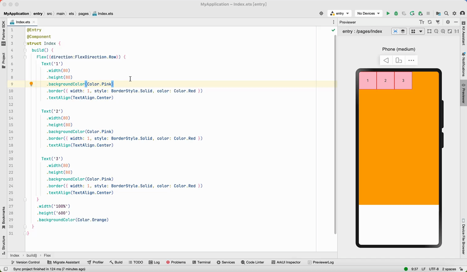
@Entry
@Component
struct BlankPage {
build() {
Flex({
direction: FlexDirection.Row
}) {
Text("1").width(50).height(50).backgroundColor(Color.Pink)
Text("2").width(50).height(50).backgroundColor(Color.Orange)
Text("3").width(50).height(50).backgroundColor(Color.Brown)
}
}
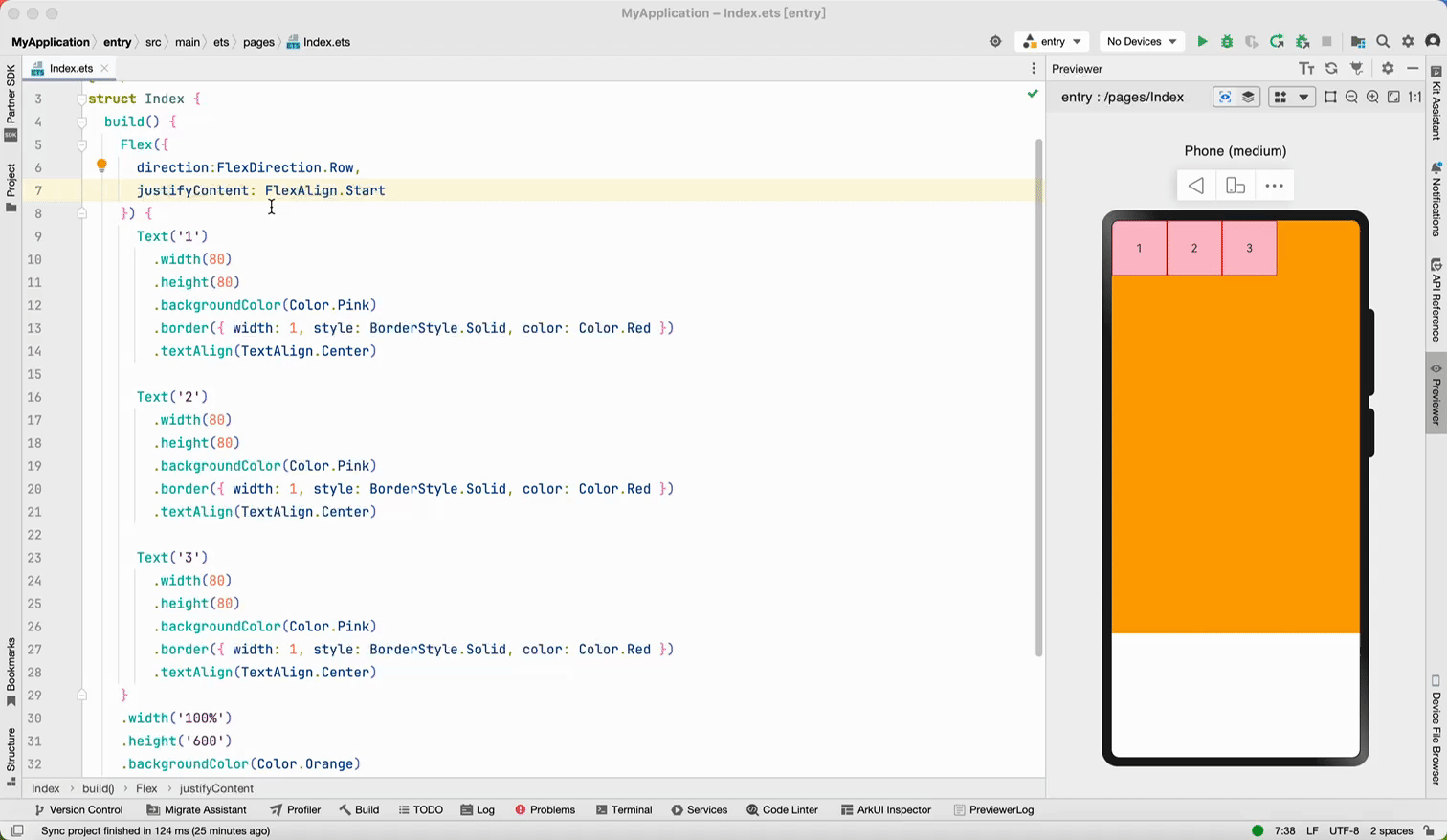
}2.3. 对齐方式
弹性布局的对齐方式参考线性布局,justifyContent()用于设置主轴对齐方式、alignItems()用于设置交叉轴对齐方式。
Flex({
  direction:FlexDirection.Row,				//主轴方向:水平排列
  justifyContent: FlexAlign.SpaceEvenly,	//主轴方向对齐方式:平均分配间隙
  alignItems:ItemAlign.Center					//交叉轴对齐方式:居中
})
2.4. 布局换行
当主轴方向上的子组件比较多时,可以让组件换行显示,同时还可以控制组件之间的间距、以及对其方式。需要用到下面几个参数实现。
- 使用
wrap参数实现布局换行;
-
- wrap: FlexWrap.Wrap 组件换行
- wrap: FlexWrap.NoWrap, //换行显示
- 通过
alignContent参数设置子元素各行在交叉轴上内组件对齐方式。
-
- alignContent: FlexAlign.Start 交叉轴开始对齐
- alignContent: FlexAlign.End 交叉轴结束对齐
- alignContent: FlexAlign.SpaceBetween 交叉轴按照
0:1:1:0分配剩余空间 - alignContent: FlexAlign.SpaceAround 交叉轴按照
0.5:1:1:0.5分配剩余空间 - alignContent: FlexAlign.SpaceEvenly 交叉轴按照
1:1:1:1分配剩余空间
- 使用
space设置子组件之间的间距;
-
- main: LengthMetrics.px(20), //主轴方向组件间距
- cross: LengthMetrics.px(20) //交叉轴方向组件简介
 Flex({
      direction: FlexDirection.Row, //主轴水平排列
      justifyContent: FlexAlign.Start, //主轴方向对齐方式,从左往右
      wrap: FlexWrap.Wrap, //换行显示
      alignContent: FlexAlign.SpaceEvenly, //交叉轴对齐方式,在换行时才有效。
      space: {
        main: LengthMetrics.px(20),   //主轴方向组件间距
        cross: LengthMetrics.px(20)   //交叉轴方向组件简介
      },
    }) {
   //...
}
3. 层叠布局(Stack)
3.1. 基本概念
层叠布局容器中的子元素依次入栈,后一个子元素覆盖前一个子元素上,子元素可以叠加,也可以设置位置。
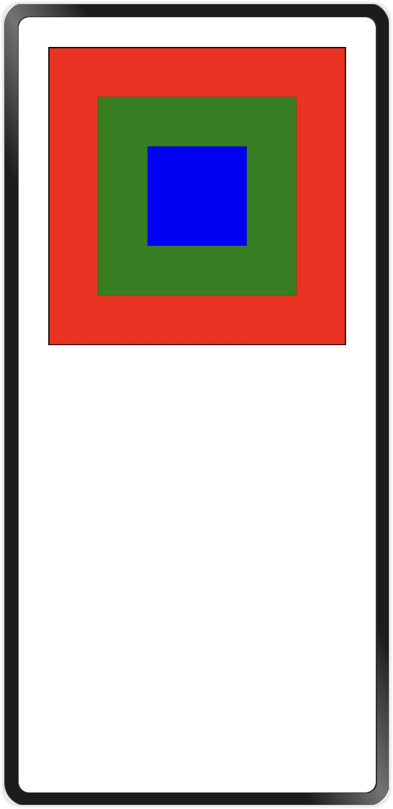
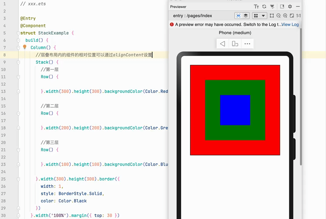
如下图所示:第1层是红色、第2层是绿色、第3层是蓝色
代码如下图所示
// xxx.ets

@Entry
@Component
struct StackExample {
  build() {
    Column() {
      //层叠布局内的组件的相对位置可以通过alignContent设置
      Stack({ alignContent: Alignment.TopEnd }) {
        //第一层
        Row() {
          Text('Text1').fontColor(Color.White)
        }.width(300).height(300)
        .backgroundColor(Color.Red)
        .alignItems(VerticalAlign.Bottom)


        //第二层
        Row() {
          Text('Text2').fontColor(Color.White)
        }.width(200).height(200)
        .backgroundColor(Color.Green)
        .alignItems(VerticalAlign.Bottom)


        //第三层
        Row() {
          Text('Text3').fontColor(Color.White)
        }.width(100).height(100)
        .backgroundColor(Color.Blue)
        .alignItems(VerticalAlign.Bottom)

      }.width(300).height(300).border({
        width: 1,
        style: BorderStyle.Solid,
        color: Color.Black
      })
    }.width('100%').margin({ top: 30 })

  }
}
3.2. 对齐方式
在Stack层叠布局中子元素的对齐方式,通过alignContent参数实现。如图下图,支持九种对齐方式。
 Stack({ alignContent: Alignment.Start }){
   ...
 }
3.3. Z序控制
Stack容器中兄弟组件显示层级关系可以通过Z序控制的zIndex属性改变。zIndex值越大,显示层级越高,即zIndex值大的组件会覆盖在zIndex值小的组件上方。
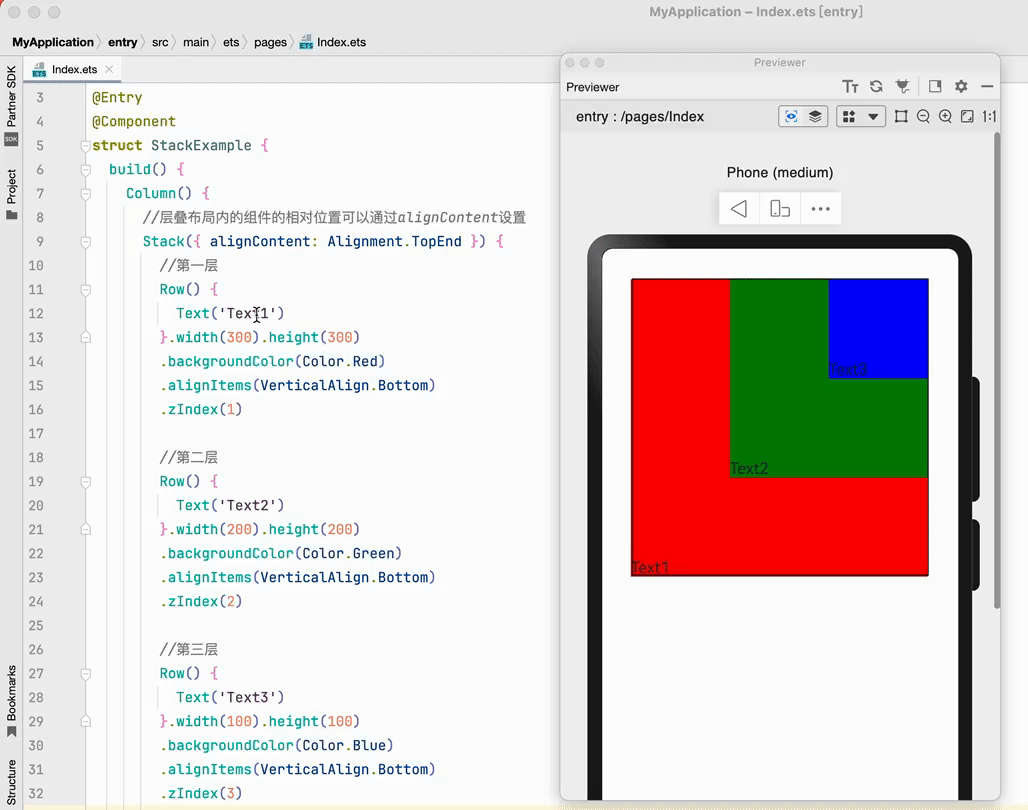
// xxx.ets

@Entry
@Component
struct StackExample {
  build() {
    Column() {
      //层叠布局内的组件的相对位置可以通过alignContent设置
      Stack({alignContent:Alignment.TopEnd}) {
        //第一层
        Row() {
          Text('Text1')
        }.width(300).height(300).backgroundColor(Color.Red)
          .alignItems(VerticalAlign.Bottom)
          .zIndex(1)

        //第二层
        Row() {
          Text('Text2')
        }.width(200).height(200).backgroundColor(Color.Green)
          .alignItems(VerticalAlign.Bottom)
          .zIndex(2)

        //第三层
        Row() {

        }.width(100).height(100).backgroundColor(Color.Blue)
          .alignItems(VerticalAlign.Bottom)
          .zIndex(3)

      }.width(300).height(300).border({
        width: 1,
        style: BorderStyle.Solid,
        color: Color.Black
      })
    }.width('100%').margin({ top: 30 })
  }
}
4. 相对布局 (RelativeContainer)
4.1. 基本概念
RelativeContainer为相对布局的容器,支持容器内部的子元素设置相对位置关系,适用于界面复杂场景的情况。
使用相对布局,需要搞清楚下面两个概念
- 锚点:通过锚点设置当前元素基于哪个元素确定位置。
- 对齐方式:通过对齐方式,设置当前元素是基于锚点的上中下对齐,还是基于锚点的左中右对齐。
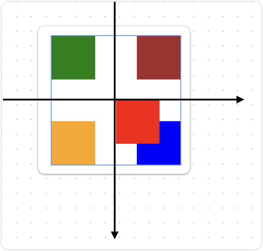
如下图所示,红色方块Row相对于父容器RelativeContainer的位置可以通过指定的锚点对其方式来设定。
左图:
- Row的左边框与RelativeContainer的左边框对齐,此时RelativeContainer的左边框就是一个锚点
- Row的上边框与RelativeContainer的上边框对齐,此时RelativeContainer的上边框就是一个锚点
右图:
- Row的下边框与RelativeContainer的下边框对齐,此时RelativeContainer的下边框就是一个锚点
- Row的右边框与RelativeContainer的有边框对齐,此时RelativeContainer的有边框就是一个锚点
4.2. 相对父容器定位
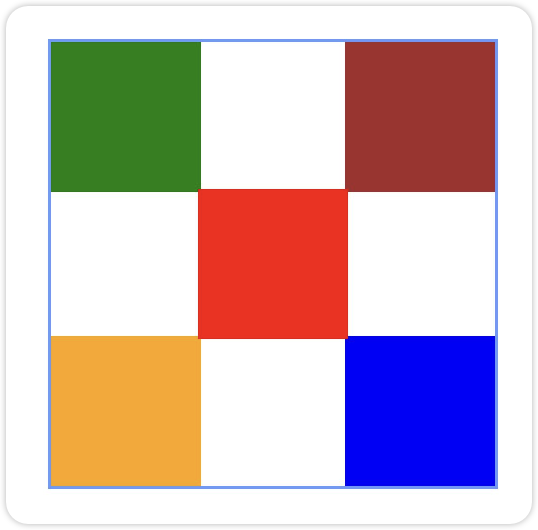
如下图所示,最外层蓝色的方框是一个RelativeContainer,然后相对于该容器,放置4个带颜色的小方块在不同的位置。
如图:第一个绿色小方块相对于父容器的对齐方式,其他组件依此内推。
完整代码如下:RelativeContainer容器组件的id默认为"__container__",每个组件的相对位置都是以
"__container__"为锚点
@Entry
@Component
struct Index {
  build() {
    Row() {
      RelativeContainer() {
        Row()
          .id("row1")
          .width(100)
          .height(100)
          .backgroundColor(Color.Green)
          .alignRules({
            top: { anchor: "__container__", align: VerticalAlign.Top },
            left: { anchor: "__container__", align: HorizontalAlign.Start }
          })

        Row()
          .id("row2")
          .width(100)
          .height(100)
          .backgroundColor(Color.Brown)
          .alignRules({
            top: { anchor: "__container__", align: VerticalAlign.Top },
            right: { anchor: "__container__", align: HorizontalAlign.End }
          })

        Row()
          .id("row3")
          .width(100)
          .height(100)
          .backgroundColor(Color.Orange)
          .alignRules({
            bottom: { anchor: "__container__", align: VerticalAlign.Bottom },
            left: { anchor: "__container__", align: HorizontalAlign.Start }
          })

        Row()
          .id("row4")
          .width(100)
          .height(100)
          .backgroundColor(Color.Blue)
          .alignRules({
            bottom: { anchor: "__container__", align: VerticalAlign.Bottom },
            right: { anchor: "__container__", align: HorizontalAlign.End }
          })
        })
      }
      .width(300).height(300)
      .margin({ left: 50 })
      .border({ width: 2, color: "#6699FF" })
    }
    .height('100%')
  }
}
4.3. 子组件位置偏移
接下来我想在蓝色方框的中间位置放置一个红色方块,按照前面学习的对齐方式采用水平居中、垂直居中对齐。
- 理想效果是这样的
@Entry
@Component
struct Index {
  build() {
    Row() {
      RelativeContainer() {
        //....
        //想要居中对齐的组件
        Row()
          .id("row5")
          .width(100)
          .height(100)
          .backgroundColor(Color.Red)
          .alignRules({
            //上边框与父组件中线居中
            top: { anchor: "__container__", align: VerticalAlign.Center },
            //左边框与父组件中线居中
            left: { anchor: "__container__", align: HorizontalAlign.Center }
          })
      }
      .width(300).height(300)
      .border({ width: 2, color: "#6699FF" })
    }
    .height('100%')
    .width('100%')
    .justifyContent(FlexAlign.Center)
  }
}- 但是实际效果是这样的
此时需要对子组件进行位置偏移,使用offset属性进行位置偏移。 注意:坐标轴的方向,x轴正方向向右,y轴正方向向下。
Row()
  .id("row5")
  .width(100)
  .height(100)
  .backgroundColor(Color.Red)
  .alignRules({
    top: { anchor: "__container__", align: VerticalAlign.Center },
    left: { anchor: "__container__", align: HorizontalAlign.Center }
  })
  .offset({
    left: -50,
    top: -50
})
哈哈,效果达到了
4.4. 相对兄弟组件定位
如果RelativeContainer父容器看作是父亲,那么里面的子组件就是儿子,同级别的多个子组件就是兄弟关系。
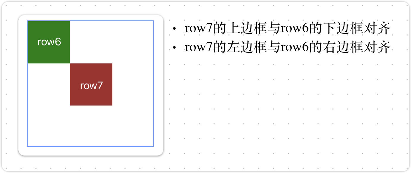
注意:相对于兄弟组件定位,必须给兄弟组件设置一个id值,否则找不到兄弟组件,会导致组件显示不了。
RelativeContainer() {
  Row().id('row6').width(100).height(100).backgroundColor(Color.Green)

  Row().id('row7').width(100).height(100).backgroundColor(Color.Brown)
    .alignRules({
      left: {anchor:'row6',align:HorizontalAlign.End},
      top:{anchor: 'row6',align:VerticalAlign.Bottom}
    })

}.width(300).height(300)
.border({ width: 2, color: "#6699FF" })
5. 滚动容器(Scroll)
5.1. 核心用法
在ArkUI中,使用Scroll表示可滚动的容器组件,当子组件的布局尺寸超过父组件的尺寸时,内容可以滚动。
📢 注意:Scorll使用时有以下两个注意点
- Scroll 有且只能包含一个子组件
- Scroll 子组件的布局尺寸大于父组件的尺寸时,才可以滚动。
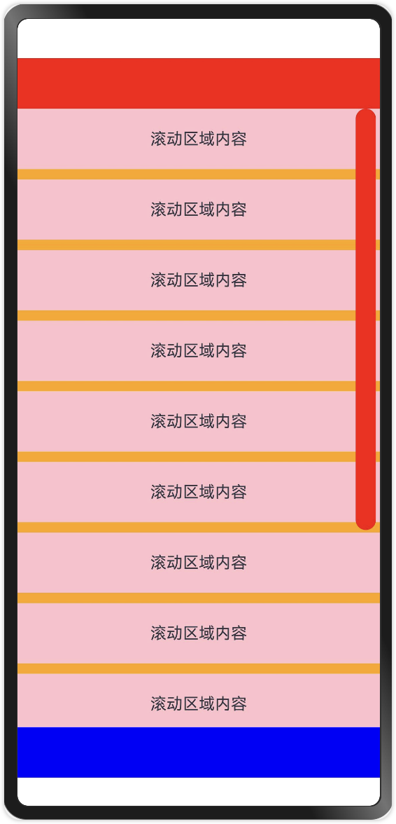
5.2. 代码演示
@Entry
@Component
struct Index {
scroller:Scroller = new Scroller()
build() {
Column() {
Row()
.width('100%')
.height(50)
.backgroundColor(Color.Red)
Scroll(){
Column({space:10}) {
Text("滚动区域内容").width('100%').height(60).textAlign(TextAlign.Center).backgroundColor(Color.Pink)
Text("滚动区域内容").width('100%').height(60).textAlign(TextAlign.Center).backgroundColor(Color.Pink)
Text("滚动区域内容").width('100%').height(60).textAlign(TextAlign.Center).backgroundColor(Color.Pink)
Text("滚动区域内容").width('100%').height(60).textAlign(TextAlign.Center).backgroundColor(Color.Pink)
Text("滚动区域内容").width('100%').height(60).textAlign(TextAlign.Center).backgroundColor(Color.Pink)
Text("滚动区域内容").width('100%').height(60).textAlign(TextAlign.Center).backgroundColor(Color.Pink)
Text("滚动区域内容").width('100%').height(60).textAlign(TextAlign.Center).backgroundColor(Color.Pink)
Text("滚动区域内容").width('100%').height(60).textAlign(TextAlign.Center).backgroundColor(Color.Pink)
Text("滚动区域内容").width('100%').height(60).textAlign(TextAlign.Center).backgroundColor(Color.Pink)
Text("滚动区域内容").width('100%').height(60).textAlign(TextAlign.Center).backgroundColor(Color.Pink)
Text("滚动区域内容").width('100%').height(60).textAlign(TextAlign.Center).backgroundColor(Color.Pink)
Text("滚动区域内容").width('100%').height(60).textAlign(TextAlign.Center).backgroundColor(Color.Pink)
Text("滚动区域内容").width('100%').height(60).textAlign(TextAlign.Center).backgroundColor(Color.Pink)
}
.width('100%')
.backgroundColor(Color.Orange)
}.layoutWeight(1)
.scrollBar(BarState.On) //打开滚动条
.scrollable(ScrollDirection.Vertical) //滚动方向
.scrollBarWidth(20) //滚动条宽度
.scrollBarColor(Color.Red) //滚动条颜色
Row()
.width('100%')
.height(50)
.backgroundColor(Color.Blue)
}
.justifyContent(FlexAlign.SpaceBetween)
.width('100%')
.height('100%')
}
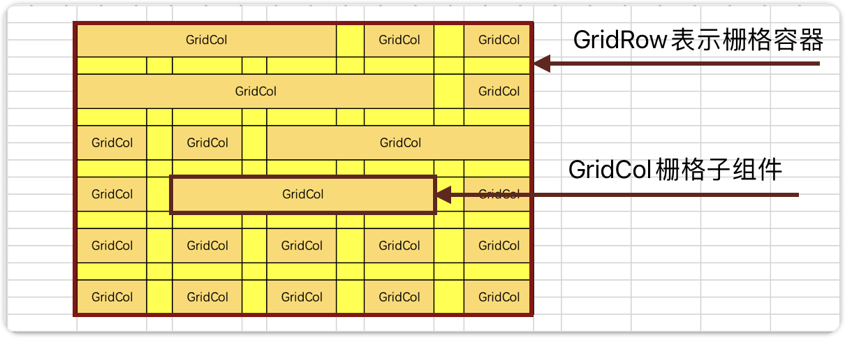
}6. 栅格布局(GridRow)
6.1. 基本概念
栅格布局可以在不同的设备上自适应排版,使得页面布局更加灵活和适应性更强。当页面元素的数量超出了一行或一列的容量时,他们会自动换到下一行或下一列。
GridRow为栅格容器组件,需与栅格子组件GridCol在栅格布局场景中联合使用。栅格系统以屏幕宽度为依据,把屏幕分为若干个列,每一个栅格子可以横跨指定的列从而完成组件的定位和布局。
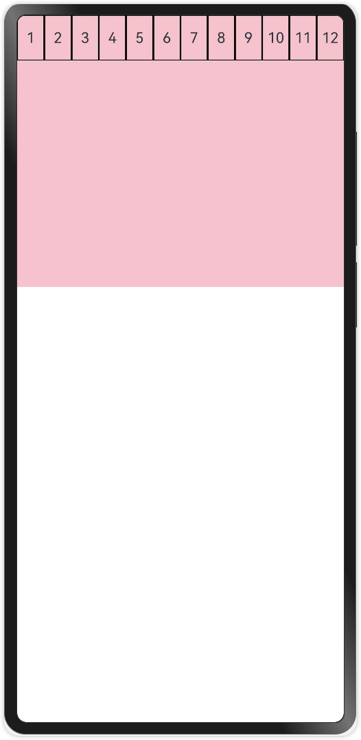
6.2. 栅格系统的总列数
栅格系统的总列数可以使用默认值(12列),也可以自己指定列数,还可以根据屏幕的宽度动态调整列数。
6.2.1. 默认栅格列数
@Entry
@Component
struct Index {
build() {
GridRow() {
GridCol() {
Row() {
Text('1')
}
.width('100%')
.height(50)
.border({ width: 1, color: Color.Black, style: BorderStyle.Solid })
.justifyContent(FlexAlign.Center)
}
GridCol() {
Row() {
Text('2')
}
.width('100%')
.height(50)
.border({ width: 1, color: Color.Black, style: BorderStyle.Solid })
.justifyContent(FlexAlign.Center)
}
GridCol() {
Row() {
Text('3')
}
.width('100%')
.height(50)
.border({ width: 1, color: Color.Black, style: BorderStyle.Solid })
.justifyContent(FlexAlign.Center)
}
GridCol() {
Row() {
Text('4')
}
.width('100%')
.height(50)
.border({ width: 1, color: Color.Black, style: BorderStyle.Solid })
.justifyContent(FlexAlign.Center)
}
GridCol() {
Row() {
Text('5')
}
.width('100%')
.height(50)
.border({ width: 1, color: Color.Black, style: BorderStyle.Solid })
.justifyContent(FlexAlign.Center)
}
GridCol() {
Row() {
Text('6')
}
.width('100%')
.height(50)
.border({ width: 1, color: Color.Black, style: BorderStyle.Solid })
.justifyContent(FlexAlign.Center)
}
GridCol() {
Row() {
Text('7')
}
.width('100%')
.height(50)
.border({ width: 1, color: Color.Black, style: BorderStyle.Solid })
.justifyContent(FlexAlign.Center)
}
GridCol() {
Row() {
Text('8')
}
.width('100%')
.height(50)
.border({ width: 1, color: Color.Black, style: BorderStyle.Solid })
.justifyContent(FlexAlign.Center)
}
GridCol() {
Row() {
Text('9')
}
.width('100%')
.height(50)
.border({ width: 1, color: Color.Black, style: BorderStyle.Solid })
.justifyContent(FlexAlign.Center)
}
GridCol() {
Row() {
Text('10')
}
.width('100%')
.height(50)
.border({ width: 1, color: Color.Black, style: BorderStyle.Solid })
.justifyContent(FlexAlign.Center)
}
GridCol() {
Row() {
Text('11')
}
.width('100%')
.height(50)
.border({ width: 1, color: Color.Black, style: BorderStyle.Solid })
.justifyContent(FlexAlign.Center)
}
GridCol() {
Row() {
Text('12')
}
.width('100%')
.height(50)
.border({ width: 1, color: Color.Black, style: BorderStyle.Solid })
.justifyContent(FlexAlign.Center)
}
}.height(300).backgroundColor(Color.Pink)
}
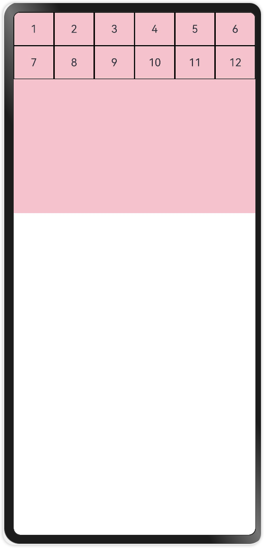
}6.2.2. 指定栅格列数
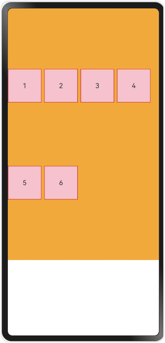
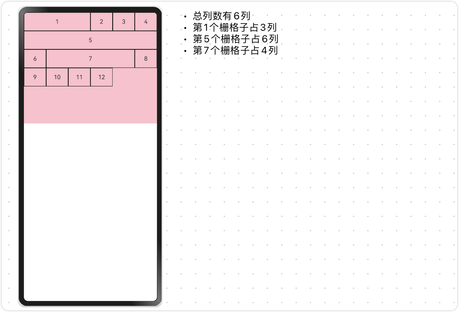
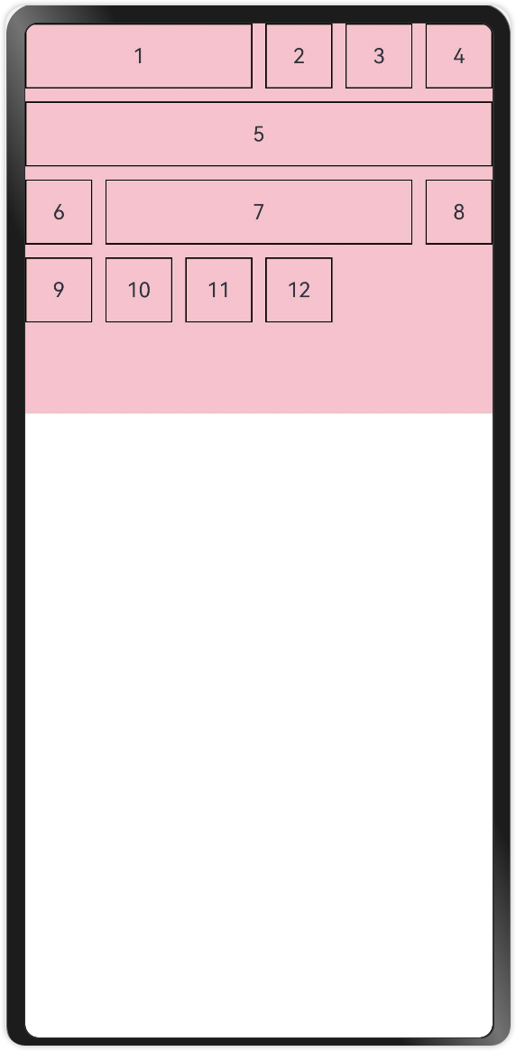
通过GridRow的{columns:6}参数可以指定栅格总列数。比如下面案例中,栅格总列数为6,一共12个栅格子,那么一行就是6个,超过一行的部分自动换行。
@Entry
@Component
struct Index {
  build() {
    GridRow({ columns: 6 }) {
      GridCol() {
        Row() {
          Text('1')
        }
        .width('100%')
        .height(50)
        .border({ width: 1, color: Color.Black, style: BorderStyle.Solid })
        .justifyContent(FlexAlign.Center)
      }

      //...中间省略了10个栅格子GridCol(),包括上下两个栅格子,一共12个栅格子

      GridCol() {
        Row() {
          Text('12')
        }
        .width('100%')
        .height(50)
        .border({ width: 1, color: Color.Black, style: BorderStyle.Solid })
        .justifyContent(FlexAlign.Center)
      }
    }.height(300).backgroundColor(Color.Pink)
  }
}
6.2.3. 动态调整列数
为了适应不同屏幕尺寸下的布局,栅格系统的总列数可以根据不同的屏幕尺寸动态调整。
要实现动态调整列数,这里需要引入一个概念叫做栅格系统断点。
栅格系统断点
是指在响应式设计中,用于控制页面布局变化的一系列特定数值点。这些数值点基于设备的屏幕宽度来设定,当屏幕宽度达到或超过某个断点时,页面的布局或组件的排列方式会相应地发生调整,以适应不同尺寸的屏幕。
如下图所示:把这条直线看作屏幕的宽度,上面的5个数值点就是断点,5个断点把屏幕宽度分为6个区间,对应6种设备宽度。(当然这个断点的数值也是可以自己设定的)

不同屏幕尺寸的设备,就是依靠断点进行区分的,如下表
|
断点名称 |
取值范围(vp) |
设备描述 |
|
xs |
[0, 320) |
最小宽度类型设备 |
|
sm |
[320, 520) |
小宽度类型设备 |
|
md |
[520, 840) |
中等宽度类型设备 |
|
lg |
[840, 1080) |
大宽度类型设备 |
|
xl |
[1080,1920) |
特大宽度类型设备 |
|
xxl |
[1920,+♾) |
超大宽度类型设备 |
如下代码:根据断点设备设置栅格总列数
GridRow({
//设置对应断点设备的总列数
columns: {
xs: 3, //最小宽度型设备3列
sm: 6, //小宽度设备6列
md: 8, //中型宽度设备8列
lg: 12 //大型宽度设备12列
},
//设置断点
breakpoints: {
value: ['320vp', '520vp', '840vp', '1080vp', '1920vp']
}
}){
//GridCol栅格子组件....
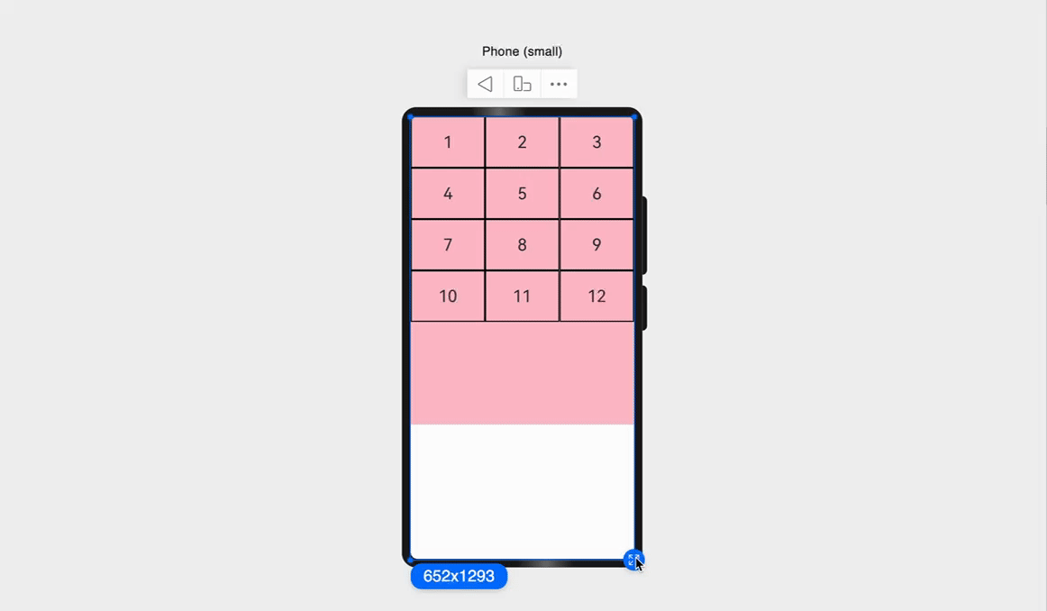
}6.3. 栅格子占用列数
通过设置GridCol传参{span:3}来设置栅格子占用的列数。比如我们想要的效果如下。
@Entry
@Component
struct Index {
  build() {
    GridRow({columns: 6) {
      //第1个栅格
      GridCol({ span: 3 }) {
        Row() {
          Text('1')
        }
        .width('100%')
        .height(50)
        .border({ width: 1, color: Color.Black, style: BorderStyle.Solid })
        .justifyContent(FlexAlign.Center)
      }
      //...中间省略了第2,3,4个栅格子
      //第5个栅格子
      GridCol({span:6}) {
        Row() {
          Text('5')
        }
        .width('100%')
        .height(50)
        .border({ width: 1, color: Color.Black, style: BorderStyle.Solid })
        .justifyContent(FlexAlign.Center)
      }
      //...中间省略了第6个栅格子
      //第7个栅格子
      GridCol({ span: 4 }) {
        Row() {
          Text('7')
        }
        .width('100%')
        .height(50)
        .border({ width: 1, color: Color.Black, style: BorderStyle.Solid })
        .justifyContent(FlexAlign.Center)
      }
      //...这里省略了第8,9,10,11,12个栅格子

    }.height(300).backgroundColor(Color.Pink)
  }
}
6.4. 栅格间距
通过GridRow的{gutter: 10} 参数可以调整栅格子之间的间距,默认为0。
GridRow({
  columns: 6
  gutter: 10
}){
  //GridCol栅格子
}
7. Grid 网格布局
ArkUI提供了Grid容器组件和子组件GridItem,用于构建网格布局。Grid用于设置网格布局相关参数,GridItem定义子组件相关特征。
7.1. 基本使用
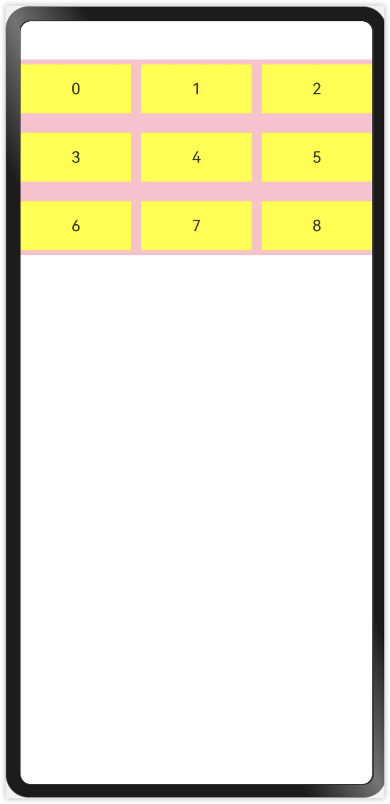
如同所示,显示一个3行3列的网格,每一个单元格中显示一个数字。
@Entry
@Component
struct GridPage1 {
  @State numbers: number[] = []

  onPageShow(): void {
    for (let index = 0; index < 10; index++) {
      this.numbers.push(index)
    }
  }

  build() {
    Column() {
      Grid() {
        ForEach(this.numbers, (item: number, index: number) => {
          GridItem() {
            Text(`${item}`).textAlign(TextAlign.Center).width("100%").height(50).backgroundColor(Color.Yellow)
          }
        })
      }
      .width("100%")
      .height(200) //Grid 如果没有设置宽高,则自适应父组件宽高
      .backgroundColor(Color.Pink)
      .columnsTemplate("1fr 1fr 1fr") //列数
      .rowsTemplate("1fr 1fr 1fr") //行数
      .rowsGap(10) //行间距
      .columnsGap(10) //列间距
    }
    .width("100%")
    .height("100%")
  }
}

讨论HarmonyOS开发技术,专注于API与组件、DevEco Studio、测试、元服务和应用上架分发等。
更多推荐

 0
0 0
0- 0


 已为社区贡献13条内容

所有评论(0)