鸿蒙开发之多样化底部导航栏04——悬浮导航栏
·
一、前言
在上一讲的鸿蒙开发之多样化底部导航栏03——灵动导航栏中,我们的应用导航栏可以做动效了。但是这样我们还是觉得不够,想要更加独特的用户体验,便会想到让导航栏悬浮起来,这样就有种“空中楼阁”的感觉
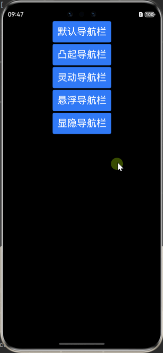
预览效果
二、正题
本文中的悬浮导航栏是让它从底部抬升一段距离,其他功能继承于灵动导航栏,该代码在项目路径:src/main/ets/pages/4-FloatingTabbar.ets
1、核心组件
系统库组件:
-
Tabs
2、核心代码
2.1 添加偏移量
在自定义的Tabbar组件 CustomTabBar({ selectedIndex: $selectedIndex })中,添加向上提升的Offset偏移量,这样它就悬浮起来了,具体提升多少,就依照自己的喜好来
// 自定义TabBar组件
CustomTabBar({ selectedIndex: $selectedIndex })
   .margin({left:20, right:20})
   .borderRadius(20)
   .offset({y:-10}) // 向上抬升10vp,-号是代表往上,+号代表往下
.backgroundColor($r('app.color.tab_bar_background'))三、完整代码
import { promptAction } from '@kit.ArkUI';

export class TabBarDataType {
  id: number;
  title: ResourceStr;
  selectedIcon: ResourceStr;
  defaultIcon: ResourceStr;

  constructor(id: number, title: ResourceStr, selectedIcon: ResourceStr, defaultIcon: ResourceStr) {
    this.id = id;
    this.title = title;
    this.selectedIcon = selectedIcon;
    this.defaultIcon = defaultIcon;
  }
}

const PUBLISH_TAB_BAR_INDEX: number = 1; // 初始化社区的tab下标

const TABINFO: TabBarDataType[] = [
  new TabBarDataType(0, '首页', $r("app.media.ic_tabbar_home_on"), $r("app.media.ic_tabbar_home_off")),
  new TabBarDataType(1, '发布', $r("app.media.ic_tabbar_publish_on"), $r("app.media.ic_tabbar_publish_off")),
  new TabBarDataType(2, '我的', $r("app.media.ic_tabbar_my_on"), $r("app.media.ic_tabbar_my_off")),
];

@Entry
@Component
export struct FloatingTabbar {
  @Provide selectedIndex: number = 0; // 初始化被选定的tabBar下标
  private controller: TabsController = new TabsController(); // 初始化Tab控制器

  build() {
    Stack({alignContent:Alignment.Bottom}) {
      Tabs({ index: this.selectedIndex, barPosition: BarPosition.End, controller: this.controller }) {
        TabContent() {
          Column() {
            Text('首页的内容')
              .fontSize(30)
              .onClick(() => {
                console.info('你点到我了....')
              })
          }
          .width('100%')
          .height('100%')
          .backgroundColor('#00CB87')
          .justifyContent(FlexAlign.Center)
        }

        TabContent() {
          // 占个位置而已
        }

        TabContent() {
          Column() {
            Text('我的内容')
              .fontSize(30)
          }
          .width('100%')
          .height('100%')
          .backgroundColor('#E67C92')
          .justifyContent(FlexAlign.Center)
        }
      }
      .barHeight(0)
      .vertical(false)
      .scrollable(false)
      .layoutWeight(1)
      .onChange((index: number) => {
        this.selectedIndex = index;
      })

      // 自定义TabBar组件
      CustomTabBar({ selectedIndex: $selectedIndex })
        .margin({left:20, right:20})
        .borderRadius(20)
        .offset({y:-10})
        .backgroundColor($r('app.color.tab_bar_background'))
    }
    .width('100%')
    .height('100%')
    .borderRadius(8)
  }
}

@Component
struct CustomTabBar {
  @Link selectedIndex: number; // 初始化被选定的tabBar下标
  @State iconOffset: number = 0; // 初始化tabBar图片的偏移量

  aboutToAppear(): void {
    this.iconOffset = -3 // 应用启动后,给被选中的按钮抬升3vp
  }

  build() {
    Flex({ direction: FlexDirection.Row, justifyContent: FlexAlign.SpaceAround, alignItems: ItemAlign.Center }) {
      ForEach(TABINFO, (item: TabBarDataType, tabIndex: number) => {
        TabItem({
          iconOffset: this.iconOffset,
          tabBarIndex: tabIndex,
          selectedIndex: $selectedIndex,
        })
      })
    }
  }
}

@Component
struct TabItem {
  @Prop iconOffset: number; // 初始化tabBar图片的偏移量
  @Prop tabBarIndex: number; // tabBar下标
  @Link selectedIndex: number; // 初始化被选定的tabBar下标

  build() {
    Column() {
      Stack() {
        // 判断tab的下标是否不为1
        if (this.tabBarIndex !== PUBLISH_TAB_BAR_INDEX) {
          Column() {
            // 通过被选中的tabBar下标值和tabBar的默认下标值来改变图片显示
            Image(this.selectedIndex === this.tabBarIndex ? TABINFO[this.tabBarIndex].selectedIcon :
            TABINFO[this.tabBarIndex].defaultIcon)
              .width(28)
              .height(28)
              .interpolation(ImageInterpolation.High)
              .offset({
                y: (this.selectedIndex === this.tabBarIndex && this.selectedIndex !== PUBLISH_TAB_BAR_INDEX) ?
                this.iconOffset : 0
              })
              .animation({ // 属性动画
                duration: 400,
                curve: Curve.Ease,
                iterations: 1,
                playMode: PlayMode.Normal
              })
          }
          .width(37)
          .height(37)
          .justifyContent(FlexAlign.Center)
        } else {
          Column() {
            Image(this.selectedIndex === this.tabBarIndex ? TABINFO[this.tabBarIndex].selectedIcon :
            TABINFO[this.tabBarIndex].defaultIcon)
              .width(60)
              .aspectRatio(1)
              .margin({ top: 4 })
              .interpolation(ImageInterpolation.High)
          }
          .width(80)
          .height(80)
          .borderRadius(40)
          .margin({ top: -10 })
          .backgroundColor($r('app.color.tab_bar_background'))
        }
      }

      if (this.tabBarIndex !== PUBLISH_TAB_BAR_INDEX) {
        Text(TABINFO[this.tabBarIndex].title)
          .fontSize(14)
          .fontColor(this.selectedIndex === this.tabBarIndex ? '#1296db' : '#707070')
      }
    }
    .width(60)
    .onClick(() => {
      if (this.tabBarIndex === PUBLISH_TAB_BAR_INDEX) {
        promptAction.showToast({
          message: '这里随你所愿',
          duration: 2000
        });
      } else {
        this.iconOffset = -3;
        this.selectedIndex = this.tabBarIndex;
      }
    })
  }
}
讨论HarmonyOS开发技术,专注于API与组件、DevEco Studio、测试、元服务和应用上架分发等。
更多推荐
 0
0 0
0- 0


 已为社区贡献5条内容

所有评论(0)