鸿蒙开发 ArkTS 组件之 Swiper 篇
Swiper是常见的轮播图组件,支持图片自动播放、循环展示等功能。基本使用需配置网络图片数组,通过ForEach渲染图片,并设置圆角、点击事件等属性。常用功能包括:autoPlay自动播放(默认3秒间隔)、loop循环、itemSpace间距设置、displayCount多图展示(支持设备适配)、indicator导航指示器。进阶功能可通过SwiperController实现手动翻页控制,包含上一
简介
Swiper 是一种滑块视图容器组件,我们有时候也叫它轮播图组件,它能够提供子组件滑动轮播显示的能力。在各大网页以及各类APP的首页,几乎都能看见该组件的使用。
该组件的完整使用方法请参考官方文档:Swiper 组件官方文档
使用方法
(1)基本使用
Swiper 的子组件类型可以为系统组件,也可以为自定义组件,而且也支持渲染控制类型,这里为了演示方便,我使用几张网络图片来简单介绍。【注意:使用网络图片记得开网络权限哦!】
示例代码如下所示:
public imageArr: string[] = [
"https://iknow-pic.cdn.bcebos.com/6f061d950a7b0208f4ca8b7f70d9f2d3572cc829",
"https://iknow-pic.cdn.bcebos.com/63d9f2d3572c11df3cd20bbd712762d0f703c229",
"https://iknow-pic.cdn.bcebos.com/63d0f703918fa0ec94c4d093349759ee3d6ddb29",
"https://img0.baidu.com/it/u=1891098205,1496125242&fm=253&app=120&f=JPEG?w=1422&h=800",
"https://img2.baidu.com/it/u=2651403683,610829418&fm=253&app=120&f=JPEG?w=1422&h=800",
"https://img0.baidu.com/it/u=983098725,2588389392&fm=253&app=120&f=JPEG?w=1422&h=800",
"https://iknow-pic.cdn.bcebos.com/e1fe9925bc315c60e453e7709fb1cb134854776f",
"https://pic.rmb.bdstatic.com/bjh/bc15f555991/250307/9464bda22b513e8295a94d97d4bc11ea.jpeg",
]
Swiper() {
ForEach(this.imageArr, (item: string, index: number) => {
Image(item)
.width('95%')
.borderRadius(10)
.onClick(() => promptAction.openToast({ message: `点击了第 ${index + 1} 张图片` }))
})
}
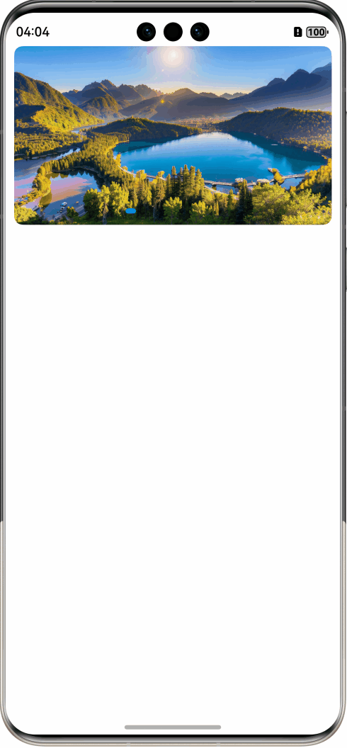
.borderRadius(10)效果如下:
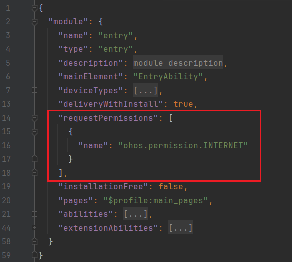
【补充1:网络权限申请方法】
找到项目中的 module.json5 文件, 然后在里面添加这样一段代码:
(2)常用属性
| 属性名 | 参数名 | 类型 | 说明 |
|---|---|---|---|
| autoPlay | value | boolean | 设置子组件是否自动播放,默认值:false |
| interval | value | number | 设置使用自动播放时播放的时间间隔,默认值:3000,单位是 ms |
| loop | value | boolean | 设置是否开启循环,默认值:true |
| itemSpace | value | number | string |
设置子组件与子组件之间间隙。不支持设置百分比 类型为 number 时,默认单位 vp。 类型为 string 时,需要显式指定像素单位,如'10px';未指定像素单位时,如'10',单位为 vp。 |
| vertical | value | boolean |
是否为纵向滑动。true为纵向滑动,false为横向滑动。 默认值:false |
| displayCount |
value (必填) |
number | string | SwiperAutoFill |
视窗内显示的子元素个数。 默认值:1 |
|
swipeByGroup (非必填) |
boolean |
是否按组进行翻页。 如果设为 true,在翻页时会按组进行翻页,每组内子元素的数量为 displayCount value 的值; 如果为false,则为默认翻页行为,即按照子元素进行翻页 |
|
| indicator | value | DotIndicator | DigitIndicator | boolean |
设置可选导航点指示器样式。 |
以上常用属性的示例代码如下所示(为了演示方便,轮播间隔时间我设为1s,实际开发中会慢一些):
@StorageProp(BreakPointConstants.BREAK_POINT_KEY) currentBreakPoint: string = BreakPointConstants.SM

Swiper() {
  ForEach(this.imageArr, (item: string, index: number) => {
    Image(item)
      .width('95%')
      .borderRadius(10)
      .onClick(() => promptAction.openToast({ message: `点击了第 ${index + 1} 张图片` }))
  })
}
.borderRadius(10) // 设置圆角
.autoPlay(true) // 开启自动播放
.loop(true) // 循环播放
.interval(1000) // 轮播间隔时间
.itemSpace(15) // 图片之间的间距
.displayCount(
  // 根据当前屏幕宽度设置图片数量,以适配不同设备
  new BreakPointType({ sm: 1, md: 2, lg: 3 }).getValue(this.currentBreakPoint)
)
.indicator(
  new DotIndicator()
    .itemWidth(8)  // Swiper组件圆点导航指示器的宽
    .itemHeight(8)  // Swiper组件圆点导航指示器的高
    .selectedItemWidth(12)  // Swiper组件圆点导航指示器的选中状态的宽
    .selectedItemHeight(8)  // Swiper组件圆点导航指示器的选中状态的高
    .selectedColor(0xFFFFFF)  // 圆点导航指示器的选中状态颜色
    .color(0x80000000) // 圆点导航指示器的颜色
)
在代码中我做了不同设备的断点适配,大家可以在文章末尾的Gitee链接中克隆项目自行切换不同设备进行尝试。
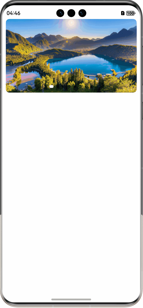
效果如下图所示:
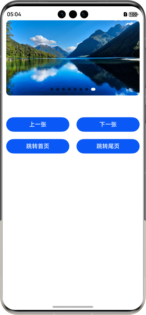
(3)关于控制器的使用
SwiperController:Swiper容器组件的控制器,可以将此对象绑定至Swiper组件,实现控制Swiper翻页等功能。使用方法如下:
class ButtonArrayType {
text: string
onClick: () => void
constructor(text: string, onClick: () => void) {
this.text = text
this.onClick = onClick
}
}
// Swiper 组件控制器
public swiperController = new SwiperController()
// 控制按钮数组
@State buttonArray: ButtonArrayType[] = [
new ButtonArrayType("上一张", () => {
this.swiperController.showPrevious()
}),
new ButtonArrayType("下一张", () => {
this.swiperController.showNext()
}),
new ButtonArrayType("跳转首页", () => {
this.swiperController.changeIndex(0)
}),
new ButtonArrayType("跳转尾页", () => {
this.swiperController.changeIndex(this.imageArr.length - 1)
})
]
Swiper(this.swiperController) {
ForEach(this.imageArr, (item: string, index: number) => {
Image(item)
.width('95%')
.borderRadius(10)
.onClick(() => promptAction.openToast({ message: `点击了第 ${index + 1} 张图片` }))
})
}
.borderRadius(10) // 设置圆角
.autoPlay(true) // 开启自动播放
.loop(true) // 循环播放
.interval(1000) // 轮播间隔时间
.itemSpace(15) // 图片之间的间距
.displayCount(
// 根据当前屏幕宽度设置图片数量,以适配不同设备
new BreakPointType({ sm: 1, md: 2, lg: 3 }).getValue(this.currentBreakPoint)
)
.indicator(
new DotIndicator()
.itemWidth(8) // Swiper组件圆点导航指示器的宽
.itemHeight(8) // Swiper组件圆点导航指示器的高
.selectedItemWidth(12) // Swiper组件圆点导航指示器的选中状态的宽
.selectedItemHeight(8) // Swiper组件圆点导航指示器的选中状态的高
.selectedColor(0xFFFFFF) // 圆点导航指示器的选中状态颜色
.color(0x80000000) // 圆点导航指示器的颜色
)
.onChange(event => {
if (event == 0) {
promptAction.openToast({ message: "您当前正在浏览第 1 张图片" })
}
})
GridRow({ columns: { sm: 2, md: 4, lg: 4 }, gutter: 20 }) {
ForEach(this.buttonArray, (item: IButtonArrayType, index: number) => {
GridCol() {
Button(item.text)
.width("100%")
.onClick(() => item.onClick())
}
.width('100%')
})
}
.width('95%')
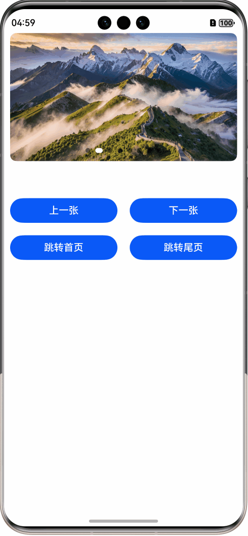
.margin({ top: 60 })效果如下图所示:
【补充2:关于在不同尺寸设备上的显示效果,这里通过旋转手机屏幕来展示 sm、md 断点的显示效果】
| sm |
md |
 |
 |
完整代码请参考 Gitee 链接: Swiper 组件

讨论HarmonyOS开发技术,专注于API与组件、DevEco Studio、测试、元服务和应用上架分发等。
更多推荐

 13
13 0
0- 0


 已为社区贡献4条内容

所有评论(0)