【鸿蒙开发】系统组件Button,TextInput
鸿蒙开发arkui组件,Button组件,TextInput组件
Button组件
Button按钮组件,可快速创建不同样式的按钮。
只能包含单个子组件
方法1:
Button(options?: {type?: ButtonType, stateEffect?: boolean})
参数:
|
参数名 |
参数类型 |
必填 |
参数描述 |
|---|---|---|---|
|
type |
ButtonType |
否 |
描述按钮显示样式。 默认值:ButtonType.Capsule |
|
stateEffect |
boolean |
否 |
按钮按下时是否开启按压态显示效果,当设置为false时,按压效果关闭。 默认值:true 说明:当开启按压态显示效果,开发者设置状态样式时,会基于状态样式设置完成后的背景色再进行颜色叠加。 |
方法2:
Button(label?: ResourceStr, options?: { type?: ButtonType, stateEffect?: boolean })
使用文本内容创建相应的按钮组件,此时Button无法包含子组件。
参数:
|
参数名 |
参数类型 |
必填 |
参数描述 |
|---|---|---|---|
|
label |
否 |
按钮文本内容。 |
|
|
options |
{ type?: ButtonType, stateEffect?: boolean } |
否 |
见方法1参数说明。 |
属性:
除支持通用属性外,还支持以下属性:
|
名称 |
参数类型 |
描述 |
|---|---|---|
|
type |
ButtonType |
设置Button样式。 默认值:ButtonType.Capsule 从API version 9开始,该接口支持在ArkTS卡片中使用。 |
|
stateEffect |
boolean |
按钮按下时是否开启按压态显示效果,当设置为false时,按压效果关闭。 默认值:true 从API version 9开始,该接口支持在ArkTS卡片中使用。 |
TextInput组件
TextInput单行文本输入框组件。
无子组件
接口:
TextInput(value?:{placeholder?: ResourceStr, text?: ResourceStr, controller?: TextInputController})
参数:
|
参数名 |
参数类型 |
必填 |
参数描述 |
|---|---|---|---|
|
placeholder |
否 |
设置无输入时的提示文本。 |
|
|
text |
否 |
设置输入框当前的文本内容。当组件设置stateStyles等刷新属性时,建议通过onChange事件将状态变量与文本实时绑定,避免组件刷新时TextArea中的文本内容异常。 |
|
|
controller8+ |
否 |
设置TextInput控制器。 |
属性:
除支持通用属性外,还支持以下属性:
|
名称 |
参数类型 |
描述 |
|---|---|---|
|
type |
设置输入框类型。 默认值:InputType.Normal |
|
|
placeholderColor |
设置placeholder文本颜色。 |
|
|
placeholderFont |
设置placeholder文本样式。 |
|
|
enterKeyType |
EnterKeyType |
设置输入法回车键类型。 默认值:EnterKeyType.Done |
|
caretColor |
设置输入框光标颜色。 |
|
|
maxLength |
number |
设置文本的最大输入字符数。 |
|
inputFilter8+ |
{ value: ResourceStr, error?: (value: string) => void } |
正则表达式,匹配表达式的输入允许显示,不匹配的输入将被过滤。目前仅支持单个字符匹配,不支持字符串匹配。 - value:设置正则表达式。 - error:正则匹配失败时,返回被过滤的内容。 |
|
copyOption9+ |
设置输入的文本是否可复制。 设置CopyOptions.None时,当前TextInput中的文字无法被复制或剪切,仅支持粘贴。 |
|
|
showPasswordIcon9+ |
boolean |
密码输入模式时,输入框末尾的图标是否显示。 默认值:true |
|
style9+ |
TextInputStyle |
设置输入框为默认风格或内联输入风格。 默认值:TextInputStyle.Default |
|
textAlign9+ |
设置输入文本在输入框中的对齐方式。 默认值:TextAlign.Start |
示例
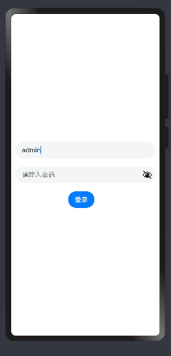
点击登录按钮,根据录入的值进行提示
@Entry
@Component
struct APage {
  @State userName: string = ""
  @State pwd: string = ""

  validate() {
    return this.userName !== "" && this.pwd !== ""
  }

  build() {
    Row() {
      Column({ space: 20 }) {
        TextInput({ placeholder: "请输入用户名", text: "admin" })
          .height(40)
          .onChange((value) => {
            this.userName = value
          })
        TextInput({ placeholder: "请输入密码" })
          .type(InputType.Password)
          .height(40)
          .onChange((value) => {
            this.pwd = value
          })

        Row() {
          Button("登录")
            .margin({
              right: 20
            })
            .enabled(this.validate())
            .onClick(() => {
              if (this.userName === "admin" && this.pwd === "123456") {
                AlertDialog.show({
                  message: "登录成功"
                })
              } else {
                AlertDialog.show({
                  message: "登录失败"
                })
              }
            })
        }
      }
      .width('100%')
      .height('100%')
      .justifyContent(FlexAlign.Center)
    }
    .padding({
      left: 10,
      right: 10
    })
  }
}

讨论HarmonyOS开发技术,专注于API与组件、DevEco Studio、测试、元服务和应用上架分发等。
更多推荐

 14
14 0
0- 0


 已为社区贡献14条内容

所有评论(0)