ARKUI--创建网格(GridGridltem)
ARKUI–创建网格(Grid/Gridltem)概述网格布局是由“行”和“列”分割的单元格所组成,通过指定“项目”所在的单元格做出各种各样的布局。网格布局具有较强的页面均分能力,子组件占比控制能力,是一种重要自适应布局,其使用场景有九宫格图片展示、日历、计算器等。ArkUI提供了Grid容器组件和子组件GridItem,用于构建网格布局。Grid用于设置网格布局相关参数,GridItem定义子组
ARKUI–创建网格(Grid/Gridltem)
概述
网格布局是由“行”和“列”分割的单元格所组成,通过指定“项目”所在的单元格做出各种各样的布局。网格布局具有较强的页面均分能力,子组件占比控制能力,是一种重要自适应布局,其使用场景有九宫格图片展示、日历、计算器等。
ArkUI提供了Grid容器组件和子组件GridItem,用于构建网格布局。Grid用于设置网格布局相关参数,GridItem定义子组件相关特征。Grid组件支持使用条件渲染、循环渲染、懒加载等方式生成子组件。
布局与约束
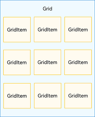
Grid组件为网格容器,其中容器内各条目对应一个GridItem组件,如下图所示。
图1 Grid与GridItem组件关系
说明
Grid的子组件必须是GridItem组件。
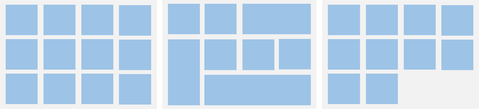
网格布局是一种二维布局。Grid组件支持自定义行列数和每行每列尺寸占比、设置子组件横跨几行或者几列,同时提供了垂直和水平布局能力。当网格容器组件尺寸发生变化时,所有子组件以及间距会等比例调整,从而实现网格布局的自适应能力。根据Grid的这些布局能力,可以构建出不同样式的网格布局,如下图所示。
图2 网格布局
如果Grid组件设置了宽高属性,则其尺寸为设置值。如果没有设置宽高属性,Grid组件的尺寸默认适应其父组件的尺寸。
Grid组件根据行列数量与占比属性的设置,可以分为三种布局情况:
- 行、列数量与占比同时设置:Grid只展示固定行列数的元素,其余元素不展示,且Grid不可滚动。(推荐使用该种布局方式)
- 只设置行、列数量与占比中的一个:元素按照设置的方向进行排布,超出的元素可通过滚动的方式展示。
- 行列数量与占比都不设置:元素在布局方向上排布,其行列数由布局方向、单个网格的宽高等多个属性共同决定。超出行列容纳范围的元素不展示,且Grid不可滚动。
设置排列方式
设置行列数量与占比
通过设置行列数量与尺寸占比可以确定网格布局的整体排列方式。Grid组件提供了rowsTemplate和columnsTemplate属性用于设置网格布局行列数量与尺寸占比。
rowsTemplate和columnsTemplate属性值是一个由多个空格和’数字+fr’间隔拼接的字符串,fr的个数即网格布局的行或列数,fr前面的数值大小,用于计算该行或列在网格布局宽度上的占比,最终决定该行或列宽度。
图3 行列数量占比示例
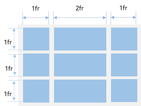
如上图所示,构建的是一个三行三列的网格布局,其在垂直方向上分为三等份,每行占一份;在水平方向上分为四等份,第一列占一份,第二列占两份,第三列占一份。
只要将rowsTemplate的值为’1fr 1fr 1fr’,同时将columnsTemplate的值为’1fr 2fr 1fr’,即可实现上述网格布局。
Grid() { ...}.rowsTemplate('1fr 1fr 1fr').columnsTemplate('1fr 2fr 1fr')
说明
当Grid组件设置了rowsTemplate或columnsTemplate时,Grid的layoutDirection、maxCount、minCount、cellLength属性不生效,属性说明可参考Grid-属性。
设置子组件所占行列数
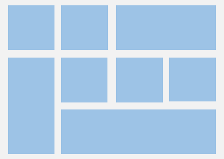
除了大小相同的等比例网格布局,由不同大小的网格组成不均匀分布的网格布局场景在实际应用中十分常见,如下图所示。在Grid组件中,可以通过创建Grid时传入合适的GridLayoutOptions实现如图所示的单个网格横跨多行或多列的场景,其中,irregularIndexes和onGetIrregularSizeByIndex可对仅设置rowsTemplate或columnsTemplate的Grid使用;onGetRectByIndex可对同时设置rowsTemplate和columnsTemplate的Grid使用。
图4 不均匀网格布局
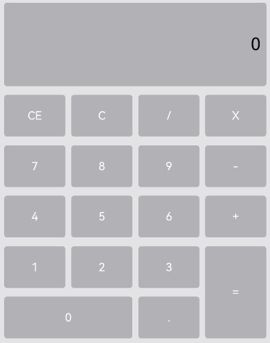
例如计算器的按键布局就是常见的不均匀网格布局场景。如下图,计算器中的按键“0”和“=”,按键“0”横跨第一、二两列,按键“=”横跨第五、六两行。使用Grid构建的网格布局,其行列标号从0开始,依次编号。
图5 计算器
在网格中,可以通过onGetRectByIndex返回的[rowStart,columnStart,rowSpan,columnSpan]来实现跨行跨列布局,其中rowStart和columnStart属性表示指定当前元素起始行号和起始列号,rowSpan和columnSpan属性表示指定当前元素的占用行数和占用列数。
所以“0”按键横跨第一列和第二列,“=”按键横跨第五行和第六行,只要将“0”对应onGetRectByIndex的rowStart和columnStart设为5和0,rowSpan和columnSpan设为1和2,将“=”对应onGetRectByIndex的rowStart和columnStart设为4和3,rowSpan和columnSpan设为2和1即可。
layoutOptions: GridLayoutOptions = {  regularSize: [1, 1],  onGetRectByIndex: (index: number) => {    if (index == key1) { // key1是“0”按键对应的index      return [5, 0, 1, 2]    } else if (index == key2) { // key2是“=”按键对应的index      return [4, 3, 2, 1]    }    // ...    // 这里需要根据具体布局返回其他item的位置  }}
Grid(undefined, this.layoutOptions) {  // ...}.columnsTemplate('1fr 1fr 1fr 1fr').rowsTemplate('2fr 1fr 1fr 1fr 1fr 1fr')
设置主轴方向
使用Grid构建网格布局时,若没有设置行列数量与占比,可以通过layoutDirection设置网格布局的主轴方向,决定子组件的排列方式。此时可以结合minCount和maxCount属性来约束主轴方向上的网格数量。
图6 主轴方向示意图
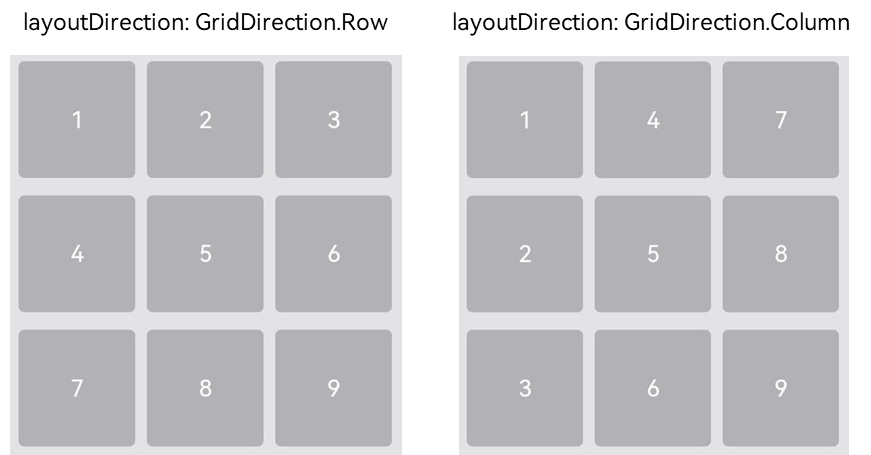
当前layoutDirection设置为Row时,先从左到右排列,排满一行再排下一行。当前layoutDirection设置为Column时,先从上到下排列,排满一列再排下一列,如上图所示。此时,将maxCount属性设为3,表示主轴方向上最大显示的网格单元数量为3。
Grid() { ...}.maxCount(3).layoutDirection(GridDirection.Row)
说明
- layoutDirection属性仅在不设置rowsTemplate和columnsTemplate时生效,此时元素在layoutDirection方向上排列。
- 仅设置rowsTemplate时,Grid主轴为水平方向,交叉轴为垂直方向。
- 仅设置columnsTemplate时,Grid主轴为垂直方向,交叉轴为水平方向。
在网格布局中显示数据
网格布局采用二维布局的方式组织其内部元素,如下图所示。
图7 通用办公服务
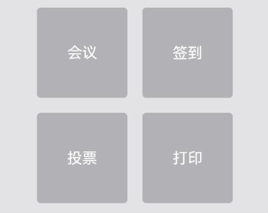
Grid组件可以通过二维布局的方式显示一组GridItem子组件。
Grid() {  GridItem() {    Text('会议')      ...  }
  GridItem() {    Text('签到')      ...  }
  GridItem() {    Text('投票')      ...  }
  GridItem() {    Text('打印')      ...  }}.rowsTemplate('1fr 1fr').columnsTemplate('1fr 1fr')
对于内容结构相似的多个GridItem,通常更推荐使用ForEach语句中嵌套GridItem的形式,来减少重复代码。
@Entry@Componentstruct OfficeService {  @State services: Array<string> = ['会议', '投票', '签到', '打印']
  build() {    Column() {      Grid() {        ForEach(this.services, (service:string) => {          GridItem() {            Text(service)          }        }, (service:string):string => service)      }      .rowsTemplate(('1fr 1fr') as string)      .columnsTemplate(('1fr 1fr') as string)    }  }}
设置行列间距
在两个网格单元之间的网格横向间距称为行间距,网格纵向间距称为列间距,如下图所示。
图8 网格的行列间距
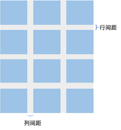
通过Grid的rowsGap和columnsGap可以设置网格布局的行列间距。在图5所示的计算器中,行间距为15vp,列间距为10vp。
Grid() { ...}.columnsGap(10).rowsGap(15)
构建可滚动的网格布局
可滚动的网格布局常用在文件管理、购物或视频列表等页面中,如下图所示。在设置Grid的行列数量与占比时,如果仅设置行、列数量与占比中的一个,即仅设置rowsTemplate或仅设置columnsTemplate属性,网格单元按照设置的方向排列,超出Grid显示区域后,Grid拥有可滚动能力。
图9 横向可滚动网格布局

如果设置的是columnsTemplate,Grid的滚动方向为垂直方向;如果设置的是rowsTemplate,Grid的滚动方向为水平方向。
如上图所示的横向可滚动网格布局,只要设置rowsTemplate属性的值且不设置columnsTemplate属性,当内容超出Grid组件宽度时,Grid可横向滚动进行内容展示。
@Entry@Componentstruct Shopping {  @State services: Array<string> = ['直播', '进口']
  build() {    Column({ space: 5 }) {      Grid() {        ForEach(this.services, (service: string, index) => {          GridItem() {          }          .width('25%')        }, (service:string):string => service)      }      .rowsTemplate('1fr 1fr') // 只设置rowsTemplate属性,当内容超出Grid区域时,可水平滚动。      .rowsGap(15)    }  }}
控制滚动位置
与新闻列表的返回顶部场景类似,控制滚动位置功能在网格布局中也很常用,例如下图所示日历的翻页功能。
图10 日历翻页
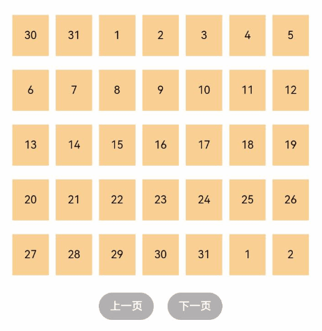
Grid组件初始化时,可以绑定一个Scroller对象,用于进行滚动控制,例如通过Scroller对象的scrollPage方法进行翻页。
private scroller: Scroller = new Scroller()
在日历页面中,用户在点击“下一页”按钮时,应用响应点击事件,通过指定scrollPage方法的参数next为true,滚动到下一页。
Column({ space: 5 }) {  Grid(this.scroller) {  }  .columnsTemplate('1fr 1fr 1fr 1fr 1fr 1fr 1fr')
  Row({space: 20}) {    Button('上一页')      .onClick(() => {        this.scroller.scrollPage({          next: false        })      })
    Button('下一页')      .onClick(() => {        this.scroller.scrollPage({          next: true        })      })  }}
性能优化
与长列表的处理类似,循环渲染适用于数据量较小的布局场景,当构建具有大量网格项的可滚动网格布局时,推荐使用数据懒加载方式实现按需迭代加载数据,从而提升列表性能。
关于按需加载优化的具体实现可参考数据懒加载章节中的示例。
当使用懒加载方式渲染网格时,为了更好的滚动体验,减少滑动时出现白块,Grid组件中也可通过cachedCount属性设置GridItem的预加载数量,只在懒加载LazyForEach中生效。
设置预加载数量后,会在Grid显示区域前后各缓存cachedCount*列数个GridItem,超出显示和缓存范围的GridItem会被释放。
Grid() { LazyForEach(this.dataSource, () => { GridItem() { } })}.cachedCount(3)
ARKUI–创建轮播(Swiper)
Swiper组件提供滑动轮播显示的能力。Swiper本身是一个容器组件,当设置了多个子组件后,可以对这些子组件进行轮播显示。通常,在一些应用首页显示推荐的内容时,需要用到轮播显示的能力。
针对复杂页面场景,可以使用 Swiper 组件的预加载机制,利用主线程的空闲时间来提前构建和布局绘制组件,优化滑动体验。
布局与约束
Swiper作为一个容器组件,如果设置了自身尺寸属性,则在轮播显示过程中均以该尺寸生效。如果自身尺寸属性未被设置,则分两种情况:如果设置了prevMargin或者nextMargin属性,则Swiper自身尺寸会跟随其父组件;如果未设置prevMargin或者nextMargin属性,则会自动根据子组件的大小设置自身的尺寸。
循环播放
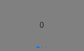
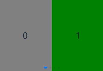
通过loop属性控制是否循环播放,该属性默认值为true。
当loop为true时,在显示第一页或最后一页时,可以继续往前切换到前一页或者往后切换到后一页。如果loop为false,则在第一页或最后一页时,无法继续向前或者向后切换页面。
- loop为true
Swiper() {  Text('0')    .width('90%')    .height('100%')    .backgroundColor(Color.Gray)    .textAlign(TextAlign.Center)    .fontSize(30)
  Text('1')    .width('90%')    .height('100%')    .backgroundColor(Color.Green)    .textAlign(TextAlign.Center)    .fontSize(30)
  Text('2')    .width('90%')    .height('100%')    .backgroundColor(Color.Pink)    .textAlign(TextAlign.Center)    .fontSize(30)}.loop(true)

- loop为false
Swiper() { // ...}.loop(false)

自动轮播
Swiper通过设置autoPlay属性,控制是否自动轮播子组件。该属性默认值为false。
autoPlay为true时,会自动切换播放子组件,子组件与子组件之间的播放间隔通过interval属性设置。interval属性默认值为3000,单位毫秒。
Swiper() { // ...}.loop(true).autoPlay(true).interval(1000)

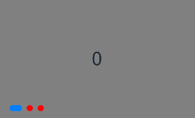
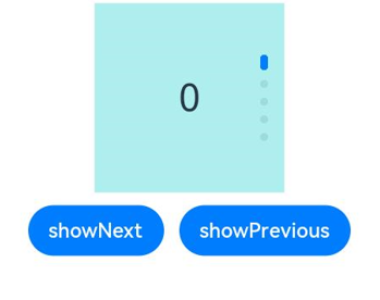
导航点样式
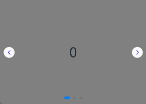
Swiper提供了默认的导航点样式和导航点箭头样式,导航点默认显示在Swiper下方居中位置,开发者也可以通过indicator属性自定义导航点的位置和样式,导航点箭头默认不显示。
通过indicator属性,开发者可以设置导航点相对于Swiper组件上下左右四个方位的位置,同时也可以设置每个导航点的尺寸、颜色、蒙层和被选中导航点的颜色。
- 导航点使用默认样式
Swiper() {  Text('0')    .width('90%')    .height('100%')    .backgroundColor(Color.Gray)    .textAlign(TextAlign.Center)    .fontSize(30)
  Text('1')    .width('90%')    .height('100%')    .backgroundColor(Color.Green)    .textAlign(TextAlign.Center)    .fontSize(30)
  Text('2')    .width('90%')    .height('100%')    .backgroundColor(Color.Pink)    .textAlign(TextAlign.Center)    .fontSize(30)}
- 自定义导航点样式
导航点直径设为30vp,左边距为0,导航点颜色设为红色。
Swiper() { // ...}.indicator( Indicator.dot() .left(0) .itemWidth(15) .itemHeight(15) .selectedItemWidth(30) .selectedItemHeight(15) .color(Color.Red) .selectedColor(Color.Blue))
Swiper通过设置displayArrow属性,可以控制导航点箭头的大小、位置、颜色,底板的大小及颜色,以及鼠标悬停时是否显示箭头。
- 箭头使用默认样式
Swiper() { // ...}.displayArrow(true, false)
- 自定义箭头样式
箭头显示在组件两侧,大小为18vp,导航点箭头颜色设为蓝色。
Swiper() { // ...}.displayArrow({ showBackground: true, isSidebarMiddle: true, backgroundSize: 24, backgroundColor: Color.White, arrowSize: 18, arrowColor: Color.Blue }, false)
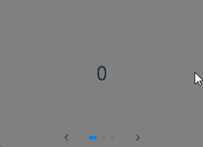
页面切换方式
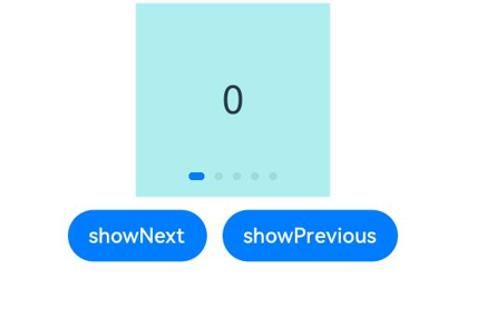
Swiper支持手指滑动、点击导航点和通过控制器三种方式切换页面,以下示例展示通过控制器切换页面的方法。
@Entry@Componentstruct SwiperDemo {  private swiperController: SwiperController = new SwiperController();
  build() {    Column({ space: 5 }) {      Swiper(this.swiperController) {        Text('0')          .width(250)          .height(250)          .backgroundColor(Color.Gray)          .textAlign(TextAlign.Center)          .fontSize(30)        Text('1')          .width(250)          .height(250)          .backgroundColor(Color.Green)          .textAlign(TextAlign.Center)          .fontSize(30)        Text('2')          .width(250)          .height(250)          .backgroundColor(Color.Pink)          .textAlign(TextAlign.Center)          .fontSize(30)      }      .indicator(true)
      Row({ space: 12 }) {        Button('showNext')          .onClick(() => {            this.swiperController.showNext(); // 通过controller切换到后一页          })        Button('showPrevious')          .onClick(() => {            this.swiperController.showPrevious(); // 通过controller切换到前一页          })      }.margin(5)    }.width('100%')    .margin({ top: 5 })  }}

轮播方向
Swiper支持水平和垂直方向上进行轮播,主要通过vertical属性控制。
当vertical为true时,表示在垂直方向上进行轮播;为false时,表示在水平方向上进行轮播。vertical默认值为false。
- 设置水平方向上轮播。
Swiper() { // ...}.indicator(true).vertical(false)
- 设置垂直方向轮播。
Swiper() { // ...}.indicator(true).vertical(true)
每页显示多个子页面
Swiper支持在一个页面内同时显示多个子组件,通过displayCount属性设置。
Swiper() { Text('0') .width(250) .height(250) .backgroundColor(Color.Gray) .textAlign(TextAlign.Center) .fontSize(30) Text('1') .width(250) .height(250) .backgroundColor(Color.Green) .textAlign(TextAlign.Center) .fontSize(30) Text('2') .width(250) .height(250) .backgroundColor(Color.Pink) .textAlign(TextAlign.Center) .fontSize(30) Text('3') .width(250) .height(250) .backgroundColor(Color.Blue) .textAlign(TextAlign.Center) .fontSize(30)}.indicator(true).displayCount(2)
自定义切换动画
Swiper支持通过customContentTransition设置自定义切换动画,可以在回调中对视窗内所有页面逐帧设置透明度、缩放比例、位移、渲染层级等属性实现自定义切换动画。
@Entry@Componentstruct SwiperCustomAnimationExample {  private DISPLAY_COUNT: number = 2  private MIN_SCALE: number = 0.75
  @State backgroundColors: Color[] = [Color.Green, Color.Blue, Color.Yellow, Color.Pink, Color.Gray, Color.Orange]  @State opacityList: number[] = []  @State scaleList: number[] = []  @State translateList: number[] = []  @State zIndexList: number[] = []
  aboutToAppear(): void {    for (let i = 0; i < this.backgroundColors.length; i++) {      this.opacityList.push(1.0)      this.scaleList.push(1.0)      this.translateList.push(0.0)      this.zIndexList.push(0)    }  }
  build() {    Column() {      Swiper() {        ForEach(this.backgroundColors, (backgroundColor: Color, index: number) => {          Text(index.toString()).width('100%').height('100%').fontSize(50).textAlign(TextAlign.Center)            .backgroundColor(backgroundColor)            .opacity(this.opacityList[index])            .scale({ x: this.scaleList[index], y: this.scaleList[index] })            .translate({ x: this.translateList[index] })            .zIndex(this.zIndexList[index])        })      }      .height(300)      .indicator(false)      .displayCount(this.DISPLAY_COUNT, true)      .customContentTransition({        timeout: 1000,        transition: (proxy: SwiperContentTransitionProxy) => {          if (proxy.position <= proxy.index % this.DISPLAY_COUNT || proxy.position >= this.DISPLAY_COUNT + proxy.index % this.DISPLAY_COUNT) {            // 同组页面完全滑出视窗外时,重置属性值            this.opacityList[proxy.index] = 1.0            this.scaleList[proxy.index] = 1.0            this.translateList[proxy.index] = 0.0            this.zIndexList[proxy.index] = 0          } else {            // 同组页面未滑出视窗外时,对同组中左右两个页面,逐帧根据position修改属性值            if (proxy.index % this.DISPLAY_COUNT === 0) {              this.opacityList[proxy.index] = 1 - proxy.position / this.DISPLAY_COUNT              this.scaleList[proxy.index] = this.MIN_SCALE + (1 - this.MIN_SCALE) * (1 - proxy.position / this.DISPLAY_COUNT)              this.translateList[proxy.index] = - proxy.position * proxy.mainAxisLength + (1 - this.scaleList[proxy.index]) * proxy.mainAxisLength / 2.0            } else {              this.opacityList[proxy.index] = 1 - (proxy.position - 1) / this.DISPLAY_COUNT              this.scaleList[proxy.index] = this.MIN_SCALE + (1 - this.MIN_SCALE) * (1 - (proxy.position - 1) / this.DISPLAY_COUNT)              this.translateList[proxy.index] = - (proxy.position - 1) * proxy.mainAxisLength - (1 - this.scaleList[proxy.index]) * proxy.mainAxisLength / 2.0            }            this.zIndexList[proxy.index] = -1          }        }      })    }.width('100%')  }}

代码
@Entry
@Component
struct SwiperPage {
  @State message: string = '轮播';
  sc:SwiperController=new SwiperController()

  build() {
    Column(){
      Swiper(this.sc){
        Text('1')
          .height(300).width('100%').backgroundColor('red')
        Text('2')
          .height(300).width('100%').backgroundColor('blue')
        Text('3')
          .height(300).width('100%').backgroundColor('green')
        Text('4')
          .height(300).width('100%').backgroundColor(Color.Pink)
        Text('5')
          .height(300).width('100%').backgroundColor(Color.Yellow)
      }
      .autoPlay(true).interval(1000)
      // .vertical(true)//垂直滚动
      .indicator(
        Indicator.dot()
          .left(10)
          .itemWidth(10)
          .selectedItemWidth(20)
          .itemHeight(10)
          .selectedItemHeight(20)
          .color(Color.Black)
          .selectedColor(Color.White)
      )
      // .displayArrow(true,false)
      .displayArrow({
        showBackground:true,
        isSidebarMiddle:true,
        backgroundSize:50,
        backgroundColor:Color.Orange,
        arrowSize:30,
        arrowColor:Color.White
      },false)
      .displayCount(2)

      Row(){
        Button('上一页').onClick(()=>this.sc.showPrevious())
        Button('下一页').onClick(()=>this.sc.showNext())
      }
    }
    .height('100%')
    .width('100%')
  }
}
Swiper
滑块视图容器,提供子组件滑动轮播显示的能力。

该组件从API Version 7开始支持。后续版本如有新增内容,则采用上角标单独标记该内容的起始版本。
Swiper组件通用属性clip的默认值为true。
子组件
可以包含子组件。

- 子组件类型:系统组件和自定义组件,支持渲染控制类型(if/else、ForEach、LazyForEach和Repeat)。
- Swiper子组件的visibility属性设置为None,Swiper的displayCount属性设置为’auto’时,对应子组件在视窗内不占位,但不影响导航点个数。
- Swiper子组件的visibility属性设置为None,或者visibility属性设置为Hidden时,对应子组件不显示,但依然会在视窗内占位。
- 当Swiper子组件个数小于等于Swiper组件内容区内显示的节点总个数(totalDisplayCount = DisplayCount + prevMargin? (1 : 0) + nextMargin? (1 : 0))时,一般按照非循环模式布局处理,此时,前后边距对应子组件不显示,但依然会在视窗内占位。Swiper组件按照totalDisplayCount个数判断测算规格。例外情况如下:
- 当Swiper子组件个数等于Swiper组件内容区内显示的节点总个数且prevMargin和nextMargin都生效时,设置loop为true支持循环。
- 当Swiper子组件个数等于Swiper组件DisplayCount数 + 1,且prevMargin和nextMargin至少一个生效时,设置loop为true会生成截图占位组件(如果使用图片异步加载等显示耗时较长的组件可能不能正确生成截图,不建议在该场景开启循环),支持循环。
- 当Swiper子组件设置了offset属性时,会按照子组件的层级进行绘制,层级高的子组件会覆盖层级低的子组件。例如,Swiper包含3个子组件,其中第3个子组件设置了offset({ x : 100 }),那么在横向循环滑动中,第3个子组件会覆盖第1个子组件,此时可设置第1个子组件的zIndex属性值大于第3个子组件,使第1个子组件层级高于第3个子组件。
- 不建议在执行翻页动画过程中增加或减少子组件,会导致未进行动画的子组件提前进入视窗,引起显示异常。
接口
Swiper(controller?: SwiperController)
元服务API: 从API version 11开始,该接口支持在元服务中使用。
参数:
| 参数名 | 参数类型 | 必填 | 参数描述 |
|---|---|---|---|
| controller | SwiperController | 否 | 给组件绑定一个控制器,用来控制组件翻页。 |
属性
除支持通用属性外,还支持以下属性:
index
index(value: number)
设置当前在容器中显示的子组件的索引值。设置小于0或大于等于子组件数量时,按照默认值0处理。
从API version 10开始,该属性支持$$双向绑定变量。
卡片能力: 从API version 10开始,该接口支持在ArkTS卡片中使用。
元服务API: 从API version 11开始,该接口支持在元服务中使用。
系统能力: SystemCapability.ArkUI.ArkUI.Full
参数:
| 参数名 | 类型 | 必填 | 说明 |
|---|---|---|---|
| value | number | 是 | 当前在容器中显示的子组件的索引值。默认值:0 |
autoPlay
autoPlay(value: boolean)
设置子组件是否自动播放。
loop为false时,自动轮播到最后一页时停止轮播。手势切换后不是最后一页时继续播放。
卡片能力: 从API version 10开始,该接口支持在ArkTS卡片中使用。
元服务API: 从API version 11开始,该接口支持在元服务中使用。
系统能力: SystemCapability.ArkUI.ArkUI.Full
参数:
| 参数名 | 类型 | 必填 | 说明 |
|---|---|---|---|
| value | boolean | 是 | 子组件是否自动播放。默认值:false |
interval
interval(value: number)
设置使用自动播放时播放的时间间隔。
卡片能力: 从API version 10开始,该接口支持在ArkTS卡片中使用。
元服务API: 从API version 11开始,该接口支持在元服务中使用。
系统能力: SystemCapability.ArkUI.ArkUI.Full
参数:
| 参数名 | 类型 | 必填 | 说明 |
|---|---|---|---|
| value | number | 是 | 自动播放时播放的时间间隔。默认值:3000单位:毫秒 |
indicator
indicator(value: DotIndicator | DigitIndicator | boolean)
设置可选导航点指示器样式。
卡片能力: 从API version 10开始,该接口支持在ArkTS卡片中使用。
元服务API: 从API version 11开始,该接口支持在元服务中使用。
系统能力: SystemCapability.ArkUI.ArkUI.Full
参数:
| 参数名 | 类型 | 必填 | 说明 |
|---|---|---|---|
| value | DotIndicator10+ | DigitIndicator10+ | boolean | 是 | 可选导航点指示器样式。- DotIndicator:圆点指示器样式。- DigitIndicator:数字指示器样式。- boolean:是否启用导航点指示器。默认值:true默认类型:DotIndicator |
loop
loop(value: boolean)
设置是否开启循环。设置为true时表示开启循环,在LazyForEach懒循环加载模式下,加载的组件数量建议大于5个。
卡片能力: 从API version 10开始,该接口支持在ArkTS卡片中使用。
元服务API: 从API version 11开始,该接口支持在元服务中使用。
系统能力: SystemCapability.ArkUI.ArkUI.Full
参数:
| 参数名 | 类型 | 必填 | 说明 |
|---|---|---|---|
| value | boolean | 是 | 是否开启循环。默认值:true |
duration
duration(value: number)
设置子组件切换的动画时长。
duration需要和curve一起使用。
curve默认曲线为弹簧曲线,此时动画时长只受曲线自身参数影响,不再受duration的控制,如果希望动画时长受到duration控制,需要给curve属性设置合理的曲线。
元服务API: 从API version 11开始,该接口支持在元服务中使用。
系统能力: SystemCapability.ArkUI.ArkUI.Full
参数:
| 参数名 | 类型 | 必填 | 说明 |
|---|---|---|---|
| value | number | 是 | 子组件切换的动画时长。默认值:400单位:毫秒 |
vertical
vertical(value: boolean)
设置是否为纵向滑动。
卡片能力: 从API version 10开始,该接口支持在ArkTS卡片中使用。
元服务API: 从API version 11开始,该接口支持在元服务中使用。
系统能力: SystemCapability.ArkUI.ArkUI.Full
参数:
| 参数名 | 类型 | 必填 | 说明 |
|---|---|---|---|
| value | boolean | 是 | 是否为纵向滑动。默认值:false |
itemSpace
itemSpace(value: number | string)
设置子组件与子组件之间间隙。不支持设置百分比。
类型为number时,默认单位vp。类型为string时,需要显式指定像素单位,如’10px’。
卡片能力: 从API version 10开始,该接口支持在ArkTS卡片中使用。
元服务API: 从API version 11开始,该接口支持在元服务中使用。
系统能力: SystemCapability.ArkUI.ArkUI.Full
参数:
| 参数名 | 类型 | 必填 | 说明 |
|---|---|---|---|
| value | number | string | 是 | 子组件与子组件之间间隙。默认值:0 |
displayMode
displayMode(value: SwiperDisplayMode)
设置主轴方向上元素排列的模式,优先以displayCount设置的个数显示,displayCount未设置时本属性生效。
卡片能力: 从API version 10开始,该接口支持在ArkTS卡片中使用。
元服务API: 从API version 11开始,该接口支持在元服务中使用。
系统能力: SystemCapability.ArkUI.ArkUI.Full
参数:
| 参数名 | 类型 | 必填 | 说明 |
|---|---|---|---|
| value | SwiperDisplayMode | 是 | 主轴方向上元素排列的模式。默认值:SwiperDisplayMode.STRETCH |
cachedCount8+
cachedCount(value: number)
设置预加载子组件个数, 以当前页面为基准,加载当前显示页面的前后个数。例如cachedCount=1时,会将当前显示的页面的前面一页和后面一页的子组件都预加载。如果设置为按组翻页,即displayCount的swipeByGroup参数设为true,预加载时会以组为基本单位。例如cachedCount=1,swipeByGroup=true时,会将当前组的前面一组和后面一组的子组件都预加载。
卡片能力: 从API version 10开始,该接口支持在ArkTS卡片中使用。
元服务API: 从API version 11开始,该接口支持在元服务中使用。
系统能力: SystemCapability.ArkUI.ArkUI.Full
参数:
| 参数名 | 类型 | 必填 | 说明 |
|---|---|---|---|
| value | number | 是 | 预加载子组件个数。默认值:1 |
disableSwipe8+
disableSwipe(value: boolean)
设置禁用组件滑动切换功能。
卡片能力: 从API version 10开始,该接口支持在ArkTS卡片中使用。
元服务API: 从API version 11开始,该接口支持在元服务中使用。
系统能力: SystemCapability.ArkUI.ArkUI.Full
参数:
| 参数名 | 类型 | 必填 | 说明 |
|---|---|---|---|
| value | boolean | 是 | 禁用组件滑动切换功能。默认值:false |
curve8+
curve(value: Curve | string | ICurve)
设置Swiper的动画曲线, 默认为弹簧插值曲线,常用曲线参考Curve枚举说明,也可以通过插值计算模块提供的接口创建自定义的插值曲线对象。
卡片能力: 从API version 10开始,该接口支持在ArkTS卡片中使用。
元服务API: 从API version 11开始,该接口支持在元服务中使用。
系统能力: SystemCapability.ArkUI.ArkUI.Full
参数:
| 参数名 | 类型 | 必填 | 说明 |
|---|---|---|---|
| value | Curve | string | ICurve10+ | 是 | Swiper的动画曲线。默认值:interpolatingSpring(-1, 1, 328, 34) |
indicatorStyle(deprecated)
indicatorStyle(value?: IndicatorStyle)
设置导航点样式。
从API version 8开始支持,从API version 10开始不再维护,建议使用indicator代替。
系统能力: SystemCapability.ArkUI.ArkUI.Full
参数:
| 参数名 | 类型 | 必填 | 说明 |
|---|---|---|---|
| value | IndicatorStyle | 否 | 导航点样式。 |
displayCount8+
displayCount(value: number | string | SwiperAutoFill, swipeByGroup?: boolean)
设置Swiper视窗内元素显示个数。
字符串类型仅支持设置为’auto’。
使用number类型且设置小于等于0时,按默认值1显示。
使用number类型时,子组件按照主轴均分Swiper宽度(减去displayCount-1个itemSpace)的方式进行主轴拉伸(收缩)布局。
使用SwiperAutoFill类型时,通过设置一个子组件最小宽度值minSize,会根据Swiper当前宽度和minSize值自动计算并更改一页内元素显示个数。当minSize为空或者小于等于0时,Swiper显示1列。
当按组进行翻页时,如果最后一组的子元素数量小于displayCount时,会使用占位子元素补齐。占位子元素只是用于布局占位,不显示任何内容。在占位子元素的位置会直接显示Swiper自身的背景样式。
在按组翻页时,判断翻页的拖拽距离阈值条件,会更新为Swiper自身宽度的一半。(按子元素翻页时,该阈值为子元素自身宽度的一半)。
卡片能力: 从API version 10开始,该接口支持在ArkTS卡片中使用。
元服务API: 从API version 11开始,该接口支持在元服务中使用。
系统能力: SystemCapability.ArkUI.ArkUI.Full
参数:
| 参数名 | 类型 | 必填 | 说明 |
|---|---|---|---|
| value | number | string | SwiperAutoFill10+ | 是 | 视窗内显示的子元素个数。默认值:1 |
| swipeByGroup11+ | boolean | 否 | 是否按组进行翻页。如果设为true,在翻页时会按组进行翻页,每组内子元素的数量为displayCount value的值;如果为false,则为默认翻页行为,即按照子元素进行翻页。默认值:false |
effectMode8+
effectMode(value: EdgeEffect)
设置边缘滑动效果,loop = false时生效。 目前支持的滑动效果参见EdgeEffect的枚举说明。控制器接口调用时不生效回弹。
卡片能力: 从API version 10开始,该接口支持在ArkTS卡片中使用。
元服务API: 从API version 11开始,该接口支持在元服务中使用。
系统能力: SystemCapability.ArkUI.ArkUI.Full
参数:
| 参数名 | 类型 | 必填 | 说明 |
|---|---|---|---|
| value | EdgeEffect | 是 | 边缘滑动效果。默认值:EdgeEffect.Spring |
displayArrow10+
displayArrow(value: ArrowStyle | boolean, isHoverShow?: boolean)
设置导航点箭头样式。
元服务API: 从API version 11开始,该接口支持在元服务中使用。
系统能力: SystemCapability.ArkUI.ArkUI.Full
参数:
| 参数名 | 类型 | 必填 | 说明 |
|---|---|---|---|
| value | boolean | ArrowStyle | 是 | 支持设置箭头和底板样式,异常场景使用ArrowStyle对象中的默认值。 |
| isHoverShow | boolean | 否 | 设置鼠标悬停时是否显示箭头。默认值:false**说明:**isHoverShow为false时,常驻显示箭头,支持点击翻页。isHoverShow为true时,只有在鼠标悬停时才会显示箭头,并支持点击翻页。 |
nextMargin10+
nextMargin(value: Length, ignoreBlank?:boolean)
设置后边距,用于露出后一项的一小部分。仅当SwiperDisplayMode为STRETCH模式时生效。
当主轴方向为横向布局时,nextMargin/prevMargin中任意一个大于子组件测算的宽度,nextMargin和prevMargin均不显示。
当主轴方向为纵向布局时,nextMargin/prevMargin中任意一个大于子组件测算的高度,nextMargin和prevMargin均不显示。
元服务API: 从API version 11开始,该接口支持在元服务中使用。
系统能力: SystemCapability.ArkUI.ArkUI.Full
参数:
| 参数名 | 类型 | 必填 | 说明 |
|---|---|---|---|
| value | Length | 是 | 后边距。默认值:0 |
| ignoreBlank12+ | boolean | 否 | 非loop场景下尾页不显示nextMargin。默认值:false**说明:**尾页场景下,prevMargin和nextMargin的值相加作为左边边距显示前一个页面。 |
prevMargin10+
prevMargin(value: Length, ignoreBlank?:boolean)
设置前边距,用于露出前一项的一小部分。仅当SwiperDisplayMode为STRETCH模式时生效。
当主轴方向为横向布局时,nextMargin/prevMargin中任意一个大于子组件测算的宽度,nextMargin和prevMargin均不显示。
当主轴方向为纵向布局时,nextMargin/prevMargin中任意一个大于子组件测算的高度,nextMargin和prevMargin均不显示。
元服务API: 从API version 11开始,该接口支持在元服务中使用。
系统能力: SystemCapability.ArkUI.ArkUI.Full
参数:
| 参数名 | 类型 | 必填 | 说明 |
|---|---|---|---|
| value | Length | 是 | 前边距。默认值:0 |
| ignoreBlank12+ | boolean | 否 | 非loop场景下首页不显示prevMargin。默认值:false**说明:**首页场景下,prevMargin和nextMargin的值相加作为右边边距显示后一个页面。 |
nestedScroll11+
nestedScroll(value: SwiperNestedScrollMode)
设置Swiper组件和父组件的嵌套滚动模式。loop为true时Swiper组件没有边缘,不会触发父组件嵌套滚动。
元服务API: 从API version 11开始,该接口支持在元服务中使用。
系统能力: SystemCapability.ArkUI.ArkUI.Full
参数:
| 参数名 | 类型 | 必填 | 说明 |
|---|---|---|---|
| value | SwiperNestedScrollMode | 是 | Swiper组件和父组件的嵌套滚动模式。默认值:SwiperNestedScrollMode.SELF_ONLY |

由于Swiper的抛滑动画逻辑和其它滚动类组件不同(Swiper一次只能滑动一页,抛滑时做翻页动画),当Swiper内嵌套其它滚动组件时,如果Swiper的翻页动画已经启动,将无法接受子节点上传的滚动偏移量。这时Swiper的翻页动画和子节点的边缘效果动画会同时执行。
indicatorInteractive12+
indicatorInteractive(value: boolean)
设置禁用组件导航点交互功能。设置为true时表示导航点可交互。
系统能力: SystemCapability.ArkUI.ArkUI.Full
参数:
| 参数名 | 类型 | 必填 | 说明 |
|---|---|---|---|
| value | boolean | 是 | 导航点是否可交互。默认值:true |
IndicatorStyle(deprecated)对象说明
从API version 8开始支持,从API version 10开始不再维护,建议使用indicator代替。
系统能力: SystemCapability.ArkUI.ArkUI.Full
| 名称 | 类型 | 必填 | 描述 |
|---|---|---|---|
| left | Length | 否 | 设置导航点距离Swiper组件左边的距离。 |
| top | Length | 否 | 设置导航点距离Swiper组件顶部的距离。 |
| right | Length | 否 | 设置导航点距离Swiper组件右边的距离。 |
| bottom | Length | 否 | 设置导航点距离Swiper组件底部的距离。 |
| size | Length | 否 | 设置导航点的直径,不支持设置百分比。默认值:6vp |
| mask | boolean | 否 | 设置是否显示导航点蒙层样式。 |
| color | ResourceColor | 否 | 设置导航点的颜色。 |
| selectedColor | ResourceColor | 否 | 设置选中的导航点的颜色。 |
SwiperDisplayMode枚举说明
Swiper在主轴上的尺寸大小模式枚举。
卡片能力: 从API version 10开始,该接口支持在ArkTS卡片中使用。
系统能力: SystemCapability.ArkUI.ArkUI.Full
| 名称 | 描述 |
|---|---|
| Stretch(deprecated) | Swiper滑动一页的宽度为Swiper组件自身的宽度。从API version 10开始不再维护,建议使用STRETCH代替。 |
| AutoLinear(deprecated) | Swiper滑动一页的宽度为子组件宽度中的最大值。从API version 10开始不再维护,建议使用Scroller.scrollTo代替。 |
| STRETCH10+ | Swiper滑动一页的宽度为Swiper组件自身的宽度。元服务API: 从API version 11开始,该接口支持在元服务中使用。 |
| AUTO_LINEAR(deprecated) | Swiper滑动一页的宽度为视窗内最左侧子组件的宽度。从API version 10开始支持,从API version 12开始不再维护,建议使用Scroller.scrollTo代替。元服务API: 从API version 11开始,该接口支持在元服务中使用。 |
SwiperNestedScrollMode11+枚举说明
Swiper组件和父组件的嵌套滚动模式枚举。
元服务API: 从API version 11开始,该接口支持在元服务中使用。
系统能力: SystemCapability.ArkUI.ArkUI.Full
| 名称 | 值 | 描述 |
|---|---|---|
| SELF_ONLY | 0 | Swiper只自身滚动,不与父组件联动。 |
| SELF_FIRST | 1 | Swiper自身先滚动,自身滚动到边缘以后父组件滚动。父组件滚动到边缘以后,如果父组件有边缘效果,则父组件触发边缘效果,否则Swiper触发边缘效果。 |
SwiperController
Swiper容器组件的控制器,可以将此对象绑定至Swiper组件,可以通过它控制翻页。
卡片能力: 从API version 10开始,该接口支持在ArkTS卡片中使用。
元服务API: 从API version 11开始,该接口支持在元服务中使用。
系统能力: SystemCapability.ArkUI.ArkUI.Full
导入对象
let controller: SwiperController = new SwiperController()
constructor
constructor()
SwiperController的构造函数。
卡片能力: 从API version 10开始,该接口支持在ArkTS卡片中使用。
元服务API: 从API version 11开始,该接口支持在元服务中使用。
系统能力: SystemCapability.ArkUI.ArkUI.Full
showNext
showNext()
翻至下一页。翻页带动效切换过程,时长通过duration指定。
卡片能力: 从API version 10开始,该接口支持在ArkTS卡片中使用。
元服务API: 从API version 11开始,该接口支持在元服务中使用。
系统能力: SystemCapability.ArkUI.ArkUI.Full
showPrevious
showPrevious()
翻至上一页。翻页带动效切换过程,时长通过duration指定。
卡片能力: 从API version 10开始,该接口支持在ArkTS卡片中使用。
元服务API: 从API version 11开始,该接口支持在元服务中使用。
系统能力: SystemCapability.ArkUI.ArkUI.Full
changeIndex12+
changeIndex(index: number, useAnimation?: boolean)
翻至指定页面。
卡片能力: 从API version 12开始,该接口支持在ArkTS卡片中使用。
系统能力: SystemCapability.ArkUI.ArkUI.Full
参数:
| 参数名 | 参数类型 | 必填项 | 参数描述 |
|---|---|---|---|
| index | number | 是 | 指定页面在Swiper中的索引值。 |
| useAnimation | boolean | 否 | 设置翻至指定页面时是否有动效,true表示有动效,false表示没有动效。默认值:false。 |
finishAnimation
finishAnimation(callback?: () => void)
停止播放动画。
卡片能力: 从API version 10开始,该接口支持在ArkTS卡片中使用。
元服务API: 从API version 11开始,该接口支持在元服务中使用。
系统能力: SystemCapability.ArkUI.ArkUI.Full
参数:
| 参数名 | 参数类型 | 必填项 | 参数描述 |
|---|---|---|---|
| callback | () => void | 否 | 动画结束的回调。 |
Indicator10+
设置导航点距离Swiper组件距离。
卡片能力: 从API version 10开始,该接口支持在ArkTS卡片中使用。
元服务API: 从API version 11开始,该接口支持在元服务中使用。
系统能力: SystemCapability.ArkUI.ArkUI.Full
| 参数名 | 参数类型 | 必填项 | 参数描述 |
|---|---|---|---|
| left | Length | 是 | 设置导航点距离Swiper组件左边的距离。默认值:0单位:vp |
| top | Length | 是 | 设置导航点距离Swiper组件顶部的距离。默认值:0单位:vp |
| right | Length | 是 | 设置导航点距离Swiper组件右边的距离。默认值:0单位:vp |
| bottom | Length | 是 | 设置导航点距离Swiper组件底部的距离。默认值:0单位:vp |
| start12+ | LengthMetrics | 是 | 在RTL模式下为航点距离Swiper组件右边的距离,在LTR模式下为导航点距离Swiper组件左边的距离默认值:0单位:vp |
| end12+ | LengthMetrics | 是 | 在RTL模式下为航点距离Swiper组件左边的距离,在LTR模式下为导航点距离Swiper组件右边的距离。默认值:0单位:vp |
| static dot | 无 | 是 | 返回一个DotIndicator对象。 |
| static digit | 无 | 是 | 返回一个DigitIndicator对象。 |
DotIndicator10+
圆点指示器属性及功能继承自Indicator。
卡片能力: 从API version 10开始,该接口支持在ArkTS卡片中使用。
元服务API: 从API version 11开始,该接口支持在元服务中使用。
系统能力: SystemCapability.ArkUI.ArkUI.Full
| 参数名 | 参数类型 | 必填项 | 参数描述 |
|---|---|---|---|
| itemWidth | Length | 是 | 设置Swiper组件圆点导航指示器的宽,不支持设置百分比。默认值:6单位:vp |
| itemHeight | Length | 是 | 设置Swiper组件圆点导航指示器的高,不支持设置百分比。默认值:6单位:vp |
| selectedItemWidth | Length | 是 | 设置选中Swiper组件圆点导航指示器的宽,不支持设置百分比。默认值:12单位:vp |
| selectedItemHeight | Length | 是 | 设置选中Swiper组件圆点导航指示器的高,不支持设置百分比。默认值:6单位:vp |
| mask | boolean | 是 | 设置是否显示Swiper组件圆点导航指示器的蒙版样式。默认值:false |
| color | ResourceColor | 是 | 设置Swiper组件圆点导航指示器的颜色。默认值:‘#182431’(10%透明度) |
| selectedColor | ResourceColor | 是 | 设置选中Swiper组件圆点导航指示器的颜色。默认值:‘#007DFF’ |
| maxDisplayCount12+ | number | 是 | 设置圆点导航点指示器样式下,导航点显示个数最大值,当实际导航点个数大于最大导航点个数时,会生效超长效果样式,样式如示例5所示。默认值:这个属性没有默认值,如果设置异常值那等同于没有超长显示效果。取值范围:6-9**说明:**1、超长显示场景,目前暂时不支持交互功能(包括:手指点击拖拽、鼠标操作等)。2、在超长显示场景下,中间页面对应的选中导航点的位置,并不是完全固定的,取决于之前的翻页操作序列。 |
constructor
constructor()
DotIndicator的构造函数。
卡片能力: 从API version 10开始,该接口支持在ArkTS卡片中使用。
元服务API: 从API version 11开始,该接口支持在元服务中使用。
系统能力: SystemCapability.ArkUI.ArkUI.Full

按压导航点时,导航点会放大至1.33倍显示,因此非按压态时导航点的可见范围边界至实际范围边界存在一定距离,该距离会随着itemWidth、itemHeight、selectedItemWidth、selectedItemHeight等参数变大而变大。
DigitIndicator10+
数字指示器属性及功能继承自Indicator。
卡片能力: 从API version 10开始,该接口支持在ArkTS卡片中使用。
元服务API: 从API version 11开始,该接口支持在元服务中使用。
系统能力: SystemCapability.ArkUI.ArkUI.Full
| 参数名 | 参数类型 | 必填项 | 参数描述 |
|---|---|---|---|
| fontColor | ResourceColor | 是 | 设置Swiper组件数字导航点的字体颜色。默认值:‘#ff182431’ |
| selectedFontColor | ResourceColor | 是 | 设置选中Swiper组件数字导航点的字体颜色。默认值:‘#ff182431’ |
| digitFont | {size?:Lengthweight?:number | FontWeight | string} | 是 | 设置Swiper组件数字导航点的字体样式:- size:数字导航点指示器的字体大小,不支持设置百分比。默认值:14vp- weight:数字导航点指示器的字重。默认值:FontWeight.Normal |
| selectedDigitFont | {size?:Lengthweight?:number | FontWeight | string} | 是 | 设置选中Swiper组件数字导航点的字体样式:- size:数字导航点选中指示器的字体大小,不支持设置百分比。默认值:14vp- weight:数字导航点选中指示器的字重。默认值:FontWeight.Normal |
constructor
constructor()
DigitIndicator的构造函数。
卡片能力: 从API version 10开始,该接口支持在ArkTS卡片中使用。
元服务API: 从API version 11开始,该接口支持在元服务中使用。
系统能力: SystemCapability.ArkUI.ArkUI.Full
ArrowStyle10+
左右箭头属性。
元服务API: 从API version 11开始,该接口支持在元服务中使用。
系统能力: SystemCapability.ArkUI.ArkUI.Full
| 参数名 | 参数类型 | 必填项 | 参数描述 |
|---|---|---|---|
| showBackground | boolean | 否 | 设置箭头底板是否显示。默认值:false |
| isSidebarMiddle | boolean | 否 | 设置箭头显示位置。默认值:false默认显示在导航点指示器两侧。 |
| backgroundSize | Length | 否 | 设置底板大小。在导航点两侧显示:默认值:24vp在组件两侧显示:默认值:32vp不支持设置百分比。 |
| backgroundColor | ResourceColor | 否 | 设置底板颜色。在导航点两侧显示:默认值:‘#00000000’在组件两侧显示:默认值:’#19182431’ |
| arrowSize | Length | 否 | 设置箭头大小。在导航点两侧显示时:默认值:18vp在组件两侧显示时:默认值:24vp**说明:**showBackground为true时,arrowSize为backgroundSize的3/4。不支持设置百分比。 |
| arrowColor | ResourceColor | 否 | 设置箭头颜色。默认值:‘#182431’ |
SwiperAutoFill10+
自适应属性。
卡片能力: 从API version 10开始,该接口支持在ArkTS卡片中使用。
元服务API: 从API version 11开始,该接口支持在元服务中使用。
系统能力: SystemCapability.ArkUI.ArkUI.Full
| 参数名 | 参数类型 | 必填项 | 参数描述 |
|---|---|---|---|
| minSize | VP | 是 | 设置元素显示最小宽度。默认值:0 |
事件
除支持通用事件外,还支持以下事件:
onChange
onChange(event: (index: number) => void)
当前显示的子组件索引变化时触发该事件,返回值为当前显示的子组件的索引值。
Swiper组件结合LazyForEach使用时,不能在onChange事件里触发子页面UI的刷新。
卡片能力: 从API version 10开始,该接口支持在ArkTS卡片中使用。
元服务API: 从API version 11开始,该接口支持在元服务中使用。
系统能力: SystemCapability.ArkUI.ArkUI.Full
参数:
| 参数名 | 类型 | 必填 | 说明 |
|---|---|---|---|
| index | number | 是 | 当前显示元素的索引。 |
onAnimationStart9+
onAnimationStart(event: (index: number, targetIndex: number, extraInfo: SwiperAnimationEvent) => void)
切换动画开始时触发该回调。参数为动画开始前的index值(不是最终结束动画的index值),多列Swiper时,index为最左侧组件的索引。
卡片能力: 从API version 10开始,该接口支持在ArkTS卡片中使用。
元服务API: 从API version 11开始,该接口支持在元服务中使用。
系统能力: SystemCapability.ArkUI.ArkUI.Full
参数:
| 参数名 | 类型 | 必填 | 说明 |
|---|---|---|---|
| index | number | 是 | 当前显示元素的索引。 |
| targetIndex10+ | number | 是 | 切换动画目标元素的索引。 |
| extraInfo10+ | SwiperAnimationEvent | 是 | 动画相关信息,包括主轴方向上当前显示元素和目标元素相对Swiper起始位置的位移,以及离手速度。 |
onAnimationEnd9+
onAnimationEnd(event: (index: number, extraInfo: SwiperAnimationEvent) => void)
切换动画结束时触发该回调。
当Swiper切换动效结束时触发,包括动画过程中手势中断,通过SwiperController调用finishAnimation。参数为动画结束后的index值,多列Swiper时,index为最左侧组件的索引。
卡片能力: 从API version 10开始,该接口支持在ArkTS卡片中使用。
元服务API: 从API version 11开始,该接口支持在元服务中使用。
系统能力: SystemCapability.ArkUI.ArkUI.Full
参数:
| 参数名 | 类型 | 必填 | 说明 |
|---|---|---|---|
| index | number | 是 | 当前显示元素的索引。 |
| extraInfo10+ | SwiperAnimationEvent | 是 | 动画相关信息,只返回主轴方向上当前显示元素相对于Swiper起始位置的位移。 |
onGestureSwipe10+
onGestureSwipe(event: (index: number, extraInfo: SwiperAnimationEvent) => void)
在页面跟手滑动过程中,逐帧触发该回调。多列Swiper时,index为最左侧组件的索引。
元服务API: 从API version 11开始,该接口支持在元服务中使用。
系统能力: SystemCapability.ArkUI.ArkUI.Full
参数:
| 参数名 | 类型 | 必填 | 说明 |
|---|---|---|---|
| index | number | 是 | 当前显示元素的索引。 |
| extraInfo | SwiperAnimationEvent | 是 | 动画相关信息,只返回主轴方向上当前显示元素相对于Swiper起始位置的位移。 |
customContentTransition12+
customContentTransition(transition: SwiperContentAnimatedTransition)
自定义Swiper页面切换动画。在页面跟手滑动和离手后执行切换动画的过程中,会对视窗内所有页面逐帧触发回调,开发者可以在回调中设置透明度、缩放比例、位移等属性来自定义切换动画。
使用说明:
1、循环场景下,设置prevMargin和nextMargin属性,使得Swiper前后端显示同一页面时,该接口不生效。
2、在页面跟手滑动和离手后执行切换动画的过程中,会对视窗内所有页面逐帧触发SwiperContentTransitionProxy回调。例如,当视窗内有下标为0、1的两个页面时,会每帧触发两次index值分别为0和1的回调。
3、设置displayCount属性的swipeByGroup参数为true时,若同组中至少有一个页面在视窗内时,则会对同组中所有页面触发回调,若同组所有页面均不在视窗内时,则会一起下渲染树。
4、在页面跟手滑动和离手后执行切换动画的过程中,默认动画(页面滑动)依然会发生,若希望页面不滑动,可以设置主轴方向上负的位移(translate属性)来抵消页面滑动。例如:当displayCount属性值为2,视窗内有下标为0、1的两个页面时,页面水平滑动过程中,可以逐帧设置第0页的translate属性在x轴上的值为-position * mainAxisLength来抵消第0页的位移,设置第1页的translate属性在x轴上的值为-(position - 1) * mainAxisLength来抵消第1页的位移。
系统能力: SystemCapability.ArkUI.ArkUI.Full
参数:
| 参数名 | 类型 | 必填 | 说明 |
|---|---|---|---|
| transition | SwiperContentAnimatedTransition | 是 | Swiper自定义切换动画相关信息。 |
onContentDidScroll12+
onContentDidScroll(handler: ContentDidScrollCallback)
监听Swiper页面滑动事件。
使用说明:
1、循环场景下,设置prevMargin和nextMargin属性,使得Swiper前后端显示同一页面时,该接口不生效。
2、在页面滑动过程中,会对视窗内所有页面逐帧触发ContentDidScrollCallback回调。例如,当视窗内有下标为0、1的两个页面时,会每帧触发两次index值分别为0和1的回调。
3、设置displayCount属性的swipeByGroup参数为true时,若同组中至少有一个页面在视窗内时,则会对同组中所有页面触发回调。
系统能力: SystemCapability.ArkUI.ArkUI.Full
参数:
| 参数名 | 类型 | 必填 | 说明 |
|---|---|---|---|
| handler | ContentDidScrollCallback | 是 | Swiper滑动时触发的回调。 |
SwiperContentAnimatedTransition12+对象说明
Swiper自定义切换动画相关信息。
系统能力: SystemCapability.ArkUI.ArkUI.Full
| 参数名 | 类型 | 必填 | 说明 |
|---|---|---|---|
| timeout | number | 否 | Swiper自定义切换动画超时时间。从页面执行默认动画(页面滑动)至移出视窗外的第一帧开始计时,如果到达该时间后,开发者仍未调用SwiperContentTransitionProxy的finishTransition接口通知Swiper组件此页面的自定义动画已结束,那么组件就会认为此页面的自定义动画已结束,立即将该页面节点下渲染树。单位ms,默认值为0。 |
| transition | Callback<SwiperContentTransitionProxy> | 是 | 自定义切换动画具体内容。 |
SwiperContentTransitionProxy12+对象说明
Swiper自定义切换动画执行过程中,返回给开发者的proxy对象。开发者可通过该对象获取自定义动画视窗内的页面信息,同时,也可以通过调用该对象的finishTransition接口通知Swiper组件页面自定义动画已结束。
系统能力: SystemCapability.ArkUI.ArkUI.Full
属性
| 参数名 | 类型 | 必填 | 说明 |
|---|---|---|---|
| selectedIndex | number | 是 | 当前选中页面的索引。 |
| index | number | 是 | 视窗内页面的索引。 |
| position | number | 是 | index页面相对于Swiper主轴起始位置(selectedIndex对应页面的起始位置)的移动比例。 |
| mainAxisLength | number | 是 | index对应页面在主轴方向上的长度。 |
例如,当前选中的子组件的索引为0,从第0页切换到第1页的动画过程中,每帧都会对视窗内所有页面触发回调,当视窗内有第0
页和第1页两页时,每帧会触发两次回调。其中第一次回调的selectedIndex为0,index为0,position为当前帧第0页相对于动画开
始前第0页的移动比例,mainAxisLength为主轴方向上第0页的长度;第二次回调的selectedIndex仍为0,index为1,position为当
前帧第1页相对于动画开始前第0页的移动比例,mainAxisLength为主轴方向上第1页的长度。
若动画曲线为弹簧插值曲线,从第0页切换到第1页的动画过程中,可能会因为离手时的位置和速度,先过滑到第2页,再回弹到
第1页,该过程中每帧会对视窗内第1页和第2页触发回调。
finishTransition12+
finishTransition()
通知Swiper组件,此页面的自定义动画已结束。
系统能力: SystemCapability.ArkUI.ArkUI.Full
ContentDidScrollCallback12+类型说明
Swiper滑动时触发的回调,参数可参考SwiperContentTransitionProxy中的说明。
ContentDidScrollCallback = (selectedIndex: number, index: number, position: number, mainAxisLength: number) => void
系统能力: SystemCapability.ArkUI.ArkUI.Full
| 参数名 | 类型 | 必填 | 说明 |
|---|---|---|---|
| selectedIndex | number | 是 | 当前选中页面的索引。 |
| index | number | 是 | 视窗内页面的索引。 |
| position | number | 是 | index页面相对于Swiper主轴起始位置(selectedIndex对应页面的起始位置)的移动比例。 |
| mainAxisLength | number | 是 | index对应页面在主轴方向上的长度。 |
示例
示例1
该示例实现了通过indicatorInteractive控制导航点交互功能。
// xxx.ets
class MyDataSource implements IDataSource {
  private list: number[] = []

  constructor(list: number[]) {
    this.list = list
  }

  totalCount(): number {
    return this.list.length
  }

  getData(index: number): number {
    return this.list[index]
  }

  registerDataChangeListener(listener: DataChangeListener): void {
  }

  unregisterDataChangeListener() {
  }
}

@Entry
@Component
struct SwiperExample {
  private swiperController: SwiperController = new SwiperController()
  private data: MyDataSource = new MyDataSource([])

  aboutToAppear(): void {
    let list: number[] = []
    for (let i = 1; i <= 10; i++) {
      list.push(i);
    }
    this.data = new MyDataSource(list)
  }

  build() {
    Column({ space: 5 }) {
      Swiper(this.swiperController) {
        LazyForEach(this.data, (item: string) => {
          Text(item.toString())
            .width('90%')
            .height(160)
            .backgroundColor(0xAFEEEE)
            .textAlign(TextAlign.Center)
            .fontSize(30)
        }, (item: string) => item)
      }
      .cachedCount(2)
      .index(1)
      .autoPlay(true)
      .interval(4000)
      .loop(true)
      .indicatorInteractive(true)
      .duration(1000)
      .itemSpace(0)
      .indicator( // 设置圆点导航点样式
        new DotIndicator()
          .itemWidth(15)
          .itemHeight(15)
          .selectedItemWidth(15)
          .selectedItemHeight(15)
          .color(Color.Gray)
          .selectedColor(Color.Blue))
      .displayArrow({ // 设置导航点箭头样式
        showBackground: true,
        isSidebarMiddle: true,
        backgroundSize: 24,
        backgroundColor: Color.White,
        arrowSize: 18,
        arrowColor: Color.Blue
      }, false)
      .curve(Curve.Linear)
      .onChange((index: number) => {
        console.info(index.toString())
      })
      .onGestureSwipe((index: number, extraInfo: SwiperAnimationEvent) => {
        console.info("index: " + index)
        console.info("current offset: " + extraInfo.currentOffset)
      })
      .onAnimationStart((index: number, targetIndex: number, extraInfo: SwiperAnimationEvent) => {
        console.info("index: " + index)
        console.info("targetIndex: " + targetIndex)
        console.info("current offset: " + extraInfo.currentOffset)
        console.info("target offset: " + extraInfo.targetOffset)
        console.info("velocity: " + extraInfo.velocity)
      })
      .onAnimationEnd((index: number, extraInfo: SwiperAnimationEvent) => {
        console.info("index: " + index)
        console.info("current offset: " + extraInfo.currentOffset)
      })

      Row({ space: 12 }) {
        Button('showNext')
          .onClick(() => {
            this.swiperController.showNext()
          })
        Button('showPrevious')
          .onClick(() => {
            this.swiperController.showPrevious()
          })
      }.margin(5)
    }.width('100%')
    .margin({ top: 5 })
  }
}

示例2
// xxx.ets
class MyDataSource implements IDataSource {
  private list: number[] = []

  constructor(list: number[]) {
    this.list = list
  }

  totalCount(): number {
    return this.list.length
  }

  getData(index: number): number {
    return this.list[index]
  }

  registerDataChangeListener(listener: DataChangeListener): void {
  }

  unregisterDataChangeListener() {
  }
}

@Entry
@Component
struct SwiperExample {
  private swiperController: SwiperController = new SwiperController()
  private data: MyDataSource = new MyDataSource([])

  aboutToAppear(): void {
    let list: number[] = []
    for (let i = 1; i <= 10; i++) {
      list.push(i);
    }
    this.data = new MyDataSource(list)
  }

  build() {
    Column({ space: 5 }) {
      Swiper(this.swiperController) {
        LazyForEach(this.data, (item: string) => {
          Text(item.toString())
            .width('90%')
            .height(160)
            .backgroundColor(0xAFEEEE)
            .textAlign(TextAlign.Center)
            .fontSize(30)
        }, (item: string) => item)
      }
      .cachedCount(2)
      .index(1)
      .autoPlay(true)
      .interval(4000)
      .indicator(Indicator.digit() // 设置数字导航点样式
        .right("43%")
        .top(200)
        .fontColor(Color.Gray)
        .selectedFontColor(Color.Gray)
        .digitFont({ size: 20, weight: FontWeight.Bold })
        .selectedDigitFont({ size: 20, weight: FontWeight.Normal }))
      .loop(true)
      .duration(1000)
      .itemSpace(0)
      .displayArrow(true, false)

      Row({ space: 12 }) {
        Button('showNext')
          .onClick(() => {
            this.swiperController.showNext()
          })
        Button('showPrevious')
          .onClick(() => {
            this.swiperController.showPrevious()
          })
      }.margin(5)
    }.width('100%')
    .margin({ top: 5 })
  }
}

示例3
// xxx.ets
class MyDataSource implements IDataSource {
  private list: number[] = []

  constructor(list: number[]) {
    this.list = list
  }

  totalCount(): number {
    return this.list.length
  }

  getData(index: number): number {
    return this.list[index]
  }

  registerDataChangeListener(listener: DataChangeListener): void {
  }

  unregisterDataChangeListener() {
  }
}

@Entry
@Component
struct SwiperExample {
  private swiperController: SwiperController = new SwiperController()
  private data: MyDataSource = new MyDataSource([])

  aboutToAppear(): void {
    let list: number[] = []
    for (let i = 1; i <= 10; i++) {
      list.push(i);
    }
    this.data = new MyDataSource(list)
  }

  build() {
    Column({ space: 5 }) {
      Swiper(this.swiperController) {
        LazyForEach(this.data, (item: string) => {
          Text(item.toString())
            .width('90%')
            .height(160)
            .backgroundColor(0xAFEEEE)
            .textAlign(TextAlign.Center)
            .fontSize(30)
        }, (item: string) => item)
      }
      .displayCount(3, true)
      .autoPlay(true)
      .interval(4000)
      .loop(true)
      .duration(1000)
      .itemSpace(10)
      .indicator( // 设置圆点导航点样式
        new DotIndicator()
          .itemWidth(15)
          .itemHeight(15)
          .selectedItemWidth(15)
          .selectedItemHeight(15)
          .color(Color.Gray)
          .selectedColor(Color.Blue))

      Row({ space: 12 }) {
        Button('showNext')
          .onClick(() => {
            this.swiperController.showNext()
          })
        Button('showPrevious')
          .onClick(() => {
            this.swiperController.showPrevious()
          })
      }.margin(5)
    }.width('100%')
    .margin({ top: 5 })
  }
}

示例4
本示例通过customContentTransition接口实现了自定义Swiper页面切换动画。
// xxx.ets
@Entry
@Component
struct SwiperCustomAnimationExample {
  private DISPLAY_COUNT: number = 2
  private MIN_SCALE: number = 0.75

  @State backgroundColors: Color[] = [Color.Green, Color.Blue, Color.Yellow, Color.Pink, Color.Gray, Color.Orange]
  @State opacityList: number[] = []
  @State scaleList: number[] = []
  @State translateList: number[] = []
  @State zIndexList: number[] = []

  aboutToAppear(): void {
    for (let i = 0; i < this.backgroundColors.length; i++) {
      this.opacityList.push(1.0)
      this.scaleList.push(1.0)
      this.translateList.push(0.0)
      this.zIndexList.push(0)
    }
  }

  build() {
    Column() {
      Swiper() {
        ForEach(this.backgroundColors, (backgroundColor: Color, index: number) => {
          Text(index.toString()).width('100%').height('100%').fontSize(50).textAlign(TextAlign.Center)
            .backgroundColor(backgroundColor)
            // 自定义动画变化透明度、缩放页面、抵消系统默认位移、渲染层级等
            .opacity(this.opacityList[index])
            .scale({ x: this.scaleList[index], y: this.scaleList[index] })
            .translate({ x: this.translateList[index] })
            .zIndex(this.zIndexList[index])
        })
      }
      .height(300)
      .indicator(false)
      .displayCount(this.DISPLAY_COUNT, true)
      .customContentTransition({
        // 页面移除视窗时超时1000ms下渲染树
        timeout: 1000,
        // 对视窗内所有页面逐帧回调transition,在回调中修改opacity、scale、translate、zIndex等属性值,实现自定义动画
        transition: (proxy: SwiperContentTransitionProxy) => {
          if (proxy.position <= proxy.index % this.DISPLAY_COUNT || proxy.position >= this.DISPLAY_COUNT + proxy.index % this.DISPLAY_COUNT) {
            // 同组页面往左滑或往右完全滑出视窗外时,重置属性值
            this.opacityList[proxy.index] = 1.0
            this.scaleList[proxy.index] = 1.0
            this.translateList[proxy.index] = 0.0
            this.zIndexList[proxy.index] = 0
          } else {
            // 同组页面往右滑且未滑出视窗外时,对同组中左右两个页面,逐帧根据position修改属性值,实现两个页面往Swiper中间靠拢并透明缩放的自定义切换动画
            if (proxy.index % this.DISPLAY_COUNT === 0) {
              this.opacityList[proxy.index] = 1 - proxy.position / this.DISPLAY_COUNT
              this.scaleList[proxy.index] = this.MIN_SCALE + (1 - this.MIN_SCALE) * (1 - proxy.position / this.DISPLAY_COUNT)
              this.translateList[proxy.index] = - proxy.position * proxy.mainAxisLength + (1 - this.scaleList[proxy.index]) * proxy.mainAxisLength / 2.0
            } else {
              this.opacityList[proxy.index] = 1 - (proxy.position - 1) / this.DISPLAY_COUNT
              this.scaleList[proxy.index] = this.MIN_SCALE + (1 - this.MIN_SCALE) * (1 - (proxy.position - 1) / this.DISPLAY_COUNT)
              this.translateList[proxy.index] = - (proxy.position - 1) * proxy.mainAxisLength - (1 - this.scaleList[proxy.index]) * proxy.mainAxisLength / 2.0
            }
            this.zIndexList[proxy.index] = -1
          }
        }
      })
      .onContentDidScroll((selectedIndex: number, index: number, position: number, mainAxisLength: number) => {
        // 监听Swiper页面滑动事件,在该回调中可以实现自定义导航点切换动画等
        console.info("onContentDidScroll selectedIndex: " + selectedIndex + ", index: " + index + ", position: " + position + ", mainAxisLength: " + mainAxisLength)
      })
    }.width('100%')
  }
}

示例5
本示例通过DotIndicator接口的maxDisplayCount属性实现了圆点导航点超长显示动画效果。
class MyDataSource implements IDataSource {
  private list: number[] = []

  constructor(list: number[]) {
    this.list = list
  }

  totalCount(): number {
    return this.list.length
  }

  getData(index: number): number {
    return this.list[index]
  }

  registerDataChangeListener(listener: DataChangeListener): void {
  }

  unregisterDataChangeListener() {
  }
}

@Entry
@Component
struct Index {
  private swiperController: SwiperController = new SwiperController()
  private data: MyDataSource = new MyDataSource([])

  aboutToAppear(): void {
    let list: number[] = []
    for (let i = 1; i <= 15; i++) {
      list.push(i);
    }
    this.data = new MyDataSource(list)
  }

  build() {
    Column({ space: 5 }) {
      Swiper(this.swiperController) {
        LazyForEach(this.data, (item: string) => {
          Text(item.toString())
            .width('90%')
            .height(160)
            .backgroundColor(0xAFEEEE)
            .textAlign(TextAlign.Center)
            .fontSize(30)
        }, (item: string) => item)
      }
      .cachedCount(2)
      .index(5)
      .autoPlay(true)
      .interval(4000)
      .loop(true)
      .duration(1000)
      .itemSpace(0)
      .indicator( // 设置圆点导航点样式
        new DotIndicator()
          .itemWidth(8)
          .itemHeight(8)
          .selectedItemWidth(16)
          .selectedItemHeight(8)
          .color(Color.Gray)
          .selectedColor(Color.Blue)
          .maxDisplayCount(9))
      .displayArrow({ // 设置导航点箭头样式
        showBackground: true,
        isSidebarMiddle: true,
        backgroundSize: 24,
        backgroundColor: Color.White,
        arrowSize: 18,
        arrowColor: Color.Blue
      }, false)
      .curve(Curve.Linear)
      Row({ space: 12 }) {
        Button('showNext')
          .onClick(() => {
            this.swiperController.showNext()
          })
        Button('showPrevious')
          .onClick(() => {
            this.swiperController.showPrevious()
          })
      }.margin(5)
    }.width('100%')
    .margin({ top: 5 })
  }
}

ARKUI–选项卡(Tabs)
当页面信息较多时,为了让用户能够聚焦于当前显示的内容,需要对页面内容进行分类,提高页面空间利用率。Tabs组件可以在一个页面内快速实现视图内容的切换,一方面提升查找信息的效率,另一方面精简用户单次获取到的信息量。
基本布局
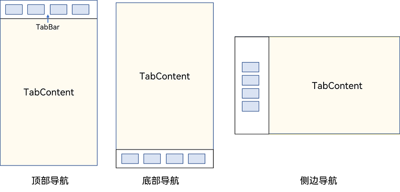
Tabs组件的页面组成包含两个部分,分别是TabContent和TabBar。TabContent是内容页,TabBar是导航页签栏,页面结构如下图所示,根据不同的导航类型,布局会有区别,可以分为底部导航、顶部导航、侧边导航,其导航栏分别位于底部、顶部和侧边。
图1 Tabs组件布局示意图
说明
- TabContent组件不支持设置通用宽度属性,其宽度默认撑满Tabs父组件。
- TabContent组件不支持设置通用高度属性,其高度由Tabs父组件高度与TabBar组件高度决定。
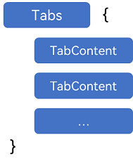
Tabs使用花括号包裹TabContent,如图2,其中TabContent显示相应的内容页。
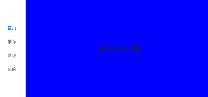
图2 Tabs与TabContent使用
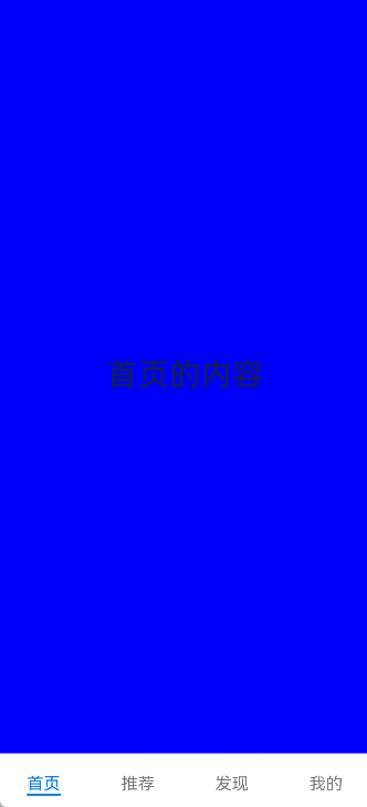
每一个TabContent对应的内容需要有一个页签,可以通过TabContent的tabBar属性进行配置。在如下TabContent组件上设置tabBar属性,可以设置其对应页签中的内容,tabBar作为内容的页签。
TabContent() { Text('首页的内容').fontSize(30) }.tabBar('首页')
设置多个内容时,需在Tabs内按照顺序放置。
Tabs() {  TabContent() {    Text('首页的内容').fontSize(30)  }  .tabBar('首页')
  TabContent() {    Text('推荐的内容').fontSize(30)  }  .tabBar('推荐')
  TabContent() {    Text('发现的内容').fontSize(30)  }  .tabBar('发现')    TabContent() {    Text('我的内容').fontSize(30)  }  .tabBar("我的")}
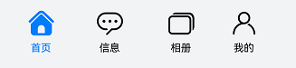
底部导航
底部导航是应用中最常见的一种导航方式。底部导航位于应用一级页面的底部,用户打开应用,能够分清整个应用的功能分类,以及页签对应的内容,并且其位于底部更加方便用户单手操作。底部导航一般作为应用的主导航形式存在,其作用是将用户关心的内容按照功能进行分类,迎合用户使用习惯,方便在不同模块间的内容切换。
图3 底部导航栏
导航栏位置使用Tabs的barPosition参数进行设置。默认情况下,导航栏位于顶部,此时,barPosition为BarPosition.Start。设置为底部导航时,需要将barPosition设置为BarPosition.End。
Tabs({ barPosition: BarPosition.End }) { // TabContent的内容:首页、发现、推荐、我的 ...}
顶部导航
当内容分类较多,用户对不同内容的浏览概率相差不大,需要经常快速切换时,一般采用顶部导航模式进行设计,作为对底部导航内容的进一步划分,常见一些资讯类应用对内容的分类为关注、视频、数码,或者主题应用中对主题进行进一步划分为图片、视频、字体等。
图4 顶部导航栏
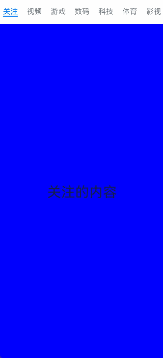
Tabs({ barPosition: BarPosition.Start }) { // TabContent的内容:关注、视频、游戏、数码、科技、体育、影视 ...}
侧边导航
侧边导航是应用较为少见的一种导航模式,更多适用于横屏界面,用于对应用进行导航操作,由于用户的视觉习惯是从左到右,侧边导航栏默认为左侧侧边栏。
图5 侧边导航栏
实现侧边导航栏需要将Tabs的vertical属性设置为true,vertical默认值为false,表明内容页和导航栏垂直方向排列。
Tabs({ barPosition: BarPosition.Start }) { // TabContent的内容:首页、发现、推荐、我的 ...}.vertical(true).barWidth(100).barHeight(200)
说明
- vertical为false时,tabbar的宽度默认为撑满屏幕的宽度,需要设置barWidth为合适值。
- vertical为true时,tabbar的高度默认为实际内容的高度,需要设置barHeight为合适值。
限制导航栏的滑动切换
默认情况下,导航栏都支持滑动切换,在一些内容信息量需要进行多级分类的页面,如支持底部导航+顶部导航组合的情况下,底部导航栏的滑动效果与顶部导航出现冲突,此时需要限制底部导航的滑动,避免引起不好的用户体验。
图6 限制底部导航栏滑动

控制滑动切换的属性为scrollable,默认值为true,表示可以滑动,若要限制滑动切换页签则需要设置为false。
Tabs({ barPosition: BarPosition.End }) {  TabContent(){    Column(){      Tabs(){        // 顶部导航栏内容        ...      }    }    .backgroundColor('#ff08a8f1')    .width('100%')  }  .tabBar('首页')
  // 其他TabContent内容:发现、推荐、我的  ...}.scrollable(false)
固定导航栏
当内容分类较为固定且不具有拓展性时,例如底部导航内容分类一般固定,分类数量一般在3-5个,此时使用固定导航栏。固定导航栏不可滚动,无法被拖拽滚动,内容均分tabBar的宽度。
图7 固定导航栏

Tabs的barMode属性用于控制导航栏是否可以滚动,默认值为BarMode.Fixed。
Tabs({ barPosition: BarPosition.End }) { // TabContent的内容:首页、发现、推荐、我的 ...}.barMode(BarMode.Fixed)
滚动导航栏
滚动导航栏可以用于顶部导航栏或者侧边导航栏的设置,内容分类较多,屏幕宽度无法容纳所有分类页签的情况下,需要使用可滚动的导航栏,支持用户点击和滑动来加载隐藏的页签内容。
图8 可滚动导航栏

滚动导航栏需要设置Tabs组件的barMode属性,默认值为BarMode.Fixed表示为固定导航栏,BarMode.Scrollable表示可滚动导航栏。
Tabs({ barPosition: BarPosition.Start }) { // TabContent的内容:关注、视频、游戏、数码、科技、体育、影视、人文、艺术、自然、军事 ...}.barMode(BarMode.Scrollable)
自定义导航栏
对于底部导航栏,一般作为应用主页面功能区分,为了更好的用户体验,会组合文字以及对应语义图标表示页签内容,这种情况下,需要自定义导航页签的样式。
图9 自定义导航栏
系统默认情况下采用了下划线标志当前活跃的页签,而自定义导航栏需要自行实现相应的样式,用于区分当前活跃页签和未活跃页签。
设置自定义导航栏需要使用tabBar的参数,以其支持的CustomBuilder的方式传入自定义的函数组件样式。例如这里声明tabBuilder的自定义函数组件,传入参数包括页签文字title,对应位置index,以及选中状态和未选中状态的图片资源。通过当前活跃的currentIndex和页签对应的targetIndex匹配与否,决定UI显示的样式。
@Builder tabBuilder(title: string, targetIndex: number, selectedImg: Resource, normalImg: Resource) { Column() { Image(this.currentIndex === targetIndex ? selectedImg : normalImg) .size({ width: 25, height: 25 }) Text(title) .fontColor(this.currentIndex === targetIndex ? '#1698CE' : '#6B6B6B') } .width('100%') .height(50) .justifyContent(FlexAlign.Center)}
在TabContent对应tabBar属性中传入自定义函数组件,并传递相应的参数。
TabContent() { Column(){ Text('我的内容') } .width('100%') .height('100%') .backgroundColor('#007DFF')}.tabBar(this.tabBuilder('我的', 0, $r('app.media.mine_selected'), $r('app.media.mine_normal')))
切换至指定页签
在不使用自定义导航栏时,默认的Tabs会实现切换逻辑。在使用了自定义导航栏后,默认的Tabs仅实现滑动内容页和点击页签时内容页的切换逻辑,页签切换逻辑需要自行实现。即用户滑动内容页和点击页签时,页签栏需要同步切换至内容页对应的页签。
图10 内容页和页签不联动

此时需要使用Tabs提供的onChange事件方法,监听索引index的变化,并将当前活跃的index值传递给currentIndex,实现页签的切换。
@Entry@Componentstruct TabsExample1 {  @State currentIndex: number = 2
  @Builder tabBuilder(title: string, targetIndex: number) {    Column() {      Text(title)        .fontColor(this.currentIndex === targetIndex ? '#1698CE' : '#6B6B6B')    }  }
  build() {    Column() {      Tabs({ barPosition: BarPosition.End }) {        TabContent() {          ...        }.tabBar(this.tabBuilder('首页', 0))
        TabContent() {          ...        }.tabBar(this.tabBuilder('发现', 1))
        TabContent() {          ...        }.tabBar(this.tabBuilder('推荐', 2))
        TabContent() {          ...        }.tabBar(this.tabBuilder('我的', 3))      }      .animationDuration(0)      .backgroundColor('#F1F3F5')      .onChange((index: number) => {        this.currentIndex = index      })    }.width('100%')  }}
图11 内容页和页签联动

若希望不滑动内容页和点击页签也能实现内容页和页签的切换,可以将currentIndex传给Tabs的index参数,通过改变currentIndex来实现跳转至指定索引值对应的TabContent内容。也可以使用TabsController,TabsController是Tabs组件的控制器,用于控制Tabs组件进行内容页切换。通过TabsController的changeIndex方法来实现跳转至指定索引值对应的TabContent内容。
@State currentIndex: number = 2private controller: TabsController = new TabsController()
Tabs({ barPosition: BarPosition.End, index: this.currentIndex, controller: this.controller }) {  ...}.height(600).onChange((index: number) => {   this.currentIndex = index})
Button('动态修改index').width('50%').margin({ top: 20 })  .onClick(()=>{    this.currentIndex = (this.currentIndex + 1) % 4})
Button('changeIndex').width('50%').margin({ top: 20 })  .onClick(()=>{    let index = (this.currentIndex + 1) % 4    this.controller.changeIndex(index)})
图12 切换指定页签

开发者可以通过Tabs组件的onContentWillChange接口,设置自定义拦截回调函数。拦截回调函数在下一个页面即将展示时被调用,如果回调返回true,新页面可以展示;如果回调返回false,新页面不会展示,仍显示原来页面。
Tabs({ barPosition: BarPosition.End, controller: this.controller, index: this.currentIndex }) {...}.onContentWillChange((currentIndex, comingIndex) => { if (comingIndex == 2) { return false } return true})
图13 支持开发者自定义页面切换拦截事件

代码
@Entry
@Component
struct TabsPage {
  @State message: string = 'Hello World';

  build() {
    Column(){
      // this.test1()
      // this.test2()
      this.test3()
    }
    .height('100%')
    .width('100%')
  }
  @Builder test1(){
    Tabs({barPosition:BarPosition.End}){
      TabContent(){
        //内容
        Row(){
          Text('首页的文字')
        }.height('100%').width('100%').backgroundColor(Color.Blue)
      }
      .tabBar('首页')
      TabContent(){
        //内容
        Row(){
          Text('推荐的文字')
        }.height('100%').width('100%').backgroundColor(Color.Pink)
      }
      .tabBar('推荐')
      TabContent(){
        //内容
        Row(){
          Text('发现的文字')
        }.height('100%').width('100%').backgroundColor('green')
      }
      .tabBar('发现')
      TabContent(){
        //内容
        Row(){
          Text('我的的文字')
        }.height('100%').width('100%').backgroundColor(Color.Yellow)
      }
      .tabBar('我的')
    }
    .height('100%')
    .width('100%')
  }

  @Builder test2(){
    Tabs({barPosition:BarPosition.End}){
      TabContent(){
        Tabs(){
          TabContent(){
           Image($r('app.media.a9')).width('100%').height('100%').backgroundColor(Color.Blue)
          }.tabBar('关注')
          TabContent(){
            Text('推荐').width('100%').height('100%').backgroundColor(Color.Brown)
          }.tabBar('推荐')
          TabContent(){
            Text('视频').width('100%').height('100%').backgroundColor(Color.Red)
          }.tabBar('视频')
          TabContent(){
            Text('音频').width('100%').height('100%').backgroundColor(Color.Pink)
          }.tabBar('音频')
          TabContent(){
            Text('商城').width('100%').height('100%').backgroundColor(Color.Yellow)
          }.tabBar('商城')
          TabContent(){
            Text('热点').width('100%').height('100%').backgroundColor(Color.Orange)
          }.tabBar('热点')
          TabContent(){
            Text('科目').width('100%').height('100%').backgroundColor(Color.Gray)
          }.tabBar('科目')
          TabContent(){
            Text('阿斯顿').width('100%').height('100%').backgroundColor(Color.Green)
          }.tabBar('阿斯顿')
        }
        // .vertical(true)//左侧导航|右侧导航+{barPosition:BarPosition.End}
        .barMode(BarMode.Scrollable)//滚动
        .animationDuration(300)//动画
        .animationMode(AnimationMode.NO_ANIMATION)
        .barOverlap(true)
        .barBackgroundBlurStyle(BlurStyle.NONE)//导航透明度
        .barBackgroundColor('#00000000')//导航全透明颜色
      }
      .tabBar('首页')
      TabContent(){
        //内容
        Row(){
          Text('推荐的文字')
        }.height('100%').width('100%').backgroundColor(Color.Pink)
      }
      .tabBar('推荐')
      TabContent(){
        //内容
        Row(){
          Text('发现的文字')
        }.height('100%').width('100%').backgroundColor('green')
      }
      .tabBar('发现')
      TabContent(){
        //内容
        Row(){
          Text('我的的文字')
        }.height('100%').width('100%').backgroundColor(Color.Yellow)
      }
      .tabBar('我的')
    }
    .height('100%')
    .width('100%')
  }

  @State currentIndex:number=0//被选中的tab下标
  @Builder navStyle(img:Resource,title:string,index:number){
    Column(){
      SymbolGlyph(img).fontColor([index==this.currentIndex? '#1698CE' : '#6b6b6b'])
        .fontSize(30)
      Text(title).fontColor(index==this.currentIndex? '#1698CE' : '#6b6b6b')
    }
  }

  @Builder test3(){
    Tabs({barPosition:BarPosition.End,index:this.currentIndex}){
      TabContent(){
        Row(){
          Text('首页的文字')
        }.height('100%').width('100%').backgroundColor(Color.Blue)
      }
      .tabBar(this.navStyle($r('sys.symbol.house'),'首页',0))
      TabContent(){
        //内容
        Row(){
          Text('推荐的文字')
        }.height('100%').width('100%').backgroundColor(Color.Pink)
      }
      .tabBar(this.navStyle($r('sys.symbol.car_maintain'),'推荐',1))
      TabContent(){
        //内容
        Row(){
          Text('发现的文字')
        }.height('100%').width('100%').backgroundColor('green')
      }
      .tabBar(this.navStyle($r('sys.symbol.car_2_circle_slash'),'发现',2))
      TabContent(){
        //内容
        Row(){
          Text('我的的文字')
        }.height('100%').width('100%').backgroundColor(Color.Yellow)
      }.tabBar(this.navStyle($r('sys.symbol.card_package'),'我的',3))
    }
    .height('100%')
    .width('100%')
    .onChange((index)=>{
      this.currentIndex=index
    })
  }
}
TabContent
仅在Tabs中使用,对应一个切换页签的内容视图。

该组件从API Version 7开始支持。后续版本如有新增内容,则采用上角标单独标记该内容的起始版本。
子组件
支持单个子组件。

可内置系统组件和自定义组件,支持渲染控制类型(if/else、ForEach和LazyForEach)。
接口
TabContent()
元服务API: 从API version 11开始,该接口支持在元服务中使用。
属性
除支持通用属性外,还支持以下属性:
tabBar
tabBar(value: string | Resource | CustomBuilder | { icon?: string | Resource; text?: string | Resource })
设置TabBar上显示内容。
如果icon采用svg格式图源,则要求svg图源删除其自有宽高属性值。如采用带有自有宽高属性的svg图源,icon大小则是svg本身内置的宽高属性值大小。
设置的内容超出tabbar页签时进行裁切。
元服务API: 从API version 11开始,该接口支持在元服务中使用。
系统能力: SystemCapability.ArkUI.ArkUI.Full
参数:
| 参数名 | 类型 | 必填 | 说明 |
|---|---|---|---|
| value | string | Resource |CustomBuilder8+| {icon?: string | Resource,text?: string | Resource} | 是 | TabBar上显示内容。CustomBuilder: 构造器,内部可以传入组件(API8版本以上适用)。 |
tabBar9+
tabBar(value: SubTabBarStyle | BottomTabBarStyle)
设置TabBar上显示内容。底部样式没有下划线效果。icon异常时显示灰色图块。
元服务API: 从API version 11开始,该接口支持在元服务中使用。
系统能力: SystemCapability.ArkUI.ArkUI.Full
参数:
| 参数名 | 类型 | 必填 | 说明 |
|---|---|---|---|
| value | SubTabBarStyle | BottomTabBarStyle | 是 | TabBar上显示内容。SubTabBarStyle: 子页签样式。BottomTabBarStyle: 底部页签和侧边页签样式。 |

- TabContent组件不支持设置通用宽度属性,其宽度默认撑满Tabs父组件。
- TabContent组件不支持设置通用高度属性,其高度由Tabs父组件高度与TabBar组件高度决定。
- vertical属性为false值,交换上述2个限制。
- TabContent组件不支持内容过长时页面的滑动,如需页面滑动,可嵌套List使用。
SubTabBarStyle9+对象说明
子页签样式。打开后在切换页签时会播放跳转动画。
constructor
constructor(content: ResourceStr | ComponentContent)
SubTabBarStyle的构造函数。
元服务API: 从API version 12开始,该接口支持在元服务中使用。
参数:
| 参数名 | 参数类型 | 必填 | 参数描述 |
|---|---|---|---|
| content | ResourceStr | ComponentContent12+ | 是 | 页签内的文字内容。从API version 10开始,content类型为ResourceStr。从API version 12开始,支持ComponentContent设置自定义内容。**说明:**1.自定义内容不支持labelStyle属性。2.自定义内容超出页签范围,则不显示超出部分。3.自定义内容小于页签范围,则会居中对齐。4.自定义内容异常或无可用显示组件,则显示空白。 |
of10+
static of(content: ResourceStr | ComponentContent)
SubTabBarStyle的静态构造函数。
元服务API: 从API version 12开始,该接口支持在元服务中使用。
参数:
| 参数名 | 参数类型 | 必填 | 参数描述 |
|---|---|---|---|
| content | ResourceStr | ComponentContent12+ | 是 | 页签内的文字内容。从API version 12开始,支持ComponentContent设置自定义内容。**说明:**1.自定义内容不支持labelStyle属性。2.自定义内容超出页签范围,则不显示超出部分。3.自定义内容小于页签范围,则会居中对齐。4.自定义内容异常或无可用显示组件,则显示空白。 |
属性
支持以下属性:
| 名称 | 参数类型 | 描述 |
|---|---|---|
| indicator10+ | IndicatorStyle | 设置选中子页签的下划线风格。子页签的下划线风格仅在水平模式下有效。元服务API: 从API version 11开始,该接口支持在元服务中使用。 |
| selectedMode10+ | SelectedMode | 设置选中子页签的显示方式。子页签的显示方式仅在水平模式下有效。默认值:SelectedMode.INDICATOR元服务API: 从API version 11开始,该接口支持在元服务中使用。 |
| board10+ | BoardStyle | 设置选中子页签的背板风格。子页签的背板风格仅在水平模式下有效。元服务API: 从API version 11开始,该接口支持在元服务中使用。 |
| labelStyle10+ | LabelStyle | 设置子页签的label文本和字体的样式。元服务API: 从API version 11开始,该接口支持在元服务中使用。 |
| padding10+ | Padding | Dimension | 设置子页签的内边距属性(不支持百分比设置)。使用Dimension时,四个方向内边距同时生效。默认值:{left:8.0vp,right:8.0vp,top:17.0vp,bottom:18.0vp}元服务API: 从API version 11开始,该接口支持在元服务中使用。 |
| id11+ | string | 设置子页签的id。元服务API: 从API version 12开始,该接口支持在元服务中使用。 |
IndicatorStyle10+对象说明
元服务API: 从API version 11开始,该接口支持在元服务中使用。
| 名称 | 参数类型 | 必填 | 描述 |
|---|---|---|---|
| color | ResourceColor | 否 | 下划线的颜色和背板颜色。默认值:#FF007DFF |
| height | Length | 否 | 下划线的高度(不支持百分比设置)。默认值:2.0单位:vp |
| width | Length | 否 | 下划线的宽度(不支持百分比设置)。默认值:0.0单位:vp**说明:**宽度设置为0时,按页签文本宽度显示。 |
| borderRadius | Length | 否 | 下划线的圆角半径(不支持百分比设置)。默认值:0.0单位:vp |
| marginTop | Length | 否 | 下划线与文字的间距(不支持百分比设置)。默认值:8.0单位:vp |
SelectedMode10+枚举说明
元服务API: 从API version 11开始,该接口支持在元服务中使用。
| 名称 | 描述 |
|---|---|
| INDICATOR | 使用下划线模式。 |
| BOARD | 使用背板模式。 |
BoardStyle10+对象说明
元服务API: 从API version 11开始,该接口支持在元服务中使用。
| 名称 | 参数类型 | 必填 | 描述 |
|---|---|---|---|
| borderRadius | Length | 否 | 背板的圆角半径(不支持百分比设置)。默认值:8.0单位:vp |
LabelStyle10+对象说明
| 名称 | 参数类型 | 必填 | 描述 |
|---|---|---|---|
| overflow | TextOverflow | 否 | 设置Label文本超长时的显示方式。默认值是省略号截断。元服务API: 从API version 11开始,该接口支持在元服务中使用。 |
| maxLines | number | 否 | 设置Label文本的最大行数。如果指定此参数,则文本最多不会超过指定的行。如果有多余的文本,可以通过textOverflow来指定截断方式。默认值是1。元服务API: 从API version 11开始,该接口支持在元服务中使用。 |
| minFontSize | number | ResourceStr | 否 | 设置Label文本最小显示字号(不支持百分比设置)。需配合maxFontSize以及maxLines或布局大小限制使用。自适应文本大小生效后,font.size不生效。默认值是0.0fp。元服务API: 从API version 11开始,该接口支持在元服务中使用。 |
| maxFontSize | number | ResourceStr | 否 | 设置Label文本最大显示字号(不支持百分比设置)。需配合minFontSize以及maxLines或布局大小限制使用。自适应文本大小生效后,font.size不生效。默认值是0.0fp。元服务API: 从API version 11开始,该接口支持在元服务中使用。 |
| heightAdaptivePolicy | TextHeightAdaptivePolicy | 否 | 设置Label文本自适应高度的方式。默认值是最大行数优先。元服务API: 从API version 11开始,该接口支持在元服务中使用。 |
| font | Font | 否 | 设置Label文本字体样式。当页签为子页签时,默认值是字体大小16.0fp、字体类型’HarmonyOS Sans’,字体风格正常,字重正常。当页签为底部页签时,默认值是字体大小10.0fp、字体类型’HarmonyOS Sans’,字体风格正常,字重中等。从API version 12开始,底部页签页签内容左右排布时默认字体大小为12.0fp。元服务API: 从API version 11开始,该接口支持在元服务中使用。 |
| unselectedColor12+ | ResourceColor | 否 | 设置Label文本字体未选中时的颜色。默认值:#99182431 |
| selectedColor12+ | ResourceColor | 否 | 设置Label文本字体选中时的颜色。默认值:#FF007DFF |
BottomTabBarStyle9+对象说明
底部页签和侧边页签样式。
constructor
constructor(icon: ResourceStr | TabBarSymbol, text: ResourceStr)
BottomTabBarStyle的构造函数。
元服务API: 从API version 11开始,该接口支持在元服务中使用。
参数:
| 参数名 | 参数类型 | 必填 | 参数描述 |
|---|---|---|---|
| icon | ResourceStr | TabBarSymbol12+ | 是 | 页签内的图片内容。 |
| text | ResourceStr | 是 | 页签内的文字内容。 |
of10+
static of(icon: ResourceStr | TabBarSymbol, text: ResourceStr)
BottomTabBarStyle的静态构造函数。
元服务API: 从API version 11开始,该接口支持在元服务中使用。
参数:
| 参数名 | 参数类型 | 必填 | 参数描述 |
|---|---|---|---|
| icon | ResourceStr | TabBarSymbol12+ | 是 | 页签内的图片内容。 |
| text | ResourceStr | 是 | 页签内的文字内容。 |
属性
支持以下属性:
| 名称 | 参数类型 | 描述 |
|---|---|---|
| padding10+ | Padding | Dimension | 设置底部页签的内边距属性(不支持百分比设置)。使用Dimension时,四个方向内边距同时生效。默认值:{left:4.0vp,right:4.0vp,top:0.0vp,bottom:0.0vp}元服务API: 从API version 11开始,该接口支持在元服务中使用。 |
| verticalAlign10+ | VerticalAlign | 设置底部页签的图片、文字在垂直方向上的对齐格式。默认值:VerticalAlign.Center元服务API: 从API version 11开始,该接口支持在元服务中使用。 |
| layoutMode10+ | LayoutMode | 设置底部页签的图片、文字排布的方式,具体参照LayoutMode枚举。默认值:LayoutMode.VERTICAL元服务API: 从API version 11开始,该接口支持在元服务中使用。 |
| symmetricExtensible10+ | boolean | 设置底部页签的图片、文字是否可以对称借左右底部页签的空余位置中的最小值,仅fixed水平模式下在底部页签之间有效。默认值:false元服务API: 从API version 11开始,该接口支持在元服务中使用。 |
| labelStyle10+ | LabelStyle | 设置底部页签的label文本和字体的样式。元服务API: 从API version 11开始,该接口支持在元服务中使用。 |
| id11+ | string | 设置底部页签的id。元服务API: 从API version 12开始,该接口支持在元服务中使用。 |
| iconStyle12+ | TabBarIconStyle | 设置底部页签的label图标的样式。 |
TabBarSymbol12+对象说明
| 参数名 | 参数类型 | 必填 | 参数描述 |
|---|---|---|---|
| normal | SymbolGlyphModifier | 是 | 页签内symbol图标普通态样式。默认值:fontColor:#66182431,renderingStrategy:SymbolRenderingStrategy.MULTIPLE_OPACITY,fontSize:24vp |
| selected | SymbolGlyphModifier | 否 | 页签内symbol图标选中态样式。默认值:fontColor:#ff007dff,renderingStrategy:SymbolRenderingStrategy.MULTIPLE_OPACITY,fontSize:24vp |
LayoutMode10+枚举说明
元服务API: 从API version 11开始,该接口支持在元服务中使用。
| 名称 | 描述 |
|---|---|
| AUTO | 若页签宽度大于104vp,页签内容为左右排布,否则页签内容为上下排布。仅TabBar为垂直模式或Fixed水平模式时有效。 |
| VERTICAL | 页签内容上下排布。 |
| HORIZONTAL | 页签内容左右排布。 |
TabBarIconStyle12+对象说明
| 名称 | 参数类型 | 必填 | 描述 |
|---|---|---|---|
| unselectedColor | ResourceColor | 否 | 设置Label图标未选中时的颜色。默认值:#33182431**说明:**仅对svg图源生效,设置后会替换svg图片的填充颜色。 |
| selectedColor | ResourceColor | 否 | 设置Label图标选中时的颜色。默认值:#FF007DFF**说明:**仅对svg图源生效,设置后会替换svg图片的填充颜色。 |
事件
除支持通用事件外,还支持以下事件:
onWillShow12+
onWillShow(event: VoidCallback)
逻辑回调,TabContent将要显示的时候触发该回调。场景包括TabContent首次显示,TabContent切换,页面切换,窗口前后台切换。
元服务API: 从API version 12开始,该接口支持在元服务中使用。
系统能力: SystemCapability.ArkUI.ArkUI.Full
参数:
| 参数名 | 类型 | 必填 | 说明 |
|---|---|---|---|
| event | VoidCallback | 是 | TabContent将要显示的回调函数。 |
onWillHide12+
onWillHide(event: VoidCallback)
逻辑回调,TabContent将要隐藏的时候触发该回调。场景包括TabContent切换,页面切换,窗口前后台切换。
元服务API: 从API version 12开始,该接口支持在元服务中使用。
系统能力: SystemCapability.ArkUI.ArkUI.Full
参数:
| 参数名 | 类型 | 必填 | 说明 |
|---|---|---|---|
| event | VoidCallback | 是 | TabContent将要隐藏的回调函数。 |
示例
示例1
// xxx.ets
@Entry
@Component
struct TabContentExample {
  @State fontColor: string = '#182431'
  @State selectedFontColor: string = '#007DFF'
  @State currentIndex: number = 0
  private controller: TabsController = new TabsController()

  @Builder tabBuilder(index: number) {
    Column() {
      Image(this.currentIndex === index ? '/common/public_icon_on.svg' : '/common/public_icon_off.svg')
        .width(24)
        .height(24)
        .margin({ bottom: 4 })
        .objectFit(ImageFit.Contain)
      Text(`Tab${index + 1}`)
        .fontColor(this.currentIndex === index ? this.selectedFontColor : this.fontColor)
        .fontSize(10)
        .fontWeight(500)
        .lineHeight(14)
    }.width('100%')
  }

  build() {
    Column() {
      Tabs({ barPosition: BarPosition.End, controller: this.controller }) {
        TabContent() {
          Column() {
            Text('Tab1')
              .fontSize(36)
              .fontColor('#182431')
              .fontWeight(500)
              .opacity(0.4)
              .margin({ top: 30, bottom: 56.5 })
            Divider()
              .strokeWidth(0.5)
              .color('#182431')
              .opacity(0.05)
          }.width('100%')
        }.tabBar(this.tabBuilder(0))

        TabContent() {
          Column() {
            Text('Tab2')
              .fontSize(36)
              .fontColor('#182431')
              .fontWeight(500)
              .opacity(0.4)
              .margin({ top: 30, bottom: 56.5 })
            Divider()
              .strokeWidth(0.5)
              .color('#182431')
              .opacity(0.05)
          }.width('100%')
        }.tabBar(this.tabBuilder(1))

        TabContent() {
          Column() {
            Text('Tab3')
              .fontSize(36)
              .fontColor('#182431')
              .fontWeight(500)
              .opacity(0.4)
              .margin({ top: 30, bottom: 56.5 })
            Divider()
              .strokeWidth(0.5)
              .color('#182431')
              .opacity(0.05)
          }.width('100%')
        }.tabBar(this.tabBuilder(2))

        TabContent() {
          Column() {
            Text('Tab4')
              .fontSize(36)
              .fontColor('#182431')
              .fontWeight(500)
              .opacity(0.4)
              .margin({ top: 30, bottom: 56.5 })
            Divider()
              .strokeWidth(0.5)
              .color('#182431')
              .opacity(0.05)
          }.width('100%')
        }.tabBar(this.tabBuilder(3))
      }
      .vertical(false)
      .barHeight(56)
      .onChange((index: number) => {
        this.currentIndex = index
      })
      .width(360)
      .height(190)
      .backgroundColor('#F1F3F5')
      .margin({ top: 38 })
    }.width('100%')
  }
}

示例2
// xxx.ets
@Entry
@Component
struct TabContentExample {
  @State fontColor: string = '#182431'
  @State selectedFontColor: string = '#007DFF'
  @State currentIndex: number = 0
  private controller: TabsController = new TabsController()

  @Builder tabBuilder(index: number) {
    Column() {
      Image(this.currentIndex === index ? '/common/public_icon_on.svg' : '/common/public_icon_off.svg')
        .width(24)
        .height(24)
        .margin({ bottom: 4 })
        .objectFit(ImageFit.Contain)
      Text('Tab')
        .fontColor(this.currentIndex === index ? this.selectedFontColor : this.fontColor)
        .fontSize(10)
        .fontWeight(500)
        .lineHeight(14)
    }.width('100%').height('100%').justifyContent(FlexAlign.Center)
  }

  build() {
    Column() {
      Tabs({ barPosition: BarPosition.Start, controller: this.controller }) {
        TabContent()
          .tabBar(this.tabBuilder(0))
        TabContent()
          .tabBar(this.tabBuilder(1))
        TabContent()
          .tabBar(this.tabBuilder(2))
        TabContent()
          .tabBar(this.tabBuilder(3))
      }
      .vertical(true)
      .barWidth(96)
      .barHeight(414)
      .onChange((index: number) => {
        this.currentIndex = index
      })
      .width(96)
      .height(414)
      .backgroundColor('#F1F3F5')
      .margin({ top: 52 })
    }.width('100%')
  }
}

示例3
// xxx.ets
@Entry
@Component
struct TabBarStyleExample {
  build() {
    Column({ space: 5 }) {
      Text("子页签样式")
      Column() {
        Tabs({ barPosition: BarPosition.Start }) {
          TabContent() {
            Column().width('100%').height('100%').backgroundColor(Color.Pink)
          }.tabBar(new SubTabBarStyle('Pink'))
          .onWillShow(() => {
            console.info("Pink will show")
          })
          .onWillHide(() => {
            console.info("Pink will hide")
          })

          TabContent() {
            Column().width('100%').height('100%').backgroundColor(Color.Yellow)
          }.tabBar(new SubTabBarStyle('Yellow'))
          .onWillShow(() => {
            console.info("Yellow will show")
          })
          .onWillHide(() => {
            console.info("Yellow will hide")
          })

          TabContent() {
            Column().width('100%').height('100%').backgroundColor(Color.Blue)
          }.tabBar(new SubTabBarStyle('Blue'))
          .onWillShow(() => {
            console.info("Blue will show")
          })
          .onWillHide(() => {
            console.info("Blue will hide")
          })

          TabContent() {
            Column().width('100%').height('100%').backgroundColor(Color.Green)
          }.tabBar(new SubTabBarStyle('Green'))
          .onWillShow(() => {
            console.info("Green will show")
          })
          .onWillHide(() => {
            console.info("Green will hide")
          })
        }
        .vertical(false)
        .scrollable(true)
        .barMode(BarMode.Fixed)
        .onChange((index: number) => {
          console.info(index.toString())
        })
        .width('100%')
        .backgroundColor(0xF1F3F5)
      }.width('100%').height(200)
      Text("底部页签样式")
      Column() {
        Tabs({ barPosition: BarPosition.End }) {
          TabContent() {
            Column().width('100%').height('100%').backgroundColor(Color.Pink)
          }.tabBar(new BottomTabBarStyle($r('sys.media.ohos_app_icon'), 'Pink'))
          .onWillShow(() => {
            console.info("Pink will show")
          })
          .onWillHide(() => {
            console.info("Pink will hide")
          })

          TabContent() {
            Column().width('100%').height('100%').backgroundColor(Color.Yellow)
          }.tabBar(new BottomTabBarStyle($r('sys.media.ohos_app_icon'), 'Yellow'))
          .onWillShow(() => {
            console.info("Yellow will show")
          })
          .onWillHide(() => {
            console.info("Yellow will hide")
          })

          TabContent() {
            Column().width('100%').height('100%').backgroundColor(Color.Blue)
          }.tabBar(new BottomTabBarStyle($r('sys.media.ohos_app_icon'), 'Blue'))
          .onWillShow(() => {
            console.info("Blue will show")
          })
          .onWillHide(() => {
            console.info("Blue will hide")
          })

          TabContent() {
            Column().width('100%').height('100%').backgroundColor(Color.Green)
          }.tabBar(new BottomTabBarStyle($r('sys.media.ohos_app_icon'), 'Green'))
          .onWillShow(() => {
            console.info("Green will show")
          })
          .onWillHide(() => {
            console.info("Green will hide")
          })
        }
        .vertical(false)
        .scrollable(true)
        .barMode(BarMode.Fixed)
        .onChange((index: number) => {
          console.info(index.toString())
        })
        .width('100%')
        .backgroundColor(0xF1F3F5)
      }.width('100%').height(200)
      Text("侧边页签样式")
      Column() {
        Tabs({ barPosition: BarPosition.Start }) {
          TabContent() {
            Column().width('100%').height('100%').backgroundColor(Color.Pink)
          }.tabBar(new BottomTabBarStyle($r('sys.media.ohos_app_icon'), 'Pink'))
          .onWillShow(() => {
            console.info("Pink will show")
          })
          .onWillHide(() => {
            console.info("Pink will hide")
          })

          TabContent() {
            Column().width('100%').height('100%').backgroundColor(Color.Yellow)
          }.tabBar(new BottomTabBarStyle($r('sys.media.ohos_app_icon'), 'Yellow'))
          .onWillShow(() => {
            console.info("Yellow will show")
          })
          .onWillHide(() => {
            console.info("Yellow will hide")
          })

          TabContent() {
            Column().width('100%').height('100%').backgroundColor(Color.Blue)
          }.tabBar(new BottomTabBarStyle($r('sys.media.ohos_app_icon'), 'Blue'))
          .onWillShow(() => {
            console.info("Blue will show")
          })
          .onWillHide(() => {
            console.info("Blue will hide")
          })

          TabContent() {
            Column().width('100%').height('100%').backgroundColor(Color.Green)
          }.tabBar(new BottomTabBarStyle($r('sys.media.ohos_app_icon'), 'Green'))
          .onWillShow(() => {
            console.info("Green will show")
          })
          .onWillHide(() => {
            console.info("Green will hide")
          })
        }
        .vertical(true).scrollable(true).barMode(BarMode.Fixed)
        .onChange((index: number) => {
          console.info(index.toString())
        })
        .width('100%')
        .backgroundColor(0xF1F3F5)
      }.width('100%').height(400)
    }
  }
}

示例4
// xxx.ets
@Entry
@Component
struct TabsAttr {
  private controller: TabsController = new TabsController()
  @State indicatorColor: Color = Color.Blue;
  @State indicatorWidth: number = 40;
  @State indicatorHeight: number = 10;
  @State indicatorBorderRadius: number = 5;
  @State indicatorSpace: number = 10;
  @State subTabBorderRadius: number = 20;
  @State selectedMode: SelectedMode = SelectedMode.INDICATOR;
  private colorFlag: boolean = true;
  private widthFlag: boolean = true;
  private heightFlag: boolean = true;
  private borderFlag: boolean = true;
  private spaceFlag: boolean = true;

  build() {
    Column() {
      Button("下划线颜色变化").width('100%').margin({ bottom: '12vp' })
        .onClick((event?: ClickEvent) => {
          // 对Button组件的宽高属性进行动画配置
          if (this.colorFlag) {
            animateTo({
              duration: 1000, // 动画时长
              curve: Curve.Linear, // 动画曲线
              delay: 200, // 动画延迟
              iterations: 1, // 播放次数
              playMode: PlayMode.Normal, // 动画模式
              onFinish: () => {
                console.info('play end')
              }
            }, () => {
              this.indicatorColor = Color.Red
            })
          } else {
            animateTo({
              duration: 1000, // 动画时长
              curve: Curve.Linear, // 动画曲线
              delay: 200, // 动画延迟
              iterations: 1, // 播放次数
              playMode: PlayMode.Normal, // 动画模式
              onFinish: () => {
                console.info('play end')
              }
            }, () => {
              this.indicatorColor = Color.Yellow
            })
          }
          this.colorFlag = !this.colorFlag
        })
      Button("下划线高度变化").width('100%').margin({ bottom: '12vp' })
        .onClick((event?: ClickEvent) => {
          // 对Button组件的宽高属性进行动画配置
          if (this.heightFlag) {
            animateTo({
              duration: 1000, // 动画时长
              curve: Curve.Linear, // 动画曲线
              delay: 200, // 动画延迟
              iterations: 1, // 播放次数
              playMode: PlayMode.Normal, // 动画模式
              onFinish: () => {
                console.info('play end')
              }
            }, () => {
              this.indicatorHeight = 20
            })
          } else {
            animateTo({
              duration: 1000, // 动画时长
              curve: Curve.Linear, // 动画曲线
              delay: 200, // 动画延迟
              iterations: 1, // 播放次数
              playMode: PlayMode.Normal, // 动画模式
              onFinish: () => {
                console.info('play end')
              }
            }, () => {
              this.indicatorHeight = 10
            })
          }
          this.heightFlag = !this.heightFlag
        })
      Button("下划线宽度变化").width('100%').margin({ bottom: '12vp' })
        .onClick((event?: ClickEvent) => {
          // 对Button组件的宽高属性进行动画配置
          if (this.widthFlag) {
            animateTo({
              duration: 1000, // 动画时长
              curve: Curve.Linear, // 动画曲线
              delay: 200, // 动画延迟
              iterations: 1, // 播放次数
              playMode: PlayMode.Normal, // 动画模式
              onFinish: () => {
                console.info('play end')
              }
            }, () => {
              this.indicatorWidth = 30
            })
          } else {
            animateTo({
              duration: 1000, // 动画时长
              curve: Curve.Linear, // 动画曲线
              delay: 200, // 动画延迟
              iterations: 1, // 播放次数
              playMode: PlayMode.Normal, // 动画模式
              onFinish: () => {
                console.info('play end')
              }
            }, () => {
              this.indicatorWidth = 50
            })
          }
          this.widthFlag = !this.widthFlag
        })
      Button("下划线圆角半径变化").width('100%').margin({ bottom: '12vp' })
        .onClick((event?: ClickEvent) => {
          // 对Button组件的宽高属性进行动画配置
          if (this.borderFlag) {
            animateTo({
              duration: 1000, // 动画时长
              curve: Curve.Linear, // 动画曲线
              delay: 200, // 动画延迟
              iterations: 1, // 播放次数
              playMode: PlayMode.Normal, // 动画模式
              onFinish: () => {
                console.info('play end')
              }
            }, () => {
              this.indicatorBorderRadius = 0
            })
          } else {
            animateTo({
              duration: 1000, // 动画时长
              curve: Curve.Linear, // 动画曲线
              delay: 200, // 动画延迟
              iterations: 1, // 播放次数
              playMode: PlayMode.Normal, // 动画模式
              onFinish: () => {
                console.info('play end')
              }
            }, () => {
              this.indicatorBorderRadius = 5
            })
          }
          this.borderFlag = !this.borderFlag
        })
      Button("下划线间距变化").width('100%').margin({ bottom: '12vp' })
        .onClick((event?: ClickEvent) => {
          // 对Button组件的宽高属性进行动画配置
          if (this.spaceFlag) {
            animateTo({
              duration: 1000, // 动画时长
              curve: Curve.Linear, // 动画曲线
              delay: 200, // 动画延迟
              iterations: 1, // 播放次数
              playMode: PlayMode.Normal, // 动画模式
              onFinish: () => {
                console.info('play end')
              }
            }, () => {
              this.indicatorSpace = 20
            })
          } else {
            animateTo({
              duration: 1000, // 动画时长
              curve: Curve.Linear, // 动画曲线
              delay: 200, // 动画延迟
              iterations: 1, // 播放次数
              playMode: PlayMode.Normal, // 动画模式
              onFinish: () => {
                console.info('play end')
              }
            }, () => {
              this.indicatorSpace = 10
            })
          }
          this.spaceFlag = !this.spaceFlag
        })
      Tabs({ barPosition: BarPosition.End, controller: this.controller }) {
        TabContent() {
          Column().width('100%').height('100%').backgroundColor(Color.Pink).borderRadius('12vp')
        }.tabBar(SubTabBarStyle.of('pink')
          .indicator({
            color: this.indicatorColor, //下划线颜色
            height: this.indicatorHeight, //下划线高度
            width: this.indicatorWidth, //下划线宽度
            borderRadius: this.indicatorBorderRadius, //下划线圆角半径
            marginTop: this.indicatorSpace //下划线与文字间距
          })
          .selectedMode(this.selectedMode)
          .board({ borderRadius: this.subTabBorderRadius })
          .labelStyle({})
        )

        TabContent() {
          Column().width('100%').height('100%').backgroundColor(Color.Yellow).borderRadius('12vp')
        }.tabBar('yellow')

        TabContent() {
          Column().width('100%').height('100%').backgroundColor(Color.Blue).borderRadius('12vp')
        }.tabBar('blue')

        TabContent() {
          Column().width('100%').height('100%').backgroundColor(Color.Green).borderRadius('12vp')
        }.tabBar('green')

        TabContent() {
          Column().width('100%').height('100%').backgroundColor(Color.Gray).borderRadius('12vp')
        }.tabBar('gray')

        TabContent() {
          Column().width('100%').height('100%').backgroundColor(Color.Orange).borderRadius('12vp')
        }.tabBar('orange')
      }
      .vertical(false)
      .scrollable(true)
      .barMode(BarMode.Scrollable)
      .barHeight(140)
      .animationDuration(400)
      .onChange((index: number) => {
        console.info(index.toString())
      })
      .backgroundColor(0xF5F5F5)
      .height(320)
    }.width('100%').height(250).padding({ top: '24vp', left: '24vp', right: '24vp' })
  }
}

示例5
// xxx.ets
@Entry
@Component
struct TabsTextOverflow {
  @State message: string = 'Hello World'
  private controller: TabsController = new TabsController()
  @State subTabOverflowOpaque: boolean = true;

  build() {
    Column() {
      Tabs({ barPosition: BarPosition.Start, controller: this.controller }) {
        TabContent() {
          Column() {
            Text('单行省略号截断').fontSize(30).fontColor(0xFF000000)
          }.width('100%').height('100%').backgroundColor(Color.Pink)
        }
        .tabBar(SubTabBarStyle.of('开始【单行省略号截断单行省略号截断单行省略号截断单行省略号截断单行省略号截断单行省略号截断单行省略号截断单行省略号截断单行省略号截断单行省略号截断】结束')
          .labelStyle({
            overflow: TextOverflow.Ellipsis,
            maxLines: 1,
            minFontSize: 10,
            heightAdaptivePolicy: TextHeightAdaptivePolicy.MAX_LINES_FIRST,
            font: { size: 20 }
          }))

        TabContent() {
          Column() {
            Text('先缩小再截断').fontSize(30).fontColor(0xFF000000)
          }.width('100%').height('100%').backgroundColor(Color.Pink)
        }
        .tabBar(SubTabBarStyle.of('开始【先缩小再截断先缩小再截断先缩小再截断先缩小再截断先缩小再截断先缩小再截断先缩小再截断先缩小再截断先缩小再截断先缩小再截断先缩小再截断先缩小再截断先缩小再截断先缩小再截断】结束')
          .labelStyle({
            overflow: TextOverflow.Clip,
            maxLines: 1,
            minFontSize: 15,
            maxFontSize: 15,
            heightAdaptivePolicy: TextHeightAdaptivePolicy.MIN_FONT_SIZE_FIRST,
            font: { size: 20 }
          }))

        TabContent() {
          Column() {
            Text('先缩小再换行再截断').fontSize(30).fontColor(0xFF000000)
          }.width('100%').height('100%').backgroundColor(Color.Pink)
        }
        .tabBar(SubTabBarStyle.of('开始【先缩小再换行再截断先缩小再换行再截断先缩小再换行再截断先缩小再换行再截断先缩小再换行再截断先缩小再换行再截断先缩小再换行再截断先缩小再换行再截断】结束')
          .labelStyle({
            overflow: TextOverflow.Clip,
            maxLines: 2,
            minFontSize: 15,
            maxFontSize: 15,
            heightAdaptivePolicy: TextHeightAdaptivePolicy.MIN_FONT_SIZE_FIRST,
            font: { size: 20 }
          }))

        TabContent() {
          Column() {
            Text('换行').fontSize(30).fontColor(0xFF000000)
          }
          .width('100%').height('100%').backgroundColor(Color.Pink)
        }.tabBar(SubTabBarStyle.of('开始【换行换行换行换行换行换行换行换行换行换行换行换行换行换行换行】结束')
          .labelStyle({
            overflow: TextOverflow.Clip,
            maxLines: 10,
            minFontSize: 10,
            heightAdaptivePolicy: TextHeightAdaptivePolicy.MAX_LINES_FIRST,
            font: { size: 20 }
          }))
      }
      .vertical(true).scrollable(true)
      .barMode(BarMode.Fixed)
      .barHeight(720)
      .barWidth(200).animationDuration(400)
      .onChange((index: number) => {
        console.info(index.toString())
      })
      .height('100%').width('100%')
    }
    .height('100%')
  }
}

示例6
// xxx.ets
@Entry
@Component
struct TabContentExample6 {
  private controller: TabsController = new TabsController()
  @State text: string = "2"
  @State tabPadding: number = 0;
  @State symmetricExtensible: boolean = false;
  @State layoutMode: LayoutMode = LayoutMode.VERTICAL;
  @State verticalAlign: VerticalAlign = VerticalAlign.Center;

  build() {
    Column() {
      Row() {
        Button("padding+10 " + this.tabPadding)
          .width('47%')
          .height(50)
          .margin({ top: 5 })
          .onClick((event?: ClickEvent) => {
            this.tabPadding += 10
          })
          .margin({ right: '6%', bottom: '12vp' })
        Button("padding-10 " + this.tabPadding)
          .width('47%')
          .height(50)
          .margin({ top: 5 })
          .onClick((event?: ClickEvent) => {
            this.tabPadding -= 10
          })
          .margin({ bottom: '12vp' })
      }

      Row() {
        Button("文本增加 ")
          .width('47%')
          .height(50)
          .margin({ top: 5 })
          .onClick((event?: ClickEvent) => {
            this.text += '文本增加'
          })
          .margin({ right: '6%', bottom: '12vp' })
        Button("文本重置")
          .width('47%')
          .height(50)
          .margin({ top: 5 })
          .onClick((event?: ClickEvent) => {
            this.text = "2"
          })
          .margin({ bottom: '12vp' })
      }

      Row() {
        Button("symmetricExtensible改变 " + this.symmetricExtensible)
          .width('100%')
          .height(50)
          .margin({ top: 5 })
          .onClick((event?: ClickEvent) => {
            this.symmetricExtensible = !this.symmetricExtensible
          })
          .margin({ bottom: '12vp' })
      }

      Row() {
        Button("layoutMode垂直 ")
          .width('47%')
          .height(50)
          .margin({ top: 5 })
          .onClick((event?: ClickEvent) => {
            this.layoutMode = LayoutMode.VERTICAL;
          })
          .margin({ right: '6%', bottom: '12vp' })
        Button("layoutMode水平 ")
          .width('47%')
          .height(50)
          .margin({ top: 5 })
          .onClick((event?: ClickEvent) => {
            this.layoutMode = LayoutMode.HORIZONTAL;
          })
          .margin({ bottom: '12vp' })
      }

      Row() {
        Button("verticalAlign朝上")
          .width('100%')
          .height(50)
          .margin({ top: 5 })
          .onClick((event?: ClickEvent) => {
            this.verticalAlign = VerticalAlign.Top;
          })
          .margin({ bottom: '12vp' })
      }

      Row() {
        Button("verticalAlign居中")
          .width('100%')
          .height(50)
          .margin({ top: 5 })
          .onClick((event?: ClickEvent) => {
            this.verticalAlign = VerticalAlign.Center;
          })
          .margin({ bottom: '12vp' })
      }

      Row() {
        Button("verticalAlign朝下")
          .width('100%')
          .height(50)
          .margin({ top: 5 })
          .onClick((event?: ClickEvent) => {
            this.verticalAlign = VerticalAlign.Bottom;
          })
          .margin({ bottom: '12vp' })
      }


      Tabs({ barPosition: BarPosition.End, controller: this.controller }) {
        TabContent() {
          Column().width('100%').height('100%').backgroundColor(Color.Pink)
        }.tabBar(BottomTabBarStyle.of($r("sys.media.ohos_app_icon"), "1"))

        TabContent() {
          Column().width('100%').height('100%').backgroundColor(Color.Green)
        }.tabBar(BottomTabBarStyle.of($r("sys.media.ohos_app_icon"), this.text)
          .padding(this.tabPadding)
          .verticalAlign(this.verticalAlign)
          .layoutMode(this.layoutMode)
          .symmetricExtensible(this.symmetricExtensible))

        TabContent() {
          Column().width('100%').height('100%').backgroundColor(Color.Blue)
        }.tabBar(BottomTabBarStyle.of($r("sys.media.ohos_app_icon"), "3"))
      }
      .animationDuration(300)
      .height('60%')
      .backgroundColor(0xf1f3f5)
      .barMode(BarMode.Fixed)
    }
    .width('100%')
    .height(500)
    .margin({ top: 5 })
    .padding('24vp')
  }
}

示例7
本示例通过labelStyle中的unselectedColor和selectedColor改变底部页签以及子页签的文本颜色。
通过iconStyle中的unselectedColor和selectedColor改变底部页签的图标颜色。
// xxx.ets
@Entry
@Component
struct TabBarStyleExample {
  build() {
    Column({ space: 5 }) {
      Text("子页签样式")
      Column() {
        Tabs({ barPosition: BarPosition.Start }) {
          TabContent() {
            Column().width('100%').height('100%').backgroundColor(Color.Pink)
          }.tabBar(new SubTabBarStyle('Pink')
            .labelStyle({ unselectedColor: Color.Red, selectedColor: Color.Green }))

          TabContent() {
            Column().width('100%').height('100%').backgroundColor(Color.Yellow)
          }.tabBar(new SubTabBarStyle('Yellow')
            .labelStyle({ unselectedColor: Color.Red, selectedColor: Color.Green }))

          TabContent() {
            Column().width('100%').height('100%').backgroundColor(Color.Blue)
          }.tabBar(new SubTabBarStyle('Blue')
            .labelStyle({ unselectedColor: Color.Red, selectedColor: Color.Green }))

          TabContent() {
            Column().width('100%').height('100%').backgroundColor(Color.Green)
          }.tabBar(new SubTabBarStyle('Green')
            .labelStyle({ unselectedColor: Color.Red, selectedColor: Color.Green })
          )
        }
        .vertical(false)
        .scrollable(true)
        .barMode(BarMode.Fixed)
        .onChange((index: number) => {
          console.info(index.toString())
        })
        .width('100%')
        .backgroundColor(0xF1F3F5)
      }.width('100%').height(200)

      Text("底部页签样式")
      Column() {
        Tabs({ barPosition: BarPosition.End }) {
          TabContent() {
            Column().width('100%').height('100%').backgroundColor(Color.Pink)
          }
          .tabBar(new BottomTabBarStyle('/common/public_icon_off.svg', 'pink')
            .labelStyle({ unselectedColor: Color.Red, selectedColor: Color.Green })
            .iconStyle({ unselectedColor: Color.Red, selectedColor: Color.Green })
          )

          TabContent() {
            Column().width('100%').height('100%').backgroundColor(Color.Yellow)
          }.tabBar(new BottomTabBarStyle('/common/public_icon_off.svg', 'Yellow')
            .labelStyle({ unselectedColor: Color.Red, selectedColor: Color.Green })
            .iconStyle({ unselectedColor: Color.Red, selectedColor: Color.Green })
          )

          TabContent() {
            Column().width('100%').height('100%').backgroundColor(Color.Blue)
          }.tabBar(new BottomTabBarStyle('/common/public_icon_off.svg', 'Blue')
            .labelStyle({ unselectedColor: Color.Red, selectedColor: Color.Green })
            .iconStyle({ unselectedColor: Color.Red, selectedColor: Color.Green })
          )

          TabContent() {
            Column().width('100%').height('100%').backgroundColor(Color.Green)
          }.tabBar(new BottomTabBarStyle('/common/public_icon_off.svg', 'Green')
            .labelStyle({ unselectedColor: Color.Red, selectedColor: Color.Green })
            .iconStyle({ unselectedColor: Color.Red, selectedColor: Color.Green })
          )
        }
        .vertical(false)
        .scrollable(true)
        .barMode(BarMode.Fixed)
        .onChange((index: number) => {
          console.info(index.toString())
        })
        .width('100%')
        .backgroundColor(0xF1F3F5)
      }.width('100%').height(200)
    }
  }
}

示例8
该示例实现了通过ComponentContent设置SubTabBarStyle。
// xxx.ets
import { ComponentContent, UIContext } from "@kit.ArkUI"

class Params {
  text: string = ""

  constructor(text: string) {
    this.text = text;
  }
}

@Builder
function buildText(params: Params) {
  Column() {
    Text(params.text)
      .fontSize(20)
      .fontWeight(FontWeight.Bold)
      .margin(20)
  }
}

@Entry
@Component
struct Index {
  @State message1: string = "tabBar1"
  @State message2: string = "tabBar2"
  context: UIContext = this.getUIContext()
  private count1 = 0;
  private count2 = 0;
  private controller: TabsController = new TabsController();
  tabBar1: ComponentContent<Params> = new ComponentContent<Params>(this.context, wrapBuilder<[Params]>(buildText), new Params(this.message1));
  tabBar2: ComponentContent<Params> = new ComponentContent<Params>(this.context, wrapBuilder<[Params]>(buildText), new Params(this.message2));

  build() {
    Row() {
      Column() {
        Button("更新tabBar1").width('90%').margin(20)
          .onClick((event?: ClickEvent) => {
            this.count1 += 1;
            const message1 = "Update 1_" + this.count1.toString();
            this.tabBar1.update(new Params(message1));
          })
        Button("更新tabBar2").width('90%').margin(20)
          .onClick((event?: ClickEvent) => {
            this.count2 += 1;
            const message2 = "Update 2_" + this.count2.toString();
            this.tabBar2.update(new Params(message2));
          })
        Tabs({ barPosition: BarPosition.Start, controller: this.controller }) {
          TabContent() {
            Column().width('100%').height('100%').backgroundColor(Color.Pink).borderRadius('12vp')
          }.tabBar(new SubTabBarStyle(this.tabBar1))
          TabContent() {
            Column().width('100%').height('100%').backgroundColor(Color.Blue).borderRadius('12vp')
          }.tabBar(SubTabBarStyle.of(this.tabBar2))
        }
        .vertical(false)
        .barWidth(414)
        .barHeight(96)
        .width(414)
        .height(414)
        .backgroundColor('#F1F3F5')
        .margin({ top: 20 })
      }
      .width('100%')
      .height('100%')
    }
    .height('100%')
  }
}

示例9
该示例实现了BottomTabBarStyle图片传入Symbol。
// xxx.ets
import { SymbolGlyphModifier } from '@kit.ArkUI'

@Entry
@Component
struct Index {
  @State symbolModifier1: SymbolGlyphModifier = new SymbolGlyphModifier($r('sys.symbol.ohos_wifi'));
  @State symbolModifier2: SymbolGlyphModifier = new SymbolGlyphModifier($r('sys.symbol.ellipsis_bubble'));
  @State symbolModifier3: SymbolGlyphModifier = new SymbolGlyphModifier($r('sys.symbol.dot_video'));
  @State symbolModifier4: SymbolGlyphModifier = new SymbolGlyphModifier($r('sys.symbol.exposure'));
  build() {
    Column({space: 5}) {
      Text("底部页签样式")
      Column(){
        Tabs({barPosition: BarPosition.End}) {
          TabContent() {
            Column().width('100%').height('100%').backgroundColor(Color.Pink)
          }.tabBar(new BottomTabBarStyle({
            normal: this.symbolModifier1,
          }, 'Pink'))
          .onWillShow(() => {
            console.info("Pink will show")
          })
          .onWillHide(() => {
            console.info("Pink will hide")
          })

          TabContent() {
            Column().width('100%').height('100%').backgroundColor(Color.Orange)
          }.tabBar(new BottomTabBarStyle({
            normal: this.symbolModifier2,
          }, 'Orange'))
          .onWillShow(() => {
            console.info("Orange will show")
          })
          .onWillHide(() => {
            console.info("Orange will hide")
          })

          TabContent() {
            Column().width('100%').height('100%').backgroundColor(Color.Blue)
          }.tabBar(new BottomTabBarStyle({
            normal: this.symbolModifier3,
          }, 'Blue'))
          .onWillShow(() => {
            console.info("Blue will show")
          })
          .onWillHide(() => {
            console.info("Blue will hide")
          })

          TabContent() {
            Column().width('100%').height('100%').backgroundColor(Color.Green)
          }.tabBar(new BottomTabBarStyle({
            normal: this.symbolModifier4,
          }, 'Green'))
          .onWillShow(() => {
            console.info("Green will show")
          })
          .onWillHide(() => {
            console.info("Green will hide")
          })
        }
        .vertical(false)
        .scrollable(true)
        .barMode(BarMode.Fixed)
        .onChange((index:number)=>{
          console.info(index.toString())
        })
        .width('100%')
        .backgroundColor(0xF1F3F5)
      }.width('100%').height(200)
    }
  }
}

Tabs
通过页签进行内容视图切换的容器组件,每个页签对应一个内容视图。

该组件从API Version 7开始支持。后续版本如有新增内容,则采用上角标单独标记该内容的起始版本。
该组件从API Version 11开始默认支持安全区避让特性(默认值为:expandSafeArea([SafeAreaType.SYSTEM], [SafeAreaEdge.BOTTOM])),开发者可以重写该属性覆盖默认行为,API Version 11之前的版本需配合expandSafeArea属性实现安全区避让。
子组件
不支持自定义组件作为子组件, 仅可包含子组件TabContent, 以及渲染控制类型if/else和ForEach, 并且if/else和ForEach下也仅支持TabContent, 不支持自定义组件。

Tabs子组件的visibility属性设置为None,或者visibility属性设置为Hidden时,对应子组件不显示,但依然会在视窗内占位。
接口
Tabs(value?: {barPosition?: BarPosition, index?: number, controller?: TabsController})
元服务API: 从API version 11开始,该接口支持在元服务中使用。
系统能力: SystemCapability.ArkUI.ArkUI.Full
参数:
| 参数名 | 参数类型 | 必填 | 参数描述 |
|---|---|---|---|
| barPosition | BarPosition | 否 | 设置Tabs的页签位置。默认值:BarPosition.Start |
| index | number | 否 | 设置当前显示页签的索引。默认值:0**说明:**设置为小于0的值时按默认值显示。可选值为[0, TabContent子节点数量-1]。直接修改index跳页时,切换动效不生效。 使用TabController的changeIndex时,默认生效切换动效,可以设置animationDuration为0关闭动画。从API version 10开始,该参数支持$$双向绑定变量。 |
| controller | TabsController | 否 | 设置Tabs控制器。 |
BarPosition枚举说明
Tabs页签位置枚举。
元服务API: 从API version 11开始,该接口支持在元服务中使用。
系统能力: SystemCapability.ArkUI.ArkUI.Full
| 名称 | 描述 |
|---|---|
| Start | vertical属性方法设置为true时,页签位于容器左侧;vertical属性方法设置为false时,页签位于容器顶部。 |
| End | vertical属性方法设置为true时,页签位于容器右侧;vertical属性方法设置为false时,页签位于容器底部。 |
属性
除支持通用属性外,还支持以下属性:
vertical
vertical(value: boolean)
设置是否为纵向Tab。
元服务API: 从API version 11开始,该接口支持在元服务中使用。
系统能力: SystemCapability.ArkUI.ArkUI.Full
参数:
| 参数名 | 类型 | 必填 | 说明 |
|---|---|---|---|
| value | boolean | 是 | 是否为纵向Tab。默认值:false,横向Tabs,为true时纵向Tabs。当横向Tabs设置height为auto时,Tabs组件高度自适应子组件高度,即为tabBar高度+divider线宽+TabContent高度+上下padding值+上下border宽度。当纵向Tabs设置width为auto时,Tabs组件宽度自适应子组件宽度,即为tabBar宽度+divider线宽+TabContent宽度+左右padding值+左右border宽度。尽量保持每一个页面中的子组件尺寸大小一致,避免滑动页面时出现页面切换动画跳动现象。 |
scrollable
scrollable(value: boolean)
设置是否可以通过滑动页面进行页面切换。
元服务API: 从API version 11开始,该接口支持在元服务中使用。
系统能力: SystemCapability.ArkUI.ArkUI.Full
参数:
| 参数名 | 类型 | 必填 | 说明 |
|---|---|---|---|
| value | boolean | 是 | 是否可以通过滑动页面进行页面切换。默认值:true,可以通过滑动页面进行页面切换。为false时不可滑动切换页面。 |
barMode
barMode(value: BarMode, options?: ScrollableBarModeOptions)
设置TabBar布局模式。
元服务API: 从API version 11开始,该接口支持在元服务中使用。
系统能力: SystemCapability.ArkUI.ArkUI.Full
参数:
| 参数名 | 类型 | 必填 | 说明 |
|---|---|---|---|
| value | BarMode | 是 | 布局模式。默认值:BarMode.Fixed |
| options10+ | ScrollableBarModeOptions | 否 | Scrollable模式下的TabBar的布局样式。**说明:**仅Scrollable模式下有效 |
barWidth
barWidth(value: Length)
设置TabBar的宽度值。设置为小于0或大于Tabs宽度值时,按默认值显示。
元服务API: 从API version 11开始,该接口支持在元服务中使用。
系统能力: SystemCapability.ArkUI.ArkUI.Full
参数:
| 参数名 | 类型 | 必填 | 说明 |
|---|---|---|---|
| value | Length8+ | 是 | TabBar的宽度值。默认值:未设置SubTabBarStyle和BottomTabBarStyle的TabBar且vertical属性为false时,默认值为Tabs的宽度。未设置SubTabBarStyle和BottomTabBarStyle的TabBar且vertical属性为true时,默认值为56vp。设置SubTabBarStyle样式且vertical属性为false时,默认值为Tabs的宽度。设置SubTabBarStyle样式且vertical属性为true时,默认值为56vp。设置BottomTabBarStyle样式且vertical属性为true时,默认值为96vp。设置BottomTabBarStyle样式且vertical属性为false时,默认值为Tabs的宽度。 |
barHeight
barHeight(value: Length)
设置TabBar的高度值。设置为小于0或大于Tabs高度值时,按默认值显示。
元服务API: 从API version 11开始,该接口支持在元服务中使用。
系统能力: SystemCapability.ArkUI.ArkUI.Full
参数:
| 参数名 | 类型 | 必填 | 说明 |
|---|---|---|---|
| value | Length8+ | 是 | TabBar的高度值。默认值:未设置带样式的TabBar且vertical属性为false时,默认值为56vp。未设置带样式的TabBar且vertical属性为true时,默认值为Tabs的高度。设置SubTabBarStyle样式且vertical属性为false时,默认值为56vp。设置SubTabBarStyle样式且vertical属性为true时,默认值为Tabs的高度。设置BottomTabBarStyle样式且vertical属性为true时,默认值为Tabs的高度。设置BottomTabBarStyle样式且vertical属性为false时,默认值为56vp, 从API Version 12开始,默认值变更为52vp。 |
animationDuration
animationDuration(value: number)
设置点击TabBar页签和调用TabsController的changeIndex接口切换TabContent的动画时长。该参数不支持百分比设置。
元服务API: 从API version 11开始,该接口支持在元服务中使用。
系统能力: SystemCapability.ArkUI.ArkUI.Full
参数:
| 参数名 | 类型 | 必填 | 说明 |
|---|---|---|---|
| value | number | 是 | 点击TabBar页签和调用TabsController的changeIndex接口切换TabContent的动画时长。默认值:API version 10及以前,不设置该属性或设置为null时,默认值为0ms,即点击TabBar页签和调用TabsController的changeIndex接口切换TabContent无动画。设置为小于0或undefined时,默认值为300ms。API version 11及以后,不设置该属性或设置为异常值,且设置TabBar为BottomTabBarStyle样式时,默认值为0ms。设置TabBar为其他样式时,默认值为300ms。 |
animationMode12+
animationMode(mode: Optional)
设置点击TabBar页签时切换TabContent的动画形式。
元服务API: 从API version 12开始,该接口支持在元服务中使用。
系统能力: SystemCapability.ArkUI.ArkUI.Full
参数:
| 参数名 | 类型 | 必填 | 说明 |
|---|---|---|---|
| mode | Optional<AnimationMode> | 是 | 点击TabBar页签时切换TabContent的动画形式。默认值:默认值是AnimationMode.CONTENT_FIRST,表示在点击TabBar切换TabContent时,先加载目标页内容,再开始切换动画。 |
divider10+
divider(value: DividerStyle | null)
设置区分TabBar和TabContent的分割线样式。
元服务API: 从API version 11开始,该接口支持在元服务中使用。
系统能力: SystemCapability.ArkUI.ArkUI.Full
参数:
| 参数名 | 类型 | 必填 | 说明 |
|---|---|---|---|
| value | DividerStyle | null | 是 | 分割线样式,默认不显示分割线。DividerStyle: 分割线的样式;null: 不显示分割线。 |
fadingEdge10+
fadingEdge(value: boolean)
设置页签超过容器宽度时是否渐隐消失。建议配合barBackgroundColor属性一起使用,如果barBackgroundColor属性没有定义,会默认显示页签末端为白色的渐隐效果。
元服务API: 从API version 11开始,该接口支持在元服务中使用。
系统能力: SystemCapability.ArkUI.ArkUI.Full
参数:
| 参数名 | 类型 | 必填 | 说明 |
|---|---|---|---|
| value | boolean | 是 | 页签超过容器宽度时是否渐隐消失。默认值:true |
barOverlap10+
barOverlap(value: boolean)
设置TabBar是否背后变模糊并叠加在TabContent之上。
元服务API: 从API version 11开始,该接口支持在元服务中使用。
系统能力: SystemCapability.ArkUI.ArkUI.Full
参数:
| 参数名 | 类型 | 必填 | 说明 |
|---|---|---|---|
| value | boolean | 是 | TabBar是否背后变模糊并叠加在TabContent之上。默认值:false |
barBackgroundColor10+
barBackgroundColor(value: ResourceColor)
设置TabBar的背景颜色。
元服务API: 从API version 11开始,该接口支持在元服务中使用。
系统能力: SystemCapability.ArkUI.ArkUI.Full
参数:
| 参数名 | 类型 | 必填 | 说明 |
|---|---|---|---|
| value | ResourceColor | 是 | TabBar的背景颜色。默认值:透明 |
barBackgroundBlurStyle11+
barBackgroundBlurStyle(value: BlurStyle)
设置TabBar的背景模糊材质。
元服务API: 从API version 11开始,该接口支持在元服务中使用。
系统能力: SystemCapability.ArkUI.ArkUI.Full
参数:
| 参数名 | 类型 | 必填 | 说明 |
|---|---|---|---|
| value | BlurStyle | 是 | TabBar的背景模糊材质。默认值:BlurStyle.NONE |
barGridAlign10+
barGridAlign(value: BarGridColumnOptions)
以栅格化方式设置TabBar的可见区域。具体参见BarGridColumnOptions对象。仅水平模式下有效,不适用于XS、XL和XXL设备。
元服务API: 从API version 11开始,该接口支持在元服务中使用。
系统能力: SystemCapability.ArkUI.ArkUI.Full
参数:
| 参数名 | 类型 | 必填 | 说明 |
|---|---|---|---|
| value | BarGridColumnOptions | 是 | 以栅格化方式设置TabBar的可见区域。 |
DividerStyle10+对象说明
分割线样式对象。
元服务API: 从API version 11开始,该接口支持在元服务中使用。
系统能力: SystemCapability.ArkUI.ArkUI.Full
| 名称 | 参数类型 | 必填 | 描述 |
|---|---|---|---|
| strokeWidth | Length | 是 | 分割线的线宽(不支持百分比设置)。默认值:0.0单位:vp |
| color | ResourceColor | 否 | 分割线的颜色。默认值:#33182431 |
| startMargin | Length | 否 | 分割线与侧边栏顶端的距离(不支持百分比设置)。默认值:0.0单位:vp |
| endMargin | Length | 否 | 分割线与侧边栏底端的距离(不支持百分比设置)。默认值:0.0单位:vp |
BarGridColumnOptions10+对象说明
TabBar栅格化方式设置的对象,包括栅格模式下的column边距和间隔,以及小、中、大屏下,页签占用的columns数量。
元服务API: 从API version 11开始,该接口支持在元服务中使用。
系统能力: SystemCapability.ArkUI.ArkUI.Full
| 名称 | 参数类型 | 必填 | 描述 |
|---|---|---|---|
| margin | Dimension | 否 | 栅格模式下的column边距(不支持百分比设置)。默认值:24.0单位:vp |
| gutter | Dimension | 否 | 栅格模式下的column间隔(不支持百分比设置)。默认值:24.0单位:vp |
| sm | number | 否 | 小屏下,页签占用的columns数量,必须是非负偶数。小屏为大于等于320vp但小于600vp。默认值为-1,代表页签占用TabBar全部宽度。 |
| md | number | 否 | 中屏下,页签占用的columns数量,必须是非负偶数。中屏为大于等于600vp但小于800vp。默认值为-1,代表页签占用TabBar全部宽度。 |
| lg | number | 否 | 大屏下,页签占用的columns数量,必须是非负偶数。大屏为大于等于840vp但小于1024vp。默认值为-1,代表页签占用TabBar全部宽度。 |
ScrollableBarModeOptions10+对象说明
Scrollable模式下的TabBar的布局样式对象。
元服务API: 从API version 11开始,该接口支持在元服务中使用。
系统能力: SystemCapability.ArkUI.ArkUI.Full
| 名称 | 参数类型 | 必填 | 描述 |
|---|---|---|---|
| margin | Dimension | 否 | Scrollable模式下的TabBar的左右边距(不支持百分比设置)。默认值:0.0单位:vp |
| nonScrollableLayoutStyle | LayoutStyle | 否 | Scrollable模式下不滚动时的页签排布方式。默认值:LayoutStyle.ALWAYS_CENTER |
BarMode枚举说明
TabBar布局模式枚举。
元服务API: 从API version 11开始,该接口支持在元服务中使用。
系统能力: SystemCapability.ArkUI.ArkUI.Full
| 名称 | 值 | 描述 |
|---|---|---|
| Scrollable | 0 | 每一个TabBar均使用实际布局宽度,超过总长度(横向Tabs的barWidth,纵向Tabs的barHeight)后可滑动。 |
| Fixed | 1 | 所有TabBar平均分配barWidth宽度(纵向时平均分配barHeight高度)。 |
AnimationMode12+枚举说明
点击TabBar页签时切换TabContent的动画形式枚举。
元服务API: 从API version 12开始,该接口支持在元服务中使用。
系统能力: SystemCapability.ArkUI.ArkUI.Full
| 名称 | 值 | 描述 |
|---|---|---|
| CONTENT_FIRST | 0 | 先加载目标页内容,再开始切换动画 |
| ACTION_FIRST | 1 | 先开始切换动画,再加载目标页内容;生效需要同时需要满足:Tabs的height、width没有设置成auto |
| NO_ANIMATION | 2 | 关闭默认动画 |
LayoutStyle10+枚举说明
Scrollable模式下不滚动时的页签排布方式枚举。
元服务API: 从API version 11开始,该接口支持在元服务中使用。
系统能力: SystemCapability.ArkUI.ArkUI.Full
| 名称 | 值 | 描述 |
|---|---|---|
| ALWAYS_CENTER | 0 | 当页签内容超过TabBar宽度时,TabBar可滚动。当页签内容不超过TabBar宽度时,TabBar不可滚动,页签紧凑居中。 |
| ALWAYS_AVERAGE_SPLIT | 1 | 当页签内容超过TabBar宽度时,TabBar可滚动。当页签内容不超过TabBar宽度时,TabBar不可滚动,且所有页签平均分配TabBar宽度。仅水平模式下有效,否则视为LayoutStyle.ALWAYS_CENTER。 |
| SPACE_BETWEEN_OR_CENTER | 2 | 当页签内容超过TabBar宽度时,TabBar可滚动。当页签内容不超过TabBar宽度但超过TabBar宽度一半时,TabBar不可滚动,页签紧凑居中。当页签内容不超过TabBar宽度一半时,TabBar不可滚动,保证页签居中排列在TabBar宽度一半,且间距相同。 |
事件
除支持通用事件外,还支持以下事件:
onChange
onChange(event: (index: number) => void)
Tab页签切换后触发的事件。
触发该事件的条件:
1、TabContent支持滑动时,组件触发滑动时触发。
2、通过控制器API接口调用。
3、通过状态变量构造的属性值进行修改。
4、通过页签处点击触发。
元服务API: 从API version 11开始,该接口支持在元服务中使用。
系统能力: SystemCapability.ArkUI.ArkUI.Full
参数:
| 参数名 | 类型 | 必填 | 说明 |
|---|---|---|---|
| index | number | 是 | 当前显示的index索引,索引从0开始计算。 |
onTabBarClick10+
onTabBarClick(event: (index: number) => void)
Tab页签点击后触发的事件。
元服务API: 从API version 11开始,该接口支持在元服务中使用。
系统能力: SystemCapability.ArkUI.ArkUI.Full
参数:
| 参数名 | 类型 | 必填 | 说明 |
|---|---|---|---|
| index | number | 是 | 被点击的index索引,索引从0开始计算。 |
onAnimationStart11+
onAnimationStart(handler: (index: number, targetIndex: number, event: TabsAnimationEvent) => void)
切换动画开始时触发该回调。参数为动画开始前的index值(不是最终结束动画的index值)。
元服务API: 从API version 12开始,该接口支持在元服务中使用。
系统能力: SystemCapability.ArkUI.ArkUI.Full
参数:
| 参数名 | 类型 | 必填 | 说明 |
|---|---|---|---|
| index | number | 是 | 当前显示元素的索引。 |
| targetIndex | number | 是 | 切换动画目标元素的索引。 |
| event | TabsAnimationEvent | 是 | 动画相关信息,包括主轴方向上当前显示元素和目标元素相对Tabs起始位置的位移,以及离手速度。 |
onAnimationEnd11+
onAnimationEnd(handler: (index: number, event: TabsAnimationEvent) => void)
切换动画结束时触发该回调。当Tabs切换动效结束时触发,包括动画过程中手势中断。参数为动画结束后的index值。
元服务API: 从API version 12开始,该接口支持在元服务中使用。
系统能力: SystemCapability.ArkUI.ArkUI.Full
参数:
| 参数名 | 类型 | 必填 | 说明 |
|---|---|---|---|
| index | number | 是 | 当前显示元素的索引。 |
| event | TabsAnimationEvent | 是 | 动画相关信息,只返回主轴方向上当前显示元素相对于Tabs起始位置的位移。 |
onGestureSwipe11+
onGestureSwipe(handler: (index: number, event: TabsAnimationEvent) => void)
在页面跟手滑动过程中,逐帧触发该回调。
元服务API: 从API version 12开始,该接口支持在元服务中使用。
系统能力: SystemCapability.ArkUI.ArkUI.Full
参数:
| 参数名 | 类型 | 必填 | 说明 |
|---|---|---|---|
| index | number | 是 | 当前显示元素的索引。 |
| event | TabsAnimationEvent | 是 | 动画相关信息,只返回主轴方向上当前显示元素相对于Tabs起始位置的位移。 |
customContentTransition11+
customContentTransition(delegate: (from: number, to: number) => TabContentAnimatedTransition | undefined)
自定义Tabs页面切换动画。
使用说明:
1、当使用自定义切换动画时,Tabs组件自带的默认切换动画会被禁用,同时,页面也无法跟手滑动。
2、当设置为undefined时,表示不使用自定义切换动画,仍然使用组件自带的默认切换动画。
3、当前自定义切换动画不支持打断。
4、目前自定义切换动画只支持两种场景触发:点击页签和调用TabsController.changeIndex()接口。
5、当使用自定义切换动画时,Tabs组件支持的事件中,除了onGestureSwipe,其他事件均支持。
6、onChange和onAnimationEnd事件的触发时机需要特殊说明:如果在第一次自定义动画执行过程中,触发了第二次自定义动画,那么在开始第二次自定义动画时,就会触发第一次自定义动画的onChange和onAnimationEnd事件。
7、当使用自定义动画时,参与动画的页面布局方式会改为Stack布局。如果开发者未主动设置相关页面的zIndex属性,那么所有页面的zIndex值是一样的,页面的渲染层级会按照在组件树上的顺序(即页面的index值顺序)确定。因此,开发者需要主动修改页面的zIndex属性,来控制页面的渲染层级。
卡片能力: 从API version 11开始,该接口支持在ArkTS卡片中使用。
元服务API: 从API version 12开始,该接口支持在元服务中使用。
系统能力: SystemCapability.ArkUI.ArkUI.Full
参数:
| 参数名 | 类型 | 必填 | 说明 |
|---|---|---|---|
| from | number | 是 | 动画开始时,当前页面的index值。 |
| to | number | 是 | 动画开始时,目标页面的index值。 |
返回值:
| 类型 | 说明 |
|---|---|
| TabContentAnimatedTransition | undefined | 自定义切换动画相关信息。 |
onContentWillChange12+
onContentWillChange(handler: (currentIndex: number, comingIndex: number) => boolean)
自定义Tabs页面切换拦截事件能力,新页面即将显示时触发该回调。
触发该回调的条件:
1、TabContent支持滑动时,滑动组件切换新页面时触发。
2、通过TabsController.changeIndex接口切换新页面时触发。
3、通过动态修改index属性值切换新页面时触发。
4、通过点击TabBar页签切换新页面时触发。
5、TabBar页签获焦后,通过键盘左右方向键等切换新页面时触发。
元服务API: 从API version 12开始,该接口支持在元服务中使用。
系统能力: SystemCapability.ArkUI.ArkUI.Full
参数:
| 参数名 | 类型 | 必填 | 说明 |
|---|---|---|---|
| currentIndex | number | 是 | 当前显示页面的index索引,索引从0开始计算。 |
| comingIndex | number | 是 | 将要显示的新页面的index索引。 |
返回值:
| 类型 | 说明 |
|---|---|
| boolean | 当回调函数handler的返回值为true时,Tabs可以切换到新页面。当回调函数handler的返回值为false时,Tabs无法切换到新页面,仍然显示原来页面内容。 |
TabsController
Tabs组件的控制器,用于控制Tabs组件进行页签切换。不支持一个TabsController控制多个Tabs组件。
元服务API: 从API version 11开始,该接口支持在元服务中使用。
系统能力: SystemCapability.ArkUI.ArkUI.Full
导入对象
let controller: TabsController = new TabsController()
constructor
constructor()
TabsController的构造函数。
元服务API: 从API version 11开始,该接口支持在元服务中使用。
系统能力: SystemCapability.ArkUI.ArkUI.Full
changeIndex
changeIndex(value: number)
控制Tabs切换到指定页签。
元服务API: 从API version 11开始,该接口支持在元服务中使用。
系统能力: SystemCapability.ArkUI.ArkUI.Full
参数:
| 参数名 | 参数类型 | 必填 | 参数描述 |
|---|---|---|---|
| value | number | 是 | 页签在Tabs里的索引值,索引值从0开始。**说明:**设置小于0或大于最大数量的值时,取默认值0。 |
preloadItems12+
preloadItems(indices: Optional<Array>): Promise
控制Tabs预加载指定子节点。调用该接口后会一次性加载所有指定的子节点,因此为了性能考虑,建议分批加载子节点。
元服务API: 从API version 12开始,该接口支持在元服务中使用。
参数:
| 参数名 | 参数类型 | 必填 | 参数描述 |
|---|---|---|---|
| indices | Optional<Array> | 是 | 需预加载的子节点的下标数组。默认值:空数组。 |
返回值:
| 类型 | 说明 |
|---|---|
| Promise | 预加载完成后触发的回调。 |
错误码:
以下错误码的详细介绍请参见通用错误码错误码。
| 错误码ID | 错误信息 |
|---|---|
| 401 | Parameter invalid. Possible causes: 1. The type of the parameter is not Array; 2. The parameter is an empty array; 3. The parameter contains an invalid index. |
示例
示例1
本示例通过onChange实现切换时自定义tabBar和TabContent的联动。
// xxx.ets
@Entry
@Component
struct TabsExample {
  @State fontColor: string = '#182431'
  @State selectedFontColor: string = '#007DFF'
  @State currentIndex: number = 0
  private controller: TabsController = new TabsController()

  @Builder tabBuilder(index: number, name: string) {
    Column() {
      Text(name)
        .fontColor(this.currentIndex === index ? this.selectedFontColor : this.fontColor)
        .fontSize(16)
        .fontWeight(this.currentIndex === index ? 500 : 400)
        .lineHeight(22)
        .margin({ top: 17, bottom: 7 })
      Divider()
        .strokeWidth(2)
        .color('#007DFF')
        .opacity(this.currentIndex === index ? 1 : 0)
    }.width('100%')
  }

  build() {
    Column() {
      Tabs({ barPosition: BarPosition.Start, index: this.currentIndex, controller: this.controller }) {
        TabContent() {
          Column().width('100%').height('100%').backgroundColor('#00CB87')
        }.tabBar(this.tabBuilder(0, 'green'))

        TabContent() {
          Column().width('100%').height('100%').backgroundColor('#007DFF')
        }.tabBar(this.tabBuilder(1, 'blue'))

        TabContent() {
          Column().width('100%').height('100%').backgroundColor('#FFBF00')
        }.tabBar(this.tabBuilder(2, 'yellow'))

        TabContent() {
          Column().width('100%').height('100%').backgroundColor('#E67C92')
        }.tabBar(this.tabBuilder(3, 'pink'))
      }
      .vertical(false)
      .barMode(BarMode.Fixed)
      .barWidth(360)
      .barHeight(56)
      .animationDuration(400)
      .onChange((index: number) => {
        this.currentIndex = index
      })
      .width(360)
      .height(296)
      .margin({ top: 52 })
      .backgroundColor('#F1F3F5')
    }.width('100%')
  }
}

示例2
本示例通过divider实现了分割线各种属性的展示。
// xxx.ets
@Entry
@Component
struct TabsDivider1 {
  private controller1: TabsController = new TabsController()
  @State dividerColor: string = 'red'
  @State strokeWidth: number = 2
  @State startMargin: number = 0
  @State endMargin: number = 0
  @State nullFlag: boolean = false

  build() {
    Column() {
      Tabs({ controller: this.controller1 }) {
        TabContent() {
          Column().width('100%').height('100%').backgroundColor(Color.Pink)
        }.tabBar('pink')

        TabContent() {
          Column().width('100%').height('100%').backgroundColor(Color.Yellow)
        }.tabBar('yellow')

        TabContent() {
          Column().width('100%').height('100%').backgroundColor(Color.Blue)
        }.tabBar('blue')

        TabContent() {
          Column().width('100%').height('100%').backgroundColor(Color.Green)
        }.tabBar('green')

        TabContent() {
          Column().width('100%').height('100%').backgroundColor(Color.Red)
        }.tabBar('red')
      }
      .vertical(true)
      .scrollable(true)
      .barMode(BarMode.Fixed)
      .barWidth(70)
      .barHeight(200)
      .animationDuration(400)
      .onChange((index: number) => {
        console.info(index.toString())
      })
      .height('200vp')
      .margin({ bottom: '12vp' })
      .divider(this.nullFlag ? null : {
        strokeWidth: this.strokeWidth,
        color: this.dividerColor,
        startMargin: this.startMargin,
        endMargin: this.endMargin
      })

      Button('常规Divider').width('100%').margin({ bottom: '12vp' })
        .onClick(() => {
          this.nullFlag = false;
          this.strokeWidth = 2;
          this.dividerColor = 'red';
          this.startMargin = 0;
          this.endMargin = 0;
        })
      Button('空Divider').width('100%').margin({ bottom: '12vp' })
        .onClick(() => {
          this.nullFlag = true
        })
      Button('颜色变为蓝色').width('100%').margin({ bottom: '12vp' })
        .onClick(() => {
          this.dividerColor = 'blue'
        })
      Button('宽度增加').width('100%').margin({ bottom: '12vp' })
        .onClick(() => {
          this.strokeWidth += 2
        })
      Button('宽度减小').width('100%').margin({ bottom: '12vp' })
        .onClick(() => {
          if (this.strokeWidth > 2) {
            this.strokeWidth -= 2
          }
        })
      Button('上边距增加').width('100%').margin({ bottom: '12vp' })
        .onClick(() => {
          this.startMargin += 2
        })
      Button('上边距减少').width('100%').margin({ bottom: '12vp' })
        .onClick(() => {
          if (this.startMargin > 2) {
            this.startMargin -= 2
          }
        })
      Button('下边距增加').width('100%').margin({ bottom: '12vp' })
        .onClick(() => {
          this.endMargin += 2
        })
      Button('下边距减少').width('100%').margin({ bottom: '12vp' })
        .onClick(() => {
          if (this.endMargin > 2) {
            this.endMargin -= 2
          }
        })
    }.padding({ top: '24vp', left: '24vp', right: '24vp' })
  }
}

示例3
本示例通过fadingEdge实现了切换子页签渐隐和不渐隐。
// xxx.ets
@Entry
@Component
struct TabsOpaque {
  @State message: string = 'Hello World'
  private controller: TabsController = new TabsController()
  private controller1: TabsController = new TabsController()
  @State selfFadingFade: boolean = true;

  build() {
    Column() {
      Button('子页签设置渐隐').width('100%').margin({ bottom: '12vp' })
        .onClick((event?: ClickEvent) => {
          this.selfFadingFade = true;
        })
      Button('子页签设置不渐隐').width('100%').margin({ bottom: '12vp' })
        .onClick((event?: ClickEvent) => {
          this.selfFadingFade = false;
        })
      Tabs({ barPosition: BarPosition.End, controller: this.controller }) {
        TabContent() {
          Column().width('100%').height('100%').backgroundColor(Color.Pink)
        }.tabBar('pink')

        TabContent() {
          Column().width('100%').height('100%').backgroundColor(Color.Yellow)
        }.tabBar('yellow')

        TabContent() {
          Column().width('100%').height('100%').backgroundColor(Color.Blue)
        }.tabBar('blue')

        TabContent() {
          Column().width('100%').height('100%').backgroundColor(Color.Green)
        }.tabBar('green')

        TabContent() {
          Column().width('100%').height('100%').backgroundColor(Color.Green)
        }.tabBar('green')

        TabContent() {
          Column().width('100%').height('100%').backgroundColor(Color.Green)
        }.tabBar('green')

        TabContent() {
          Column().width('100%').height('100%').backgroundColor(Color.Green)
        }.tabBar('green')

        TabContent() {
          Column().width('100%').height('100%').backgroundColor(Color.Green)
        }.tabBar('green')
      }
      .vertical(false)
      .scrollable(true)
      .barMode(BarMode.Scrollable)
      .barHeight(80)
      .animationDuration(400)
      .onChange((index: number) => {
        console.info(index.toString())
      })
      .fadingEdge(this.selfFadingFade)
      .height('30%')
      .width('100%')

      Tabs({ barPosition: BarPosition.Start, controller: this.controller1 }) {
        TabContent() {
          Column().width('100%').height('100%').backgroundColor(Color.Pink)
        }.tabBar('pink')

        TabContent() {
          Column().width('100%').height('100%').backgroundColor(Color.Yellow)
        }.tabBar('yellow')

        TabContent() {
          Column().width('100%').height('100%').backgroundColor(Color.Blue)
        }.tabBar('blue')

        TabContent() {
          Column().width('100%').height('100%').backgroundColor(Color.Green)
        }.tabBar('green')

        TabContent() {
          Column().width('100%').height('100%').backgroundColor(Color.Green)
        }.tabBar('green')

        TabContent() {
          Column().width('100%').height('100%').backgroundColor(Color.Green)
        }.tabBar('green')
      }
      .vertical(true)
      .scrollable(true)
      .barMode(BarMode.Scrollable)
      .barHeight(200)
      .barWidth(80)
      .animationDuration(400)
      .onChange((index: number) => {
        console.info(index.toString())
      })
      .fadingEdge(this.selfFadingFade)
      .height('30%')
      .width('100%')
    }
    .padding({ top: '24vp', left: '24vp', right: '24vp' })
  }
}

示例4
本示例通过barOverlap实现了TabBar是否背后变模糊并叠加在TabContent之上。
// xxx.ets
@Entry
@Component
struct barBackgroundColorTest {
  private controller: TabsController = new TabsController()
  @State barOverlap: boolean = true;
  @State barBackgroundColor: string = '#88888888';

  build() {
    Column() {
      Button("barOverlap变化").width('100%').margin({ bottom: '12vp' })
        .onClick((event?: ClickEvent) => {
          if (this.barOverlap) {
            this.barOverlap = false;
          } else {
            this.barOverlap = true;
          }
        })

      Tabs({ barPosition: BarPosition.Start, index: 0, controller: this.controller }) {
        TabContent() {
          Column() {
            Text(`barOverlap ${this.barOverlap}`).fontSize(16).margin({ top: this.barOverlap ? '56vp' : 0 })
            Text(`barBackgroundColor ${this.barBackgroundColor}`).fontSize(16)
          }.width('100%').width('100%').height('100%')
          .backgroundColor(Color.Pink)
        }
        .tabBar(new BottomTabBarStyle($r('sys.media.ohos_app_icon'), "1"))

        TabContent() {
          Column() {
            Text(`barOverlap ${this.barOverlap}`).fontSize(16).margin({ top: this.barOverlap ? '56vp' : 0 })
            Text(`barBackgroundColor ${this.barBackgroundColor}`).fontSize(16)
          }.width('100%').width('100%').height('100%')
          .backgroundColor(Color.Yellow)
        }
        .tabBar(new BottomTabBarStyle($r('sys.media.ohos_app_icon'), "2"))

        TabContent() {
          Column() {
            Text(`barOverlap ${this.barOverlap}`).fontSize(16).margin({ top: this.barOverlap ? '56vp' : 0 })
            Text(`barBackgroundColor ${this.barBackgroundColor}`).fontSize(16)
          }.width('100%').width('100%').height('100%')
          .backgroundColor(Color.Green)
        }
        .tabBar(new BottomTabBarStyle($r('sys.media.ohos_app_icon'), "3"))
      }
      .vertical(false)
      .barMode(BarMode.Fixed)
      .height('60%')
      .barOverlap(this.barOverlap)
      .scrollable(true)
      .animationDuration(10)
      .barBackgroundColor(this.barBackgroundColor)
    }
    .height(500)
    .padding({ top: '24vp', left: '24vp', right: '24vp' })
  }
}

示例5
本示例通过barGridAlign实现了以栅格化方式设置TabBar的可见区域。
// xxx.ets
@Entry
@Component
struct TabsExample5 {
  private controller: TabsController = new TabsController()
  @State gridMargin: number = 10
  @State gridGutter: number = 10
  @State sm: number = -2
  @State clickedContent: string = "";

  build() {
    Column() {
      Row() {
        Button("gridMargin+10 " + this.gridMargin)
          .width('47%')
          .height(50)
          .margin({ top: 5 })
          .onClick((event?: ClickEvent) => {
            this.gridMargin += 10
          })
          .margin({ right: '6%', bottom: '12vp' })
        Button("gridMargin-10 " + this.gridMargin)
          .width('47%')
          .height(50)
          .margin({ top: 5 })
          .onClick((event?: ClickEvent) => {
            this.gridMargin -= 10
          })
          .margin({ bottom: '12vp' })
      }

      Row() {
        Button("gridGutter+10 " + this.gridGutter)
          .width('47%')
          .height(50)
          .margin({ top: 5 })
          .onClick((event?: ClickEvent) => {
            this.gridGutter += 10
          })
          .margin({ right: '6%', bottom: '12vp' })
        Button("gridGutter-10 " + this.gridGutter)
          .width('47%')
          .height(50)
          .margin({ top: 5 })
          .onClick((event?: ClickEvent) => {
            this.gridGutter -= 10
          })
          .margin({ bottom: '12vp' })
      }

      Row() {
        Button("sm+2 " + this.sm)
          .width('47%')
          .height(50)
          .margin({ top: 5 })
          .onClick((event?: ClickEvent) => {
            this.sm += 2
          })
          .margin({ right: '6%' })
        Button("sm-2 " + this.sm).width('47%').height(50).margin({ top: 5 })
          .onClick((event?: ClickEvent) => {
            this.sm -= 2
          })
      }

      Text("点击内容:" + this.clickedContent).width('100%').height(200).margin({ top: 5 })


      Tabs({ barPosition: BarPosition.End, controller: this.controller }) {
        TabContent() {
          Column().width('100%').height('100%').backgroundColor(Color.Pink)
        }.tabBar(BottomTabBarStyle.of($r("sys.media.ohos_app_icon"), "1"))

        TabContent() {
          Column().width('100%').height('100%').backgroundColor(Color.Green)
        }.tabBar(BottomTabBarStyle.of($r("sys.media.ohos_app_icon"), "2"))

        TabContent() {
          Column().width('100%').height('100%').backgroundColor(Color.Blue)
        }.tabBar(BottomTabBarStyle.of($r("sys.media.ohos_app_icon"), "3"))
      }
      .width('350vp')
      .animationDuration(300)
      .height('60%')
      .barGridAlign({ sm: this.sm, margin: this.gridMargin, gutter: this.gridGutter })
      .backgroundColor(0xf1f3f5)
      .onTabBarClick((index: number) => {
        this.clickedContent += "now index " + index + " is clicked\n";
      })
    }
    .width('100%')
    .height(500)
    .margin({ top: 5 })
    .padding('10vp')
  }
}

示例6
本示例实现了barMode的ScrollableBarModeOptions参数,该参数仅在Scrollable模式下有效。
// xxx.ets
@Entry
@Component
struct TabsExample6 {
  private controller: TabsController = new TabsController()
  @State scrollMargin: number = 0
  @State layoutStyle: LayoutStyle = LayoutStyle.ALWAYS_CENTER
  @State text: string = "文本"

  build() {
    Column() {
      Row() {
        Button("scrollMargin+10 " + this.scrollMargin)
          .width('47%')
          .height(50)
          .margin({ top: 5 })
          .onClick((event?: ClickEvent) => {
            this.scrollMargin += 10
          })
          .margin({ right: '6%', bottom: '12vp' })
        Button("scrollMargin-10 " + this.scrollMargin)
          .width('47%')
          .height(50)
          .margin({ top: 5 })
          .onClick((event?: ClickEvent) => {
            this.scrollMargin -= 10
          })
          .margin({ bottom: '12vp' })
      }

      Row() {
        Button("文本增加 ")
          .width('47%')
          .height(50)
          .margin({ top: 5 })
          .onClick((event?: ClickEvent) => {
            this.text += '文本增加'
          })
          .margin({ right: '6%', bottom: '12vp' })
        Button("文本重置")
          .width('47%')
          .height(50)
          .margin({ top: 5 })
          .onClick((event?: ClickEvent) => {
            this.text = "文本"
          })
          .margin({ bottom: '12vp' })
      }

      Row() {
        Button("layoutStyle.ALWAYS_CENTER")
          .width('100%')
          .height(50)
          .margin({ top: 5 })
          .fontSize(15)
          .onClick((event?: ClickEvent) => {
            this.layoutStyle = LayoutStyle.ALWAYS_CENTER;
          })
          .margin({ bottom: '12vp' })
      }

      Row() {
        Button("layoutStyle.ALWAYS_AVERAGE_SPLIT")
          .width('100%')
          .height(50)
          .margin({ top: 5 })
          .fontSize(15)
          .onClick((event?: ClickEvent) => {
            this.layoutStyle = LayoutStyle.ALWAYS_AVERAGE_SPLIT;
          })
          .margin({ bottom: '12vp' })
      }

      Row() {
        Button("layoutStyle.SPACE_BETWEEN_OR_CENTER")
          .width('100%')
          .height(50)
          .margin({ top: 5 })
          .fontSize(15)
          .onClick((event?: ClickEvent) => {
            this.layoutStyle = LayoutStyle.SPACE_BETWEEN_OR_CENTER;
          })
          .margin({ bottom: '12vp' })
      }

      Tabs({ barPosition: BarPosition.End, controller: this.controller }) {
        TabContent() {
          Column().width('100%').height('100%').backgroundColor(Color.Pink)
        }.tabBar(SubTabBarStyle.of(this.text))

        TabContent() {
          Column().width('100%').height('100%').backgroundColor(Color.Green)
        }.tabBar(SubTabBarStyle.of(this.text))

        TabContent() {
          Column().width('100%').height('100%').backgroundColor(Color.Blue)
        }.tabBar(SubTabBarStyle.of(this.text))
      }
      .animationDuration(300)
      .height('60%')
      .backgroundColor(0xf1f3f5)
      .barMode(BarMode.Scrollable, { margin: this.scrollMargin, nonScrollableLayoutStyle: this.layoutStyle })
    }
    .width('100%')
    .height(500)
    .margin({ top: 5 })
    .padding('24vp')
  }
}

示例7
本示例通过customContentTransition实现了自定义Tabs页面的切换动画。
// xxx.ets
interface itemType {
  text: string,
  backgroundColor: Color
}

@Entry
@Component
struct TabsCustomAnimationExample {
  @State data: itemType[] = [
    {
      text: 'Red',
      backgroundColor: Color.Red
    },
    {
      text: 'Yellow',
      backgroundColor: Color.Yellow
    },
    {
      text: 'Blue',
      backgroundColor: Color.Blue
    }]
  @State opacityList: number[] = []
  @State scaleList: number[] = []

  private durationList: number[] = []
  private timeoutList: number[] = []
  private customContentTransition: (from: number, to: number) => TabContentAnimatedTransition = (from: number, to: number) => {
    let tabContentAnimatedTransition = {
      timeout: this.timeoutList[from],
      transition: (proxy: TabContentTransitionProxy) => {
        this.scaleList[from] = 1.0
        this.scaleList[to] = 0.5
        this.opacityList[from] = 1.0
        this.opacityList[to] = 0.5
        animateTo({
          duration: this.durationList[from],
          onFinish: () => {
            proxy.finishTransition()
          }
        }, () => {
          this.scaleList[from] = 0.5
          this.scaleList[to] = 1.0
          this.opacityList[from] = 0.5
          this.opacityList[to] = 1.0
        })
      }
    } as TabContentAnimatedTransition
    return tabContentAnimatedTransition
  }

  aboutToAppear(): void {
    let duration = 1000
    let timeout = 1000
    for (let i = 1; i <= this.data.length; i++) {
      this.opacityList.push(1.0)
      this.scaleList.push(1.0)
      this.durationList.push(duration * i)
      this.timeoutList.push(timeout * i)
    }
  }

  build() {
    Column() {
      Tabs() {
        ForEach(this.data, (item: itemType, index: number) => {
          TabContent() {}
          .tabBar(item.text)
          .backgroundColor(item.backgroundColor)
          // 自定义动画变化透明度、缩放页面等
          .opacity(this.opacityList[index])
          .scale({ x: this.scaleList[index], y: this.scaleList[index] })
        })
      }
      .backgroundColor(0xf1f3f5)
      .width('100%')
      .height(500)
      .customContentTransition(this.customContentTransition)
    }
  }
}

示例8
本示例通过onContentWillChange实现了自定义页面手势滑动切换拦截。
//xxx.ets
@Entry
@Component
struct TabsExample {
  @State currentIndex: number = 2
  private controller: TabsController = new TabsController()
  @Builder tabBuilder(title: string,targetIndex: number) {
    Column(){
      Text(title).fontColor(this.currentIndex === targetIndex ? '#1698CE' : '#6B6B6B')
    }.width('100%')
    .height(50)
    .justifyContent(FlexAlign.Center)
  }
  build() {
    Column() {
      Tabs({ barPosition: BarPosition.End, controller: this.controller, index: this.currentIndex }) {
        TabContent() {
          Column(){
            Text('首页的内容')
          }.width('100%').height('100%').backgroundColor('#00CB87').justifyContent(FlexAlign.Center)
        }.tabBar(this.tabBuilder('首页',0))

        TabContent() {
          Column(){
            Text('发现的内容')
          }.width('100%').height('100%').backgroundColor('#007DFF').justifyContent(FlexAlign.Center)
        }.tabBar(this.tabBuilder('发现',1))

        TabContent() {
          Column(){
            Text('推荐的内容')
          }.width('100%').height('100%').backgroundColor('#FFBF00').justifyContent(FlexAlign.Center)
        }.tabBar(this.tabBuilder('推荐',2))

        TabContent() {
          Column(){
            Text('我的内容')
          }.width('100%').height('100%').backgroundColor('#E67C92').justifyContent(FlexAlign.Center)
        }.tabBar(this.tabBuilder('我的',3))
      }
      .vertical(false)
      .barMode(BarMode.Fixed)
      .barWidth(360)
      .barHeight(60)
      .animationDuration(0)
      .onChange((index: number) => {
        this.currentIndex = index
      })
      .width(360)
      .height(600)
      .backgroundColor('#F1F3F5')
      .scrollable(true)
      .onContentWillChange((currentIndex, comingIndex) => {
        if (comingIndex == 2) {
          return false
        }
        return true
      })

      Button('动态修改index').width('50%').margin({ top: 20 })
        .onClick(()=>{
          this.currentIndex = (this.currentIndex + 1) % 4
        })

      Button('changeIndex').width('50%').margin({ top: 20 })
        .onClick(()=>{
          this.currentIndex = (this.currentIndex + 1) % 4
          this.controller.changeIndex(this.currentIndex)
        })
    }.width('100%')
  }
}

示例9
本示例通过onChange、onAnimationStart、onAnimationEnd、onGestureSwipe等接口实现了自定义TabBar的切换动画。
// xxx.ets
import { ComponentUtils } from '@kit.ArkUI'

@Entry
@Component
struct TabsExample {
  @State currentIndex: number = 0
  @State animationDuration: number = 300
  @State indicatorLeftMargin: number = 0
  @State indicatorWidth: number = 0
  private tabsWidth: number = 0
  private componentUtils: ComponentUtils = this.getUIContext().getComponentUtils()

  @Builder
  tabBuilder(index: number, name: string) {
    Column() {
      Text(name)
        .fontSize(16)
        .fontColor(this.currentIndex === index ? '#007DFF' : '#182431')
        .fontWeight(this.currentIndex === index ? 500 : 400)
        .id(index.toString())
        .onAreaChange((oldValue: Area,newValue: Area) => {
          if (this.currentIndex === index && (this.indicatorLeftMargin === 0 || this.indicatorWidth === 0)){
            if (newValue.position.x != undefined) {
              let positionX = Number.parseFloat(newValue.position.x.toString())
              this.indicatorLeftMargin = Number.isNaN(positionX) ? 0 : positionX
            }
            let width = Number.parseFloat(newValue.width.toString())
            this.indicatorWidth = Number.isNaN(width) ? 0 : width
          }
        })
    }.width('100%')
  }

  build() {
    Stack({ alignContent: Alignment.TopStart }) {
      Tabs({ barPosition: BarPosition.Start }) {
        TabContent() {
          Column().width('100%').height('100%').backgroundColor('#00CB87')
        }.tabBar(this.tabBuilder(0, 'green'))

        TabContent() {
          Column().width('100%').height('100%').backgroundColor('#007DFF')
        }.tabBar(this.tabBuilder(1, 'blue'))

        TabContent() {
          Column().width('100%').height('100%').backgroundColor('#FFBF00')
        }.tabBar(this.tabBuilder(2, 'yellow'))

        TabContent() {
          Column().width('100%').height('100%').backgroundColor('#E67C92')
        }.tabBar(this.tabBuilder(3, 'pink'))
      }
      .onAreaChange((oldValue: Area,newValue: Area)=> {
        let width = Number.parseFloat(newValue.width.toString())
        this.tabsWidth = Number.isNaN(width) ? 0 : width
      })
      .barWidth('100%')
      .barHeight(56)
      .width('100%')
      .height(296)
      .backgroundColor('#F1F3F5')
      .animationDuration(this.animationDuration)
      .onChange((index: number) => {
        this.currentIndex = index  // 监听索引index的变化,实现页签内容的切换。
      })
      .onAnimationStart((index: number, targetIndex: number, event: TabsAnimationEvent) => {
        // 切换动画开始时触发该回调。下划线跟着页面一起滑动,同时宽度渐变。
        this.currentIndex = targetIndex
        let targetIndexInfo = this.getTextInfo(targetIndex)
        this.startAnimateTo(this.animationDuration, targetIndexInfo.left, targetIndexInfo.width)
      })
      .onAnimationEnd((index: number,event: TabsAnimationEvent) => {
        // 切换动画结束时触发该回调。下划线动画停止。
        let currentIndicatorInfo = this.getCurrentIndicatorInfo(index,event)
        this.startAnimateTo(0,currentIndicatorInfo.left,currentIndicatorInfo.width)
      })
      .onGestureSwipe((index: number,event: TabsAnimationEvent) => {
        // 在页面跟手滑动过程中,逐帧触发该回调。
        let currentIndicatorInfo = this.getCurrentIndicatorInfo(index,event)
        this.currentIndex = currentIndicatorInfo.index
        this.indicatorLeftMargin = currentIndicatorInfo.left
        this.indicatorWidth = currentIndicatorInfo.width
      })

      Column()
        .height(2)
        .width(this.indicatorWidth)
        .margin({ left: this.indicatorLeftMargin, top:48})
        .backgroundColor('#007DFF')
    }.width('100%')
  }

  private getTextInfo(index: number): Record<string, number> {
    let rectangle = this.componentUtils.getRectangleById(index.toString())
    return { 'left': px2vp(rectangle.windowOffset.x), 'width': px2vp(rectangle.size.width) }
  }

  private getCurrentIndicatorInfo(index: number, event: TabsAnimationEvent): Record<string, number> {
    let nextIndex = index
    if (index > 0 && event.currentOffset > 0) {
      nextIndex--
    } else if (index < 3 && event.currentOffset < 0) {
      nextIndex++
    }
    let indexInfo = this.getTextInfo(index)
    let nextIndexInfo = this.getTextInfo(nextIndex)
    let swipeRatio = Math.abs(event.currentOffset / this.tabsWidth)
    let currentIndex = swipeRatio > 0.5 ? nextIndex : index  // 页面滑动超过一半,tabBar切换到下一页。
    let currentLeft = indexInfo.left + (nextIndexInfo.left - indexInfo.left) * swipeRatio
    let currentWidth = indexInfo.width + (nextIndexInfo.width - indexInfo.width) * swipeRatio
    return { 'index': currentIndex, 'left': currentLeft, 'width': currentWidth }
  }

  private startAnimateTo(duration: number, leftMargin: number, width: number) {
    animateTo({
      duration: duration, // 动画时长
      curve: Curve.Linear, // 动画曲线
      iterations: 1, // 播放次数
      playMode: PlayMode.Normal, // 动画模式
      onFinish: () => {
        console.info('play end')
      }
    }, () => {
      this.indicatorLeftMargin = leftMargin
      this.indicatorWidth = width
    })
  }
}

示例10
本示例通过preloadItems接口实现了预加载指定子节点。
复制代码// xxx.ets
import { BusinessError } from '@kit.BasicServicesKit'

@Entry
@Component
struct TabsPreloadItems {
  @State currentIndex: number = 1
  private tabsController: TabsController = new TabsController()

  build() {
    Column() {
      Tabs({ index: this.currentIndex, controller: this.tabsController }) {
        TabContent() {
          MyComponent({ color: '#00CB87' })
        }.tabBar(SubTabBarStyle.of('green'))

        TabContent() {
          MyComponent({ color: '#007DFF' })
        }.tabBar(SubTabBarStyle.of('blue'))

        TabContent() {
          MyComponent({ color: '#FFBF00' })
        }.tabBar(SubTabBarStyle.of('yellow'))

        TabContent() {
          MyComponent({ color: '#E67C92' })
        }.tabBar(SubTabBarStyle.of('pink'))
      }
      .width(360)
      .height(296)
      .backgroundColor('#F1F3F5')
      .onChange((index: number) => {
        this.currentIndex = index
      })

      Button('preload items: [0, 2, 3]')
        .margin(5)
        .onClick(() => {
          // 预加载第0、2、3个子节点,提高滑动或点击切换至这些节点时的性能
          this.tabsController.preloadItems([0, 2, 3])
            .then(() => {
              console.info('preloadItems success.')
            })
            .catch((error: BusinessError) => {
              console.error('preloadItems failed, error code: ' + error.code + ', error message: ' + error.message)
            })
        })
    }
  }
}

@Component
struct MyComponent {
  private color: string = ""

  aboutToAppear(): void {
    console.info('aboutToAppear backgroundColor:' + this.color)
  }

  aboutToDisappear(): void {
    console.info('aboutToDisappear backgroundColor:' + this.color)
  }

  build() {
    Column()
      .width('100%')
      .height('100%')
      .backgroundColor(this.color)
  }
}
按钮(Button)
创建按钮
Button通过调用接口来创建,接口调用有以下两种形式:
-
创建不包含子组件的按钮。
Button(label?: ResourceStr, options?: { type?: ButtonType, stateEffect?: boolean })其中,label用来设置按钮文字,type用于设置Button类型,stateEffect属性设置Button是否开启点击效果。
Button('Ok', { type: ButtonType.Normal, stateEffect: true }) .borderRadius(8) .backgroundColor(0x317aff) .width(90) .height(40)
-
创建包含子组件的按钮。
Button(options?: {type?: ButtonType, stateEffect?: boolean})只支持包含一个子组件,子组件可以是基础组件或者容器组件。
Button({ type: ButtonType.Normal, stateEffect: true }) { Row() { Image($r('app.media.loading')).width(20).height(40).margin({ left: 12 }) Text('loading').fontSize(12).fontColor(0xffffff).margin({ left: 5, right: 12 }) }.alignItems(VerticalAlign.Center)}.borderRadius(8).backgroundColor(0x317aff).width(90).height(40)
设置按钮类型
Button有三种可选类型,分别为胶囊类型(Capsule)、圆形按钮(Circle)和普通按钮(Normal),通过type进行设置。
-
胶囊按钮(默认类型)
此类型按钮的圆角自动设置为高度的一半,不支持通过borderRadius属性重新设置圆角。
Button('Disable', { type: ButtonType.Capsule, stateEffect: false }) .backgroundColor(0x317aff) .width(90) .height(40)
-
圆形按钮
此类型按钮为圆形,不支持通过borderRadius属性重新设置圆角。
Button('Circle', { type: ButtonType.Circle, stateEffect: false }) .backgroundColor(0x317aff) .width(90) .height(90)
-
普通按钮
此类型的按钮默认圆角为0,支持通过borderRadius属性重新设置圆角。
Button('Ok', { type: ButtonType.Normal, stateEffect: true }) .borderRadius(8) .backgroundColor(0x317aff) .width(90) .height(40)
自定义样式
-
设置边框弧度。
使用通用属性来自定义按钮样式。例如通过borderRadius属性设置按钮的边框弧度。
Button('circle border', { type: ButtonType.Normal }) .borderRadius(20) .height(40)
-
设置文本样式。
通过添加文本样式设置按钮文本的展示样式。
Button('font style', { type: ButtonType.Normal }) .fontSize(20) .fontColor(Color.Pink) .fontWeight(800)
-
设置背景颜色。
添加backgroundColor属性设置按钮的背景颜色。
Button('background color').backgroundColor(0xF55A42)
-
创建功能型按钮。
为删除操作创建一个按钮。
let MarLeft: Record<string, number> = { 'left': 20 }Button({ type: ButtonType.Circle, stateEffect: true }) { Image($r('app.media.ic_public_delete_filled')).width(30).height(30)}.width(55).height(55).margin(MarLeft).backgroundColor(0xF55A42)
添加事件
Button组件通常用于触发某些操作,可以绑定onClick事件来响应点击操作后的自定义行为。
Button('Ok', { type: ButtonType.Normal, stateEffect: true }) .onClick(()=>{ console.info('Button onClick') })
场景示例
-
用于启动操作。
可以用按钮启动任何用户界面元素,按钮会根据用户的操作触发相应的事件。例如,在List容器里通过点击按钮进行页面跳转。
// xxx.ets@Entry@Componentstruct ButtonCase1 {  pathStack: NavPathStack = new NavPathStack();
  @Builder  PageMap(name: string) {    if (name === "first_page") {      pageOneTmp()    } else if (name === "second_page") {      pageTwoTmp()    } else if (name === "third_page") {      pageThreeTmp()    }  }
  build() {    Navigation(this.pathStack) {      List({ space: 4 }) {        ListItem() {          Button("First").onClick(() => {            this.pathStack.pushPath({ name: "first_page"})          })            .width('100%')        }
        ListItem() {          Button("Second").onClick(() => {            this.pathStack.pushPath({ name: "second_page"})          })            .width('100%')        }
        ListItem() {          Button("Third").onClick(() => {            this.pathStack.pushPath({ name: "third_page"})          })            .width('100%')        }      }      .listDirection(Axis.Vertical)      .backgroundColor(0xDCDCDC).padding(20)    }    .mode(NavigationMode.Stack)    .navDestination(this.PageMap)  }}
// pageOne@Componentexport struct pageOneTmp {  pathStack: NavPathStack = new NavPathStack();
  build() {    NavDestination() {      Column() {        Text("first_page")      }.width('100%').height('100%')    }.title("pageOne")    .onBackPressed(() => {      const popDestinationInfo = this.pathStack.pop() // 弹出路由栈栈顶元素      console.log('pop' + '返回值' + JSON.stringify(popDestinationInfo))      return true    })    .onReady((context: NavDestinationContext) => {      this.pathStack = context.pathStack    })  }}
// pageTwo@Componentexport struct pageTwoTmp {  pathStack: NavPathStack = new NavPathStack();
  build() {    NavDestination() {      Column() {        Text("second_page")      }.width('100%').height('100%')    }.title("pageTwo")    .onBackPressed(() => {      const popDestinationInfo = this.pathStack.pop() // 弹出路由栈栈顶元素      console.log('pop' + '返回值' + JSON.stringify(popDestinationInfo))      return true    })    .onReady((context: NavDestinationContext) => {      this.pathStack = context.pathStack    })  }}
// pageThree@Componentexport struct pageThreeTmp {  pathStack: NavPathStack = new NavPathStack();
  build() {    NavDestination() {      Column() {        Text("third_page")      }.width('100%').height('100%')    }.title("pageThree")    .onBackPressed(() => {      const popDestinationInfo = this.pathStack.pop() // 弹出路由栈栈顶元素      console.log('pop' + '返回值' + JSON.stringify(popDestinationInfo))      return true    })    .onReady((context: NavDestinationContext) => {      this.pathStack = context.pathStack    })  }}
-
用于提交表单。
在用户登录/注册页面,使用按钮进行登录或注册操作。
// xxx.ets@Entry@Componentstruct ButtonCase2 { build() { Column() { TextInput({ placeholder: 'input your username' }).margin({ top: 20 }) TextInput({ placeholder: 'input your password' }).type(InputType.Password).margin({ top: 20 }) Button('Register').width(300).margin({ top: 20 }) .onClick(() => { // 需要执行的操作 }) }.padding(20) }}
-
悬浮按钮
在可以滑动的界面,滑动时按钮始终保持悬浮状态。
// xxx.ets@Entry@Componentstruct HoverButtonExample { private arr: number[] = [0, 1, 2, 3, 4, 5, 6, 7, 8, 9] build() { Stack() { List({ space: 20, initialIndex: 0 }) { ForEach(this.arr, (item:number) => { ListItem() { Text('' + item) .width('100%').height(100).fontSize(16) .textAlign(TextAlign.Center).borderRadius(10).backgroundColor(0xFFFFFF) } }, (item:number) => item.toString()) }.width('90%') Button() { Image($r('app.media.ic_public_add')) .width(50) .height(50) } .width(60) .height(60) .position({x: '80%', y: 600}) .shadow({radius: 10}) .onClick(() => { // 需要执行的操作 }) } .width('100%') .height('100%') .backgroundColor(0xDCDCDC) .padding({ top: 5 }) }}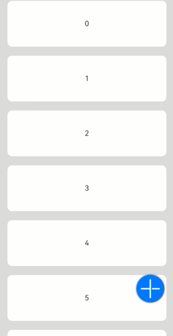
单选框(Radio)
创建单选框
Radio通过调用接口来创建,接口调用形式如下:
Radio(options: {value: string, group: string})
其中,value是单选框的名称,group是单选框的所属群组名称。checked属性可以设置单选框的状态,状态分别为false和true,设置为true时表示单选框被选中。
Radio支持设置选中状态和非选中状态的样式,不支持自定义形状。
Radio({ value: 'Radio1', group: 'radioGroup' }) .checked(false)Radio({ value: 'Radio2', group: 'radioGroup' }) .checked(true)
添加事件
除支持通用事件外,Radio还用于选中后触发某些操作,可以绑定onChange事件来响应选中操作后的自定义行为。
Radio({ value: 'Radio1', group: 'radioGroup' }) .onChange((isChecked: boolean) => { if(isChecked) { //需要执行的操作 } }) Radio({ value: 'Radio2', group: 'radioGroup' }) .onChange((isChecked: boolean) => { if(isChecked) { //需要执行的操作 } })
场景示例
通过点击Radio切换声音模式。
// xxx.etsimport { promptAction } from '@kit.ArkUI';
@Entry@Componentstruct RadioExample {  @State Rst:promptAction.ShowToastOptions = {'message': 'Ringing mode.'}  @State Vst:promptAction.ShowToastOptions = {'message': 'Vibration mode.'}  @State Sst:promptAction.ShowToastOptions = {'message': 'Silent mode.'}  build() {    Row() {      Column() {        Radio({ value: 'Radio1', group: 'radioGroup' }).checked(true)          .height(50)          .width(50)          .onChange((isChecked: boolean) => {            if(isChecked) {              // 切换为响铃模式              promptAction.showToast(this.Rst)            }          })        Text('Ringing')      }      Column() {        Radio({ value: 'Radio2', group: 'radioGroup' })          .height(50)          .width(50)          .onChange((isChecked: boolean) => {            if(isChecked) {              // 切换为振动模式              promptAction.showToast(this.Vst)            }          })        Text('Vibration')      }      Column() {        Radio({ value: 'Radio3', group: 'radioGroup' })          .height(50)          .width(50)          .onChange((isChecked: boolean) => {            if(isChecked) {              // 切换为静音模式              promptAction.showToast(this.Sst)            }          })        Text('Silent')      }    }.height('100%').width('100%').justifyContent(FlexAlign.Center)  }}
切换按钮(Toggle)
创建切换按钮
Toggle通过调用接口来创建,接口调用形式如下:
Toggle(options: { type: ToggleType, isOn?: boolean })
其中,ToggleType为开关类型,包括Button、Checkbox和Switch,isOn为切换按钮的状态。
API version 11开始,Checkbox默认样式由圆角方形变为圆形。
接口调用有以下两种形式:
-
创建不包含子组件的Toggle。
当ToggleType为Checkbox或者Switch时,用于创建不包含子组件的Toggle:
Toggle({ type: ToggleType.Checkbox, isOn: false })Toggle({ type: ToggleType.Checkbox, isOn: true })
Toggle({ type: ToggleType.Switch, isOn: false })Toggle({ type: ToggleType.Switch, isOn: true })
-
创建包含子组件的Toggle。
当ToggleType为Button时,只能包含一个子组件,如果子组件有文本设置,则相应的文本内容会显示在按钮上。
Toggle({ type: ToggleType.Button, isOn: false }) { Text('status button') .fontColor('#182431') .fontSize(12)}.width(100)Toggle({ type: ToggleType.Button, isOn: true }) { Text('status button') .fontColor('#182431') .fontSize(12)}.width(100)
自定义样式
-
通过selectedColor属性设置Toggle打开选中后的背景颜色。
Toggle({ type: ToggleType.Button, isOn: true }) { Text('status button') .fontColor('#182431') .fontSize(12)}.width(100).selectedColor(Color.Pink)Toggle({ type: ToggleType.Checkbox, isOn: true }) .selectedColor(Color.Pink)Toggle({ type: ToggleType.Switch, isOn: true }) .selectedColor(Color.Pink)
-
通过switchPointColor属性设置Switch类型的圆形滑块颜色,仅对type为ToggleType.Switch生效。
Toggle({ type: ToggleType.Switch, isOn: false }) .switchPointColor(Color.Pink)Toggle({ type: ToggleType.Switch, isOn: true }) .switchPointColor(Color.Pink)
添加事件
除支持通用事件外,Toggle还用于选中和取消选中后触发某些操作,可以绑定onChange事件来响应操作后的自定义行为。
Toggle({ type: ToggleType.Switch, isOn: false }) .onChange((isOn: boolean) => { if(isOn) { // 需要执行的操作 } })
场景示例
Toggle用于切换蓝牙开关状态。
// xxx.etsimport { promptAction } from '@kit.ArkUI';@Entry@Componentstruct ToggleExample { @State BOnSt:promptAction.ShowToastOptions = {'message': 'Bluetooth is on.'} @State BOffSt:promptAction.ShowToastOptions = {'message': 'Bluetooth is off.'} build() { Column() { Row() { Text("Bluetooth Mode") .height(50) .fontSize(16) } Row() { Text("Bluetooth") .height(50) .padding({left: 10}) .fontSize(16) .textAlign(TextAlign.Start) .backgroundColor(0xFFFFFF) Toggle({ type: ToggleType.Switch }) .margin({left: 200, right: 10}) .onChange((isOn: boolean) => { if(isOn) { promptAction.showToast(this.BOnSt) } else { promptAction.showToast(this.BOffSt) } }) } .backgroundColor(0xFFFFFF) } .padding(10) .backgroundColor(0xDCDCDC) .width('100%') .height('100%') }}
显示图片(image)
开发者经常需要在应用中显示一些图片,例如:按钮中的icon、网络图片、本地图片等。在应用中显示图片需要使用Image组件实现,Image支持多种图片格式,包括png、jpg、bmp、svg、gif和heif,具体用法请参考Image组件。
Image通过调用接口来创建,接口调用形式如下:
Image(src: PixelMap | ResourceStr | DrawableDescriptor)
该接口通过图片数据源获取图片,支持本地图片和网络图片的渲染展示。其中,src是图片的数据源,加载方式请参考加载图片资源。
加载图片资源
Image支持加载存档图、多媒体像素图两种类型。
存档图类型数据源
存档图类型的数据源可以分为本地资源、网络资源、Resource资源、媒体库资源和base64。
-
本地资源
创建文件夹,将本地图片放入ets文件夹下的任意位置。
Image组件引入本地图片路径,即可显示图片(根目录为ets文件夹)。
Image('images/view.jpg').width(200) -
网络资源
引入网络图片需申请权限ohos.permission.INTERNET,具体申请方式请参考声明权限。此时,Image组件的src参数为网络图片的链接。
当前Image组件仅支持加载简单网络图片。
Image组件首次加载网络图片时,需要请求网络资源,非首次加载时,默认从缓存中直接读取图片,更多图片缓存设置请参考setImageCacheCount、setImageRawDataCacheSize、setImageFileCacheSize。但是,这三个图片缓存接口并不灵活,且后续不继续演进,对于复杂情况,更推荐使用ImageKnife。
Image('https://www.example.com/example.JPG') // 实际使用时请替换为真实地址 -
Resource资源
使用资源格式可以跨包/跨模块引入图片,resources文件夹下的图片都可以通过$r资源接口读取到并转换到Resource格式。
图1 resources
调用方式:
Image($r('app.media.icon'))还可以将图片放在rawfile文件夹下。
图2 rawfile
调用方式:
Image($rawfile('example1.png')) -
媒体库file://data/storage
支持file://路径前缀的字符串,用于访问通过选择器提供的图片路径。
-
调用接口获取图库的照片url。
import { photoAccessHelper } from '@kit.MediaLibraryKit';import { BusinessError } from '@kit.BasicServicesKit'; @Entry@Componentstruct Index { @State imgDatas: string[] = []; // 获取照片url集 getAllImg() { try { let PhotoSelectOptions:photoAccessHelper.PhotoSelectOptions = new photoAccessHelper.PhotoSelectOptions(); PhotoSelectOptions.MIMEType = photoAccessHelper.PhotoViewMIMETypes.IMAGE_TYPE; PhotoSelectOptions.maxSelectNumber = 5; let photoPicker:photoAccessHelper.PhotoViewPicker = new photoAccessHelper.PhotoViewPicker(); photoPicker.select(PhotoSelectOptions).then((PhotoSelectResult:photoAccessHelper.PhotoSelectResult) => { this.imgDatas = PhotoSelectResult.photoUris; console.info('PhotoViewPicker.select successfully, PhotoSelectResult uri: ' + JSON.stringify(PhotoSelectResult)); }).catch((err:Error) => { let message = (err as BusinessError).message; let code = (err as BusinessError).code; console.error(`PhotoViewPicker.select failed with. Code: ${code}, message: ${message}`); }); } catch (err) { let message = (err as BusinessError).message; let code = (err as BusinessError).code; console.error(`PhotoViewPicker failed with. Code: ${code}, message: ${message}`); } } // aboutToAppear中调用上述函数,获取图库的所有图片url,存在imgDatas中 async aboutToAppear() { this.getAllImg(); } // 使用imgDatas的url加载图片。 build() { Column() { Grid() { ForEach(this.imgDatas, (item:string) => { GridItem() { Image(item) .width(200) } }, (item:string):string => JSON.stringify(item)) } }.width('100%').height('100%') }} -
从媒体库获取的url格式通常如下。
Image('file://media/Photos/5').width(200)
-
-
base64
路径格式为data:image/[png|jpeg|bmp|webp|heif];base64,[base64 data],其中[base64 data]为Base64字符串数据。
Base64格式字符串可用于存储图片的像素数据,在网页上使用较为广泛。
多媒体像素图
PixelMap是图片解码后的像素图,具体用法请参考图片开发指导。以下示例将加载的网络图片返回的数据解码成PixelMap格式,再显示在Image组件上。
-
创建PixelMap状态变量。
@State image: PixelMap | undefined = undefined; -
引用多媒体。
(1) 引用网络权限与媒体库权限。
import { http } from '@kit.NetworkKit';import { image } from '@kit.ImageKit';import { BusinessError } from '@kit.BasicServicesKit';(2) 填写网络图片地址。
let OutData: http.HttpResponsehttp.createHttp().request("https://www.example.com/xxx.png", (error: BusinessError, data: http.HttpResponse) => { if (error) { console.error(`http request failed with. Code: ${error.code}, message: ${error.message}`); } else { OutData = data } }) -
将网络地址成功返回的数据,编码转码成pixelMap的图片格式。
let code: http.ResponseCode | number = OutData.responseCodeif (http.ResponseCode.OK === code) { let imageData: ArrayBuffer = OutData.result as ArrayBuffer; let imageSource: image.ImageSource = image.createImageSource(imageData); class tmp { height: number = 100 width: number = 100 } let si: tmp = new tmp() let options: Record<string, number | boolean | tmp> = { 'alphaType': 0, // 透明度 'editable': false, // 是否可编辑 'pixelFormat': 3, // 像素格式 'scaleMode': 1, // 缩略值 'size': { height: 100, width: 100 } } // 创建图片大小 class imagetmp { image: PixelMap | undefined = undefined set(val: PixelMap) { this.image = val } } imageSource.createPixelMap(options).then((pixelMap: PixelMap) => { let im = new imagetmp() im.set(pixelMap) })} -
显示图片。
class htp{ httpRequest: Function | undefined = undefined set(){ if(this.httpRequest){ this.httpRequest() } }}Button("获取网络图片") .onClick(() => { let sethtp = new htp() sethtp.set() })Image(this.image).height(100).width(100)同时,也可以传入pixelMap创建PixelMapDrawableDescriptor对象,用来显示图片。
import { DrawableDescriptor, PixelMapDrawableDescriptor } from '@kit.ArkUI'class htp{ httpRequest: Function | undefined = undefined set(){ if(this.httpRequest){ this.httpRequest() } }}Button("获取网络图片") .onClick(() => { let sethtp = new htp() sethtp.set() this.drawablePixelMap = new PixelMapDrawableDescriptor(this.image) })Image(this.drawablePixelMap).height(100).width(100)
显示矢量图
Image组件可显示矢量图(svg格式的图片),svg标签文档请参考svg说明。
svg格式的图片可以使用fillColor属性改变图片的绘制颜色。
Image($r('app.media.cloud')) .width(50) .fillColor(Color.Blue)
图3 原始图片
图4 设置绘制颜色后的svg图片

添加属性
给Image组件设置属性可以使图片显示更灵活,达到一些自定义的效果。以下是几个常用属性的使用示例,完整属性信息详见Image。
设置图片缩放类型
通过objectFit属性使图片缩放到高度和宽度确定的框内。
@Entry@Componentstruct MyComponent {  scroller: Scroller = new Scroller()
  build() {    Scroll(this.scroller) {      Column() {        Row() {          Image($r('app.media.img_2'))            .width(200)            .height(150)            .border({ width: 1 })              // 保持宽高比进行缩小或者放大,使得图片完全显示在显示边界内。            .objectFit(ImageFit.Contain)            .margin(15)            .overlay('Contain', { align: Alignment.Bottom, offset: { x: 0, y: 20 } })          Image($r('app.media.ic_img_2'))            .width(200)            .height(150)            .border({ width: 1 })              // 保持宽高比进行缩小或者放大,使得图片两边都大于或等于显示边界。            .objectFit(ImageFit.Cover)            .margin(15)            .overlay('Cover', { align: Alignment.Bottom, offset: { x: 0, y: 20 } })          Image($r('app.media.img_2'))            .width(200)            .height(150)            .border({ width: 1 })              // 自适应显示。            .objectFit(ImageFit.Auto)            .margin(15)            .overlay('Auto', { align: Alignment.Bottom, offset: { x: 0, y: 20 } })        }
        Row() {          Image($r('app.media.img_2'))            .width(200)            .height(150)            .border({ width: 1 })              // 不保持宽高比进行放大缩小,使得图片充满显示边界。            .objectFit(ImageFit.Fill)            .margin(15)            .overlay('Fill', { align: Alignment.Bottom, offset: { x: 0, y: 20 } })          Image($r('app.media.img_2'))            .width(200)            .height(150)            .border({ width: 1 })              // 保持宽高比显示,图片缩小或者保持不变。            .objectFit(ImageFit.ScaleDown)            .margin(15)            .overlay('ScaleDown', { align: Alignment.Bottom, offset: { x: 0, y: 20 } })          Image($r('app.media.img_2'))            .width(200)            .height(150)            .border({ width: 1 })              // 保持原有尺寸显示。            .objectFit(ImageFit.None)            .margin(15)            .overlay('None', { align: Alignment.Bottom, offset: { x: 0, y: 20 } })        }      }    }  }}
图片插值
当原图分辨率较低并且放大显示时,图片会模糊出现锯齿。这时可以使用interpolation属性对图片进行插值,使图片显示得更清晰。
@Entry@Componentstruct Index {  build() {    Column() {      Row() {        Image($r('app.media.grass'))          .width('40%')          .interpolation(ImageInterpolation.None)          .borderWidth(1)          .overlay("Interpolation.None", { align: Alignment.Bottom, offset: { x: 0, y: 20 } })          .margin(10)        Image($r('app.media.grass'))          .width('40%')          .interpolation(ImageInterpolation.Low)          .borderWidth(1)          .overlay("Interpolation.Low", { align: Alignment.Bottom, offset: { x: 0, y: 20 } })          .margin(10)      }.width('100%')      .justifyContent(FlexAlign.Center)
      Row() {        Image($r('app.media.grass'))          .width('40%')          .interpolation(ImageInterpolation.Medium)          .borderWidth(1)          .overlay("Interpolation.Medium", { align: Alignment.Bottom, offset: { x: 0, y: 20 } })          .margin(10)        Image($r('app.media.grass'))          .width('40%')          .interpolation(ImageInterpolation.High)          .borderWidth(1)          .overlay("Interpolation.High", { align: Alignment.Bottom, offset: { x: 0, y: 20 } })          .margin(10)      }.width('100%')      .justifyContent(FlexAlign.Center)    }    .height('100%')  }}
设置图片重复样式
通过objectRepeat属性设置图片的重复样式方式,重复样式请参考ImageRepeat枚举说明。
@Entry@Componentstruct MyComponent { build() { Column({ space: 10 }) { Row({ space: 5 }) { Image($r('app.media.ic_public_favor_filled_1')) .width(110) .height(115) .border({ width: 1 }) .objectRepeat(ImageRepeat.XY) .objectFit(ImageFit.ScaleDown) // 在水平轴和竖直轴上同时重复绘制图片 .overlay('ImageRepeat.XY', { align: Alignment.Bottom, offset: { x: 0, y: 20 } }) Image($r('app.media.ic_public_favor_filled_1')) .width(110) .height(115) .border({ width: 1 }) .objectRepeat(ImageRepeat.Y) .objectFit(ImageFit.ScaleDown) // 只在竖直轴上重复绘制图片 .overlay('ImageRepeat.Y', { align: Alignment.Bottom, offset: { x: 0, y: 20 } }) Image($r('app.media.ic_public_favor_filled_1')) .width(110) .height(115) .border({ width: 1 }) .objectRepeat(ImageRepeat.X) .objectFit(ImageFit.ScaleDown) // 只在水平轴上重复绘制图片 .overlay('ImageRepeat.X', { align: Alignment.Bottom, offset: { x: 0, y: 20 } }) } }.height(150).width('100%').padding(8) }}
设置图片渲染模式
通过renderMode属性设置图片的渲染模式为原色或黑白。
@Entry@Componentstruct MyComponent { build() { Column({ space: 10 }) { Row({ space: 50 }) { Image($r('app.media.example')) // 设置图片的渲染模式为原色 .renderMode(ImageRenderMode.Original) .width(100) .height(100) .border({ width: 1 }) // overlay是通用属性,用于在组件上显示说明文字 .overlay('Original', { align: Alignment.Bottom, offset: { x: 0, y: 20 } }) Image($r('app.media.example')) // 设置图片的渲染模式为黑白 .renderMode(ImageRenderMode.Template) .width(100) .height(100) .border({ width: 1 }) .overlay('Template', { align: Alignment.Bottom, offset: { x: 0, y: 20 } }) } }.height(150).width('100%').padding({ top: 20,right: 10 }) }}
设置图片解码尺寸
通过sourceSize属性设置图片解码尺寸,降低图片的分辨率。
原图尺寸为1280960,该示例将图片解码为4040和90*90。
@Entry@Componentstruct Index { build() { Column() { Row({ space: 50 }) { Image($r('app.media.example')) .sourceSize({ width: 40, height: 40 }) .objectFit(ImageFit.ScaleDown) .aspectRatio(1) .width('25%') .border({ width: 1 }) .overlay('width:40 height:40', { align: Alignment.Bottom, offset: { x: 0, y: 40 } }) Image($r('app.media.example')) .sourceSize({ width: 90, height: 90 }) .objectFit(ImageFit.ScaleDown) .width('25%') .aspectRatio(1) .border({ width: 1 }) .overlay('width:90 height:90', { align: Alignment.Bottom, offset: { x: 0, y: 40 } }) }.height(150).width('100%').padding(20) } }}
为图片添加滤镜效果
通过colorFilter修改图片的像素颜色,为图片添加滤镜。
@Entry@Componentstruct Index { build() { Column() { Row() { Image($r('app.media.example')) .width('40%') .margin(10) Image($r('app.media.example')) .width('40%') .colorFilter( [1, 1, 0, 0, 0, 0, 1, 0, 0, 0, 0, 0, 1, 0, 0, 0, 0, 0, 1, 0]) .margin(10) }.width('100%') .justifyContent(FlexAlign.Center) } }}

同步加载图片
一般情况下,图片加载流程会异步进行,以避免阻塞主线程,影响UI交互。但是特定情况下,图片刷新时会出现闪烁,这时可以使用syncLoad属性,使图片同步加载,从而避免出现闪烁。不建议图片加载较长时间时使用,会导致页面无法响应。
Image($r('app.media.icon')) .syncLoad(true)
事件调用
通过在Image组件上绑定onComplete事件,图片加载成功后可以获取图片的必要信息。如果图片加载失败,也可以通过绑定onError回调来获得结果。
@Entry@Componentstruct MyComponent {  @State widthValue: number = 0  @State heightValue: number = 0  @State componentWidth: number = 0  @State componentHeight: number = 0
  build() {    Column() {      Row() {        Image($r('app.media.ic_img_2'))          .width(200)          .height(150)          .margin(15)          .onComplete(msg => {            if(msg){              this.widthValue = msg.width              this.heightValue = msg.height              this.componentWidth = msg.componentWidth              this.componentHeight = msg.componentHeight            }          })            // 图片获取失败,打印结果          .onError(() => {            console.info('load image fail')          })          .overlay('\nwidth: ' + String(this.widthValue) + ', height: ' + String(this.heightValue) + '\ncomponentWidth: ' + String(this.componentWidth) + '\ncomponentHeight: ' + String(this.componentHeight), {            align: Alignment.Bottom,            offset: { x: 0, y: 60 }          })      }    }  }}
视频播放(video)
Video组件用于播放视频文件并控制其播放状态,常用于为短视频和应用内部视频的列表页面。当视频完整出现时会自动播放,用户点击视频区域则会暂停播放,同时显示播放进度条,通过拖动播放进度条指定视频播放到具体位置。具体用法请参考Video。
创建视频组件
Video通过调用接口来创建,接口调用形式如下:
Video(value: VideoOptions)
VideoOptions对象包含参数src、currentProgressRate、previewUri、controller。其中,src指定视频播放源的路径,加载方式请参考加载视频资源,currentProgressRate用于设置视频播放倍速,previewUri指定视频未播放时的预览图片路径,controller设置视频控制器,用于自定义控制视频。具体用法请参考VideoOptions对象说明。
加载视频资源
Video组件支持加载本地视频和网络视频。
加载本地视频
-
普通本地视频。
加载本地视频时,首先在本地rawfile目录指定对应的文件,如下图所示。
再使用资源访问符$rawfile()引用视频资源。
@Componentexport struct VideoPlayer{ private controller:VideoController | undefined; private previewUris: Resource = $r ('app.media.preview'); private innerResource: Resource = $rawfile('videoTest.mp4'); build(){ Column() { Video({ src: this.innerResource, previewUri: this.previewUris, controller: this.controller }) } }} -
Data Ability提供的视频路径带有dataability://前缀,使用时确保对应视频资源存在即可。
@Componentexport struct VideoPlayer{ private controller:VideoController | undefined; private previewUris: Resource = $r ('app.media.preview'); private videoSrc: string = 'dataability://device_id/com.domainname.dataability.videodata/video/10' build(){ Column() { Video({ src: this.videoSrc, previewUri: this.previewUris, controller: this.controller }) } }}
加载沙箱路径视频
支持file:///data/storage路径前缀的字符串,用于读取应用沙箱路径内的资源,需要保证应用沙箱目录路径下的文件存在并且有可读权限。
@Componentexport struct VideoPlayer {  private controller: VideoController | undefined;  private videoSrc: string = 'file:///data/storage/el2/base/haps/entry/files/show.mp4'
  build() {    Column() {      Video({        src: this.videoSrc,        controller: this.controller      })    }  }}
加载网络视频
加载网络视频时,需要申请权限ohos.permission.INTERNET,具体申请方式请参考声明权限。此时,Video的src属性为网络视频的链接。
@Componentexport struct VideoPlayer{ private controller:VideoController | undefined; private previewUris: Resource = $r ('app.media.preview'); private videoSrc: string= 'https://www.example.com/example.mp4' // 使用时请替换为实际视频加载网址 build(){ Column() { Video({ src: this.videoSrc, previewUri: this.previewUris, controller: this.controller }) } }}
添加属性
Video组件属性主要用于设置视频的播放形式。例如设置视频播放是否静音、播放是否显示控制条等。
@Componentexport struct VideoPlayer {  private controller: VideoController | undefined;
  build() {    Column() {      Video({        controller: this.controller      })        .muted(false) //设置是否静音        .controls(false) //设置是否显示默认控制条        .autoPlay(false) //设置是否自动播放        .loop(false) //设置是否循环播放        .objectFit(ImageFit.Contain) //设置视频适配模式    }  }}
事件调用
Video组件回调事件主要为播放开始、暂停结束、播放失败、播放停止、视频准备和操作进度条等事件,除此之外,Video组件也支持通用事件的调用,如点击、触摸等事件的调用。详细事件请参考事件说明。
@Entry@Componentstruct VideoPlayer{ private controller:VideoController | undefined; private previewUris: Resource = $r ('app.media.preview'); private innerResource: Resource = $rawfile('videoTest.mp4'); build(){ Column() { Video({ src: this.innerResource, previewUri: this.previewUris, controller: this.controller }) .onUpdate((event) => { //更新事件回调 console.info("Video update."); }) .onPrepared((event) => { //准备事件回调 console.info("Video prepared."); }) .onError(() => { //失败事件回调 console.info("Video error."); }) .onStop(() => { //停止事件回调 console.info("Video stoped."); }) } }}
Video控制器使用
Video控制器主要用于控制视频的状态,包括播放、暂停、停止以及设置进度等,详细使用请参考VideoController使用说明。
-
默认控制器
默认的控制器支持视频的开始、暂停、进度调整、全屏显示四项基本功能。
@Entry@Componentstruct VideoGuide { @State videoSrc: Resource = $rawfile('videoTest.mp4') @State previewUri: string = 'common/videoIcon.png' @State curRate: PlaybackSpeed = PlaybackSpeed.Speed_Forward_1_00_X build() { Row() { Column() { Video({ src: this.videoSrc, previewUri: this.previewUri, currentProgressRate: this.curRate }) } .width('100%') } .height('100%') }} -
自定义控制器
使用自定义的控制器,先将默认控制器关闭掉,之后可以使用button以及slider等组件进行自定义的控制与显示,适合自定义较强的场景下使用。
@Entry@Componentstruct VideoGuide1 {  @State videoSrc: Resource = $rawfile('videoTest.mp4')  @State previewUri: string = 'common/videoIcon.png'  @State curRate: PlaybackSpeed = PlaybackSpeed.Speed_Forward_1_00_X  @State isAutoPlay: boolean = false  @State showControls: boolean = true  @State sliderStartTime: string = '';  @State currentTime: number = 0;  @State durationTime: number = 0;  @State durationStringTime: string ='';  controller: VideoController = new VideoController()
  build() {    Row() {      Column() {        Video({          src: this.videoSrc,          previewUri: this.previewUri,          currentProgressRate: this.curRate,          controller: this.controller        }).controls(false).autoPlay(true)        .onPrepared((event)=>{          if(event){            this.durationTime = event.duration          }        })        .onUpdate((event)=>{          if(event){            this.currentTime =event.time          }        })        Row() {          Text(JSON.stringify(this.currentTime) + 's')          Slider({            value: this.currentTime,            min: 0,            max: this.durationTime          })          .onChange((value: number, mode: SliderChangeMode) => {              this.controller.setCurrentTime(value);            }).width("90%")          Text(JSON.stringify(this.durationTime) + 's')        }        .opacity(0.8)        .width("100%")      }      .width('100%')    }    .height('40%')  }}
其他说明
Video组件已经封装好了视频播放的基础能力,开发者无需进行视频实例的创建,视频信息的设置获取,只需要设置数据源以及基础信息即可播放视频,相对扩展能力较弱。如果开发者想自定义视频播放,请参考视频播放。
进度条(progress)
Progress是进度条显示组件,显示内容通常为目标操作的当前进度。具体用法请参考Progress。
创建进度条
Progress通过调用接口来创建,接口调用形式如下:
Progress(options: {value: number, total?: number, type?: ProgressType})
其中,value用于设置初始进度值,total用于设置进度总长度,type用于设置Progress样式。
Progress({ value: 24, total: 100, type: ProgressType.Linear }) // 创建一个进度总长为100,初始进度值为24的线性进度条
设置进度条样式
Progress有5种可选类型,通过ProgressType可以设置进度条样式,ProgressType类型包括:ProgressType.Linear(线性样式)、 ProgressType.Ring(环形无刻度样式)、ProgressType.ScaleRing(环形有刻度样式)、ProgressType.Eclipse(圆形样式)和ProgressType.Capsule(胶囊样式)。
-
线性样式进度条(默认类型)
说明
从API version9开始,组件高度大于宽度时,自适应垂直显示;组件高度等于宽度时,保持水平显示。
Progress({ value: 20, total: 100, type: ProgressType.Linear }).width(200).height(50)Progress({ value: 20, total: 100, type: ProgressType.Linear }).width(50).height(200)
-
环形无刻度样式进度条
// 从左往右,1号环形进度条,默认前景色为蓝色渐变,默认strokeWidth进度条宽度为2.0vpProgress({ value: 40, total: 150, type: ProgressType.Ring }).width(100).height(100)// 从左往右,2号环形进度条Progress({ value: 40, total: 150, type: ProgressType.Ring }).width(100).height(100) .color(Color.Grey) // 进度条前景色为灰色 .style({ strokeWidth: 15}) // 设置strokeWidth进度条宽度为15.0vp
-
环形有刻度样式进度条
Progress({ value: 20, total: 150, type: ProgressType.ScaleRing }).width(100).height(100) .backgroundColor(Color.Black) .style({ scaleCount: 20, scaleWidth: 5 }) // 设置环形有刻度进度条总刻度数为20,刻度宽度为5vpProgress({ value: 20, total: 150, type: ProgressType.ScaleRing }).width(100).height(100) .backgroundColor(Color.Black) .style({ strokeWidth: 15, scaleCount: 20, scaleWidth: 5 }) // 设置环形有刻度进度条宽度15,总刻度数为20,刻度宽度为5vpProgress({ value: 20, total: 150, type: ProgressType.ScaleRing }).width(100).height(100) .backgroundColor(Color.Black) .style({ strokeWidth: 15, scaleCount: 20, scaleWidth: 3 }) // 设置环形有刻度进度条宽度15,总刻度数为20,刻度宽度为3vp
-
圆形样式进度条
// 从左往右,1号圆形进度条,默认前景色为蓝色Progress({ value: 10, total: 150, type: ProgressType.Eclipse }).width(100).height(100)// 从左往右,2号圆形进度条,指定前景色为灰色Progress({ value: 20, total: 150, type: ProgressType.Eclipse }).color(Color.Grey).width(100).height(100)
-
胶囊样式进度条
说明
- 头尾两端圆弧处的进度展示效果与ProgressType.Eclipse样式相同。
- 中段处的进度展示效果为矩形状长条,与ProgressType.Linear线性样式相似。
- 组件高度大于宽度的时候自适应垂直显示。
Progress({ value: 10, total: 150, type: ProgressType.Capsule }).width(100).height(50)Progress({ value: 20, total: 150, type: ProgressType.Capsule }).width(50).height(100).color(Color.Grey)Progress({ value: 50, total: 150, type: ProgressType.Capsule }).width(50).height(100).color(Color.Blue).backgroundColor(Color.Black)
场景示例
更新当前进度值,如应用安装进度条,可通过点击Button增加progressValue,value属性将progressValue设置给Progress组件,进度条组件即会触发刷新,更新当前进度。
@Entry@Componentstruct ProgressCase1 { @State progressValue: number = 0 // 设置进度条初始值为0 build() { Column() { Column() { Progress({value:0, total:100, type:ProgressType.Capsule}).width(200).height(50).value(this.progressValue) Row().width('100%').height(5) Button("进度条+5") .onClick(()=>{ this.progressValue += 5 if (this.progressValue > 100){ this.progressValue = 0 } }) } }.width('100%').height('100%') }}

气泡提示 (Popup)
Popup属性可绑定在组件上显示气泡弹窗提示,设置弹窗内容、交互逻辑和显示状态。主要用于屏幕录制、信息弹出提醒等显示状态。
气泡分为两种类型,一种是系统提供的气泡PopupOptions,一种是开发者可以自定义的气泡CustomPopupOptions。其中PopupOptions为系统提供的气泡,通过配置primaryButton、secondaryButton来设置带按钮的气泡。CustomPopupOptions通过配置builder参数来设置自定义的气泡。
文本提示气泡
文本提示气泡常用于只展示带有文本的信息提示,不带有任何交互的场景。Popup属性需绑定组件,当bindPopup属性中参数show为true时会弹出气泡提示。
在Button组件上绑定Popup属性,每次点击Button按钮,handlePopup会切换布尔值,当值为true时,触发bindPopup弹出气泡。
@Entry@Componentstruct PopupExample { @State handlePopup: boolean = false build() { Column() { Button('PopupOptions') .onClick(() => { this.handlePopup = !this.handlePopup }) .bindPopup(this.handlePopup, { message: 'This is a popup with PopupOptions', }) }.width('100%').padding({ top: 5 }) }}
添加气泡状态变化的事件
通过onStateChange参数为气泡添加状态变化的事件回调,可以判断当前气泡的显示状态。
@Entry@Componentstruct PopupExample {  @State handlePopup: boolean = false
  build() {    Column() {      Button('PopupOptions')        .onClick(() => {          this.handlePopup = !this.handlePopup        })        .bindPopup(this.handlePopup, {          message: 'This is a popup with PopupOptions',          onStateChange: (e)=> { // 返回当前的气泡状态            if (!e.isVisible) {              this.handlePopup = false            }          }        })    }.width('100%').padding({ top: 5 })  }}
带按钮的提示气泡
通过primaryButton、secondaryButton属性为气泡最多设置两个Button按钮,通过此按钮进行简单的交互,开发者可以通过配置action参数来设置想要触发的操作。
@Entry@Componentstruct PopupExample22 {  @State handlePopup: boolean = false
  build() {    Column() {      Button('PopupOptions').margin({ top: 200 })        .onClick(() => {          this.handlePopup = !this.handlePopup        })        .bindPopup(this.handlePopup, {          message: 'This is a popup with PopupOptions',          primaryButton: {            value: 'Confirm',            action: () => {              this.handlePopup = !this.handlePopup              console.info('confirm Button click')            }          },          secondaryButton: {            value: 'Cancel',            action: () => {              this.handlePopup = !this.handlePopup            }          },          onStateChange: (e) => {            if (!e.isVisible) {              this.handlePopup = false            }          }        })    }.width('100%').padding({ top: 5 })  }}
气泡的动画
气泡通过定义transition控制气泡的进场和出场动画效果。
// xxx.ets@Entry@Componentstruct PopupExample {  @State handlePopup: boolean = false  @State customPopup: boolean = false
  // popup构造器定义弹框内容  @Builder popupBuilder() {    Row() {      Text('Custom Popup with transitionEffect').fontSize(10)    }.height(50).padding(5)  }
  build() {    Flex({ direction: FlexDirection.Column }) {      // PopupOptions 类型设置弹框内容      Button('PopupOptions')        .onClick(() => {          this.handlePopup = !this.handlePopup        })        .bindPopup(this.handlePopup, {          message: 'This is a popup with transitionEffect',          placementOnTop: true,          showInSubWindow: false,          onStateChange: (e) => {            if (!e.isVisible) {              this.handlePopup = false            }          },          // 设置弹窗显示动效为透明度动效与平移动效的组合效果,无退出动效          transition:TransitionEffect.asymmetric(            TransitionEffect.OPACITY.animation({ duration: 1000, curve: Curve.Ease }).combine(              TransitionEffect.translate({ x: 50, y: 50 })),            TransitionEffect.IDENTITY)        })        .position({ x: 100, y: 150 })
      // CustomPopupOptions 类型设置弹框内容      Button('CustomPopupOptions')        .onClick(() => {          this.customPopup = !this.customPopup        })        .bindPopup(this.customPopup, {          builder: this.popupBuilder,          placement: Placement.Top,          showInSubWindow: false,          onStateChange: (e) => {            if (!e.isVisible) {              this.customPopup = false            }          },          // 设置弹窗显示动效与退出动效为缩放动效          transition:TransitionEffect.scale({ x: 1, y: 0 }).animation({ duration: 500, curve: Curve.Ease })        })        .position({ x: 80, y: 300 })    }.width('100%').padding({ top: 5 })  }}
olor.Grey).width(100).height(100)
[外链图片转存中...(img-IJbsxW5q-1734482006016)]

- 胶囊样式进度条

说明

- 头尾两端圆弧处的进度展示效果与ProgressType.Eclipse样式相同。
- 中段处的进度展示效果为矩形状长条,与ProgressType.Linear线性样式相似。
- 组件高度大于宽度的时候自适应垂直显示。

```typescript
Progress({ value: 10, total: 150, type: ProgressType.Capsule }).width(100).height(50)Progress({ value: 20, total: 150, type: ProgressType.Capsule }).width(50).height(100).color(Color.Grey)Progress({ value: 50, total: 150, type: ProgressType.Capsule }).width(50).height(100).color(Color.Blue).backgroundColor(Color.Black)
[外链图片转存中…(img-GjX7YzpL-1734482006016)]
场景示例
更新当前进度值,如应用安装进度条,可通过点击Button增加progressValue,value属性将progressValue设置给Progress组件,进度条组件即会触发刷新,更新当前进度。
@Entry@Componentstruct ProgressCase1 { @State progressValue: number = 0 // 设置进度条初始值为0 build() { Column() { Column() { Progress({value:0, total:100, type:ProgressType.Capsule}).width(200).height(50).value(this.progressValue) Row().width('100%').height(5) Button("进度条+5") .onClick(()=>{ this.progressValue += 5 if (this.progressValue > 100){ this.progressValue = 0 } }) } }.width('100%').height('100%') }}
[外链图片转存中…(img-0df29i5l-1734482006016)]
气泡提示 (Popup)
Popup属性可绑定在组件上显示气泡弹窗提示,设置弹窗内容、交互逻辑和显示状态。主要用于屏幕录制、信息弹出提醒等显示状态。
气泡分为两种类型,一种是系统提供的气泡PopupOptions,一种是开发者可以自定义的气泡CustomPopupOptions。其中PopupOptions为系统提供的气泡,通过配置primaryButton、secondaryButton来设置带按钮的气泡。CustomPopupOptions通过配置builder参数来设置自定义的气泡。
文本提示气泡
文本提示气泡常用于只展示带有文本的信息提示,不带有任何交互的场景。Popup属性需绑定组件,当bindPopup属性中参数show为true时会弹出气泡提示。
在Button组件上绑定Popup属性,每次点击Button按钮,handlePopup会切换布尔值,当值为true时,触发bindPopup弹出气泡。
@Entry@Componentstruct PopupExample { @State handlePopup: boolean = false build() { Column() { Button('PopupOptions') .onClick(() => { this.handlePopup = !this.handlePopup }) .bindPopup(this.handlePopup, { message: 'This is a popup with PopupOptions', }) }.width('100%').padding({ top: 5 }) }}
[外链图片转存中…(img-3tJomtZh-1734482006016)]
添加气泡状态变化的事件
通过onStateChange参数为气泡添加状态变化的事件回调,可以判断当前气泡的显示状态。
@Entry@Componentstruct PopupExample {  @State handlePopup: boolean = false
  build() {    Column() {      Button('PopupOptions')        .onClick(() => {          this.handlePopup = !this.handlePopup        })        .bindPopup(this.handlePopup, {          message: 'This is a popup with PopupOptions',          onStateChange: (e)=> { // 返回当前的气泡状态            if (!e.isVisible) {              this.handlePopup = false            }          }        })    }.width('100%').padding({ top: 5 })  }}
[外链图片转存中…(img-SjA9oQ9M-1734482006016)]
带按钮的提示气泡
通过primaryButton、secondaryButton属性为气泡最多设置两个Button按钮,通过此按钮进行简单的交互,开发者可以通过配置action参数来设置想要触发的操作。
@Entry@Componentstruct PopupExample22 {  @State handlePopup: boolean = false
  build() {    Column() {      Button('PopupOptions').margin({ top: 200 })        .onClick(() => {          this.handlePopup = !this.handlePopup        })        .bindPopup(this.handlePopup, {          message: 'This is a popup with PopupOptions',          primaryButton: {            value: 'Confirm',            action: () => {              this.handlePopup = !this.handlePopup              console.info('confirm Button click')            }          },          secondaryButton: {            value: 'Cancel',            action: () => {              this.handlePopup = !this.handlePopup            }          },          onStateChange: (e) => {            if (!e.isVisible) {              this.handlePopup = false            }          }        })    }.width('100%').padding({ top: 5 })  }}
[外链图片转存中…(img-jqMa5Nq7-1734482006016)]
气泡的动画
气泡通过定义transition控制气泡的进场和出场动画效果。
// xxx.ets@Entry@Componentstruct PopupExample {  @State handlePopup: boolean = false  @State customPopup: boolean = false
  // popup构造器定义弹框内容  @Builder popupBuilder() {    Row() {      Text('Custom Popup with transitionEffect').fontSize(10)    }.height(50).padding(5)  }
  build() {    Flex({ direction: FlexDirection.Column }) {      // PopupOptions 类型设置弹框内容      Button('PopupOptions')        .onClick(() => {          this.handlePopup = !this.handlePopup        })        .bindPopup(this.handlePopup, {          message: 'This is a popup with transitionEffect',          placementOnTop: true,          showInSubWindow: false,          onStateChange: (e) => {            if (!e.isVisible) {              this.handlePopup = false            }          },          // 设置弹窗显示动效为透明度动效与平移动效的组合效果,无退出动效          transition:TransitionEffect.asymmetric(            TransitionEffect.OPACITY.animation({ duration: 1000, curve: Curve.Ease }).combine(              TransitionEffect.translate({ x: 50, y: 50 })),            TransitionEffect.IDENTITY)        })        .position({ x: 100, y: 150 })
      // CustomPopupOptions 类型设置弹框内容      Button('CustomPopupOptions')        .onClick(() => {          this.customPopup = !this.customPopup        })        .bindPopup(this.customPopup, {          builder: this.popupBuilder,          placement: Placement.Top,          showInSubWindow: false,          onStateChange: (e) => {            if (!e.isVisible) {              this.customPopup = false            }          },          // 设置弹窗显示动效与退出动效为缩放动效          transition:TransitionEffect.scale({ x: 1, y: 0 }).animation({ duration: 500, curve: Curve.Ease })        })        .position({ x: 80, y: 300 })    }.width('100%').padding({ top: 5 })  }}

讨论HarmonyOS开发技术,专注于API与组件、DevEco Studio、测试、元服务和应用上架分发等。
更多推荐

 25
25 0
0- 0


 已为社区贡献5条内容

所有评论(0)