ArkTS的常用组件
·
ArkTS的常用组件
一、Swiper轮播组件
示例:
@Entry
@Component
struct Index {
  build() {
    Column() {
      Swiper() {
        Image($r('app.media.backpageExp'))
        Image($r('app.media.background'))
        Image($r('app.media.backpageExp'))
      }
      .width("100%")
  //  .height(100)	//不限定高度,就是为了让轮播图在多端系统上面更好的
      .aspectRatio(2.4)
      .border({
        width: 1
      })
    }
    .width("100%")
    .height("100%")
  }
}
1. 常见属性
| 属性属性 | 传承类型 | 作用 | 默认值 |
|---|---|---|---|
| loop | boolean | 是否开启循环 | true |
| autoPlay | boolean | 是否自动播放 | false |
| interval | number | 自动播放的时间间隔 | 3000 |
| vertical | boolean | 纵向滑动轮播 | false |
示例:
@Entry
@Component
struct Index {
  build() {
    Column() {
      Swiper() {
        Image($r('app.media.backpageExp'))
        Image($r('app.media.background'))
        Image($r('app.media.backpageExp'))
      }
      .width("100%")
      .height(100)
      .border({
        width: 1
      })
      .autoPlay(true)
      .interval(1000)
   // .loop(false)
    }
    .width("100%")
    .height("100%")
  }
}
2. 样式自定义
语法:
Swiper(){
	...
}
.indercator(
	Indicator.dot()		// 设置小圆点的相关属性
		.itemWidth(20)		// 未选中时候的高
		.itemHeight(20)		// 未选中时候的宽
		.color(Color.Black)   // 未选中时候的颜色
		.selectedItemWidth(30)   // 选中时候的宽
		.selectedItemHight(30)   // 选中时候的高
		.selectedColor(Color.White)  // 选中时候的颜色
)
二、Scroll滑动组件
用法说明:
- 设置尺寸
- 设置溢出的子组件(只支持一个子组件)
- 滚动方向
1. 常用属性
| 属性名称 | 参数类型 | 作用 | 值 |
|---|---|---|---|
| scrollable | ScrollDirection | 设置滚动方向 | ScrollDirection.Vertical 纵向 ScrollDirection.Horizontal 横向 |
| scrollBar | BarState | 设置滚动条状态 | |
| scrollBarColor | string | number | Color | 设置滚动条颜色 | |
| scrollBarWidth | string | number | 设置滚动条宽度 | |
| edgeEffect | value: EdgeEffect | 设置边缘滑动效果 | EdgeErrect.None 无 EdgeErrect.Spring 弹簧 EdgeEffect.Fade 阴影 |
示例:
@Entry
@Component
struct Index {
  build() {
    Column() {
      Scroll() {
        Column({ space: 10 }) {
          ForEach(Array.from({ length: 10 }), (item: string, index) => {
            Text(`测试文本${index + 1}`)
              .width("100%")
              .height(100)
              .fontSize(20)
              .fontColor(Color.White)
              .textAlign(TextAlign.Center)
              .backgroundColor(Color.Orange)
              .borderRadius(25)
          })
        }
        .width("100%")
        .padding(10)
      }
      .width("100%")
      .height(600)
      .border({
        width: 1
      })
      .scrollable(ScrollDirection.Vertical)
      .scrollBarColor(Color.Blue)
      .scrollBarWidth(10)
      .edgeEffect(EdgeEffect.Spring)
    }
    .width("100%")
    .height("100%")
  }
}
2. 滑动条控制器
步骤:
a. 实例化 Scroll 的控制器
scroller: Scroller = new Scroller()
b.绑定给 Scroll 组件
Scroll(this.scroller){
	...
}
c.控制器的方法 控制滚动,控制器属性 获取滚动距离
	this.scroller.scrollEdge(Edge.Top)		// 回到顶部
	this.scroller.scrollEdge(Edge.Bottom)	// 去到底部
	this.scroller.currentOffset().xOffset	//获取当前滚动的x轴距离
    this.scroller.currentOffset().yOffset	//获取当前滚动的y轴距离
示例:
@Entry
@Component
struct Index {
  scroller: Scroller = new Scroller();
  build() {
    Column() {
      Scroll(this.scroller) {
        Column({ space: 10 }) {
          ForEach(Array.from({ length: 10 }), (item: string, index) => {
            Text(`测试文本${index + 1}`)
              .width("100%")
              .height(100)
              .fontSize(20)
              .fontColor(Color.White)
              .textAlign(TextAlign.Center)
              .backgroundColor(Color.Orange)
              .borderRadius(25)
          })
        }
        .width("100%")
        .padding(10)
      }
      .width("100%")
      .height(600)
      .border({
        width: 1
      })
      .scrollable(ScrollDirection.Vertical)
      .scrollBarColor(Color.Blue)
      .scrollBarWidth(10)
      .edgeEffect(EdgeEffect.Spring)

      Row() {
        Button('回到顶部')
          .onClick(() => {
            this.scroller.scrollEdge(Edge.Top)
          })
        Button('去到底部')
          .onClick(() => {
            this.scroller.scrollEdge(Edge.Bottom)
          })
      }

      Button('获取已经滚动的距离')
        .onClick(() => {
          const x = this.scroller.currentOffset().xOffset
          const y = this.scroller.currentOffset().yOffset
          AlertDialog.show({
            message: `x = ${x}, y = ${y}`
          })
        })
    }
    .width("100%")
    .height("100%")
  }
}
4. 滚动容器的事件
在滚动的元素同时,触发一些事件(函数)
注意:现在已经将onScroller该属性废除了,改用onWillScroll
语法:
	.onWillScroll((...)=>{
		...
	})
示例:
//获取已经滚动的距离
	Scroll(){
		...
	}
    .onWillScroll((x, y) => {
       console.log(`当前滑动距离 x: ${x} y:${y}`)		//可以用来控制滑动一定距离是,显示置顶按钮
    })
    ...
三、Tabs导航栏组件
用途: 做分页处理,即导航栏的使用
Tabs标签可以直接铺满整个屏幕,这样更适配且方便开发
1. 基础结构
build(){
	Tabs(){
		TabContent(){

		}
		.tabBar('首页’)
		TabContent(){

		}
		.tabBar('收藏’)
		TabContent(){

		}
		.tabBar('内容’)
	}
}
-
Tabs( ) 表面这个页面已经是一个被导航栏控制的页面
-
TabContent( ) 则是导航栏所能在单页面上显示的内容,
这个其实就类似于层叠布局,只是被选择的TabContent层级更高,覆盖了其他的
-
.tabBar则是直接构造出一个可供点击的导航栏区域,让页面切换更合理
他的高度不可变?
2. 常用属性
| 属性名称 | 参数类型 | 作用 | 传参 | 位置 |
|---|---|---|---|---|
| barPosition | BarPosition | 调整导航栏的位置 | BarPosition.Start BarPosition.End |
Tabs({ barPosition: BarPosition.Start }) |
| vertical | boolen | 调整导航栏水平或垂直 | true/false | Tabs( ).vertical( ) |
| scrollable | boolen | 调整是否手势滑动切换 | true/false | Tabs( ).scrollable( ) |
| animationDuration | boolen | 导航栏的切换时间 | true/false | Tabs( ).vertical( ) |
| barMode | BarMode | 导航栏是否可滑动(当导航栏元素过多时) | BarMode.Scrollable | Tabs( ).barMode( ) |
示例:
@Entry
@Component
struct Index {
  scroller: Scroller = new Scroller();
  titles: string[] = [
    '首页', '关注', '热门', '军事', '体育', '数码', '财经', '美食', '旅行'
  ]

  build() {
    Tabs({ barPosition: BarPosition.Start }) {
      ForEach(this.titles, (item: string, index) => {
        TabContent() {
          Text(`${item}内容`)
        }
        .tabBar(item)
      })
    }
    .barMode(BarMode.Scrollable)	//当元素较多的时候再使用,少的时候会压缩宽度
    .animationDuration(1000)
    .scrollable(false)

    // .vertical(true)
  }
}
3. 自定义TabBar
使用@Builder来创建一个带结构的样式,让他作为参数放入到 .tabBar() 中
示例
@Builder
function myTabBarStyle(text: string) {
  Column({ space: 10 }) {
    Image($r('app.media.startIcon'))
      .height(30)
    Text(text)
  }
  .margin({
    left: 5,
    right: 5
  })
  .border({
    width: 1
  })
}

@Entry
@Component
struct Index {
  scroller: Scroller = new Scroller();
  titles: string[] = [
    '首页', '关注', '热门', '军事', '体育', '数码', '财经', '美食', '旅行'
  ]

  build() {
    Tabs({ barPosition: BarPosition.Start }) {
      ForEach(this.titles, (item: string, index) => {
        TabContent() {
          Text(`${item}内容`)
        }
        .tabBar(myTabBarStyle(item))
      })
    }
    .barMode(BarMode.Scrollable)
    .animationDuration(1000)
    .scrollable(false)
  }
}
4. TabBar高亮选择切换
思路:
I. 记录所点击的 TabBar 的索引
II.在TabBar内部比较 标记 == 记录的标记 ? 高亮 : 不高亮
示例:
@Entry
@Component
struct Index {
  @State selectIndex: number = 0;

  @Builder
  myTabBarStyle(index: number, text: string, selImg: ResourceStr, img: ResourceStr) {
    Column({ space: 10 }) {
      Image(index == this.selectIndex ? selImg : img)
        .height(30)
      Text(text)
        .fontColor(index == this.selectIndex ? Color.Red : Color.Gray)
    }
  }

  build() {
    Tabs({ barPosition: BarPosition.End }) {
      TabContent() {
        Text(`内容`)
      }
      .tabBar(this.myTabBarStyle(0, '首页', $r('app.media.startIcon'), $r('app.media.foreground')))

      TabContent() {
        Text(`内容`)
      }
      .tabBar(this.myTabBarStyle(1, '收藏', $r('app.media.startIcon'), $r('app.media.foreground')))

      TabContent() {
        Text(`内容`)
      }
      .tabBar(this.myTabBarStyle(2, '我的', $r('app.media.startIcon'), $r('app.media.foreground')))
    }
    // .barMode(BarMode.Scrollable)
    .animationDuration(1000)
    .scrollable(false)
    .onTabBarClick((index: number) => {
      this.selectIndex = index;
    })
    // .onChange((index: number) => {
    //   this.selectIndex = index;
    // });
    .backgroundColor('#ccc')

  }
}
四、List列表组件
当列表元素到达一定数量时,超过List组件限定的大小时,自动滚动,很方便处理数组元素
1. 常见属性
| 属性名称 | 参数类型 | 作用 | 值 |
|---|---|---|---|
| listDirection | Axis | 调整主轴方向 | Axis.Vertical 水平 Axis.Horizontal 垂直 |
| lanes | number, number | 调整列数和距离 | lanes(2, 3) |
| alignListItem | ListItemAlign | 列的对齐方式 | ListItemAlign.Start ListItemAlign.Center ListItemAlign.End |
| scrollBar | BarState | 滚动条状态 | BarState.Auto |
| divider | {stroken: ,color: ,startMargin: , endMargin: } | 列之间的分割线的样式 | { strokeWidth: 2, color: Color.Blue, } |
示例:
List() {
  ForEach(Array.from({ length: 20 }), () => {
    ListItem() {
      Row() {
      }.width("80%").height(100).backgroundColor(Color.Brown)
    }
    .padding(10)
  })
}
.width("100%")
.height("80%")
.border({
  width: 1
})
.layoutWeight(1)
.listDirection(Axis.Vertical)
// .listDirection(Axis.Horizontal)
.lanes(2, 5) // 2列 距离为5
.alignListItem(ListItemAlign.Center)
// .alignListItem(ListItemAlign.End)
// .alignListItem(ListItemAlign.Start)
.scrollBarColor(BarState.Auto)
.divider({
  strokeWidth: 2,		//分割线宽度为2
  color: Color.Blue,	//分割线的
})
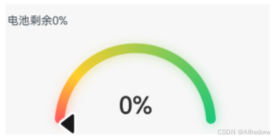
五、环形图标组件
Gauge 是一个环形的进度条组件
参考文档:

讨论HarmonyOS开发技术,专注于API与组件、DevEco Studio、测试、元服务和应用上架分发等。
更多推荐


 28
28 0
0- 0


 已为社区贡献7条内容

所有评论(0)