鸿蒙API13开发【自定义组件的自定义布局】ArkTS组件
自定义组件的自定义布局用于通过数据计算的方式布局自定义组件内的子组件。
自定义组件的自定义布局用于通过数据计算的方式布局自定义组件内的子组件。
说明
本模块首批接口从API version 9开始支持,后续版本的新增接口,采用上角标单独标记接口的起始版本。
onPlaceChildren10+
onPlaceChildren?(selfLayoutInfo: GeometryInfo, children: Array, constraint: ConstraintSizeOptions):void
ArkUI框架会在自定义组件布局时,将该自定义组件的子节点自身的尺寸范围通过onPlaceChildren传递给该自定义组件。不允许在onPlaceChildren函数中改变状态变量。
系统能力: SystemCapability.ArkUI.ArkUI.Full
元服务API: 从API version 11开始,该接口支持在元服务中使用。
参数:
| 参数名 | 类型 | 说明 |
|---|---|---|
| selfLayoutInfo | [GeometryInfo] | 父组件布局信息。 |
| children | Array<[Layoutable]> | 子组件布局信息。 |
| constraint | [ConstraintSizeOptions] | 父组件constraint信息。 |
示例:
onMeasureSize10+
onMeasureSize?(selfLayoutInfo: GeometryInfo, children: Array, constraint: ConstraintSizeOptions): SizeResult
ArkUI框架会在自定义组件确定尺寸时,将该自定义组件的节点信息和尺寸范围通过onMeasureSize传递给该开发者。不允许在onMeasureSize函数中改变状态变量。
系统能力: SystemCapability.ArkUI.ArkUI.Full
元服务API: 从API version 11开始,该接口支持在元服务中使用。
参数:
| 参数名 | 类型 | 说明 |
|---|---|---|
| selfLayoutInfo | [GeometryInfo] | 父组件布局信息。 |
| children | Array<[Measurable]> | 子组件布局信息。**说明:**如果没有设置子组件的布局信息,子组件会维持上一次的布局信息,当子组件从来没有设置过尺寸时,尺寸默认为0。 |
| constraint | [ConstraintSizeOptions] | 父组件constraint信息。 |
返回值:
| 类型 | 描述 |
|---|---|
| [SizeResult] | 组件尺寸信息。 |
示例一:
自定义布局代码示例。
// xxx.ets
@Entry
@Component
struct Index {
build() {
Column() {
CustomLayout({ builder: ColumnChildren })
}
}
}
@Builder
function ColumnChildren() {
ForEach([1, 2, 3], (index: number) => { //暂不支持lazyForEach的写法
Text('S' + index)
.fontSize(30)
.width(100)
.height(100)
.borderWidth(2)
.offset({ x: 10, y: 20 })
})
}
@Component
struct CustomLayout {
@Builder
doNothingBuilder() {
};
@BuilderParam builder: () => void = this.doNothingBuilder;
@State startSize: number = 100;
result: SizeResult = {
width: 0,
height: 0
};
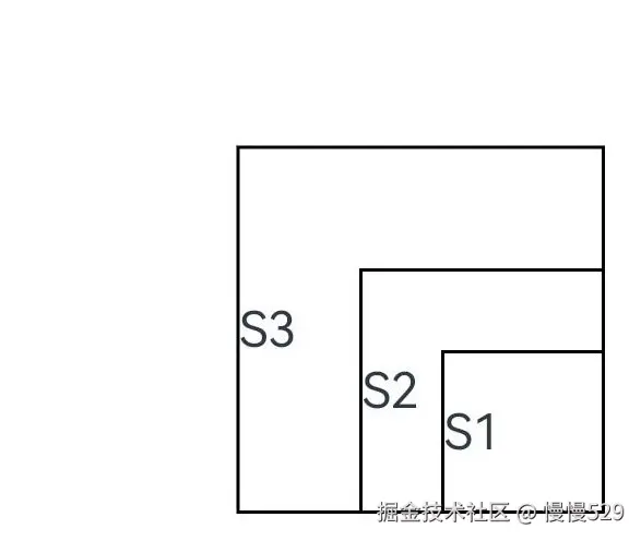
onPlaceChildren(selfLayoutInfo: GeometryInfo, children: Array<Layoutable>, constraint: ConstraintSizeOptions) {
let startPos = 300;
children.forEach((child) => {
let pos = startPos - child.measureResult.height;
child.layout({ x: pos, y: pos })
})
}
onMeasureSize(selfLayoutInfo: GeometryInfo, children: Array<Measurable>, constraint: ConstraintSizeOptions) {
let size = 100;
children.forEach((child) => {
let result: MeasureResult = child.measure({ minHeight: size, minWidth: size, maxWidth: size, maxHeight: size })
size += result.width / 2
;
})
this.result.width = 100;
this.result.height = 400;
return this.result;
}
build() {
this.builder()
}
}
示例二:
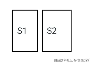
通过组件的位置灵活判断是否参与布局计算。
// xxx.ets
@Entry
@Component
struct Index {
  build() {
    Column() {
      CustomLayout({ builder: ColumnChildren })
    }
    .justifyContent(FlexAlign.Center)
    .width("100%")
    .height("100%")
  }
}

@Builder
function ColumnChildren() {
  ForEach([1, 2, 3], (item: number, index: number) => { //暂不支持lazyForEach的写法
    Text('S' + item)
      .fontSize(20)
      .width(60 + 10 * index)
      .height(100)
      .borderWidth(2)
      .margin({ left:10 })
      .padding(10)
  })
}

@Component
struct CustomLayout {
  // 只布局一行,如果布局空间不够的子组件不显示的demo
  @Builder
  doNothingBuilder() {
  };

  @BuilderParam builder: () => void = this.doNothingBuilder;
  result: SizeResult = {
    width: 0,
    height: 0
  };
  overFlowIndex: number = -1;

  onPlaceChildren(selfLayoutInfo: GeometryInfo, children: Array<Layoutable>, constraint: ConstraintSizeOptions) {
    let currentX = 0;
    let infinity = 100000;
    if (this.overFlowIndex == -1) {
      this.overFlowIndex = children.length;
    }
    for (let index = 0; index < children.length; ++index) {
      let child = children[index];
      if (index >= this.overFlowIndex) {
        // 如果子组件超出父组件范围,将它布局到较偏的位置,达到不显示的目的
        child.layout({x: infinity, y: 0});
        continue;
      }
      child.layout({ x: currentX, y: 0 })
      let margin = child.getMargin();
      currentX += child.measureResult.width + margin.start + margin.end;
    }
  }

  onMeasureSize(selfLayoutInfo: GeometryInfo, children: Array<Measurable>, constraint: ConstraintSizeOptions) {
    let width = 0;
    let height = 0;
    this.overFlowIndex = -1;
    // 假定该组件的宽度不能超过200vp,也不能超过最大约束
    let maxWidth = Math.min(200, constraint.maxWidth as number);
    for (let index = 0; index < children.length; ++index) {
      let child = children[index];
      let childResult: MeasureResult = child.measure({
          minHeight: constraint.minHeight,
          minWidth: constraint.minWidth,
          maxWidth: constraint.maxWidth,
          maxHeight: constraint.maxHeight
      })
      let margin = child.getMargin();
      let newWidth = width + childResult.width + margin.start + margin.end;
      if (newWidth > maxWidth) {
        // 记录不该布局的组件的下标
        this.overFlowIndex = index;
        break;
      }
      // 累积父组件的宽度和高度
      width = newWidth;
      height = Math.max(height, childResult.height + margin.top + margin.bottom);
    }
    this.result.width = width;
    this.result.height = height;
    return this.result;
  }

  build() {
    this.builder()
  }
}
GeometryInfo10+
父组件布局信息,继承自[SizeResult]。
系统能力: SystemCapability.ArkUI.ArkUI.Full
元服务API: 从API version 11开始,该接口支持在元服务中使用。
| 属性 | 类型 | 说明 |
|---|---|---|
| borderWidth | [EdgeWidth] | 父组件边框宽度。单位:vp |
| margin | [Margin] | 父组件margin信息。单位:vp |
| padding | [Padding] | 父组件padding信息。单位:vp |
| width | number | 测量后的宽。单位:vp**说明:**若值为空时,则返回组件的百分比宽。 |
| height | number | 测量后的高。单位:vp**说明:**若值为空时,则返回组件的百分比高。 |
Layoutable10+
子组件布局信息。
系统能力: SystemCapability.ArkUI.ArkUI.Full
属性
| 属性 | 类型 | 必填 | 说明 |
|---|---|---|---|
| measureResult | [MeasureResult] | 是 | 子组件测量后的尺寸信息,继承自[SizeResult]元服务API: 从API version 11开始,该接口支持在元服务中使用。单位:vp |
layout
layout(position: Position)
调用此方法对子组件的位置信息进行限制。
元服务API: 从API version 11开始,该接口支持在元服务中使用。
系统能力: SystemCapability.ArkUI.ArkUI.Full
参数:
| 参数名 | 类型 | 必填 | 说明 |
|---|---|---|---|
| position | [Position] | 是 | 位置。 |
getMargin12+
getMargin() : DirectionalEdgesT
调用此方法获得子组件的margin信息。
元服务API: 从API version 12开始,该接口支持在元服务中使用。
返回值:
| 类型 | 说明 |
|---|---|
| [DirectionalEdgesT] | 子组件的margin信息。 |
getPadding12+
getPadding() : DirectionalEdgesT
调用此方法获得子组件的padding信息。
元服务API: 从API version 12开始,该接口支持在元服务中使用。
返回值:
| 类型 | 说明 |
|---|---|
| [DirectionalEdgesT] | 子组件的padding信息。 |
getBorderWidth12+
getBorderWidth() : DirectionalEdgesT
调用此方法获得子组件的borderWidth信息。
元服务API: 从API version 12开始,该接口支持在元服务中使用。
返回值:
| 类型 | 说明 |
|---|---|
| [DirectionalEdgesT] | 子组件的borderWidth信息。 |
Measurable10+
子组件位置信息。
系统能力: SystemCapability.ArkUI.ArkUI.Full
元服务API: 从API version 11开始,该接口支持在元服务中使用。
measure
measure(constraint: ConstraintSizeOptions) : MeasureResult
调用此方法对子组件的尺寸范围进行限制。
系统能力: SystemCapability.ArkUI.ArkUI.Full
元服务API: 从API version 11开始,该接口支持在元服务中使用。
参数:
| 参数名 | 类型 | 必填 | 说明 |
|---|---|---|---|
| constraint | [ConstraintSizeOptions] | 是 | 约束尺寸。 |
返回值:
| 类型 | 说明 |
|---|---|
| [MeasureResult] | 测量后的组件布局信息。 |
getMargin12+
getMargin() : DirectionalEdgesT
获取子组件的margin信息。
元服务API: 从API version 12开始,该接口支持在元服务中使用。
系统能力: SystemCapability.ArkUI.ArkUI.Full
返回值:
| 类型 | 说明 |
|---|---|
| [DirectionalEdgesT] | 子组件的margin信息。 |
getPadding12+
getPadding() : DirectionalEdgesT
获取子组件的padding信息。
元服务API: 从API version 12开始,该接口支持在元服务中使用。
系统能力: SystemCapability.ArkUI.ArkUI.Full
返回值:
| 类型 | 说明 |
|---|---|
| [DirectionalEdgesT] | 子组件的padding信息。 |
getBorderWidth12+
getBorderWidth() : DirectionalEdgesT
获取子组件的borderWidth信息。
元服务API: 从API version 12开始,该接口支持在元服务中使用。
系统能力: SystemCapability.ArkUI.ArkUI.Full
返回值:
| 类型 | 说明 |
|---|---|
| [DirectionalEdgesT] | 子组件的borderWidth信息。 |
MeasureResult10+
测量后的组件布局信息。
系统能力: SystemCapability.ArkUI.ArkUI.Full
元服务API: 从API version 11开始,该接口支持在元服务中使用。
| 属性 | 类型 | 说明 |
|---|---|---|
| width | number | 测量后的宽。单位:vp |
| height | number | 测量后的高。单位:vp |
SizeResult10+
组件尺寸信息。
系统能力: SystemCapability.ArkUI.ArkUI.Full
元服务API: 从API version 11开始,该接口支持在元服务中使用。
| 属性 | 类型 | 说明 |
|---|---|---|
| width | number | 测量后的宽。单位:vp |
| height | number | 测量后的高。单位:vp |
DirectionalEdgesT12+
全球化的边缘属性。
系统能力: SystemCapability.ArkUI.ArkUI.Full
卡片能力: 从API version 12开始,该接口支持在ArkTS卡片中使用。
| 属性 | 类型 | 说明 |
|---|---|---|
| start | T | 起始边缘的属性。在LTR的方向下,为左边缘,在RTL的方向下,为右边缘。 |
| end | T | 终止边缘的属性。在LTR的方向下,为右边缘,在RTL的方向下,为左边缘。 |
| top | T | 顶部边缘的属性。 |
| bottom | T | 底部边缘的属性。 |
说明
- 自定义布局暂不支持LazyForEach写法。
- 使用builder形式的自定义布局创建,自定义组件的build()方法内只允许存在this.builder(),即示例的推荐用法。
- 父容器(自定义组件)上设置的尺寸信息,除aspectRatio之外,优先级小于onMeasureSize设置的尺寸信息。
- 子组件设置的位置信息,offset、position、markAnchor优先级大于onPlaceChildren设置的位置信息,其他位置设置属性不生效。
- 使用自定义布局方法时,需要同时调用onMeasureSize和onPlaceChildren方法,否则可能出现布局异常。
onLayout(deprecated)
onLayout?(children: Array, constraint: ConstraintSizeOptions): void
ArkUI框架会在自定义组件布局时,将该自定义组件的子节点信息和自身的尺寸范围通过onLayout传递给该自定义组件。不允许在onLayout函数中改变状态变量。
参数:
| 参数名 | 类型 | 说明 |
|---|---|---|
| children | Array<[LayoutChild]> | 子组件布局信息。 |
| constraint | [ConstraintSizeOptions] | 父组件constraint信息。 |
onMeasure(deprecated)
onMeasure?(children: Array, constraint: ConstraintSizeOptions): void
ArkUI框架会在自定义组件确定尺寸时,将该自定义组件的子节点信息和自身的尺寸范围通过onMeasure传递给该自定义组件。不允许在onMeasure函数中改变状态变量。
参数:
| 参数名 | 类型 | 说明 |
|---|---|---|
| children | Array<[LayoutChild]> | 子组件布局信息。 |
| constraint | [ConstraintSizeOptions] | 父组件constraint信息。 |
LayoutChild(deprecated)
子组件布局信息。
从API version 9开始,从API version 10开始废弃,该接口支持在ArkTS卡片中使用。
| 属性 | 类型 | 说明 |
|---|---|---|
| name | string | 子组件名称。 |
| id | string | 子组件id。 |
| constraint | [ConstraintSizeOptions] | 子组件约束尺寸。 |
| borderInfo | [LayoutBorderInfo] | 子组件border信息。 |
| position | [Position] | 子组件位置坐标。 |
| measure | (childConstraint: [ConstraintSizeOptions]) => void | 调用此方法对子组件的尺寸范围进行限制。 |
| layout | (LayoutInfo: [LayoutInfo]) => void | 调用此方法对子组件的位置信息进行限制。 |
LayoutBorderInfo(deprecated)
子组件border信息。
从API version 9开始,从API version 10开始废弃,该接口支持在ArkTS卡片中使用。
| 属性 | 类型 | 描述 |
|---|---|---|
| borderWidth | [EdgeWidths] | 边框宽度类型,用于描述组件边框不同方向的宽度。 |
| margin | [Margin] | 外边距类型,用于描述组件不同方向的外边距。 |
| padding | [Padding] | 内边距类型,用于描述组件不同方向的内边距。 |
LayoutInfo(deprecated)
子组件layout信息。
从API version 9开始,从API version 10开始废弃,该接口支持在ArkTS卡片中使用。
| 属性 | 类型 | 说明 |
|---|---|---|
| position | [Position] | 子组件位置坐标。 |
| constraint | [ConstraintSizeOptions] | 子组件约束尺寸。 |
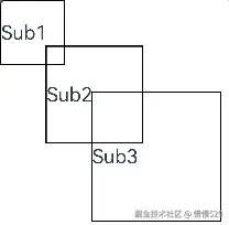
通过layout修改布局。
// xxx.ets
@Entry
@Component
struct Index {
  build() {
    Column() {
      CustomLayout() {
        ForEach([1, 2, 3], (index: number) => {
          Text('Sub' + index)
            .fontSize(30)
            .borderWidth(2)
        })
      }
    }
  }
}


@Component
struct CustomLayout {
  @Builder
  doNothingBuilder() {
  };

  @BuilderParam builder: () => void = this.doNothingBuilder;

  onLayout(children: Array<LayoutChild>, constraint: ConstraintSizeOptions) {
    let pos = 0;
    children.forEach((child) => {
      child.layout({ position: { x: pos, y: pos }, constraint: constraint })
      pos += 70;
    })
  }

  onMeasure(children: Array<LayoutChild>, constraint: ConstraintSizeOptions) {
    let size = 100;
    children.forEach((child) => {
      child.measure({ minHeight: size, minWidth: size, maxWidth: size, maxHeight: size })
      size += 50;
    })
  }

  build() {
    this.builder()
  }
}
最后呢
很多开发朋友不知道需要学习那些鸿蒙技术?鸿蒙开发岗位需要掌握那些核心技术点?为此鸿蒙的开发学习必须要系统性的进行。
而网上有关鸿蒙的开发资料非常的少,假如你想学好鸿蒙的应用开发与系统底层开发。你可以参考这份资料,少走很多弯路,节省没必要的麻烦。由两位前阿里高级研发工程师联合打造的《鸿蒙NEXT星河版OpenHarmony开发文档》里面内容包含了(ArkTS、ArkUI开发组件、Stage模型、多端部署、分布式应用开发、音频、视频、WebGL、OpenHarmony多媒体技术、Napi组件、OpenHarmony内核、Harmony南向开发、鸿蒙项目实战等等)鸿蒙(Harmony NEXT)技术知识点
如果你是一名Android、Java、前端等等开发人员,想要转入鸿蒙方向发展。可以直接领取这份资料辅助你的学习。下面是鸿蒙开发的学习路线图。

针对鸿蒙成长路线打造的鸿蒙学习文档。话不多说,我们直接看详细鸿蒙(OpenHarmony )手册(共计1236页)与鸿蒙(OpenHarmony )开发入门视频,帮助大家在技术的道路上更进一步。
- 《鸿蒙 (OpenHarmony)开发学习视频》
- 《鸿蒙生态应用开发V2.0白皮书》
- 《鸿蒙 (OpenHarmony)开发基础到实战手册》
- OpenHarmony北向、南向开发环境搭建
- 《鸿蒙开发基础》
- 《鸿蒙开发进阶》
- 《鸿蒙开发实战》

总结
鸿蒙—作为国家主力推送的国产操作系统。部分的高校已经取消了安卓课程,从而开设鸿蒙课程;企业纷纷跟进启动了鸿蒙研发。
并且鸿蒙是完全具备无与伦比的机遇和潜力的;预计到年底将有 5,000 款的应用完成原生鸿蒙开发,未来将会支持 50 万款的应用。那么这么多的应用需要开发,也就意味着需要有更多的鸿蒙人才。鸿蒙开发工程师也将会迎来爆发式的增长,学习鸿蒙势在必行! 自↓↓↓拿

讨论HarmonyOS开发技术,专注于API与组件、DevEco Studio、测试、元服务和应用上架分发等。
更多推荐
 17
17 0
0- 0


 已为社区贡献1211条内容

所有评论(0)