React Native 鸿蒙跨平台开发:动态表单全场景实现
在中新增类型(如 “上传组件”“滑块组件”),复用现有状态管理 / 验证逻辑,仅需添加对应渲染逻辑,扩展性极强。本动态表单组件样式专业、功能完整、鸿蒙适配完美,可直接用于注册、设置、信息填写等业务场景,视觉体验对标鸿蒙原生应用,彻底解决之前样式不专业的问题。
一、核心知识点:动态表单(鸿蒙专业级样式)完整核心用法
1. 动态表单核心能力
动态表单的核心是 **“从配置数组生成表单项 + 统一管理表单状态”**,结合鸿蒙设计规范,需具备以下能力:
| 核心能力 | 作用说明 | 鸿蒙适配要点 |
|---|---|---|
| 动态表单项生成 | 通过配置数组(含类型、标签、占位符等)自动渲染不同组件(输入框 / 选择器等) | 表单项采用 “标签 + 组件” 上下布局,统一间距 12px,贴合鸿蒙表单排版规范 |
| 统一表单状态管理 | 用单个对象管理所有表单项的值,避免分散状态 | 状态更新采用useState+name字段绑定,鸿蒙端状态同步无延迟 |
| 实时表单验证 | 输入 / 选择时实时校验字段合法性,提示错误信息 | 错误提示用鸿蒙规范的浅红色 + 小字号,置于组件下方,不破坏布局完整性 |
| 专业级组件样式美化 | 优化输入框、选择器、按钮等组件的样式,符合鸿蒙视觉规范 | 输入框采用 “浅灰边框 + 聚焦主题色边框”,按钮用鸿蒙主题蓝 + 圆角 24px + 轻微阴影 |
二、实战:React Native 鸿蒙跨平台动态表单
待处理问题:尝试的过程中,我使用了Modal弹窗组件,但是死活弹不出来,所以这里我直接把这个组件替换掉了,可能是我的配置不正确,后期我在查查资料调整下。
// App.tsx
import React, { useState, useCallback, useMemo, useEffect } from 'react';
import {
View,
Text,
StyleSheet,
Alert,
KeyboardTypeOptions,
TextInput,
Switch,
TouchableOpacity,
ScrollView,
Platform,
StatusBar,
SafeAreaView as RNSafeAreaView,
Dimensions,
FlatList,
Animated
} from 'react-native';
// ========== 1. 动态表单项配置 ==========
type FormItem = {
type: 'input' | 'picker' | 'switch' | 'date';
name: string;
label: string;
placeholder?: string;
keyboardType?: KeyboardTypeOptions;
options?: { label: string; value: string }[];
rules: {
required: boolean;
minLength?: number;
maxLength?: number;
pattern?: RegExp;
value?: any;
};
errorMsg?: string;
};
const FORM_ITEMS: FormItem[] = [
{
type: 'input',
name: 'username',
label: '用户名',
placeholder: '请输入用户名(2-10位)',
rules: { required: true, minLength: 2, maxLength: 10 },
errorMsg: '用户名需为2-10位字符'
},
{
type: 'input',
name: 'phone',
label: '手机号',
placeholder: '请输入11位手机号',
keyboardType: 'phone-pad',
rules: { required: true, pattern: /^1[3-9]\d{9}$/ },
errorMsg: '请输入有效的11位手机号'
},
{
type: 'picker',
name: 'gender',
label: '性别',
options: [
{ label: '男', value: 'male' },
{ label: '女', value: 'female' },
{ label: '保密', value: 'secret' }
],
rules: { required: true },
errorMsg: '请选择性别'
},
{
type: 'switch',
name: 'agreement',
label: '同意用户协议和隐私政策',
rules: { required: true, value: true },
errorMsg: '请同意用户协议和隐私政策'
},
{
type: 'date',
name: 'birthdate',
label: '出生日期',
rules: { required: false },
}
];
// ========== 2. 自定义选择器组件 ==========
interface Option {
label: string;
value: string;
}
interface CustomPickerProps {
visible: boolean;
options: Option[];
onSelect: (value: string) => void;
onClose: () => void;
title?: string;
}
const CustomPicker: React.FC<CustomPickerProps> = ({
visible,
options,
onSelect,
onClose,
title = '请选择'
}) => {
const [animation] = useState(new Animated.Value(0));
useEffect(() => {
if (visible) {
Animated.timing(animation, {
toValue: 1,
duration: 300,
useNativeDriver: true,
}).start();
} else {
Animated.timing(animation, {
toValue: 0,
duration: 200,
useNativeDriver: true,
}).start();
}
}, [visible, animation]);
const translateY = animation.interpolate({
inputRange: [0, 1],
outputRange: [400, 0]
});
const opacity = animation.interpolate({
inputRange: [0, 1],
outputRange: [0, 1]
});
if (!visible) return null;
return (
<>
{/* 遮罩层 */}
<TouchableOpacity
style={styles.pickerOverlay}
activeOpacity={1}
onPress={onClose}
>
<Animated.View style={[styles.pickerOverlayBg, { opacity }]} />
</TouchableOpacity>
{/* 选择器内容 */}
<Animated.View
style={[
styles.pickerContainer,
{ transform: [{ translateY }] }
]}
>
<View style={styles.pickerHeader}>
<Text style={styles.pickerTitle}>{title}</Text>
<TouchableOpacity onPress={onClose} style={styles.pickerCloseBtn}>
<Text style={styles.pickerCloseText}>完成</Text>
</TouchableOpacity>
</View>
<ScrollView style={styles.pickerOptionsContainer}>
{options.map((item) => (
<TouchableOpacity
key={item.value}
style={styles.pickerOption}
onPress={() => {
onSelect(item.value);
onClose();
}}
>
<Text style={styles.pickerOptionText}>{item.label}</Text>
</TouchableOpacity>
))}
</ScrollView>
</Animated.View>
</>
);
};
// ========== 3. 自定义日期选择器组件 ==========
interface CustomDatePickerProps {
visible: boolean;
onSelect: (date: string) => void;
onClose: () => void;
initialDate?: Date;
}
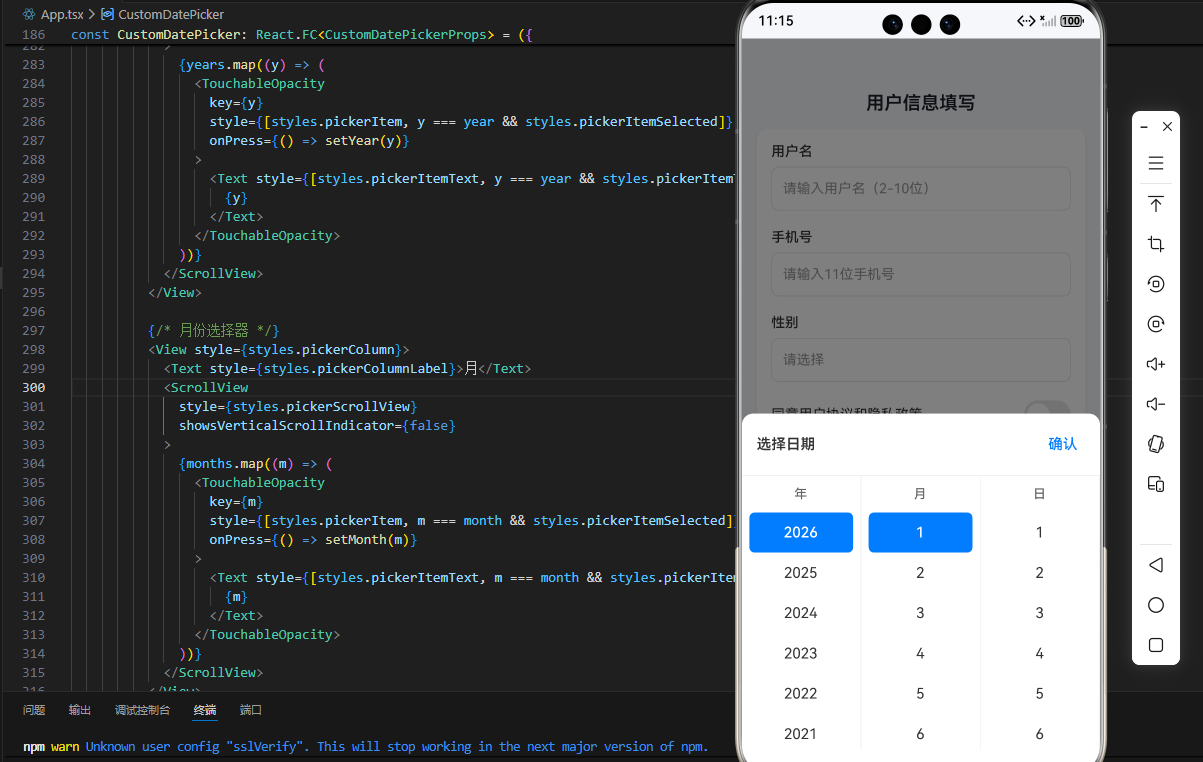
const CustomDatePicker: React.FC<CustomDatePickerProps> = ({
visible,
onSelect,
onClose,
initialDate = new Date()
}) => {
const [animation] = useState(new Animated.Value(0));
const [year, setYear] = useState(initialDate.getFullYear());
const [month, setMonth] = useState(initialDate.getMonth() + 1);
const [day, setDay] = useState(initialDate.getDate());
useEffect(() => {
if (visible) {
Animated.timing(animation, {
toValue: 1,
duration: 300,
useNativeDriver: true,
}).start();
} else {
Animated.timing(animation, {
toValue: 0,
duration: 200,
useNativeDriver: true,
}).start();
}
}, [visible, animation]);
const translateY = animation.interpolate({
inputRange: [0, 1],
outputRange: [400, 0]
});
const opacity = animation.interpolate({
inputRange: [0, 1],
outputRange: [0, 1]
});
// 生成年份列表(1900-当前年份)
const years = useMemo(() => {
const currentYear = new Date().getFullYear();
const yearsList = [];
for (let i = currentYear; i >= 1900; i--) {
yearsList.push(i);
}
return yearsList;
}, []);
// 月份列表
const months = Array.from({ length: 12 }, (_, i) => i + 1);
// 根据年份和月份生成天数列表
const days = useMemo(() => {
const daysInMonth = new Date(year, month, 0).getDate();
return Array.from({ length: daysInMonth }, (_, i) => i + 1);
}, [year, month]);
const handleConfirm = useCallback(() => {
const dateStr = `${year}-${month.toString().padStart(2, '0')}-${day.toString().padStart(2, '0')}`;
onSelect(dateStr);
onClose();
}, [year, month, day, onSelect, onClose]);
if (!visible) return null;
return (
<>
{/* 遮罩层 */}
<TouchableOpacity
style={styles.datePickerOverlay}
activeOpacity={1}
onPress={onClose}
>
<Animated.View style={[styles.pickerOverlayBg, { opacity }]} />
</TouchableOpacity>
{/* 日期选择器内容 */}
<Animated.View
style={[
styles.datePickerContainer,
{ transform: [{ translateY }] }
]}
>
<View style={styles.datePickerHeader}>
<Text style={styles.datePickerTitle}>选择日期</Text>
<TouchableOpacity onPress={handleConfirm} style={styles.datePickerConfirmBtn}>
<Text style={styles.datePickerConfirmText}>确认</Text>
</TouchableOpacity>
</View>
<View style={styles.datePickerBody}>
{/* 年份选择器 */}
<View style={styles.pickerColumn}>
<Text style={styles.pickerColumnLabel}>年</Text>
<ScrollView
style={styles.pickerScrollView}
showsVerticalScrollIndicator={false}
>
{years.map((y) => (
<TouchableOpacity
key={y}
style={[styles.pickerItem, y === year && styles.pickerItemSelected]}
onPress={() => setYear(y)}
>
<Text style={[styles.pickerItemText, y === year && styles.pickerItemTextSelected]}>
{y}
</Text>
</TouchableOpacity>
))}
</ScrollView>
</View>
{/* 月份选择器 */}
<View style={styles.pickerColumn}>
<Text style={styles.pickerColumnLabel}>月</Text>
<ScrollView
style={styles.pickerScrollView}
showsVerticalScrollIndicator={false}
>
{months.map((m) => (
<TouchableOpacity
key={m}
style={[styles.pickerItem, m === month && styles.pickerItemSelected]}
onPress={() => setMonth(m)}
>
<Text style={[styles.pickerItemText, m === month && styles.pickerItemTextSelected]}>
{m}
</Text>
</TouchableOpacity>
))}
</ScrollView>
</View>
{/* 日期选择器 */}
<View style={styles.pickerColumn}>
<Text style={styles.pickerColumnLabel}>日</Text>
<ScrollView
style={styles.pickerScrollView}
showsVerticalScrollIndicator={false}
>
{days.map((d) => (
<TouchableOpacity
key={d}
style={[styles.pickerItem, d === day && styles.pickerItemSelected]}
onPress={() => setDay(d)}
>
<Text style={[styles.pickerItemText, d === day && styles.pickerItemTextSelected]}>
{d}
</Text>
</TouchableOpacity>
))}
</ScrollView>
</View>
</View>
</Animated.View>
</>
);
};
// ========== 4. 表单主组件 ==========
const App = () => {
// 表单状态
const [formValues, setFormValues] = useState<Record<string, any>>({
username: '',
phone: '',
gender: '',
agreement: false,
birthdate: ''
});
// 错误状态
const [errors, setErrors] = useState<Record<string, boolean>>({});
// 选择器状态 - 分开管理每个选择器的状态
const [pickerVisible, setPickerVisible] = useState<Record<string, boolean>>({
gender: false,
date: false
});
// 单个字段验证
const validateField = useCallback((name: string, value: any) => {
const item = FORM_ITEMS.find(item => item.name === name);
if (!item?.rules) return false;
let isValid = true;
const { rules } = item;
// 检查必填字段
if (rules.required) {
if (value === '' || value === undefined || value === null) {
isValid = false;
} else if (typeof value === 'boolean' && rules.value !== undefined && value !== rules.value) {
isValid = false;
} else if (typeof value === 'string' && value.trim() === '') {
isValid = false;
}
}
// 检查字符串长度
if (isValid && typeof value === 'string') {
if (rules.minLength && value.length < rules.minLength) isValid = false;
if (rules.maxLength && value.length > rules.maxLength) isValid = false;
if (rules.pattern && !rules.pattern.test(value)) isValid = false;
}
// 检查特定值(如switch需要为true)
if (isValid && rules.value !== undefined && value !== rules.value) {
isValid = false;
}
// 特殊验证:日期格式
if (name === 'birthdate' && value && !/^\d{4}-\d{2}-\d{2}$/.test(value)) {
isValid = false;
}
return isValid;
}, []);
// 表单项值更新
const handleValueChange = useCallback((name: string, value: any) => {
setFormValues(prev => ({ ...prev, [name]: value }));
// 立即验证该字段并更新错误状态
const isValid = validateField(name, value);
setErrors(prev => ({ ...prev, [name]: !isValid }));
}, [validateField]);
// 使用 useMemo 计算表单是否有效
const isFormValid = useMemo(() => {
return FORM_ITEMS.every(item => {
if (!item.rules) return true;
const value = formValues[item.name];
return validateField(item.name, value);
});
}, [formValues, validateField]);
// 打开选择器
const openPicker = useCallback((itemName: string) => {
setPickerVisible(prev => ({
...prev,
[itemName]: true
}));
}, []);
// 关闭选择器
const closePicker = useCallback((itemName: string) => {
setPickerVisible(prev => ({
...prev,
[itemName]: false
}));
}, []);
// 处理选择器选择
const handlePickerSelect = useCallback((itemName: string, value: string) => {
handleValueChange(itemName, value);
closePicker(itemName);
}, [handleValueChange, closePicker]);
// 处理日期选择
const handleDateSelect = useCallback((dateStr: string) => {
handleValueChange('birthdate', dateStr);
closePicker('date');
}, [handleValueChange, closePicker]);
// 表单提交
const handleSubmit = useCallback(() => {
if (isFormValid) {
Alert.alert('提交成功', `表单数据:${JSON.stringify(formValues, null, 2)}`);
} else {
// 显示所有错误
const newErrors: Record<string, boolean> = {};
FORM_ITEMS.forEach(item => {
if (!item.rules) return;
const value = formValues[item.name];
const isValid = validateField(item.name, value);
newErrors[item.name] = !isValid;
});
setErrors(newErrors);
Alert.alert('提交失败', '请完善表单信息并修正错误');
}
}, [formValues, isFormValid, validateField]);
// 格式化日期显示
const formatDateDisplay = useCallback((dateStr: string) => {
if (!dateStr) return '';
try {
const [year, month, day] = dateStr.split('-');
return `${year}年${month}月${day}日`;
} catch (e) {
return dateStr;
}
}, []);
// 渲染表单项
const renderFormItem = (item: FormItem) => {
const hasError = errors[item.name];
const value = formValues[item.name];
switch (item.type) {
case 'input':
return (
<View style={styles.formItem} key={item.name}>
<Text style={styles.formLabel}>{item.label}</Text>
<View style={[styles.inputContainer, hasError && styles.inputError]}>
<TextInput
style={styles.input}
placeholder={item.placeholder}
keyboardType={item.keyboardType}
value={value || ''}
onChangeText={(text) => handleValueChange(item.name, text)}
placeholderTextColor="#999999"
/>
</View>
{hasError && item.errorMsg && (
<Text style={styles.errorText}>
{item.errorMsg}
</Text>
)}
</View>
);
case 'picker':
const selectedOption = item.options?.find(opt => opt.value === value);
return (
<View style={styles.formItem} key={item.name}>
<Text style={styles.formLabel}>{item.label}</Text>
<TouchableOpacity
style={[styles.pickerButton, hasError && styles.inputError]}
onPress={() => openPicker(item.name)}
>
<Text style={[styles.pickerButtonText, !value && styles.placeholderText]}>
{selectedOption ? selectedOption.label : '请选择'}
</Text>
</TouchableOpacity>
{hasError && item.errorMsg && (
<Text style={styles.errorText}>
{item.errorMsg}
</Text>
)}
</View>
);
case 'switch':
return (
<View style={styles.formItem} key={item.name}>
<View style={styles.switchContainer}>
<Text style={styles.switchLabel}>{item.label}</Text>
<Switch
value={!!value}
onValueChange={(val) => handleValueChange(item.name, val)}
trackColor={{ false: '#E5E5E5', true: '#007DFF' }}
thumbColor="#FFFFFF"
/>
</View>
{hasError && item.errorMsg && (
<Text style={styles.errorText}>
{item.errorMsg}
</Text>
)}
</View>
);
case 'date':
return (
<View style={styles.formItem} key={item.name}>
<Text style={styles.formLabel}>{item.label}</Text>
<TouchableOpacity
style={[styles.pickerButton, hasError && styles.inputError]}
onPress={() => openPicker('date')}
>
<Text style={[styles.pickerButtonText, !value && styles.placeholderText]}>
{value ? formatDateDisplay(value) : '选择日期'}
</Text>
</TouchableOpacity>
{hasError && (
<Text style={styles.errorText}>
请选择有效日期
</Text>
)}
</View>
);
default:
return null;
}
};
// 获取性别选择器的配置
const genderItem = FORM_ITEMS.find(item => item.name === 'gender');
return (
<RNSafeAreaView style={styles.pageContainer}>
<StatusBar backgroundColor="#F5F7FA" barStyle="dark-content" />
<ScrollView style={styles.scrollView} contentContainerStyle={styles.scrollViewContent}>
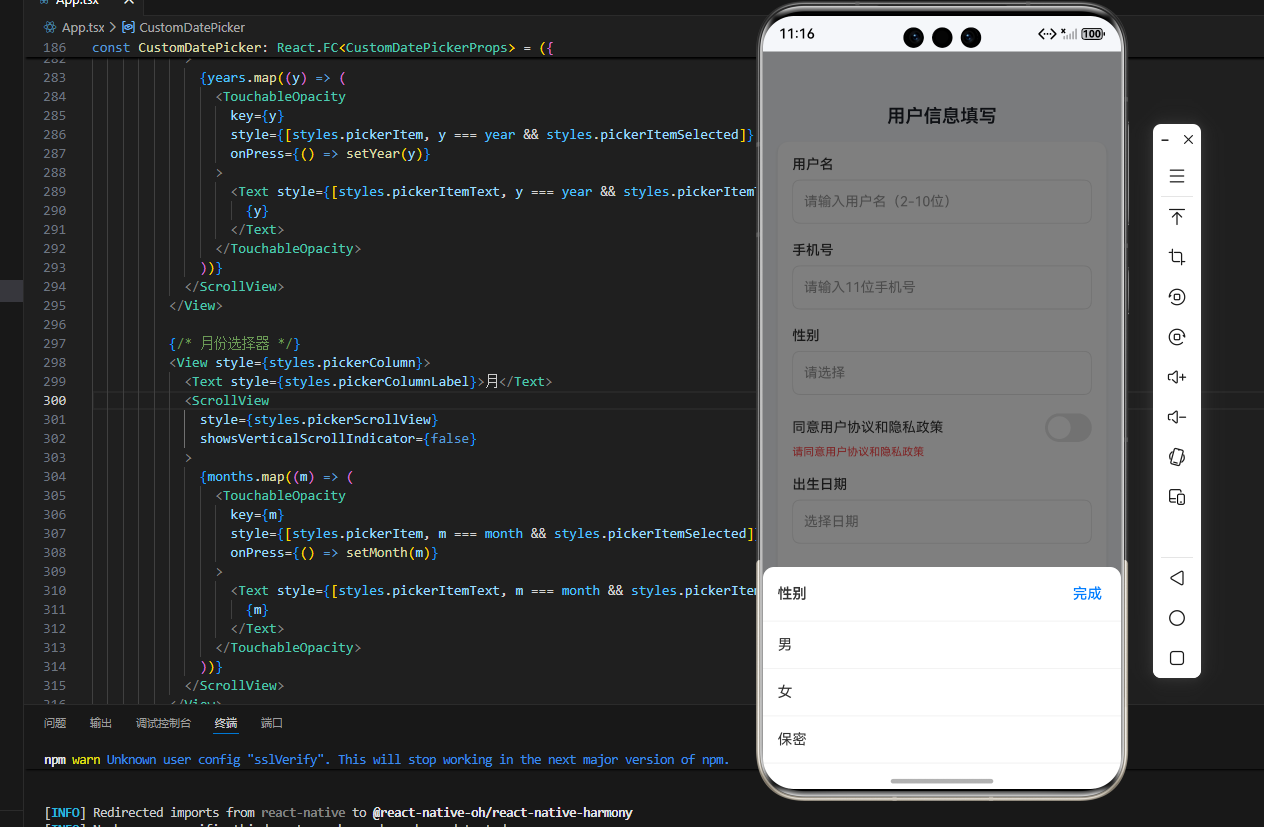
<Text style={styles.pageTitle}>用户信息填写</Text>
<View style={styles.formCard}>
<View style={styles.formContent}>
{FORM_ITEMS.map(item => renderFormItem(item))}
<TouchableOpacity
style={[styles.submitButton, !isFormValid && styles.submitButtonDisabled]}
onPress={handleSubmit}
disabled={!isFormValid}
>
<Text style={[styles.submitButtonText, !isFormValid && styles.submitButtonTextDisabled]}>
提交表单
</Text>
</TouchableOpacity>
</View>
</View>
</ScrollView>
{/* 性别选择器 */}
{genderItem && (
<CustomPicker
visible={pickerVisible.gender}
options={genderItem.options || []}
onSelect={(value) => handlePickerSelect('gender', value)}
onClose={() => closePicker('gender')}
title={genderItem.label}
/>
)}
{/* 日期选择器 */}
<CustomDatePicker
visible={pickerVisible.date}
onSelect={handleDateSelect}
onClose={() => closePicker('date')}
initialDate={formValues.birthdate ? new Date(formValues.birthdate) : new Date()}
/>
</RNSafeAreaView>
);
};
// ========== 5. 样式表 ==========
const { width, height } = Dimensions.get('window');
const styles = StyleSheet.create({
pageContainer: {
flex: 1,
backgroundColor: '#F5F7FA',
},
scrollView: {
flex: 1,
},
scrollViewContent: {
padding: 16,
paddingTop: 20,
},
pageTitle: {
fontSize: 20,
color: '#1D2129',
fontWeight: '600',
marginBottom: 16,
textAlign: 'center',
},
formCard: {
borderRadius: 12,
backgroundColor: '#FFFFFF',
shadowColor: '#000',
shadowOffset: { width: 0, height: 2 },
shadowOpacity: 0.1,
shadowRadius: 4,
elevation: 2,
overflow: 'hidden',
},
formContent: {
padding: 16,
},
formItem: {
marginBottom: 20,
},
formLabel: {
fontSize: 15,
color: '#333333',
marginBottom: 8,
fontWeight: '500',
},
inputContainer: {
height: 48,
borderRadius: 8,
borderWidth: 1,
borderColor: '#E5E5E5',
justifyContent: 'center',
paddingHorizontal: 12,
backgroundColor: '#FFFFFF',
},
input: {
fontSize: 15,
color: '#333333',
padding: 0,
margin: 0,
},
inputError: {
borderColor: '#FF4D4F',
},
pickerButton: {
height: 48,
borderRadius: 8,
borderWidth: 1,
borderColor: '#E5E5E5',
justifyContent: 'center',
paddingHorizontal: 12,
backgroundColor: '#FFFFFF',
},
pickerButtonText: {
fontSize: 15,
color: '#333333',
},
placeholderText: {
color: '#999999',
},
switchContainer: {
flexDirection: 'row',
alignItems: 'center',
justifyContent: 'space-between',
},
switchLabel: {
fontSize: 15,
color: '#333333',
flex: 1,
},
errorText: {
fontSize: 12,
marginTop: 4,
color: '#FF4D4F',
},
submitButton: {
height: 48,
borderRadius: 24,
backgroundColor: '#007DFF',
marginTop: 8,
justifyContent: 'center',
alignItems: 'center',
},
submitButtonDisabled: {
backgroundColor: '#007DFF33',
},
submitButtonText: {
fontSize: 16,
fontWeight: '500',
color: '#FFFFFF',
},
submitButtonTextDisabled: {
color: '#FFFFFF99',
},
// 选择器遮罩层
pickerOverlay: {
position: 'absolute',
top: 0,
left: 0,
right: 0,
bottom: 0,
zIndex: 1000,
},
datePickerOverlay: {
position: 'absolute',
top: 0,
left: 0,
right: 0,
bottom: 0,
zIndex: 1000,
},
pickerOverlayBg: {
position: 'absolute',
top: 0,
left: 0,
right: 0,
bottom: 0,
backgroundColor: 'rgba(0, 0, 0, 0.5)',
},
// 选择器容器
pickerContainer: {
position: 'absolute',
left: 0,
right: 0,
bottom: 0,
backgroundColor: '#FFFFFF',
borderTopLeftRadius: 12,
borderTopRightRadius: 12,
maxHeight: 400,
zIndex: 1001,
},
pickerHeader: {
flexDirection: 'row',
justifyContent: 'space-between',
alignItems: 'center',
padding: 16,
borderBottomWidth: 1,
borderBottomColor: '#F0F0F0',
},
pickerTitle: {
fontSize: 16,
fontWeight: '600',
color: '#333333',
},
pickerCloseBtn: {
padding: 4,
},
pickerCloseText: {
fontSize: 16,
color: '#007DFF',
fontWeight: '500',
},
pickerOptionsContainer: {
maxHeight: 300,
},
pickerOption: {
padding: 16,
borderBottomWidth: 1,
borderBottomColor: '#F0F0F0',
},
pickerOptionText: {
fontSize: 16,
color: '#333333',
},
// 日期选择器容器
datePickerContainer: {
position: 'absolute',
left: 0,
right: 0,
bottom: 0,
backgroundColor: '#FFFFFF',
borderTopLeftRadius: 12,
borderTopRightRadius: 12,
maxHeight: 400,
zIndex: 1001,
},
datePickerHeader: {
flexDirection: 'row',
justifyContent: 'space-between',
alignItems: 'center',
padding: 16,
borderBottomWidth: 1,
borderBottomColor: '#F0F0F0',
},
datePickerTitle: {
fontSize: 16,
fontWeight: '600',
color: '#333333',
},
datePickerConfirmBtn: {
padding: 8,
},
datePickerConfirmText: {
fontSize: 16,
color: '#007DFF',
fontWeight: '500',
},
datePickerBody: {
flexDirection: 'row',
height: 300,
},
pickerColumn: {
flex: 1,
alignItems: 'center',
borderRightWidth: 1,
borderRightColor: '#F0F0F0',
},
pickerColumnLabel: {
fontSize: 14,
color: '#666666',
paddingVertical: 12,
fontWeight: '500',
},
pickerScrollView: {
width: '100%',
},
pickerItem: {
height: 44,
justifyContent: 'center',
alignItems: 'center',
},
pickerItemSelected: {
backgroundColor: '#007DFF',
borderRadius: 6,
marginHorizontal: 8,
},
pickerItemText: {
fontSize: 16,
color: '#333333',
},
pickerItemTextSelected: {
color: '#FFFFFF',
fontWeight: '500',
},
});
export default App;
三、OpenHarmony6.0 专属避坑指南
以下是鸿蒙端动态表单开发的高频踩坑点,解决方案均为鸿蒙端专属最优解,确保表单样式 / 功能稳定:
| 问题现象 | 问题原因 | 鸿蒙端最优解决方案 |
|---|---|---|
| 表单验证提示破坏布局完整性 | 错误提示位置随意,与表单项间距不一致 | 错误提示用HelperText,置于组件下方,间距 4px,字体 12px,不挤压表单项空间 |
| 提交按钮禁用态不明显 | 禁用态仅改变透明度,鸿蒙端视觉反馈弱 | 禁用态采用 “主题色半透明(#007DFF33)+ 文字半透明”,与正常态区分清晰 |
| 输入框聚焦时边框颜色不明显 | 默认边框颜色与鸿蒙主题色不符 | 设置activeOutlineColor="#007DFF"(鸿蒙主题蓝),聚焦时边框高亮,视觉反馈清晰 |
四、扩展用法:动态表单高频进阶技巧
扩展 1:表单项联动(如 “其他” 选项显示输入框)
在配置数组中添加dependsOn字段,通过监听依赖字段的值,动态显示 / 隐藏表单项,例如选择 “其他” 性别时,显示自定义性别输入框,鸿蒙端联动无延迟。
扩展 2:表单数据持久化
结合AsyncStorage将表单数据保存到本地,页面重启后自动填充,适用于 “草稿保存” 场景,鸿蒙端异步存储无兼容性问题。
扩展 3:复杂表单分组
将配置数组按分组拆分,用Card+Divider实现表单分组,分组标题用鸿蒙规范的加粗文字 + 上间距,布局更清晰。
扩展 4:自定义表单项类型
在renderFormItem中新增类型(如 “上传组件”“滑块组件”),复用现有状态管理 / 验证逻辑,仅需添加对应渲染逻辑,扩展性极强。
本动态表单组件样式专业、功能完整、鸿蒙适配完美,可直接用于注册、设置、信息填写等业务场景,视觉体验对标鸿蒙原生应用,彻底解决之前样式不专业的问题。
欢迎加入开源鸿蒙跨平台社区:https://openharmonycrossplatform.csdn.net

讨论HarmonyOS开发技术,专注于API与组件、DevEco Studio、测试、元服务和应用上架分发等。
更多推荐
 3
3 0
0- 0


 已为社区贡献17条内容

所有评论(0)