鸿蒙一多开发时界面适配的三种方法
本文介绍了鸿蒙系统响应式布局的实现方法,主要包含断点布局、媒体查询和栅格布局三种技术方案。文章重点讲解了断点工具封装的两个版本(V1/V2)和媒体查询工具的两个版本(V1/V2),提供了关键代码实现和使用示例。其中断点布局通过监听窗口尺寸变化实现不同屏幕尺寸下的界面适配,媒体查询则支持深色模式等系统特性检测,栅格布局则提供了更灵活的界面排版方案。这些工具封装简化了开发者在多设备适配时的工作量,可直
目录
2.1.2 系统工具-BreakPointType (便捷小工具,用过都说好~)
2.2.3 系统工具-BreakpointSystem (关键!)
2.2.4 系统工具-BreakpointSystem-V2 (关键!)
开发者们在进行一多开发时肯定会遇到不同设备屏幕尺寸不同的问题,在鸿蒙中,为了解决不同设备间屏幕尺寸不同而导致的界面不匹配的问题,鸿蒙提供了许多方法,开发者们可以根据具体情况进行选择。本文针对界面级一多开发,着重讲解怎么利用响应式布局来实现不同屏幕尺寸上展现不同的效果。
如果您是熟悉一多开发界面适配的开发者,可以直接跳转到相应位置进行代码的CV!
断点工具V1:2.1.3 断点工具封装(关键!)
断点工具V2:2.1.4 断点工具封装-V2 附带开启全屏(关键!)
媒体查询工具V1:2.2.3 系统工具-BreakpointSystem (关键!)
媒体查询工具V2:2.2.4 系统工具-BreakpointSystem-V2 (关键!)
1. 自适应布局
自适应布局详情查看官方文档:自适应布局
2. 响应式布局
本文着重介绍响应式布局怎么做。
2.1 断点
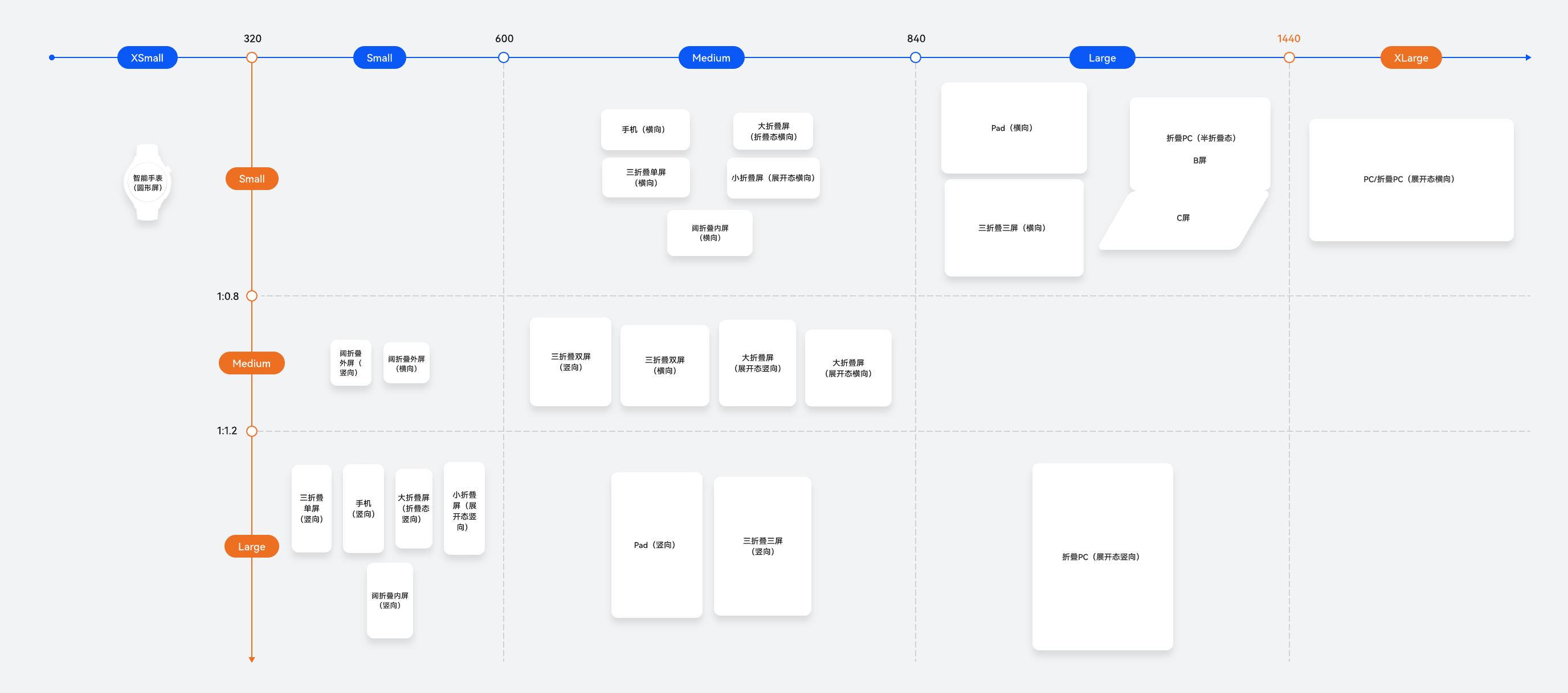
断点以应用窗口宽度为切入点,将应用窗口在宽度维度上分成了几个不同的区间,即不同的断点,在不同的区间下,开发者可根据需要实现不同的页面布局效果。
|
断点名称 |
取值范围(vp) |
设备 |
|---|---|---|
| xs |
[0, 320) |
智能手表(圆形屏) |
| sm |
[320, 600) |
手机竖屏 |
| md |
[600, 840) |
手机横屏、三折叠双屏 |
| lg |
[840, 1440) |
pad(横向)/三折叠三屏(横向)/折叠PC(半折叠态) |
| xl | [1440,+∞) | PC/折叠PC |
具体设备分类如下图:
2.1.1 具体原理——通过窗口对象,监听窗口尺寸变化:
在EntryAbility 中添加监听:
import window from '@ohos.window'
import display from '@ohos.display'
import UIAbility from '@ohos.app.ability.UIAbility'

export default class EntryAbility extends UIAbility {
  private windowObj?: window.Window
  private curBp: string = ''
  //...
  // 根据当前窗口尺寸更新断点
  private updateBreakpoint(windowWidth: number) :void{
    // 将长度的单位由px换算为vp
    let windowWidthVp = windowWidth / display.getDefaultDisplaySync().densityPixels
    let newBp: string = ''
    if (windowWidthVp < 320) {
      newBp = 'xs' // 超小屏
    } else if (windowWidthVp < 600) {
      newBp = 'sm' // 小屏
    } else if (windowWidthVp < 840) {
      newBp = 'md' // 中屏
    } else {
      newBp = 'lg' // 大屏
    }
    if (this.curBp !== newBp) {
      this.curBp = newBp
      // 使用状态变量记录当前断点值
      AppStorage.setOrCreate('currentBreakpoint', this.curBp)
    }
  }

  onWindowStageCreate(windowStage: window.WindowStage) :void{
    windowStage.getMainWindow().then((windowObj) => {
      this.windowObj = windowObj
      // 获取应用启动时的窗口尺寸
      this.updateBreakpoint(windowObj.getWindowProperties().windowRect.width)
      // 注册回调函数,监听窗口尺寸变化
      windowObj.on('windowSizeChange', (windowSize)=>{
        this.updateBreakpoint(windowSize.width)
      })
    });
   // ...
  }

  //...
}
在页面中使用断点信息:
@Entry
@Component
struct Index {
  @StorageProp('currentBreakpoint') curBp: string = 'sm'

  build() {
    Flex({justifyContent: FlexAlign.Center, alignItems: ItemAlign.Center}) {
      Text(this.curBp).fontSize(50).fontWeight(FontWeight.Medium)
    }
    .width('100%')
    .height('100%')
  }
}
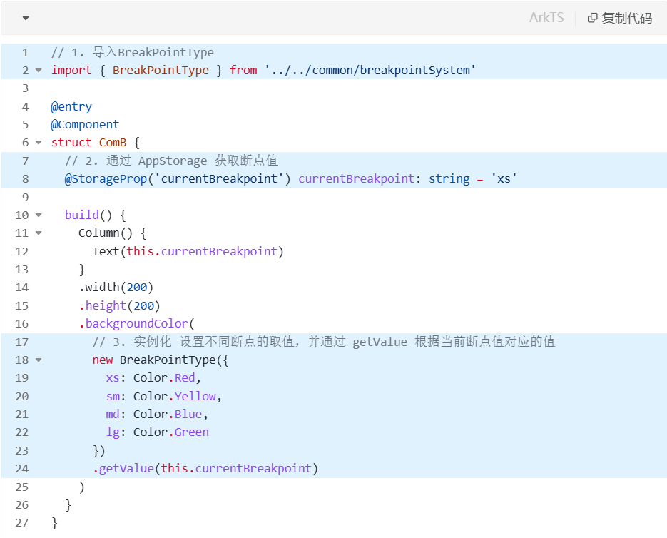
2.1.2 系统工具-BreakPointType (便捷小工具,用过都说好~)
此工具可根据具体传入断点值所对应的参数,实现不同效果。
// common/breakpointSystem.ets
interface BreakPointTypeOption<T> {
  xs?: T
  sm?: T
  md?: T
  lg?: T
}

export enum BreakPointEnum {
  XS = "xs",
  SM = "sm",
  MD = "md",
  LG = "lg",
  XL = "xl"
}

export class BreakPointType<T> {
  options: BreakPointTypeOption<T>

  constructor(option: BreakPointTypeOption<T>) {
    this.options = option
  }

  getValue(currentBreakPoint: BreakPointEnum): T {
    return (this.options as Record<BreakPointEnum, T>)[currentBreakPoint]
  }
}
用法:
2.1.3 断点工具封装(关键!)
在utils下新建一个ArkTs文件ScreenManager.ets
// utils/ScreenManager.ets
import { display, window } from "@kit.ArkUI"

export enum BreakPointEnum {
  XS = "xs",
  SM = "sm",
  MD = "md",
  LG = "lg",
  XL = "xl"
}

export class ScreenManager {
  ctx: Context
  curBp: BreakPointEnum = BreakPointEnum.XS

  constructor(ctx: Context) {
    this.ctx = ctx
  }

  async init() {
    try {
      // 1. 获取窗口对象
      const win = await window.getLastWindow(this.ctx)
      // 2. 获取当前屏幕宽度, 确定断点值
      this.updateBreakpoint(display.getDefaultDisplaySync().width)
      // 3. 窗口宽度发生变化, 确定断点值
      win.on('windowSizeChange', (size) => {
        this.updateBreakpoint(size.width)
      })
    } catch (e) {
    }
  }

  async off() {
    try {
      const win = await window.getLastWindow(this.ctx)
      win.off("windowSizeChange")
    } catch (e) {
    }
  }

  updateBreakpoint(windowWidth: number): void {
    try {
      // 获取vp尺寸
      let windowWidthVp = windowWidth / display.getDefaultDisplaySync()
        .densityPixels
      let newBp: BreakPointEnum = BreakPointEnum.XS
      //  核心代码2: 基于窗口宽度vp值,判断当前设备属于哪个断点范围
      if (windowWidthVp < 320) {
        newBp = BreakPointEnum.XS
      } else if (windowWidthVp < 600) {
        newBp = BreakPointEnum.SM
      } else if (windowWidthVp < 840) {
        newBp = BreakPointEnum.MD
      } else if (windowWidthVp < 1440) {
        newBp = BreakPointEnum.LG
      } else {
        newBp = BreakPointEnum.XL
      }
      if (this.curBp !== newBp) {
        this.curBp = newBp
        // 核心代码3: 使用状态变量记录当前断点值
        AppStorage.setOrCreate('currentBreakpoint', this.curBp)
      }
    } catch (err) {
    }
  }
}
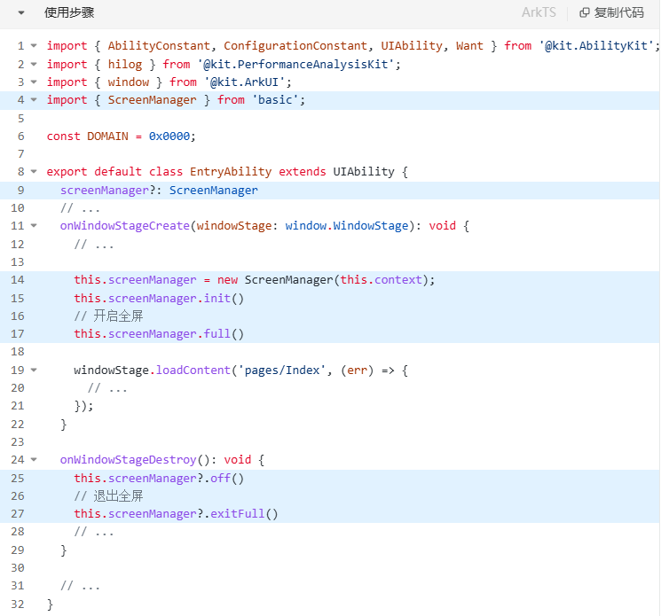
使用步骤(关键代码已在图中标记):
在EntryAbility文件中加入如下代码,即可查询到屏幕断点并记录到全局。
import { ScreenManager } from '../utils/ScreenManager';

export default class EntryAbility extends UIAbility {
  screenManager?: ScreenManager // 关键代码

 // ...

  onWindowStageCreate(windowStage: window.WindowStage): void {
    this.screenManager = new ScreenManager(this.context) // 关键代码
    this.screenManager.init() // 关键代码

    windowStage.loadContent('pages/ScreenWidth', (err) => {
      // ...
    });
  }

  onWindowStageDestroy(): void {
    this.screenManager.off() // 窗口卸载  // 关键代码
    // ...
  }

  // ...
}
2.1.4 断点工具封装-V2 附带开启全屏(关键!)
需要用到 系统工具-BreakPointType(见上文)。
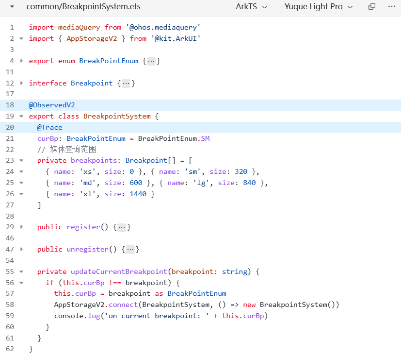
由于在V2中,AppStorage存储类型变为对象存储,所以我们需要新建一个类来存放断点值。如下图:
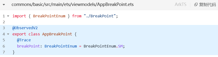
断点工具命名依旧是utils包下的ScreenManager.ets。代码如下:
与v1相比,差异不是很大
差异:
第7行:此处使用AppStorageV2来进行全局断点数据共享。
第60行:由AppStorageV2链接的AppBreakPoint类里的断点值,被@Trace装饰,因此第60行可以直接进行更改,更改后的数据可以直接同步到全局。
import { AppStorageV2, display, window } from "@kit.ArkUI"
import { AppSafeArea, BreakPointEnum } from "../viewmodels"
import { AppBreakPoint } from "../viewmodels/AppBreakPoint"

export class ScreenManager {
  ctx: Context
  app: AppBreakPoint = AppStorageV2.connect(AppBreakPoint, () => new AppBreakPoint())!

  constructor(ctx: Context) {
    this.ctx = ctx
  }

  /**
   * 初始化屏幕工具, 监听屏幕变化,拿到断点值
   * */
  async init() {
    try {
      // 1. 获取窗口对象
      const win = await window.getLastWindow(this.ctx)
      // 2. 获取当前屏幕宽度, 确定断点值
      this.updateBreakpoint(display.getDefaultDisplaySync().width)
      // 3. 窗口宽度发生变化, 确定断点值
      win.on('windowSizeChange', (size) => {
        this.updateBreakpoint(size.width)
      })
    } catch (e) {
    }
  }

  /**
   * 注销屏幕监听
   * */
  async off() {
    try {
      const win = await window.getLastWindow(this.ctx)
      win.off("windowSizeChange")
    } catch (e) {
    }
  }

  updateBreakpoint(windowWidth: number): void {
    try {
      // 获取vp尺寸
      let windowWidthVp = windowWidth / display.getDefaultDisplaySync()
        .densityPixels
      let newBp: BreakPointEnum = BreakPointEnum.XS
      //  核心代码2: 基于窗口宽度vp值,判断当前设备属于哪个断点范围
      if (windowWidthVp < 320) {
        newBp = BreakPointEnum.XS
      } else if (windowWidthVp < 600) {
        newBp = BreakPointEnum.SM
      } else if (windowWidthVp < 840) {
        newBp = BreakPointEnum.MD
      } else if (windowWidthVp < 1440) {
        newBp = BreakPointEnum.LG
      } else {
        newBp = BreakPointEnum.XL
      }
      if (this.app.breakPoint !== newBp) {
        this.app.breakPoint = newBp
      }
    } catch (err) {
    }
  }

  /**
   * 开启全屏
   * */
  async full() {
    try {
      const win = await window.getLastWindow(this.ctx)
      await win.setWindowLayoutFullScreen(true)
      const topArea = win.getWindowAvoidArea(window.AvoidAreaType.TYPE_SYSTEM)
      const bottomArea = win.getWindowAvoidArea(window.AvoidAreaType.TYPE_NAVIGATION_INDICATOR)
      const safeArea = AppStorageV2.connect(AppSafeArea, () => new AppSafeArea())!
      const uiCtx = win.getUIContext()
      safeArea.topHeight = uiCtx.px2vp(topArea.topRect.height)
      safeArea.bottomHeight = uiCtx.px2vp(bottomArea.bottomRect.height)
    } catch (e) {
      HDMLog.error(e)
    }
  }

  /**
   * 关闭全屏
   * */
  async exitFull() {
    try {
      const win = await window.getLastWindow(this.ctx)
      await win.setWindowLayoutFullScreen(false)
      const safeArea = AppStorageV2.connect(AppSafeArea, () => new AppSafeArea())!
      safeArea.topHeight = 0
      safeArea.bottomHeight = 0
    } catch (e) {
    }
  }
}
使用步骤:
2.2 媒体查询
媒体查询可以做到很多事,例如屏幕宽度查询(利用这个可以做到断点)、屏幕是否为圆形屏幕、系统是否为深色模式等。详见:OpenHarmony-媒体查询
2.2.1 核心用法
为了方便标记,这里的代码采用图片的形式哈~
使用时按照如下去使用。
2.2.2 深色模式查询
例如在页面中:
// 1. 引入模块
import mediaquery from '@ohos.mediaquery';
// 2. 创建监听器
const listenerDark: mediaquery.MediaQueryListener = mediaquery.matchMediaSync('(dark-mode: true)')
@Entry
@Component
struct Demo09 {
@State message: string = '';
aboutToAppear(): void {
// 3. 注册监听器
listenerDark.on('change', (res: mediaquery.MediaQueryResult)=>{
console.log('深色模式', JSON.stringify(res))
this.message = res.matches ? '深色模式' : '正常模式'
})
}
// 4. 移除监听器
aboutToDisappear(): void {
listenerDark.off('change')
}
build() {
RelativeContainer() {
Text(this.message)
.id('Demo09HelloWorld')
.fontSize(50)
.fontWeight(FontWeight.Bold)
.alignRules({
center: { anchor: '__container__', align: VerticalAlign.Center },
middle: { anchor: '__container__', align: HorizontalAlign.Center }
})
}
.height('100%')
.width('100%')
}
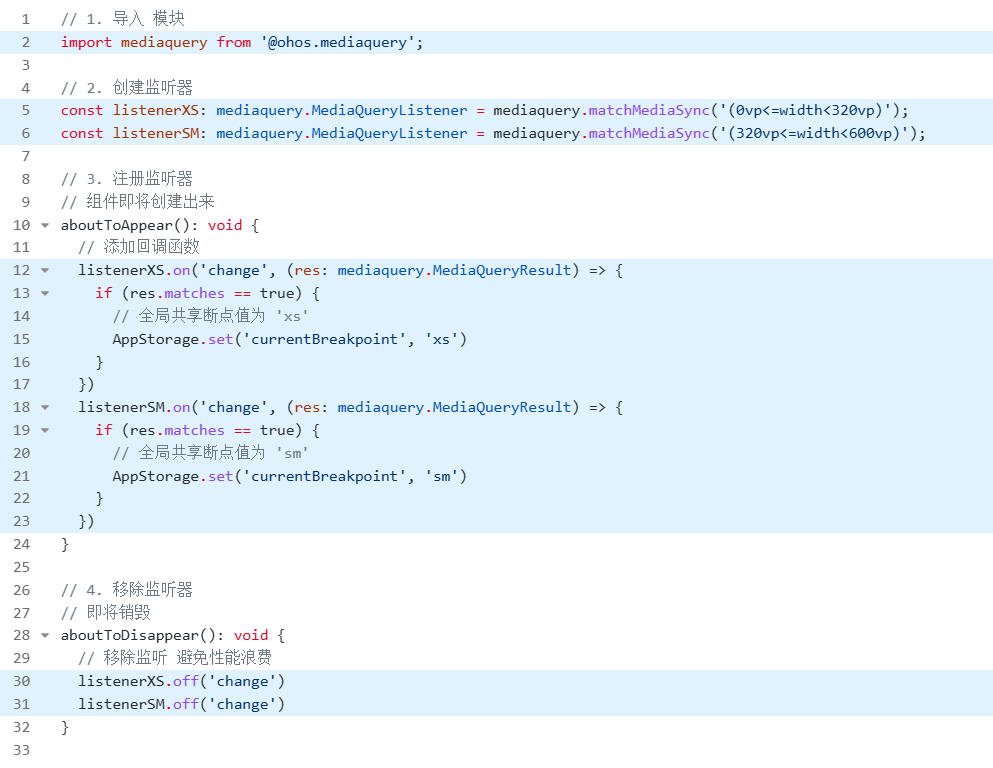
}2.2.3 系统工具-BreakpointSystem (关键!)
我们把媒体查询断点封装成工具类,放在 common下的 BreakpointSystem.ets 文件里。
工具代码:
import mediaQuery from '@ohos.mediaquery'
interface Breakpoint {
name: string
size: number
mediaQueryListener?: mediaQuery.MediaQueryListener
}
export const BreakpointKey: string = 'currentBreakpoint'
export class BreakpointSystem {
private currentBreakpoint: string = 'md'
private breakpoints: Breakpoint[] = [
{ name: 'xs', size: 0 }, { name: 'sm', size: 320 },
{ name: 'md', size: 600 }, { name: 'lg', size: 840 },
{ name: 'xl', size: 1440 }
]
public register() {
this.breakpoints.forEach((breakpoint: Breakpoint, index) => {
let condition: string
if (index === this.breakpoints.length - 1) {
condition = '(' + breakpoint.size + 'vp<=width' + ')'
} else {
condition = '(' + breakpoint.size + 'vp<=width<' + this.breakpoints[index + 1].size + 'vp)'
}
console.log(condition)
breakpoint.mediaQueryListener = mediaQuery.matchMediaSync(condition)
breakpoint.mediaQueryListener.on('change', (mediaQueryResult) => {
if (mediaQueryResult.matches) {
this.updateCurrentBreakpoint(breakpoint.name)
}
})
})
}
public unregister() {
this.breakpoints.forEach((breakpoint: Breakpoint) => {
if (breakpoint.mediaQueryListener) {
breakpoint.mediaQueryListener.off('change')
}
})
}
private updateCurrentBreakpoint(breakpoint: string) {
if (this.currentBreakpoint !== breakpoint) {
this.currentBreakpoint = breakpoint
AppStorage.set<string>(BreakpointKey, this.currentBreakpoint)
console.log('on current breakpoint: ' + this.currentBreakpoint)
}
}
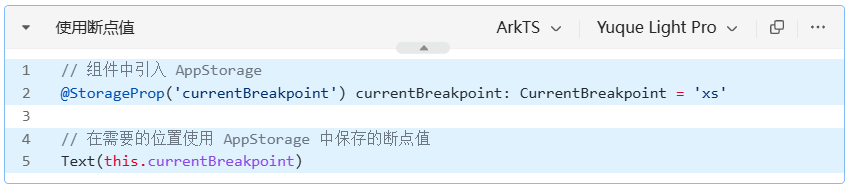
}页面中使用:
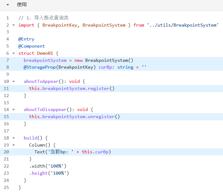
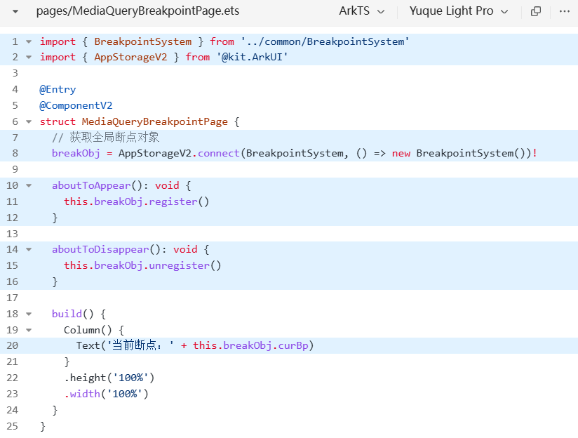
2.2.4 系统工具-BreakpointSystem-V2 (关键!)
和v1相差不大,已在图中标明。
使用:
2.3 栅格布局
栅格布局详见官网:栅格布局

讨论HarmonyOS开发技术,专注于API与组件、DevEco Studio、测试、元服务和应用上架分发等。
更多推荐


 11
11 0
0- 0


 已为社区贡献3条内容

所有评论(0)