鸿蒙5.0开发实战案例:一多布局实战(长视频)指南(一)
本文介绍了鸿蒙应用开发中如何利用"一多"布局能力实现长视频应用的页面适配。文章详细讲解了首页8个区域的布局方案,包括底部/侧边页签、顶部页签及搜索框、Banner图等关键组件的实现方法。通过栅格布局、Swiper组件、List组件等技术,根据不同设备尺寸和断点变化自动调整布局样式,实现一套代码适配多端设备的目标。文中还提供了具体代码示例,展示如何通过设置vertical属性、d
📑往期推文全新看点(文中附带最新·鸿蒙全栈学习笔记)
✒️ 鸿蒙应用开发与鸿蒙系统开发哪个更有前景?
✒️ 嵌入式开发适不适合做鸿蒙南向开发?看完这篇你就了解了~
✒️ 对于大前端开发来说,转鸿蒙开发究竟是福还是祸?
✒️ 鸿蒙岗位需求突增!移动端、PC端、IoT到底该怎么选?
✒️ 记录一场鸿蒙开发岗位面试经历~
✒️ 持续更新中……
页面开发
本章介绍长视频应用中如何使用“一多”的布局能力,完成页面层级的一套页面、多端适配。同时介绍长视频应用中的 交互开发 和推荐的 资源使用 方式。
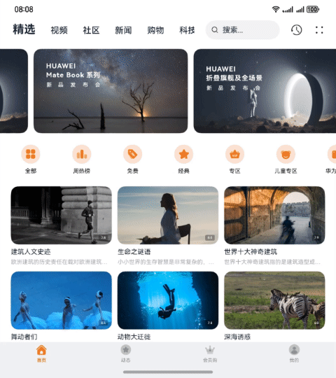
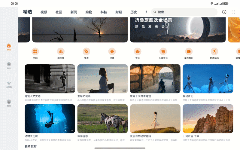
首页
长视频应用首页主要发挥推荐精选视频的作用,解决用户想要看视频的核心需求,所以首页内容都围绕这一功能设计。观察首页在2in1上的UX设计图,可以进行如下设计(图中为包括可滑动区域的内容):
- 将应用首页划分为8个区域,效果图如下:

- 整个页面响应式适配,借助栅格组件能力监听不同断点变化实现不同的布局效果。
- 首页区域2在小设备上呈两行显示,在中设备和大设备上单行显示,断点变化时切换显示效果。
- 首页区域3、4使用自适应布局延伸能力随不同设备尺寸延伸或隐藏。
- 首页区域1,5-8使用响应式布局中的栅格断点系统,根据断点变化切换改变组件内相应的属性实现布局效果。
长视频应用搜索页的8个基础区域介绍及实现方案如下表所示:
| 区域编号 | 简介 | 实现方案 |
|---|---|---|
| 1 | 底部/侧边页签 | 借助 栅格布局 监听断点变化改变位置。 |
| 2 | 顶部页签及搜索框 | 栅格布局监听断点变化实现折行显示,List组件 实现延伸能力,layoutWeight实现拉伸能力。 |
| 3 | Banner图 | Swiper组件,指定displayCount属性实现延伸能力,设置aspectRatio属性实现缩放能力。 |
| 4 | 图标列表 | Swiper组件,指定displayCount属性实现自适应布局延伸能力,设置aspectRatio属性实现缩放能力。 |
| 5 | 推荐视频 | 网格容器,借助栅格组件能力监听断点变化改变列数,设置aspectRatio属性实现缩放能力。 |
| 6 | 新片发布 | 网格容器,借助栅格组件能力监听断点变化改变列数,设置aspectRatio属性实现缩放能力。 |
| 7 | 每日佳片 | 利用响应式布局的栅格布局,结合 Stack组件 和 Grid组件,设置aspectRatio属性实现缩放能力。 |
| 8 | 往期回顾 | 响应式布局的栅格布局,设置aspectRatio属性实现缩放能力。 |
在实际开发中,区域1为外层导航栏,区域2为内层导航栏,区域3-8为并列的首页内容,所以对应的开发顺序为区域1、区域2和区域3-8。另外,为了提升用户的使用体验,首页设计了额外的功能,包括 首页社区页签的沉浸式设计 ,2in1首页Banner图的排版创新,首页推荐视频区域长按预览,首页推荐视频区域的缩放。
- 底部/侧边页签
底部/侧边页签区域,使用Tabs组件,设置在不同断点下的vertical属性,实现显示在首页的不同位置。在sm和md断点下,页签显示在底部,高度为56vp;在lg断点下页签显示在左侧,宽度为96vp,且页签居中显示。
示意图如下:

// features/home/src/main/ets/view/Home.ets
// 底部/侧边页签区域
Tabs({
  // lg断点时,页签栏在侧边;sm、md断点时,页签栏在底部
  barPosition: this.currentBreakpoint === BreakpointConstants.BREAKPOINT_LG ? BarPosition.Start : BarPosition.End
}) {
  // ...
}
// 底部页签大小的变换
.barWidth(this.currentBreakpoint === BreakpointConstants.BREAKPOINT_LG ? $r('app.float.bottom_tab_bar_width_lg') :
  CommonConstants.FULL_PERCENT)
.barHeight(this.currentBreakpoint === BreakpointConstants.BREAKPOINT_LG ? CommonConstants.FULL_PERCENT :
  (deviceInfo.deviceType === CommonConstants.DEVICE_TYPES[0] ? $r('app.float.tab_size_lg') :
  $r('app.float.tab_size')))
// 设置不同断点下页签的布局模式
.barMode(this.currentBreakpoint === BreakpointConstants.BREAKPOINT_LG ? BarMode.Scrollable : BarMode.Fixed,
  { nonScrollableLayoutStyle: LayoutStyle.ALWAYS_CENTER })
// lg断点时为纵向Tabs,sm、md断点时为横向Tabs
.vertical(this.currentBreakpoint === BreakpointConstants.BREAKPOINT_LG)
- 顶部页签及搜索框
不同断点下,顶部页签和搜索框占用不同栅格列数,使用栅格布局实现在sm断点下分两行显示,在md和lg断点下单行显示。根据设计将栅格在sm、md和lg的断点上分别划分为4列、12列、12列。示意图如下:

// features/home/src/main/ets/view/HomeHeader.ets
// 顶部页签及搜索框
build() {
  GridRow({
    columns: {
      // 栅格数4、12、12列
      sm: CommonConstants.GRID_ROW_COLUMNS[2],
      md: CommonConstants.GRID_ROW_COLUMNS[0],
      lg: CommonConstants.GRID_ROW_COLUMNS[0]
    }
  }) {
    GridCol({
      span: {
        // 顶部页签占用4、7、7列
        sm: CommonConstants.GRID_COLUMN_SPANS[5],
        md: CommonConstants.GRID_COLUMN_SPANS[2],
        lg: CommonConstants.GRID_COLUMN_SPANS[2]
      }
    }) {
      this.TopTabBar()
    }

    GridCol({
      span: {
        // 搜索框占用4、5、5列
        sm: CommonConstants.GRID_COLUMN_SPANS[5],
        md: CommonConstants.GRID_COLUMN_SPANS[3],
        lg: CommonConstants.GRID_COLUMN_SPANS[3]
      }
    }) {
      this.searchBar()
    }
  }
}
随着设备宽度变大,顶部页签间距变大、页面能够展示更多页签内容,使用List组件实现延伸能力;同时使用layoutWeight将增加的空间全部分配给搜索框,实现拉伸能力。
// features/home/src/main/ets/view/HomeHeader.ets
// 顶部页签
@Builder
TopTabBar() {
  Row() {
    Column() {
      List({
        // 随着断点变大,页签间距变大
        space: new BreakpointType(HomeConstants.SEARCH_TAB_LIST_SPACES[0], HomeConstants.SEARCH_TAB_LIST_SPACES[1],
          HomeConstants.SEARCH_TAB_LIST_SPACES[2]).getValue(this.currentBreakpoint)
      }) {
        ...
      }
    }
  }
}

// 搜索框
@Builder
searchBar() {
  Row() {
    Stack({ alignContent: Alignment.Start }) {
      // ...
    }
    .alignSelf(ItemAlign.Center)
    // 增加的空间全部分配给搜索框
    .layoutWeight(1)
  }
}
- Banner图
Banner图和图标列表区域,均使用Swiper组件,设置在不同断点下的displayCount属性来实现自适应布局的延伸能力,本章节以Banner图区域作为示例,图标列表的实现读者可以自行查看代码。Banner图区域中,Banner展示数量在sm断点下为1,并显示导航点指示器;在md和lg断点下Banner为2,且前后边距展示前后两张Banner图的部分内容。
在“一多”的应用中,经常会出现窗口大小改变如果组件随着窗口宽度变化只改变宽度、不改变高度,会导致图片变形,视觉上会给用户带来较差体验。为解决这一痛点,需要给Stack组件设置aspectRatio属性,Stack的高度会跟随宽度变化相应等比发生变化,Banner图大小变化且宽高比保持不变,实现自适应布局的缩放能力。
示意图如下:

// features/home/src/main/ets/view/BannerView.ets
// Banner图区域
Swiper() {
  LazyForEach(this.bannerDataSource, (item: Banner, index: number) => {
    Column() {
      Stack() {
        // ...
      }
      .height(item.getBannerImg().getHeight().getValue(this.currentBreakpoint))
      .width(CommonConstants.FULL_PERCENT)
      // 宽高按照预设的比例,随容器组件发生变化且宽高比不变
      .aspectRatio(new BreakpointType(HomeConstants.BANNER_RATIOS[0], HomeConstants.BANNER_RATIOS[1],
        HomeConstants.BANNER_RATIOS[2]).getValue(this.currentBreakpoint))
    }
  }, (item: Banner, index: number) => index + JSON.stringify(item))
}
// ...
.index(2)
// 设置不同断点下的Banner展示数量,实现自适应布局的延伸能力
.displayCount(this.currentBreakpoint === BreakpointConstants.BREAKPOINT_SM ? 1 : HomeConstants.TWO)
.itemSpace(HomeConstants.SWIPER_ITEM_SPACE)
// 设置是否显示导航点指示器
.indicator(this.currentBreakpoint === BreakpointConstants.BREAKPOINT_SM ? Indicator.dot()
  .itemWidth($r('app.float.swiper_item_size'))
  .itemHeight($r('app.float.swiper_item_size'))
  .selectedItemWidth($r('app.float.swiper_selected_item_width'))
  .selectedItemHeight($r('app.float.swiper_item_size'))
  .color($r('app.color.swiper_indicator'))
  .selectedColor(Color.White) : false
)
.loop(true)
.width(CommonConstants.FULL_PERCENT)
.visibility((this.currentBreakpoint === BreakpointConstants.BREAKPOINT_LG) && (this.currentTopIndex === 1) ?
  Visibility.None : Visibility.Visible)
.effectMode(EdgeEffect.None)
// md与lg设备上前后露出两张Banner图的大小不同
.prevMargin(new BreakpointType($r('app.float.swiper_prev_next_margin_sm'),
  $r('app.float.swiper_prev_next_margin_md'), $r('app.float.swiper_prev_next_margin_lg'))
  .getValue(this.currentBreakpoint))
.nextMargin(new BreakpointType($r('app.float.swiper_prev_next_margin_sm'),
  $r('app.float.swiper_prev_next_margin_md'), $r('app.float.swiper_prev_next_margin_lg'))
  .getValue(this.currentBreakpoint))
- 推荐视频
视频推荐和新片发布区域,均使用网格布局Grid组件,在不同断点下将父组件分为不同列数,来实现自适应布局的占比能力,本章节以推荐视频区域作为示例,新片发布区域的实现读者可以自行查看代码。
视频推荐区域中,网格布局在sm断点下分2列,md断点下分3列,lg断点下分4列。示意图如下:

// products/phone/src/main/ets/entryability/EntryAbility.ets
private updateBreakpoint(windowWidth: number): void{
  let windowWidthVp = windowWidth / display.getDefaultDisplaySync().densityPixels;
  let curBp: string = '';
  let videoGridColumn: string = CommonConstants.VIDEO_GRID_COLUMNS[0];
  // 设置不同断点下视频推荐区域的网格布局列数
  if (windowWidthVp < BreakpointConstants.BREAKPOINT_RANGES[1]) {
    curBp = BreakpointConstants.BREAKPOINT_SM;
    videoGridColumn = CommonConstants.VIDEO_GRID_COLUMNS[0];
  } else if (windowWidthVp < BreakpointConstants.BREAKPOINT_RANGES[2]) {
    curBp = BreakpointConstants.BREAKPOINT_MD;
    videoGridColumn = CommonConstants.VIDEO_GRID_COLUMNS[1];
  } else {
    curBp = BreakpointConstants.BREAKPOINT_LG;
    videoGridColumn = CommonConstants.VIDEO_GRID_COLUMNS[2];
  }
  AppStorage.setOrCreate('currentBreakpoint', curBp);
  AppStorage.setOrCreate('videoGridColumn', videoGridColumn);
}
为实现图片大小等比变化,需要给Stack组件设置aspectRatio属性,同 Banner图区域 ,实现自适应布局的缩放能力。不同的是,因为Grid组件设置了rowsTemplate属性,子组件GridItem均分Grid组件的全部高度,所以Grid组件不能自适应为内容组件的高度,需要用getGridHeight方法先自行计算出Grid组件的高度,从而保证子组件中图片等比放大或缩小。在getGridHeight方法中,先根据窗口宽度和网格列数,计算出单张图片宽度;再根据图片宽度和宽高比计算出图片高度,并与标题和内容栏高度相加;最后乘网格行数得到Grid组件的总高度。
// features/home/src/main/ets/view/RecommendedVideo.ets
build() {
  Column() {
    // 推荐视频区域
    Grid() {
      ForEach(this.videoImgList, (item: VideoImage, index: number) => {
        GridItem() {
          Column() {
            Stack({ alignContent: Alignment.Bottom}) {
              ...
            }
            .width(CommonConstants.FULL_PERCENT)
            // 宽高按照预设的比例,随容器组件发生变化且宽高比不变
            .aspectRatio(HomeConstants.VIDEO_DIALOG_ASPECT_RATIO)
            ...
            VideoTitle({ currentTopIndex: this.currentTopIndex, title: item.getTitle() })
            VideoContent({ currentTopIndex: this.currentTopIndex, content: item.getContent() })
          }
          .alignItems(HorizontalAlign.Start)
        }
      }, (item: VideoImage, index: number) => index + JSON.stringify(item))
    }
    // 设置网格布局列数,均分宽度
    .columnsTemplate(this.videoGridColumn)
    .rowsTemplate(CommonConstants.VIDEO_GRID_COLUMNS[0])
    .columnsGap($r('app.float.video_grid_gap'))
    // 根据不同断点下列数动态计算总高度,保持图片宽高比不变
    .height(this.getGridHeight(this.videoGridColumn, this.currentBreakpoint, this.windowWidth))
    ...
  }
}

// 计算网格布局总高度
getGridHeight(videoGridColumn: string, currentBreakpoint: string, windowWidth: number): string {
  // 获取窗口宽度,减掉两侧空白部分
  let result: number = px2vp(windowWidth) - new BreakpointType(HomeConstants.VIDEO_GRID_MARGIN[0],
    HomeConstants.VIDEO_GRID_MARGIN[1], HomeConstants.VIDEO_GRID_MARGIN[2]).getValue(this.currentBreakpoint);
  if (currentBreakpoint === BreakpointConstants.BREAKPOINT_LG) {
    result = result - HomeConstants.LG_SIDEBAR_WIDTH;
  }
  // 根据网格列数计算单张图片宽度
  if (videoGridColumn === CommonConstants.VIDEO_GRID_COLUMNS[0]) {
    result = (result - HomeConstants.VIDEO_GRID_ITEM_SPACE * 1) / HomeConstants.TWO;
  } else if (videoGridColumn === CommonConstants.VIDEO_GRID_COLUMNS[1]) {
    result = (result - HomeConstants.VIDEO_GRID_ITEM_SPACE * 2) / CommonConstants.THREE;
  } else if (videoGridColumn === CommonConstants.VIDEO_GRID_COLUMNS[2]) {
    result = (result - HomeConstants.VIDEO_GRID_ITEM_SPACE * 3) / CommonConstants.FOUR;
  } else {
    result = (result - HomeConstants.VIDEO_GRID_ITEM_SPACE * 4) / HomeConstants.FIVE;
  }
  // 计算单张图片高度及标题、内容高度,相加计算网格布局总高度
  return result / HomeConstants.VIDEO_DIALOG_ASPECT_RATIO * HomeConstants.TWO +
    HomeConstants.VIDEO_GRID_DESCRIPTION_HEIGHT + HomeConstants.HEIGHT_UNIT;
}
- 每日佳片
每日佳片和往期回顾区域,均使用挪移布局实现“上下布局”与“左右布局”间的切换。本章节以每日佳片区域作为示例,往期回顾区域的实现读者可以自行查看代码。
每日佳片区域中,使用GirdRow组件和GridCol组件设置主图部分和子图部分在sm、md和lg断点下的栅格列数,使用BreakpointType设置不同断点下的高度。子图部分中,使用Grid网格布局,通过2行+2列的布局均分给4张子图。为实现图片大小等比变化,需要给Stack组件设置aspectRatio属性,同 Banner图区域 ,实现自适应布局的缩放能力。Grid组件的高度计算,getDailyVideoHeight方法同 推荐视频区域 getGridHeight方法。
示意图如下:
| 示意图 | sm | md | lg |
|---|---|---|---|
| 效果图 |  |
 |
 |
| 栅格布局图 |  |
 |
// features/home/src/main/ets/view/DailyVideo.ets
// 每日佳片区域
Column() {
  SubtitleComponent({ title: HomeConstants.HOME_SUB_TITLES[1] })
  GridRow({
    columns: {
      // 栅格数4、12、12列
      sm: BreakpointConstants.GRID_ROW_COLUMNS[2],
      md: BreakpointConstants.GRID_ROW_COLUMNS[0],
      lg: BreakpointConstants.GRID_ROW_COLUMNS[0]
    },
    gutter: $r('app.float.grid_row_gutter')
  }) {
    // 主图部分
    GridCol({
      span: {
        // 主图占用4、6、6列
        sm: BreakpointConstants.GRID_COLUMN_SPANS[5],
        md: BreakpointConstants.GRID_COLUMN_SPANS[1],
        lg: BreakpointConstants.GRID_COLUMN_SPANS[1]
      }
    }) {
      Column() {
        ...
      }
      // 动态设置不同断点下的高度
      .height(this.getDailyVideoHeight(this.currentBreakpoint, this.windowWidth, true))
    }
    // 子图部分
    GridCol({
      span: {
        // 子图占用4、6、6列
        sm: BreakpointConstants.GRID_COLUMN_SPANS[5],
        md: BreakpointConstants.GRID_COLUMN_SPANS[1],
        lg: BreakpointConstants.GRID_COLUMN_SPANS[1]
      }
    }) {
      Grid() {
        ForEach(this.dailyVideoImgList, (item: VideoImage) => {
          GridItem() {
            Column() {
              Stack({ alignContent: Alignment.Bottom }) {
                VideoImgComponent({ imgSrc: item.getImgSrc() })
                VideoImgPlay()
                VideoImgRating({ rating: item.getRating() })
              }
              // 宽高按照预设的比例,随容器组件发生变化且宽高比不变
              .aspectRatio(HomeConstants.VIDEO_DIALOG_ASPECT_RATIO)
              ...
            }
            .alignItems(HorizontalAlign.Start)
          }
        }, (item: VideoImage, index: number) => index + JSON.stringify(item))
      }
      ...
      // 根据不同断点下列数动态计算总高度,保持图片宽高比不变
      .height(this.getDailyVideoHeight(this.currentBreakpoint, this.windowWidth, false))
      // 设置网格布局列数,均分高度
      .columnsTemplate(CommonConstants.VIDEO_GRID_COLUMNS[0])
      .rowsTemplate(CommonConstants.VIDEO_GRID_COLUMNS[0])
    }
  }
}
- 首页社区页签的沉浸式设计
沉浸式的视频播放和互动作为视频类应用的核心,沉浸式首页的设计在长视频应用中必不可少。为了给用户带了沉浸感强的体验,沉浸式界面往往会发生特别的变化,在页面中使用大型、高分辨率的背景图片,从而创造具有视觉冲击力的效果,同时文字、图标、按钮和背景的颜色也相应的改变。为解决这一难题,可以在项目中分别为不同设备重构一套代码用于展示沉浸式的页面。
本章针对长视频应用的沉浸式首页的主要特点给出推荐的解决方案:
| 主要特点 | 解决方案 |
|---|---|
| Banner图覆盖到侧边页签和顶部页签栏 | 将Banner图设置为backgroundImage,并使用Row组件显示文字占位,侧边/底部页签和顶部页签栏使用 Tabs组件 和 Stack组件 控制层级,并根据设计将背景色设置为透明。 |
| 背景色与Banner图底色保持统一色调 | 在backgroundImage处设置backgroundColor属性为统一色调的背景色。 |
| 下滑过程中顶部页签栏背景色更改为统一色调 | 在 Scroll组件 的onScroll方法中获取当前y轴滑动偏移量,根据固定偏移量修改顶部页签栏的backgroundColor属性为统一色调的背景色。 |
| 文字和图标颜色与背景色为对比色 | 相关文字和图标设置颜色时增加条件判断。 |
效果图如下:

// features/home/src/main/ets/view/Home.ets
TabContent() {
  if (this.currentTopIndex === 2) {
    // 沉浸式设计,顶部页签切换为“社区”时展示
    Stack() {
      Scroll(this.sideScroller) {
        Column() {
          HomeContent()
            .visibility(!this.isSearching ? Visibility.Visible : Visibility.None)
          SearchView({ isSearching: $isSearching })
            .visibility(!this.isSearching ? Visibility.None : Visibility.Visible)
        }
        .width(CommonConstants.FULL_PERCENT)
      }
      .scrollBar(BarState.Off)
      .height(CommonConstants.FULL_PERCENT)
      // 获取下滑时y轴滑动偏移量
      .onScrollFrameBegin((offset: number) => {
        this.scrollHeight = this.sideScroller.currentOffset().yOffset;
        return { offsetRemain: offset }
      })

      HomeHeader({ isSearching: $isSearching })
        .visibility(!this.isSearching ? Visibility.Visible : Visibility.None)
        .padding({ left: this.currentBreakpoint === BreakpointConstants.BREAKPOINT_LG ?
          $r('app.float.side_bar_width') : 0 })
    }
    .height(CommonConstants.FULL_PERCENT)
    .width(CommonConstants.FULL_PERCENT)
    .alignContent(Alignment.Top)
  }
}
.tabBar(this.BottomTabBuilder(this.tabList[0], 0))

// features/home/src/main/ets/view/HomeContent.ets
Column() {
  ...
}
// 设置背景图,覆盖侧边页签栏和顶部页签栏
.backgroundImage(this.currentTopIndex === 2 && !this.isSearching ? new BreakpointType(
  $r('app.media.immersive_background_sm'), $r('app.media.immersive_background_md'),
  $r('app.media.immersive_background_lg')).getValue(this.currentBreakpoint) : $r('app.media.white_background'))
// 设置背景图大小
.backgroundImageSize({ width: CommonConstants.FULL_PERCENT, height: new BreakpointType(
  $r('app.float.immersive_background_height_sm'), $r('app.float.immersive_background_height_md'),
  $r('app.float.immersive_background_height_lg')).getValue(this.currentBreakpoint) })
// 设置统一色调背景色
.backgroundColor(this.currentTopIndex === 2 && !this.isSearching ? (this.currentBreakpoint !==
  BreakpointConstants.BREAKPOINT_MD ? $r('app.color.home_content_background') :
  $r('app.color.home_content_background_md')) : Color.White)
.width(CommonConstants.FULL_PERCENT)

// features/home/src/main/ets/view/HomeHeader.ets
Column() {
  GridRow({...}) {
    ...
  }
  // 下滑过程中顶部页签栏背景色更改
  .backgroundColor(this.scrollHeight >= new BreakpointType(HomeConstants.BACKGROUND_CHANGE_HEIGHT[0],
    HomeConstants.BACKGROUND_CHANGE_HEIGHT[1], HomeConstants.BACKGROUND_CHANGE_HEIGHT[2])
    .getValue(this.currentBreakpoint) && this.currentTopIndex === 2 ? $r('app.color.home_content_background') :
    Color.Transparent)
}
- 2in1的Banner图排版创新
在lg断点下,切换顶部页签,能够查看Banner图的排版创新,增多展示内容,提高浏览效率。三列Banner图按4:4:3预设的比例排布,使用layoutWeight实现自适应布局的占比能力。
效果图如下:

// features/home/src/main/ets/view/BannerView.ets
// 切换页签展示Banner的排版创新效果,按照4:4:3
Row({ space: HomeConstants.BANNER_ROW_SPACE }) {
  BannerText({...})
    .layoutWeight(CommonConstants.FOUR)

  BannerText({...})
    .layoutWeight(CommonConstants.FOUR)

  Column() {
    BannerText({...})
      .layoutWeight(1)
    BannerText({...})
      .layoutWeight(1)
  }
  .layoutWeight(CommonConstants.THREE)
}
- 推荐视频区域长按预览
长按首页推荐视频区域的第一张图片,在图片的位置显示 自定义弹窗组件 播放视频,弹窗默认向上方展开。当图片上划至窗口顶部时,弹窗自适应向下方展开。长按手势事件用 LongPressGesture方法 实现。
因为Banner图区域使用了aspectRatio属性来控制图片的宽高比不变,所以不能手动计算视频推荐区域距离窗口顶部的高度,动态获取组件的高度也成为“一多”开发中经常遇到的难点。对这种问题,推荐使用 组件标识 的getInspectorByKey方法获取组件相对于应用窗口左上角的水平和垂直方向坐标,获取的位置属性单位为px,使用 像素单位 的px2vp方法转换单位为vp,从而确定自定义弹窗的偏移量offset。
效果图如下:

// features/home/src/main/ets/view/RecommendedVideo.ets
Stack({ alignContent: Alignment.Center }) {
  Image(item.getImgSrc())
    ...
    // 设置组件id
    .id(JSON.stringify(item))
}
...
.gesture(
LongPressGesture({ repeat: false })
  .onAction(() => {
    if (index !== 0) {
      Logger.info(`Please long press the first image`);
      return;
    }
    // 获取组件所有属性
    let obj: Record<string, string> = JSON.parse(getInspectorByKey(JSON.stringify(item)));
    let rectInfo: string[] = JSON.parse(HomeConstants.SQUARE_BRACKETS[0] + obj.$rect +
      HomeConstants.SQUARE_BRACKETS[1]);
    // 获取组件所有属性
    let rectTop: number = px2vp(JSON.parse(HomeConstants.SQUARE_BRACKETS[0] + rectInfo[0] +
      HomeConstants.SQUARE_BRACKETS[1])[1]);
    let rectTop2: number = px2vp(JSON.parse(HomeConstants.SQUARE_BRACKETS[0] + rectInfo[1] +
      HomeConstants.SQUARE_BRACKETS[1])[1]);
    // 获取组件距离左侧的宽度
    let rectLeft: number = px2vp(JSON.parse(HomeConstants.SQUARE_BRACKETS[0] + rectInfo[0] +
      HomeConstants.SQUARE_BRACKETS[1])[0]);
    let topHeightNeeded: number = new BreakpointType(HomeConstants.VIDEO_DIALOG_HEIGHTS[0],
      HomeConstants.VIDEO_DIALOG_HEIGHTS[1], HomeConstants.VIDEO_DIALOG_HEIGHTS[2])
      .getValue(this.currentBreakpoint) + rectTop - rectTop2;
    if (this.currentBreakpoint === BreakpointConstants.BREAKPOINT_SM) {
      topHeightNeeded += HomeConstants.HOME_HEADER_HEIGHT_SM;
    }
    let dialogYOffset: number;
    // 自适应弹窗展开方向
    if (topHeightNeeded < rectTop) {
      dialogYOffset = rectTop2 - new BreakpointType(HomeConstants.VIDEO_DIALOG_HEIGHTS[0],
        HomeConstants.VIDEO_DIALOG_HEIGHTS[1], HomeConstants.VIDEO_DIALOG_HEIGHTS[2])
        .getValue(this.currentBreakpoint);
    } else {
      dialogYOffset = rectTop;
    }
    this.windowUtil = WindowUtil.getInstance();
    let isLayoutFullScreen: boolean = true;
    if (this.windowUtil === undefined) {
      Logger.error(`WindowUtil is undefined`);
      return;
    }
    let mainWindow = this.windowUtil.getMainWindow();
    if (mainWindow === undefined) {
      Logger.error(`MainWindow is undefined`);
      return;
    }
    isLayoutFullScreen = mainWindow.getWindowProperties().isLayoutFullScreen;
    // 减掉2in1设备中窗口的宽高
    if (deviceInfo.deviceType === CommonConstants.DEVICE_TYPES[0] && !isLayoutFullScreen) {
      dialogYOffset -= HomeConstants.WINDOW_UNDEFINED_TOP;
      rectLeft -= HomeConstants.WINDOW_UNDEFINED_LEFT;
    } else {
      Logger.info(`No need to subtract extra height`);
    }
    this.videoDialogController = new CustomDialogController({
      builder: VideoDialog(),
      autoCancel: true,
      customStyle: true,
      alignment: DialogAlignment.TopStart,
      offset: {
        dx: rectLeft,
        dy: dialogYOffset
      }
    });
    // 显示自定义弹窗播放视频
    this.videoDialogController.open();
  }))
- 推荐视频区域的缩放
在md和lg断点下,首页的推荐视频区域支持双指捏合放大与缩小。网格布局在md断点下默认3列显示,两指向中心捏合切换为4列显示,两指向外放大切换为3列显示;lg断点下,4列、5列显示同理。这一效果通过在 PinchGesture 双指触发捏合手势中动态修改网格布局的columnsTemplate属性实现。
效果图如下:
| md | lg |
|---|---|
 |
 |
// features/home/src/main/ets/view/RecommendedVideo.ets
Column() {
  // 宫格布局
  Grid() {
    ...
  }
  // 设置两行多列显示
  .columnsTemplate(this.videoGridColumn)
  .rowsTemplate(CommonConstants.VIDEO_GRID_COLUMNS[0])
  ...
}
// 两指捏合控制网格的放大与缩放
.gesture(PinchGesture({ fingers: 2 }).onActionUpdate((event: GestureEvent) => {
  if (event.scale > 1 && this.currentBreakpoint !== BreakpointConstants.BREAKPOINT_SM) {
    if (this.currentBreakpoint === BreakpointConstants.BREAKPOINT_MD) {
      animateTo({
        duration: HomeConstants.ANIMATION_DURATION
      }, () => {
        this.videoGridColumn = CommonConstants.VIDEO_GRID_COLUMNS[1];
      })
    } else {
      animateTo({
        duration: HomeConstants.ANIMATION_DURATION
      }, () => {
        this.videoGridColumn = CommonConstants.VIDEO_GRID_COLUMNS[2];
      })
    }
  } else if (event.scale < 1 && this.currentBreakpoint !== BreakpointConstants.BREAKPOINT_SM) {
    if (this.currentBreakpoint === BreakpointConstants.BREAKPOINT_MD) {
      animateTo({
        duration: HomeConstants.ANIMATION_DURATION
      }, () => {
        this.videoGridColumn = CommonConstants.VIDEO_GRID_COLUMNS[2];
      })
    } else {
      animateTo({
        duration: HomeConstants.ANIMATION_DURATION
      }, () => {
        this.videoGridColumn = CommonConstants.VIDEO_GRID_COLUMNS[3];
      })
    }
  } else {
    Logger.info(`Two-finger operation is not supported`);
  }
}))


讨论HarmonyOS开发技术,专注于API与组件、DevEco Studio、测试、元服务和应用上架分发等。
更多推荐

 35
35 0
0- 0


 已为社区贡献137条内容

所有评论(0)