ARKUI常用组件
通过textAlign属性设置文本对齐样式。
常用组件
ArkTS的基本组成如下所示
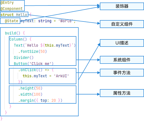
,@Component表示自定义组件,@Entry表示该自定义组件为入口组件
常用组件
文本组件
文本显示 (Text/Span)
Text可通过以下两种方式来创建:
-
string字符串。
Text('我是一段文本')

-
引用Resource资源。
资源引用类型可以通过$r创建Resource类型对象,文件位置为/resources/base/element/string.json。
-
引用Resource资源。
资源引用类型可以通过$r创建Resource类型对象,文件位置为/resources/base/element/string.json。
Text($r('app.string.module_desc')) .baselineOffset(0) .fontSize(30) .border({ width: 1 }) .padding(10) .width(300)
添加子组件span
Span只能作为Text和RichEditor组件的子组件显示文本内容。可以在一个Text内添加多个Span来显示一段信息,例如产品说明书、承诺书等。
-
创建Span。
Span组件需要写到Text组件内,单独写Span组件不会显示信息,Text与Span同时配置文本内容时,Span内容覆盖Text内容。
Text('我是Text') { Span('我是Span')}.padding(10).borderWidth(1)
-
设置文本装饰线及颜色。
通过decoration设置文本装饰线及颜色。
Text() { Span('我是Span1,').fontSize(16).fontColor(Color.Grey) .decoration({ type: TextDecorationType.LineThrough, color: Color.Red }) Span('我是Span2').fontColor(Color.Blue).fontSize(16) .fontStyle(FontStyle.Italic) .decoration({ type: TextDecorationType.Underline, color: Color.Black }) Span(',我是Span3').fontSize(16).fontColor(Color.Grey) .decoration({ type: TextDecorationType.Overline, color: Color.Green })}.borderWidth(1).padding(10)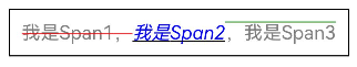
-
通过textCase设置文字一直保持大写或者小写状态。
Text() { Span('I am Upper-span').fontSize(12) .textCase(TextCase.UpperCase)}.borderWidth(1).padding(10)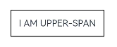
-
添加事件。
由于Span组件无尺寸信息,事件仅支持添加点击事件onClick。
Text() { Span('I am Upper-span').fontSize(12) .textCase(TextCase.UpperCase) .onClick(()=>{ console.info('我是Span——onClick') })}
letterSpacing
letterSpacing(value: number | string)
| 参数名 | 类型 | 必填 | 描述 |
|---|---|---|---|
| value | letterSpacing | 是 | 设置文本字符间距。取值小于0,字符聚集重叠,取值大于0且随着数值变大,字符间距越来越大,稀疏分布。 |
Span('字符间距').letterSpacing(10)
textCase
textCase(value: TextCase)
| 参数名 | 类型 | 必填 | 描述 |
|---|---|---|---|
| value | textCase | 是 | 设置文本大小写。 |
lineHeight10+
lineHeight(value: Length)
设置文本行高。
| 参数名 | 类型 | 必填 | 描述 |
|---|---|---|---|
| value | Length | 是 | 设置文本行高。 |
font10+
font(value: Font)
设置文本样式。包括字体大小、字体粗细、字体族和字体风格。
| 参数名 | 类型 | 必填 | 描述 |
|---|---|---|---|
| value | Font | 是 | 设置文本样式。包括字体大小、字体粗细、字体族和字体风格。 |
Span('行高').lineHeight(40)
  .font({size:20,family:'HarmonyOS Sans',
    style:FontStyle.Italic,weight:FontWeight.Bolder})
textShadow11+
textShadow(value: ShadowOptions | Array)
设置文字阴影效果。该接口支持以数组形式入参,实现多重文字阴影。不支持fill字段, 不支持智能取色模式。
| 参数名 | 类型 | 必填 | 描述 |
|---|---|---|---|
| value | ShadowOptionsArray<ShadowOptions | 是 | 设置文字阴影效果。该接口支持以数组形式入参,实现多重文字阴影。不支持fill字段, 不支持智能取色模式。 |
 Span('文字阴影')
          .textShadow({color:Color.Blue,offsetX:15,offsetY:5,radius:4})
        Span('文字阴影')
          .textShadow([
            {color:Color.Blue,offsetX:5,offsetY:5,radius:4},
            {color:Color.Red,offsetX:10,offsetY:10,radius:7}
          ])
BaseSpan
定义BaseSpan基础类,包含Span的通用属性。
系统能力: SystemCapability.ArkUI.ArkUI.Full
元服务API: 从API version 12开始,该接口支持在元服务中使用。
textBackgroundStyle11+
textBackgroundStyle(style: TextBackgroundStyle)
设置背景样式。作为ContainerSpan的子组件时可以继承它的此属性值,优先使用其自身的此属性。
元服务API: 从API version 12开始,该接口支持在元服务中使用。
系统能力: SystemCapability.ArkUI.ArkUI.Full
参数:
| 参数名 | 类型 | 必填 | 描述 |
|---|---|---|---|
| style | TextBackgroundStyle | 是 | 背景样式。默认值:{color: Color.Transparent,radius: 0} |
baselineOffset12+
baselineOffset(value: LengthMetrics)
设置Span基线的偏移量。此属性与父组件的baselineOffset是共存的。
系统能力: SystemCapability.ArkUI.ArkUI.Full
参数:
| 参数名 | 类型 | 必填 | 描述 |
|---|---|---|---|
| value | LengthMetrics | 是 | 设置Span基线的偏移量,设置该值为百分比时,按默认值显示。正数内容向上偏移,负数向下偏移。默认值:0在ImageSpan中,设置为非0时会导致设置verticalAlign失效。 |
示例
示例1
decoration、letterSpacing、textCase属性接口使用示例
// xxx.ets
@Entry
@Component
struct SpanExample {
  build() {
    Flex({ direction: FlexDirection.Column, alignItems: ItemAlign.Start, justifyContent: FlexAlign.SpaceBetween }) {
      Text('Basic Usage').fontSize(9).fontColor(0xCCCCCC)
      Text() {
        Span('In Line')
        Span(' Component')
        Span(' !')
      }

      Text() {
        Span('This is the Span component').fontSize(12).textCase(TextCase.Normal)
          .decoration({ type: TextDecorationType.None, color: Color.Red })
      }

      // 文本横线添加
      Text('Text Decoration').fontSize(9).fontColor(0xCCCCCC)
      Text() {
        Span('I am Underline-WAVY-span').decoration({ type: TextDecorationType.Underline, color: Color.Red, style: TextDecorationStyle.WAVY }).fontSize(12)
      }

      Text() {
        Span('I am LineThrough-DOTTED-span')
          .decoration({ type: TextDecorationType.LineThrough, color: Color.Red, style: TextDecorationStyle.DOTTED })
          .fontSize(12)
      }

      Text() {
        Span('I am Overline-DASHED-span').decoration({ type: TextDecorationType.Overline, color: Color.Red, style: TextDecorationStyle.DASHED }).fontSize(12)
      }

      // 文本字符间距
      Text('LetterSpacing').fontSize(9).fontColor(0xCCCCCC)
      Text() {
        Span('span letter spacing')
          .letterSpacing(0)
          .fontSize(12)
      }

      Text() {
        Span('span letter spacing')
          .letterSpacing(-2)
          .fontSize(12)
      }

      Text() {
        Span('span letter spacing')
          .letterSpacing(3)
          .fontSize(12)
      }


      // 文本大小写展示设置
      Text('Text Case').fontSize(9).fontColor(0xCCCCCC)
      Text() {
        Span('I am Lower-span').fontSize(12)
          .textCase(TextCase.LowerCase)
          .decoration({ type: TextDecorationType.None })
      }

      Text() {
        Span('I am Upper-span').fontSize(12)
          .textCase(TextCase.UpperCase)
          .decoration({ type: TextDecorationType.None })
      }
    }.width('100%').height(250).padding({ left: 35, right: 35, top: 35 })
  }
}
示例2
@Entry
@Component
struct TextSpanExample {
  @State textShadows : ShadowOptions | Array<ShadowOptions> = [{ radius: 10, color: Color.Red, offsetX: 10, offsetY: 0 },{ radius: 10, color: Color.Black, offsetX: 20, offsetY: 0 },
      { radius: 10, color: Color.Brown, offsetX: 30, offsetY: 0 },{ radius: 10, color: Color.Green, offsetX: 40, offsetY: 0 },
      { radius: 10, color: Color.Yellow, offsetX: 100, offsetY: 0 }]
  build() {
    Column({ space: 8 }) {
      Text() {
        Span('123456789').fontSize(50).textShadow(this.textShadows)
      }
      Text() {
        Span('123456789') // span can inherit text shadow & font size from outer text
      }.fontSize(50).textShadow(this.textShadows)
    }
  }
}
示例3
// xxx.ets
@Component
@Entry
struct Index {
  build() {
    Column() {
      Text() {
        Span('   Hello World !   ')
          .fontSize('20fp')
          .textBackgroundStyle({color: "#7F007DFF", radius: "5vp"})
          .fontColor(Color.White)
      }
    }.width('100%').margin({bottom: '5vp'}).alignItems(HorizontalAlign.Center)
  }
}
示例4
该示例实现了如何设置Span基线的偏移量。
import { LengthUnit, LengthMetrics } from '@kit.ArkUI';

@Entry
@Component
struct Index {

  build() {
    Row() {
      Column() {
        Text(){
          Span('word1')
            .baselineOffset(new LengthMetrics(20,LengthUnit.VP))
          Span('word2')
            .baselineOffset(new LengthMetrics(0,LengthUnit.VP))
          ImageSpan($r("app.media.icon"))
            .width('45px')
            .baselineOffset(new LengthMetrics(-20,LengthUnit.VP))
        }
        .backgroundColor(Color.Gray)
      }
      .width('100%')
    }
    .height('100%')
  }
}
自定义文本样式
-
通过textAlign属性设置文本对齐样式。
Text('左对齐') .width(300) .textAlign(TextAlign.Start) .border({ width: 1 }) .padding(10)Text('中间对齐') .width(300) .textAlign(TextAlign.Center) .border({ width: 1 }) .padding(10)Text('右对齐') .width(300) .textAlign(TextAlign.End) .border({ width: 1 }) .padding(10)
通过textOverflow属性控制文本超长处理,textOverflow需配合maxLines一起使用(默认情况下文本自动折行)
Text('超出滚动水水水水水水水水水水水asd水水水水水水水水水阿斯顿水水水水士大夫水水水水水')
        .width(300).backgroundColor('#ccc')
        .textOverflow({overflow:TextOverflow.MARQUEE})
      Text('超出隐藏水水水水水水水水水水水asd水水水水水水水水水阿斯顿水水水水士大夫水水水水水')
        .width(300).backgroundColor('#ccc')
        .textOverflow({overflow:TextOverflow.Ellipsis})
        .maxLines(2)//最大行数
通过minFontSize与maxFontSize自适应字体大小,minFontSize设置文本最小显示字号,maxFontSize设置文本最大显示字号,minFontSize与maxFontSize必须搭配同时使用,以及需配合maxline或布局大小限制一起使用,单独设置不生效。
Text('超出隐藏水水水水水水水水水水水asd水水水水水水水水水ffffffffffffffffsa地方')
        .width(300).backgroundColor('#ccc')
        .minFontSize(10).maxFontSize(30)
        .maxLines(1)
      Text('超出隐藏水水水水水水水水水水水asd阿道夫撒地方撒旦')
        .width(300).backgroundColor('#ccc')
        .minFontSize(10).maxFontSize(30)
        .maxLines(2)
通过copyOption属性设置文本是否可复制粘贴。
Text("这是一段可复制文本") .fontSize(30) .copyOption(CopyOptions.InApp)
其他属性
draggable9+
draggable(value: boolean)
设置选中文本拖拽效果。
不能和onDragStart事件同时使用。
需配合CopyOptions一起使用,设置copyOptions为CopyOptions.InApp或者CopyOptions.LocalDevice,并且draggable设置为true时,支持对选中文本的拖拽以及选中内容复制到输入框。
元服务API: 从API version 11开始,该接口支持在元服务中使用。
系统能力: SystemCapability.ArkUI.ArkUI.Full
参数:
| 参数名 | 类型 | 必填 | 说明 |
|---|---|---|---|
| value | boolean | 是 | 选中文本拖拽效果。默认值:false |
heightAdaptivePolicy10+
heightAdaptivePolicy(value: TextHeightAdaptivePolicy)
设置文本自适应高度的方式。
当设置为TextHeightAdaptivePolicy.MAX_LINES_FIRST时,优先使用maxlines属性来调整文本高度。如果使用maxLines属性的布局大小超过了布局约束,则尝试在minFontSize和maxFontSize的范围内缩小字体以显示更多文本。
当设置为TextHeightAdaptivePolicy.MIN_FONT_SIZE_FIRST时,优先使用minFontSize属性来调整文本高度。如果使用minFontSize属性可以将文本布局在一行中,则尝试在minFontSize和maxFontSize的范围内增大字体并使用最大可能的字体大小。
当设置为TextHeightAdaptivePolicy.LAYOUT_CONSTRAINT_FIRST时,优先使用布局约束来调整文本高度。如果布局大小超过布局约束,则尝试在minFontSize和maxFontSize的范围内缩小字体以满足布局约束。如果将字体大小缩小到minFontSize后,布局大小仍然超过布局约束,则删除超过布局约束的行。
元服务API: 从API version 11开始,该接口支持在元服务中使用。
系统能力: SystemCapability.ArkUI.ArkUI.Full
参数:
| 参数名 | 类型 | 必填 | 说明 |
|---|---|---|---|
| value | TextHeightAdaptivePolicy | 是 | 文本自适应高度的方式。默认值:TextHeightAdaptivePolicy.MAX_LINES_FIRST |
textIndent10+
textIndent(value: Length)
设置首行文本缩进。
 Text('首行缩进saaaaaaaaaaaasdfsdfsdfsdfsdfsdfergsdfgsdfggdhgsdgesfhdcbsdgfhdsh')
        .width(300).backgroundColor('#f0f')
        .textIndent(10)
| 参数名 | 类型 | 必填 | 描述 |
|---|---|---|---|
| value | Length | 是 | 设置首行文本缩进。 |
wordBreak11+
wordBreak(value: WordBreak)
设置断行规则。WordBreak.BREAK_ALL与{overflow: TextOverflow.Ellipsis},maxLines组合使用可实现英文单词按字母截断,超出部分以省略号显示
Text('断行规则hello word hello word hello word hello word hello word hello word hello word hello word hello word hello word hello word ')
        .width(300).backgroundColor('#fcf').maxLines(2)
        .wordBreak(WordBreak.BREAK_WORD)
        .textOverflow({overflow:TextOverflow.Ellipsis})
| 参数名 | 类型 | 必填 | 描述 |
|---|---|---|---|
| value | WordBreak | 是 | 设置断行规则。WordBreak.BREAK_ALL与{overflow: TextOverflow.Ellipsis},maxLines组合使用可实现英文单词按字母截断,超出部分以省略号显示 |
selection11+
selection(selectionStart: number, selectionEnd: number)
设置选中区域。选中区域高亮且显示手柄和文本选择菜单。
当copyOption设置为CopyOptions.None时,设置selection属性不生效。
当overflow设置为TextOverflow.MARQUEE时,设置selection属性不生效。
当selectionStart大于等于selectionEnd时不选中。可选范围为[0, textSize],textSize为文本内容最大字符数,入参小于0处理为0,大于textSize处理为textSize。
当selectionStart或selectionEnd在截断不可见区域时不选中。截断为false时超出父组件的文本选中区域生效。
元服务API: 从API version 11开始,该接口支持在元服务中使用。
系统能力: SystemCapability.ArkUI.ArkUI.Full
参数:
| 参数名 | 类型 | 必填 | 说明 |
|---|---|---|---|
| selectionStart | number | 是 | 所选文本的起始位置。默认值:-1 |
| selectionEnd | number | 是 | 所选文本的结束位置。默认值:-1 |
Text('设置选中hello word hello word hello word hello word hello word hello word hello word hello word hello word hello word hello word ')
        .width(300).backgroundColor('#faf').maxLines(2).copyOption(CopyOptions.InApp)
        .selection(0,10)
ellipsisMode11+
ellipsisMode(value: EllipsisMode)
设置省略位置。ellipsisMode属性需要配合overflow设置为TextOverflow.Ellipsis以及maxLines使用,单独设置ellipsisMode属性不生效。
EllipsisMode.START和EllipsisMode.CENTER仅在单行超长文本生效。
Text('设置省略位置hello word hello word hello word hello word hello word hello word hello word hello word hello word hello word hello word ')
        .width(300).backgroundColor('#fcf').maxLines(1)
        .textOverflow({overflow:TextOverflow.Ellipsis})
        .ellipsisMode(EllipsisMode.START)
| 参数名 | 类型 | 必填 | 描述 |
|---|---|---|---|
| value | EllipsisMode | 是 | 设置省略位置。ellipsisMode属性需要配合overflow设置为TextOverflow.Ellipsis以及maxLines使用,单独设置ellipsisMode属性不生效。 |
bindSelectionMenu11+
bindSelectionMenu(spanType: TextSpanType, content: CustomBuilder, responseType: TextResponseType,
options?: SelectionMenuOptions)
设置自定义选择菜单。
bindSelectionMenu长按响应时长为600ms,bindContextMenu长按响应时长为800ms,同时绑定且触发方式均为长按时,优先响应bindSelectionMenu。
自定义菜单超长时,建议内部嵌套Scroll组件使用,避免键盘被遮挡。
元服务API: 从API version 12开始,该接口支持在元服务中使用。
系统能力: SystemCapability.ArkUI.ArkUI.Full
参数:
| 参数名 | 类型 | 必填 | 说明 |
|---|---|---|---|
| spantype | TextSpanType | 是 | 选择菜单的类型。默认值:TextSpanType.TEXT |
| content | CustomBuilder | 是 | 选择菜单的内容。 |
| responseType | TextResponseType | 是 | 选择菜单的响应类型。默认值:TextResponseType.LONG_PRESS |
| options | SelectionMenuOptions | 否 | 选择菜单的选项。 |
fontFeature12+
fontFeature(value: string)
设置文字特性效果,比如数字等宽的特性。
格式为:normal |
的格式为: [ | on | off ]
的个数可以有多个,中间用’,'隔开。
例如,使用等宽数字的输入格式为:“ss01” on。
系统能力: SystemCapability.ArkUI.ArkUI.Full
参数:
| 参数名 | 类型 | 必填 | 说明 |
|---|---|---|---|
| value | string | 是 | 文字特性效果。 |
fontFeature属性列表
设置 Font Feature 属性,Font Feature 是 OpenType 字体的高级排版能力,如支持连字、数字等宽等特性,一般用在自定义字体中,其能力需要字体本身支持。
更多 Font Feature 能力介绍可参考 https://www.w3.org/TR/css-fonts-3/#font-feature-settings-prop 和 https://sparanoid.com/lab/opentype-features/
不支持Text内同时存在文本内容和Span或ImageSpan子组件。如果同时存在,只显示Span或ImageSpan内的内容。
字体排版引擎会对开发者传入的宽度width进行向下取整,保证是整型像素后进行排版。如果字体排版引擎向上取整,可能会出现文字右侧被截断。
当多个Text组件在Row容器内布局且没有设置具体的布局分配信息时,Text会以Row的最大尺寸进行布局。如果需要子组件主轴累加的尺寸不超过Row容器主轴的尺寸,可以设置layoutWeight或者是以Flex布局来约束子组件的主轴尺寸。
lineSpacing12+
lineSpacing(value: LengthMetrics)
设置文本的行间距,设置值不大于0时,取默认值0。
Text('文字特性,Hello Word123 Hello Word123 Hello Word123 Hello Word123 Hello Word123 Hello Word123 Hello Word123 Hello Word123 Hello Word123 Hello Word123 Hello Word123')
  .fontSize(20).maxLines(2)
  .lineSpacing(LengthMetrics.vp(5))
| 参数名 | 类型 | 必填 | 描述 |
|---|---|---|---|
| value | LengthMetrics | 是 | 设置文本的行间距,设置值不大于0时,取默认值0。 |
privacySensitive12+
privacySensitive(supported: boolean)
设置是否支持卡片敏感隐私信息。
卡片能力: 从API version 12开始,该接口支持在ArkTS卡片中使用。
系统能力: SystemCapability.ArkUI.ArkUI.Full
参数:
| 参数名 | 类型 | 必填 | 说明 |
|---|---|---|---|
| supported | boolean | 是 | 是否支持卡片敏感隐私信息。默认值为false,当设置为true时,隐私模式下文字将被遮罩为横杠“-”样式。**说明:**设置null则不敏感。进入隐私模式需要卡片框架支持。 |
lineBreakStrategy12+
lineBreakStrategy(strategy: LineBreakStrategy)
设置折行规则。该属性在wordBreak不等于breakAll的时候生效,不支持连词符。
元服务API: 从API version 12开始,该接口支持在元服务中使用。
系统能力: SystemCapability.ArkUI.ArkUI.Full
参数:
| 属性名 | 参数类型 | 必填 | 说明 |
|---|---|---|---|
| lineBreakStrategy | LineBreakStrategy | 是 | 文本的折行规则。默认值:LineBreakStrategy.GREEDY |
textSelectable12+
textSelectable(value: TextSelectableMode)
设置是否支持文本可选择、可获焦以及Touch后能否获取焦点。
元服务API: 从API version 12开始,该接口支持在元服务中使用。
系统能力: SystemCapability.ArkUI.ArkUI.Full
参数:
| 参数名 | 类型 | 必填 | 说明 |
|---|---|---|---|
| textSelectable | TextSelectableMode | 是 | 文本是否支持可选择、可获焦。默认值:TextSelectableMode.SELECTABLE_UNFOCUSABLE |
TextDataDetectorConfig11+对象说明
元服务API: 从API version 12开始,该接口支持在元服务中使用。
| 参数名 | 类型 | 必填 | 说明 |
|---|---|---|---|
| types | [TextDataDetectorType] | 是 | 设置文本识别的实体类型。设置types为null或者[]时,识别所有类型的实体,否则只识别指定类型的实体。 |
| onDetectResultUpdate | (result: string) => void | 否 | 文本识别成功后,触发onDetectResultUpdate回调。- result:文本识别的结果,Json格式。 |
事件
除支持通用事件外,还支持以下事件:
onCopy11+
onCopy(callback:(value: string) => void)
长按文本内部区域弹出剪贴板后,点击剪切板复制按钮,触发该回调。目前文本复制仅支持文本。
元服务API: 从API version 11开始,该接口支持在元服务中使用。
系统能力: SystemCapability.ArkUI.ArkUI.Full
参数:
| 参数名 | 类型 | 必填 | 说明 |
|---|---|---|---|
| value | string | 是 | 复制的文本内容。 |
onTextSelectionChange11+
onTextSelectionChange(callback: (selectionStart: number, selectionEnd: number) => void)
文本选择的位置发生变化时,触发该回调。
元服务API: 从API version 12开始,该接口支持在元服务中使用。
系统能力: SystemCapability.ArkUI.ArkUI.Full
参数:
| 参数名 | 类型 | 必填 | 说明 |
|---|---|---|---|
| selectionStart | number | 是 | 所选文本的起始位置。 |
| selectionEnd | number | 是 | 所选文本的结束位置。 |
TextOptions11+
Text初始化参数。
| 名称 | 类型 | 必填 | 说明 |
|---|---|---|---|
| controller | TextController | 是 | 文本控制器。 |
TextController11+
Text组件的控制器。
元服务API: 从API version 12开始,该接口支持在元服务中使用。
导入对象
controller: TextController = new TextController()
closeSelectionMenu
closeSelectionMenu(): void
关闭自定义选择菜单或系统默认选择菜单。
元服务API: 从API version 12开始,该接口支持在元服务中使用。
setStyledString12+
setStyledString(value: StyledString): void
触发绑定或更新属性字符串。
参数:
| 参数名 | 参数类型 | 必填 | 参数描述 |
|---|---|---|---|
| value | StyledString | 是 | 属性字符串。**说明:**StyledString的子类MutableStyledString也可以作为入参值。 |
getLayoutManager12+
getLayoutManager(): LayoutManager
获取布局管理器对象。
元服务API: 从API version 12开始,该接口支持在元服务中使用。
返回值:
| 类型 | 说明 |
|---|---|
| LayoutManager | 布局管理器对象。 |
示例
示例1
textAlign、maxLines、textOverflow、lineHeight属性接口使用示例
// xxx.ets
@Extend(Text)
function style(TextAlign: TextAlign) {
  .textAlign(TextAlign)
  .fontSize(12)
  .border({ width: 1 })
  .padding(10)
  .width('100%')
}

@Entry
@Component
struct TextExample1 {
  build() {
    Flex({ direction: FlexDirection.Column, alignItems: ItemAlign.Start, justifyContent: FlexAlign.SpaceBetween }) {
      // 文本水平方向对齐方式设置
      // 单行文本
      Text('textAlign').fontSize(9).fontColor(0xCCCCCC)
      Text('TextAlign set to Center.')
        .style(TextAlign.Center)
      Text('TextAlign set to Start.')
        .style(TextAlign.Start)
      Text('TextAlign set to End.')
        .style(TextAlign.End)

      // 多行文本
      Text('This is the text content with textAlign set to Center.')
        .style(TextAlign.Center)
      Text('This is the text content with textAlign set to Start.')
        .style(TextAlign.Start)
      Text('This is the text content with textAlign set to End.')
        .style(TextAlign.End)


      // 文本超长时显示方式
      Text('TextOverflow+maxLines').fontSize(9).fontColor(0xCCCCCC)
      // 超出maxLines截断内容展示
      Text('This is the setting of textOverflow to Clip text content This is the setting of textOverflow to None text content. This is the setting of textOverflow to Clip text content This is the setting of textOverflow to None text content.')
        .textOverflow({ overflow: TextOverflow.Clip })
        .maxLines(1)
        .style(TextAlign.Start)

      // 超出maxLines展示省略号
      Text('This is set textOverflow to Ellipsis text content This is set textOverflow to Ellipsis text content.')
        .textOverflow({ overflow: TextOverflow.Ellipsis })
        .maxLines(1)
        .style(TextAlign.Start)

      Text('lineHeight').fontSize(9).fontColor(0xCCCCCC)
      Text('This is the text with the line height set. This is the text with the line height set.')
        .style(TextAlign.Start)
      Text('This is the text with the line height set. This is the text with the line height set.')
        .style(TextAlign.Start)
        .lineHeight(20)
    }.height(600).width(340).padding({ left: 35, right: 35, top: 35 })
  }
}
示例2
decoration、baselineOffset、letterSpacing、textCase属性接口使用示例
@Extend(Text)
function style() {
  .fontSize(12)
  .border({ width: 1 })
  .padding(10)
  .width('100%')
}

@Entry
@Component
struct TextExample2 {
  build() {
    Flex({ direction: FlexDirection.Column, alignItems: ItemAlign.Start, justifyContent: FlexAlign.SpaceBetween }) {
      Text('decoration').fontSize(9).fontColor(0xCCCCCC)
      Text('This is the text content with the decoration set to LineThrough and the color set to Red.')
        .decoration({
          type: TextDecorationType.LineThrough,
          color: Color.Red
        })
        .style()

      Text('This is the text content with the decoration set to Overline and the color set to Red.')
        .decoration({
          type: TextDecorationType.Overline,
          color: Color.Red,
          style: TextDecorationStyle.DOTTED
        })
        .style()

      Text('This is the text content with the decoration set to Underline and the color set to Red.')
        .decoration({
          type: TextDecorationType.Underline,
          color: Color.Red,
          style: TextDecorationStyle.WAVY
        })
        .style()

      // 文本基线偏移
      Text('baselineOffset').fontSize(9).fontColor(0xCCCCCC)
      Text('This is the text content with baselineOffset 0.')
        .baselineOffset(0)
        .style()
      Text('This is the text content with baselineOffset 30.')
        .baselineOffset(30)
        .style()
      Text('This is the text content with baselineOffset -20.')
        .baselineOffset(-20)
        .style()

      // 文本字符间距
      Text('letterSpacing').fontSize(9).fontColor(0xCCCCCC)
      Text('This is the text content with letterSpacing 0.')
        .letterSpacing(0)
        .style()
      Text('This is the text content with letterSpacing 3.')
        .letterSpacing(3)
        .style()
      Text('This is the text content with letterSpacing -1.')
        .letterSpacing(-1)
        .style()

      Text('textCase').fontSize(9).fontColor(0xCCCCCC)
      Text('This is the text content with textCase set to Normal.')
        .textCase(TextCase.Normal)
        .style()
      // 文本全小写展示
      Text('This is the text content with textCase set to LowerCase.')
        .textCase(TextCase.LowerCase)
        .style()
      // 文本全大写展示
      Text('This is the text content with textCase set to UpperCase.')
        .textCase(TextCase.UpperCase)
        .style()

    }.height(700).width(350).padding({ left: 35, right: 35, top: 35 })
  }
}
示例3
textShadow,heightAdaptivePolicy,TextOverflow.MARQUEE使用示例:
@Extend(Text)
function style(HeightAdaptivePolicy: TextHeightAdaptivePolicy) {
  .width('80%')
  .height(90)
  .borderWidth(1)
  .minFontSize(10)
  .maxFontSize(30)
  .maxLines(2)
  .textOverflow({ overflow: TextOverflow.Ellipsis })
  .heightAdaptivePolicy(HeightAdaptivePolicy)
}

@Entry
@Component
struct TextExample3 {
  build() {
    Column({ space: 8 }) {
      Text('textShadow').fontSize(9).fontColor(0xCCCCCC).margin(15).width('90%')
      // 设置文字阴影效果
      Text('textShadow')
        .width('80%')
        .height(55)
        .fontSize(40)
        .lineHeight(55)
        .textAlign(TextAlign.Center)
        .textShadow({
          radius: 10,
          color: Color.Black,
          offsetX: 0,
          offsetY: 0
        })
        .borderWidth(1)
      Divider()
      // 设置文本自适应高度的方式
      Text('heightAdaptivePolicy').fontSize(9).fontColor(0xCCCCCC).margin(15).width('90%')
      Text('This is the text with the height adaptive policy set')
        .style(TextHeightAdaptivePolicy.MAX_LINES_FIRST)
      Text('This is the text with the height adaptive policy set')
        .style(TextHeightAdaptivePolicy.MIN_FONT_SIZE_FIRST)
      Text('This is the text with the height adaptive policy set')
        .style(TextHeightAdaptivePolicy.LAYOUT_CONSTRAINT_FIRST)
      Divider()
      Text('marquee').fontSize(9).fontColor(0xCCCCCC).margin(15).width('90%')
      // 设置文本超长时以跑马灯的方式展示
      Text('This is the text with the text overflow set marquee')
        .width(300)
        .borderWidth(1)
        .textOverflow({ overflow: TextOverflow.MARQUEE })
    }
  }
}
示例4
ellipsisMode和wordBreak使用示例
// xxx.ets
@Entry
@Component
struct TextExample4 {
  @State text: string =
    'The text component is used to display a piece of textual information.Support universal attributes and universal text attributes.'
  @State ellipsisModeIndex: number = 0;
  @State ellipsisMode: EllipsisMode[] = [EllipsisMode.START, EllipsisMode.CENTER, EllipsisMode.END]
  @State ellipsisModeStr: string[] = ['START', 'CENTER', 'END']
  @State wordBreakIndex: number = 0;
  @State wordBreak: WordBreak[] = [WordBreak.NORMAL, WordBreak.BREAK_ALL, WordBreak.BREAK_WORD]
  @State wordBreakStr: string[] = ['NORMAL', 'BREAK_ALL', 'BREAK_WORD']
  @State textClip: boolean = false

  build() {
    Column({ space: 10 }) {
      Text(this.text)
        .fontSize(16)
        .border({ width: 1 })
        .lineHeight(20)
        .maxLines(1)
        .textOverflow({ overflow: TextOverflow.Ellipsis })
        .ellipsisMode(this.ellipsisMode[this.ellipsisModeIndex])
        .width(300)
        .margin({ left: 20, top: 20 })

      Row() {
        Button('更改省略号位置:' + this.ellipsisModeStr[this.ellipsisModeIndex]).onClick(() => {
          this.ellipsisModeIndex++
          if (this.ellipsisModeIndex > (this.ellipsisModeStr.length - 1)) {
            this.ellipsisModeIndex = 0
          }
        })
      }

      Text('This is set wordBreak to WordBreak text Taumatawhakatangihangakoauauotamateaturipukakapikimaungahoronukupokaiwhenuakitanatahu.')
        .fontSize(12)
        .border({ width: 1 })
        .wordBreak(WordBreak.NORMAL)
        .lineHeight(20)
        .maxLines(2)
        .clip(this.textClip)
        .width(260)
      Row() {
        Button('切换clip:' + this.textClip).onClick(() => {
          this.textClip = !this.textClip
        })
      }

      Text(this.text)
        .fontSize(12)
        .border({ width: 1 })
        .maxLines(2)
        .textOverflow({ overflow: TextOverflow.Ellipsis })
        .wordBreak(this.wordBreak[this.wordBreakIndex])
        .lineHeight(20)
        .width(260)
      Row() {
        Button('更改wordBreak模式:' + this.wordBreakStr[this.wordBreakIndex]).onClick(() => {
          this.wordBreakIndex++
          if (this.wordBreakIndex > (this.wordBreakStr.length - 1)) {
            this.wordBreakIndex = 0
          }
        })
      }
    }
  }
}
示例5
selection和onCopy使用示例
@Entry
@Component
struct TextExample5 {
  @State onCopy: string = ''
  @State text: string = 'This is set selection to Selection text content This is set selection to Selection text content.'
  @State start: number = 0
  @State end: number = 20

  build() {
    Flex({ direction: FlexDirection.Column, alignItems: ItemAlign.Start, justifyContent: FlexAlign.Start }) {
      Text(this.text)
        .fontSize(12)
        .border({ width: 1 })
        .lineHeight(20)
        .margin(30)
        .copyOption(CopyOptions.InApp)
        .selection(this.start, this.end)
        .onCopy((value: string) => {
          this.onCopy = value
        })
      Button('Set text selection')
        .margin({left:20})
        .onClick(() => {
          // 变更文本选中起始点、终点
          this.start = 10
          this.end = 30
        })
      Text(this.onCopy).fontSize(12).margin(10).key('copy')
    }.height(600).width(335).padding({ left: 35, right: 35, top: 35 })
  }
}
示例6
enableDataDetector和dataDetectorConfig使用示例
@Entry
@Component
struct TextExample6 {
  @State phoneNumber: string = '(86) (755) ********';
  @State url: string = 'www.********.com';
  @State email: string = '***@example.com';
  @State address: string = 'XX省XX市XX区XXXX';
  @State datetime: string = 'XX年XX月XX日XXXX';
  @State enableDataDetector: boolean = true;
  @State types: TextDataDetectorType[] = [];

  build() {
    Row() {
      Column() {
        Text(
          '电话号码:' + this.phoneNumber + '\n' +
          '链接:' + this.url + '\n' +
          '邮箱:' + this.email + '\n' +
          '地址:' + this.address + '\n' +
          '时间:' + this.datetime
        )
          .fontSize(16)
          .copyOption(CopyOptions.InApp)
          .enableDataDetector(this.enableDataDetector)
          .dataDetectorConfig({types : this.types, onDetectResultUpdate: (result: string)=>{}})
          .textAlign(TextAlign.Center)
          .borderWidth(1)
          .padding(10)
          .width('100%')
      }
      .width('100%')
    }
    .height('100%')
  }
}
示例7
bindSelectionMenu,onTextSelectionChange及closeSelectionMenu使用示例
@Entry
@Component
struct TextExample7 {
  controller: TextController = new TextController();
  options: TextOptions = { controller: this.controller };

  build() {
    Column() {
      Column() {
        Text(undefined, this.options) {
          Span('Hello World')
          ImageSpan($r('app.media.icon'))
            .width('100px')
            .height('100px')
            .objectFit(ImageFit.Fill)
            .verticalAlign(ImageSpanAlignment.CENTER)
        }
        .copyOption(CopyOptions.InApp)
        .bindSelectionMenu(TextSpanType.IMAGE, this.LongPressImageCustomMenu, TextResponseType.LONG_PRESS, {
          onDisappear: () => {
            console.info(`自定义选择菜单关闭时回调`);
          },
          onAppear: () => {
            console.info(`自定义选择菜单弹出时回调`);
          }
        })
        .bindSelectionMenu(TextSpanType.TEXT, this.RightClickTextCustomMenu, TextResponseType.RIGHT_CLICK)
        .bindSelectionMenu(TextSpanType.MIXED, this.SelectMixCustomMenu, TextResponseType.SELECT)
        .onTextSelectionChange((selectionStart: number, selectionEnd: number) => {
          console.info(`文本选中区域变化回调, selectionStart: ${selectionStart}, selectionEnd: ${selectionEnd}`);
        })
        .borderWidth(1)
        .borderColor(Color.Red)
        .width(200)
        .height(100)
      }
      .width('100%')
      .backgroundColor(Color.White)
      .alignItems(HorizontalAlign.Start)
      .padding(25)
    }
    .height('100%')
  }

  @Builder
  RightClickTextCustomMenu() {
    Column() {
      Menu() {
        MenuItemGroup() {
          MenuItem({ startIcon: $r('app.media.app_icon'), content: "Right Click Menu 1", labelInfo: "" })
            .onClick((event) => {
              this.controller.closeSelectionMenu();
            })
          MenuItem({ startIcon: $r('app.media.app_icon'), content: "Right Click Menu 2", labelInfo: "" })
          MenuItem({ startIcon: $r('app.media.app_icon'), content: "Right Click Menu 3", labelInfo: "" })
        }
      }
      .MenuStyles()
    }
  }

  @Builder
  LongPressImageCustomMenu() {
    Column() {
      Menu() {
        MenuItemGroup() {
          MenuItem({ startIcon: $r('app.media.app_icon'), content: "Long Press Image Menu 1", labelInfo: "" })
            .onClick((event) => {
              this.controller.closeSelectionMenu();
            })
          MenuItem({ startIcon: $r('app.media.app_icon'), content: "Long Press Image Menu 2", labelInfo: "" })
          MenuItem({ startIcon: $r('app.media.app_icon'), content: "Long Press Image Menu 3", labelInfo: "" })
        }
      }
      .MenuStyles()
    }
  }

  @Builder
  SelectMixCustomMenu() {
    Column() {
      Menu() {
        MenuItemGroup() {
          MenuItem({ startIcon: $r('app.media.app_icon'), content: "Select Mixed Menu 1", labelInfo: "" })
            .onClick((event) => {
              this.controller.closeSelectionMenu();
            })
          MenuItem({ startIcon: $r('app.media.app_icon'), content: "Select Mixed Menu 2", labelInfo: "" })
          MenuItem({ startIcon: $r('app.media.app_icon'), content: "Select Mixed Menu 3", labelInfo: "" })
        }
      }
      .MenuStyles()
    }
  }
}

@Extend(Menu)
function MenuStyles() {
  .radius($r('sys.float.ohos_id_corner_radius_card'))
  .clip(true)
  .backgroundColor('#F0F0F0')
}
示例8
fontFeature、lineSpacing和lineBreakStrategy使用示例。
import { LengthMetrics } from '@kit.ArkUI'

@Extend(Text) function lineSpacingValue(LineSpacing: LengthMetrics|undefined) {
  .lineSpacing(LineSpacing)
  .fontSize(12)
  .border({ width: 1 })
}
@Entry
@Component
struct TextExample8 {
  @State message1: string = "They can be classified as built-in components–those directly provided by the ArkUI framework and custom components – those defined by developers" +
    "The built-in components include buttons radio buttonsprogress indicators and text You can set the rendering effectof thesecomponents in method chaining mode," +
    "page components are divided into independent UI units to implementindependent creation development and reuse of different units on pages making pages more engineering-oriented.";
  @State lineBreakStrategyIndex: number = 0;
  @State lineBreakStrategy: LineBreakStrategy[] = [LineBreakStrategy.GREEDY, LineBreakStrategy.HIGH_QUALITY, LineBreakStrategy.BALANCED]
  @State lineBreakStrategyStr: string[] = ['GREEDY', 'HIGH_QUALITY', 'BALANCED']
  build() {
    Flex({ direction: FlexDirection.Column, alignItems: ItemAlign.Start, justifyContent: FlexAlign.SpaceBetween }) {
      Text('lineSpacing').fontSize(9).fontColor(0xCCCCCC)
      Text('This is a context with no lineSpacing set.')
        .lineSpacingValue(undefined)
      Text( 'This is a context with lineSpacing set to 20_px.')
        .lineSpacingValue(LengthMetrics.px(20))
      Text('This is the context with lineSpacing set to 20_vp.')
        .lineSpacingValue(LengthMetrics.vp(20))
      Text('This is the context with lineSpacing set to 20_fp.')
        .lineSpacingValue(LengthMetrics.fp(20))
      Text('This is the context with lineSpacing set to 20_lpx.')
        .lineSpacingValue(LengthMetrics.lpx(20))
      Text('This is the context with lineSpacing set to 100%.')
        .lineSpacingValue(LengthMetrics.percent(1))
      Text('fontFeature').fontSize(9).fontColor(0xCCCCCC)
      Text('This is ss01 on : 0123456789')
        .fontSize(20)
        .fontFeature("\"ss01\" on")
      Text('This is ss01 off: 0123456789')
        .fontSize(20)
        .fontFeature("\"ss01\" off")
      Text('lineBreakStrategy').fontSize(9).fontColor(0xCCCCCC)
      Text(this.message1)
        .fontSize(12)
        .border({ width: 1 })
        .padding(10)
        .width('100%')
        .lineBreakStrategy(this.lineBreakStrategy[this.lineBreakStrategyIndex])
      Row() {
        Button('更改lineBreakStrategy模式:' + this.lineBreakStrategyStr[this.lineBreakStrategyIndex]).onClick(() => {
          this.lineBreakStrategyIndex++
          if(this.lineBreakStrategyIndex > (this.lineBreakStrategyStr.length - 1)) {
            this.lineBreakStrategyIndex = 0
          }
        })
      }
    }.height(600).width(350).padding({ left: 35, right: 35, top: 35 })
  }
}
示例9
getLayoutManager使用示例。
@Entry
@Component
struct TextExample9 {
  @State lineCount: string = ""
  @State glyphPositionAtCoordinate: string = ""
  @State lineMetrics: string = ""
  controller: TextController = new TextController()
  @State textStr: string =
    'Hello World! 您好,世界!'

  build() {
    Scroll() {
      Column() {
        Text('Text组件getLayoutManager接口获取段落相对组件的信息')
          .fontSize(9)
          .fontColor(0xCCCCCC)
          .width('90%')
          .padding(10)
        Text(this.textStr, { controller: this.controller })
          .fontSize(25)
          .borderWidth(1)
          .onAreaChange(() => {
            let layoutManager: LayoutManager = this.controller.getLayoutManager()
            this.lineCount = "LineCount: " + layoutManager.getLineCount()
          })

        Text('LineCount').fontSize(9).fontColor(0xCCCCCC).width('90%').padding(10)
        Text(this.lineCount)

        Text('GlyphPositionAtCoordinate').fontSize(9).fontColor(0xCCCCCC).width('90%').padding(10)
        Button("相对组件坐标[150,50]字形信息")
          .onClick(() => {
            let layoutManager: LayoutManager = this.controller.getLayoutManager()
            let position: PositionWithAffinity = layoutManager.getGlyphPositionAtCoordinate(150, 50)
            this.glyphPositionAtCoordinate =
              "相对组件坐标[150,50] glyphPositionAtCoordinate position: " + position.position + " affinity: " +
              position.affinity
          })
          .margin({ bottom: 20, top: 10 })
        Text(this.glyphPositionAtCoordinate)

        Text('LineMetrics').fontSize(9).fontColor(0xCCCCCC).width('90%').padding(10)
        Button("首行行信息、文本样式信息、以及字体属性信息")
          .onClick(() => {
            let layoutManager: LayoutManager = this.controller.getLayoutManager()
            let lineMetrics: LineMetrics = layoutManager.getLineMetrics(0)
            this.lineMetrics = "lineMetrics is " + JSON.stringify(lineMetrics) + '\n\n'
            let runMetrics = lineMetrics.runMetrics
            runMetrics.forEach((value, key) => {
              this.lineMetrics += "runMetrics key is " + key + " " + JSON.stringify(value) + "\n\n"
            });
          })
          .margin({ bottom: 20, top: 10 })
        Text(this.lineMetrics)
      }
      .margin({ top: 100, left: 8, right: 8 })
    }
  }
}
示例10
textSelectable使用示例,展示了设置TextSelectMode.SELECTABLE_FOCUSABEL属性时能够触发键盘框选文本功能。
@Entry
@Component
struct TextExample10 {
  @State message: string = 'TextTextTextTextTextTextTextText' + 'TextTextTextTextTextTextTextTextTextTextTextTextTextTextTextText';

  build() {
    Column() {
      Text(this.message)
        .width(300)
        .height(100)
        .maxLines(5)
        .fontColor(Color.Black)
        .copyOption(CopyOptions.InApp)
        .selection(3, 8)
        .textSelectable(TextSelectableMode.SELECTABLE_FOCUSABLE)
    }.width('100%').margin({ top: 100 })
  }
}
nate)
    Text('LineMetrics').fontSize(9).fontColor(0xCCCCCC).width('90%').padding(10)
    Button("首行行信息、文本样式信息、以及字体属性信息")
      .onClick(() => {
        let layoutManager: LayoutManager = this.controller.getLayoutManager()
        let lineMetrics: LineMetrics = layoutManager.getLineMetrics(0)
        this.lineMetrics = "lineMetrics is " + JSON.stringify(lineMetrics) + '\n\n'
        let runMetrics = lineMetrics.runMetrics
        runMetrics.forEach((value, key) => {
          this.lineMetrics += "runMetrics key is " + key + " " + JSON.stringify(value) + "\n\n"
        });
      })
      .margin({ bottom: 20, top: 10 })
    Text(this.lineMetrics)
  }
  .margin({ top: 100, left: 8, right: 8 })
}
}
}
[外链图片转存中...(img-UCKNwbd0-1732537738177)]


#### 示例10

textSelectable使用示例,展示了设置TextSelectMode.SELECTABLE_FOCUSABEL属性时能够触发键盘框选文本功能。
@Entry
@Component
struct TextExample10 {
@State message: string = ‘TextTextTextTextTextTextTextText’ + ‘TextTextTextTextTextTextTextTextTextTextTextTextTextTextTextText’;
build() {
Column() {
Text(this.message)
.width(300)
.height(100)
.maxLines(5)
.fontColor(Color.Black)
.copyOption(CopyOptions.InApp)
.selection(3, 8)
.textSelectable(TextSelectableMode.SELECTABLE_FOCUSABLE)
}.width(‘100%’).margin({ top: 100 })
}
}

讨论HarmonyOS开发技术,专注于API与组件、DevEco Studio、测试、元服务和应用上架分发等。
更多推荐


 9
9 0
0- 0


 已为社区贡献5条内容

所有评论(0)