HarmonyOS多设备银行理财界面开发实战
弹窗这个功能在每个App里都很常见,这个项目用的是装饰器来自定义弹窗样式。关键的一点是,设置为 true 之后弹窗的样式就完全由你自己控制了。});build() {Column() {Row() {})})这个弹窗的设计思路是这样的:弹窗的大小虽然在不同设备上有所调整,但差异不会太大。华为官方的建议是弹窗不建议在不同设备之间直接放大太多,不然可能导致内容显示不全或者无法交互。这一点在实际开发中很
HarmonyOS多设备银行理财界面开发实战——一次开发、多端部署全流程详解
大家好,今天咱们来聊一个在HarmonyOS开发里非常实用的话题:一次开发,多端部署。什么意思呢?就是说你写一套代码,同时让这个应用在直板手机、双折叠手机、平板这些不同屏幕尺寸的设备上都能跑,而且每个设备上的页面都能自适应,显示效果还都挺好看的。这次我们要做的案例是一个银行理财应用,这种应用对UI的要求很高,因为涉及到金融数据展示,在不同设备上既要信息完整,又不能显得乱。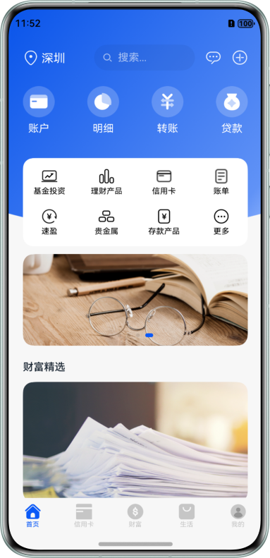

一、开发环境准备
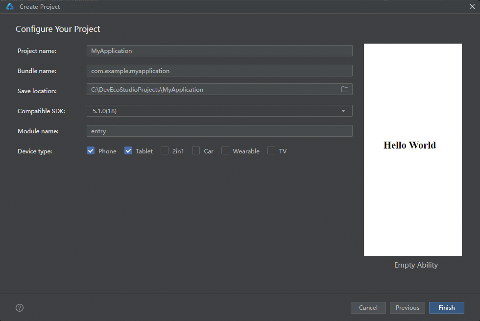
在正式开始写代码之前,你得先把开发环境搭建好。这个案例对工具版本是有明确要求的,别拿个旧版本就去搞,后面大概率会踩坑。
软件要求:
- DevEco Studio版本:6.0.2 Release及以上
- HarmonyOS SDK版本:6.0.2 Release SDK及以上
硬件要求:
- 需要准备直板机、双折叠(Mate X系列)、平板这几种设备
- HarmonyOS系统版本:5.1.0 Release及以上
环境搭建的步骤我就不多说了,简单来说就是:先装DevEco Studio,然后配置好网络代理(国内开发这个很重要,不然下载SDK各种超时),最后把设备调试的环境也配好。你可以用真机也可以用模拟器,看你自己方便。
二、项目整体代码结构
在动手写代码之前,我们先来看看整个项目的代码结构,了解清楚每个目录是干嘛的,后面看代码的时候就不会迷路。这个项目采用了模块化的架构设计,分为三层:公共能力层(commons)、基础特性层(features)、产品定制层(product)。
MultiFinancialManagement/
├──commons                                    // 公共能力层
│  ├──basic/src/main/ets                      // 基础能力
│  │  ├──constants
│  │  │  ├──CommonConstants.ets               // 公共常量类
│  │  │  └──RouterConstants.ets               // 路由常量类
│  │  ├──utils
│  │  │  ├──BreakpointUtil.ets                // 断点工具类
│  │  │  └──Logger.ets                        // 日志工具类
│  │  └──viewmodel
│  │     ├──BusinessInfo.ets                  // 首页数据信息实体类
│  │     └──FundDetail.ets                    // 基金详情实体类
│  ├──base/src/main/resources                 // 资源文件目录
│  └──base/src/Index.ets                      // 对外接口类
├──features                                   // 基础特性层
│  ├──fund/src/main/ets                       // 基金详情
│  │  ├──constants
│  │  │  └──FundConstants.ets                 // 基金常量类
│  │  ├──view
│  │  │  ├──ChartLegendComponent.ets          // 图表
│  │  │  ├──DetailComponent.ets               // 基金详情
│  │  │  ├──FundComponent.ets                 // 产品专题
│  │  │  ├──Funding.ets                       // 产品专题页面
│  │  │  ├──FundingDetail.ets                 // 基金详情页面
│  │  │  ├──FundNavigationComponent.ets       // 产品专题分栏组件
│  │  │  └──TrendsPage.ets                    // 业绩走势全屏显示页面
│  │  └──viewmodel
│  │     ├──ChartAxisFormatter.ets            // 图表图例处理
│  │     ├──ChartViewModel.ets                // 图表显示模块
│  │     └──FundingViewModel.ets              // 基金模块
│  ├──fund/src/main/resources                 // 资源文件目录
│  ├──fund/src/Index.ets                      // 对外接口类
│  ├──fundComparison/src/main/ets             // 基金对比
│  │  ├──constants
│  │  │  └──ComparisonConstants.ets           // 基金对比常量类
│  │  ├──view
│  │  │  ├──ComparisonComponent.ets           // 选择基金
│  │  │  ├──ComparisonDetailComponent.ets     // 基金对比详情
│  │  │  └──ComparisonDetailPage.ets          // 基金对比详情页面
│  │  └──viewmodel
│  │     ├──ComparisonInfo.ets                // 基金对比实体类
│  │     └──FundComparisonViewModel.ets       // 基金对比模块
│  ├──fundComparison/src/main/resources       // 资源文件目录
│  ├──fundComparison/src/Index.ets            // 对外接口类
│  ├──home/src/main/ets                       // 首页
│  │  ├──constants
│  │  │  └──HomeConstants.ets                 // 首页常量
│  │  ├──view
│  │  │  ├──AccountComponent.ets              // 账号自定义组件
│  │  │  ├──AccountPage.ets                   // 账号页面
│  │  │  ├──AdvertisementDialog.ets           // 弹窗
│  │  │  ├──DemandDepositComponent.ets        // 活期内容组件
│  │  │  ├──HomeComponent.ets                 // 首页自定义组件
│  │  │  ├──InvestmentComponent.ets           // 投资内容组件
│  │  │  └──LiabilitiesComponent.ets          // 负债内容组件
│  │  └──viewmodel
│  │     └──HomeViewModel.ets                 // 首页模块
│  ├──home/src/main/resources                 // 资源文件目录
│  ├──home/src/Index.ets                      // 对外接口类
│  ├──transaction/src/main/ets                // 交易转账
│  │  ├──constants
│  │  │  └──TransactionConstants.ets          // 交易转账常量类
│  │  └──view
│  │     └──TransactionComponent.ets          // 交易转账自定义组件
│  ├──transaction/src/main/resources          // 资源文件目录
│  └──transaction/src/Index.ets               // 对外接口类
└──product                                    // 产品定制层
   ├──phone/src/main/ets                      // 支持直板机、双折叠、平板
   │  ├──entryability
   │  │  └──EntryAbility.ets                  // 程序入口类
   │  └──pages
   │     └──Index.ets                         // 主界面
   └──phone/src/main/resources                // 资源文件目录
你看,这个结构其实非常清晰。commons 放的是所有模块共用的东西,比如常量、工具类、数据实体。features 下面按业务模块分了四个子模块:首页(home)、基金(fund)、基金对比(fundcomparison)、交易转账(transaction)。最后 product 是产品定制层,这里放了真正要跑在设备上的入口代码。
三、核心知识点一:断点工具类 BreakpointUtil
在多端适配开发里,最核心的一个概念就是"断点"(Breakpoint)。简单来说,系统会根据当前设备的屏幕宽度,自动判断你处于哪个断点区间,然后你就可以根据不同的断点来设置不同的UI参数。
这个项目定义了三个断点:
sm(小屏):宽度小于600vp,对应直板手机md(中屏):宽度在600vp到840vp之间,对应双折叠手机展开态lg(大屏):宽度大于840vp,对应平板
先来看断点常量的定义,在 CommonConstants.ets 里:
// commons/basic/src/main/ets/constants/CommonConstants.ets
export class CommonConstants {
  // 断点定义
  static readonly BREAK_POINT_XS: string = 'xs';
  static readonly BREAK_POINT_SM: string = 'sm';
  static readonly BREAK_POINT_MD: string = 'md';
  static readonly BREAK_POINT_LG: string = 'lg';

  // 断点阈值,单位是vp
  static readonly BREAK_POINTS_VALUE: Array<string> = ['320vp', '600vp', '840vp'];
  static readonly BREAK_POINTS_VALUE_NUMBER: Array<number> = [320, 600, 840];

  // 栅格列数,不同设备对应不同的总列数
  static readonly COLUMN_SM: number = 4;   // 小屏4列
  static readonly COLUMN_MD: number = 8;   // 中屏8列
  static readonly COLUMN_LG: number = 12;  // 大屏12列

  // 全宽全高
  static readonly FULL_WIDTH_PERCENT: string = '100%';
  static readonly FULL_HEIGHT_PERCENT: string = '100%';
  static readonly TAB_BAR_HEIGHT_PERCENT: string = '100%';
  static readonly TAB_HEIGHT_PERCENT: string = '50%';

  // 导航路径
  static readonly PATH_DETAIL: string = 'detail';
  static readonly PATH_COMPARISON: string = 'comparison';
  static readonly PATH_COMPARISON_DETAIL: string = 'comparisonDetail';
  static readonly PATH_BUYING: string = 'buying';

  // 字体权重
  static readonly FONT_WEIGHT_500: number = 500;
  static readonly FONT_WEIGHT_700: number = 700;

  // 字体族
  static readonly FONT_FAMILY_HEI_TI: string = 'HarmonyHeiTi-Medium';
}
这里面有个关键的设计:栅格系统。小屏用4列,中屏用8列,大屏用12列。这个数字不是随便定的,12是4和8的公倍数,这样你在任何屏幕尺寸下,布局的分配都能整除,不会出现奇怪的间隙。
接下来是真正发挥魔力的 BreakpointUtil 工具类。这个类虽然代码不多,但它是整个多端适配的核心机制:
// commons/basic/src/main/ets/utils/BreakpointUtil.ets
declare interface BreakPointOption<T> extends Record<string, T | undefined> {
  sm?: T,
  md?: T,
  lg?: T,
  xl?: T,
  xxl?: T
}

export class BreakpointUtil<T> {
  options: BreakPointOption<T>;

  constructor(option: BreakPointOption<T>) {
    this.options = option;
  }

  getValue(currentPoint: string): T {
    return this.options[currentPoint] as T;
  }
}
看到了吗?这个类使用了泛型,这意味着你传什么类型的值进去,它就返回什么类型的值。在实际使用中,它的用法非常优雅,比如你想要在不同设备上设置不同的高度:
.height(new BreakpointUtil({
  sm: $r('app.float.business_width_sm'),
  md: $r('app.float.business_width_md'),
  lg: $r('app.float.business_width_lg')
}).getValue(this.currentPoint))
这样一行代码就搞定了三种设备的适配!不用写一堆 if-else,代码干净利落。你以后在自己的项目里做多端适配的时候,完全可以把这个工具类直接拿去用。
四、核心知识点二:断点的检测和更新
断点值是怎么来的呢?这就要看 EntryAbility.ets 了。在应用的入口类里,系统会在窗口创建和窗口大小变化的时候去检测当前应该属于哪个断点:
// product/phone/src/main/ets/entryability/EntryAbility.ets
import { UIAbility, Want, AbilityConstant } from '@kit.AbilityKit';
import { BusinessError } from '@kit.BasicServicesKit';
import { hilog } from '@kit.PerformanceAnalysisKit';
import { display, window } from '@kit.ArkUI';
import { CommonConstants } from 'basic';

const DOMAIN = 0x0000;
const TAG = 'EntryAbility';

export default class EntryAbility extends UIAbility {
  private windowObj?: window.Window;

  onCreate(want: Want, launchParam: AbilityConstant.LaunchParam): void {
    hilog.info(0x0000, 'testTag', '%{public}s', 'Ability onCreate');
  }

  onDestroy(): void {
    hilog.info(0x0000, 'testTag', '%{public}s', 'Ability onDestroy');
  }

  onWindowStageCreate(windowStage: window.WindowStage): void {
    hilog.info(0x0000, 'testTag', '%{public}s', 'Ability onWindowStageCreate');

    windowStage.getMainWindow().then((data: window.Window) => {
      this.windowObj = data;
      try {
        this.updateBreakpoint(this.windowObj.getWindowProperties().windowRect.width);
      } catch (error) {
        hilog.error(DOMAIN, TAG, `Failed to obtain the window properties. Cause code: ${error.code}, message: ${error.message}`)
      }
      // 监听窗口大小变化,比如用户折叠/展开折叠屏
      this.windowObj.on('windowSizeChange', (windowSize: window.Size) => {
        this.updateBreakpoint(windowSize.width);
      })
    }).catch((error: BusinessError) => {
      hilog.error(DOMAIN, TAG, `Failed to obtain the main window. Cause code: ${error.code}, message: ${error.message}`)
    });

    windowStage.loadContent('pages/Index', (err: BusinessError<void>, data) => {
      if (err.code) {
        hilog.error(0x0000, 'testTag', 'Failed to load the content. Cause: %{public}s', JSON.stringify(err) ?? '');
        return;
      }
      hilog.info(0x0000, 'testTag', 'Succeeded in loading the content. Data: %{public}s', JSON.stringify(data) ?? '');
    });
  }

  private updateBreakpoint(windowWidth: number): void {
    try {
      let windowWidthVp = windowWidth / display.getDefaultDisplaySync().densityPixels;
      let curBp: string = '';
      if (windowWidthVp < CommonConstants.BREAK_POINTS_VALUE_NUMBER[1]) {
        curBp = CommonConstants.BREAK_POINT_SM;
      } else if (windowWidthVp < CommonConstants.BREAK_POINTS_VALUE_NUMBER[2]) {
        curBp = CommonConstants.BREAK_POINT_MD;
      } else {
        curBp = CommonConstants.BREAK_POINT_LG;
      }
      AppStorage.setOrCreate('breakPoint', curBp);
    } catch (error) {
      hilog.error(DOMAIN, TAG, `Failed to obtain the default display. Cause code: ${error.code}, message: ${error.message}`)
    }
  }

  onWindowStageDestroy(): void {
    hilog.info(0x0000, 'testTag', '%{public}s', 'Ability onWindowStageDestroy');
  }

  onForeground(): void {
    hilog.info(0x0000, 'testTag', '%{public}s', 'Ability onForeground');
  }

  onBackground(): void {
    hilog.info(0x0000, 'testTag', '%{public}s', 'Ability onBackground');
  }
}
这段代码的核心逻辑在 updateBreakpoint 方法里。它的处理流程是这样的:
- 先把窗口的物理像素宽度转换成 vp(虚拟像素)单位,因为HarmonyOS的布局是基于vp的
- 然后拿转换后的宽度和断点阈值做比较
- 最后把算出来的断点值存到
AppStorage里
AppStorage 是HarmonyOS全局状态管理的机制。你把 breakPoint 存进去之后,任何组件都可以通过 @StorageLink 或 @StorageProp 来响应式地获取到这个值。一旦断点发生变化(比如用户折叠了折叠屏),所有用了这个值的组件都会自动更新。
注意看 windowSizeChange 这个监听器,它非常重要。折叠屏设备的特点就是屏幕宽度会动态变化,用户展开的时候宽度突然变大,折叠的时候又变小。有了这个监听器,应用就能实时响应这种变化,不需要用户手动刷新。
五、核心知识点三:首页沉浸式设计
这个银行理财应用的首页用了沉浸式设计,就是说顶部状态栏是透明的,背景图片可以一直延伸到状态栏区域,视觉效果会更好看。这种效果在很多金融类App里都很常见,给人一种高端大气的感觉。
主界面的实现代码在 product/phone/src/main/ets/pages/Index.ets,我们一段一段来看:
// product/phone/src/main/ets/pages/Index.ets
import { CommonModifier, display, window } from '@kit.ArkUI';
import { BreakpointUtil, CommonConstants, RouterConstants } from 'basic';
import { AccountPage, AdvertisementDialog, HomeComponent } from 'home';
import { Funding, FundingDetail, TrendsPage } from 'fund';
import { ComparisonDetailPage, ComparisonInfo } from 'fundcomparison';
import { hilog } from '@kit.PerformanceAnalysisKit';
import { BusinessError } from '@kit.BasicServicesKit';

const DOMAIN = 0x0000;
const TAG = 'Index';

@Entry
@Component
struct Index {
  @StorageLink('breakPoint') breakPoint: string = CommonConstants.BREAK_POINT_SM;
  @State currentTabIndex: number = 0;
  @StorageProp('avoidArea') topHeight: number = 0;
  @StorageProp('bottom') bottom: number = 0;
  @State backgroundImageY: number = 0;
  @State tabBarModifier: CommonModifier = new CommonModifier();
  @StorageLink('pageIndexInfos') pageIndexInfos: NavPathStack = new NavPathStack();
  public tabBarHeight: number = 0;

  // 自定义弹窗控制器
  dialogController: CustomDialogController = new CustomDialogController({
    builder: AdvertisementDialog(),
    backgroundColor: $r('app.color.dialog_background'),
    alignment: DialogAlignment.Center,
    maskColor: $r('app.color.dialog_mask'),
    customStyle: true
  });
沉浸式的关键代码在 onPageShow 方法里:
  onPageShow() {
    window.getLastWindow(this.getUIContext().getHostContext()).then((windowStage: window.Window) => {
      try {
        let area = windowStage.getWindowAvoidArea(window.AvoidAreaType.TYPE_SYSTEM);
        let topHeight = this.getUIContext().px2vp(area.topRect.height);
        let bottomArea = windowStage.getWindowAvoidArea(window.AvoidAreaType.TYPE_NAVIGATION_INDICATOR);
        let bottom = this.getUIContext().px2vp(bottomArea.bottomRect.height);
        if (topHeight > 0) {
          windowStage.setWindowLayoutFullScreen(true).catch((error: BusinessError) => {
            hilog.error(DOMAIN, TAG,
              `Failed to set the window layout to full-screen mode. Cause code: ${error.code}, message: ${error.message}`)
          });
          AppStorage.setOrCreate('avoidArea', topHeight);
          AppStorage.setOrCreate('bottom', bottom);
        }
      } catch (error) {
        hilog.error(DOMAIN, TAG,
          `Failed to obtain the window avoid area. Cause code: ${error.code}, message: ${error.message}`)
      }
    }).catch((error: BusinessError) => {
      hilog.error(DOMAIN, TAG, `Failed to obtain the last window. Cause code: ${error.code}, message: ${error.message}`)
    })
  }
这里做了几件重要的事:
- 通过
getWindowAvoidArea获取系统避开区域,也就是状态栏和导航栏占用的区域大小 - 把像素值转换成vp值(
px2vp) - 调用
setWindowLayoutFullScreen(true)把窗口设置为全屏布局模式 - 把状态栏高度和底部导航栏高度存到
AppStorage里,这样其他组件可以拿到这个值来做padding
onPageHide 里还有对应的恢复逻辑,页面退出的时候要把全屏模式关掉:
  onPageHide() {
    window.getLastWindow(this.getUIContext().getHostContext()).then((windowStage: window.Window) => {
      if (this.topHeight > 0) {
        windowStage.setWindowLayoutFullScreen(false).catch((error: BusinessError) => {
          hilog.error(DOMAIN, TAG,
            `Failed to set the window layout to full-screen mode. Cause code: ${error.code}, message: ${error.message}`)
        });
      }
    }).catch((error: BusinessError) => {
      hilog.error(DOMAIN, TAG, `Failed to obtain the last window. Cause code: ${error.code}, message: ${error.message}`)
    })
  }
然后在 build 方法里,整个页面的布局是用 Navigation + GridRow + GridCol 组合来实现的:
  build() {
    Navigation(this.pageIndexInfos) {
      GridRow({
        breakpoints: {
          value: CommonConstants.BREAK_POINTS_VALUE,
          reference: BreakpointsReference.WindowSize
        },
        columns: {
          sm: CommonConstants.COLUMN_SM,
          md: CommonConstants.COLUMN_MD,
          lg: CommonConstants.COLUMN_LG
        },
        direction: GridRowDirection.Row
      }) {
        GridCol({
          span: {
            sm: CommonConstants.COLUMN_SM,
            md: CommonConstants.COLUMN_MD,
            lg: CommonConstants.COLUMN_LG
          }
        }) {
          Column() {
            Tabs({
              barPosition: this.breakPoint === CommonConstants.BREAK_POINT_LG ? BarPosition.Start : BarPosition.End,
              barModifier: this.tabBarModifier
            }) {
              TabContent() {
                HomeComponent({
                  currentPoint: this.breakPoint,
                  scrollY: this.backgroundImageY
                }).margin({ top: this.topHeight })
              }
              .tabBar(this.BuildTabs($r('app.media.ic_public_home_filled'), $r('app.string.tab_bar_home'), 0))

              TabContent() { }
              .tabBar(this.BuildTabs($r('app.media.ic_public_cards_filled'), $r('app.string.tab_bar_card'), 1))
              .backgroundColor(Color.White)

              TabContent() { }
              .tabBar(this.BuildTabs($r('app.media.ic_home_fortunes'), $r('app.string.tab_bar_fortunes'), 2))
              .backgroundColor(Color.White)

              TabContent() { }
              .tabBar(this.BuildTabs($r('app.media.ic_life_filled'), $r('app.string.tab_bar_life'), 3))
              .backgroundColor(Color.White)

              TabContent() { }
              .tabBar(this.BuildTabsMine($r('app.media.ic_home_mine'), $r('app.media.ic_home_mine_filled'),
                $r('app.string.tab_bar_mine'), 4))
              .backgroundColor(Color.White)
            }
            .vertical(this.breakPoint === CommonConstants.BREAK_POINT_LG)
            .barWidth(this.breakPoint === CommonConstants.BREAK_POINT_LG ?
              $r('app.float.tab_bar_width') : CommonConstants.TAB_BAR_HEIGHT_PERCENT)
            .barHeight(this.breakPoint === CommonConstants.BREAK_POINT_LG ?
              CommonConstants.TAB_BAR_HEIGHT_PERCENT : $r('app.float.tab_bar_height'))
            .backgroundImage(this.currentTabIndex === 0 ? new BreakpointUtil({
              sm: $r('app.media.ic_home_phone_background'),
              md: $r('app.media.ic_home_fold_background'),
              lg: $r('app.media.ic_home_tablet_background')
            }).getValue(this.breakPoint) : $r('app.media.ic_home_not_background'))
            .backgroundImageSize(ImageSize.Contain)
            .backgroundImagePosition({ y: this.backgroundImageY })
            .backgroundColor($r('app.color.home_background'))
            .scrollable(false)
            .onChange((index: number) => {
              this.currentTabIndex = index;
            })
            .padding({ bottom: this.bottom })
          }
        }
      }
    }
    .mode(NavigationMode.Stack)
    .navDestination(this.PagesMap)
    .height(CommonConstants.FULL_HEIGHT_PERCENT)
    .hideTitleBar(true)
    .hideToolBar(true)
  }
这里有几个非常精妙的设计:
-
Tabs组件的方向自适应:在小屏和中屏设备上,底部Tab栏在下方(
BarPosition.End);在大屏设备上,Tab栏跑到左边去了(BarPosition.Start),变成侧边栏。这是因为大屏幕设备有足够的宽度,侧边栏导航更符合用户习惯。 -
背景图自适应:不同设备用不同的背景图片,通过
BreakpointUtil来切换。直板机用竖版背景、折叠屏用横版背景、平板用更大的横版背景。 -
滚动监听:
backgroundImageY这个状态变量会随着用户滚动而变化,让背景图产生视差效果,非常有质感。
还有一个细节值得注意,就是在断点为 lg 时,Tab栏会有额外的 padding 来让它在侧边垂直居中:
  breakPointListener() {
    if (this.breakPoint === CommonConstants.BREAK_POINT_LG) {
      try {
        let screenHeightPx = display.getDefaultDisplaySync().height;
        const currentHeightPx = this.getUIContext().px2vp(screenHeightPx);
        this.tabBarModifier.padding({ top: currentHeightPx * 0.25, bottom: currentHeightPx * 0.25 });
        this.tabBarModifier.alignSelf(ItemAlign.Stretch);
      } catch (error) {
        hilog.error(DOMAIN, TAG,
          `Failed to get default display. Cause code: ${error.code}, message: ${error.message}`);
      }
    } else {
      this.tabBarModifier.padding(0);
    }
  }
六、核心知识点四:自定义弹窗
弹窗这个功能在每个App里都很常见,这个项目用的是 @CustomDialog 装饰器来自定义弹窗样式。关键的一点是 customStyle: true,设置为 true 之后弹窗的样式就完全由你自己控制了。
// features/home/src/main/ets/view/AdvertisementDialog.ets
import { BreakpointUtil, CommonConstants } from 'basic';

@CustomDialog
export struct AdvertisementDialog {
  @StorageProp('breakPoint') currentPoint: string = CommonConstants.BREAK_POINT_SM;
  controller: CustomDialogController = new CustomDialogController({
    builder: AdvertisementDialog()
  });

  build() {
    Column() {
      Row() {
        Image($r('app.media.ic_public_close'))
          .width($r('app.float.common_image_width'))
          .height($r('app.float.common_image_height'))
          .fillColor(Color.White)
      }
      .justifyContent(FlexAlign.End)
      .width(CommonConstants.FULL_WIDTH_PERCENT)
      .alignItems(VerticalAlign.Center)
      .height($r('app.float.common_height'))
      .onClick(() => {
        this.controller.close();
      })

      Image($r('app.media.ic_dialog_phone'))
        .width(new BreakpointUtil({
          sm: $r('app.float.dialog_width_sm'),
          md: $r('app.float.dialog_width_md'),
          lg: $r('app.float.dialog_width_lg')
        }).getValue(this.currentPoint))
        .height(new BreakpointUtil({
          sm: $r('app.float.dialog_height_sm'),
          md: $r('app.float.dialog_height_md'),
          lg: $r('app.float.dialog_height_md')
        }).getValue(this.currentPoint))
        .borderRadius($r('app.float.dialog_border_radius'))
        .onClick(() => {
          this.controller.close();
        })
    }
    .width(new BreakpointUtil({
      sm: $r('app.float.dialog_width_sm'),
      md: $r('app.float.dialog_width_md'),
      lg: $r('app.float.dialog_width_lg')
    }).getValue(this.currentPoint))
    .height(new BreakpointUtil({
      sm: $r('app.float.dialog_all_height_sm'),
      md: $r('app.float.dialog_all_height_md'),
      lg: $r('app.float.dialog_all_height_lg')
    }).getValue(this.currentPoint))
  }
}
这个弹窗的设计思路是这样的:弹窗的大小虽然在不同设备上有所调整,但差异不会太大。华为官方的建议是弹窗不建议在不同设备之间直接放大太多,不然可能导致内容显示不全或者无法交互。这一点在实际开发中很容易被忽略,大家往往觉得屏幕大了弹窗就跟着大就行了,但实际体验可能并不好。
七、核心知识点五:首页内容组件的多端适配
首页内容组件 HomeComponent 是展示多端适配技术最集中的一个文件。我们来看看它是怎么处理不同设备下的布局差异的。
// features/home/src/main/ets/view/HomeComponent.ets
import { BreakpointUtil, BusinessInfo, CommonConstants, RouterConstants } from 'basic';
import { HomeConstants } from '../constants/HomeConstants';
import HomeViewModel from '../viewmodel/HomeViewModel';

@Component
export struct HomeComponent {
  @Prop currentPoint: string = CommonConstants.BREAK_POINT_SM;
  @Link scrollY: number;
  @StorageLink('pageIndexInfos') pageIndexInfos: NavPathStack = new NavPathStack();
  private offsetValue: number = 0;
在 build 方法里,页面顶部的搜索栏和图标行会根据滚动位置动态改变颜色,这是一个常见的沉浸式设计效果:当用户往下滚动的时候,文字和图标从黑色变成白色(因为背景是蓝色渐变的),当滚动回顶部的时候又变回黑色。
            Search({ placeholder: $r('app.string.search_placeholder') })
              .width(this.currentPoint === CommonConstants.BREAK_POINT_SM ?
                $r('app.float.search_width_sm') : $r('app.float.search_width'))
              .borderColor(this.scrollY < HomeConstants.LIST_SLIDING_OFFSET ||
                (this.currentPoint === CommonConstants.BREAK_POINT_LG &&
                  this.scrollY < HomeConstants.LIST_SLIDING_OFFSET_LG) ?
                $r('app.color.five_percent_black') : $r('app.color.five_percent_white'))
              .placeholderColor(this.scrollY < HomeConstants.LIST_SLIDING_OFFSET ||
                (this.currentPoint === CommonConstants.BREAK_POINT_LG &&
                  this.scrollY < HomeConstants.LIST_SLIDING_OFFSET_LG) ?
                  $r('app.color.sixty_percent_black_home') : $r('app.color.sixty_percent_white_home'))
在业务功能按钮区域,不同设备显示不同数量的按钮:
              if (this.currentPoint === CommonConstants.BREAK_POINT_SM) {
                this.buildButtonBusiness(HomeViewModel.getPhoneBusiness().slice(
                  HomeConstants.BUSINESS_DATA_COUNT_START,
                  HomeConstants.BUSINESS_DATA_COUNT_SM))
                this.buildButtonBusiness(HomeViewModel.getPhoneBusiness().slice(
                  HomeConstants.BUSINESS_DATA_COUNT_SM))
              }
              if (this.currentPoint === CommonConstants.BREAK_POINT_MD) {
                this.buildButtonBusiness(HomeViewModel.getFoldBusiness().slice(
                  HomeConstants.BUSINESS_DATA_COUNT_START,
                  HomeConstants.BUSINESS_DATA_COUNT_MD))
                this.buildButtonBusiness(HomeViewModel.getFoldBusiness().slice(
                  HomeConstants.BUSINESS_DATA_COUNT_MD))
              }
              if (this.currentPoint === CommonConstants.BREAK_POINT_LG) {
                this.buildButtonBusiness(HomeViewModel.getTabletBusiness().slice(
                  HomeConstants.BUSINESS_DATA_COUNT_START,
                  HomeConstants.BUSINESS_DATA_COUNT_LG))
                this.buildButtonBusiness(HomeViewModel.getTabletBusiness().slice(
                  HomeConstants.BUSINESS_DATA_COUNT_LG))
              }
HomeViewModel 里对不同设备返回了不同数量的业务按钮数据:直板机显示7个、折叠屏显示11个、平板显示15个。这是合理的,因为屏幕越大能展示的信息量就越多。
Swiper轮播图组件也做了适配。在小屏上显示指示器(indicator),在大屏上隐藏指示器(因为大屏可以同时显示多张图,不需要翻页指示)。显示数量也是不同的:
            Swiper() {
              ForEach(HomeViewModel.getSwiperBusiness(), (item: BusinessInfo) => {
                Image(item.icon)
                  .width(CommonConstants.FULL_WIDTH_PERCENT)
                  .borderRadius($r('app.float.swiper_image_border_radius'))
                  .height(new BreakpointUtil({
                    sm: $r('app.float.swiper_image_height_sm'),
                    md: $r('app.float.swiper_image_height_md'),
                    lg: $r('app.float.swiper_image_height_lg')
                  }).getValue(this.currentPoint))
              }, (item: BusinessInfo, index: number) => index + JSON.stringify(item))
            }
            .autoPlay(true)
            .loop(true)
            .itemSpace(new BreakpointUtil({
              sm: HomeConstants.SWIPER_SPACE_SM,
              md: HomeConstants.SWIPER_SPACE_MD,
              lg: HomeConstants.SWIPER_SPACE_LG
            }).getValue(this.currentPoint))
            .displayCount(new BreakpointUtil({
              sm: HomeConstants.SWIPER_DISPLAY_COUNT_SM,
              md: HomeConstants.SWIPER_DISPLAY_COUNT_MD,
              lg: HomeConstants.SWIPER_DISPLAY_COUNT_LG
            }).getValue(this.currentPoint))
            .indicator(this.currentPoint === CommonConstants.BREAK_POINT_SM ? true : false)
列表区域用了 List 组件的 lanes 属性来实现多列布局,这也是一个很实用的技巧:
            List({ space: HomeConstants.LIST_SPACE }) {
              ForEach(HomeViewModel.getListBusiness(), (item: BusinessInfo) => {
                ListItem() {
                  Image(item.icon)
                    .height(new BreakpointUtil({
                      sm: $r('app.float.list_image_height_sm'),
                      md: $r('app.float.list_image_height_md'),
                      lg: $r('app.float.list_image_height_lg')
                    }).getValue(this.currentPoint))
                    .width(CommonConstants.FULL_WIDTH_PERCENT)
                    .borderRadius($r('app.float.list_image_radius'))
                    .onClick(() => {
                      this.pageIndexInfos.pushPathByName(RouterConstants.FUNDING_URL, null);
                    })
                }
              }, (item: BusinessInfo, index: number) => index + JSON.stringify(item))
            }
            .lanes(new BreakpointUtil({
              sm: HomeConstants.LIST_LANES_COUNT_SM,
              md: HomeConstants.LIST_LANES_COUNT_MD,
              lg: HomeConstants.LIST_LANES_COUNT_LG
            }).getValue(this.currentPoint), $r('app.float.list_lanes_space'))
lanes 属性可以让 List 组件自动把内容分成多列来排列,小屏1列、中屏2列、大屏3列,非常方便。
八、核心知识点六:分栏布局与导航
在基金产品详情页,这个项目用了 Navigation 组件来实现分栏布局。分栏布局的意思就是在平板上,左边显示基金列表,右边显示基金详情,两个面板同时展示。
FundComponent 是产品专题的核心组件,它的外层也是用了 GridRow + GridCol 的栅格布局:
// features/fund/src/main/ets/view/FundComponent.ets (核心部分)
@Component
export struct FundComponent {
  @State currentPoint: string = CommonConstants.BREAK_POINT_SM;
  @State tabBarIndex: number = 0;
  @State backgroundX: number = 0;
  @StorageProp('avoidArea') topHeight: number = 0;
  @StorageProp('bottom') bottom: number = 0;
  @StorageLink('pageIndexInfos') pageIndexInfos: NavPathStack = new NavPathStack();
  private controller: TabsController = new TabsController();

  build() {
    GridRow({
      breakpoints: {
        value: CommonConstants.BREAK_POINTS_VALUE,
        reference: BreakpointsReference.ComponentSize
      },
      columns: {
        sm: CommonConstants.COLUMN_SM,
        md: CommonConstants.COLUMN_MD,
        lg: CommonConstants.COLUMN_LG
      },
      direction: GridRowDirection.Row
    }) {
注意这里的 reference 参数用的是 BreakpointsReference.ComponentSize,而主页面用的是 BreakpointsReference.WindowSize。这两个的区别是:WindowSize 是根据整个窗口的大小来判断断点,ComponentSize 是根据组件本身的大小来判断断点。在分栏布局的场景下,每个分栏的宽度可能只有窗口宽度的一半,所以用 ComponentSize 更准确。
基金列表也是用了 lanes 属性做多列自适应:
                      List() {
                        ForEach(new BreakpointUtil({
                          sm: FundingViewModel.getAllFundInfo(0, 2),
                          md: FundingViewModel.getAllFundInfo(0, 4),
                          lg: FundingViewModel.getAllFundInfo(0, 6)
                        }).getValue(this.currentPoint), (item: FundDetail) => {
                          ListItem() {
                            Row() {
                              Text(item.amplitude)
                                .fontSize('24fp')
                                .fontColor('#E84026')
                                .fontWeight(700)
                              Text(item.name)
                                .fontSize('16fp')
                                .fontWeight(500)
                                .fontFamily('HarmonyHeiTi-Medium')
                                .margin({ left: '16vp' })
                            }
                            .justifyContent(FlexAlign.SpaceAround)
                          }
                        }, (item: FundDetail) => JSON.stringify(item))
                      }
                      .lanes(new BreakpointUtil({ sm: 1, md: 2, lg: 3 }).getValue(this.currentPoint))
                      .width(CommonConstants.FULL_WIDTH_PERCENT)
这里不仅列数变了,连数据量也变了:小屏2条、中屏4条、大屏6条。同时这里直接用了硬编码的样式值('24fp'、'#E84026'),而不是引用资源,这可能是为了演示方便。在实际项目里,建议还是统一用资源引用,方便做主题切换。
九、核心知识点七:账号页面的大屏分栏
账号页面 AccountComponent 是展示 GridRow 分栏能力的又一个好例子。它把页面分成了左右两个区域:
- 左边是用户信息概览(总资产、昨日收益等),大屏占4列,中屏占8列
- 右边是具体的账户明细(活期、投资、负债),大屏占8列,中屏占8列(会上下排列)
// features/home/src/main/ets/view/AccountComponent.ets
@Preview
@Component
export struct AccountComponent {
  @StorageLink('breakPoint') breakPoint: string = CommonConstants.BREAK_POINT_SM;
  @StorageProp('avoidArea') topHeight: number = 0;
  @StorageProp('bottom') bottom: number = 0;
  @StorageLink('pageIndexInfos') pageIndexInfos: NavPathStack = new NavPathStack();

  build() {
    GridRow({
      breakpoints: {
        value: CommonConstants.BREAK_POINTS_VALUE,
        reference: BreakpointsReference.WindowSize
      },
      columns: {
        sm: CommonConstants.COLUMN_SM,
        md: CommonConstants.COLUMN_MD,
        lg: CommonConstants.COLUMN_LG
      },
      direction: GridRowDirection.Row
    }) {
      GridCol({
        span: {
          sm: CommonConstants.COLUMN_SM,
          md: CommonConstants.COLUMN_MD,
          lg: CommonConstants.COLUMN_SM   // 大屏只占4列
        }
      }) {
        // 左侧:用户概览卡片
        Column() {
          // ... 省略具体内容
        }
        .height(this.breakPoint === CommonConstants.BREAK_POINT_LG ?
          CommonConstants.FULL_HEIGHT_PERCENT : $r('app.float.account_top_height'))
      }
      .linearGradient({
        direction: GradientDirection.Left,
        colors: [[$r('app.color.top_start'), 0], [$r('app.color.top_end'), 1]]
      })

      GridCol({
        span: {
          sm: CommonConstants.COLUMN_SM,
          md: CommonConstants.COLUMN_MD,
          lg: CommonConstants.COLUMN_MD   // 大屏占8列
        }
      }) {
        // 右侧:账户明细
        Scroll() {
          Column() {
            DemandDepositComponent(this.breakPoint)
            InvestmentComponent(this.breakPoint)
            LiabilitiesComponent(this.breakPoint)
          }
        }
      }
    }
  }
}
左侧卡片还用了 linearGradient 渐变色来美化背景。在大屏下,左侧卡片会铺满整个高度(FULL_HEIGHT_PERCENT),在小屏下则只占顶部的一部分。
十、活期和投资组件的布局差异
DemandDepositComponent 和 InvestmentComponent 这两个组件展示了更细致的多端布局差异处理方式。
活期组件里,大屏(lg)和小屏/中屏用了完全不同的布局结构:
// features/home/src/main/ets/view/DemandDepositComponent.ets
@Builder
export function DemandDepositComponent(breakPoint: string = CommonConstants.BREAK_POINT_SM) {
  if (breakPoint === CommonConstants.BREAK_POINT_LG) {
    // 大屏:横向并排排列三张卡片
    Row({ space: HomeConstants.ROW_SPACE }) {
      Column() { /* 储蓄卡 */ }.buildColumnItemStyles()
      Column() { /* 活期 */ }.buildColumnItemStyles()
      Column() { /* 日日宝 */ }.buildColumnItemStyles()
    }
  } else {
    // 小屏/中屏:纵向排列,折叠屏用Flex横向排列子项
    Row() {
      Column() {
        // ...
        Flex({
          direction: breakPoint === CommonConstants.BREAK_POINT_SM ?
            FlexDirection.Column : FlexDirection.Row
        }) {
          // 直板机纵向排列,折叠屏横向排列
        }
      }
    }
  }
}
投资组件用了类似的策略,也是通过 FlexDirection 的切换来实现横向和纵向布局的切换:
// features/home/src/main/ets/view/InvestmentComponent.ets
@Builder
export function InvestmentComponent(breakPoint: string = CommonConstants.BREAK_POINT_SM) {
  Flex({
    direction: breakPoint === CommonConstants.BREAK_POINT_SM ? FlexDirection.Column : FlexDirection.Row
  }) {
    // 直板机纵向排列,中屏/大屏横向排列
  }
}
这个思路很好理解:手机屏幕窄,内容就纵向堆叠;平板和折叠屏宽,内容就横向并排。通过一个条件判断就搞定了,非常直观。
十一、数据实体类
最后提一下两个数据实体类,它们是页面数据的载体:
// commons/basic/src/main/ets/viewmodel/BusinessInfo.ets
export class BusinessInfo {
  icon: Resource;
  text: ResourceStr;
  router?: string;
  iconBig?: Resource;

  constructor(icon: Resource, text: ResourceStr, iconBig?: Resource, router?: string) {
    this.icon = icon;
    this.text = text;
    this.iconBig = iconBig;
    this.router = router;
  }
}

// commons/basic/src/main/ets/viewmodel/FundDetail.ets
export class FundDetail {
  name: ResourceStr;
  amplitude: ResourceStr;

  constructor(name: ResourceStr, amplitude: ResourceStr) {
    this.name = name;
    this.amplitude = amplitude;
  }
}
BusinessInfo 有个 iconBig 字段,专门用来在大屏上显示更大的图标版本。这个设计很贴心,因为在大屏幕上,同样的功能入口如果还是用小图标,会显得很寒酸,切换到大图标后视觉效果会好很多。
十二、总结
通过这个银行理财应用的完整案例,我们学到了HarmonyOS多端适配的核心技术栈:
- 断点系统:通过
BreakpointUtil工具类配合泛型,优雅地实现一套代码多端适配 - 栅格布局:
GridRow+GridCol的12列栅格系统,灵活分配页面空间 - 响应式状态管理:
AppStorage+@StorageLink实现断点变化的全局响应 - 沉浸式设计:通过
setWindowLayoutFullScreen和避开区域计算实现全屏沉浸效果 - 自定义弹窗:
@CustomDialog+customStyle: true实现品牌化的弹窗样式 - 分栏布局:
Navigation组件配合不同mode实现大屏分栏、小屏栈式导航 - List多列布局:
lanes属性让列表内容自动分列排列 - Flex方向自适应:根据断点动态切换 Flex 的方向,实现横竖布局切换
- Swiper显示数量自适应:通过
displayCount在不同设备上展示不同数量的轮播项
这些技术点不仅适用于银行理财应用,对于任何需要适配多设备形态的HarmonyOS应用都有参考价值。最关键的是要学会 BreakpointUtil 这个模式,它把多端适配的复杂度封装在了极简的API后面,让业务代码保持清晰和可维护。
如果你正在做HarmonyOS的开发,强烈建议把这个案例的源码克隆下来,自己跑一跑,然后在不同的设备上看看效果,切换折叠屏的开合状态感受一下断点切换的丝滑体验。代码是最好的老师,看十遍文章不如自己动手改一改。

讨论HarmonyOS开发技术,专注于API与组件、DevEco Studio、测试、元服务和应用上架分发等。
更多推荐

 62
62 0
0- 0


 已为社区贡献122条内容

所有评论(0)