【鸿蒙原生】天气卡片应用实战
本文介绍了从零构建鸿蒙原生天气卡片应用的全过程,使用DevEco Studio和ArkTS/ArkUI技术栈。主要内容包括: 资源文件体系:详细配置颜色、尺寸、文案等资源文件,采用响应式单位fp和vp,便于多语言适配和维护。 核心UI实现:通过两层Column构建卡片布局,包含天气图标、温度、城市、描述等元素,底部采用Row布局展示湿度和风速信息,并应用渐变背景、圆角、阴影等视觉效果。 开发技巧:
鸿蒙原生天气卡片应用实战:从零到一构建 ArkUI 天气组件
开发环境:DevEco Studio + ArkTS + ArkUI
项目地址:muban23
完成时间:2026-05-28
前言
在鸿蒙应用开发中,天气卡片是最常见的 UI 组件之一——信息层级清晰、视觉表现力强,非常适合用来练习 ArkUI 的布局和主题系统。
本文记录从空白模板到一个完整天气卡片界面的全过程,包含遇到的编译坑和修复思路。
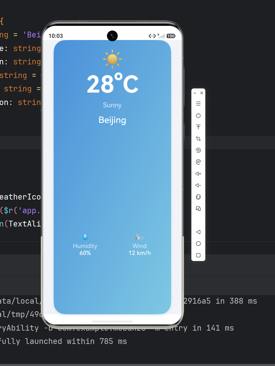
最终效果
┌─────────────────────────────┐
│          ☀️                 │
│          28°C               │
│         Sunny               │
│        Beijing              │
│        ─────────            │
│    💧          🌬️          │
│  Humidity     Wind          │
│    60%       12 km/h        │
└─────────────────────────────┘
- 蓝色渐变卡片,右下方向渐变
- 圆角 32vp,柔和的投影阴影
- 顶部天气图标 + 大号温度
- 中间城市名 + 天气描述
- 底部两栏:湿度 / 风速
第一步:资源文件体系
鸿蒙推荐使用 $r() 引用资源,而非硬编码。我们按颜色、尺寸、文案三个维度配置。
color.json — 配色
{
  "color": [
    { "name": "weather_card_bg_start", "value": "#4A90D9" },
    { "name": "weather_card_bg_end",   "value": "#7EC8E3" },
    { "name": "weather_text_primary",  "value": "#FFFFFF" },
    { "name": "weather_text_secondary","value": "#E0F0FF" },
    { "name": "weather_detail_bg",     "value": "#33FFFFFF" }
  ]
}
| 资源 | 用途 |
|---|---|
weather_card_bg_start |
渐变起始色(深蓝) |
weather_card_bg_end |
渐变结束色(浅蓝) |
weather_text_primary |
主文字(白色) |
weather_text_secondary |
辅助文字(半透明白) |
weather_detail_bg |
分隔线/装饰(极浅白) |
float.json — 尺寸
{
  "float": [
    { "name": "weather_temp_font",   "value": "64fp" },
    { "name": "weather_city_font",   "value": "24fp" },
    { "name": "weather_desc_font",   "value": "18fp" },
    { "name": "weather_detail_font", "value": "16fp" },
    { "name": "weather_icon_font",   "value": "48fp" },
    { "name": "weather_card_radius", "value": "32vp" },
    { "name": "weather_card_padding","value": "24vp" },
    { "name": "weather_detail_radius","value": "16vp" }
  ]
}
注意:
fp是字体像素(跟随系统字体缩放),vp是虚拟像素(跟随屏幕密度),两者是 ArkUI 的核心响应式单位。
string.json — 文案
{
  "string": [
    { "name": "weather_title",       "value": "Weather" },
    { "name": "weather_city",        "value": "Beijing" },
    { "name": "weather_temp",        "value": "28°C" },
    { "name": "weather_desc",        "value": "Sunny" },
    { "name": "weather_humidity",    "value": "Humidity" },
    { "name": "weather_wind",        "value": "Wind" },
    { "name": "weather_humidity_val","value": "60%" },
    { "name": "weather_wind_val",    "value": "12 km/h" }
  ]
}
文案统一抽取为资源后,后续做多语言只需添加对应 en-US / zh-CN 目录即可。
第二步:核心 UI — Index.ets
布局结构是一个两层 Column:
Column (全屏居中)
  └── Column (卡片容器)
       ├── Text ☀️ (天气图标)
       ├── Text 28°C (温度)
       ├── Text Sunny (描述)
       ├── Text Beijing (城市)
       ├── Divider (分隔线)
       └── Row (详情栏)
            ├── Column 💧 Humidity 60%
            ├── Divider (竖线)
            └── Column 🌬️ Wind 12 km/h
关键代码:
@Entry
@Component
struct WeatherCard {
  @State city: string = 'Beijing';
  @State temperature: string = '28°C';
  @State description: string = 'Sunny';
  @State humidity: string = '60%';
  @State windSpeed: string = '12 km/h';
  private weatherIcon: string = '\u2600\uFE0F'; // ☀️

  build() {
    Column() {
      Column() {
        Text(this.weatherIcon).fontSize($r('app.float.weather_icon_font'))
        Text(this.temperature)
          .fontSize($r('app.float.weather_temp_font'))
          .fontColor($r('app.color.weather_text_primary'))
          .fontWeight(FontWeight.Bold)
        // ... 其余组件
      }
      .width('85%')
      .padding($r('app.float.weather_card_padding'))
      .borderRadius($r('app.float.weather_card_radius'))
      .linearGradient({
        direction: GradientDirection.RightBottom,
        colors: [
          [$r('app.color.weather_card_bg_start'), 0.0],
          [$r('app.color.weather_card_bg_end'), 1.0]
        ]
      })
      .shadow({
        radius: 24,
        color: 0x334A90D9,
        offsetX: 0,
        offsetY: 8
      })
    }
    .width('100%').height('100%')
    .justifyContent(FlexAlign.Center)
    .backgroundColor('#F0F4F8')
  }
}
关键 API 要点:
| API | 作用 |
|---|---|
.linearGradient({ direction, colors }) |
线性渐变背景 |
.shadow({ radius, color, offsetX, offsetY }) |
投影阴影 |
.borderRadius() |
卡片圆角 |
.layoutWeight(1) |
弹性平分空间(Row 内两栏) |
第三步:两个编译坑 🕳️
编译时遇到了 7 个错误,集中在两类:
🕳️ 坑一:$r() 返回 Resource 而非 string
// ❌ 错误写法
@State temperature: string = $r('app.string.weather_temp');

// ✅ 正确写法
@State temperature: string = '28°C';      // state 存字面量
Text($r('app.string.weather_temp'))        // $r() 只在组件上引用
原因:$r() 的返回类型是 Resource,不能赋值给 string 类型变量。ArkTS 是静态类型语言,这一点比 JS 严格。
正确做法:
- 静态文案直接用
$r()写在Text()里 - 可能变化的值用
@State存字面量字符串
🕳️ 坑二:渐变方向枚举名
// ❌ 错误
direction: GradientDirection.BottomRight

// ✅ 正确
direction: GradientDirection.RightBottom
ArkUI 的枚举命名规则是先水平后垂直,RightBottom = 从左上到右下。同理还有 LeftTop、RightTop、LeftBottom。
最佳实践总结
- 资源先行:颜色、尺寸、文案优先写入
element/下的 JSON 资源文件,通过$r()引用 @State存值,$r()存样式:动态数据用@State的字面量,静态资源引用用$r()- 两层嵌套实现卡片:外层
Column负责全屏居中 + 背景色,内层Column是卡片本体 layoutWeight平分空间:Row 中的两栏各设layoutWeight(1)即可等宽- 枚举名查文档:ArkUI 的
GradientDirection是RightBottom而非BottomRight
扩展方向
这个天气卡片预留了良好的扩展接口:
- 接入真实天气 API:将
@State的硬编码值改为网络请求结果 - 多城市切换:添加城市选择器,
@State city联动刷新所有数据 - 动态图标:根据
description切换不同 emoji(☀️ / ☁️ / 🌧 / 🌨) - 添加动画:卡片入场时的透明度 / 位移动画
- 卡片式 Widget:转为 ArkTS Widget 添加到桌面

讨论HarmonyOS开发技术,专注于API与组件、DevEco Studio、测试、元服务和应用上架分发等。
更多推荐
 7
7 0
0- 0


 已为社区贡献11条内容

所有评论(0)