ArkUI学习(4)
本文介绍了鸿蒙应用开发中的三种核心布局方式:相对布局(RelativeContainer)、栅格布局(GridRow/GridCol)和选项卡布局(Tabs/TabContent)。相对布局通过alignRules设置组件对齐规则,支持复杂场景下的元素定位;栅格布局采用类似九宫格的设计,可通过columns、span等参数灵活控制行列分布;选项卡布局则通过Tabs组件实现页面切换功能,支持设置页签
·
官方教学视频链接:鸿蒙应用开发实战课-华为开发者学堂
这篇文章介绍了剩下的相对布局,栅格布局以及经典的选项卡布局。
RelativeContainer为相对布局组件,用于复杂场景中元素对齐的局面
1、子组件可以通过设置alignRules来设置自身在相对容器中的对齐规则
2、如果同时设置了四个对齐方向可以实现设置组件大小
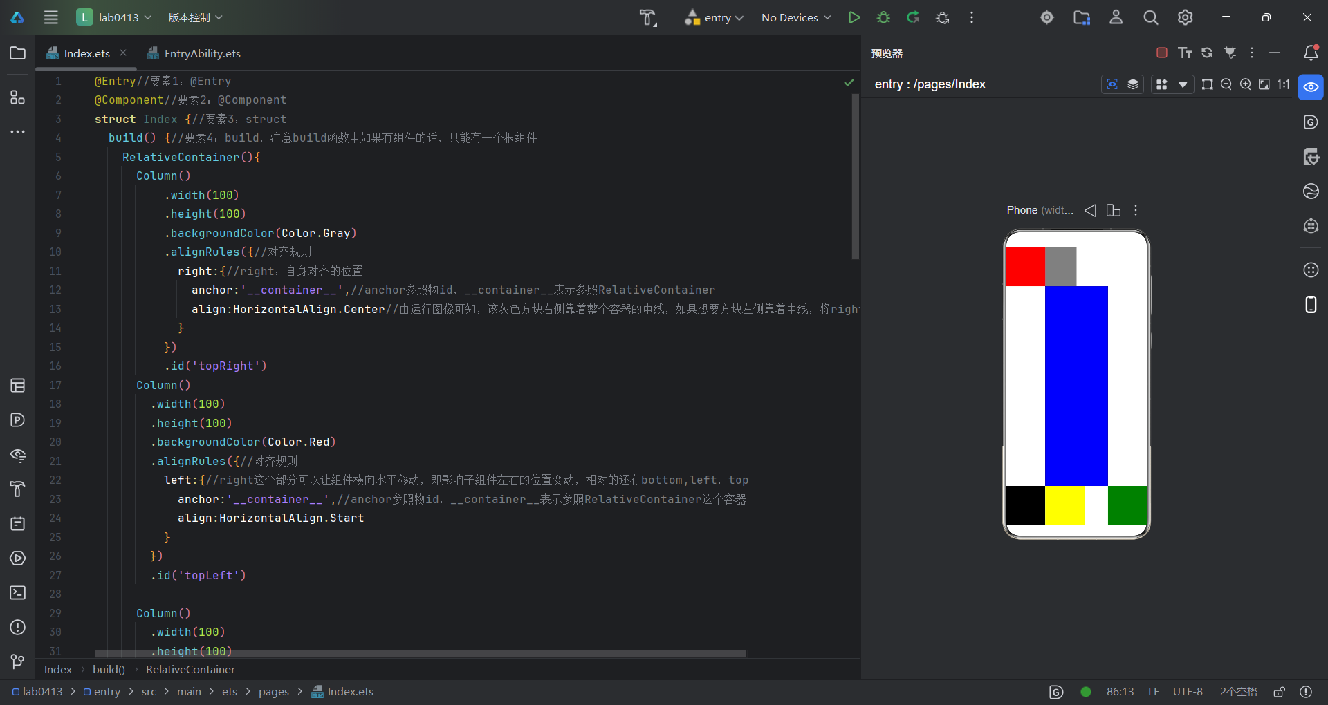
学过html的朋友应该能很快理解到这个,几个子组件的排列,代码如下:
@Entry//要素1:@Entry
@Component//要素2:@Component
struct Index {//要素3:struct
build() {//要素4:build,注意build函数中如果有组件的话,只能有一个根组件
RelativeContainer(){
Column()
.width(100)
.height(100)
.backgroundColor(Color.Gray)
.alignRules({//对齐规则
right:{//right:自身对齐的位置
anchor:'__container__',//anchor参照物id,__container__表示参照RelativeContainer
align:HorizontalAlign.Center//由运行图像可知,该灰色方块右侧靠着整个容器的中线,如果想要方块左侧靠着中线,将right改为left即可
}
})
.id('topRight')
Column()
.width(100)
.height(100)
.backgroundColor(Color.Red)
.alignRules({//对齐规则
left:{//right这个部分可以让组件横向水平移动,即影响子组件左右的位置变动,相对的还有bottom,left,top
anchor:'__container__',//anchor参照物id,__container__表示参照RelativeContainer这个容器
align:HorizontalAlign.Start
}
})
.id('topLeft')
Column()
.width(100)
.height(100)
.backgroundColor(Color.Black)
.alignRules({//对齐规则
bottom:{
anchor:'__container__',
align:VerticalAlign.Bottom
}
})
.id('bottomLeft')
Column()
.width(100)
.height(100)
.backgroundColor(Color.Green)
.alignRules({//对齐规则
bottom:{
anchor:'__container__',
align:VerticalAlign.Bottom
},
right:{//right这个部分可以让组件横向水平移动,即影响子组件左右的位置变动,相对的还有bottom
anchor:'__container__',//anchor参照物id,__container__表示参照RelativeContainer这个容器
align:HorizontalAlign.End
}
})
.id('bottomRight')
Column()
.width(100)
.height(100)
.backgroundColor(Color.Yellow)
.alignRules({
left:{
anchor:'bottomLeft',//将参照物更改为左下角的黑色方块
align:HorizontalAlign.End//黄色方块的左侧靠着黑色方块的右侧,如果是用的Start,那将覆盖黑色方块
},
top:{
anchor:'bottomLeft',
align:VerticalAlign.Top
}
})
.id('yellow')
Column()
.backgroundColor(Color.Blue)
.alignRules({
left:{
anchor:'topLeft',
align:HorizontalAlign.End
},
right:{
anchor:'bottomRight',
align:HorizontalAlign.Start
},
top: {
anchor:'topLeft',
align:VerticalAlign.Bottom
},
bottom:{
anchor:'bottomLeft',
align:VerticalAlign.Top
}
})
.id('Blue')
}
.height('100%')
.width('100%')
}
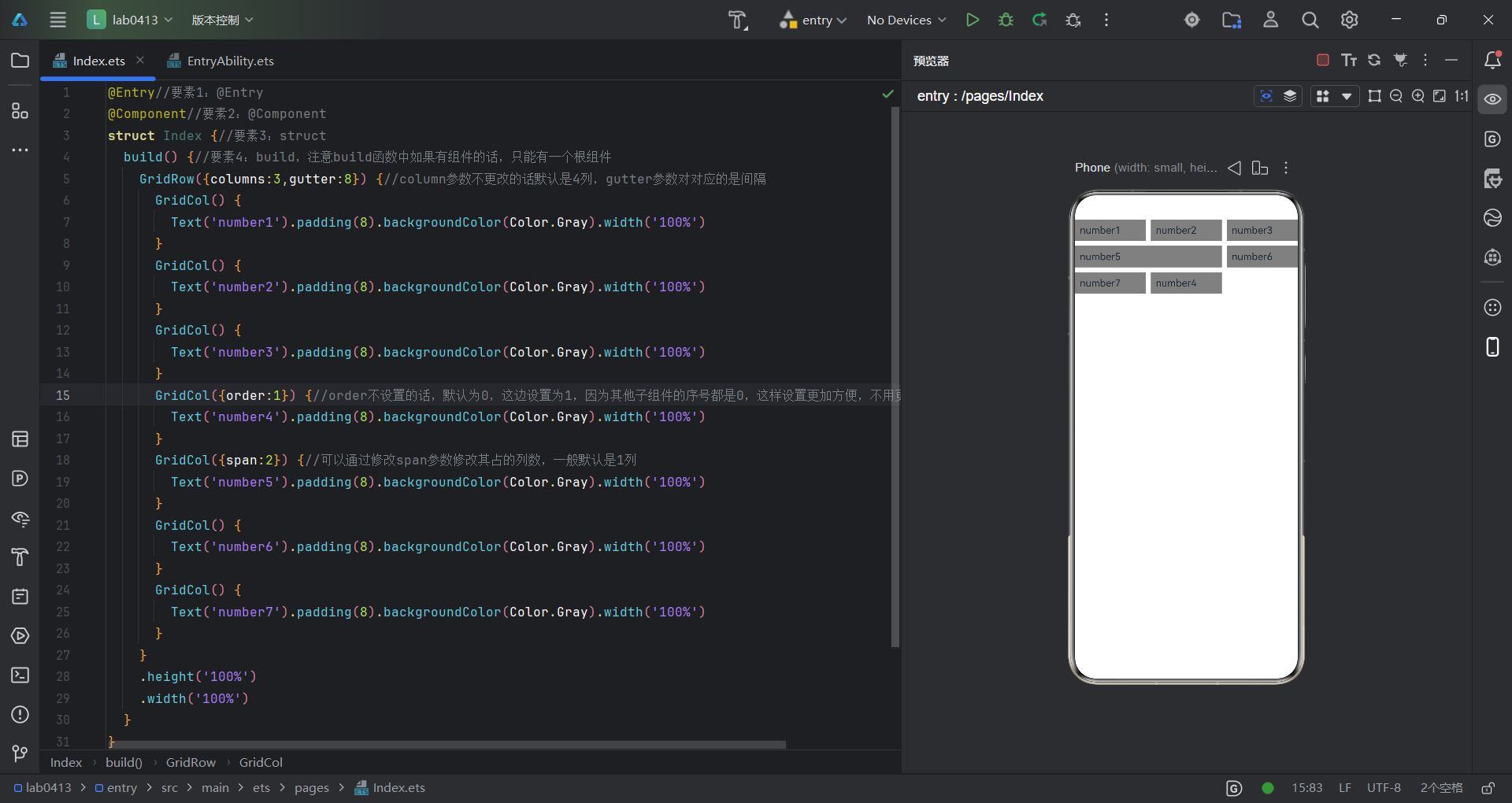
}以下运行截图是另一种布局,叫做栅格布局,这种布局,其实可以联想到朋友圈的九宫格,GridRow组件包含GridCol组件才能实现这种栅格布局效果
代码如下:
@Entry//要素1:@Entry
@Component//要素2:@Component
struct Index {//要素3:struct
build() {//要素4:build,注意build函数中如果有组件的话,只能有一个根组件
GridRow({columns:3,gutter:8}) {//column参数不更改的话默认是4列,gutter参数对对应的是间隔
GridCol() {
Text('number1').padding(8).backgroundColor(Color.Gray).width('100%')
}
GridCol() {
Text('number2').padding(8).backgroundColor(Color.Gray).width('100%')
}
GridCol() {
Text('number3').padding(8).backgroundColor(Color.Gray).width('100%')
}
GridCol({order:1}) {//order不设置的话,默认为0,这边设置为1,因为其他子组件的序号都是0,这样设置更加方便,不用更改代码结构
Text('number4').padding(8).backgroundColor(Color.Gray).width('100%')
}
GridCol({span:2}) {//可以通过修改span参数修改其占的列数,一般默认是1列
Text('number5').padding(8).backgroundColor(Color.Gray).width('100%')
}
GridCol() {
Text('number6').padding(8).backgroundColor(Color.Gray).width('100%')
}
GridCol() {
Text('number7').padding(8).backgroundColor(Color.Gray).width('100%')
}
}
.height('100%')
.width('100%')
}
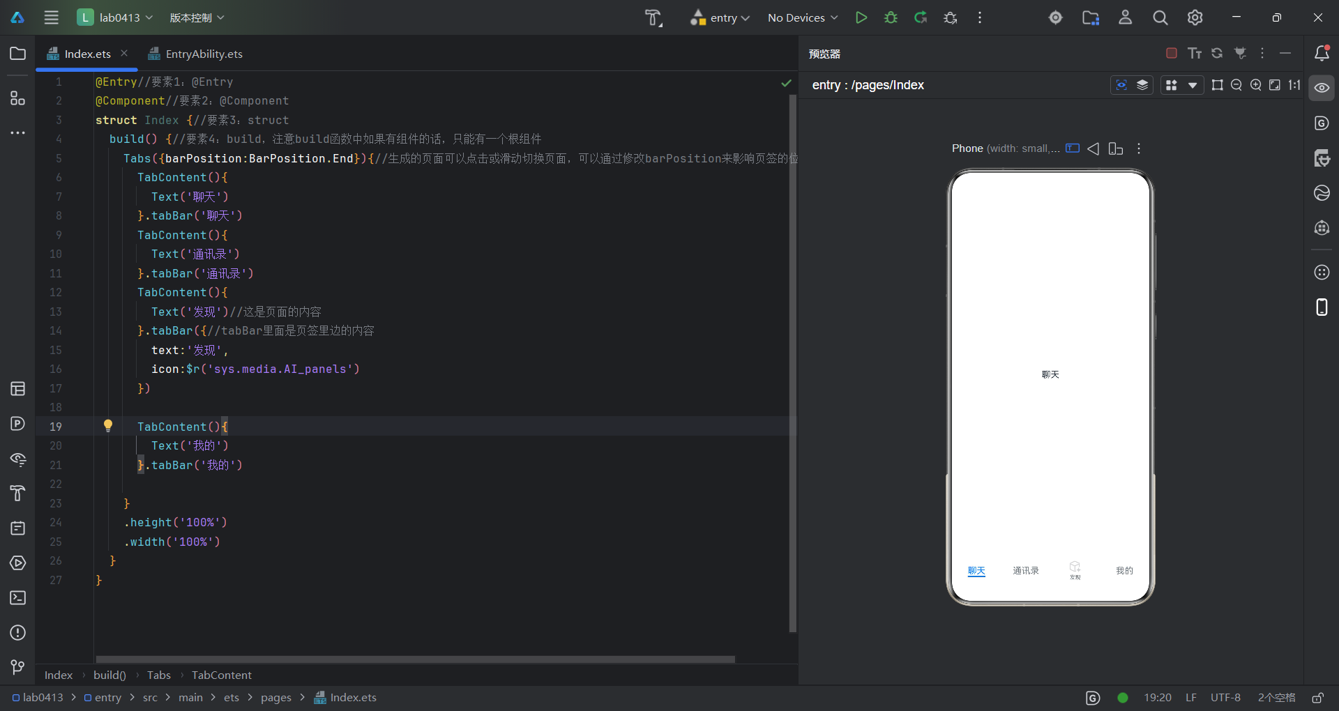
}Tab+TabContent搭配为选项卡组件,通过页签进行内容切换的容器组件,可以联想到微信的界面
代码如下:
@Entry//要素1:@Entry
@Component//要素2:@Component
struct Index {//要素3:struct
  build() {//要素4:build,注意build函数中如果有组件的话,只能有一个根组件
    Tabs({barPosition:BarPosition.End}){//生成的页面可以点击或滑动切换页面,可以通过修改barPosition来影响页签的位置
      TabContent(){
        Text('聊天')
      }.tabBar('聊天')
      TabContent(){
        Text('通讯录')
      }.tabBar('通讯录')
      TabContent(){
        Text('发现')//这是页面的内容
      }.tabBar({//tabBar里面是页签里边的内容
        text:'发现',
        icon:$r('sys.media.AI_panels')
      })

      TabContent(){
        Text('我的')
      }.tabBar('我的')

    }
    .height('100%')
    .width('100%')
  }
}
恭喜你,学完了鸿蒙开发的所有基本布局

讨论HarmonyOS开发技术,专注于API与组件、DevEco Studio、测试、元服务和应用上架分发等。
更多推荐
 0
0 0
0- 0


 已为社区贡献10条内容

所有评论(0)