鸿蒙5.0ArkUI基础语法
常用的系统组件
|
组件 |
描述 |
|
Text |
显示文本 |
|
Image |
显示图片 |
|
Column |
列,内容垂直排列 |
|
Row |
行,内容水平排列 |
|
Button |
按钮 |
通用属性
|
属性 |
描述 |
|
width |
宽度 |
|
height |
高度 |
|
backgroundColor |
背景色 |
文本属性
使用: .属性(参数)
|
属性 |
描述 |
|
fontSize |
字体大小 |
|
fontColor |
字体颜色 |
|
fontStyle |
字体样式 |
|
fontWeight |
字体粗细 |
|
lineHeight |
文本行高 |
|
decoration |
文本修饰线及颜色 |
|
textAlign |
水平方向Text对齐方式 |
|
align |
垂直方向对齐方式 |
|
textIndent |
文本首行缩进 |
|
textOverflow |
设置文本超长时的显示方式 |
|
maxLines |
设置文本的最大行数 |
fontstyle:字体样式
作用:设置字体是否倾斜
Normal:正常字体
Italic:斜体
fontWeight:字体大小
[100, 900],取值越大,字体越粗,默认值为 400
例如:fontweight(600)
枚举
FontWeight
- Lighter:字体较细
- Normal:字体粗细正常,默认值
- Regular:字体粗细正常
- Medium:字体粗细适中
- Bold:字体较粗
- Bolder:字体非常粗
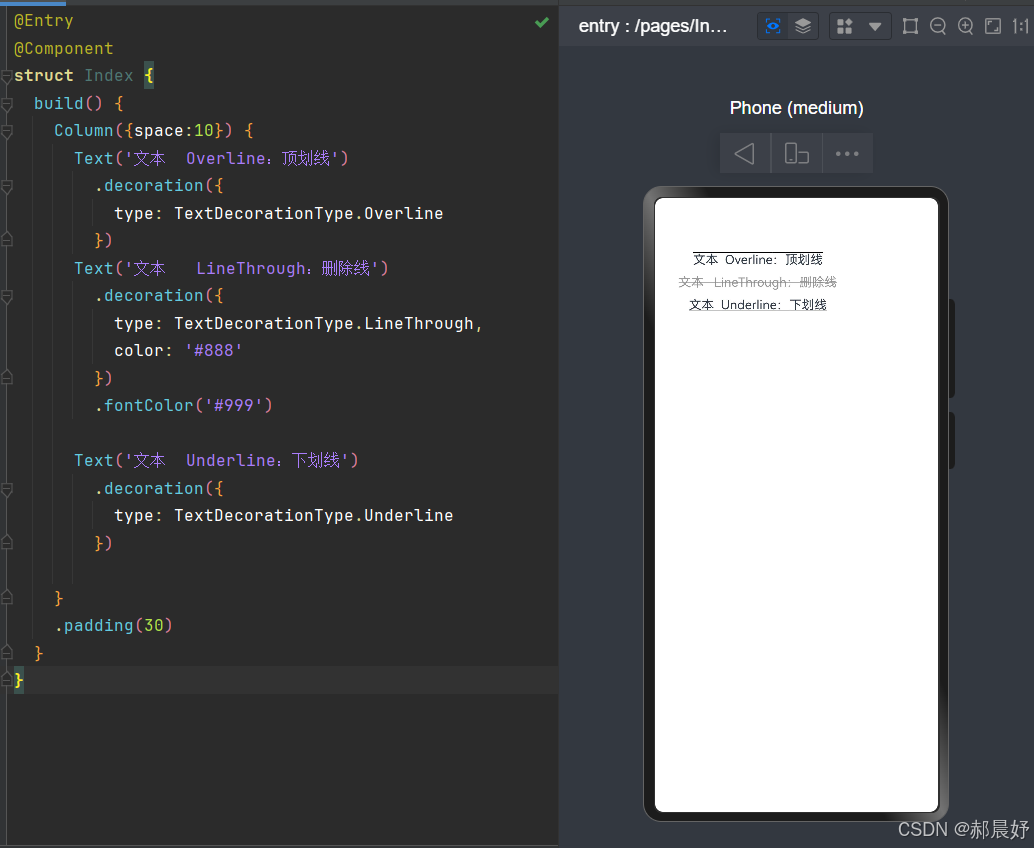
decoration:文本修饰
作用:设置文本装饰样式及其颜色
{}type:修饰线类型,
TextDecorationType(枚举)
- None:无
- Underline:下划线
- LineThrough:删除线
- Overline:顶划线
- color:修饰线颜色,可选,默认为黑色
代码视图如下:
@Entry
@Component
struct Index {
  build() {
    Column({space:10}) {
      Text('文本  Overline:顶划线')
        .decoration({
          type: TextDecorationType.Overline
        })
      Text('文本   LineThrough:删除线')
        .decoration({
          type: TextDecorationType.LineThrough,
          color: '#888'
        })
        .fontColor('#999')

      Text('文本  Underline:下划线')
        .decoration({
          type: TextDecorationType.Underline
        })

    }
    .padding(30)
  }
}
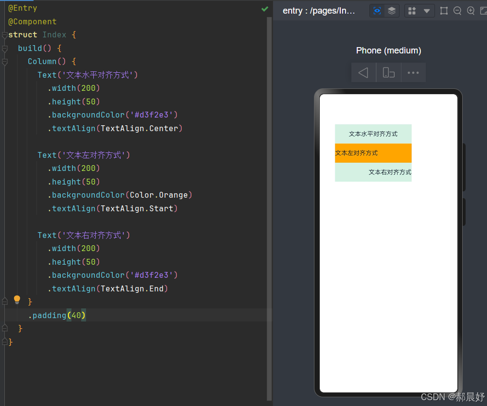
文本水平对齐方式
作用:设置文本在水平方向的对齐方式
属性:textAlign
参数:枚举
TextAlign
- Start:左对齐,默认值
- Center:居中
- End:右对齐
代码视图如下:
@Entry
@Component
struct Index {
  build() {
    Column() {
      Text('文本水平对齐方式')
        .width(200)
        .height(50)
        .backgroundColor('#d3f2e3')
        .textAlign(TextAlign.Center)

      Text('文本左对齐方式')
        .width(200)
        .height(50)
        .backgroundColor(Color.Orange)
        .textAlign(TextAlign.Start)

      Text('文本右对齐方式')
        .width(200)
        .height(50)
        .backgroundColor('#d3f2e3')
        .textAlign(TextAlign.End)
    }
    .padding(40)
  }
}
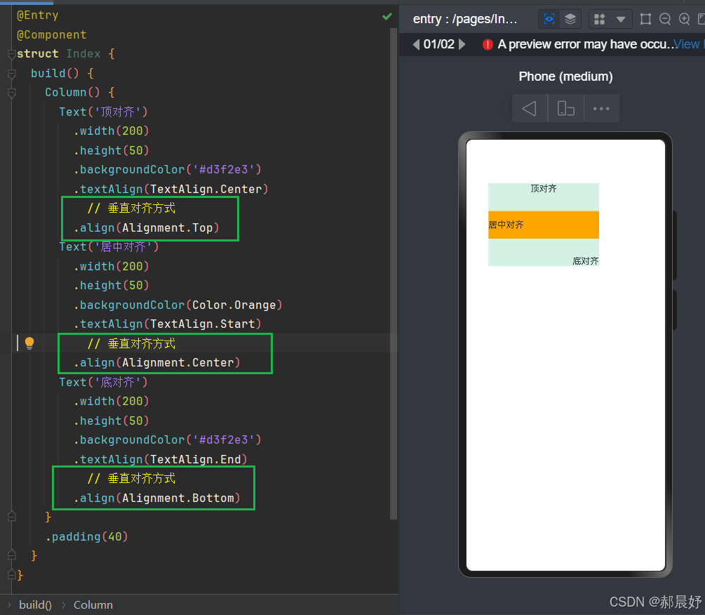
文本垂直对齐方式
Text 组件内容默认垂直居中。
可使用
align属性调整Text组件垂直对齐方式。属性:
align()参数: 枚举
Alignment
参数
描述
Top
顶对齐
Center
垂直居中,默认值
Bottom
底对齐
代码视图如下:
@Entry
@Component
struct Index {
  build() {
    Column() {
      Text('顶对齐')
        .width(200)
        .height(50)
        .backgroundColor('#d3f2e3')
        .textAlign(TextAlign.Center)
          // 垂直对齐方式
        .align(Alignment.Top)
      Text('居中对齐')
        .width(200)
        .height(50)
        .backgroundColor(Color.Orange)
        .textAlign(TextAlign.Start)
          // 垂直对齐方式
        .align(Alignment.Center)
      Text('底对齐')
        .width(200)
        .height(50)
        .backgroundColor('#d3f2e3')
        .textAlign(TextAlign.End)
          // 垂直对齐方式
        .align(Alignment.Bottom)
    }
    .padding(40)
  }
}
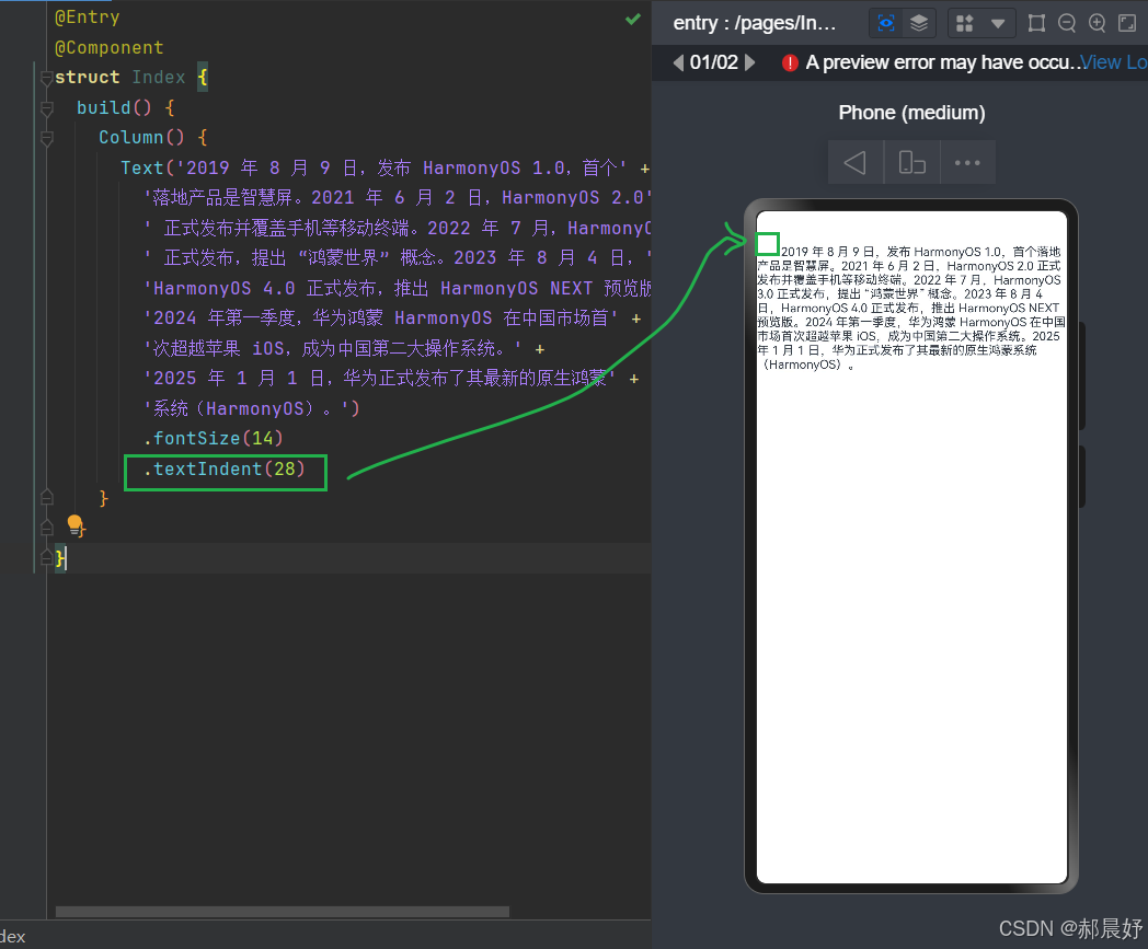
文本首行缩进
属性:textIndent
参数:数值
代码视图如下:
@Entry
@Component
struct Index {
  build() {
    Column() {
      Text('2019 年 8 月 9 日,发布 HarmonyOS 1.0,首个' +
        '落地产品是智慧屏。2021 年 6 月 2 日,HarmonyOS 2.0' +
        ' 正式发布并覆盖手机等移动终端。2022 年 7 月,HarmonyOS 3.0' +
        ' 正式发布,提出 “鸿蒙世界” 概念。2023 年 8 月 4 日,' +
        'HarmonyOS 4.0 正式发布,推出 HarmonyOS NEXT 预览版。' +
        '2024 年第一季度,华为鸿蒙 HarmonyOS 在中国市场首' +
        '次超越苹果 iOS,成为中国第二大操作系统。' +
        '2025 年 1 月 1 日,华为正式发布了其最新的原生鸿蒙' +
        '系统(HarmonyOS)。')
        .fontSize(14)
        .textIndent(28)
    }
  }
}
文本溢出
属性:textOverflow
参数:{overflow:TextOverflow},
TextOverflow为枚举类型
- None:文本超长时裁剪显示
- Clip:文本超长时进行裁剪显示
- Ellipsis:文本超长时显示不下的文本用省略号代替
- MARQUEE:文本超长时以跑马灯的方式展示(滚动显示)
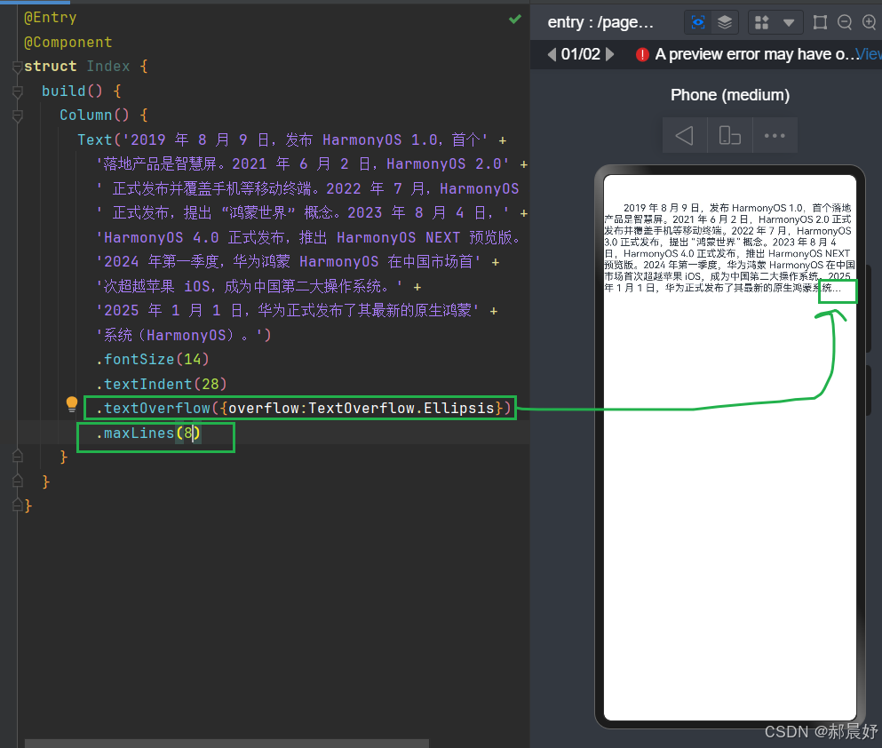
最大行数
属性:maxLines
参数:数字
代码视图如下:
@Entry
@Component
struct Index {
  build() {
    Column() {
      Text('2019 年 8 月 9 日,发布 HarmonyOS 1.0,首个' +
        '落地产品是智慧屏。2021 年 6 月 2 日,HarmonyOS 2.0' +
        ' 正式发布并覆盖手机等移动终端。2022 年 7 月,HarmonyOS 3.0' +
        ' 正式发布,提出 “鸿蒙世界” 概念。2023 年 8 月 4 日,' +
        'HarmonyOS 4.0 正式发布,推出 HarmonyOS NEXT 预览版。' +
        '2024 年第一季度,华为鸿蒙 HarmonyOS 在中国市场首' +
        '次超越苹果 iOS,成为中国第二大操作系统。' +
        '2025 年 1 月 1 日,华为正式发布了其最新的原生鸿蒙' +
        '系统(HarmonyOS)。')
        .fontSize(14)
        .textIndent(28)
        .textOverflow({overflow:TextOverflow.Ellipsis})
        .maxLines(8)
    }
  }
}

讨论HarmonyOS开发技术,专注于API与组件、DevEco Studio、测试、元服务和应用上架分发等。
更多推荐

 20
20 0
0- 0


 已为社区贡献11条内容

所有评论(0)