#跟着若城学鸿蒙# UI组件篇-Tabs及其属性
ArkUI中的Tabs组件详解
Tabs组件是ArkUI框架中用于实现页面内容切换的重要容器组件,它提供了多种导航布局模式和丰富的自定义功能,能够帮助开发者构建高效的用户界面导航系统。本文将全面介绍Tabs组件的功能特性、使用方法和实际应用场景。
一、Tabs组件概述
Tabs组件是一种用于在一个页面内实现视图内容快速切换的工具,可以提高查找信息的效率并精简用户单次获取的信息量。它支持多种导航布局(如底部导航、顶部导航、侧边导航),并提供丰富的自定义选项以满足不同的设计需求。
基本组成
Tabs组件的页面组成包含两个主要部分:
- TabContent:内容页,显示对应页签的内容
- TabBar:导航页签栏,用于切换不同内容页
根据不同的导航类型,布局会有区别,可以分为:
- 底部导航:导航栏位于底部
- 顶部导航:导航栏位于顶部
- 侧边导航:导航栏位于侧边
基本用法
@Entry
@Component
struct StepperExample {

  build() {
    Tabs() {
      TabContent() {
        Text('首页的内容').fontSize(30)
      }.tabBar('首页')

      TabContent() {
        Text('推荐的内容').fontSize(30)
      }.tabBar('推荐')

      TabContent() {
        Text('发现的内容').fontSize(30)
      }.tabBar('发现')

      TabContent() {
        Text('我的内容').fontSize(30)
      }.tabBar("我的")
    }
  }
}
二、Tabs组件的导航模式
1. 底部导航
底部导航是应用中最常见的一种导航方式,位于应用一级页面的底部,方便用户单手操作。
@Entry
@Component
struct StepperExample {
  build() {
    Tabs({ barPosition: BarPosition.End }) {
      TabContent() {
        // 首页内容
      }.tabBar('首页')

      TabContent() {
        // 发现内容
      }.tabBar('发现')

      TabContent() { // 推荐内容
      }.tabBar('推荐')

      TabContent() {
        // 我的内容
      }.tabBar('我的')
    }
  }
}
2. 顶部导航
当内容分类较多且用户需要频繁切换时,一般采用顶部导航模式。
@Entry
@Component
struct StepperExample {
  build() {
    Tabs({ barPosition: BarPosition.Start }) {
      TabContent() {
        // 首页内容
      }.tabBar('首页')

      TabContent() {
        // 发现内容
      }.tabBar('发现')

      TabContent() { // 推荐内容
      }.tabBar('推荐')

      TabContent() {
        // 我的内容
      }.tabBar('我的')
    }
  }
}
3. 侧边导航
侧边导航适用于横屏界面,默认为左侧侧边栏。
@Entry
@Component
struct StepperExample {
  build() {
    Tabs({ barPosition: BarPosition.Start }) {
      TabContent() {
        // 首页内容
      }.tabBar('首页')

      TabContent() {
        // 发现内容
      }.tabBar('发现')

      TabContent() { // 推荐内容
      }.tabBar('推荐')

      TabContent() {
        // 我的内容
      }.tabBar('我的')
    }.vertical(true)
  }
}
三、Tabs组件的核心功能
1. 控制器功能
TabsController是Tabs组件的控制器,用于控制Tabs组件进行页签切换。
@Entry
@Component
struct TabsExample {
  @State currentIndex: number = 2
  private controller: TabsController = new TabsController()

  build() {
    Column() {
      Tabs({ barPosition: BarPosition.End, index: this.currentIndex, controller: this.controller }) {
        TabContent() {
          Column().width('100%').height('100%').backgroundColor('#00CB87')
        }.tabBar('green')

        TabContent() {
          Column().width('100%').height('100%').backgroundColor('#007DFF')
        }.tabBar('blue')

        TabContent() {
          Column().width('100%').height('100%').backgroundColor('#FFBF00')
        }.tabBar('yellow')

        TabContent() {
          Column().width('100%').height('100%').backgroundColor('#E67C92')
        }.tabBar('pink')
      }.onChange((index: number) => {
        this.currentIndex = index
      })

      Button('changeIndex').width('50%').margin({ top: 20 }).onClick(() => {
        let index = (this.currentIndex + 1) % 4
        this.controller.changeIndex(index)
      })
    }
  }
}
2. 导航栏模式
Tabs组件支持两种导航栏模式:
固定导航栏(Fixed):
Tabs({ barPosition: BarPosition.End }) { // TabContent内容 } .barMode(BarMode.Fixed) 滚动导航栏(Scrollable):
Tabs({ barPosition: BarPosition.Start }) { // TabContent内容 } .barMode(BarMode.Scrollable) 3. 滑动切换控制
可以通过scrollable属性控制是否允许滑动切换页面:
Tabs({ barPosition: BarPosition.End }) { TabContent() { Column() { Tabs() { // 顶部导航栏内容 } } }.tabBar('首页') } .scrollable(false) 4. 自定义导航栏
开发者可以完全自定义导航栏的样式和交互:
@Entry
@Component
struct TabsExample {
  @State currentIndex: number = 0

  @Builder
  tabBuilder(title: string, targetIndex: number) {
    Column() {
      Text(title).fontColor(this.currentIndex === targetIndex ? '#1698CE' : '#6B6B6B')
      Divider().strokeWidth(2).color('#007DFF').opacity(this.currentIndex === targetIndex ? 1 : 0)
    }.width('100%')
  }

  build() {
    Column() {
      Tabs({ barPosition: BarPosition.Start, index: this.currentIndex }) {
        TabContent() {
          Column().width('100%').height('100%').backgroundColor('#00CB87')
        }.tabBar(this.tabBuilder('green', 0))

        TabContent() {
          Column().width('100%').height('100%').backgroundColor('#007DFF')
        }.tabBar(this.tabBuilder('blue', 1))

        TabContent() {
          Column().width('100%').height('100%').backgroundColor('#FFBF00')
        }.tabBar(this.tabBuilder('yellow', 2))

        TabContent() {
          Column().width('100%').height('100%').backgroundColor('#E67C92')
        }.tabBar(this.tabBuilder('pink', 3))
      }.onChange((index: number) => {
        this.currentIndex = index
      })
    }
  }
}
四、Tabs组件的高级功能
1. 页面切换拦截
开发者可以通过onContentWillChange接口设置自定义拦截回调函数,控制页面切换行为。
Tabs({ barPosition: BarPosition.End, controller: this.controller, index: this.currentIndex }) { // TabContent内容 } .onContentWillChange((currentIndex, comingIndex) => { if (comingIndex == 2) { return false // 禁止切换到索引为2的页面 } return true }) 2. 动画控制
Tabs组件支持多种动画模式,可以通过animationMode属性设置:
Tabs({ barPosition: BarPosition.End }) { // TabContent内容 } .animationMode(AnimationMode.CONTENT_FIRST) 也可以通过animationDuration属性控制动画时长:
Tabs({ barPosition: BarPosition.End }) { // TabContent内容 } .animationDuration(300) // 300毫秒 3. 嵌套滚动联动
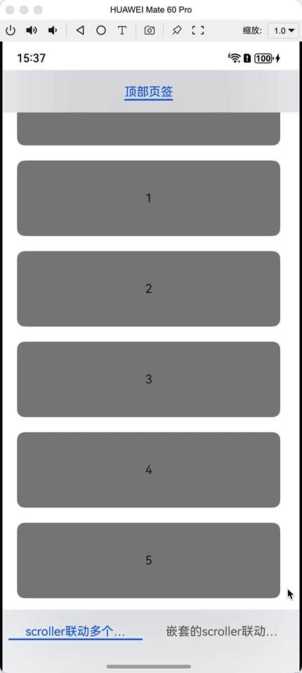
Tabs组件支持与可滚动容器(如List、Scroll)的联动效果:
@Entry
@Component
struct TabsExample {
  private arr: string[] = []
  private parentTabsController: TabsController = new TabsController()
  private childTabsController: TabsController = new TabsController()
  private listScroller: Scroller = new Scroller()
  private parentScroller: Scroller = new Scroller()
  private childScroller: Scroller = new Scroller()

  aboutToAppear(): void {
    for (let i = 0; i < 20; i++) {
      this.arr.push(i.toString())
    }
    let context = this.getUIContext()
    context.bindTabsToScrollable(this.parentTabsController, this.listScroller)
    context.bindTabsToScrollable(this.childTabsController, this.listScroller)
    context.bindTabsToNestedScrollable(this.parentTabsController, this.parentScroller, this.childScroller)
  }

  aboutToDisappear(): void {
    let context = this.getUIContext()
    context.unbindTabsFromScrollable(this.parentTabsController, this.listScroller)
    context.unbindTabsFromScrollable(this.childTabsController, this.listScroller)
    context.unbindTabsFromNestedScrollable(this.parentTabsController, this.parentScroller, this.childScroller)
  }

  build() {
    Tabs({ barPosition: BarPosition.End, controller: this.parentTabsController }) {
      TabContent() {
        Tabs({ controller: this.childTabsController }) {
          TabContent() {
            List({ space: 20, initialIndex: 0, scroller: this.listScroller }) {
              ForEach(this.arr, (item: string) => {
                ListItem() {
                  Text(item)
                    .width('100%')
                    .height(100)
                    .fontSize(16)
                    .textAlign(TextAlign.Center)
                    .borderRadius(10)
                    .backgroundColor(Color.Gray)
                }
              }, (item: string) => item)
            }.scrollBar(BarState.Off).width('90%').height('100%')
          }.tabBar('顶部页签')
        }.barOverlap(true).clip(true)
      }.tabBar('scroller联动多个TabsController')

      TabContent() {
        Scroll(this.parentScroller) {
          List({ scroller: this.childScroller }) {
            ForEach(this.arr, (item: string) => {
              ListItem() {
                Text(item)
                  .width('100%')
                  .height(100)
                  .fontSize(16)
                  .textAlign(TextAlign.Center)
                  .borderRadius(10)
                  .backgroundColor(Color.Gray)
              }
            })
          }
        }
      }.tabBar('嵌套的scroller联动TabsController')
    }.barOverlap(true).clip(true)
  }
} 
五、Tabs组件的实际应用示例
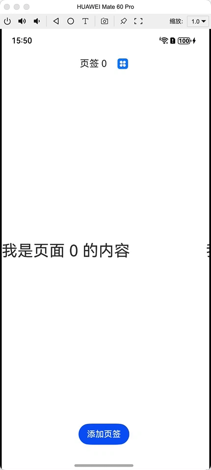
示例1:动态添加/删除页签
@Entry
@Component
struct DynamicTabsExample {
  @State tabArray: Array<number> = [0]
  @State focusIndex: number = 0
  @State pre: number = -1
  private controller: TabsController = new TabsController()

  @Builder
  Tab(tabNumber: number) {
    Row({ space: 20 }) {
      Text("页签 " + tabNumber).fontSize(18)
      Image($r('app.media.app_icon')).width(20).height(20).onClick(() => {
        let focusNumber = this.tabArray[this.focusIndex]
        if (this.focusIndex === this.tabArray.indexOf(tabNumber) && this.focusIndex == this.tabArray.length - 1) {
          if (this.pre >= 0) {
            this.focusIndex = this.pre
          } else {
            this.focusIndex = this.focusIndex - 1
          }
        }
        this.tabArray.splice(this.tabArray.indexOf(tabNumber), 1)
        this.pre = -1
        if (this.tabArray.indexOf(focusNumber) >= 0) {
          this.focusIndex = this.tabArray.indexOf(focusNumber)
        }
      })
    }.backgroundColor(this.tabArray.indexOf(tabNumber) === this.focusIndex ? "#ffffffff" : "#ffb7b7b7")
  }

  build() {

    Column() {
      Tabs({ barPosition: BarPosition.Start, index: this.focusIndex, controller: this.controller }) {
        ForEach(this.tabArray, (item: number) => {
          TabContent() {
            Text('我是页面 ' + item + " 的内容").height('100%').width('100%').fontSize(30)
          }.tabBar(this.Tab(item))
        }, (item: number) => item.toString())
      }.onChange((index) => {
        this.focusIndex = index
      }).layoutWeight(1)

      Button('添加页签').onClick(() => {
        this.tabArray.push(this.tabArray.length)
        this.pre = this.focusIndex
        this.focusIndex = this.tabArray.length - 1
      }).margin({bottom:20})
    }.height("100%")
  }
}
六、总结
Tabs组件作为ArkUI框架中重要的导航容器组件,提供了丰富的功能和灵活的定制选项。通过本文的介绍,我们了解了:
- Tabs组件的基本组成和三种主要导航模式
- 核心功能包括控制器、导航栏模式、滑动控制和自定义导航栏
- 高级功能如页面切换拦截、动画控制和嵌套滚动联动
- 动态页签管理
合理使用Tabs组件可以显著提升应用的用户体验,实现清晰的信息架构和高效的导航系统。开发者应根据具体场景选择合适的导航模式和功能组合,以构建最佳的用户界面。
----
以上

讨论HarmonyOS开发技术,专注于API与组件、DevEco Studio、测试、元服务和应用上架分发等。
更多推荐

 13
13 0
0- 0


 已为社区贡献257条内容

所有评论(0)