#跟着若城学鸿蒙# UI组件篇-Indicator及其属性
一、Indicator组件概述
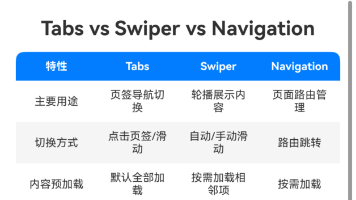
Indicator组件是ArkUI框架中一个重要的导航指示器组件,主要用于在Swiper等可滑动容器中显示当前位置指示。该组件从API Version 10开始支持,并在后续版本中不断增强了功能。
1.1 基本特性
Indicator组件提供两种主要的导航指示器样式:
- 圆点指示器(DotIndicator):通过圆点样式显示当前位置,支持自定义大小、颜色等属性
- 数字指示器(DigitIndicator):通过数字形式显示当前位置,支持自定义字体样式
Indicator组件可以与Swiper组件绑定使用,也可以作为独立组件使用。当作为独立组件时,需要通过IndicatorComponentController控制器来实现与Swiper的联动。
1.2 核心功能
- 显示当前位置和总页数
- 支持自定义样式和布局
- 支持与Swiper组件联动
- 支持独立使用
- 提供交互反馈
二、Indicator组件API详解
2.1 构造函数
Indicator组件通过IndicatorComponent构造函数创建:
IndicatorComponent(controller?: IndicatorComponentController) 参数说明:
| 参数名 | 类型 | 必填 | 说明 |
|---|---|---|---|
| controller | IndicatorComponentController | 否 | 设置控制器,用于控制独立导航点进行跳转 |
2.2 主要属性
style属性
设置导航点指示器样式:
style(indicatorStyle: DotIndicator | DigitIndicator) 参数说明:
| 参数名 | 类型 | 必填 | 说明 |
|---|---|---|---|
| indicatorStyle | DotIndicator | DigitIndicator | 是 |
示例代码:
@Entry
@Component
struct IndicatorExample {

  build() {
    Column() {
      IndicatorComponent() .style(new DotIndicator().itemWidth(10).itemHeight(10))
    }
  }
}
loop属性
设置是否开启循环:
loop(isLoop: boolean) 参数说明:
| 参数名 | 类型 | 必填 | 说明 |
|---|---|---|---|
| isLoop | boolean | 是 | 是否开启循环 |
vertical属性
设置是否为纵向滑动:
vertical(isVertical: boolean) 参数说明:
| 参数名 | 类型 | 必填 | 说明 |
|---|---|---|---|
| isVertical | boolean | 是 | 是否为纵向滑动 |
2.3 事件
onChange事件
当前显示的选中导航点索引变化时触发:
onChange(event: Callback<number>) 参数说明:
| 参数名 | 类型 | 必填 | 说明 |
|---|---|---|---|
| event | Callback<number> | 是 | 索引变化回调 |
示例代码:
IndicatorComponent() .onChange((index: number) => { console.log(`Current index: ${index}`); }) 三、Indicator样式定制
3.1 圆点指示器(DotIndicator)
DotIndicator提供了一系列样式定制方法:
itemWidth
设置圆点宽度:
itemWidth(value: Length): DotIndicator itemHeight
设置圆点高度:
itemHeight(value: Length): DotIndicator mask
设置是否显示蒙版样式:
mask(value: boolean): DotIndicator color
设置圆点颜色:
color(value: ResourceColor): DotIndicator selectedColor
设置选中圆点颜色:
selectedColor(value: ResourceColor): DotIndicator 示例代码:
DotIndicator() .itemWidth(10) .itemHeight(10) .color(Color.Gray) .selectedColor(Color.Blue) 3.2 数字指示器(DigitIndicator)
DigitIndicator提供了字体相关的样式定制:
fontColor
设置数字颜色:
fontColor(value: ResourceColor): DigitIndicator selectedFontColor
设置选中数字颜色:
selectedFontColor(value: ResourceColor): DigitIndicator digitFont
设置数字字体:
digitFont(value: Font): DigitIndicator selectedDigitFont
设置选中数字字体:
selectedDigitFont(value: Font): DigitIndicator 示例代码:
DigitIndicator() .fontColor(Color.Gray) .selectedFontColor(Color.Blue) .digitFont({ size: 14, weight: FontWeight.Normal }) 四、IndicatorComponentController控制器
IndicatorComponentController是Indicator组件的控制器,用于控制独立Indicator的行为。
4.1 构造函数
constructor() 4.2 主要方法
showNext
跳转到下一导航点:
showNext(): void showPrevious
跳转到上一导航点:
showPrevious(): void 示例代码:
@Entry
@Component
struct IndicatorExample {
  controller: IndicatorComponentController = new IndicatorComponentController();

  build() {
    Column() {
      IndicatorComponent(this.controller)
      Button('Next').onClick(() => {
        this.controller.showNext();
      })
      Button('Previous').onClick(() => {
        this.controller.showPrevious();
      })
    }
  }
}
五、与Swiper组件配合使用
Indicator组件最常用的场景是与Swiper组件配合使用,提供页面位置指示。
5.1 基本用法
@Entry
@Component
struct SwiperWithIndicator {
  private controller: IndicatorComponentController = new IndicatorComponentController();

  build() {
    Column() {
      Swiper() {
        ForEach([1, 2, 3, 4], (item: number) => {
          Text(`Page ${item}`).fontSize(30).width('100%').height('100%').textAlign(TextAlign.Center)
        })
      }.indicator(this.controller).loop(false)

      IndicatorComponent(this.controller).style(new DotIndicator().itemWidth(10).itemHeight(10))
    }.width('100%').height('100%')
  }
}
5.2 高级配置
Swiper的indicator方法可以接受更多配置:
indicator(indicator: IndicatorComponentController | DotIndicator | DigitIndicator | boolean) 参数说明:
| 参数名 | 类型 | 必填 | 说明 |
|---|---|---|---|
| indicator | IndicatorComponentController | DotIndicator | DigitIndicator |
示例代码:
Swiper() .indicator( DotIndicator() .itemWidth(15) .itemHeight(15) .color(Color.Gray) .selectedColor(Color.Blue) ) 六、性能优化与最佳实践
6.1 性能优化建议
- 合理使用缓存:对于复杂Indicator样式,考虑使用缓存机制
- 避免频繁更新:减少不必要的Indicator状态更新
- 使用轻量级样式:简化Indicator的样式复杂度
七、常见问题与解决方案
7.1 Indicator不显示
问题描述:Indicator组件未在界面上显示
可能原因:
- 未正确绑定controller
- Swiper的indicator属性未设置
- 样式设置导致不可见
解决方案:
- 检查controller是否正确创建和绑定
- 确保设置了Swiper的indicator属性
- 检查Indicator的样式设置,特别是颜色和大小
7.2 Indicator与Swiper不同步
问题描述:Indicator显示的位置与Swiper当前页不一致
可能原因:
- onChange事件未正确处理
- controller状态未更新
解决方案:
- 确保正确处理onChange事件
- 使用双向绑定保持状态同步
7.3 自定义样式不生效
问题描述:自定义的Indicator样式未按预期显示
可能原因:
- 样式参数设置错误
- 样式优先级问题
解决方案:
- 检查样式参数是否符合要求
- 确保样式设置顺序正确
八、总结
ArkUI中的Indicator组件是一个功能强大且灵活的导航指示器,通过与Swiper等组件的配合,可以有效地提升用户体验。本文详细介绍了Indicator组件的各种特性和使用方法,包括:
- Indicator的基本概念和核心功能
- 丰富的API和样式定制选项
- 与Swiper组件的集成方式
- 性能优化和最佳实践
- 常见问题解决方案
通过合理使用Indicator组件,开发者可以轻松实现各种导航指示需求,创建更加直观和用户友好的界面交互体验。
----
以上

讨论HarmonyOS开发技术,专注于API与组件、DevEco Studio、测试、元服务和应用上架分发等。
更多推荐

 9
9 0
0- 0


 已为社区贡献257条内容

所有评论(0)