鸿蒙开发ArkTs语法基础04
1. 线性布局
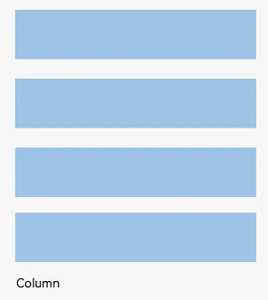
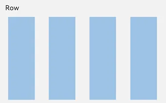
线性布局(LinearLayout)是开发中最常用的布局,通过线性容器 Row 和 Column 构建。Column容器内子元素按照垂直方向排列,Row容器内子元素按照水平方向排列。根据不同的排列方向,开发者可选择使用Row或Column容器创建线性布局。
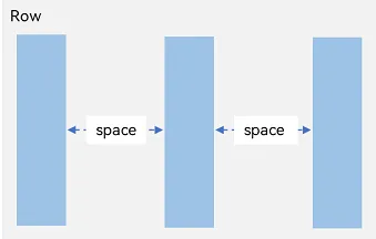
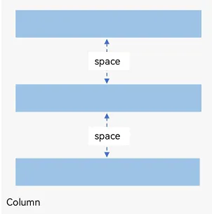
间距
在布局容器内,可以通过 space 属性设置布局主方向方向上子元素的间距,使各子元素在布局主方向上有等间距效果。
@Entry
@Component
struct Index {
  build() {
    Row({ space: 20}) {
      Text('子元素1')
        .width(100)
        .height(40)
        .backgroundColor(Color.Pink)
      Text('子元素2')
        .width(100)
        .height(40)
        .backgroundColor(Color.Orange)
      Text('子元素3')
        .width(100)
        .height(40)
        .backgroundColor(Color.Brown)
    }
  }
}
@Entry
@Component
struct Index {
build() {
Column({ space: 20}) {
Text('子元素1')
.width(100)
.height(40)
.backgroundColor(Color.Pink)
Text('子元素2')
.width(100)
.height(40)
.backgroundColor(Color.Orange)
Text('子元素3')
.width(100)
.height(40)
.backgroundColor(Color.Brown)
}
}
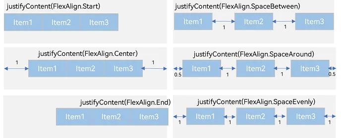
}布局主方向对齐方式
属性:justifyContent()
参数:枚举FlexAlign
|
属性 |
描述 |
|
Start |
首端对齐 |
|
Center |
居中对齐 |
|
End |
尾部对齐 |
|
Spacebetween |
两端对齐 子元素之间间距相等 |
|
SpaceAround |
子元素两侧间距相等 第一个元素到行首的距离和最后一个元素到行尾的距离是相邻元素之间距离的一半 |
|
SpaceEvenly |
相邻元素之间的距离、第一个元素与行首的间距、最后一个元素到行尾的间距都完全一样 |
@Entry
@Component
struct Index {
  build() {
    Row() {
      Text('子元素1')
        .width(80)
        .height(40)
        .backgroundColor(Color.Pink)
      Text('子元素2')
        .width(80)
        .height(40)
        .backgroundColor(Color.Orange)
      Text('子元素3')
        .width(80)
        .height(40)
        .backgroundColor(Color.Brown)
    }
      .width('100%')
      .height(200)
      .backgroundColor('#ccc')
      // 主布局方向的对齐方式
      .justifyContent(FlexAlign.Center)
      // 两端对齐
      .justifyContent(FlexAlign.SpaceBetween)
  }
}
概念:
-
布局主方向在线性布局中叫做布局主轴
-
另外一条坐标轴叫做交叉轴
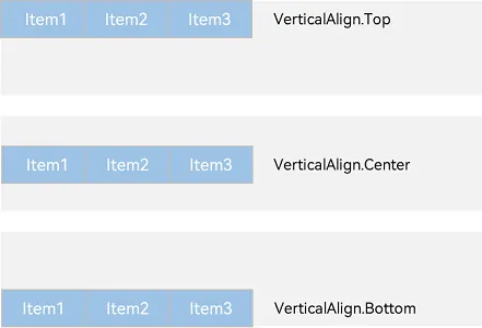
交叉轴对齐方式
以 Row 为例,主轴在水平方向,交叉轴在垂直方向
属性:alignItems()
参数:枚举类型VerticalAlign
注意:布局容器在交叉轴要有足够空间,否则无法生效
@Entry
@Component
struct Index {
  build() {
    Row() {
      Text('子元素1')
        .width(80)
        .height(40)
        .backgroundColor(Color.Pink)
      Text('子元素2')
        .width(80)
        .height(40)
        .backgroundColor(Color.Orange)
      Text('子元素3')
        .width(80)
        .height(40)
        .backgroundColor(Color.Brown)
    }
      .width('100%')
      .height(200)
      .backgroundColor('#ccc')
      // 顶部对齐
      .alignItems(VerticalAlign.Top)
      // 底部对齐
      .alignItems(VerticalAlign.Bottom)
  }
}
单个子元素交叉轴对齐方式
属性:alignSelf()
参数:枚举ItemAlign(Stretch拉伸,交叉轴拉伸效果)
@Entry
@Component
struct Index {
  build() {
    Row() {
      Text('子元素1')
        .width(80)
        .height(40)
        .backgroundColor(Color.Pink)
      Text('子元素2')
        .width(80)
        .height(40)
        .backgroundColor(Color.Orange)
        // 交叉轴方向尺寸拉伸
        .alignSelf(ItemAlign.Stretch)
      Text('子元素3')
        .width(80)
        .height(40)
        .backgroundColor(Color.Brown)
    }
      .width('100%')
      .height(200)
      .backgroundColor('#ccc')
  }
}
自适应缩放
父容器尺寸确定时,设置了 layoutWeight 属性的子元素与兄弟元素占主轴尺寸按照权重进行分配。
属性:layoutWeight()
参数:数字
@Entry
@Component
struct Index {
  build() {
    Column() {
      // 主轴方向:水平方向
      Row() {
        Text('左侧')
          .width(60)
          .height(30)
          .backgroundColor('#ccc')
        Text('中间')
          .height(30)
          .backgroundColor(Color.Pink)
          .layoutWeight(1)
        Text('右侧 layoutWeight')
          .height(30)
          .backgroundColor('#fc0')
          .layoutWeight(1)
      }
    }
  }
}
2、弹性布局(Flex)
换行
弹性布局分为单行布局和多行布局。默认情况下,Flex 容器中的子元素都排在一条线(又称“轴线”)上。子元素尺寸总和大于 Flex 容器尺寸时,子元素尺寸会自动挤压。
wrap 属性控制当子元素主轴尺寸之和大于容器主轴尺寸时,Flex 是单行布局还是多行布局。在多行布局时,通过交叉轴方向,确认新行排列方向。
参数:wrap
值:枚举 FlexWrap
@Entry
@Component
struct Index {
  build() {
    Column() {
      Flex({wrap:FlexWrap.Wrap}) {
        Text()
          .width(80)
          .height(40)
          .backgroundColor(Color.Pink)
          .margin(5)
        Text()
          .width(80)
          .height(40)
          .backgroundColor(Color.Orange)
          .margin(5)
        Text()
          .width(80)
          .height(40)
          .backgroundColor(Color.Pink)
          .margin(5)
        Text()
          .width(80)
          .height(40)
          .backgroundColor(Color.Orange)
          .margin(5)
        Text()
          .width(80)
          .height(40)
          .backgroundColor(Color.Pink)
          .margin(5)
        Text()
          .width(80)
          .height(40)
          .backgroundColor(Color.Orange)
          .margin(5)
      }
        .width('100%')
        .height(200)
        .backgroundColor('#ccc')
    }
  }
}
总结:布局不难,思路要清晰,多练

讨论HarmonyOS开发技术,专注于API与组件、DevEco Studio、测试、元服务和应用上架分发等。
更多推荐


 4
4 0
0- 0


 已为社区贡献6条内容

所有评论(0)