鸿蒙开发ArkTs语法基础05
1.、定位
作用:改变组件位置
分类:
- 绝对定位:
position,相对父组件左上角进行偏移 - 相对定位:
offset,相对自身左上角进行偏移
绝对定位
属性:position()
参数:{x: 水平偏移量, y: 垂直偏移量}
偏移量取值
- 数字,单位是
vp - 百分比,参照父组件尺寸计算结果
@Entry
@Component
struct Index {
  build() {
    Column() {
      Text('文字内容')
        .width(80)
        .height(40)
        .backgroundColor(Color.Pink)
        .position({
          x: 0,
          y: 0
        })
    }
      .width('100%')
      .height(200)
      .backgroundColor('#ccc')
  }
}
绝对定位特点:
- 参照父组件左上角进行偏移
- 绝对定位后的组件不再占用自身原有位置
相对定位
属性:offset()
参数:{x: 水平偏移量, y: 垂直偏移量}
偏移量取值
- 数字,单位是
vp - 百分比,参照父组件尺寸计算结果
@Entry
@Component
struct Index {
  build() {
    Column() {
      Text('内容1')
        .width(80)
        .height(40)
        .backgroundColor(Color.Pink)
      Text('内容2')
        .width(80)
        .height(40)
        .backgroundColor(Color.Orange)
        // 占位
        .offset({
          x: 100,
          y: -30
        })
      Text('内容3')
        .width(80)
        .height(40)
        .backgroundColor(Color.Brown)
    }
    .width('100%')
    .height(200)
    .backgroundColor('#ccc')
  }
}
相对定位特点:
- 相对自身左上角进行偏移
- 相对定位后的组件仍然占用自身原有位置
Z 序控制
定位后的组件,默认后定义的组件在最上面显示,可以通过 zIndex 属性调整显示层级
属性:zIndex(数字)
特点:取值为整数数字,取值越大,显示层级越高
@Entry
@Component
struct Index {
  build() {
    Column() {
      Text('内容1')
        .width(100)
        .height(50)
        .backgroundColor(Color.Pink)
        .position({x: 0, y:0})
          // Z 轴显示顺序,取值越大,显示层级越高
        .zIndex(1)
      Text('内容2')
        .width(200)
        .height(60)
        .backgroundColor(Color.Orange)
        .position({x: 50,y: 30})

    }
    .width(300)
    .height(200)
    .backgroundColor('#ccc')
  }
}
2、层叠布局
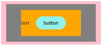
层叠布局(StackLayout)用于在屏幕上预留一块区域来显示组件中的元素,提供元素可以重叠的布局。层叠布局通过 Stack 容器组件实现位置的固定定位与层叠,容器中的子元素依次入栈,后一个子元素覆盖前一个子元素,子元素可以叠加,也可以设置位置。
层叠布局具有较强的页面层叠、位置定位能力,其使用场景有广告、卡片层叠效果等。
基本使用
Stack 组件为容器组件,容器内可包含各种子元素。其中子元素默认进行居中堆叠。子元素被约束在Stack下,进行自己的样式定义以及排列。
@Entry
@Component
struct Index {
  build() {
    Column(){
      Stack() {
        Column(){}
        .width('90%')
        .height(130)
        .backgroundColor(Color.Gray)
        Text('text')
          .width('60%')
          .height('60%')
          .backgroundColor(Color.Orange)
        Button('button')
          .width('30%')
          .height('30%')
          .backgroundColor('#ff8ff3eb')
          .fontColor('#000')
      }
      .width('100%')
      .height(150)
      .backgroundColor(Color.Pink)
    }
    .margin(10)
  }
}
对齐方式
参数:alignContent
取值:枚举 Alignment
|
名称 |
描述 |
|
TopStart |
顶部起始端 |
|
Top |
顶部横向居中 |
|
TopEnd |
顶部尾端 |
|
Start |
起始端纵向居中 |
|
Center |
居中(默认) |
|
End |
尾端纵向居中 |
|
BottomStart |
底部起始端 |
|
Bottom |
底部横向居中 |
|
BottomEnd |
底部尾端 |
@Entry
@Component
struct Index {
  build() {
    Column(){
      Stack({ alignContent: Alignment.BottomEnd }) {
        Column(){}
        .width('90%')
        .height(130)
        .backgroundColor(Color.Gray)
        Text('text')
          .width('60%')
          .height('60%')
          .backgroundColor(Color.Orange)
        Button('button')
          .width('30%')
          .height('30%')
          .backgroundColor('#ff8ff3eb')
          .fontColor('#000')
      }
      .width('100%')
      .height(150)
      .backgroundColor(Color.Pink)
    }
    .margin(10)
  }
}
3、通用属性
多态样式
属性:stateStyles()
|
参数 |
描述 |
|
normal |
组件无状态时的样式(默认状态) |
|
pressed |
组件按下状态的样式 |
|
disabled |
组件禁用状态的样式 |
|
focused |
组件获焦状态的样式 |
/*
.stateStyles({
  状态: {
    属性
  }
})
*/

@Entry
@Component
struct Index {
  build() {
    Column() {
      Text('文本')
      .width(50)
      .height(50)
      .backgroundColor(Color.Pink)
      .stateStyles({
        pressed: {
          .width(200)
        }
      })
    }
      .padding(20)
  }
}
动画 animation
组件的某些通用属性变化时,可以通过属性动画实现渐变过渡效果,提升用户体验。支持的属性包括width、height、backgroundColor、opacity、scale、rotate、translate等。
属性:animation
参数: {}
|
参数 |
描述 |
|
duration |
设置动画时长。 默认值:1000 单位:毫秒 |
|
curve |
设置动画曲线 默认值: |
|
delay |
设置动画延迟执行的时长。 默认值:0,不延迟播放。 单位:毫秒 |
|
iterations |
设置播放次数。 默认值:1 设置为-1时表示无限次播放。设置为0时表示无动画效果。 |
import curves from '@ohos.curves'

@Entry
@Component
struct Index {
  build() {
    Column() {
      Text('文本')
      .width(50)
      .height(50)
      .backgroundColor(Color.Pink)
      .stateStyles({
        pressed: {
          .width(200)
        }
      })
      .animation({
        duration: 2000,
        // 速度曲线
        curve: curves.springMotion(),
        delay: 1000,
        iterations: -1
      })
    }
      .padding(20)
  }
}
图形变换
用于对组件进行平移、旋转、缩放、矩阵变换等操作。
平移
作用:可使组件在以组件左上角为坐标原点的坐标系中进行移动
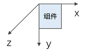
属性:translate()
参数:{x?: X轴移动距离, y?: Y轴移动距离, z?: Z轴移动距离}
import curves from '@ohos.curves'

@Entry
@Component
struct Index {
  build() {
    Column() {
      Image($r('app.media.cat'))
        .width(200)
        .aspectRatio(1)
        .stateStyles({
          normal: {
            .translate({x: 0})
          },
          pressed: {
            .translate({x: 100})
          }
        })
        .animation({
          curve: curves.springMotion()
        })
    }
    .padding(20)
  }
}
缩放
作用:分别设置X轴、Y轴、Z轴的缩放比例,默认值为1
属性:scale(),
参数: {x?: X轴缩放比例, y?: Y轴缩放比例, z?: Z轴缩放比例, centerX?: Y轴中心点坐标, centerY? Y轴中心点坐标}
import curves from '@ohos.curves'

@Entry
@Component
struct Index {
  build() {
    Column() {
      Image($r('app.media.cat'))
        .width(200)
        .aspectRatio(1)
        .stateStyles({
          normal: {
            .scale({x:1, y: 1})
          },
          pressed: {
            .scale({x: 0.8, y: 0.8})
          }
        })
        .animation({
          curve: curves.springMotion()
        })
    }
    .padding(20)
  }
}
旋转
作用:可使组件在以组件左上角为坐标原点的坐标系中进行旋转
属性:rotate()
参数:{angle: 旋转角度, centerX?: Y轴中心点坐标, centerY? Y轴中心点坐标}
import curves from '@ohos.curves'

@Entry
@Component
struct Index {
  build() {
    Column() {
      Image($r('app.media.cat'))
        .width(200)
        .aspectRatio(1)
        .stateStyles({
          normal: {
            .rotate({angle: 0})
          },
          pressed: {
            .rotate({angle: 60})
          }
        })
        .animation({
          curve: curves.springMotion()
        })
    }
    .padding(20)
  }
}

讨论HarmonyOS开发技术,专注于API与组件、DevEco Studio、测试、元服务和应用上架分发等。
更多推荐


 5
5 0
0- 0


 已为社区贡献6条内容

所有评论(0)