【HarmonyOS实战】 ArkUI声明式UI:Column、Row、Text、Image怎么用?
写 HarmonyOS 的 UI,用的是声明式 UI的方式。和 Android 的 XML 布局、Web 的 HTML+CSS 不同,声明式 UI 就是"你说要什么,框架帮你画出来"。Column(竖排)、Row(横排)、Stack(叠加)、Text(文字)、Image(图片)。看完之后,加油站卡片那个布局你闭眼都能写出来。项目预览Column竖排,Row横排,两者嵌套能搭出任何布局属性通过链式.
文章目录
前言
写 HarmonyOS 的 UI,用的是声明式 UI 的方式。和 Android 的 XML 布局、Web 的 HTML+CSS 不同,声明式 UI 就是"你说要什么,框架帮你画出来"。
这篇文章用项目里真实的代码,带你把 ArkUI 最常用的布局组件搞清楚:Column(竖排)、Row(横排)、Stack(叠加)、Text(文字)、Image(图片)。看完之后,加油站卡片那个布局你闭眼都能写出来。
项目预览
一、组件的基本写法
ArkUI 的组件在 build() 方法里写,每个组件都是一个"函数调用"的形式:
build() {
  Column() {           // 容器组件,括号里写子组件
    Text('你好')       // 叶子组件,括号里写内容
      .fontSize(16)    // 属性方法,用 . 链式调用
      .fontColor('#333333')
  }
}
关键规则:
- 容器组件(Column、Row、Stack)里可以放子组件
- 叶子组件(Text、Image)是最终显示内容的
- 属性通过
.属性名(值)的方式链式设置
二、Column 和 Row:布局的两大基石
2.1 Column(纵向排列)
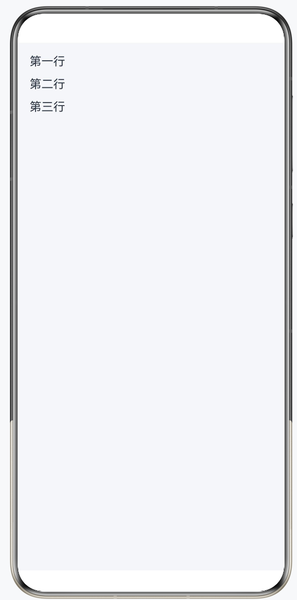
Column 让子组件从上到下依次排列:
Column({ space: 12 }) {    // space 设置子组件之间的间距(像素)
  Text('第一行')
  Text('第二行')
  Text('第三行')
}
.width('100%')             // 宽度占满父容器
.height(200)               // 高度 200 像素
.alignItems(HorizontalAlign.Start)  // 子组件水平对齐方式:左对齐
常用属性:
| 属性 | 作用 | 示例值 |
|---|---|---|
space |
子组件间距 | 12(像素) |
alignItems |
水平对齐 | HorizontalAlign.Start/Center/End |
justifyContent |
垂直对齐 | FlexAlign.Start/Center/SpaceBetween |
2.2 Row(横向排列)
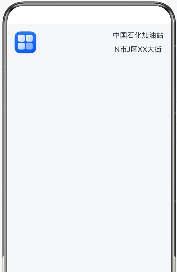
Row 让子组件从左到右依次排列:
Row({ space: 16 }) {   // 子组件水平间距 16
  Image($r('app.media.image1'))
    .width(48)
    .height(48)
  Column({ space: 12 }) {
    Text('中国石化加油站')
    Text('N市J区XX大街')
  }
}
.justifyContent(FlexAlign.SpaceBetween)  // 两端对齐
.width('100%')
常用属性:
| 属性 | 作用 | 示例值 |
|---|---|---|
space |
子组件间距 | 16(像素) |
alignItems |
垂直对齐 | VerticalAlign.Top/Center/Bottom |
justifyContent |
水平对齐 | FlexAlign.Start/Center/SpaceBetween |
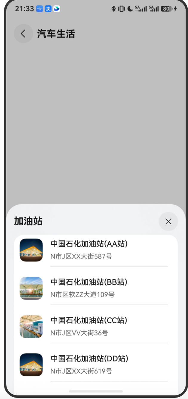
2.3 项目中的实际布局
来看项目里加油站信息卡片的布局代码:
// entry/src/main/ets/pages/GasStationPage.ets
@Builder
stationInfoCard(gasStation: StationData): void {
  Column({ space: Constants.SPACE_12 }) {              // 外层纵向容器
    Row({ space: Constants.SPACE_16 }) {               // 内层横向排列
      // 左侧:加油站图片
      Image(gasStation.image)
        .width(Constants.GAS_STATION_IMAGE_WIDTH)      // 48px
        .height(Constants.GAS_STATION_IMAGE_HEIGHT);   // 48px

      // 右侧:文字信息区域
      Column({ space: Constants.SPACE_12 }) {
        Row() {
          Column({ space: Constants.SPACE_6 }) {
            // 加油站名称
            Text(gasStation.name)
              .fontSize(Constants.FONT_SIZE_16)        // 16px
              .fontWeight(Constants.FONT_WEIGHT_500)
              .lineHeight(Constants.LINE_HEIGHT_21)
              .fontColor($r('app.color.gas_station_name_color'));
            // 地址
            Text(gasStation.addr)
              .fontSize(Constants.FONT_SIZE_14)        // 14px
              .fontColor($r('app.color.gas_station_addr_color'));
          }
          .alignItems(HorizontalAlign.Start);          // 文字左对齐
        }
        .width('70%')
        .justifyContent(FlexAlign.SpaceBetween);
      };
    }
    .height(Constants.GAS_STATION_IMAGE_HEIGHT)        // 行高 = 图片高度 48px
    .width('100%')
  }
}
布局分析:
- 最外层是
Column,纵向容器 - 里面是一个
Row,左图右文的横向布局 - 右侧文字区域又是一个
Column,名称在上、地址在下
这种"外Column内Row"或"外Row内Column"的嵌套方式,是 ArkUI 布局的最常用模式。
三、Text 组件:文字展示
Text 是最基础的文字组件,支持丰富的样式设置:
Text('加油站名称')
  .fontSize(16)                          // 字体大小
  .fontWeight(FontWeight.Medium)         // 字重:Lighter/Normal/Medium/Bold
  .fontColor('#333333')                  // 颜色:十六进制或资源引用
  .lineHeight(21)                        // 行高
  .maxLines(1)                           // 最多显示几行
  .textOverflow({ overflow: TextOverflow.Ellipsis })  // 超出省略号
  .textAlign(TextAlign.Center)           // 对齐:Start/Center/End
3.1 使用资源引用(推荐方式)
项目中不写死颜色字符串,而是引用资源文件里的颜色:
// 不推荐(写死)
Text('名称').fontColor('#333333')

// 推荐(资源引用)
Text('名称').fontColor($r('app.color.gas_station_name_color'))
$r('app.color.XXX') 会从 resources/base/element/color.json 里取值,支持亮色/暗色模式自动切换。
3.2 使用字符串资源
// 不推荐
Text('加油站')

// 推荐(支持多语言)
Text($r('app.string.gas_station'))
对应资源文件:
// resources/zh_CN/element/string.json
{
  "string": [
    { "name": "gas_station", "value": "加油站" }
  ]
}
四、Image 组件:图片展示
Image($r('app.media.image1'))  // 使用资源图片
  .width(48)
  .height(48)
  .objectFit(ImageFit.Cover)   // 填充方式:Cover/Contain/Fill等
  .borderRadius(8)             // 圆角

// 使用网络图片
Image('https://example.com/photo.jpg')
  .width(100)
  .height(100)
项目中的返回按钮图标:
// GasStationPage.ets
Image($r('app.media.back'))
  .width(Constants.IMAGE_BACK_WIDTH)   // 40px
  .height(Constants.IMAGE_BACK_HEIGHT) // 40px
  .onClick(() => {
    this.pageInfos.pop();  // 返回上一页
  });
五、Stack:叠加布局
Stack 是叠加容器,子组件会互相重叠,常用于地图+悬浮按钮这样的场景:
// GasStationPage.ets
Stack() {
  // 底层:全屏地图
  MapComponent({
    mapOptions: this.mapOptions,
    mapCallback: this.callback,
  });

  // 上层:标题栏(返回按钮 + 标题文字)
  this.titleBuilder();  // 叠加在地图上方
}
.width('100%')
.height('100%')
Stack 默认所有子组件居中叠加,可以通过 .position() 指定绝对位置:
// 标题区域固定在顶部
Row({ space: Constants.SPACE_8 }) {
  Image($r('app.media.back'))...
  Text($r('app.string.car_life'))...
}
.position({
  top: Constants.POSITION_TOP   // 距顶部 50px
})
六、常用属性汇总
6.1 尺寸相关
.width(100)          // 固定宽度(px)
.width('100%')       // 百分比宽度
.height(200)         // 固定高度
.height('100%')      // 百分比高度
.layoutWeight(1)     // 弹性权重(类似 flex: 1)
layoutWeight 特别重要,它表示在剩余空间中按权重分配:
Row() {
  Image(...).width(48)         // 固定48px
  Column()
    .layoutWeight(1)           // 剩余所有空间都给这个Column
}
6.2 间距相关
.padding(16)                   // 四周内边距 16px
.padding({ left: 12, right: 12, top: 8 })  // 分别设置
.margin(16)                    // 四周外边距
.margin({ left: 16, right: 16 })
6.3 装饰相关
.backgroundColor('#FFFFFF')           // 背景色
.backgroundColor($r('app.color.xxx')) // 资源引用
.borderRadius(16)                      // 圆角
.opacity(0.9)                          // 透明度(0-1)
6.4 点击事件
Text('点我')
  .onClick(() => {
    // 点击后执行的逻辑
    console.log('被点击了');
    this.pageInfos.pushPathByName('GasStationPage', true);
  })
七、完整的主页布局解析
来看 MainPage.ets 完整的 build() 方法:
// entry/src/main/ets/pages/MainPage.ets
build() {
  Navigation(this.pageInfos) {    // Navigation 提供路由能力
    this.pageBuilder();            // 调用自定义 @Builder 方法
  }
  .title($r('app.string.car_life'))   // 导航栏标题
  .width('100%')
  .height('100%')
  .backgroundColor($r('app.color.page_background'));
}

@Builder
pageBuilder() {
  Column() {
    Row({ space: Constants.SPACE_16 }) {
      // 左侧图标
      Image($r('app.media.image1'))
        .width(48).height(48);

      // 右侧:文字 + 箭头
      Row() {
        Text($r('app.string.gas_station'))
          .fontWeight(500).fontSize(16);
        Image($r('app.media.chevron_right'))
          .width(12).height(24);
      }
      .layoutWeight(1)                     // 占满剩余宽度
      .justifyContent(FlexAlign.SpaceBetween);  // 文字左、箭头右
    }
    .onClick(() => {
      // 跳转到加油站地图页
      this.pageInfos.pushPathByName('GasStationPage', true);
    })
    .padding({ left: 12, right: 12 })
    .borderRadius(16)
    .backgroundColor($r('app.color.start_window_background'))
    .width('100%')
    .height(72);  // 行高 72px
  }
  .padding({ left: 16, right: 16 })
  .width('100%').height('100%');
}
布局结构:
Navigation(路由容器)
  └── Column(外层纵向)
       └── Row(一行:图标 + 文字 + 箭头)
            ├── Image(左侧图标,固定48px)
            └── Row(右侧,layoutWeight:1)
                 ├── Text(加油站,左对齐)
                 └── Image(箭头,右对齐)
总结
ArkUI 的布局核心就三点:
Column竖排,Row横排,两者嵌套能搭出任何布局- 属性通过链式
.方法()设置,写起来很流畅 layoutWeight做弹性布局,position()做绝对定位
下一篇我们讲 Constants 常量管理——为什么要把所有数字都抽到一个类里,直接写 16 不行吗?

讨论HarmonyOS开发技术,专注于API与组件、DevEco Studio、测试、元服务和应用上架分发等。
更多推荐

 0
0 0
0- 0


 已为社区贡献98条内容

所有评论(0)