小白必看:HarmonyOS6中为什么我的分隔线显示不对?Divider 常见问题
在 UI 设计中,视觉分隔承担着组织信息层次、引导用户视线的重要职责。一条 1px 的分隔线,能让复杂的界面瞬间清晰有序。HarmonyOS ArkUI 提供了Divider组件和多种视觉分隔方案,本篇系统讲解所有分隔方式,并结合本项目源码展示最佳实践。Divider 是 ArkUI 中最小却最实用的组件之一。水平线用于分隔列表项,竖线用于分隔并列内容,配合 List 的divider属性可以快速
金牌创作者
·
文章目录
前言
在 UI 设计中,视觉分隔承担着组织信息层次、引导用户视线的重要职责。一条 1px 的分隔线,能让复杂的界面瞬间清晰有序。HarmonyOS ArkUI 提供了 Divider 组件和多种视觉分隔方案,本篇系统讲解所有分隔方式,并结合本项目源码展示最佳实践。
一、Divider 基础用法
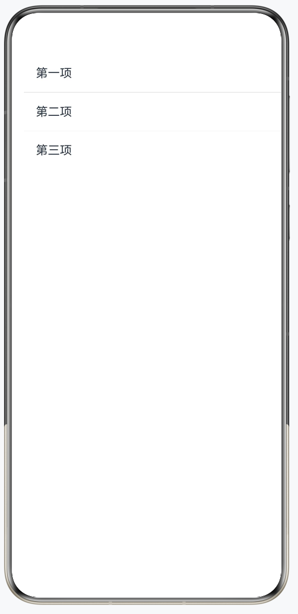
1.1 最简单的水平分隔线
@Entry
@Component
struct DividerBasicDemo {
  build() {
    Column({ space: 0 }) {
      Text('第一项').padding(16).width('100%')

      Divider()              // ← 最基础的分隔线
        .strokeWidth(1)      // 线宽(逻辑像素)
        .color('#E8E8E8')    // 线条颜色

      Text('第二项').padding(16).width('100%')

      Divider()
        .strokeWidth(0.5)    // 0.5px 更细腻
        .color('#F0F0F0')

      Text('第三项').padding(16).width('100%')
    }
    .width('100%')
    .backgroundColor('#FFFFFF')
    .borderRadius(12)
    .margin(16)
  }
}
1.2 本项目中的 Divider
GasStationPage.ets 的 stationInfoCard 中:
Divider()
  .strokeWidth(Constants.STROKE_WIDTH)   // 细线
  .color($r('sys.color.mask_fourth'))    // 使用系统颜色(自动适配深色模式)
  .width(Constants.PERCENT_70)           // 只占70%宽度(左对齐,不顶边)
设计解析:
width(70%)而不是100%:产生"内缩感",符合 Material/HarmonyOS 设计语言- 使用
sys.color.mask_fourth系统颜色:自动适配深色模式(深色下变为深色线)
二、Divider 完整属性
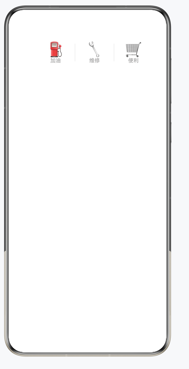
2.1 竖向分隔线
@Entry
@Component
struct VerticalDividerDemo {
  build() {
    Row() {
      Column() {
        Text('⛽').fontSize(32)
        Text('加油').fontSize(12).fontColor('#999999')
      }
      .padding({ left: 24, right: 24, top: 16, bottom: 16 })

      // 竖向分隔线
      Divider()
        .vertical(true)      // ← 竖向!
        .strokeWidth(1)
        .color('#E8E8E8')
        .height(40)          // 需要设置高度

      Column() {
        Text('🔧').fontSize(32)
        Text('维修').fontSize(12).fontColor('#999999')
      }
      .padding({ left: 24, right: 24, top: 16, bottom: 16 })

      Divider()
        .vertical(true)
        .strokeWidth(1)
        .color('#E8E8E8')
        .height(40)

      Column() {
        Text('🛒').fontSize(32)
        Text('便利').fontSize(12).fontColor('#999999')
      }
      .padding({ left: 24, right: 24, top: 16, bottom: 16 })
    }
    .width('100%')
    .backgroundColor('#FFFFFF')
    .borderRadius(12)
    .margin(16)
    .justifyContent(FlexAlign.Center)
  }
}
2.2 Divider 属性汇总
| 属性 | 类型 | 说明 |
|---|---|---|
strokeWidth |
number | 线条粗细(单位 vp) |
color |
ResourceColor | 线条颜色 |
vertical |
boolean | true=竖向,false=横向(默认) |
lineCap |
LineCapStyle | 线端样式:Butt/Round/Square |
.width() |
number|string | 水平线长度 |
.height() |
number|string | 竖向线高度 |
.margin() |
边距对象 | 分隔线两侧间距 |
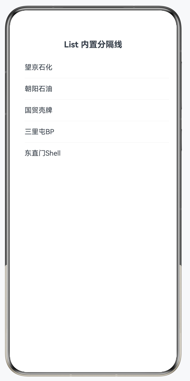
三、List 内置分隔线
3.1 List 的 divider 属性
比手动插入 Divider 更便捷,List 自带分隔线属性:
@Entry
@Component
struct ListDividerDemo {
  private stations: string[] = ['望京石化', '朝阳石油', '国贸壳牌', '三里屯BP', '东直门Shell'];

  build() {
    Column({ space: 16 }) {
      Text('List 内置分隔线').fontSize(18).fontWeight(FontWeight.Bold)

      List() {
        ForEach(this.stations, (station: string) => {
          ListItem() {
            Text(station)
              .padding({ left: 16, right: 16, top: 14, bottom: 14 })
              .fontSize(15)
              .width('100%')
          }
        })
      }
      .divider({
        strokeWidth: 0.5,
        color: '#F0F0F0',
        startMargin: 16,  // 左侧缩进(不顶边)
        endMargin: 0,     // 右侧不缩进
      })
      .backgroundColor('#FFFFFF')
      .borderRadius(12)
      .margin({ left: 16, right: 16 })
    }
    .padding({ top: 24 })
    .width('100%')
  }
}
3.2 手动 Divider vs List divider 对比
| 方式 | 优点 | 缺点 |
|---|---|---|
List divider 属性 |
代码简洁,自动处理最后一项 | 样式控制有限 |
| 手动在 ListItem 中加 Divider | 完全自定义(位置、颜色、宽度) | 需要处理最后一项不显示 |
// 手动分隔线(处理最后一项)
List() {
  ForEach(this.stations, (station: string, index: number) => {
    ListItem() {
      Column() {
        Text(station).padding(16).width('100%')
        // 最后一项不显示分隔线
        if (index < this.stations.length - 1) {
          Divider()
            .strokeWidth(0.5)
            .color('#F0F0F0')
            .margin({ left: 16 })
        }
      }
    }
  })
}
四、其他视觉分隔方式
4.1 间距分隔(space)
最简单的分隔,用 Row/Column 的 space 属性:
Column({ space: 16 }) { // 子组件之间自动16vp间距
  // ...
}
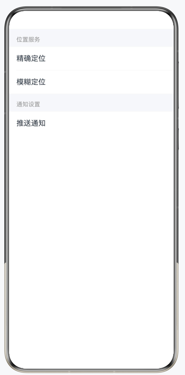
4.2 背景色分隔
用不同背景色区分区域,比线条更柔和:
@Entry
@Component
struct BackgroundDividerDemo {
  build() {
    Column({ space: 0 }) {
      // 分组标题(灰色背景,充当分隔)
      Text('位置服务')
        .fontSize(13)
        .fontColor('#999999')
        .padding({ left: 16, top: 16, bottom: 8 })
        .width('100%')
        .backgroundColor('#F5F7FA') // ← 背景色分隔

      // 内容区(白色背景)
      Column() {
        Text('精确定位').padding(16).width('100%').backgroundColor('#FFFFFF')
        Divider().strokeWidth(0.5).color('#F0F0F0').margin({ left: 16 })
        Text('模糊定位').padding(16).width('100%').backgroundColor('#FFFFFF')
      }

      // 分组标题
      Text('通知设置')
        .fontSize(13)
        .fontColor('#999999')
        .padding({ left: 16, top: 16, bottom: 8 })
        .width('100%')
        .backgroundColor('#F5F7FA')

      // 内容区
      Text('推送通知').padding(16).width('100%').backgroundColor('#FFFFFF')
    }
    .width('100%')
  }
}
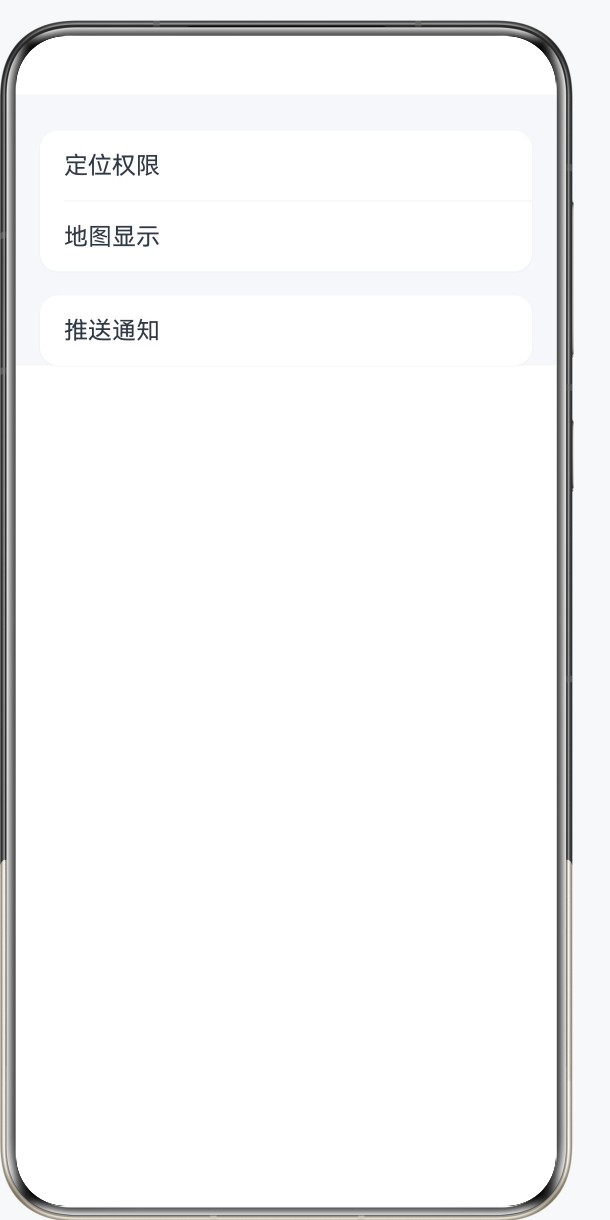
4.3 圆角卡片分组(现代风格)
@Entry
@Component
struct CardGroupDemo {
  build() {
    Column({ space: 16 }) {
      // 卡片1:定位设置
      Column({ space: 0 }) {
        Text('定位权限')
          .padding({ left: 16, right: 16, top: 14, bottom: 14 })
          .fontSize(16)
          .width('100%')
        Divider().strokeWidth(0.5).color('#F0F0F0').margin({ left: 16 })
        Text('地图显示')
          .padding({ left: 16, right: 16, top: 14, bottom: 14 })
          .fontSize(16)
          .width('100%')
      }
      .backgroundColor('#FFFFFF')
      .borderRadius(12)
      .shadow({ radius: 2, color: '#10000000', offsetX: 0, offsetY: 1 })
      .margin({ left: 16, right: 16 })

      // 卡片2:通知设置
      Column({ space: 0 }) {
        Text('推送通知')
          .padding({ left: 16, right: 16, top: 14, bottom: 14 })
          .fontSize(16)
          .width('100%')
      }
      .backgroundColor('#FFFFFF')
      .borderRadius(12)
      .shadow({ radius: 2, color: '#10000000', offsetX: 0, offsetY: 1 })
      .margin({ left: 16, right: 16 })
    }
    .padding({ top: 24 })
    .width('100%')
    .backgroundColor('#F5F7FA')
  }
}
五、视觉分隔设计规范
5.1 HarmonyOS 分隔线设计原则
| 场景 | 推荐方式 | 参数建议 |
|---|---|---|
| 列表项间 | Divider / List divider | strokeWidth: 0.5,左缩进16vp |
| 卡片内区块 | Divider | strokeWidth: 0.5,70-90%宽 |
| 功能分组 | 背景色切换 | #F5F7FA / #FFFFFF 交替 |
| 重要分隔 | 较厚线条 | strokeWidth: 1~2 |
| 装饰性 | 间距 | space: 12~16 |
5.2 深色模式适配
// ❌ 不推荐:硬编码颜色(深色模式下不适配)
Divider().color('#E8E8E8')

// ✅ 推荐:使用系统颜色资源
Divider().color($r('sys.color.mask_fourth'))

// ✅ 或使用 app 资源(在 color.json 中同时定义浅色/深色)
Divider().color($r('app.color.divider_color'))
总结
Divider 是 ArkUI 中最小却最实用的组件之一。水平线用于分隔列表项,竖线用于分隔并列内容,配合 List 的 divider 属性可以快速实现标准列表分隔。在现代 App 设计中,结合卡片圆角、背景色切换和间距,比纯粹的线条分隔能实现更精致的层次感。始终使用系统颜色资源而非硬编码颜色值,以确保深色模式的正确适配。

讨论HarmonyOS开发技术,专注于API与组件、DevEco Studio、测试、元服务和应用上架分发等。
更多推荐

 1
1 0
0- 0


 已为社区贡献131条内容

所有评论(0)