鸿蒙新特性:Checkbox 与 Radio 组件 — 问卷调查页面深度解析
本文深入探讨了ArkUI中Radio和Checkbox组件的实际应用,通过问卷调查Demo展示其核心特性和实现要点。文章首先指出这两个"简单"组件在实际开发中的常见问题,包括分组管理、状态跟踪、不可变更新和表单校验。然后分别解析Radio和Checkbox的语法特性:Radio通过group参数实现互斥单选,Checkbox独立管理多选状态。重点强调了在ArkUI声明式框架下,必须遵循状态→UI单
选择题是表单交互的最高频模式——单选题用 Radio,多选题用 Checkbox。这两类组件看似简单,但在实际项目中涉及分组管理、选中态联动、必填校验、已选计数等细节。ArkUI 对 Checkbox 和 Radio 的设计遵循声明式原则:状态 → UI 单向流动,
onChange→ 数据回写。本文用一个完整的"问卷调查"Demo,展示从题目渲染到提交校验的全流程实现。
一、为什么 Checkbox 和 Radio 需要专门讨论?
不少开发者对这两个组件的态度是"太简单了,不需要学"。但实际项目中踩坑最多的恰恰是这些"简单"组件:
- Radio 的分组问题:多个 Radio 如何互斥?通过
group参数形成逻辑分组,但分组数据如何在 @State 中管理? - Checkbox 的选中态问题:如何跟踪每个选项的选中状态?用布尔数组、Map、还是 Set?
- 数组不可变更新:改变数组中某一项时,如何让 ArkUI 检测到变化并重新渲染?
- 表单校验:必答题未答时,如何精确提示用户"第3题和第5题未完成"?
这些问题在纯 JS/TS 中很容易解决(直接 mutate 数组元素即可),但在 ArkUI 的 @State 响应式体系中,需要遵循不可变更新模式。
二、Radio 组件
2.1 基本语法
Radio({ value: string, group: string })
  .checked(boolean)
  .radioStyle({ checkedBackgroundColor: string })
  .onChange((checked: boolean) => void)
关键参数:
value:当前选项的唯一标识符。同一分组内每个 Radio 的value必须不同。group:分组标识。同一group的 Radio 互斥——选中一个,其他自动取消。这是 Radio 实现"单选题"的核心机制。.checked():当前是否选中。这是声明式 API——你告诉组件"你应该处于选中状态",而不是"点击后选中"。.radioStyle():自定义选中状态的颜色样式。.onChange():用户点击时触发,checked为true(表示被选中)。
2.2 分组管理
同一分组内的 Radio 通过 group 参数互斥:
// 四个选项自动互斥——选A自动取消B/C/D
Radio({ value: 'A', group: 'question1' }).checked(this.selectedAnswer === 'A')
  .onChange((checked) => { if (checked) this.selectedAnswer = 'A'; })
Radio({ value: 'B', group: 'question1' }).checked(this.selectedAnswer === 'B')
  .onChange((checked) => { if (checked) this.selectedAnswer = 'B'; })
Radio({ value: 'C', group: 'question1' }).checked(this.selectedAnswer === 'C')
  .onChange((checked) => { if (checked) this.selectedAnswer = 'C'; })
Radio({ value: 'D', group: 'question1' }).checked(this.selectedAnswer === 'D')
  .onChange((checked) => { if (checked) this.selectedAnswer = 'D'; })
框架保证:同一 group 内同时只有一个 Radio 处于 checked 状态。开发者不需要手动"取消其他选项"。
2.3 在问卷中的实际使用
在本文 Demo 中,每道单选题的选项通过 ForEach 渲染,选中状态通过 Question.radioSelected(存储选项索引)跟踪:
ForEach(q.options, (opt: string, optIndex: number) => {
  Row() {
    Radio({ value: `q${q.id}_${optIndex}`, group: `question_${q.id}` })
      .checked(this.isRadioSelected(q.id, optIndex))
      .radioStyle({ checkedBackgroundColor: AppColors.PRIMARY })
      .onChange((checked: boolean) => {
        if (checked) {
          this.selectRadio(q.id, optIndex);
        }
      })

    Text(opt).fontSize(14).margin({ left: 8 }).layoutWeight(1)
  }
  .width('100%').height(44)
  .borderRadius(4)
  .backgroundColor(this.isRadioSelected(q.id, optIndex) ?
    AppColors.PRIMARY + '0A' : Color.Transparent)
  .border({
    width: 1,
    color: this.isRadioSelected(q.id, optIndex) ?
      AppColors.PRIMARY + '40' : '#F0F0F0'
  })
  .margin({ bottom: 8 })
})
radioSelected 存储选中的选项索引(-1 表示未选)。isRadioSelected() 判断当前选项是否被选中。selectRadio() 执行不可变更新。
2.4 自定义样式
Radio({ value: 'opt1', group: 'grp1' })
  .checked(true)
  .radioStyle({
    checkedBackgroundColor: '#1677FF',  // 选中时圆心的颜色
    uncheckedBorderColor: '#C9CDD4',     // 未选中时边框颜色
    checkedBorderColor: '#1677FF',       // 选中时边框颜色
    uncheckedBackgroundColor: '#FFFFFF'   // 未选中时背景颜色
  })
默认样式已适配鸿蒙设计规范,一般只需自定义 checkedBackgroundColor 即可匹配品牌色。
三、Checkbox 组件
3.1 基本语法
Checkbox({ name?: string, group?: string })
  .select(boolean)
  .selectedColor(string)
  .onChange((value: boolean) => void)
关键参数:
name:当前复选框的唯一名称(可选,用于分组)。group:分组标识(可选)。同一group的 Checkbox 共享分组逻辑。.select():当前是否选中。声明式 API。.selectedColor():选中状态的颜色。.onChange():用户点击时触发,value为新的选中状态。
3.2 Checkbox 与 Radio 的核心区别
| Radio | Checkbox | |
|---|---|---|
| 互斥机制 | 同 group 自动互斥 | 每个独立,无互斥 |
| 典型场景 | 单选题 | 多选题 |
| 数据存储 | 单个值(选中的 value) | 布尔数组(每项的 true/false) |
| group 作用 | 必须设置,用于互斥 | 可选,用于批量操作 |
| 取消 | 不能取消(选A取消B,但A本身不能被"取消选中") | 可以取消(点两次回到未选中) |
3.3 多选题状态管理
在本文 Demo 中,每道多选题使用 Question.checkboxSelected(布尔数组)跟踪:
// Question 类中
checkboxSelected: boolean[];  // [true, false, true, false]

// 渲染时
ForEach(q.options, (opt: string, optIndex: number) => {
  Row() {
    Checkbox({ name: `q${q.id}_${optIndex}` })
      .select(this.isCheckboxChecked(q.id, optIndex))
      .selectedColor(AppColors.PRIMARY)
      .onChange((checked: boolean) => {
        this.toggleCheckbox(q.id, optIndex);
      })

    Text(opt).fontSize(14).margin({ left: 8 }).layoutWeight(1)
  }
  ...
})

// 切换选中
toggleCheckbox(questionId: number, optionIndex: number): void {
  this.questions = this.questions.map((q: Question) => {
    if (q.id === questionId) {
      let copy = new Question(q.id, q.type, q.title, q.required, [...q.options]);
      copy.checkboxSelected = [...q.checkboxSelected];
      copy.checkboxSelected[optionIndex] = !copy.checkboxSelected[optionIndex];
      return copy;
    }
    return q;
  });
}
关键操作:
map创建新数组- 对目标题目
new Question(...)创建新对象 [...q.checkboxSelected]复制布尔数组- 切换指定索引的值
- 非目标题目返回原对象
3.4 未确定态(Indeterminate)
Checkbox 支持"部分选中"态,常见于"全选/取消全选"场景:
Checkbox({ name: 'selectAll', group: 'batch' })
  .select(this.isAllSelected)       // 全选时为 true
  .indeterminate(this.isPartial)    // 部分选中时为 true
当列表中有 5 道多选题,已选 3 道时——全选 Checkbox 显示为 indeterminate(横线),而非空或勾。
四、Demo:问卷调查
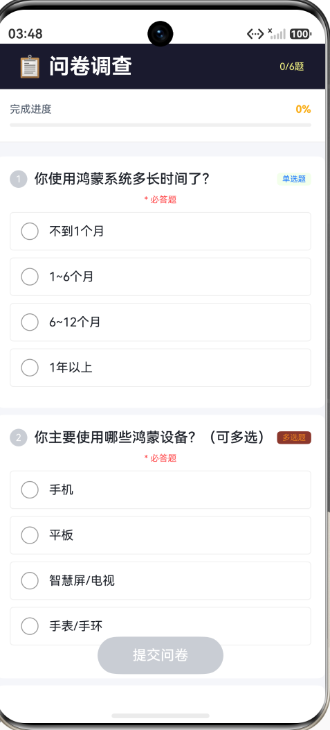
本 Demo 构建一个完整的问卷调查页面——6 道题目(3 单选 + 3 多选),必答校验、进度追踪、提交反馈。
页面结构
SurveyPage (~330行)
├── Header(📋 问卷调查 + 已答题数)
├── 进度条(百分比 + Progress 线性进度条)
├── Scroll
│   └── 题目卡片 × 6
│       ├── 题号圆圈 + 题目文字 + 类型标签(单选/多选)
│       ├── (必答题:* 必答题 红色提示)
│       └── 选项列表(Radio 或 Checkbox + 选项文字)
│           └── 选中项背景变色 + 蓝色边框
├── 底部浮层:提交问卷 / 重新填写
数据模型
class Question {
  id: number;
  type: string;              // 'radio' | 'checkbox'
  title: string;             // 题目文字
  required: boolean;         // 是否必答
  options: string[];         // 选项列表
  radioSelected: number;     // 单选题:选中索引(-1 未选)
  checkboxSelected: boolean[]; // 多选题:每个选项的选中状态
}
6 道题目覆盖不同主题(系统使用时长、设备偏好、满意度、特性偏好、推荐意愿、改进方向),第 6 题为非必答。
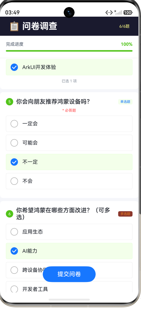
进度追踪
顶部 Progress 进度条实时反映完成度:
getAnsweredCount(): number {
  return this.questions.filter((q: Question) => this.isAnswered(q)).length;
}

isAnswered(q: Question): boolean {
  if (q.type === 'radio') return q.radioSelected >= 0;
  return q.checkboxSelected.some((v: boolean) => v);
}

getProgress(): number {
  return this.getAnsweredCount() / this.questions.length;
}
Progress 颜色随完成度变化:
<40%金色 → “刚开始”40%~80%蓝色 → “进行中”≥80%绿色 → “快完成了”
每个题目卡片的题号圆圈也用绿色表示"已答",灰色表示"未答"。
选项样式
选中和未选中的选项有明显视觉区分:
.backgroundColor(this.isOptionSelected(q, optIndex) ?
  AppColors.PRIMARY + '0A' : Color.Transparent)
.border({
  width: 1,
  color: this.isOptionSelected(q, optIndex) ?
    AppColors.PRIMARY + '40' : '#F0F0F0'
})
选中项:浅蓝背景 + 蓝色半透明边框。未选中项:透明背景 + 灰色边框。
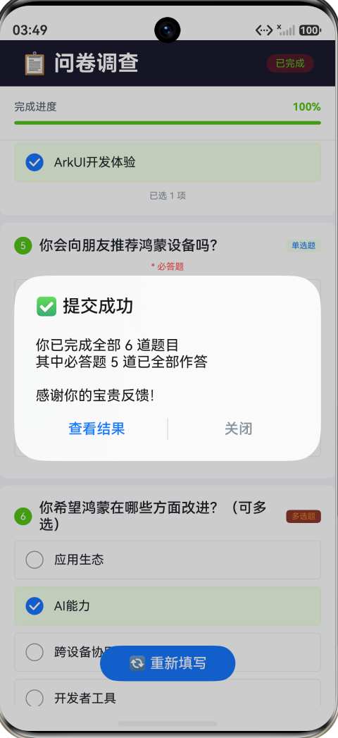
提交校验
提交时检查所有必答题是否为"已答"状态:
handleSubmit(): void {
  const unanswered = this.questions.filter((q: Question) =>
  q.required && !this.isAnswered(q));

  if (unanswered.length > 0) {
    const names = unanswered.map((q: Question) => `第${q.id}题`).join('、');
    promptAction.showToast({ message: `请完成必答题:${names}` });
    return;
  }

  this.submitted = true;
  promptAction.showDialog({
    title: '✅ 提交成功',
    message: `你已完成全部 ${this.questions.length} 道题目...`,
    buttons: [...]
  });
}
isAnswered 对单选题判断 radioSelected >= 0,对多选题判断 checkboxSelected 中至少有一个 true。
五个交互点
- 单选作答 — 点击 Radio 或整行选项区域,选中一项,同组其他选项自动取消
- 多选作答 — 点击 Checkbox 或整行选项区域,切换该项的选中/未选中
- 进度实时更新 — 每答完一题,顶部进度条和百分比实时刷新
- 提交校验 — 点击"提交问卷",未完成必答题时弹出 Toast 提示具体题号
- 重新填写 — 提交后出现"重新填写"按钮,重置所有题目和状态
五、完整代码
import { AppColors, BorderRadius, FontSize, Spacing } from '../common/Constants';
import { promptAction } from '@kit.ArkUI';

class Question {
  id: number;
  type: string;
  title: string;
  required: boolean;
  options: string[];
  radioSelected: number;
  checkboxSelected: boolean[];

  constructor(id: number, type: string, title: string, required: boolean,
    options: string[]) {
    this.id = id;
    this.type = type;
    this.title = title;
    this.required = required;
    this.options = options;
    this.radioSelected = -1;
    this.checkboxSelected = new Array<boolean>(options.length).fill(false);
  }
}

const QUESTIONS: Question[] = [
  new Question(1, 'radio', '你使用鸿蒙系统多长时间了?', true,
    ['不到1个月', '1~6个月', '6~12个月', '1年以上']),
  new Question(2, 'checkbox', '你主要使用哪些鸿蒙设备?(可多选)', true,
    ['手机', '平板', '智慧屏/电视', '手表/手环']),
  new Question(3, 'radio', '你对鸿蒙系统的整体满意度如何?', true,
    ['非常满意', '比较满意', '一般', '不太满意']),
  new Question(4, 'checkbox', '你最看重鸿蒙的哪些特性?(可多选)', true,
    ['分布式能力', '流畅度/性能', '隐私安全', 'ArkUI开发体验']),
  new Question(5, 'radio', '你会向朋友推荐鸿蒙设备吗?', true,
    ['一定会', '可能会', '不一定', '不会']),
  new Question(6, 'checkbox', '你希望鸿蒙在哪些方面改进?(可多选)', false,
    ['应用生态', 'AI能力', '跨设备协同', '开发者工具']),
];

@Entry
@Component
struct SurveyPage {
  @State questions: Question[] = QUESTIONS.map((q: Question) => {
    return new Question(q.id, q.type, q.title, q.required, [...q.options]);
  });
  @State submitted: boolean = false;

  getAnsweredCount(): number {
    return this.questions.filter((q: Question) => this.isAnswered(q)).length;
  }

  getTotalRequired(): number {
    return this.questions.filter((q: Question) => q.required).length;
  }

  isAnswered(q: Question): boolean {
    if (q.type === 'radio') return q.radioSelected >= 0;
    return q.checkboxSelected.some((v: boolean) => v);
  }

  getProgress(): number {
    return this.getAnsweredCount() / this.questions.length;
  }

  getProgressColor(): string {
    const p = this.getProgress();
    if (p >= 0.8) return '#52C41A';
    if (p >= 0.4) return '#1677FF';
    return '#FAAD14';
  }

  selectRadio(questionId: number, optionIndex: number): void {
    if (this.submitted) return;
    this.questions = this.questions.map((q: Question) => {
      if (q.id === questionId) {
        let copy = new Question(q.id, q.type, q.title, q.required, [...q.options]);
        copy.radioSelected = optionIndex;
        copy.checkboxSelected = [...q.checkboxSelected];
        return copy;
      }
      return q;
    });
  }

  toggleCheckbox(questionId: number, optionIndex: number): void {
    if (this.submitted) return;
    this.questions = this.questions.map((q: Question) => {
      if (q.id === questionId) {
        let copy = new Question(q.id, q.type, q.title, q.required, [...q.options]);
        copy.radioSelected = q.radioSelected;
        copy.checkboxSelected = [...q.checkboxSelected];
        copy.checkboxSelected[optionIndex] = !copy.checkboxSelected[optionIndex];
        return copy;
      }
      return q;
    });
  }

  isRadioSelected(questionId: number, optionIndex: number): boolean {
    const q = this.questions.find((q: Question) => q.id === questionId);
    return q ? q.radioSelected === optionIndex : false;
  }

  isCheckboxChecked(questionId: number, optionIndex: number): boolean {
    const q = this.questions.find((q: Question) => q.id === questionId);
    return q ? q.checkboxSelected[optionIndex] : false;
  }

  getTypeLabel(type: string): string {
    return type === 'radio' ? '单选题' : '多选题';
  }

  getTypeColor(type: string): string {
    return type === 'radio' ? '#1677FF' : '#E67E22';
  }

  getCheckboxCheckedCount(questionId: number): number {
    const q = this.questions.find((q: Question) => q.id === questionId);
    if (!q) return 0;
    return q.checkboxSelected.filter((v: boolean) => v).length;
  }

  handleSubmit(): void {
    const unanswered = this.questions.filter((q: Question) =>
    q.required && !this.isAnswered(q));
    if (unanswered.length > 0) {
      const names = unanswered.map((q: Question) => `第${q.id}题`).join('、');
      promptAction.showToast({ message: `请完成必答题:${names}` });
      return;
    }
    this.submitted = true;
    promptAction.showDialog({
      title: '✅ 提交成功',
      message: `你已完成全部 ${this.questions.length} 道题目\n` +
        `其中必答题 ${this.getTotalRequired()} 道已全部作答\n\n感谢你的宝贵反馈!`,
      buttons: [
        { text: '查看结果', color: AppColors.PRIMARY },
        { text: '关闭', color: AppColors.TEXT_TERTIARY }
      ]
    });
  }

  handleReset(): void {
    this.questions = QUESTIONS.map((q: Question) => {
      return new Question(q.id, q.type, q.title, q.required, [...q.options]);
    });
    this.submitted = false;
  }

  build() {
    Stack() {
      Column() {
        Row() {
          Text('📋 问卷调查')
            .fontSize(FontSize.HEADLINE)
            .fontWeight(FontWeight.Bold)
            .fontColor(Color.White)
            .layoutWeight(1)
          if (this.submitted) {
            Text('已完成').fontSize(11).fontColor('#52C41A')
              .padding({ left: 10, right: 10, top: 4, bottom: 4 })
              .backgroundColor('#52C41A22').borderRadius(9999)
          } else {
            Text(`${this.getAnsweredCount()}/${this.questions.length}题`)
              .fontSize(11).fontColor('#FFFFFF88')
          }
        }
        .width('100%').height(52)
        .backgroundColor('#1a1a2e')
        .padding({ left: Spacing.XXL, right: Spacing.XXL })

        Column() {
          Row() {
            Text('完成进度').fontSize(FontSize.CAPTION)
              .fontColor(AppColors.TEXT_SECONDARY)
            Blank()
            Text(`${Math.round(this.getProgress() * 100)}%`)
              .fontSize(FontSize.CAPTION)
              .fontColor(this.getProgressColor())
              .fontWeight(FontWeight.Bold)
          }
          .width('100%').margin({ bottom: Spacing.SM })

          Progress({
            value: Math.round(this.getProgress() * 100),
            total: 100,
            type: ProgressType.Linear
          })
            .width('100%').height(6)
            .color(this.getProgressColor())
            .backgroundColor('#F0F0F0')
        }
        .width('100%').padding(Spacing.LG)
        .backgroundColor(Color.White)
        .border({ width: { bottom: 1 }, color: '#F0F0F0' })

        Scroll() {
          Column() {
            ForEach(this.questions, (q: Question) => {
              Column() {
                Row() {
                  Text(`${q.id}`).fontSize(11).fontColor(Color.White)
                    .width(20).height(20).borderRadius(10)
                    .backgroundColor(this.isAnswered(q) ? '#52C41A' :
                    AppColors.TEXT_DISABLED)
                    .textAlign(TextAlign.Center)
                    .margin({ right: Spacing.SM })

                  Text(q.title).fontSize(FontSize.MEDIUM)
                    .fontColor(AppColors.TEXT_PRIMARY)
                    .fontWeight(FontWeight.Medium)
                    .layoutWeight(1).maxLines(2)

                  Text(this.getTypeLabel(q.type)).fontSize(9)
                    .fontColor(this.getTypeColor(q.type))
                    .padding({ left: 6, right: 6, top: 2, bottom: 2 })
                    .backgroundColor(this.getTypeColor(q.type) + '15')
                    .borderRadius(4)
                }
                .width('100%').margin({ bottom: Spacing.SM })

                if (q.required) {
                  Text('* 必答题').fontSize(10)
                    .fontColor('#FF4D4F').margin({ bottom: Spacing.SM })
                }

                ForEach(q.options, (opt: string, optIndex: number) => {
                  Row() {
                    if (q.type === 'radio') {
                      Radio({ value: `q${q.id}_${optIndex}`,
                      group: `question_${q.id}` })
                        .checked(this.isRadioSelected(q.id, optIndex))
                        .radioStyle({ checkedBackgroundColor: AppColors.PRIMARY })
                        .onChange((checked: boolean) => {
                          if (checked) this.selectRadio(q.id, optIndex);
                        })
                    } else {
                      Checkbox({ name: `q${q.id}_${optIndex}` })
                        .select(this.isCheckboxChecked(q.id, optIndex))
                        .selectedColor(AppColors.PRIMARY)
                        .onChange((checked: boolean) => {
                          this.toggleCheckbox(q.id, optIndex);
                        })
                    }
                    Text(opt).fontSize(FontSize.BODY)
                      .fontColor(AppColors.TEXT_PRIMARY)
                      .margin({ left: Spacing.SM }).layoutWeight(1)
                  }
                  .width('100%').height(44)
                  .padding({ left: Spacing.SM, right: Spacing.SM })
                  .borderRadius(BorderRadius.SM)
                  .backgroundColor(this.isOptionSelected(q, optIndex) ?
                    AppColors.PRIMARY + '0A' : Color.Transparent)
                  .border({ width: 1,
                    color: this.isOptionSelected(q, optIndex) ?
                    AppColors.PRIMARY + '40' : '#F0F0F0' })
                  .margin({ bottom: Spacing.SM })
                  .onClick(() => {
                    if (q.type === 'radio') this.selectRadio(q.id, optIndex);
                    else this.toggleCheckbox(q.id, optIndex);
                  })
                })

                if (q.type === 'checkbox') {
                  Text(`已选 ${this.getCheckboxCheckedCount(q.id)} 项`)
                    .fontSize(10).fontColor(AppColors.TEXT_TERTIARY)
                    .margin({ top: 2 })
                }
              }
              .width('100%').padding(Spacing.LG)
              .backgroundColor(Color.White).borderRadius(BorderRadius.MD)
              .margin({ left: Spacing.LG, right: Spacing.LG, bottom: Spacing.SM })
            })
          }
          .width('100%').padding({ top: Spacing.LG, bottom: 100 })
        }
        .layoutWeight(1).scrollBar(BarState.Off)
        .backgroundColor('#F5F6FA')
      }
      .width('100%').height('100%')

      Column() {
        if (this.submitted) {
          Button('🔄 重新填写').fontSize(FontSize.MEDIUM)
            .fontColor(Color.White).backgroundColor(AppColors.PRIMARY)
            .borderRadius(9999)
            .padding({ left: 32, right: 32, top: 10, bottom: 10 })
            .onClick(() => { this.handleReset(); })
        } else {
          Button('提交问卷').fontSize(FontSize.MEDIUM)
            .fontColor(Color.White)
            .backgroundColor(this.getAnsweredCount() >= this.getTotalRequired() ?
            AppColors.PRIMARY : AppColors.TEXT_DISABLED)
            .borderRadius(9999)
            .padding({ left: 40, right: 40, top: 12, bottom: 12 })
            .onClick(() => { this.handleSubmit(); })
        }
      }
      .width('100%')
      .position({ bottom: 28 })
      .alignItems(HorizontalAlign.Center)
    }
    .width('100%').height('100%')
  }

  isOptionSelected(q: Question, optIndex: number): boolean {
    if (q.type === 'radio') return q.radioSelected === optIndex;
    return q.checkboxSelected[optIndex];
  }
}
六、常见面试题 / 踩坑点
6.1 Radio 的分组机制是如何工作的?
Radio 通过 group 参数形成逻辑分组。所有 group 相同的 Radio 构成一个"单选组"——框架内部维护了一个 group → 当前选中value 的映射。
当你点击 A 时:
onChange触发,checked = true- 框架查找同一 group 中之前选中的 Radio
- 将它的状态改为
checked = false - 将 A 的状态改为
checked = true
注意:框架只管理同一 group 内部的互斥。如果两个题目用了相同的 group 名,它们会错误地互斥。确保每道题使用唯一的 group 名(如 group: question_${q.id})。
6.2 Checkbox 的 select 和 onChange 的关系?
.select(value):声明式控制选中状态。你通过这个属性告诉 Checkbox"你应该处于选中/未选中状态"。.onChange((checked) => { ... }):用户交互回调。用户点击后触发,你在回调中更新数据,然后数据变化反向驱动.select()更新 UI。
这是典型的"声明式 UI → 事件回调 → 数据更新 → 重新渲染"循环。如果你发现 Checkbox 点击后没反应,99% 是 .onChange 中忘记更新数据。
6.3 如何实现"点击整行选项区域触发选择"?
为选项 Row 添加 .onClick(),直接调用与 Checkbox/Radio 相同的处理函数:
Row() {
  Checkbox({ ... })
    .select(...)
    .onChange((checked) => { this.toggleCheckbox(q.id, optIndex); })
  Text(opt)
}
.onClick(() => {
  this.toggleCheckbox(q.id, optIndex);  // 与 onChange 调用同一方法
})
这样用户点击文字区域也能触发选择——比只能点小方框体验好得多。
6.4 如何实现"至少选N个"的校验?
在 handleSubmit 中增加 Checkbox 最低选择数校验:
const minSelectQ2 = this.getCheckboxCheckedCount(2);
if (minSelectQ2 < 2) {
  promptAction.showToast({ message: '第2题请至少选择2项' });
  return;
}
"最多选N个"的实现类似——在 toggleCheckbox 中加限制:
toggleCheckbox(questionId: number, optionIndex: number): void {
  const q = this.questions.find((q: Question) => q.id === questionId);
  if (!q) return;
  const current = q.checkboxSelected.filter((v: boolean) => v).length;
  if (!q.checkboxSelected[optionIndex] && current >= MAX_SELECT) {
    return;  // 已达上限,不允许再选
  }
  // 正常切换...
}
6.5 不可变更新为什么这么重要?
ArkUI 的 @State 变化检测基于引用相等。如果你直接修改数组元素:
// 错误:ArkUI 检测不到变化
this.questions[0].radioSelected = 2;

// 正确:创建新数组 + 新对象
this.questions = this.questions.map((q) => {
  if (q.id === 1) {
    let copy = new Question(...);
    copy.radioSelected = 2;
    return copy;
  }
  return q;
});
第一个写法不触发重新渲染——因为 this.questions 的引用没变,框架认为"数据没变化"。第二个写法创建了全新的数组和对象,框架能检测到引用变化,触发 UI 更新。
七、总结
Checkbox 和 Radio 是"越小越容易犯错"的组件。它们的 API 不到 5 个参数,但如何在 @State 体系中正确管理选中状态、如何在多个组件间同步数据、如何处理不可变更新——这些"周边技能"决定了代码质量。
1. Radio 的 group 就是互斥边界。 同一 group 自动互斥——这是 Radio 的核心价值。但必须确保不同题目使用不同的 group,否则会出现跨题目互斥的 bug。
2. Checkbox 用布尔数组管理多项选择。 不需要 Set、不需要 Map——一个 boolean[] 即可。关键是用不可变更新([...array] 创建新数组)确保框架检测到变化。
3. .onClick 做整行响应。 不仅是 Checkbox/Radio 的小圆圈可以点——整行选项区域都应该响应点击。.onClick 调用与 .onChange 相同的方法即可。
4. 提交校验 = 遍历 + 过滤。 必答题校验不需要 Form 组件,只需要 filter(qi => qi.required && !isAnswered(qi))。如果有未答的题,用 Toast 精确提示题号,引导用户完成。
Checkbox 和 Radio 最适用的场景:
- 问卷调查 / 反馈表单(单选 + 多选 + 必答校验)
- 设置页面(多项偏好选择、权限勾选)
- 购物车(全选/单选商品、批量操作)
- 测评/考试系统(单选题 + 多选题 + 自动评分)
- 数据批量操作列表(勾选 + 全选 + 批量删除)
这两个组件是"表单系统的原子单位"——所有复杂的表单交互最终都归结为"单选或多选"。掌握它们的不可变更新模式、分组管理和校验逻辑,是成为熟练 ArkUI 开发者的必经之路。

讨论HarmonyOS开发技术,专注于API与组件、DevEco Studio、测试、元服务和应用上架分发等。
更多推荐
 1
1 0
0- 0


 已为社区贡献45条内容

所有评论(0)