HarmonyOS 首页架构实战:从裸代码到组件化的演进过程
HarmonyOS 首页架构实战:从裸代码到组件化的演进过程
一个饮品 App 首页从"能跑"到"能维护",中间隔了哪些重构。
前言
这个饮品 App 的首页改了好几版了。最早就是一堆 Text 和 Image 堆在一起,数据直接写死在组件里,能跑但没法维护。后来逐步加了数据层、图片容错、搜索功能,代码结构比之前清晰了不少。
这篇文章基于最新版代码,把首页从数据到 UI 的完整架构讲一遍。不是教程式的"第一步第二步",而是分享我在重构过程中的思考——哪些地方一开始设计得不对,后来是怎么改的。
完整效果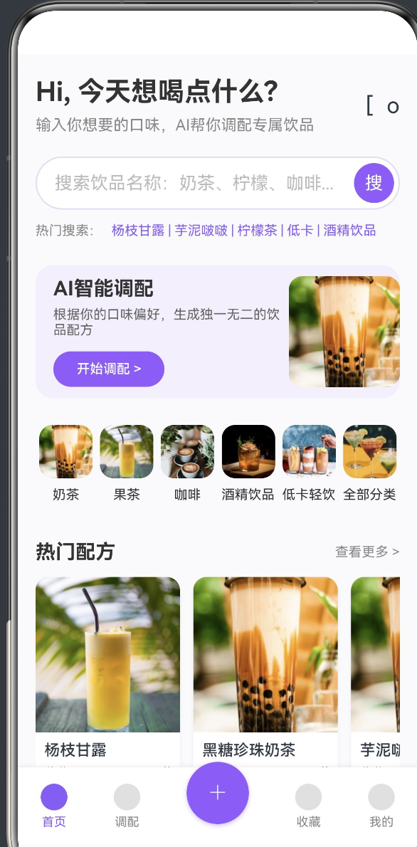
代码结构:先看全貌
import router from '@ohos.router'
import { SafeImage } from '../components/SafeImage'
import { RECIPES, RecipeData } from '../data/RecipeData'
@Entry
@Component
struct DrinkAppHome {
@State searchText: string = ''
// 图片资源(CDN 链接)
private imgBubbleTea: string = 'https://...'
// ...
// 数据
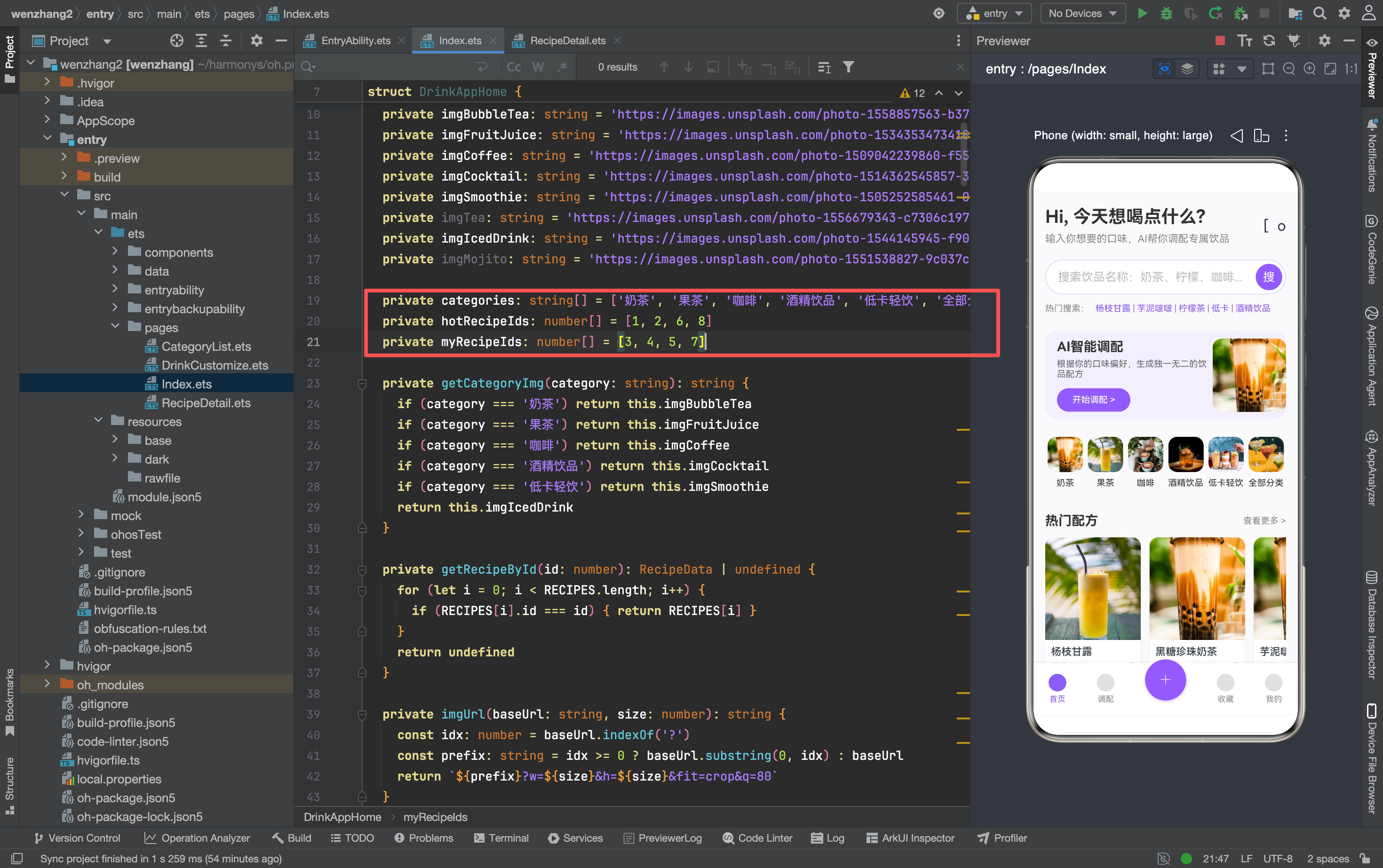
private categories: string[] = [...]
private hotRecipeIds: number[] = [1, 2, 6, 8]
private myRecipeIds: number[] = [3, 4, 5, 7]
// 工具方法
private getCategoryImg(category: string): string { ... }
private getRecipeById(id: number): RecipeData | undefined { ... }
private imgUrl(baseUrl: string, size: number): string { ... }
private doSearch(): void { ... }
build() { ... }
@Builder HeaderSection() { ... }
@Builder SearchSection() { ... }
// ... 其他 @Builder
}
和早期版本相比,最大的变化是引入了三个外部依赖:
SafeImage— 图片加载容错组件RECIPES— 配方数据数组RecipeData— 配方数据接口
这三个东西把数据、UI、容错分开了,后面维护起来方便很多。
数据层:RECIPES 和 RecipeData
最早版本的配方数据是直接写在 @Builder 方法里的——图片 URL、名称、收藏数全部硬编码。后来发现要改一个配方得翻好几个地方,就把数据抽出来了。
// data/RecipeData.ts
interface RecipeData {
  id: number
  name: string
  img: string
  base: string
  category: string
  sweetness: number
  // ... 其他字段
}

const RECIPES: RecipeData[] = [
  { id: 1, name: '杨枝甘露', img: 'https://...', base: '奶茶', category: '奶茶', sweetness: 70 },
  { id: 2, name: '芋泥啵啵', img: 'https://...', base: '奶茶', category: '奶茶', sweetness: 80 },
  // ...
]

export { RECIPES, RecipeData }
首页通过 ID 数组引用配方:
private hotRecipeIds: number[] = [1, 2, 6, 8]
private myRecipeIds: number[] = [3, 4, 5, 7]
然后用 getRecipeById() 方法根据 ID 查找完整数据:
private getRecipeById(id: number): RecipeData | undefined {
  for (let i = 0; i < RECIPES.length; i++) {
    if (RECIPES[i].id === id) { return RECIPES[i] }
  }
  return undefined
}
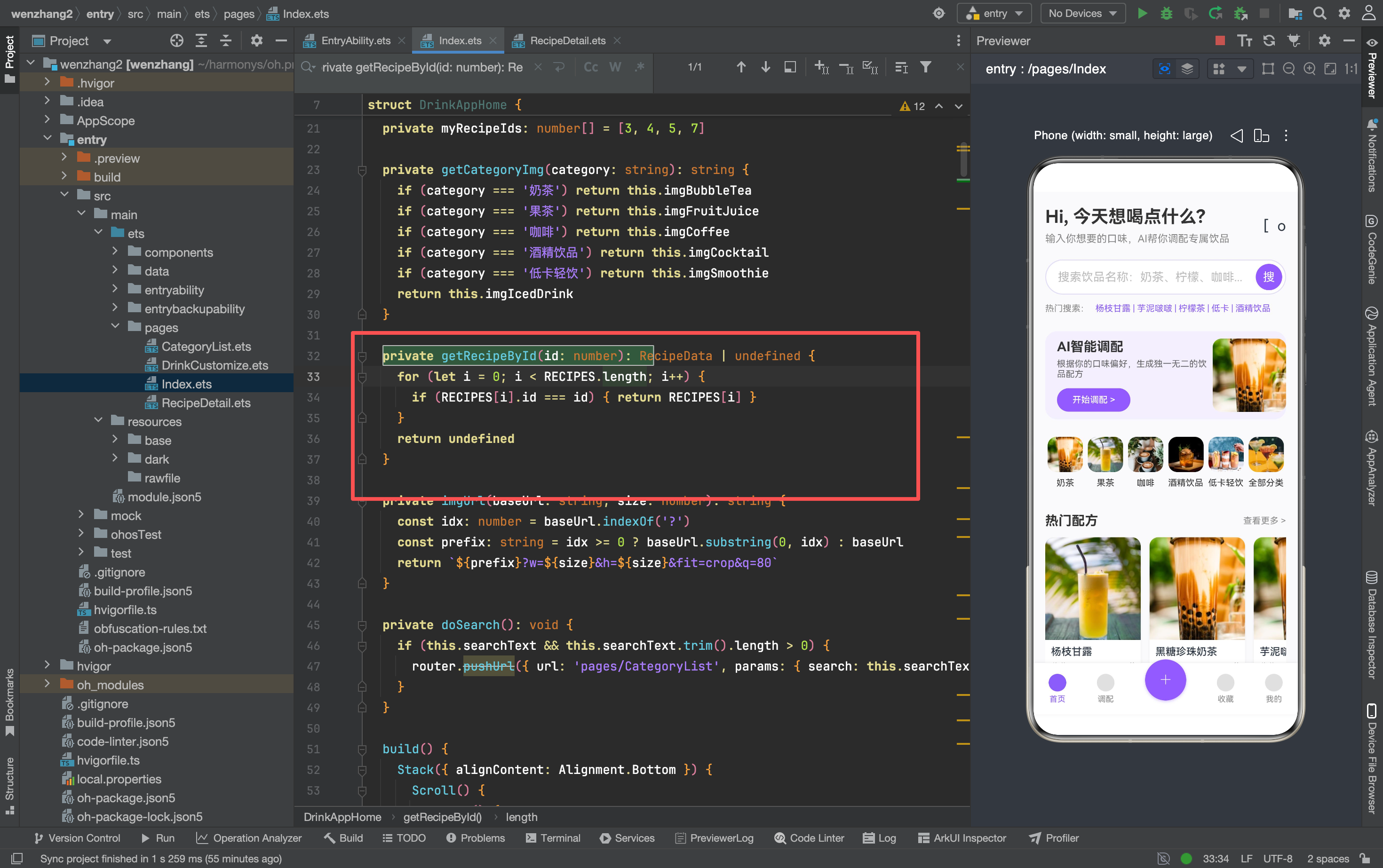
这个设计的好处是:首页只关心"展示哪些配方"(ID 列表),不关心配方的具体内容。要换一批热门配方,改一下 hotRecipeIds 就行,不用动 UI 代码。
一个细节:getRecipeById 返回 RecipeData | undefined,因为 ID 可能找不到对应配方。UI 层必须处理 undefined 的情况:
Text(this.getRecipeById(id)?.name || '饮品')
如果直接写 this.getRecipeById(id).name,ID 找不到时会崩溃。
SafeImage:图片加载的容错方案
网络图片在移动端是出了名的不可靠——URL 可能失效、加载可能超时、图片可能格式不对。直接用 Image 组件加载网络图片,一旦出问题就是一片空白或者崩溃。
所以封装了一个 SafeImage 组件:
// components/SafeImage.ets
@Component
export struct SafeImage {
  @Prop imgSrc: string = ''
  @Prop imgWidth: number = 100
  @Prop imgHeight: number = 100
  @Prop imgRadius: number = 0
  @Prop emoji: string = '🍹'

  build() {
    Stack() {
      // 占位层:显示 emoji
      Row() {
        Text(this.emoji).fontSize(36).opacity(0.4)
      }
      .width('100%')
      .height('100%')
      .backgroundColor('#EDE8F5')
      .justifyContent(FlexAlign.Center)
      .alignItems(VerticalAlign.Center)
      .borderRadius(this.imgRadius)

      // 图片层:覆盖在占位层上面
      Image(this.imgSrc)
        .width('100%')
        .height('100%')
        .borderRadius(this.imgRadius)
        .objectFit(ImageFit.Cover)
    }
    .width(this.imgWidth)
    .height(this.imgHeight)
  }
}
工作原理:
- 先渲染一个带 emoji 的占位层(背景色
#EDE8F5) - 图片加载完成后覆盖在占位层上面
- 如果图片加载失败,占位层始终可见,用户不会看到空白区域
使用方式:
SafeImage({
  imgSrc: this.imgUrl(this.imgBubbleTea, 200),
  imgWidth: 100,
  imgHeight: 100,
  imgRadius: 12,
  emoji: '奶'
})
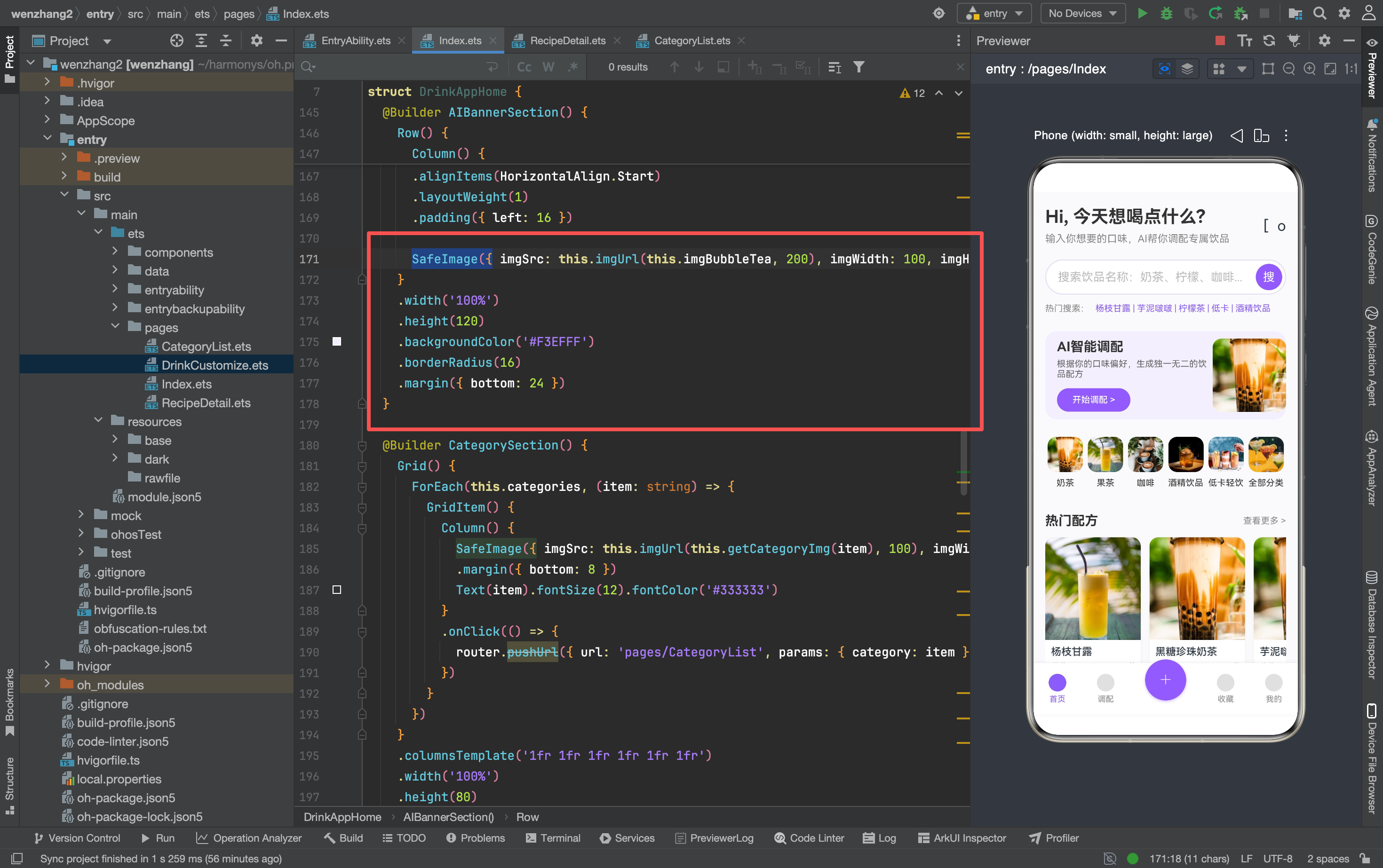
emoji 参数可以根据饮品类型传不同的表情符号,让占位状态也有辨识度。
imgUrl:动态控制图片尺寸
Unsplash 的 CDN 支持通过 URL 参数控制输出尺寸:
private imgUrl(baseUrl: string, size: number): string {
  const idx: number = baseUrl.indexOf('?')
  const prefix: string = idx >= 0 ? baseUrl.substring(0, idx) : baseUrl
  return `${prefix}?w=${size}&h=${size}&fit=crop&q=80`
}
这个方法把原始 URL 的查询参数截掉,拼上新的尺寸参数。比如原始 URL 是 https://images.unsplash.com/photo-xxx?w=400&h=400,调用 imgUrl(url, 200) 会变成 https://images.unsplash.com/photo-xxx?w=200&h=200&fit=crop&q=80。
为什么要这样做?
首页不同位置需要不同尺寸的图片:
- 分类金刚区:48x48 的小图,不需要高分辨率
- AI Banner:100x100 的中图
- 配方卡片:260x260 的大图
如果所有地方都用原图(400x400),小图区域浪费流量。如果都用缩略图,大图区域画质不够。imgUrl 方法让每个使用场景都能拿到合适尺寸的图片。
搜索功能:从输入到跳转
最早版本的搜索框只是个摆设——用户输入了什么,没有实际处理。新版加了完整的搜索流程:
@State searchText: string = ''

@Builder SearchSection() {
  Row() {
    TextInput({ placeholder: '搜索饮品名称:奶茶、柠檬、咖啡...', text: this.searchText })
      .layoutWeight(1)
      .backgroundColor(Color.Transparent)
      .fontSize(14)
      .placeholderColor('#BBBBBB')
      .onChange((value: string) => { this.searchText = value })
      .onSubmit(() => { this.doSearch() })

    Button() {
      Text('搜').fontSize(16).fontColor(Color.White)
    }
    .type(ButtonType.Circle)
    .width(36)
    .height(36)
    .backgroundColor('#8A5DFA')
    .margin({ right: 4 })
    .onClick(() => { this.doSearch() })
  }
  // ...
}

private doSearch(): void {
  if (this.searchText && this.searchText.trim().length > 0) {
    router.pushUrl({ url: 'pages/CategoryList', params: { search: this.searchText.trim() } })
  }
}
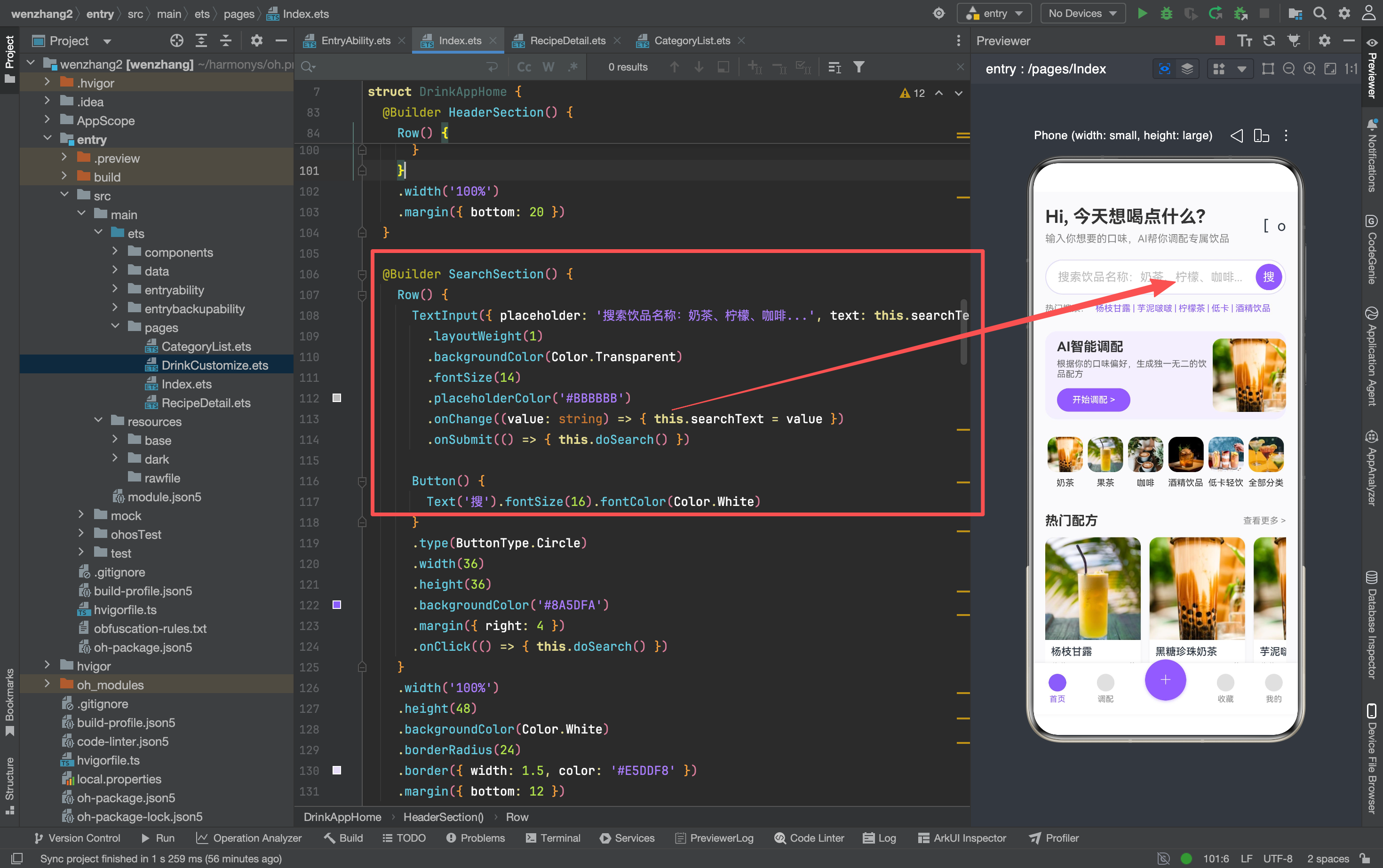
两个触发搜索的入口:
- 回车键:
TextInput的.onSubmit()回调 - 搜索按钮:点击事件调用
doSearch()
doSearch() 做了三件事:
- 检查输入是否为空(防止空搜索)
- 去除首尾空格(
trim()) - 跳转到分类列表页,把搜索词作为参数传过去
为什么搜索结果页复用分类列表页?
因为搜索和分类本质上是同一件事——都是筛选配方。区别只是一个按名称筛选,一个按分类筛选。与其新建一个搜索结果页,不如让分类列表页同时支持两种模式:
// CategoryList 页面接收参数
const params = router.getParams() as Record<string, Object>
if (params?.search) {
  // 搜索模式:按名称筛选
  this.loadBySearch(params.search as string)
} else if (params?.category) {
  // 分类模式:按分类筛选
  this.loadByCategory(params.category as string)
}
这样少了一个页面,维护成本降低一半。
配方卡片:Stack 布局实现图片加载态
配方卡片的图片区域用了 Stack 布局,目的是在图片加载过程中显示占位内容:
Stack() {
  // 占位层
  Row() {
    Text('饮').fontSize(36).opacity(0.4)
  }
  .width('100%').height(140)
  .backgroundColor('#EDE8F5')
  .borderRadius({ topLeft: 12, topRight: 12 })
  .justifyContent(FlexAlign.Center)
  .alignItems(VerticalAlign.Center)

  // 图片层
  Image(this.imgUrl(this.getRecipeById(id)?.img || this.imgBubbleTea, 260))
    .width('100%').height(140)
    .borderRadius({ topLeft: 12, topRight: 12 })
    .objectFit(ImageFit.Cover)
}
这里有个细节:Image 的数据源用了 this.getRecipeById(id)?.img || this.imgBubbleTea。|| 后面的 this.imgBubbleTea 是兜底值——如果 getRecipeById 返回 undefined(比如 ID 找不到),图片会 fallback 到奶茶的默认图。
为什么不用 SafeImage?
因为这里的 Stack 布局已经自己处理了占位态。SafeImage 适合简单的图片展示场景,需要自定义占位内容时直接用 Stack 更灵活。
两个方案各有适用场景:
- 简单场景(分类图标、Banner 图)→
SafeImage - 需要自定义占位内容(配方卡片)→
Stack手动实现
分类金刚区:数据驱动的 Grid 布局
private categories: string[] = ['奶茶', '果茶', '咖啡', '酒精饮品', '低卡轻饮', '全部分类']

@Builder CategorySection() {
  Grid() {
    ForEach(this.categories, (item: string) => {
      GridItem() {
        Column() {
          SafeImage({
            imgSrc: this.imgUrl(this.getCategoryImg(item), 100),
            imgWidth: 48,
            imgHeight: 48,
            imgRadius: 12,
            emoji: '饮'
          })
          .margin({ bottom: 8 })
          Text(item).fontSize(12).fontColor('#333333')
        }
        .onClick(() => {
          router.pushUrl({ url: 'pages/CategoryList', params: { category: item } })
        })
      }
    })
  }
  .columnsTemplate('1fr 1fr 1fr 1fr 1fr 1fr')
  .width('100%')
  .height(80)
  .margin({ bottom: 24 })
}
分类数据存在数组里,ForEach 循环渲染。每个分类项点击后跳转到分类列表页,把分类名作为参数。
getCategoryImg() 方法把分类名映射到对应的图片 URL:
private getCategoryImg(category: string): string {
  if (category === '奶茶') return this.imgBubbleTea
  if (category === '果茶') return this.imgFruitJuice
  if (category === '咖啡') return this.imgCoffee
  if (category === '酒精饮品') return this.imgCocktail
  if (category === '低卡轻饮') return this.imgSmoothie
  return this.imgIcedDrink
}
这里有个可以优化的地方:if-else 链可以用 Map 替代,但 ArkTS 中 Map 的类型推断有些问题,暂时先这样写。等后续数据量大了再考虑重构。
横向滚动列表:List + ForEach 的组合
热门配方和我的配方都用横向滚动列表:
@Builder HorizontalRecipeList() {
  List({ space: 12 }) {
    ForEach(this.hotRecipeIds, (id: number) => {
      ListItem() {
        Column() {
          // 图片区域(Stack 布局)
          // 文字区域
        }
        .width(130)
        .backgroundColor(Color.White)
        .borderRadius(12)
        .shadow({ radius: 8, color: 'rgba(0,0,0,0.05)', offsetY: 4 })
        .onClick(() => {
          router.pushUrl({ url: 'pages/RecipeDetail', params: { recipeId: id } })
        })
      }
    })
  }
  .listDirection(Axis.Horizontal)
  .scrollBar(BarState.Off)
  .width('100%')
  .margin({ bottom: 24 })
}
几个关键点:
List({ space: 12 })控制卡片间距.listDirection(Axis.Horizontal)设为横向滚动.scrollBar(BarState.Off)隐藏滚动条(横向滚动条在移动端通常不好看)- 每个卡片宽度固定
130,高度由内容撑开
点击卡片跳转到详情页,传的是配方 ID:
router.pushUrl({ url: 'pages/RecipeDetail', params: { recipeId: id } })
详情页通过 recipeId 从 RECIPES 数组中查找完整数据。
底部导航栏:可选回调的设计模式
底部导航栏的 TabItem 用了可选回调参数:
@Builder TabItem(title: string, isActive: boolean, onClick?: () => void) {
  Column({ space: 4 }) {
    Circle({ width: 24, height: 24 })
      .fill(isActive ? '#8A5DFA' : '#E0E0E0')
    Text(title)
      .fontSize(11)
      .fontColor(isActive ? '#8A5DFA' : '#888888')
  }
  .onClick(() => {
    if (onClick) { onClick() }
  })
}
使用方式:
this.TabItem('首页', true)   // 当前页,不传回调
this.TabItem('调配', false, () => {
  router.pushUrl({ url: 'pages/DrinkCustomize' })
})

// 中间 + 按钮单独处理
Button() {
  Text('+').fontSize(32).fontColor(Color.White).fontWeight(FontWeight.Lighter)
}
.type(ButtonType.Circle)
.width(56).height(56)
.backgroundColor('#8A5DFA')
.margin({ top: -24 })
.shadow({ radius: 10, color: 'rgba(138, 93, 250, 0.4)', offsetY: 4 })
.onClick(() => {
  router.pushUrl({ url: 'pages/DrinkCustomize' })
})

this.TabItem('收藏', false)
this.TabItem('我的', false)
这个设计的好处:
- 当前页不传回调,点击不会重复跳转
- 其他页传入跳转函数,点击自然跳转
- 不需要在
TabItem内部判断title是什么
中间的 “+” 按钮单独处理,因为它需要凸出导航栏(.margin({ top: -24 })),和普通 Tab 的布局不同。
踩坑记录
1. getRecipeById 返回 undefined
getRecipeById 可能返回 undefined(ID 找不到),所有使用它的地方都必须处理:
// ❌ 崩溃
Text(this.getRecipeById(id).name)

// ✅ 安全
Text(this.getRecipeById(id)?.name || '饮品')
ArkTS 的严格模式会在编译期检查空值,但可选链 ?. 和 fallback || 是最简单的方式。
2. imgUrl 的 URL 拼接
imgUrl 方法假设原始 URL 的查询参数在 ? 之后。如果 URL 本身没有查询参数,indexOf('?') 返回 -1,substring(0, -1) 会返回空字符串。
private imgUrl(baseUrl: string, size: number): string {
  const idx: number = baseUrl.indexOf('?')
  const prefix: string = idx >= 0 ? baseUrl.substring(0, idx) : baseUrl
  return `${prefix}?w=${size}&h=${size}&fit=crop&q=80`
}
这里 idx >= 0 的判断处理了两种情况,不会出问题。但如果 URL 格式异常(比如有 # 锚点),可能需要更复杂的解析。
3. TextInput 的双向绑定
TextInput 通过 text: this.searchText 绑定初始值,通过 .onChange() 更新状态变量。但 ArkTS 的 TextInput 不支持真正的双向绑定——必须手动在 .onChange() 里更新 @State 变量:
TextInput({ placeholder: '...', text: this.searchText })
  .onChange((value: string) => { this.searchText = value })
如果忘了 .onChange(),输入框的内容不会同步到 searchText,搜索时拿到的是空字符串。
4. Stack 布局的层级
Stack 中的子组件按声明顺序堆叠——后声明的在上面。所以 Image 必须在占位 Row 之后声明,否则占位层会盖住图片:
Stack() {
  Row() { /* 占位层 — 在下面 */ }
  Image(...)  // 图片层 — 在上面
}
如果顺序反了,用户会看到一个 emoji 占位符,图片永远不会显示。
组件化思路:什么时候该抽组件
这次重构最大的收获是学会了判断"什么时候该把代码抽成独立组件":
不需要抽的情况:
- 代码只在一个地方用
- 逻辑简单,几行代码就能说清楚
- 和父组件的数据耦合紧密
需要抽的情况:
- 代码在多个地方复用(比如
SafeImage) - 逻辑复杂,抽出来让父组件更清晰
- 需要独立的生命周期或状态管理
SafeImage 被抽成独立组件,是因为它在首页的多个位置使用(分类图标、Banner 图、配方卡片),而且有独立的占位逻辑。如果只在一个地方用,直接写在 build() 里就够了。
写在最后
这个首页从最初的"一堆 Text 堆在一起"到现在有了数据层、组件化、搜索功能、图片容错,花了好几轮重构。每一轮重构都不是推倒重来,而是在现有代码基础上逐步优化。
ArkUI 的声明式写法让这种渐进式重构变得相对容易——你想改哪个模块,找到对应的 @Builder 方法改就行,不影响其他部分。但前提是你得把模块拆得足够清晰,否则改一个地方会牵连一片。
后面计划把 RECIPES 数据从本地数组迁移到网络 API,到时候首页的加载逻辑又要改一轮。不过有了现在的数据层结构,改动量应该不会太大。

讨论HarmonyOS开发技术,专注于API与组件、DevEco Studio、测试、元服务和应用上架分发等。
更多推荐
 1
1 0
0- 0


 已为社区贡献23条内容

所有评论(0)