【HarmonyOS 6】从0开始制作宠物商店APP(一)——搭建项目框架与悬浮底部导航
前言
这个系列我们会从零开始,基于 HarmonyOS 6 开发一个宠物商店应用。
整个系列会以"功能模块"为主线逐步推进。作为第一篇文章,我们不急着写业务逻辑,先把项目框架搭起来——包括:
- 项目结构怎么组织。
- 深色模式怎么适配(颜色不要写死)。
- 底部悬浮导航怎么做。
一、项目结构
先看一眼我们现在的目录结构:
frontend/
  entry/
    src/main/ets/
      entryability/
        EntryAbility.ets        // Ability 生命周期入口
      components/
        PagePlaceholder.ets     // 公共占位组件
      pages/
        Index.ets               // 主入口,HdsTabs 悬浮页签容器
        HomePage.ets            // 首页
        ShopPage.ets            // 商店页
        CartPage.ets            // 购物车页
        ProfilePage.ets         // 个人中心页
    src/main/resources/
      base/
        element/
          color.json            // 浅色模式颜色资源
          float.json            // 字号资源
          string.json           // 字符串资源
        media/
      dark/
        element/
          color.json            // 深色模式颜色资源
目前我们只搭了框架,5 个底部页签页面都只是占位,后续会逐个填充业务功能。
几个设计上的选择:
- 每个底部页签一个独立文件:
HomePage.ets、ShopPage.ets等,不把所有内容塞在Index.ets里。 - 公共组件放在
components/:例如PagePlaceholder,多个页面可以复用。 - Ability 代码单独放
entryability/:生命周期代码不跟 UI 混在一起。
这些在前期养成习惯,后面功能多了就不会乱。
二、深色模式适配
深色模式适配,核心思路就是颜色不写死。
2.1 颜色资源文件
我们在 base/element/color.json 中定义浅色模式的颜色,在 dark/element/color.json 中定义对应的深色模式颜色。系统会根据当前主题自动切换。
这是浅色模式的 base/element/color.json:
{
  "color": [
    { "name": "start_window_background", "value": "#FFFFFF" },
    { "name": "page_background", "value": "#F1F3F5" },
    { "name": "card_background", "value": "#FFFFFF" },
    { "name": "text_primary", "value": "#182431" },
    { "name": "text_secondary", "value": "#666666" },
    { "name": "text_tertiary", "value": "#999999" },
    { "name": "accent", "value": "#007DFF" },
    { "name": "divider", "value": "#E5E5E5" },
    { "name": "tab_bar_background", "value": "#CCFFFFFF" }
  ]
}
这是深色模式的 dark/element/color.json:
{
  "color": [
    { "name": "start_window_background", "value": "#000000" },
    { "name": "page_background", "value": "#121212" },
    { "name": "card_background", "value": "#1E1E1E" },
    { "name": "text_primary", "value": "#E6E6E6" },
    { "name": "text_secondary", "value": "#AAAAAA" },
    { "name": "text_tertiary", "value": "#777777" },
    { "name": "accent", "value": "#4EA1FF" },
    { "name": "divider", "value": "#2A2A2A" },
    { "name": "tab_bar_background", "value": "#CC1E1E1E" }
  ]
}
两个文件的 name 必须保持一致,系统才会在深色模式时自动切换到 dark/ 下的值。
2.2 如何使用
在代码中通过 $r('app.color.xxx') 引用,例如:
.backgroundColor($r('app.color.page_background'))
.fontColor($r('app.color.text_primary'))
不管当前是什么主题,系统都会自动取对应的颜色值。后续所有新页面的颜色,一律走资源文件,不要直接写十六进制色值。
2.3 Ability 中的配置
在 EntryAbility.ets 中,我们通过 setColorMode 设置为跟随系统:
onCreate(want: Want, launchParam: AbilityConstant.LaunchParam): void {
  try {
    this.context.getApplicationContext().setColorMode(ConfigurationConstant.ColorMode.COLOR_MODE_NOT_SET);
  } catch (err) {
    hilog.error(DOMAIN, 'testTag', 'Failed to set colorMode. Cause: %{public}s', JSON.stringify(err));
  }
}
COLOR_MODE_NOT_SET 表示跟随系统设置,用户切换深色/浅色时,应用会自动响应。
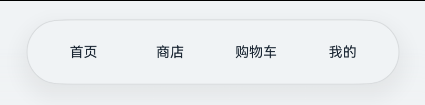
三、底部悬浮导航
导航是应用的骨架。我们选用 HdsTabs 组件来做底部悬浮页签。
3.1 为什么用 HdsTabs
从 API 23开始,官方提供了 HdsTabs 组件,它天然支持:
- 底部悬浮样式(
barOverlap)。 - 沉浸光感材质(
systemMaterialEffect)。 - 迷你栏(
miniBar)。
不需要自己写复杂的 Stack 叠加布局,一行配置就能开启。
3.2 导入模块
在 Index.ets 顶部导入:
import { HdsTabs, HdsTabsController, hdsMaterial } from '@kit.UIDesignKit';
三个东西各有用处:
| 导入 | 作用 |
|---|---|
HdsTabs |
页签容器组件 |
HdsTabsController |
控制器,用来编程式切换页签 |
hdsMaterial |
沉浸光感材质的枚举参数 |
3.3 初始化控制器
@Entry
@Component
struct Index {
  private controller: HdsTabsController = new HdsTabsController();
  // ...
}
HdsTabsController 在后面如果需要编程式跳转页签时会用到。
3.4 页签内容组件
我们有 4 个底部页签,每个页面对应一个独立组件文件:
-
HomePage— 首页 -
ShopPage— 商店 -
CartPage— 购物车 -
ProfilePage— 我的
每个页面当前都是占位状态,统一使用 PagePlaceholder 组件展示标题和提示文案。
来看一下 PagePlaceholder 的实现:
@Component
export struct PagePlaceholder {
  @Prop pageTitle: ResourceStr = '';
  @Prop tipText: ResourceStr = $r('app.string.placeholder_tip');

  build() {
    Column() {
      Text(this.pageTitle)
        .fontSize($r('app.float.title_font_size'))
        .fontWeight(FontWeight.Bold)
        .fontColor($r('app.color.text_primary'))
        .margin({ top: 64, bottom: 16 })

      Text(this.tipText)
        .fontSize($r('app.float.placeholder_font_size'))
        .fontColor($r('app.color.text_secondary'))
    }
    .width('100%')
    .height('100%')
    .backgroundColor($r('app.color.page_background'))
    .justifyContent(FlexAlign.Start)
    .alignItems(HorizontalAlign.Center)
  }
}
几个细节:
@Prop pageTitle: ResourceStr:类型用ResourceStr而不是string,因为$r('app.string.xxx')返回的是Resource类型,不能直接赋给string。ResourceStr = string | Resource,两者都能接收。- 所有颜色和字号都走资源文件:
$r('app.color.xxx')、$r('app.float.xxx'),深色模式自动适配。 @Prop的默认值:tipText给了默认值$r('app.string.placeholder_tip'),调用方可以不传。
5 个页面组件则各自引用 PagePlaceholder,例如 HomePage:
import { PagePlaceholder } from '../components/PagePlaceholder';

@Component
export struct HomePage {
  build() {
    Column() {
      PagePlaceholder({ pageTitle: $r('app.string.page_home_title') })
    }
    .width('100%')
    .height('100%')
  }
}
其他 4 个页面结构完全相同,只是传入的 pageTitle 不同。
3.5 自定义页签栏
底部页签栏需要展示文字,我们通过 @Builder 自定义:
@Builder
tabBuilder(text: ResourceStr, index: number) {
  Column() {
    Text(text)
      .fontSize($r('app.float.tab_font_size'))
      .fontColor($r('app.color.text_primary'))
  }
  .width('100%')
  .height('100%')
  .justifyContent(FlexAlign.Center)
  .onClick(() => {
    this.controller.changeIndex(index);
  })
}
这里没有用系统图标,我们先只展示文字。后续可以替换为图标。
3.6 组装 HdsTabs
这是 Index.ets 的核心构建方法:
build() {
  Column() {
    HdsTabs({ controller: this.controller }) {
      TabContent() {
        HomePage()
      }
      .tabBar(this.tabBuilder($r('app.string.tab_home'), 0))

      TabContent() {
        ShopPage()
      }
      .tabBar(this.tabBuilder($r('app.string.tab_shop'), 1))

      TabContent() {
        CartPage()
      }
      .tabBar(this.tabBuilder($r('app.string.tab_cart'), 2))

      TabContent() {
        ProfilePage()
      }
      .tabBar(this.tabBuilder($r('app.string.tab_profile'), 3))
    }
    .barOverlap(true)
    .barPosition(BarPosition.End)
    .vertical(false)
    .barFloatingStyle({
      barWidth: { smallWidth: 320, mediumWidth: 360, largeWidth: 420 },
      barBottomMargin: 28,
      systemMaterialEffect: {
        materialType: hdsMaterial.MaterialType.IMMERSIVE,
        materialLevel: hdsMaterial.MaterialLevel.ADAPTIVE
      }
    })
  }
  .width('100%')
  .height('100%')
  .backgroundColor($r('app.color.page_background'))
}
3.7 关键属性说明
布局相关:
.barOverlap(true)            // 页签栏悬浮于内容之上
.barPosition(BarPosition.End) // 页签栏放在底部
.vertical(false)              // 横向页签
这三个是悬浮底部页签的基础配置,缺一不可。
悬浮样式 barFloatingStyle:
.barFloatingStyle({
  barWidth: { smallWidth: 320, mediumWidth: 360, largeWidth: 420 },
  barBottomMargin: 28,
  systemMaterialEffect: {
    materialType: hdsMaterial.MaterialType.IMMERSIVE,
    materialLevel: hdsMaterial.MaterialLevel.ADAPTIVE
  }
})
各参数含义:
| 参数 | 作用 |
|---|---|
barWidth |
页签栏分档宽度,适配不同屏幕尺寸 |
barBottomMargin |
页签栏距离容器底部的间距 |
systemMaterialEffect |
沉浸光感材质效果 |
沉浸光感 systemMaterialEffect:
systemMaterialEffect: {
  materialType: hdsMaterial.MaterialType.IMMERSIVE,
  materialLevel: hdsMaterial.MaterialLevel.ADAPTIVE
}
IMMERSIVE 是沉浸式材质,ADAPTIVE 让材质等级由系统自适应。如果设备不支持沉浸式,可以降级为 SMOOTH,不过这里我们先用 ADAPTIVE 交给系统处理。
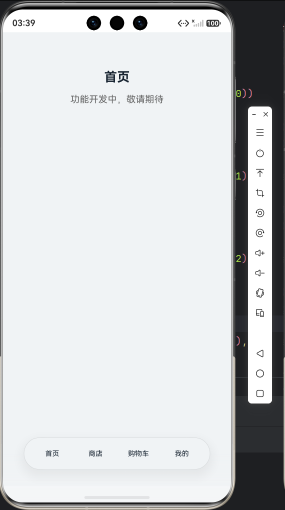
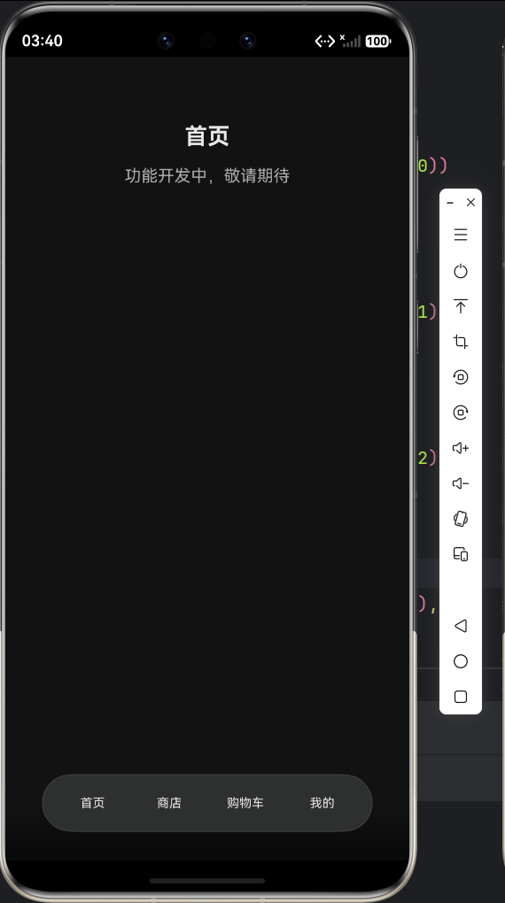
四、最终效果
到这步为止,应用已经有了:
- 完整的项目结构:页面组件分离、公共组件抽离、资源文件分深浅色两套。
- 深色模式适配:所有颜色通过
$r('app.color.xxx')引用,跟随系统自动切换。 - 底部悬浮导航:4 个页签,悬浮在内容之上,带有沉浸光感材质效果。
目前 4 个页面的内容都是占位状态。
以上就是第一篇文章的全部内容。代码全部来自我们的宠物商店项目,后续每实现一个功能模块,都会对应一篇教程文章,从零讲清楚实现思路和关键细节。

讨论HarmonyOS开发技术,专注于API与组件、DevEco Studio、测试、元服务和应用上架分发等。
更多推荐

 0
0 0
0- 0


 已为社区贡献16条内容

所有评论(0)