ReactNative项目OpenHarmony三方库集成实战:react-native-vector-icons
欢迎加入开源鸿蒙跨平台社区:https://openharmonycrossplatform.csdn.net
项目基于 RN 0.72.90 开发
📋 前言
图标是UI设计中不可或缺的元素。react-native-vector-icons 是 React Native 生态中最流行的图标库,提供了丰富的图标集和自定义字体支持,能够满足绝大多数应用的图标需求。
🎯 库简介
基本信息
- 库名称:
react-native-vector-icons - 版本信息:
10.0.3支持 RN 0.72 版本,10.2.0支持 RN 0.77 版本 - 官方仓库: https://github.com/oblador/react-native-vector-icons
- 图标预览: https://oblador.github.io/react-native-vector-icons/
- 主要功能:
- 🎨 15+ 内置图标集
- 📦 10000+ 图标
- 🔧 自定义字体支持
- 🎯 Button 组件
- 📱 跨平台支持(iOS、Android、HarmonyOS)
内置图标集
| 图标集 | 图标数量 | 说明 |
|---|---|---|
| AntDesign | 298 | Ant Design 图标 |
| Entypo | 411 | Entypo 图标集 |
| EvilIcons | 70 | 简约风格图标 |
| Feather | 286 | 线性图标 |
| FontAwesome | 675 | 经典图标集 |
| FontAwesome5 | 1598 (free) | FontAwesome 5 版本 |
| FontAwesome6 | 2016 (free) | FontAwesome 6 版本 |
| Fontisto | 615 | Fontisto 图标 |
| Foundation | 283 | Foundation 图标 |
| Ionicons | 1338 | Ionic 图标集 |
| MaterialIcons | 2189 | Google Material 图标 |
| MaterialCommunityIcons | 6596 | Material Design 图标 |
| Octicons | 250 | GitHub 图标 |
| Zocial | 100 | 社交图标 |
| SimpleLineIcons | 189 | 简约线条图标 |
为什么选择这个库?
| 特性 | 原生方案 | react-native-vector-icons |
|---|---|---|
| 图标数量 | ⚠️ 有限 | ✅ 10000+ |
| 跨平台一致性 | ⚠️ 差异大 | ✅ 统一效果 |
| 自定义字体 | ⚠️ 复杂 | ✅ 简单配置 |
| 图标按钮 | ⚠️ 需自行实现 | ✅ 内置 Button 组件 |
| HarmonyOS 支持 | ⚠️ 需适配 | ✅ 完善适配 |
兼容性验证
在以下环境验证通过:
- RNOH: 0.72.33; SDK: OpenHarmony 5.0.0.71; IDE: DevEco Studio 5.0.3.900; ROM: NEXT.0.0.71
- RNOH: 0.77.18; SDK: HarmonyOS 6.0.0.47; IDE: DevEco Studio 6.0.0.858; ROM: 6.0.0.107
📦 安装步骤
1. 安装依赖
# RN 0.72 版本
npm install react-native-vector-icons@10.0.3

# RN 0.77 版本
npm install react-native-vector-icons@10.2.0

# 或者使用 yarn
yarn add react-native-vector-icons
2. 验证安装
安装完成后,检查 package.json 文件:
{
  "dependencies": {
    "react-native-vector-icons": "^10.0.3"
  }
}
🔧 HarmonyOS 平台配置 ⭐
重要提示
⚠️ HarmonyOS 暂不支持 AutoLink,需要手动配置字体文件。
⚠️ 请使用 API 11 及以上版本,低版本会导致 font 注册不成功,图标显示不出来。
1. 复制字体文件
将 node_modules/react-native-vector-icons/Fonts 目录下的字体文件复制到 entry/src/main/resources/rawfile/fonts 目录下。
需要复制的字体文件:
AntDesign.ttf
Entypo.ttf
EvilIcons.ttf
Feather.ttf
FontAwesome.ttf
FontAwesome5_Brands.ttf
FontAwesome5_Regular.ttf
FontAwesome5_Solid.ttf
FontAwesome6_Brands.ttf
FontAwesome6_Regular.ttf
FontAwesome6_Solid.ttf
Fontisto.ttf
Foundation.ttf
Ionicons.ttf
MaterialCommunityIcons.ttf
MaterialIcons.ttf
Octicons.ttf
SimpleLineIcons.ttf
Zocial.ttf
2. 注册字体文件
打开 entry/src/main/ets/pages/Index.ets,在 RNApp 组件中注册字体: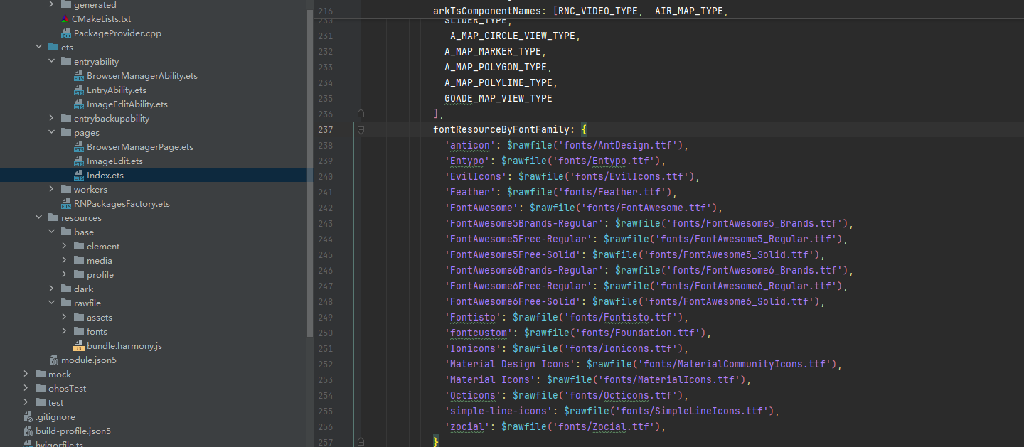
RNApp({
  rnInstanceConfig: {
    fontResourceByFontFamily: {
      'anticon': $rawfile('fonts/AntDesign.ttf'),
      'Entypo': $rawfile('fonts/Entypo.ttf'),
      'EvilIcons': $rawfile('fonts/EvilIcons.ttf'),
      'Feather': $rawfile('fonts/Feather.ttf'),
      'FontAwesome': $rawfile('fonts/FontAwesome.ttf'),
      'FontAwesome5Brands-Regular': $rawfile('fonts/FontAwesome5_Brands.ttf'),
      'FontAwesome5Free-Regular': $rawfile('fonts/FontAwesome5_Regular.ttf'),
      'FontAwesome5Free-Solid': $rawfile('fonts/FontAwesome5_Solid.ttf'),
      'FontAwesome6Brands-Regular': $rawfile('fonts/FontAwesome6_Brands.ttf'),
      'FontAwesome6Free-Regular': $rawfile('fonts/FontAwesome6_Regular.ttf'),
      'FontAwesome6Free-Solid': $rawfile('fonts/FontAwesome6_Solid.ttf'),
      'Fontisto': $rawfile('fonts/Fontisto.ttf'),
      'fontcustom': $rawfile('fonts/Foundation.ttf'),
      'Ionicons': $rawfile('fonts/Ionicons.ttf'),
      'Material Design Icons': $rawfile('fonts/MaterialCommunityIcons.ttf'),
      'Material Icons': $rawfile('fonts/MaterialIcons.ttf'),
      'Octicons': $rawfile('fonts/Octicons.ttf'),
      'simple-line-icons': $rawfile('fonts/SimpleLineIcons.ttf'),
      'zocial': $rawfile('fonts/Zocial.ttf'),
    }
    // ...
  }
})
📖 API 详解
基本用法
import FontAwesome from 'react-native-vector-icons/FontAwesome';

<FontAwesome name="glass" size={20} color="#4F8EF7" />
图标组件属性
| 属性 | 类型 | 必填 | 说明 | HarmonyOS 支持 |
|---|---|---|---|---|
| name | string | 是 | 图标名称 | ✅ |
| size | number | 否 | 图标尺寸,默认 12 | ✅ |
| color | string | 否 | 图标颜色 | ✅ |
Button 组件
每个图标集都提供一个 Button 组件,方便创建带图标的按钮。
import FontAwesome from 'react-native-vector-icons/FontAwesome';

<FontAwesome.Button
  name="facebook"
  backgroundColor="#3b5998"
  onPress={handlePress}
>
  Login with Facebook
</FontAwesome.Button>
Button 属性:
| 属性 | 类型 | 说明 |
|---|---|---|
| name | string | 图标名称 |
| size | number | 图标尺寸 |
| color | string | 图标颜色 |
| backgroundColor | string | 按钮背景色 |
| borderRadius | number | 圆角 |
| onPress | function | 点击回调 |
各图标集使用示例
AntDesign
import AntDesign from 'react-native-vector-icons/AntDesign';

<AntDesign name="stepforward" size={30} color="#900" />
<AntDesign name="forward" size={30} color="#900" />
Entypo
import Entypo from 'react-native-vector-icons/Entypo';

<Entypo name="code" size={30} color="#900" />
<Entypo name="github" size={30} color="#900" />
Feather
import Feather from 'react-native-vector-icons/Feather';

<Feather name="activity" size={30} color="#900" />
<Feather name="heart" size={30} color="#900" />
FontAwesome
import FontAwesome from 'react-native-vector-icons/FontAwesome';

<FontAwesome name="glass" size={30} color="#900" />
<FontAwesome name="heart" size={30} color="#900" />
FontAwesome5
import FontAwesome5 from 'react-native-vector-icons/FontAwesome5';

<FontAwesome5 name="angry" size={30} color="#900" />
<FontAwesome5 name="adn" size={30} color="#900" brand />
<FontAwesome5 name="ad" size={30} color="#900" solid />
FontAwesome6
import FontAwesome6 from 'react-native-vector-icons/FontAwesome6';

<FontAwesome6 name="bookmark" size={30} color="#900" />
<FontAwesome6 name="adn" size={30} color="#900" brand />
<FontAwesome6 name="apple-whole" size={30} color="#900" solid />
Ionicons
import Ionicons from 'react-native-vector-icons/Ionicons';

<Ionicons name="md-checkmark-circle" size={30} color="#900" />
<Ionicons name="ios-heart" size={30} color="#900" />
MaterialIcons
import MaterialIcons from 'react-native-vector-icons/MaterialIcons';

<MaterialIcons name="airplay" size={30} color="#900" />
<MaterialIcons name="favorite" size={30} color="#900" />
MaterialCommunityIcons
import MaterialCommunityIcons from 'react-native-vector-icons/MaterialCommunityIcons';

<MaterialCommunityIcons name="account" size={30} color="#900" />
<MaterialCommunityIcons name="heart" size={30} color="#900" />
自定义字体
1. 使用 createIconSet
适用于用户自制的字体文件:
import { createIconSet } from 'react-native-vector-icons';

const CustomIcon = createIconSet(
  require('../assets/fonts/test.json'),
  'poppy-icon',
  '../assets/fonts/test.ttf'
);

<CustomIcon name="application-record" size={30} color="#900" />
2. 使用 Fontello 字体
从 fontello.com 下载字体:
import { createIconSetFromFontello } from 'react-native-vector-icons';
import fontelloConfig from '../assets/fonts/config.json';

const CustomFontello = createIconSetFromFontello(
  fontelloConfig,
  'fontello',
  '../assets/fonts/fontello.ttf'
);

<CustomFontello name="emo-happy" size={30} color="#900" />
3. 使用 IcoMoon 字体
从 icomoon.io 下载字体:
import { createIconSetFromIcoMoon } from 'react-native-vector-icons';
import icoMoonConfig from '../assets/fonts/selection.json';

const CustomIconMoon = createIconSetFromIcoMoon(
  icoMoonConfig,
  'icomoon',
  '../assets/fonts/icomoon.ttf'
);

<CustomIconMoon name="home2" size={30} color="#900" />
注册自定义字体
自定义字体也需要在 Index.ets 中注册:
RNApp({
  rnInstanceConfig: {
    fontResourceByFontFamily: {
      // ... 内置字体
      'icomoon': $rawfile('fonts/icomoon.ttf'),
      'fontello': $rawfile('fonts/fontello.ttf'),
      'poppy-icon': $rawfile('fonts/test.ttf'),
    }
  }
})
📋 完整示例
import React from 'react';
import {
View,
Text,
StyleSheet,
ScrollView,
SafeAreaView,
StatusBar,
TouchableOpacity,
Alert,
} from 'react-native';
import AntDesign from 'react-native-vector-icons/AntDesign';
import Entypo from 'react-native-vector-icons/Entypo';
import Feather from 'react-native-vector-icons/Feather';
import FontAwesome from 'react-native-vector-icons/FontAwesome';
import FontAwesome5 from 'react-native-vector-icons/FontAwesome5';
import FontAwesome6 from 'react-native-vector-icons/FontAwesome6';
import Ionicons from 'react-native-vector-icons/Ionicons';
import MaterialIcons from 'react-native-vector-icons/MaterialIcons';
import MaterialCommunityIcons from 'react-native-vector-icons/MaterialCommunityIcons';
import Octicons from 'react-native-vector-icons/Octicons';
import SimpleLineIcons from 'react-native-vector-icons/SimpleLineIcons';
const App: React.FC = () => {
const handlePress = (iconName: string) => {
Alert.alert('提示', `点击了 ${iconName} 图标`);
};
return (
<SafeAreaView style={styles.container}>
<StatusBar barStyle="dark-content" backgroundColor="#FFFFFF" />
<View style={styles.header}>
<Text style={styles.headerTitle}>图标库演示</Text>
</View>
<ScrollView style={styles.content}>
<View style={styles.section}>
<Text style={styles.sectionTitle}>AntDesign</Text>
<View style={styles.iconRow}>
<TouchableOpacity onPress={() => handlePress('stepforward')}>
<AntDesign name="stepforward" size={32} color="#007AFF" />
</TouchableOpacity>
<TouchableOpacity onPress={() => handlePress('forward')}>
<AntDesign name="forward" size={32} color="#34C759" />
</TouchableOpacity>
<TouchableOpacity onPress={() => handlePress('backward')}>
<AntDesign name="backward" size={32} color="#FF9500" />
</TouchableOpacity>
<TouchableOpacity onPress={() => handlePress('setting')}>
<AntDesign name="setting" size={32} color="#FF3B30" />
</TouchableOpacity>
</View>
</View>
<View style={styles.section}>
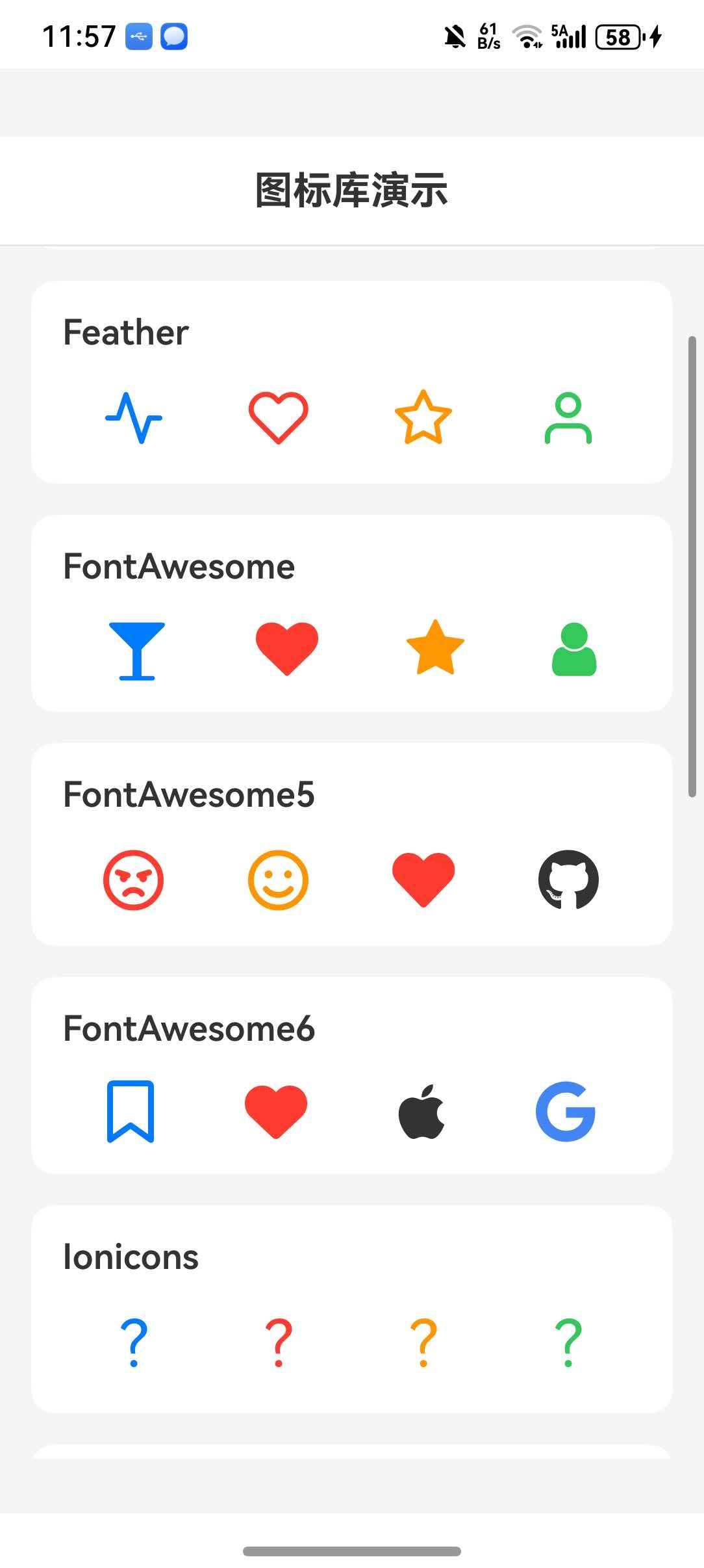
<Text style={styles.sectionTitle}>Feather</Text>
<View style={styles.iconRow}>
<Feather name="activity" size={32} color="#007AFF" />
<Feather name="heart" size={32} color="#FF3B30" />
<Feather name="star" size={32} color="#FF9500" />
<Feather name="user" size={32} color="#34C759" />
</View>
</View>
<View style={styles.section}>
<Text style={styles.sectionTitle}>FontAwesome</Text>
<View style={styles.iconRow}>
<FontAwesome name="glass" size={32} color="#007AFF" />
<FontAwesome name="heart" size={32} color="#FF3B30" />
<FontAwesome name="star" size={32} color="#FF9500" />
<FontAwesome name="user" size={32} color="#34C759" />
</View>
</View>
<View style={styles.section}>
<Text style={styles.sectionTitle}>FontAwesome5</Text>
<View style={styles.iconRow}>
<FontAwesome5 name="angry" size={32} color="#FF3B30" />
<FontAwesome5 name="smile" size={32} color="#FF9500" />
<FontAwesome5 name="heart" size={32} color="#FF3B30" solid />
<FontAwesome5 name="github" size={32} color="#333" brand />
</View>
</View>
<View style={styles.section}>
<Text style={styles.sectionTitle}>FontAwesome6</Text>
<View style={styles.iconRow}>
<FontAwesome6 name="bookmark" size={32} color="#007AFF" />
<FontAwesome6 name="heart" size={32} color="#FF3B30" solid />
<FontAwesome6 name="apple" size={32} color="#333" brand />
<FontAwesome6 name="google" size={32} color="#4285F4" brand />
</View>
</View>
<View style={styles.section}>
<Text style={styles.sectionTitle}>Ionicons</Text>
<View style={styles.iconRow}>
<Ionicons name="md-home" size={32} color="#007AFF" />
<Ionicons name="md-heart" size={32} color="#FF3B30" />
<Ionicons name="md-star" size={32} color="#FF9500" />
<Ionicons name="md-person" size={32} color="#34C759" />
</View>
</View>
<View style={styles.section}>
<Text style={styles.sectionTitle}>MaterialIcons</Text>
<View style={styles.iconRow}>
<MaterialIcons name="home" size={32} color="#007AFF" />
<MaterialIcons name="favorite" size={32} color="#FF3B30" />
<MaterialIcons name="star" size={32} color="#FF9500" />
<MaterialIcons name="person" size={32} color="#34C759" />
</View>
</View>
<View style={styles.section}>
<Text style={styles.sectionTitle}>MaterialCommunityIcons</Text>
<View style={styles.iconRow}>
<MaterialCommunityIcons name="home" size={32} color="#007AFF" />
<MaterialCommunityIcons name="heart" size={32} color="#FF3B30" />
<MaterialCommunityIcons name="star" size={32} color="#FF9500" />
<MaterialCommunityIcons name="account" size={32} color="#34C759" />
</View>
</View>
<View style={styles.section}>
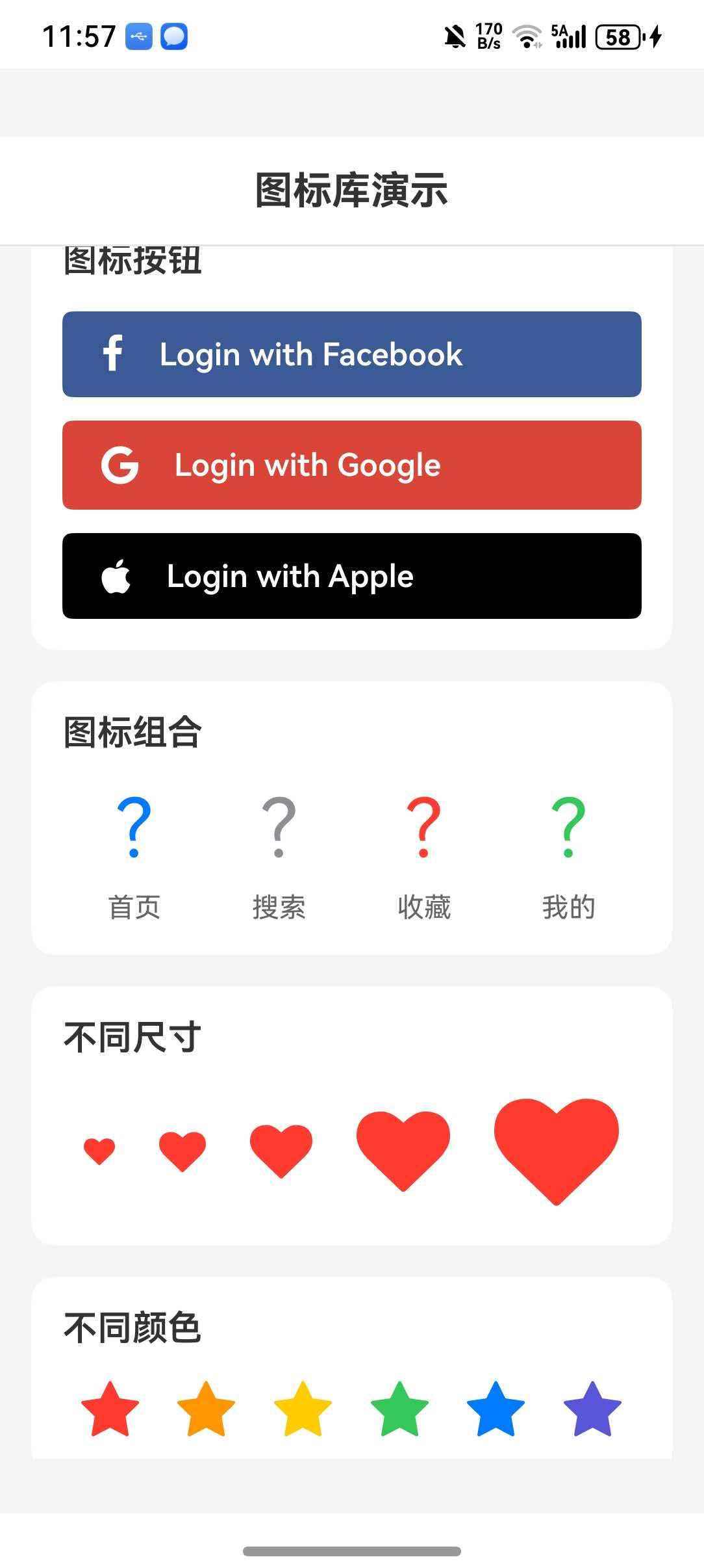
<Text style={styles.sectionTitle}>图标按钮</Text>
<FontAwesome.Button
name="facebook"
backgroundColor="#3b5998"
style={styles.button}
onPress={() => handlePress('Facebook')}
>
<Text style={styles.buttonText}>Login with Facebook</Text>
</FontAwesome.Button>
<View style={{ height: 12 }} />
<FontAwesome5.Button
name="google"
backgroundColor="#DB4437"
brand
style={styles.button}
onPress={() => handlePress('Google')}
>
<Text style={styles.buttonText}>Login with Google</Text>
</FontAwesome5.Button>
<View style={{ height: 12 }} />
<FontAwesome6.Button
name="apple"
backgroundColor="#000000"
brand
style={styles.button}
onPress={() => handlePress('Apple')}
>
<Text style={styles.buttonText}>Login with Apple</Text>
</FontAwesome6.Button>
</View>
<View style={styles.section}>
<Text style={styles.sectionTitle}>图标组合</Text>
<View style={styles.combinedRow}>
<View style={styles.iconWithLabel}>
<Ionicons name="md-home" size={40} color="#007AFF" />
<Text style={styles.label}>首页</Text>
</View>
<View style={styles.iconWithLabel}>
<Ionicons name="md-search" size={40} color="#8E8E93" />
<Text style={styles.label}>搜索</Text>
</View>
<View style={styles.iconWithLabel}>
<Ionicons name="md-heart" size={40} color="#FF3B30" />
<Text style={styles.label}>收藏</Text>
</View>
<View style={styles.iconWithLabel}>
<Ionicons name="md-person" size={40} color="#34C759" />
<Text style={styles.label}>我的</Text>
</View>
</View>
</View>
<View style={styles.section}>
<Text style={styles.sectionTitle}>不同尺寸</Text>
<View style={styles.sizeRow}>
<FontAwesome name="heart" size={16} color="#FF3B30" />
<FontAwesome name="heart" size={24} color="#FF3B30" />
<FontAwesome name="heart" size={32} color="#FF3B30" />
<FontAwesome name="heart" size={48} color="#FF3B30" />
<FontAwesome name="heart" size={64} color="#FF3B30" />
</View>
</View>
<View style={styles.section}>
<Text style={styles.sectionTitle}>不同颜色</Text>
<View style={styles.colorRow}>
<FontAwesome name="star" size={32} color="#FF3B30" />
<FontAwesome name="star" size={32} color="#FF9500" />
<FontAwesome name="star" size={32} color="#FFCC00" />
<FontAwesome name="star" size={32} color="#34C759" />
<FontAwesome name="star" size={32} color="#007AFF" />
<FontAwesome name="star" size={32} color="#5856D6" />
</View>
</View>
</ScrollView>
</SafeAreaView>
);
};
const styles = StyleSheet.create({
container: {
flex: 1,
backgroundColor: '#F5F5F5',
},
header: {
flexDirection: 'row',
alignItems: 'center',
justifyContent: 'center',
padding: 16,
backgroundColor: '#FFFFFF',
borderBottomWidth: 1,
borderBottomColor: '#E5E5EA',
},
headerTitle: {
fontSize: 20,
fontWeight: '700',
color: '#333333',
},
content: {
flex: 1,
padding: 16,
},
section: {
backgroundColor: '#FFFFFF',
borderRadius: 12,
padding: 16,
marginBottom: 16,
},
sectionTitle: {
fontSize: 18,
fontWeight: '600',
color: '#333333',
marginBottom: 16,
},
iconRow: {
flexDirection: 'row',
justifyContent: 'space-around',
alignItems: 'center',
},
sizeRow: {
flexDirection: 'row',
justifyContent: 'space-around',
alignItems: 'center',
},
colorRow: {
flexDirection: 'row',
justifyContent: 'space-around',
alignItems: 'center',
flexWrap: 'wrap',
},
button: {
paddingVertical: 12,
paddingHorizontal: 20,
},
buttonText: {
color: '#FFFFFF',
fontSize: 16,
fontWeight: '600',
marginLeft: 8,
},
combinedRow: {
flexDirection: 'row',
justifyContent: 'space-around',
alignItems: 'center',
},
iconWithLabel: {
alignItems: 'center',
},
label: {
marginTop: 8,
fontSize: 14,
color: '#666666',
},
});
export default App;
⚠️ 注意事项
1. 字体文件必须存在
确保字体文件已正确复制到 entry/src/main/resources/rawfile/fonts 目录下,否则图标无法正常显示。
2. API 版本要求
请使用 API 11 及以上版本,低版本会导致 font 注册不成功。
3. 字体名称映射
不同图标集的字体名称不同,注册时需要使用正确的名称:
| 图标集 | 字体名称 |
|---|---|
| AntDesign | anticon |
| Entypo | Entypo |
| Feather | Feather |
| FontAwesome | FontAwesome |
| FontAwesome5 | FontAwesome5Free-Regular / FontAwesome5Free-Solid / FontAwesome5Brands-Regular |
| FontAwesome6 | FontAwesome6Free-Regular / FontAwesome6Free-Solid / FontAwesome6Brands-Regular |
| Ionicons | Ionicons |
| MaterialIcons | Material Icons |
| MaterialCommunityIcons | Material Design Icons |
4. 不支持的 API
以下 API 在 HarmonyOS 上暂不支持:
| API | 说明 |
|---|---|
| getImageSource | 将字体绘制为 Bitmap |
| getImageSourceSync | 同步将字体绘制为 Bitmap |
5. 图标名称查找
使用前请在 图标预览网站 查找正确的图标名称。
6. 自定义字体配置
使用自定义字体时,需要同时准备 .ttf 和 .json 文件:
.ttf文件:字体文件.json文件:图标名称与 Unicode 的映射关系
7. Button 组件样式
Button 组件支持自定义样式:
<FontAwesome.Button
  name="heart"
  backgroundColor="#FF3B30"
  borderRadius={20}
  style={{ paddingVertical: 10, paddingHorizontal: 20 }}
>
  Favorite
</FontAwesome.Button>
8. TypeScript 类型声明
如果使用 TypeScript 开发,需要添加类型声明文件。在项目中创建 src/types/react-native-vector-icons.d.ts 文件:
declare module 'react-native-vector-icons' {
  import { ComponentClass } from 'react';
  import { ViewStyle, TextStyle } from 'react-native';

  interface IconProps {
    name: string;
    size?: number;
    color?: string;
    style?: ViewStyle | TextStyle;
  }

  interface IconButtonProps {
    name: string;
    size?: number;
    color?: string;
    backgroundColor?: string;
    borderRadius?: number;
    style?: ViewStyle;
    onPress?: () => void;
    children?: React.ReactNode;
  }

  interface IconComponent extends ComponentClass<IconProps> {
    Button: ComponentClass<IconButtonProps>;
  }

  function createIconSet(glyphMap: any, fontFamily: string, fontFile?: string): IconComponent;
  function createIconSetFromFontello(config: any, fontFamily?: string, fontFile?: string): IconComponent;
  function createIconSetFromIcoMoon(config: any, fontFamily?: string, fontFile?: string): IconComponent;
}

declare module 'react-native-vector-icons/AntDesign' {
  import { ComponentClass } from 'react';
  import { ViewStyle, TextStyle } from 'react-native';
  interface IconProps { name: string; size?: number; color?: string; style?: ViewStyle | TextStyle; }
  interface IconButtonProps { name: string; size?: number; color?: string; backgroundColor?: string; borderRadius?: number; style?: ViewStyle; onPress?: () => void; children?: React.ReactNode; }
  const Icon: ComponentClass<IconProps> & { Button: ComponentClass<IconButtonProps> };
  export default Icon;
}

declare module 'react-native-vector-icons/Entypo' {
  import { ComponentClass } from 'react';
  import { ViewStyle, TextStyle } from 'react-native';
  interface IconProps { name: string; size?: number; color?: string; style?: ViewStyle | TextStyle; }
  interface IconButtonProps { name: string; size?: number; color?: string; backgroundColor?: string; borderRadius?: number; style?: ViewStyle; onPress?: () => void; children?: React.ReactNode; }
  const Icon: ComponentClass<IconProps> & { Button: ComponentClass<IconButtonProps> };
  export default Icon;
}

declare module 'react-native-vector-icons/EvilIcons' {
  import { ComponentClass } from 'react';
  import { ViewStyle, TextStyle } from 'react-native';
  interface IconProps { name: string; size?: number; color?: string; style?: ViewStyle | TextStyle; }
  interface IconButtonProps { name: string; size?: number; color?: string; backgroundColor?: string; borderRadius?: number; style?: ViewStyle; onPress?: () => void; children?: React.ReactNode; }
  const Icon: ComponentClass<IconProps> & { Button: ComponentClass<IconButtonProps> };
  export default Icon;
}

declare module 'react-native-vector-icons/Feather' {
  import { ComponentClass } from 'react';
  import { ViewStyle, TextStyle } from 'react-native';
  interface IconProps { name: string; size?: number; color?: string; style?: ViewStyle | TextStyle; }
  interface IconButtonProps { name: string; size?: number; color?: string; backgroundColor?: string; borderRadius?: number; style?: ViewStyle; onPress?: () => void; children?: React.ReactNode; }
  const Icon: ComponentClass<IconProps> & { Button: ComponentClass<IconButtonProps> };
  export default Icon;
}

declare module 'react-native-vector-icons/FontAwesome' {
  import { ComponentClass } from 'react';
  import { ViewStyle, TextStyle } from 'react-native';
  interface IconProps { name: string; size?: number; color?: string; style?: ViewStyle | TextStyle; }
  interface IconButtonProps { name: string; size?: number; color?: string; backgroundColor?: string; borderRadius?: number; style?: ViewStyle; onPress?: () => void; children?: React.ReactNode; }
  const Icon: ComponentClass<IconProps> & { Button: ComponentClass<IconButtonProps> };
  export default Icon;
}

declare module 'react-native-vector-icons/FontAwesome5' {
  import { ComponentClass } from 'react';
  import { ViewStyle, TextStyle } from 'react-native';
  interface IconProps { name: string; size?: number; color?: string; brand?: boolean; solid?: boolean; style?: ViewStyle | TextStyle; }
  interface IconButtonProps { name: string; size?: number; color?: string; brand?: boolean; solid?: boolean; backgroundColor?: string; borderRadius?: number; style?: ViewStyle; onPress?: () => void; children?: React.ReactNode; }
  const Icon: ComponentClass<IconProps> & { Button: ComponentClass<IconButtonProps> };
  export default Icon;
}

declare module 'react-native-vector-icons/FontAwesome6' {
  import { ComponentClass } from 'react';
  import { ViewStyle, TextStyle } from 'react-native';
  interface IconProps { name: string; size?: number; color?: string; brand?: boolean; solid?: boolean; style?: ViewStyle | TextStyle; }
  interface IconButtonProps { name: string; size?: number; color?: string; brand?: boolean; solid?: boolean; backgroundColor?: string; borderRadius?: number; style?: ViewStyle; onPress?: () => void; children?: React.ReactNode; }
  const Icon: ComponentClass<IconProps> & { Button: ComponentClass<IconButtonProps> };
  export default Icon;
}

declare module 'react-native-vector-icons/Fontisto' {
  import { ComponentClass } from 'react';
  import { ViewStyle, TextStyle } from 'react-native';
  interface IconProps { name: string; size?: number; color?: string; style?: ViewStyle | TextStyle; }
  interface IconButtonProps { name: string; size?: number; color?: string; backgroundColor?: string; borderRadius?: number; style?: ViewStyle; onPress?: () => void; children?: React.ReactNode; }
  const Icon: ComponentClass<IconProps> & { Button: ComponentClass<IconButtonProps> };
  export default Icon;
}

declare module 'react-native-vector-icons/Foundation' {
  import { ComponentClass } from 'react';
  import { ViewStyle, TextStyle } from 'react-native';
  interface IconProps { name: string; size?: number; color?: string; style?: ViewStyle | TextStyle; }
  interface IconButtonProps { name: string; size?: number; color?: string; backgroundColor?: string; borderRadius?: number; style?: ViewStyle; onPress?: () => void; children?: React.ReactNode; }
  const Icon: ComponentClass<IconProps> & { Button: ComponentClass<IconButtonProps> };
  export default Icon;
}

declare module 'react-native-vector-icons/Ionicons' {
  import { ComponentClass } from 'react';
  import { ViewStyle, TextStyle } from 'react-native';
  interface IconProps { name: string; size?: number; color?: string; style?: ViewStyle | TextStyle; }
  interface IconButtonProps { name: string; size?: number; color?: string; backgroundColor?: string; borderRadius?: number; style?: ViewStyle; onPress?: () => void; children?: React.ReactNode; }
  const Icon: ComponentClass<IconProps> & { Button: ComponentClass<IconButtonProps> };
  export default Icon;
}

declare module 'react-native-vector-icons/MaterialCommunityIcons' {
  import { ComponentClass } from 'react';
  import { ViewStyle, TextStyle } from 'react-native';
  interface IconProps { name: string; size?: number; color?: string; style?: ViewStyle | TextStyle; }
  interface IconButtonProps { name: string; size?: number; color?: string; backgroundColor?: string; borderRadius?: number; style?: ViewStyle; onPress?: () => void; children?: React.ReactNode; }
  const Icon: ComponentClass<IconProps> & { Button: ComponentClass<IconButtonProps> };
  export default Icon;
}

declare module 'react-native-vector-icons/MaterialIcons' {
  import { ComponentClass } from 'react';
  import { ViewStyle, TextStyle } from 'react-native';
  interface IconProps { name: string; size?: number; color?: string; style?: ViewStyle | TextStyle; }
  interface IconButtonProps { name: string; size?: number; color?: string; backgroundColor?: string; borderRadius?: number; style?: ViewStyle; onPress?: () => void; children?: React.ReactNode; }
  const Icon: ComponentClass<IconProps> & { Button: ComponentClass<IconButtonProps> };
  export default Icon;
}

declare module 'react-native-vector-icons/Octicons' {
  import { ComponentClass } from 'react';
  import { ViewStyle, TextStyle } from 'react-native';
  interface IconProps { name: string; size?: number; color?: string; style?: ViewStyle | TextStyle; }
  interface IconButtonProps { name: string; size?: number; color?: string; backgroundColor?: string; borderRadius?: number; style?: ViewStyle; onPress?: () => void; children?: React.ReactNode; }
  const Icon: ComponentClass<IconProps> & { Button: ComponentClass<IconButtonProps> };
  export default Icon;
}

declare module 'react-native-vector-icons/SimpleLineIcons' {
  import { ComponentClass } from 'react';
  import { ViewStyle, TextStyle } from 'react-native';
  interface IconProps { name: string; size?: number; color?: string; style?: ViewStyle | TextStyle; }
  interface IconButtonProps { name: string; size?: number; color?: string; backgroundColor?: string; borderRadius?: number; style?: ViewStyle; onPress?: () => void; children?: React.ReactNode; }
  const Icon: ComponentClass<IconProps> & { Button: ComponentClass<IconButtonProps> };
  export default Icon;
}

declare module 'react-native-vector-icons/Zocial' {
  import { ComponentClass } from 'react';
  import { ViewStyle, TextStyle } from 'react-native';
  interface IconProps { name: string; size?: number; color?: string; style?: ViewStyle | TextStyle; }
  interface IconButtonProps { name: string; size?: number; color?: string; backgroundColor?: string; borderRadius?: number; style?: ViewStyle; onPress?: () => void; children?: React.ReactNode; }
  const Icon: ComponentClass<IconProps> & { Button: ComponentClass<IconButtonProps> };
  export default Icon;
}

讨论HarmonyOS开发技术,专注于API与组件、DevEco Studio、测试、元服务和应用上架分发等。
更多推荐

 7
7 0
0- 0


 已为社区贡献10条内容

所有评论(0)