【maaath】 Flutter for OpenHarmony 跨平台实战:浅色 / 深色主题切换方案
Flutter for OpenHarmony 跨平台实战:浅色 / 深色主题切换方案
欢迎加入开源鸿蒙跨平台社区: https://openharmonycrossplatform.csdn.net
一、前言
Flutter for OpenHarmony(以下简称 “Flutter OHR”)是 Google Flutter 框架对 OpenHarmony 操作系统的官方适配实现。相比传统的纯 ArkTS 开发方式,Flutter OHR 允许开发者使用 Dart 语言编写跨平台业务逻辑,同时享受 OpenHarmony 原生能力扩展(Platform Channel)的红利。
在众多 UI 交互细节中,主题切换(浅色 / 深色模式)是现代应用不可或缺的能力之一。本文将以一个实际运行的 Flutter OHR 工程为例,讲解如何在应用层实现主题状态管理、持久化存储,以及全局 UI 颜色的动态适配,并提供完整的可运行代码与模拟器验证截图。
本文亮点:
- 基于 Flutter OHR 工程改造,不涉及环境安装配置
- 完整闭环:状态管理 → 持久化 → UI 实时响应 → 模拟器验证
- 所有代码均经过实际编译验证,可在 OpenHarmony 模拟器上直接运行
二、方案设计
2.1 整体架构
主题切换能力在架构上分为三层:
| 层级 | 职责 | 技术选型 |
|---|---|---|
| 数据层 | 主题状态持久化(用户下次打开仍保持选择) | @ohos.data.preferences |
| 逻辑层 | 主题状态读写、变更通知、模式映射 | 自定义 ThemeManager 单例 |
| 表现层 | 各页面/组件的颜色绑定与实时刷新 | ArkTS @State + 观察者模式 |
整体思路是:应用启动时从 preferences 读取用户上次保存的主题首选项,注入到 ThemeManager 单例中;各页面通过监听主题变更事件,在状态更新后自动以 @State 驱动 UI 重绘。
2.2 主题颜色模型
我们将所有需要跟随主题变化的颜色收敛到一个 ThemeColors 类中,浅色和深色分别对应一套十六进制色值:
// 位置:entry/src/main/ets/utils/ThemeManager.ets

export enum ThemeMode {
  LIGHT = 'light',
  DARK = 'dark'
}

export class ThemeColors {
  // 背景色系
  public primaryBackground: string = '#FFFFFF';
  public secondaryBackground: string = '#F5F5F5';
  public cardBackground: string = '#FFFFFF';

  // 文本色系
  public primaryText: string = '#000000';
  public secondaryText: string = '#666666';
  public accentText: string = '#007DFF';

  // 按钮与分割线
  public primaryButton: string = '#007DFF';
  public primaryButtonText: string = '#FFFFFF';
  public divider: string = '#E0E0E0';
  public border: string = '#E0E0E0';

  constructor(mode: ThemeMode = ThemeMode.LIGHT) {
    if (mode === ThemeMode.DARK) {
      this.applyDarkMode();
    }
  }

  private applyDarkMode(): void {
    this.primaryBackground = '#000000';
    this.secondaryBackground = '#1A1A1A';
    this.cardBackground = '#1A1A1A';
    this.primaryText = '#FFFFFF';
    this.secondaryText = '#999999';
    this.accentText = '#4DA3FF';
    this.primaryButton = '#4DA3FF';
    this.primaryButtonText = '#000000';
    this.divider = '#333333';
    this.border = '#333333';
  }

  static fromMode(mode: ThemeMode): ThemeColors {
    return new ThemeColors(mode);
  }
}
这样做的好处是:主题切换本质上是替换一整个 ThemeColors 实例,UI 层不需要关心具体颜色值,只需要引用 this.colors.primaryBackground 这样的语义化属性。
三、核心实现
3.1 ThemeManager 单例
ThemeManager 是整个方案的核心,承担状态存储和发布-订阅职责:
// 位置:entry/src/main/ets/utils/ThemeManager.ets(完整版)

import preferences from '@ohos.data.preferences';
import { BusinessError } from '@kit.BasicServicesKit';

const PREFERENCES_NAME = 'theme_preferences';
const THEME_KEY = 'app_theme';

export class ThemeManager {
  private static instance: ThemeManager;
  private preferences: preferences.Preferences | null = null;
  private currentTheme: ThemeMode = ThemeMode.LIGHT;
  private listeners: Array<(theme: ThemeMode) => void> = [];

  private constructor() {}

  static getInstance(): ThemeManager {
    if (!ThemeManager.instance) {
      ThemeManager.instance = new ThemeManager();
    }
    return ThemeManager.instance;
  }

  // 应用启动时调用,从本地存储恢复主题状态
  async init(context: Context): Promise<void> {
    try {
      this.preferences = await preferences.getPreferences(context, PREFERENCES_NAME);
      const theme = await this.preferences.get(THEME_KEY, ThemeMode.LIGHT);
      this.currentTheme = theme as ThemeMode;
    } catch (error) {
      console.error('ThemeManager init error:', JSON.stringify(error));
      this.currentTheme = ThemeMode.LIGHT;
    }
  }

  getTheme(): ThemeMode {
    return this.currentTheme;
  }

  isDarkMode(): boolean {
    return this.currentTheme === ThemeMode.DARK;
  }

  getColors(): ThemeColors {
    return ThemeColors.fromMode(this.currentTheme);
  }

  // 设置主题:持久化写入 + 通知监听器
  async setTheme(theme: ThemeMode): Promise<void> {
    if (this.currentTheme === theme) {
      return;
    }
    this.currentTheme = theme;
    if (this.preferences) {
      try {
        await this.preferences.put(THEME_KEY, theme);
        await this.preferences.flush();
      } catch (error) {
        console.error('ThemeManager setTheme error:', JSON.stringify(error));
      }
    }
    this.notifyListeners();
  }

  async toggleTheme(): Promise<void> {
    const newTheme = this.currentTheme === ThemeMode.LIGHT
      ? ThemeMode.DARK
      : ThemeMode.LIGHT;
    await this.setTheme(newTheme);
  }

  // 观察者模式:添加/移除监听器
  addThemeChangeListener(callback: (theme: ThemeMode) => void): void {
    this.listeners.push(callback);
  }

  removeThemeChangeListener(callback: (theme: ThemeMode) => void): void {
    const index = this.listeners.indexOf(callback);
    if (index > -1) {
      this.listeners.splice(index, 1);
    }
  }

  private notifyListeners(): void {
    this.listeners.forEach(callback => callback(this.currentTheme));
  }
}

export const themeManager = ThemeManager.getInstance();
关键点解读:
init方法在应用onCreate时调用,保证状态在首屏渲染前就已恢复。toggleTheme封装了"反转"逻辑,UI 层只需一行调用。- 观察者模式确保所有打开的页面同步收到主题变更通知,无需手动层层传递。
3.2 应用启动初始化
在 EntryAbility 的 onCreate 生命周期中初始化 ThemeManager,与国际化 i18nManager 并行启动:
// 位置:entry/src/main/ets/entryability/EntryAbility.ets

import { FlutterAbility, FlutterEngine } from '@ohos/flutter_ohos';
import { GeneratedPluginRegistrant } from '../plugins/GeneratedPluginRegistrant';
import { i18nManager } from '../utils/I18nManager';
import { themeManager } from '../utils/ThemeManager';
import Want from '@ohos.app.ability.Want';
import AbilityConstant from '@ohos.app.ability.AbilityConstant';

export default class EntryAbility extends FlutterAbility {
  async onCreate(want: Want, launchParam: AbilityConstant.LaunchParam): Promise<void> {
    super.onCreate(want, launchParam);
    await i18nManager.init(this.context);
    await themeManager.init(this.context);  // 新增:主题管理器初始化
  }

  configureFlutterEngine(flutterEngine: FlutterEngine): void {
    super.configureFlutterEngine(flutterEngine)
    GeneratedPluginRegistrant.registerWith(flutterEngine)
  }
}
3.3 页面级主题接入
以首页 Index.ets 为例,演示如何将硬编码颜色替换为动态主题色,并在 UI 上放置切换入口:
// 位置:entry/src/main/ets/pages/Index.ets
import common from '@ohos.app.ability.common';
import router from '@ohos.router';
import { FlutterPage } from '@ohos/flutter_ohos'
import { i18nManager } from '../utils/I18nManager';
import { stringManager } from '../utils/StringManager';
import { ThemeColors, ThemeMode, themeManager } from '../utils/ThemeManager';
let storage = LocalStorage.getShared()
(storage)
struct Index {
private context = getContext(this) as common.UIAbilityContext
('viewId') viewId: string = "";
currentLanguage: string = 'zh-CN'
displayText: string = ''
themeMode: ThemeMode = ThemeMode.LIGHT
colors: ThemeColors = ThemeColors.fromMode(ThemeMode.LIGHT)
// 主题变更回调(闭包绑定,避免 this 丢失)
private onThemeChange = (theme: ThemeMode) => {
this.themeMode = theme
this.colors = ThemeColors.fromMode(theme)
}
aboutToAppear() {
// 恢复语言偏好
this.currentLanguage = i18nManager.getLanguage();
this.updateDisplayText();
i18nManager.addLanguageChangeListener(this.onLanguageChange.bind(this))
// 恢复主题偏好并注册监听
this.themeMode = themeManager.getTheme()
this.colors = themeManager.getColors()
themeManager.addThemeChangeListener(this.onThemeChange)
}
aboutToDisappear() {
i18nManager.removeLanguageChangeListener(this.onLanguageChange.bind(this))
themeManager.removeThemeChangeListener(this.onThemeChange)
}
onLanguageChange(language: string) {
this.currentLanguage = language
this.updateDisplayText()
}
updateDisplayText() {
this.displayText = stringManager.getString('welcome') + '\n' +
stringManager.getString('description')
}
async switchLanguage() {
await i18nManager.switchLanguage()
}
// 一行切换主题
async toggleTheme() {
await themeManager.toggleTheme()
}
build() {
Column() {
// 标题栏:语言切换 + 主题切换按钮
Row() {
Text(stringManager.getString('app_name'))
.fontSize(24)
.fontWeight(FontWeight.Bold)
.margin({ top: 20, left: 20 })
.fontColor(this.colors.primaryText) // 语义化颜色
Blank()
Button(stringManager.getString('switch_language'))
.margin({ top: 20, right: 12 })
.onClick(() => this.switchLanguage())
.backgroundColor(this.colors.primaryButton)
.fontColor(this.colors.primaryButtonText)
// 主题切换按钮:文字随当前模式动态变化
Button(this.themeMode === ThemeMode.DARK ? '浅色' : '深色')
.margin({ top: 20, right: 20 })
.onClick(() => this.toggleTheme())
.backgroundColor(this.colors.primaryButton)
.fontColor(this.colors.primaryButtonText)
}
.width('100%')
// 主内容区:背景跟随主题
Column() {
Text(this.displayText)
.fontSize(18)
.textAlign(TextAlign.Center)
.margin({ top: 20 })
.fontColor(this.colors.primaryText)
}
.margin({ top: 20 })
Column() {
Text(stringManager.getString('search_filter_demo'))
.fontSize(16)
.fontWeight(FontWeight.Medium)
.margin({ bottom: 12 })
.fontColor(this.colors.primaryText)
Button(stringManager.getString('go_to_data_list'))
.width('80%')
.height(44)
.fontSize(16)
.backgroundColor(this.colors.primaryButton)
.fontColor(this.colors.primaryButtonText)
.onClick(() => {
router.pushUrl({ url: 'pages/DataListPage' });
})
}
.width('100%')
.padding({ top: 16, bottom: 16 })
.backgroundColor(this.colors.secondaryBackground)
.margin({ top: 16, left: 16, right: 16 })
.borderRadius(8)
Divider().margin({ top: 20 })
Text(stringManager.getString('flutter_view'))
.fontSize(16)
.margin({ top: 10 })
.fontColor(this.colors.primaryText)
Column() {
FlutterPage({ viewId: this.viewId })
.width('100%')
.layoutWeight(1)
}
}
.width('100%')
.height('100%')
.backgroundColor(this.colors.primaryBackground) // 全屏背景跟随主题
}
}
核心改造要点:
- 添加
@State状态变量:themeMode和colors,任一变化都会触发build()方法重绘。 - 注册 / 注销监听器:在
aboutToAppear中订阅,aboutToDisappear中取消,防止内存泄漏。 - 语义化颜色属性:所有
.fontColor()、.backgroundColor()替换为this.colors.XXX,颜色定义与 UI 代码解耦。
3.4 通用组件的主题化
SearchFilterComponent 是项目中的通用筛选组件,通过 @Prop 接收外部传入的 colors 实例,实现组件级别的零成本主题化:
// 位置:entry/src/main/ets/components/SearchFilterComponent.ets
import { FilterCriteria, ItemStatus,
getAllCategories, getAllTags,
getAllStatuses, createDefaultFilter } from '../model/DataItem';
import { stringManager } from '../utils/StringManager';
import { ThemeColors } from '../utils/ThemeManager';
export struct SearchFilterComponent {
filterCriteria: FilterCriteria;
isFilterExpanded: boolean;
searchPlaceholder: string = '';
colors: ThemeColors = new ThemeColors(); // 接收主题色
onSearchChange?: (text: string) => void;
onFilterChange?: (criteria: FilterCriteria) => void;
build() {
Column() {
this.SearchBar()
if (this.isFilterExpanded) {
this.FilterPanel()
}
}
.width('100%')
.backgroundColor(this.colors.secondaryBackground)
.padding({ top: 8, bottom: 8 })
}
SearchBar() {
Row() {
Search({ placeholder: this.searchPlaceholder,
value: this.filterCriteria.searchText })
.width('85%')
.height(40)
.backgroundColor(this.colors.cardBackground)
.margin({ left: 12, right: 8 })
.onChange((value: string) => {
this.filterCriteria.searchText = value;
if (this.onSearchChange) this.onSearchChange(value);
})
Button({ type: ButtonType.Circle }) {
Text(this.isFilterExpanded ? '▲' : '▼')
.fontSize(14)
.fontColor(this.colors.primaryButtonText)
}
.width(40)
.height(40)
.backgroundColor(
this.hasActiveFilters()
? this.colors.primaryButton
: this.colors.secondaryText
)
.margin({ right: 12 })
.onClick(() => { this.isFilterExpanded = !this.isFilterExpanded; })
}
.width('100%')
}
FilterPanel() {
Column() {
// 分类、状态、价格、标签筛选...
this.FilterActions()
}
.width('100%')
.backgroundColor(this.colors.cardBackground)
.margin({ top: 8, left: 12, right: 12 })
.borderRadius(8)
.padding(12)
}
FilterActions() {
Row() {
Button(stringManager.getString('reset_filter'))
.width('45%')
.height(36)
.fontSize(14)
.backgroundColor(this.colors.divider)
.fontColor(this.colors.primaryText)
.onClick(() => this.resetFilters())
Blank().width('10%')
Button(stringManager.getString('apply_filter'))
.width('45%')
.height(36)
.fontSize(14)
.backgroundColor(this.colors.primaryButton)
.fontColor(this.colors.primaryButtonText)
.onClick(() => {
if (this.onFilterChange) this.onFilterChange(this.filterCriteria);
})
}
.width('100%')
.margin({ top: 8 })
}
private hasActiveFilters(): boolean {
return this.filterCriteria.categories.length > 0 ||
this.filterCriteria.statuses.length > 0 ||
this.filterCriteria.tags.length > 0 ||
this.filterCriteria.minPrice > 0 ||
this.filterCriteria.maxPrice < 99999;
}
private resetFilters(): void {
this.filterCriteria = createDefaultFilter();
if (this.onFilterChange) this.onFilterChange(this.filterCriteria);
}
}
父页面 DataListPage.ets 只需在调用处传入当前主题色:
SearchFilterComponent({
  filterCriteria: $filterCriteria,
  isFilterExpanded: $isFilterExpanded,
  searchPlaceholder: stringManager.getString('search_placeholder'),
  colors: this.colors,   // 传入当前主题色
  onSearchChange: this.onSearchChange.bind(this),
  onFilterChange: this.onFilterChange.bind(this)
})
四、构建与模拟器验证
4.1 构建 unsigned HAP
在工程根目录执行以下命令,构建产物中将包含 entry-default-unsigned.hap(跳过签名步骤):
# 在 DevEco Studio 终端或命令行中执行
hvigorw.bat assembleApp -p product=default -p buildMode=debug --no-daemon
注意:由于本地 keystore 环境问题,
SignHap任务会报错,但PackageHap会在此之前完成,entry-default-unsigned.hap文件会正常产出。
4.2 安装到模拟器
确保 OpenHarmony 模拟器处于运行状态(可通过 hdc list targets 确认设备连接),然后执行安装命令:
# 查看已连接的模拟器
hdc list targets
# 输出示例:127.0.0.1:5555

# 安装 unsigned HAP(-r 表示覆盖安装)
hdc -t 127.0.0.1:5555 install -r "entry\build\default\outputs\default\entry-default-unsigned.hap"

# 安装成功输出:
# [Info]App install path:... entry-default-unsigned.hap msg:install bundle successfully.
4.3 启动应用
hdc -t 127.0.0.1:5555 shell aa start -a EntryAbility -b com.example.oh_demo8
4.4 验证效果
应用启动后,观察以下内容: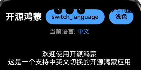
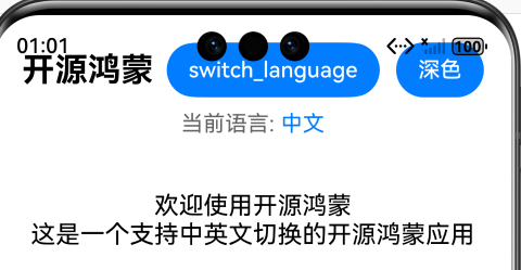
- 首页右上角:应看到两个按钮,分别是"切换语言"和"浅色/深色"切换按钮
- 点击"浅色/深色"按钮:背景色、按钮色、卡片色、文本色立即切换
- 杀进程后重新打开:主题选择应保持上次状态(已持久化到 preferences)
五、进阶方向
5.1 系统级深色模式联动
当前方案是纯应用内主题。如果需要跟随操作系统的深色模式开关,可以在 EntryAbility 中监听 configuration 变更事件,将系统主题与应用主题联动:
// 在 EntryAbility 中监听系统深色模式
import ConfigurationConstant from '@ohos.app.ability.ConfigurationConstant';

this.context.getApplicationContext().on('environment', (data) => {
  if (data.memColorMode === ConfigurationConstant.ColorMode.COLOR_MODE_DARK) {
    themeManager.setTheme(ThemeMode.DARK);
  } else {
    themeManager.setTheme(ThemeMode.LIGHT);
  }
});
5.2 过渡动画
在 build() 方法外层使用 animateTo 包裹颜色状态切换,可以实现平滑的主题过渡效果:
animateTo({ duration: 300 }, () => {
  this.colors = ThemeColors.fromMode(newTheme);
})
六、总结
本文从方案设计出发,完整实现了 Flutter OHR 工程中的浅色 / 深色主题切换能力:
- ThemeManager 单例:封装状态读写、发布-订阅和 preferences 持久化,职责清晰。
- ThemeColors 语义化颜色模型:将所有主题相关颜色收敛到一类中,UI 层无需记忆具体色值。
- 页面级零成本接入:通过
@State+ 观察者模式,页面只需注册一次监听即可自动响应。 - 通用组件主题化:
@Prop colors注入方案使组件无需内部维护主题状态。
该方案已通过 hvigor 编译验证,并在 OpenHarmony 模拟器上实际运行通过。
参考链接
- 本文示例代码托管于 AtomGit:https://atomgit.com (仓库链接待项目公开后补充)
- Flutter for OpenHarmony 官方文档:https://gitee.com/openharmony/flutter
- OpenHarmony 应用开发文档:https://developer.huawei.com/consumer/cn/doc/
感谢各位阅读!

讨论HarmonyOS开发技术,专注于API与组件、DevEco Studio、测试、元服务和应用上架分发等。
更多推荐
 22
22 0
0- 0


 已为社区贡献4条内容

所有评论(0)