【ArkTS-装饰器】
ArkTS-装饰器
- ■ UI状态管理
- ■ @Entry (进入)页面的生命周期
- ■ @Component (组件)
- ■ @Builder(构建): 自定义构建函数可复用 UI 片段
- ■ @Extend (扩展组件) // @Extend仅支持在全局定义,不支持在组件内部定义
- ■ @Styles (样式) //定义组件重用样式
- ■ @State(状态)
- ■ @Prop(父子单向同步)
- ■ @Link (双向数据绑定)
- ■ AppStorage
- ■ @ObjectLink (与父组件共享同一对象引用)
- ■ @Observed (观察)
- ■ @Track(跟踪)
- ■ @Provide(提供数据)和@Consume (消费数据)
- ■ @Watch(监听)
- ■ @Monitor (监听) //状态变量修改
- ■ @LocalBuilder: 维持组件父子关系
- ■ @AnimatableExtend(动画)
- ■ @Require装饰器:校验构造传参
- ■ @Reusable (复用) //组件复用
- ■ @Param (参数) 组件外部输入
- ■ @Once:初始化同步一次
- ■ @Event (事件)
- ■ @Type (类型) //标记类属性的类型
■ UI状态管理
■ @Entry (进入)页面的生命周期
一个页面有且仅有一个@Entry入口。
■ aboutToAppear
aboutToAppear 是一个生命周期钩子,在组件构建(build)之前、首次出现或重新出现时自动执行。
@Entry
@Component
struct IndexPage {
  @State userInfo: string = ''
  // 生命周期:组件即将显示时调用
  aboutToAppear() {
    console.info('IndexPage 即将显示')

    // 示例1:从 AppStorage 获取数据
    this.userInfo = AppStorage.get<string>('userName', '匿名用户')

    // 示例2:模拟网络请求
    this.loadUserData()

    // 示例3:埋点统计
    analyticsService.pageView('HomePage')
  }

  async loadUserData() {
    try {
      // 模拟异步请求
      const data = await fetchUserApi()
      console.info('用户数据加载完成:', data)
      // 更新状态,触发 UI 刷新
      this.userInfo = data.name
    } catch (error) {
      console.error('加载失败:', error)
    }
  }

  build() {
    Column() {
      Text(`用户:${this.userInfo}`)
        .fontSize(18)
        .margin(20)
    }
    .width('100%')
    .height('100%')
  }
}
■ aboutToDisappear
aboutToAppear() {
  console.info('页面显示')
  // 开始监听
  eventHub.on('dataUpdate', this.handleData)
}

aboutToDisappear() {
  console.info('页面隐藏')
  // 及时解绑,避免内存泄漏
  eventHub.off('dataUpdate', this.handleData)
}
■ @Component (组件)
HarmonyOS的生命周期可以分为 @Compnent的生命周期和 @Entry的生命周期 也就是自定义组件的生命周期和页面的生命周期。
@Component和@Entry,ArkTS通过这两个关键字来装饰struct声明的数据结构,这个过程我们称为自定义组件。
组件内部需要提供一个build函数,我们在该函数体内按照链式调用的方式来描述整个页面的UI布局。
■ 1. Component装饰的struct称为UI组件。主要特征:
- 一个页面有且仅有一个@Entry入口。
- 一个页面可以包含一个或多个component;
- 每个component都必须实现 build 方法来更新UI;
- 一个component内部还可以调用另外一个component;
■ 2. component内部还可以调用另外一个component 示例
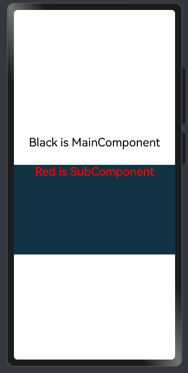
示例
@Entry       //一个页面有且仅有一个@Entry入口。
@Component   //一个页面可以包含一个或多个component;
struct MainComponent {
  build() {
    Flex({ direction: FlexDirection.Column, alignItems: ItemAlign.Center, justifyContent: FlexAlign.Center }) {
      Text('Black is MainComponent')
        .fontSize(26)
        .fontColor(Color.Black)
        .height(50)
      SubComponent()  //调用
			.width('100%')   //自定义组件也有属性。
			.height(200)
			.backgroundColor('#123343')
    }
    .width('100%')
    .height('100%')
  }
}

@Component  //一个页面可以包含一个或多个component;
struct SubComponent {
  build() {
    Flex({ direction: FlexDirection.Row, alignItems: ItemAlign.Center, justifyContent: FlexAlign.Center }) {
      Text('Red is SubComponent')
        .fontSize(26)
        .fontWeight(500)
        .fontColor(Color.Red)
    }
    .width('100%')
  }
}
■ @Builder(构建): 自定义构建函数可复用 UI 片段
■ 1. @Builder无参数
  // 简单的无参数Builder
  @Builder
  simpleTextBuilder() {
    Text('Hello World')
      .fontSize(30)
      .fontWeight(FontWeight.Bold)
      .fontColor(Color.Blue)
  }
■ 2. @Builder带参数的
  // 带参数的Builder
  @Builder
  parameterizedBuilder(text: string, size: number, color: Color) {
    Text(text)
      .fontSize(size)
      .fontColor(color)
      .fontWeight(FontWeight.Medium)
  }
■ 3. @Builder包含逻辑的
  // 包含逻辑的Builder
  @Builder
  conditionalBuilder(score: number) {
    if (score >= 90) {
      Text('优秀')
        .fontColor(Color.Green)
    } else if (score >= 60) {
      Text('及格')
        .fontColor(Color.Orange)
    } else {
      Text('不及格')
        .fontColor(Color.Red)
    }
  }
■ 4. @Builder包含循环的
  // 包含循环的Builder
  @Builder
  listBuilder(items: string[]) {
    Column() {
      ForEach(items, (item: string) => {
        Text(item)
          .fontSize(16)
          .margin(5)
      })
    }
  }
■ 5. @Builder使用列表
@Entry
@Component
struct BuilderExample {
  // 简单的无参数Builder
  @Builder
  simpleTextBuilder() {
    Text('Hello World')
      .fontSize(30)
      .fontWeight(FontWeight.Bold)
      .fontColor(Color.Blue)
  }

  // 带参数的Builder
  @Builder
  parameterizedBuilder(text: string, size: number, color: Color) {
    Text(text)
      .fontSize(size)
      .fontColor(color)
      .fontWeight(FontWeight.Medium)
  }

  // 包含逻辑的Builder
  @Builder
  conditionalBuilder(score: number) {
    if (score >= 90) {
      Text('优秀')
        .fontColor(Color.Green)
    } else if (score >= 60) {
      Text('及格')
        .fontColor(Color.Orange)
    } else {
      Text('不及格')
        .fontColor(Color.Red)
    }
  }

  // 包含循环的Builder
  @Builder
  listBuilder(items: string[]) {
    Column() {
      ForEach(items, (item: string) => {
        Text(item)
          .fontSize(16)
          .margin(5)
      })
    }
  }

  build() {
    Column({ space: 20 }) {
      // 使用无参数Builder
      this.simpleTextBuilder()

      // 使用带参数Builder
      this.parameterizedBuilder('自定义文本', 24, Color.Red)

      Divider()

      // 使用条件Builder
      this.conditionalBuilder(85)
      this.conditionalBuilder(55)

      Divider()

      // 使用列表Builder
      this.listBuilder(['项目1', '项目2', '项目3', '项目4'])
    }
    .width('100%')
    .height('100%')
    .padding(20)
    .justifyContent(FlexAlign.Center)
  }
}
■ 6. @Builder全局定义
// 全局Builder定义
@Builder
function GlobalCard(title: string, content: string) {
  Column() {
    Text(title)
      .fontSize(20)
      .fontWeight(FontWeight.Bold)
      .margin({ bottom: 10 })

    Text(content)
      .fontSize(16)
      .fontColor(Color.Gray)
  }
  .padding(15)
  .backgroundColor(Color.White)
  .border({ width: 1, color: Color.Gray })
  .borderRadius(8)
  .width('90%')
  .margin({ bottom: 10 })
}

@Entry
@Component
struct GlobalBuilderExample {
  build() {
    Column() {
      Text('全局Builder示例')
        .fontSize(24)
        .fontWeight(FontWeight.Bold)
        .margin({ bottom: 20 })

      // 使用全局Builder
      GlobalCard('标题1', '这是第一个卡片的内容')
      GlobalCard('标题2', '这是第二个卡片的内容,内容可以更长一些')
      GlobalCard('标题3', '第三个卡片的内容')
    }
    .width('100%')
    .height('100%')
    .padding(20)
    .backgroundColor('#F5F5F5')
    .justifyContent(FlexAlign.Start)
  }
}
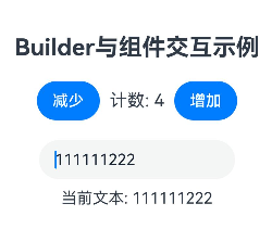
■ 7. @Builder 与组件交互
@Entry
@Component
struct InteractiveBuilderExample {
  @State count: number = 0
  @State text: string = '初始文本'

  // Builder访问组件状态
  @Builder
  counterBuilder() {
    Row() {
      Button('减少')
        .onClick(() => {
          this.count--
        })

      Text(`计数: ${this.count}`)
        .fontSize(18)
        .margin(10)

      Button('增加')
        .onClick(() => {
          this.count++
        })
    }
  }

  // Builder访问组件方法
  @Builder
  textInputBuilder() {
    Column() {
      TextInput({ text: this.text })
        .onChange((value: string) => {
          this.text = value
        })
        .width(200)

      Text(`当前文本: ${this.text}`)
        .fontSize(16)
        .margin({ top: 10 })
    }
  }

  build() {
    Column({ space: 20 }) {
      Text('Builder与组件交互示例')
        .fontSize(24)
        .fontWeight(FontWeight.Bold)

      this.counterBuilder()
      this.textInputBuilder()
    }
    .width('100%')
    .height('100%')
    .padding(20)
    .justifyContent(FlexAlign.Center)
  }
}
■ 8. @BuilderParam:使用@Builder 作为参数
- @BuilderParam 允许将接收@Builder作为参数传递给组件,实现高度可定制的 UI:
@Component
struct CustomCard {
  // 使用@BuilderParam接收Builder作为参数
  @BuilderParam headerBuilder: () => void
  @BuilderParam contentBuilder: () => void

  build() {
    Column() {
      // 使用传入的headerBuilder
      this.headerBuilder()

      Divider()
        .margin(10)

      // 使用传入的contentBuilder
      this.contentBuilder()
    }
    .padding(15)
    .border({ width: 1, color: Color.Gray })
    .borderRadius(8)
    .width('90%')
    .margin(10)
  }
}

@Entry
@Component
struct BuilderParamExample {
  @Builder
  customHeader() {
    Row() {
      Image($r('app.media.icon'))
        .width(30)
        .height(30)
        .margin({ right: 10 })

      Text('自定义标题')
        .fontSize(18)
        .fontWeight(FontWeight.Bold)
    }
  }

  @Builder
  customContent() {
    Text('这是自定义的内容区域,可以包含任何UI组件和布局')
      .fontSize(14)
      .fontColor(Color.Gray)
  }

  @Builder
  anotherHeader() {
    Text('另一个标题样式')
      .fontSize(20)
      .fontColor(Color.Blue)
      .fontWeight(FontWeight.Bold)
  }

  @Builder
  anotherContent() {
    Column() {
      Text('多行内容')
      Text('第二行内容')
      Button('按钮')
        .margin({ top: 10 })
    }
  }

  build() {
    Column() {
      Text('@BuilderParam示例')
        .fontSize(24)
        .fontWeight(FontWeight.Bold)
        .margin({ bottom: 20 })

      // 使用CustomCard组件,传入不同的Builder
      CustomCard({
        headerBuilder: this.customHeader,
        contentBuilder: this.customContent
      })

      CustomCard({
        headerBuilder: this.anotherHeader,
        contentBuilder: this.anotherContent
      })
    }
    .width('100%')
    .height('100%')
    .padding(20)
    .backgroundColor('#F5F5F5')
    .justifyContent(FlexAlign.Start)
  }
}
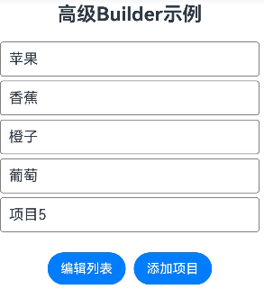
■ 9. @Builder(构建) 与 @State (State)
@Entry
@Component
struct AdvancedBuilderExample {
  @State items: string[] = ['苹果', '香蕉', '橙子', '葡萄']
  @State isEditing: boolean = false

  // 动态生成列表项的Builder
  @Builder
  itemListBuilder() {
    Column() {
      ForEach(this.items, (item: string, index: number) => {
        this.listItemBuilder(item, index)
      })
    }
  }

  // 单个列表项的Builder
  @Builder
  listItemBuilder(item: string, index: number) {
    Row() {
      Text(item)
        .fontSize(18)
        .layoutWeight(1)

      if (this.isEditing) {
        Button('删除')
          .onClick(() => {
            this.items.splice(index, 1)
            this.items = [...this.items] // 触发状态更新
          })
          .backgroundColor(Color.Red)
          .fontColor(Color.White)
      }
    }
    .padding(10)
    .border({ width: 1, color: Color.Gray })
    .borderRadius(4)
    .margin({ bottom: 5 })
    .width('100%')
  }

  build() {
    Column({ space: 20 }) {
      Text('高级Builder示例')
        .fontSize(24)
        .fontWeight(FontWeight.Bold)

      this.itemListBuilder()

      Row({ space: 10 }) {
        Button(this.isEditing ? '完成编辑' : '编辑列表')
          .onClick(() => {
            this.isEditing = !this.isEditing
          })

        Button('添加项目')
          .onClick(() => {
            const newItem = `项目${this.items.length + 1}`
            this.items = [...this.items, newItem]
          })
      }
    }
    .width('100%')
    .height('100%')
    .padding(20)
    .justifyContent(FlexAlign.Start)
  }
}
■ @Extend (扩展组件) // @Extend仅支持在全局定义,不支持在组件内部定义
// xxx.ets
//@Extend仅支持在全局定义,不支持在组件内部定义
@Extend(Text)  //@Extend装饰的方法支持参数,只能Text调用
function fancy(fontSize: number) {
  .fontColor(Color.Red)
  .fontSize(fontSize)
}

@Entry
@Component
struct FancyUse {
  build() {
    Row({ space: 10 }) {
      Text('Fancy')
        .fancy(16)
      Text('Fancy')
        .fancy(24)
    }
  }
}
■ @Styles (样式) //定义组件重用样式
@Entry
@Component
struct FancyUse {
  @State heightValue: number = 50;

  @Styles
  fancy() {
    .height(this.heightValue)
    .backgroundColor(Color.Blue)
    .onClick(() => {
      this.heightValue = 100;
    })
  }

  build() {
    Column() {
      Button('change height1')
        .fancy()
      Button('change height2')
        .fancy()
    }
    .height('100%')
    .width('100%')
  }
}
■ 1. stateStyles (多态样式)
focused:获焦态。
normal:正常态。
pressed:按压态。
disabled:不可用态。
clicked:点击态。
selected:选中态。
■ 2. @Styles和stateStyles联合使用 : 示例通过@Styles指定stateStyles的不同状态。
@Entry
@Component
struct MyComponent {
  @Styles normalStyle() {
    .backgroundColor(Color.Gray)
  }

  @Styles pressedStyle() {
    .backgroundColor(Color.Red)
  }

  build() {
    Column() {
      Text('Text1')
        .fontSize(50)
        .fontColor(Color.White)
        .stateStyles({
          normal: this.normalStyle,
          pressed: this.pressedStyle,
        })
    }
  }
}
■ 3. 示例: stateStyles 获焦态和按压态
@Entry
@Component
struct StateStylesSample {
  build() {
    Column() {
      Button('Button1')
        .stateStyles({
          focused: {
            .backgroundColor('#ffffeef0')
          },
          pressed: {
            .backgroundColor('#ff707070')
          },
          normal: {
            .backgroundColor('#ff2787d9')
          }
        })
        .margin(20)
      Button('Button2')
        .stateStyles({
          focused: {
            .backgroundColor('#ffffeef0')
          },
          pressed: {
            .backgroundColor('#ff707070')
          },
          normal: {
            .backgroundColor('#ff2787d9')
          }
        })
    }.margin('30%')
  }
}
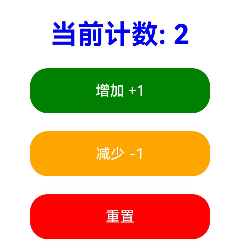
■ @State(状态)
@State装饰的变量,或称为状态变量,一旦变量拥有了状态属性,就和自定义组件的渲染绑定起来。
当状态改变时,UI会发生对应的渲染改变。
■ 1. 示例 -状态改变时 UI会发生对应的渲染改变
@Entry
@Component
struct CounterExample {
  // 使用@State装饰器声明一个状态变量count,初始值为0
  // 当count的值发生变化时,会触发UI重新渲染
  @State count: number = 0

  // 构建函数,定义UI布局
  build() {
    // 垂直布局容器,设置对齐方式和间距
    Column({ space: 20 }) {
      // 显示计数器当前值
      Text(`当前计数: ${this.count}`)
        .fontSize(30)
        .fontWeight(FontWeight.Bold)
        .fontColor(Color.Blue)

      // 增加计数按钮
      Button('增加 +1')
        .onClick(() => {
          // 点击按钮时,count值增加1
          // 由于count是@State变量,UI会自动更新
          this.count++
        })
        .width(200)
        .height(50)
        .backgroundColor(Color.Green)

      // 减少计数按钮
      Button('减少 -1')
        .onClick(() => {
          // 点击按钮时,count值减少1
          this.count--
        })
        .width(200)
        .height(50)
        .backgroundColor(Color.Orange)

      // 重置计数器按钮
      Button('重置')
        .onClick(() => {
          // 点击按钮时,将count重置为0
          this.count = 0
        })
        .width(200)
        .height(50)
        .backgroundColor(Color.Red)
    }
    // 设置Column容器的宽度、高度和对齐方式
    .width('100%')
    .height('100%')
    .justifyContent(FlexAlign.Center)
  }
}
■ @Prop(父子单向同步)
- 单向数据流:数据从父组件流向子组件,子组件不能直接修改父组件的数据
- 同步更新:当父组件的数据变化时,子组件的 @Prop 变量会自动更新
- 局部修改:子组件可以修改 @Prop 变量的值,但不会影响父组件
- 类型一致性:@Prop 变量的类型必须与父组件传递的数据类型一致
■ 示例一:
// 简单类型
@Prop count: number;
// 赋值的变化可以被观察到
this.count = 1;
// 复杂类型
@Prop title: Model;
// 可以观察到赋值的变化
this.title = new Model('Hi');
■ 示例二:当装饰的类型是Object或者class复杂类型时,可以观察到自身的赋值和第一层的属性的变化
class Info {
  public value: string;
  constructor(value: string) {
    this.value = value;
  }
}
class Model {
  public value: string;
  public info: Info;
  constructor(value: string, info: Info) {
    this.value = value;
    this.info = info;
  }
}

@Prop title: Model;
// 可以观察到第一层的变化
this.title.value = 'Hi';
// 观察不到第二层的变化
this.title.info.value = 'ArkUI';
■ 示例三:当装饰的类型是数组的时候,可以观察到数组本身的赋值和数组项的添加、删除和更新。
// @Prop装饰的对象为数组时
@Prop title: string[];
// 数组自身的赋值可以观察到
this.title = ['1'];
// 数组项的赋值可以观察到
this.title[0] = '2';
// 删除数组项可以观察到
this.title.pop();
// 新增数组项可以观察到
this.title.push('3');
■ 示例四:子类中用法
@Component
struct Son {
  @Prop message: string = 'Hi';   //@Prop更新后,会触发Son组件的刷新。

  build() {
    Column() {
      Text(this.message)
    }
  }
}

// 当@State装饰的变量message改变时,Father组件会刷新。
// 由于Son组件使用@Prop接收了该变量,因此Father组件刷新的过程中会使用message的最新值去更新@Prop的值。
// @Prop更新后,会触发Son组件的刷新。
@Entry
@Component
struct Father {
  @State message: string = 'Hello';

  build() {
    Column() {
      Text(this.message)
      Button(`father click`).onClick(() => {
        this.message += '*';     //当@State装饰的变量message改变时,Father组件会刷新。
      })
      Son({ message: this.message })
    }
  }
}
■ 示例五:父组件@State到子组件@Prop简单数据类型同步
@Component
struct CountDownComponent {
  @Prop count: number = 0;
  costOfOneAttempt: number = 1;

  build() {
    Column() {
      if (this.count > 0) {
        Text(`You have ${this.count} Nuggets left`)
      } else {
        Text('Game over!')
      }
      // @Prop装饰的变量不会同步给父组件
      Button(`Try again`).onClick(() => {
        this.count -= this.costOfOneAttempt;
      })
    }
  }
}

@Entry
@Component
struct ParentComponent {
  @State countDownStartValue: number = 10;

  build() {
    Column() {
      Text(`Grant ${this.countDownStartValue} nuggets to play.`)
      // 父组件的数据源的修改会同步给子组件
      Button(`+1 - Nuggets in New Game`).onClick(() => {
        this.countDownStartValue += 1;
      })
      // 父组件的修改会同步给子组件
      Button(`-1  - Nuggets in New Game`).onClick(() => {
        this.countDownStartValue -= 1;
      })

      CountDownComponent({ count: this.countDownStartValue, costOfOneAttempt: 2 })
    }
  }
}
■ 示例六:从父组件@State数组项到子组件@Prop简单数据类型同步
@Component
struct Child {
  @Prop value: number = 0;

  build() {
    Text(`${this.value}`)
      .fontSize(50)
      .onClick(() => {
        this.value++;
      })
  }
}

@Entry
@Component
struct Index {
  @State arr: number[] = [1, 2, 3];

  build() {
    Row() {
      Column() {
        Child({ value: this.arr[0] })
        Child({ value: this.arr[1] })
        Child({ value: this.arr[2] })

        Divider().height(5)

        ForEach(this.arr,
          (item: number) => {
            Child({ value: item })
          },
          (item: number) => item.toString()
        )
        Text('replace entire arr')
          .fontSize(50)
          .onClick(() => {
            // 两个数组都包含项“3”。
            this.arr = this.arr[0] == 1 ? [3, 4, 5] : [1, 2, 3];
          })
      }
    }
  }
}
■ 示例七:从父组件中的@State类对象属性到@Prop简单类型的同步
class Book {
  public title: string;
  public pages: number;
  public readIt: boolean = false;

  constructor(title: string, pages: number) {
    this.title = title;
    this.pages = pages;
  }
}

@Component
struct ReaderComp {
  @Prop book: Book = new Book('', 0);

  build() {
    Column({space:20}) {
      Text(this.book.title)
      Text(`...has${this.book.pages} pages!`)
      Text(`...${this.book.readIt ? 'I have read' : 'I have not read it'}`)
        .onClick(() => this.book.readIt = true)
    }
  }
}

@Entry
@Component
struct Library {
  @State book: Book = new Book('100 secrets of C++', 765);

  build() {
    Column() {
      ReaderComp({ book: this.book })
      Divider().height(5)
      ReaderComp({ book: this.book })
    }
  }
}
■ 示例八:@Prop本地初始化不和父组件同步
@Component
struct MyComponent {
  @Prop customCounter: number;
  @Prop customCounter2: number = 5;

  build() {
    Column() {
      Row() {
        Text(`From Main: ${this.customCounter}`).fontColor('#ff6b6565').margin({ left: -110, top: 12 })
      }

      Row() {
        Button('Click to change locally!')
          .width(288)
          .height(40)
          .margin({ left: 30, top: 12 })
          .fontColor('#FFFFFF')
          .onClick(() => {
            this.customCounter2++;
          })
      }

      Row() {
        Text(`Custom Local: ${this.customCounter2}`).fontColor('#ff6b6565').margin({ left: -110, top: 12 })
      }
    }
  }
}

@Entry
@Component
struct MainProgram {
  @State mainCounter: number = 10;

  build() {
    Column() {
      Row() {
        Column() {
          // customCounter必须从父组件初始化,因为MyComponent的customCounter成员变量缺少本地初始化;此处,customCounter2可以不做初始化。
          MyComponent({ customCounter: this.mainCounter })
          // customCounter2也可以从父组件初始化,父组件初始化的值会覆盖子组件customCounter2的本地初始化的值
          MyComponent({ customCounter: this.mainCounter, customCounter2: this.mainCounter })
        }
      }

      Row() {
        Column() {
          Button('Click to change number')
            .width(288)
            .height(40)
            .margin({ left: 30, top: 12 })
            .fontColor('#FFFFFF')
            .onClick(() => {
              this.mainCounter++;
            })
        }
      }
    }
  }
}
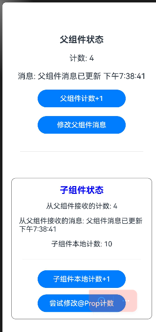
■ 1. 示例功能说明:
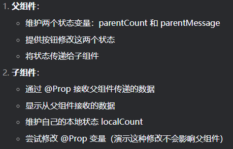
import { ToolBar } from '@ohos.arkui.advanced.ToolBar';

@Entry
@Component
struct ParentComponent {
  // 父组件的状态变量
  @State parentCount: number = 0
  @State parentMessage: string = "Hello from Parent"

  build() {
    Column({ space: 20 }) {
      // 显示父组件的状态
      Text("父组件状态")
        .fontSize(20)
        .fontWeight(FontWeight.Bold)

      Text(`计数: ${this.parentCount}`)
        .fontSize(18)

      Text(`消息: ${this.parentMessage}`)
        .fontSize(18)

      // 修改父组件状态的按钮
      Button('父组件计数+1')
        .onClick(() => {
          this.parentCount++
        })
        .width(200)

      Button('修改父组件消息')
        .onClick(() => {
          this.parentMessage = "父组件消息已更新 " + new Date().toLocaleTimeString()
        })
        .width(200)

      Divider().margin(20)

      // 使用子组件,并通过构造函数传递@Prop数据
      ChildComponent({
        count: this.parentCount,
        message: this.parentMessage
      })
    }
    .width('100%')
    .height('100%')
    .padding(20)
    .justifyContent(FlexAlign.Center)
  }
}

@Component
struct ChildComponent {
  // 使用@Prop装饰器接收父组件传递的数据
  // 当父组件的parentCount变化时,会自动更新这里的count
  @Prop count: number
  // 当父组件的parentMessage变化时,会自动更新这里的message
  @Prop message: string

  // 子组件本地的状态变量
  @State localCount: number = 0

  build() {
    Column({ space: 15 }) {
      Text("子组件状态")
        .fontSize(20)
        .fontWeight(FontWeight.Bold)
        .fontColor(Color.Blue)

      Text(`从父组件接收的计数: ${this.count}`)
        .fontSize(16)

      Text(`从父组件接收的消息: ${this.message}`)
        .fontSize(16)
        // .fontColor(Color.Green)

      Text(`子组件本地计数: ${this.localCount}`)
        .fontSize(16)
        // .fontColor(Color.Purple)

      Divider().margin(10)

      // 修改子组件本地状态的按钮
      Button('子组件本地计数+1')
        .onClick(() => {
          this.localCount++
        })
        .width(200)

      // 尝试修改@Prop变量(不会影响父组件)
      Button('尝试修改@Prop计数')
        .onClick(() => {
          // 这个修改只会影响子组件内部,不会同步回父组件
          this.count += 10
          console.log("子组件修改了@Prop count,但不会影响父组件")
        })
        .width(200)
    }
    .padding(15)
    .border({ width: 1, color: Color.Gray })
    .borderRadius(10)
    .margin({ top: 20 })
  }
}
■ @Link (双向数据绑定)
- 双向数据绑定:父子组件共享同一数据源,任何一方的修改都会同步到另一方.
- 必须使用$符号:在父组件中传递 @Link 变量时,必须使用 $variableName 语法.
- 类型一致性:@Link 变量的类型必须与父组件中的状态变量类型一致.
- 无需初始化:@Link 变量不能在子组件中初始化,必须从父组件传递.
■ AppStorage
■ 示例一:多页面共享数据-在 main.ts 中初始化 AppStorage
配置页面main_pages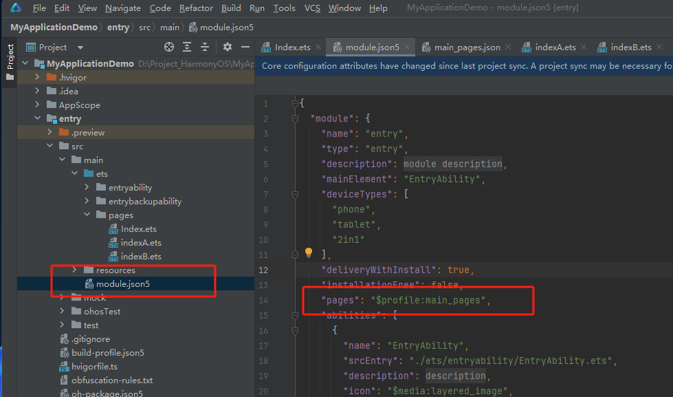
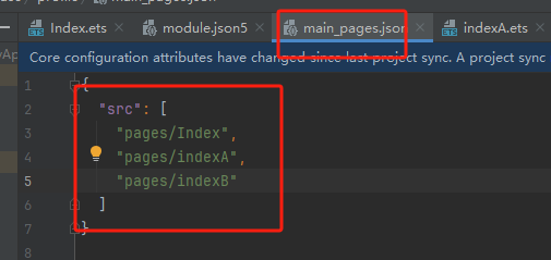
src/main/resources/base/profile/main_pages.json
{
  "src": [
    "pages/Index",
    "pages/indexA",
    "pages/indexB"
  ]
}
index.ets
import router from '@ohos.router'

// 初始化 AppStorage
AppStorage.setOrCreate('userName', '张三')
AppStorage.setOrCreate('isLoggedIn', false)
AppStorage.setOrCreate<number>('userScore', 0)

@Entry
@Component
struct Index {
  @State message: string = 'Hello World';

  build() {
    RelativeContainer() {
      Text(this.message)
        .id('HelloWorld')
        .fontSize($r('app.float.page_text_font_size'))
        .fontWeight(FontWeight.Bold)
        .alignRules({
          center: { anchor: '__container__', align: VerticalAlign.Center },
          middle: { anchor: '__container__', align: HorizontalAlign.Center }
        })
        .onClick(() => {
          this.message = 'Welcome';
        })

      Button('进入indexA')
        .onClick(() => {
          // 跳转到设置页面(页面路径需在main_pages.json中配置)
          router.pushUrl({
            url: 'pages/indexA' // 目标页面的路径
          })
        })
    }
    .height('100%')
    .width('100%')
  }
}
indexA.ets
import router from '@ohos.router'

@Entry
@Component
struct PageA {
  @StorageLink('userName') userName: string = ''
  @StorageLink('userScore') userScore: number = 0

  build() {
    Column() {
      Text(`当前用户名:${this.userName}`)
      Text(`当前用分数:${this.userScore}`)
      TextInput()
        // .placeholder('输入新名字')
        .onChange((value) => {
          this.userName = value  // 自动同步到所有页面
        })

      Button('增加分数')
        .onClick(() => {
          this.userScore += 10
        })

      Button('返回主界面')
        .onClick(() => {
          router.pushUrl({
            url: 'pages/Index' // 目标页面的路径
          })
        })

      Button('进入indexB')
        .onClick(() => {
          router.pushUrl({
            url: 'pages/indexB' // 目标页面的路径
          })
        })

    }
    .margin(20)
  }
}
indexB.ets
import router from '@ohos.router'


@Entry
@Component
struct PageB {
  @StorageLink('userName') userName: string = ''      // 可读可写
  @StorageProp('userScore') userScore: number = 0     // 只读

  build() {
    Column() {
      Text(`欢迎你,${this.userName}!`)
        .onClick(() => {
          this.userName += 10
        })
      Text(`你的分数:${this.userScore}`)
        .onClick(() => {
          this.userScore += 10
        })

      Button('返回页面A')
        .onClick(() => {
          router.pushUrl({
            url: 'pages/indexA'
          })
        })
    }
    .margin(20)
  }
}
■ 示例二:实现多页面数据共享-在 app.ets 的 onCreate 生命周期中初始化
步骤一:新建app.ets文件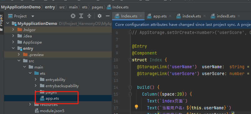
app.ets 中添加如下共享数据
// app.ets
import app from '@ohos.app.ability.application'

class MyApplication {
  onCreate() {
    // ✅ 应用启动时初始化 AppStorage
    AppStorage.setOrCreate('userName', '张三')
    AppStorage.setOrCreate('isLoggedIn', false)
    AppStorage.setOrCreate('themeMode', 'light')
    AppStorage.setOrCreate<number>('userScore', 0)
    AppStorage.setOrCreate<Array<string>>('favorites', [])

    console.info('AppStorage 初始化完成')
    console.info('当前用户:', AppStorage.get<string>('userName'))
  }

  onDestroy() {
    // 应用销毁时可清理资源
    console.info('应用即将销毁')
  }
}
步骤二:其他页面用@StorageLink使用数据
import router from '@ohos.router'

@Entry
@Component
struct PageA {
  @StorageLink('userName') userName: string = ''   // 自动从 AppStorage 获取
  @StorageLink('userScore') userScore: number = 0   // 自动从 AppStorage 获取

  build() {
    Column({space:20}) {
      Text(`indexA页面`)
      Text(`当前用户名:${this.userName}`)
      Text(`当前用分数:${this.userScore}`)

      Button('当前用户名++')
        .onClick(() => {
          this.userName += 10
        })
      Button('当前用分数++')
        .onClick(() => {
          this.userScore += 10
        })

      Button('返回主界面')
        .onClick(() => {
          router.pushUrl({
            url: 'pages/Index' // 目标页面的路径
          })
        })

      Button('进入indexB')
        .onClick(() => {
          router.pushUrl({
            url: 'pages/indexB' // 目标页面的路径
          })
        })

    }
    .margin(20)
  }
}
步骤三:或者其他页面用@StorageProp使用数据
@StorageProp 装饰的再次进入会变成原来的数据。
import router from '@ohos.router'

@Entry
@Component
struct PageB {
  @StorageLink('userName') userName: string = ''      // 可读可写   // 自动从 AppStorage 获取
  @StorageProp('userScore') userScore: number = 0     // 只读    // 自动从 AppStorage 获取

  build() {
    Column({space:20}) {
      Text(`indexB页面`)
      Text(`欢迎你,${this.userName}!`)
      Text(`你的分数:${this.userScore}`)

      Button('欢迎你++')
        .onClick(() => {
          this.userName +=10
        })

      Button('你的分数++')
        .onClick(() => {
          this.userScore +=10
        })

      Button('返回页面A')
        .onClick(() => {
          router.pushUrl({
            url: 'pages/indexA'
          })
        })
    }
    .margin(20)
  }
}
■ 延迟初始化(按需)aboutToAppear 中初始化:
你也可以在第一个页面的 aboutToAppear 中初始化:
@Entry
@Component
struct SplashPage {
  aboutToAppear() {
    if (!AppStorage.has('userName')) {
      AppStorage.setOrCreate('userName', '张三')
      console.info('首次启动,初始化用户数据')
    }
  }

  build() {
    Column() {
      Text('启动页...')
    }
  }
}
■ @ObjectLink (与父组件共享同一对象引用)
使用@ObjectLink装饰器接收对象,与父组件共享同一对象引用
■ @Observed (观察)
@Observed 类装饰器
@ObservedV2仅能装饰class,无法装饰自定义组件。
■ 1. 观察变化
@Observed装饰的类,如果其属性为非简单类型,比如class、Object或者数组,那么这些属性也需要被@Observed装饰,否则将观察不到这些属性的变化。
class Child {
  public num: number;
  constructor(num: number) {
    this.num = num;
  }
}

@Observed      //
class Parent {
  public child: Child;      //child 修改被监视 但是 Child类没有@Observed修饰无法观察child属性变化
  public count: number;     //count 修改被监视

  constructor(child: Child, count: number) {
    this.child = child;
    this.count = count;
  }
}
--------------------------------------
代码中使用
@ObjectLink parent: Parent;

// 赋值变化可以被观察到
this.parent.child = new Child(5);
this.parent.count = 5;

// Child没有被@Observed装饰,其属性的变化观察不到
this.parent.child.num = 5;
■ 2. 类中使用@Trace装饰的静态属性具有被观测变化的能力。
@ObservedV2
class Manager {
  @Trace static count: number = 1;
}
@Entry
@ComponentV2
struct Index {
  build() {
    Column() {
      // 当点击改变count时,Text组件会刷新
      Text(`${Manager.count}`)
        .onClick(() => {
          Manager.count++;
        })
    }
  }
}
■ 3. 在嵌套类中使用@Trace装饰的属性具有被观测变化的能力。
@ObservedV2
class Son {
  @Trace age: number = 100;
}
class Father {
  son: Son = new Son();
}
@Entry
@ComponentV2
struct Index {
  father: Father = new Father();

  build() {
    Column() {
      // 当点击改变age时,Text组件会刷新
      Text(`${this.father.son.age}`)
        .onClick(() => {
          this.father.son.age++;
        })
    }
  }
}
■ 4. 示例一:定义一个被观察的类
// 定义一个被观察的类,使用@Observed装饰器
@Observed
class UserInfo {
  // 使用@Track装饰器标记需要跟踪的字段
  @Track name: string
  @Track age: number
  // 这个字段没有使用@Track,变化不会触发UI更新
  internalId: number = 0

  constructor(name: string, age: number) {
    this.name = name
    this.age = age
  }
}
■ 5. 非@Trace装饰的成员属性用在UI上无法触发UI刷新
@ObservedV2
class Person {
  id: number = 0;
  @Trace age: number = 8;
}
@Entry
@ComponentV2
struct Index {
  person: Person = new Person();

  build() {
    Column() {
      // age被@Trace装饰,用在UI中可以触发UI刷新
      Text(`${this.person.age}`)
        .onClick(() => {
          this.person.age++; // 点击会触发UI刷新
        })
      // id未被@Trace装饰,用在UI中不会触发UI刷新
      Text(`${this.person.id}`) // 当id变化时不会刷新
        .onClick(() => {
          this.person.id++; // 点击不会触发UI刷新
        })
    }
  }
}
■ 6. @Observed 和 @ObjectLink 一起使用
// 允许@ObjectLink装饰的数据属性赋值
this.objLink.a= …
// 不允许@ObjectLink装饰的数据自身赋值
this.objLink= …
■ 1. 示例一:错误和正确写法
@Observed
class Info {
  count: number;

  constructor(count: number) {
    this.count = count;
  }
}

class Test {
  msg: number;

  constructor(msg: number) {
    this.msg = msg;
  }
}

// 错误写法,count未指定类型,编译报错
@ObjectLink count;
// 错误写法,Test未被@Observed装饰,编译报错
@ObjectLink test: Test;

// 正确写法
@ObjectLink count: Info;
■ 2. 示例二:@ObjectLink装饰的变量不能本地初始化,仅能通过构造参数从父组件传入初始值,否则编译期会报错。
@Observed
class Info {
  count: number;

  constructor(count: number) {
    this.count = count;
  }
}

// 错误写法,编译报错
@ObjectLink count: Info = new Info(10);

// 正确写法
@ObjectLink count: Info;
■ 3. 示例三:@ObjectLink装饰继承于Date的class时,可以观察到Date整体的赋值,同时可通过调用Date的接口更新Date的属性。
@ObjectLink装饰继承于Date的class时,可以观察到Date整体的赋值,同时可通过调用Date的接口setFullYear, setMonth, setDate, setHours, setMinutes, setSeconds, setMilliseconds, setTime, setUTCFullYear, setUTCMonth, setUTCDate, setUTCHours, setUTCMinutes, setUTCSeconds, setUTCMilliseconds 更新Date的属性。
@Observed
class DateClass extends Date {
  constructor(args: number | string) {
    super(args);
  }
}

@Observed
class NewDate {
  public data: DateClass;

  constructor(data: DateClass) {
    this.data = data;
  }
}

@Component
struct Child {
  label: string = 'date';
  @ObjectLink data: DateClass; //@ObjectLink装饰继承于Date的class时,可以观察到Date整体的赋值,同时可通过调用Date的接口

  build() {
    Column() {
      Button('child increase the day by 1')
        .onClick(() => {
          this.data.setDate(this.data.getDate() + 1);
        })
      DatePicker({
        start: new Date('1970-1-1'),
        end: new Date('2100-1-1'),
        selected: this.data
      })
    }
  }
}

@Entry
@Component
struct Parent {
  @State newData: NewDate = new NewDate(new DateClass('2023-1-1'));

  build() {
    Column() {
      Child({ label: 'date', data: this.newData.data })

      Button('parent update the new date')
        .onClick(() => {
          this.newData.data = new DateClass('2023-07-07');
        })
      Button(`ViewB: this.newData = new NewDate(new DateClass('2023-08-20'))`)
        .onClick(() => {
          this.newData = new NewDate(new DateClass('2023-08-20'));
        })
    }
  }
}
■ 4. 示例四:@ObjectLink装饰的变量不能被赋值,运行时报错,可以更改@ObjectLink装饰变量的成员属性
@Observed   //@Observed
class Info {
  count: number;

  constructor(count: number) {
    this.count = count;
  }
}

@Component
struct Child {
  @ObjectLink num: Info;

  build() {
    Column() {
      Text(`num的值: ${this.num.count}`)
        .onClick(() => {
          // 错误写法,@ObjectLink装饰的变量不能被赋值,运行时报错
          // this.num = new Info(10);
          // 正确写法,可以更改@ObjectLink装饰变量的成员属性
          this.num.count = 20;
        })
    }
  }
}

@Entry
@Component
struct Parent {
  @State num: Info = new Info(10);

  build() {
    Column() {
      Text(`count的值: ${this.num.count}`)
      Button('click')
        .onClick(() => {
          // 可以在父组件做整体替换
          this.num = new Info(30);
        })
      Child({num: this.num})
    }
  }
}
■ @Track(跟踪)
@Track应用于class对象的属性级更新。@Track装饰的属性变化时,只会触发该属性关联的UI更新。
- 精确跟踪:只跟踪被 @Track 装饰的字段,其他字段的变化不会触发UI更新
- 性能优化:避免不必要的渲染,提高应用性能
- 必须与 @Observed 配合使用:@Track 只能用于被 @Observed 装饰的类中的字段
- 深度观察:对于嵌套对象,需要每一层都使用 @Observed 和 @Track
■ 借助getFontSize的日志打印,可以分辨哪个组件触发了渲染
class Info {
  name: string = 'Jack';
  age: number = 12;
}

@Entry
@Component
struct Index {
  @State info: Info = new Info();

  // 借助getFontSize的日志打印,可以分辨哪个组件触发了渲染
  getFontSize(id: number): number {
    console.info(`Component ${id} render`);
    return 30;
  }

  build() {
    Column({space:10}) {
      Text(`name: ${this.info.name}`)
        .fontSize(this.getFontSize(1))  //Text UI 更新会调用 fontSize函数从而调用 getFontSize方法;

      Text(`age: ${this.info.age}`)
        .fontSize(this.getFontSize(2))  //Text UI 更新会调用 fontSize函数从而调用 getFontSize方法;

      // 点击当前Button,可以发现当前虽然仅改变了name属性
      // 但是依旧会触发两个Text的刷新
      // Text(`age: ${this.info.age}`)是冗余刷新
      // 说明
      // 当UI刷新时,会执行组件的属性设置方法,利用这一机制可以通过观察getFontSize方法是否被调用来判断当前组件是否刷新。
      Button('change name').onClick(() => {
        this.info.name = 'Jane'+ this.info.age;
      })

      // 点击当前Button,可以发现当前虽然仅改变了age属性
      // 但是依旧会触发两个Text的刷新
      // Text(`name: ${this.info.name}`)是冗余刷新
      // 说明
      // 当UI刷新时,会执行组件的属性设置方法,利用这一机制可以通过观察getFontSize方法是否被调用来判断当前组件是否刷新。
      Button('change age').onClick(() => {
        this.info.age++;
      })
    }
    .height('100%')
    .width('100%')
  }
}
■ 示例二 用@Track装饰的变量的用到的组件UI, 变量值不变组件UI也不更新。(减少不必要的UI渲染)
class LogTrack {
  @Track str1: string;
  @Track str2: string;

  constructor(str1: string) {
    this.str1 = str1;
    this.str2 = 'World';
  }
}

class LogNotTrack {
  str1: string;
  str2: string;

  constructor(str1: string) {
    this.str1 = str1;
    this.str2 = '世界';
  }
}

@Entry
@Component
struct AddLog {
  @State logTrack: LogTrack = new LogTrack('Hello');
  @State logNotTrack: LogNotTrack = new LogNotTrack('你好');

  isRender(index: number) {
    console.log(`Text ${index} is rendered`);
    return 50;
  }

  build() {
    Row() {
      Column() {
        Text(this.logTrack.str1) // Text1
          .fontSize(this.isRender(1))
          .fontWeight(FontWeight.Bold)
        Text(this.logTrack.str2) // Text2
          .fontSize(this.isRender(2))
          .fontWeight(FontWeight.Bold)
        Button('change logTrack.str1')
          .onClick(() => {
            this.logTrack.str1 = 'Bye';      //只更新 Text 1 is rendered
          })


        Text(this.logNotTrack.str1) // Text3
          .fontSize(this.isRender(3))
          .fontWeight(FontWeight.Bold)
        Text(this.logNotTrack.str2) // Text4
          .fontSize(this.isRender(4))
          .fontWeight(FontWeight.Bold)
        Button('change logNotTrack.str1')
          .onClick(() => {
            this.logNotTrack.str1 = '再见';  //都更新 Text 3 is rendered Text 4 is rendered
          })
      }
      .width('100%')
    }
    .height('100%')
  }
}
■ 示例三:class类中 被@Track装饰变量才会渲染UI更新 ,其他非@Track修饰的表里修改后的不会更新
class Log {
  @Track logInfo: string;
  owner: string;
  id: number;
  time: Date;
  location: string;
  reason: string;

  constructor(logInfo: string) {
    this.logInfo = logInfo;
    this.owner = 'OH';
    this.id = 0;
    this.time = new Date();
    this.location = 'CN';
    this.reason = 'NULL';
  }
}

@Entry
@Component
struct AddLog {
  @State log: Log = new Log('origin info.');

  build() {
    Row() {
      Column() {
        Text(this.log.logInfo)
          .fontSize(50)
          .fontWeight(FontWeight.Bold)
          .onClick(() => {
            // 没有被@Track装饰的属性可以在点击事件中使用。
            console.log('owner: ' + this.log.owner +
              ' id: ' + this.log.id +
              ' time: ' + this.log.time +
              ' location: ' + this.log.location +
              ' reason: ' + this.log.reason);
            this.log.time = new Date();
            this.log.id++;

            this.log.logInfo += ' info.';      //log的logInfo被@Track装饰 才会渲染UI更新  其他修改后的不会更新
          })
      }
      .width('100%')
    }
    .height('100%')
  }
}
■ @Provide(提供数据)和@Consume (消费数据)
@Provide/@Consume装饰的状态变量有以下特性:
@Provide和@Consume,应用于与后代组件的双向数据同步、状态数据在多个层级之间传递的场景。不同于上文提到的父子组件之间通过命名参数机制传递。
@Provide和@Consume摆脱参数传递机制的束缚,实现跨层级传递。
@Provide/@Consume是跨组件层级的双向同步。
@Provide装饰的状态变量自动对其所有后代组件可用,开发者不需要多次在组件之间传递变量。
后代通过使用@Consume去获取@Provide提供的变量,建立在@Provide和@Consume之间的双向数据同步,与@State/@Link不同的是,前者可以更便捷的在多层级父子组件之间传递。
@Provide和@Consume通过变量名或者变量别名绑定,需要类型相同,否则会发生类型隐式转换,从而导致应用行为异常。
■ 示例一 进行绑定
// 通过相同的变量名绑定
@Provide age: number = 0;
@Consume age: number;

// 通过相同的变量别名绑定
@Provide('a') id: number = 0;
@Consume('a') age: number;

// 通过Provide的变量别名和Consume的变量名相同绑定
@Provide('a') id: number = 0;
@Consume a: number;

// 通过Provide的变量名和Consume的变量别名绑定
@Provide id: number = 0;
@Consume('id') a: number;
■ 示例二 可以使用相同名字和别名进行绑定
@Component
struct Child {
  @Consume num: number;
  // 从API version 20开始,@Consume装饰的变量支持设置默认值
  @Consume num1: number;


  build() {
    Column() {
      Text(`num的值: ${this.num}`)
        .onClick(() => {   //使用箭头函数配置组件的事件方法。
          this.num++
        })
      Text(`num1的值: ${this.num1}`)
        .onClick(() => {   //使用箭头函数配置组件的事件方法。
          this.num1+=10
        })
    }
  }
}

@Entry
@Component
struct Parent {
  @Provide num: number = 10;
  @Provide num1: number = 20;
  build() {
    Column() {
      Text(`num的值: ${this.num}`)
        .onClick(() => {   //使用箭头函数配置组件的事件方法。
          this.num++
        })
      Child()
    }
  }
}
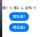
■ @Watch(监听)
@Watch用于监听状态变量的变化,当状态变量变化时,@Watch的回调方法将被调用.
@Entry
@Component
struct AdvancedWatchExample {
  @State @Watch('onMultipleChange') value1: number = 0
  @State @Watch('onMultipleChange') value2: number = 0
  @State message: string = ""

  // 监听多个状态变化的回调函数
  onMultipleChange() {
    this.message = `值1: ${this.value1}, 值2: ${this.value2}, 总和: ${this.value1 + this.value2}`
  }

  build() {
    Column({ space: 10 }) {
      Text(this.message)
        .fontSize(16)

      Button('增加值1')
        .onClick(() => {
          this.value1 += 1
        })

      Button('增加值2')
        .onClick(() => {
          this.value2 += 1
        })
    }
  }
}
■ @Monitor (监听) //状态变量修改
■ @LocalBuilder: 维持组件父子关系
@LocalBuilder myBuilderFunction() { ... } //自定义组件内自定义构建函数
■ @AnimatableExtend(动画)
@AnimatableExtend仅支持定义在全局,不支持在组件内部定义。
@AnimatableExtend定义的函数参数类型必须为number类型或者实现 AnimatableArithmetic接口的自定义类型。
@AnimatableExtend定义的函数体内只能调用@AnimatableExtend括号内组件的属性方法。
//示例通过改变Text组件宽度实现逐帧布局的效果。
@AnimatableExtend(Text)
function animatableWidth(width: number) {
  .width(width)
}

@Entry
@Component
struct AnimatablePropertyExample {
  @State textWidth: number = 80;

  build() {
    Column() {
      Text("AnimatableProperty")
        .animatableWidth(this.textWidth)
        .animation({ duration: 2000, curve: Curve.Ease })
      Button("Play")
        .onClick(() => {
          this.textWidth = this.textWidth == 80 ? 160 : 80;
        })
    }.width("100%")
    .padding(10)
  }
}
■ @Require装饰器:校验构造传参
//使用@Require装饰@State、@Prop、@Provide装饰的状态变量,可以在无本地初始值的情况下直接在组件内使用,不会编译报错。

@Entry
@Component
struct Index {
  message: string = 'Hello World';

  build() {
    Column() {
      Child({ message: this.message })
    }
  }
}

@Component
struct Child {
  @Require @State message: string;

  build() {
    Column() {
      Text(this.message) // 从API version 18开始,可以编译通过。
    }
  }
}
■ @Reusable (复用) //组件复用
■ @Param (参数) 组件外部输入
■ @Once:初始化同步一次
■ @Event (事件)
■ @Type (类型) //标记类属性的类型

讨论HarmonyOS开发技术,专注于API与组件、DevEco Studio、测试、元服务和应用上架分发等。
更多推荐

 21
21 0
0- 0


 已为社区贡献7条内容

所有评论(0)