Arkts组件类型
1.轮播图:
简介:常用于首页广告、图片 banner、引导页,支持自动播放、手势左右滑动、指示器、循环轮播。
示例:
@Entry
@Component
struct SwiperBanner {
// 图片资源数组
bannerList: ResourceColor[] = [
$r("sys.media.ohos_ic_public_image"),
$r("sys.media.ohos_ic_public_camera"),
$r("sys.media.ohos_ic_public_user")
]
build() {
Column() {
Swiper() {
ForEach(this.bannerList, (item: ResourceColor) => {
Image(item)
.width("100%")
.height(180)
.objectFit(ImageFit.Cover)
.borderRadius(8)
})
}
.width("92%")
.height(180)
.loop(true) // 循环轮播
.autoPlay(true) // 自动播放
.interval(3000) // 3秒切换一张
.indicator(true) .indicatorColor("#EEEEEE")
.indicatorSelectedColor("#007aff")
.margin({ top: 10 })
.onChange((idx: number) => {
console.info("当前轮播下标:" + idx)
})
}
.width("100%")
}
}
2.视频:
简介:
视频,支持本地视频、网络视频资源,提供播放、暂停、进度拖动、静音、循环等基础视频能力。
示例:
基础网络视频播放:
@Entry
@Component
struct VideoDemo {
build() {
Column() {
Text("网络视频播放器").fontSize(20).margin(10)
Video({
src: "https://xxx.mp4" // 替换为合法mp4视频地址
})
.width("95%")
.height(220)
.controls(true) // 显示自带播放栏
.loop(false)
.autoPlay(false)
.objectFit(ImageFit.Cover)
.onStart(() => {
console.log("视频开始播放")
})
.onFinish(() => {
console.log("视频播放完毕")
})
.onUpdate((time: number) => {
// time 当前播放毫秒
})
.onError(() => { console.log("视频加载失败")
})
}
.width("100%")
}
}
本地视频播放:
@Entry
@Component
struct LocalVideo {
build() {
Column() {
Video($rawfile("test.mp4"))
.width("90%")
.height(240)
.controls(true)
.muted(false)
}
}
}
3.图片:
简介:
图片,用于展示本地、网络、系统资源图片;支持缩放、裁剪、圆角、填充模式,是页面最常用组件。
示例:
本地媒体图片:
@Entry
@Component
struct ImageDemo {
build() {
Column({ space: 15 }) {
// 普通矩形图片
Image($r("app.media.banner"))
.width("90%")
.height(160)
.objectFit(ImageFit.Cover)
.borderRadius(10)
// 圆形头像
Image($r("app.media.user"))
.width(80)
.height(80)
.borderRadius(40)
.objectFit(ImageFit.Cover)
// 带兜底图
Image("https://xxx/test.jpg")
.width(120)
.height(120)
.alt($r("app.media.default"))
}
.width("100%")
.padding(15) } }
网络图片(需网络权限)
module.json5 添加网络权限:
"requestPermissions": [
{
"name": "ohos.permission.INTERNET"
}
]
使用:
Image("https://picsum.photos/id/237/200/200")
.width(150)
.height(150)
.objectFit(ImageFit.Cover)
4.选项卡:
简介:
选项卡,实现顶部 / 底部标签切换页面(首页、分类、我的这类导航)。
示例:
顶部普通文字选项卡:
@Entry
@Component
struct TabsTopDemo {
@State currentIndex: number = 0
build() {
Column() {
Tabs({ barPosition: BarPosition.Start, index: this.currentIndex }) {
// 第一页
TabContent() {
Text("首页页面内容").fontSize(24).margin(50)
}
.tabBar(Text("首页").fontSize(18))
// 第二页
TabContent() {
Text("分类页面内容").fontSize(24).margin(50)
}
.tabBar(Text("分类").fontSize(18))
// 第三页
TabContent() {
Text("我的页面内容").fontSize(24).margin(50)
}
.tabBar(Text("我的").fontSize(18))
}
.barHeight(50)
.width("100%")
.height("100%")
.onTabChange((index: number) => {
this.currentIndex = index
console.log("切换到:" + index)
})
}
}
}
5.文本/输入框:
Text(文本)、TextInput(输入框)
文本:Text("这是展示文本")
.fontSize(22)
.fontWeight(FontWeight.Bold)
.fontColor("#333333")
.textAlign(TextAlign.Center)
.width("100%")
输入框:
TextArea({ text: "" })
.placeholder("请输入留言内容")
.width("90%")
.height(100)
6.按钮:
简介:
按钮是用于点击触发事件(登录、提交、返回、操作按钮),支持文字按钮、图片按钮、图文组合、圆角、自定义背景。
示例:
Button("登录")
.width("90%")
.height(46)
.fontSize(18)
.backgroundColor("#007DFF")
.borderRadius(10)
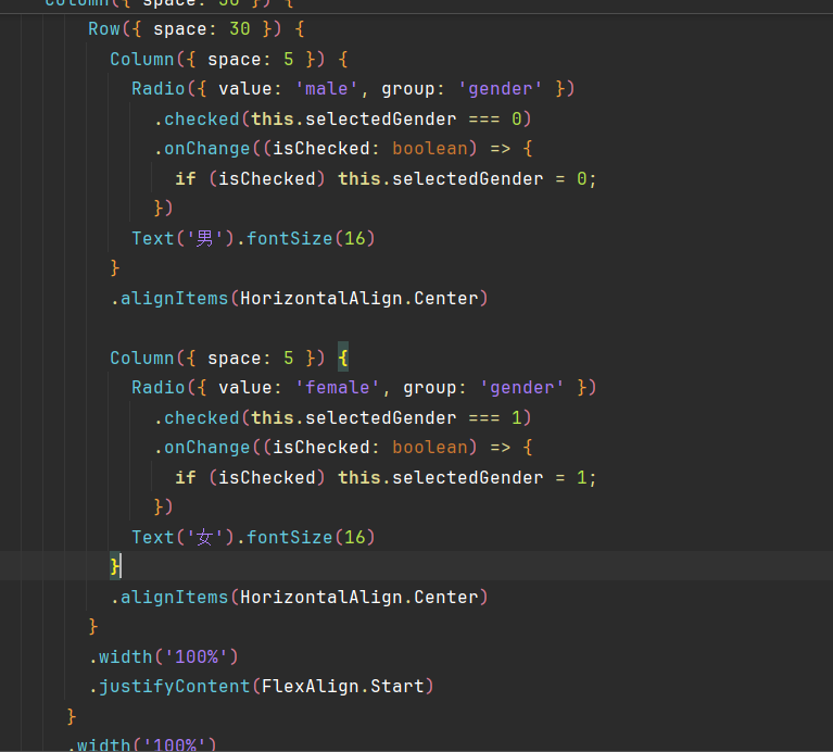
7.单选框:
简介:
同一组内只能选中一个选项,常用于性别、支付方式、单一选择场景。
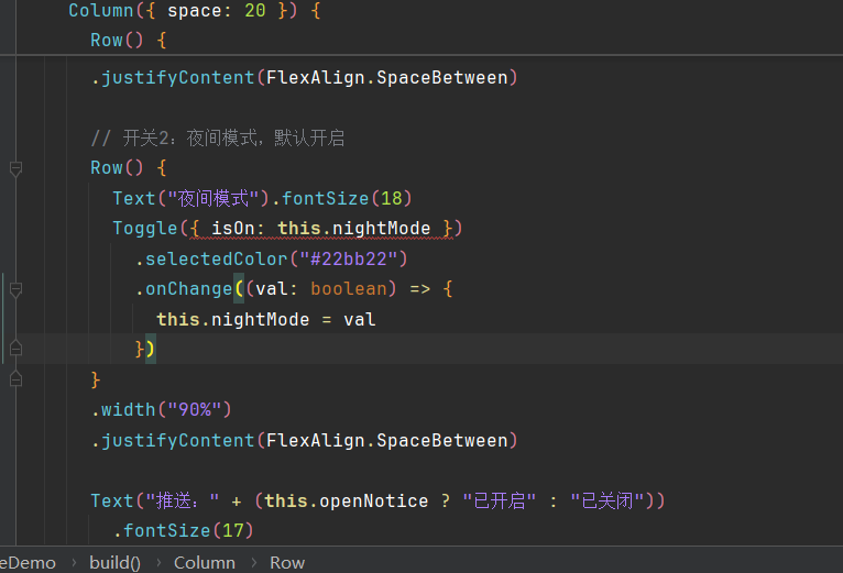
8.Toggle:
Toggle 是滑动开关组件,类似手机设置里的开启 / 关闭按钮,只有两种状态:打开、关闭。
事件
1.@status
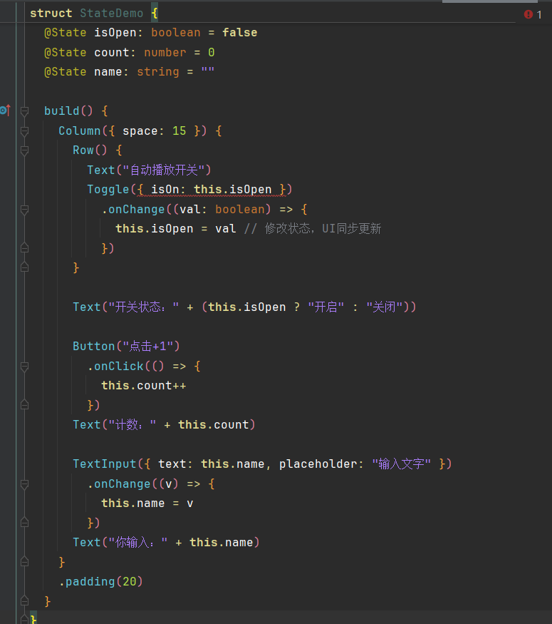
简介:@State 是 ArkTS 核心状态管理装饰器,用来定义页面内私有状态变量。
2.弹窗
两种弹窗
AlertDialog 系统简易弹窗 系统自带提示框,快速实现提示、确认、选择,无需自定义布局,代码极简。
@Entry @Component struct AlertDialogDemo { build() { Column({ space: 20 }) { Button("弹出提示弹窗") .width(180) .onClick(() => { AlertDialog.show({ title: "提示", message: "确定要删除这条数据吗?删除后无法恢复", secondaryButton: { value: "取消", action: () => { console.log("点击取消") } }, primaryButton: { value: "确定", action: () => { console.log("点击确认删除") } } }) }) } .width("100%") .padding(30) } }
CustomDialog 自定义弹窗 完全自定义布局,可放输入框、图片、表单、复杂控件,灵活度高。
// 1. 定义自定义弹窗 @CustomDialog struct LoginDialog { controller: CustomDialogController @State account: string = "" build() { Column({ space: 15 }) { Text("用户登录") .fontSize(22) .fontWeight(FontWeight.Bold) TextInput({ text: this.account, placeholder: "请输入账号" }) .width("90%") .height(44) .onChange((v) => { this.account = v }) Row({ space: 20 }) { Button("取消") .backgroundColor("#999") .onClick(() => { this.controller.close() // 关闭弹窗 }) Button("登录") .onClick(() => { console.log("账号:" + this.account) this.controller.close() }) } } .width("85%") .padding(20) .borderRadius(12) .backgroundColor(Color.White) } } // 主页面 @Entry @Component struct CustomDialogDemo { // 弹窗控制器 dialogCtrl: CustomDialogController = new CustomDialogController({ builder: LoginDialog(), autoCancel: true // 点击遮罩层自动关闭 }) build() { Column() { Button("打开登录弹窗") .width(180) .height(45) .onClick(() => { this.dialogCtrl.open() // 弹出弹窗 }) } .width("100%") .justifyContent(FlexAlign.Center) .height("100%") } }
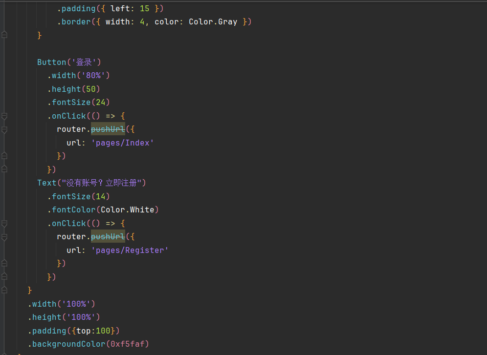
3.路由
简介:路由用于多个页面之间跳转、传参、返回上一页
4.值变化监听事件
简介:值变化监听事件,输入框、单选框、开关、滑块等控件数值 / 选中状态改变时自动触发,用来实时获取用户操作后的最新值。
格式:
控件()
.onChange((value) => {
// value:控件最新的值
})

讨论HarmonyOS开发技术,专注于API与组件、DevEco Studio、测试、元服务和应用上架分发等。
更多推荐

 3
3 0
0- 0


 已为社区贡献2条内容

所有评论(0)