《主题颜色自定义》一、ohos_arkui_theme使用指南
HarmonyOS NEXT @ohos.arkui.theme 主题换肤完整使用指南
关键词:CustomTheme、CustomColors、ThemeControl、onWillApplyTheme、主题换肤
效果
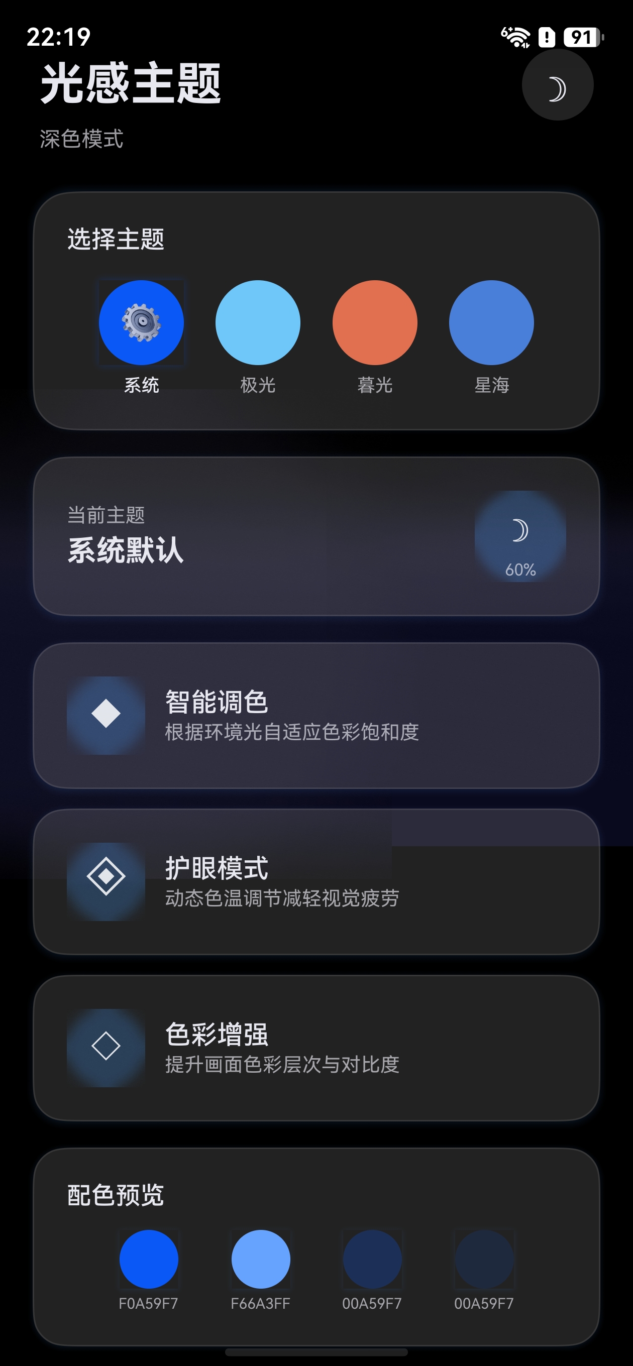
一、概述
@ohos.arkui.theme 是 HarmonyOS 提供的应用级主题换肤模块,它允许开发者自定义应用的品牌色、字体色、组件背景色等视觉风格,并实现一键切换主题的能力。
1.1 核心能力
| 能力 | 说明 |
|---|---|
| 自定义品牌色 | 通过 CustomColors 覆盖系统默认 token 色值 |
| 应用级主题切换 | 通过 ThemeControl.setDefaultTheme() 全局生效 |
| 组件感知主题变化 | onWillApplyTheme() 生命周期回调获取当前主题 |
| 深浅色主题 | 通过 colors + darkColors 分别定义浅色/深色配色 |
1.2 核心类型一览
CustomColors   → 定义具体颜色值(brand, fontPrimary, backgroundPrimary 等)
CustomTheme    → 主题对象,包含 colors(浅色)和 darkColors(深色)
ThemeControl   → 主题控制器,用于设置/切换全局主题
Theme          → 当前生效的主题对象(只读),在 onWillApplyTheme 中获取
二、环境准备
2.1 项目要求
- DevEco Studio 6.1+ (Release)
- HarmonyOS NEXT SDK (API 23+)
- 项目
compileSdkVersion≥ 23
2.2 导入方式
// 方式一:从 @kit.ArkUI 导入(推荐)
import { CustomColors, CustomTheme, ThemeControl, Theme } from '@kit.ArkUI'

// 方式二:从 @ohos.arkui.theme 导入
import { CustomColors, CustomTheme, ThemeControl, Theme } from '@ohos.arkui.theme'
兼容性提示:
ThemeColorMode枚举在某些 SDK 版本(如 HarmonyOS SDK 6.1.x)的@kit.ArkUI中可能未导出。如果编译报错Module has no exported member 'ThemeColorMode',请改用自定义状态管理深浅色模式(参考 WithTheme 指南的兼容性方案)。
两种方式功能完全一致,@kit.ArkUI 是 Kit 统一入口,推荐优先使用。
三、自定义主题颜色
3.1 理解系统 Token 色值
HarmonyOS 系统内置了一套完整的颜色 Token,每个 Token 控制 UI 的不同部分。以下是常用 Token:
| Token 名称 | 对应系统颜色 | 作用 |
|---|---|---|
brand |
sys.color.brand |
品牌色,影响 Button 默认背景、Slider 选中色等 |
fontPrimary |
sys.color.font_primary |
主文本颜色 |
fontEmphasize |
sys.color.font_emphasize |
强调文本颜色 |
fontOnPrimary |
sys.color.font_on_primary |
品牌色上的文本颜色 |
backgroundPrimary |
sys.color.background_primary |
主背景色 |
backgroundEmphasize |
sys.color.background_emphasize |
强调背景色 |
compBackgroundPrimary |
sys.color.comp_background_primary |
组件默认背景 |
compBackgroundEmphasize |
sys.color.comp_background_emphasize |
组件强调背景 |
compDivider |
sys.color.comp_divider |
分割线颜色 |
关键规则:你只需要覆盖想要修改的 Token,未修改的部分自动继承系统默认值。
3.2 实现 CustomColors
import { CustomColors } from '@kit.ArkUI'

// 定义浅色模式颜色
export class MyColors implements CustomColors {
  brand: ResourceColor = '#FF75D9'           // 品牌色:粉色
  fontPrimary: ResourceColor = '#FF182431'   // 主文本色
  fontOnPrimary: ResourceColor = '#FFFFFFFF' // 品牌色上的文字(白色)
  backgroundPrimary: ResourceColor = '#FFF5F5F5'  // 背景色
  compDivider: ResourceColor = '#1AFF75D9'   // 分割线(半透明品牌色)
}
3.3 实现 CustomTheme
import { CustomTheme } from '@kit.ArkUI'

// 定义深色模式颜色
export class MyDarkColors implements CustomColors {
  brand: ResourceColor = '#FF99E6'
  fontPrimary: ResourceColor = '#FFE6FFFFFF'
  fontOnPrimary: ResourceColor = '#FF1A1A1A'
  backgroundPrimary: ResourceColor = '#FF1A1A1A'
  compDivider: ResourceColor = '#1AFF99E6'
}

// 组合浅色 + 深色为完整主题
export class MyTheme implements CustomTheme {
  colors: MyColors = new MyColors()
  darkColors: MyDarkColors = new MyDarkColors()
}

// 导出主题实例
export const myTheme: CustomTheme = new MyTheme()
提示:如果不需要深色模式适配,可以只实现
colors,省略darkColors。
四、应用主题
4.1 方式一:应用级全局主题(ThemeControl)
ThemeControl.setDefaultTheme() 在页面 build 之前执行,可以设置整个应用的默认主题。
import { ThemeControl } from '@kit.ArkUI'
import { myTheme } from './MyTheme'

// 在模块顶层执行,确保在页面 build 前生效
ThemeControl.setDefaultTheme(myTheme)

@Entry
@Component
struct MainPage {
  build() {
    Column() {
      // 所有子组件自动应用 myTheme 的配色
      Button('品牌色按钮')  // 按钮背景自动使用 brand 色
      Slider({ value: 50 }) // 滑块已加载部分使用 brand 色
      Checkbox()            // 选中态使用 brand 色
    }
  }
}
关键要点:
setDefaultTheme()必须在模块顶层执行(不在函数内)- 调用后,应用内所有组件的默认配色都会跟随自定义主题
- 可以多次调用来动态切换全局主题
4.2 方式二:动态切换主题
import { ThemeControl } from '@kit.ArkUI'

@Entry
@Component
struct ThemeSwitchPage {
  @State themeIndex: number = 0

  build() {
    Column({ space: 20 }) {
      Button('切换主题')
        .onClick(() => {
          this.themeIndex = (this.themeIndex + 1) % 3
          switch (this.themeIndex) {
            case 0:
              ThemeControl.setDefaultTheme(defaultTheme)
              break
            case 1:
              ThemeControl.setDefaultTheme(pinkTheme)
              break
            case 2:
              ThemeControl.setDefaultTheme(greenTheme)
              break
          }
        })

      // 切换后所有组件自动更新
      Button('主按钮')
      Slider({ value: 60 })
    }
  }
}
五、感知主题变化
5.1 onWillApplyTheme 回调
当主题发生变化时(通过 ThemeControl 或 WithTheme 切换),组件的 onWillApplyTheme() 生命周期会被调用。
@Entry
@Component
struct ThemeAwarePage {
  @State brandColor: ResourceColor = $r('sys.color.brand')
  @State bgColor: ResourceColor = $r('sys.color.background_primary')

  // 在 build() 之前执行,可获取当前生效的主题对象
  onWillApplyTheme(theme: Theme) {
    // theme.colors 包含了当前主题的所有颜色值
    this.brandColor = theme.colors.brand
    this.bgColor = theme.colors.backgroundPrimary
  }

  build() {
    Column() {
      Text('主题感知文本')
        .fontColor(this.brandColor)
      Button('品牌色按钮')
        .backgroundColor(this.brandColor)
    }
    .backgroundColor(this.bgColor)
  }
}
5.2 Theme 对象结构
interface Theme {
  colors: Readonly<CustomColors>  // 当前生效的颜色(只读)
}
theme.colors 中可以访问所有 Token 颜色值:
onWillApplyTheme(theme: Theme) {
  // 常用颜色访问
  let brand = theme.colors.brand
  let font = theme.colors.fontPrimary
  let bg = theme.colors.backgroundPrimary
  let divider = theme.colors.compDivider
  // ... 更多 Token
}
六、完整示例:多主题切换应用
以下是一个完整的多主题切换示例,包含 3 种自定义主题和动态切换功能。
6.1 主题定义文件(MyThemes.ets)
import { CustomColors, CustomTheme } from '@kit.ArkUI'

// ===== 主题一:樱花粉 =====
class SakuraColors implements CustomColors {
  brand: ResourceColor = '#FFFF7EB3'
  fontPrimary: ResourceColor = '#FF2D1B2E'
  fontOnPrimary: ResourceColor = '#FFFFFFFF'
  backgroundPrimary: ResourceColor = '#FFFFF0F5'
  compDivider: ResourceColor = '#20FF7EB3'
}

class SakuraDarkColors implements CustomColors {
  brand: ResourceColor = '#FFFF5E9E'
  fontPrimary: ResourceColor = '#FFFFF0F5'
  fontOnPrimary: ResourceColor = '#FF2D1B2E'
  backgroundPrimary: ResourceColor = '#FF1A0F18'
  compDivider: ResourceColor = '#20FF5E9E'
}

class SakuraTheme implements CustomTheme {
  colors: SakuraColors = new SakuraColors()
  darkColors: SakuraDarkColors = new SakuraDarkColors()
}

// ===== 主题二:森林绿 =====
class ForestColors implements CustomColors {
  brand: ResourceColor = '#FF4CAF50'
  fontPrimary: ResourceColor = '#FF1B2D1B'
  fontOnPrimary: ResourceColor = '#FFFFFFFF'
  backgroundPrimary: ResourceColor = '#FFF0FFF0'
  compDivider: ResourceColor = '#204CAF50'
}

class ForestTheme implements CustomTheme {
  colors: ForestColors = new ForestColors()
}

// ===== 主题三:系统默认 =====
class DefaultTheme implements CustomTheme {}

// ===== 导出主题实例 =====
export const sakuraTheme: CustomTheme = new SakuraTheme()
export const forestTheme: CustomTheme = new ForestTheme()
export const defaultTheme: CustomTheme = new DefaultTheme()
6.2 主页面(ThemeSwitchDemo.ets)
import { Theme, ThemeControl } from '@kit.ArkUI'
import { sakuraTheme, forestTheme, defaultTheme } from './MyThemes'

// 设置初始默认主题
ThemeControl.setDefaultTheme(defaultTheme)

@Entry
@Component
struct ThemeSwitchDemo {
  @State currentBrand: ResourceColor = $r('sys.color.brand')
  @State currentBg: ResourceColor = $r('sys.color.background_primary')
  themeList: { name: string; theme: CustomTheme }[] = [
    { name: '系统默认', theme: defaultTheme },
    { name: '樱花粉', theme: sakuraTheme },
    { name: '森林绿', theme: forestTheme }
  ]
  @State selectedIndex: number = 0

  onWillApplyTheme(theme: Theme) {
    this.currentBrand = theme.colors.brand
    this.currentBg = theme.colors.backgroundPrimary
  }

  build() {
    Column({ space: 24 }) {
      Text('主题换肤演示')
        .fontSize(24)
        .fontWeight(FontWeight.Bold)
        .fontColor(this.currentBrand)

      // 主题选择区域
      Row({ space: 16 }) {
        ForEach(this.themeList, (item: { name: string; theme: CustomTheme }, index: number) => {
          Column({ space: 8 }) {
            Circle()
              .width(48)
              .height(48)
              .fill(index === 0 ? '#FF0A59F7' : (index === 1 ? '#FFFF7EB3' : '#FF4CAF50'))
              .shadow({
                radius: this.selectedIndex === index ? 12 : 0,
                color: this.selectedIndex === index ? '#40000000' : '#00000000'
              })
            Text(item.name)
              .fontSize(12)
              .fontColor(this.selectedIndex === index ? this.currentBrand : '#80000000')
          }
          .onClick(() => {
            this.selectedIndex = index
            ThemeControl.setDefaultTheme(item.theme)
          })
        }, (item: { name: string }, index: number) => item.name)
      }
      .justifyContent(FlexAlign.Center)
      .width('100%')

      // 展示受主题影响的组件
      Column({ space: 16 }) {
        Button('品牌色按钮')
          .buttonStyle(ButtonStyleMode.EMPHASIZED)
        Slider({ value: 50, max: 100 })
          .width('80%')
        Checkbox()
        Toggle({ type: ToggleType.Switch, isOn: true })
      }
      .padding(24)
      .borderRadius(16)
      .backgroundColor(this.currentBg)
    }
    .width('100%')
    .height('100%')
    .justifyContent(FlexAlign.Center)
    .backgroundColor($r('sys.color.background_primary'))
  }
}
6.3 运行效果说明
| 操作 | 效果 |
|---|---|
| 点击"樱花粉" | 按钮背景变粉色,文本变粉色,背景变浅粉 |
| 点击"森林绿" | 按钮背景变绿色,文本变绿色,背景变浅绿 |
| 点击"系统默认" | 恢复系统默认蓝色主题 |
| 切换系统深浅色 | 有 darkColors 的主题自动适配深色配色 |
七、最佳实践
7.1 主题文件组织
ets/
├── theme/
│   ├── ThemeColors.ets     # 颜色定义
│   ├── ThemeConfig.ets     # 主题配置导出
│   └── ThemeManager.ets    # 主题管理(可选)
├── pages/
│   └── MainPage.ets
7.2 注意事项
| 规则 | 说明 |
|---|---|
| 只覆盖需要修改的 Token | 未修改的部分继承系统默认值,减少维护成本 |
setDefaultTheme() 放在模块顶层 |
确保在页面 build 之前执行 |
始终提供 darkColors |
系统深色模式下如果没有 darkColors 会使用默认深色值 |
使用 $r('sys.color.*') 引用系统色 |
让组件自动跟随主题变化 |
配合 WithTheme 做局部主题 |
全局用 ThemeControl,局部用 WithTheme |
7.3 主题与 WithTheme 的关系
ThemeControl.setDefaultTheme()  →  影响整个应用(全局)
WithTheme({ theme: xxx })       →  只影响子组件(局部)
onWillApplyTheme()              →  两种切换方式都会触发
八、常见问题
Q1:调用 setDefaultTheme 后界面没变化?
A:确保 setDefaultTheme() 在模块顶层执行,不在函数内部执行。如果在 onClick 等事件回调中切换主题,需要传入新的主题实例。
Q2:深色模式下颜色没变?
A:需要在 CustomTheme 中实现 darkColors 属性。同时,如果使用 $r('app.color.xxx') 自定义颜色,需要在 resources/dark/element/color.json 中定义深色模式的颜色值。
Q3:如何获取当前主题的某个颜色值用于自定义组件?
A:使用 onWillApplyTheme(theme: Theme) 回调,通过 theme.colors.xxx 获取。
九、总结
@ohos.arkui.theme 提供了完整的应用级主题换肤能力:
- 定义主题:实现
CustomColors+CustomTheme接口 - 应用主题:
ThemeControl.setDefaultTheme()全局生效 - 感知变化:
onWillApplyTheme()获取当前主题颜色 - 深浅适配:通过
colors+darkColors分别定义
掌握这些核心概念后,配合 WithTheme 组件可以实现更精细的局部主题控制,打造品牌一致性的 UI 体验。
参考文档

讨论HarmonyOS开发技术,专注于API与组件、DevEco Studio、测试、元服务和应用上架分发等。
更多推荐


 0
0 0
0- 0


 已为社区贡献61条内容

所有评论(0)