《主题颜色自定义》二、WithTheme使用指南
HarmonyOS NEXT WithTheme 容器组件完整使用指南
关键词:WithTheme、ThemeColorMode、局部主题、深浅色切换、自定义配色
SDK 兼容性提示:
ThemeColorMode枚举在某些 HarmonyOS SDK 版本(如 6.1.x)的@kit.ArkUI中可能未导出。如果遇到编译错误,可改用自定义状态管理深浅色模式(详见本文第九节“兼容性方案”)。
效果
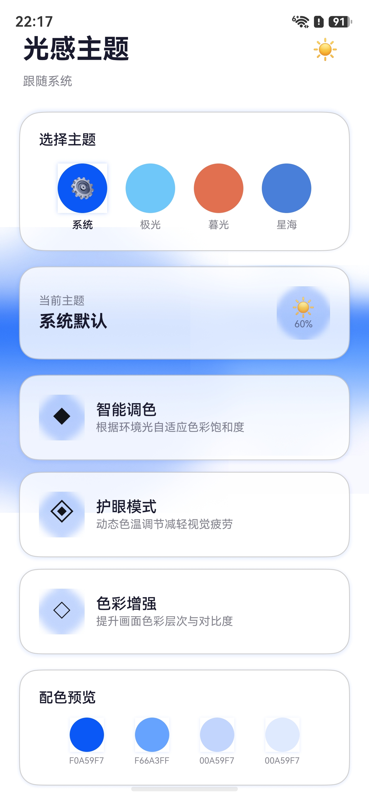 |
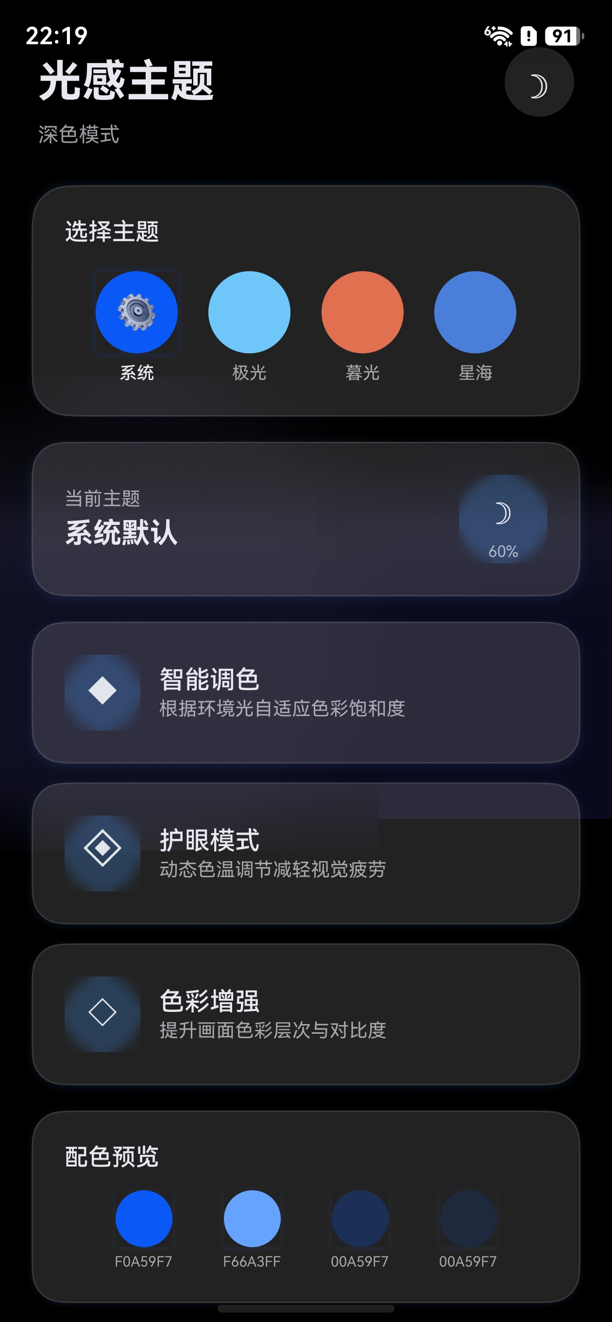 |
|---|
一、概述
WithTheme 是 HarmonyOS 提供的局部主题控制容器组件,它可以为指定区域内的子组件设置独立的深浅色模式和自定义配色,而不影响页面其他部分。
1.1 核心能力
| 能力 | 说明 |
|---|---|
| 局部深浅色切换 | 指定子组件区域固定为浅色或深色模式 |
| 局部自定义配色 | 在指定区域应用自定义 CustomTheme |
| 嵌套使用 | 支持多层嵌套,内层覆盖外层 |
| 动态切换 | 通过 @State 驱动动态更新主题配置 |
1.2 与 ThemeControl 的对比
| 特性 | ThemeControl | WithTheme |
|---|---|---|
| 作用范围 | 全局(整个应用) | 局部(子组件区域) |
| 设置方式 | ThemeControl.setDefaultTheme() |
WithTheme({ theme, colorMode }) |
| 使用时机 | 页面入口处设置默认主题 | 页面内局部区域自定义 |
| 深浅色控制 | 跟随系统或 setColorMode() |
可独立指定 ThemeColorMode |
二、接口说明
2.1 基本语法
WithTheme(options: WithThemeOptions) {
  // 子组件(仅支持单个子组件)
}
2.2 WithThemeOptions 参数
| 参数 | 类型 | 必填 | 默认值 | 说明 |
|---|---|---|---|---|
theme |
CustomTheme |
否 | undefined(跟随系统 token) |
自定义主题配色 |
colorMode |
ThemeColorMode |
否 | ThemeColorMode.SYSTEM |
深浅色模式 |
2.3 ThemeColorMode 枚举
| 值 | 说明 |
|---|---|
ThemeColorMode.SYSTEM |
跟随系统深浅色模式 |
ThemeColorMode.LIGHT |
固定使用浅色模式 |
ThemeColorMode.DARK |
固定使用深色模式 |
注意:WithTheme 不支持通用属性和通用事件,它只是一个作用域容器。
三、深浅色模式控制
3.1 基础用法:固定局部深浅色
最直接的使用场景是让页面某一部分固定为深色或浅色模式。
@Entry
@Component
struct ColorModeDemo {
  build() {
    Column() {
      // 区域一:跟随系统(默认行为)
      Column() {
        Text('跟随系统')
          .fontSize(20)
          .fontWeight(FontWeight.Bold)
      }
      .width('100%')
      .height('30%')
      .justifyContent(FlexAlign.Center)
      .backgroundColor($r('sys.color.background_primary'))

      // 区域二:固定深色模式
      WithTheme({ colorMode: ThemeColorMode.DARK }) {
        Column() {
          Text('固定深色')
            .fontSize(20)
            .fontWeight(FontWeight.Bold)
        }
        .width('100%')
        .height('30%')
        .justifyContent(FlexAlign.Center)
        .backgroundColor($r('sys.color.background_primary'))
      }

      // 区域三:固定浅色模式
      WithTheme({ colorMode: ThemeColorMode.LIGHT }) {
        Column() {
          Text('固定浅色')
            .fontSize(20)
            .fontWeight(FontWeight.Bold)
        }
        .width('100%')
        .height('30%')
        .justifyContent(FlexAlign.Center)
        .backgroundColor($r('sys.color.background_primary'))
      }
    }
    .height('100%')
  }
}
3.2 深色模式生效的前提条件
使用 ThemeColorMode.DARK 时,需要在项目中添加深色资源文件:
resources/
├── base/
│   └── element/
│       └── color.json      # 浅色模式颜色
└── dark/
    └── element/
        └── color.json      # 深色模式颜色
dark/element/color.json 示例:
{
  "color": [
    {
      "name": "start_window_background",
      "value": "#000000"
    }
  ]
}
如果缺少 dark 目录,深色模式将使用系统默认深色值,自定义的 $r('app.color.xxx') 资源不会切换。
四、自定义配色
4.1 基础用法:局部自定义主题
在指定区域应用自定义主题配色,只影响该区域内的系统组件。
import { CustomColors, CustomTheme } from '@kit.ArkUI'

// 定义绿色主题
class GreenColors implements CustomColors {
  brand: ResourceColor = '#FF4CAF50'
  fontPrimary: ResourceColor = '#FF049404'
  fontOnPrimary: ResourceColor = '#FFFFFFFF'
  compBackgroundPrimary: ResourceColor = '#FFF0FFF0'
  compDivider: ResourceColor = '#204CAF50'
}

class GreenTheme implements CustomTheme {
  colors: GreenColors = new GreenColors()
}

const greenTheme: CustomTheme = new GreenTheme()

@Entry
@Component
struct LocalThemeDemo {
  build() {
    Column({ space: 24 }) {
      // 外部:使用系统默认主题
      Column({ space: 12 }) {
        Text('系统默认主题')
          .fontSize(16)
        Button('默认按钮')
          .buttonStyle(ButtonStyleMode.EMPHASIZED)
        Slider({ value: 50 })
      }

      // 内部:使用自定义绿色主题
      WithTheme({ theme: greenTheme }) {
        Column({ space: 12 }) {
          Text('自定义绿色主题')
            .fontSize(16)
          Button('绿色按钮')
            .buttonStyle(ButtonStyleMode.EMPHASIZED)
          Slider({ value: 50 })
        }
      }
    }
    .padding(24)
  }
}
4.2 动态切换局部主题
通过 @State 驱动 WithTheme 的 theme 参数变化,实现动态切换。
import { CustomColors, CustomTheme } from '@kit.ArkUI'

class PinkColors implements CustomColors {
  brand: ResourceColor = '#FFFF7EB3'
  fontEmphasize: ResourceColor = '#FFFF7EB3'
  fontOnPrimary: ResourceColor = '#FFFFFFFF'
  compBackgroundPrimary: ResourceColor = '#FFFFF0F5'
}

class BlueColors implements CustomColors {
  brand: ResourceColor = '#FF4A7FD9'
  fontEmphasize: ResourceColor = '#FF4A7FD9'
  fontOnPrimary: ResourceColor = '#FFFFFFFF'
  compBackgroundPrimary: ResourceColor = '#FFF0F4FF'
}

class DynamicTheme implements CustomTheme {
  colors: CustomColors
  constructor(colors: CustomColors) {
    this.colors = colors
  }
}

@Entry
@Component
struct DynamicThemeSwitch {
  @State isPink: boolean = true

  build() {
    Column({ space: 20 }) {
      Button('切换主题颜色')
        .onClick(() => {
          this.isPink = !this.isPink
        })

      WithTheme({
        theme: this.isPink
          ? new DynamicTheme(new PinkColors())
          : new DynamicTheme(new BlueColors())
      }) {
        Column({ space: 12 }) {
          Text('主题区域')
            .fontSize(18)
            .fontWeight(FontWeight.Bold)
          Button('受主题影响')
            .buttonStyle(ButtonStyleMode.EMPHASIZED)
          Toggle({ type: ToggleType.Switch, isOn: true })
          Slider({ value: 60 })
        }
        .padding(20)
        .borderRadius(16)
      }
    }
    .padding(24)
  }
}
五、组合使用:theme + colorMode
WithTheme 可以同时指定 theme 和 colorMode,实现更精细的控制。
import { CustomColors, CustomTheme } from '@kit.ArkUI'

class WarmColors implements CustomColors {
  brand: ResourceColor = '#FFFF8C00'
  fontPrimary: ResourceColor = '#FF3D2C00'
  fontOnPrimary: ResourceColor = '#FFFFFFFF'
  compBackgroundPrimary: ResourceColor = '#FFFFF8F0'
}

class WarmDarkColors implements CustomColors {
  brand: ResourceColor = '#FFCC7000'
  fontPrimary: ResourceColor = '#FFFFF8F0'
  fontOnPrimary: ResourceColor = '#FF3D2C00'
  compBackgroundPrimary: ResourceColor = '#FF1A1508'
}

class WarmTheme implements CustomTheme {
  colors: WarmColors = new WarmColors()
  darkColors: WarmDarkColors = new WarmDarkColors()
}

const warmTheme: CustomTheme = new WarmTheme()

@Entry
@Component
struct CombinedDemo {
  @State mode: ThemeColorMode = ThemeColorMode.LIGHT

  build() {
    Column({ space: 16 }) {
      // 切换按钮
      Row({ space: 12 }) {
        Button('浅色')
          .onClick(() => { this.mode = ThemeColorMode.LIGHT })
        Button('深色')
          .onClick(() => { this.mode = ThemeColorMode.DARK })
        Button('系统')
          .onClick(() => { this.mode = ThemeColorMode.SYSTEM })
      }

      // 使用自定义主题 + 指定深浅色模式
      WithTheme({ theme: warmTheme, colorMode: this.mode }) {
        Column({ space: 12 }) {
          Text('暖色主题')
            .fontSize(18)
            .fontWeight(FontWeight.Bold)
          Button('暖色按钮')
            .buttonStyle(ButtonStyleMode.EMPHASIZED)
          Slider({ value: 50 })
          // 使用 $r 引用颜色,会自动跟随 colorMode 切换
          Text('资源引用颜色')
            .backgroundColor($r('app.color.start_window_background'))
            .padding(8)
        }
        .padding(20)
        .borderRadius(16)
        .width('100%')
      }
    }
    .padding(24)
  }
}
六、嵌套 WithTheme
WithTheme 支持嵌套使用,内层的配置会覆盖外层。
import { CustomColors, CustomTheme } from '@kit.ArkUI'

class OuterColors implements CustomColors {
  brand: ResourceColor = '#FF4CAF50'  // 绿色
}

class InnerColors implements CustomColors {
  brand: ResourceColor = '#FFFF5722'  // 橙色
}

const outerTheme: CustomTheme = (() => {
  class T implements CustomTheme { colors = new OuterColors() }
  return new T()
})()

const innerTheme: CustomTheme = (() => {
  class T implements CustomTheme { colors = new InnerColors() }
  return new T()
})()

@Entry
@Component
struct NestedDemo {
  build() {
    // 外层:绿色主题
    WithTheme({ theme: outerTheme }) {
      Column({ space: 20 }) {
        Button('外层:绿色主题')
          .buttonStyle(ButtonStyleMode.EMPHASIZED)

        // 内层:覆盖为橙色主题
        WithTheme({ theme: innerTheme }) {
          Column({ space: 12 }) {
            Button('内层:橙色主题')
              .buttonStyle(ButtonStyleMode.EMPHASIZED)
          }
        }
      }
      .padding(24)
    }
  }
}
嵌套规则:
- 子组件优先使用最近的
WithTheme作用域 - 内层未设置的属性会从外层继承
colorMode和theme可以独立覆盖
七、完整实战示例:页面局部换肤
以下是一个完整的实战示例,展示如何在页面中实现局部区域的换肤功能。
7.1 主题配置文件
// theme/PageThemes.ets
import { CustomColors, CustomTheme } from '@kit.ArkUI'

export interface PageThemeInfo {
  name: string
  theme: CustomTheme
  mode: ThemeColorMode
}

class RoseColors implements CustomColors {
  brand: ResourceColor = '#FFE91E63'
  fontPrimary: ResourceColor = '#FF2D1520'
  fontOnPrimary: ResourceColor = '#FFFFFFFF'
  backgroundPrimary: ResourceColor = '#FFFFF0F5'
  compBackgroundPrimary: ResourceColor = '#FFFFE0EB'
}

class RoseDarkColors implements CustomColors {
  brand: ResourceColor = '#FFC2185B'
  fontPrimary: ResourceColor = '#FFFFF0F5'
  fontOnPrimary: ResourceColor = '#FF2D1520'
  backgroundPrimary: ResourceColor = '#FF1A0F14'
  compBackgroundPrimary: ResourceColor = '#FF2A1A22'
}

class RoseTheme implements CustomTheme {
  colors: RoseColors = new RoseColors()
  darkColors: RoseDarkColors = new RoseDarkColors()
}

class MintColors implements CustomColors {
  brand: ResourceColor = '#FF00BFA5'
  fontPrimary: ResourceColor = '#FF0A2D28'
  fontOnPrimary: ResourceColor = '#FFFFFFFF'
  backgroundPrimary: ResourceColor = '#FFF0FFFC'
  compBackgroundPrimary: ResourceColor = '#FFE0FFF8'
}

class MintTheme implements CustomTheme {
  colors: MintColors = new MintColors()
}

export const pageThemes: PageThemeInfo[] = [
  { name: '玫瑰红', theme: new RoseTheme(), mode: ThemeColorMode.LIGHT },
  { name: '玫瑰红(深)', theme: new RoseTheme(), mode: ThemeColorMode.DARK },
  { name: '薄荷绿', theme: new MintTheme(), mode: ThemeColorMode.LIGHT },
]
7.2 页面实现
// pages/LocalSkinPage.ets
import { Theme } from '@kit.ArkUI'
import { pageThemes, PageThemeInfo } from '../theme/PageThemes'

@Entry
@Component
struct LocalSkinPage {
  @State themeIndex: number = 0
  @State currentTheme: CustomTheme = pageThemes[0].theme
  @State currentMode: ThemeColorMode = pageThemes[0].mode
  @State brandColor: ResourceColor = $r('sys.color.brand')

  onWillApplyTheme(theme: Theme) {
    this.brandColor = theme.colors.brand
  }

  selectTheme(index: number) {
    this.themeIndex = index
    this.currentTheme = pageThemes[index].theme
    this.currentMode = pageThemes[index].mode
  }

  build() {
    Column({ space: 20 }) {
      // 标题区域(不受 WithTheme 影响)
      Text('局部换肤演示')
        .fontSize(22)
        .fontWeight(FontWeight.Bold)

      // 主题选择按钮
      Row({ space: 8 }) {
        ForEach(pageThemes, (item: PageThemeInfo, index: number) => {
          Button(item.name)
            .fontSize(12)
            .fontColor(this.themeIndex === index ? Color.White : Color.Black)
            .backgroundColor(this.themeIndex === index ? this.brandColor : '#FFE0E0E0')
            .borderRadius(16)
            .onClick(() => { this.selectTheme(index) })
        }, (item: PageThemeInfo, index: number) => `${index}`)
      }

      // 受 WithTheme 影响的区域
      WithTheme({ theme: this.currentTheme, colorMode: this.currentMode }) {
        Column({ space: 16 }) {
          Button('主操作按钮')
            .buttonStyle(ButtonStyleMode.EMPHASIZED)
          Toggle({ type: ToggleType.Switch, isOn: true })
          Slider({ value: 65 })
            .width('80%')
          Text('当前主题风格')
            .fontSize(14)
            .padding(8)
            .borderRadius(8)
            .backgroundColor($r('sys.color.comp_background_primary'))
        }
        .padding(24)
        .borderRadius(20)
        .width('100%')
      }
    }
    .padding(24)
    .width('100%')
    .height('100%')
  }
}
八、最佳实践
8.1 使用场景
| 场景 | 推荐方式 |
|---|---|
| 整个应用换肤 | ThemeControl.setDefaultTheme() |
| 页面某区域独立风格 | WithTheme({ theme }) |
| 强制某区域深色/浅色 | WithTheme({ colorMode }) |
| 预览主题效果 | WithTheme 嵌套展示不同主题 |
| 弹窗/浮层独立主题 | 在弹窗内容中使用 WithTheme |
8.2 注意事项
-
单子组件限制:
WithTheme只接受单个子组件,如果需要多个子组件,用Column或Row包裹。 -
资源文件配合:使用
$r('app.color.xxx')时,需要同时配置base和dark资源目录才能正确切换深浅色。 -
性能考虑:避免频繁创建主题对象。建议在模块顶层定义常量,而非在
build()中new。 -
与系统组件配合:
Button、Slider、Toggle、Checkbox等系统组件会自动响应WithTheme的主题变化。
8.3 代码组织建议
ets/
├── theme/
│   ├── PageThemes.ets       # 局部主题定义
│   └── AppThemes.ets        # 全局主题定义
├── pages/
│   ├── MainPage.ets         # 使用 ThemeControl
│   └── DetailPage.ets       # 使用 WithTheme
九、常见问题
Q1:WithTheme 内使用 $r('app.color.xxx') 颜色没变?
A:$r('app.color.xxx') 切换深浅色需要在 dark/element/color.json 中定义对应颜色。如果只有 base 目录下的定义,colorMode 切换不会生效。
Q2:WithTheme 中可以放多个子组件吗?
A:不可以直接放多个。需要用 Column、Row、Stack 等容器组件包裹:
// 错误
WithTheme({ theme: myTheme }) {
  Text('A')
  Text('B')
}
// 正确
WithTheme({ theme: myTheme }) {
  Column() {
    Text('A')
    Text('B')
  }
}
Q3:WithTheme 和 ThemeControl 同时使用会怎样?
A:WithTheme 的作用域内会覆盖 ThemeControl 的全局设置。在 WithTheme 作用域外的组件仍然使用 ThemeControl 设置的全局主题。
Q4:如何同时改变主题和深浅色模式?
A:同时传递 theme 和 colorMode 参数:
WithTheme({ theme: myTheme, colorMode: ThemeColorMode.DARK }) { ... }
如果
ThemeColorMode不可用,可以只传theme,通过自定义状态管理深浅色,详见第九节。
九、兼容性方案:当 ThemeColorMode 不可用时
在某些 HarmonyOS SDK 版本中,ThemeColorMode 可能无法从 @kit.ArkUI 导出。此时可以采用以下替代方案:
9.1 自定义深浅色状态管理
import { CustomTheme } from '@kit.ArkUI'
import { ConfigurationConstant } from '@kit.AbilityKit'

@Entry
@Component
struct CompatibleThemePage {
  // 用数字索引代替 ThemeColorMode 枚举
  // 0: 跟随系统, 1: 浅色, 2: 深色
  @State colorModeIndex: number = 0
  @State isDarkMode: boolean = false
  @State currentTheme: CustomTheme = myCustomTheme
  @StorageProp('currentColorMode') systemColorMode: ConfigurationConstant.ColorMode =
    ConfigurationConstant.ColorMode.COLOR_MODE_LIGHT

  updateDarkMode(): void {
    if (this.colorModeIndex === 2) {
      this.isDarkMode = true
    } else if (this.colorModeIndex === 1) {
      this.isDarkMode = false
    } else {
      this.isDarkMode = this.systemColorMode === ConfigurationConstant.ColorMode.COLOR_MODE_DARK
    }
  }

  switchColorMode(): void {
    this.colorModeIndex = (this.colorModeIndex + 1) % 3
    this.updateDarkMode()
  }

  build() {
    // WithTheme 只传 theme,深浅色通过自定义颜色值管理
    WithTheme({ theme: this.currentTheme }) {
      Column() {
        Button('切换深浅色')
          .onClick(() => { this.switchColorMode() })
        Text(this.isDarkMode ? '深色' : '浅色')
          .fontColor(this.isDarkMode ? '#FFFFFF' : '#000000')
          .backgroundColor(this.isDarkMode ? '#1A1A1A' : '#F5F5F5')
      }
    }
  }
}
9.2 方案对比
| 特性 | ThemeColorMode 方式 | 自定义状态方式 |
|---|---|---|
| SDK 兼容性 | 部分版本不可用 | 所有版本可用 |
| 系统组件自动适配 | 是(WithTheme 内部处理) | 需要手动控制颜色 |
| 灵活性 | 仅三种模式 | 可任意扩展 |
| 代码复杂度 | 较低 | 稍高 |
推荐:对于自定义 UI 较多的应用,使用自定义状态管理方式更灵活;对于主要依赖系统组件的应用,优先尝试 ThemeColorMode。
十、总结
WithTheme 是 HarmonyOS 主题系统的局部控制利器:
colorMode控制局部深浅色(SYSTEM / LIGHT / DARK)theme控制局部自定义配色(CustomTheme实例)- 两者可组合使用,实现更精细的控制
- 支持嵌套,内层覆盖外层
- 配合
$r()资源引用和dark资源目录实现完整的深浅色适配
在实际项目中,通常将 ThemeControl(全局主题)与 WithTheme(局部主题)配合使用,构建灵活的多主题 UI 架构。
参考文档

讨论HarmonyOS开发技术,专注于API与组件、DevEco Studio、测试、元服务和应用上架分发等。
更多推荐


 3
3 0
0- 0


 已为社区贡献61条内容

所有评论(0)