HarmonyOS7 用 AlignRuleOption 做跟手悬浮按钮:左手右手都顺手
智感握姿里最直观的变化,是页面上的悬浮按钮会跟着左右手状态移动。这个效果不是用一堆 position 硬算出来的,而是靠 RelativeContainer 和 AlignRuleOption。
项目源码:https://gitcode.com/HarmonyOS_Samples/SmartReach/tree/master
先看按钮长什么样
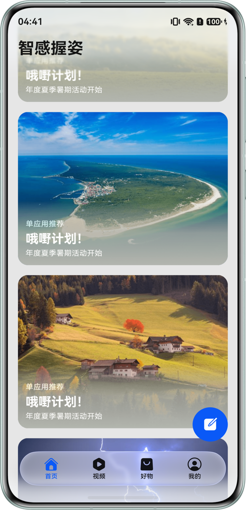
页面底部有一个圆形悬浮按钮,它会根据握持方向靠左或靠右。手机上看起来很轻,平板上就更有意义了。
初始对齐规则
MainPage.ets 里先定义了默认对齐规则:
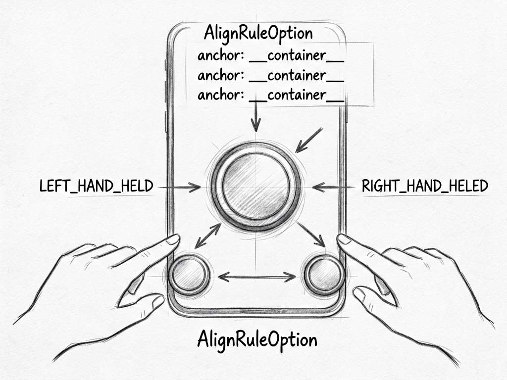
@Local floatingAlignRules: AlignRuleOption = {
  right: { anchor: '__container__', align: HorizontalAlign.End },
  bottom: { anchor: '__container__', align: VerticalAlign.Bottom },
}
这段表示:默认贴着父容器右下角。__container__ 可以理解成当前 RelativeContainer 的容器锚点。
小白可以这样记:right + bottom 就是右下,left + bottom 就是左下。
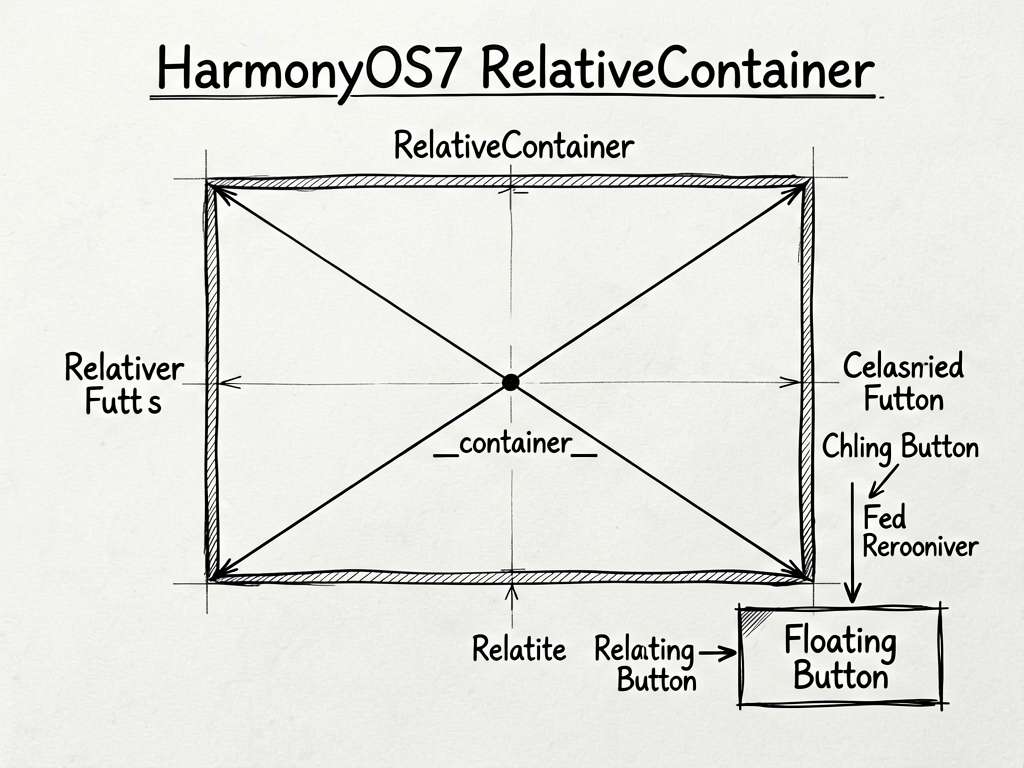
按钮放在 RelativeContainer 里
代码里外层是 RelativeContainer:
RelativeContainer() {
  HdsTabs({ controller: this.controller }) {
    // 页面主体
  }

  Row() {
    SymbolGlyph($r('sys.symbol.square_and_pencil_fill'))
      .fontColor([$r('sys.color.icon_on_primary')])
      .fontSize($r('sys.float.Title_M'))
  }
  .alignRules(this.floatingAlignRules)
  .width(56)
  .aspectRatio(1)
}
Row 是圆形按钮,.alignRules(this.floatingAlignRules) 决定它在容器里的位置。
这比手动写坐标好维护。屏幕变宽、设备旋转、进入折叠屏状态时,对齐规则比绝对坐标更稳。
左手握持时改成 left
握持状态变化后,代码会把对齐规则换掉:
if (status === motion.HoldingHandStatus.LEFT_HAND_HELD) {
  this.floatingAlignRules = {
    left: { anchor: '__container__', align: HorizontalAlign.Start },
    bottom: { anchor: '__container__', align: VerticalAlign.Bottom },
  };
}
这里没有改按钮本身,也没有改父容器,只改了状态对象。ArkUI 会根据状态变化刷新布局。
右手握持时改回 right
右手握持对应的是:
else if (status === motion.HoldingHandStatus.RIGHT_HAND_HELD) {
  this.floatingAlignRules = {
    right: { anchor: '__container__', align: HorizontalAlign.End },
    bottom: { anchor: '__container__', align: VerticalAlign.Bottom },
  };
}
这就是跟手的本质:系统告诉你状态,你更新 UI 对齐规则。
margin 也做了断点适配
按钮不是贴死到边缘,它还有左右 margin:
.margin({
  left: new BreakpointType({
    sm: $r('sys.float.padding_level8'),
    md: $r('sys.float.padding_level12'),
    lg: $r('sys.float.padding_level16')
  }).getValue(this.globalInfoModel.widthBreakpoint),
  right: new BreakpointType({
    sm: $r('sys.float.padding_level8'),
    md: $r('sys.float.padding_level12'),
    lg: $r('sys.float.padding_level16')
  }).getValue(this.globalInfoModel.widthBreakpoint),
  bottom: 100,
})
小屏边距小一点,大屏边距大一点,这样按钮不会挤在屏幕边上。
写在最后
做悬浮按钮不要一上来就想着自己算坐标。这个示例给了一个更稳的写法:RelativeContainer 管布局,AlignRuleOption 管方向,状态变化时只改规则。简单,但很实用。

讨论HarmonyOS开发技术,专注于API与组件、DevEco Studio、测试、元服务和应用上架分发等。
更多推荐


 51
51 0
0- 0


 已为社区贡献604条内容

所有评论(0)