鸿蒙 HarmonyOS ArkTS 音乐播放器界面布局深度学习指南
项目演示
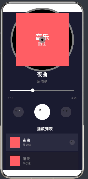
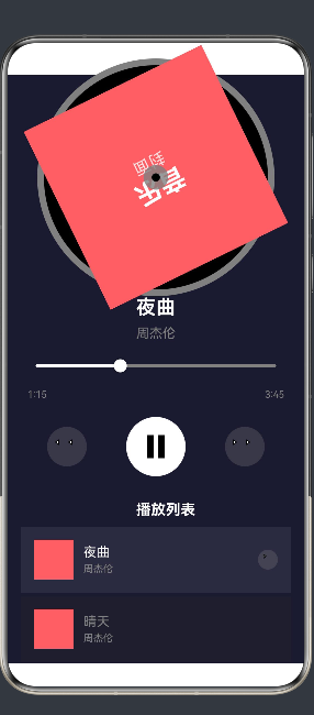
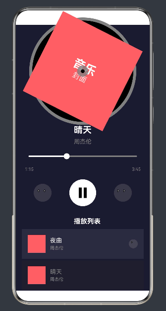
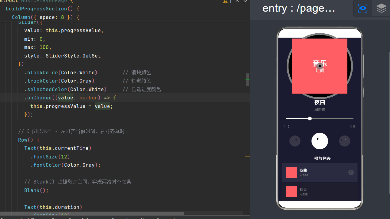
API Level: 24 | 框架: ArkUI | 语言: ArkTS
目录
- 鸿蒙 HarmonyOS 与 ArkTS 概述
- 音乐播放器界面设计理念
- 核心布局组件详解
- 封面区域实现:唱片效果与旋转动画
- 控制条区域实现:播放控制与交互
- 列表区域实现:滚动列表与状态管理
- 状态管理与组件通信
- 动画效果与交互体验
- API Level 24 特性详解
- 完整代码实现
- 常见问题与解决方案
- 进阶优化与最佳实践
1. 鸿蒙 HarmonyOS 与 ArkTS 概述
1.1 HarmonyOS 简介
HarmonyOS 是华为公司自主研发的分布式操作系统,旨在实现全场景智能设备的无缝连接。其核心特性包括:
- 分布式架构:支持多设备协同工作,实现能力共享
- 弹性部署:可运行于手机、平板、手表、电视等多种设备
- 统一开发:一套代码可部署到多种设备
1.2 ArkTS 语言基础
ArkTS 是 HarmonyOS 的原生开发语言,基于 TypeScript 扩展而来,专为声明式 UI 开发设计。其核心特性:
@Entry
@Component
struct MusicPlayerPage {
  @State isPlaying: boolean = false;

  build() {
    Column() {
      Text('Hello World')
        .fontSize(24)
    }
  }
}
关键装饰器说明:
| 装饰器 | 作用 | 使用场景 |
|---|---|---|
@Entry |
标记页面入口组件 | 页面级组件 |
@Component |
标记自定义组件 | 可复用的 UI 组件 |
@State |
标记状态变量 | 需要驱动 UI 更新的变量 |
@Builder |
标记构建函数 | 复用的 UI 片段 |
1.3 ArkUI 组件体系
ArkUI 提供了丰富的 UI 组件,分为以下几类:
- 布局组件:Column、Row、Stack、Flex
- 基础组件:Text、Image、Button、TextInput
- 容器组件:List、Scroll、Tab
- 画布组件:Canvas、Path、Circle
2. 音乐播放器界面设计理念
2.1 界面布局架构
音乐播放器采用经典的垂直布局结构,从上到下分为五个功能区域:
┌─────────────────────────────────────┐
│         封面区域 (Cover Section)     │
│    ┌───────────────────────────┐    │
│    │                           │    │
│    │      圆形唱片封面          │    │
│    │     (旋转动画效果)         │    │
│    │                           │    │
│    └───────────────────────────┘    │
├─────────────────────────────────────┤
│      信息区域 (Info Section)         │
│    歌曲标题                          │
│    歌手名称                          │
├─────────────────────────────────────┤
│     进度条区域 (Progress Section)    │
│    ███████████░░░░░░░░░░░░░░░░░     │
│    1:15                          3:45│
├─────────────────────────────────────┤
│     控制条区域 (Control Bar)         │
│    ◀◀    ▶/⏸    ▶▶                 │
├─────────────────────────────────────┤
│     列表区域 (Song List)             │
│    ┌───────────────────────────┐    │
│    │  [封面] 歌曲1 - 歌手1      │    │
│    │  [封面] 歌曲2 - 歌手2      │    │
│    │  [封面] 歌曲3 - 歌手3      │    │
│    └───────────────────────────┘    │
└─────────────────────────────────────┘
2.2 设计原则
- 视觉层次分明:封面作为视觉焦点,占据最大空间
- 交互便捷:控制按钮位于手指自然触及区域
- 信息清晰:播放状态一目了然
- 响应式设计:适配不同屏幕尺寸
3. 核心布局组件详解
3.1 Column 垂直布局
Column 组件用于垂直排列子组件,是构建页面的基础布局容器:
Column() {
  Text('第一行')
  Text('第二行')
  Text('第三行')
}
.width('100%')
.height('100%')
.justifyContent(FlexAlign.Center)
常用属性:
| 属性 | 类型 | 说明 |
|---|---|---|
width |
string/number | 宽度 |
height |
string/number | 高度 |
justifyContent |
FlexAlign | 垂直对齐方式 |
alignItems |
HorizontalAlign | 水平对齐方式 |
space |
number | 子组件间距 |
layoutWeight |
number | 权重分配 |
3.2 Row 水平布局
Row 组件用于水平排列子组件,常用于构建行内元素:
Row({ space: 16 }) {
  Text('左侧')
  Blank()
  Text('右侧')
}
.width('100%')
3.3 Stack 叠层布局
Stack 组件用于叠加子组件,实现层叠效果:
Stack({ alignContent: Alignment.Center }) {
  Circle({ width: 100, height: 100 })
    .fill(Color.Black)
  Text('中心文字')
    .fontColor(Color.White)
}
关键属性:
| 属性 | 说明 |
|---|---|
alignContent |
子组件对齐方式 |
Alignment.Center |
居中对齐 |
Alignment.TopStart |
左上角对齐 |
3.4 List 列表组件
List 组件用于展示可滚动列表,支持高性能渲染:
List({ space: 4 }) {
  ForEach(songList, (item) => {
    ListItem() {
      Text(item.title)
    }
  }, (item) => item.id.toString())
}
.layoutWeight(1)
4. 封面区域实现:唱片效果与旋转动画
4.1 唱片效果设计
唱片效果采用多层 Stack 叠加实现,从外到内依次为:
- 外层边框:黑色圆形带灰色描边
- 内层背景:黑色圆形
- 封面图片:圆形裁剪的封面
- 中心轴:灰色圆环和黑色圆点
@Builder
buildCoverSection() {
  Column() {
    Stack({ alignContent: Alignment.Center }) {
      // 外层边框
      Circle({ width: 280, height: 280 })
        .fill(Color.Black)
        .stroke(Color.Gray)
        .strokeWidth(8)

      // 内层背景
      Circle({ width: 260, height: 260 })
        .fill(Color.Black)
        .opacity(0.9)

      // 封面核心区域
      Stack() {
        Column() {
          Text('音乐')
            .fontSize(32)
            .fontWeight(FontWeight.Bold)
            .fontColor(Color.White)
          Text('封面')
            .fontSize(20)
            .fontColor(Color.White)
            .opacity(0.8)
        }
      }
      .width(240)
      .height(240)
      .backgroundColor('#FF6B6B')
      .clipShape(Circle())
      .rotate({ angle: this.isPlaying ? 360 : 0 })
      .animation({
        duration: 20000,
        iterations: -1,
        curve: Curve.Linear
      })

      // 中心轴
      Circle({ width: 30, height: 30 })
        .fill(Color.Gray)
        .opacity(0.8)

      // 中心圆点
      Circle({ width: 10, height: 10 })
        .fill(Color.Black)
    }
    .layoutWeight(1)
  }
  .width('100%')
  .justifyContent(FlexAlign.Center)
  .layoutWeight(1.2)
}
4.2 圆形裁剪技巧
使用 clipShape(Circle()) 实现圆形裁剪,需注意:
- 宽高相等:确保
width == height才能得到正圆形 - 裁剪顺序:
clipShape应在尺寸设置之后调用 - 背景色设置:使用
backgroundColor设置背景色
Stack() {
  // 内容
}
.width(240)
.height(240)
.backgroundColor('#FF6B6B')
.clipShape(Circle())
4.3 旋转动画实现
播放状态下的旋转动画通过 rotate 和 animation 组合实现:
.rotate({ angle: this.isPlaying ? 360 : 0 })
.animation({
  duration: 20000,      // 20秒旋转一圈
  iterations: -1,       // 无限循环
  curve: Curve.Linear   // 线性动画
})
动画参数说明:
| 参数 | 类型 | 说明 |
|---|---|---|
duration |
number | 动画时长(毫秒) |
iterations |
number | 循环次数,-1 表示无限 |
curve |
Curve | 动画曲线 |
delay |
number | 延迟时间(毫秒) |
5. 控制条区域实现:播放控制与交互
5.1 控制按钮布局
控制条使用 Row 水平排列三个按钮,顺序为:上一首 → 播放/暂停 → 下一首
@Builder
buildControlBar() {
  Row({ space: 48 }) {
    this.buildSkipButton(true)   // 上一首
    this.buildPlayButton()       // 播放/暂停
    this.buildSkipButton(false)  // 下一首
  }
  .width('100%')
  .padding({ top: 20, bottom: 20 })
  .justifyContent(FlexAlign.Center)
}
5.2 播放/暂停按钮
播放/暂停按钮是视觉焦点,尺寸最大,使用白色圆形背景:
@Builder
buildPlayButton() {
  Stack({ alignContent: Alignment.Center }) {
    // 按钮背景
    Circle({ width: 72, height: 72 })
      .fill(Color.White)

    // 根据播放状态显示不同图标
    if (this.isPlaying) {
      // 暂停状态 - 双竖线
      Row({ space: 6 }) {
        Column()
          .width(8)
          .height(28)
          .backgroundColor(Color.Black)
        Column()
          .width(8)
          .height(28)
          .backgroundColor(Color.Black)
      }
    } else {
      // 播放状态 - 三角形
      Path()
        .width(24)
        .height(28)
        .commands('M0,0 L0,28 L20,14 Z')
        .fill(Color.Black)
    }
  }
  .onClick(() => {
    this.togglePlay()
  })
}
5.3 Path 组件绘制图标
使用 Path 组件绘制矢量图标,通过 SVG path 命令定义形状:
// 播放三角形
Path()
  .width(24)
  .height(28)
  .commands('M0,0 L0,28 L20,14 Z')
  .fill(Color.Black)

// 向左箭头
Path()
  .width(12)
  .height(16)
  .commands('M12,0 L0,8 L12,16 Z')
  .fill(Color.White)
Path 命令说明:
| 命令 | 语法 | 说明 |
|---|---|---|
M |
M x,y |
移动到指定坐标 |
L |
L x,y |
绘制直线到指定坐标 |
Z |
Z |
闭合路径 |
5.4 上一首/下一首按钮
@Builder
buildSkipButton(isPrevious: boolean) {
  Stack({ alignContent: Alignment.Center }) {
    Circle({ width: 48, height: 48 })
      .fill(Color.Gray)
      .opacity(0.3)

    Row({ space: 4 }) {
      if (isPrevious) {
        // 上一首 - 两个向左箭头
        Path()
          .width(12)
          .height(16)
          .commands('M12,0 L0,8 L12,16 Z')
          .fill(Color.White)
        Path()
          .width(12)
          .height(16)
          .commands('M12,0 L0,8 L12,16 Z')
          .fill(Color.White)
      } else {
        // 下一首 - 两个向右箭头
        Path()
          .width(12)
          .height(16)
          .commands('M0,0 L12,8 L0,16 Z')
          .fill(Color.White)
        Path()
          .width(12)
          .height(16)
          .commands('M0,0 L12,8 L0,16 Z')
          .fill(Color.White)
      }
    }
  }
  .onClick(() => {
    if (isPrevious) {
      this.playPrevious()
    } else {
      this.playNext()
    }
  })
}
6. 列表区域实现:滚动列表与状态管理
6.1 列表布局结构
列表区域包含标题和可滚动列表两部分:
@Builder
buildSongList() {
  Column() {
    // 列表标题
    Text('播放列表')
      .fontSize(18)
      .fontWeight(FontWeight.Bold)
      .fontColor(Color.White)
      .padding({ left: 24, top: 10, bottom: 10 })

    // 歌曲列表
    List({ space: 4 }) {
      ForEach(this.songList, (item: SongItem, index: number) => {
        ListItem() {
          // 列表项内容
        }
      }, (item: SongItem) => item.id.toString())
    }
    .width('100%')
    .layoutWeight(1)
    .padding({ left: 16, right: 16 })
  }
  .width('100%')
  .layoutWeight(1)
}
6.2 列表项设计
每个列表项包含:封面缩略图、歌曲信息、播放状态标识
ListItem() {
  Row({ space: 12 }) {
    // 封面缩略图
    Stack() {
    }
    .width(48)
    .height(48)
    .clipShape(Circle())
    .backgroundColor('#FF6B6B')

    // 歌曲信息
    Column({ space: 4 }) {
      Text(item.title)
        .fontSize(16)
        .fontColor(item.isPlaying ? Color.White : Color.Gray)

      Text(item.artist)
        .fontSize(12)
        .fontColor(Color.Gray)
    }
    .layoutWeight(1)
    .alignItems(HorizontalAlign.Start)

    // 播放状态标识
    if (item.isPlaying) {
      Stack({ alignContent: Alignment.Center }) {
        Circle({ width: 24, height: 24 })
          .fill(Color.Gray)
          .opacity(0.3)

        Path()
          .width(10)
          .height(12)
          .commands('M0,0 L0,12 L8,6 Z')
          .fill(Color.White)
      }
    }
  }
  .width('100%')
  .padding(16)
  .backgroundColor(item.isPlaying ? '#2a2a3e' : '#1e1e2e')
  .onClick(() => {
    this.playSong(index)
  })
}
6.3 ForEach 渲染优化
ForEach 的第三个参数是 keyGenerator,用于优化列表性能:
ForEach(
  this.songList,                        // 数据源
  (item: SongItem, index: number) => {  // 渲染函数
    ListItem() {
      // 内容
    }
  },
  (item: SongItem) => item.id.toString() // key生成器
)
keyGenerator 的重要性:
- 帮助框架识别列表项的唯一性
- 减少不必要的 DOM 操作
- 提升列表滚动性能
7. 状态管理与组件通信
7.1 @State 状态变量
@State 装饰器标记的变量会触发 UI 更新:
@State isPlaying: boolean = false
@State currentSongIndex: number = 0
@State progressValue: number = 35
7.2 播放状态切换
togglePlay(): void {
  this.isPlaying = !this.isPlaying
}
7.3 歌曲切换逻辑
使用取模运算实现循环播放:
playPrevious(): void {
  this.currentSongIndex = (this.currentSongIndex - 1 + this.songList.length) % this.songList.length
  this.updatePlayingState()
}

playNext(): void {
  this.currentSongIndex = (this.currentSongIndex + 1) % this.songList.length
  this.updatePlayingState()
}
7.4 状态同步更新
updatePlayingState(): void {
  for (let i = 0; i < this.songList.length; i++) {
    this.songList[i].isPlaying = (i === this.currentSongIndex)
  }
}
7.5 列表点击播放
playSong(index: number): void {
  this.currentSongIndex = index
  this.isPlaying = true
  this.updatePlayingState()
}
8. 动画效果与交互体验
8.1 旋转动画
封面旋转动画在播放状态切换时自动触发:
.rotate({ angle: this.isPlaying ? 360 : 0 })
.animation({
  duration: 20000,
  iterations: -1,
  curve: Curve.Linear
})
8.2 进度条交互
进度条支持拖动调节:
Slider({
  value: this.progressValue,
  min: 0,
  max: 100,
  style: SliderStyle.OutSet
})
  .blockColor(Color.White)
  .trackColor(Color.Gray)
  .selectedColor(Color.White)
  .onChange((value: number) => {
    this.progressValue = value
  })
8.3 按钮点击反馈
所有按钮都绑定了点击事件:
.onClick(() => {
  this.togglePlay()
})
8.4 列表项高亮
当前播放歌曲的列表项使用不同背景色高亮:
.backgroundColor(item.isPlaying ? '#2a2a3e' : '#1e1e2e')
9. API Level 24 特性详解
9.1 API Level 概述
API Level 24 是 HarmonyOS NEXT 的重要版本,带来了多项新特性:
9.2 新增组件特性
Slider 组件增强:
- 支持
SliderStyle.InSet和SliderStyle.OutSet两种样式 - 提供更丰富的自定义属性
Path 组件增强:
- 支持更复杂的路径绘制
- 提供更好的性能优化
Circle 组件:
- 支持独立的
stroke和strokeWidth属性 - 提供更灵活的样式控制
9.3 状态管理改进
@State 响应式更新:
- 更精确的状态追踪
- 更少的不必要渲染
9.4 动画系统增强
animation 方法:
- 支持更多动画曲线
- 提供更好的动画控制
9.5 布局优化
layoutWeight 优化:
- 更精确的权重分配
- 支持非整数权重值
10. 完整代码实现
10.1 Index.ets 完整代码
@Entry
@Component
struct MusicPlayerPage {
  @State isPlaying: boolean = false
  @State currentSongIndex: number = 0
  @State progressValue: number = 35
  @State duration: string = '3:45'
  @State currentTime: string = '1:15'

  @State songList: Array<SongItem> = [
    { id: 1, title: '夜曲', artist: '周杰伦', isPlaying: true },
    { id: 2, title: '晴天', artist: '周杰伦', isPlaying: false },
    { id: 3, title: '稻香', artist: '周杰伦', isPlaying: false },
    { id: 4, title: '七里香', artist: '周杰伦', isPlaying: false },
    { id: 5, title: '青花瓷', artist: '周杰伦', isPlaying: false },
    { id: 6, title: '简单爱', artist: '周杰伦', isPlaying: false },
    { id: 7, title: '告白气球', artist: '周杰伦', isPlaying: false },
    { id: 8, title: '发如雪', artist: '周杰伦', isPlaying: false },
  ]

  build() {
    Column() {
      this.buildCoverSection()
      this.buildInfoSection()
      this.buildProgressSection()
      this.buildControlBar()
      this.buildSongList()
    }
    .width('100%')
    .height('100%')
    .backgroundColor($r('app.color.app_background'))
    .padding({ top: $r('app.float.safe_area_top'), bottom: $r('app.float.safe_area_bottom') })
  }

  @Builder
  buildCoverSection() {
    Column() {
      Stack({ alignContent: Alignment.Center }) {
        Circle({ width: 280, height: 280 })
          .fill(Color.Black)
          .stroke(Color.Gray)
          .strokeWidth(8)

        Circle({ width: 260, height: 260 })
          .fill(Color.Black)
          .opacity(0.9)

        Stack() {
          Column() {
            Text('音乐')
              .fontSize(32)
              .fontWeight(FontWeight.Bold)
              .fontColor(Color.White)
            Text('封面')
              .fontSize(20)
              .fontColor(Color.White)
              .opacity(0.8)
          }
        }
        .width(240)
        .height(240)
        .backgroundColor('#FF6B6B')
        .clipShape(Circle())
        .rotate({ angle: this.isPlaying ? 360 : 0 })
        .animation({
          duration: 20000,
          iterations: -1,
          curve: Curve.Linear
        })

        Circle({ width: 30, height: 30 })
          .fill(Color.Gray)
          .opacity(0.8)

        Circle({ width: 10, height: 10 })
          .fill(Color.Black)
      }
      .layoutWeight(1)
    }
    .width('100%')
    .justifyContent(FlexAlign.Center)
    .layoutWeight(1.2)
  }

  @Builder
  buildInfoSection() {
    Column({ space: 8 }) {
      Text(this.songList[this.currentSongIndex].title)
        .fontSize(24)
        .fontWeight(FontWeight.Bold)
        .fontColor(Color.White)

      Text(this.songList[this.currentSongIndex].artist)
        .fontSize(16)
        .fontColor(Color.Gray)
    }
    .width('100%')
    .padding({ top: 20, bottom: 10 })
  }

  @Builder
  buildProgressSection() {
    Column({ space: 8 }) {
      Slider({
        value: this.progressValue,
        min: 0,
        max: 100,
        style: SliderStyle.OutSet
      })
        .blockColor(Color.White)
        .trackColor(Color.Gray)
        .selectedColor(Color.White)
        .onChange((value: number) => {
          this.progressValue = value
        })

      Row() {
        Text(this.currentTime)
          .fontSize(12)
          .fontColor(Color.Gray)

        Blank()

        Text(this.duration)
          .fontSize(12)
          .fontColor(Color.Gray)
      }
      .width('100%')
    }
    .width('100%')
    .padding({ left: 24, right: 24 })
  }

  @Builder
  buildControlBar() {
    Row({ space: 48 }) {
      this.buildSkipButton(true)
      this.buildPlayButton()
      this.buildSkipButton(false)
    }
    .width('100%')
    .padding({ top: 20, bottom: 20 })
    .justifyContent(FlexAlign.Center)
  }

  @Builder
  buildPlayButton() {
    Stack({ alignContent: Alignment.Center }) {
      Circle({ width: 72, height: 72 })
        .fill(Color.White)

      if (this.isPlaying) {
        Row({ space: 6 }) {
          Column()
            .width(8)
            .height(28)
            .backgroundColor(Color.Black)
          Column()
            .width(8)
            .height(28)
            .backgroundColor(Color.Black)
        }
      } else {
        Path()
          .width(24)
          .height(28)
          .commands('M0,0 L0,28 L20,14 Z')
          .fill(Color.Black)
      }
    }
    .onClick(() => {
      this.togglePlay()
    })
  }

  @Builder
  buildSkipButton(isPrevious: boolean) {
    Stack({ alignContent: Alignment.Center }) {
      Circle({ width: 48, height: 48 })
        .fill(Color.Gray)
        .opacity(0.3)

      Row({ space: 4 }) {
        if (isPrevious) {
          Path()
            .width(12)
            .height(16)
            .commands('M12,0 L0,8 L12,16 Z')
            .fill(Color.White)
          Path()
            .width(12)
            .height(16)
            .commands('M12,0 L0,8 L12,16 Z')
            .fill(Color.White)
        } else {
          Path()
            .width(12)
            .height(16)
            .commands('M0,0 L12,8 L0,16 Z')
            .fill(Color.White)
          Path()
            .width(12)
            .height(16)
            .commands('M0,0 L12,8 L0,16 Z')
            .fill(Color.White)
        }
      }
    }
    .onClick(() => {
      if (isPrevious) {
        this.playPrevious()
      } else {
        this.playNext()
      }
    })
  }

  @Builder
  buildSongList() {
    Column() {
      Text('播放列表')
        .fontSize(18)
        .fontWeight(FontWeight.Bold)
        .fontColor(Color.White)
        .padding({ left: 24, top: 10, bottom: 10 })

      List({ space: 4 }) {
        ForEach(this.songList, (item: SongItem, index: number) => {
          ListItem() {
            Row({ space: 12 }) {
              Stack() {
              }
              .width(48)
              .height(48)
              .clipShape(Circle())
              .backgroundColor('#FF6B6B')

              Column({ space: 4 }) {
                Text(item.title)
                  .fontSize(16)
                  .fontColor(item.isPlaying ? Color.White : Color.Gray)

                Text(item.artist)
                  .fontSize(12)
                  .fontColor(Color.Gray)
              }
              .layoutWeight(1)
              .alignItems(HorizontalAlign.Start)

              if (item.isPlaying) {
                Stack({ alignContent: Alignment.Center }) {
                  Circle({ width: 24, height: 24 })
                    .fill(Color.Gray)
                    .opacity(0.3)

                  Path()
                    .width(10)
                    .height(12)
                    .commands('M0,0 L0,12 L8,6 Z')
                    .fill(Color.White)
                }
              }
            }
            .width('100%')
            .padding(16)
            .backgroundColor(item.isPlaying ? '#2a2a3e' : '#1e1e2e')
            .onClick(() => {
              this.playSong(index)
            })
          }
        }, (item: SongItem) => item.id.toString())
      }
      .width('100%')
      .layoutWeight(1)
      .padding({ left: 16, right: 16 })
    }
    .width('100%')
    .layoutWeight(1)
  }

  togglePlay(): void {
    this.isPlaying = !this.isPlaying
  }

  playPrevious(): void {
    this.currentSongIndex = (this.currentSongIndex - 1 + this.songList.length) % this.songList.length
    this.updatePlayingState()
  }

  playNext(): void {
    this.currentSongIndex = (this.currentSongIndex + 1) % this.songList.length
    this.updatePlayingState()
  }

  playSong(index: number): void {
    this.currentSongIndex = index
    this.isPlaying = true
    this.updatePlayingState()
  }

  updatePlayingState(): void {
    for (let i = 0; i < this.songList.length; i++) {
      this.songList[i].isPlaying = (i === this.currentSongIndex)
    }
  }
}

class SongItem {
  id: number = 0
  title: string = ''
  artist: string = ''
  isPlaying: boolean = false
}
10.2 资源配置文件
color.json:
{
  "color": [
    {
      "name": "start_window_background",
      "value": "#FFFFFF"
    },
    {
      "name": "app_background",
      "value": "#1a1a2e"
    }
  ]
}
float.json:
{
  "float": [
    {
      "name": "page_text_font_size",
      "value": "50fp"
    },
    {
      "name": "safe_area_top",
      "value": "0fp"
    },
    {
      "name": "safe_area_bottom",
      "value": "0fp"
    }
  ]
}
11. 常见问题与解决方案
11.1 圆形裁剪不生效
问题:clipShape(Circle()) 裁剪后仍然显示方形
原因:width 和 height 不相等,或者 clipShape 调用顺序错误
解决方案:
// 正确写法
Stack() {
}
.width(240)
.height(240)
.backgroundColor('#FF6B6B')
.clipShape(Circle())  // 必须在尺寸设置之后
11.2 旋转动画不工作
问题:封面在播放状态下不旋转
原因:rotate 和 animation 的参数配置不正确
解决方案:
.rotate({ angle: this.isPlaying ? 360 : 0 })
.animation({
  duration: 20000,
  iterations: -1,  // -1 表示无限循环
  curve: Curve.Linear
})
11.3 列表项点击无响应
问题:点击列表项不能切换播放歌曲
原因:ListItem 的点击事件绑定位置错误
解决方案:
ListItem() {
  Row() {
    // 内容
  }
  .onClick(() => {
    this.playSong(index)
  })
}
11.4 组件属性报错
问题:某些属性调用时报错
原因:API Level 版本不兼容,某些属性在特定版本中不支持
解决方案:
| 属性 | 替代方案 |
|---|---|
blockRadius |
移除,使用默认值 |
blockWidth |
移除,使用默认值 |
stroke({color, width}) |
拆分为 stroke(color) + strokeWidth(width) |
backgroundColor(LinearGradient) |
使用纯色背景 |
12. 进阶优化与最佳实践
12.1 性能优化
列表性能优化:
- 使用
keyGenerator优化渲染 - 避免在列表项中使用复杂计算
- 使用
@Builder复用 UI 片段
动画性能优化:
- 使用
renderGroup(true)优化复杂动画 - 避免频繁改变布局属性
- 使用硬件加速
12.2 代码复用
@Builder 提取公共组件:
@Builder
buildCoverThumbnail() {
  Stack() {
  }
  .width(48)
  .height(48)
  .clipShape(Circle())
  .backgroundColor('#FF6B6B')
}
工具类封装:
class PlayerUtils {
  static formatTime(seconds: number): string {
    const mins = Math.floor(seconds / 60)
    const secs = seconds % 60
    return `${mins}:${secs.toString().padStart(2, '0')}`
  }
}
12.3 状态管理进阶
使用 @Link 和 @Prop 进行组件通信:
@Component
struct SongListItem {
  @Prop song: SongItem
  @Link isPlaying: boolean

  build() {
    // 组件内容
  }
}
12.4 响应式设计
适配不同屏幕尺寸:
Column() {
  // 使用相对单位
  Text('标题')
    .fontSize(24)

  // 使用 layoutWeight 分配空间
  Stack()
    .layoutWeight(1)
}
.width('100%')
.height('100%')
12.5 主题支持
支持黑白主题切换:
@State isDarkMode: boolean = true

build() {
  Column() {
    // 内容
  }
  .backgroundColor(this.isDarkMode ? '#1a1a2e' : '#ffffff')
}
总结
本文详细介绍了使用 HarmonyOS ArkTS 构建音乐播放器界面的完整流程,涵盖了:
- 布局设计:使用 Column、Row、Stack 等布局组件构建完整界面
- 核心功能:封面旋转、播放控制、列表滚动等交互实现
- 状态管理:使用 @State 管理播放状态和歌曲列表
- 动画效果:实现封面旋转等视觉效果
- API Level 24:适配最新 API 版本的特性
通过学习本文,您将掌握:
- ArkTS 声明式 UI 的开发模式
- 复杂界面布局的设计思路
- 状态驱动的 UI 更新机制
- 常见组件的使用技巧
希望本文能帮助您快速入门 HarmonyOS ArkTS 开发!

讨论HarmonyOS开发技术,专注于API与组件、DevEco Studio、测试、元服务和应用上架分发等。
更多推荐

 4
4 0
0- 0


 已为社区贡献23条内容

所有评论(0)