企业级鸿蒙实战:智能充电桩首页开发——核心模块与原生组件落地实现(上)
前言
本期为大家带来智能充电桩APP的核心页面——首页开发实战。本项目基于HarmonyOS API12构建,聚焦原生组件(Swiper、Progress、Select等)的灵活运用、自定义组件复用及页面路由配置,通过实战帮助大家掌握鸿蒙应用从界面搭建到交互逻辑的完整开发流程。
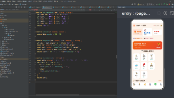
实现效果如下:
后续会补上(条件不允许)🙏
一、本期目标
1. 完成首页整体UI布局,包含顶部标题栏、功能卡片区、车辆信息区、充电状态展示区等核心模块。
2. 实现下拉选择车辆、充电启停切换、快捷操作跳转等交互逻辑。
3. 复用自定义组件(Comcard、Information等),提升代码可维护性。
4. 配置页面路由,实现首页到充电桩列表、车辆列表等页面的跳转。
二、首页核心模块开发
1. 搭建基础界面框架
首页采用“纵向分层+横向分区”的布局逻辑,整体用Column包裹实现从上到下的模块排列,局部区域(如功能卡片、车辆信息)用Row实现横向均分显示,核心依赖鸿蒙原生线性布局组件Row/Column。
基础框架示例代码如下:
typescript
@Entry
@Component
export struct HomePage {
build() {
// 页面根容器,纵向排列所有模块
Column() {
// 1. 顶部标题栏(Logo+APP名称)
Row() {
Image($r("app.media.homelogo")).width(45)
Text('智能充电家用版').fontSize(25).fontWeight(900)
}
// 2. 功能卡片区(我的充电桩、我的爱车)
Row() {
// 自定义卡片组件1
Comcard({...})
// 自定义卡片组件2
Comcard({...})
}
// 3. 车辆信息区(下拉选择+车辆详情)
Column() {
// 下拉选择器Row
Row() { Text('当前车辆'); Select(...) }
// 车辆信息Row
Row() { Information({...}); Information({...}) }
}
// 后续模块:轮播图、充电状态、进度条、快捷操作...
}
.width('100%')
.height('100%')
.padding(10)
// 页面背景渐变
.linearGradient({
direction: GradientDirection.Top,
colors: [['#f1f4f8', 0.0], ["#e4e9f0", 0.4], ["#ccd6e3", 0.6]]
})
}
}
2. 核心模块实现(附关键代码)
(1)顶部标题栏
作用:展示APP标识,采用Row横向排列Logo与文本,通过margin控制上下间距,确保页面顶部视觉统一。
typescript
Row() {
Image($r("app.media.homelogo"))
.width(45)
Text('智能充电家用版')
.fontSize(25)
.fontWeight(900)
}.margin({ top: 20, bottom: 35 })
.width('100%')
(2)功能卡片区(复用自定义Comcard组件)
分析:“我的充电桩”和“我的爱车”卡片样式一致,均包含图标、数量、标签,因此复用自定义Comcard组件,点击卡片实现页面跳转。
typescript
Row() {
// 我的充电桩卡片
Comcard({
number: 3,
label: '我的充电桩',
useImages: 'app.media.homeChargingpiles',
unitOfMeasurement: '个'
}) .onClick(() => {
// 跳转到充电桩列表页
router.pushUrl({url:'home/StationListPage'})
})
// 我的爱车卡片
Comcard({
number: 2,
label: '我的爱车',
useImages: 'app.media.homecars',
unitOfMeasurement: "辆"
})
.onClick(() => {
// 跳转到车辆列表页
router.pushUrl({ url: 'home/CarListPage' })
})
}.justifyContent(FlexAlign.SpaceAround) // 横向均分排列
.width('100%')
.margin({ bottom: 40 })
(3)车辆选择与信息展示
包含“下拉选择车辆”和“车辆信息横向展示”两部分,使用Select组件实现下拉选择,复用Information组件展示车牌、品牌等信息。
typescript
// 1. 车辆下拉选择器
Row() {
Text('当前车辆')
.fontSize(22)
.fontWeight(700)
Select(this.carOptions) // carOptions为车辆列表数据
.padding({ left: 130 })
.value(this.selectedCar) // 当前选中车辆
.backgroundColor(Color.Transparent)
.onSelect((index: number) => {
this.selectedCar = this.carOptions[index].value as string;
// TODO: 实际项目中需调用切换车辆接口
})
}
.margin({ bottom: 20 })
.width("100%")
.justifyContent(FlexAlign.SpaceBetween)
// 2. 车辆信息展示(横向4个信息项)
Row() {
Information({ message: this.selectedCar, label: "车牌" })
Information({ message: this.brand, label: "品牌" })
Information({ message: this.model, label: "型号" })
Information({ message: this.remainingMileage, label: "剩余里程" })
}
.justifyContent(FlexAlign.SpaceAround)
.width('100%')
.margin({ bottom: 10 })
(4)轮播图(Swiper组件)
用于展示车辆或充电相关宣传图,通过DotIndicator设置指示器样式,提升页面视觉效果。
typescript
Swiper() {
Image($r('app.media.homecar1'))
Image($r('app.media.homecar1'))
Image($r('app.media.homecar1'))
}
.height(160)
.width('100%')
.margin({ bottom: 20 })
// 轮播图指示器配置
.indicator(
new DotIndicator()
.itemWidth(10)
.itemHeight(2)
.selectedColor("#b4b8be")
.selectedItemWidth(10)
.selectedItemHeight(2)
)
(5)充电状态与进度展示
核心交互区,包含“充电启停按钮”“充电数据展示”“进度条”三部分,通过@State装饰器管理充电状态(ischarging),点击按钮切换状态。
typescript
// 1. 充电状态与启停按钮
Row() {
Text(this.ischarging ? this.charging : '未连接充电桩')
.fontWeight(600)
.fontSize(20)
Button(this.ischarging ? '停止充电' : '开始充电')
.height(30)
.onClick(() => {
// 切换充电状态
this.ischarging = !this.ischarging
})
}
.margin({ bottom: 8 })
.width('100%')
.justifyContent(FlexAlign.SpaceBetween)
// 2. 充电数据(功率、电量、剩余时间)
Row() {
RowInformation({ message: this.chargingPower, label: '充电功率' })
RowInformation({ message: this.chargingPower1, label: '充电电量' })
RowInformation({ message: this.timeRemaining, label: '预计剩余时间' })
}.width('100%')
.justifyContent(FlexAlign.SpaceBetween)
.margin({ bottom: 8 })
// 3. 充电进度条(渐变颜色)
Row() {
Progress({ value: 66, total: 100, type: ProgressType.Linear })
.style({ strokeWidth: 12 })
.layoutWeight(1) // 占满剩余宽度
.color(this.color1) // 渐变颜色(提前定义)
.foregroundBlurStyle(BlurStyle.Thin)
.backgroundBlurStyle(BlurStyle.COMPONENT_ULTRA_THICK)
.borderRadius(5)
Text() {
Span('66% ');
Span(' | ' + '充电中').fontColor(Color.Gray)
}
}
.margin({ bottom: 30 })
(6)快捷操作区
包含“添加充电桩”“添加车辆”“一键充电”三个功能按钮,采用Row横向排列,点击实现页面跳转或接口调用。
typescript
Row() {
// 添加充电桩
quickActions({ img: 'app.media.homeaddchargingPiles', label: '添加充电桩' })
.onClick(() => {
router.pushUrl({url:'home/AddStationPage'})
})
// 添加车辆
quickActions({ img: 'app.media.homeaddcar', label: '添加车辆' })
.onClick(() => {
router.pushUrl({url:'home/HomecarDetails'})
})
// 一键充电
quickActions({ img: 'app.media.homeoneClickCharging', label: '一键充电' })
.onClick(() => {
// TODO: 实际项目中调用一键充电接口
})
}
.shadow({ radius: 20, color: Color.Gray }) // 阴影效果
.padding(20)
.justifyContent(FlexAlign.SpaceBetween)
.backgroundColor(Color.White)
.borderRadius(12)
.height(160)
.width('98%')
.margin({ bottom: 10 })
3. 关键状态与数据定义
页面中动态数据(如选中车辆、充电状态、充电数据等)通过@State装饰器管理,确保状态变更时UI实时更新,核心定义如下:
typescript
// 模拟当前选择车辆
@State selectedCar: string = '京A 88888';
// 车辆品牌
@State brand: string = '奥迪';
// 车辆型号
@State model: string = 'A6';
// 剩余公里数
@State remainingMileage: string = '100.2km';
// 车辆列表(下拉选择数据源)
@State carOptions: Array<SelectOption> = [{ value: '京A 88888' }, { value: '辽B D66666' }];
// 充电状态(true=充电中,false=未充电)
@State ischarging: boolean = false
// 充电桩连接信息
@State charging: string = '已连接1号充电桩'
// 充电功率(kW)
@State chargingPower: string = '900'
// 充电电量(kWh)
@State chargingPower1: string = "3.6"
// 预计剩余时间
@State timeRemaining: string = '1h20mn'
// 进度条渐变颜色
public color1: LinearGradient =
new LinearGradient([{ color: "#65EEC9A3", offset: 0 }, { color: "#FFEF629F", offset: 1 }])
三、核心知识点总结
1. 布局逻辑:灵活运用Row/Column实现“纵向分层、横向分区”,通过justifyContent、layoutWeight等属性控制组件排列与占比。
2. 组件复用:自定义Comcard、Information等组件,减少重复代码,提升开发效率(类似登录页的InputField组件复用思想)。
3. 状态管理:使用@State装饰器管理页面动态数据,实现状态变更与UI更新的联动(如充电启停、车辆切换)。
4. 页面跳转:通过router.pushUrl实现首页到其他功能页的路由跳转,需提前配置路由表(参考登录页路由配置逻辑)。
本期首页开发聚焦原生组件实战与基础交互实现,下期将深入讲解充电接口调用、车辆数据联调等实战内容,小码在这里祝您码到成功

讨论HarmonyOS开发技术,专注于API与组件、DevEco Studio、测试、元服务和应用上架分发等。
更多推荐
 10
10 0
0- 0


 已为社区贡献7条内容

所有评论(0)